
4 minute read
Erik Spiekermann


spiekermann
alongside Christian Schwartz as they collaborated on the design of a type family for German Railways. After leaving the MetaDesign firm in 2001, he founded a new firm called
Advertisement
United Designers Networks.
This second firm also has offices located in Berlin, San Francisco, and London. As of 2009, the firm was renamed and is now recognized as Edenspiekermann. (Adobe 2021). Having spent the last fifty years in the graphic design and typographic industry, Spiekermann has distinguished some of his type preferences and personal discoveries over the last five decades. His dream setup includes a balance of both analog and digital traditions and machinery.
He takes both into account when de signing a new font type. “From real life.
I open my eyes and I travel and I look. And I read everything. I open my eyes and I travel and I look. And I read
everything”, is the response Spiekermann gave when asked what inspires him while creating graphics and typefaces (Workspiration 2018). Erik Spiekermann currently has offices in Amsterdam, Berlin, Los Angeles, San Francisco, London, and Singapore. Some of the typefaces he has designing throughout his career include: FF Meta, ITC Officina, FF Info, FF Unit, and FF Real. He has also designed several custom fonts for companies such as The
Economist, Deutshe Bahn, Cisco, Bosch,
Mozilla, and Autodesk. (Adobe 2021). Many believe Spiekermann played a large roll in the development and advancement of cultural communication and information sharing, certainly in Germany, but also on a global scale.
Article written by: Sarah Koepplinger
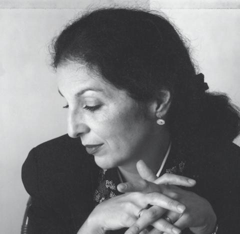
erik
Louise FiLi
BY PAYTON HUDSON
Is there only one way to catch someone’s eye? Typography can vary from the loose variations to more strict limitations found in swiss style, but in the end, due to opinion, people tend to choose which they feel is correct. Some shy away from the classical style of type because they find it too basic while others cannot stand the sight of modern type. For Louise Fili, all forms are an inspiration. Through her personal background with type, love for cuisine, and impact on the art directing scene, Fili innovates past the barriers of ‘wrong design’ and leaves a trail of inspiration and achievement. A t the age of sixteen, Fili stepped off a plane and fell in love with type. After landing in Italy for the first time, Fili says, she saw a sign for Baci Perugina chocolates that was different from any other advertisement she had ever seen (Fili 9). From there she became enamored with type. Though she did not start experimenting with design until much later, Louise submerged herself in Italy’s style of design. In her book, The Signs of Italy, she speaks extensively about her love for various styles of type that can be found all over Italy. Fili collected pictures of Restaurant signs, advertisements, posters, wrappers, painted signs and everything else Italy had to offer. As technology got better, her research was able to be taken to new heights and her dedication to travel to new cities and photograph different areas grew even stronger. Fili states, she would sometimes have to wait for things to move just to get the perfect shot of a letterform tucked away in an alley (Fili


above: A logo design for pearl oyster bar done by Louise Fili
9). Though the walking would seem like a bother, Fili’s love for Italy powers her work from her youth all the way to now. She speaks of the cities that she finds the most interesting such as Lucca, Bologna, and Turin, as if she can tell you every sign street by street. Her research does not stop there, though. In her book, Scripts: Elegant Lettering from Design’s Golden Age, Fili comprises some of her photography again, this time separating the styles of Scripts by country and giving some background research using her knowledge. Fili’s approach to research even at a young age, reflects the approach she has for her own work and the amount of styles present in them. Louise’s love for Italy can be found in her journey to food packaging in New York city. In her interview podcast with Logo Geek, she talks about her beginnings in the food packaging industry and all of the inspiration Italy has on her job decision. After working a bleak period as an art director and restaurant logo designer in New York, she decided to go into what she loves: Food, design, and all things Italy.
Food, design and all things italy
- Louise Fili
As an Italian American, Fili grew up in a life centered around food. Moved by her childhood, she looked into the food packaging business. In order to pursue her passion in a more centered environment Fili established her own studio and directed her attention on turning the packaging industry into a beauty centered practice. Her impact in the world of restaurant reflects this belief as well. In the podcast, The Food Seen with Matteo Bologna and Douglas Riccardi, Fili talks in length about her experience with the restaurant industry in New York compared to Italy. Fili states that, in comparison, the logo business is almost nonexistent in Italy because


