7 minute read
ART APPRECIATION
LISA AND GEOFFREY WEBSTER AND FAMILY WERE VERY HAPPY TO HAVE FOUND A HOME IN A HIGHLY DESIRED AUSTIN NEIGHBORHOOD — AN AREA IN WHICH HOMES AVAILABLE FOR SALE ARE EXTREMELY LIMITED. ORIGINALLY BUILT IN 2009 IN A RATHER TRADITIONAL HILL COUNTRY AND DARK MEDITERRANEAN STYLE, THE HOUSE’S AESTHETIC DIDN’T QUITE MATCH THE FAMILY’S STYLE, HOWEVER. THEY DECIDED A REMODEL WAS NEEDED TO MAKE THE HOME FEEL ENTIRELY THEIRS.
BY CLAUDIA ALARCÓN | PHOTOGRAPHY BY ANDREA CALO
Advertisement
LLISA TURNED TO HEIDI FELIZ-GRIMM, SENIOR designer of Martha O’Hara Interiors, to revamp the home’s interiors. By making the decision to remodel and furnish to the homeowners’ standards, Heidi was able to tie elements of their style with some of the key features they adored about the home, successfully merging their dramatic and modern flair within the traditional Hill Country home. The home had some interesting original elements which were kept intact, such as arched details, ceiling beams, an accent stone wall in the kitchen and travertine tile, limestone and rich, highly distressed, wide-plank cherryfinished hardwood flooring. Certain favorite pieces of furniture such as a desk, nightstands, lounge chairs and chaise lounges were reimagined and repurposed to fit the new style. Window casings were modernized with refreshed paint, the entire home was brightened with light paint colors and a high-end ambiance was conceived with elegant lighting and luxurious furnishings.
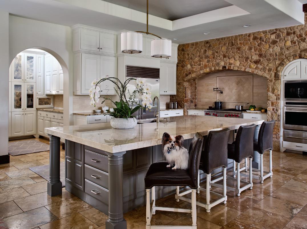
While the majority of the kitchen is original to the home, new cabinet colors, countertops and appliances were updated, with leather barstools from Hickory Chair and pendant lighting by Hudson Valley as added accessories. The adjacent dining room table is a custom design by Old Biscayne and upholstered chairs with a geometric design and metal legs come from Century Furniture. The 100 percent Himalayan wool rug in coral is by Fay + Belle.
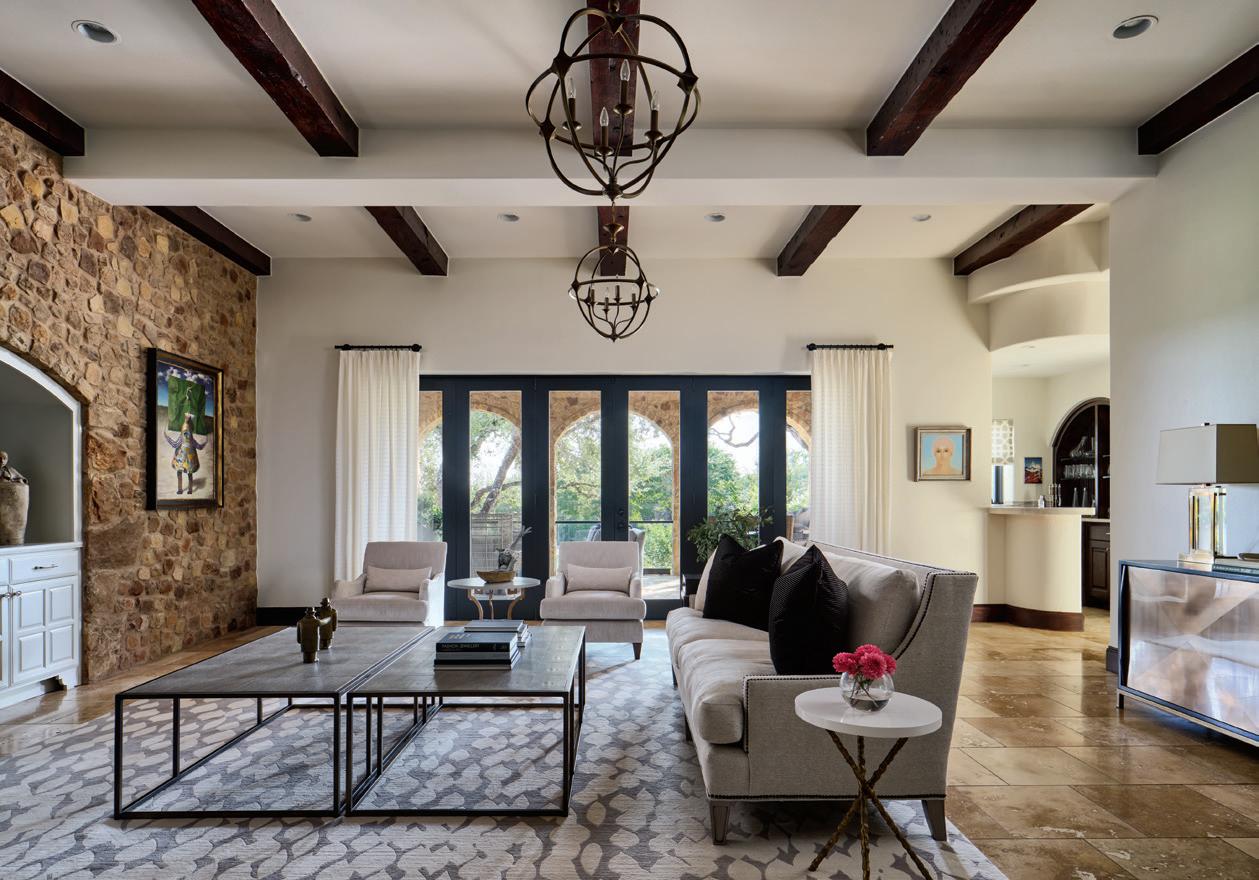
The living room also retained many original architectural elements such as the stone wall, ceiling details and arched entrances, but Heidi reimagined the space with custom furnishings and accessories, including a Lillian August sofa with a nail head trim and oatmeal-colored upholstery, side chairs from Baker Furniture, coffee table by Vanguard, a Fay + Belle Nepalese rug and lighting by Currey & Co. On the stone wall and over the Oly Studio console hang paintings by Mario Gomez.
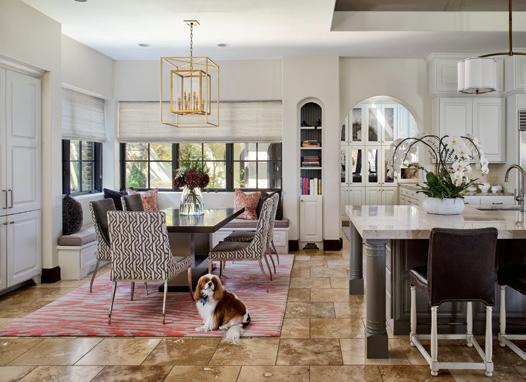
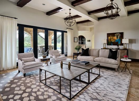
Most importantly, Heidi worked closely with Lisa to make sure their prized art collection was showcased properly within the home. To better highlight the artworks, Heidi chose to paint the walls with Benjamin Moore White Dove OC-17 with an eggshell finish.
“Geoffrey and Lisa have been collecting art for many years, and working with them was a dream,” said Heidi. “We transitioned their contemporary art with an updated home design by embracing traditional high-end finishes like her beautiful hardwood flooring and stone accent walls, but did so in a way where it feels current and timeless. With such a large house and many blank walls, we found multiple opportunities to hang stunning, large pieces, mimicking the walls of a gallery showcase.”
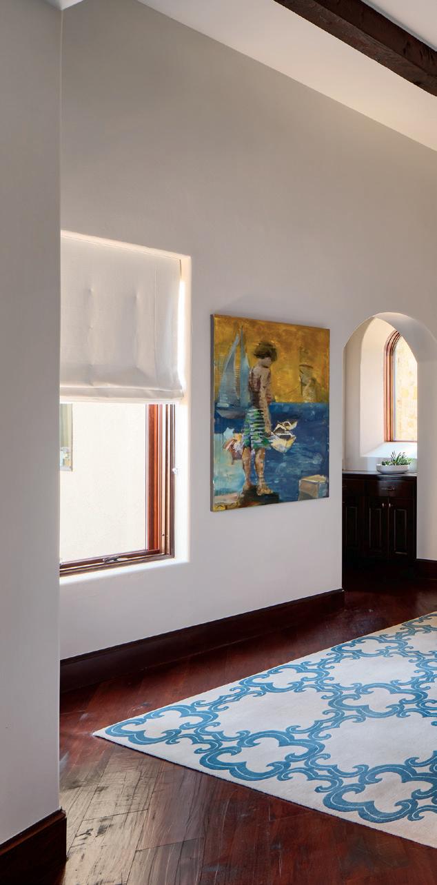
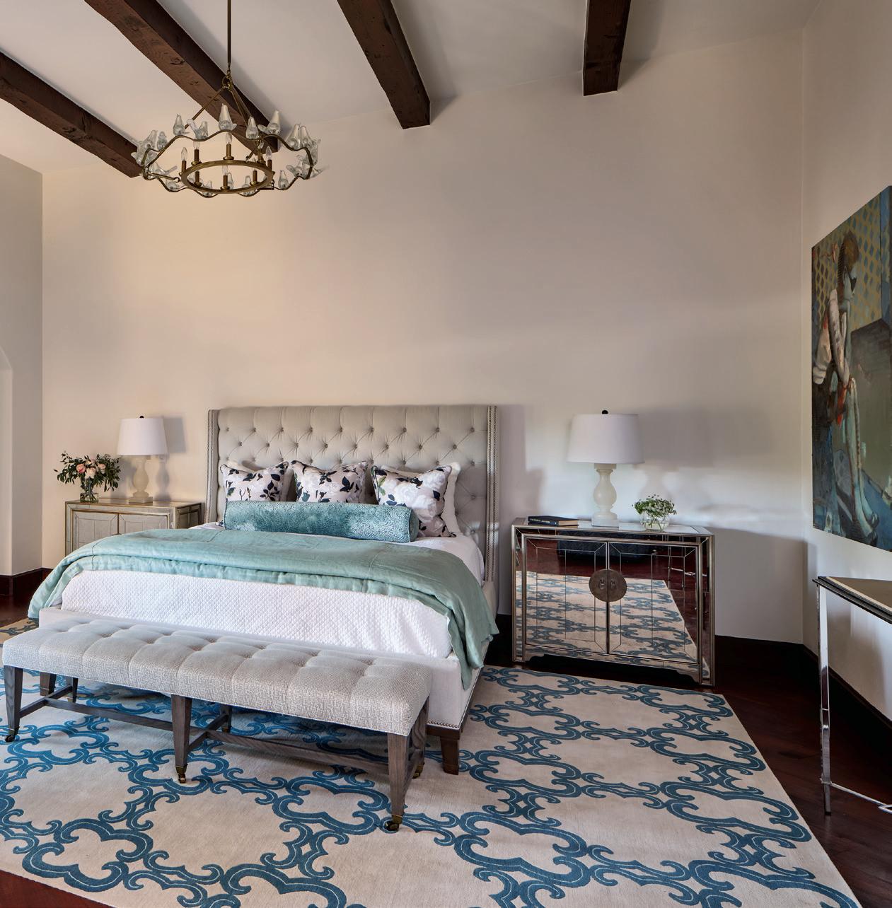
In the primary suite, another Fay + Belle rug grounds the room and a new bed by Vanguard and bench by Lee Industries accompany the homeowners’ original nightstands, repurposed in the design. On either side of the bed hang oil paintings by Michael Azgour.
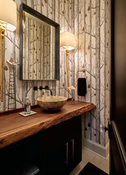
The powder room is both bold and serene at the same time. The custom wallpaper by Cole & Son features a tree and pear design and the cabinets are painted Benjamin Moore 1603 Graphite with semi-gloss finish. The homeowner’s second sculpture by artist Kevin Box sits atop a live edge solid walnut wood slab. Visual Comfort sconces provide a gilded finish.
To begin, Heidi selected and placed all the furnishings before focusing on art placement. “It felt so natural because Lisa’s taste in art is sophisticated. She likes geometrics and solids, so her style in art worked well with all the furnishings and patterns we selected for her. I really enjoyed finding inspiration from her artwork when picking out colors and patterns within the furnishings.”
Geoffrey and Lisa enjoy visiting reputable galleries, always looking for something that first and foremost makes an emotional connection, “though often we’re not able to define that connection until long after the piece graces our home. But any collector knows that feeling that consumes your sensory attention,” she said. “We have no defined criteria, such as only abstract or post-impressionist or what-
ever. We consider color, shape, material and treatments to be important for selection.”
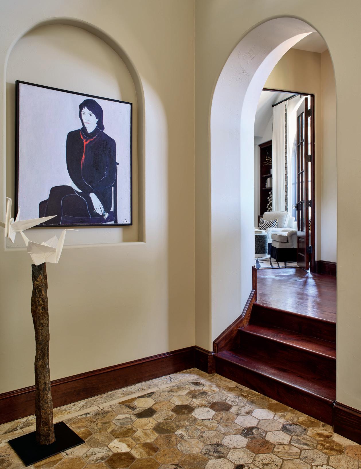
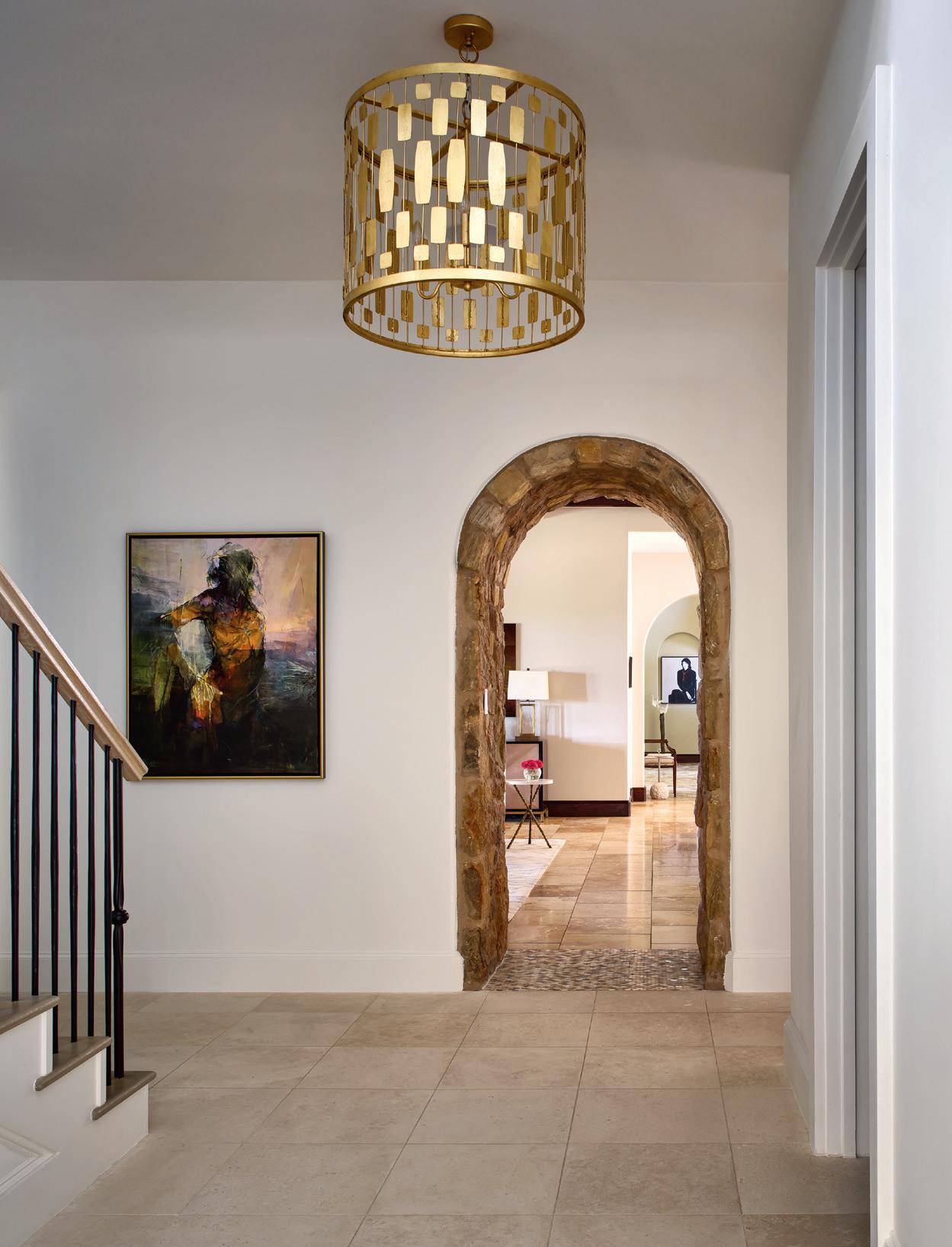
Once while in a gallery in Chicago, the couple discovered an oil and chalk piece, named “Olga” by the artist. Lisa recalls, “We liked the simplicity of the image that drew us deeper into the figure’s features. We talked about her for days, went back to see her several times, then went home leaving her there. About six years later while internet browsing a gallery’s work several states away from Chicago, we saw her tucked back in a corner. We phoned the gallery and learned they were crating her up to go back to the artist. She came to our home and has been at the end of a central hallway ever since. We think Olga waited patiently for us to find her and we are very happy she joined our collection.”
Having identified a potential selection, practical things come to the fore such as price, but most importantly,
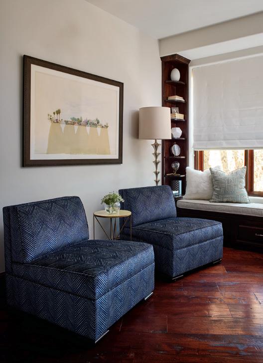
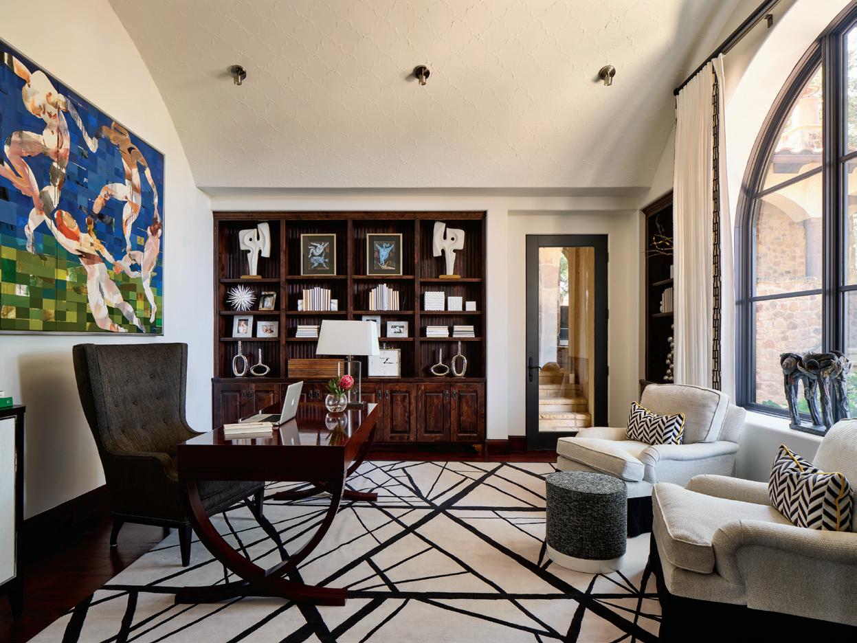
In Lisa’s office, her desk and lounge chairs were repurposed for the room, while Heidi added a Fay + Belle rug and a Wesley Hall drum ottoman in a graphite textural fabric to complete the furnishings. The striking painting is by Michael Azgour.
whether it fits in two ways. First, is there a place for it to sit or hang and second, will it clash or harmonize with its surround. “Two stunning pieces may not be able to rest near each other,” said Lisa.
“Lisa was very open to moving things as needed, there weren’t any pieces that needed to stay in a specific spot,” explained Heidi. “We walked around the house to decide together which pieces would work in each place. Lisa has a very good eye for this as well. It made the process a breeze because there was much in which we agreed upon. She knew how much we appreciated her artwork, and we worked hard to make it shine throughout the home.”
Heidi provided some important suggestions for homeowners who are not sure where to start incorporating art into their homes.
SCALE. Consider all dimensions of your space in comparison to your art pieces because when it comes to the scale of a piece, art is terribly conspicuous when too small or too big.
DON’T OVERWHELM. There is such a thing as too much art. It’s important to not overwhelm your spaces so they feel cluttered and thoughtless. Art cannot be appreciated this way. Trust in your designer and they will help in letting your art shine throughout your home.
CATALOG. By cataloging your art with photos and sizes, your designer can plan your art placement accordingly.
SHOPPING. For those who are still adding to their art collection, plan on shopping with your designer when possible. They can help you select pieces that will complement your home design.” u
MARTHA O’HARA INTERIORS
512-222-3201 | oharainteriors.com
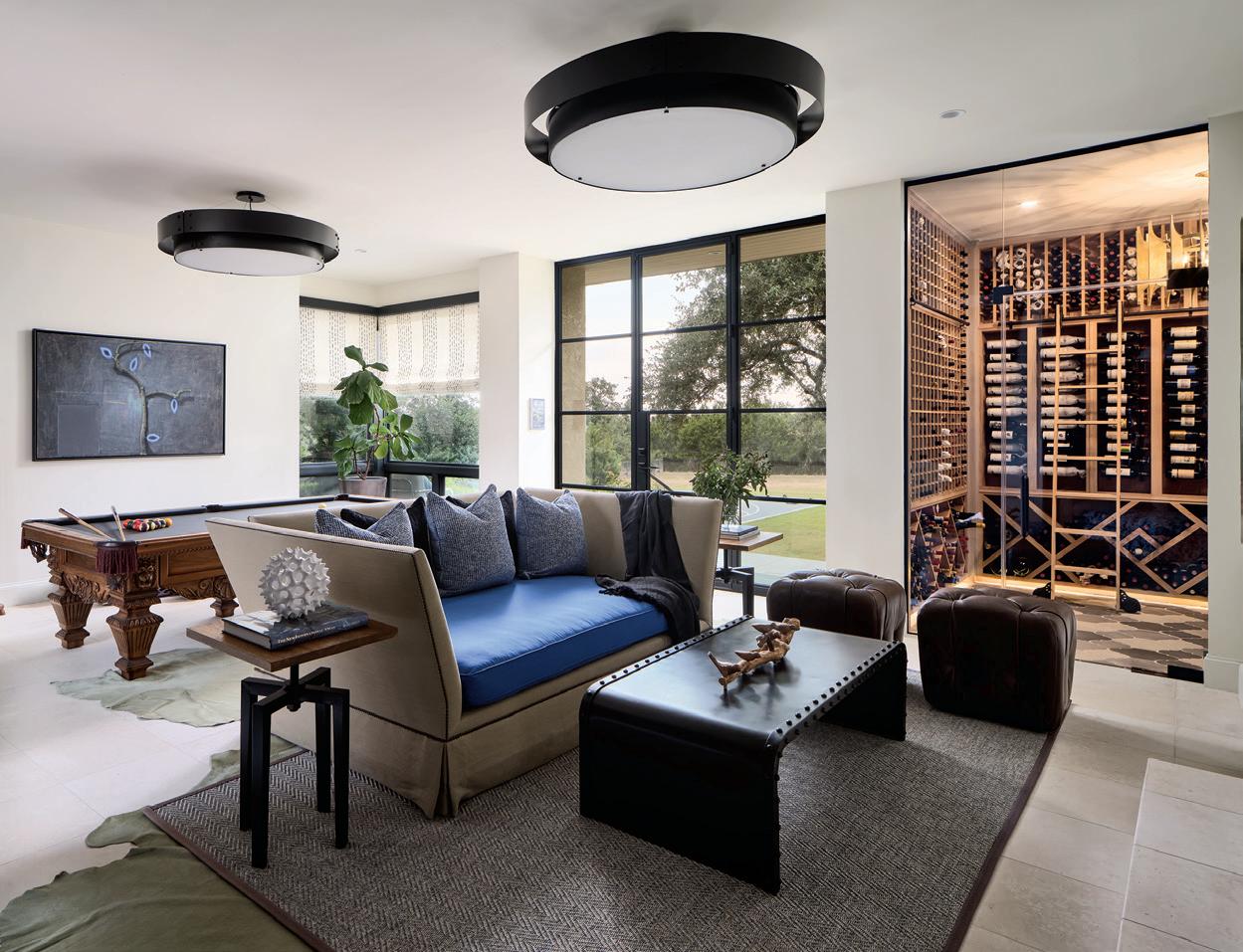
The game room is highlighted by the new wine room carved into a corner of the spacious downstairs room. The dominant painting behind the pool table is by Wolfgang Schroeder. The homeowners’ original sofa was reupholstered, and custom Vanguard tufted leather ottomans and a dovetail metal table in a gunmetal finish were added, along with black drum lights by Ultralights.
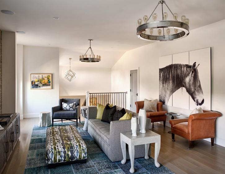
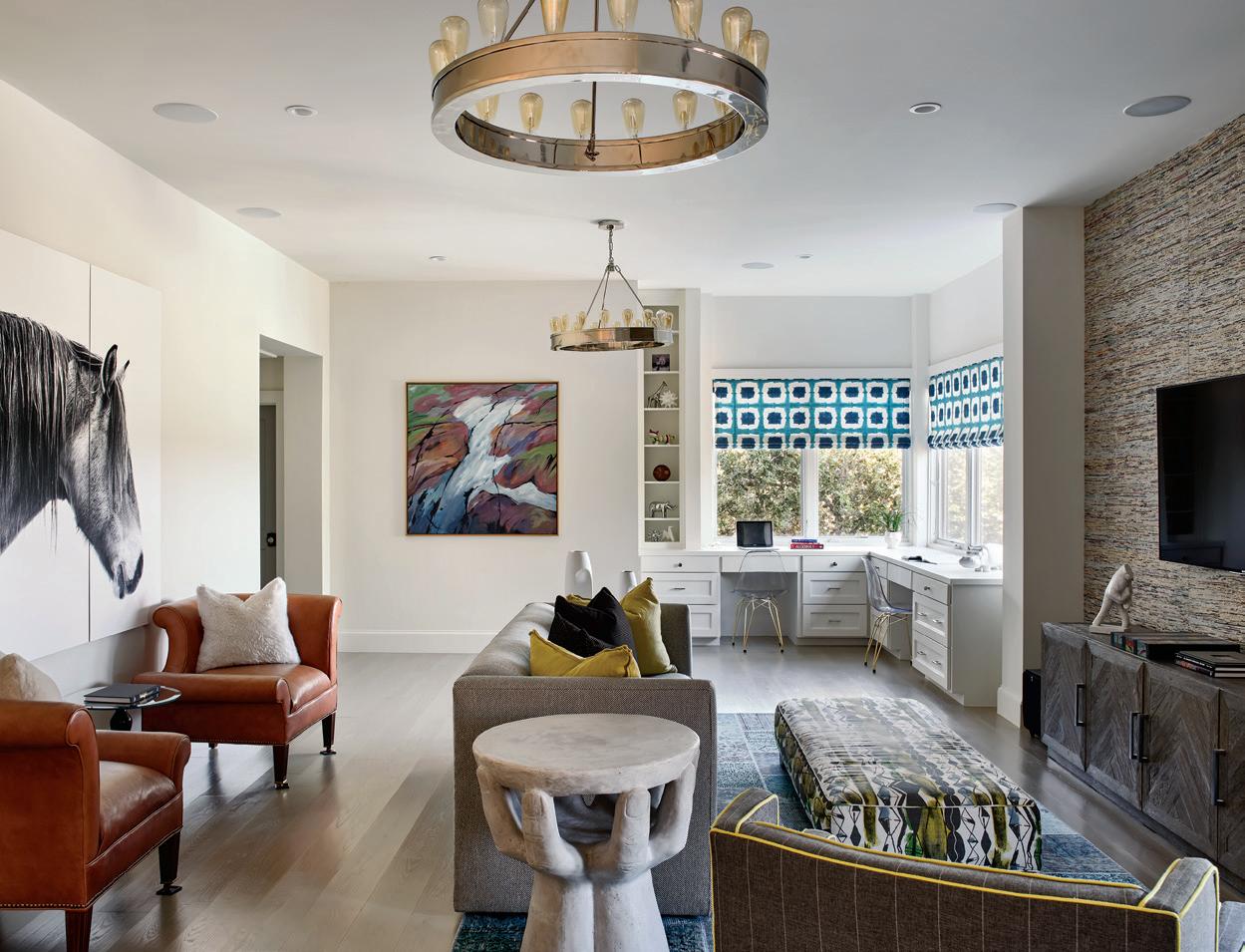
Upstairs, a separate lounge area doubles as the kids’ work space with built-in desks and acrylic chairs with gold legs from Zuo Modern. The acrylic painting hanging next to the desks is by Reina Nieland and is one of Lisa’s first pieces, purchased at the Burlington Art Center in Canada. Against the opposite wall near the stairwell is a watercolor and graphite painting by Karla Woznlak. The equine triptych is a photo printed on museum paper by McMillen Fine Art Photography. Two Visual Comfort polished nickel chandeliers, side tables from Noir Furniture and a tree stump table from Arteriors join the homeowners’ existing sofa, chairs and ottoman, all reupholstered for the new space. On the TV wall, the tactile wallcovering is from Weitzner and made from newspaper clippings.
