6 minute read
PALETTE
Is it BLUE or PURPLE?
DESCRIBED BY PANTONE AS “A DYNAMIC PERIWINKLE BLUE WITH A VIVIFYING VIOLET RED UNDERTONE,” WHICHEVER COLOR YOU SEE, VERY PERI ECHOES PAST PURPLES WITH A MODERN TWIST.
Advertisement
BY TRISHA DOUCETTE
Most often associated with royalty, the color purple is usually divided into two camps: those that love it and those that don’t. But since Pantone introduced the 2022 Color of the Year, Very Peri, be prepared to see more shades of this vivacious violet. Actually, since 2000, Pantone has selected variations of this regal color five times, if you count the red undertones in 2000’s Cerulean Blue and 2016’s Serenity (which they paired with Rose Quartz, marking the first time they introduced a duo Color of the Year). 2008 brought Blue Iris, 2014 had Radiant Orchid and 2018 introduced the richest of purples with Ultra Violet. Leatrice Eiseman, Executive Director of the Pantone Color Institute, says, “… Pantone 17-3938 Very Peri displays a spritely, joyous attitude and dynamic presence that encourages courageous creativity and imaginative expressions.” Sign me up!
For more than 20 years, the Pantone Color of the Year has influenced product development spanning all areas of design, including fashion and home furnishings. Color experts at the Pantone Color Institute study worldwide color influences in all industries from the arts to fashion and technology to forecast global trends. 2022 actually marks the first year that Pantone invented a whole new hue for their Color of the Year rather than selecting a color from their pre-fixed palette.
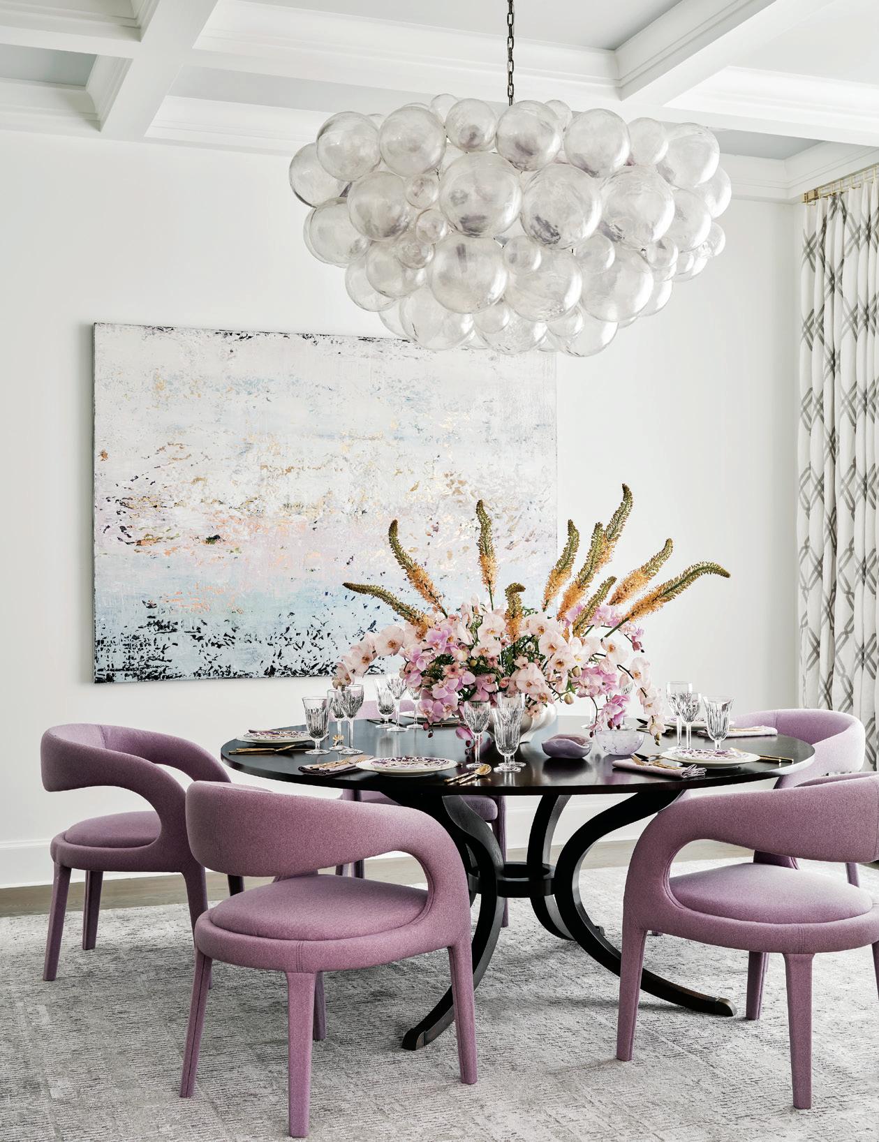
Designers have long been embracing shades of bluishpurple in bold applications or pared down versions. Crystal Romero, Lead Designer for Bradshaw Designs in San Antonio, says, “The official Pantone shade of Very Peri is naturally a bolder choice for interior spaces, but variations of that shade have been used for years. It can certainly be used in a full room for those looking for a bold design, but we have found that subtle applications of this color throughout decorative and furnishing pieces work best. Our dining room design is a prime example of a similar ‘user-friendly’ alternative — a cross between lilac and mauve. This sister shade still maintains that ‘wow’ factor that we were aiming for but doesn’t overpower other elements in the room.”
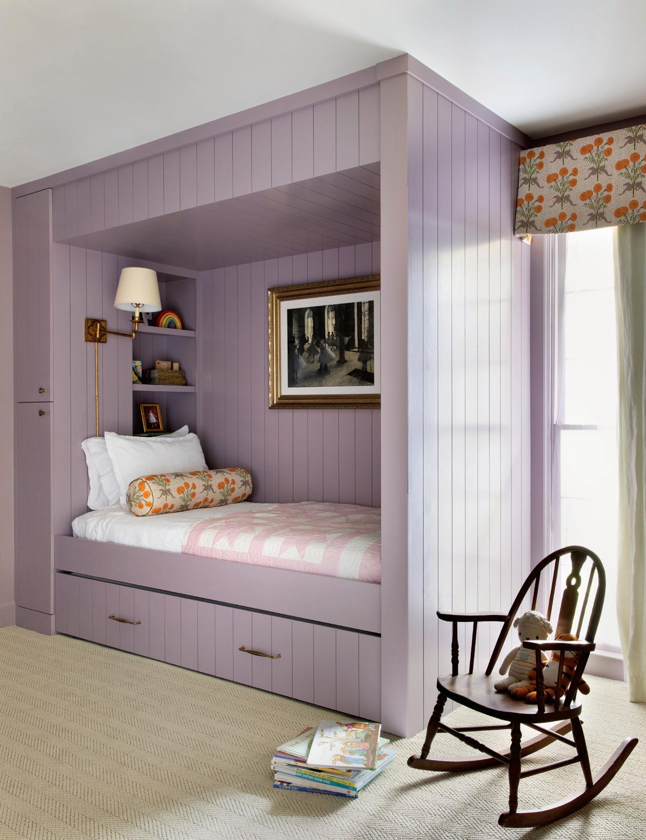
Austin designer Shannon Eddings of Shannon Eddings Interiors also prefers variations to the shade, saying, “I’m a big fan of toning it down a bit and then saturating a room in the color. Very Peri in its pure form is quite the statement so a toned-down version would be a great way to highlight a fun, on-trend color but keep it a bit more timeless.” Eddings designed a built-in canopy bed for a child’s room, painting it in Benjamin Moore® Mauve Dessert. “We are getting a lot of love for this earthy shade of purple that can go both feminine or masculine. We predict seeing more of it this winter as people are moving toward more color favorites from the ‘80s/‘90s and looking to stay moody in their color schemes. When it’s dark, the mauve can get very calming and when the sun is out, the color reads bright and inviting. We like it for built-in bunks, library bookcases or a small-scale space like a powder bath (with the trim and ceiling painted in the same color but different finish),” she explains.
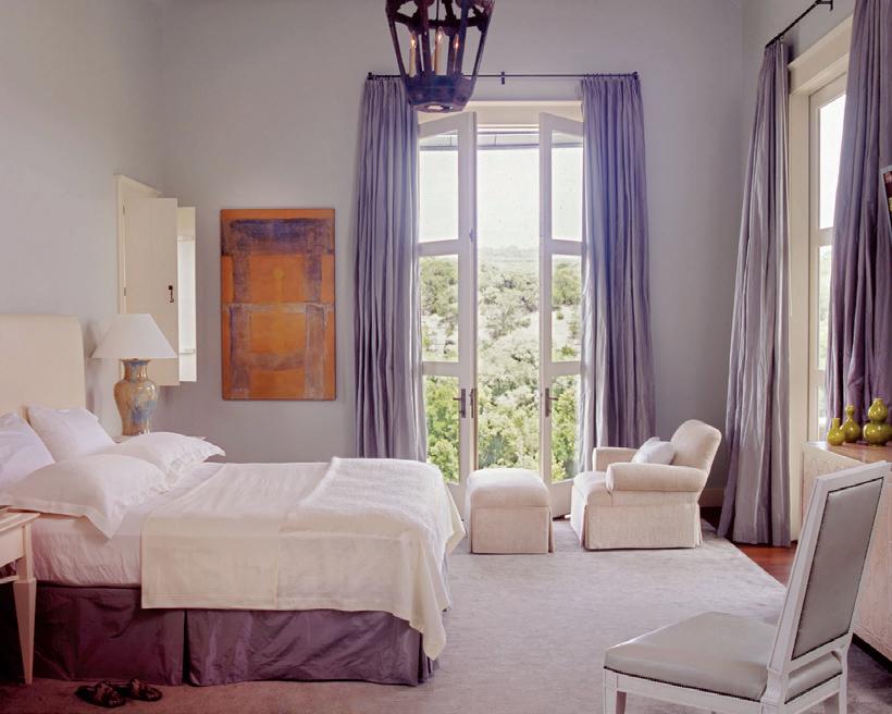
Mark Ashby of Mark Ashby Design in Austin cautions using certain muted shades of Very Peri. “I suggest full formula for this color because a lightened version leans toward baby blue.” He used periwinkle for his clients’ primary suite as an accent to the blue skies streaming through the luxurious floor-to-ceiling windows and doors. “The color works to enliven a neutral, bright white room as shown here or to contrast a richer brown palette with its jeweled hues. Accents of periwinkle blue add interest, and it has more staying power than fully saturated walls. Silk curtains and velvet pillows are a safer bet for a blast of this tone.”
Eddings also prefers implementing the color in textiles. “A really lovely yellow or green fabric would pair nicely with a periwinkle trim, or I can see this color on a cool pair of


MARK ASHBY DESIGN

X-base benches with a contrast trim floating in an eclectic living room. This color seems to be just funky enough that I would likely keep it to accessories unless it is a color my clients are absolutely in love with.”
Romero agrees, saying her clients wouldn’t shy away from a bold color choice but would be more open to including the color in accessories instead of grander applications. “The placement of this color works beautifully in both subtle and bold applications, but we have found that clients tend to gravitate toward pops of this color in a space. Perhaps it feels like less of a commitment and doesn’t overpower the interior design as a whole — think dining chairs, pillows, vases or artwork.”
Finding accessories in shades of periwinkle will not be difficult. Pantone partnered with Cariuma to create sneakers for both women and men in the iconic shade. You can always count on KitchenAid® for a variety of color choices — see the Blue Velvet and Lavender Cream in Stand Mixers to add a luscious lavender in your kitchen. West Elm’s Estelle Glassware brings iridescent color to your dining table, and the list goes on.
Romero suggests homeowners use periwinkle in various ways to complement their current design by pairing it with green, pink or blue shades. Eddings adds, “Very Peri would be really lovely paired with any shade of green in my opinion. I love a jewel tone color combo and can see how those two would be a match made in heaven — especially an emerald green.”
Ashby considers the shade timeless and seasonless, “Although springtime seems an appropriate time to toss periwinkle cashmere throws over white slip covered sofas.” Romero suggests ways to carry the shade through each season. Resting in the middle of the value scale, neither too dark nor too light, “Very Peri is a versatile shade that can be paired with many different colors to create the perfect mood year-round. For example, pairing Very Peri with white or citron green will make a space feel airy and playful during the spring and summer months, while deeper colors like burgundy and navy can add warmth in cooler seasons.”
So, when 2023 rolls around and Pantone introduces a new Color of the Year, where does that leave Very Peri? “As a secondary color, violet will always, in some capacity, be a part of many interior spaces. So, do we believe Very Peri will also have longevity? Simple answer, yes; it really comes down to what it is paired with,” advises Romero. Ashby concludes, “This beautiful hue is timeless in my opinion.” u
BRADSHAW DESIGNS
210-824-1535 | bradshawdesigns.com
MARK ASHBY DESIGN
512-524-1220 | markashbydesign.com
SHANNON EDDINGS INTERIORS
512-496-7578 | shannoneddings.com


