

IMAGINEYOURHOME


TOTALLY ORGANIZED


The experts at Ferguson Bath, Kitchen & Lighting Gallery are here to help create a home that’s as extraordinary as you are. Any project, any style, any dream—bring your inspiration to Ferguson Bath, Kitchen & Lighting Gallery. Visit build.com/ferguson to schedule your personalized showroom experience today.


DREAM

SANCTUARY


DWELL 19 GIFT GUIDE
Our curated gift guide covers every aesthetic from the artist to the modernist. 28
ENTERTAINING
Designer Debra Zinn shares an elegant Christmas brunch table brimming with Parisian flair. 30

HOLIDAY STYLE
Founded by best friends Emily Slater and Lindsay Marko, A Signature Welcome offers beautifully packaged gifts with carefully curated items. 34
DESIGN BOARD
Designer Lauren Branch revamps the dining room in her midcentury-modern home, infusing it with charm and modernity.


AAs we move into the holiday season, often at breakneck speed, it’s easy to feel overwhelmed at the thought of hosting guests, buying gifts for every person on your list, or getting your home just-so for the holidays. We both find it hard sometimes to keep in mind the point of the occasions, as I'm sure you do, too. But the point is JOY.

Joy is at the center of every gathering with family and friends during the season. Joy is at the center of decorating your home for little ones, or for everyone. And joy is at the center of giving thoughtful gifts to those you love and those who deserve recognition. No matter how taxing, no matter how harried, our cups are filled with things we have to offer others. Even when you think you’re running on empty, there’s always a drop more, and then come those moments when you feel warmly the same joy you are giving to others. And suddenly, our cups are filled again.
We have filled these pages with moments of gifting, hosting, and being together. Our Great Gatherings issue is brimming with peace, love, and joy that we hope will flow out to each and every one of you.

 Blake Miller and Anne Marie Ashley Co-Editors-in-Chief


Maps
iangle homedesigndecormag.com

CO-EDITORS-IN-CHIEF
ANNE MARIE ASHLEY BLAKE MILLER
ASSOCIATE EDITOR KARIN SIMONEAU
ART DIRECTOR LINDSAY RICHARDS PUBLISHER MICHAEL KOOIMAN ASSOCIATE PUBLISHER OONAGH MURRAY WRITERS SARAH CROSLAND LEE RHODES CHRISTINA SPRATT SPENCER DANA W. TODD REBECCA VOIGT JILL WALDBIESER

®
®





Dinner and salad plates:

Royal Crown Derby
Chargers: Anna Weatherley
Dessert plates: Mottahedeh
Flatware: Vietri
Glasses: Vintage
Napkins: Vintage
Tablecloth: Custom-made with Villa Nova fabric
Flowers: West Queen Studio


TOP: Owners Lindsay Marko and Emily Slater.
BOTTOM: The Art of the Bar gift box is part of the new Holiday 2022 collection and includes items like a tea towel, a stoneware vase, and all-natural cocktail mix.
Gracious GIFTING
PRODUCED BY ANNE MARIE ASHLEYBest friends Emily Slater and Lindsay Marko waxed poetic about their vision of starting a business together ever since their days at the University of Georgia. After full emersion in planning their own weddings, a business plan for wedding welcome gifts was hatched. With Marko’s design degree from Parsons and Slater’s experience as an editor with a luxury national wedding publication, they felt confident they had a niche.
Fast forward eight years, and their business, A Signature Welcome (ASW), has expanded to include corporate gifting, personal gifting, and wedding welcome gifts. “I think we always knew we wanted to expand, but we wanted it to happen organically,” explains Slater. “When the pandemic hit and weddings halted, we had to pivot to stay afloat, and the corporate industry was in a very unique place for us to enter.” With everyone quarantined in their homes, companies found new ways to express employee appreciation, and gifts through ASW’s unique branded options offered high-end luxury appeal.
In the same vein, as people searched for new ways to connect with close friends and family or brighten someone’s day during uncertain times, surprise gift boxes were born—beautifully packaged gifts with curated items that were shipped free nationwide from their local shop in Raleigh or Charleston. Personal gifting took off too,


Taking things up a notch.
That’s


The Crosstown® Workstation Sink
The stainless steel sink that accommodates a cutting board, colander and dish-drying station. Maximize usability and improve functionality with a minimal footprint.

2022 HOLIDAY COLLECTION
Gather
Give the foundations for gathering and kitchens.
—EMILY SLATER
All pre-curated gifts at ASW are hand-packaged and hand-wrapped with aesthetics front-of-mind.


“A new favorite coffee table book or a new scent for the powder room are warm touches they can sprinkle throughout the home,” says Slater. “Before any gift leaves our studio, our team asks: would we want it?” Whether you’re gifting to a family member or a few friends, a client, or your whole business team, ASW’s custom-designed or pre-curated boxes amp up not only the pampering this season, but the thoughtfulness, as well. u
Home Comforts
Layer on comfort with candles, a blanket, and snacks to share.
SEE THE FULL COLLECTION OF PRE-CURATED GIFTS AT ASIGNATUREWELCOME.COM and Slater and Marko expanded their list of luxury brands offered, covering everything from gourmet food and wellness kits to home goods and cooking, always gathering as many local items as possible.

“As gifting experts, we know you can never go wrong by showing thoughtful appreciation, no matter how big or small,” Slater says. “The wonderful thing about gifting is it still provides a moment to be unique; you don’t have to do it like everyone else. Our design team can help customers develop a full custom experience.”
ASW’s pre-curated gifts are convenient, yet thoughtful and luxe. Their Home Comforts gift, for example, layers on the cozy with specially selected taper candles and holders, a jar of matches, a throw blanket, a ceramic bowl, and a few snacks to keep you warm.
Ayurvedic gift box is the ultimate self-care gift, complete with incense and pepita flaxseed balls.

Morning Coffee Ground coffee, muffin and pancake mix, and a cane tray to serve them on.
Winter's Taste
This gift has all the gourmet winter flavors to put you in the holiday spirit.
“THE WONDERFUL THING ABOUT GIFTING IS IT STILL PROVIDES A MOMENT TO BE UNIQUE; YOU DON’T HAVE TO DO IT LIKE EVERYONE ELSE.”The

LAUREN Branch

When designer Lauren Branch of Kéfi Home Interiors moved into her grandparents’ midcentury-modern home in the Triangle, she knew she wanted to ramp up the inherent charm while infusing her own contemporary take on the classic aesthetic. Here, she fills us in on her dining room design.

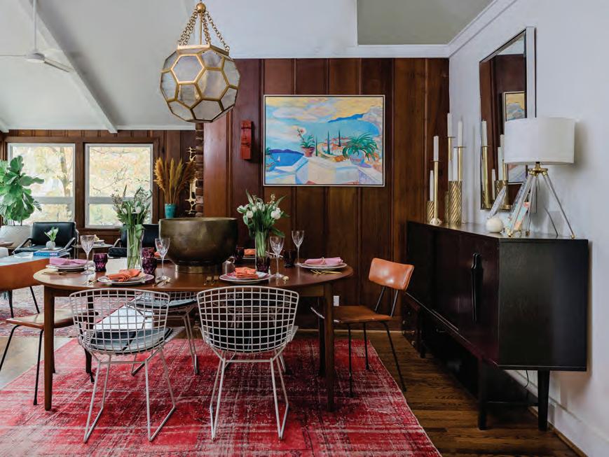

“We focused on balancing the beautiful, richly toned wood-paneled walls with equal parts white to keep it bright and airy,” she explains. To create a fresh, fun, and casual feel, Branch also accented with bold pops of jewel-toned colors complemented with soft brass finishes, while sculptural vintage pieces stand alongside new modern ones. “Furniture, accessories, and artwork that combine beauty and function are always top of mind, but with three young kids, we didn’t want anything too precious,” she adds. “Authentic Turkish rugs and Bertoia chairs that only require minimal wipe down seemed like a perfect fit for my family of five.”


1. Caspian Sideboard / to the trade / fourhands.com

2. Midcentury Brass Candle Holders / $495 for a set of three / chairish.com
3. Vintage Distressed Rug / $1,309 / revivalrugs.com


4. Bertoia Dining Side Chairs / $1,100 / dwr.com
5. Hexsation Chandelier / $4,022 / corbettlighting.hvlgroup.com
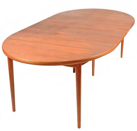
6. Vintage Teak Dining Table / $4,850 / chairish.com
7. Clementine Print / $276 for a 24x30 / blakelymade.com


Team worked with architect Quinn Pillsworth to design the perfect space between two arches for her grandmother’s Welsh hutch and her great-grandmother’s china collection. The colors are subtly echoed in the pair of pillows on the Highland House sofa. OPPOSITE: The painting by Joey Lancaster was purchased to fit the awkward space between the two entrances to the living room.

SSARAH AND COLEMAN Team were 90 percent of the way to achieving the “American Dream”—they had two kids, two dogs, and a successful business. All they needed was the house.
They knew exactly where they’d build it, too: in the newly subdivided area of Chatham, which is tucked away from busy roads in WinstonSalem. “We really loved the idea of this new neighborhood in such a beautiful part of town,” says Sarah Team. “We wanted our kids to live in the kind of neighborhood we both grew up in.”
They hired architect Quinn Pillsworth to draw up the plans and enlisted custom home builder Ron Williams to build the home. But they also needed an interior designer. They interviewed

several, but when they met Meredith Beregovski of Georgia Street Design, “It was like a Cinderella fit,” says Team.
“There was an instant connection,” agrees Beregovski. “Sarah has great style and she wanted something that felt fresh.” The designer could tell from the architectural details like the coffered ceiling and arches that the Teams wanted to maintain an air of tradition, but without having the space feel like their parents’ homes. “They were building this home to last forever, and they wanted to make sure it stood the test of time,” says Beregovski, “so they went with something very classic, very clean, and able to change with time.”
In the living room, a painting by Eleanor Scott Davis pops among the neutral palette. The rug is by Stark.
OPPOSITE: “In a lot of open-concept homes, you miss that moment for art because there are no walls,” says Beregovski. The painting of a sailboat that hangs on the wall next to the black-lacquered staircase is by artist Becca Speight.

Of course, it was also a family home. Sarah and Coleman’s daughters were just three and six years old when they moved in. “We knew that our kids were going to be playing and living here hard, but we also wanted it to be really pretty,” says Team. There were also the dogs and a prodigious art collection to accommodate, as well as a desire for a fair amount of entertaining space.
Working from architectural plans during the height of the pandemic, Beregovski made it all happen. “There were things in the design that led me through the selection process, for sure,” she says. “I put a lot of thought into making sure the space was cohesive with the architecture and design.” For example, she accentuated architectural details by using special trim around bookcases, wallpaper behind the shelves, lots of texture, and

The visible home office "needed to perform aesthetically like a dining room,” says Beregovski. The designer upholstered the chairs in Kravet fabric and used coordinating grasscloth wallpaper by Stroheim. Commissioned from local artist and Sarah’s friend, Anna Jarrell, the painting depicts Coleman’s family’s sailboat, Teamwork.

The Teams had a perfectly suitable dining room table and chairs, so Beregovski designed around them, adding a handmade beaded and hemp-wrapped chandelier by Ro Sham Beaux, a Persian rug, and wallpaper by twenty2. A colorful Karen Schmidt landscape hangs in the space, and the blue ceiling ties the room to the adjacent butler’s pantry.

“People may not take the risk of painting their entire kitchen dark, but a butler's pantry sets a mood,” says Beregovski. The cabinets are painted in Farrow & Ball De Nimes blue, which also coordinates with the kitchen’s hydrangea tile mosaic backsplash. The high-traffic area adjacent to the butler’s pantry was outfitted with a side table from Highland House, a gold bamboo-style mirror by Mirror Image, and a vintage Persian rug.

The primary bedroom needed to be "a clear-your-mind oasis,” so the palette is neutral and calming. A Highland House banquette was placed in front of the window to enjoy the future rose garden, and the rug is by Stanton, with a Visual Comfort Chandelier above.

“If Meredith offered me two choices, one bold and one neutral, I would usually go with the neutral,” says Team. The powder room was the exception. “It’s a place people are always willing to take a chance,” says Beregovski. The Schumacher wallpaper uses a traditional print in a vibrant color. The mirror is by Chelsea House and the sconces are by Visual Comfort.

unique door hardware. “Meredith has a gift of walking into a house that’s only framed, and the look on her face says she can visualize everything,” says Team.
Most of the furniture in the home was selected for the space from Highland House, and some of the artwork, as well, including the large painting by Joey Lancaster outside the living room.
“We gave her some ideas and pictures of our general style,
but it wasn’t a checklist of what she had to do,” says Team. “We fully trusted her.” In fact, by the end of the project, Team and Beregovski had extended their business relationship to a personal one as close friends.
The Team family now has the last piece of their “American Dream”. “It didn’t take long for it to feel like home,” says Team. “Two years later, we’re still excited to walk in the door.”u
GARDEN
SANCTUARY
TEXT BY ANNE MARIE ASHLEY | PHOTOGRAPHY BY MICHAEL BLEVINSOUT OF ONE WOMAN’S GRIEF JOURNEY SPRINGS A GARDEN OF BEAUTY, TENDED BY DESIGNER KARA COX.

Original abstract art by Windy O’Connor hangs over a Highland House sofa with bullion fringe. Michael Clement hand-painted porcelain lamps sit on the side tables, and Gillette’s antique chairs flank the sofa. The mirrored coffee table is from A. Tyner Antiques.

WHEN HOMEOWNER Pam Gillette lost her husband in 2014, she and her two daughters moved to Greensboro to be closer to family and make the transition to a new way of living easier. Coming from Florida, Gillette was looking for a fresh start and was eager to create a warm, colorful, and happy home the three could retreat to while they grieved and moved forward.

“It was important to me to set an example for my daughters on how to move through adversity and be strong,” explains Gillette of her decision. They found a charming 1930s home in Irving Park and set about making it their own. But as Gillette struggled to settle on a cohesive look in the new home, she knew she needed to consult an interior designer. She contacted Kara Cox after a friend, one of Cox’s clients, suggested she reach out.
“Honestly, Kara’s style was very different from mine at the time,” says Gillette, “but I think we decided to
Wgive it a go after I explained my situation and what I was looking for. Kara came up with an idea for a design I loved after discovering that I spent two summers in a row in the English countryside.”
While on her grieving journey, Gillette and her best friend escaped to England for some quiet healing, and as such, went on walkabouts in the gardens of the English countryside. Each morning they were given a map and were allowed to wander on their own. “Those were some very special moments, and I did a lot of healing during those walks in nature. I wanted to bring that same feeling to our new home in Greensboro,” says Gillette. Having picked up painting, Gillette’s pieces were full of color and whimsy, two elements that she wanted for her daughters in their new space.
“When I came together with Pam, she had a lot of large antiques that she loved and wanted to reuse,” recalls Cox. “So, we did, but we added color and pattern, along with some more modern touches.” With
 An original piece from artist Philip Durst made from crumpled book pages hangs over an antique secretary in the library. OPPOSITE: Phillip Jeffries silk Stardust wallpaper gives the walls a sunset glow in the dining room. Host chairs backed with Lee Jofa embroidery fabric sit at the antique dining table, and a custom drapery rod and chandelier, both made by Louise Gaskill, add glamour.
In the family room, a card table and vintage carved chairs in yellow velvet found on Chairish create a cozy corner. OPPOSITE: The primary suite is modeled after an English garden. John Derian for Designers Guild wallpaper envelops the room in cabbage roses. Custom bedside lamps made with Venetian glass are by Louise Gaskill, and Gillette used her own antique furniture.


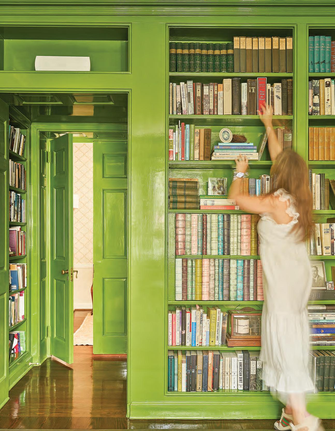
OPPOSITE: Library walls in this garden-inspired home were covered in neutral Phillip Jeffries grasscloth wallpaper, and trim and bookcases were lacquered in a custom color from Fine Paints of Europe in spring grass green. The Knole sofa sits in the bay window, with an ottoman covered in Osborne & Little cut-velvet fabric added for comfort.


a neutral canvas to work from, Cox set about adding layer upon layer of color and pattern, all the while bringing an English country garden to life in North Carolina. “Pam also loves folk art, so we added some vibrant colors on the walls,” she says. “She was never afraid of any color. She was a maximalist. And that’s something I knew I could get into.”
The dining room provided a starting block for the rest of the home, designed in a sort of sunset palette that changes throughout the day. “I didn’t want my home to be like everyone else’s,” says Gillette. “I needed it to reflect my personality. It needed to be fun and cheerful, and make people wonder.” Cox gathered many of Gillette’s findings from hikes outdoors and used them to accessorize different rooms. Her bird nest collection or the occasional curiosity, for example, was mixed skillfully among vintage and found objects that the pair discovered when shopping together in High Point.
In the kitchen, Cox only added some vintage rugs and window treatments, and left the original wallpaper up in the entryway. New lighting, modern sculptures, vintage rugs, and art transformed the surroundings into a cohesive home that delighted Gillette. “The house really does read like a garden
The kitchen was left relatively untouched by Cox, who only added a vintage rug and some simple Roman shades over the sink window.
RIGHT: In the library, a small TV is hidden behind a custom-made panel with hand-painted book bindings meant to blend in with bookshelves, lacquered in custom paint by Fine Paints of Europe.


walkabout,” says Cox. “It’s very colorful but has visual breaks and neutral moments.”
In the center of the home sits a library, where Gillette spends a good deal of time. It serves as one of her favorite rooms in the home, along with her bedroom. Cox wanted this room to be especially bold, so she chose to lacquer the trim in a high-gloss bold green, swath the walls in grasscloth by Phillip Jeffries, and add floral draperies. Bookcases are filled with books and mementos, and they even hide a TV behind a custom-made cabinet covered in hand-painted book spines that match the room palette.

In Gillette’s bedroom, Cox used a cabbage rose wallpaper from John Derian to fully envelop the room. In combination with her antique four-poster bed, it imparts a truly private English garden sanctuary.
Ultimately, a sanctuary is what Gillette and her daughters were looking for, and Cox is grateful to be a part of creating it for this weary threesome. “There’s always some level of intimacy to working on someone’s home,” she says. “But adding the element of combating loneliness, or grief, or simply ferrying someone to a happier place in life through design is something that can’t be conveyed in words.”u
In the children’s music room, designer Jenn Frost added playful touches, including a refinished piano in bright lacquered Sherwin-Williams Cruising and a Rebel Walls mural of a world map pasted across an entire wall.

FAMILY ROOMS
TEXT BY SARAH CROSLAND | PHOTOGRAPHY BY DUSTIN PECKIN THIS NEW RALEIGH HOME, EACH ROOM WAS CREATED WITH A FAMILY OF SIX IN MIND.
With their house full of boys, the Burkes incorporated touches of blue throughout the space, but they also just love the color. “They really like blue because it’s soft, serene, and classic,” says Frost.
WHEN MELISSA AND JAMES BURKE began the process of building and designing their new home, they wanted to create a space that was both functional and fun. The couple has four boys, including twin twelve-year-olds, which meant that in addition to necessary functionality, like plenty of storage for toys and shoes, they also designed cool and quirky elements like a climbing wall to keep them active.
w“They have a house full,” says designer Jenn Frost, who connected with the Burkes via their builder, Rufty Homes. “They’re such a fun family, and it was important to them to have a home that was fun and comfortable for the boys. Everything in the home is geared toward the family as a whole.”
The modern farmhouse–style home pays homage to Melissa Burke’s Midwestern roots,

where her family still owns a large farm. That style also contributed to two of her other wish-list items: lots of light and plenty of outdoor space.
“I wanted the whole house to be bright, with light streaming in,” says Burke. “And we wanted to maximize outdoor living. Our back porch feels very much like a room, and with its fireplace and heat lamps, you can almost use it year-round.”
The family of six fully utilizes all of the home’s spaces. A music room, featuring a lacquered blue piano and a world map covering one wall, is where the boys often spread out their homework or art projects when they’re not practicing the piano. A loft above the twins’ bedroom, which includes catamaran netting across part of its floor, is a favorite spot for the whole family to curl up for reading time before bed. And a hidden door to a small nook under the staircase is used as a
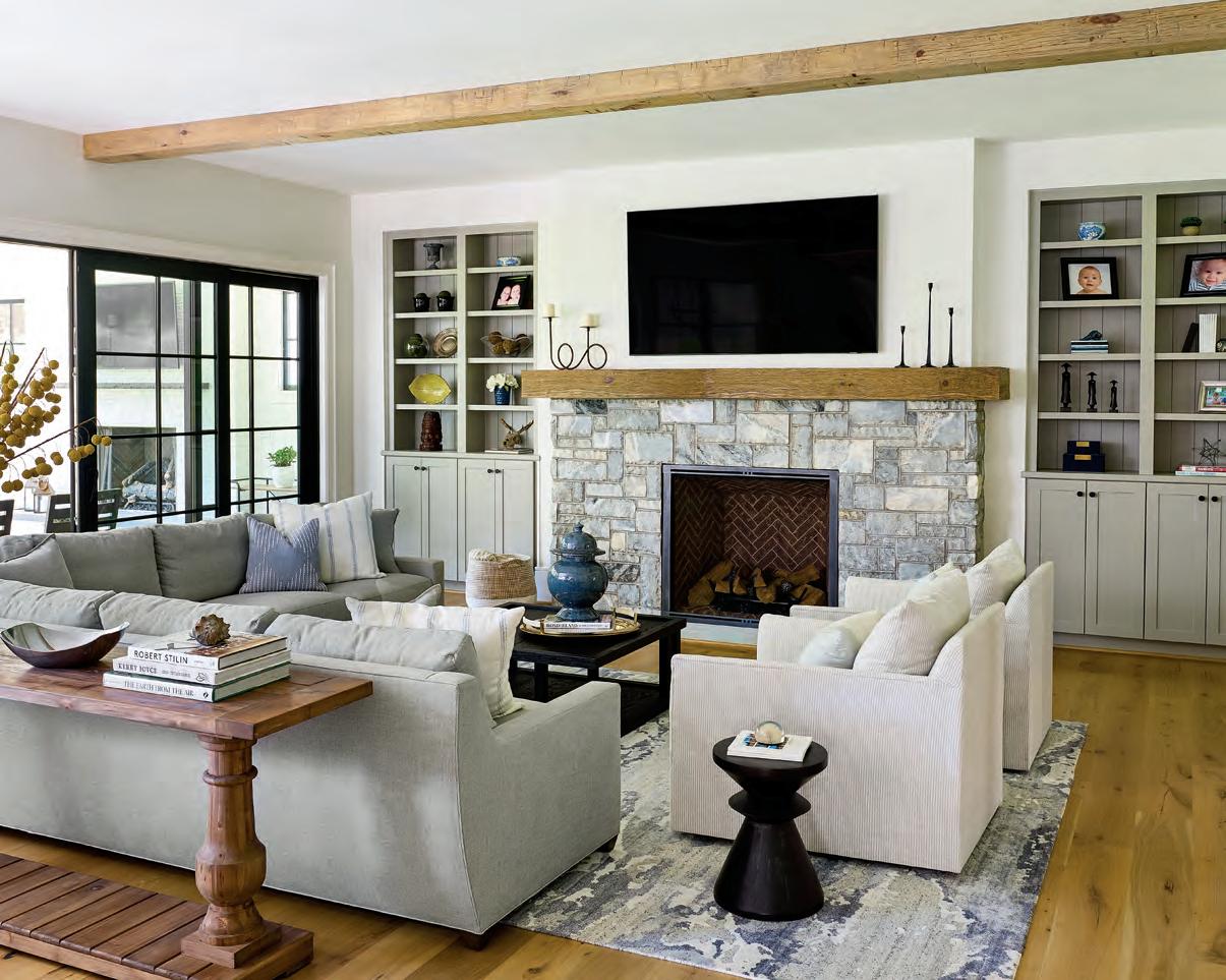
In the kitchen, functionality was especially important to Burke. “Basically, every drawer has a function,” she says, noting that they wanted enough cabinet space for everything to be put away. “Even the paper towel holder has a drawer.”

RIGHT: With its blue cabinets, bold tile, and big windows, the homeowners liked the laundry room so much that they opted not to put a door on it so light streams into the hallway. “It’s utilitarian and a constant hub of activity,” says Burke. “But we also made it a focal point.”


With four young boys, it was important to the Burkes to create cozy spaces for them throughout the home, such as this window seat in the primary bedroom.
 LEFT: To make their powder room feel special for guests, Frost designed a custom vanity and papered the space in a striking Schumacher blue-fern wallcovering.
Everything in this home is geared toward the Burkes's four boys, but the twin boys' bedroom is special, featuring a climbing wall and loft play area. play area for the youngest son, who is five. “We call it his Harry Potter room,” jokes Burke.

Of course, like any busy working mom, some of her favorite spaces in the home are the ones that are the most functional. “The mudroom is this massive drop zone where everyone has their own cubby—including our nanny,” she says. “This was a critical part of our design—we kept making it bigger and bigger.”
They also embraced the idea of both usefulness and style in the laundry room. “It’s a room that sometimes falls flat,” says Frost, who notes that because of the heavy use of this room, they included two washers and two dryers. “This gave it an
almost commercial feel, but then we added the fun black-andwhite floor with soft blue accents. The space really pops out.”
In many ways, the Burkes wanted a home that gave them all their own spaces, but ultimately brought them together. Nowhere is this clearer than in the built-in seats that are spread throughout the home. “I wanted to create places where my kids would sit and talk with me,” says Burke, noting spots like the window seat in the primary bedroom and a built-in seat in her husband’s office. “They’re intentional gathering spots where they can rest and talk. We’ve really loved these little touches in the home.” u


STILL A STEINWAY
THE BOSTON GRAND PIANO SHARES ITS FAMOUS PARENT’S PEDIGREE.
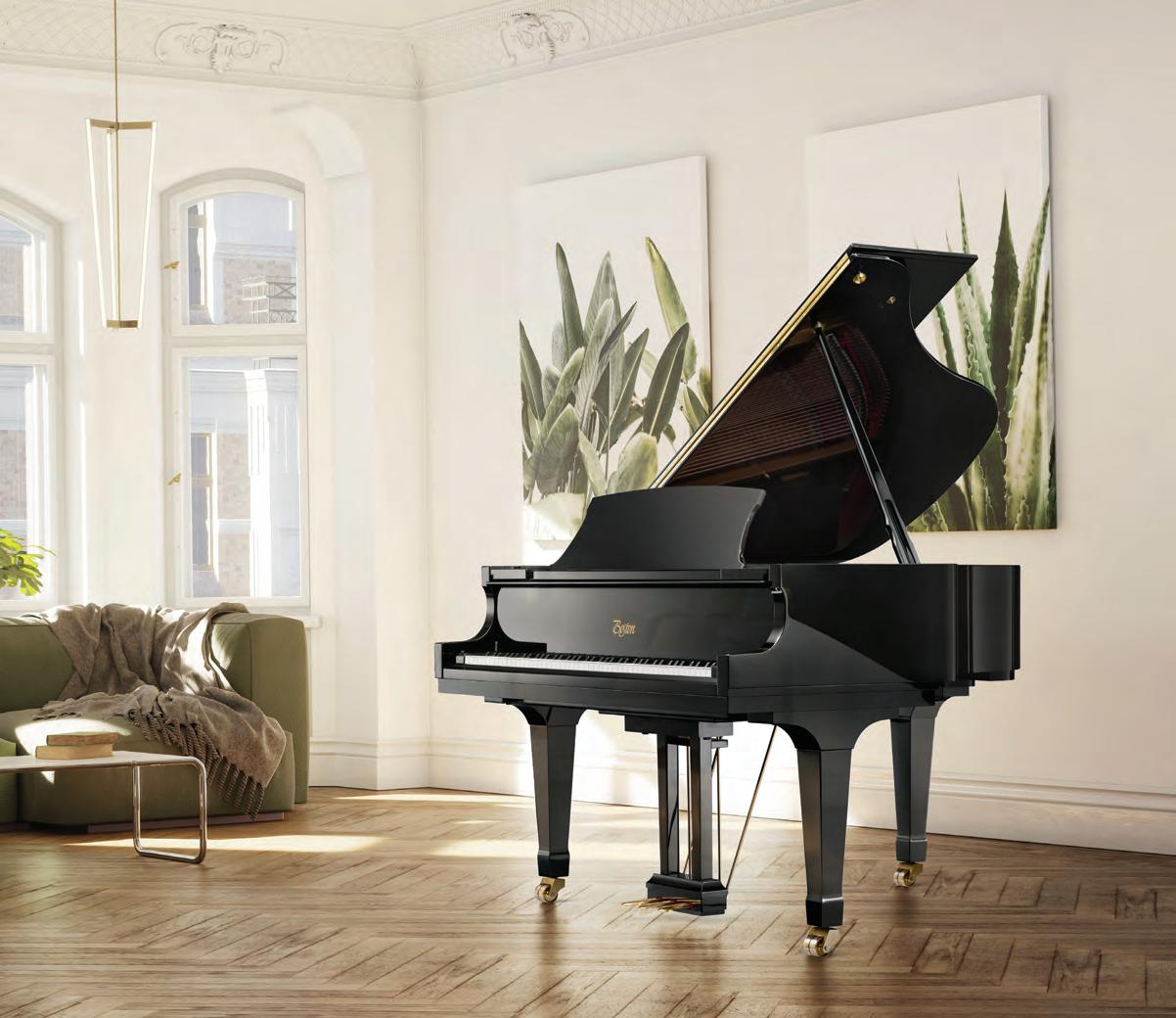
WRITTEN BY DANA W. TODDIt’s an incredible feat, but Steinway & Sons, New York City’s master piano craftsman for 170 years, has found a way to bring its highly prized musical instruments into even more households. Steinway’s engineers have reproduced the company’s inimitable “Steinway sound,” patented technology, and classic design in the Boston grand piano.
“The Boston is perfect for those who are not quite ready for a full Steinway investment,” says Greg Barfield of Hopper Piano, a Raleigh dealer that sells the Steinway family of pianos. “Boston is mirrored after a Steinway grand piano yet is more accessible to the everyday market.”


Steinway engineer and Boston creator Susan Kenagy says, “Boston piano designs grow out of the Steinway designs; they grow out of what we learned by studying the piano expertise that Steinway developed. The action feels so good and is so responsive that it makes our playing sound better than on another piano. I incorpo rated as much of the Steinway DNA as possible in the Boston piano while still meeting the Boston price-point target.”
The Boston design emphasizes sophisticated geometry so it produces the same rich, warm, melodic tone of a true low-tension string scale for which Steinway is known. “Steinway is most famous for the sound and touch of its pianos, so the company replicated these important features in the Boston piano,” says Keith Pendergraft of Hopper Piano. “It is constructed of the same high-quality raw materials, including hard rock maple, Sitka spruce, and solid copper for endurance and longevity.”
Prized by educational institutions and churches, Boston pianos are the right fit for
—GREG BARFIELD
pianists who want to make an initial investment in a Steinway product for themselves or their children’s piano lessons. Artists, students, teachers, and homeowners appreciate Boston’s superior feel and its trademark responsiveness. The piano holds its value, just as you would expect of an instru ment from this prestigious company. When it’s time to upgrade to a Steinway grand piano, the company will credit
Visit HOPPER PIANO at 1800-A TILLERY PLACE or HOPPERPIANO.COM, or call 919-755-0185
the full Boston purchase price on a trade-in toward a Stein way for ten years after purchase.
In polished ebony or rich mahogany, the Boston can even be customized with a “pop of color” on the underside of the lid for a dramatic, decorator-savvy look. Imagine a Boston grand sitting in your living room or music room, coordinated with the draperies and furnishings. Spectacular! u
“BOSTON IS MIRRORED AFTER A STEINWAY GRAND PIANO YET IS MORE ACCESSIBLE TO THE EVERYDAY MARKET.”


SUPERIOR
A LABOR OF LOVE
CRAFTSMANSHIP AND SPLENDID COLORSMAKE
THE PERSIAN CARPET’S AFGHAN RUGS STAND OUT. WRITTEN BY LEE RHODES
It’s not hyperbole to say that every rug tells a story. Many rugs come from places with incredibly rich histories, and this lends them a special appeal. They tell stories of exquisite craftsmanship and unique cultural heritages. And the rugs from The Persian Carpet, a family-owned retail store that launched in 1976 and is known for its specialty-rug collections, tell the most captivating tales of all.
Take the store’s Afghan collection, for instance, which stands out even among their many other proprietary lines.
Made of luxurious wool from the city of Ghazni, located in central Afghanistan, each rug in the collection is a labor of love. Doug Lay, owner and founder of The Persian Carpet, explains that Ghazni wool has a wonderful sheen to it and absorbs the rich colors of the dye beautifully. The company is currently creating Afghan rugs from a palette of more than 160 colors, which provides great flexibility in the design process and offers a look that is impossible to duplicate in rugs from other regions.
Also noteworthy? “Within the Afghan collection, we strive to resurrect older designs and modify them so they fit into modern-day design techniques,” explains Lay.
Specifically, several years ago some of Lay’s colleagues in the industry approached him about an opportunity to help restore rug production within a particular area of Afghanistan. He agreed, and they reviewed old designs before settling on fifteen to get started. “We were flying by the seat of our pants,” says Lay, who had been designing and producing rugs in other countries for decades. Though the Afghan look is completely different from what he’d previously tackled, Lay’s wealth of knowledge and experience paid off.
The rest is history, as they say. The Persian Carpet has now resurrected 135 Afghan designs, producing roughly fifteen to twenty at any given time. “We drop and add, which is true of any carpet production,” adds Lay. “We’re constantly refreshing the collection.” And considering how Afghan rugs are made, this is no small feat. Handspun by the Hazara people, one rugs takes, on average, three months for the dye and loom process, and then another three months for the final steps that lead to the finished product. And this doesn’t take into account the design phase on the front end. All in all, the length of time it takes to make a rug is highly subjective and dependent on size and how many people work on it. Intricate designs with high-knot counts require more knots per square inch and, as a result, more time.
Visit PERSIANCARPET.COM or call 919.489.8362

“By the time a single rug is completely finished, at least three hundred people will have worked on it,” says Lay. With such extensive production, it might seem that these magnificent rugs are hard to come by. But The Persian Carpet sells them locally at their Durham store and to countless wholesale dealers across the country. They are so popular that they are regularly shown at High Point Market and Las Vegas Market, and certain designs are repeat best sellers. u

“BY THE TIME A SINGLE RUG IS COMPLETELY FINISHED, AT LEAST THREE HUNDRED PEOPLE WILL HAVE WORKED ON IT.”
—DOUG LAY

DRESSED FOR SUCCESS
 BY COURTNEY VAUGHN
YOUR HOME SHOULD BE AS FASHIONABLE AS YOUR CLOSET.
Why save your best looks for a night out on the town? Bring your fashion sensibilities into your home, especially into your kitchen, with a little help from Elkay. A home deliberately styled with color and modern lines is as welcome as a refined wardrobe. Functionality is a key factor in choosing kitchen sinks, faucets, and all the components that make a custom kitchen work at highest capacity. But homeowners should also consider how choosing different colors and forms will impart the
modern, transitional, or contemporary style that tells their story. Elkay has been known for product innovation in sink technology since its inception in 1920. But the company has also focused on making its sinks and fixtures key pieces of jewelry for the kitchen by developing new styles and finishes that optimize a curated look.

A sink is truly the utilitarian heart of the kitchen, and a workstation adds major functionality and style to the room. The Circuit Chef workstation, for example, is an entertainer’s dream. Customized inserts, such as cutting boards, colanders, and bottom grids, operate on two tiers and move effortlessly from meal prep to entertaining to cleanup. Elkay’s workstations also have inserts that enable homeowners

to chill wine in one section of the sink while holding an impromptu charcuterie board in another.
But it’s the modern lines and range of colors that enable homeowners to make a style statement. Classic stainless steel, smooth fireclay in white or matte gray, and the newest highperformance quartz colors of Arctic Fox white and Obsidian black, launching early next year, translate the language of each sink in a different way. The workstation’s inherent design versatility is eye-catching, while new colors blend well with popular honed concrete and matte countertop finishes.
Fixtures can also make a design statement. Elkay’s new Avado filtration faucet features clean lines and three finish choices of stainless, chrome, and matte black, providing functionality and customization.
It’s all about choosing how you want to dress your home for success. Innovations in functionality and design continue to reach the marketplace. For homeowners and designers who want to take advantage of new products in inspired colorways to customize and showcase their personal style, the sky is the limit. u

FOUR PILLARS
BY JON RUFTYBUILDING A CUSTOM HOME—WHETHER IT’S YOUR FIRST PROJECT OR YOUR THIRD—IS A LENGTHY, INVOLVED PROCESS, BUT IT DOESN’T HAVE TO BE DIFFICULT.


Rufty Homes has the design and construction formula for a luxury custom home process that works. It has been practiced and perfected over the last thirty-four years. Our model enables homeowners to shift from a beginning concept to move-in day by working with a master builder focused solely on building tailored homes distinctive to each family.
There are four pillars of the Rufty luxury custom homebuilding process that help a homeowner build an individualized retreat in harmony with a particular piece of land.

Initial Consultation. In this phase, we explain the entire process and timeline, from beginning to end. Some homeowners may have already purchased a lot on which they wish to build; otherwise, we show them available lots in desirable neighborhoods or work
with them to find what they want. This is where we talk about the design vision, budget parameters, and how the house will fit into the lot’s topography so everyone is on the same page and working toward a common goal. Homeowners have a chance to show examples of the style they want and discuss the size of house they need for their family, and we encourage them to dream big.
Pre-construction Agreement. Consider this the planning stage on steroids, where we pair the homeowner with an architect, if needed, and help source an interior designer. Both of these professionals, in conjunction with Rufty Homes, take all of the homeowners’ clippings, ideas, wants, and needs, and transform them into working drawings. In this phase, Rufty will help homeowners who need guidance on initiating construction financing and
HOMES HAS THE DESIGN AND CONSTRUCTION FORMULA FOR A LUXURY CUSTOM HOME PROCESS THAT WORKS.”

finalizing budgets, and the sweet conclusion is a reserved spot in the Rufty construction schedule.
Contract Package. Here is where we finalize all proposals, specifications, and agreements between Rufty and the homeowner. For the homeowner, this can be an exciting time to navigate, making choices for their home with the expert guidance of a designer, who will help narrow those options to a manageable number based on style and needs.
Construction & Closing. After being assigned a project manager who works with the homeowner throughout the
Contact RUFTY HOMES at 919-460-8550 or EMAIL JON@RUFTY.COM
entire construction, closing, and orientation processes, the Rufty team and its specialty subcontractors make the homeowner’s dream come true. The assigned Rufty project manager keeps the homeowner updated on a daily and weekly basis until the entire process is complete, including after the physical move-in takes place.
Rufty homeowners Bill and Donna say, “We put a lot of time and thought into designing our home, and it was important to us to find a builder who would support our vision while also helping us make smart design decisions. After our first meeting with Rufty Homes, it was clear they understood our goals and were on board with some of the more unique aspects important to us.” u
“RUFTY
A BOULDER LOOK
BY DAVID PAYNEFrom dramatic to Zen, stonework can affect the look and feel of your yard while adding unexpected focal points and solving landscaping problems.

Let’s think past the contrived look of small river rocks lined up as flower-bed borders. Instead, consider how the placement of various-sized boulders can lead to a natural and organic appearance. Especially useful for newly constructed homes, boulders nestled beside a grouping of tall ornamental grasses add a look of permanence to the yard. Choosing
boulders with moss and lichens growing on them breathes even more longevity into the area while adding texture. Similarly, if your landscape lacks interest, boulders and specimen stones can be used to build levels into the design. With proper placement, stones of varying sizes, installed in conjunction with retaining walls, raised beds, or sloping ground, incorporate an oasis of interest among the greenery of an expansive lawn. This type of application also solves tricky issues like dead areas that don’t support much plant growth.
Rocks and boulders solve other problems in the landscape, as well. For areas that are frequently eroded by rainfall, a dry creek bed of rocks and boulders “flowing” down a slope can hide a drainage system underneath that handles runoff problems and properly diverts excessive water. A destination

IF YOU’RE SEARCHING FOR A UNIQUE WAY TO JAZZ UP YOUR LANDSCAPE THAT DOESN’T INVOLVE FLOWERS OR SHRUBBERY, CONSIDER ADDING SPECIMEN ROCKS AND BOULDERS IN STRATEGIC PLACES.
“pool” of small river rocks completes the look and adds beauty and a definitive solution to channeling water.
If your yard needs a pleasing aesthetic, boulders can serve as striking focal points. Cluster them under trees where nothing else will grow or place them as natural benches in various parts of the garden. I like to use what’s endemic to our area. My favorite for our geographic region is gray mountain stone. Chiseled and geometric or smooth and round, the shape of the stone and its placement can signal high drama or calm Zen. Large, rounded boulders used in conjunction with Japanese maples, camellias, and hostas, for example, set the mood as a traditional Oriental garden.

The only question is: Why aren’t you already using specialty stones and boulders in your landscape plan? They are a standout way to add an artistic statement and give the eye a delightful place to land while complementing your home. u

“STONEWORK CAN AFFECT THE LOOK AND FEEL OF YOUR YARD WHILE ADDING UNEXPECTED FOCAL POINTS AND SOLVING LANDSCAPING PROBLEMS.”
FIRESIDE LIVING
BY LESLIE WOLVERTONGREEK
LORE CREDITS PROMETHEUSFOR DEFYING THE GODS AND DELIVERING FIRE TO HUMANS, A GIFT THAT SEPARATED MANKIND FROM ANIMALS AND PROPELLED THEM INTO CIVILIZATION.
Humans have gathered by the light of this captured flame for millennia, with the earliest firepits dating back 400,000 years. Archaeologists discovered ancient firepits lined with stones at Tabun Cave in Israel and the Klasies River Caves of South Africa. Entire tribes and clans gathered around the safety and sustenance of these fires.
Fire still captures our primal attention with its distinctive ability to enliven a space. Whether a garden fireplace, a

poolside fire table, or a copper bowl filled with flame, fire is aesthetic and functional, dramatic and comforting all at once. The addition of fire can maximize the investment of a landscape design project, providing four seasons of outdoor entertainment. It may act as a flickering backdrop for a quiet evening or the heartbeat of a lively party. When not in use, a concrete fire table can serve as a place to rest a drink or hold a plate of hors d’oeuvres, or it can be a spot to kick up your feet after a rewarding day of work.
The modern fire feature has evolved from the Paleolithic into a stand-alone work of art. Old North State’s team of designers and craftsmen fashion these elements from myriad materials, including limestone, corten steel, cast

IS AESTHETIC AND FUNCTIONAL, DRAMATIC AND COMFORTING ALL AT
ONCE.”
stone, concrete, and high-temperature glass. Natural gas technology facilitates a clean and effortless experience in a simple vessel that rests upon a stately column of rough-hewn stone. A massive cast-iron fire kettle offers the luxury of a wood fire outdoors and is perfect for both warmth and cooking. A feng shui–inspired fire table of copper and steel is a natural fit for an Asian garden.

For many ONS clients, fire means family. Celebratory meals are prepared in the outdoor kitchen adjacent to an alfresco living space where loved ones linger by the flames. When a firepit is a backyard amenity, fiery marsh mallows are no longer reserved for the occasional family camping trip. A natural gas fire feature offers a moment’s respite for weary parents after the kids are tucked into bed. Beyond the glow of the television, fire has proven itself an intimate and convivial family gathering place, setting the scene for love, warmth, and conversation. u

“FIRETOP: CHARLES REGISTER; BOTTOM: BRUCE DEBOER
MYTH-BUSTERS & DOING GOOD
BY SUNNY SURANAMANY HOMEOWNERS LONG TO DESIGN A KITCHEN OR BATH WITH A NATURAL STONE COUNTERTOP, BUT UNDERSTANDING THE FACTS CAN BE OVERWHELMING.
Natural stone is formed in the earth through many geological processes, so it is, by its very nature, a hardworking, durable choice. I’d like to share the myths most commonly associated with natural stone countertops and the truth you need to make an informed decision.

Myth: Natural stone is too expensive for me. Truth: The popularity of marble and natural stone in celebrity homes, luxury hotels, and designs featured in the media have led to the misconception that they are not an option for most homeowner budgets. In reality, most natural stones are extremely affordable, and the price is often surprisingly comparable to man-made stones.
Myth: Natural stone stains too easily. Acidic and richly colored substances will permanently etch and stain all natural stones.

Truth: Today’s advancements in surfacing and sealing technology ensure stones are hardier and more stainresistant to things like lemon juice, vinegar, red wine, and tomato juice than ever before. Hard marbles, dolomites, and quartzites such as our Maharaja are highly resistant to heat and normal wear and tear. Maharaja is the first quartzite of its kind, with beautiful composition of offwhite understated crosshatch veining and warm crystalline deposits. Exclusively supplied by our partners at RSG Stone, this quartzite from India is quite impervious to even the most enthusiastic kitchen endeavor. To prove it, CRS has a countertop testing station in our gallery where you can try rich and acidic foods on various types of stone.
Myth: Natural stone is artificially treated. Truth: While it’s true that some suppliers may add colorenhancing treatments or fillers to their natural stones,

CRS believes that nature adds all the beauty a natural stone needs. We strongly encourage homeowners to question the integrity of natural stone from suppliers and look for full transparency when choosing countertops.
The last myth we want to bust is near and dear to our hearts because we work hard to give back and be a friend in the stone sourcing community. The myth is that natural stone is unethically sourced; on the contrary, we work in tandem with quarries and suppliers who promote fair trade and make charitable donations to those in need. The purchase of of our natural stone slabs puts food on the table, which means you can feel good about your countertop purchase.
There is more to CRS Marble & Granite than beautiful veins of gold, black, and gray running through the natural stones. There is also a vein of philanthropy, where a
"THE PURCHASE OF OUR NATURAL STONE SLABS PUTS FOOD ON THE TABLE, WHICH MEANS YOU CAN FEEL GOOD ABOUT YOUR COUNTERTOP PURCHASE."
portion of CRS’ proceeds serves the surrounding Triangle community. A project that’s particularly special to us is NCIAP People’s Medical Care, a nonprofit organization whose motto is Hassle-Free Healthcare for All.
Operated through the voluntary time and financial contributions of local businesses like CRS and individual contributors, NCIAP People’s Medical Care collects a small service fee to partially cover a range of primary- and specialty-care services for patients. Donors’ contributions cover the fee gap. Operating without fear of being out-ofnetwork or not adequately covered by insurance, patients can schedule visits with physicians at two office locations, one in Raleigh and one in Apex.
NCIAP People’s Medical Care is an organization whose main goal is to make the lives of local residents easier and healthier. To date, NCIAP has served over 60,000 patients.

In addition to financial support, I helped co-found this organization with some talented and caring physicians and have served on the board of directors since its inception. You, too, can get involved by making an individual donation to assist those in need and help fund the newest office in Apex.
CRS wants to educate our customers on the merits and truths of choosing natural stone, and giving back to our community is just another way we let our actions speak louder than our words. u
Contact SUNNY SURANA at CRS MARBLE & GRANITE’S RALEIGH SHOWROOM at 7521 EXHIBIT COURT, visit CRSGRANITE.COM, or call 919-784-9282
"NCIAP PEOPLE'S MEDICAL CARE IS AN ORGANIZATION WHOSE MAIN GOAL IS TO MAKE THE LIVES OF LOCAL RESIDENTS EASIER AND HEALTHIER."


SPOTLIGHT ARTS & EXHIBITIONS
EGYPTIAN TENT
GREGG MUSEUM OF ART & DESIGN
Through December 23 gregg.arts.ncsu.edu
Roger Manley, director of Gregg Museum of Art & Design, describes a collecting museum as a “climate-controlled attic of curiosities.” A fine example of this is now on display. Egyptian Tent features a rare and colorfully appliquéd Egyptian tour tent—one of only six of its kind known in the world—and several pharaonic and geometric appliquéd tent panels, known as khayamiya, made in Cairo in the early twentieth century. All objects represented are part of the museum’s diverse and dynamic permanent collection of over 35,000 objects. Adding to its exotic provenance: the Egyptian tour tent was transferred to the Gregg Museum from the collection of North Carolina’s storied Chinqua Penn Plantation.

START TALKING: FISCHER/ SHULL COLLECTION OF CONTEMPORARY ART

NORTH CAROLINA MUSEUM OF ART
Through February 5, 2023 ncartmuseum.org
Start Talking features more than forty works, including photographs, paintings, mixed-media assemblages, and sculptures, from a transformative promised gift to the NCMA from the collection of Randy Shull and Hedy Fischer. The artists in this exhibition challenge the status quo and diverge from dominant historical perspectives on identity, power, resistance, and agency, focusing on women and Black and Latin American artists.
TITUS HEAGINS: I STILL LOVE YOU . . .
CAM RALEIGH
Through February 5, 2023 camraleigh.org
A love letter to the transgender community in Havana, Titus Heagins: I Still Love You . . . refers to a pattern the photographer observed while visiting the island and building relationships with its transgender community members over the course of two decades. In intimate portraits, Heagins expresses his enduring commitment to the people, their lives, and their humanity.


