
10 minute read
Our one and only green
from Huskie Brand Guide
FIGHT, FIGHT, FIGHT FOR THE DEAR OLD GREEN AND WHITE! Saskatchewan, our University. And it’s shout, shout, shout and let your voice ring out,
For Saskatchewan, our University. We’ll rise to a man, be it win or lose or draw, And cheer old Alma Mater with a rah-rah-rah! For Deo Patrie our mother strong and free — Saskatchewan our University — Rah!

University Fight Song by Huskie Alumn Russell Hopkins circa 1930
349C / 349U C90 / M33 / Y90 / K25 R11 / G106 / B65 #0B6A41
* With only green, white and black in our logo, full-colour reproductions can be reduced to just two colours bringing cost savings when applicable.
LOCKUP LOGOMARK
LOGOTYPE
BLACK/WHITE COLOUR
COLOUR REVERSE

BLACK/WHITE REVERSE
PRIMARY LOCKUP
The Primary lockup is your number one go-to choice for all uses of the Huskie logo. It is one of the strongest and most recognizable marks in Canadian university sports, and it is unique to us. Use it when you want immediate recognition that you are a proud Huskie. To ensure it is being used properly, only use approved official logo files supplied by Huskie Athletics.
LOCKUP = LOGOMARK + LOGOTYPE
A lockup combines our logomark (see page 7) with our logotype (see page 11) stacked on top of one another, with equal spacing between the logomark, the green line, and the lettering.
FOUR VERSIONS
Your first choice for using the mark on a light background is the colour version, followed by the black/white for grayscale printing. For use on a dark background, use the colour reverse option where colour is available or the black/white reverse for grayscale printing. When placed on black, the face of our Huskie dog emerges from the darkness, revealing just the white of the face through the negative space.
WIDE LOCKUP
To help with filling longer horizontal placements, the Huskies lockup also comes in a wide version. The green line now moves to the side and stretches the height of the logomark.
LOGOMARK
BLACK/WHITE
WIDE LOCKUP
COLOUR REVERSE
WIDE LOGOTYPE

BLACK/WHITE REVERSE
BLACK/WHITE COLOUR
COLOUR REVERSE
PRIMARY LOGOMARK
The primary logomark is the Huskie head with the letters “U” and “S” behind it. Using on its own without the logotype can give your design a cleaner look. Only use a logomark by itself when it is on an obvious USask Huskies product.
BLACK/WHITE REVERSE

FOUR VERSIONS
Like the primary lockup (see page 5), your first choice for using the mark on a light background is the colour version, followed by the black/white for grayscale printing. For use on a dark background, use the colour reverse option where colour is available or the black/white reverse for grayscale printing. When placed on black, the face of our Huskie dog emerges from the darkness, revealing just the white of the face through the negative space.
* Note the difference between the black/ white and the black/white reverse: the black/white features white-filled, blackoutlined letters; with the black/white reverse letters being black-filled, whiteoutlined. Make sure to use the correct version or it will result in very thin letters from the outline disappearing into the background.
SECONDARY LOGOMARK
Taken directly from the primary logomark, this secondary mark is still highly recognizable as a symbol for Huskie Athletics and its member teams. Known for their athleticism, intelligence and intense vigour, these majestic canines are renowned for their ability to work as a pack to win the day. Use the secondary logomark when your materials call for a simplified version of the primary logomark.
ONE VERSION
With no colour to our Huskie dog, there’s only one version of the secondary logomark. When used on a black background, the white of our Huskie dog emerges from the darkness, revealing just the white of the face through the negative space.
* Do not outline the secondary logomark with white or any colour, to maintain the unveiling of the face through the darkness.
LOCKUPS FOR THE SECONDARY LOGOMARK ARE ALSO AVAILABLE FROM HUSKIE ATHLETICS, TO HELP YOU CUSTOMIZE YOUR PROJECT.
BLACK COLOUR
WHITE
HERITAGE LOGOMARK
Like the historic river in which the USask campus lies on, the heritage S represents the winding, never ending journey to achieve academic and athletic greatness. It’s also a tip of the cap to our rich athletic heritage. Use this vintage logo when your materials call for a historic look.
THREE VERSIONS
Only a single colour is needed to reproduce our vintage logomark. Use the green version as your first choice where colour is available. The solid white version is to be used on dark backgrounds, and a solid black is available in grayscale applications for light backgrounds.
LOCKUPS FOR THE HERITAGE LOGOMARK ARE ALSO AVAILABLE FROM HUSKIE ATHLETICS, TO HELP YOU CUSTOMIZE YOUR PROJECT.
RETIRED LOGOMARKS
With a legacy of over 100 years of competition, a number of symbols and logos have been created to represent Huskie Athletics and thier storied programs. Having consistent, strong visuals across all Huskie sports elevates the brand and only makes it stronger. To show everyone we are truly one team, the following logos are retired. Everyone loves a comeback and that goes for logos as well. For approval on using these marks or any others not shown here please contact the Huskie Athletics Chief Athletics Officer at 306-966-7959.
COLLEGIATE S HERITAGE HUSKIE HOCKEY SCRIPT HUSTLIN’ HUSKIE
Note the differences in letterforms of the eliminated Huskies script (see page 24). The crossbar of the H, the loop in the k, and the underline off the s.
COLOUR
BLACK
PRIMARY LOGOTYPE
Following the University of Saskatchewan brand identity, the Huskies logotype is designed using the Myriad Pro font family. A green line stretches the length of the logotype, with the same slashed edges as the “U” and “S” from the Primary logomark.
WIDE FORMAT
To aid with filling longer placements, the Huskies logotype also comes in a wider version. The green line now moves to the side and stretches the height of the logotype.
THREE VERSIONS OF EACH
There are three options in using the Huskie logotype. Use the colour version as your first choice where colour is available. The solid white version is to be used on dark backgrounds, and a solid black is available in grayscale applications for light backgrounds.

WHITE
LOGOTYPES FOR ALL
For every sport and entity within Huskie Athletics, a logotype has been created. Use them recognizing teams or entities within Huskie Athletics.
LOCKUPS FOR EACH LOGOTYPE ARE AVAILABLE FROM HUSKIE ATHLETICS, TO HELP YOU CUSTOMIZE YOUR PROJECT.
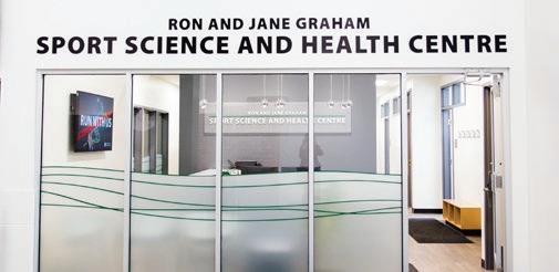
HUSKIE HEALTH

The most recent addition to the Huskie family is Huskie Health. Huskie Health began as sports physiotherapists treating Huskie student-athletes. With the opening of a new, state-of-the-art facility in Merlis Belsher Place, Huskie Health is now open to the general public to treat any injury that can be aided by physiotherapy.

CORRECT USAGE
To maintain the mark’s integrity and avoid visual confusion, each of the Huskie lockups have an established protected space and minimum reproduction size. No other type or graphic element (including folds, trims or edges) should fall within the protected space shown, and a size appropriate for legibility should be used at all times.
For logos including our Huskie dog’s head, keep an area equal to the height of the snout on all sides. For logos including the heritage logomark, keep an area equal to the height inside the S on all sides. When using a logotype alone, keep an area equal to the height of the H on all sides.
For logos including the Primary logomark, ensure a width of at least 0.625” or 75 pixels. For logos including the Vintage logomark, ensure a width of at least 0.375” or 50 pixels. For logos including the Secondary logomark, ensure a width of at least 0.375” or 50 pixels. When using a logotype alone, ensure a width of at least 0.625” or 75 pixels.
INCORRECT USAGE
Avoid these mistakes when using Huskie logos to avoid diluting the Huskie Athletics brand and keeping it as elite as our athletes.
Do not combine logomarks and logotype yourself.
SPORTBALL CLUB Do not edit our logotypes.
WRONG RIGHT
Do not layer logomarks. Do not invert colours.
Do not change our colours from our beloved green and white.
Do not outline any of our marks. Do not seperate pieces of our logomarks. Do not stretch, skew or rotate our marks.
Do not swap out our logomarks. Do not reproduce in low quality.
Do not place on a distracting background. Do not use expired marks (see page 24).
VERBAL IDENTITY
Words are powerful. They shape ideas. Encourage action. Change lives. And when you write for a brand, words significantly influence the way people perceive your organization, and how they choose to interact with it.
HUSKIE OR HUSKIES?
Use the plural form when using the name by itself: 9 University of Saskatchewan Huskies 9 The Huskies
Use the singular form when using it as a descriptor: 9 Huskie Athletics 9 Huskie Football 9 Huskie athletes
WHAT’S IN A NAME?
Just as it’s important to properly use the Huskie Athletics name, it is also important to properly identify where our teams play. Use the following official names for the rinks, fields and courts: 9 Education gym – wrestling 9 Griffiths Stadium in Nutrien Park – cross country, football, soccer 9 Ron and Jane Graham Centre Court at the Physical Activity Complex (PAC) – basketball, volleyball 9 Merlis Belsher Place – hockey 9 Saskatoon Field House – track and field
PHOTOGRAPHY

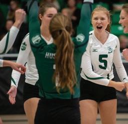


When choosing photos to represent the Huskies, choose ones that proudly display our hard-working, hustling, intense student-athletes and our loud, excited fans in a full stadium. We want to feel the action!
Avoid photos of injured or resting athletes, mistakes or well-guarded players and quiet or empty stands,
USASK IDENTITY
Using the USask visual identity ensures the Huskies are proudly representing where they come from. For a complete explanation of the USask visual identity, please refer to the Visual Expression Guide at communications.usask.ca/visual.
USASK LOGO
Where possible, use of the official university logo should be added to Huskie designs.
TYPOGRAPHY
regular / semibold / bold / black / light
The main font for USask material is Myriad Pro. There are varying weights to choose from to suit your design, such as light, semi bold and black. These can be used effectively to emphasize a point within a body of text or to fit within the tight spaces of a small ad.
HUSKIE BRAND IN ACTION
From team apparel, merchandise, stationery, fan give-aways and everything inbetween, the Huskie brand should be applied beautifully and dillegently. For help creating your Huskie branded materials, please contact Huskie Athletics at 306-966-1111 or huskies@usask.ca.

University stationery with Huskie branding applied for official documentation.
HUSKIE BRAND IN ACTION
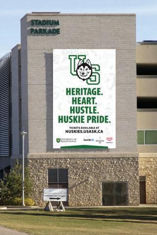
HERITAGE. HEART. HUSTLE. HUSKIE PRIDE.
TICKETS AVAILABLE AT HUSKIES.USASK.CA
Our parkade banner displayed proudly on College Drive.
HUSKIE BRAND IN ACTION

Huskie Tickets brochure.
HUSKIE BRAND IN ACTION
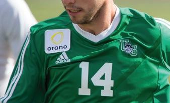


The Huskies brand on team apparel and fan merchandise.


