1 minute read
Layout inspiration
from Chicha booklet
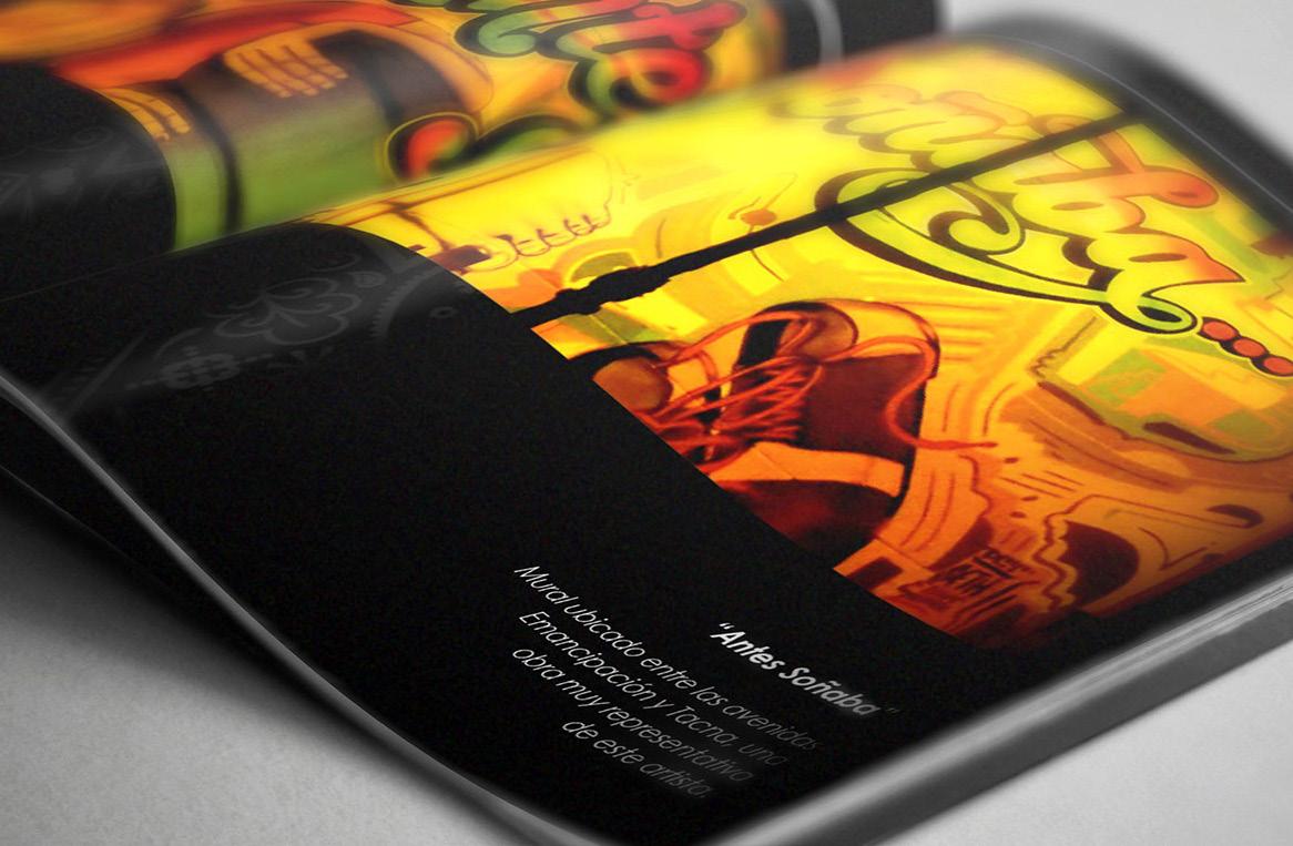
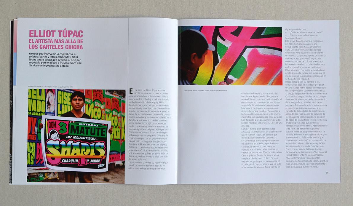
Maintain the neon colors of the chicha culture, using them to accentuate the visual communication of the magazine.

Advertisement
Combine black and white with neon colors to contrast the most important topics of the publication.


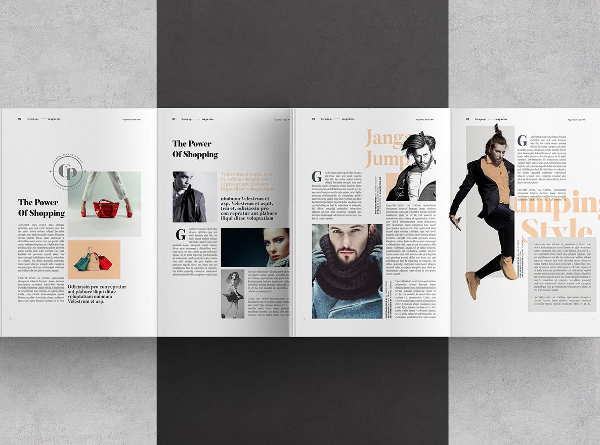
Take elements of minimalist layout and insert them into the context of a magazine that maintains the “chicha” essence of the mixture and color.


GRID AND LAYOUT
To diagram the publication, the workspace was divided into a grid of 4 rows and 3 columns, with a separation of 0.25 inches between each.
In this way, texts, images and graphics will be placed in a preset order.


