11 minute read
UPHOLSTERED SEAT PAD Give a tired bench a spring refresh
WE WANT YOUR HOME
Love it
Advertisement
See your house in
STYLE AT HOME
Show us yours and you could be a Style at Home star stylist!
We’re always on the lookout for real homes packed full of affordable ideas. If you’re proud of what you’ve achieved, why not share your ideas with other Style at Home readers, so they can be inspired, too? It’s easy to get in touch –snap some pics on your phone (living room, kitchen and one bedroom are a must…) and send them to us via email or social media – see below.
PUT ON A SHOW The faux fireplace surround offers a space to display some of Kate’s favourite things
COME ON IN!
‘It was a total
Buy it Shop Kate’s elegant eclectic style
PAGE 54
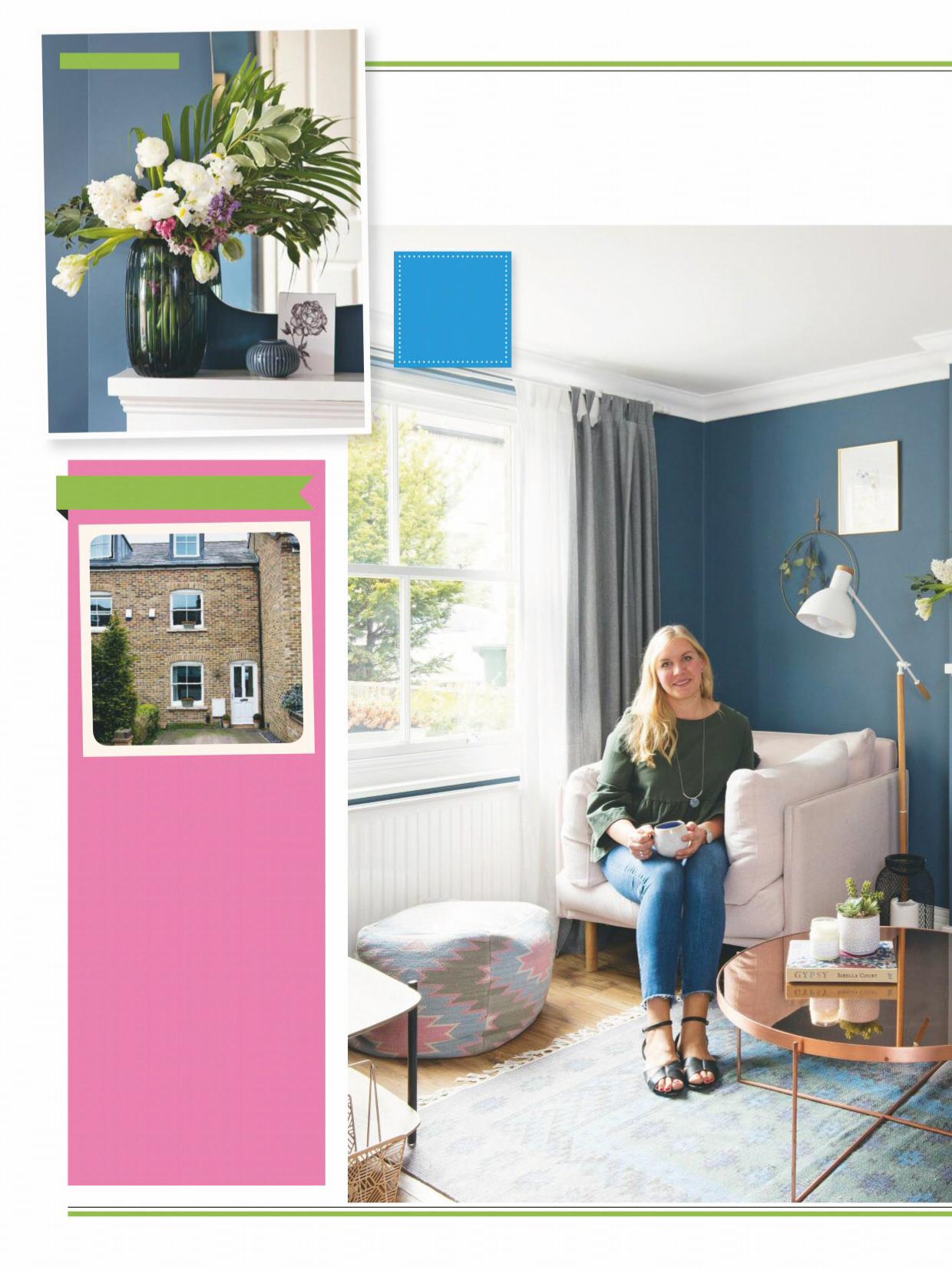
46 | ABOUT ME I’m Kate Kozina, 35, co-founder of floral boutique Fine Stems London (finestems.co.uk). I live here with my husband Gregory, 36, and our daughters, Varvara, seven, and Stefania, five.
OUR HOME A three-bedroom Victorian terraced house near Richmond, Greater London. We moved here in May 2016.
WHEN WE MOVED IN The house offered a good amount of space and was perfectly liveable, but felt tired and dated in its decor. Plus, the layout wasn’t well-suited to modern family living.
AND NOW We’ve created a spacious, open-plan layout. Redecorating each room has transformed the bland interior.
VICTORIAN TERRACE
Love it
GAME CHANGER’
WINNING COMBO ‘I’ve chosen reflective pieces such as the mirror and copper coffee table to bounce light around the room so the dark walls don’t feel imposing’
Reconfiguring the downstairs of her Victorian home meant Kate was able to create a practical, open-plan space for her young family
IDEA TO STEAL ‘Bring back the house’s character with a mock fireplace’

Having focused our property search on this part of London for quite some time, we couldn’t believe our luck when this house near Richmond came on the market in one of our favourite streets,’ says Kate. ‘It’s down the road from a fantastic primary school, which was a top priority for us, and the house offered the space we needed for our growing family.
Modern makeover Structurally, the house didn’t need a lot of work at all and we could instead concentrate our time and budget on putting our stamp on the interior. The only major work we carried out was opening up the downstairs layout to create a more fluid and practical space that linked the living room, dining room and kitchen. We knew open-plan was best suited to our way of living, as we love to host friends and family, so having a link between the kitchen and dining areas was important to us.
Professional help I called on the expertise of interior designer Elena Creswell of Elena Creswell Design to help with the spatial planning of the new layout and to help us pull the whole look together. We decided to remove a loo on the ground floor, which previously jutted out awkwardly between the kitchen and dining area, and this allowed the downstairs to become one large space, instead of a disjointed series of rooms. Not only did this small change greatly improve the flow of the downstairs, which is perfect for our girls to run around in, but it also meant the space now benefits from lots more
Love it
VICTORIAN TERRACE
SMART STORAGE ‘As we don’t have a dedicated hallway, this Scandi-style sideboard provides storage for hats, scarves and shoes’
OFF THE WALL ‘I’ve used simple wooden panelling from B&Q in the porch to create a cosy, cabin-like vibe as soon as you enter the house’
BOLD BRASS ‘I’ve accessorised with metallic brass accents, as the colour stands out against the navy walls’

natural daylight, coming in from both the front and back of the house.
Design decisions Once the work was finished, I was able to start thinking about the interior decoration, pulling ideas together with detailed mood boards. I love Scandinavian design but also wanted to introduce a modern country-inspired look to make the property feel homely and cosy. The kitchen was the biggest challenge, as we had to work around the existing plumbing within a relatively small space, and design something that would flow into the open-plan area, too. Elena suggested dividing the kitchen into two separate zones, with one wall housing the cooker and fridge, and the other the sink and storage units. This made the best use of the space and created a practical configuration for day-to-day living. For the kitchen cabinetry, we chose an Ikea design to keep costs down, then customised the cupboard and drawer fronts with new handles for a more luxurious, high-end feel.
Into the blue I wanted to keep the cosiness of the house alive, as it had been this charm that we fell in love with when we first viewed the property. We experimented with different colours for the living and dining areas, but decided on a deep blue from Mylands to give the space a dramatic look. It now contrasts beautifully against the white kitchen, but keeps this part of the house cosy in winter when we want to curl up in front of the TV. Before redecorating, I felt the living area was lacking a focal point, so we
IDEA TO STEAL ‘Go for mismatched pendants for extra character’
BRIGHT IDEA ‘The pendants make a beautiful feature and help light this middle part of the house on darker days’
Do it! GALLERY WALL ARRANGEMENTS
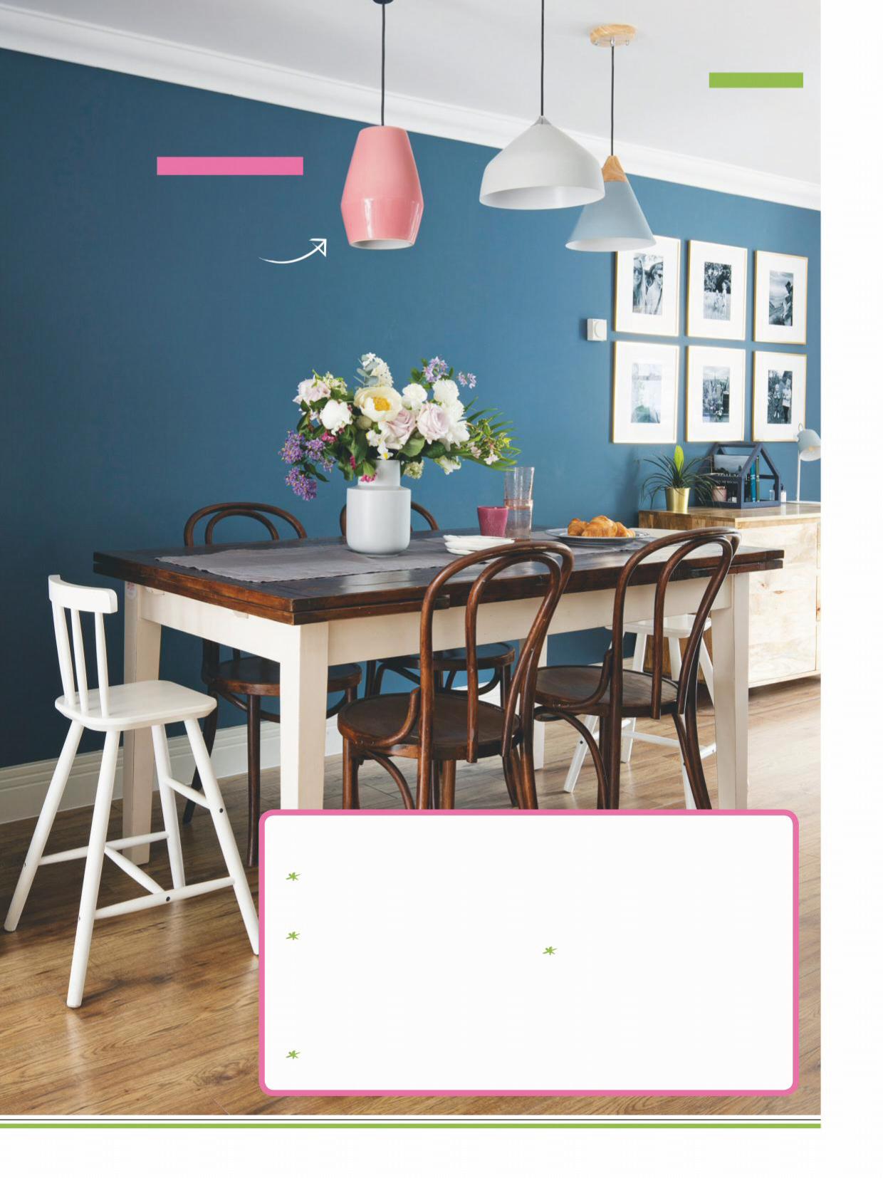
A row of three is good for halls and landings or above a bed. This suits a series of pictures in identical frames. Try hanging from a peg rail or picture rail. For a grid like Kate’s, use identical frames and matching artwork, like black and white photography or a series of botanical prints. Plan it out by sticking paper templates to the wall with masking tape. To get the spacing right, aim for a 2cm gap both vertically and horizontally between each frame. Create a relaxed formation that can be added to over time. Start with a rectangular frame in the centre and work outwards. This style is more forgiving for a mix of frames and pictures and is ideal for adding accents such as mirrors, clocks and wall decor. Go graphic with a stepped arrangement. Begin with a line of frames along the same horizontal line, using a sideboard, sofa or dining table as a guide. Build the display upwards. Sticking with a cohesive colour theme will create even more impact. If your right-angle lines are dead on, you can mix up frame sizes or orientations.
Love it
VICTORIAN TERRACE
IKEA HACK ‘To keep costs down, we chose an Ikea kitchen and customised it with copper details and open shelving’
IDEA TO STEAL ‘Tile the whole wall above the sink for an easy-clean splash zone’
DIY DESIGNS ‘We created some simple shelves from wood we found at a timber yard’

decided to build a mock chimney breast and fireplace to centre the seating around. I then sourced an old Victorianstyle electric fire online and had it cleaned up and fixed –it’s now one of my favourite features in the house and it has definitely restored some of the original charm.
Savvy styling When it came to shopping for the open-plan space, it was important to choose pieces that would sit right proportionally and complement the different zones. I chose a mixture of contemporary furniture, such as the sleek copper coffee table in the living room, and more country-inspired pieces, such as the dining table, to blend the old with the new and build up an interesting collection. The different styles help to balance the space and create a look that is both cosy and modern, which is what I was hoping to achieve. To tie the whole house together, I picked out a few design elements that we then included throughout the interior. Hexagons, for example, feature in the porch, kitchen and bathroom. We even managed to find some hexagonal pendant lights for the kitchen!
Do it! REPLACE UNIT HANDLES
1Unscrew the old handles. Then measure the distance between the two threaded ‘legs’ or holes on the handles. This is your fixing centre and is usually standard size. 2 If you can’t find the exact match for the old handle, use a back plate or choose a handle with a larger fixing centre distance. 3 If the old holes will be visible, fill them using wood putty. Allow this to dry, then sand and smooth. Paint the cabinet before drilling the new holes, then screw the handles in place.

TIMELESS CHOICE ‘I went for sleek white gloss units and wooden worktops in the new kitchen as I knew they wouldn’t date’
NEW LAYOUT ‘By removing the awkwardly positioned loo, we have opened up the floor space’
works Why it
STYLE AT HOME SAYSÉ
‘Kate’s kitchen might have simple white gloss doors, but it’s got a designer edge thanks to the unusual handles and statement hexagon tiles’
Add an atmospheric glow 3 of the best MODERN WALL LIGHTS
FAB FLUTING Wall light, from £60, Houseof
MODERN DECO Wanda LED wall light, £39, Made
INDUSTRIAL CHIC Adonis copper wall light, £19, Dunelm
SMART SOLUTION ‘We chose to have niche shelves built into the wall to help keep the bath surround clear of clutter’
MULTIPURPOSE ‘The girls share the loft bedroom and we have designed the space so that they have separate areas for sleeping, playing, reading and working’

works Why it
STYLE AT HOME SAYS…
‘Kate has really made the most of the space, with clever zoning and lots of smart storage options’
SPACE SAVER ‘Ikea wardrobes with sliding doors make the best use of the bedroom floor space’
BALANCING ACT ‘To balance out the dramatic deep blue walls and add a feminine edge, I have introduced plenty of soft textures –like the upholstered bed frame, throws and cushions’
VICTORIAN TERRACE
Love it
IDEA TO STEAL ‘Add height to a low headboard with a picture ledge’
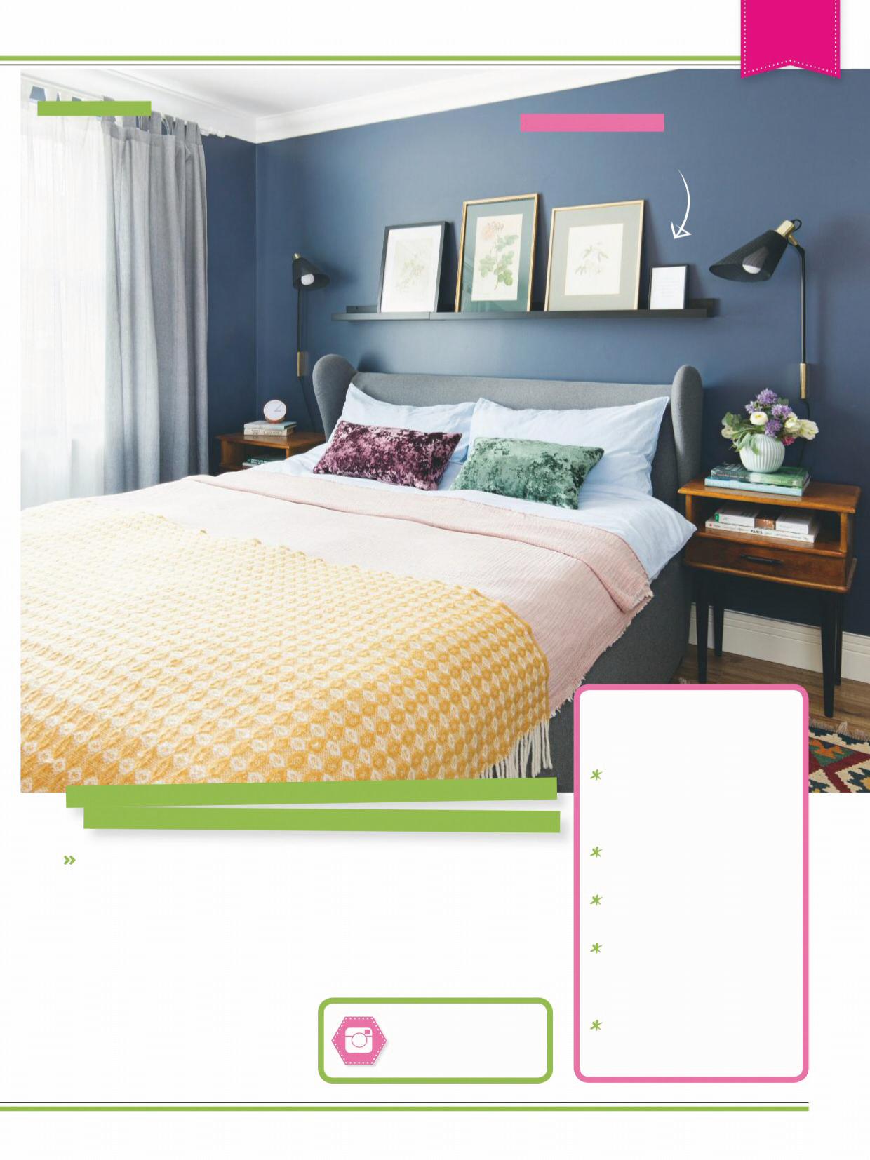
main bedroom and guest room on the first floor. Continuing the colour scheme from downstairs, I chose a similar blue for our bedroom walls. We installed fitted Ikea wardrobes, as they provide great storage, and chose a sleek, modern look for both the en suite and the bathroom. We painted the girls’ bedroom in a cool grey colour –they grow so quickly, it was important to have a room that could be easily updated over the years.
Finished result Thanks to the reconfigured downstairs layout, the house now offers us the family-friendly space that we first envisioned when we came to view it. Bringing an expert like Elena on board made the whole planning, renovating and redecorating process run smoothly. It’s been a wonderful experience seeing all of our ideas come to life. We are so happy with how it’s turned out and are confident that we’ll all be very happy here for a long time to come.’
Where to buy Kate’s style
MAISONS DU MONDE Online retailer for furniture, accessories and soft furnishings in a wide range of styles, from country to contemporary.
SWOON Mid-century inspired furniture produced as limitededition designs.
MADE Designer-look modern furniture, lighting and accessories at relatively affordable prices.
ANTHROPOLOGIE Find artisan-inspired homeware, ranging from furniture to glassware and ornate cabinet knobs and drawer pulls.
£85 Free up space on a bedside table by fitting lighting on the wall. Tinus wall light, LA REDOUTE
£6 Blend in a touch of rose gold. Marble and coppereffect wall clock, WILKO
CLASSIC DESIGN
Buy Kate’s style…
ELEGANT ECLECTIC

Combine timeless pieces with pared-back designs to create sophisticated simplicity
While Kate has kept a few classic pieces of furniture and accessories to complement the character of the period property, she’s also mixed in modern designs to create an inviting finish for what’s now an open-plan family home. Rose gold, copper and brass adds a welcoming lift to the rooms with highlighting pops of polish, paired with accessories in laundered teal, blush pink and soft grey, to give a contemporary palette.
£39 Break up block colour with simple pattern. Cubus throw, MADE
£38.50 Add a botanical glam accent. Avery pineapple, MAISONS DU MONDE
£22 A sleek hexagonal shape adds contemporary style. Gilmore brass hanging mirror, ARTISANTI
£99 Choose timeless seating. Harrington bistro chair, CULT FURNITURE
£10 This tonal design gives a subtle injection of pattern. Tapestry cushion, GEORGE HOME
£25 Tinted glass vases are a chic twist on ceramics. Vermont ribbed vase, HABITAT
£89.99 Line up botanical prints on a picture ledge. Spring Leaf framed wall art, VERY
ELEGANT ECLECTIC
Buy it
£95 Blush Pink pendant light. THE DEN & NOW
£116 Hang a couple of modern pendants to create a minimalist chandelier. Hattermorn pendant, POOKY
£249.99 Go for an upholstered bed with a modern silhouette. Pemberton bed, FURNITURE CHOICE
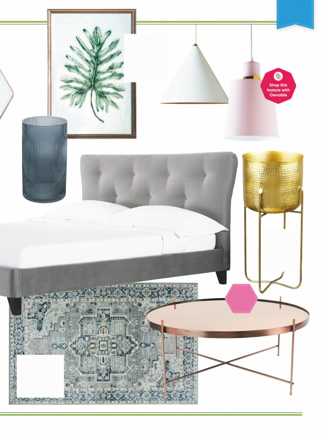
£70.99 Faded looks give an antique effect. Heriz Oriental Medallion Blue rug, CARPETRIGHT
METAL MARVEL
£25 Create height with a plant stand. Vindflakt plant pot, £25, IKEA
£149 Go glam with polished metallics. Zuiver Cupid coffee FEATURE MICHELA COLLING


