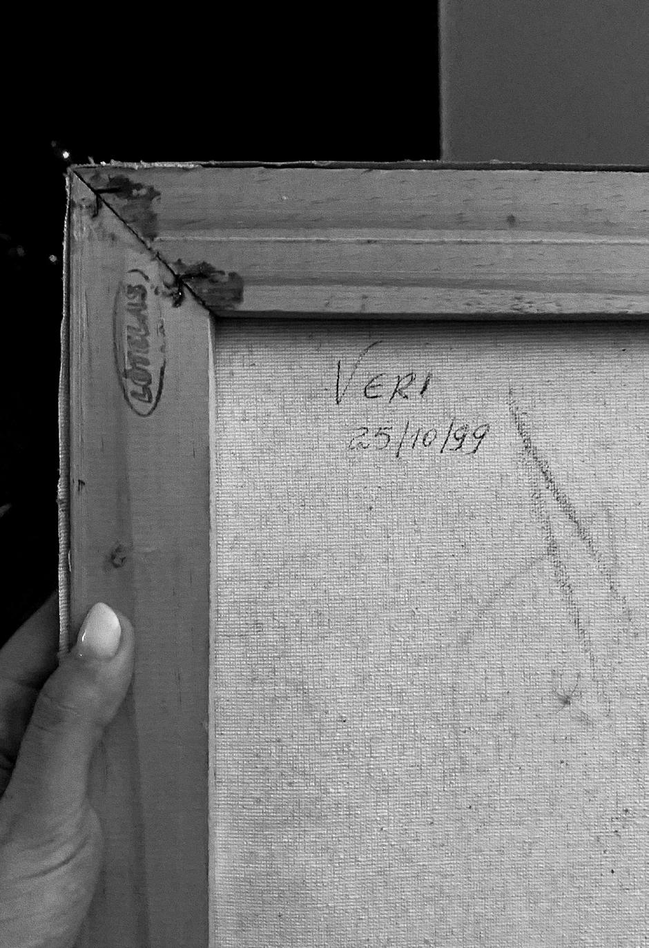
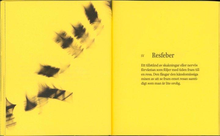
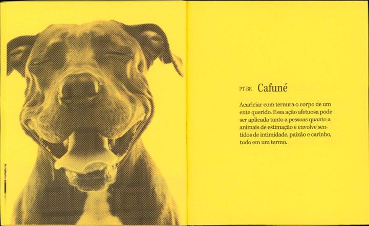
Always com Saudade
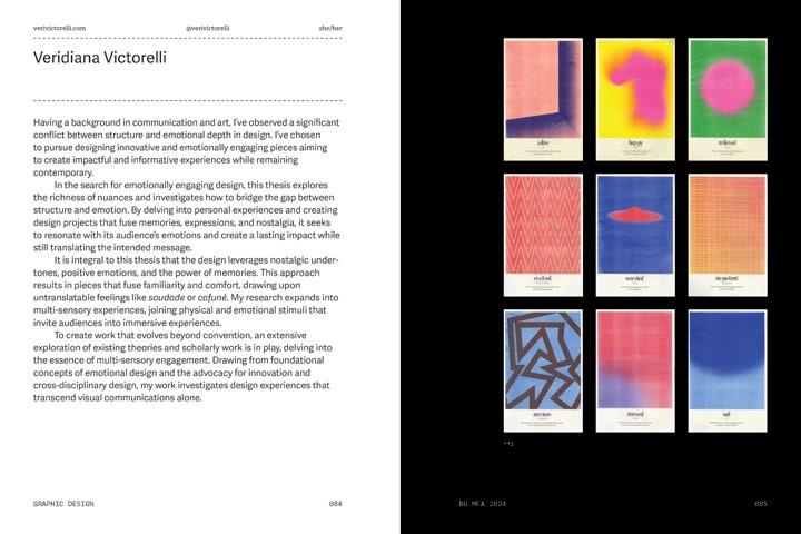
Veridiana Victorelli
Having a background in communication and art, the author of this thesis observed a significant conflict between structure and emotional depth in Design. The chosen methodology focuses on pursuing innovative and emotionally engaging pieces aiming to create impactful and informative experiences while remaining contemporary.
In the search for Emotionally Engaging Design, this thesis explores the richness of nuances and investigates how to bridge the gap between structure and emotion. By delving into personal experiences and creating design projects that fuse memories, expressions, and nostalgia, it seeks to resonate with its audience’s emotions and create a lasting impact while still translating the intended message.
It is integral to this thesis that the Design leverages nostalgic undertones, positive emotions, and the power of memories. This approach results in pieces that infuse familiarity and comfort, drawing upon some of its designer’s untranslatable feelings like “Saudade” or “Cafuné.” The research expands into multi-sensory experiences, joining physical and emotional stimuli that invite its audience into an immersive experience.
To create work that evolves beyond convention, an extensive exploration of existing theories and scholarly work is in play; it delves into the essence of multi-sensory engagement. Drawing from foundational concepts of emotional Design and the advocacy for innovation and cross-disciplinary Design, this thesis investigates design experiences that transcend visual communications alone.
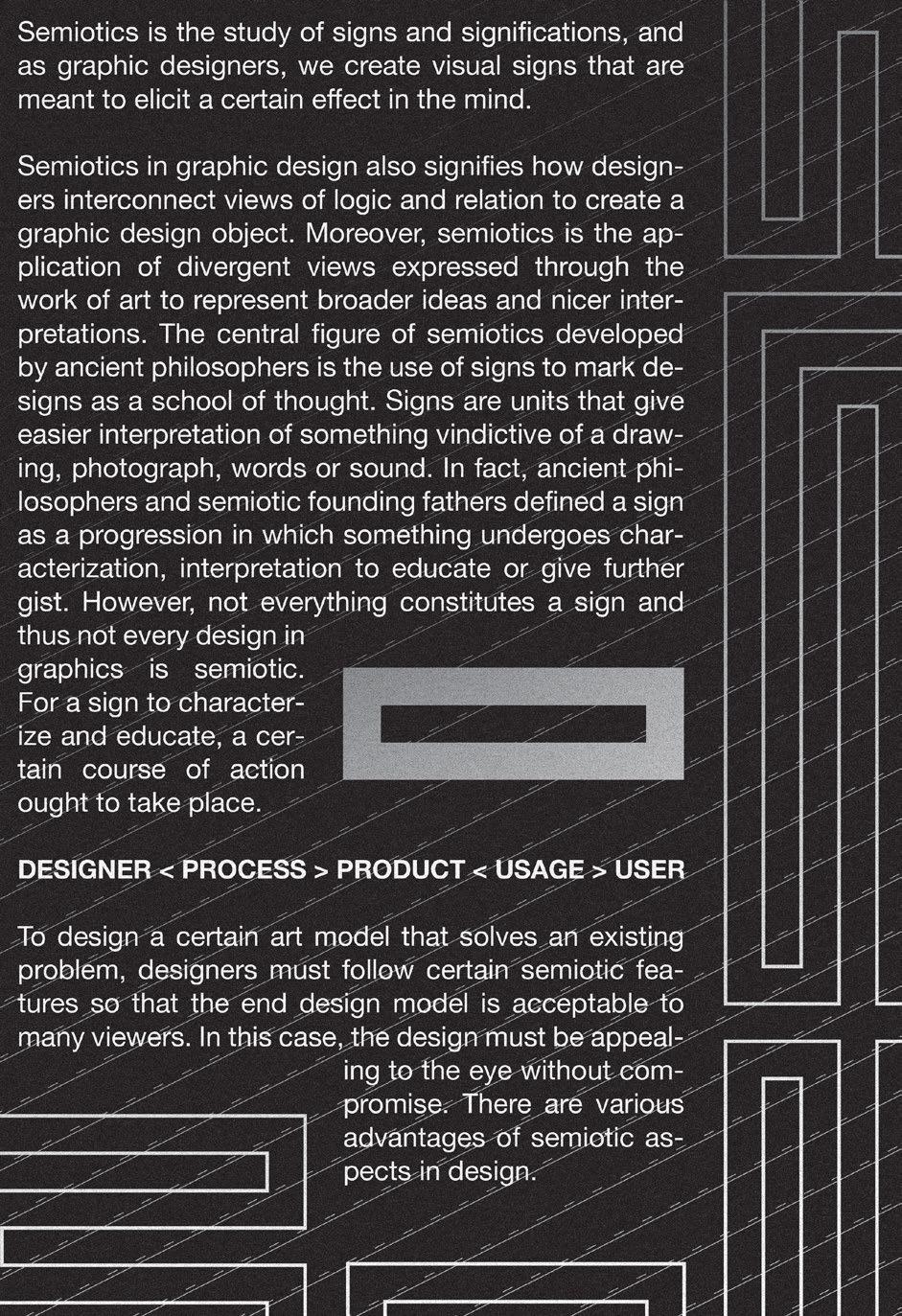
b
d
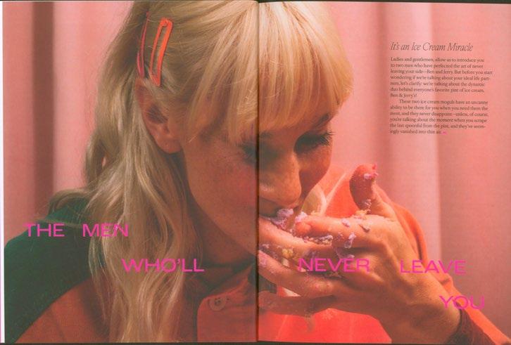
“To give all the ugly stuff meaning, and amplify the good…You make beautiful things, because you love the world, and maybe the world doesn’t always look how it does in your books, but I think putting them out there, that changes the world a little bit. And the world can’t afford to lose that.”
Emily Henry, Book Lovers
1
2
My graphic design career didn’t come as a surprise to anyone around me. Kids always have their dreams of what they want to be when they grow up, an astronaut, a pilot or an actress. For me, since I was three years old I wanted to be a painter.
Since a very young age, I wanted to be around creative people. But as we grow up, society tells us that we have to make money, that we have to learn how to sell ourselves. And always being a communicative person, I chose the path of communication and advertising, thinking that I would translate all my creative ideas and will to be a painter into creative agencies. Not long into that I still felt that inner child wanting more, wanting the freedom that comes with creating for the sake of beauty, the sake of connection and not with selling. That’s when I pivoted to graphic design and found a passion. But still, the need to always be the front cover, to sell an idea, to sell a lifestyle. And when that consumes you to a point that you no longer want to design, what do we do? Go to grad school!
The experience of graduate school came with another challenge. Being Brazilian and inserted in a new culture, a new country and becoming not just one more fish in the sea in Brazil, now I had the opportunity to embrace being from a different place and find out what that means for me and my path as a designer. The first instinct was to find out what makes Brazil what it is, what constitutes Brazilian art and culture and how to translate that within my creations. It didn’t take long to come to the same realization many before me had, Brazil is one of the most diverse countries that I know, and that made the task of pinpointing what was Brazilian really hard. But it didn’t stop me from accidentally always going back to things that relate to my own experience of being Brazilian.
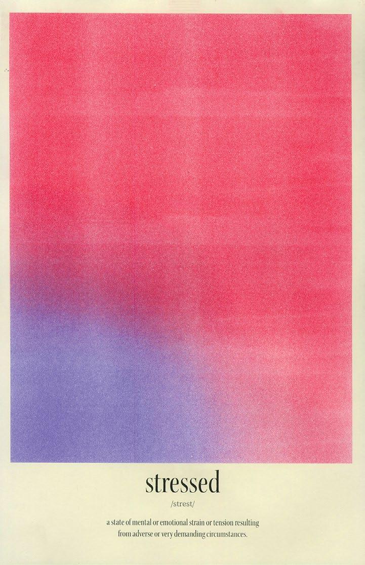
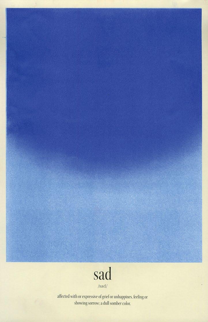
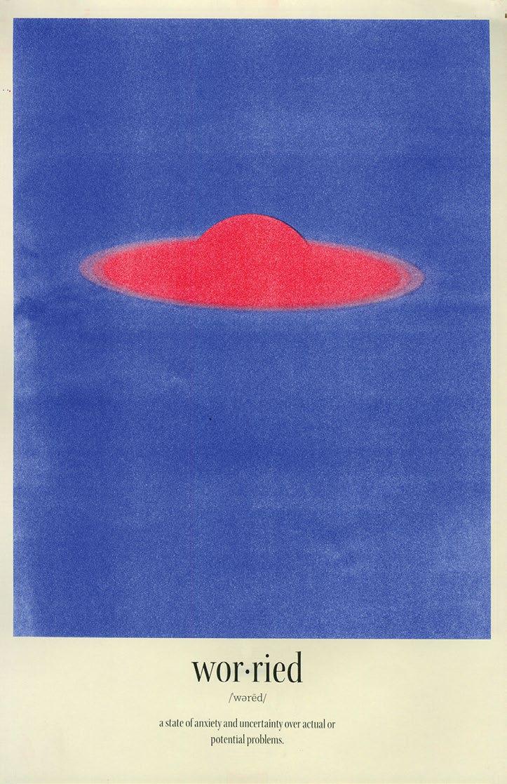
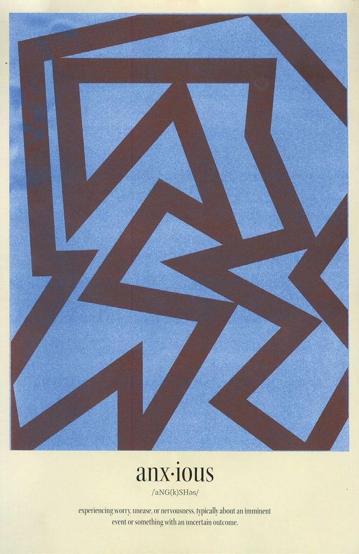
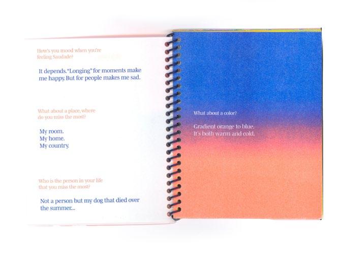
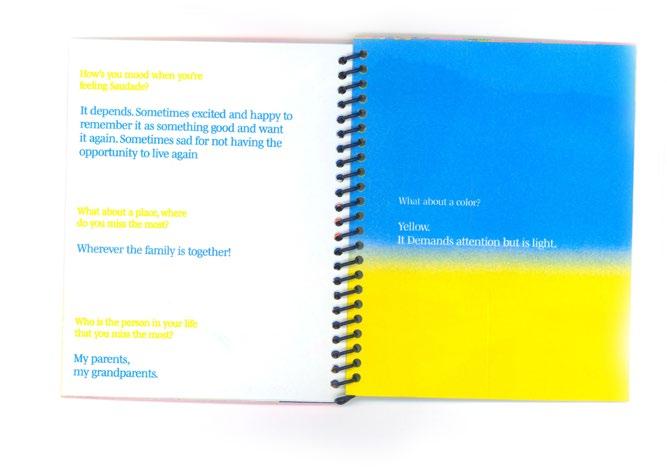
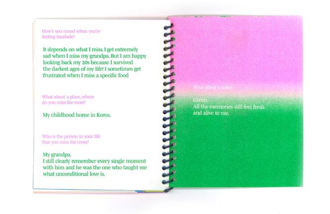
One thing that I kept going back to was the feeling of Saudade and the inability to translate that to other languages. Saudade is a bittersweet emotion of longing and nostalgia for something or someone. When people talk about longing, it’s normally associated with a negative feeling, the absence disconnected to the positive memories that comes with not having something or someone. Saudade on the other hand, is always associated with a memory or a feeling, and being far away
3
from home, family and friends, I found myself in a constant state of Saudade. That became a common thread in life and work, what I was feeling was so real, painful and good at the same time, that I had to find a way to communicate that emotion to other people.
That’s when it clicked for me, that I didn’t have to inspire myself on Brazilian artists, Brazilian styles or aesthetics, to properly convey being Brazilian. My upbringing, my experiences, the magazines that I had access to, what was on tv, the music and all cultural aspects and patterns were what made me and how that translated into my design process in a way that only a Brazilian could, but also my own essence as a designer.
Veridiana Victorelli
Boston, 2024
4
6
7
8
9 Contents Part One Part Two Part Three What are Emotions? 10 Why I Make? 22 Making Beautiful Things 248 Conversation with Conversation with Conversation with Relatability 24 Elena Foraker 224 Jessalyn Aaland 94 Akshita Chandra 14 Multisensorial Co Creation Experiences & Memories Nostalgia 116 128 166 200
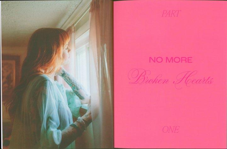
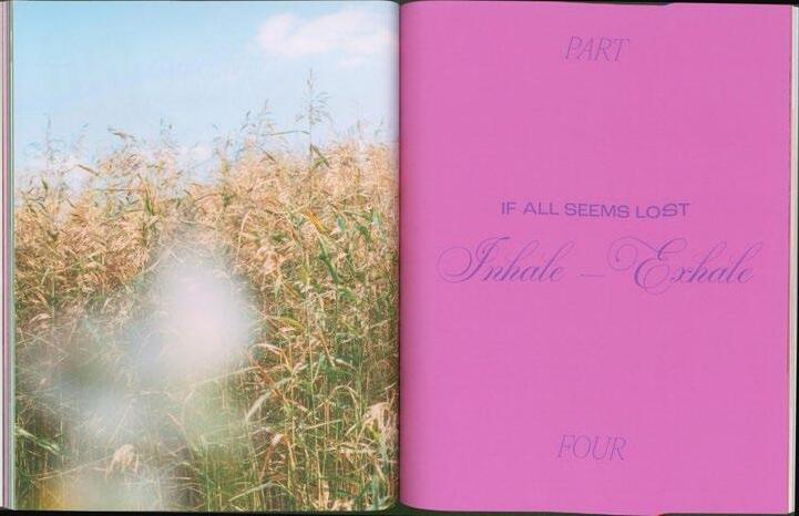
Part One
What are Emotions?
10
Before I even start talking about graphic design, the first question to ask myself is what are emotions? According to the Oxford dictionary they are a natural instinctive state of mind deriving from one’s circumstances, mood, or relationships with others1. Some would go as far to say emotions are completely derived from one’s past experiences and that narrates how they react to present situations, others call it a natural instinct of reacting to a circumstance. The overall concept of emotion is easily understood, but it’s hard to depict something as intangible as that in simple terms to translate into design.
Emotions are the reason we cry when we watch a sad movie, or when we laugh with friends on an old joke. However, they play a much bigger role in our lives than we let on.
Emotions are the single driver of subconscious choices, the motivation behind our everyday actions. Each one of us have different patterns of emotions that guide our daily choices or help make decisions on hader matters. Antonio Damásio in his book Descartes’ Error Emotion, Reason, and the Human Brain discusses the correlation between emotions, reason and the body, and theorizes on how the three things are interconnected. When discussing neurochemistry, Damásio states that serotonin is one of the main neurotransmitters…one of the roles of serotonin in primates is the inhibition of aggressive behavior…when neurons in which serotonin originates are blocked from delivering it, one consequence is that the animals behave impulsively and aggressively.2 Concluding that a person with a higher number of positive emotions will, potentially make less troubling and positive decisions.
So why is it, that in an era of selling and convincing people to buy with graphic design, we are forgetting about emotions? A design should be logical and structured, but it also should transcend from plain communication, it should create an emotional bond between the designed item and its
1– Oxford Dictionary (Google search, Apr 2024)
2– Antonio Damasio Descartes’ Error Emotion, Reason, and the Human Brain,
page 76.
11
user. This concept is called Emotional Design, and discussed in depth by Donald Norman. But it is still unknown to some people that when asked what the term means, the answer is as short as designs that are made to spark emotions. Others consider designing in a more “human” form, taking into account the needs and desires of society and design with empathy.
Norman, in his book Emotional Design tells a story about three teapots and how one of them is completely unusable but he still keeps it on display, he questions why. “I value my teapots not only for their function for brewing tea, but because they are sculptural artwork. I love standing in front of the window, comparing the contrasting shapes, watching the play of light on the varied surfaces.”3 He continues to explain how the three teapots represent to him the three aspects of design. Visceral, a design that is concerned with appearances. Behavioral, which aligns design with the pleasure and effectiveness of using something. And finally Reflective design, that considers the rationalization of a piece. Can it tell a story? Will I be able to enjoy a narrative created with or by this product? When an object goes beyond its design and adds a personal component to it and becomes something more than a simple possession.
Ok, but why does all that matter to graphic design? Many theories exist on product design and space design, how curating nostalgic undertones and relating directly to consumers emotions helps to create a bond between design and consumer. Yet, can’t graphic design also create these deep connections with the public? Can it not be beautiful, nostalgic and play with its viewers’ deepest memories to convey emotions? If the answer is no, then why is a book always judged by its cover, why do people buy only for the packaging? And why do fans steal posters of their favorite bands on the street to collect? The answer to those questions is simple: all of these examples create deep connections with its viewer, be it by beauty, by experience, nostalgia. It all involves emotional graphic design.
12
3– Donald Norman Emotional Design, Prologue.
13
Conversation with Akshita Chandra
Thoughts on experiences as immigrants navigating identity and cultural background in a new country and struggles and triumphs in embracing their heritage through design. And exploration of the significance of emotions in graphic design.
14
Veridiana Victorelli
VV
Akshita Chandra AC
Quick intro about me. I’m from Brazil. I moved to Boston two years ago, just to get my Master’s in graphic design and when I got here, I found out that being Brazilian was a characteristic (haha). When you’re home, you’re just like everyone else. So I was like, let me try to understand what it means in my design process. So I found my way of embracing Brazil – by emotions. It’s all about positive emotions.
Yeah, that sounds great. A lot of that resonates with me, because I moved to the States in 2019, for a master’s. And like similar emotions, similar feelings about how you’re hyper aware that you’re not from here and hyper aware of my identity and being just a little bit different from the majority of the people around me. And I had never thought about identity or my cultural background, etc. I’ve been very, very aware and conscious of that ever since I moved here. And I still am, it’s been, what, five years since I’ve moved here. It’s just I think everybody, every immigrant that comes here for studies, for jobs, whatever it is, goes through that process. Now I don’t. I don’t ever see myself getting over that.
I don’t even think we should.
Yeah, no. It’s just like it’s fine that we’re different, or that we’ve been raised with different experiences. A lot of times people talk about pop culture references or things that they grew up with. And a lot of the things we had back in India, like the cartoons, or Disney channels, stuff like that. There are things that were similar, but there are a lot of things that we didn’t have back in India. So we grew up with different things. You know, like different experiences, and sometimes it makes me feel left out. But then I’m like, whatever, I have this whole other rich experience that
15
I’ve grown up with that they don’t have either. So, you know, why should I feel for more?
Yeah, yeah, I agree. 100%, But what, what led you to come to the US, apart from obviously, grad school?
When I graduated from undergrad in 2016, I sort of always knew that I wanted to pursue higher studies in design. I wasn’t quite ready for it when I just had just gotten out of undergrad. And then three years later I finally decided, I think I’m ready to take the plunge. And I was researching a lot of colleges. I spoke to a lot of people about those specific programs that I was looking into. And a lot of what I was looking for, ended up being in the US. It just so happened that whatever I was looking for in the master’s program happened to be in the US. And I knew my seniors from undergrad or people that I knew from the new design community also came to the US to mica, specifically. So I knew I had a lot of people’s experiences to draw from and also why they ended up choosing Mica. And all of that really resonated with me.
Yeah. And what about your thesis? I’ve seen your project (Figure 1) and it’s amazing.
I was reacting to what I was feeling in the moment and what I felt like I needed to respond to in the moment and because I’m a graphic designer, it just became a graphic example. I didn’t want my last project in grad school to be a commercial project because like, you know, after I was done, I would have to do it.
And your project ended up being emotional. Tell me a little bit about it. How did you choose emotions, those were your emotions then? Or how did the research go? There’s not a lot of things on emotional graphic design. There’s a lot of product design, interior design.
16
VV VV
VV
AC AC
↑ Figure 1 Emotional Gamut, 2021. Acrylic visual analogies of the seven primary emotions.
AC I think the whole concept of this came out of the pandemic, there were a lot of things that we were fearful about that we hated, loneliness, fear of contagion. Just being so far away from friends and family in general, just a lot of anxiety and stress about everything that was happening. But then there were all these buckets of being stuck in the same house with friends. And trying to make the best out of the situation. So it was kind of, in my mind, it was like, it’s, you know, it can’t be all good or all bad. And that sort of like led me to this idea of emotions being so complex, and the whole idea of like, multiple emotions, overlapping each other to form one experience. And then I started so reading up about it, and you’re right, like a lot of the, the books and the, the decks that I read was not design oriented at all, I read some chapters in some books from neuro scientists, or like psychologists that are talking about the medical or scientific aspect of it. I did a lot of reading. A lot of research on UX principles, because emotional design is a thing in interactive design, that where it hinges on, right? You’re, you’re designing these interfaces that elicit a sort of emotional response and get you to buy something or whatever. A lot of my theory came from scientific reading. I read about color and shapes, how that informs me, informs design language, like if you pick red what’s the story, why we think pink is for love, or like, joy is for yellow, why do we have that sort of color and form associations.
It’s almost like you’re creating your own theory, you’re grabbing from thousands of things, but at the end of the day, you’re creating your own thing. I was reading about neuro nostalgia and music and how music that we listened to growing up shaped our brains and no music ever hit as hard as the music that we weren’t listening between 12 and 18.
18
VV
Yeah, it’s these tidbits of information that you grab onto, and then you research more into it was very helpful. There’s this one psychotherapist that I follow on Instagram, she’s based in India, and I followed her for many years. There was something that she said on a post about emotions and the complexity of what makes emotions such a human experience. And that led me to another sort of tangent into researching about that. So it’s just when you’re also thinking about your thesis, it’s like, you’re so engrossed in that thing that you see it everywhere. Consciously or subconsciously.
I mean, that’s awesome. And then at the end, you’re created this beautiful thing. I think, by reading a lot about the negative emotions though, it’s so easy to get carried away on creating creepy things or something that relates to the negativity of it. But at the end, have you joined the emotions and created this pretty thing in a digestible way? How did that work?
Because emotions are so complex, and it’s so divisive even in the scientific world. I just wanted to take a small part of it and make it accessible, digestible, and make it as easy to understand as possible. And it was just this one concept that no one experience is all good or all bad. There are so many different emotions at play, and it’s okay, it’s a very natural human response to be very happy for your friend but also have a little jealousy. It’s complex. My idea was more of presenting that as clearly as possible. Then when I started building the system, I started reading a lot about storytelling and I’m building visual systems and how our brain sort of interprets visual language differently. Or about iconography or like semiology, and diagrams and networks and like, even cartography, and it’s how you visually present data in, you
19
AC AC
VV
know, like, bite size. Like, a very accessible way. So I was reading a lot about how you like to take all of this tense information that you’ve collected and sort of translate it into something very visual.
At the end of the day, you’re understanding the thing and creating a story on it.
I wanted to ground my decisions on something. If I was making certain design decisions, or visual decisions on a project, I wanted it to come from somewhere, not just like, Oh, this feels right. To me. That becomes very subjective. And I want it to be as universal as possible. I did this survey, a visual survey of sorts. And I sent it to a bunch of people, where I was asking, like, if you had to draw something for love, what would you draw? What color? And I picked out patterns of that. And it’s very interesting, because it really relates to a lot of the text that I was reading. Why is pink for love? Why are warmer colors for joy? Unlike fear, it was always dark or angles, always pointy. Joy was always bulbous, and round, softer. So a lot of those decisions also came from this survey that I did. And it was nice, because it all sort of came together with why these shapes and forms and colors form a universal language. It’s so ingrained in us. So it made you do that a little bit, while also not being too obvious, or not to still keep it a little bit more surprising.
That’s awesome. You decided the seven main emotions got input from everyone else to make. It makes sense for everyone. And I guess that’s what great design is all about. What was the hardest one?
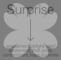
That’s interesting... It was a surprise (Figure 2).
Because we can be very positive and very negative, right?
20
VV VV VV AC AC
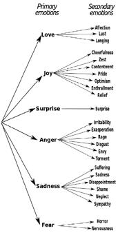
Exactly. You know, surprises can be scary. Not all surprises are pleasant. And some people don’t like surprises. But there’s also that aspect of being pleasantly surprised. So that was kind of a difficult one to arrive on. When I chose the seven emotions there was like there was this chart (Figure 3) that I was looking at. And basically these are the seven main emotions. And then there are secondary emotions than tertiary emotions that like to fall into those categories. Surprise did have positive and negative effects. So it was like, What color do I choose? What shape do I choose? That sort of carries that association of good and bad in the same thing.
I know Emotional Design is often described in the UI/UX context for a positive user experience. To me, anything that evokes something in you can be Emotional Design. Any piece of design that is purposeful about eliciting an emotional response is Emotional by Design. It’s natural. I could relate to it.
I’m glad. Yeah. Initially I had a brighter, more sort of like neon blue. And then that didn’t quite do it. And then I ended up arriving at that green.
That’s amazing! And after all that, how would you explain Emotional Design?
↑ Figure 3 W. Gerrod Parrot's tree structure for emotions with their different levels.
→ Figure 2 Visual analogie for Suprise by Akshita Chandra.
21 AC AC AC VV VV
Why I Make?
22
Part Two
Excerpt from WhatsApp message. First line says Wow, and second line It’s yummy to look at
23
Relatability
24
25
Feeling Experiment
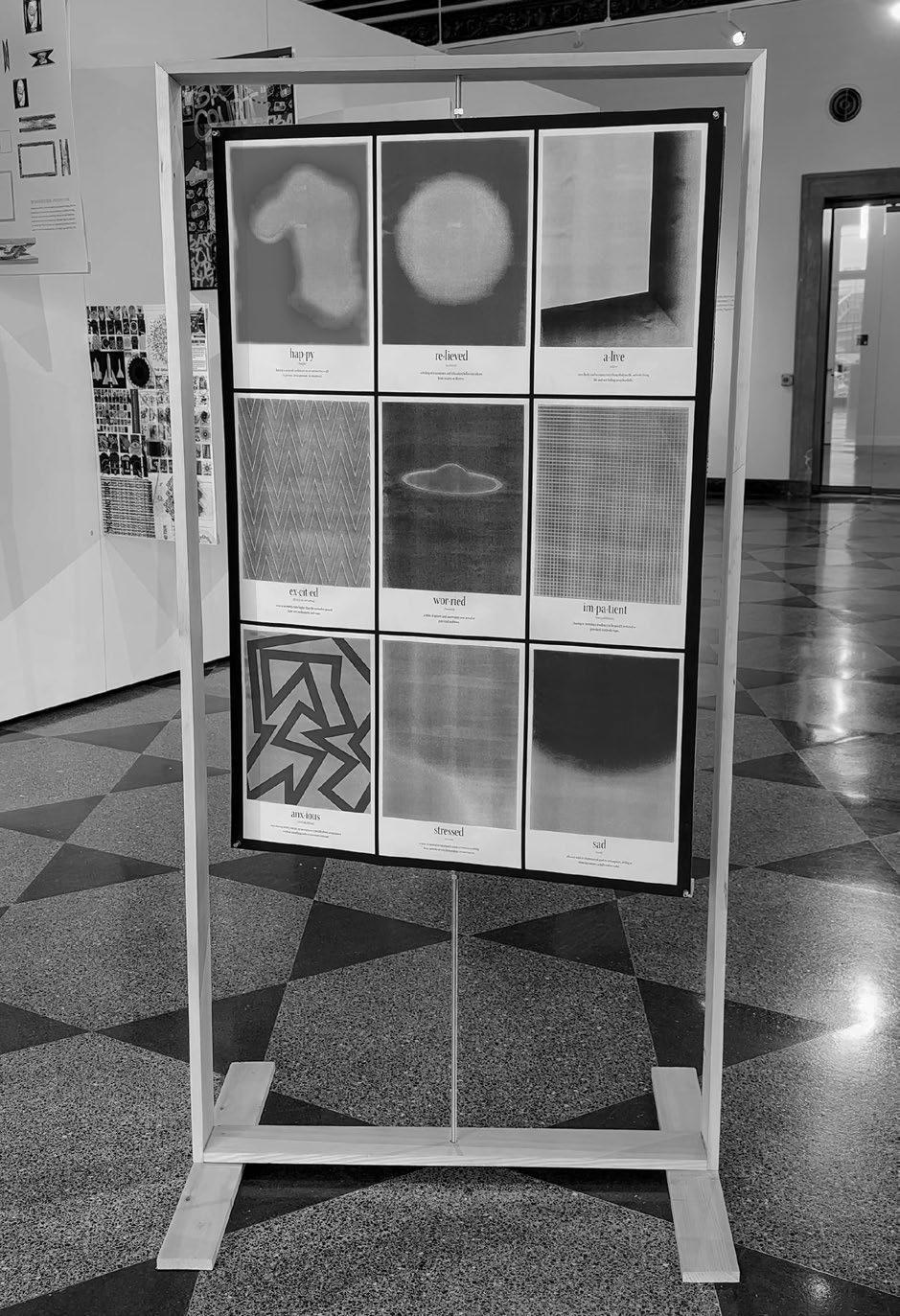
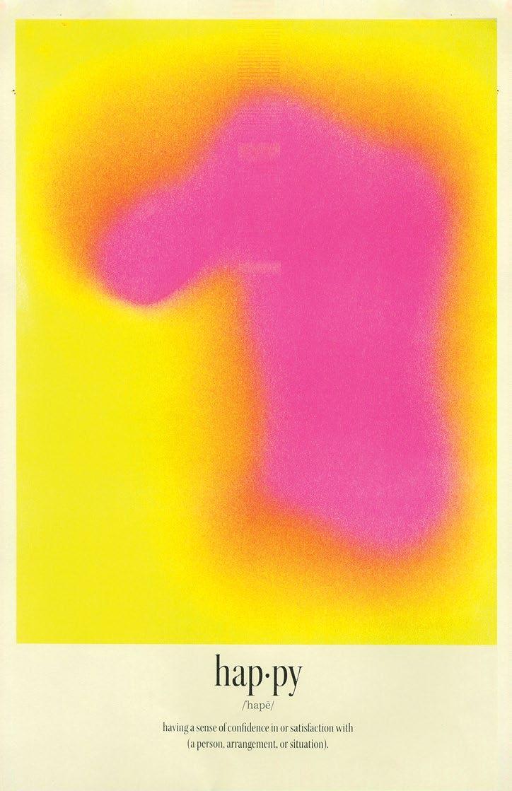
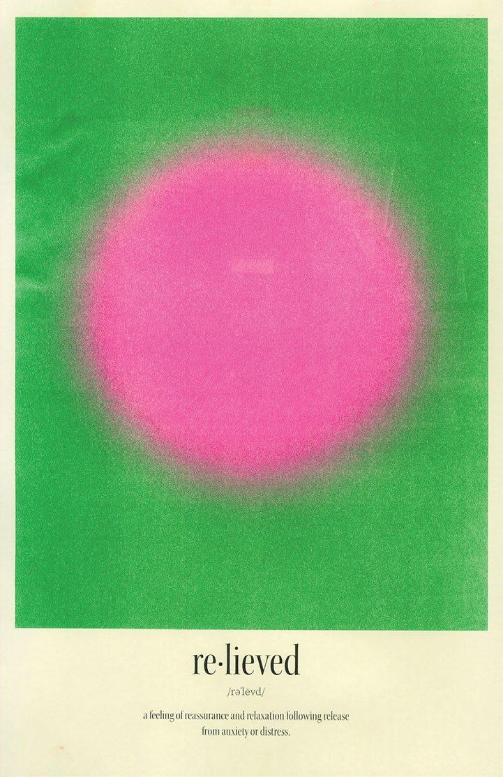
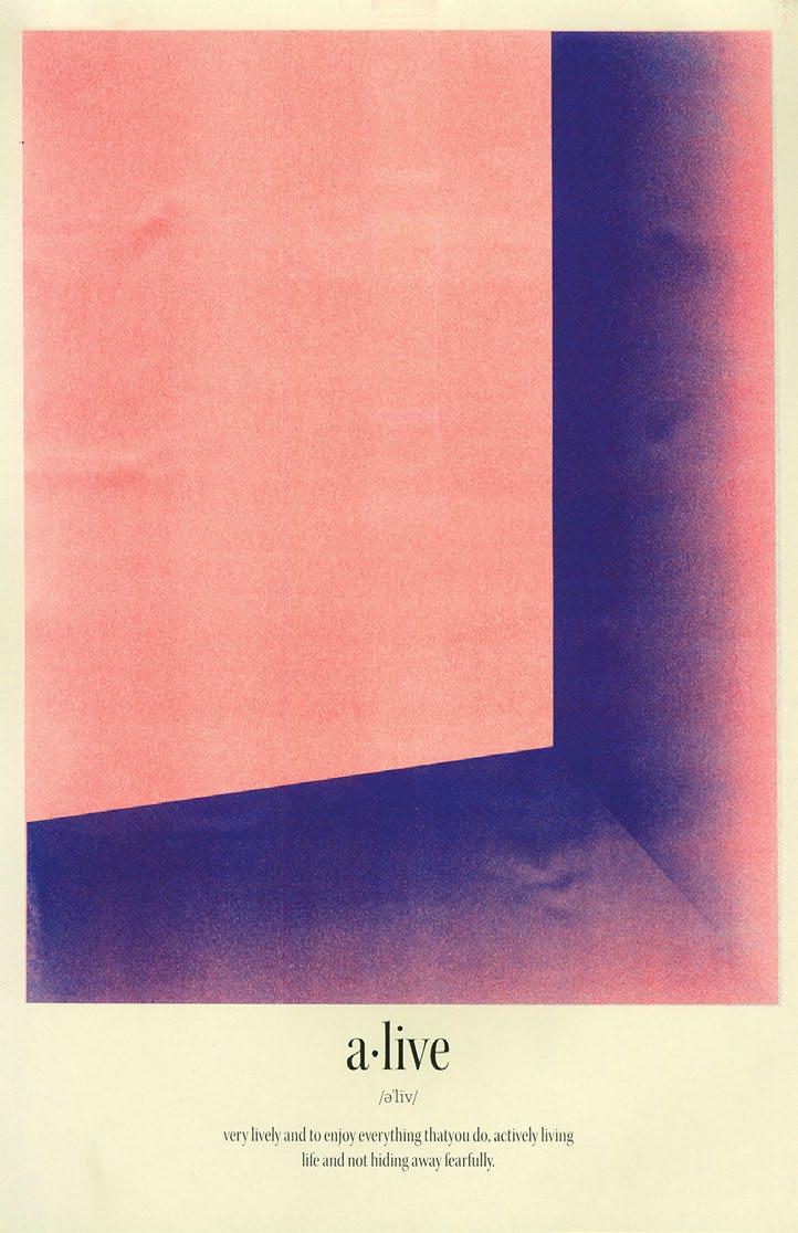
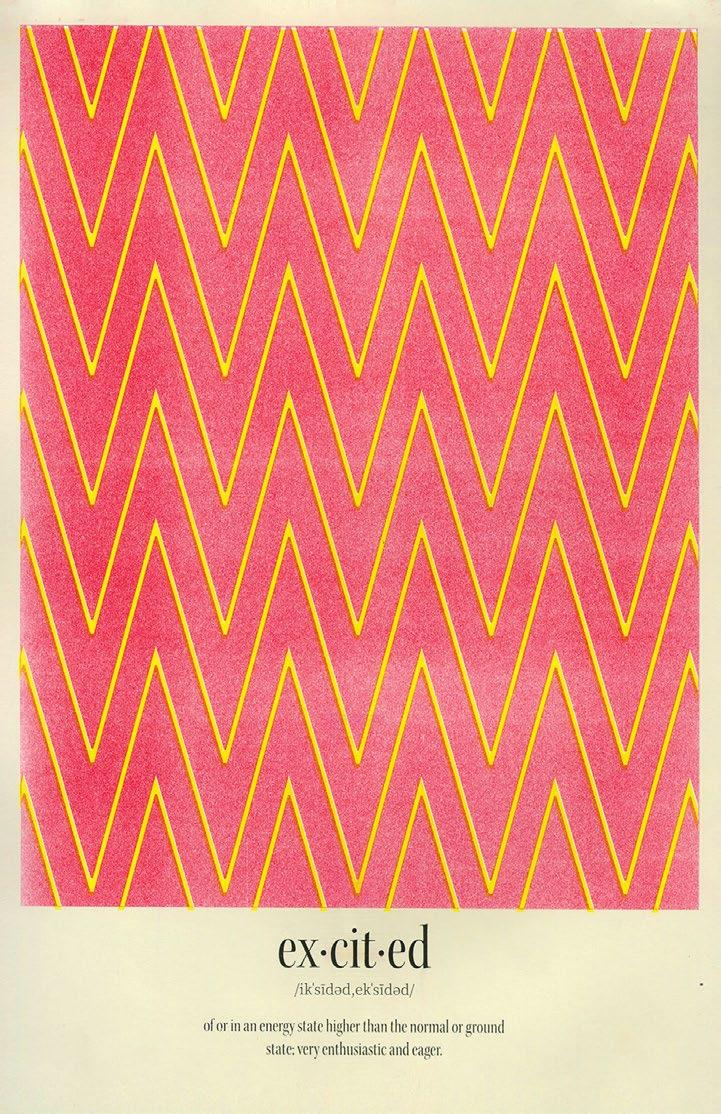
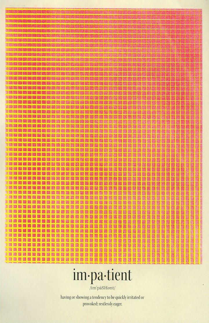
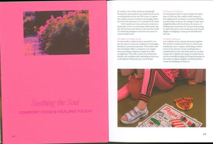
Emotions and feelings are complex, abstract experiences that color our lives in unique and profound ways. Through this project, I explore the captivating concept of abstracting emotions by the interplay of colors and shapes. Every aspect of our daily lives has the power to impact our emotions, creating a rich tapestry of feelings that are as diverse as the individuals who experience them.
By carefully selecting colors and respecting the constraints of the Risograph printer, the chosen colors intend to radiate the chosen emotions. Yellow radiates warmth and joy, pink embraces tenderness and compassion, green symbolizes renewal and growth, blue represents calmness and serenity, and purple embodies creativity and spirituality. These colors, paired with the psychology of shapes, allow us to further refine the emotional narrative. Fluid and circular shapes evoke harmony, relaxation, and unity. In contrast, straight lines and angular shapes provoke a dynamic and energetic response. Together, these elements form a visual language that speaks to the depth and diversity of human emotions.
26
28
29
30
31
32
33
34
35
36
37
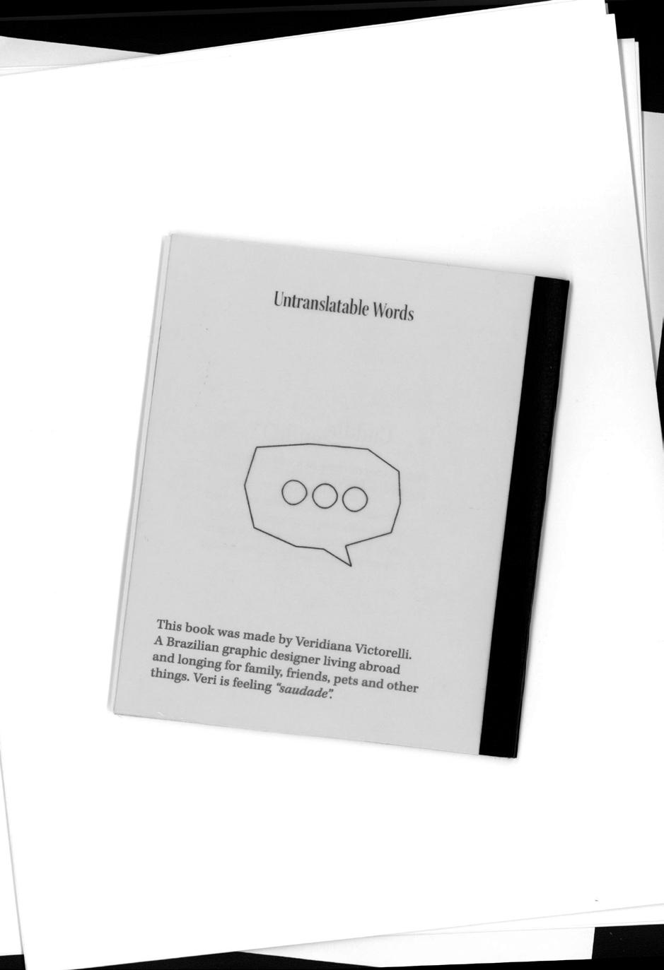
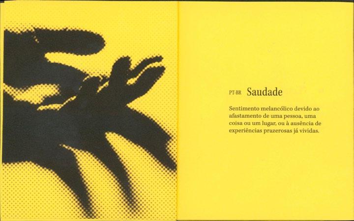
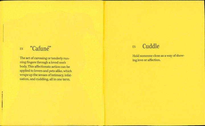
Untranslatable
Words
This publication explores the depths of language and culture, highlighting the profound impact of words that defy easy translation. Each word is a window into a unique cultural mindset, revealing shades of emotion and experience that may be challenging to express succinctly in other languages. This illuminates the nuanced relationship between language and culture, showcasing how words encapsulate the essence of a society's collective consciousness.
38
40
41
42
43

44
45
46
47
48
49
50
51
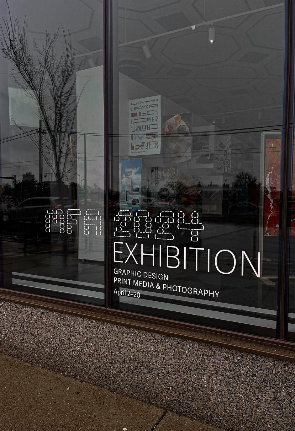
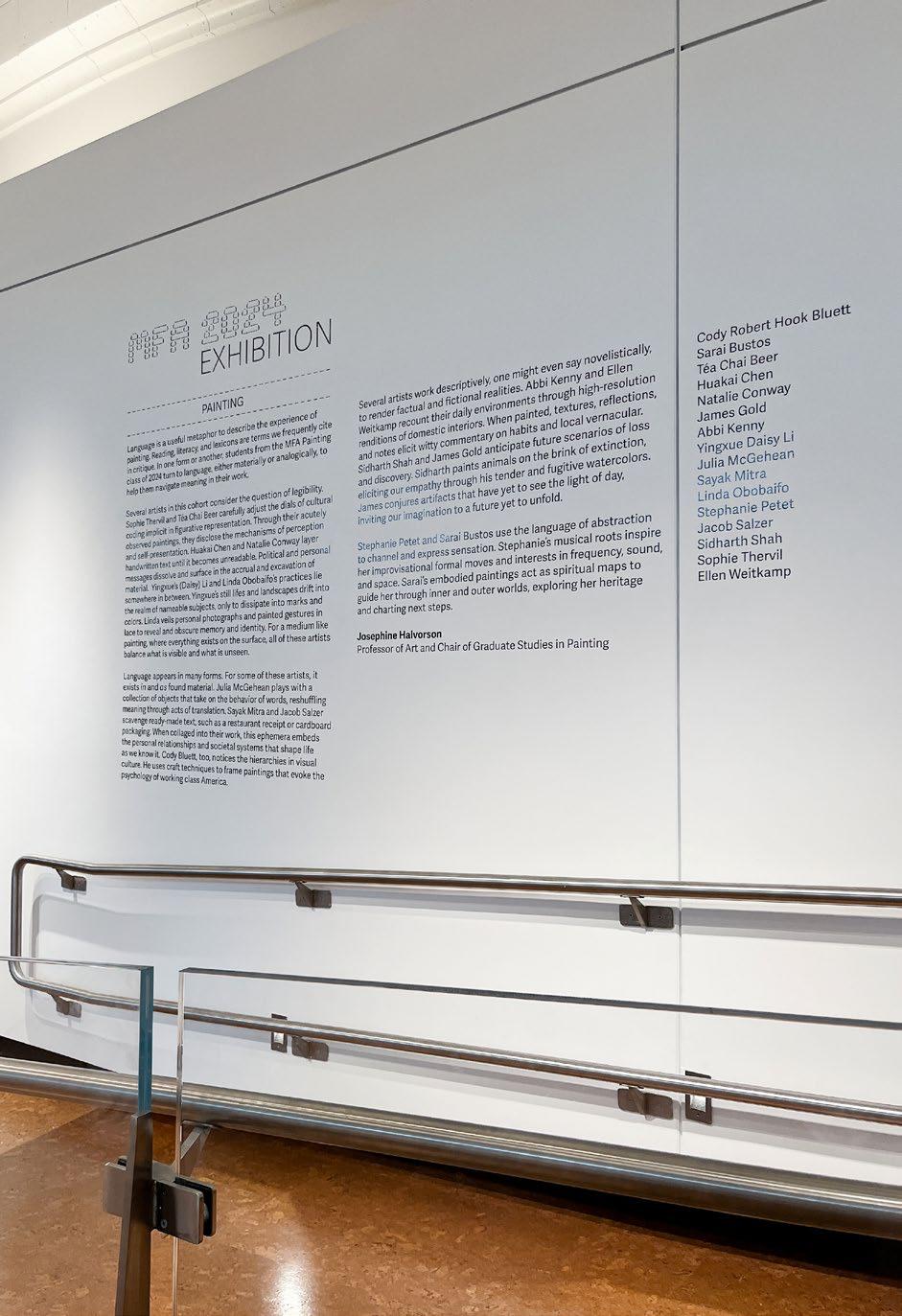
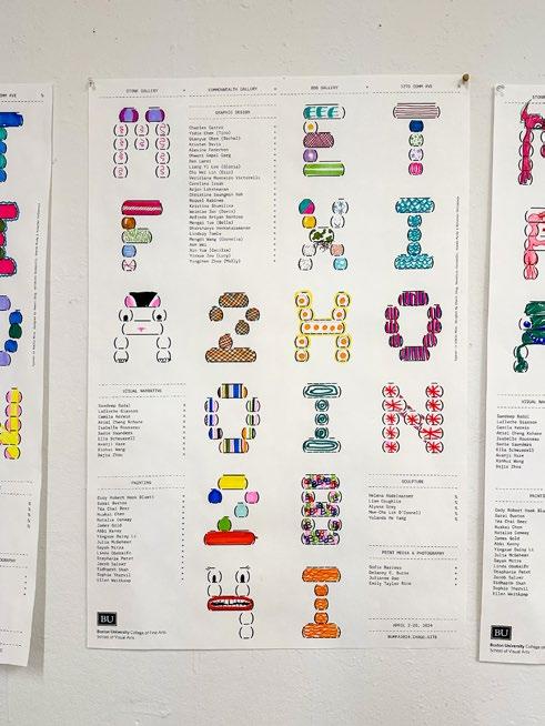
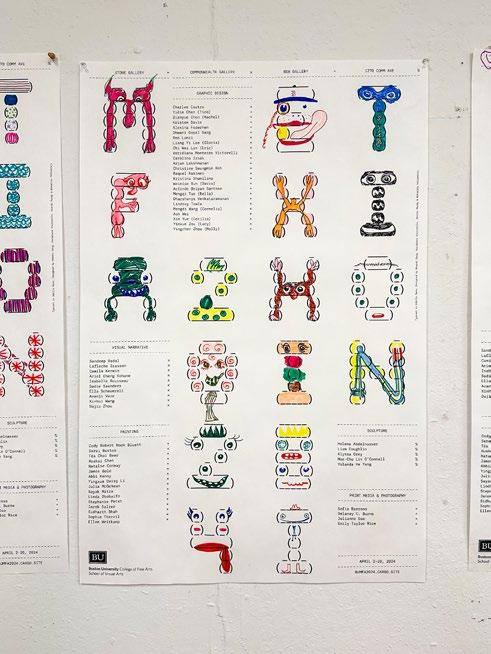
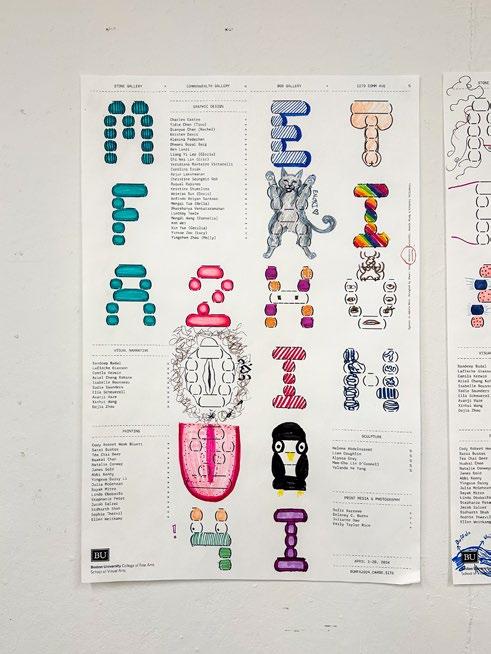
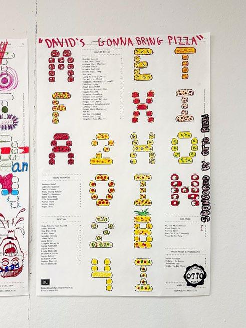
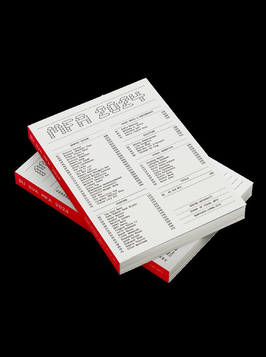
MFA 2024 Exhibition
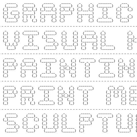
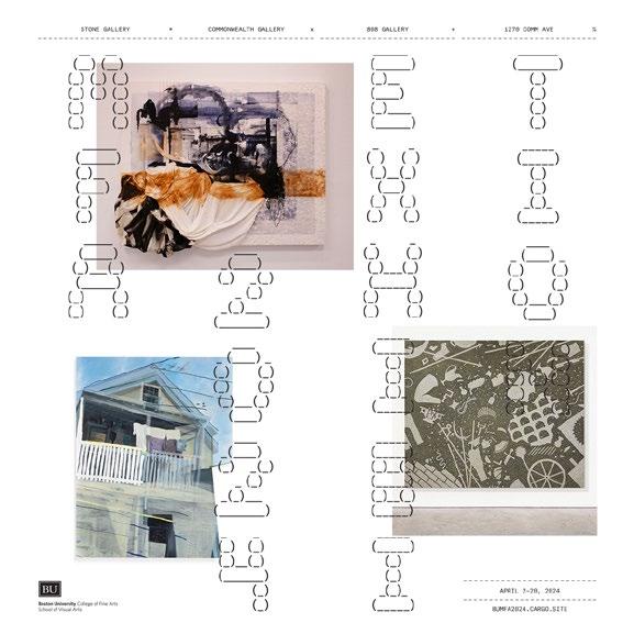
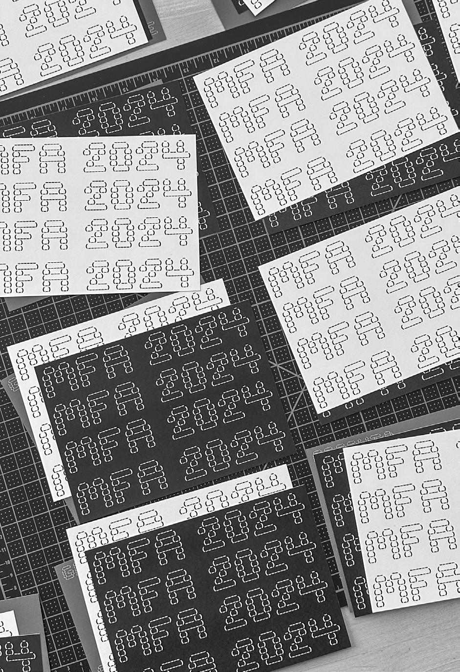
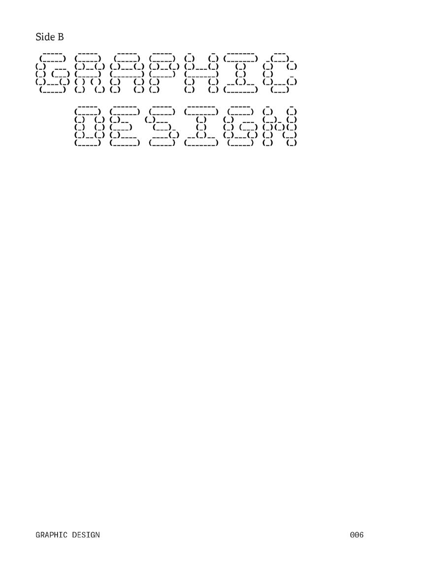
Under the guidance of Christopher Sleboda, I worked alongside Dhwani Garg, Amanda Mundy, and Niharika Yellamraju to create the 2024 MFA Exhibition academic identity for Boston University’s Graphic Design, Painting, Print Media & Photography, Sculpture, and Visual Narrative graduate programs. Our key theme is that every detail contributes to the entirety. It also highlights how the sum of individual actions forms a comprehensive whole. Receipts and invoices serve as tangible manifestations of transactions. So, each individual within a community is a part of a receipt, contributing to collective histories. In our quest to manifest these concepts into tangible design elements, we used the adelle superfamily, which metaphorically embodies the essence of familial unity and interconnectedness. Our identity system draws inspiration from receipt design, utilizing type as a form within its constraints. Just as parentheses are incomplete without each other, so too are the intricate dynamics within a family. We used Ascii art as a unique addition to our design toolkit. We created the Ascii type to complement the Adelle superfamily and fit the bill perfectly.
52
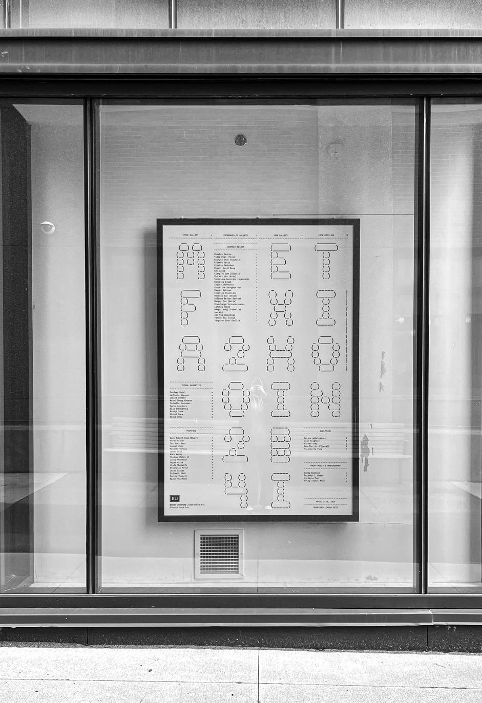
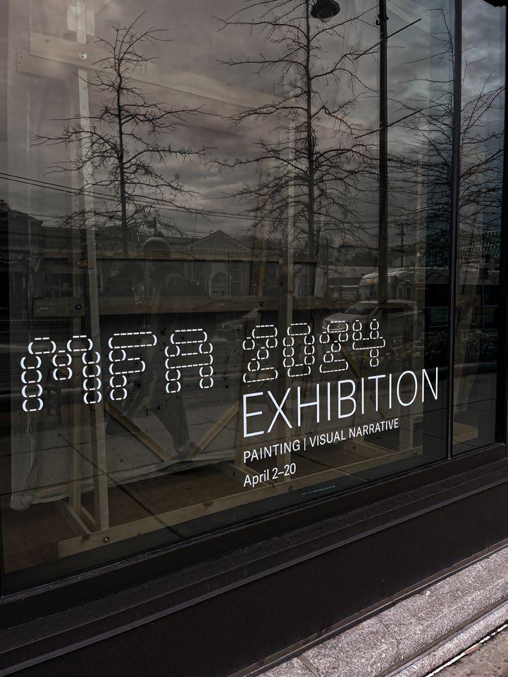
↑ Vynil signage at Stone Gallery, Boston University.
→ Vynil signage at 808 Gallery, Boston University.
54
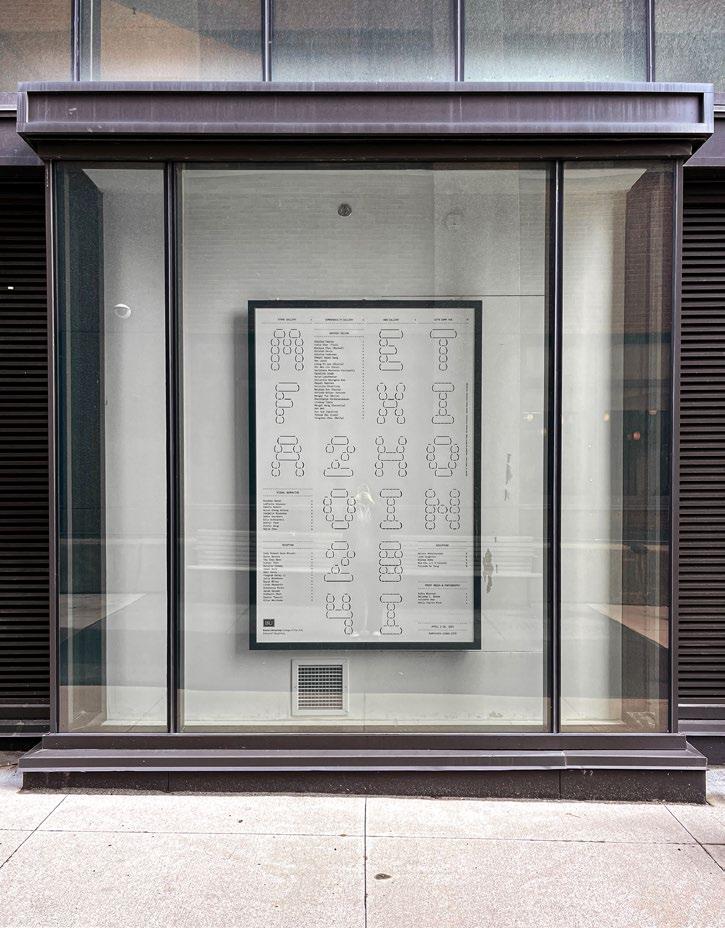
↑ Duratrans poster created for Boston Uiversity's Stone Gallery.
← Title wall for the painting cohort exhibition at Stone Gallery, Boston University.
57
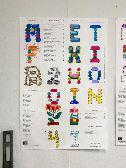
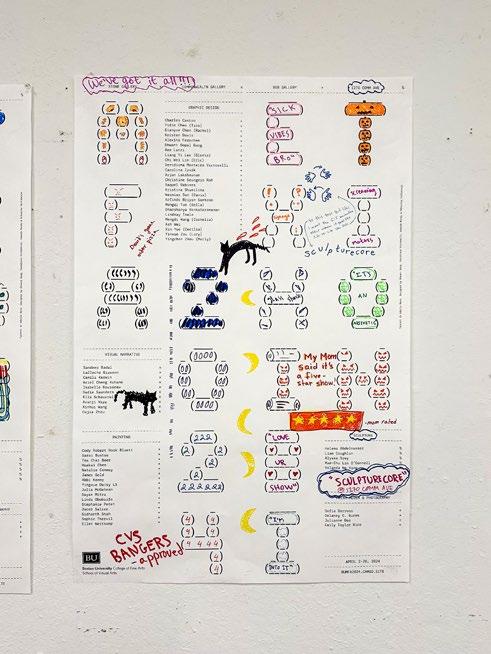
↑→ Personalization on posters made by painting graduate students at Boston University.
58
59
↑→ Personalization on posters made by painting graduate students at Boston University.
60
61
↑→ Personalization on posters made by painting graduate students at Boston University.
62
63
64
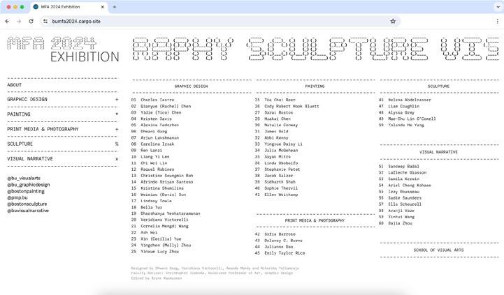
↑ Website for the MFA 2024 Exhibition, bumfa2024.cargo.site
← Customizable social media assets for the MFA 2024 Exhibition.
65
↑ Catalog cover for the MFA 2024 cohorts.
← Three color post cards distributed for the MFA 2024 Exhibition.
67
68
69
70
71
72
73
74
75
76
77
78
↑ Option of full white spreads created for the MFA 2024 Caralog.
← Option of white and black spreads created for the MFA 2024 Caralog.
79
Why is it so hard to write 50 questions?
What makes a good essential question? It invites us to revisit ideas, get closer to core motivations, look further into the future, shine light bulbs on biases, celebrate the unexpected, break barriers, test the limits of intimacy and empower critical thinking 1.
This project is a website that serves as a reflection of my mind, constantly questioning a variety of serious and lighthearted topics with a touch of humor. The site features 50 questions that explore the essence of design, compare maximalism and minimalism, and delve into the experience of being an international student in the US, particularly focusing on life on OPT after graduation. Each question is paired with a GIF, enhancing the experience and inviting viewers to engage with the content in a joyful and introspective way.
1– Iteration on the words of Seth Goldenbed on the book Radical Curiosity: Questioning Commonly Held Beliefs to Imagine Flourishing Futures.
80
(0001)
What am I doing here?
(0004)
Why am I such a perfectionist?
(0013)
Why is life so complicated sometimes?
(0017)
Why is letter and tabloid a thing?
(0027)
How to provoke intense emotions through design?
(0042)
Can an emotional connection be felt physically?
Conversation with Jessalyn Aaland
Exploring our experiences with art, identity, and nostalgia, this conversation emphasizes the significance of tapping into emotions to create meaningful and impactful art.
94
Veridiana Victorelli
Jessalyn
Well, thank you so much for making time on a Sunday. You were away this week for a book fair?
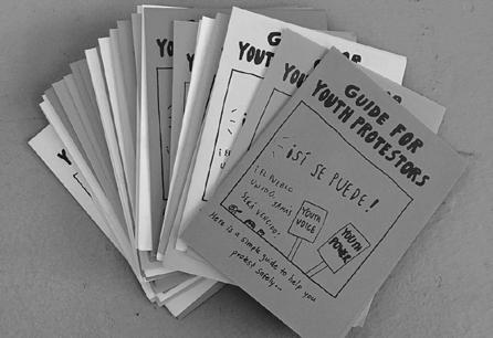
No, I was a visiting artist at an art school for high schoolers. I do this project guide for youth protesters (Figure 1). It is like the students make their own guides inspired by it on topics they’re interested in. So I introduced you to the fun of printing via a copier and folding.
VV
Aaland JA JA JA
VV VV VV
Awesome. I love working with kids. I mean, my whole dream in life is to open a nonprofit art school in Brazil.
Is that where you’re from? Before coming to Boston?
Yes! I only came for grad school.
Oh, wow. Amazing. I guess it’s your second year?
Yeah. I’m graduating in May. I guess that’s why I’m always channeling memories and nostalgia. I just miss home.
That makes sense. I mean, it’s hard to move to a totally different country.
Super! But let me introduce a little bit of me and my thesis. Because I came from Brazil I do a lot of things based
↑ Figure 1 Guide for Youth Protestors, 2017-current, quarterfold, double-sided sheet
95
on memories and nostalgia and missing home. There’s this Portuguese word Saudade that’s a very beautiful iteration on missing something or someone, longing is seen as negative. And saudade is basically like when you miss something, but you have a beautiful memory of it.
JA Cool. I hope you’re gonna talk about that in your book!
It’s all focused on emotional design, which is a task in itself. A lot of people talk about emotional design with interior design, or product design. But there is not a lot of it for graphic design. And people do it all the time. I mean, in your VV VV VV
Oh yes! When I got here when I got to Boston being Brazilian became a characteristic. I was hyper aware that I wasn’t just a designer anymore, I was a Brazilian designer. So I thought, let me try to approach that somehow.
Yeah. Which is really hard. Because Brazil, so dynamic.
That’s, that’s exactly how I felt. I was like, What is Brazilian art? What’s Brazil? And that’s when I started to figure out that the feeling that I got being from Brazil was something that I could approach. I really got attached to this feeling of missing home and saudade is a big thing. I did a lot of projects on it with my pets or introducing the word to people and then iterating their interpretations into visuals. So a lot of mixed emotions in my work.
Yeah. Bittersweet thing!
96
JA JA
JA
work, doing this with kids, teaching people how to protest or the prints for teachers, that it’s all gravitating towards making someone feel something.
Interesting! Yeah I’m involved in emotions myself, I mean this is interesting because I’ve used AI in my work and I’m trying to understand it. And so I was recently also reading some articles about it and one talked about with the prevalence of AI in society, what will become important for like engineers, for example, but I think this also applies to designers or anyone, is being able to be in touch with the things that make us human and emotions, because machines can’t do that. That’s literally something they can’t do.
Exactly! But tell me about you. VV
JA
I don’t identify as a designer; I’m an artist working in an interdisciplinary way. Design is part of my interest. I grew up in California near Los Angeles and have been in the Bay Area since 2006. I studied abroad for a year in England, but otherwise, I’ve always lived in California. My background has influenced my perspective; I came from being involved in music as a teenager. I used to book experimental music shows, which didn’t have a huge audience, so I had to work hard to attract people. That’s when I started making posters for the shows. I would describe myself as “design-adjacent.” I don’t have formal training in design, but I would create handmade collage posters for the shows, focusing on shape with the text and using stickers as part of the collage. Stickers have always been a part of my life; I’ve been using them forever. Even though stickers are often nostalgic for most people, they’ve always been around for me. I’ve been using them since I did collage work when I was younger. I’m interested in
97
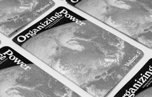
composition, color, texture, shapes, and negative space, which are things people in design are interested in, but I’m not oriented towards computers. I work in an analog way and have been for a long time. I got into using stickers in my collages because I’ve been on the internet longer than most people my age, since the mid-90s. I had friends all over the world, and we would write each other letters with elaborate sticker collages. I’ve always collected stickers and was interested in incorporating them into my art. I’m interested in industrial or commercial things, everyday things that most people have access to. Accessibility is something I’m interested in; much of the art I make is not for an art audience but for young people or community projects. For example, the book “Organizing Power” (Figure 2) is for communities outside of an arts context, addressing a need in my community. I started using stickers in my art because I hadn’t seen anyone else do it, and I thought it would be fun to try. I love packaging design, political posters, and album art, so I’ve crossed over into various worlds. My undergraduate degree was in literature, with a very conceptual-focused art program. It was open-ended, and I always had to acquire new skills to make the things I wanted to make. I grew up going to craft stores with my mom, so stickers have always been around in my life. I always want to make something I’ve never seen before; that’s successful to me. My art was focused on collage work for a long time until I started using digital tools. About 11 years ago, I did a residency at Facebook and discovered digital tools like a CNC cutter, which changed my work a lot. I started using more digital tools but still love the clean, crisp cuts the machine can make. My work has a design influence, but I have zero training as a designer.
98
I also grew up using stickers.
JA That’s great! Stickers have always been around in my life. When I travel, I like to get stickers from different countries. I really like the sparkly, holographic ones and the ones with a textural element. I’ve always collected stickers and incorporated them into my art. My partner Paul and I run our press, and we’re both artists. We focus on collections, research-based projects, and archives. We’re currently reprinting a book about every candlepin bowling alley in Maine, which is a photo journey exploring the aesthetics of everyday objects and people. Everyday objects and people are big interests of mine across my work. My art practice involves exploring who I am and the world around me. I used to teach high school, and my art was influenced by utopian ideas. However, after Trump’s election, I felt an interest in making more explicit political work, which transitioned into making social practice work. For example, I made a booklet in 2017 for students participating in a walkout after Trump’s inauguration. It’s a design object with a community-focused purpose, educating young people through humor and simple information. I’ve distributed thousands of these at protests, libraries, and schools, making it a mass form of communication. My work comes from a need; I want to get information and inspiring posters to teachers and communities. My publishing work is part of that, allowing me to give away 22,000 inspiring posters around the world. Print is an economical way to distribute work, and Paul and I started our press in 2017, mostly publishing our own work but also collaborating on projects with others
99
VV
← Figure 2 Organizing Power Volume 1, 2023. Current Editions No. 2.
VV
That’s so cool. You studied literature but what were you teaching? Art…
JA Not at all. I mean, I do a lot of arts integration. I got a literature’s of the world degree, which was a lot of film theory and cultural studies. So I actually thought I would go get a PhD in cultural studies and be like a visual culture academic, like visual culture studies and do Siri and then I like taught high school, I was substitute teaching at the time, and then because it was a job you could get and easily not go to work for a month, and it paid decently. So I thought about being a school librarian and that I had to go get a teaching credential. And I was like, Well, I can pass the English test, I guess, because I’m good at that. And I technically got a degree in that. And then I just ended up teaching. So a lot of this stuff in my life is like, you know, you kind of follow a path and it takes you this other way. But, I was teaching English and ESL, but with a lot of arts integration involved in theory and stuff.
VV
Yeah, I’m always a big advocate for the saying that’s like, “What’s yours is already stored.” So it doesn’t matter the path you take; whatever is supposed to happen is gonna happen. I guess it didn’t matter, like, your major or if you wanted to be a librarian or anything; it was supposed to happen. You mentioned the cuts you did on Facebook. Is that the poster with the flowers you did on the sunsets?
JA That work is pretty recent, but that’s where I first used the tool that I use. You can look on my website, but there’s a project I did in 2013 called “Light is the Left Hand,” (Figure 3) and it’s a big installation. I used punched paper from scrapbooking. I glued together two to five pieces of paper to make flowers. Then, there are some pedestal model monoliths
100
VV
JA
type things. Those were drawings put into Illustrator and cut out with the sign tool out of vinyl. Later, I wanted to play around with those flower shapes more, and I thought, “Cool, okay, I could cut this out with this line cutter.” So, I bought a cutting plotter. Those sunset flowers were a public art project in Emeryville on the bus shelters here. I got into the sunset because I was asked to contribute artwork in like 2017 or something to a nonprofit community bookstore benefit. I used a book of California sunsets as the source material. I just played around with getting those flower shapes out of it and thought, “Oh, these are cool. I can reconfigure them into these bigger scale sunsets.”
That’s with magazine papers…
Yeah, as well. I got really into incorporating flowers when I was doing that collage work. My mom was a florist growing up, and I’ve always really liked flowers. Coming from a literature background, I love symbolism. I think about how flowers are these standards for human emotions like sympathy, apology, celebration. I like these non-literal substitutes for people in our emotions. I was using chairs to symbolize people and human communication. I’ve brought in all these flowers. I also spend a lot of time outside; Paul and I go on a lot of trips to the
↑ Figure 3 Light Is the Left Hand (detail), 2013, paper, vinyl, and metallic foil, variable dimensions.
101
JA
JA
California mountains and go swimming in the rivers. We’re always excited about the rural design we encounter on signs. I spend a lot of time in nature and hiking. I think this interconnectedness to our worlds is important. I think about connections a lot, like connecting with yourself, connecting with your community and people around you, connecting with the natural world.
I love that a lot of people look at stickers in a nostalgic way, but for you, it’s always been part of your life. You don’t look at them as nostalgic. But at the same time, you’re cutting flowers that, for me, look like stickers. And it also relates to the fact that your mom was a florist.
Yeah, that thing. Nostalgia is such a loaded term because sometimes it evokes this idea that things were better in the past. I don’t actually think that. I’m interested in the future as a person and I like imagining utopias that could exist. This is a really personal thing for me, like the flowers. Some of my older work is really personal too. I have a difficult relationship with my mom. So, this is like the part of her that I love and appreciate, this creative energy that I’ve clearly got from her in some way. My family is not artists, not creative people for the most part.
My dad works with farms and agriculture. My mom was always just a mom.
Yeah, mine is my entire aesthetic. My uncles, cousins, they’re all business people. It’s like I am the odd one out. It’s a weird feeling. You meet friends, and they’re like, “Oh, my parents are artists and musicians.” That was not me growing up.
My dad’s side of the family was always business/agricultural. Everyone in my city in Brazil is kind of focused on agriculture.
102
VV
VV VV
VV JA JA
What
is the city called?
It’s called Londrina. It’s in South Brazil, near São Paulo, but in a different state. We are four daughters, and my dad was always passionate about fashion, but in a very bizarre way, not like a fashion-forward trendy way. He was always engaging in creativity, even being in agriculture. It kind of panned out to me being a graphic designer, my third sister being a filmmaker, another sister into fashion design. It’s interesting because we were never like, “Oh, we’re artists,” but we all became artists. I think it’s because he was engaged in creativity, even in the little things like Sunday mornings, playing music we never heard. So, it’s not necessarily an artist’s family, but yeah.
My mom was from a really Southern California, white, middle-class, suburban family. My parents had really traditional gender roles; my dad was a salesperson, and my mom was a stay-at-home mom, except when she had her floral business for a while. She was really into crafting. I think a lot about using commercial supplies that are very directed. I love creativity within constraints. I think about constraints a lot; it’s like a mentality a designer would maybe understand more than an artist. I’m always impressed by painters who start with a blank canvas and make something appear; it’s the opposite of how I work. I set up limitations and make something within that. That’s my favorite way to work. But anyway, I grew up with some unusual creativity, but not traditionally, maybe not in a super mainstream or fine art sense.
You didn’t grow up to be an artist, but you absolutely are one. VV
103
JA Yeah, I was going to be a writer. I love writing. I learned to read at a really young age and spent a lot of time alone in my room reading books.
VV
That’s awesome. I feel like because I have such a big family, I keep stealing from all of my sisters’ experiences. For me, it was music, and I grew up watching a lot of TV; my sister grew up reading a lot of romance and fanfiction. The little one is our baby, and she’s 22 and she cannot do anything by herself. We can steal from everything. But I just want to go back to the stickers for one second. My mom, my aunts, everyone collected stickers, and this passed on to me and my sisters. We had those gigantic books where we would put the stickers in really carefully, trade them with friends. It was a sacred thing. We never used them; we have the books forever. My aunt had Coca-Cola stickers from Spain that she would never allow us to touch. To see your work getting this thing that for some people is collectible and sacred, if you are collecting it and using it.
JA I do have some stickers that I haven’t used; they’re too special. But because they were so annexed, because I was buying them as an adult, mostly, I was buying them for that purpose. I tried to make them not precious. My mom’s a big hoarder, and this thing in our family that has been passed on to me from my mom and grandma, I’ve been trying to not have that mentality. Using them in my art allowed me to channel that interest in collecting. My partner, Paul, actually had sticker books too. We have one of them. I love looking at old sticker books; I have this friend Chris Larson who has made ceramic, actual cast sticker books. They’re really cool. I think a lot about
104
childhood agency through my work. I feel like when you get stickers, you don’t have a lot of power as a kid, but this idea that you have stickers, and you can decide whether you keep them pristine or just slap a ton of them on a page. I think there’s this power of agency with stickers that’s compelling to young people. I have young nephews, and one is really into them right now. Apart from a few, I’m mostly not precious, although I do have some where I’ll save the last one on a sheet. In some ways, putting them into my art gives them a more permanent life. I like to see them in action and dialogue with other things. They kind of inspire me to make new things.
Yeah, I love it. I love that banner, by the way. It’s beautiful. And I did see the painting. That’s stickers on a notebook. And I think that’s, that’s just brilliant. For me. It took me back to middle school. VV
JA
And that’s what I wanted, actually, is this idea of being in school, and you know, like, having been a teacher. before cell phones were everywhere. It was like passing notes. Or like, you know, you’re playing around with the paper and you’re like scribbling on it. I don’t know, I got really interested in how young people use the page, you know, and find agency and ownership and remark making and things like that. And I’m inspired by young people. But I also like making art that I think is accessible to everyday people and young people because lots of people either have nostalgia for stickers, especially women, and that’s always exciting to me. I think my work with flowers is pretty fun coded. And I kind of liked that.
Oh the sticker book (Figure 4), when I saw that I was like “I need to I need to look at it”.
105
VV
JA JA
Thank you. That’s the reaction I wanted. If I saw that book, I’d be like I absolutely have to get this. It needs to be in my life. So it feels really good as an artist to make something you feel like that about. And then, I had to come with a sticker of the sticker packaging obviously.
VV
I love that. And for me, for example, it was so special because it reminded me of the person who would always take me to buy new stickers. Every Saturday morning my grandpa would give us 10 bucks, and say you can buy whatever you want. And because the stickers are so inexpensive, that’s what we all bought. We went home with like, 10 packs of news tickers. But how was other people’s reaction to it?
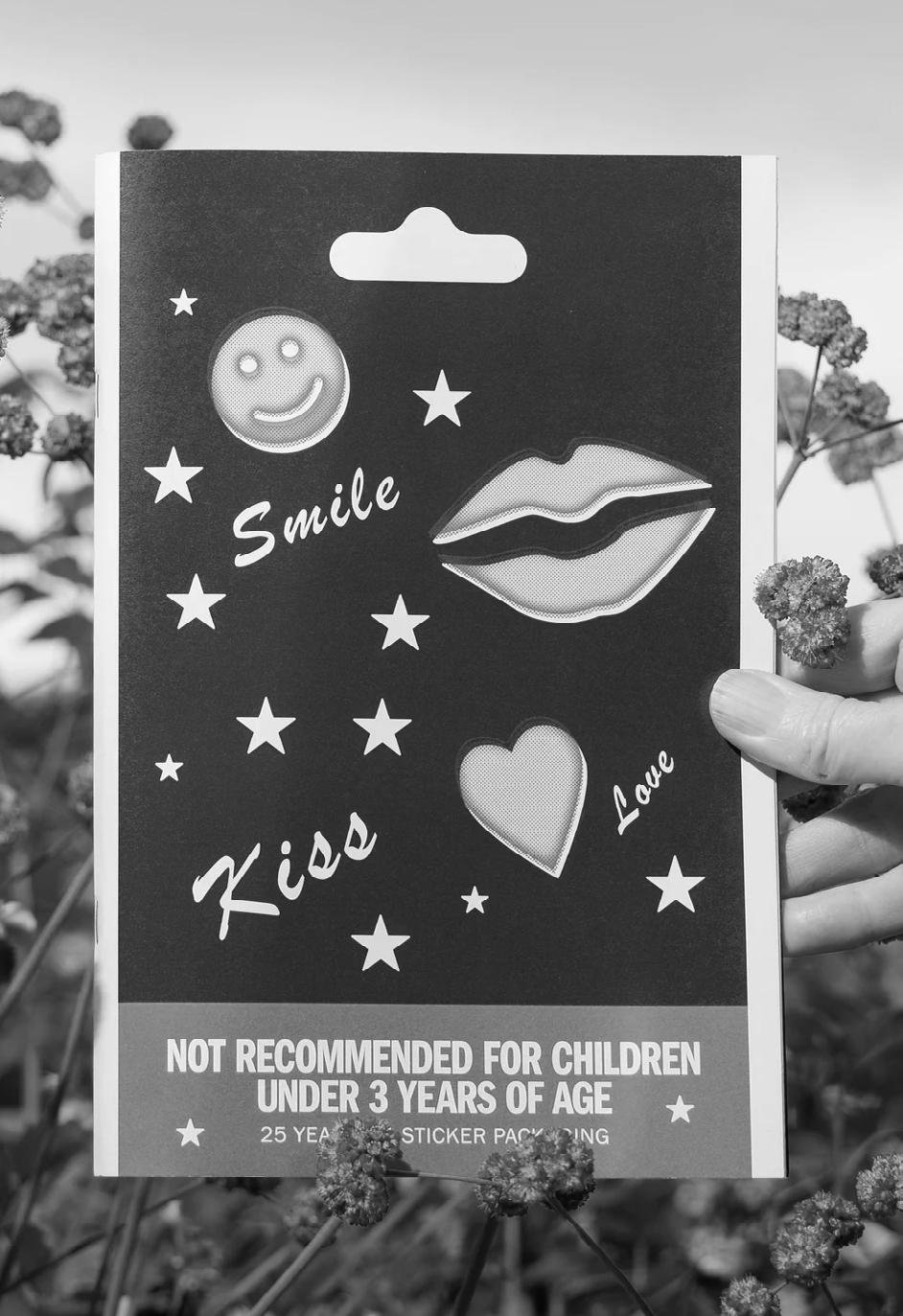
I think yeah, it’s really fun because I feel like in general, or the work that we produce as artists for our press, the topics are really wide ranging but super niche. We’ve only been doing book fairs since August, we did the LA art book fair and it’s interesting to see people’s reactions, because people will either come over, it’ll be like, Oh my god, I have to have this like the sticker book, or they’re like, really into candlepin bowling, or they’re like, whatever this is not for me and immediately skipped by a table. I kind of enjoy that. Like, I think the publication’s we make definitely produce strong reactions on different topics, which is what I’m going for. I think we’re kind of like maximalists, we always want to figure out what the line is, and like, push up to it or, what are the limitations of this medium and push up
← Figure 4 Not Recommended for Children
Under 3 Years of Age: 25 Years of Sticker
Packaging, 2023. Current Editions No. 7.
107
to that. And like, it’s fine. You know, some people might be like, nothing here is for me, and this is not my vibe. And that’s totally cool. But I like putting that out there. Yeah, I’m excited by this sticker book, probably like 85 to 90% of the people who buy are women, which I think is great. I just really like how publications can be a collection of something. And that’s the kind of stuff I’m interested in as a viewer. And it’s also the kind of stuff I want to make. So I realized, I’ve been saving these and I thought maybe I would make them into like an artwork. And then I was like, no, the artwork is the book, it needs to be the book. And I wanted them to be on black so it really highlights them in a crisp way. And, of course the cover had to be inspired by one of the stickers and Paul designed it. We both like how the printing on the label that we ripped off from for the cover was kind of offset and had this, you know, bit of like, misalignment in the printing. So I had to put that in the book, and it looks awesome.
That’s amazing. I’m always noticing the little things, even like cereal boxes when it’s not aligned.
JA Yes, it feels human.
A lot of my work in collage is figuring out how to cover up mistakes and adapt to mistakes you make in your work. But I really like collections and finding out what other people collect. Yeah, I’ve tried to like having a more minimal collection. It’s always something I’m interested in. I don’t know. So I think publications are such a great medium for that. And I really like making publications because they’re, like, so affordable to share with people. I make work that travels the world and lots of people can access it, because it’s affordable. They meet people from all over the world. So we’re making publications, and there’s someone with a writing
108
VV
background and theory background. I get to use that in my work, you know, even just a little intro essay, like I’ve always loved short essay writing styles.
And books are something you can collect, never have to stop buying!
JA For sure. You know, I have been going to art book fairs for many years. And I was not really collecting things. But now that I’m at them all the time, it’s like, I try not to go crazy. But I really think about how I now really like to collect things from people I get to know. Like oh, this publisher and I were neighbors, I want to have something of theirs. It’s a really personal thing for me, I tried to find, you know, a way to get to know someone else’s practice. And so those are things I value most.
I can relate to that 100%. My first art book fair I spent so much money, and I came home to this amount of beautiful things. But did I really love them? And not it’s not even something conscious, but at the end of the day, when I look at the things that I bought at the fair, I’m like, well, this person was so nice and told me an interesting story, and now I have this thing from them. But obviously you have a lot of passion towards every little detail of your work. But do you plan the reaction you want? Or is it just your emotion encapsulated?
JA I mean, yeah, not like specifically, but I do. The thing I was doing with the kids this week was about making user centered guides. So really thinking about who’s going to use this and what their needs are. So I was talking with them about this. And it’s like, I really wanted it to be funny, you know, and
109
VV
VV
find some humor so it’s like, there’s a lot of jokes in it. The reactions I kind of want from people change but there’s some similarities. Some of it is more personal, but I want people to find humor a lot of the time. I think that’s important because that drives us and connects us and makes us want to make the world better. I often make things where I want people to feel puzzled or feel like it’s mysterious on purpose like that in a funny way. I want people to feel joy, like those flower things on the buses that we were talking about. I wanted people to feel a sense of joy and celebration, and that you are walking down the street and you see this thing. That sticker book, I just wanted people to feel the joy and like appreciating these packaging designs. And also, I did know that for a lot of people, it is nostalgic, and probably people would have that reaction. And that’s a nice feeling, too. I think it adds empowerment, especially in my publications. I want people to feel informed, empowered, but also feel a sense of joy and celebration. So yeah, I haven’t consciously thought about it. But it is a thing. I’m thinking about it a lot. How can I like, you know, inspire, I want people to feel inspired. I want people to feel hopeful, and a lot of my projects. But yeah, like that class, that poster in the school’s ones. Sometimes I did want a poster that was mysterious or puzzling, because I was getting contemporary artists who are not always designers to make them and a lot of them like, have never done anything to be risk graph printed, or don’t have a design background. So I do like, especially in a classroom, I love the idea that students might be puzzled by something and be like, like, it still feels accessible and not like a tooth, or like out of their grasp. But you know, when I taught high school, I had a lot of my own art in my classroom just to fill the walls and student work. But um, you know, I wanted the students to feel represented that there
110
were like, artists from their backgrounds so that they could feel like art making was something they could do or that the quotes like that they felt part of the place. And then I like, you know, I had a collage that was like a compost pile of. And I put that in a classroom wall. And every so often there’d be a kid just totally spacing out to it while we were doing silent reading. And I’m like, Yeah, you needed a mental break, and you spaced out about that art. And that is the reaction I want people to have or like, you know, I also because my 2d work sometimes, you know, I like work that’s multi layered, that you might see one thing when you look at it, but like if you spend more time with it, or you get some info, you can be like, Oh, I can see that thing in it too. And it’s like, yeah, or issue, like multifaceted meanings. So it kind of is like a thing you can think about over time. So that’s a reaction I love when I get that from people where they’re like, oh, at first I just saw these flowers, but then I thought about this thing. So I don’t know. I like the layers. But yeah, I guess I am thinking about reactions a lot.
Just a link to the layers and and first glances yesterday, I watched this movie The Zone of Interest. It’s a WW2 movie. And at first glance, I was like, nothing’s happening but there’s something about it, that we don’t want to turn it off. We kind of want to keep watching it, but nothing is happening. And it’s in German and you’re like, I don’t get what they’re saying, but it’s fine, I’m intrigued. And then at the end I discussed it with my sister and my first thought was it’s gonna be those movies that show the life of the family. And then we were talking about it. And we’re like, but it’s kind of how
111
VV
society is now. There’s so many conflicts going on, everywhere, and so many political mistakes. And we’re just here living life.
Oh, you might, like I’ve been watching, Alia Solomon is like the most famous Palestinian director, and he made this film, Divine Intervention that kind of has a similar vibe, where it’s like, the dialogue is really sparse. This film is about a guy who has a girlfriend and they meet at a checkpoint because they live in the West Bank in two different zones. And there’s almost no dialogue, but it’s funny, like, a lot of his films are exactly about what you said, we’re living in Palestine, but we’re just people trying to live our lives. The absurdity of things that happen there. It’s multi-layered, you know, and it’s about this big issue, but it’s also like zoomed in, it’s like, the micro and the macro. Like, those are things I like, people are just trying to have a relationship, you know, but the macro thing is everything that their world is controlled by. I think I just like people!
VV
JA JA
Oh I love people. And I just love being happy. And I guess for you, going into teaching and being around high schoolers and wanting to show them the nuances of the world in such a fun way. You’re teaching them about heavy topics but making things accessible with a colorful piece of paper.
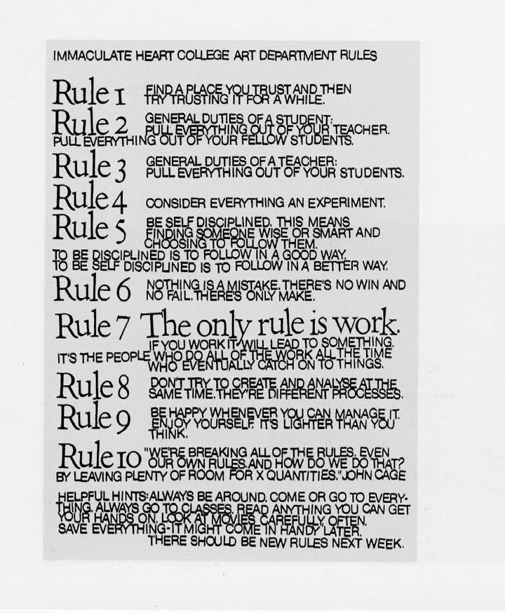
Do you know Corita Kent? She was from Boston, and you might have seen her 10 rules (Figure 5). So it’s like, one thing I was doing with the kids this week was talking about her 10 rules. And one of her rules is to be happy, it’s lighter than you think. It’s not as hard as you think, we can find joy in those small moments. I think it’s really important.
112
Yeah, and I guess translating it into everything you do. At the end of the day you’re thinking about what people want to feel its joy and, and even if it’s even a hard conversation.
JA JA Emotions are really important to consider because if we want to make change, and we want to make a better world, which is very important to me, and probably underscores my entire life, we have to make it a compelling place to want to be in and the joyful things and the things that make us human, even the more difficult things are what make us want to progress and move towards making a better world. It’s like that’s, like that feeling of awe and wonder and inspiration. Like, that’s why I think art is actually really important for people!
That’s beautiful! If you could say one thing that inspired you to become the artist that you are today and that you think everyone needs to do it. What would it be?
I think being curious about the world around you is really important. And so that includes, you know, a lot of my work responding to the people around me and the history around me. I’m always interested in the history of a place. So spending time to closely observe your world, I think is really important and just being present in the world. And I think also finding the things that bring you joy and engaging with those will help you do that for other people. And I think those are important. Most of my work is inspired by a deep engagement with the world around me. So whether it’s through stickers that I like, or seeing signs or the natural world, I think being an engaged person is the main inspiration.
113
VV VV
114
← Figure 5 10 Rules for Students and Teachers, 1967, Sister Corita Kent.
115
Multisensorial
116
117
Structure & Morphology
Oy, with the poodles already. The phrase is often used by Lorelai when she is exasperated or surprised. Me, Dhwani Garg and Kristen Davis had the same feeling as Lorelai when we discovered our mutual love for Gilmore Girls. The American television show that aired between 2000–2007 is set in the small town of Stars Hollow, and follows the lives of the mother-daughter duo Lorelai and Rory Gilmore. The show is known for its witty dialogue, pop culture references, and heartwarming moments. Lorelai and Rory’s close relationship is a central theme, as is their navigation of love, career, and family. We took inspiration from the themes of the show that were important to us. Why did we love Gilmore Girls? What emotions did we feel watching it? What emotions would we want to convey to someone who hadn’t seen the show? Watching Gilmore Girls is an experience. You’re supposed to curl up on the couch with your coffee and binge-watch twelve episodes in a row. It’s a comfortable show. It welcomes you to come and experience the coziness of small-town life with Lorelai and Rory. We knew we wanted to create that atmosphere in our project, so we let that lead the way. It had to be beautiful to look at and have that sense of loving comfort we all appreciate about the show.
118

122
123
124
125
126
127
Co-Creation
128
129
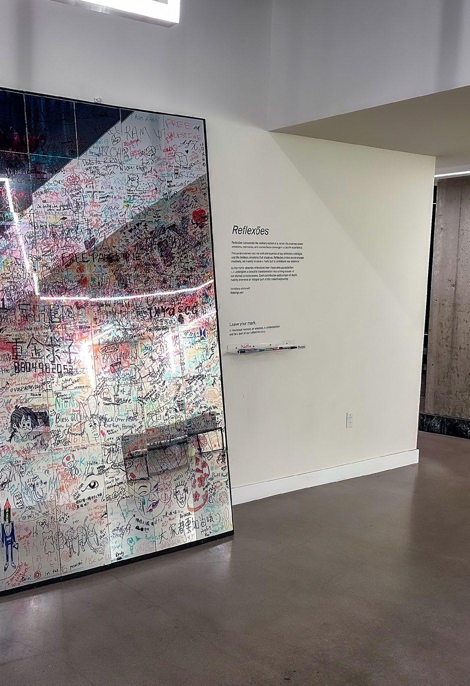
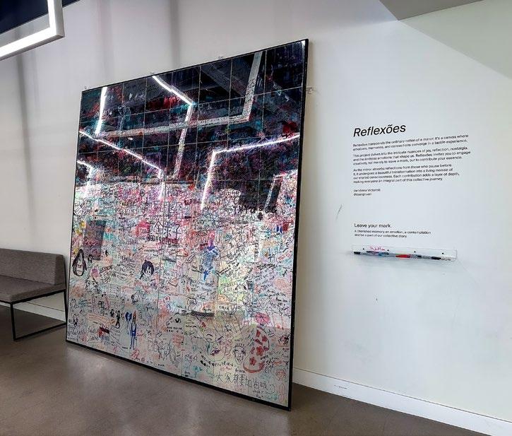
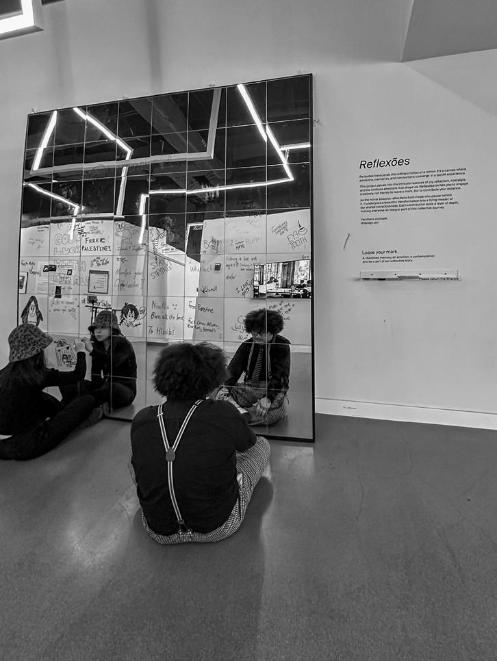
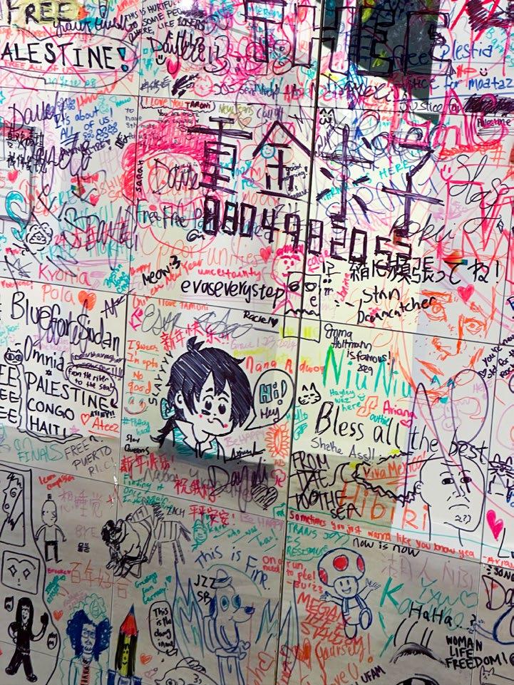
Reflexões
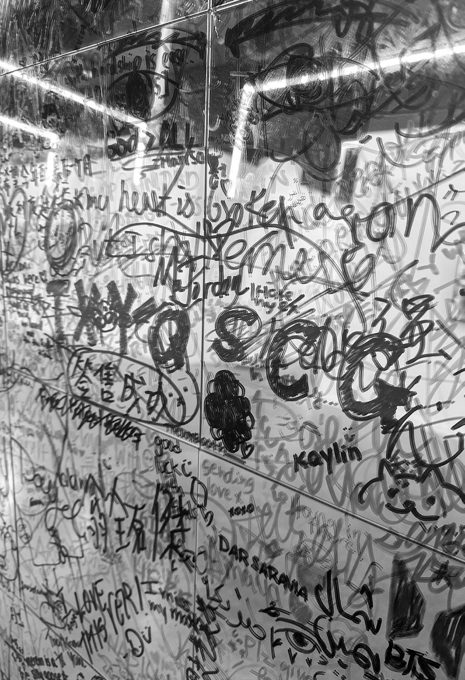
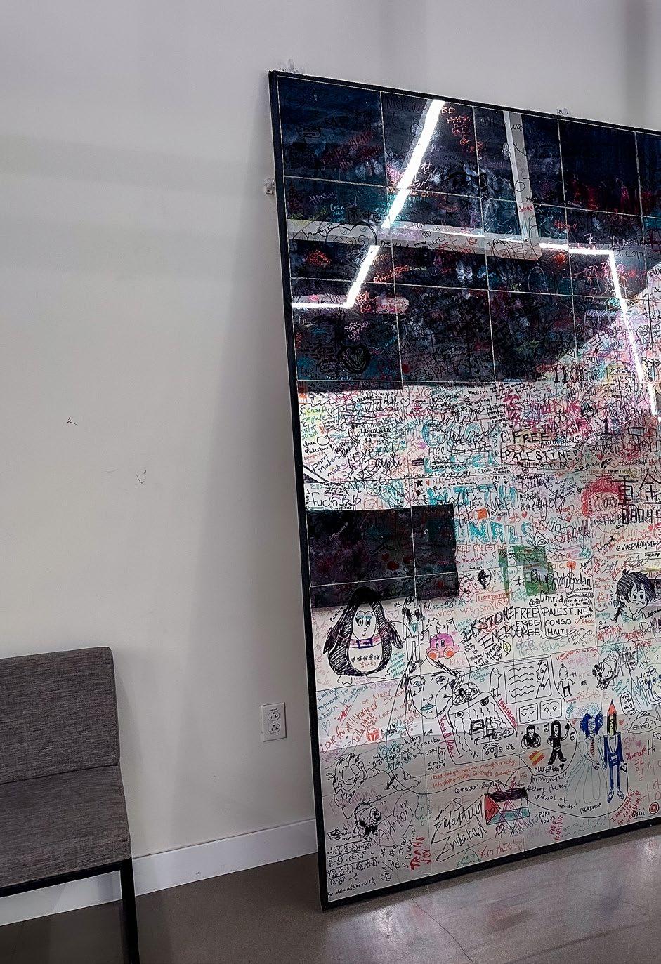
Reflexões transcends the ordinary notion of a mirror; it's a canvas where emotions, memories, and connections converge in a tactile experience.
This project delves into the intricate nuances of joy, reflection, nostalgia, and the limitless emotions that shape us. Reflexes invites you to engage creatively, not merely to leave a mark, but to contribute your essence.
As the mirror absorbs reflections from those who pause before it, it undergoes a beautiful transformation into a living mosaic of our shared consciousness. Each contribution adds a layer of depth, making everyone an integral part of this collective journey.
130
134
135
136
137
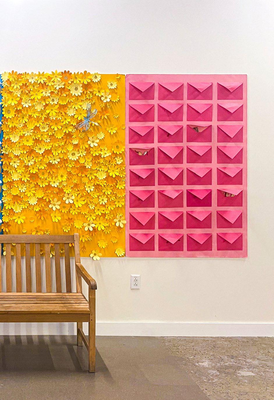
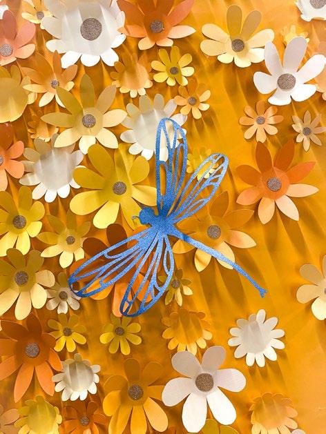
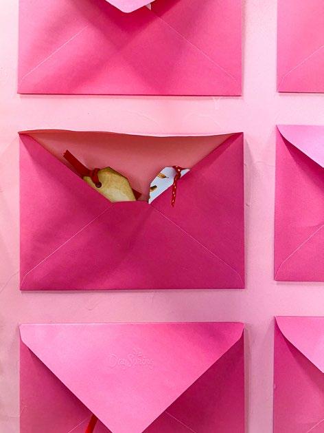
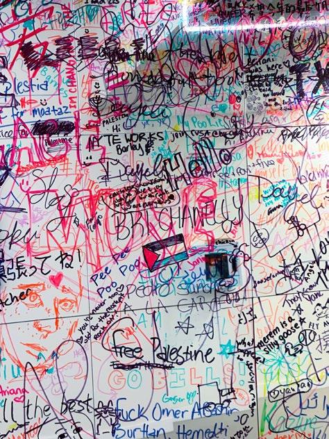
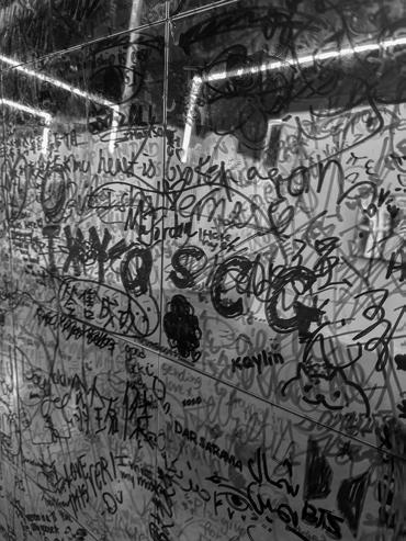
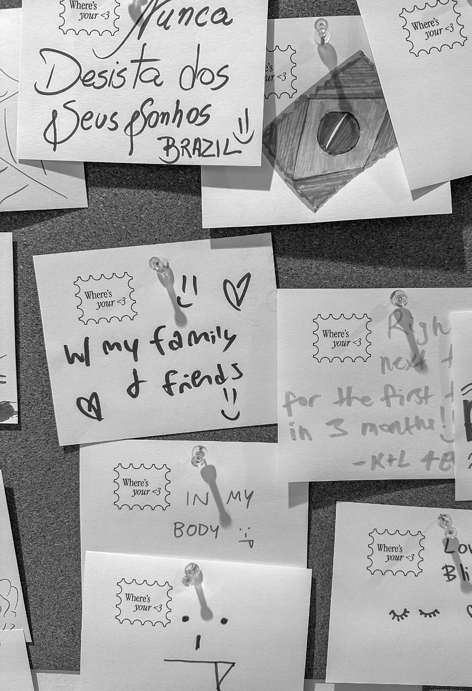
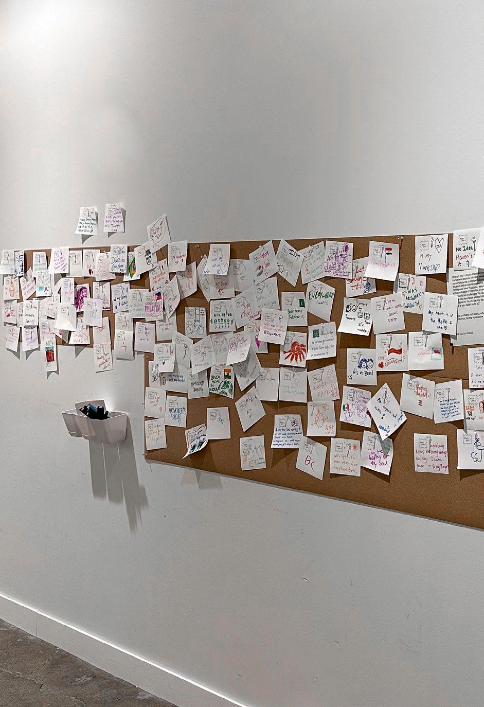
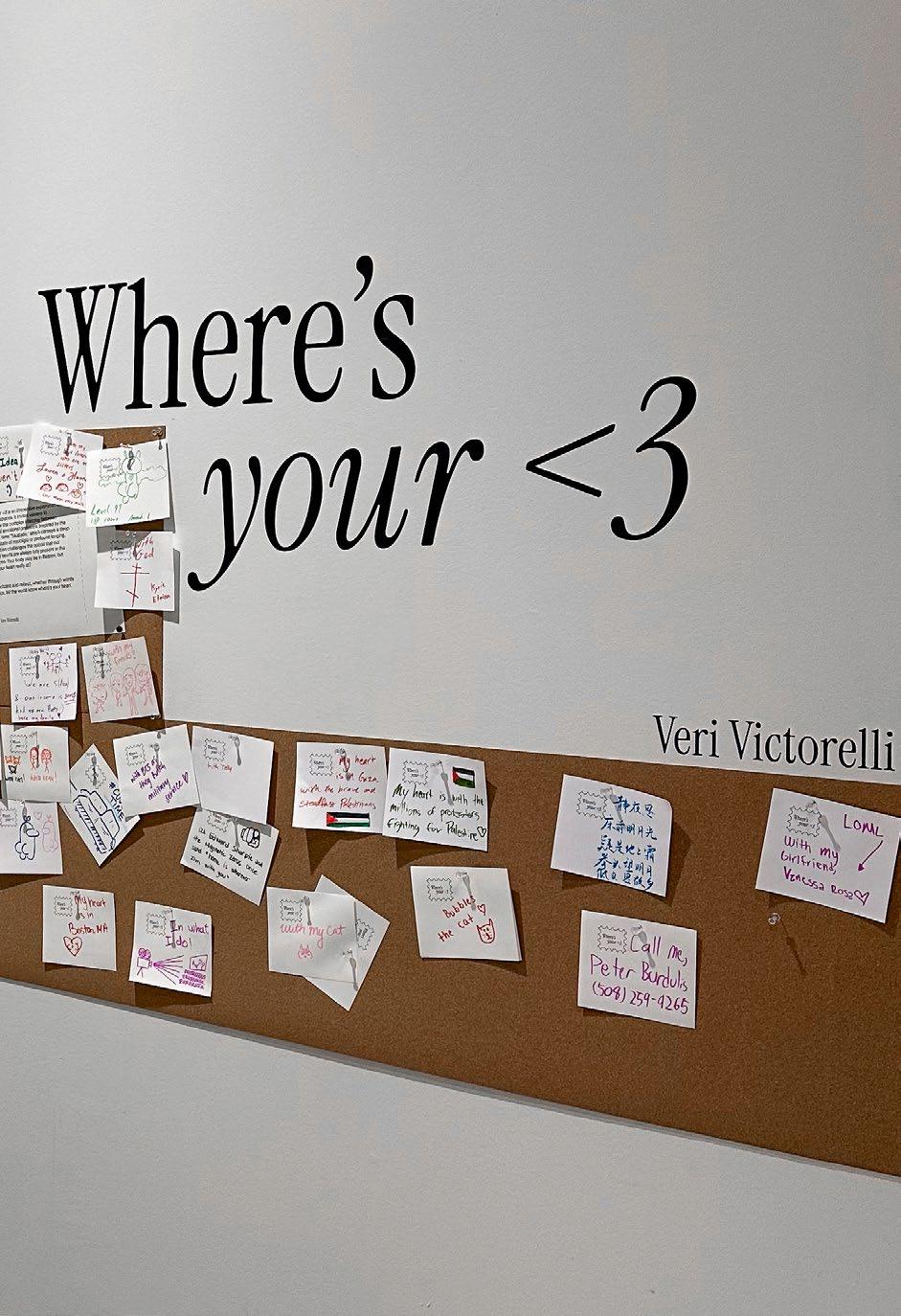
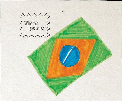
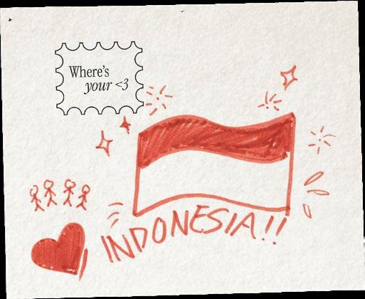
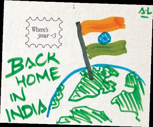
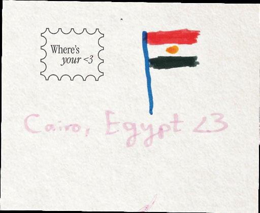
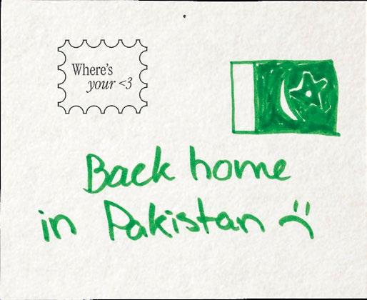
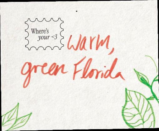
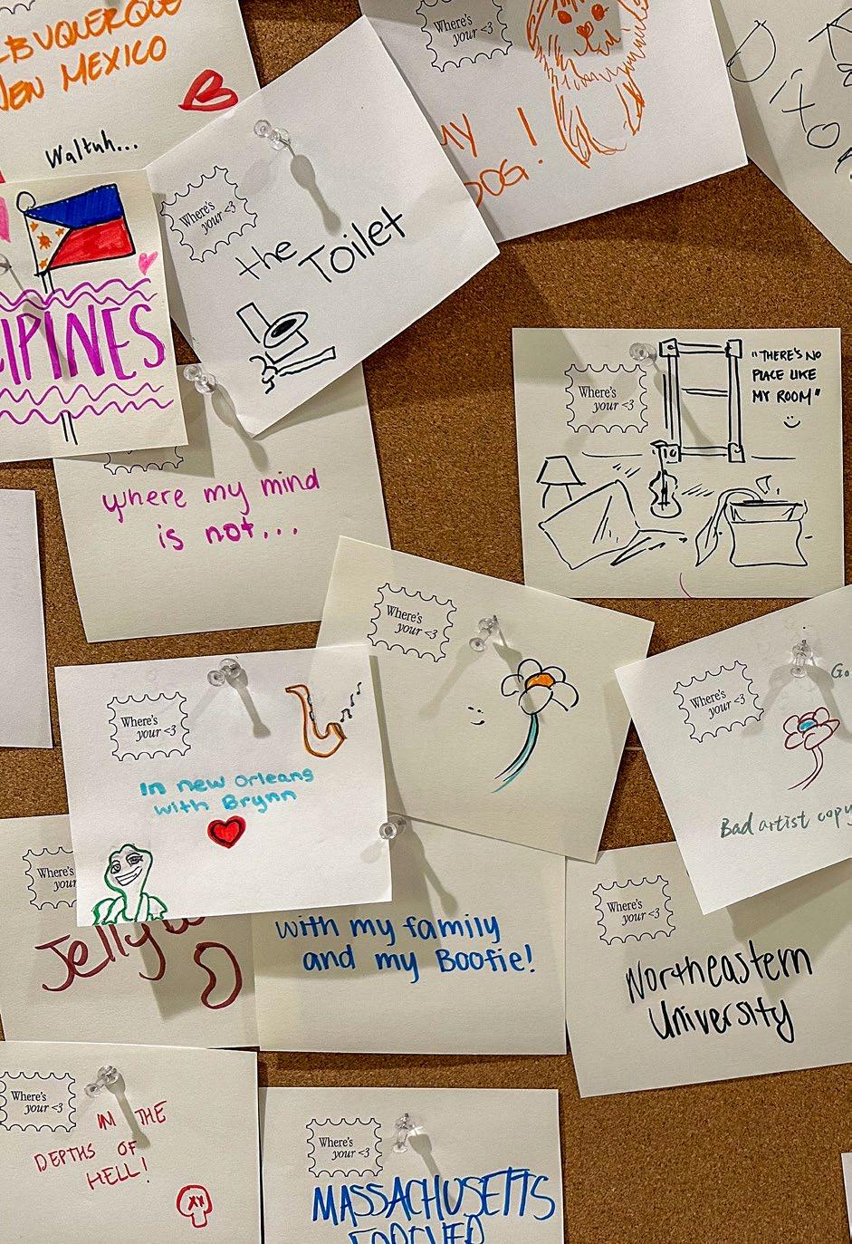
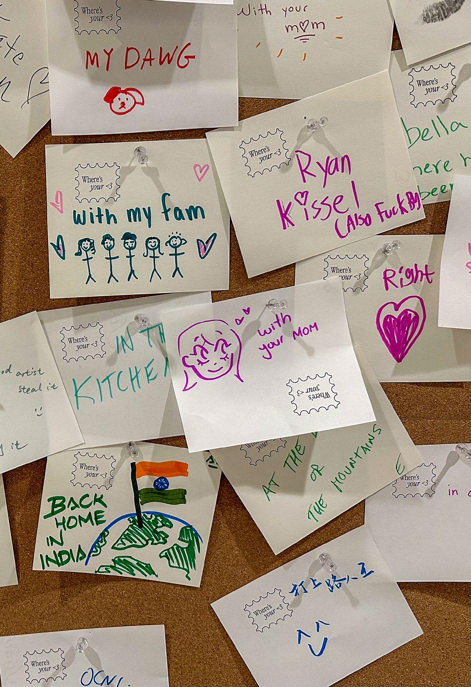
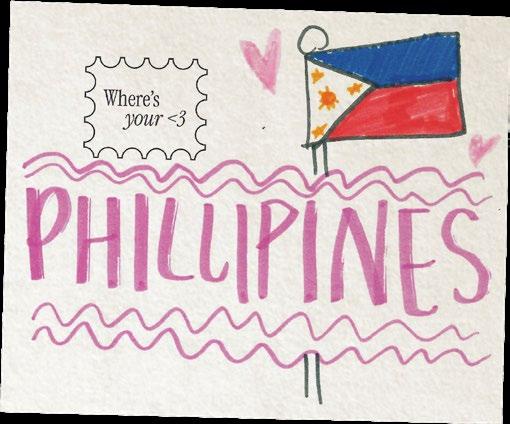
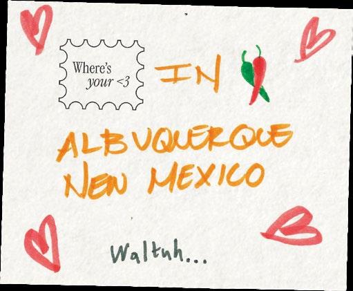
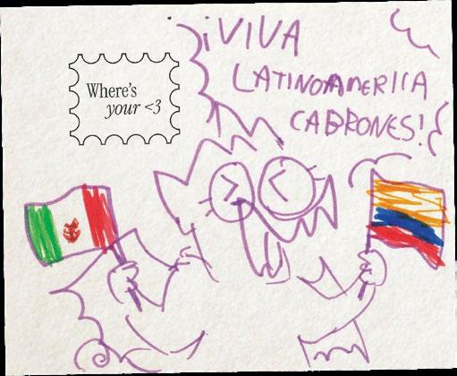
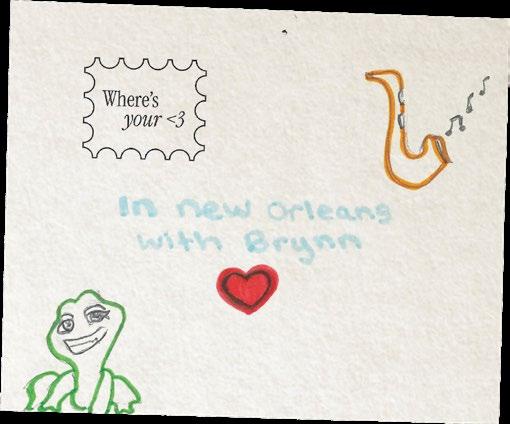
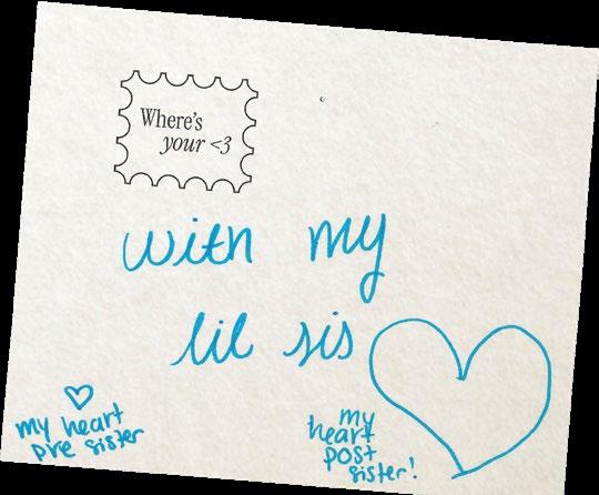
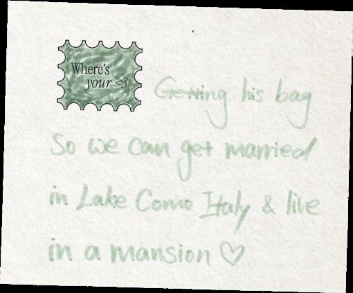
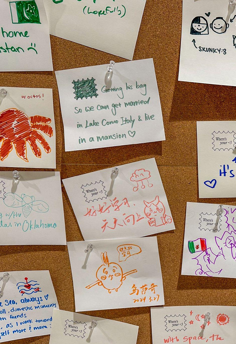
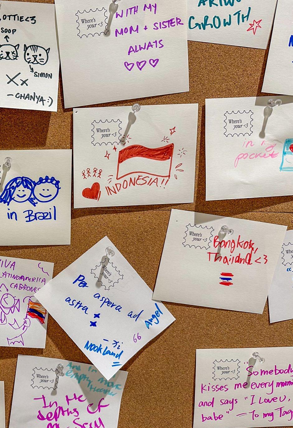
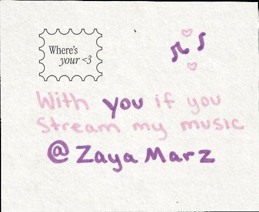
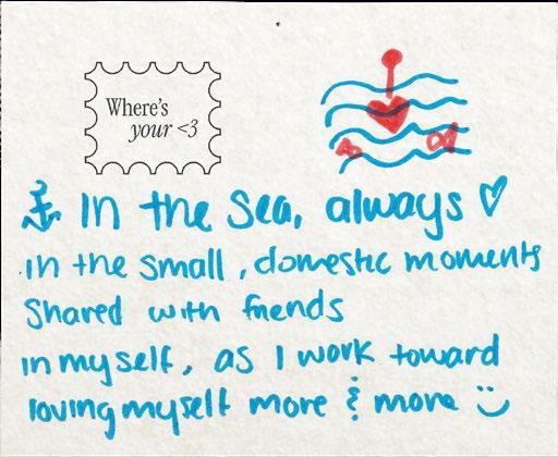
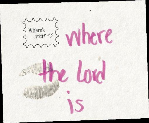
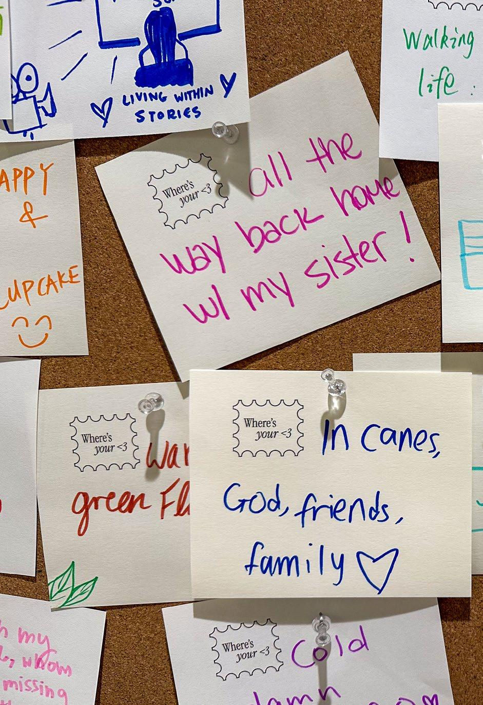
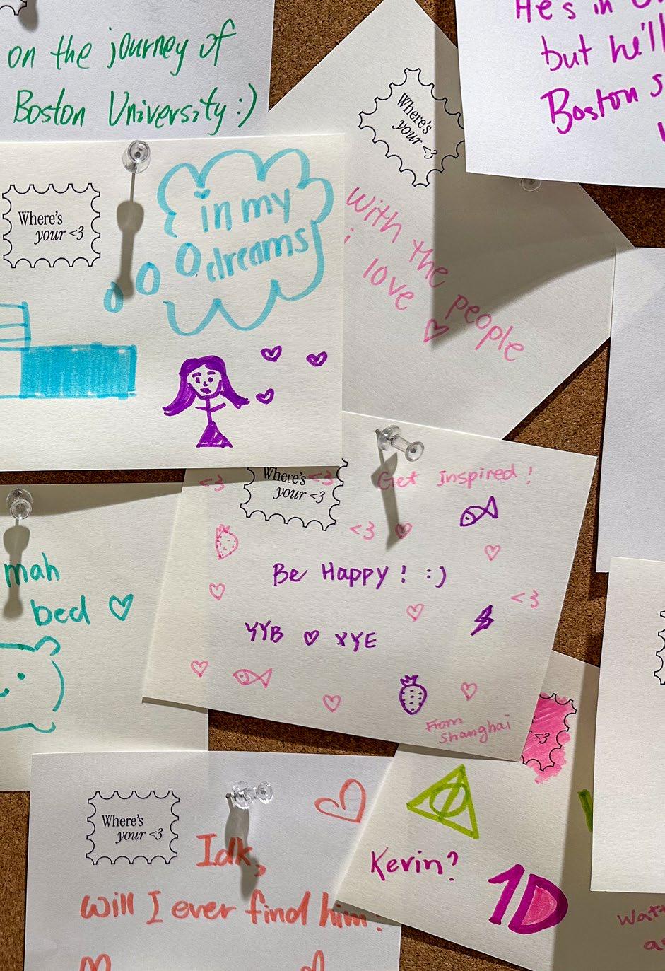
Where’s your <3
“Where’s your <3” is an immersive exploration of transitional spaces, or the ones we pass through on our way to somewhere else. They’re like the hallways, airports, or train stations of our lives. These spaces are not where we live or spend a lot of time, but we move through them regularly.
Located at Boston University’s Fuller Building, home to The Howard Thurman Center, the installation invites viewers to contemplate the complex interplay between physical and emotional presence. Inspired by the Portuguese term “Saudade,” which conveys a deep emotional state of nostalgic or profound longing, the installation challenges the notion that our bodies and hearts are always fully present in the same spaces. Your body may be in Boston, but where is your heart really at?
138
142
143
144
145
146
147
150
151
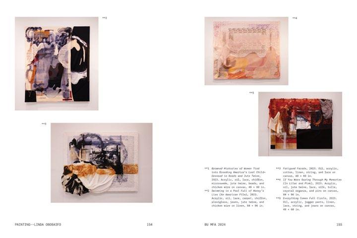
152
153
154
155
158
159
160
161
162
163
Experiences & Memories
166
167
Saudade
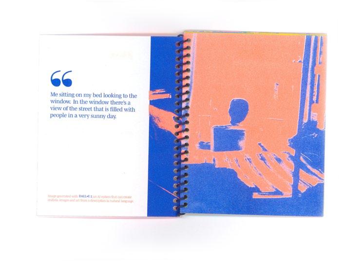
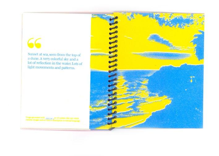
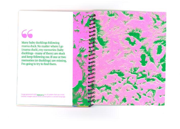
This project is based on the Portuguese word Saudade and the inability to translate that to other languages. Saudade is a bittersweet emotion of longing and nostalgia. One of the most famous expressions of saudade is the poem “Canção do Exílio” by Gonçalves dias, which reflects the author’s homesickness for Brazil. Through interviews with both Brazilians and non-Brazilians, the project delves into the intricacies of the feeling. The responses, as varied as the individuals who shared them, were transformed into stunning visual representations using DALL•E, an AI image generation platform. This collaborative effort between the creator and respondents beautifully captures the essence of Saudade showing how it feels to different people. It’s a beautiful way to explore a feeling that connects us all, even if we describe it differently.
168
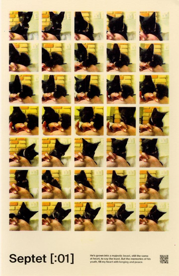
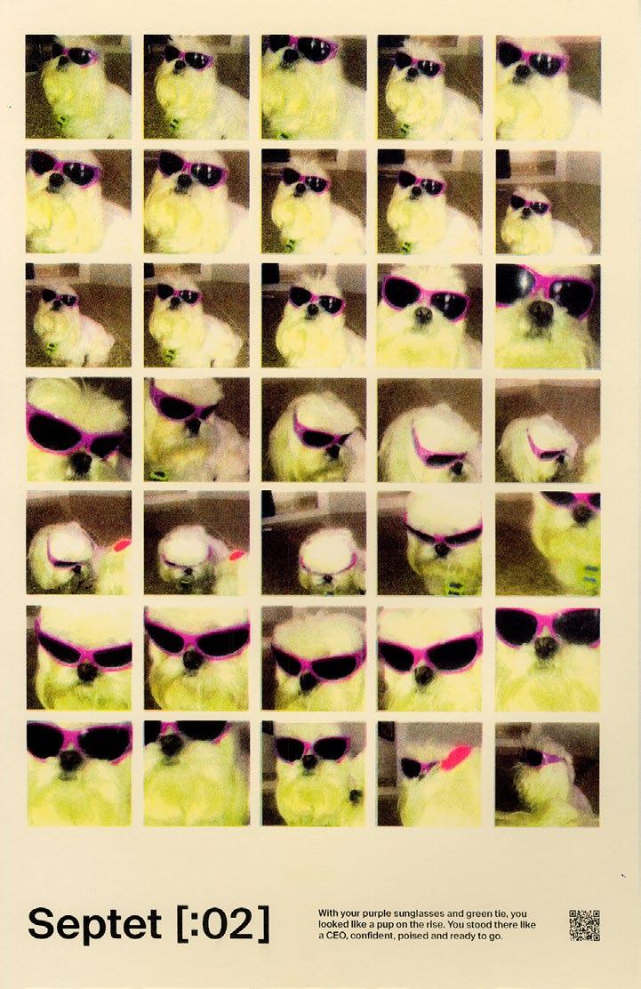
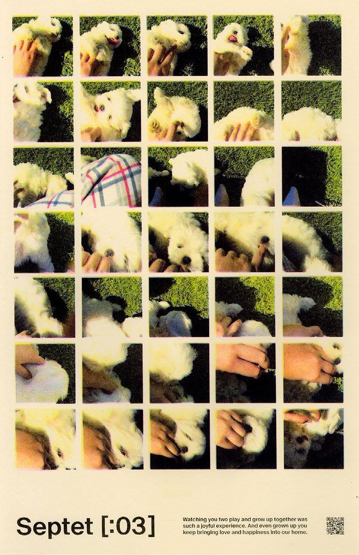
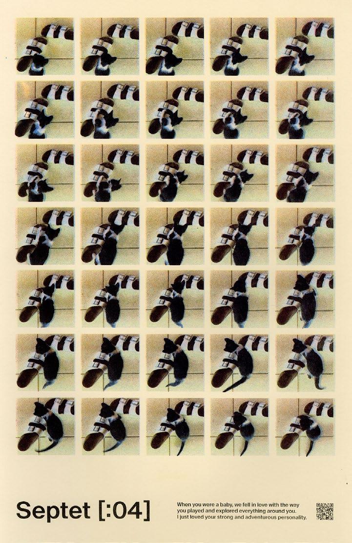
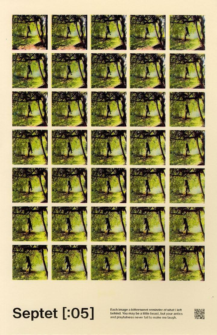
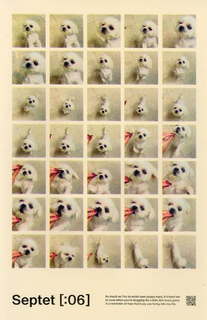
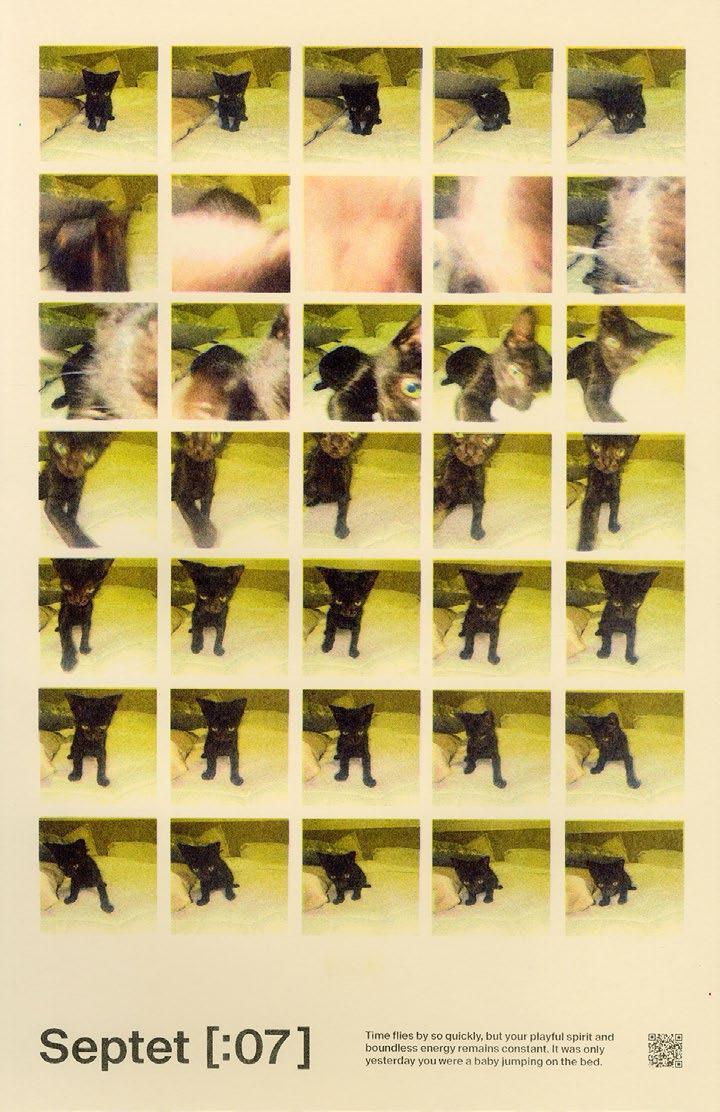
Saudade Septets
This poster collection is an exploration of nostalgia, longing, and the beauty of fleeting moments captured through the lens of memory. The seven Risograph printed posters delves deep into the essence of saudade, a Portuguese word that encapsulates the bittersweet yearning for something or someone absent, lost, or unattainable.
Each poster in this collection is a visual and poetic journey, crafted with meticulous attention to detail. The foundation of the artwork lies in the 35-frame animations, these animations were then dissected into 35 stills, with each still serving as the inspiration for a unique poster.
Accompanying each poster is a septet, a poetic form consisting of seven lines, carefully composed to evoke the emotions and memories captured in the video. These septets act as a bridge between the visual and the verbal, enriching the viewer's experience by offering a glimpse into the artist's emotional landscape.
176
178
179
180
181
182
183
184
185
Residual Chaos
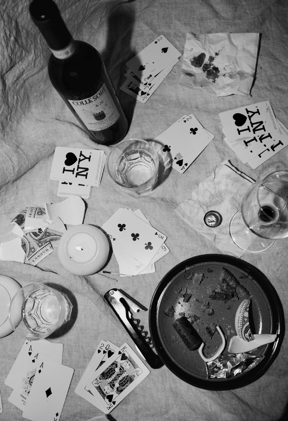
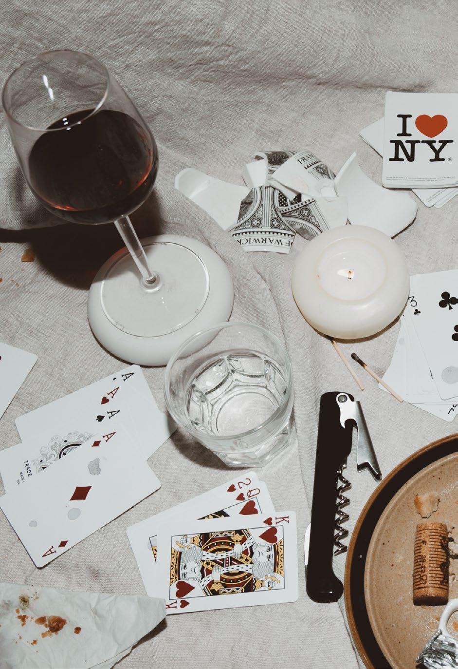
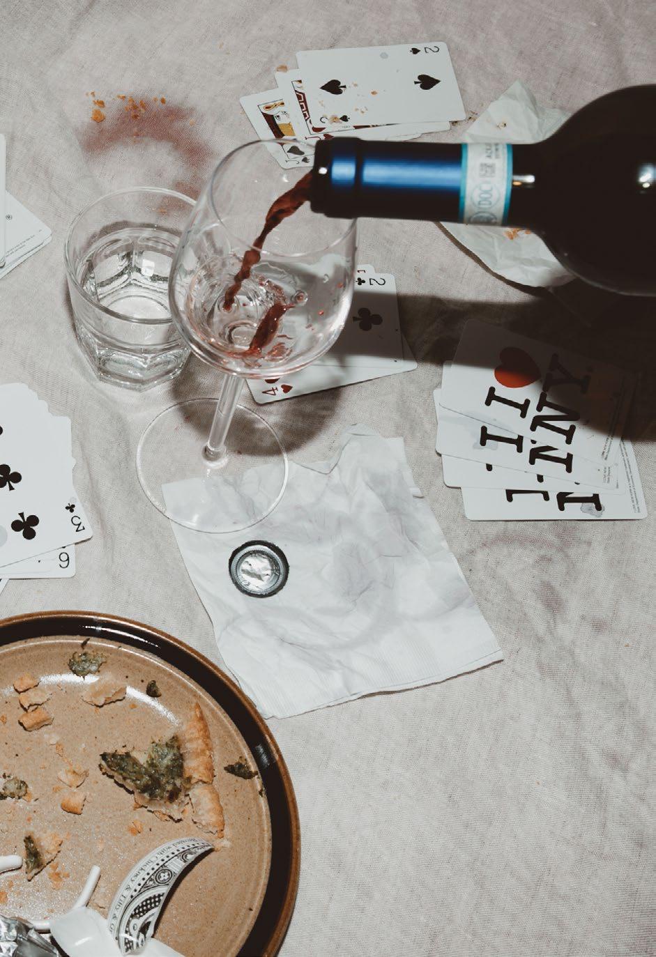
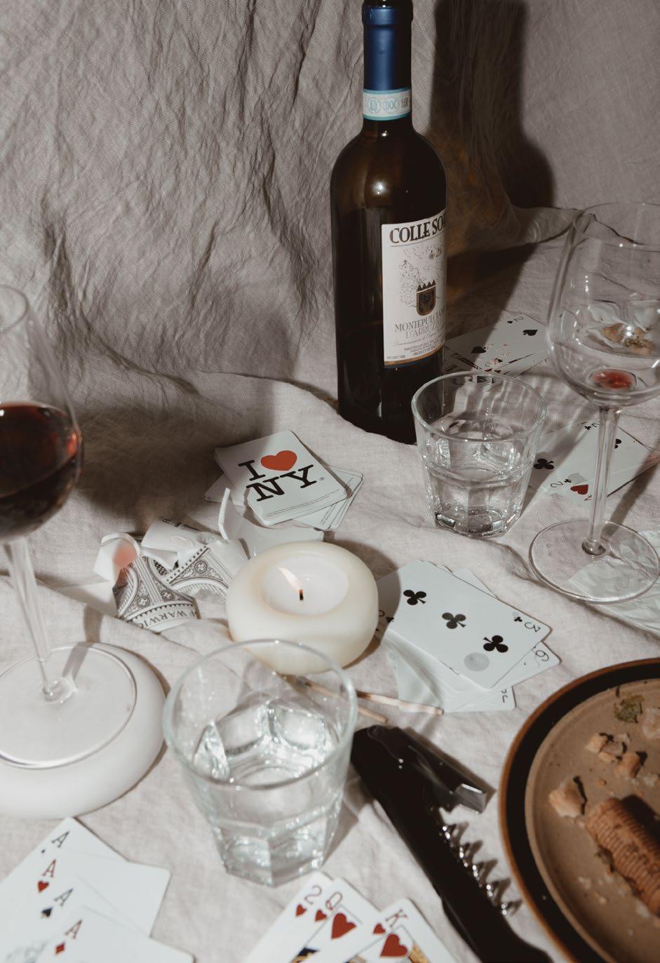
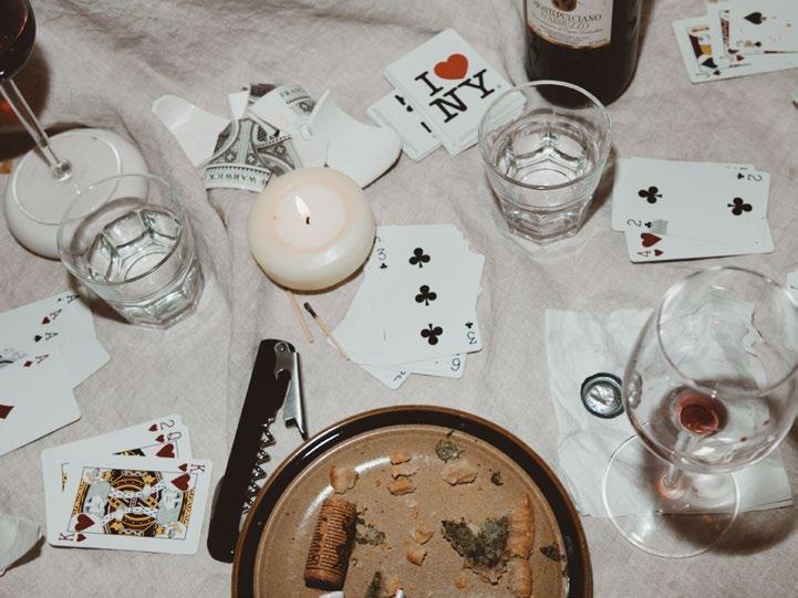
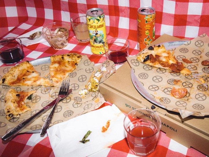
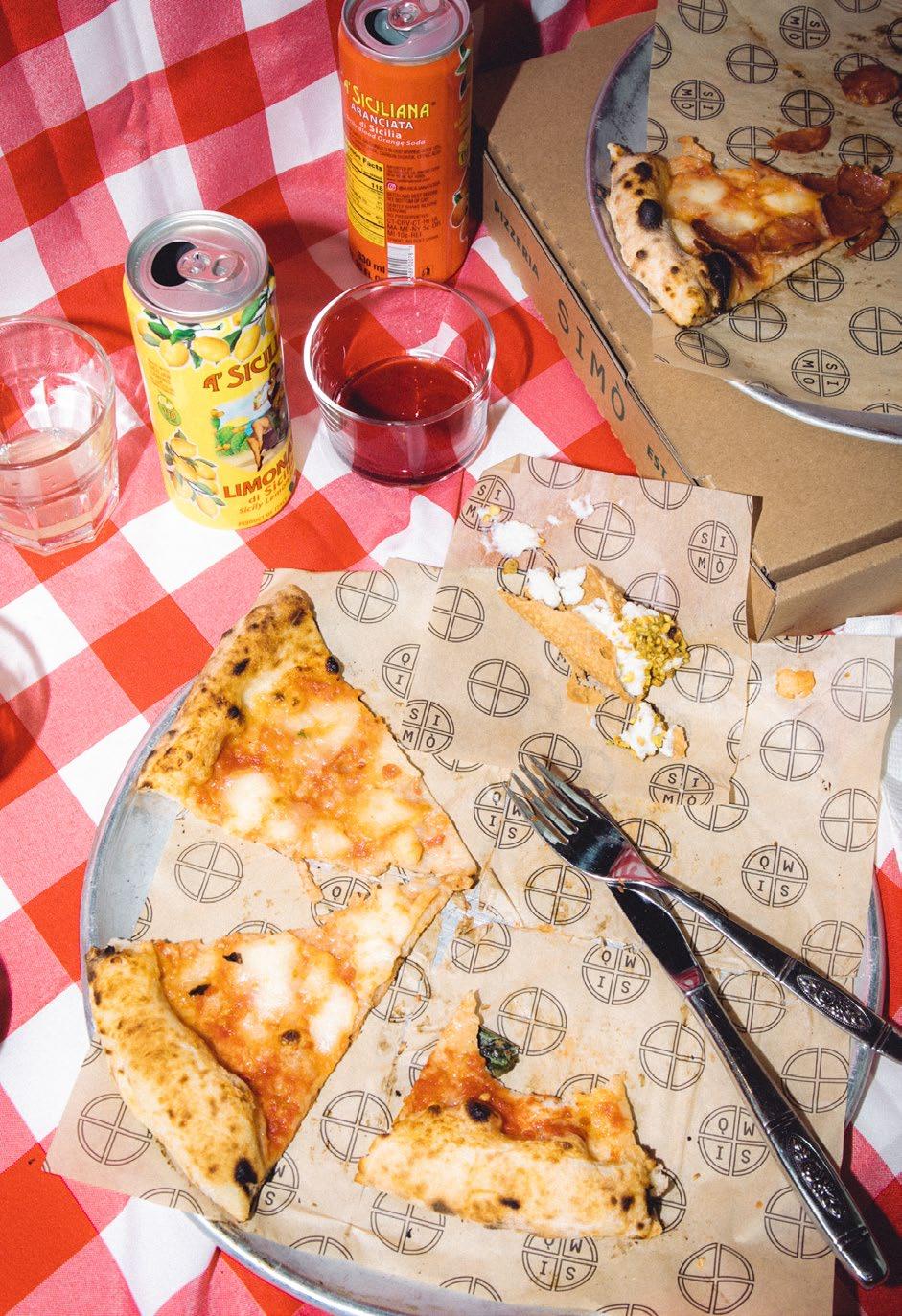
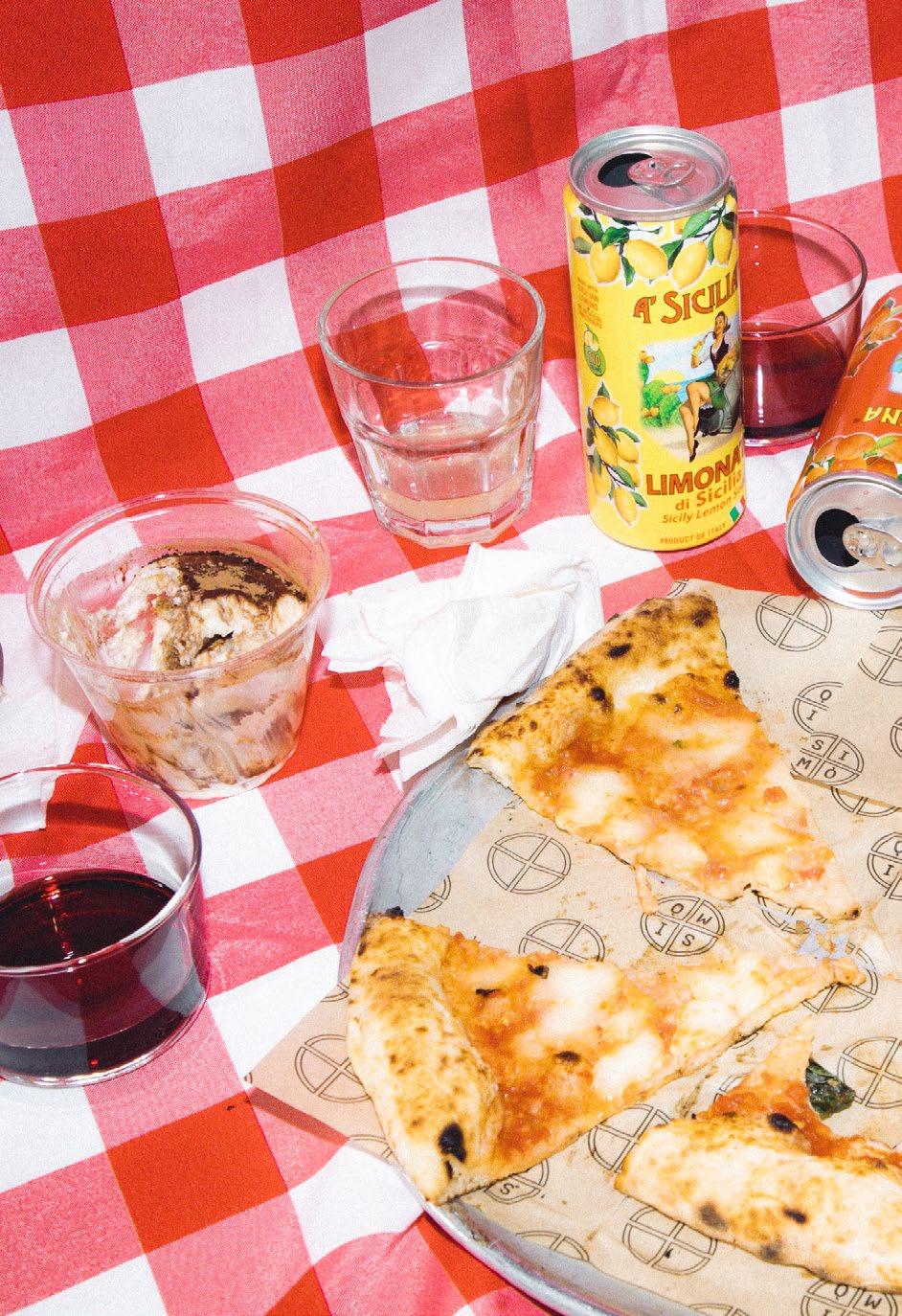
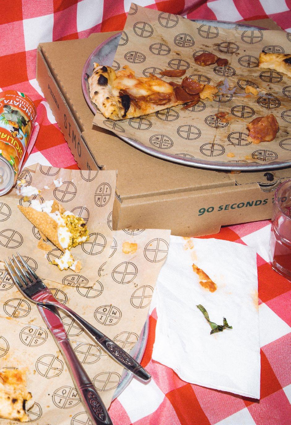
In my collection of photographs, I seek to immortalize the beauty found in the aftermath of gatherings with loved ones. Whether it's the scattered remnants of a pizza night with friends or the remnants of a wine and cards evening with family, I am captivated by the chaos left behind. To me, this disorder and randomness hold a unique level of structure and order, revealing the essence of memories that linger in the mess. Each photograph is a testament to the nostalgic and meaningful moments associated with the remnants of these gatherings, showcasing the beauty in the chaos that often goes unnoticed.
186
191
192
Histories
In this poster, I explore key events from graphic design history that have deeply influenced my approach as a designer, resonating with my interests in nostalgia, emotions, music, organized chaos, and anxiety. Inspired by the concept of emotional design, I aim to create a visual narrative that reflects the complexity and depth of these influences.
As a designer, I am drawn to the moments where design embraced chaos and evoked strong emotions. These moments remind us of the power of design to both reflect and shape our innermost feelings and experiences.
196
199
Nostalgia
200
201
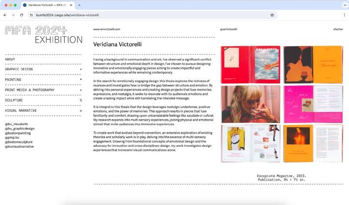
Escapista Magazine
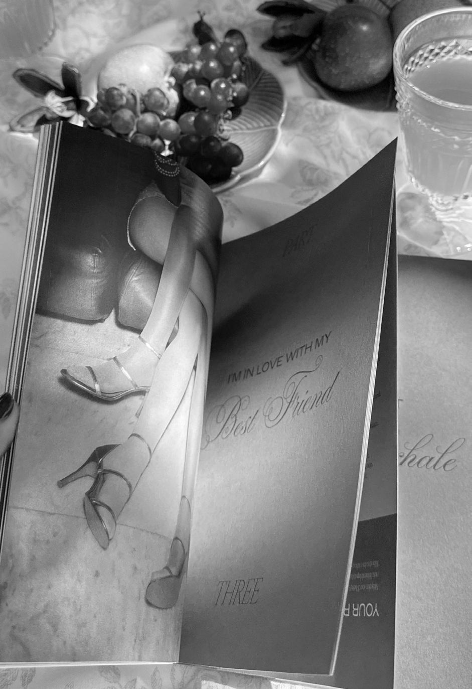
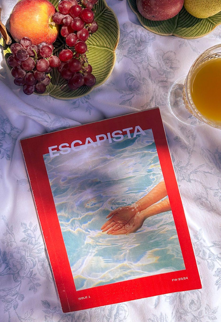
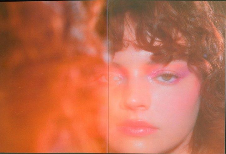
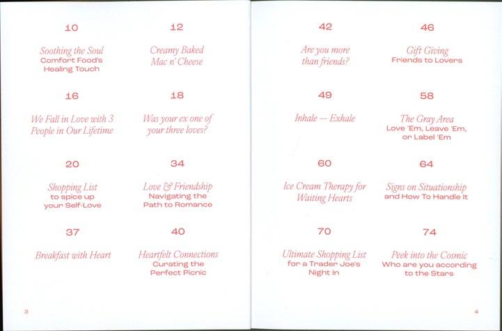
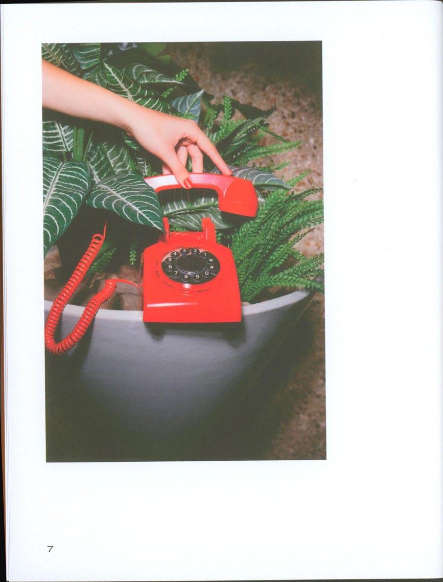
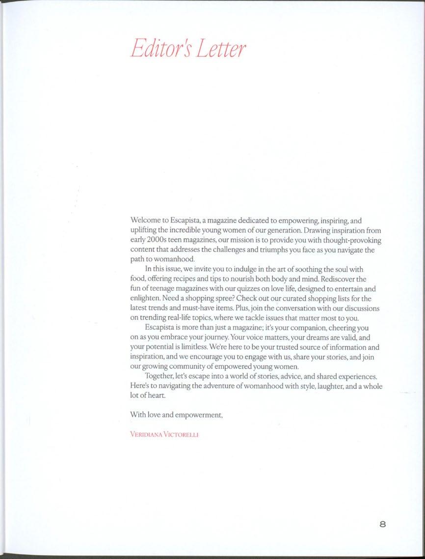
This publication was born with the combination of my love for romance novels and cooking. Inspired by the rebellious spirit of teenage years and the quiet strength of a shy girl, Escapista provides a safe and inviting space for women to explore their emotions and experiences.
Drawing from the essence of early 2000s teen magazines, Escapista's mission is to empower and inspire young women by offering thought-provoking content that resonates with their journey into womanhood. In each issue, readers will find a delightful mix of articles, features, and tips designed to nourish both body and soul.
202
205
206
207
208
209
210
211
212
213
216
217
220
221
222
223
Conversation with Elena Foraker
Explore emotional design through nostalgia, personal aesthetics, reality TV, personal experiences and girlhood.
224
Elena Foraker
Veridiana Victorelli VV FF
Do you want to just introduce yourself? How did you end up a graphic designer?
So I did my undergrad at Colorado College, and I studied fine art. We touched a computer, maybe one day of the whole program, it was not anything like graphic design. A lot of drawing landscapes. Then I graduated and started working in an art gallery in Oakland. And the part I was interested in was the little flyers we would give out. I was like, I want to design these. And then I had a long, hard look at what I wanted to do in my life. And I was like, something creative, but I don’t want to be selling people art. I hate being a salesman, or saleswoman. And so then I taught myself Adobe stuff. I worked on minted, and during that job, it was eight hours a day of illustrator just perfecting layers. And it was really soul sucking, but also showed me a bunch of designs that I hated. I feel like I actually got into design because I saw so much out in the world that I hated. I was like this is so [...] I need to make something better. And then, yeah, after that I applied to RISD. I did a three year program because I didn’t have a graphic design background. During my thesis year, I was doing an independent study project where I was making Not here to make friends (Figure 1). ButI hated the design that I made, it was just not well considered, or it didn’t have the time or mental energy. So then when it graduated, and it was pandemic, I decided to redesign it and actually publish it and make it real. And that’s how that kind of started.
I mean, I can totally relate to that, it’s almost like everything freezes, right?
Yeah, it’s true. It’s true. It’s like, what’s the point of making this right now? Will it go in my thesis?
225
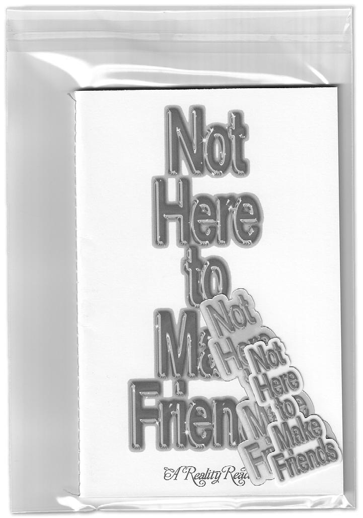
↑ Figure 1 Not Here to Make Friends Season
1, 2021. Zine by Elena Foraker.
226
Am I just making it for whatever reason? (haha) But it’s a great challenge, though, the fact that you’ve thought about it for so long. It probably helped, right?
It helped. It was hard though. Doing it after graduation. I remember I probably printed out like 100 spread layouts. I just could not. I was paralyzed. Or maybe it was the pandemic or something. But I could not choose a layout for my life. Because also you know, you’re used to having all this professor’s feedback, and then suddenly, you’re just on your own. But it worked out. And now I have a much easier time choosing layouts.
I mean, yeah, I think if you keep working on it and set a kind of creative vibe for it, it’s easier to make other iterations versions later. But since you touched on the Not here to make friends, someone could call the contents heavy subjects. It’s almost like you’re giving a critic to something but it’s you who made it fun, and digestible. How was the process? Was that an intention?
Yeah, um, so my thesis in grad school was about being both critical and celebratory of pop culture because I love all these shows. I’m not just coming in as a hater. But I want to hold myself accountable. And to the fact that you know, you can watch these shows, but there’s problems with them. And then also just, I think, I’ve gotten from my parents or from professors, this is trash. And I was like, well, actually, it tells us a lot about culture and a lot about bigger topics. And so kind of this was a Fuck you, I’m gonna make this thing and it’s going to be very legit. And I’m going to show you that these topics, whether this TV is considered a guilty pleasure,
227
VV VV
FF FF
I’m not gonna feel guilty. And I’m going to show you with these critical essays that I am thinking deeper when I’m watching it. And you can too. A lot of things I do, it’s just like a rebellion.
I mean, that’s your process. totally valid!
Should I prove my parents wrong?
Did they have a hard time accepting that, oh, I’m gonna be an artist?
Um, they’re always been supportive. But up until a few years ago, my mom really wanted me to go to business school still. I think now I finally have a legit job. She’s like, Okay, you’re not gonna go to business school.
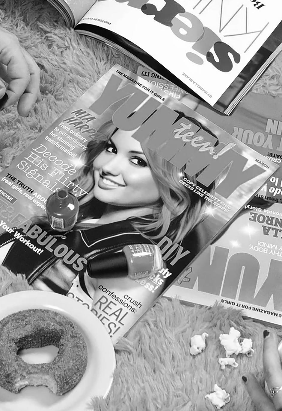
Now you’re on a payroll. But I guess that, that ultimately raises character a lot. Having to convince people that graphic design is a thing. But I think it’s interesting that you said that everything is about rebellion. How would you point that out in other work? For a Yummy Magazine (Figure 2), for example, how would that be a rebellion?
Well, that was not my own initiated project, I was brought on to it. But I think in the same way. You know, people consider things geared towards teen girls frivolous, silly, not of importance, and kind of taking this project that centers the teen girl experience as an important experience that a lot of people have gone through. And it kind of... I used to read seventeen magazines, etcetera, etcetera. And I don’t think those magazines are taken very seriously, even though they have such a big cultural impact. Being it good or bad. But also, it’s like all those years of reading those, were preparing me to make this project, it all works out in the end.
228
VV EF EF EF VV VV
That’s true. I guess it taught us that people can be wrong. In the long run, you know? I really love this project. And I love that it’s kind of nostalgic, and it’s almost like embracing this thing that we had, a memory of the experience of the 17 year old girl that would get that magazine and read it. Was that a choice? The content for teens is not appreciated, but the nostalgic effect really plays a big role.
Yeah, I mean, I think for me, the design was very nostalgic, I also looked back at a bunch of old magazines. Since the early eighties, and I was like holy shit, all this is hot right now. But I think, you know, specific typographic things that they were doing in those magazines, which were insane. But also, there’s just a massive amount of text and 12 different fonts on one page, and it was just like, Oh, my God! It brought me back. And also wait, I kind of do some of this in my work. I think it stayed with me. Maybe this is the reason I became a graphic designer, all the types. But yes, I was thinking about nostalgia. So this project came about because I had interviewed Elizabeth Renstrom for my thesis and so we’ve stayed in touch. And in my interview, she had said something about using nostalgia as a way to bring people into the project, it helps to draw people to whatever the thing is, and then once they’re looking at it closer, that’s when you can hit them with the real message. And I was like, wow, that’s true. I mean, that is working. And the content, I mean, hopefully some people were able to escape, but just so much stays with you. No one’s gonna love you, unless you’re really skinny or dramatic stuff in that sense. But yeah, I think using what people are drawn to, the nostalgic design, or oh, this looks exactly like the things I read in the early 2000s. And then once they’re looking they sense something’s weird.
229
VV EF
Yeah, and I think the AI, it took me a long second to look at it and be like, there’s nothing written on it. Like I saw letters, and my brain automatically, just assumed a meaning, you know? That was a great experience on my end! But what about other other work that you did, I think your whole aesthetic is something you’ve been curating for a while and, and now you can really tell. How did that come to be?
I don’t know. I think it just sort of happened one day in grad school. I was like, I love pink. Which is very antithetical to how I dress, I’m normally wearing all black. And kind of just, I kept finding myself drawn to pink and sparkles and glitter, and I was like, what’s happening? And then I kind of just embraced it. And then my professor, Bethany, the head of the program, hates the color pink. And so I was like, I’m gonna use it more, once again, rebellion. And then I saw it was kind of happening naturally. And then at a certain point, I was like, where’s this coming from? And then Oh, this is all super early 2000s. Everything I saw as a middle schooler has really come back into my life.
I read about this recently, or I don’t know, maybe it’s a TikTok, you know... The music you listen to when your brain was forming when you’re in middle school to college, it has a different neural pathway connection than music you’re gonna listen to now. So nothing’s gonna hit as hard as whatever you listen to back then. And I think the same thing is happening, nothing’s gonna hit as hard as the
231
VV EF ← Figure 2 Yummy Mag Teen March Issue, 2023.
visual stuff I was looking at back then. The glitter and the pink and the chrome and the bubbles. In my thesis there were two directions I could have gone. One was hyper femme middle school, and the other was death. Those were the areas of interest. And so it happened. I had more work in this hyper femme direction. So I kind of just went with it. And then, you know, I got hired to do similar things. It’s like, the more you put out there, that’s what people hire you for. And then it kind of just snowballed. And now I really enjoy making this kind of work. It’s fun.
Brilliant! I think that’s so interesting, I was watching High School Musical and listening to Hilary Duff.
Love Hilary Duff!
Oh, I love it. But tell a little bit of what you were watching and consuming? The big three... In my case it was, Gossip Girl, High School Musical and What Dreams are Made Of by Hilary Duff. You know, hey now, hey now...
Great song! I was watching so much reality TV. Everything you could imagine on MTV, I was watching. A lot of Gilmore Girls. I was really into Britney Spears, still am. The Kardashians, Sweet 16, Next,
America’s Next Top Model. Did you watch any of this?
America’s Next Top Model, yes!
Big one. Damn. I guess housewives is more recent and wasn’t watching housewives back then. There’s so many, a lot of reality shows I would come home [to watch]. Because I was an only child, I’d come home from middle school and just like to watch TV. And then, as soon as I heard the car coming in, I’d go do my homework. But I really consumed a lot of television. For sure.
232
VV VV VV EF EF EF
So interesting to see how experiences connect even though your experience in the US was similar to my experience in Brazil. But going back to Gilmore Girls, I am obsessed. I watched it when I was teen and I kept watching it till this day, it just goes on repeat.
Also I grew up in New England. So it felt real, felt similar.
VV
I think the whole point of watching it now – I saw a TikTok saying this – Gen Z is now obsessed with Gilmore Girls, because it’s the world that they want to live in, you don’t have social media, where you can only talk to people a few times a day or like in person or when you meet them in school. And we had this experience growing up, it’s such a nostalgic show! It is kind of the vibe of your visual, it’s not y2k or blingy or anything, but you get that from the show at the same time. VV
I feel like Lorelai sometimes, her outfits are pretty y2k. It definitely impacted me. I always wanted that relationship with my mother that she [Rory] had. I was not going to have that. So that was something I used to watch and just like to dream of, but I think, you know, I think I watched it in middle school. And then I did go to boarding school for high school and I do think maybe her experience at Chilton, although I don’t know how great that experience was, but it gave me a representation of what private school was going to be like. And also I think Rory was one of the characters on TV that was, you know, her whole thing was being smart. And that was cool, all that wasn’t bad. And coming from my public school, where it was lame to be smart. I was
233
EF EF
like, this is cool! I’ll go to private school too, like Rory. So I think back then it very directly impacted the choices I made to what I did in high school. And then it was funny because in high school, it was boarding school. That same year was when Gossip Girl came out and I was like, holy shit. Like, I was going to school with these 1% of the 1%, their dad like owned the Philippines. This is my life now and so on. It was too real. But I don’t know how Gilmore Girl affects me now. It’s been a while. I like to watch it in LA because we have no seasons. It has such a fall vibe in my mind.
How do I take a picture, like what? But so cool, being able to go to boarding school. Was it in the US or...? VV
Oh yeah, it’s always fall. Even though it’s like “I smell snow” and stuff. No, it’s always fall!
It’s never summer. And the lack of smartphones in that show. I can see why that draws Gen Z in.
Yeah, it was in New Hampshire. So it was only like an hour away from where I grew up. And it was... boarding school is fucked up, traumatic. I feel like a lot of my work is about the trauma of being a teenage girl. There’s so much trauma and being a teenage girl. EF EF
They never experienced it! We had the opportunity to have the upper hand on growing up with both. Now we can appreciate both, but I wouldn’t live without my cell phone (haha).
Oh, I went to lunch yesterday and forgot my phone. I was so uncomfortable. It’s like what do I do with my hands?
234
VV VV
EF
VV VV
VV
Oh, but being surrounded by so many people different from you, that must have been nice.
Yeah, there were a lot of people from all over. I mean, it was cool, great education, exposed to a lot of different cultures and people I wouldn’t have been exposed to. I think the wealth was insane. And really skewed my perception of my own worth or place . I was always trying to keep up with the Joneses. I would want a new dress and I can’t, I can’t keep up with that. And I think there’s just also a lot of, I mean, I don’t know what high school is like for non boarding school people. But I can imagine that there’s some grounding that comes with being with your own family at home at night versus in the dorms where it’s like, just pure chaos. Your chaos, it’s like very fun at times, but also just, you’re constantly surrounded by wealthy girls. I don’t know, there’s a lot of eating disorders, it just was a lot.
No, I totally understand that. I feel like in some capacity, we had very similar upbringings. One of my sisters went to boarding school in Cambridge, England with the princess of Bali. How do you keep up with that?
Also you’re like, 13? Just fucks with you!
And it gives you so much freedom at such a young age. One time I decided that I didn’t want to live with my parents anymore, I was 13. So I moved to Orlando, from Brazil, for eight months. I there doing my thing. And when you’re given that much freedom at such a young age, it’s almost like now I just want to be a kid again, and that plays a very deep role in whatever I’m doing. What about you?
235
EF EF
A lot of I do, it’s like Rebellion
things just a Rebellion
Interesting. Yeah, I mean, in school one of our mottos or something was like with freedom comes responsibility. That was the thing. And, I mean, I went because I was wanting to get away from my family, too. I was like, I want to live on my own. And I think you know, you mature faster. And maybe that’s why I like all the shit that I like all my girlhood things. I think I rebelled. It was rebellious. Once again, I don’t like authority.
I mean, I was definitely very prepared for college. It was like, this is nothing guys, go do your own laundry.
Oh, I was gonna say, it is interesting how girlhood is such a think piece. Everyone’s talking about girlhood right now and I was like, guys, I was doing this a long time ago (haha).
I mean, that’s true. But everyone approaches it so differently, everyone had a different experience growing up. And how do you put that in a bubble in a thing? And say this is how you talk about it.
And it’s interesting, in fashion. I mean, I guess I work in fashion, but it’s never something I imagine happening for me. But fashion is so obsessed with coquette, girlhood, pink, bows. Although I think that’s on its way out.
Oh, maybe. But it doesn’t mean that you can’t do it anymore.
It’s annoying though. Because it’s like, when something you’re already doing becomes a trend, people might assume you are just hopping on the trend or, like, if you keep doing it, oh, you’re late to the trend. I just, I mean, I guess I shouldn’t care what people think. But...
It’s just really hard.
238
VV VV VV
EF EF EF
...what’s my thing now?
I guess your thing could be just continuing it, it’s amazing. But that’s such a great point. Do you feel the need to change your work because what you were doing and you are doing became a trend?
I mean, I think I’m just more conscious of it. I don’t think I’m necessarily changing. I really like to always bring it back to glitter theory, do you know glitter theory?
No...
So, this was coined like a bunch of years ago, but it’s basically the concept of using pink hyper femme aesthetics as a form of strength. I can be serious and have pink tax, those are not mutually exclusive. And being extra aware of it, or choosing to make things super glittery. Kind of like Not Here to Make Friends as well. I can be serious and it can be hot pink. My mission is to make pink girlhood serious. Or like just deserving of the same amount of respect that whatever Euro dude is designing. (haha) I didn’t invent the theory, but I stand by it.
I love that you said Euro dude...
And I guess not that it became a trend, do you think it takes the importance out of it? It’s not you trying to be rebellious and presenting a heavy topic in a girly way.
I think it still has merit. Because although it is trendy to have girly things, it’s that trend is still being shit on. I’m constantly like... I had a conversation with people the other day from my program who are like years ahead or whatever, and they’re like, oh, why is it so [full of] these all these bows and literally, it’s like, even though it’s popular,
239
EF
EF EF EF EF
VV VV VV VV
there’s still the high academics or there’s a specific world of people that still don’t respect it. And that’s kind of the specific world that I’m often talking to.
I’m like not in academia anymore, but I still care about it. I think, I mean, I wish I had gone to art school as an undergrad, like, I just had such a good experience at RISD. And now, it’s just my eyes were open to this whole new, whole new social circle and thought processes.
I mean, obviously, it was very challenging, workload levels, but I think it felt so...I felt enlightened. And just felt like I really found my people. Which, you know, is hard to do in adulthood. I feel like a lot of people go through their lives not really finding people who are passionate about the same things as they are, I mean, most of my friends now are graphic designers because of grad school. And like, we just have this common frame of reference. I think grad school is such a special time. I loved my senior year of college, that’s when I was basically all in art classes. So then my reasoning was yeah, I can go into debt, definitely. The chances are, it’s just going to be like that again, but better. And it was. So I took that risk. And it paid off.
That’s great! Just to round up, what is, in your opinion, one of your works that you think best represents everything that you’re passionate about?
Probably Yummy Magazine and Not Here to Make Friends. Yeah. I think both of those are like my most recent. They really represent things I really care about. Just like early arts, pink sparkle, reality TV, pop culture. Rebellion.
Rebellion is a big word here (haha).
240
EF EF Academia.
VV VV VV
Well, now once I started saying that, like I can’t stop. And I mean, I do love publication design. I love books. I love to buy books and touch books. I love typography. So I think those really encapsulated a lot of things that I love and care about.
Since you touched on the topic of buying books, what drives you to buy the book?
Compulsion? Well, I grew up in a house full of books, because my stepdad was a writer and he just bought a lot of books. And from forever I’ve been really into books. And now I buy them for various reasons. This one’s pink. So I worked in Special Collections in our library in grad school, which was sick, because it was super empty. And I could just go back into the shelves and look through all these artists’ books and get paid to do that. And also, my dream is to have my own library at home. I love books.
I love them too. I mean, I am ashamed and not ashamed to say that I buy most of the books first because of aesthetics.
I, it’s so embarrassing, the amount of books I have not read. And then I tell myself I’m gonna read it and I don’t, but it actually is super helpful. And especially when you’re designing a new book, just to be able to hold it and notice a running header on the top left. Oh, that’s an option. Like, I always tell people to just steal, no one owns a centered header. Obviously don’t copy the layout, but you need to see things and see what you like and flip through it. It’s super helpful when you’re designing
It’s so good! I was gonna say, like, one thing that you could tell anyone to do. Let’s just say buy books.
Buy the books. Read them. Or not?
241
EF EF EF EF
VV
VV VV
Exactly. But I feel like technical books aren’t just to really read, you will need them at some point. And then you’re going to have them get the information that you need. But it’s not like you have to read about grid systems.
No, I don’t. I think I have the grid system book. I don’t think I’ve ever read it. Well, also Baggu buys books for me. So I’m like, I’ll just buy another book on the company.
How did you end up at Baggy though? Like you said briefly that you never thought you would work in fashion. How did it happen?
I ended up here because of this book. So they were designing it with my old thesis advisor. I was freelancing for a long time, but occasionally would like to send out these emails to every professor I ever had, like, I need a job. And so he emailed me saying that Baggu was about to hire a senior designer, I think you’d like them. And I was like, great. So he connected me and the co-founder of Baggu went to RISD so she knew it was legit. But I think his recommendation is what got me the job. It was very nice. After a year or so I was promoted to art director, which has been a super interesting learning experience. Like I keep telling them I still want to do typography. But yeah, it’s been good. Last summer, I did too many freelance projects at the same time, and it was bad. Now I’m just doing one freelance project on the side and it’s nice, I can do my little book design. And then the rest of the time. I’m planning photoshoots like that’s all they do. Which is interesting!
242
VV VV EF EF
I mean, but you come up with the concept. You create the whole vibe... But do you have the creative team underneath you? Of graphic designers?
Yeah. So I am, you know, giving them crits and stuff. Which is fun. It is interesting because in grad school, I was like, I’m never going to be a teacher. I would freeze during crits. I don’t know what I think about these things. I would not really talk in critiques. And now, many years later, I feel so comfortable giving feedback, I know exactly what I like, and what I don’t like. And it’s like, Thank God, Thank God. It finally clicked. I have opinions.
In school, you’re like I’m not better than anyone here... Why am I giving critiques to this person? And now you’re in a position that people expect and like that you give the feedback.
And I try to be a good art director to them. You know, I feel like there’s bad ones out there or not bad ones just like... I don’t know. I think, in the industry, there’s such a range of really terrible people to work for, to like, really great people to work for. So I want my team to enjoy graphic design, you know? I’ll give them fun projects that I could take for myself. But I want you guys to enjoy your job. Do you want to do this really cool collaboration? And they’re like, yes.
That’s nice. And you’re in, you’re still involved. You’re just not doing the type choice (haha).
Oh yeah. But that’s what I have my freelance for.
Do you only get clients now that align with what you want? And how did that process go? It’s not easy to get to a point where you can choose your clients.
243
VV
VV VV VV
EF EF EF
At first, it was, yeah, a lot of just saying yes to everything. And then it kind of just snowballed where it’s what you put out there is what people are gonna hire you for. I am at the point where I’m not going to do a job where they just want a graphic designer, you have to want my graphic design for me to work for you. It’s just going to be miserable for both of us. I mean, I did this tooth gems book (Figure 3), and now I got hired to do a nail art book. What am I doing? But then people, all these people who have their tooth gems in this book are really excited right now. And so it makes me excited. But it started a few years ago that people started coming to me for my specific work. I think that’s also, I’ve tried to use Instagram to really put myself out there even though it’s so embarrassing. I think I’ve gotten a lot of work from Instagram, so gotta give it its props.
I mean, yeah, I think Instagram is the platform now. Unless you’re a TikToker. And then, like, Who has the time!
It is interesting, though. How TikTok has raised this whole generation of people who can make videos. They know about cuts and like, frame rates and transitions, it is a whole specific skill set that people are just learning growing up. Which is interesting, because I am not a video person. But it’s a specific skill set that I think a lot of the youth are going to have.
Oh, yeah, I mean, we grew up on Tumblr, on CSS and HTML, and we all became either coders or graphic designers. We’re gonna have a lot of filmmakers and directors eventually.
Well, I have a final question. I briefly mentioned emotional design. If you had to, like, find emotional design in your work, how would you define it?
244
VV VV
EF EF
↑
245
Figure 3 Tooth Gem Style BEDAZZLED SMILES FROM AROUND THE WORLD, 2024.
I mean, it’s a design that makes you feel something, right. Or either makes the viewer feel something or is communicating my emotions. Like my SVU Dead Girl website. I think it is like maybe my strongest emotional design piece. And I think it works in both ways. Like, it conveys my own, you know, being upset with all these dead girls in media and like, how that’s an actual reality of the world, that violence against women, but also the design of it, the way that it’s such a barrage of these graphic images, it’s supposed to make you feel disgusted. And I think it works in that way and makes you reconsider. Like, why is it that we have so much dead girl media? Why do we love that? Or why do we consume that? So I think that was also a really crazy project for me, because I did it during a winter session, like a really condensed period where I watched 100 or something episodes of SVU Dead Girls, and just took a screenshot whenever you saw the dead girl. And so it was just hours a day of that same show, and then I couldn’t go outside at night alone. It affected me. I was like, I might be killed.
Perfect! One last thing, what changed a lot for me, and my process was knowing that I read a lot of romance novels. And I think you’re. I think I already know your answer but what’s the one thing that you think dictates a lot that you do?
Reality TV. Love Island, The Bachelor. Damn, I’m watching so much Below Deck. Yeah, I love reality TV.
What would you say is the one show everyone should watch?
246
EF
EF
VV VV
Well, one that I keep recommending to everyone is Below Deck. It’s very interesting. It’s kind of like Downton Abbey and the above ground/below ground, the rich people, the people working and you learn a lot about boats. And it kind of makes me feel better about working, they’re working so hard. Like I can work hard too. It’s inspirational. It’s also just great, great drama. I think everyone will love Below Deck. I recommend it.
247
EF
Part Three
Making Beautiful Things
248
The search for beauty in the design world goes beyond the mere aesthetic; it becomes a conduit for evoking joy, nostalgia, and profound emotional responses. While my thesis explores the emotional aspects of design, it's crucial to acknowledge the value of crafting beautiful things for the sheer pleasure they bring. Aesthetics play a pivotal role in our daily lives, shaping our environments and influencing our moods subtly yet profoundly.
Even when not explicitly working within the framework of emotional design, a piece's aesthetics can spark delight. Think of a well-designed chair that provides comfort and pleases the eye with its curves and textures. Or consider a beautifully illustrated book cover that draws you in before you even read a word. These examples highlight how the craft and design of everyday objects can elevate our experiences, adding a layer of richness and beauty to our lives.
In a world often filled with challenges and complexities, the ability of a beautiful design to uplift and inspire should not be underestimated. Whether through thoughtful color choices, harmonious proportions, or intricate details, the pursuit of beauty in design can bring light and positivity to those who interact with it.
249
The title, meaning "mixture" or "blend," reflects Mélange's essence: a celebration of the diversity of graphic design around the globe. Through the publication, I explore and showcase the unique styles, techniques, and cultural influences that shape graphic design in different parts of the world.
In this inaugural issue, I explore the vibrant landscape of Brazilian graphic design, where creativity and sustainability intersect to form a unique artistic identity. And also shine a spotlight on the rising stars of Brazilian graphic design, showcasing their distinct styles and exploring how the country's rich cultural heritage informs their work.
250
Mélange
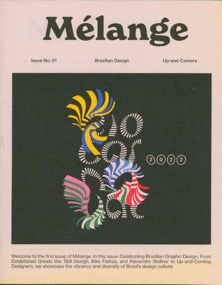
252
253
254
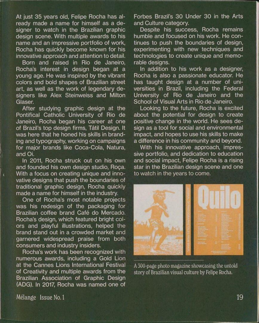
255
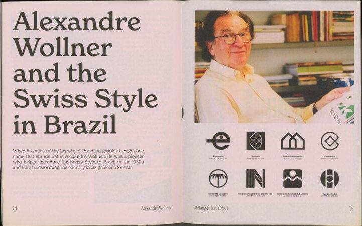
256
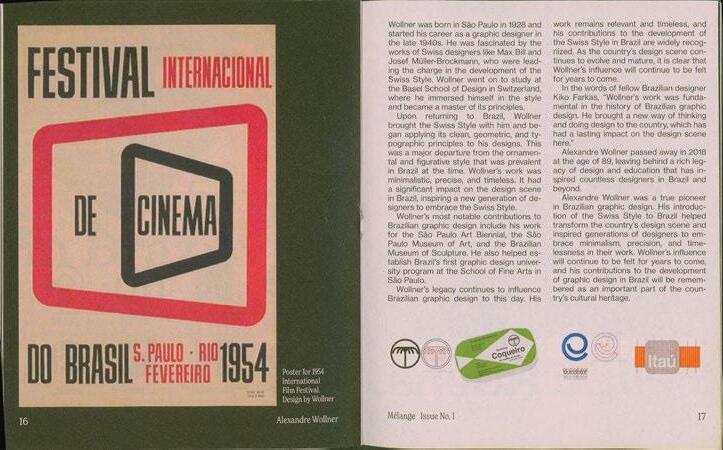
257
Cybèle Varela Monograph
Unlike traditional books, artist books are a form of art themselves. They can take many forms, from handmade, limited editions to more widely produced publications, but they all share a common trait: they are a medium for artistic expression.
In this artist book, I present the world of Cybele Varela, a Brazilian artist whose work is characterized by its celebration of life's complexities, capturing the essence of human emotions and experiences. Through her use of vibrant colors, intricate patterns, and bold strokes, she invites you to explore the depths of her imagination and the beauty of her vision. .
Many of her pieces come in three canvases, each telling a unique yet interconnected story. To honor this aspect of her work, this book features fold-out pages that mirror the triptych format, allowing you to experience her art in its intended form.
258
261
262
263
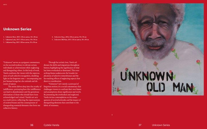
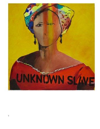
264
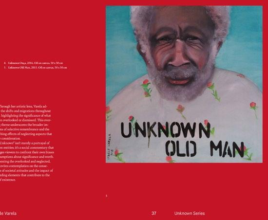
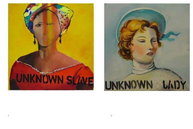
265
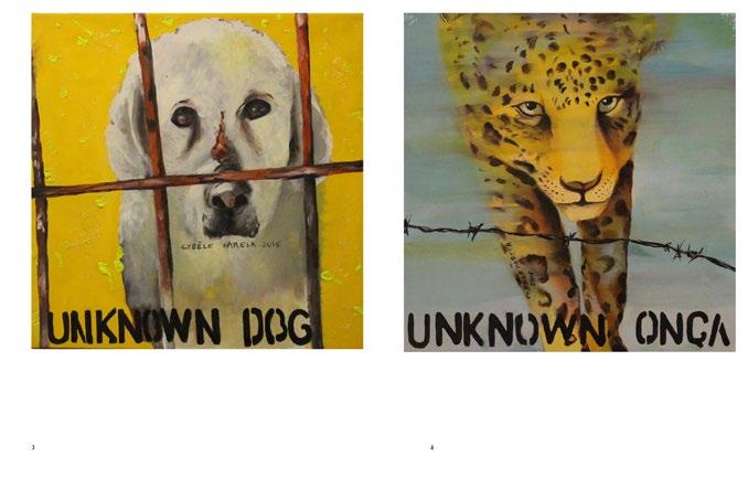
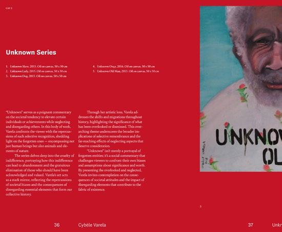
266
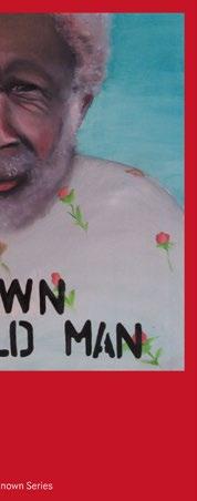
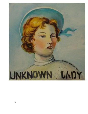
267
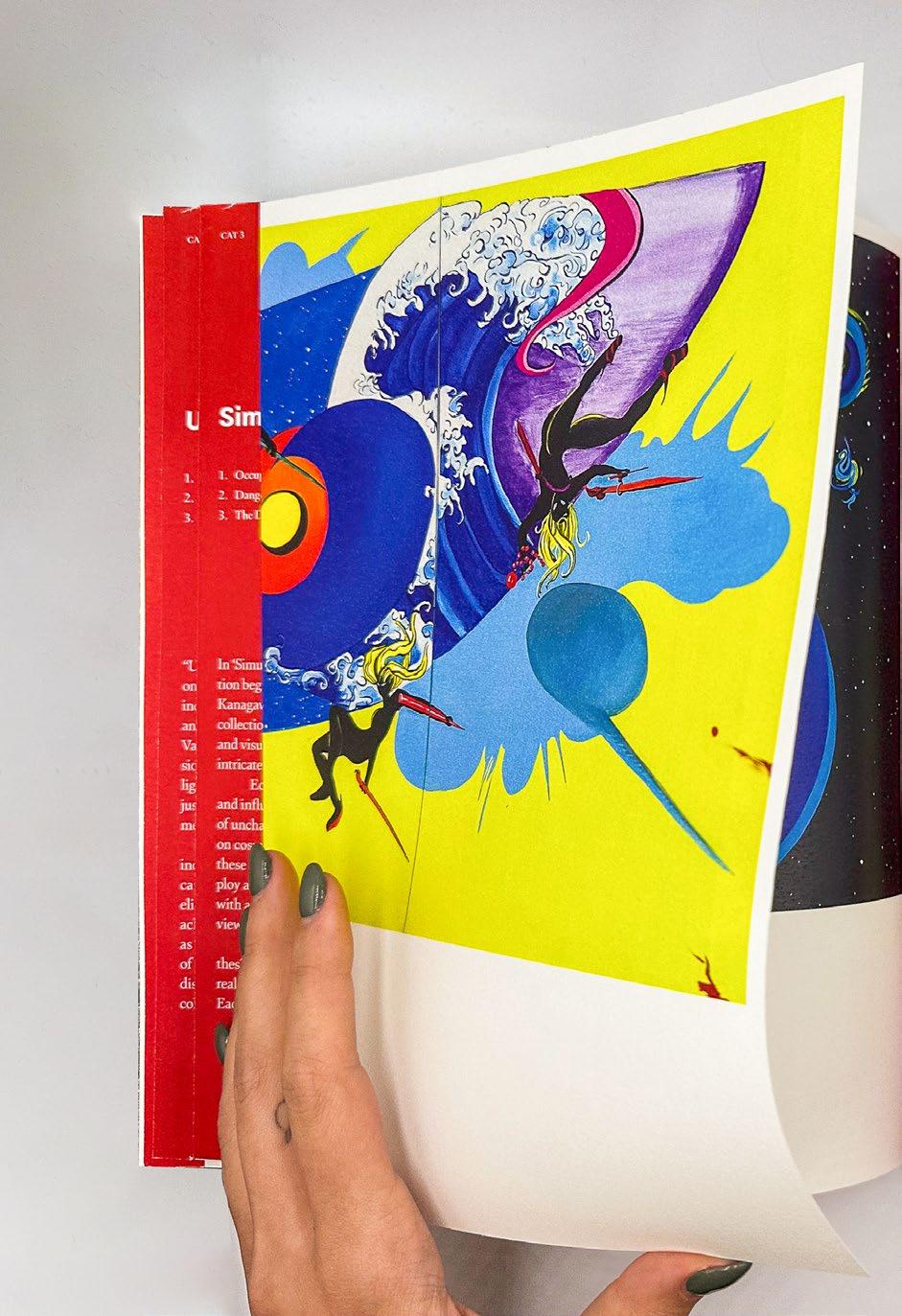
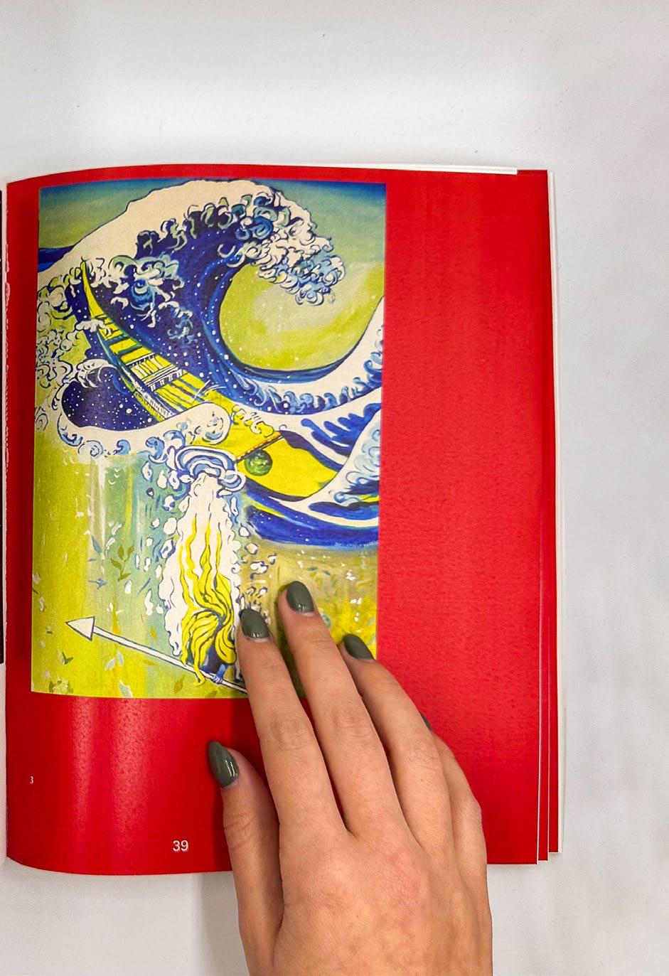
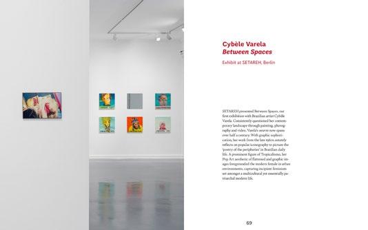
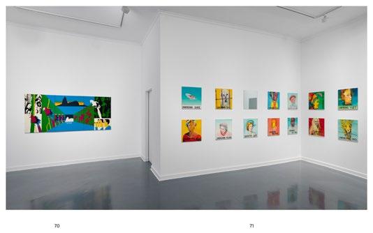
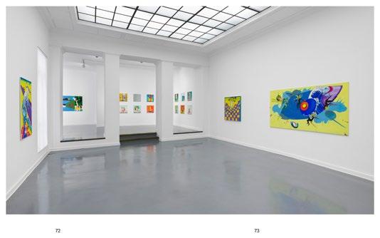
270
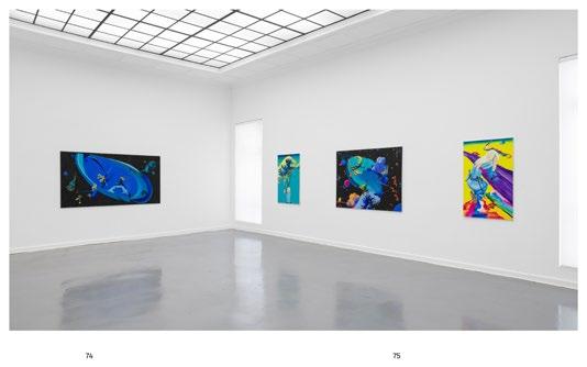
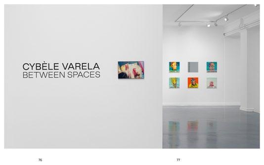
271
Between the Lines
This publication explores the design of five carefully selected books, considering aspects such as size, weight, paper type, binding, number of pages, and grid system, among others. The French folding binding adds a unique touch, enhancing the overall aesthetic and feel of the book.
The title "Between the Lines" signifies the exploration of details beyond the actual content of the analyzed books, emphasizing the importance of design elements in shaping the reading experience. The cover of the book is done in mirrored paper, symbolizing the reflection of its contents on the books that were being analyzed.
272
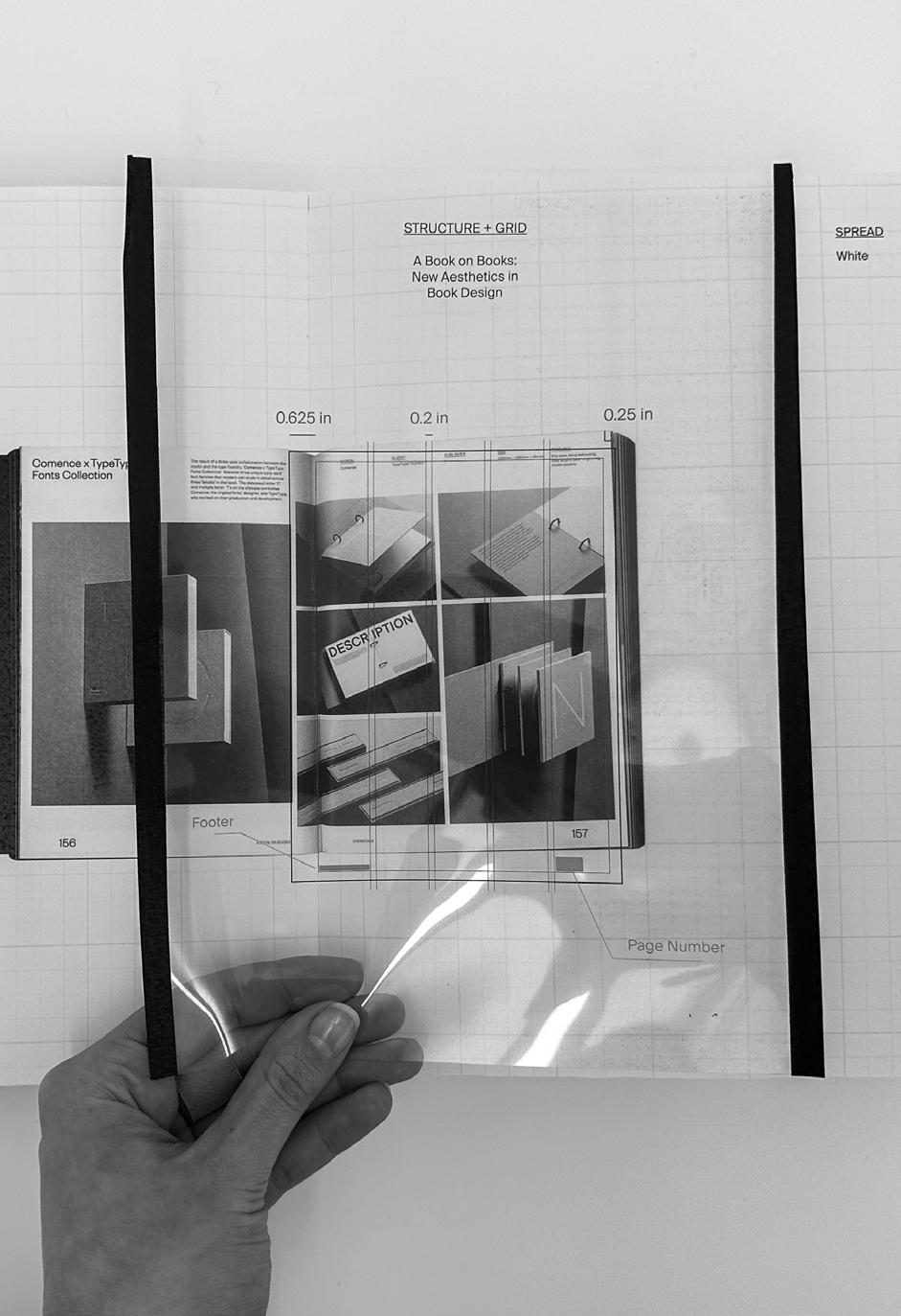
274
275
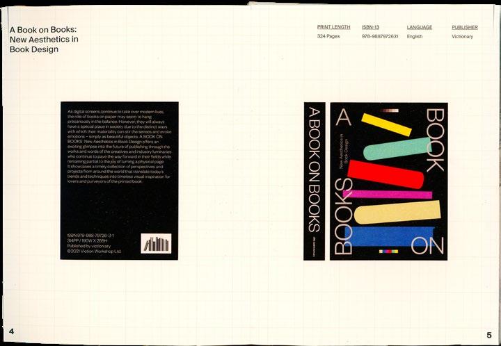
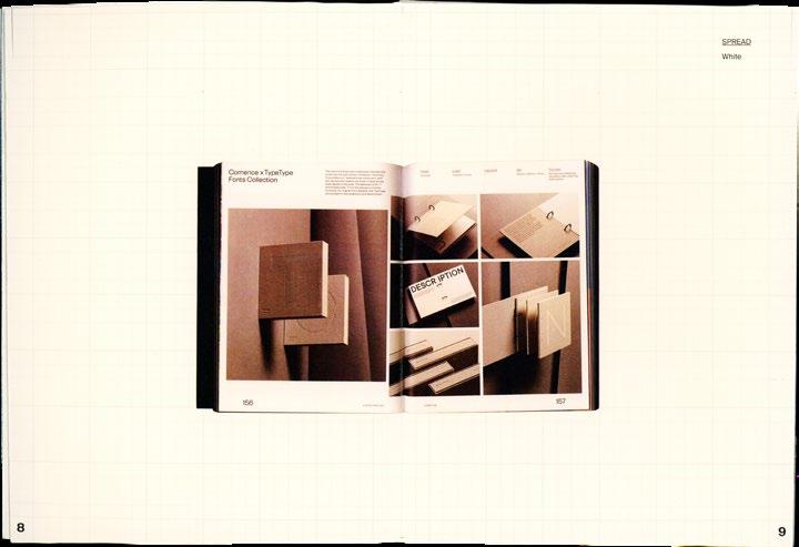
276
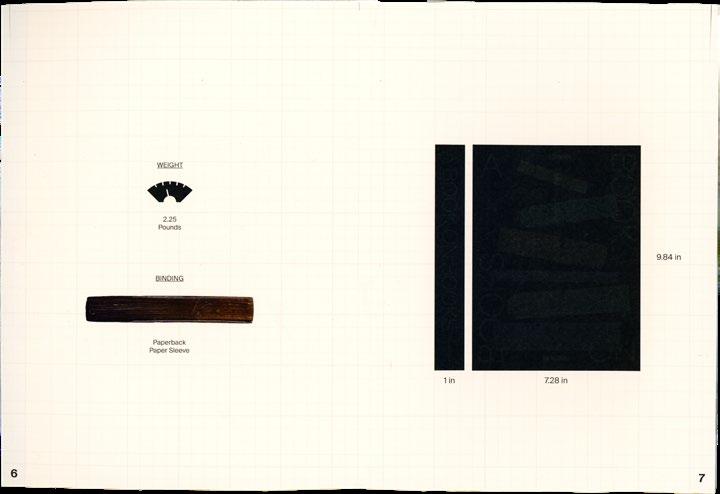
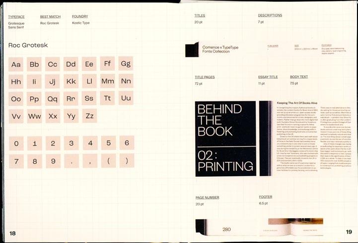
277
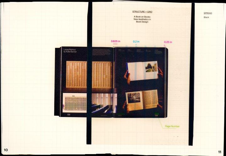
278
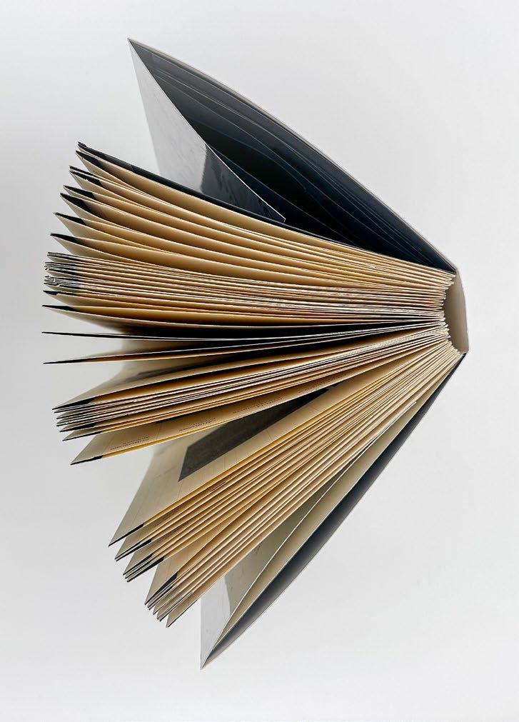
279
Subuverting the Grid
280
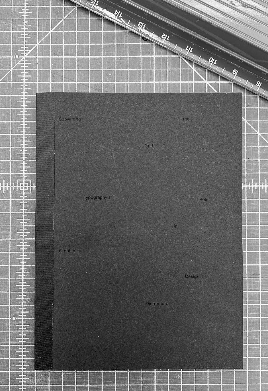
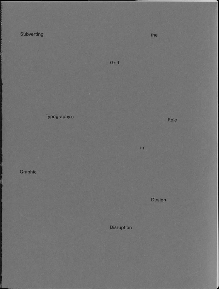
282
283
284
285
286
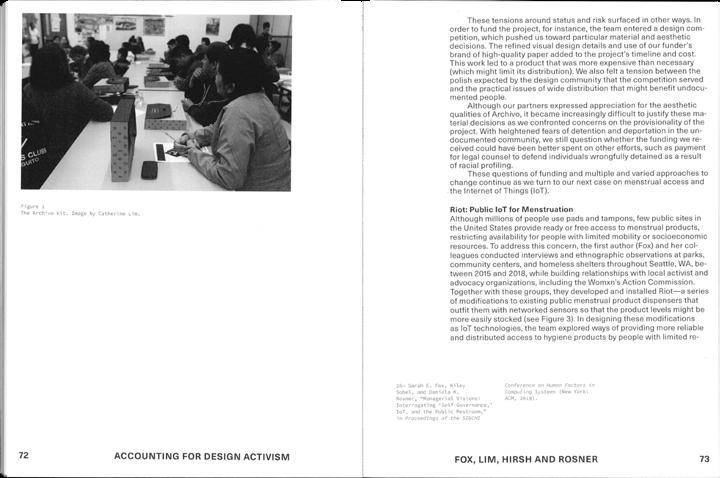
287
Design Studies
Design Studies explores how graphic design and music influence each other. It examines how design elements are inspired by music genres, artists, and album covers. The project celebrates the creative synergy between the two art forms and aims to inspire others to appreciate their profound connection.
288
290
291
292
293
294
295
For the people that I love...
Always com Saudade was created as my final thesis project for Boston University's MFA in Graphic Design, but it's so much more than that. It represents my years in Boston, coming from Brazil, and how I felt every day, so thankful to be here while at the same time longing for my home, family, and friends. This is why I first need to thank my parents, Henrique and Giselle Victorelli, for the strength and support every day to dive deep into my creative endeavors since I was a kid and now for the opportunity to pursue my graduate studies in Graphic Design, without you I am nothing. I also need to thank my sisters Gabriela and Luisa for always being there on WhatsApp, laughing, crying, and feeling all the happiness or desperation moments with me. But my sister Manuela deserves the biggest shout-out to anyone. We share an apartment; we share our lives every day, and we wake up in the same place and go to sleep at the same time. Living with you has been a joy, sharing our creative sides and crafting our routine and life. Seeing your growth has inspired me every day, and without your help and insight through many projects, I couldn't have reached as far as I did. I love you so much!
To my professors who have learned my way to work, being the last-minute girl and always making it work, your patience and guidance were irreplaceable. My biggest thank you to Christopher Sleboda for being so detail-oriented that it taught me to look closely at life, and to Kristen Coogan for understanding my chaotic brain and always knowing how to guide that into a fantastic thesis work. To Nick Rock, thank you for your patience and guidance through my discovery that graphic design
is art and installations are a possibility (so happy!). To James Grady and his wonderful creative mind, which has helped me create some of the work I am most proud of. To Brockett Horne, who shares my love for theory and semiotics, and her amazing guidance in life and design. Thank you to Claire Bula and how you can sense all that we are feeling and makes us feel better in a second. To Jialun Wang, I hope our life post-OPT is as great as it was at Boston University. And finally, to Mary Yang, I admire you and thank you for letting me be a part of your inspiring senior studio class; I'm in awe every day with you.
Finally, to all my friends and colleagues at BU, but especially Dhwani Garg, Arfindo Santoso, and Arjun Lakshmanan for being my solid rock since week one and never giving up on me, even when I didn't show up for our 8 am classes. I could name every friend I have in Brazil and around the world, but they know how much I love and appreciate them and how they held such a special place in my heart that I channeled this into my work by missing them and creating such emotional pieces.
Bibliography
Damasio, Antonio. "Damasio's Theory." Vanderbilt University Department of Psychology. Accessed April, 2024. http:// www.psy.vanderbilt.edu/courses/psy115a/DamasioEssay/ Damasio'sTheory.html
Lerner, Jennifer S. "Emotion and Decision Making: Multiple Moderating and Mediating Processes." Harvard University. https://scholar.harvard.edu/files/jenniferlerner/files/emotion_ and_decision_making.pdf.
"Oxford Dictionary." Google. Accessed April, 2024.
Damasio, Antonio. Descartes’ Error: Emotion, Reason, and the Human Brain.
Caldas, Sara. Design, Create, Thrill: The Power of Graphic Design to Spark Emotions.
1 2 3 4 5
Copyright © 2024 Veridiana Monteiro Victorelli
All rights reserved. This book may not be reproduced, distributed, or transmitted in whole or in part, in any form (beyond that copying permitted by Sections 107 and 108 of the U.S. Copyright Law and except by reviewers for the public press), without written permission from the publisher.
Produced in Graduate Graphic Design II (CFA AR 884) under the guidance of faculty advisors Kristen Coogan, Associate Professor of Art, and Christopher Sleboda, Associate Professor of Art, with additional assistance provided by Bella Bennet, Teaching Fellow and Adie Fein, Visiting Critic.
Typeset in Suisse Family form Swiss Typefaces
Joly Display from Blaze Type
Parfumerie Script from Typesenses
Printed at Fenway Group Boston, Massachussets.
Published by Veridiana Monteiro Victorelli First edition

I miss home
Where the weather is always hot
And the sun always shines
Where there is no second of silence
But the noise is not overwhelming
Because the sounds of the people I love Are just enough to warm me up
I left thinking a new place would be fun
And it was
At least while the sun was up
But now it’s always cold
And I just can’t wait to go home
A Poem about Saudade
Manuela Victorelli
