Damosh richness
Cold Pressed Oils
i. Introduction 3 ii. Our Values 4 iii. Brand Moodboard 5 1 Logo 6
6 Other Applications 33 6.1 Storefront 34 6.2 ID Card 36 6.3 Packaging (250 ml) 38 6.4 Packaging (2.5 l) 40 6.5 Packaging (Barrel) 42 6.6 Packaging Tape 44 6.7 Transportation Vehicle 46
5 Stationery 26 5.1 Business Card 27 5.2 Letterhead 28 5.3 Envelope 29 5.4 Invoice 31 3 Typography 20 3.1 Authorised fonts 21
IIntroduction
The concept of Damosh richness is centered in the core beliefs of nurturing heart, quality first policy and innovation . To maintain the authenticity and consistency of the visual identity and to protect it from any distractions, we created this Brand Identity Manual.
The Brand Identity Manual contains all the graphical elements that determine the basic communications. When you use it you are ensuring the success of the brand image. Please remember to consult the Identity Manual every time you organise communications or design material for Damosh richness.
The Brand Identity Manual provides the rules applying to the visual identity system. It is the grammar which applies to the logo, typeface, colours and structure of the space.
However, those rules should not stop further improvements, well considered changes and creative experimentation.
You should always use the colour references indicated in the manual and a Pantone Colour Formula Guide to check colours for accuracy.
Please note:
This Identity Guidebook will be completed and amended on a regular basis. Therefore, whenever you start producing material, please check that you are in possession of the latest version. This version was released in October 2022.
Our Values
At Damosh richness, it is our aim to provide edible oil that is pure and rich in nutrients using modern technology and organic methods. Using Cold Pressed Technique of manufacturing oil, We ensure that the natural nurtients of the raw seeds are retained and maintained in the oil that is produced.
Brand Moodboard


Damosh Damosh Damosh


Logo 01
Logo Composition
The Logo is composed of pictogram and word and Logotype. The Symbol uses the combination of 3 elements - Sun, Leaf and Oil drop. All the elements represent the company’s values.
The corporate symbol is the most important visual factor of Damosh richness’s identity. Clarity and consistency of the logo is essential to the successful implementation of the Damosh richness corporate identity system.
Logo Construction and Freezone
The logo is designed on the basis of visual criteria and equal proportions. It can never be altered from the examples in this manual. Only use the CD-ROM data included in this manual. When unable to use the provided data, precisely reconstruct the corporate symbol using the grid shown below.
Two variations of the logo have been designed, the standard version (shown on this page) and the alternative version (shown in section 1.3).
As for the standard freezone nothing can be put here, neither texts nor drawings or photographs. The freezone can be larger than illustrated, or the unit space shown can be added on repeatedly but it should never be smaller.
1.5x
richness richness richness
1.5x 3.1x
1.1808x 4.1x
Unit ‘x’ 5x 6x
CMYK = 0/54/ 00/ 0
richness
HEX: #F68C1E
RGB = 246/140/30
Pantone = 1495 C
CMYK = 61/0/100/0
HEX: #6EBE44
RGB = 110/190/68
Pantone = 360 C
CMYK =4/95/100/39
HEX: #9A1D10
RGB = 154/29/16
Pantone = 7621 C
Alternative Logo
The exact construction of the Damosh richness logo is an integral part of its design. The logo is designed on the basis of visual criteria and equal proportions.
The Alternative placement of logomark and logotype can be used at places with horizontal space constraints. 4x 7x
Logo Sizes
To protect the integrity, legibility and impact of the Brand Damosh richness, it must never be reproduced in sizes smaller than those shown on this page.
36.7341 px 21.1235 px
50px 80px 10 Brand Identity Manual
Standard Logo Positions
The placement of logo in any document should be such that it is visible clearly.
For print documents, the logo should always be placed on the corners and can be centered on top and bottom. It should not be cropped and the freezone should always be considered when placing the logo.
For brand promotional media, the logo can be placed where it best suits with the content, such that the logo is clearly visible. Freezone should always be considered.
Alternative Logo Positions 1.6
The guidelines are the same as Standard Logo Positions. An exception is that the logo can be used vertically. In this case the the logo should always face inwards.
Logo with TM and ®
The logo should only be used in combination with the ™ and ® mark where it has a legal relevance. This may be the case on packaging or on products sold from the shop or through the website.
The ™ and ® marks can not be scaled together with the logo. If the logo is reproduced large they can be in proportion relatively small while they need to appear proportinally bigger when the logo is used small.
Please note: At the time of issuing this guidelines the application for the ™ and ® mark is still pending. The logo should therefore not be used in combination with those marks until further notice.
Incorrect Logo Usage 1.8


Never change the authorised versions of the logo as it will undermine the consistency of the overall identity.
• DO NOT Ignore the freezone.
• DO NOT blur or use drop shadow on the logo.


• DO NOT alter the proportions.
• DO NOT alter the placement or alignment of logomark and logotype.
• DO NOT swap the colors.
• DO NOT outline the logo or parts of it.
• DO NOT compromise the visibility of the logo.
• DO NOT stretch or shrink the logo.
• DO NOT blur the logo.
Colours are an important part of the identity. A hundred percent match can not always be achieved but every effort should be made to reproduce the intended colours as close to the specified as possible. The guidelines in this section should always be read before printing.
Primary Logo Colors
The colours of the logo and its variations (see 2.2) are specified in Pantone* (for single colour printing), CMYK (for four colour offset printing), and RGB (for web use, on screen presentations and pdf’s). RGB colours are specified in this manual for Adobe Illustrator CC 2020.
CMYK = 0/54/ 00/ 0
HEX: #F68C1E
RGB = 246/140/30 Pantone = 1495 C
CMYK = 61/0/100/0
HEX: #6EBE44
RGB = 110/190/68 Pantone = 360 C
CMYK =4/95/100/39
HEX: #9A1D10
RGB = 154/29/16 Pantone = 7621 C
Secondary Logo Colors 2.2
The Secondary Logo Color Palette can be used for logo backgrounds and other print media applications if needed. It is required that the colors do not subdue the visibility of logo. The color palette should be preferrably used to enhance the visuals aroung the logo. The freezone box should not be treated as background color box.
CMYK = 41/0/18/0
HEX: 92D5D5
RGB = 146/213/213 Pantone = 318 C
CMYK = 0/54/ 00/ 0
HEX: #F68C1E
RGB = 246/140/30 Pantone = 7506 C
CMYK = 0/54/ 00/ 0
HEX: #F68C1E
RGB = 246/140/30 Pantone = 372 C
CMYK = 0/54/ 00/ 0
HEX: #F68C1E
RGB = 246/140/30 Pantone = 100 C
CMYK = 0/54/ 00/ 0
HEX: #F68C1E
RGB = 246/140/30 Pantone = 496 C
Acceptable Logo Colors
The companys logo has three primary colors. Alternatively, the logo can any one of the three colors. In case of black and white printing, the logo has to be either black or white (paper color), making sure that the visibility og the logo is not compromised.
Multicolor Logo Logo in Black
Logo in White
Color Don’ts. 2.4
As the system of colour coding is clear, colours should not be used randomly and for purely decorative reason. Great care must be taken especially when colours are used as backgrounds.
Do Not use dark colors with multicolored logo.
Use Primary colors as backgroud only for logo negative.
Do not use primary color background with multicolored logo
Use Secondary color palette for background with multicolored logo
Typography 03
Good typography is not only important for the overall impression of the brand identity, it also reflects on the quality of the products, the customer service and the efficiency of the company.
02. Colors 03. Typography
Authorised Fonts 3.1
The authorised font to be used in all forms of communications is Monteserrat, a sans serif font that is highly legible font. It is a functional and contemporary typeface that best suits the corporative world. The font has been developed into a large family but only the ten given versions of weights should be used for Damosh richness.
Montserrat is available to download for free at : fonts.google.com
Monteserrat Thin
ABCDEFGHIJKLMNOPQRSTUVWXYZ
abcdefghijklmnopqrstuvwxyz 0123456789-(.,:?+!#)*”$£%”[/]&@</>
Monteserrat Regular
ABCDEFGHIJKLMNOPQRSTUVWXYZ abcdefghijklmnopqrstuvwxyz 0123456789-(.,:?+!#)*”$£%”[/]&@</>
Monteserrat SemiBold
ABCDEFGHIJKLMNOPQRSTUVWXYZ abcdefghijklmnopqrstuvwxyz 0123456789-(.,:?+!#)*”$£%”[/]&@</>
Monteserrat Bold
ABCDEFGHIJKLMNOPQRSTUVWXYZ abcdefghijklmnopqrstuvwxyz 0123456789-(.,:?+!#)*”$£%”[/]&@</>
Monteserrat Black
ABCDEFGHIJKLMNOPQRSTUVWXYZ abcdefghijklmnopqrstuvwxyz 0123456789-(.,:?+!#)*”$£%”[/]&@</>
Monteserrat Light
ABCDEFGHIJKLMNOPQRSTUVWXYZ abcdefghijklmnopqrstuvwxyz 0123456789-(.,:?+!#)*”$£%”[/]&@</>
Monteserrat Regular
ABCDEFGHIJKLMNOPQRSTUVWXYZ abcdefghijklmnopqrstuvwxyz 0123456789-(.,:?+!#)*”$£%”[/]&@</>
Monteserrat Italic
ABCDEFGHIJKLMNOPQRSTUVWXYZ abcdefghijklmnopqrstuvwxyz 0123456789-(.,:?+!#)*”$£%”[/]&@</>
Monteserrat Medium Italic
ABCDEFGHIJKLMNOPQRSTUVWXYZ abcdefghijklmnopqrstuvwxyz 0123456789-(.,:?+!#)*”$£%”[/]&@</>
Monteserrat SemiBold Italic
ABCDEFGHIJKLMNOPQRSTUVWXYZ abcdefghijklmnopqrstuvwxyz 0123456789-(.,:?+!#)*”$£%”[/]&@</>
Brand Pattern 04
A brand pattern creates more value than repetition. It provides coherence between disparate mediums and continued relevance that can adapt and respond to its audience. A brand pattern connects a product to an experience and an audience, allowing the brand to continually grow.
Stationery
Stationery 05
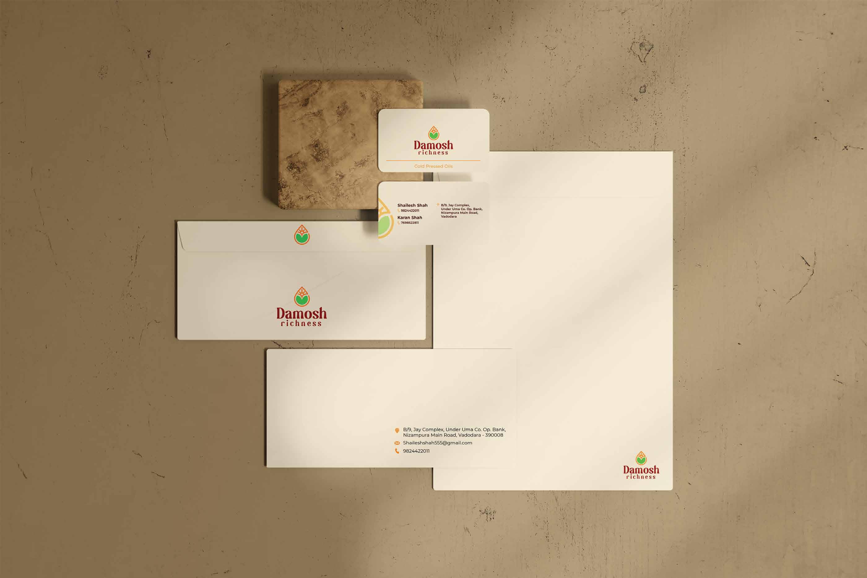
The stationery of a brand says a lot about business. It's an important part of building and projecting the brands image. Stationary may not be something that the customer comes in contact with but it becomes important for the business side of the company when dealing with investors, suppliers, commercial estate agents, etc. Good, functional stationary also makes day to day business a lot easier.
05. Stationery
02. Colors
5.1
Business Card
The business card should be used by all the employees so the design of the business card should remainconsistent.
50.8 mm
30mm x 22.104 mm
Size - 50.8mm x 88.9mm Scale - 100%
Montserrat/Regular/10 pt
Cold Pressed Oils
12.7 mm 88.9 mm 5.08 mm
Montserrat/Bold/9 pt Montserrat/SemiBold/7 pt
Vertically cropped half Logomark with 45% opacity.


12.7 mm
17.78 mm
Shailesh Shah 9824422011
Karan Shah 7698522811
B/9, Jay Complex, Under Uma Co. Op. Bank, Nizampura Main Road, Vadodara
5.08 mm 5.08 mm
Montserrat/SemiBold/7 pt
20 mm 05. Stationery
The business card should be used by all the employees so the design of the business card should remainconsistent.
20 mm 20 mm x 15.602 mm
Size - 215.9 mm x 279.4 mm Scale - 50%
To
Montserrat/Bold/16pt
Montserrat/Bold/10pt Montserrat/Bold/10pt
Montserrat/Bold/11pt 30 mm 28 Brand Identity Manual
Shailesh Shah
Designation
A-2, Building, Area, District, State, P.O. 390005 name@gmail.com
9876543210
Dt. dd/mm/yyyy
Lorem ipsum dolor sit amet, consectetuer adipiscing elit, sed diam nonummy nibh euismod tincidunt ut laoreet dolore magna aliquam erat volutpat. Ut wisi enim ad minim veniam, quis nostrud exerci tation ullamcorper suscipit lobortis nisl ut aliquip ex ea commodo consequat. Duis autem vel eum iriure dolor in hendrerit in vulputate velit esse molestie consequat, vel illum dolore eu feugiat nulla facilisis at vero eros et accumsan et iusto odio dignissim qui blandit praesent luptatum zzril delenit augue duis dolore te feugait nulla facilisi.
Lorem ipsum dolor sit amet, cons ectetuer adipiscing elit, sed diam nonummy nibh euismod tincidunt ut laoreet dolore magna aliquam erat volutpat. Ut wisi enim ad minim veniam, quis nostrud exerci tation ullamcorper suscipit lobortis nisl ut aliquip ex ea commodo consequat.
Lorem ipsum dolor sit amet, consectetuer adipiscing elit, sed diam nonummy nibh euismod tincidunt ut laoreet dolore magna aliquam erat volutpat. Ut wisi enim ad minim veniam, quis nostrud exerci tation ullamcorper suscipit lobortis nisl ut aliquip ex ea commodo consequat. Duis autem vel eum iriure dolor in hendrerit in vulputate velit esse
Shailesh Shah Designation
B/9, Jay Complex, Under Uma Co. Op. Bank, Nizampura Main Road, Vadodara - 390008.
Shaileshshah555@gmail.com
9824422011

05. Stationery
The business card should be used by all the employees so the design of the business card should remainconsistent.
47.625 mm


Envelope 5.3 9824422011

15.875 mm Fold 47.625 mm 29 Brand Identity Manual
B/9, Jay Complex, Under Uma Co. Op. Bank, Nizampura Main Road, Vadodara - 390008 Shaileshshah555@gmail.com


05. Stationery
Invoice
The business card should be used by all the employees so the design of the business card should remainconsistent.
20 mm x 15.602 mm
Montserrat/Regular/35 pt
Montserrat/Regular/12 pt
Size - 222.25 mm x 95.25 mm Scale - 50%

Other Applications 06
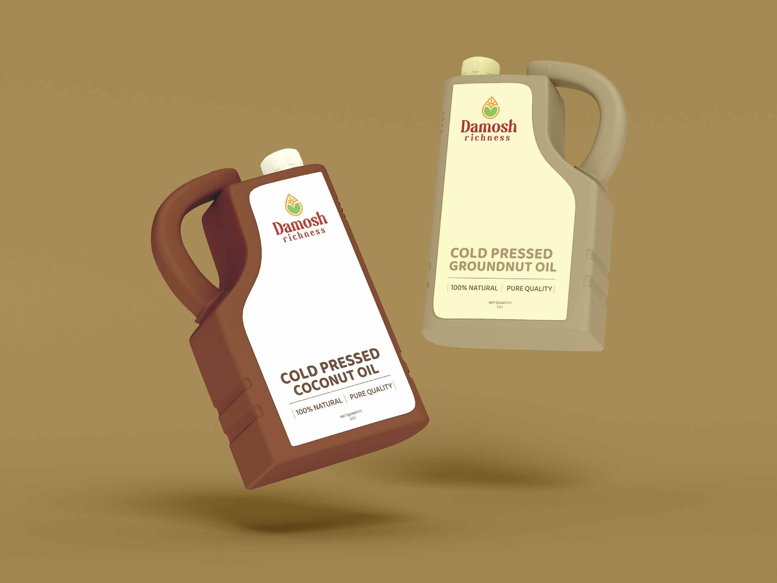
This section includes storefornt labelling, ID card design, Packaging and other medium related to production and applications of brand identity.

06. Other Applications


Packaging Label (2.5 l)
711.2 mm x 423.3418 mm
100% NATURAL PURE QUALITY
NET QUANTITY 2.5
292.775mm x 232.42mm 2.5 l
100% NATURAL PURE QUALITY
NET QUANTITY 2.5 l
06. Other Applications

GROUNDNUT OIL

30mm x 22.104 mm
48 mm
35 mm x 9.245 mm


