Introduction to technical analysis
Why chart patterns should be considered
Candlestick charts
Popular time frames
The 10 chart patterns you should know
Pattern 1 — Head and shoulder
Pattern 2 — Inverse head and shoulders
Information and strategies contained in this book are intended as educational information only and should not be treated as advice or a recommendation to trade nor used as a sole trading guide. For practical application and further learning, explore Deriv Academy. The past is not a guide to future performance, and strategies that have worked in the past may not work in the future. Trading derivative products involves a high level of risk and may not be suitable for all customers. The value of any trade, and the income derived from it, can go down as well as up, and your capital is at risk. Although due care has been taken in preparing this document, we disclaim liability for any inaccuracies or omissions.
Deriv is the manufacturer and distributor of its products. Products offered on deriv.com are considered complex derivatives and may not be suitable for retail clients. CFDs are complex instruments and come with a high risk of losing money rapidly due to leverage.
70.78% of retail investor accounts lose money when trading CFDs with this provider. 1 You should consider whether you understand how CFDs work and whether you can afford to take the risk of losing your money.
The information presented is intended for retail and professional clients.
Company information
• Deriv Investments (Europe) Ltd (W Business Centre, Level 3, Triq Dun Karm, Birkirkara BKR 9033, Malta) is licensed and regulated in Malta by the Malta Financial Services Authority under the Investment Services Act to provide investment services.
• Deriv (BVI) Ltd is licensed and regulated by the British Virgin Islands Financial Services Commission.
• Deriv (FX) Ltd is licensed and regulated by the Labuan Financial Services Authority.
• Deriv ( V) Ltd is licensed and regulated by the Vanuatu Financial Services Commission.
For more information, please visit deriv.com.
1 Disclaimer
Deriv X is unavailable to clients residing in the EU.
Pattern 3 — Double bottom
Pattern 4 — Double top
Pattern 5 — Cup and handle
Pattern 6 — Rounding top
Pattern 7 — Rounding bottom
Pattern 8 — Ascending triangle
Pattern 9 — Descending triangle
Pattern 10 — Wedges rising and falling
Summary and next steps
Frequently asked questions
Introduction to technical analysis
There are hundreds of chart formations and technical indicators Volumes have been written on the subject, some good and many long , confusing and contradictory. My aim here is to give you 10 chart patterns that you will encounter in everyday trading , whether you are trading stocks, commodities, forex, synthetics, or cryptocurrencies. You will find that these patterns have historically appeared and can consider them in making your trading plan.
Garbage in, garbage out — the importance of good data feeds
It ’s worth remembering that as technical analysis relies purely on data (numbers), your data feed should be clean, and you must be aware of data spikes or data issues. If the price is 11,12,13 and then the next price is 100, it is likely to be a data issue. The charting package, in most cases, will not know, so that is where your common sense has to take over.
It ’s also worth noting that “illiquid markets” — those of stocks or financial products that do not trade actively — are prone to spiking data and unsuitable for chart patterns or technical trading.
Disclaimer: There is no guarantee that analysing the market ’s past performance, whether on financial or synthetics, can lead to successfully predicting future market movements. These technical analysis tools merely help to understand how markets move and how such data can be analysed for a betterinformed decision when trading Please remember that trading always involves risk, and you should consider this when trading.
Chart patterns are a guide, not a guarantee
It ’s important to realise that chart patterns and technical analysis are a guide, not a guarantee. I would love to tell you that these chart patterns will work every time, but sadly they will not.
The aim is to look for a trading edge, something that helps you make a better trading decision and, over time, might bring you success in financial markets.
Chart patterns also help reduce emotions in trading , giving you a roadmap as to when to enter a trade and, more importantly, when to exit. In a fast-moving market — especially if a trade is moving against your prediction — logic and common sense can go out of the window, so having a trading plan and being aware of what pattern a market adopts can really help your trading results since you’ll then be in a better position to recognise a losing trade and let go of it.
The word market in this book can easily refer to a forex pair, stock, index, or cryptocurrency
Staying with the most liquid markets, such as major currencies, indices, larger cap individual stocks, commodities (major ones are oil and gold), and the major cryptocurrencies can help you avoid pricing issues that lead to inaccurate charts
Good data feeds will normally correct price spikes or erroneous data, but this can sometimes happen hours after the event.
To study this subject in more details, visit Deriv Academy.
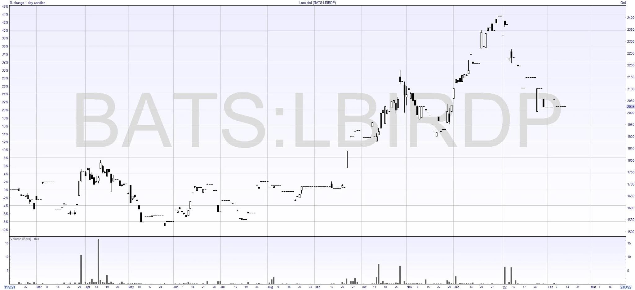
Example of an illiquid stock
Here we see many gaps and days when the stock does not trade. This is not a suitable stock for using chart patterns.
What is technical analysis?
Technical analysis ignores the news and economic data, focusing purely on price trends and volume. It primarily involves studying chart patterns, showing the trading history and statistics for whatever market is being analysed.
Even traders who prefer a fundamental analysis driven by company news, earnings, and valuation ratios sometimes use technical analysis afterwards to determine a good entry price.
We would start with a basic price chart which would show the market trading price in the past, and look for a trend or pattern that could help determine future pricing.
In this guide, I am skipping over indicators and tools such as Moving averages, RSI or MACD and only focusing on actual chart patterns.
Of course, technical indicators can also be combined with chart patterns.
Why chart patterns should be considered
If I showed you a spreadsheet of prices in numbers, chances are you will not see a pattern; however, if those same numbers are displayed in a chart, it is far easier to make sense of what is happening in a market.
Chart patterns put all buying and selling that’s happening in a financial market into a concise picture. It is possible to see buyers (bulls) and bears (sellers) take or lose control of a market. This can help you to identify a trend reversal.
Chart patterns are a pure expression of what is going on in the underly market. You or I could think something is overvalued or undervalued, but a chart pattern is purely price-driven.
Chart patterns tend to repeat themselves over and over again, which helps to appeal to human psychology and trader psychology in particular. It is common to see a market move to a round number or find support at a previous price level.
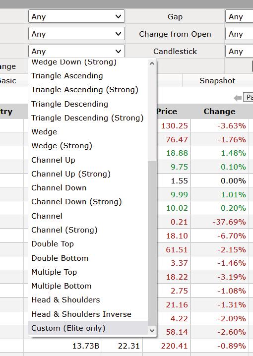
Thanks to the internet, it’s now easier than ever to find chart patterns. Many sites will offer screeners which allow you to filter for chart patterns. I use finviz.com
As you can see, I can select major patterns and then see all the stocks that meet that criteria.
A picture tells a 1,000 words
“ “
Source: finviz.com
Here I can screen chart patterns, saving hours of manual screening. Before diving into individual chart patterns, let’s first learn more about charts and timeframes.
Candlesticks charts
In the chart patterns used in this ebook, we will use candlestick charts, presumably developed in the 18th century by the legendary Japanese rice trader Homma Munehisa. The charts gave Homma and others an overview of open, high, low, and close market prices over a certain period. This method of charting prices proved to be particularly interesting and helpful due to its uncanny ability to display five data points at a time instead of just one. Charles Dow picked up the method circa 1900, and today’s financial market traders still widely use it.
Candlesticks are usually composed of a body and wick. The body, typically shaded in black/red or white/green, illustrates the opening and closing trades. The wick, consisting of an upper and lower shadow, shows the highest and lowest traded prices during the time interval represented. If the asset has closed higher than it opened, the body is white or green. The opening price is at the bottom of the body. The closing price is at the top. If the asset has closed lower than it opened, the body is black or red. The opening price is at the top. The closing price is at the bottom. A candlestick need not have either a body or a wick.
The most common colours — and the ones I use — are red for a down candle and green for an up candle. White for an up candle and black for a down candle are also used, a custom that goes back to the days of printing out charts in black and white.
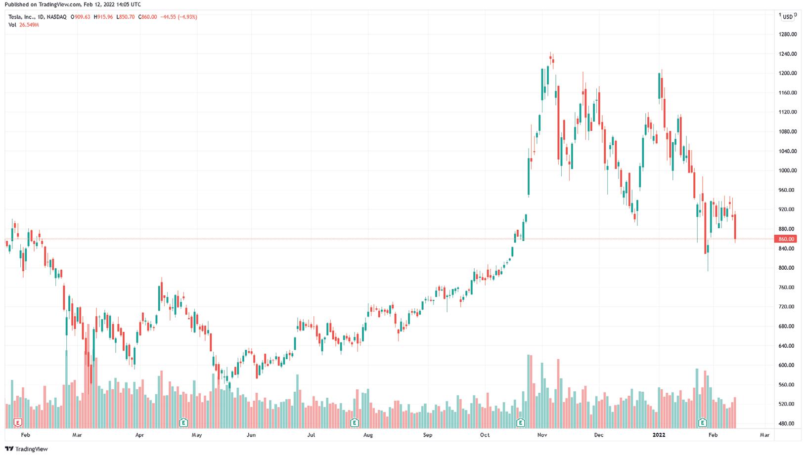
Here we see an example of Tesla (TSLA) using a candlestick chart where each bar represents one day of trading, green the stock closed up and red the stock closed down. This is the raw chart to which we can add chart patterns and indicators, as I shall explain further in the ebook.
Source: TradingView.
Popular time frames
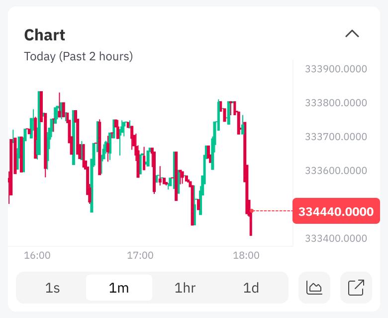
Depending on what time frame you look at, the market may give contradictory buy and sell patterns. For example, if you look at the S&P500 on a 1-minute chart it will look very different to the S&P500 on a 1-day, 1-week, or 1-month chart.
10 Chart patterns you should know
Pattern 1 Head and shoulders
a very short term — is a time frame that gives many buy and sell signals. Since it is oversensitive, it can lead to false signals. The advantage is that signals react to market moves very quickly. Therefore, there is little lag time.
is a popular time frame and helps reduce the oversensitivity issues of a 1-minute chart.
is the most commonly used time frame and the one I mainly use. Each candle on a 1-day chart represents a trading day. It is suitable for those not watching a screen all day, doesn’t have the oversensitivity of shortterm movements, and catches all major trend changes.
is a time frame that allows you to see a longer-term pattern. Of course, it’s more delayed and not as responsive, but it can provide a good picture of a longer-term trend.
is a time frame that gives you a longterm view of a market with years of data being visible on a chart. One-month chart patterns often signal a serious trend change.
There are other time frames, but these tend to be the main ones I use. The examples in this ebook are based on daily charts unless stated otherwise, but they can also be used on short or longer-term charts.
To study this subject in more details, visit Deriv Academy.
The popularity of this pattern is mainly attributed to the fact that it is easier to spot than other patterns.
The head and shoulders pattern tries to predict a reversal. Characterised by a large peak with two smaller peaks on either side, all three levels fall back to the same support level as the neckline. The trend is then likely to break out in a downward motion. Its name comes from what the pattern looks like: a head and two shoulders (and a neckline).
With this pattern, you would enter a short or sell trade below the neckline and a stop around halfway between the second shoulder. The target move would be around the distance between the head (peak) and neckline.
Pattern 2
Inverse head and shoulders
Pattern 3
Double bottom
The inverse head and shoulders or reverse bottom is a bullish pattern and indicates that sellers have been exhausted. You would enter a long trade just above the neckline and a stop towards the recent low of the second shoulder. The target would be a continuation of the head move giving a fairly good risk-to-reward potential.
A double bottom looks similar to the letter W and indicates when the price has made two unsuccessful attempts at breaking through the support level. It is a reversal chart pattern as it highlights a trend reversal. After unsuccessfully breaking through the support twice, the market price shifts towards an uptrend. You will also see triple bottoms play out.
Here we see the initial decline and attempt to rally, a second decline, which does not go below the first decline, forming support. You would buy just above the neckline and stop towards the middle of the up move, with a target at the same level that the initial decline started at.
Pattern 4
Double top
Pattern 5
Cup & handle
Opposite of a double bottom, a double top looks like the letter M. The trend enters a reversal phase after failing to break through the resistance level twice. If the price fails to move higher, then it is likely to go back to the neckline, which is support. If it fails there, it will move lower back down to the lows of the recent move. In this type of setup, you would look to take a short trade with a stop above the neckline, and your target would be the recent lows.
It’s worth adding that you will also find multiple bottoms (support) or tops (resistance) in markets, so you could see a triple top or triple bottom.
The cup and handle is a continuation stock chart pattern that signals a bullish market trend. It is the same as the rounding bottom or saucer (also a pattern worth looking out for) but features a handle after the rounding bottom. The handle resembles a flag or pennant and once completed, you can see the market break out in a bullish upwards trend.
The handle is a temporary retracement pattern and breaks out to continue the move higher.
This pattern can be fairly rare and takes time to complete; however, the upside move can be fairly explosive. The move-up is often the same distance as the cup height, so once the handle completes the next move higher, it gives us a target move of the same distance as the cup.
Pattern 6
Rounding top
Pattern 7
Rounding bottom
A rounding top usually indicates a bearish downward trend. It tends to show that the market is losing strength, with each high being lower than the previous one. We then see a move through the neckline as support fails, then we see a smaller retest (bounce) back to the neckline before a larger fall. The fall is normally the same distance as the recent high to the neckline. I have often seen this pattern in cryptocurrencies such as Bitcoin.
The flip side of the rounding top is the rounding bottom, which is a bullish pattern. The market is in a downtrend but then starts to make a series of lows, higher than the previous ones, which form the rounded bottom or saucer. We then break out of the cup and move higher.
You would look to buy around the halfway point of the formation of the U shape or once the breakout occurs.
A rounded bottom can take weeks to form, but you can use a stock screening site to identify a selection of stocks and markets that make this pattern and add them to your watch list. You would only open trades once you are heading to the breakout point.
This is very similar to the cup and handle pattern previously covered.
Pattern 8
Ascending triangle
Pattern 9
Descending triangle
The ascending triangle is a bilateral pattern meaning that the price could break out from either side. A breakout is likely where the triangle lines converge. To draw this pattern, you need to place a horizontal line (the resistance line) on the resistance points and draw an ascending line (the uptrend line) along the support points. This pattern shows the price moving into smaller and smaller ranges before the big break out. Your buy entry would be just above the resistance, with a target the same distance as the triangle’s height.
For the sell entry, you would do the exact opposite, sell below the support line, and expect a drop of at least the triangle’s height.
The descending triangle is a bilateral pattern, meaning that the price could break out from either side. A breakout is likely where the triangle lines converge. To draw this pattern, you need to place a horizontal line (the support line) on the support points and draw a descending line (the downtrend line) along the resistance points. This pattern is the exact opposite of the ascending triangle previously covered.
This pattern shows the price moving into smaller and smaller ranges before the big breakout. Your sell entry would be just below the support line, with a target the same distance as the triangle’s height.
For the buy entry, you would do the exact opposite, buy above the resistance line and expect a rise of at least the height of the triangle. You can place a stop just below the resistance line.
Pattern 10
Wedges: rising and falling
Our final patterns are wedges, and we will deal with rising and falling wedges.
Rising wedge
Wedge patterns are normally reversal patterns. A rising wedge occurs when the price makes multiple swings to new highs, yet the price waves are getting smaller. Essentially, the price action is moving in an uptrend, but contracting price action shows that the upward momentum is slowing down. Eventually, the price breaks out, and in the case of the rising wedge, the price moves lower.
You would enter a stop just above the wedge, and you would enter short. Place your sell trade just below. The target would be a move-up of the same distance as the height of where the wedge started.
Summary and next steps
I hope you have found this short guide of value and can use these patterns to help you make better trades. As stated at the outset, technical analysis and chart patterns are a guide, not a guarantee. Chart patterns can be viewed as a tool in your trader’s toolbox together with indicators such as RSI, MACD, and moving averages.
Chart patterns help you keep your trading decisions focused and disciplined, especially in fastmoving and volatile markets.
Before investing, you can use a demo account to try your new skills without risking any funds.
Most brokers offer a demo account free of charge. You can sign up for a Deriv demo account, for example, and use their many charts and trading tools.
As for trading software and websites, there are many that will automatically add chart patterns to a chart and allow screenings. With time, you will be able to spot chart patterns as your eyes become accustomed to them.
I wish you every success in your trading.
Vince Stanzione
The falling wedge is a bullish pattern that begins wide at the top and contracts as prices move lower. The trading range becomes tighter and tighter until it breaks out. In the case of the falling wedge, the price normally breaks higher, so it is a bullish pattern. You would have a stop, as shown on the chart just below the wedge. You would buy just as we break out of the pattern and then look for a target of the same distance as the height of where the wedge started. Take care as many confuse a falling wedge with a bearish pattern.
To study this subject in more details, visit Deriv Academy.
Accumulation
Accumulation occurs when a stock or market is being purchased at higher prices. Stocks whose prices are rising are considered to be under accumulation. Opposite of distribution.
Ask price
The price that you can buy at. Also referred to as buy or offer price. Opposite of bid price.
Bearish
This refers to a market in decline. Someone with a negative view of a market would be a Bear.
Bid price
The price that you can sell at. Also referred to as sell price. Opposite of ask/offer price.
Bilateral pattern
The bilateral pattern means that the price could break out on either side. An example of a bilateral pattern is an ascending or descending triangle.
Breakout
A sustained move through a support or resistance line. As a rule of thumb, this should consist of more than one day’s price action. The subsequent move can be powerful. A breakdown would be where a support area gives way, and the price moves lower.
Bullish
This refers to a market that is rising. Someone with a positive view of a market would be a Bull.
Candlestick charts
A chart that has open, high, low, and close data sets in a candle form.
Charting
The study of historical price patterns or actions to determine likely future movements.
Chart patterns
Price patterns are trends that occur in stock charts. The patterns form recognisable shapes. The common ones are covered in this ebook.
Continuation patterns
Most chart patterns can be broken down into two categories — continuation patterns or reversal patterns. Continuation patterns continue the trend that was in place prior to the development of the continuation pattern. A cup and handle pattern covered earlier is a continuation pattern.
Distribution
Distribution occurs when a stock or market is being sold at lower prices. Stocks whose prices are falling consistently are considered to be under distribution. It’s the opposite of accumulation.
Downtrend
A downtrend is a sequence of lower lows and lower highs. It’s the opposite of an uptrend.
Head and shoulders
Three-pronged chart formation resembles a head and two shoulders, where the second peak marks the extreme of the trend. The third peak fails to extend beyond the second. The pattern is completed by a break of the “neckline”, signalling a trend reversal. See also the “inverse head and shoulders” chart pattern or market bottoms.
Inverse head and shoulders
The inverse head and shoulders or reverse bottom is a bullish pattern and indicates sellers have been exhausted.Characterised by a large peak downwards with two smaller peaks on either side, all three levels rise back to the same resistance level in the neckline. The trend is then likely to break out in an upward motion.
Illiquid markets
Any market that doesn’t have immediate price discovery, volume, or wide bid/ask spreads is an illiquid market. Basically, an illiquid market is the absence of liquid assets.
Moving average
The average price of a stock/market over any given (rolling) period of time. It is used primarily as an indication of a trend and is less useful in rangebound markets. A moving average is usually plotted at the end of the time period covered but can be centred or shifted as required.
Resistance
A level where sellers are found. Usually plotted as a horizontal line touching previous highs. Can appear at psychological levels, i.e. big round numbers such as $100 or $1,000. Resistance can be seen as a ceiling, and it’s the opposite of support.
Reversal patterns
Reversal patterns reverse the trend that was in place prior to the development of the reversal pattern.
Rounding bottom
Rounding bottom is a chart pattern that shows the gradual base formation and the turn to an uptrend, especially a good long-term base formation. See also rounding top.
Rounding Top
A rounding top usually indicates a bearish downward trend. It tends to show that the market is losing strength, with each high being lower than the previous one. We then see a move through the neckline as support fails, then we see a smaller retest (bounce) back to the neckline before a larger fall.
Screener
A piece of software or website that allows you to scan or screen markets or stocks for a set of rules or trading patterns. Also known as a filter.
Sideways trend
Markets that trade in a range are in a sideways trend.
Support
A psychological, fundamental, or technical level that limits selling in a stock or market. Often described as a point where there are more buyers than sellers. Support is seen as a floor in the price and is the opposite of resistance.
Technical analysis
Technical analysis is the study of historical price action to determine future movements, usually with the use of charts. It’s the opposite of fundamental analysis.
Triangle pattern
The triangle pattern is in the form of a triangle.
Uptrend
An uptrend is a sequence of higher highs and higher lows. It’s the opposite of a downtrend.
Deriv is one of the world’s largest online brokers. We offer CFDs and other derivatives on forex, stocks & indices, cryptocurrencies, commodities, and derived indices to millions of registered users across the globe.
From inception, our goal was to break free of the high commissions and clunky products offered by traditional brokers. Also, we aim to deliver a first-class experience to digitally inclined traders, regardless of the size of their accounts.
In a journey spanning more than 23 years, we have grown to over 2.5 million customers worldwide. But our mission has remained the same:
Make trading accessible to anyone, anywhere
Vince Stanzione

