
11 minute read
Focus on Designer - Abram Games
Abram Games Focus on Designer
by Naomi Games
Advertisement
Abram Games entered the world on July 29, 1914; the day after the Great War was declared.
His father was a photographer and, with pencils and paper omnipresent in his studio, Abram began to draw. At the age of eleven, his school report stated that his drawing skills were weak, but he already knew that he was going to be an artist - perhaps even a poster designer - and nothing was going to stop him.
He left school aged fifteen but continued to work as his father’s assistant. He built a wooden shed in the yard, and there he created a portfolio of designs. He enrolled at Saint Martin’s School of Art, but soon realised that he was untalented compared to the other students. He was also shocked at the half-hearted teaching methods, and left full-time education after only two terms.
During the 1930s, posters were the kingpins of publicity media. There was little colour photography in advertising and no domestic television available. Alternatively, posters were entirely hand-drawn and reproduced by skilled chromolithographers. Each colour was identified and painstakingly redrawn onto to a printing plate. An average of sixteen separate printings was not unusual in reproducing the posters, and the hand of the craftsman was palpable. Advertising and billboard agencies commissioned leading painters and artists to paint a figure, landscape, glass of beer, or a bar of soap. Lettering was added later by an anonymous studio artist, and the poster submitted to a likely customer. If rejected, the name of the product, company, and probably the slogan would be changed to suit another client. Games commented, “Rarely did the result merit a signature and usually none was evident.”
However, when Games studied the posters of Austin Cooper, Tom Purvis, and American-born Edward McKnight Kauffer, they deeply impressed him. The posters of the “3 Cs” - the Frenchmen Adolphe Mouron Cassandre, Jean Carlu, and Paul Colin - captivated him. They were the modernists who gave posters new content and meaning.
Intent on conquering the hoardings, Abram set himself the daily exercise of designing six posters to a theme, and he soon devised a new genre. Contemplating “bespoke” design to fit one advertiser only, his posters would implant the advertiser’s name and product in the mind of the viewer directly by either association

©Estate of Abram Games, 1935, unpublished project

©Estate of Abram Games, 1936/7, unpublished project
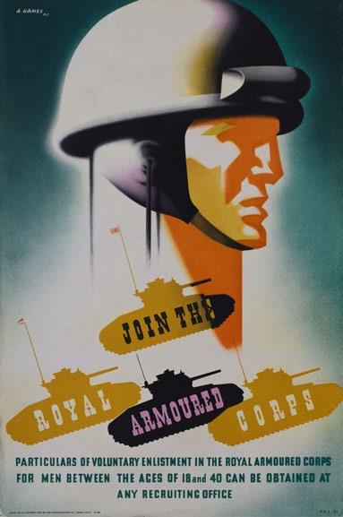
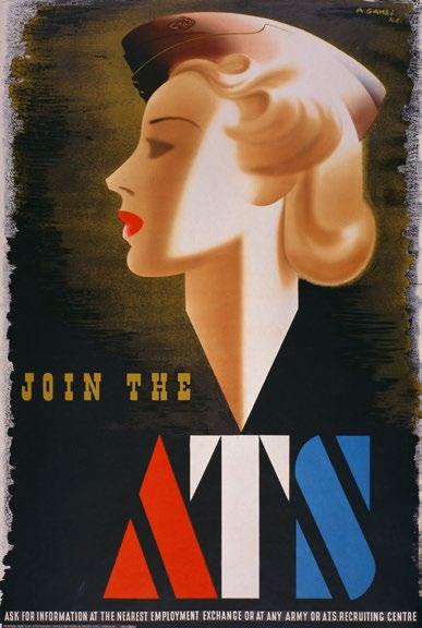
©Estate of Abram Games, 1941, War Office ©Estate of Abram Games, 1942, War Office


©Estate of Abram Games, 1942, War Office ©Estate of Abram Games, 1942, War Office
or suggestion. He wanted to create memorable posters with forceful, compact designs. Their function was to be so striking in appearance that no one could ignore them, appealing to both the intellect and the eye. Once intrigued by the poster, the viewer would then participate in helping the design fulfil its purpose. “I wind the spring and the public, in looking at the poster, will have that spring released in its mind,” he said.
Display lettering at the time was mostly hand-drawn with only small text set in metal type. The less lettering, the better the design - besides, lettering was never Games’s forte. He wanted to be responsible for the execution of the entire poster, and said, “to be truly effective, it should tell its story with little or no text.” Believing the ultimate objective of poster design to be the maximum power of individual comment expressed in minimum terms, his philosophy of “maximum meaning, minimum means,” which ceaselessly governed all his work, was born.

©Estate of Abram Games, 1942, War Office
Determined to become a great poster artist, and to pay his way, Games sought work. Traipsing through London carrying a bulging portfolio in the Great Depression years, he was lucky to find a job at £1 a week. The work was uninspiring, with many hours of unpaid overtime. At the Askew-Younge commercial art studio, he was forbidden to do anything creative and was repeatedly reminded that he was neither talented nor humble enough to become a poster designer.
Four years later, an insubordinate Abram Games was thrown out of the studio. Beginning the London tour again, he left his portfolio with the artists’ agents Harding and Giles. Reclaiming his work from them nine months later, he was told that his posters were ten years ahead of the public. “I can’t wait ten years,” he impatiently replied.
In 1937, Games visited Frank Mercer, the influential editor of Art and Industry, who subsequently wrote an article entitled “Fitting Posters to the Product.” This doublepage spread set out the philosophy of the tenacious young designer. He bought seventy copies to send to likely clients accompanied with a handwritten letter asking for work. Within a few months he received his first assignment from London Transport. Commissions followed from the General Post Office and the Royal Society for the Prevention Accidents (RoSPA), and he was thrilled that he was allowed to produce his own interpretation of each brief. As a committed socialist, Games welcomed the prospect of designing for a democracy. He would rather inform and educate than produce propaganda and advertising work, and he realised he was lucky to find clients who knew better than to interfere with their artists’ creations. He would always remember with gratitude the few discerning men with vision: Frank Pick at London Transport, Jack Beddington at Shell, Alexander Highet from the Post Office, and Ashley Havinden from WS Crawfords, who championed Games’s work.
Now established as a freelancer, Games became friends with British poster artist Tom Eckersley and a group of European émigré designers including Hans Schleger (Zero), Hans Arnold Rothholz, FHK Henrion, George Him, Jan Le Witt, and Hans Unger. He was proud to be part of this creative group. However, all careers were to be put on hold when the Second World War broke out.
Games was twenty-five when he entered the army as an infantry private in 1940. His artistic skills were limited to painting backcloths for army concerts and drawing charcoal sketches of his comrades at work and leisure. Much of their time was spent in gloomy wooden barracks where the walls, preserved with dark brown creosote, were covered with black-and-white information diagrams, which were largely ignored.

©Estate of Abram Games, 1944, War Office
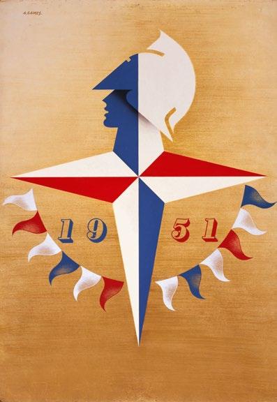
©Estate of Abram Games, 1948, Festival of Britain symbol
At the start of the Second World War, the Government reflected back to a 1914 style of poster publicity. With the limitation of private advertising, Government - instead of commercial posters - hung on the hoardings. But Games considered their messages outdated. He realised the poster had to become a social force and educate a complacent and demoralised population, one that had seen its foundation destroyed, physically and metaphorically. Instead of selling soap, it had to sell unpopular ideas and urge people to acquire new, inconvenient habits. The poster was fast becoming the spearhead of the nation’s publicity and an instrument of social change.
On his first leave, Private Games visited Jack Beddington, then in the Ministry of Information (MoI), and complained about the lack of design within the army. Beddington, perceptive and always encouraging towards young designers, proposed he offer Games’s memorandum “Army Poster Propaganda” to the War Office. Recommending anonymity, he explained, “We can’t have privates telling the War Office what to do.”
On parade in 1941, a sergeant major handed the surprised young soldier an order to report to the War Office in
London. The next morning, Games, who had been listed as a poster designer in army records, stood to attention in the corridor of a newly-bombed Whitehall building. The public relations department confided that it was in “a bit of a fix.” The clerk (not a designer) responsible for information had been transferred and a recruiting poster was urgently needed. In accordance with War Office requirements, Abram was given two stripes and classified as a “draughtsman,” as no other category existed for this type of work.
Word that a designer was working in the War Office brought a demand from the MoI for an Auxiliary Territorial Service (ATS) recruitment poster. Games’s popular ATS “Glamour Girl” poster was banned five weeks after publication because it resembled a “beauty product advertisement.” It has since become a design classic, but Abram was reluctant to be remembered as “the man who designed the ‘Blonde Bombshell’,” as he believed he had produced better work.
Inundated with extraneous work demands, Games asked his boss to search army pigeonholes for the “Poster Propaganda” memorandum. When found, it was agreed he would work on a six-month trial basis. The public
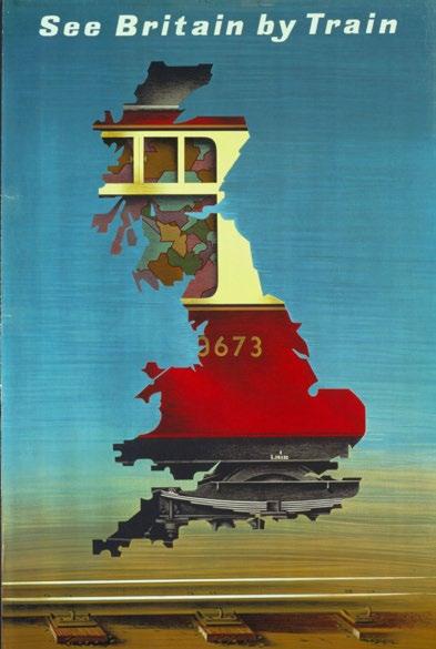
©Estate of Abram Games, 1951, British Rail

©Estate of Abram Games, 1954, Financial Times
relations department of the War Office was originally formed for the purpose of producing recruiting posters and pamphlets, but it was Games who instigated the idea of internal army information posters. Given a free hand and access to officers willing to listen to his ideas, Games, in turn, listened to their suggestions as to what was needed.
As the new instructional posters reached barrack rooms, requests came from MI5 (the security service) and MI1 (the department responsible for code breaking). Games designed posters guarding against careless talk, instructing economy and anti-waste, medical and dental care, weapon and ammunition handling, safety, antipilfering, education, trades training, aircraft recognition, the growing of food, and recruitment. Able to develop as a designer and tackle subjects unique to the poster, he insisted on acquainting himself with every possible aspect of a brief. The majority of his work was produced for army encampments, training centres, and munitions factories rather than for civilians. In 1942, not only did he produce thirty-two posters (ten in one month), but also wall-charts twice monthly for the Army Bureau of Current Affairs (ABCA). He was also made “Official War

©Estate of Abram Games & Transport for London, 1975, London Transport
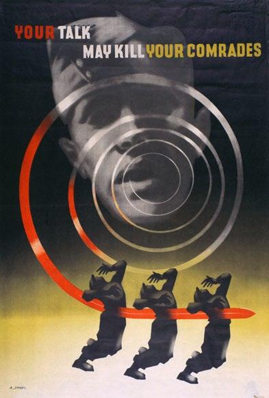

©Estate of Abram Games, 1942, War Office ©Estate of Abram Games, 1960, United Nations
Poster Artist,” the only person ever to be given this title. Difficulties beset the designer during the war; ink, paper, and reproduction restrictions were formidable obstacles. However, Games enjoyed the challenge of solving a design difficulty - and thereby discovered a new discipline. Responsible for checking and approving all proofs, he insisted on the highest reproduction quality possible under war conditions. Posters were distributed within Britain and often overseas. Metal-based printing inks, such as chrome and bright green, were forbidden by 1942. Undeterred, Games used earth colours, such as ochre and sienna, and used his airbrush to spray a large area with the same charging of the brush, thus making considerable savings on paint. Posters were printed on fragile paper, yellowing quickly and sometimes printed on the backs of others. Photolithography, with its less precise interpretation of original artwork, replaced chromolithography, which had begun to die out as artisans enlisted.
Unlike peacetime posters, wartime counterparts were concerned with matters of national interest, demanding clarity and urgency. They had to speak louder than words. The MoI adapted several designs for civilian use, the US Office of War Information placed a standing order for each new Games poster, and the Israel Defence Forces of 1948 borrowed his unique concept of posters for their military. To Abram’s dismay, an order was issued to pulp the artwork and remaining copies of all his posters after the war.
Although he designed in many disciplines, Abram Games will be remembered for six decades of poster design, many of which are still relevant today. In April 2019, an English Heritage blue plaque was unveiled on his family home in North London. He is the first British poster designer to be honoured with one.
When asked which of his 300 poster designs were his favourite, he replied, “they are like my children - I have no preferences. But if you ask which posters I want to be remembered by, they are; ‘Your Talk May Kill Your Comrades,’ ‘Guinness G,’ and ‘Freedom from Hunger.’ If I can say I designed three good posters, it is enough.’
It was more than enough.
© Naomi Games www.abramgames.com
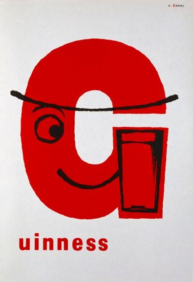
©Estate of Abram Games, 1956, Guinnes
Books:
Abram Games: His Wartime Work Publisher: Amberley Publishing ISBN: 9781445692456
Twentieth Century Graphic Designer: Abram Games Publisher: Pallas Athene ISBN: 139781843681779


