19 minute read
NOSTALGIA IS MAKING A COMEBACK · SID


NOSTALGIA
IS MAKING A COMEBACK
PHOTOPatrik Hagborg och Lina Östling ART DIRECTOR Frida Hagman STYLING Anna Strarrén DESIGN Jenny Hahne Gadd och Noomi Spange ILLUSTRATIONS Laila Reppen TEXTAnna Zethraeus-Falkirk
Swedish houses have looked so different over the years! Shifting styles, architecture and contemporary design ideals have left their mark on wallpaper motifs and colour palettes. This spring, Alla Tiders Hus will release a new collection of wallpaper patterns based on old, original wallpapers. Join us on our nostalgic wallpaper trip.
Every epoch has its aesthetic ideal. Influences from the contemporary age, fluctuations in the economy and trends come together to form their own expression and creative style – a style we often return to over the years, where our nostalgia lets the past inspire us.
Such reminiscences are the focus of the new Alla Tiders Hus collection, in which old, original wallpapers set the tone. In this inspirational wallpaper journey through Swedish homes from the late 1800s right up to the 2020s, our most fashionable period styles are represented in six different types of houses with wallpapers characteristic of their times. These carefully chosen patterns were hand picked from among our very best original wallpapers over the years, up to today’s latest styles. Some have a classic, timeless feel while others display a more eccentric character. But all the patterns play their own part in the history of our Swedish homes.
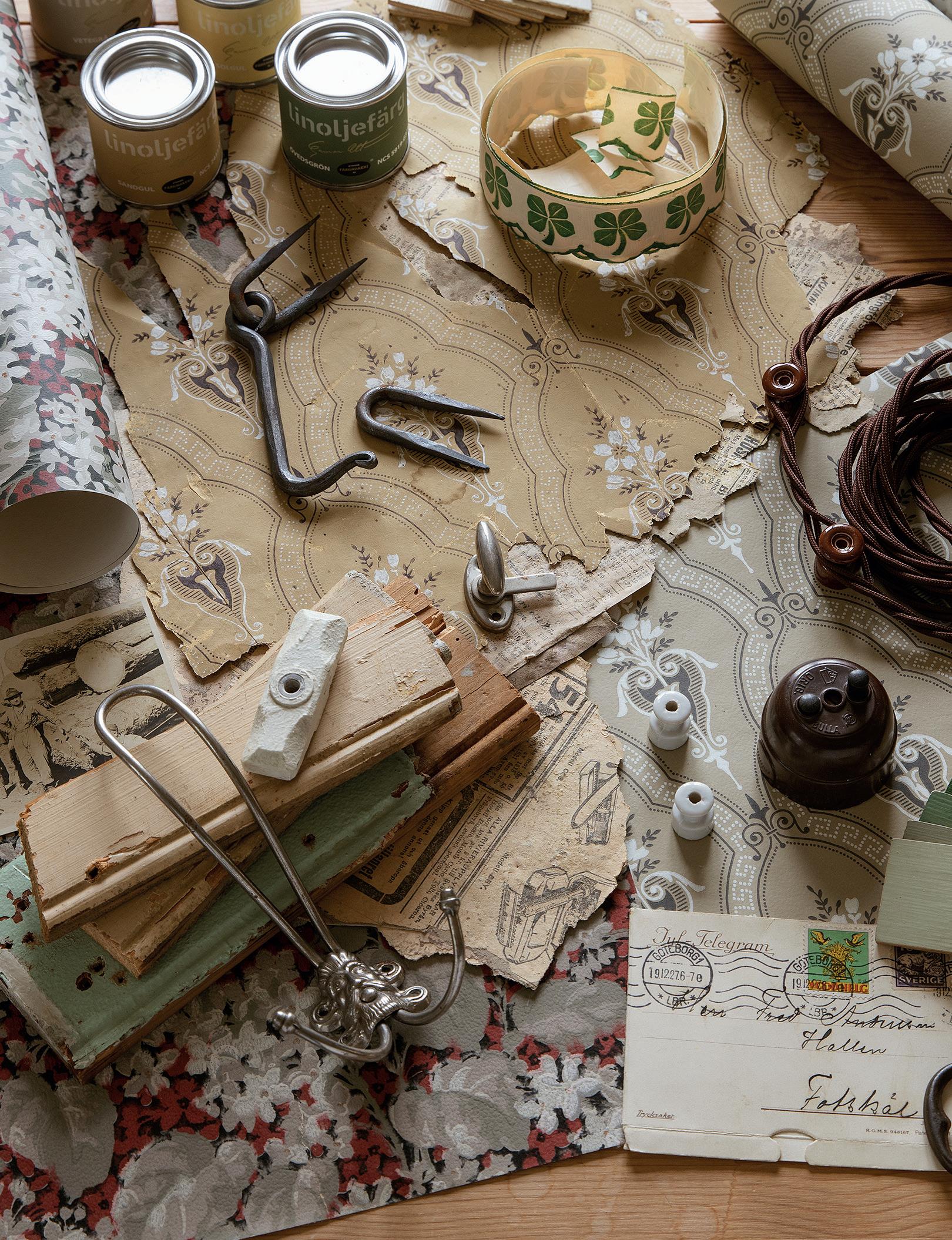
We had to delve deeply into the interior design aesthetics of former times to make the right wallpaper choices for the collection. Boråstapeter’s pattern designer Jenny Hahne Gadd and her colleague Noomi Spange searched and sorted through hundreds of wallpapers.
– We found inspiration everywhere, not just in our own pattern archives, but also in various house catalogues for former housing projects, says Jenny.
They also discovered wallpapers in old, unrenovated homes. – Indeed, we found some in old houses right here around Borås. Two of the patterns included in the collection – 1920s Trädgårdsstaden and Ängby in the ‘people’s homeland’ style – were from the same house, where two layers of wallpaper sat one atop the other, says Jenny.
All of the wallpapers bear the names of residential areas in Sweden that are typical of their times. The graphic 1950s wallpaper Ängby is named after the Stockholm suburbs Södra and Norra Ängby, with both ‘funkis’ and detached house styles. Charming, fin de siècle, Klädesholmen gets its name from the picturesque neighbourhoods of Tjörn in Bohuslän County. – And the 1970s Kryddhyllan is named after an area in Sparsör outside Borås, where houses jostle like little spice jars high up on the hill, explains Jenny.
The Alla Tiders Hus collection is just as much a tribute to Swedish wallpaper design through the ages as it is a source of inspiration for everyone who wants to borrow the style – for wallpaper and furniture alike.
THE-TURN-OF-THE-CENTURY HOUSE The period between 1890 and 1910 includes a large group of house types, from the smallest croft to the grandest merchant mansion. What unites them is their fancy fretwork, ornamental carvings and decorative, multi-pane windows. While industrialisation had given wooden buildings a boost, it had also made the production of wallpaper cheaper. – This was an age when wallpaper could be found in virtually everybody’s homes. Suddenly, ordinary folk could create cosy interiors, and people happily repapered their rooms. It’s why we find so many layers of paper on top of each other in The turn-ofthe-century houses, says Jenny.
On the other hand, Swedish pattern design had not yet begun and the offering consisted of imported patterns, mainly French, British and German. – There were so many different motifs that the style is a little difficult to summarise, but flower patterns and medallion wallpaper variations were popular. Klädesholmen is a typical stencil wallpaper with a trellis pattern that was common at the end of the nineteenth century.
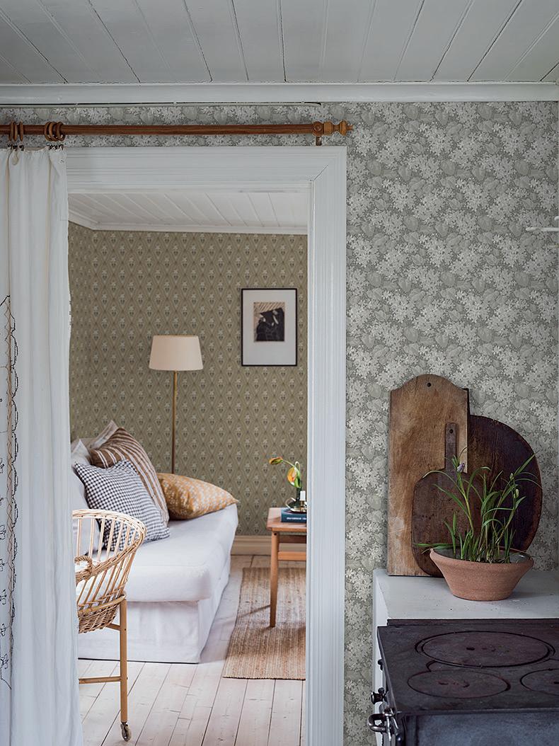
Trellis is a stylistic term for interwoven diagonal stripes and lines. It is a pattern we still see a lot of today. – This pattern is often printed directly on brown-beige paper, and this particular paper-coloured background has been preserved in Klädesholmen. At the turn of the century, wallpapers were designed to go with the functions of various rooms, and people happily chose gold features for the drawing room, and small flowers for the bedrooms. – Aratorp with its dense foliage is typical for the early 1900s. The profusion of flowers almost obscures the background with their dark, deep colours. This type of pattern really adds to a room, it surrounds you.
These lush, colourful flower motifs have made a comeback and once again we see strong patterns in today’s wallpaper trends. – The trendsetting turn-of-the-century feel was ‘more is more’. People were not afraid of clashing patterns, lots of colour and understated hues. Which is precisely why light and airy Klädesholmen and rich Aratorp go so well together.
THE ART NOVEAU HOME Jugend is a naturally inspired style epoch that embodies great expression. The term comes from the German word for youth, but south of Germany the same style is known as Art Nouveau – an entirely new artistic idiom with a softer flow of lines, airy style, big roofs and daylight openings. External walls rendered in bright colours and organic forms impart an air of the manor house. – A passion for nature is central to Jugend style, and in Sweden we had a more restrained variant influenced by Nordic nature with its somewhat milder colours and softer patterns, says Jenny.
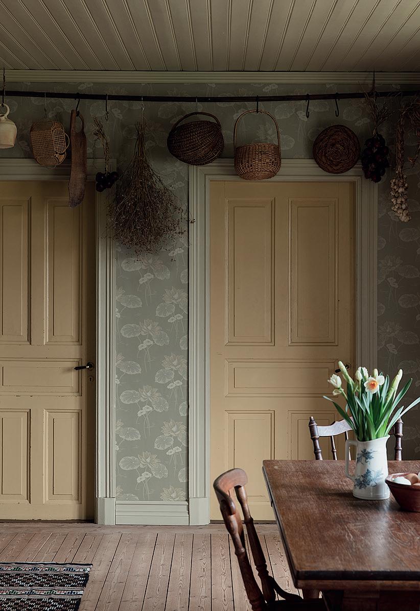
Näckrosen, with its mystical aura and eccentric expression, is a pattern typical of its times. – While Jugend style is new in so many ways, it’s also distinct and the epoch is the easiest to recognise. Even though the two wallpapers Haga and Villastan are so different, they are also clearly related.
Everything had its place during this period, and Jenny points out that we can also see how patterns have liberated themselves. – Haga shows how everything gets bigger; the foliage flows and coils at the same time as air is allowed into the patterns. It creates pleasant spaces and restful pauses.
The motifs take on a more restrained look later in the style epoch. – Villastan is an example of a later influence known as WienerJugend. Here, patterns have a stricter form that is more stylised, almost graphic.
This style was also known as kontrajugend, and included many geometric patterns. – Inspired by the original wallpapers, their green and pale, dirty pink tones create an airy impression but also have a strong feel.
xxxx Namn4172 Salängen
The wallpaper Salängen have a small floral pattern with geometrical shapes and Cubist lines. The colours are characteristic of the epoch with a restrained beige background and features in dirty pink and green.


THE TURN-OF-THECENTURY HOUSE
BLOSSOMING FRETWORK
STYLE & WALLPAPERS

Th e outside boasts ornamental features, glazed verandas, multi-pane windows and a gable roof. Inside are hardwood fl oors, high skirting boards and beaded, tongue-and-groove panelling in the kitchen. Th e hearth was the heart of the home. Wallpapers were characterised by many patterns, dense foliage and imaginary fl owers with quiet background colours and elements of ochre, brown umber, English red or chrome oxide green. Later, colours became somewhat paler, often with an off -white background and ornate gold features.

• KLÄDESHOLMEN Late 1890s stencil pattern with diagonal trellis lines with a light, country feel. A great wallpaper for creating bridges between rooms with diff erent patterns.

• ARATORP A wallpaper from the early 1900s; the pattern’s abundant foliage and dense fl owers in deep colours create a warm, cosy space. The turn of the century house -


STYLE & WALLPAPERS
Th e houses often have smooth, plaster exteriors in bright colours, but the style also includes national romantic wooden detached houses. Common architectural features include bay windows, rounded balconies, wroughtiron railings and hipped roofs or mansard roofs characterised by four sides with two pitches per side. Windows with two tall panes with smaller multiple windows above. Wallpapers show greenery in an eccentric style, often in rising motion and with space for air.
• HAGA A typical Jugend pattern with bold, coiling, elegantly mystical fl ower patterns. Th e spaces create a light and airy feel and give a restful impression.
• VILLASTAN A much more stylistically pure, graphic wallpaper but still with an exciting pattern. Mild, pale colours that have more punch than is immediately apparent.


The art noveau home


THE ART NOVEAU HOME

FLOWING FORMS AND STRONG EXPRESSION


1920s HOUSE Classic 1920s style has a cleaner, simpler expression centred around symmetrical shapes. Classical antiquity was the original inspiration, influences that recur during the eighteenth and nineteenth centuries, but which now appear in a more restrained style. In Sweden, houses from the 1920s are sparingly decorated and have fewer extensions, and the light feel is reinforced by windows that look out in several directions. – The many brown and sand-coloured wallpapers contradict the epoch’s light and airy style. We need to remember that back then, these colours weren’t considered drab in the way they are today, says Jenny.
What’s more, the furnishings would have been lighter and more airy. Because homes were not so over-furnished, the wallpaper styles imparted a warmer feel to the somewhat austere architecture. – Salängen is a wallpaper that typifies a 1920s trendsetting style: a symmetrical pattern where the motif is presented broken into geometric shapes that add a touch of Cubism.
At the same time, we were also inspired by a new type of Asian motif, often depicting our own takes on cherry blossoms. – Trädgårdsstaden represents a wallpaper style with Eastern influences that were big back then. A slightly bolder exoticism with a dark brown background, Asian-inspired flowers and bright colours.
THE MID-CENTURY HOUSE The 1930s trend towards austere functionalism was followed in the 1940s by a more accessible, ‘people’s home’ style. It was a softer follow-on from functionalism’s ideal that also continued into the 1950s. Houses were now built in the domestic vernacular with careful, small-scale simplicity in places that had room for neighbourliness and greenery. Small-format, box-shaped detached houses had warmer colours and more modest choices of materials. The midcentury house was intended for everyone. – The people’s home aesthetics of the 1940s grew permissive with added features and more colours. A soft scale in pale green, pale yellow and dull blue, Jenny tells us. In fashion and furnishings, earlier retro 1950s trends were inspired by American style – black-and-white tiled floors, mint green and pink features in rounded, puffy shapes. – When choosing the colours for this collection, we stayed with a Swedish 1950s palette, which is more restrained and has a milder impact – dirty pink, milky blue and green nuances towards shades of brown.
Typical floor plans with clearly demarcated rooms led to wallpapers with a lot of pattern. Often, one room would have one style, and the next room something completely different with a closed door in between. – With its Swedish meadow flowers, Flora is a wallpaper with a great deal of soul and a pattern repeat that is so balanced that no single part disturbs or overwhelms. A glorious pattern that is easy to like, which has become a bestseller over the years.
In earlier style epochs, wallpaper was the star of the show, but now was a time when wallpaper could also function as a neutral background with textiles, art and furniture as accents. – Ängby, named after the classic Stockholm suburbs, is one such background wallpaper. A pale grey background with simple lines in white with just one or two accent colours was the norm in the mid-century house.
STYLE & WALLPAPERS
Houses with straight lines and clean façades in a symmetrical style. Tall entrances were typical in large, detached houses, as were columns and pillars. All of the windows in the house were identical, with panes of equal size. Gable roofs were most common, covered with clay tiles or painted sheet metal. Wallpapers were in tones of beige, brown and sand and often had small fl oral patterns with features from the Far East, and sometimes also geometrical shapes.
• SALÄNGEN A small fl oral pattern with geometrical shapes and Cubist lines. Th e colours are characteristic of the epoch with a restrained beige background and features in dirty pink and green.
• TRÄDGÅRDSSTADEN An Asian-inspired wallpaper with a muted brown background and a fl oral pattern with features in bright blue and red.


THE 1920s HOUSE
CLASSIC SYMMETRY, CLEAN LINES
The 1920s house


THE MID-CENTURY HOUSE
A KINDER KIND OF FUNKIS
STYLE & WALLPAPERS
Now residential areas were being built for everyone, with a focus on neighbourhoods, parks and social spaces. Homes were characterised by a more simple, ordinary architecture where box shapes and fl at roofs were common. While wallpapers in some cases had bold patterns with specifi c designs for children’s rooms, they also often gave a neutral background impression in a role subordinate to the furnishings.
• FLORA Meadow fl owers with features in gold, pink, blue and green on a beige background. A multi-coloured wallpaper that is functional, as many colours can be repeated in the furniture, making it easy to match.
• ÄNGBY A background wallpaper, typical of its era, with a warm grey base together with oat yellow and a subdued, dirty green. Also available in a colourway with dark blue, grey green and white.
The mid-century house


THE BRICK HOME A new type of house emerged in the 1960s and 1970s – the single-storey brick home. Even though there were some wood and plaster façades, brick was most common and calcareous sandstone – marketed as Mexi Brick – became the signature style of the epoch. Houses were now planned differently, such as L-shaped single-storey detached homes and split-level homes with a half story built into a sloping lot. Floor plans were opened up and living space was maximised such that the basement was also used, giving us the immensely popular basement recreation room. – My first thought is of the strong, drab colours back then – like that typical 1970s combo, brown and orange. But at the same time, there was also a major trend towards pale, natural materials like canvas and greens from the plant kingdom, says Jenny.
Floral patterns were a central theme throughout the period, often with a playful feel. – Kryddhyllan’s 1970s pattern with its ornate foliage captures the typical spirit of the times in an Arts & Crafts interpretation that is spot on. Enthusiasm for Arts & Crafts-movement aesthetics was great at the time, inspired by late-nineteenth-century masters Morris and Voysey.
Jenny also points out how Kryddhyllan is an ideal example of how we always look to history for inspiration. – And I can picture it in front of me in tons of different types of homes with every possible colourway. Indeed, we’ve joked about being able to create a collection based solely on Kryddhyllan, laughs Jenny.
Textured wallpaper was also popular as people sought a cosier feel in the home. – Imitation texture was the most common type of pattern during this period. Anyone who’s removed wallpaper from a 1960s or 1970s home is bound to have come across it. The Vivalla wallpaper was included in a catalogue for Million Programme homes, so it was fun to have it in the collection.
THE NEW-BUILT HOUSE Naturally, there are many building styles today, but here the focus is on the spacious feel of the 2020s. Houses with vertical wood cladding, simple roofs, large windows and glass doors that let in generous amounts of light. There are often multiple entrances, making the wooden deck a continuation of the living room floor where the open floor plan continues outdoors. – Because many people see homes with open floor plans as an obstacle to patterned wallpaper, we sought to create wallpapers that can match in the same room. Not only can they work together, but also with walls in a single colour, explains Jenny.
The patterns were specifically chosen to provide many different combinations in open interiors. – Wallpaper can be an excellent way to delineate space in open floor plans and create rooms within rooms. When the kitchen, dining room and living room all flow into one, a wallpapered background can be a great setting for the dining table.
The choice of materials is important in modern homes, and the different surfaces are what determine the style of furnishing. – The trend towards nature is a central theme today, as is our feel for material. We have limestone furnishings and our facades are treated with iron sulphate. So we need walls that match – a look that’s picked up by the wallpaper Sjöhagen.
While we still prefer mild, natural tones, the range of colours has become warmer in recent years. The earlier grey tones now lean more towards beige and green. – I got my inspiration for Skogsparken’s pattern during the autumn when I was picking walnuts from a tree weighed down with nuts. I wanted to capture the feel of the beautiful shadow play beneath the tree as sunlight trickled down through the foliage, Jenny tells us.


STYLE & WALLPAPERS
Low-rise brick homes usually had a single storey and a fl at or single pitch roof. Th e garden was incorporated into the building, a feature reinforced by low, single-pane windows and wood furnishings in teak and pine. Seagrass wallpaper made its breakthrough, together with woven fabrics and cork, and a plethora of imitations. But there were also large fl oral patterns, naive motifs and medallion wallpapers in colours such as yellow, orange and brown with some green and beige.
• KRYDDHYLLAN A 1970s fl oral pattern in the Arts & Crafts style with foliage in warm beige on a putty-coloured background. Th ere are also other colourways with pale foliage in beige on an olive green or muted blue background, as well as mild pink and pale green.


• VIVALLA A tribute to texture imitations in a retro wallpaper that makes a room feel upholstered and cosy. Available in three colourways: grey beige with warm notes; a muted green; and shades of blue.


THE BRICK HOUSE
SINGLE-STORY, DRAB PATTERNS
The brick house


The new built house


THE NEW-BUILT HOUSE

CONTEMPORARY INTERPLAY WITH NATURE


STYLE & WALLPAPERS
Natural materials are centre stage in today’s modern 2020s housing. Vertical wood cladding and asymmetrical shapes in both buildings and roofs are typical of our times. Windows have a prominent place, with plenty of space, and they often run all the way from fl oor to ceiling. Multiple entrances tie the open fl oor plan to the wooden deck and the outdoors. Th e view is also more important than ever.
• SJÖHAGEN Stylewise, the wallpaper is based on our increasing feel for material and our choice of natural textures throughout the home. It goes together well with wood and natural stone.
• SKOGSPARKEN A pattern that clearly lives and breathes the 2020s, without any retro allusions. Its natural inspiration comes from the walnut tree’s beautiful autumn shadow play. Here in a muted dark green colourway.


