

Table of Contents
DESIGN

設計
H&S
Head & Shoulder Shampoo Branding Packaging
Head & Shoulders is a big brand name, with good functionality, however it consists of silicon and some other harmfull chemical ingrediants that hesitate the users to continue using it. e aim of redesign is to find the solution of a more sustainable and enviroment-friendly packaging and products


DISCOVER Research Methodology
With a purpose to figure the solutionof users’ problem when they deal with the rest of the shampoo in the bottom of bottle and to solve out the enviromental polution problems with the overloaded packaging on lands, various methods of reseaches were conducted: online survey to see customers’ awareness of hair care product, reviewing the documentay on internet, store check and compare the differences of others hair care products.
.
Document Observation & ExperienceSurvey


1 POP
=
1 DROP OF SHAMPOO
DISSOLVE IN WATER
COMPLETELY USE OUT
EASY TO TAKE FOR TRAVEL
ECO FRIENDLY ORGANIC





Wu Wei Cha
無為 Wu Wei is the practice advo cated by Taoism of letting one's action follow the simple and spon taneous course of nature , rather than interfering with the harmonious working of universal law by imposing arbitrary and artificial forms : doing or making nothing ,letting flow...


Wu’s Casita
Taipei City Map - Airbnb Illustration
e map is designed in order to let the tourists and backpackers know more about the enviroment around Wu’s Casita and make their stay in Wu’s Casita more convenient. I mainly used a soft tone of color on the map to distributing the impression of this city -- despite of its modernity, it still remains its very own tradition and nature such as Four Four South Village and Xiangshan in thie neighborhood.


OMAMORI
Branding Packaging CMF Design

Concept
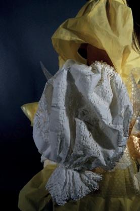

 waterproof bubble wrap wrapping paper


Posters


Graphic Design



Rémy Martin
Design


