5 minute read
INTRINSICAL-NESS
from CHEN_WANYU_PORTFOLIO
by Wendy Chen
Diamond Ranch High School was established in 1997-1999 to inject more vitality into the community and recruit more students. The studio centers on public education, especially elementary learning. And the project will be Diamond Ranch Arts and Sciences Elementary school. The notion of scalar change focuses on our design from
The reference of this method of close up and zoom out is the movie ‘The Powers of Ten’ created by Charles and Ray Eames in 1977. The intention is to work through
Advertisement
The pedagogical position of this project is to create small learning environments in the school where students reflect on the relationship between people and nature. From a functional point of view, holes of different sizes and walls of varying shape also introduce natural light into the rooms and allow for natural ventilation, which cools down the perennially hot building. The project reflects a belief that architecture should create a connection rather than a separation between people and nature.
Chairs & Classroom
The architectural shape of the classroom is designed and developed from the form and concept of the chair. Its unified and clear architectural language can enhance people’s first impression of this school and improve the integrity and harmony of the design.
The design of the chairs came from the iteration of the Thonet chair. The chairs are curved and intrinsic with different pipe widths and deformed into various models, beginning from simple line work. Since chairs are for elementary schools, more vitality is considered to be brought into the site. The chair design exaggerates some features derived from the Thonet chair and transforms the color palette.
With the meandering wall forms and the textures applied to them, the birch bark material creates natural terrain and plant growth qualities. The classroom is the landscape, which blurs the boundary between architecture and nature, allowing natural elements to be introduced into the indoor spaces. This creates the possibility for sunlight, air, and plants in the natural environment to enter the indoor spaces.


To blur the boundary between architecture and nature, the walls consist of tubes with seams. The timber pattern and translucent materials were applied to walls and spaces.

Campus

Our site and building are quietly located between the land and the mountains, and the campus has a strong sculptural quality. The free and organic form also shapes the adaptable indoor space comprised of walls, floors, ceilings, flexible interiors, and the landscape of the campus. The design language of meandering, which is driven from the lines, creates an escalating landscape and zoning along with the existing site. These forms allow teachers and students to roam, experience nature, and look at the sky and mountains at any time. They blur the boundary between architecture and nature. The community center locates at the end of the main road of the existing middle school site for public people to access this site. As the building mainly serves students and faculty in the school, the art center and sports stadium are located in the inner part of the site, which nears the sports field. On top of this, the circulation from one building to another was placed created for people to circulate inside the site.


Geometric primitives are the basic shapes we all know and recognize. They are simple three-dimensional forms such as cubes, spheres, cylinders, and cones. One of the
In addition to its formal qualities, we have also been interested in articulating methods of assembly, specifically the operations necessary in connecting and attaching parts in place. We like to imagine that building elements, while sliding, rotating, and clicking into place, may leave traces of their assembly onto the architecture itself.
The project began by using Midjourney as an early exercise to test potential configurations and spatial consequences for a geometric primitive made with interlocking parts. The second half of the semester will situate the primitive in relation to the ground.

Midjourney / DALL.E 2 v.s. 3D Primitive Puzzle


In recent years, with the increasing development of AI computing power, AI’s ability to process images has also improved. When a man’s drawing created with Midjourney AI won an award at the Fine Arts Exhibition held at the Colorado State Fair, it caused an uproar not only in the art world but also among the general public. It is undeniable that the use of AI will gradually become part of people’s lives and affect the way creators create their work. AI can produce a series of solutions in a short period of time by interpreting textual narratives and deconstructing and sewing together material from databases. However, if we imagine a 3D spatial relationship based on the 2D images generated by AI, there is an ambiguity in the results generated by AI. This allow people to read the space and the 3D relationship in different ways. This ambiguity is why we should consider AI as a powerful aid to our design and exploration of volumes.
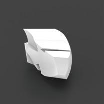
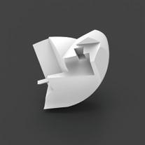
Our design uses two pictures obtained from midjourney and DALL.E 2 as the front and back hemispheres of the sphere puzzle. Using 3D modeling, we explore the relationship between the surface of the spheres and the volumes inside, such as how they connect and pull themselves together to form a sphere. In both midjourney and DALL.E 2 images, the depth and width of the gaps become the basis for cutting the spheres. We imagine the internal relationship of this sphere puzzle by disassembling the puzzle.


We use sequential disassembly to emphasize the narrative of a disassembly process and the spatial relationship between the connected parts of the different pieces. We imagine that this sphere is assembled by 9 pieces of different sizes, and in the process of disassembly, we can find that each piece overlaps and wraps around the previous parts that have not yet been disassembled. At the end of the disassembly, the core part is a key-like block that locks itself to the next piece. In terms of material selection for the physical model, we used clear resin as the core key material and plated copper, nickel, and zinc for the other pieces.
9 pieces that construct the sphere and the base


The sphere is assembled by 9 pieces of different sizes, and in the process of disassembly, we can find that each piece overlaps and wraps around the previous parts that have not yet been disassembled.

A


Turning B
Based on the primitive puzzle previously developed, we want to discover the possibility of how the primitive puzzle can be the starting point for a building. By deassembling the primitive into a new posture on a site, the spatial relationship within the sphere puzzle fundamentally disrupts the fit of the parts to its whole and opens up opportunities for the primitive to become architectural - addressing program, structure, spatial sequence, and materiality.


The site of the building is located in the heart of downtown LA, in a nearby open space of The Broad. The site is on a slope with a huge height difference which is a continuous slope all the way up to The Broad. This open space is now used as a parking lot.
As an art museum, we imagine the building and the surrounding landscape are not only an extension of the original museum space of The Broad but also a space that bridges and interlocks the space, people, and the neighborhood and allows them to flow inside. The sphere puzzle was de-assembled by a few moves, such as pulling out and adding pieces, scaling, and rotating before placing it on the site.


Circulation & Physical section Model
The building volumes are mainly divided into two halves placed on the base; they come from the process of decomposition and transformation of the sphere puzzle. The keys in the original plan still function as keys to the two large spatial assemblages in the architectural space. The two keys in the building are the main spaces for changing the flow of people. We tried to preserve the spatial relationship between the different blocks of the original plan in the process of transforming the plan into a building. The transformed building volumes are combined with the newly designed topography to create a gap for people to enter.

Physical models of this project are built in 3/32” = 1’-0” and 1/16” = 1’-0” by 3D printing, to show the detail inside the section and the relationship between building and overall landscape. To showcase the materiality of the design, In terms of material selection for the physical model, becides the spraypaints, copper, nickel, and zinc are are plated on the model.


