3 minute read
Project & Promise
“We just fell in love with the site and the character of the neighborhood, and the fact that it had multiple houses and outbuildings, was something we were looking for,” the homeowner says.
The couple have five grown children and two grandchildren who love to visit, so they imagined the property and its structures for the potential but understood the work that would need to get done.
“The whole place was a project,” explains the homeowner, who remarked that the main house had probably been added on to three or four times, and that it was relatively obvious where those additions were.
Fortunately, the couple was able to live in a small guest cottage on the property during parts of their residential integration project, that all-in-all took five years to complete.

Mueller’s team would come into the mix a few years after the purchase and after a second-floor carriage house suitable for a small family was completed above the garage. Exacting floorplans for a first floor do-over were first created by Cook, and the couple chose Mueller Homes to execute those plans.
While the property was superbly well perched above Severn River, the main home lacked the flow and layout required to really take advantage of that elevation with its smaller, choppier rooms, and an ill-placed, three-season structure that offered little to no views at all.
“There was a dilapidated screened-in porch that was blocking [the view],” Mueller explains. “Cook did a nice open-concept addition where the screenedin porch was in play and basically opened up the livable space where everybody congregates [in] the kitchen to a new family room that now gets an almost 180-degree view of the Severn River.”
The new plan provided a seamless approach that would integrate all the previous additions and updates into one cohesive look, and check off the homeowners’ biggest box on the wish list, bringing the outdoors in.
“For us, feeling like we are always outside, was something that we were looking for,” says the homeowner.
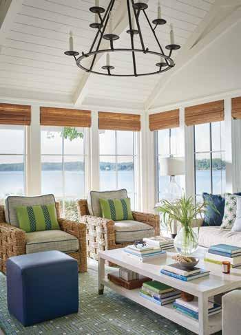
To address the sense of openness the couple required, Cook’s family room plan included a 14-foot cathedral ceiling and two walls of windows to create that 180-degree view of the river.

This clearly was a job for Mueller’s in-house millwork team who used a combination of wood treatments; shiplap for the ceiling and poplar for the beams employed in a scissor-truss pattern to dramatic effect.
An additional ceiling beam wrapped in cedar was employed so a wall could be taken down to expand the kitchen and have it flow into the adjacent family room. The result is a totally re-imaged space accented with luxe custom cabinetry and exceptional finishes which transitions into the home’s re-positioned laundry room, pantry, and powder room.
To complement this part of the renovation on the outside, Mueller suggested adding an Old-World brick treatment to the exterior where the screenedin porch had been. This brick treatment was extended to the foundational areas of the home, as well, lending texture and depth, and further addressing the homeowners’ request to unify the overall look of the home’s exterior.
Back inside, it was McLay’s turn to take all the incredible new space the couple would have and turn it into an environment that would convey an elevated seaside cottage aesthetic. McLay explains how a trip to the Washington Design Center helped additional interior inspiration.
“We spotted a rug sample that they loved, and it ended up being the jumping off point for their family room design,” McLay says.
To this McLay added an exceptional pair of chairs with a chunky, rope-like texture from John Himmel and accented them with sea-worthy blue and green fabric toss pillows from Kravet.
Pattern and texture would go on to play a leading role throughout this space and further into the kitchen, laundry room, pantry, and powder room.
“Varying the scale of patterns helps ensure it will not overwhelm the senses,” McLay says. “We did this from space to space (larger fish pattern in bathroom versus a smaller geometric in the laundry room) but also within a space by varying the scale of patterns on pillows, wallcoverings, and window treatments.”

Further enhancing the kitchen’s custom cabinetry and gleaming counters, is a combination of stylish pendant lighting from Visual Comfort, and bar- stools from Vanguard, customized with leather seats and woven fabric backs accented with large brass nail detail. Above the range is a backsplash made of marble mosaic by Atlas Marble & Tile in Arnold.

Transitioning from the incredible wide-planked white oak hardwoods of the open-plan living space into the pantry, is a rustic brick walk laid in a herringbone pattern. It’s another small detail that speaks volumes about the effects texture and pattern can add to a well-executed design scheme.
Once all the bells, whistles, and details were completed on the residence’s first floor renovation, it only made sense to the homeowners to keep a good thing going. So, the team went back to the drawing board to put the same quality workmanship and care to use, re-imaging some rooms on the upper floor, which included the primary bedroom and bath, and a to-diefor home office with a miles-long view of the Severn.
This would lead to the final steps in wholesale property integration project that the couple had imagined.


