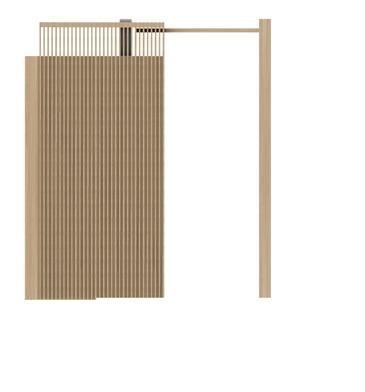
Dream of Yesterday
2020-2024
Selected Works
Applying for Architectural Positions in SCI-Arc
 Robert H. Goddard
The dreams of yesterday are the hopes of today and the reality of tomorrow.
Xiao Jin
is.jin.xiao@gmail.com
FOREWORD
In this portfolio, I present my journey from a fascination with design to the brink of professional architecture. It encapsulates my growth, illustrating how my early passion for dynamic forms evolved through learning and practical experiences. My design philosophy focuses on managing the interfaces between different realms, including various materials and spaces, reflecting in each project's meticulous attention to function and form.
I have always been intrigued by the interplay of space, materials, and construction—each element vital to crafting meaningful architecture. This collection showcases my ability to meld these aspects into coherent designs, from conceptual sketches to structured realities.
As I prepare for my future as an architect, this portfolio serves as a foundation for my commitment to thoughtful design and my aspiration to impact the built environment positively.
Flexible Constructs 48 VI VII Logic Lora 56 Academic Work CONTENT WORKS 2020-2024 Professional Work Prefabricated Building Research Articles AI Plan Generation 4 Spark Journey I School Design Re: Invention 16 II Design Development Let's Stitch 26 III Theater Design Material & Tectonic 36 IV Material & Tectonic Manipulative Details 44 V Fabrication Stairs Industrialization with modularity Interior Design Construction Design Single family house floor plan Stable Diffusion Parametric Design Fluid and transparent space fosters inspiration Typological classification Craft model Deepening Design of Bio-Tech Institute Construction Documents Structural Design Material gradient brings about space Parametric facade Rendering creation Envelope system of the Uppsala Concert & Congress Hall Junction of different materials Design and construct a deceptive stair Wood CNC Welding
Inspiring through space
Advisor
Micheal Rotondi
Team Memeber
Chia Kuang Wang
Status
Schematic Design
Design Studio
Software: Rhino 7, Auto CAD, Photoshop, Adobe Illustrator, Indesign
Handwork: 3D print, Spray painting, Sanding, CNC cut
Future School Design
Sci-ARC 23Spring
Every space can have a spark moment. This project uses spatial organization to promote communication between students of different majors. The more transparent space encourages students to move around and connect with nature in a natural flow.
The project introduces a new typology, consisting of three types: Hub, Porch, and Trail. It explains the importance of spatial organization for future school architecture and how they influence the transformation of learning methods.
Journey Spark
4
3GBX
Xiao Jin
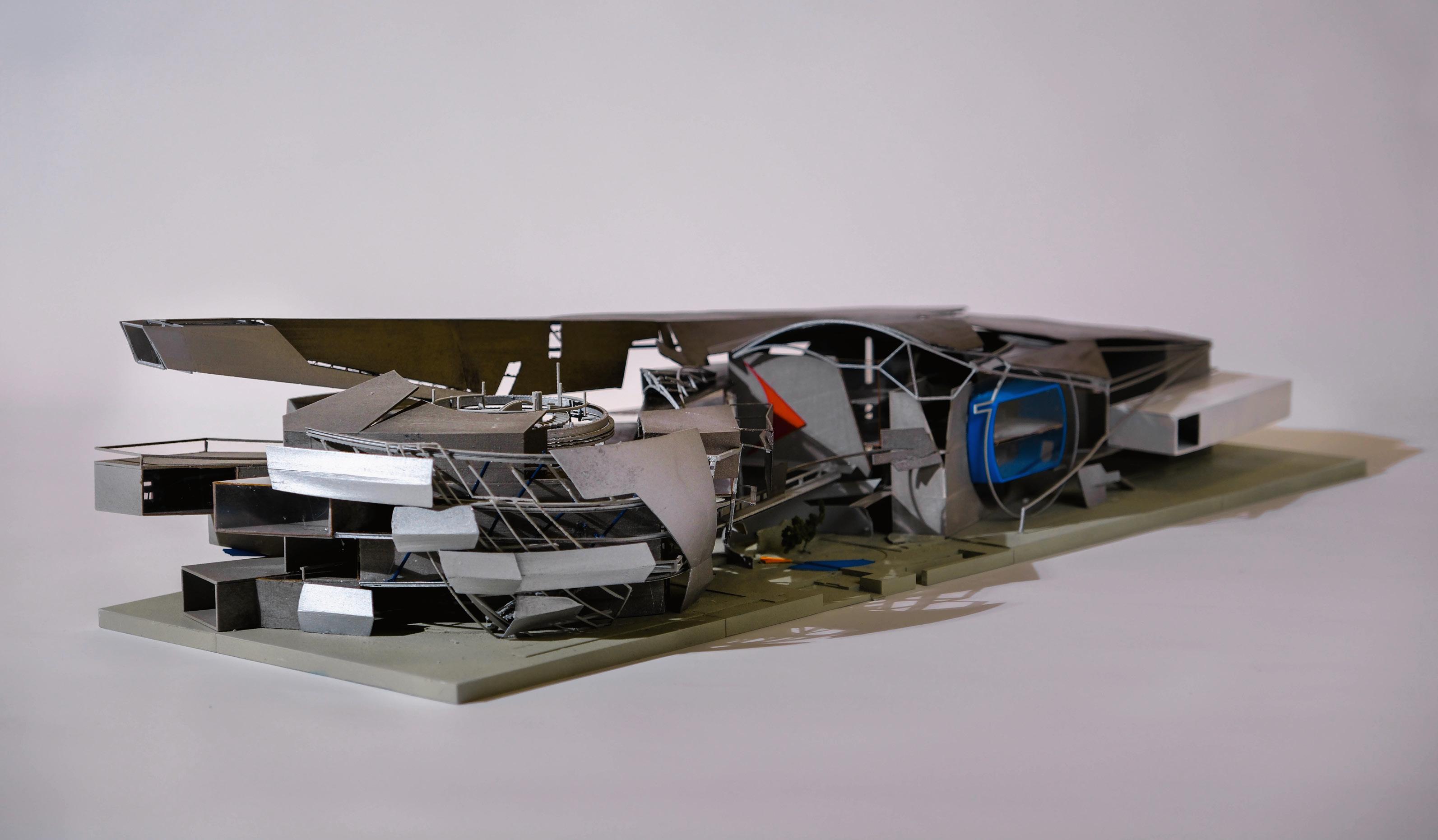

Location: 1918 Darwin Ave, Los Angeles, CA Video
5
Full-view
Photography of the model
Overall Model Photograph
Concept
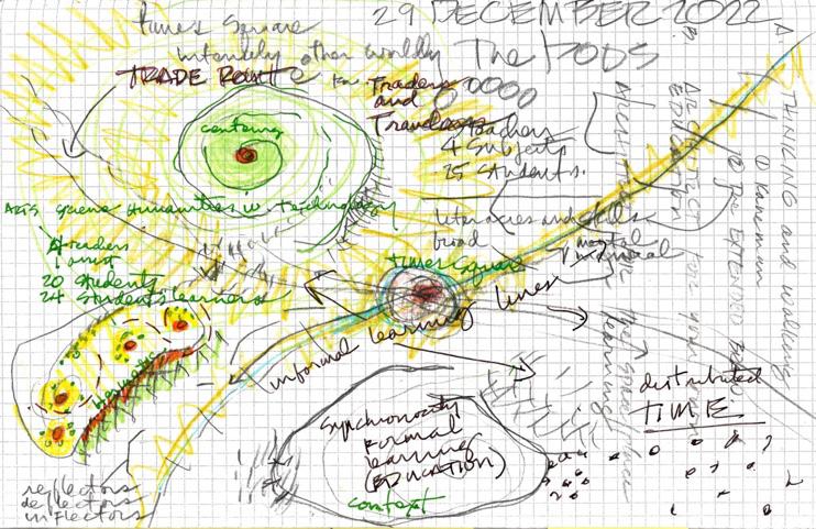
The Hub / Caravanserai
- these will be big learning spaces / volumes
- the hub is a collection of other functions
The Porch / Time Square
- interface of the Hub and the Trail
- it will mediate formal (inside) and informal (outside) learning
The Infinite Trail / Silk Road
- connecting Hubs
- for moving and thinking, making, conversing
The Aviary / mini-Forest
- the dynamics of our mini forest will be
- a part of the curriculum and a place to mentally re-center
A new architectural typology, inspired by neurons: Hub (cell body), Porch (dendrites), and Trail (axon). It represents a composite of subdivided functions. Its unique feature is the blurred or shared boundaries between functions, highlighting the need for this broader classification.
In terms of specific functions, the program explores a gradient of spatial experiences, ranging from open and noisy to private and quiet.
The Hub, the most open and potentially noisiest space, serves as a central gathering point. The Porch provides a transition between the Hub and the Trail, offering a semi-private space for interaction. The Trail, the most private and quiet space, is designed for individual contemplation and reflection.
This classification ties closely to spatial deployment, with the platform's ambiguity allowing functions to change over time. A corridor, for example, mainly serves as a passageway but occasionally transforms into an exhibition space, captivating students. This blurs the functional boundaries within the space, justifying the Hub, Porch, and Trail classification.
Inspiring through space
Hub Trail Trail -cell room Trail -Cell room -Sofa Space -Inspire room -theater -library -Launge(S) Hub -Co-working space -Workshop -studio -Exhibi�on -Auditorium/Music -Dining area Porch -Hacker space -Exhibi�on -Corridior -Classroom -Cafes -Launge(L) Porch -corridor Porch -kitchen Porch -exhibition Lounge Public Private Library Co-working Space voice volume -coffee -classroom Trail Trail -cell
Hub Trail Trail -cell room Trail -Cell room -Sofa Space -Inspire room -theater -library -Launge(S) Hub -Co-working space -Workshop -studio -Exhibi�on -Auditorium/Music -Dining area Porch -Hacker space -Exhibi�on -Corridior -Classroom -Cafes -Launge(L) Porch -corridor Porch -kitchen Porch -exhibition Lounge Public Private Library Co-working Space voice volume -coffee -classroom Trail 6
Typology
Concept Drawing by Michael Rotondi
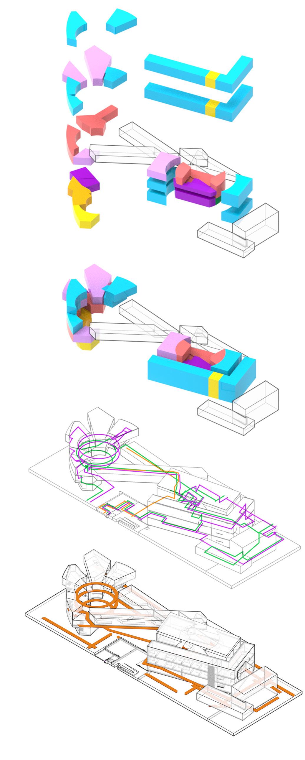
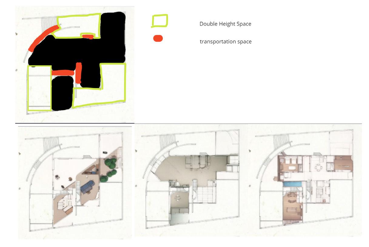
The movement paths for students, teachers, and visitors are designed so that visitors can view the works and gain inspiration without disrupting students' learning. They can also interact with talented students, fostering exchange and creativity.
Spark Journey I
Studio Co-working Space HUB 30% Workshop Exhibition Auditorium/Music Others Dining Area
Forming
Trial Porch Hub Program of Hubs Students Circulation teachters visitors Initial Attempt_Hub1 Media Lab_Porch Library Deep Practice_Hub2 29% 20% 16% 11% 10% 4% 8% 7
Platform-Type Space
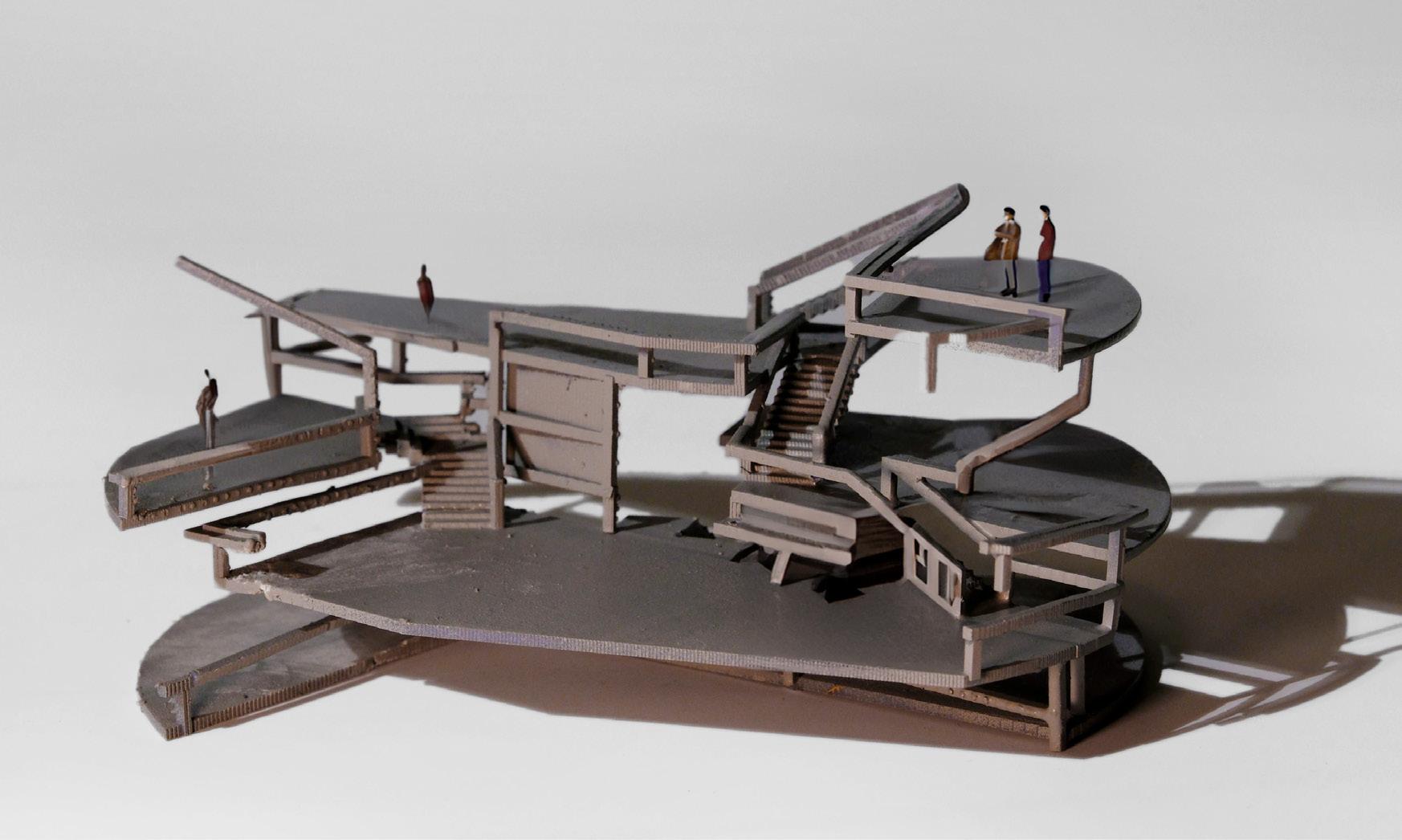


Platform-centered spaces, fundamental to the design, illustrate 'Inspiration through Transparency,' vividly captured in the facade’s emphasis on transparency and connectivity. This design approach aligns precisely with school architecture needs, aligning with the vision for open, interactive learning spaces.
Inspiring through space
Transparency
Concept Model of Plateform
South-west facade [down]
Concept Drawing
8
North-east facade [up]
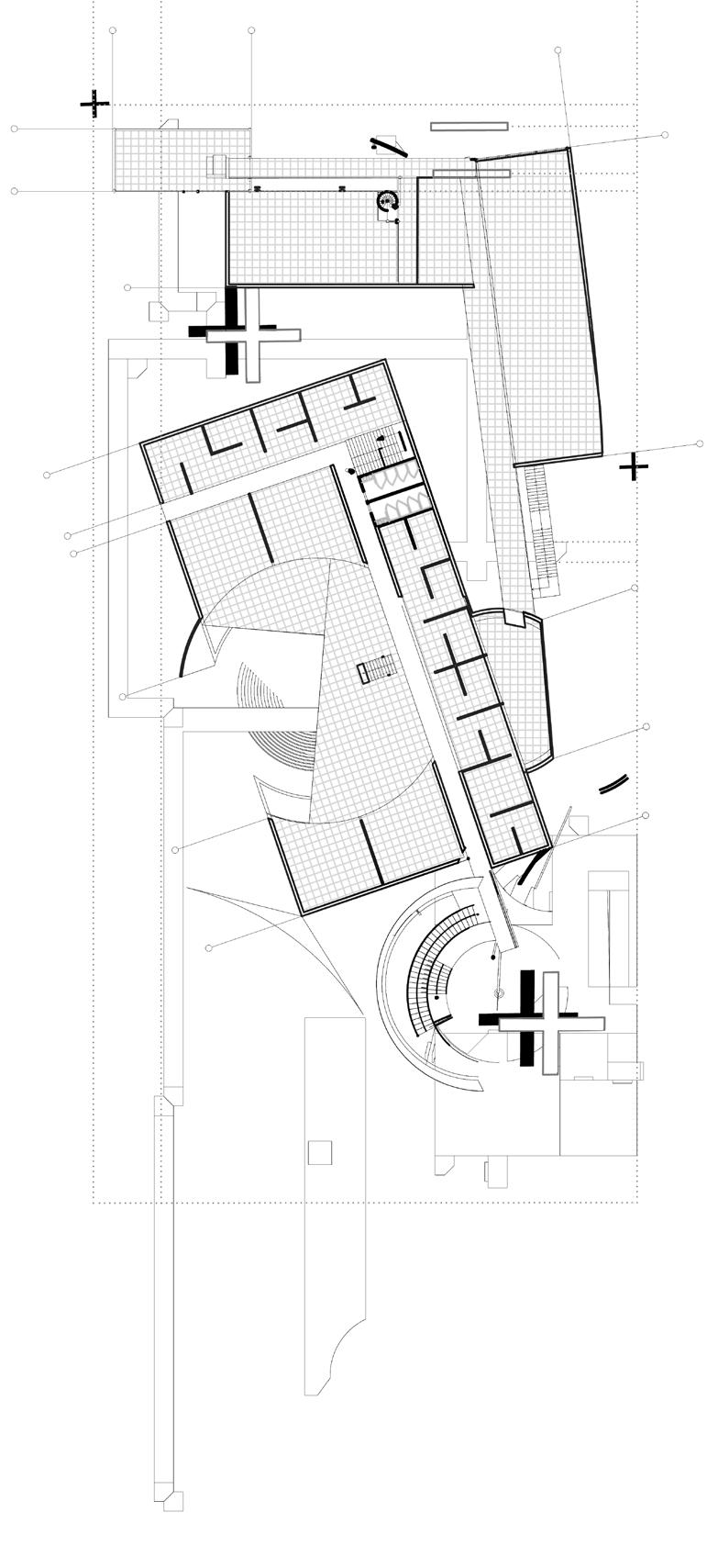
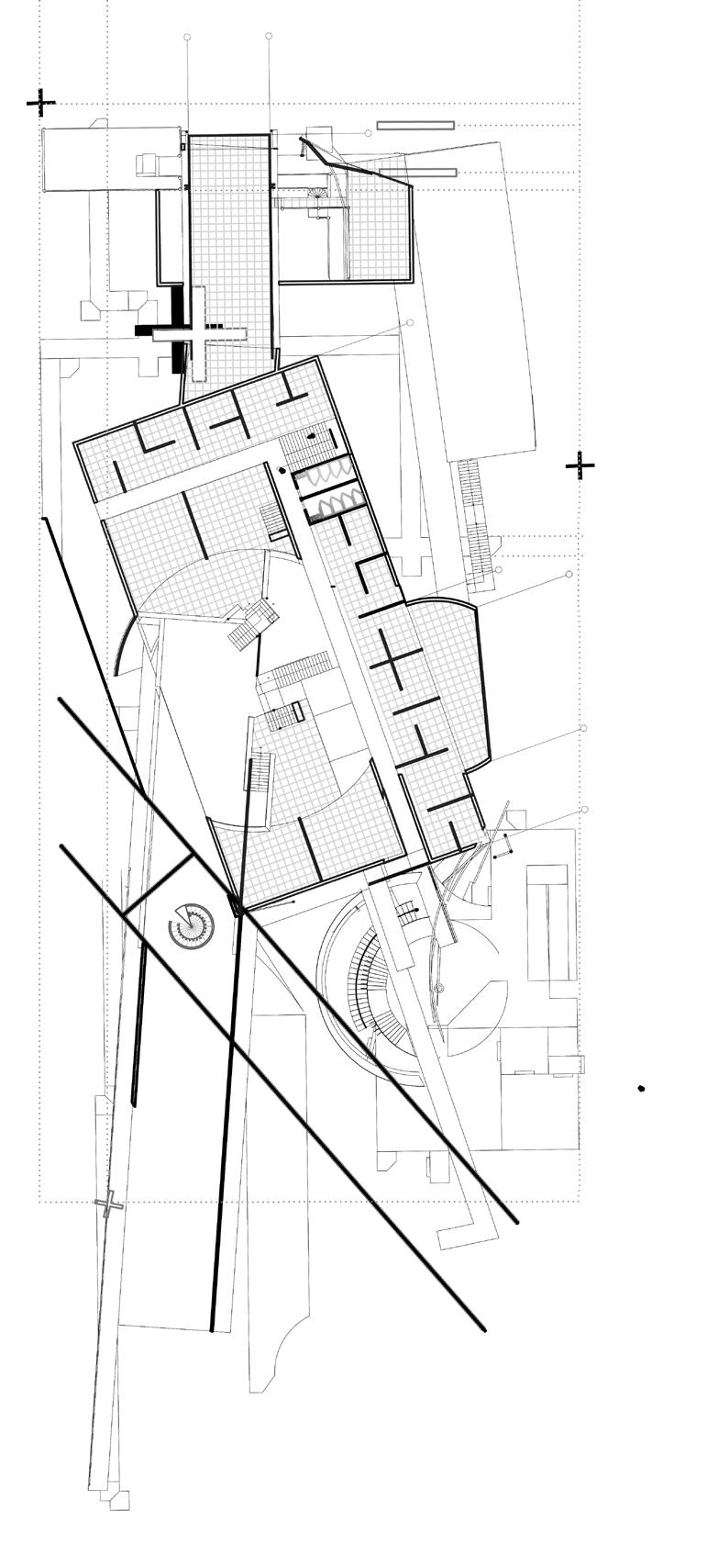


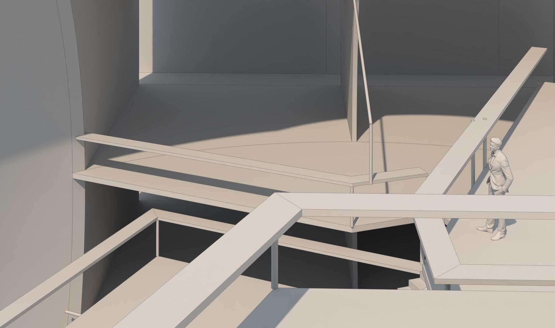
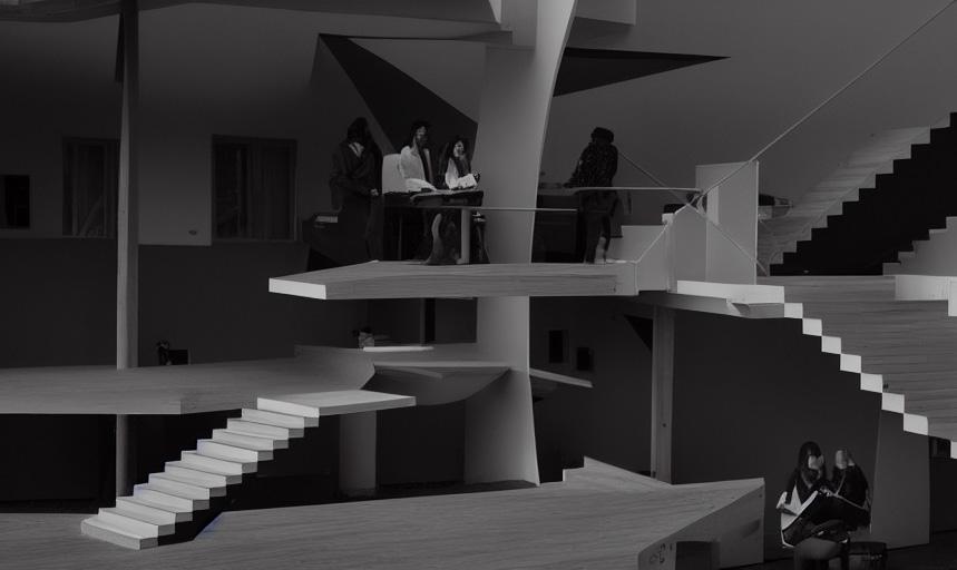
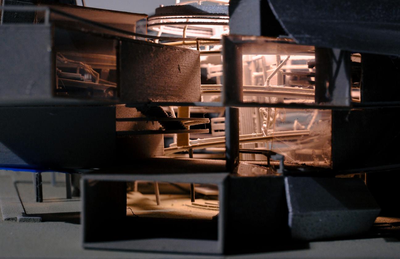
A platform-centered layout within the space prioritizes visual fluidity and transparency. Unobstructed views allow students to witness and engage with the dynamic flow of work. This fosters a seamless integration of individual focus and collaborative interaction, creating a vibrant and collaborative learning environment.
Spark Journey I
Interior Study Space
Downward View from the Platform
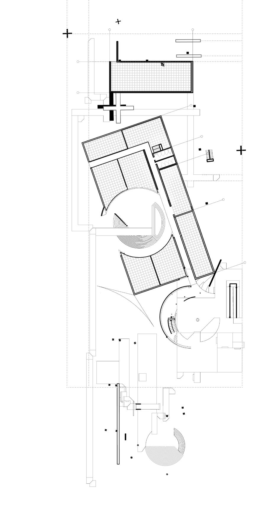
9 1.- Studio 2.- Garden 3.- Lobby 4.- Cafeteria 5.- Courtyard 6.- Bathroom 7.- Inspire room 8.- Launge(L) Hub 2 Floor Plan 1 7 1 3 3 4 4 4 6 6 6 8 8 3 5 5 5 2 2 2 2 5 5 5
Multi-layered View from the Platform


Inspiring through space
Hub1
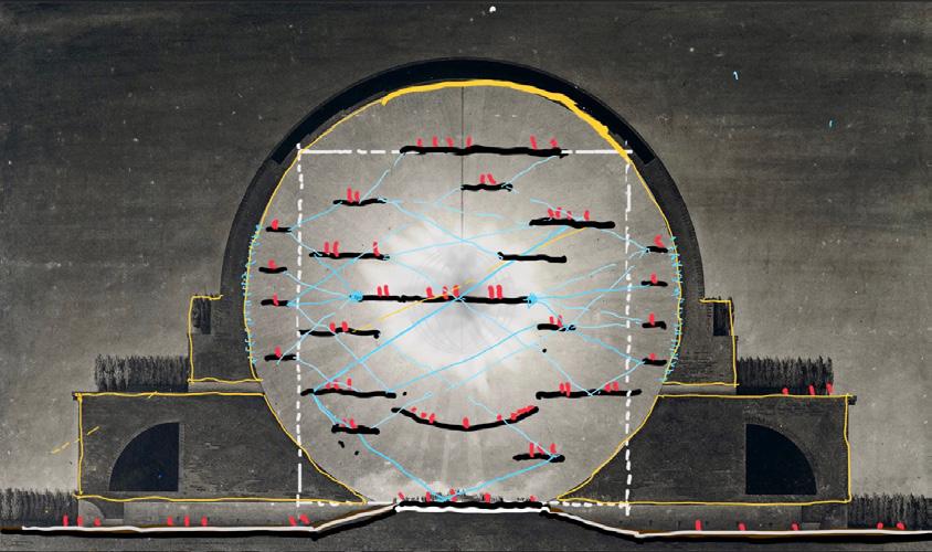
Hub1 Section
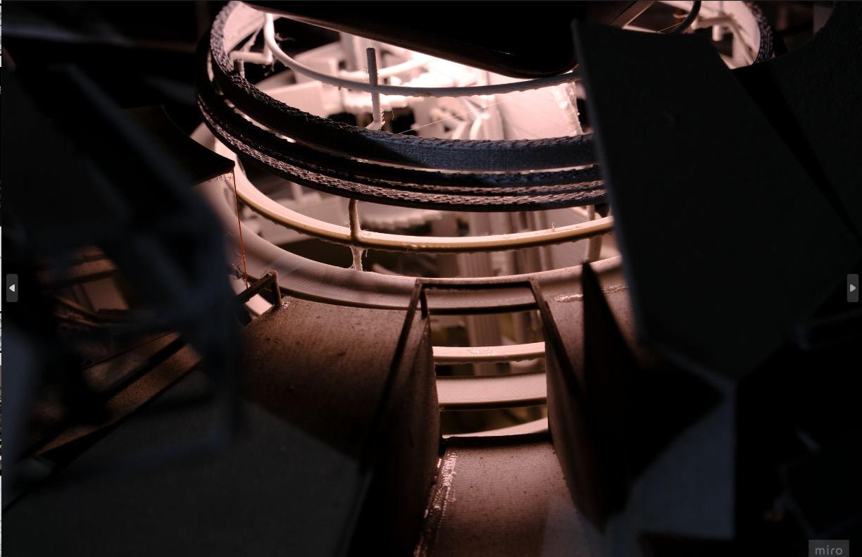
Top view of the hub 1
Hub 1 with a Transparent Atrium
10
Hub 1 Transparent Studio

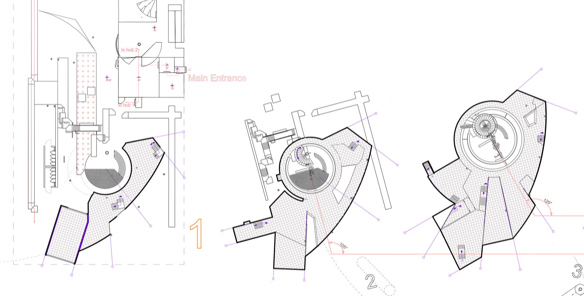
The space of Hub 1 evolves from platform spaces into a solid platform, surrounding an atrium installation. At the bottom is a garden space, providing the necessary openness and transparency for students to study, discuss, and relax in the atrium space, fostering open communication and relaxation.
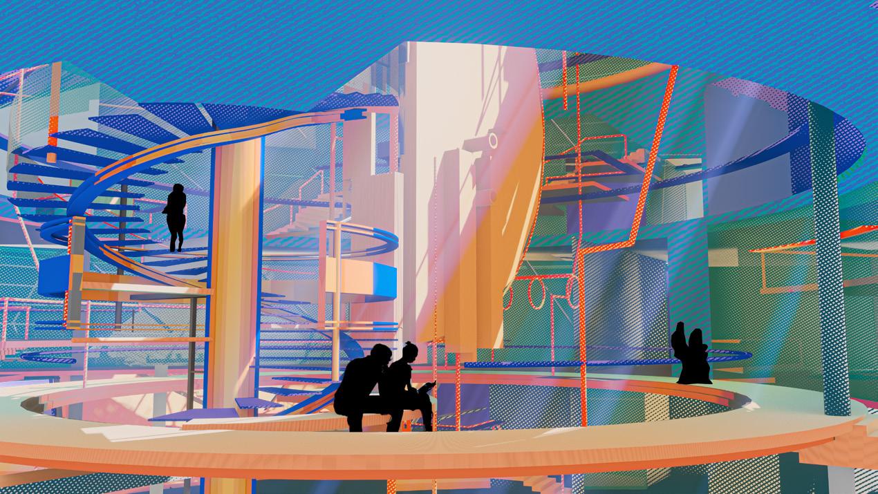
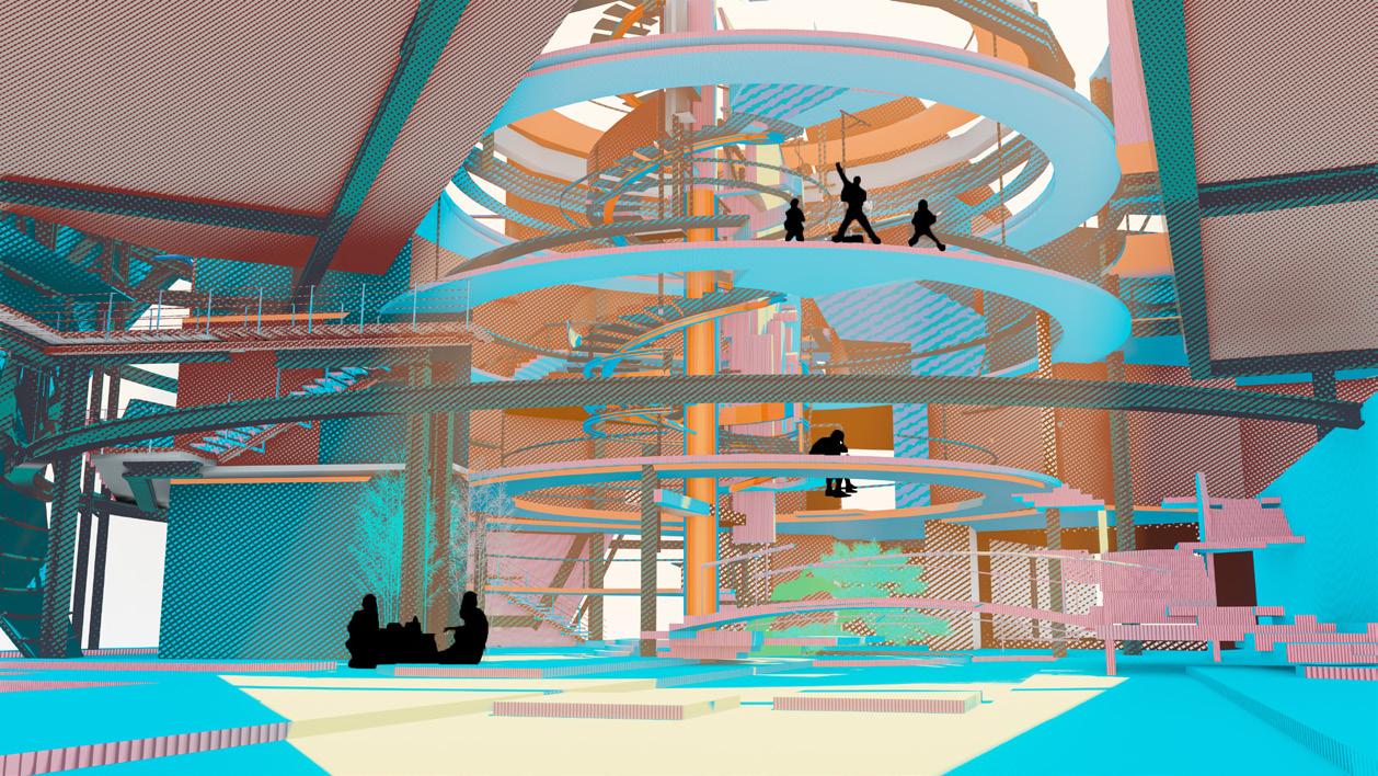
Hub 1 inherits the concept of transparency from the platform, but it features a soaring atrium that serves as both a circulation space and a place for learning and reading. Students can engage in informal learning here, and the inspiring interactive space can encourage creativity and inspiration.
11 1.- Studio 2.- Garden 3.- Lobby 4.- Cafeteria 5.- Courtyard 6.- Bathroom 7.- Inspire room 8.- Launge(L) Hub 1 Floor Plan 4 1 1 3 1 1 1 7 8 8 5 5 5 5 2 Spark Journey I
Storyboard
People View of Hub 1 from the Garden Open & Connected Atrium
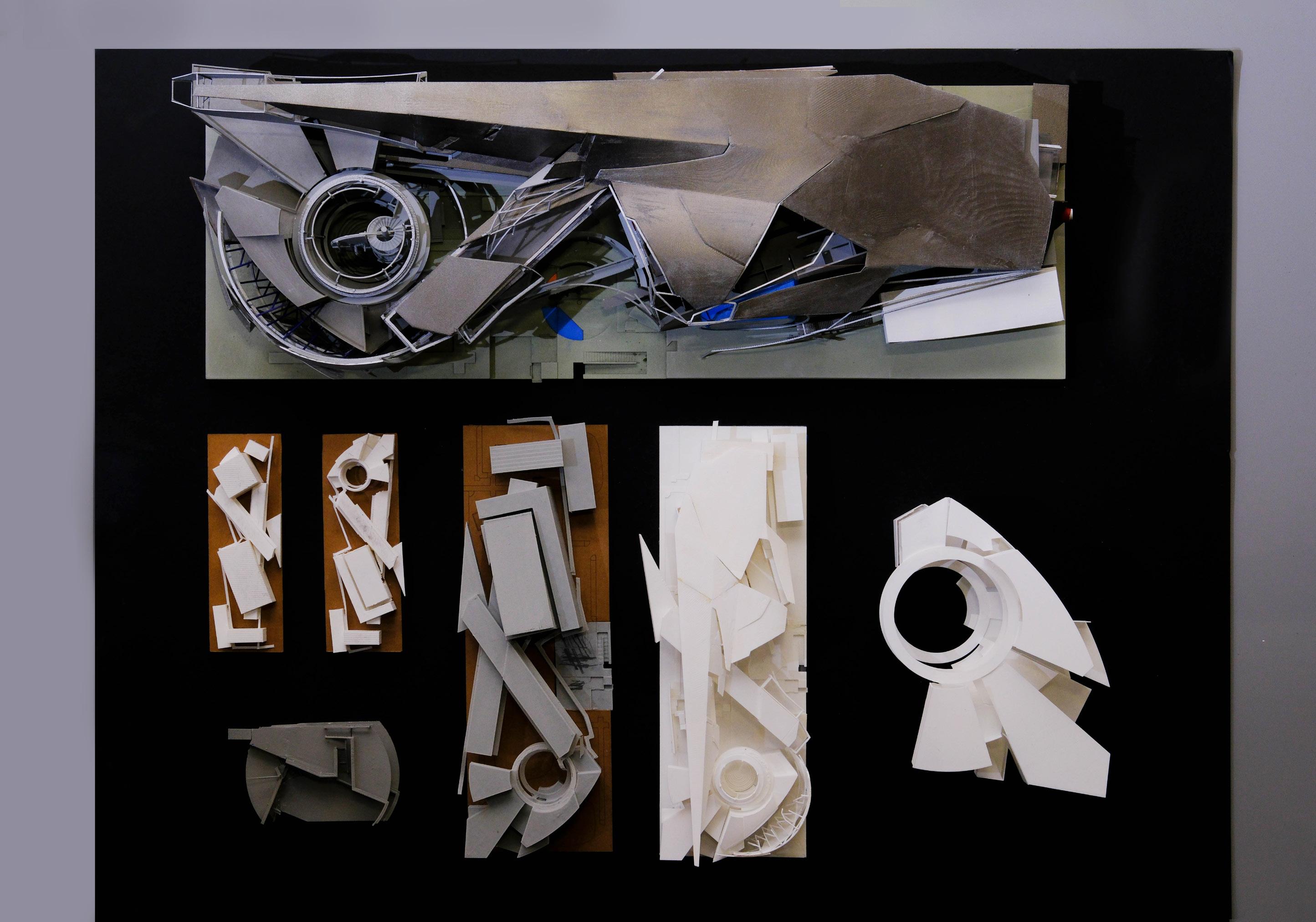
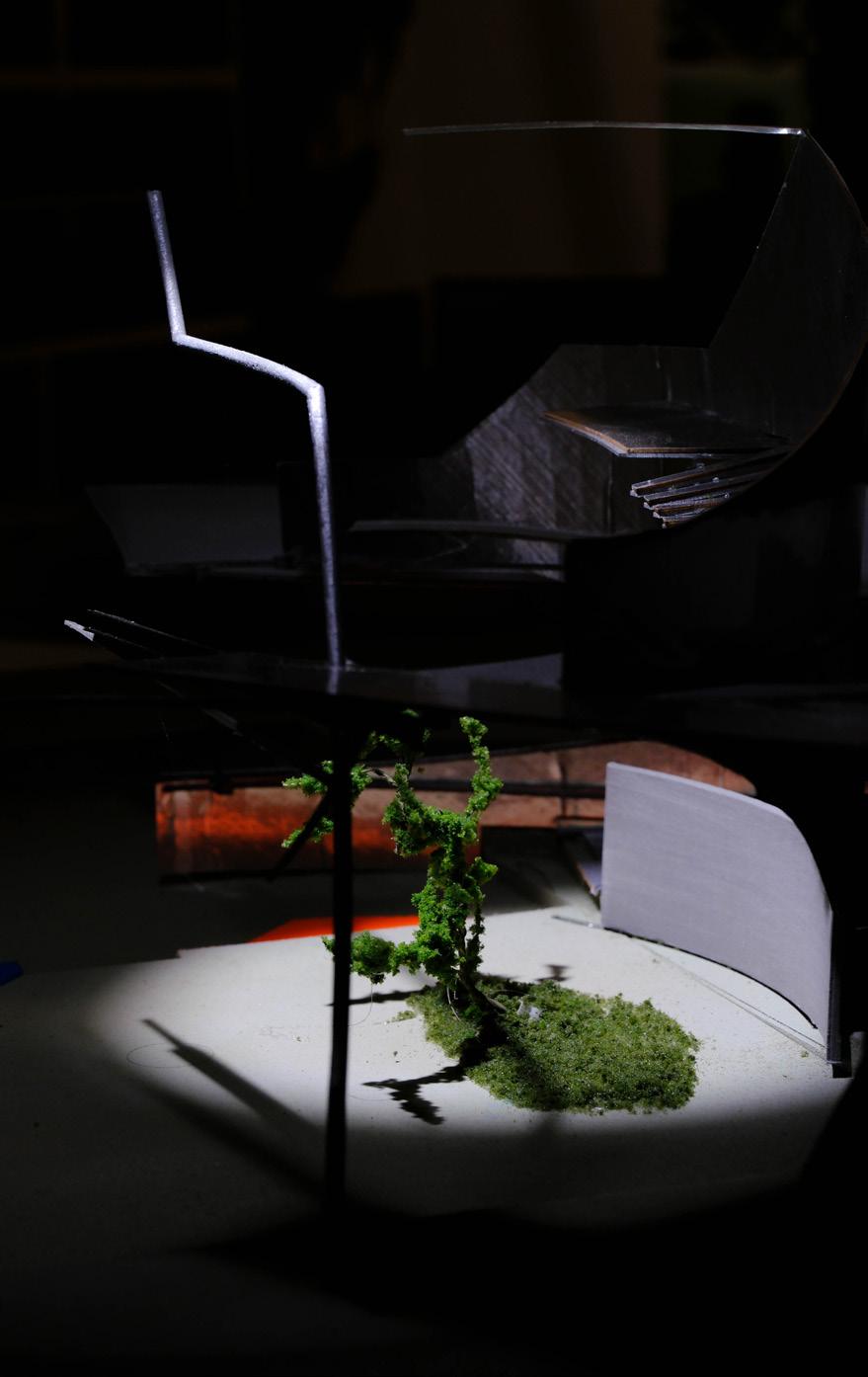
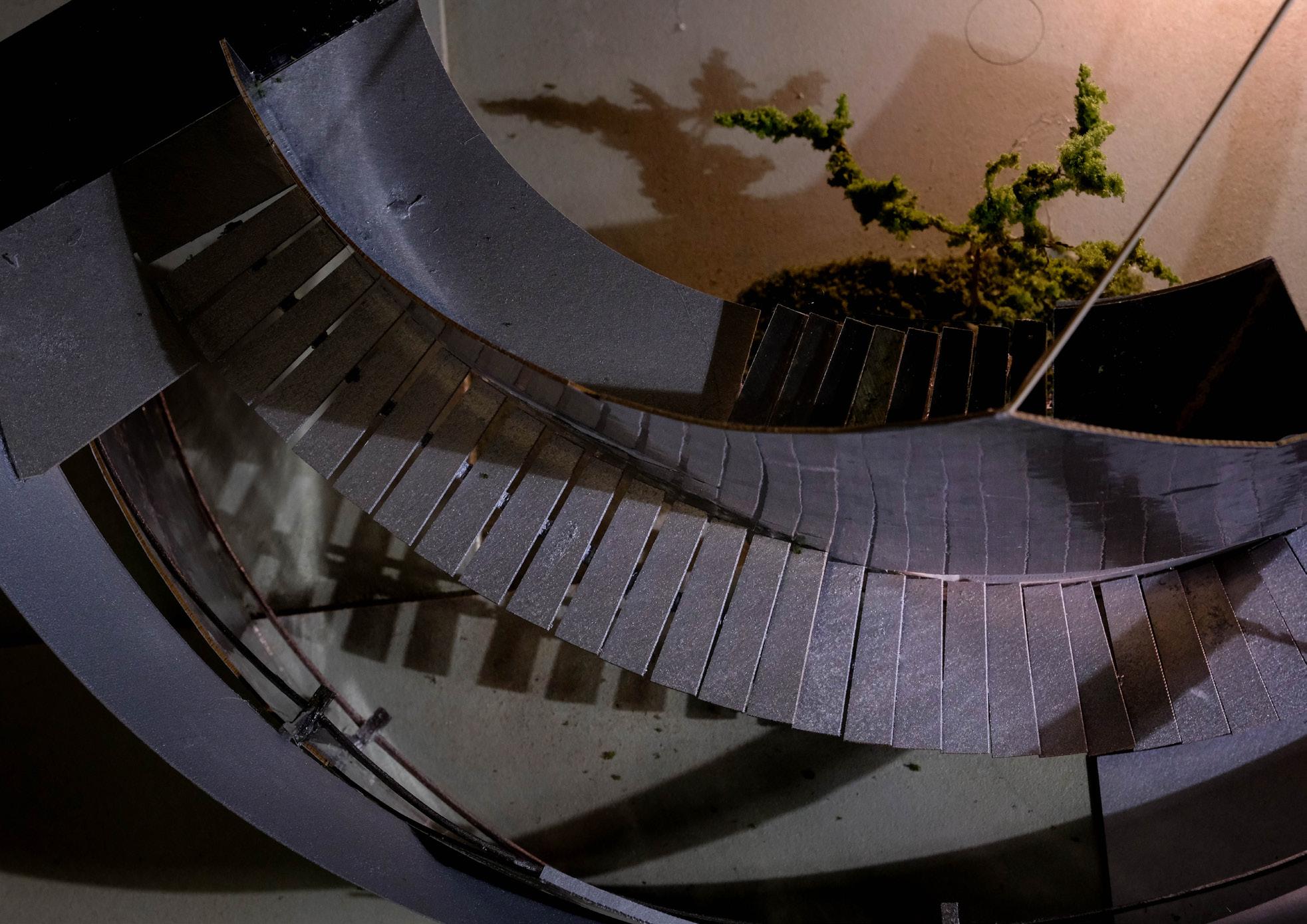
Inspiring through space high-tech style staircase overhead view courtyard plants in solitary
splendor
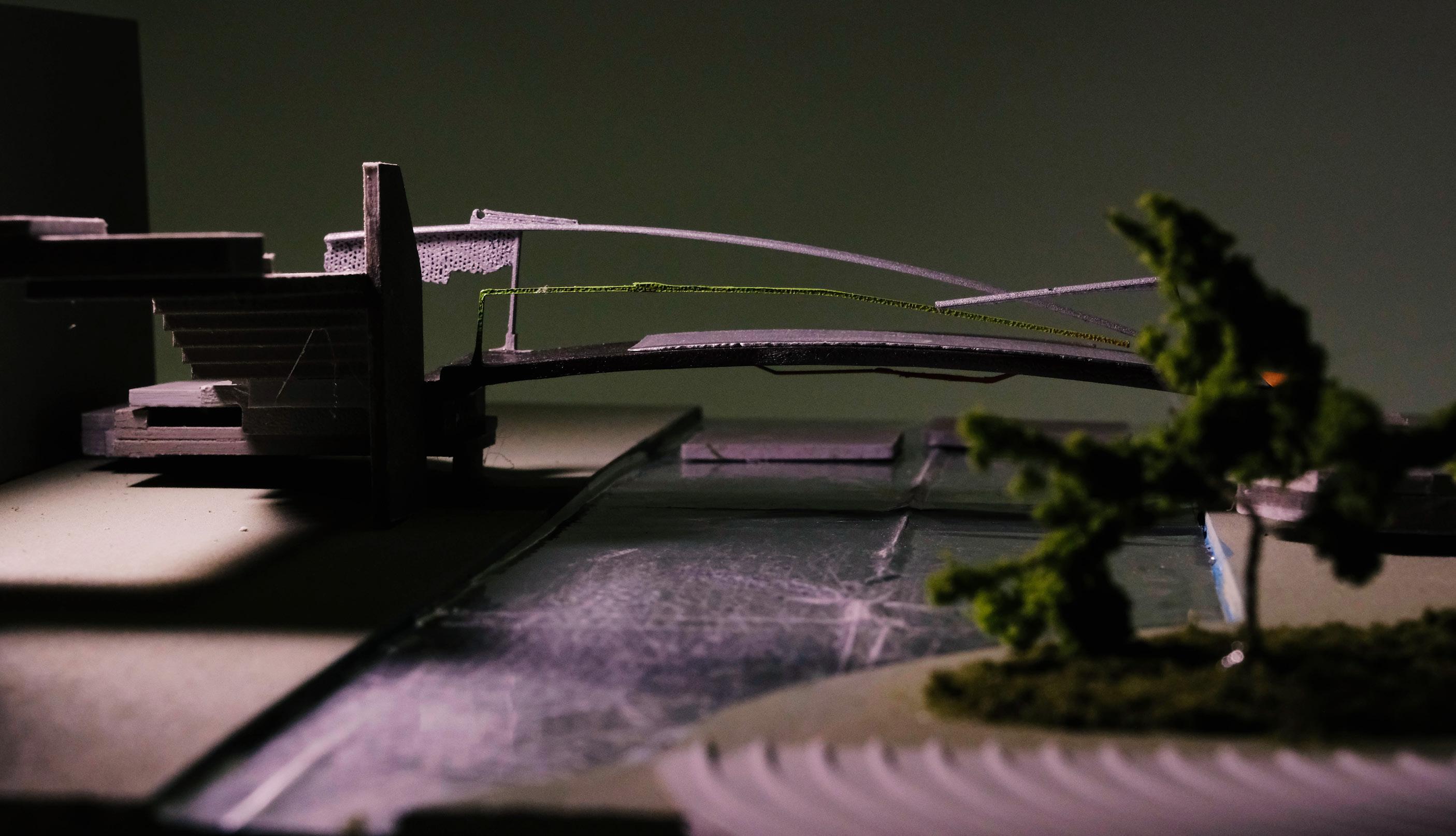
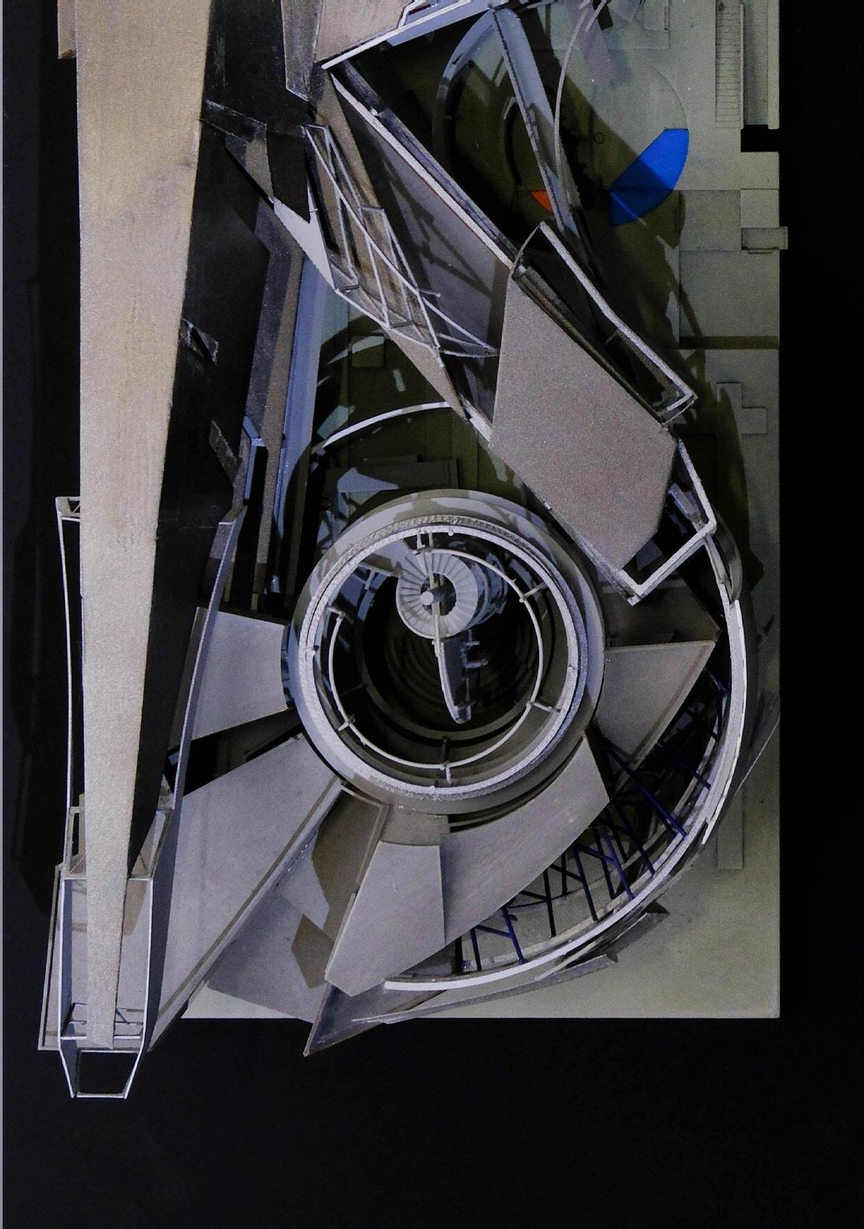
 the deconstructivist courtyard bridge [right]
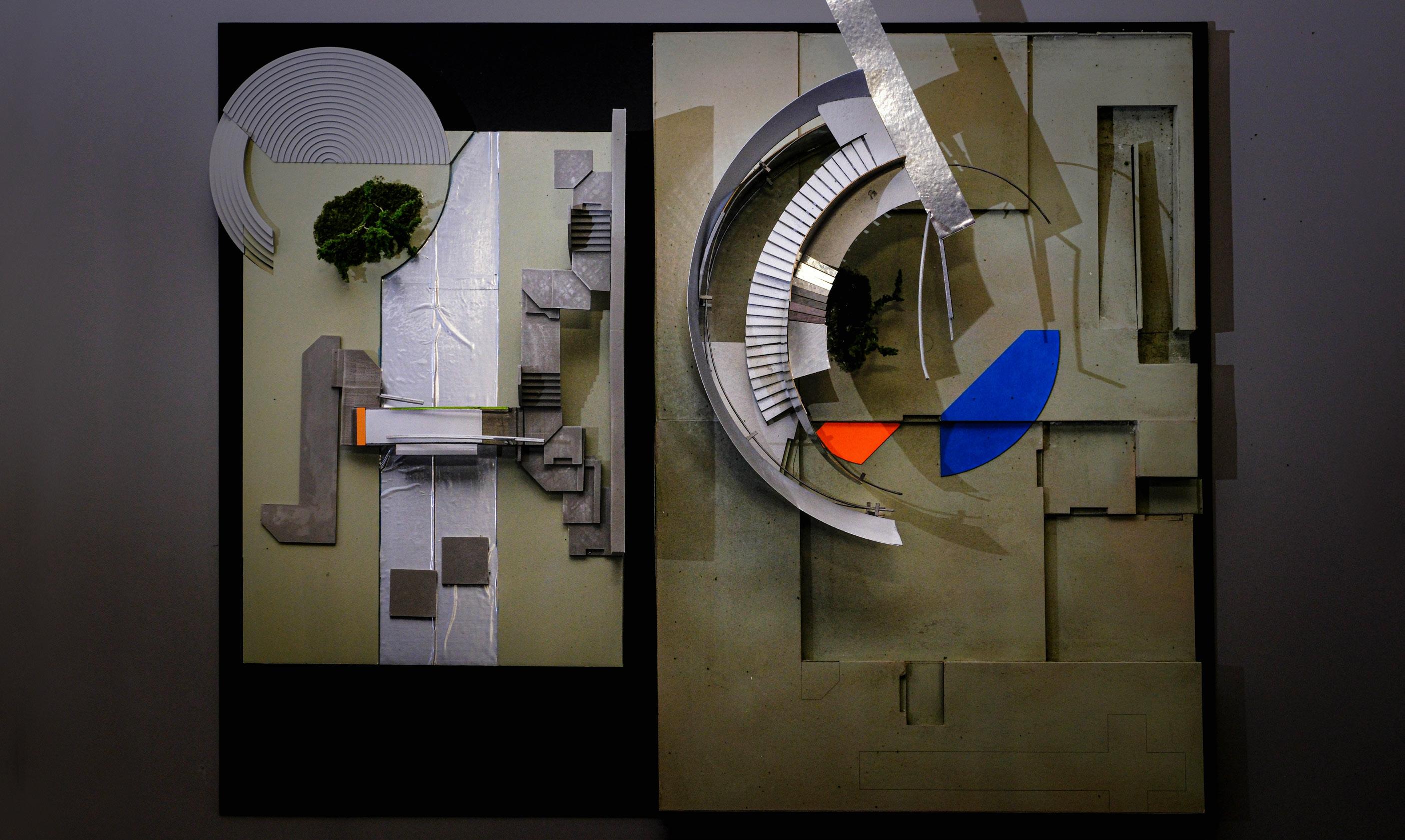
overhead view of the courtyard model
Spark Journey I
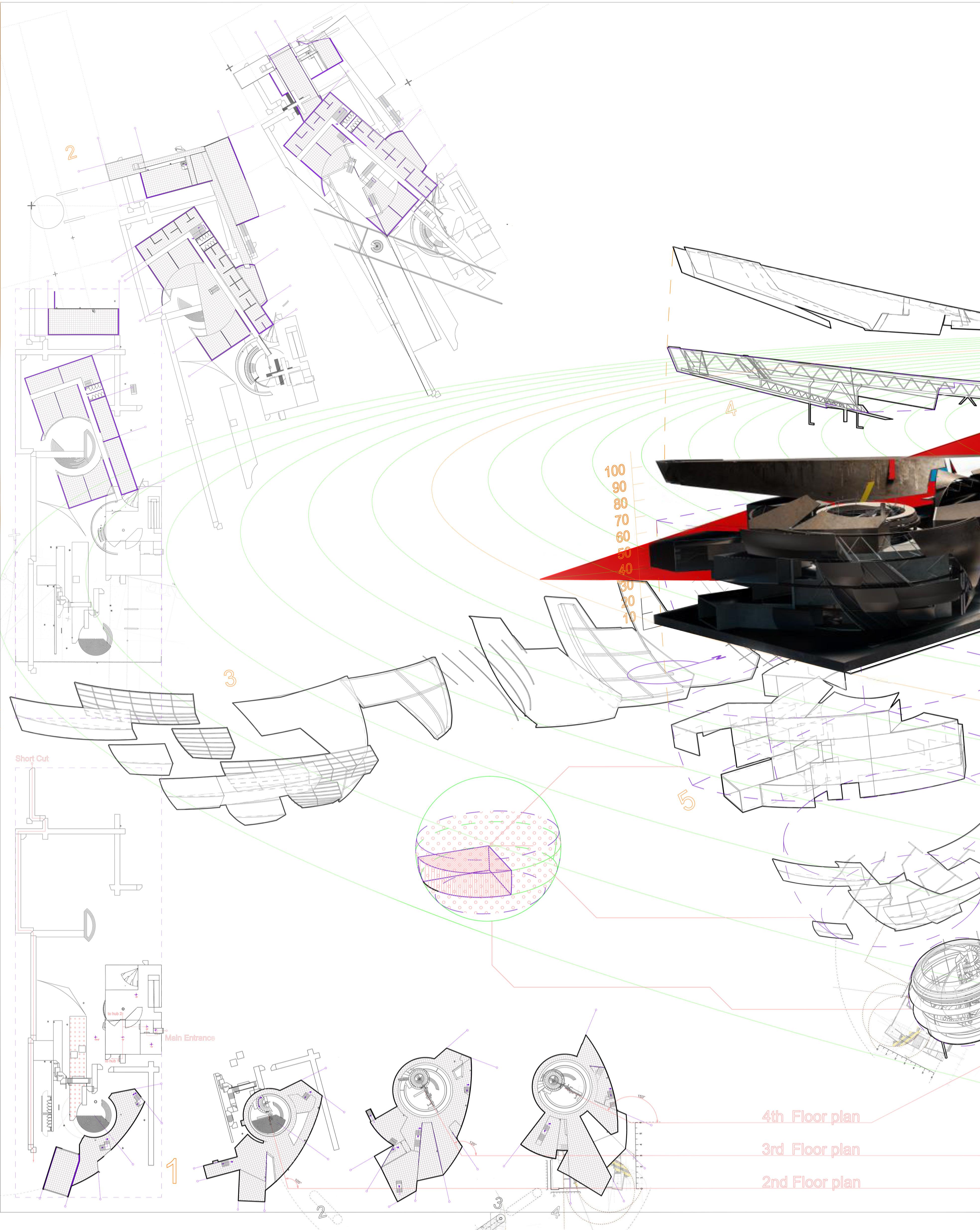
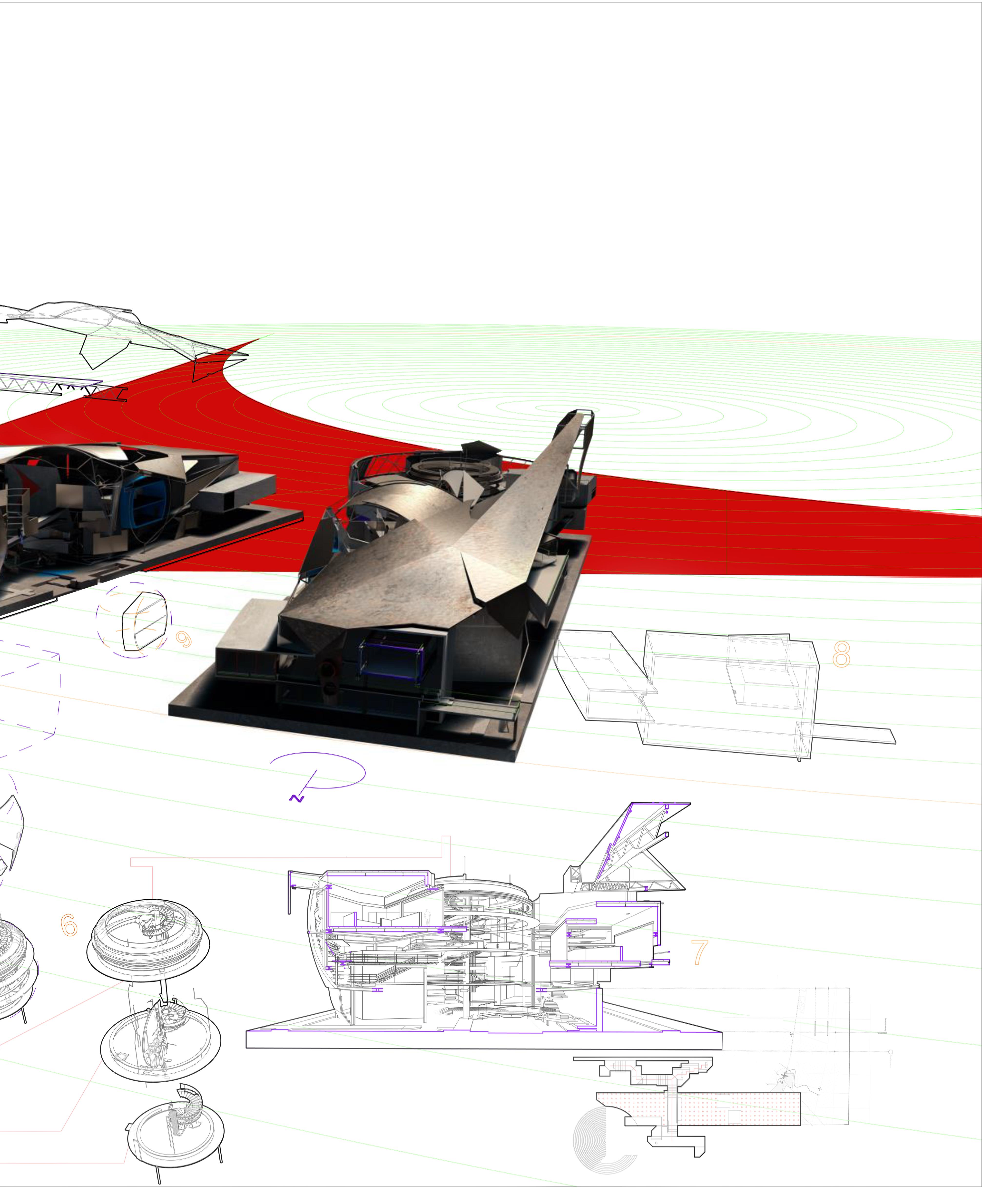
overhead view of the evolutionary models [left]
Deepening Design of Bio-Tech Institute
Instructor
Herwig Baumgartner, Zach Burns
Team Member
Wan-Yu Chen, Jinxin Xu
Alejandro Aguilera
Arjun Bharat, Diba Ghazia
Hiwot Zegeye
Qingyang Zong
Status
Design Development
Construction Documents
Software: Rhino 7, Unreal Engine 5, Zbrush, Photoshop, InDesign, Illustrator, After effect, AutoCAD,Keyshot
Design Development
Sci-ARC 22Fall
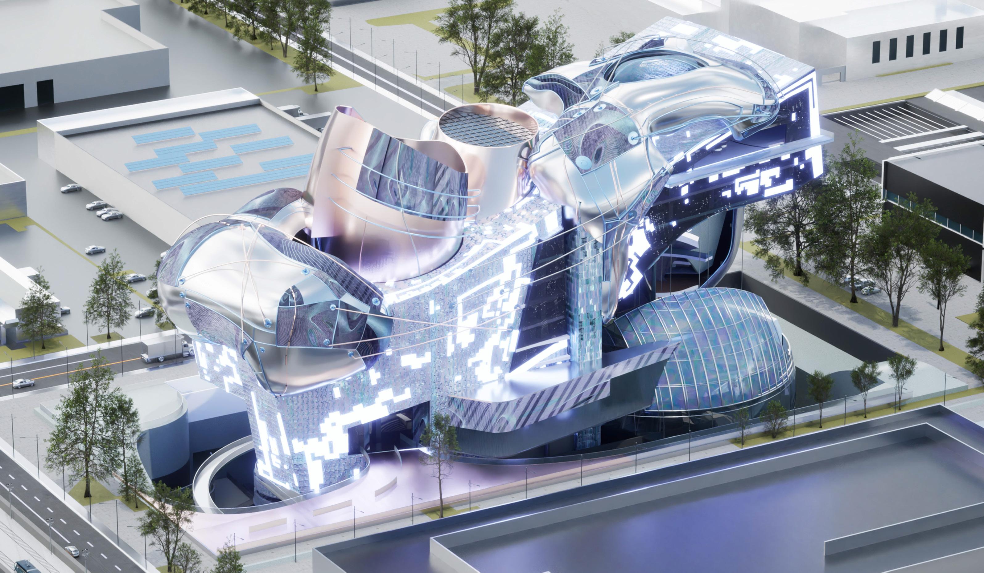
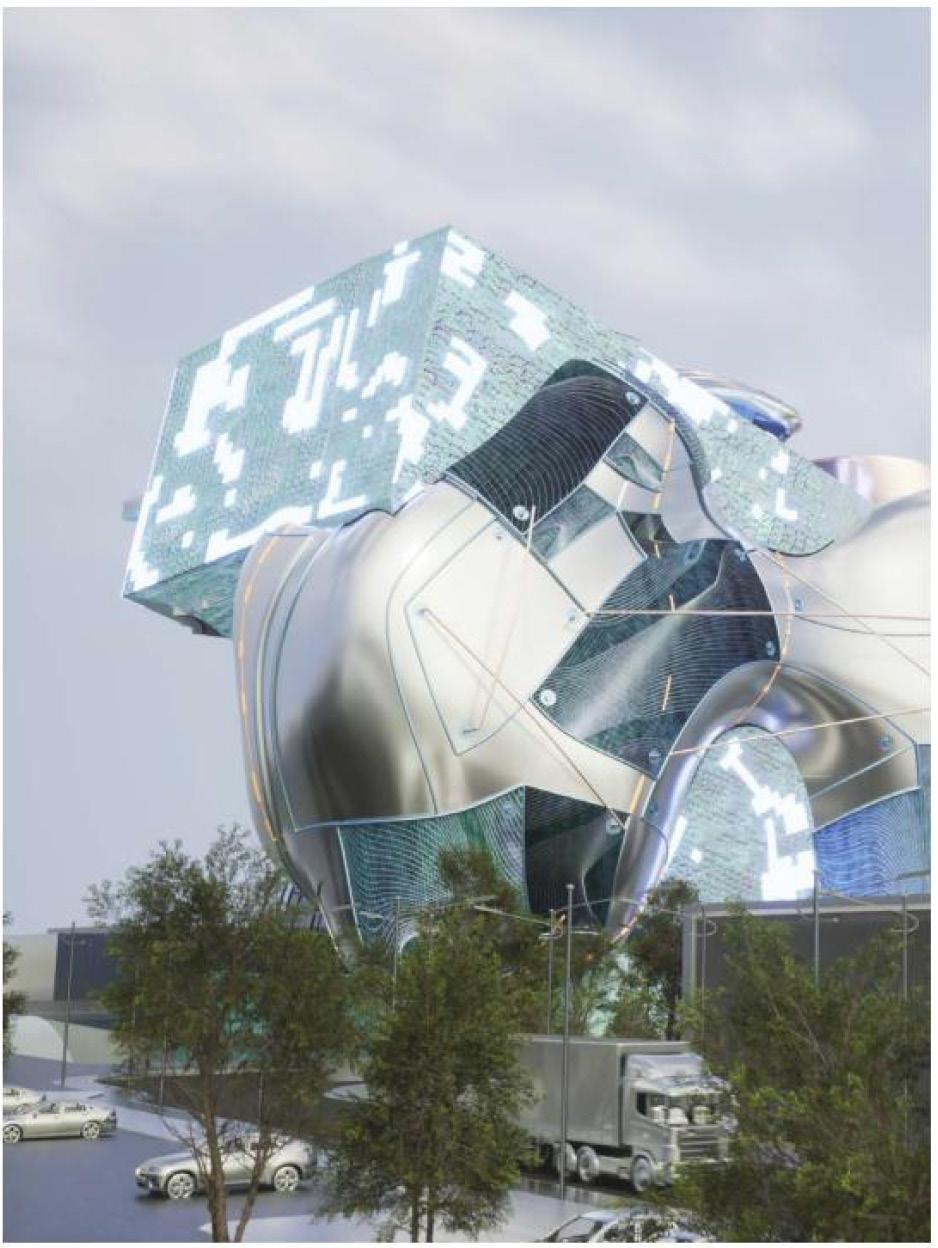
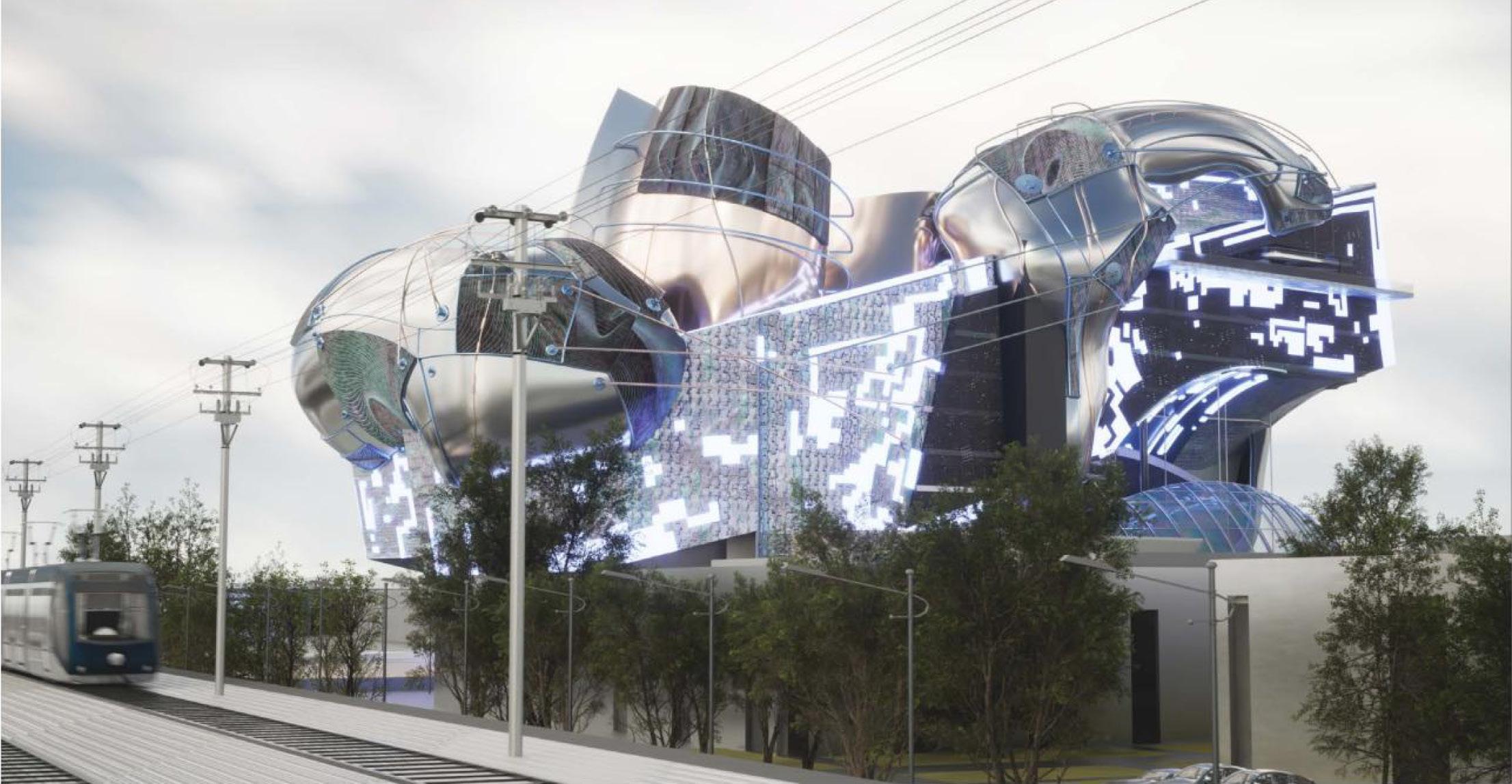
This project outlines the methodical exploration of how a seemingly unattainable concept could be realized.
Demonstrated the ability to draw drawings for the basic fundamentals of architecture. we've deepened our understanding of architectural drawings, structural principles, evacuation flow, and construction methodologies. This wealth of knowledge informs our process, ensuring the creation of a building that is functional, safe, and aesthetically pleasing.
Re:
Jin 16 II
Xiao
Invention
3222
GR
AS
Design Doc

17
Video Birdview Perspective Rendering Location: El Segundo of Los Angeles County
Invention
Axonometric rendering of the Bio-Tech Institute


A 1. Auditorium 2. Cafe 3. Core-1 4. Central Chimney 5. Core-2 6. Service Corridor 7. Texting Room 8. Equipment Room 9. Service Room 10. Core-3 11. Bio Lab Lobby 12. Core-4 FLOOR PLAN - LEVEL 05 18 Deepening Design of Bio-Tech Institute

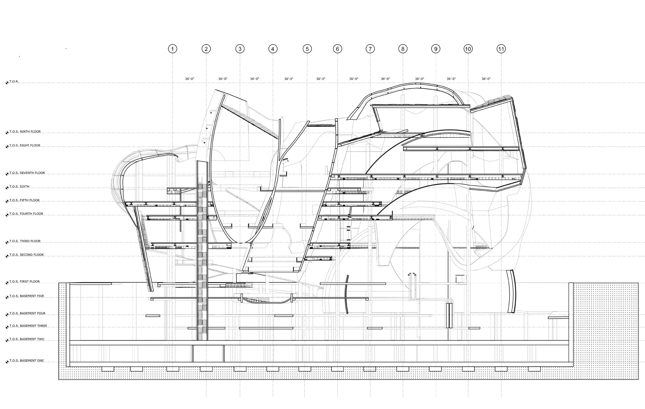
Re: Invention II A SECTION A-A SCALE : 1/32' = 1' - 0''
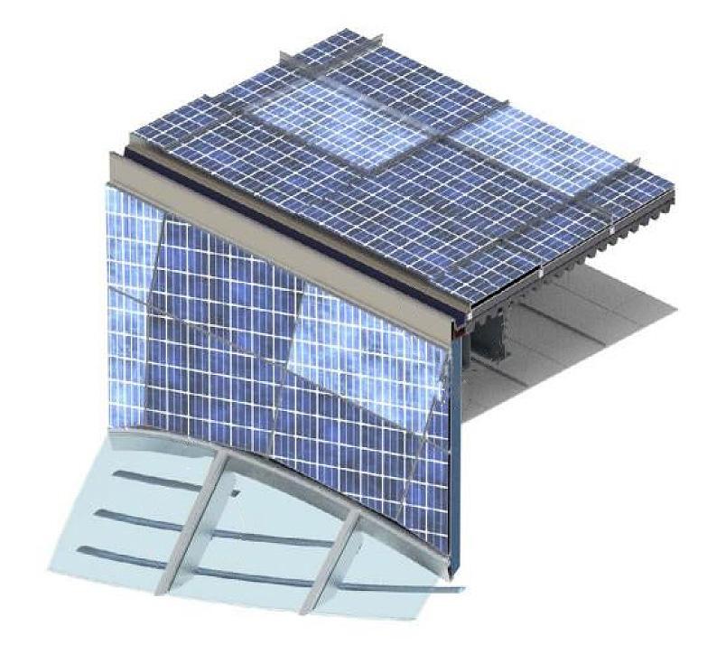
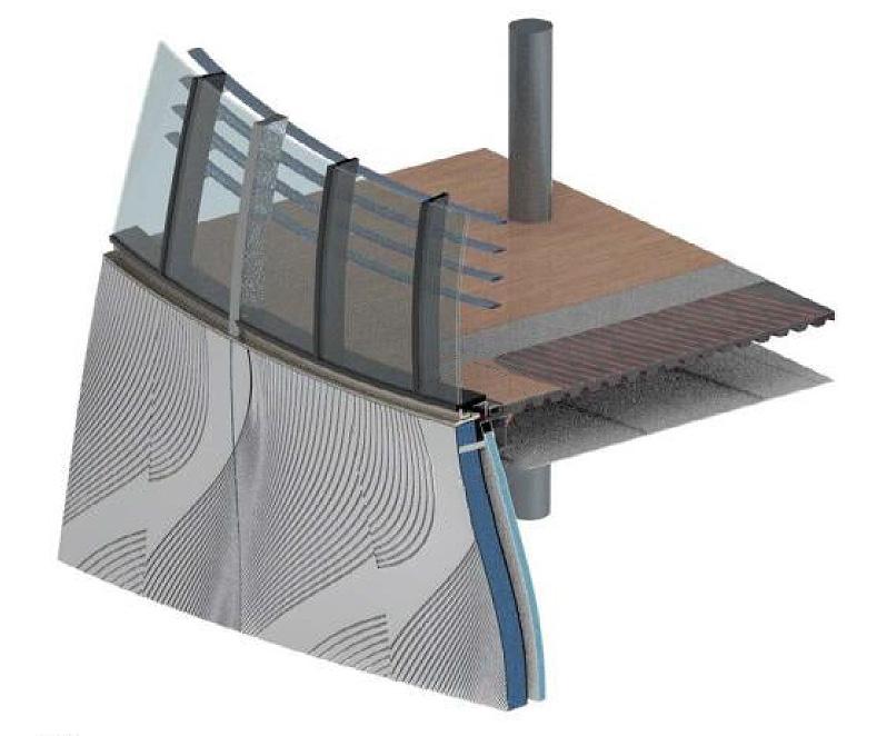
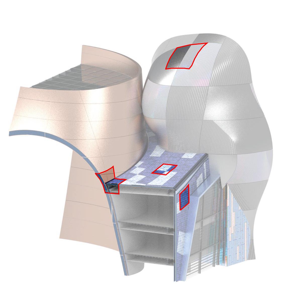
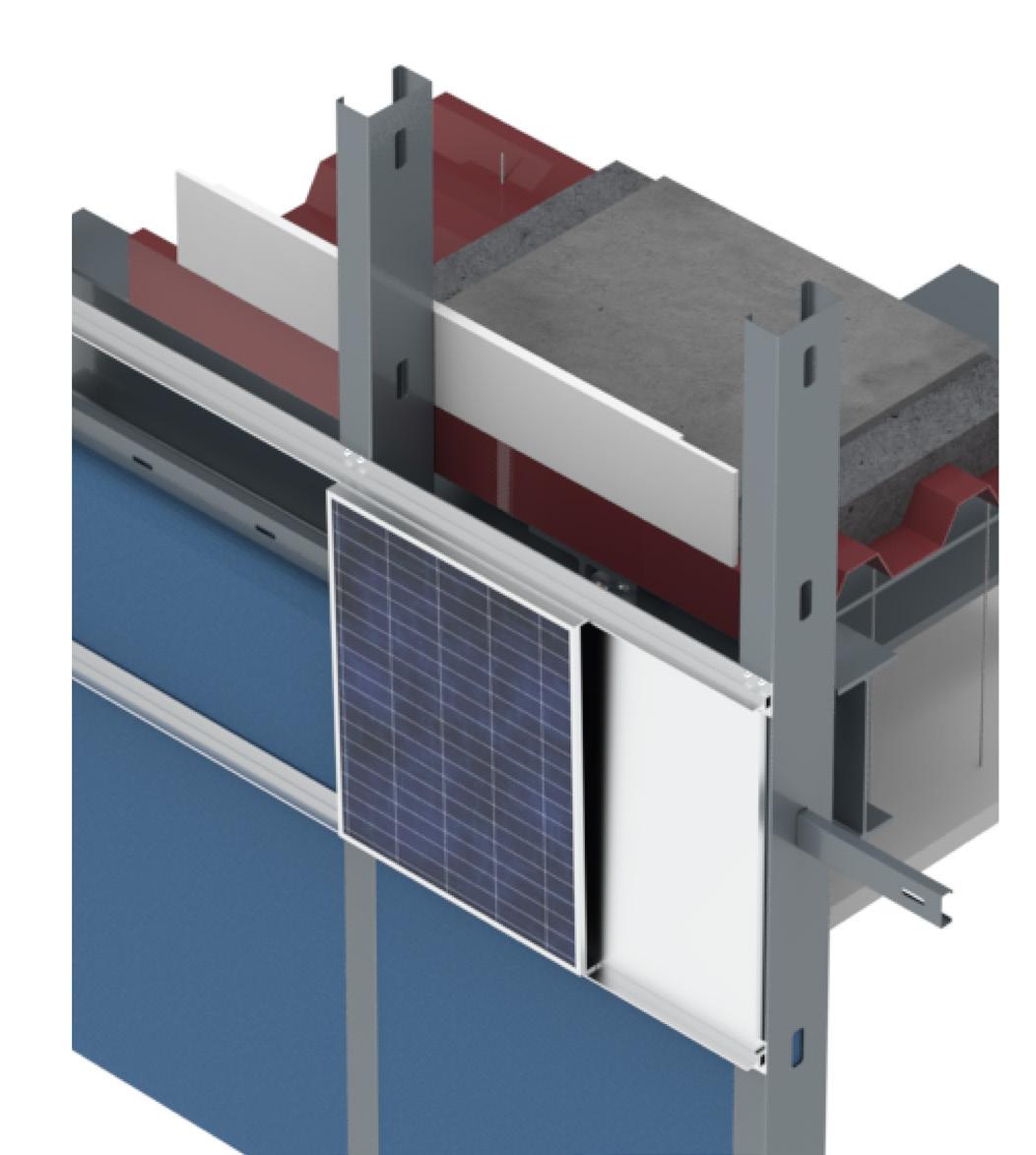
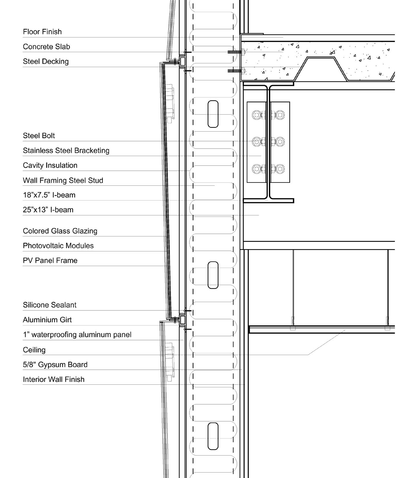
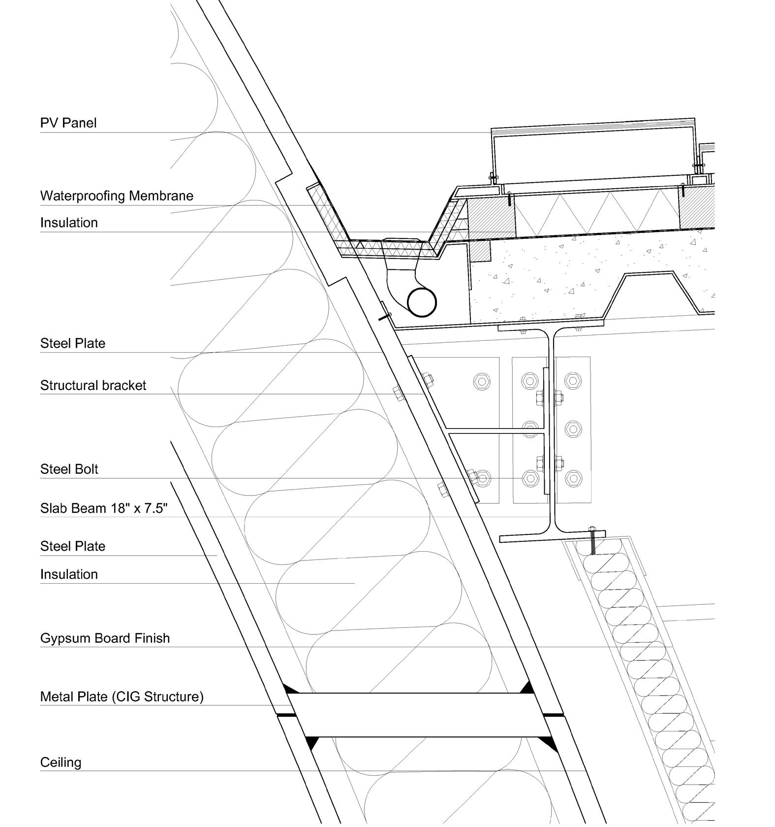
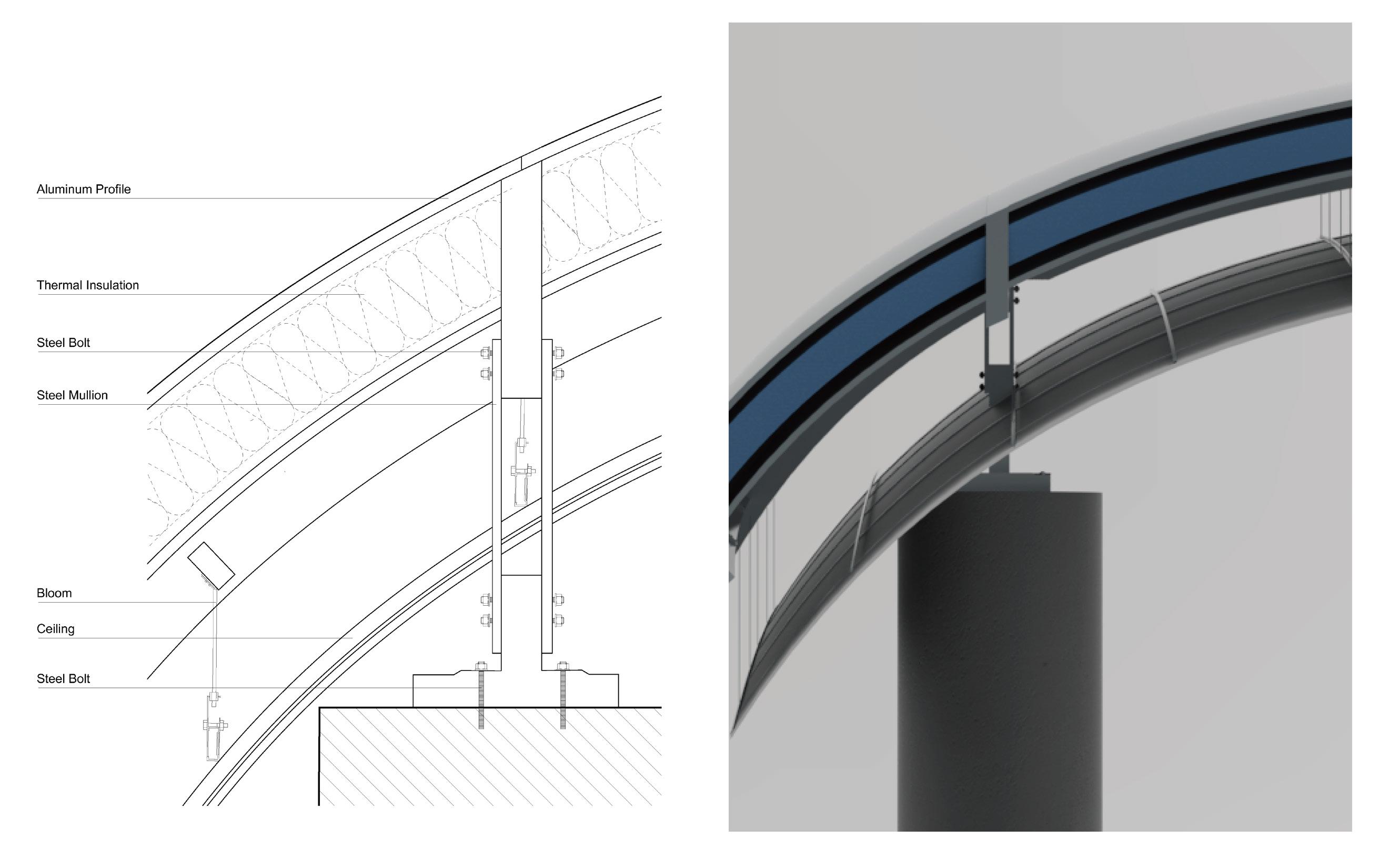
Chunk 1 Detail
(CGI structure + Glazing + Solar Panel)
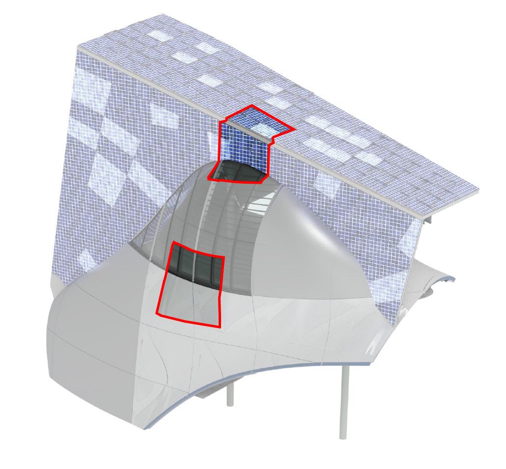
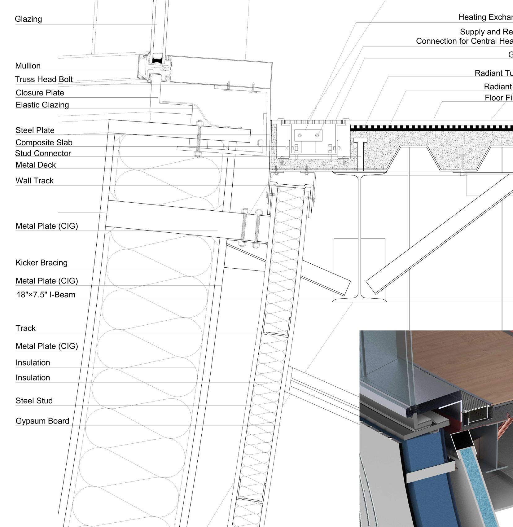
A B
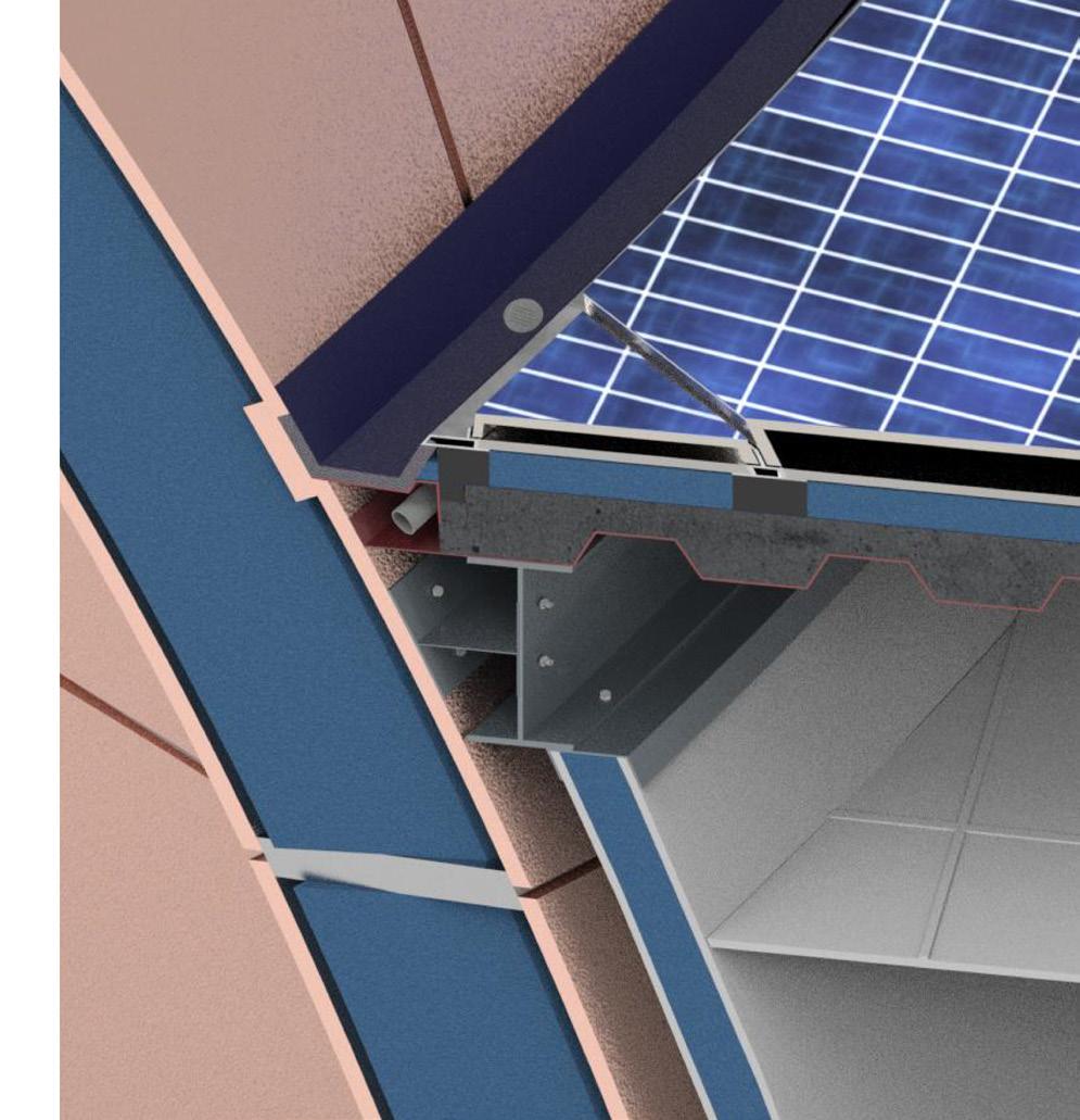
[1] Glazing Corner Drain Detail
A [1] [3] [2] B Deepening Design of Bio-Tech Institute
[2] Glazing to Metal Shell Detail

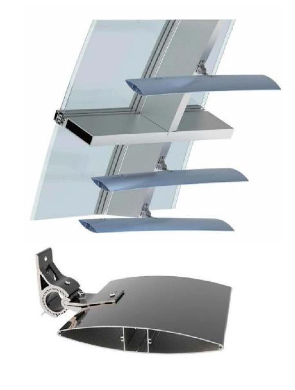
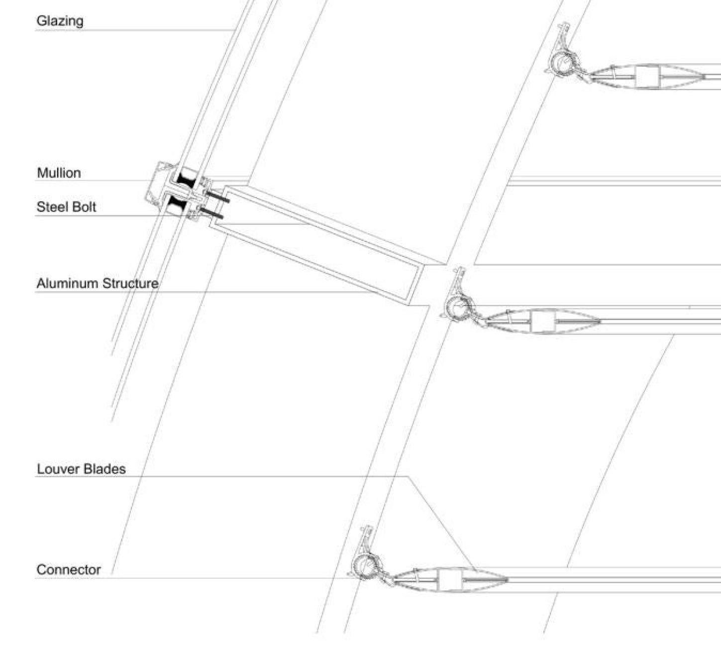
Re: Invention II [3] Glazing Mullion Detail
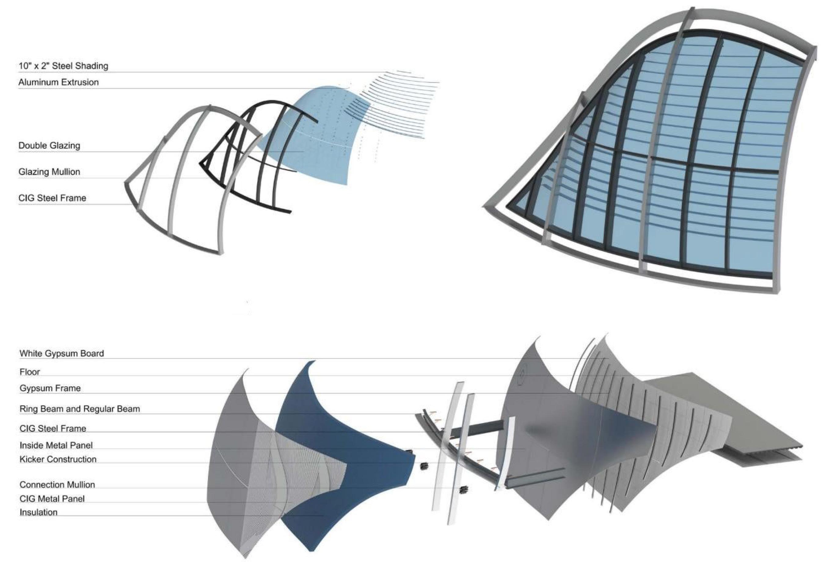
Glazing and Shading Prototype
CIG Metal Shell Prototype
A
Detail A B C D B Deepening Design of Bio-Tech Institute
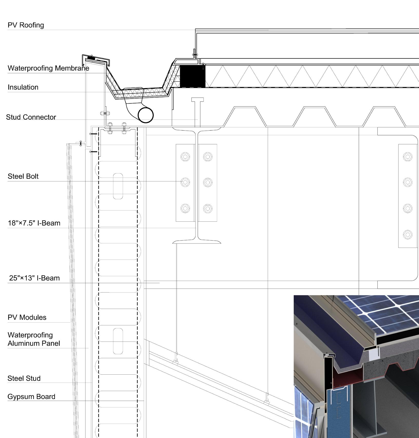
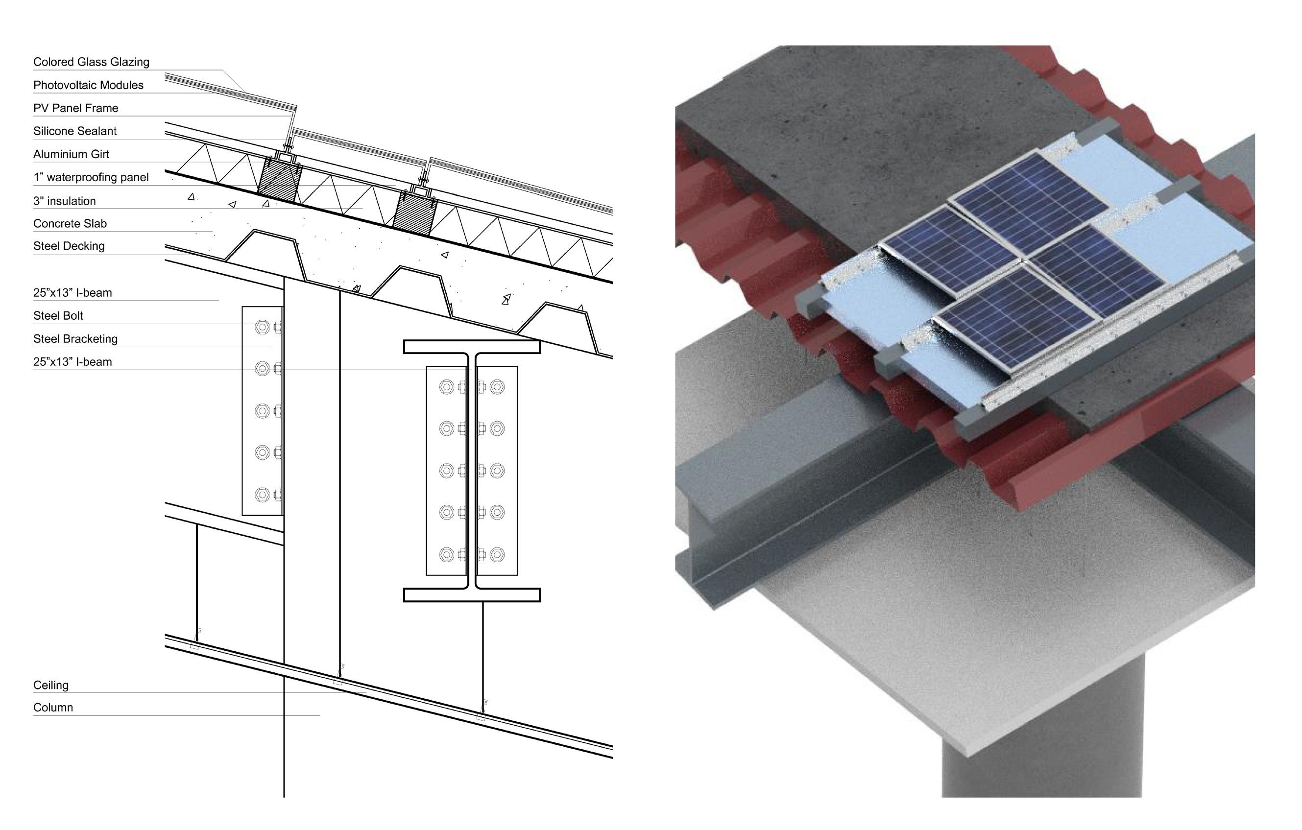
Chunk 2 Detail (Slabs + CIG + Roof Solar Panel)
A. Glazing Corner Drain Detail B. Roof Drain
Re: Invention II
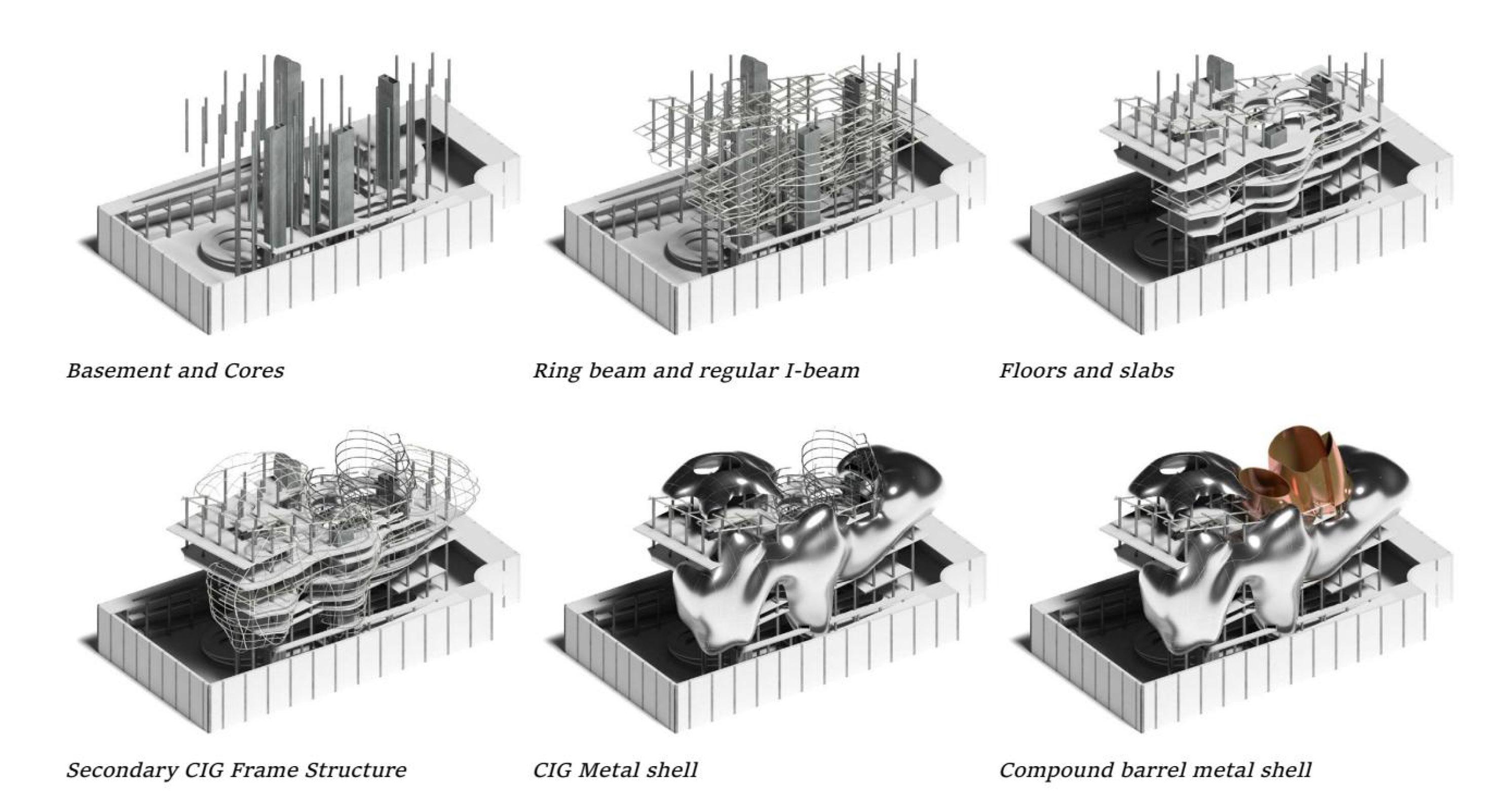
CIG Shell to Column
C.
D. Solar Panel to Slabs Detail
Structure system latters
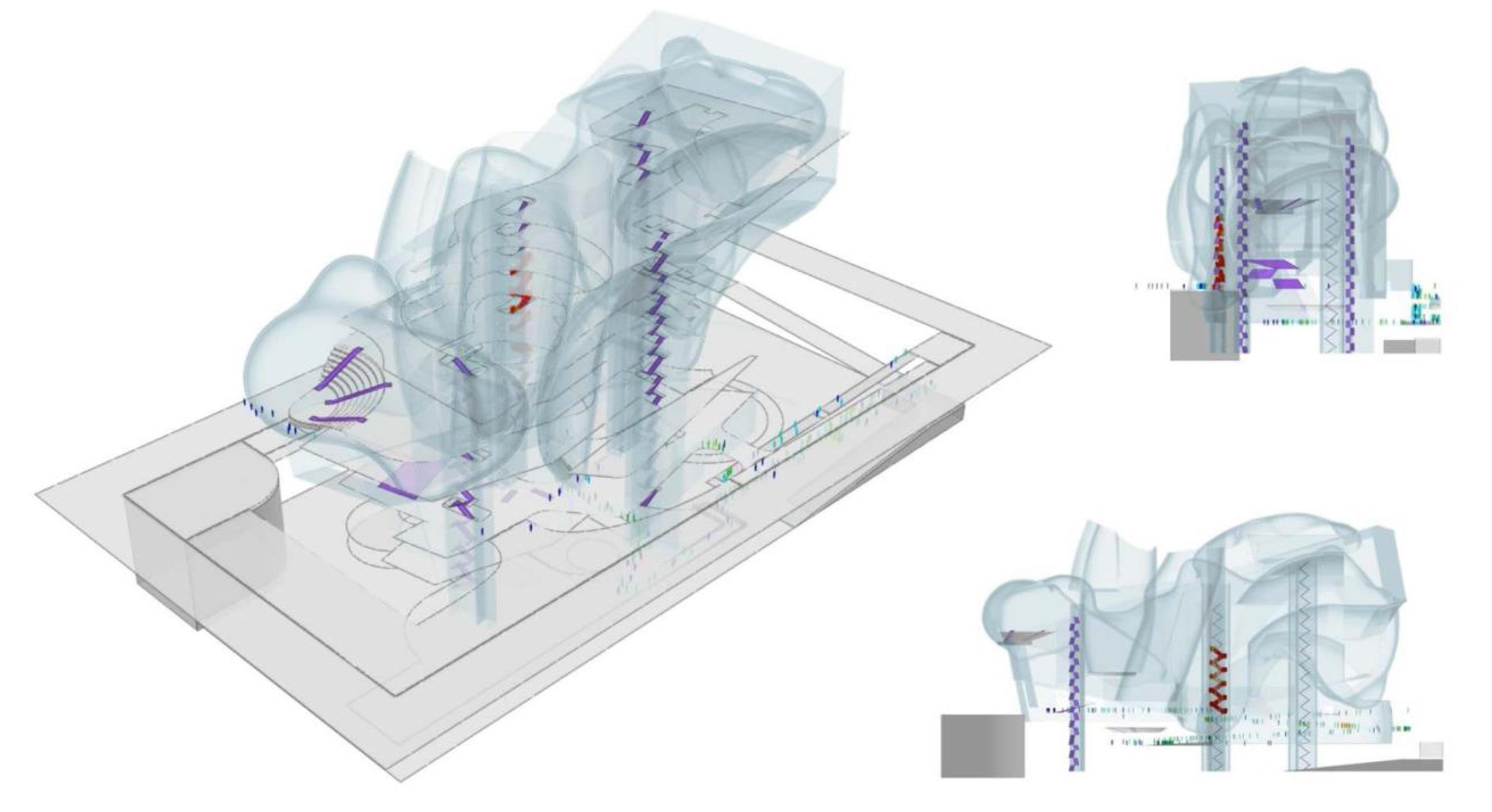
Circulation and Crowd Dynamics
24 Deepening Design of Bio-Tech Institute

Re: Invention II
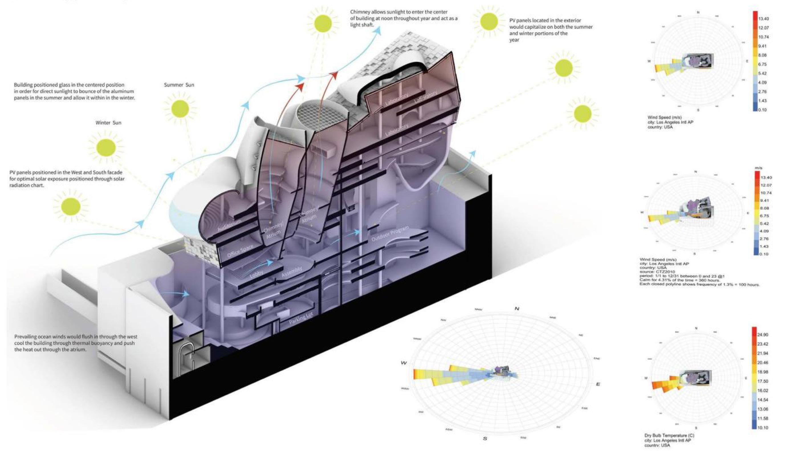
Wind Rose Diagram
Fifth Floor RCP
HVAC Plan
25
HVAC Isometric
Material gradient brings about space
Software: Rhino 7, Grasshopper, Photoshop, InDesign, Illustrator, Vray Advisor
Theater Design
SHU
19Spring
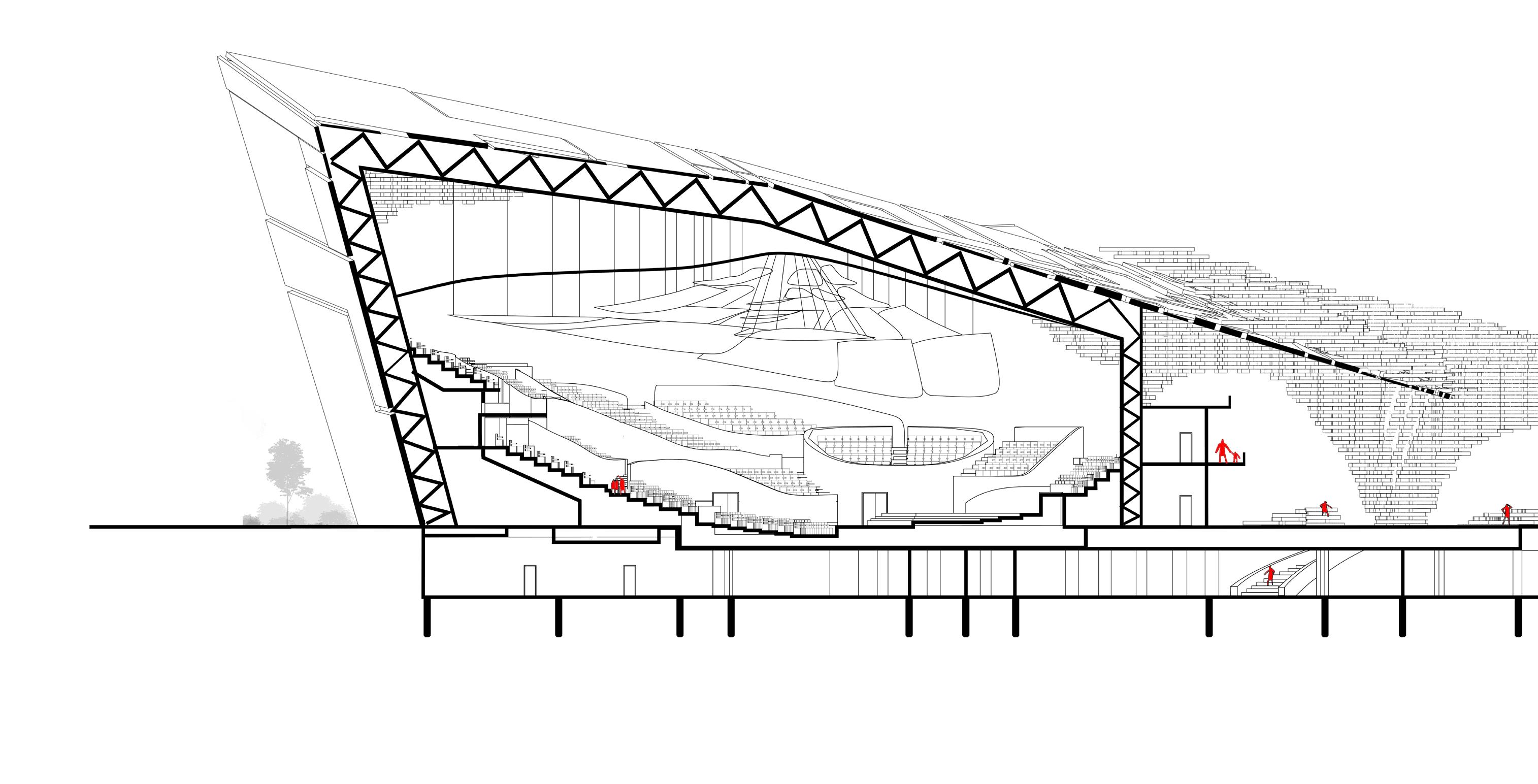
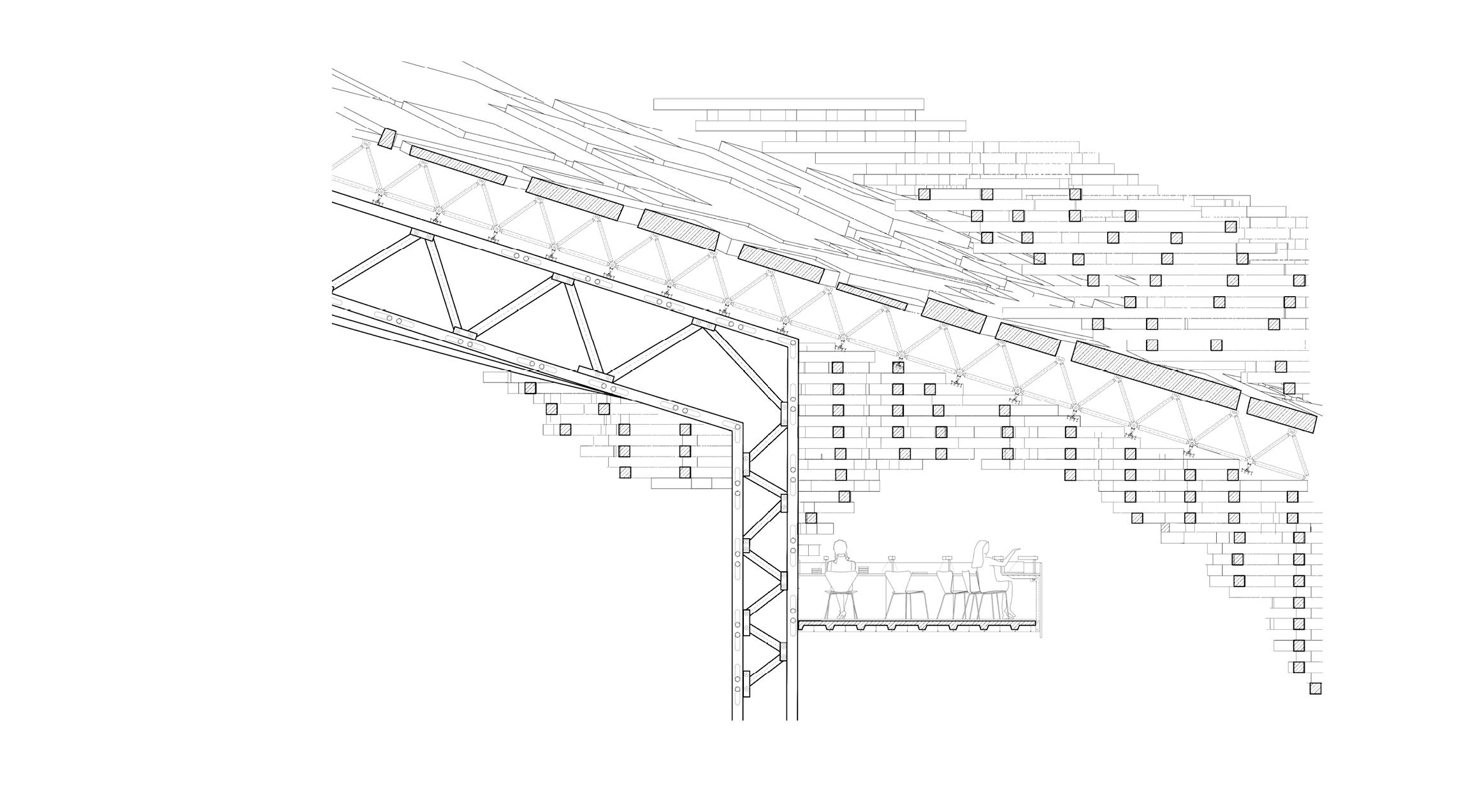
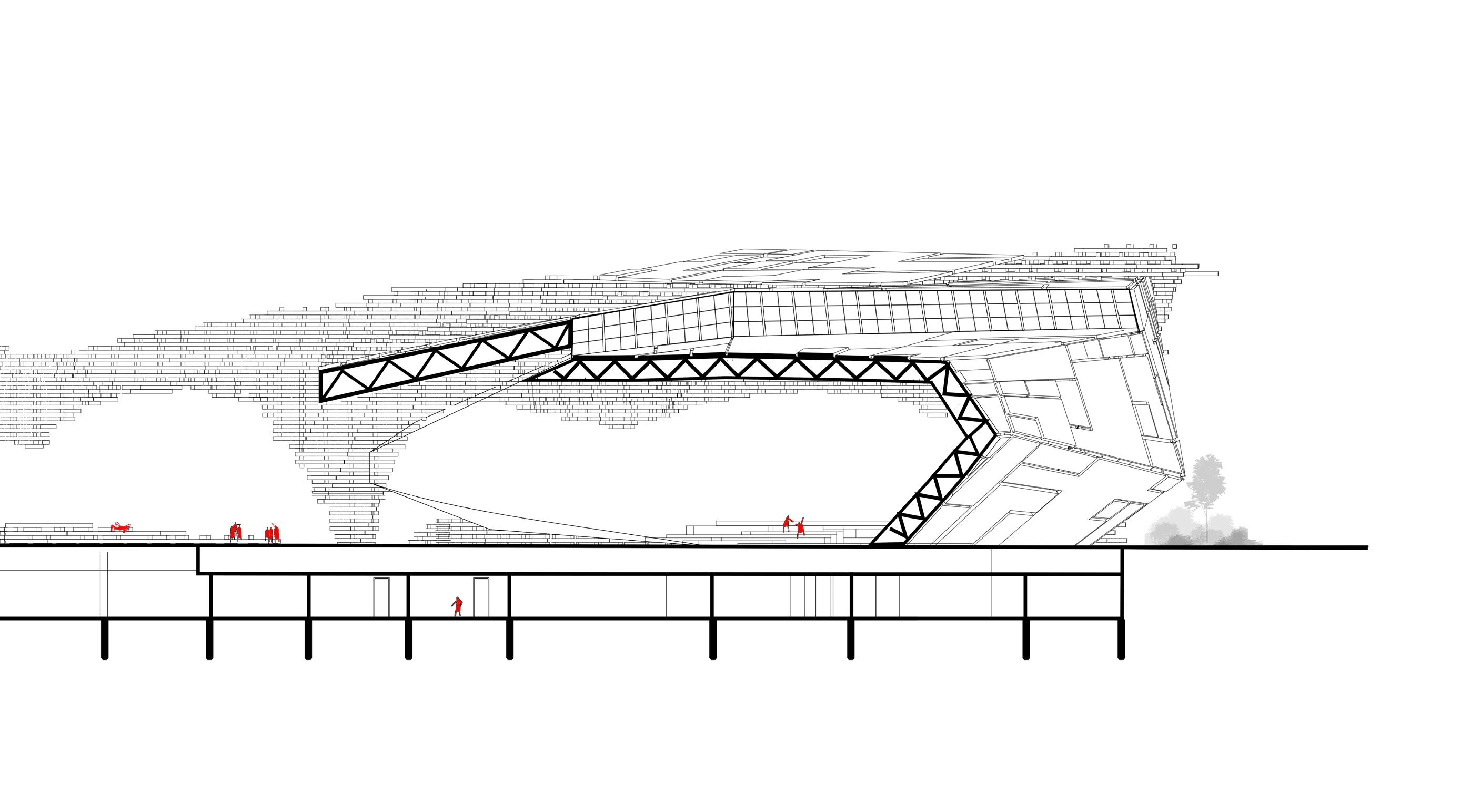
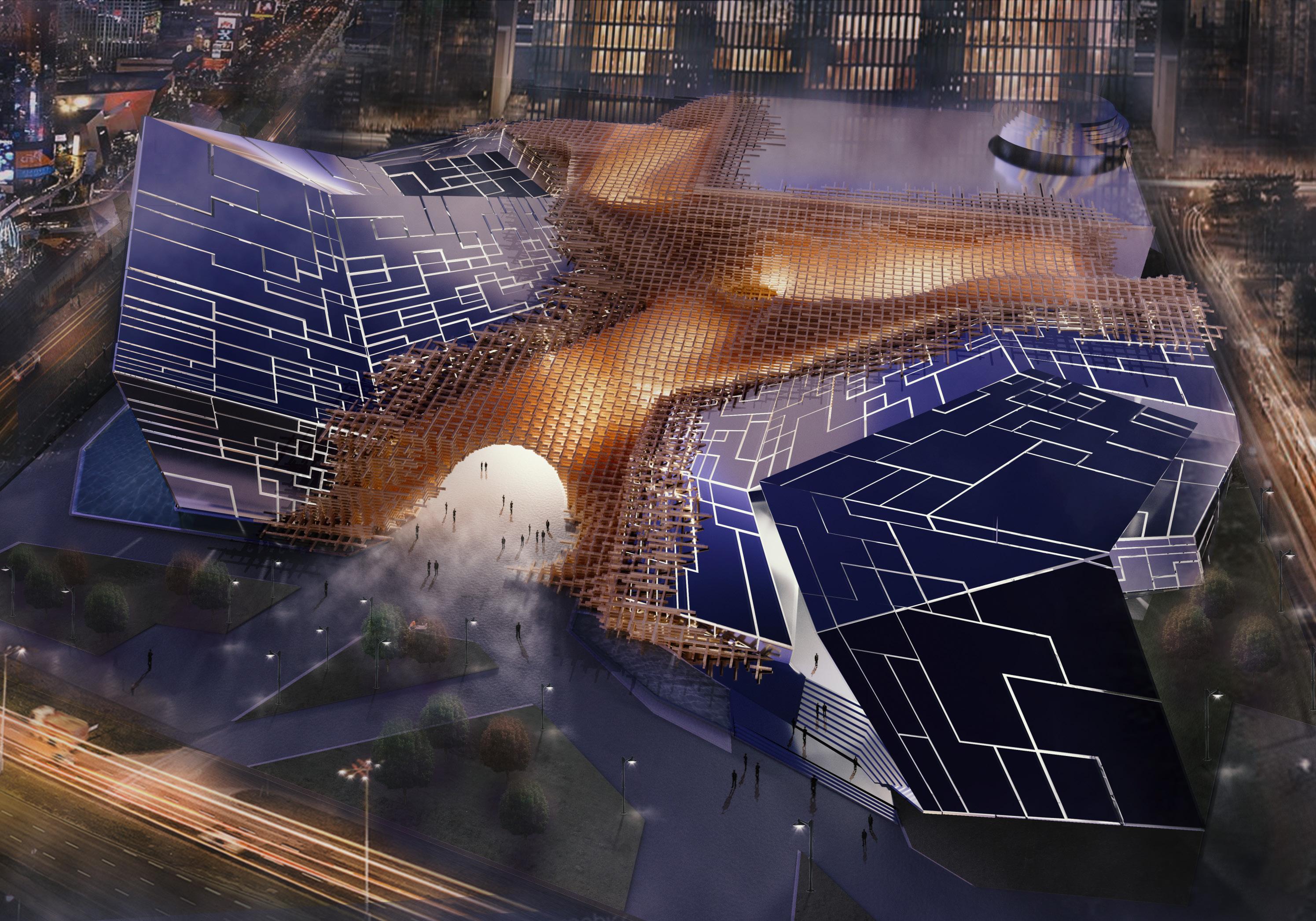
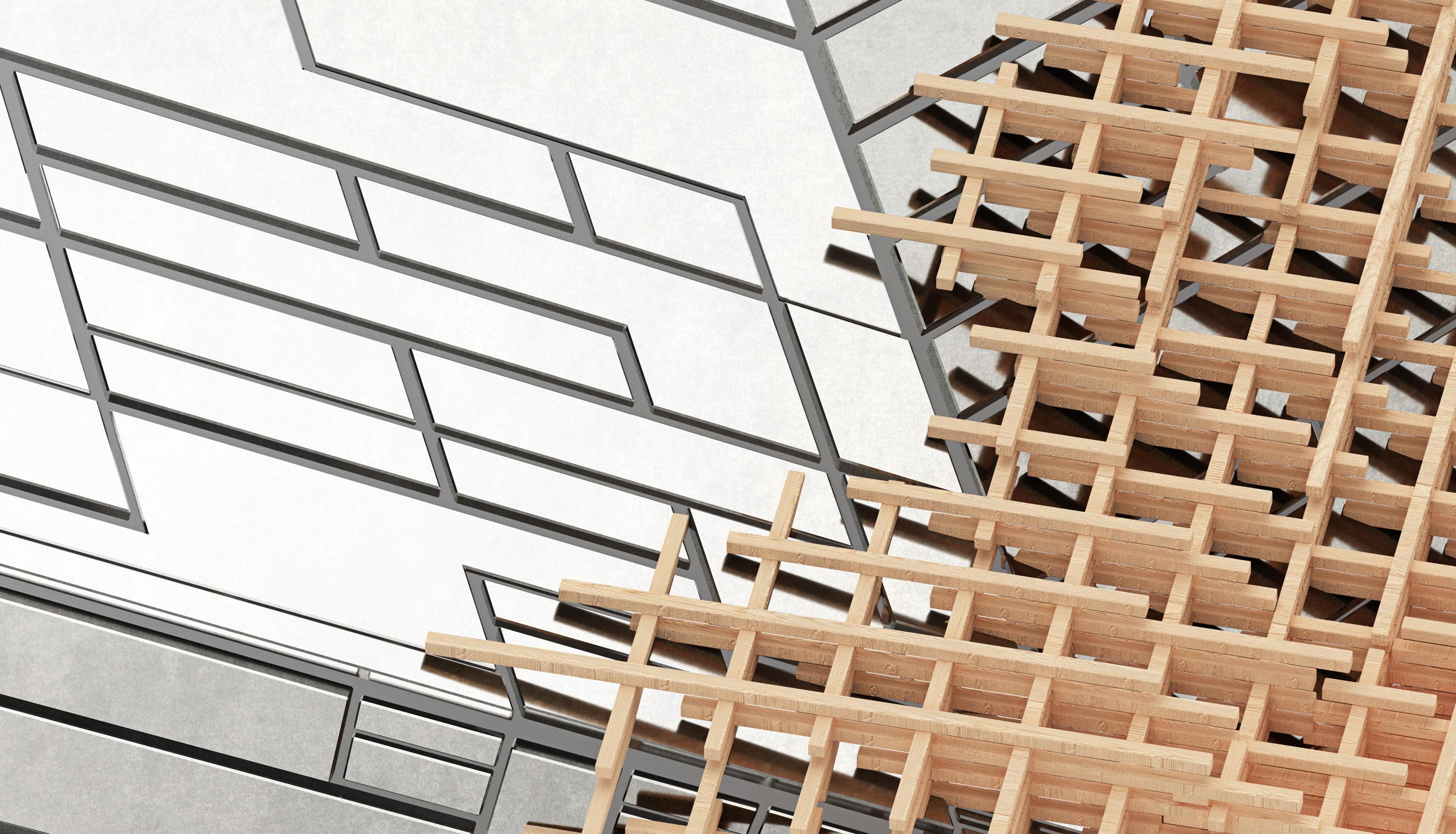
The connection and conflict between different materials create a special space. It is this transition and link that compile the space of alternative freedom.
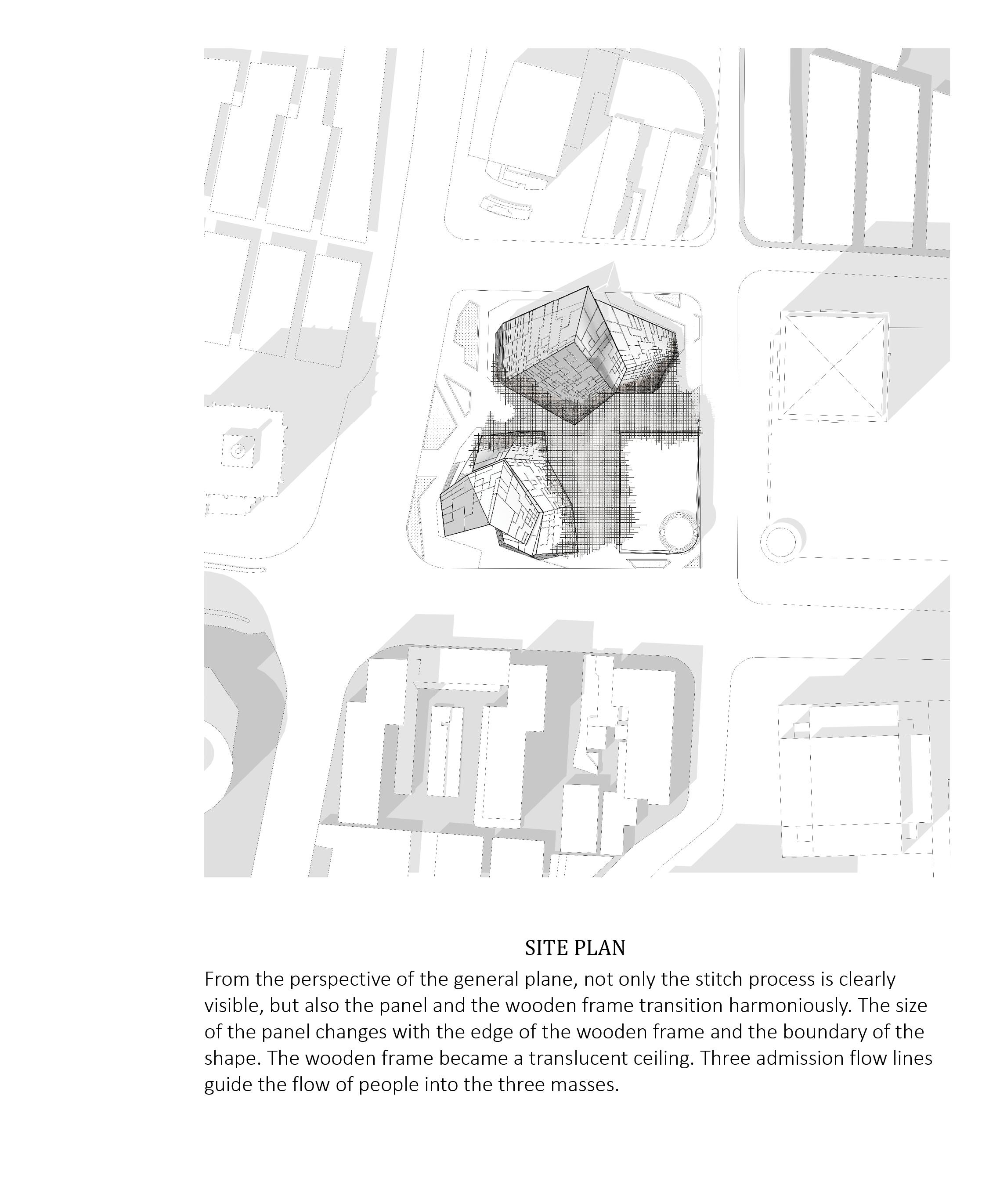
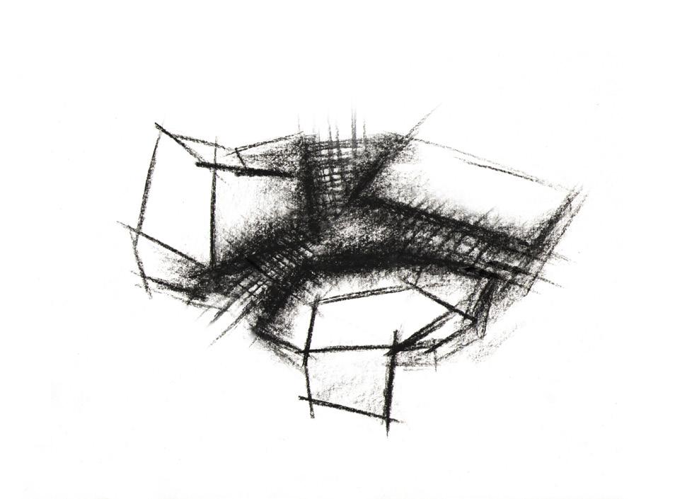
In urban design, the complex interaction of building functions reflects the threads linking blocks, streets, and buildings at various scales. The 'stitching' concept guides the design, blending functional and material elements. It explores merging wood frames and panels to create unique semioutdoor and indoor areas, reshaping the relationship between human behavior and materials.
26 III
DS 5001 Academic Porject, Unbuild
Xiao Jin
Stitch Let's
Andy Zheng Linkui Gu Individual Work Status Studio Design
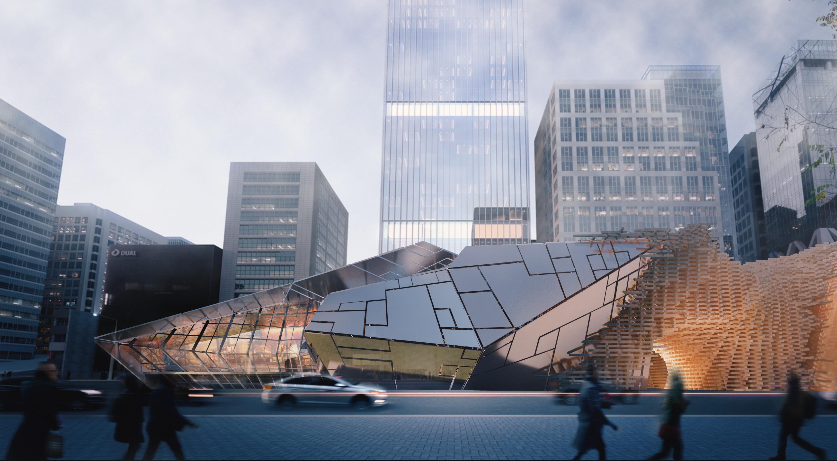
27 Birdview Perspective Rendering Location: 44 Jiangning Road, Shanghai, China
Rendering of the South Facade
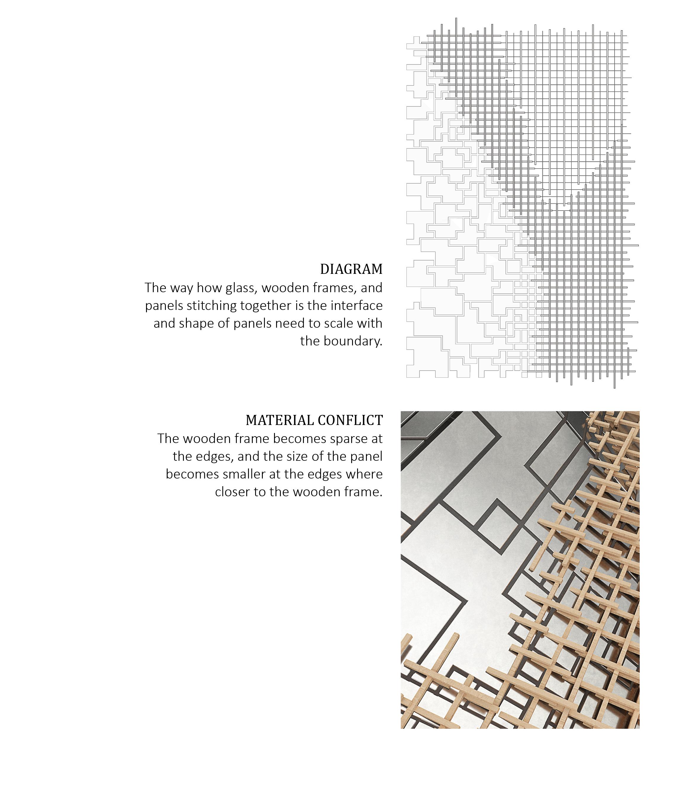
28 Material gradient brings about space
29 Let's Stitch III

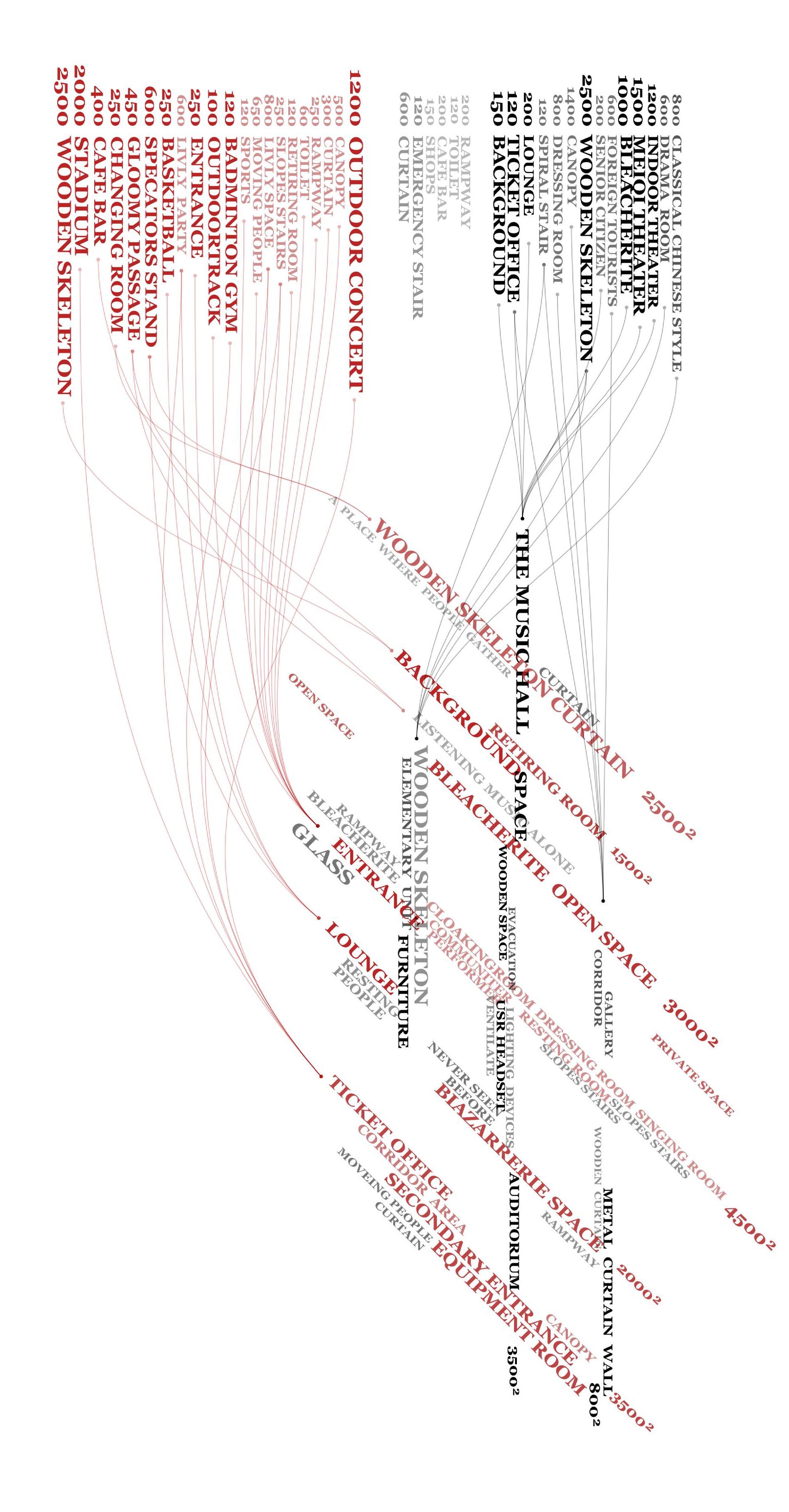
FUNCTIONAL REATIONSHIP
30 Material gradient brings about space
Function Relationship boundary Height transformation Connection Stitch Panel
CONCEPT SKETCH FORM GENERATION
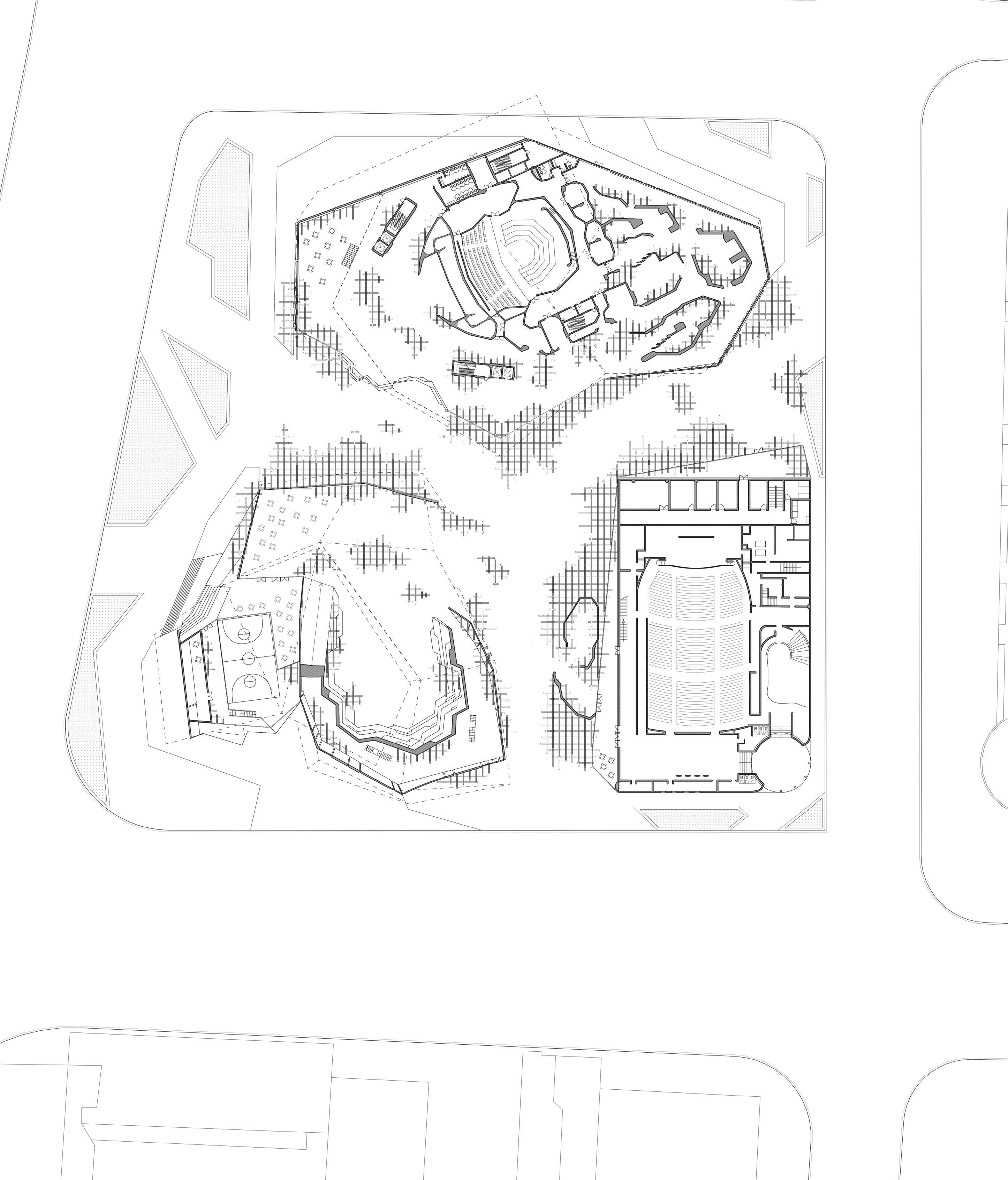
31 Let's Stitch III 1.- Stage 2.- Locker room 3.- Lobby 4.- Cafeteria 5.- Courtyard 6.- Gynasium 7.- semi-outdoor theatre 8.- Atrium 9.- Entrance 10.- Background 11.- Dressing room 12.- Private threatre 1 2 3 9 9 11 7 6 4 5 8 8 10 11 9 4 11 First Floor Plan
32 Material gradient brings about space
33 Let's Stitch III
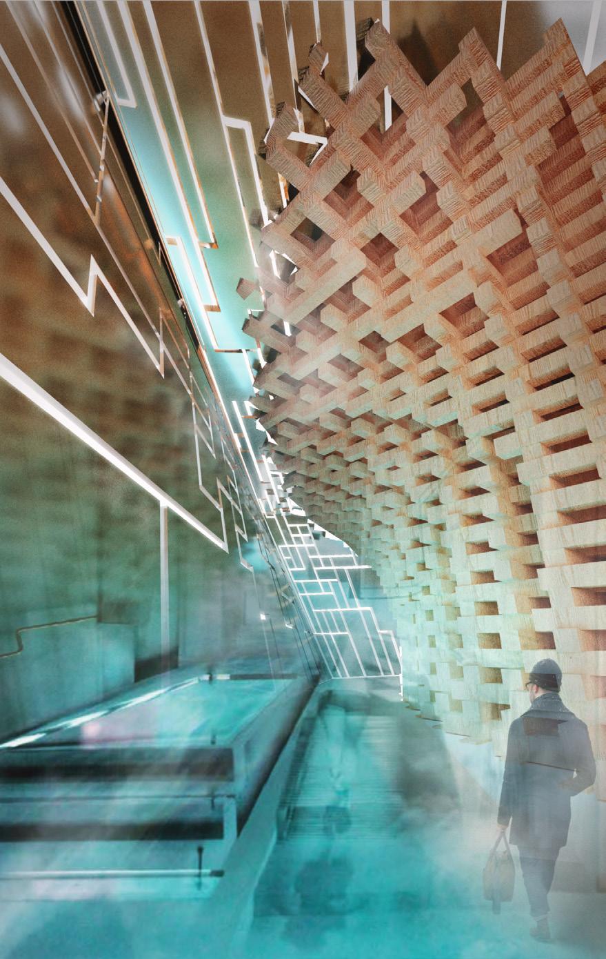
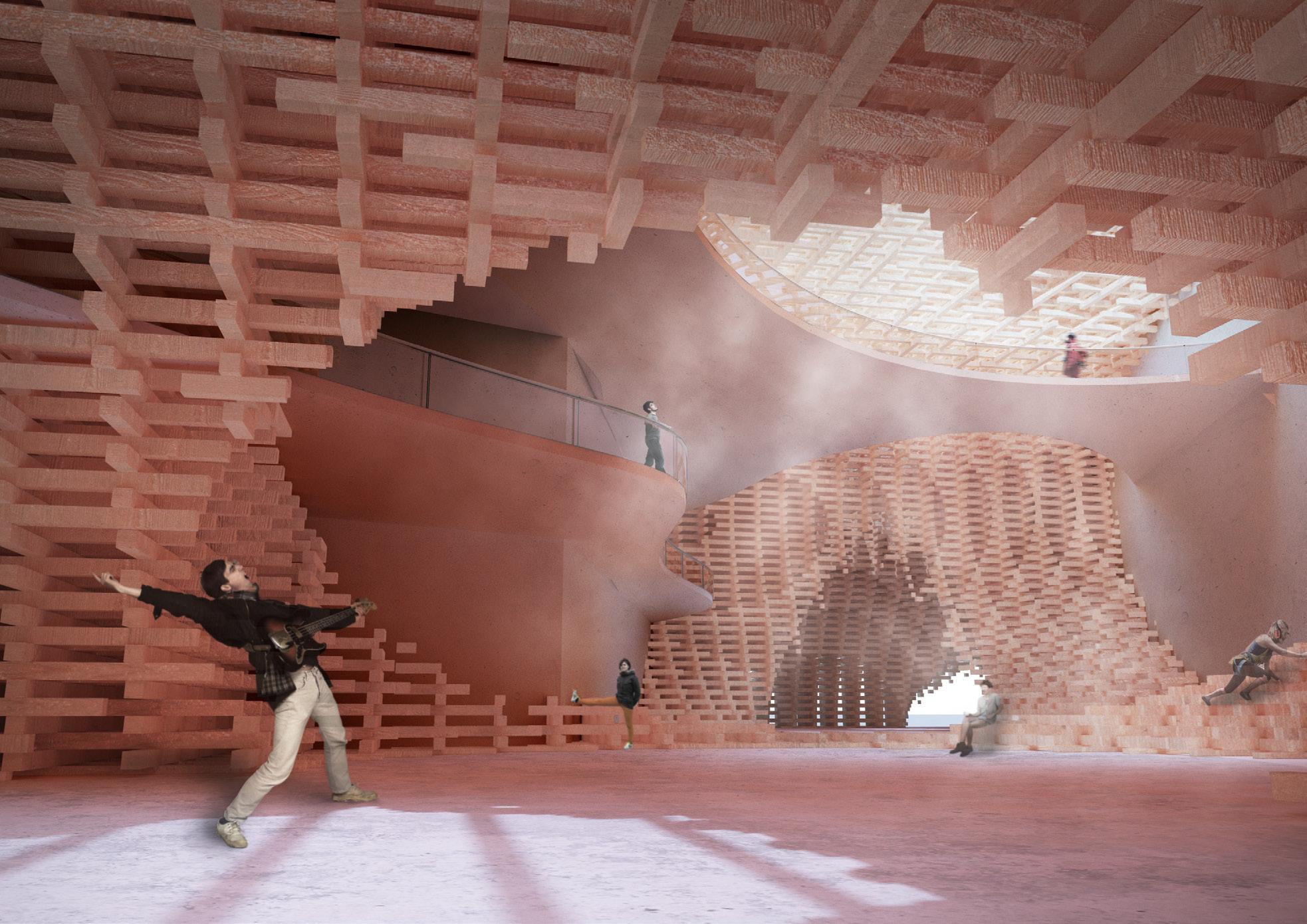
Material gradient brings about space semi-indoor atrium Concert hall corridor

Let's Stitch III
outdoor concert hall
material gradient detail [right]
bird 's-eye view of night view [left]
Instructor
Randy Jefferson, Maxi Spina Partners
David Garcia
Shichen Cao Sharaddha Kemse
Software: Rhino 7, Photoshop, InDesign, Adobe Illustrator
Uppsala Concert Hall
Sci-ARC 20Fall
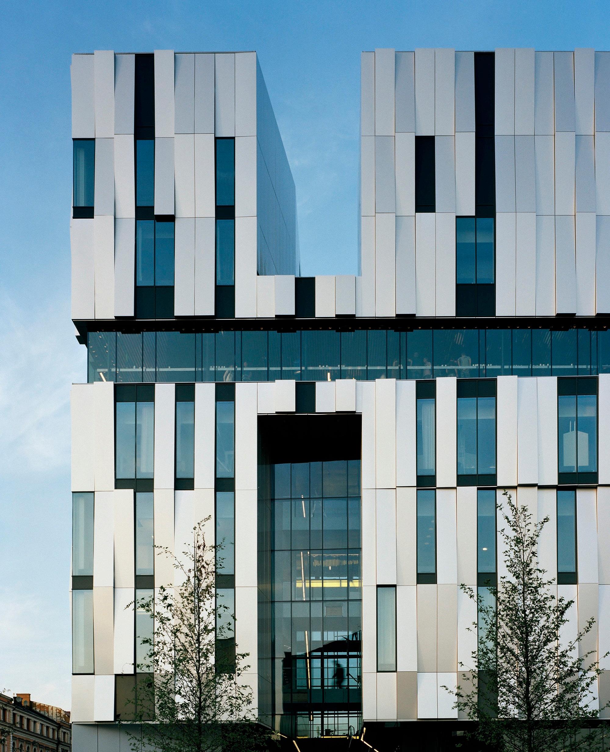
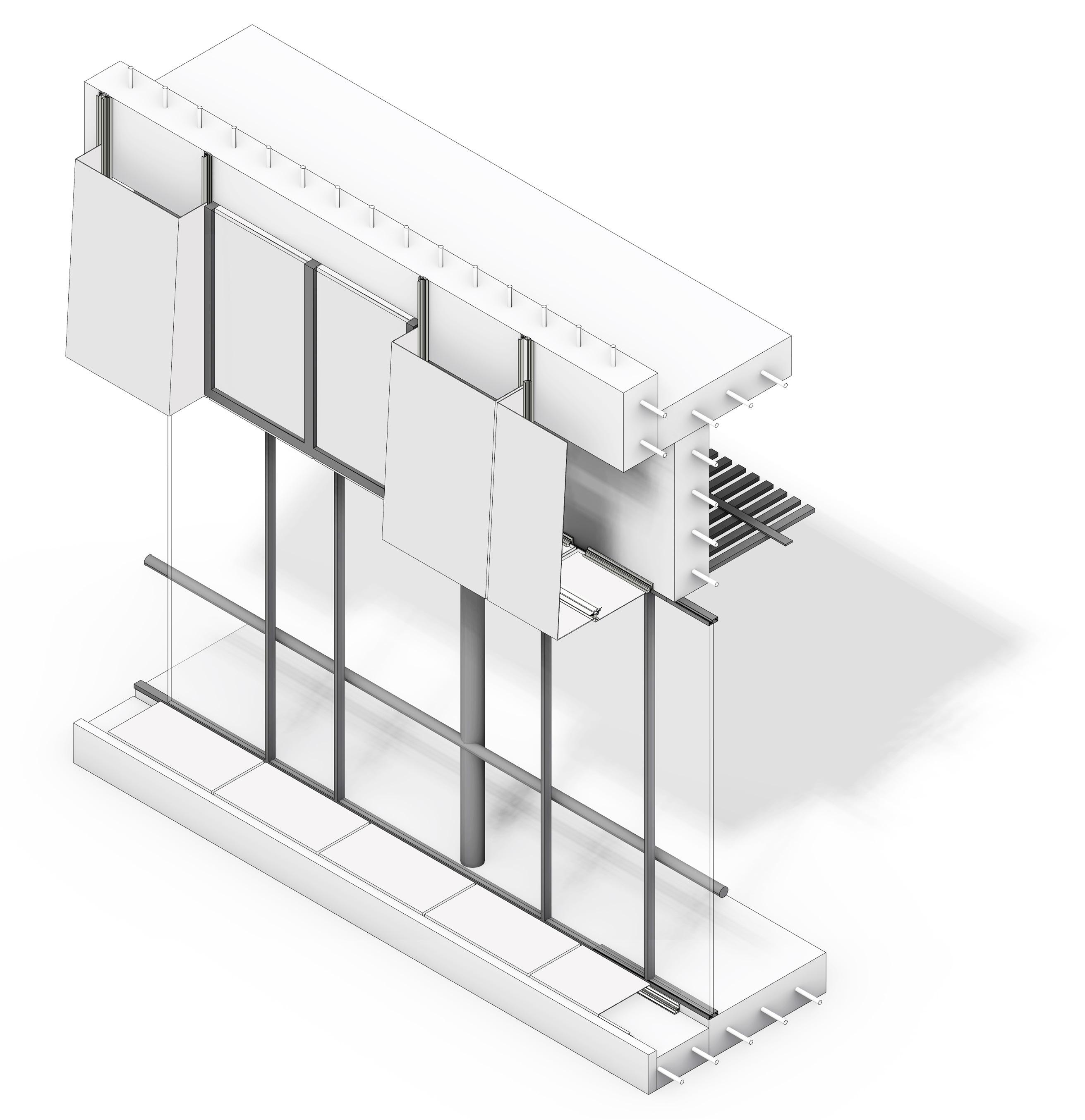
Learn about the Alucobond Panel construction by splitting, modeling, annotating, and deducing the facade of the Uppsala Concert Hall.
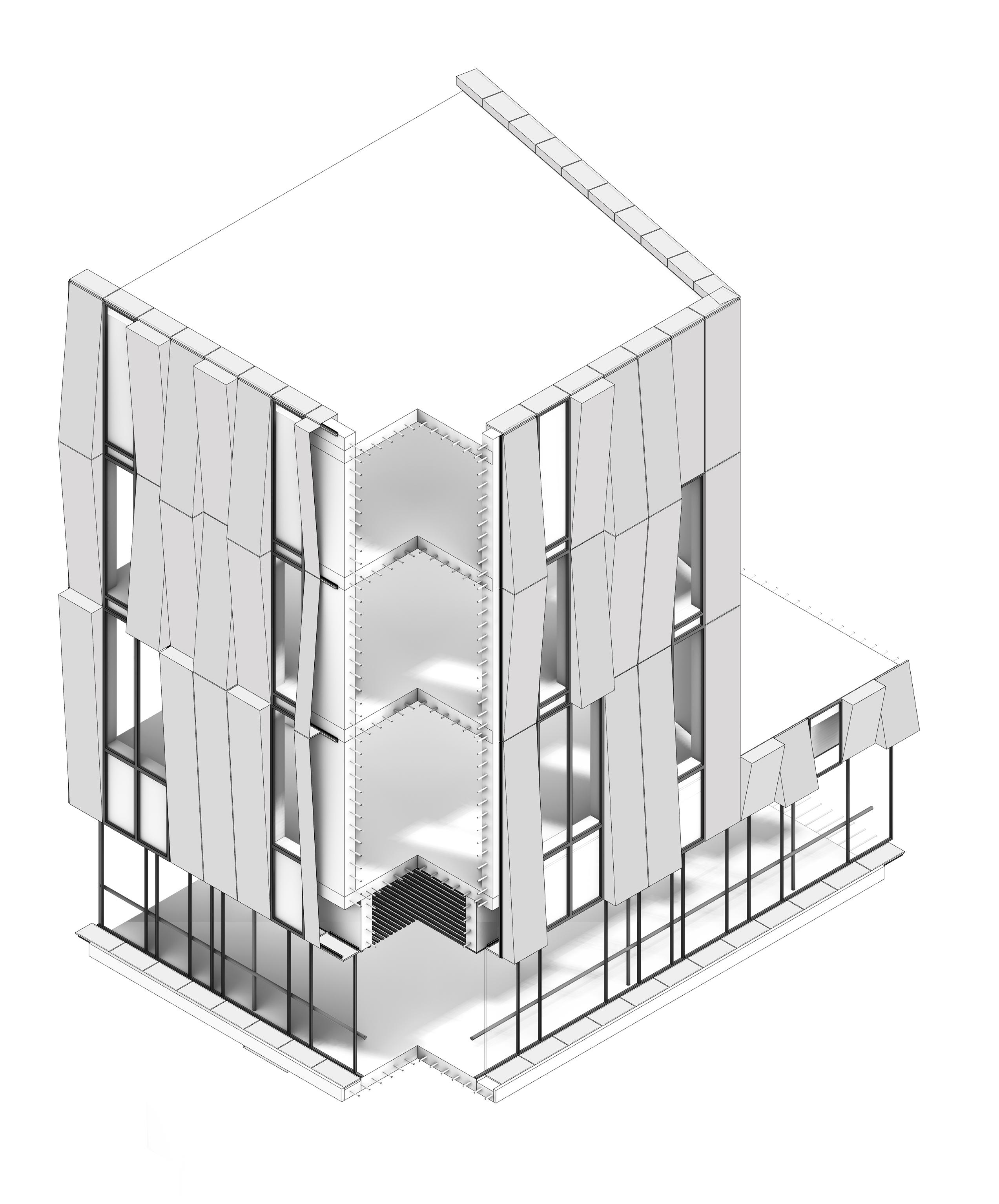
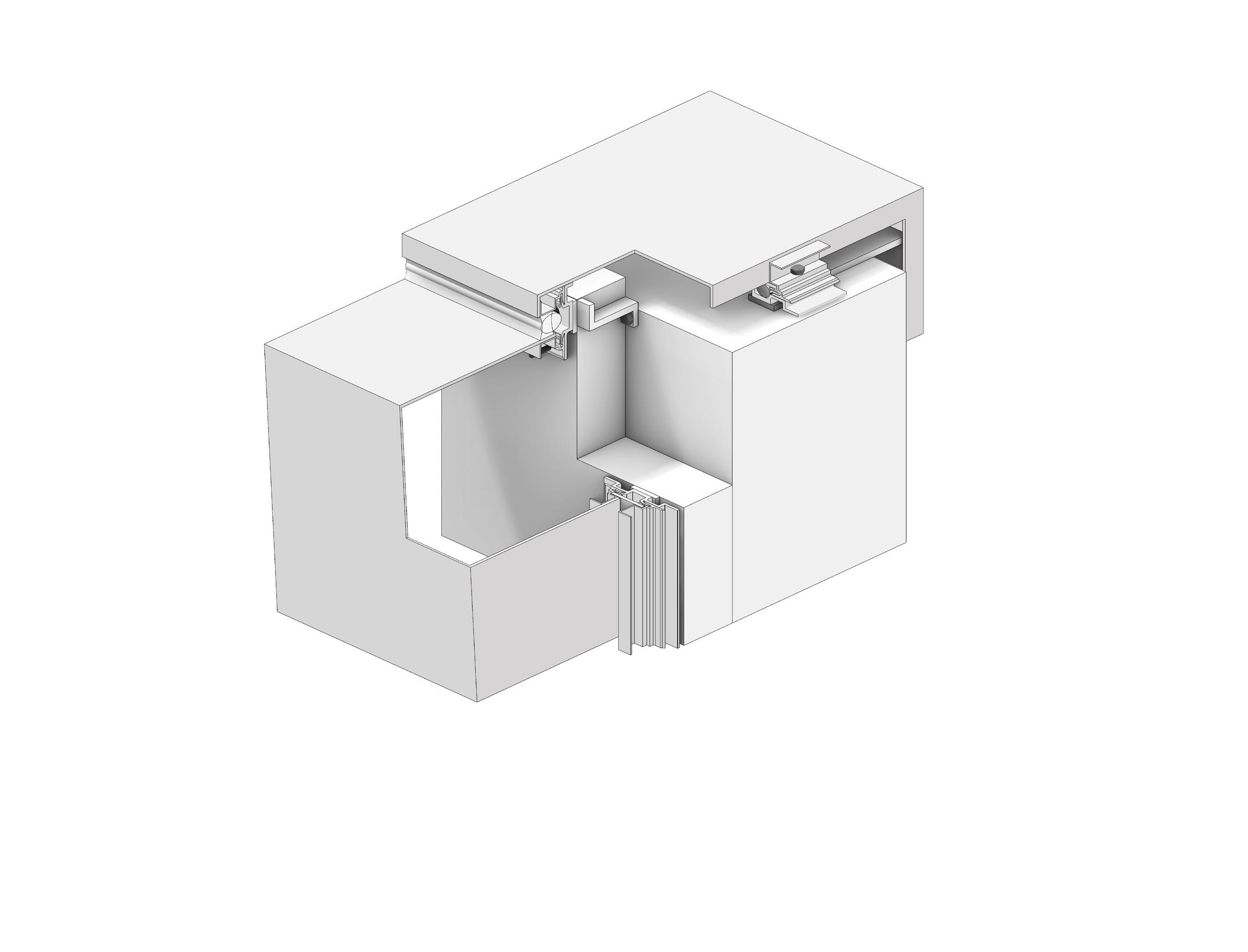
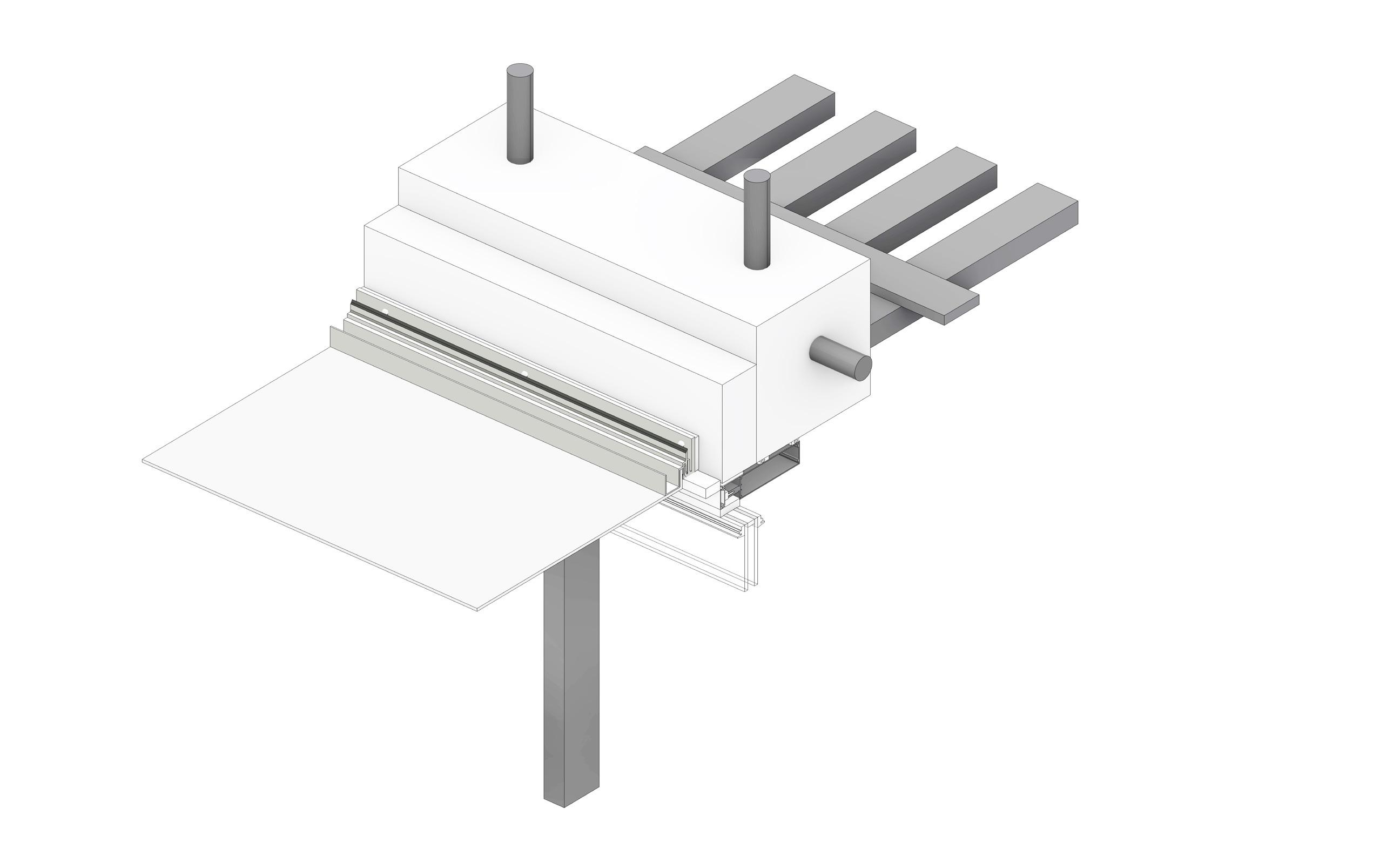
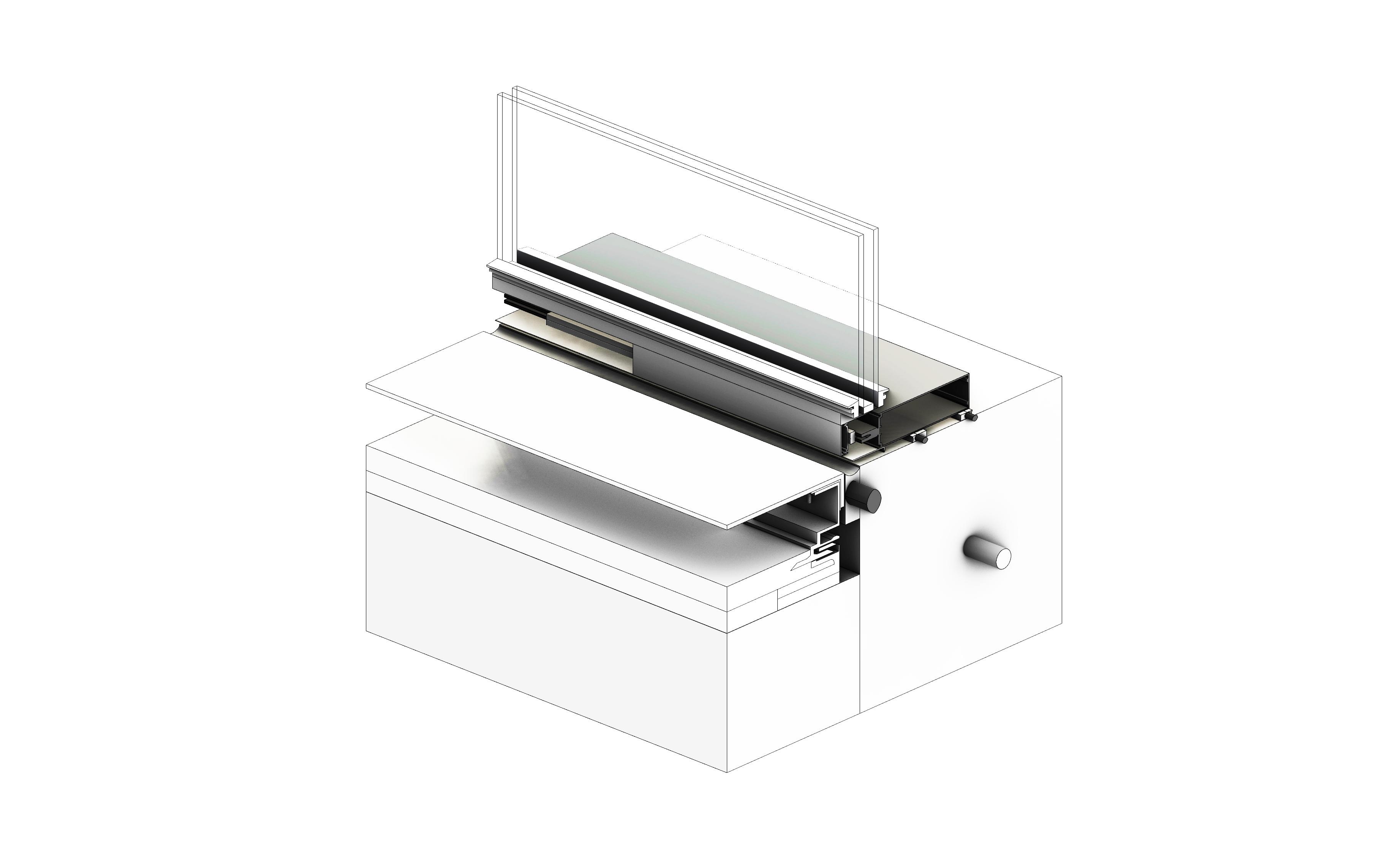
With this facade system, the construction reveals how different aluminum plates are connected to other materials. We classify them according to scale and location into the roof, the window section, and the curtain wall's aluminum panels.
After analyzing and studying the aluminum plate research method of Uppsala Concert Hall, we expanded and derived it on the original basis. We analyze and compare the similarities and differences of different parts, such as ACM system joint and sealing strip location, and so on.
Tectonic Material
system of the Uppsala Concert & Congress Hall
Envelope
36 IV Xiao Jin AS 3200 Adv MATERIAL/TECTONIC
Tectonic
Front elevation
Uppsala Concert & Congress
Location: Vaksalagatan, Uppsala, Sweden
37
Photograph of the Facade of Uppsala Concert Hall
Mass Axonometric
Envelope system of the Uppsala Concert & Congress Hall
NON-ACCESS
ROOF
A1 A2
ALUCOBOND PANEL RAIN SCREEN SYSTEM
EQUIPMENT FLOOR
38
CAST IN PLACE CONCRETE STRUCTURE
A1 - Alucobond Roof Detail
ALUCOBOND ROOF PANEL
SEALING STRIP
ACM SYSTEM
INSULATION
ACM SYSTEM
SHEATHING
ALUCOBOND PANEL
THERMALLY BROKEN CLIP
SEALING STRIP
CONCRETE WALL
WEATHER BARRIER
ACM REVEAL
CAST IN PLACE CONCRETE WALL
WEARTHER BARRIER
METAL GRID PANEL
SHEATHING
METAL CLIP
REINFORCING STEEL
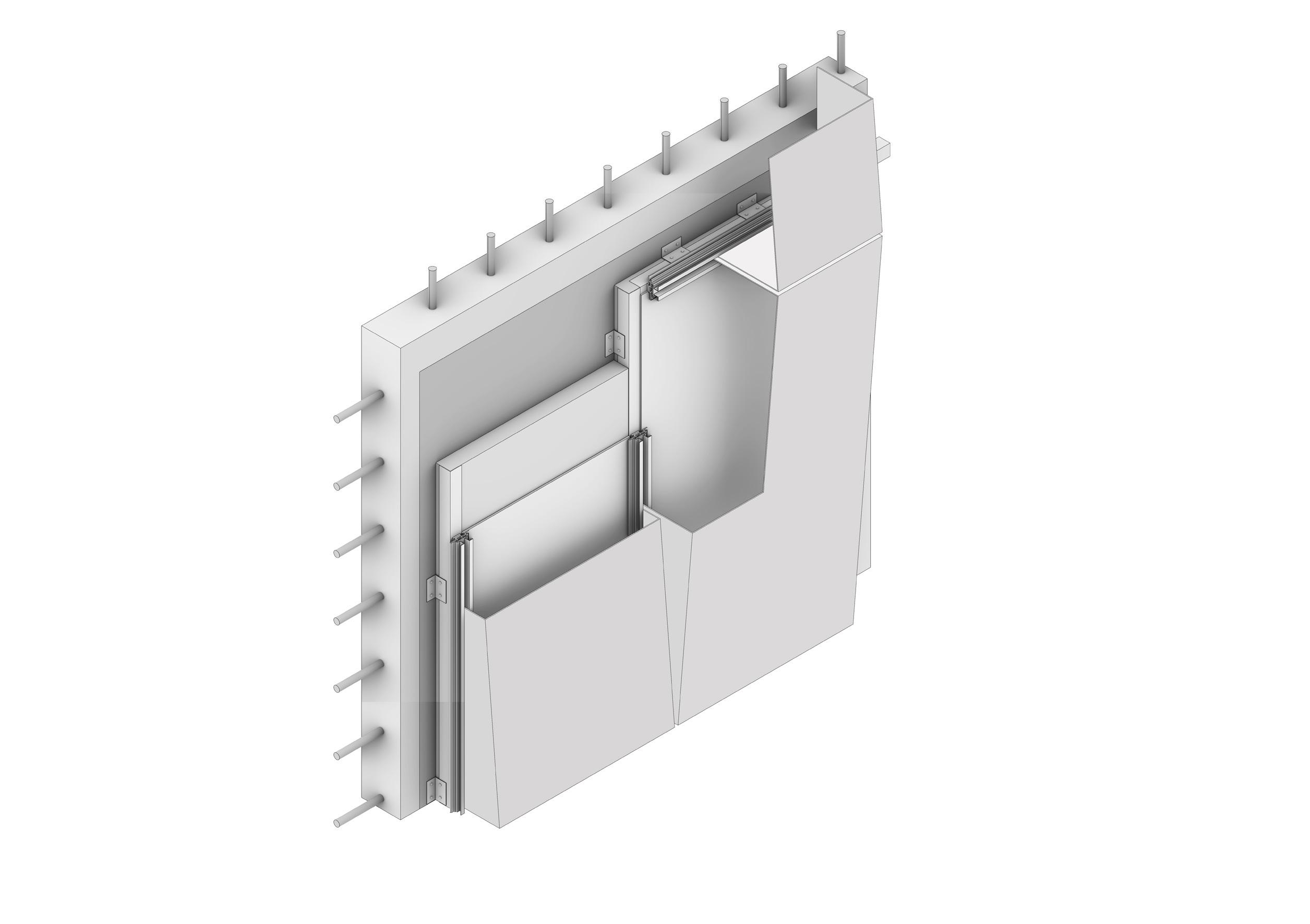
ALUCOBOND PANEL
ACM REVEAL
ACM SYSTEM JOIST
39 Material Tectonic IV
Facade Glazing
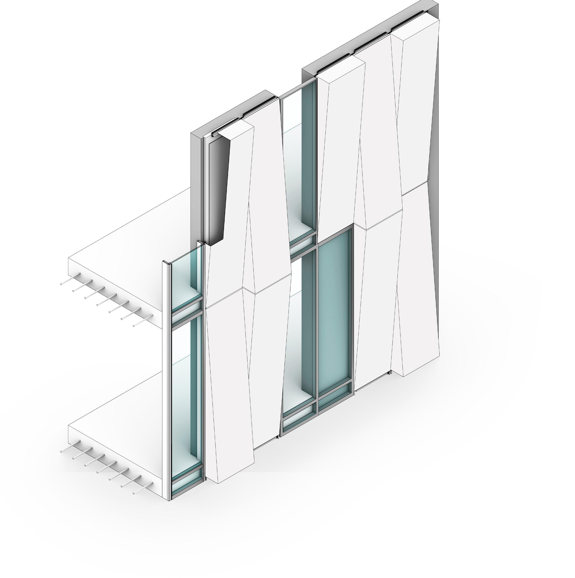

Envelope system of the Uppsala Concert & Congress Hall 40
SILICONE JAMB
GLASS PANEL MULLION WET SEAL ACM SYSTEM EXTRUSIONS AND CLIPS THERMAL SEPARATOR FLOOR INSULATION
B1 B3 B2
B2 - Window Sill Detail
B1 - Window Jumb Detail
SILICONE JAMB
WALL
GLASS PANEL
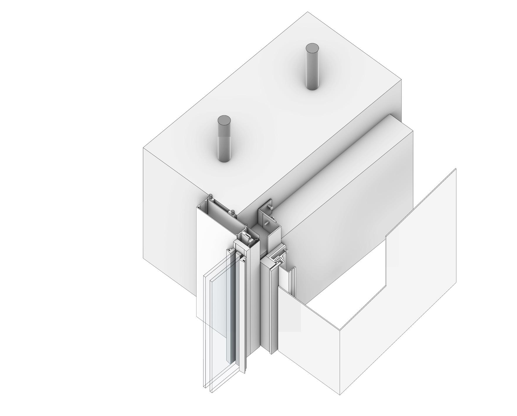
B3 - Window Head Detail
WALL
SILICONE JAMB
GLASS PANEL
INSULATION
THERMALLY BROKEN CLIP ASSEEMBLY
ALUCOBOND COMPOSITE PANEL
ACM SYSTEM EXTRUSIONS AND CLIPS
ACM REVEAL MULLION
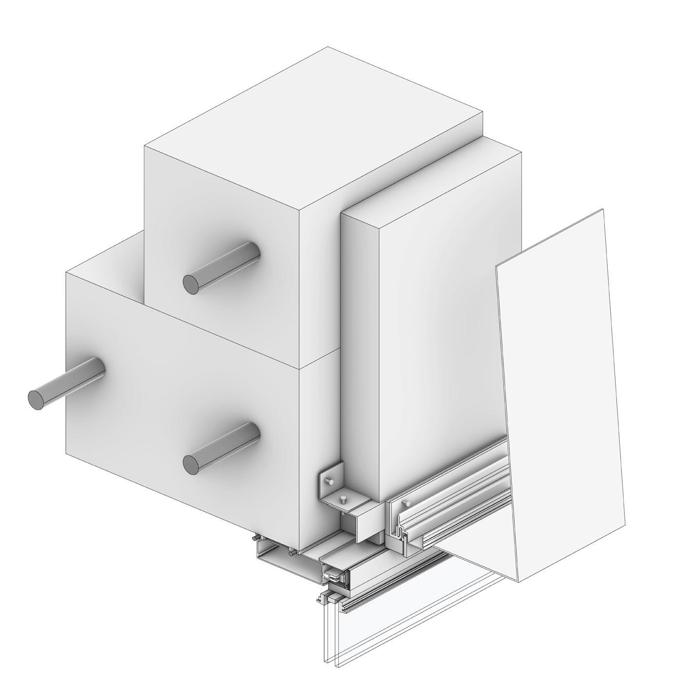
INSULATION
ALUMINIUM COMPOSITE PANEL
THERMALLY BROKEN CLIP ASSEEMBLY
THERMAL SEPARATOR
ACM REVEAL
MULLION
41
Material Tectonic IV
Envelope system of the Uppsala Concert & Congress Hall 42
C2 C1
CAST IN PLACE CONCRETE STRUCTUE
CEILING
CURTAIN WALL Curtain Wall
C1 - Curtain Wall Head Detail
REINFORCING STEEL
WALL
BOARD INSULATION
ACM SYSTEM JOIST
ALUCOBOND PANEL
C2 - Curtain Wall Sill Detail
GLASS PANEL
CEILING PANEL
CEILING PANEL MOUNT PLATE
SILICONE JAMB
MULLION
ACM REVEAL
MULLION
ALUCOBOND PANEL
BOARD INSULATION
ACM SYSTEM JOIST
SILICONE JAMB
WET SEAL SLAB
43
Material Tectonic IV
Design and construct a deceptive stair
Advisor
Dwayne Olyer
Team Memeber
Chuen Wu, Christian Filip
Status
Deployed Dec. 2022
Software: Rhino 7, Photoshop, Illustrator
Handwork: Welding, Sanding, Wood CNC, Staining, Drilling
Stair Detail Design
22Fall
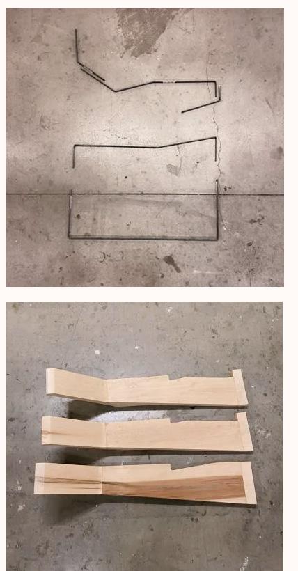
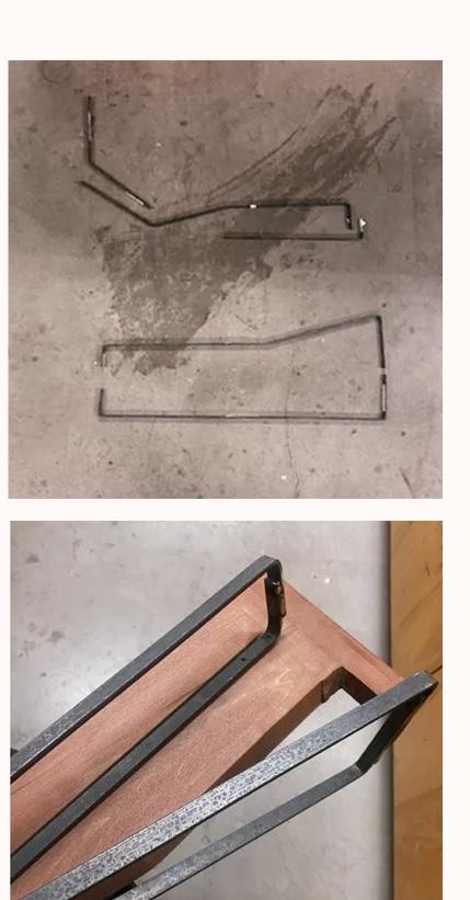
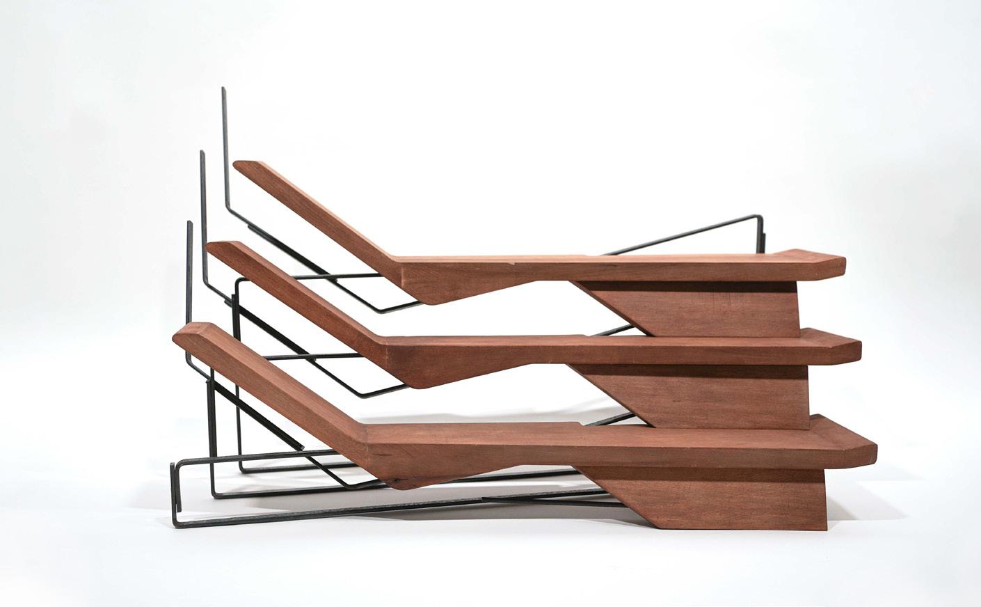
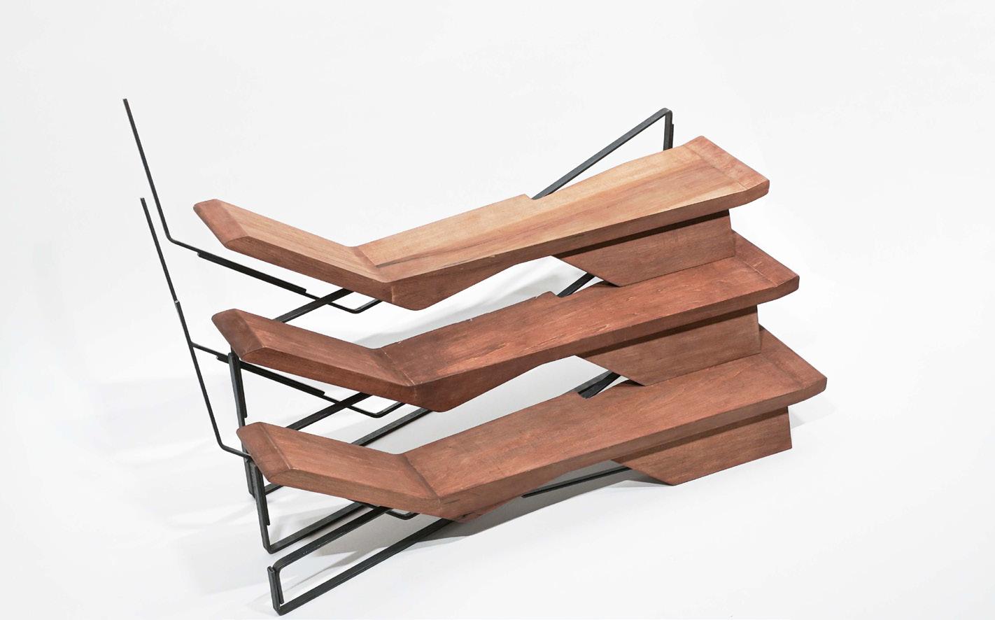
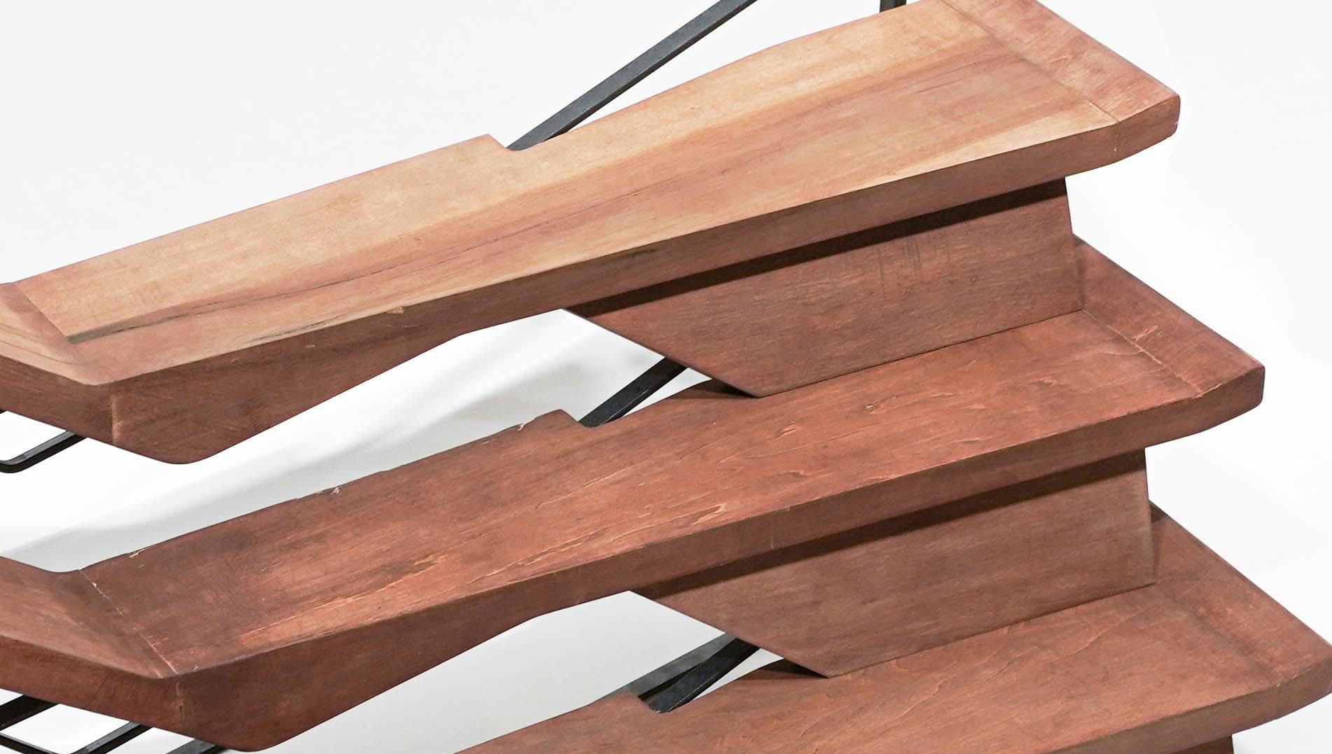
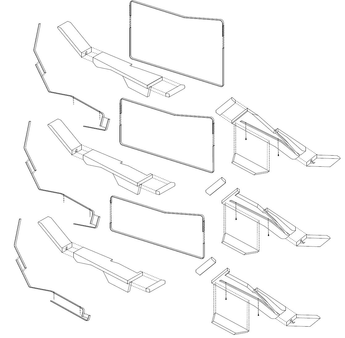
The diagonal intersecting position of the metal bar allows more balance under wood pieces. Their counterbalance strengthen the structure.
The metal frame's complexity creates a 3D curve illusion, suggesting connectivity between two frame sets, diverting focus to its design rather than the stairs. While wood appears dominant, it's the metal's interlocking and counterbalancing that fortifies the structure.
Manipulative Detail
Jin Sci-ARC 44
Xiao
AS 2509 Details, Details
Manipulative

45 Close-up view of wood and metal joint Location: Sciarc Keck ,960 E 3rd St, Los Angeles
Photography of Stair Details
However, in reality, they do not work the way they look, manipulating the audience's attention from the stair themselves to the intricacy of the structure.
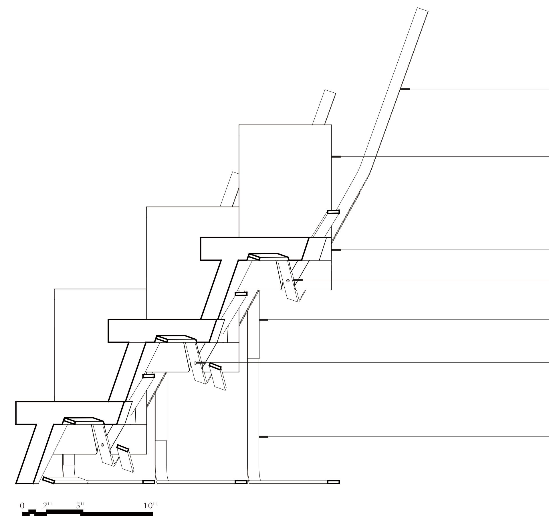 3/8'' *1'' METAL BAR
BASSWOOD 2'' THICK
BASSWOOD 5-1/2'' THICK
3/8'' *1'' METAL BAR WELDING JOINT #10 1-1/2'' SREW #10 1-1/2'' SREW
3/8'' *1'' METAL BAR
3/8'' *1'' METAL BAR
BASSWOOD 2'' THICK
BASSWOOD 5-1/2'' THICK
3/8'' *1'' METAL BAR WELDING JOINT #10 1-1/2'' SREW #10 1-1/2'' SREW
3/8'' *1'' METAL BAR
Design and construct a deceptive stair


The inherent complexity of the metal frame skillfully gives the audience an illusion, while the deliberate continuity of the two sets of frames effectively creates a convincing impression, particularly in the front view, that they seamlessly connect.
Manipulative Detail V
Status
Deployed Oct. 2021
Credits
INSOME Inc.
Role Designer
Gap Year 2021
Working Experience
Software: Rhino 7, Revit, Solidwork, Photoshop, InDesign, Adobe Illustrator
Prebricated House Design
INSOME 21Fall
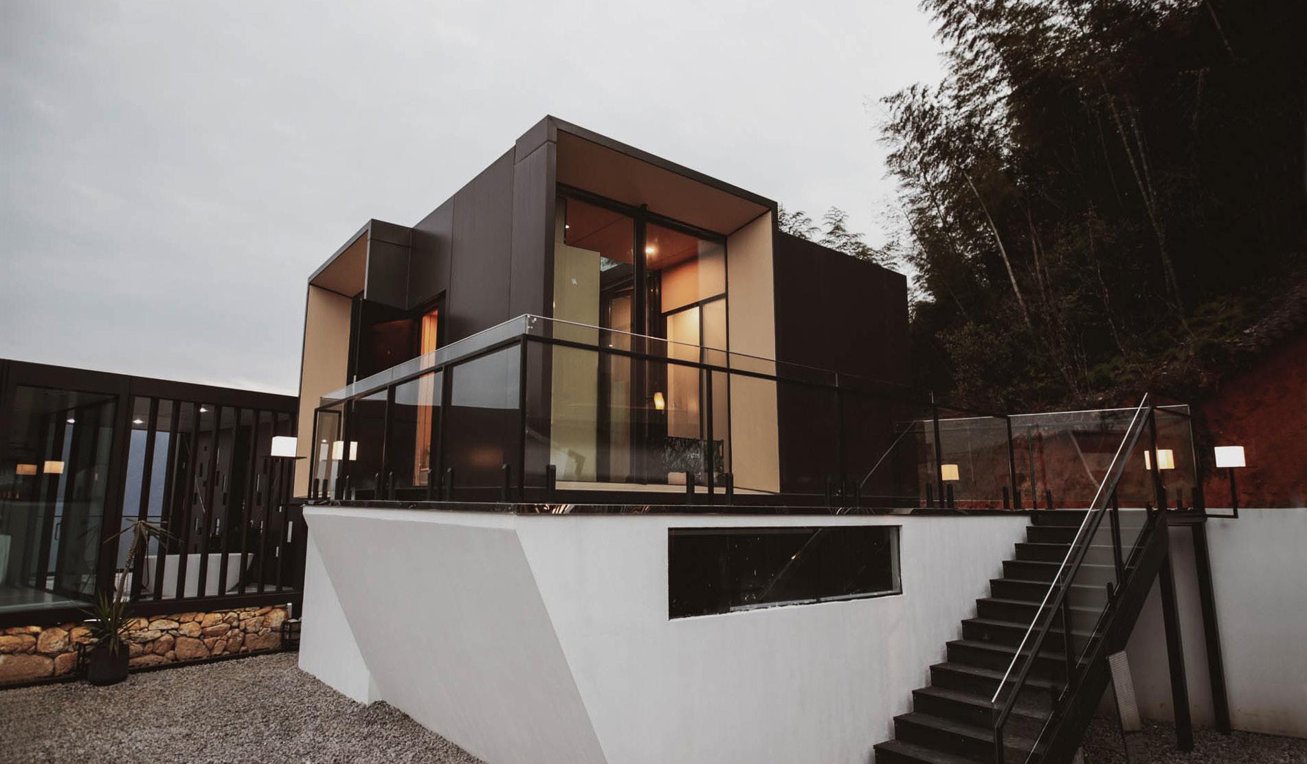
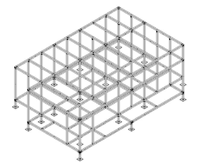
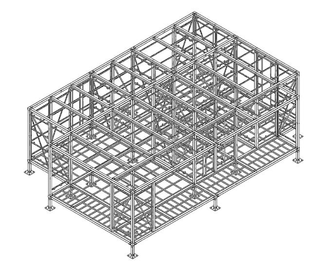
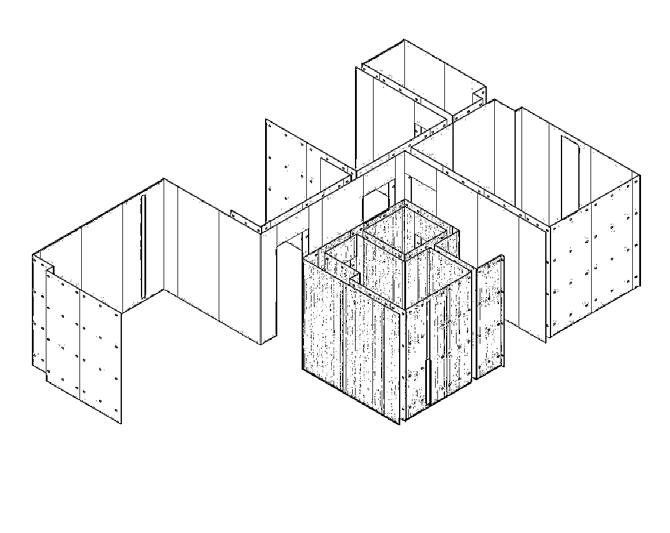
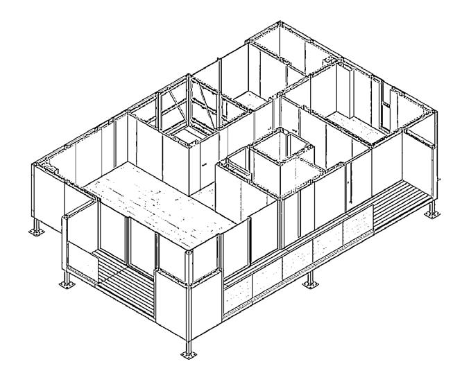
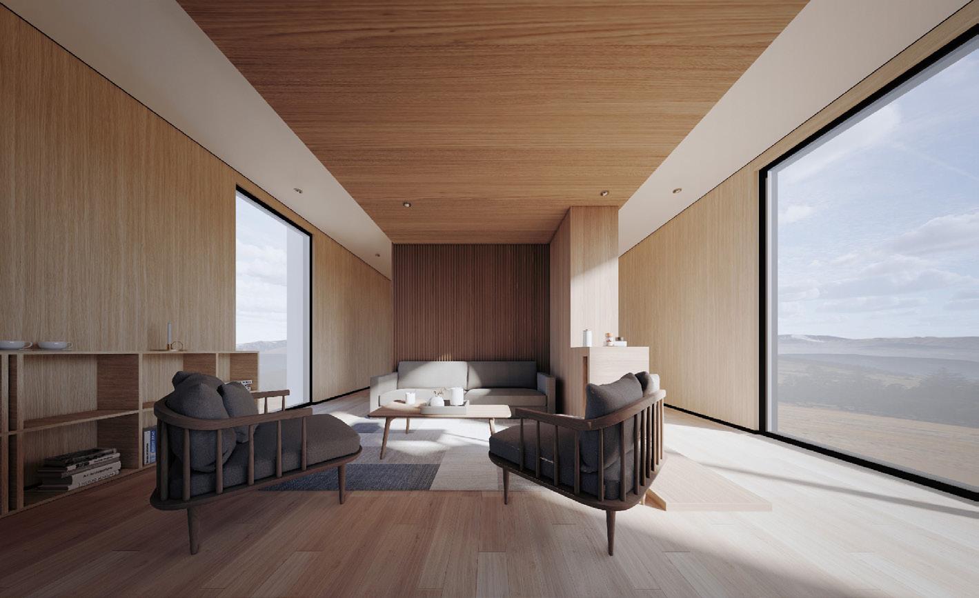
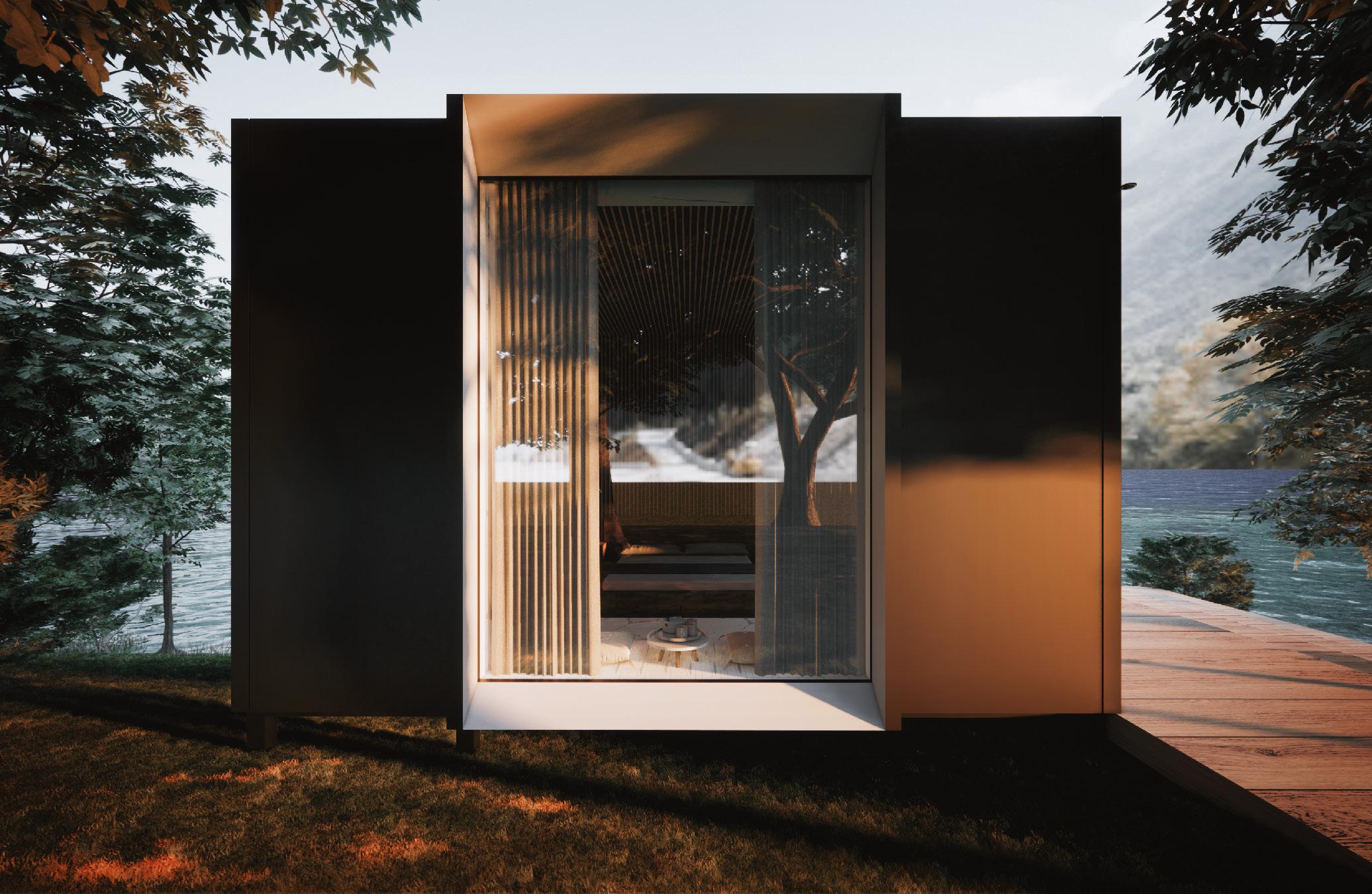
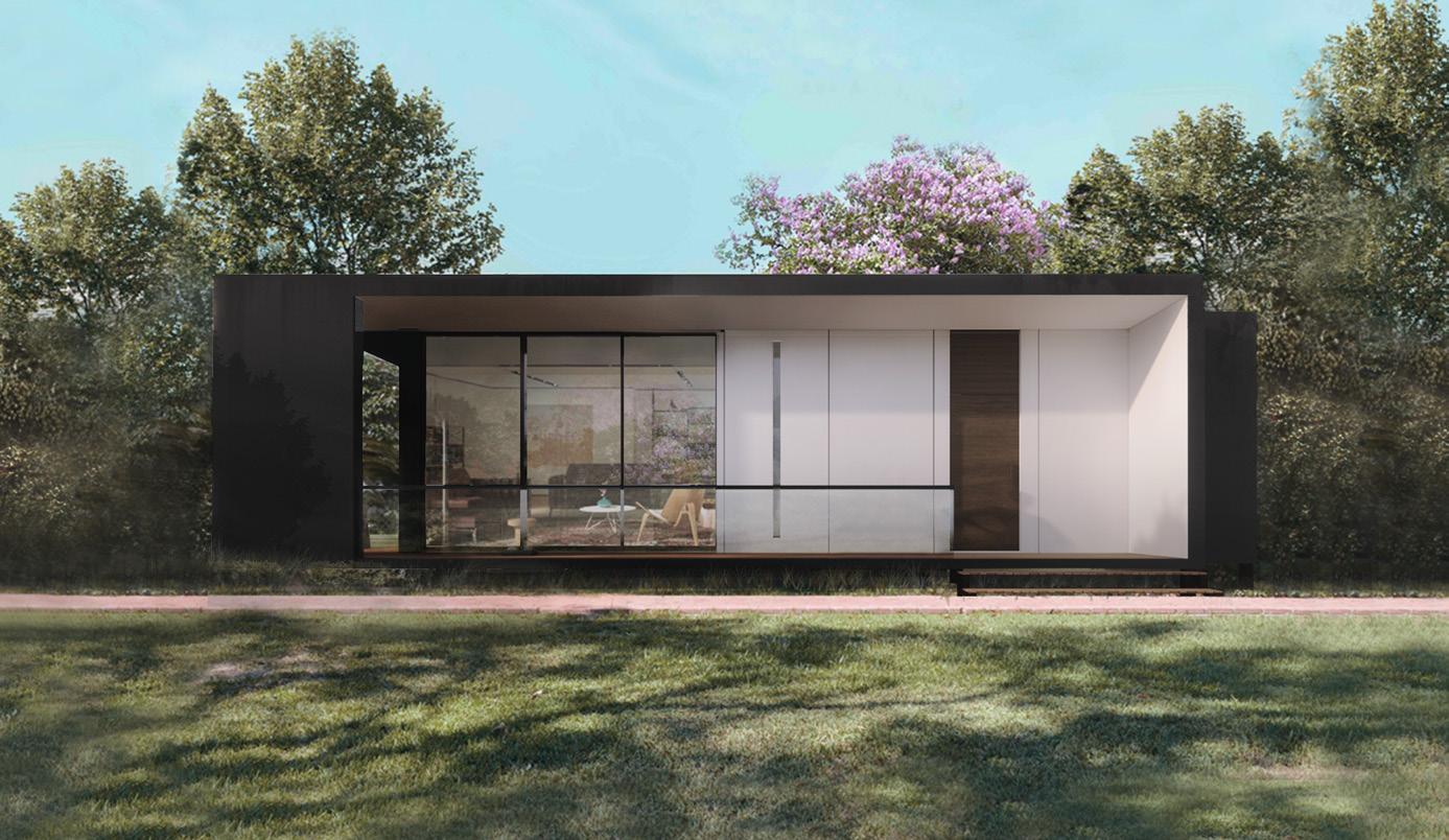
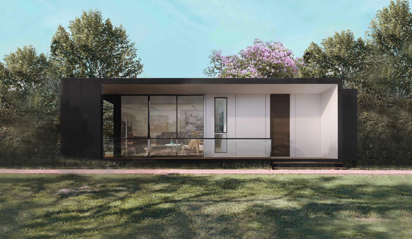
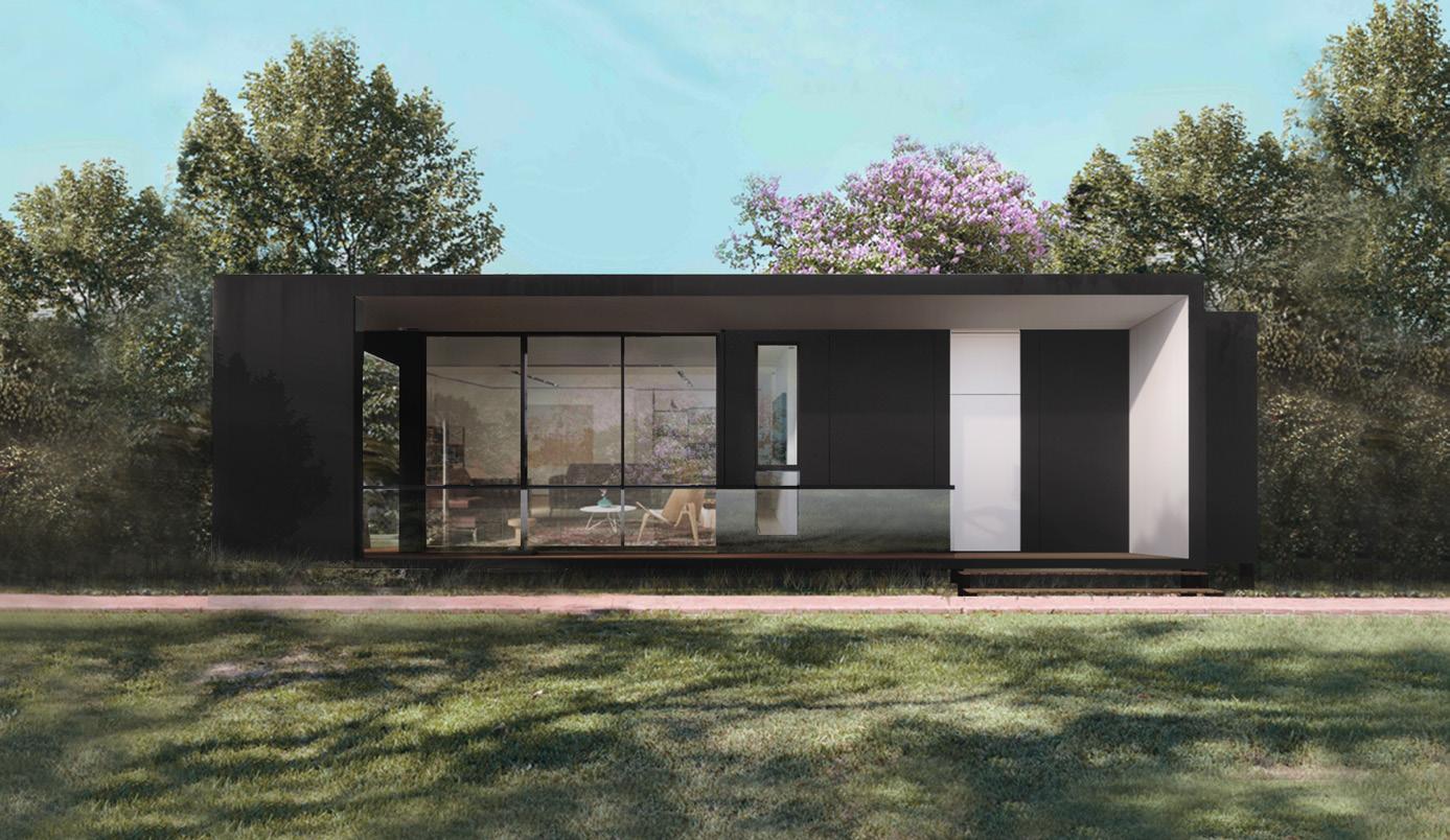
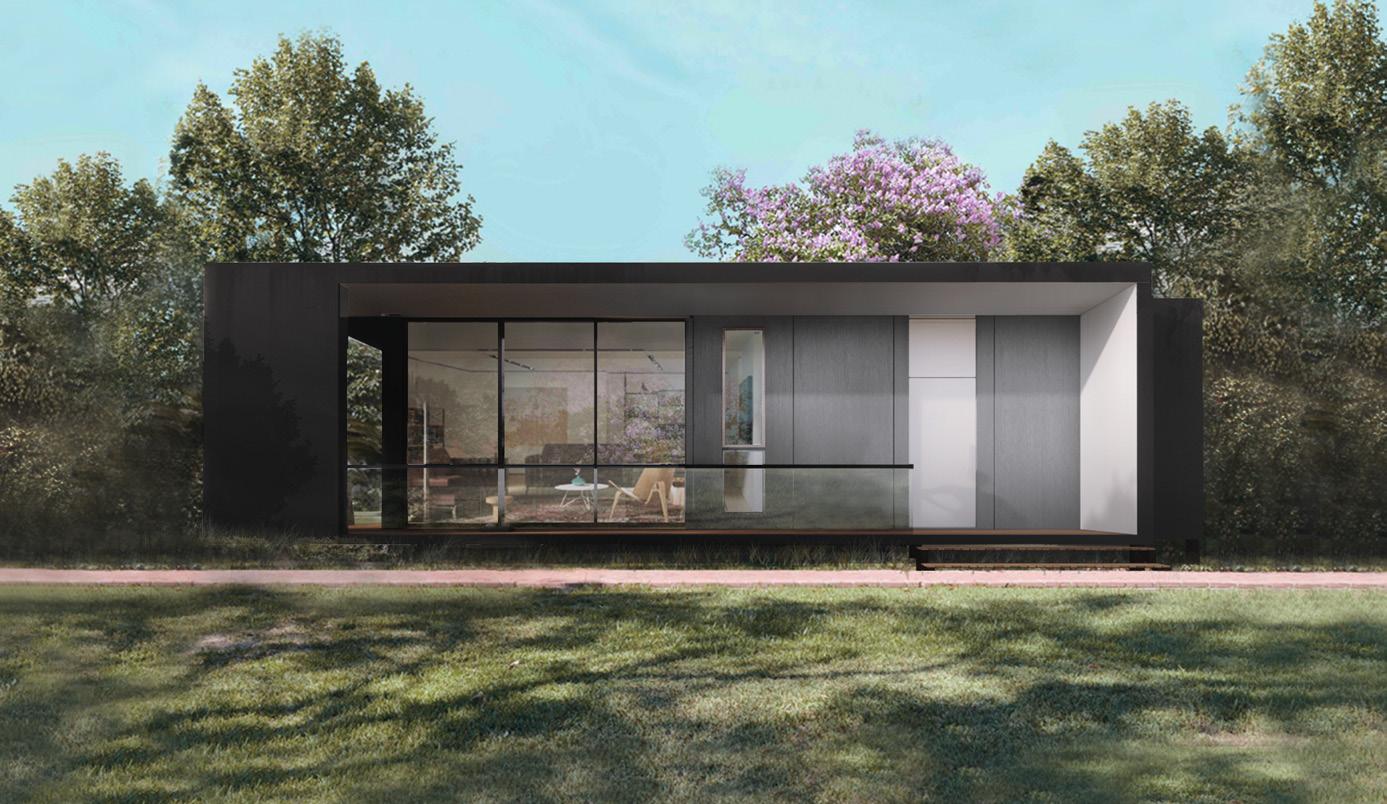
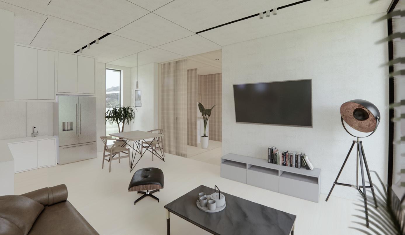
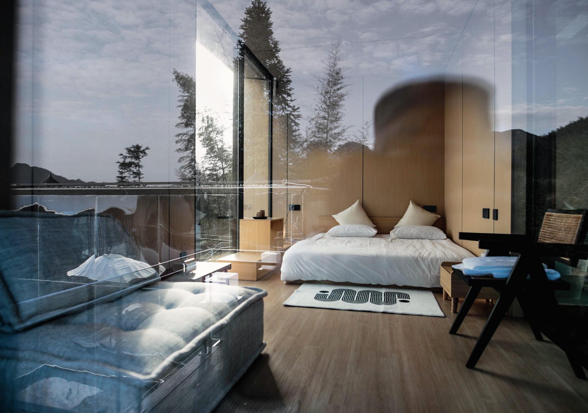
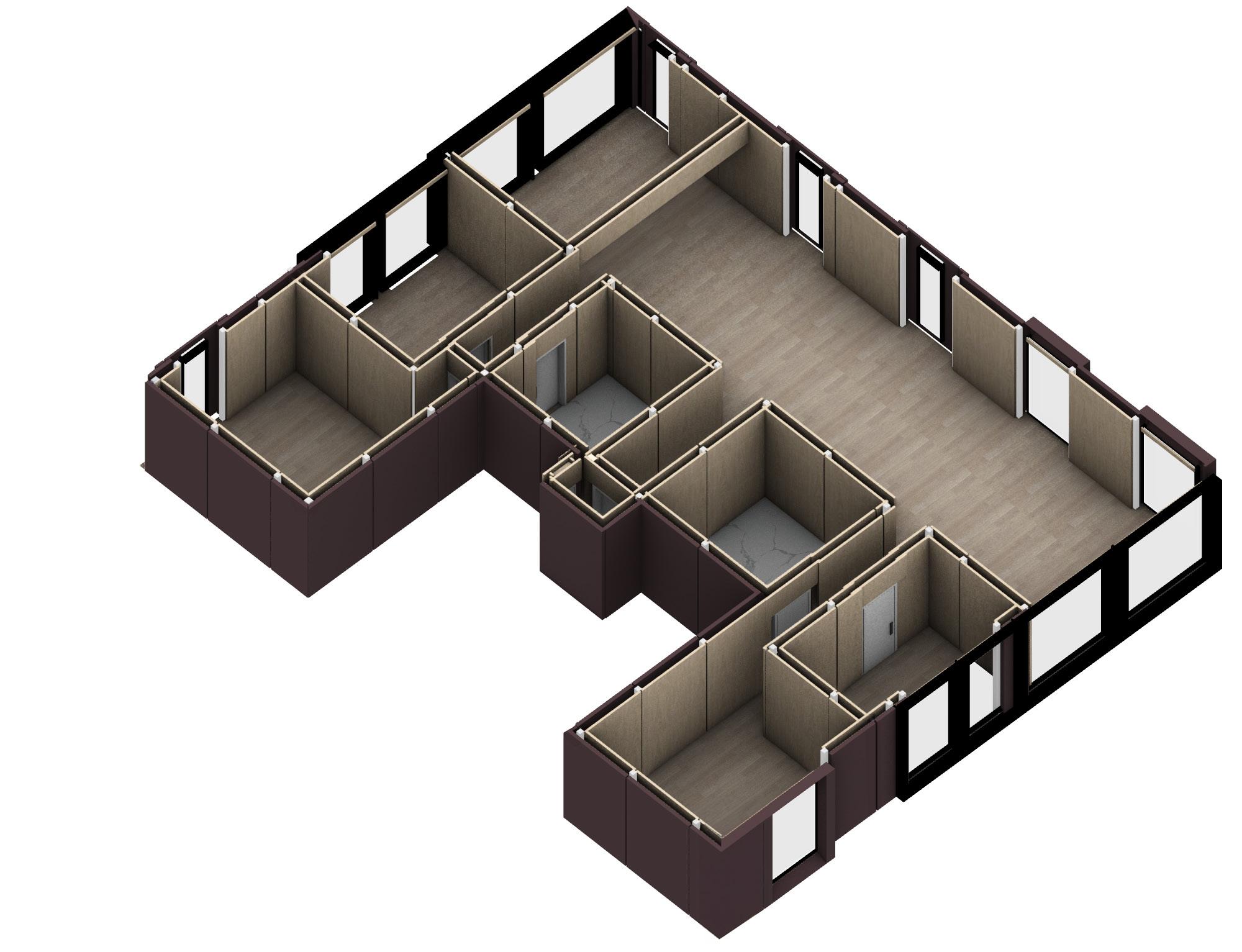
A framework system has been designed to enable the substitution of different planes and facades, aiming to minimize the variety of components as much as possible.
I was involved in collaborative architectural concept development, ensuring design's systematic and flexible nature. I coordinated with structural engineers, material suppliers, and construction teams, utilizing digital tools like Unreal Engine and Grasshopper to optimize design and construction preparation. Importantly, I also reported directly to investors, enhancing my project management skills and understanding of architectural digitization and parametric design.
Flexible
Constructs
Industrialization with modularity
48 VI
Xiao Jin


49
Z-Box Perspective View Location:
Video
Constructs
Yunhe County, Lishui, Zhejiang, China
Photograph of the Completed Prefabricated Building


Industrialization with modularity
Muse-s Plan
Muse-m Plan


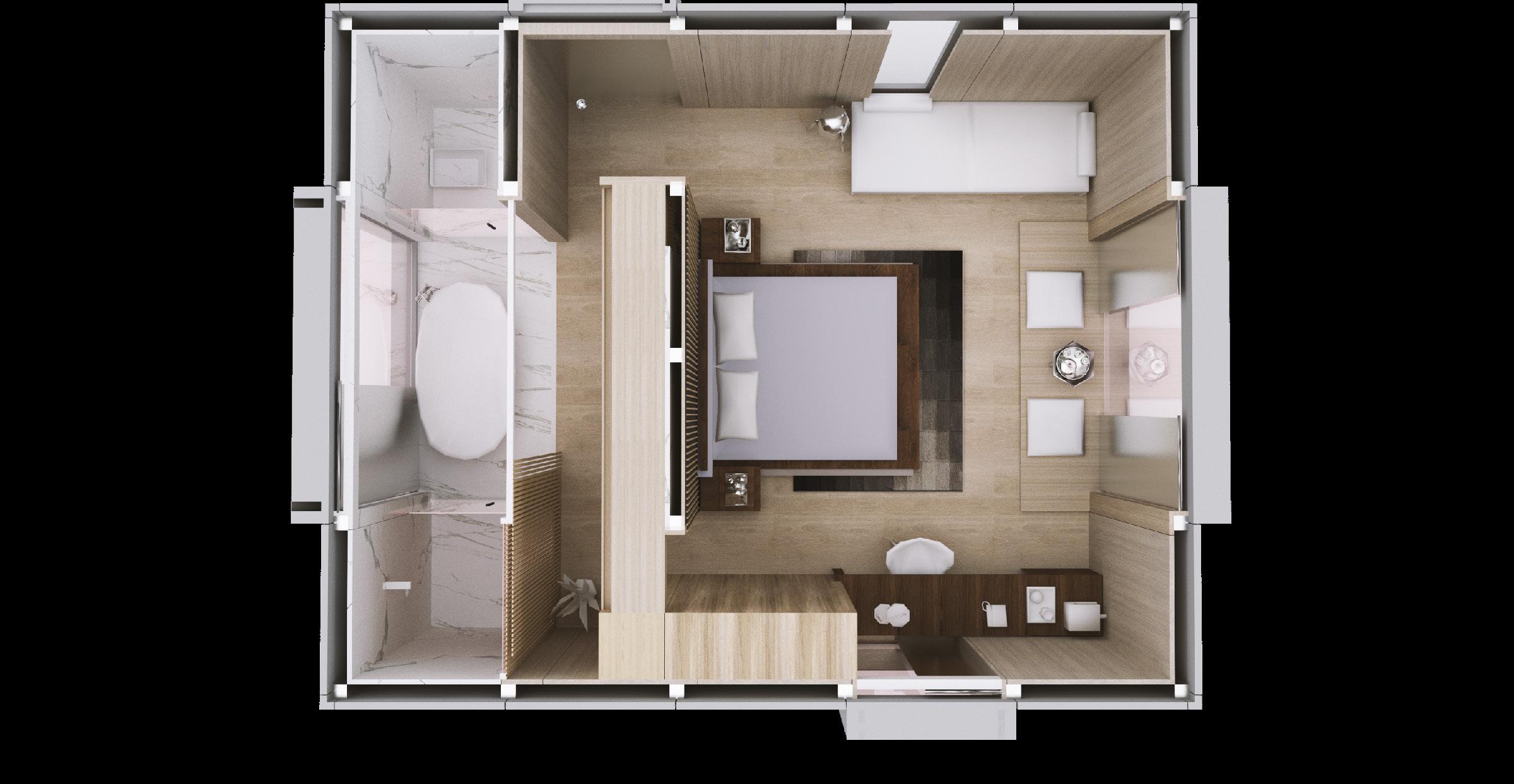
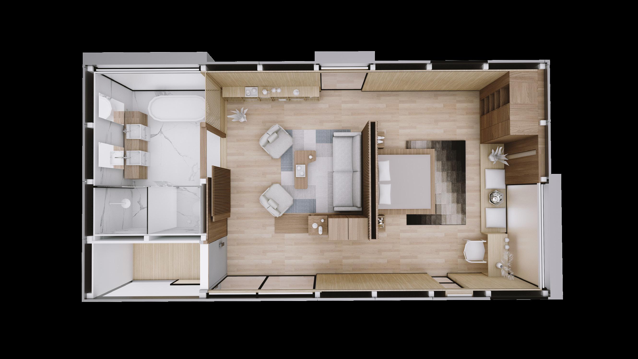
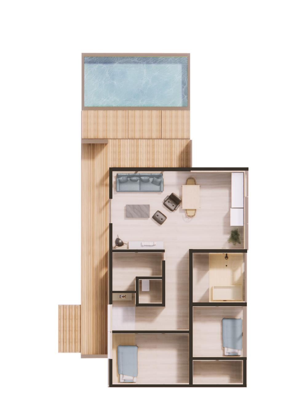
The plans on the left side demonstrate the variations in layout under the same structural system. This is made possible by the systematic design of the primary framework, secondary framework, interior wall panels, and exterior wall panels.
Flexible Constructs VI
Z-plus
Main Facade
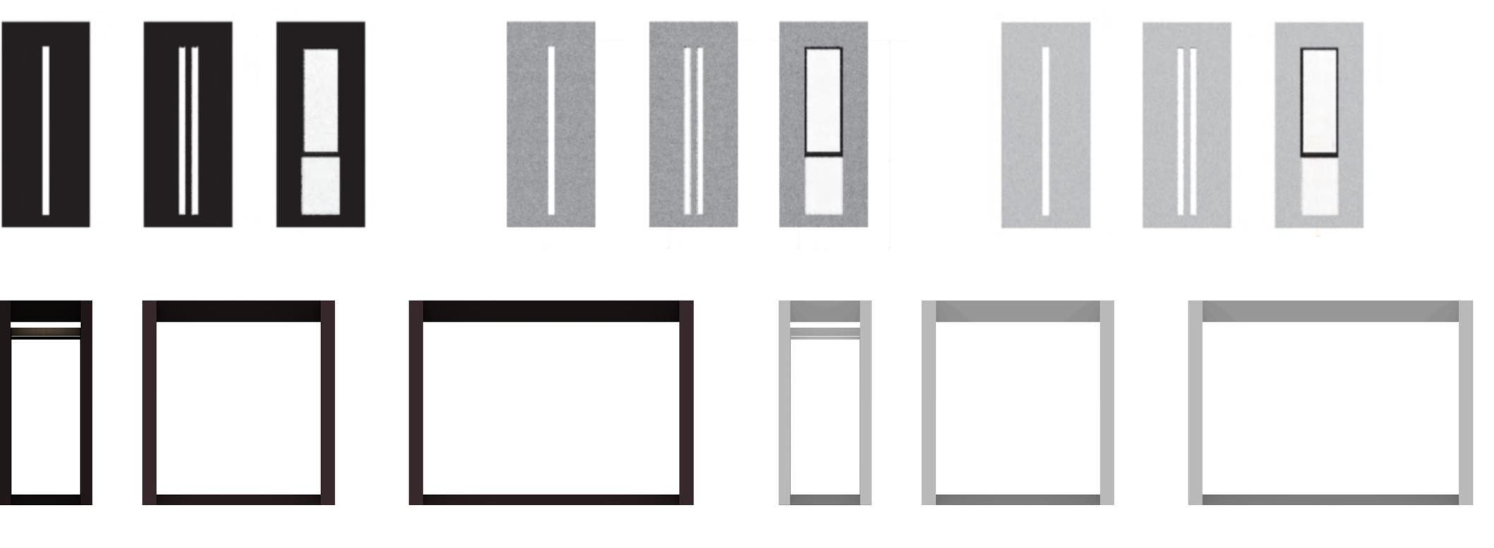
Strip Windows [1]
Wide Strip Window [2]
Black [3]
Gray [4]
Similarly, owing to the functionality of independent wall panels, users have more customization space. These panels can be disassembled and replaced either individually or in series, with a choice of different materials and textures like metal, wood, and concrete, thus achieving a rich facade effect.
The modular design of interior and exterior wall panels significantly enhances the building's performance in waterproofing, insulation, and soundproofing. This strategic separation not only elevates the aesthetic quality of the exterior but also ensures a comfortable and serene interior ambiance. By integrating functionality with design, this approach offers a harmonious blend of form and utility, creating spaces that are both visually striking and eco-friendly.


with modularity
Industrialization
52
facade design, panel replacement: different window; interior design. z-plus an,
Video


Interior Dining Room [1]
Living Room [2]
Corridor [3]
lobby [4]
Z-plus Plan
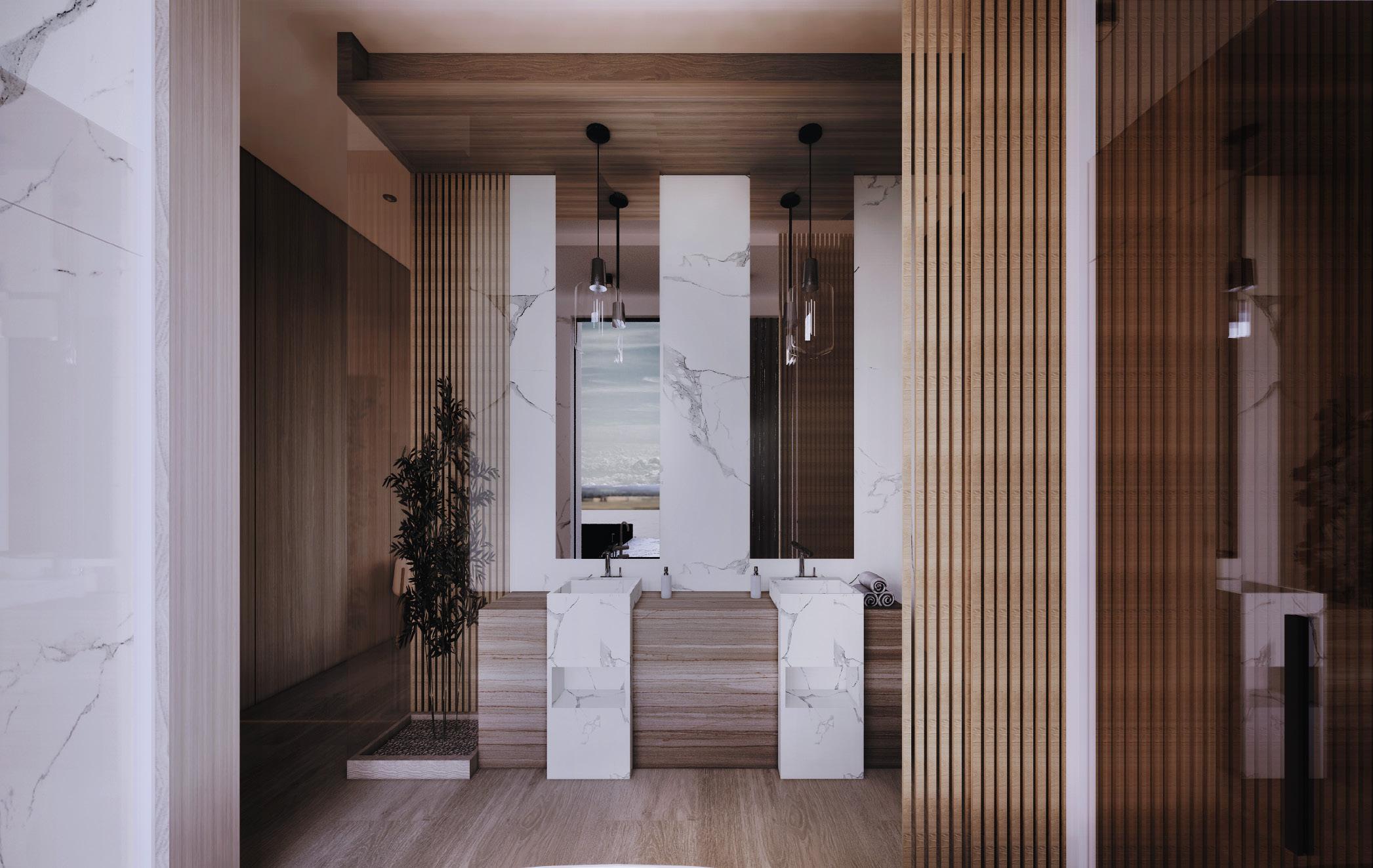
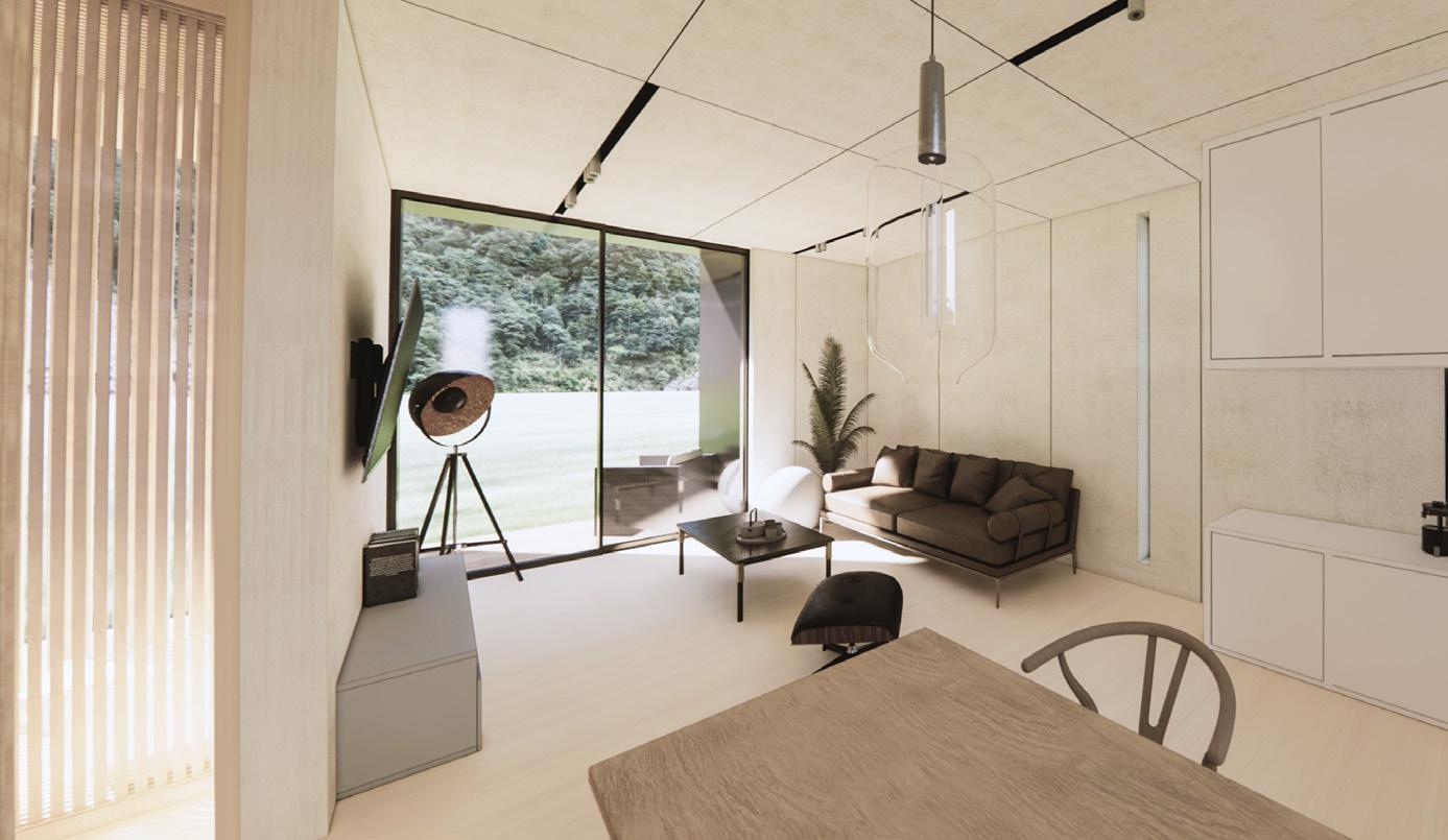
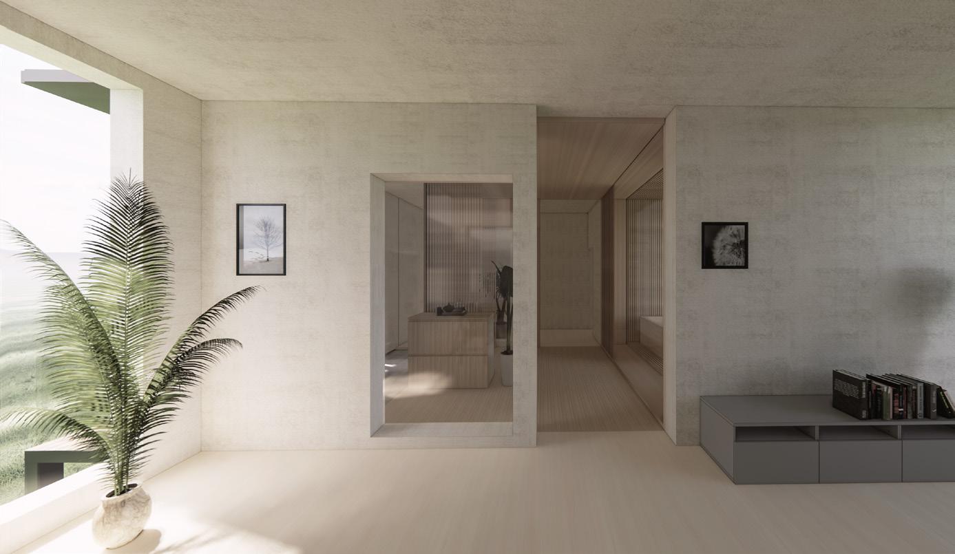
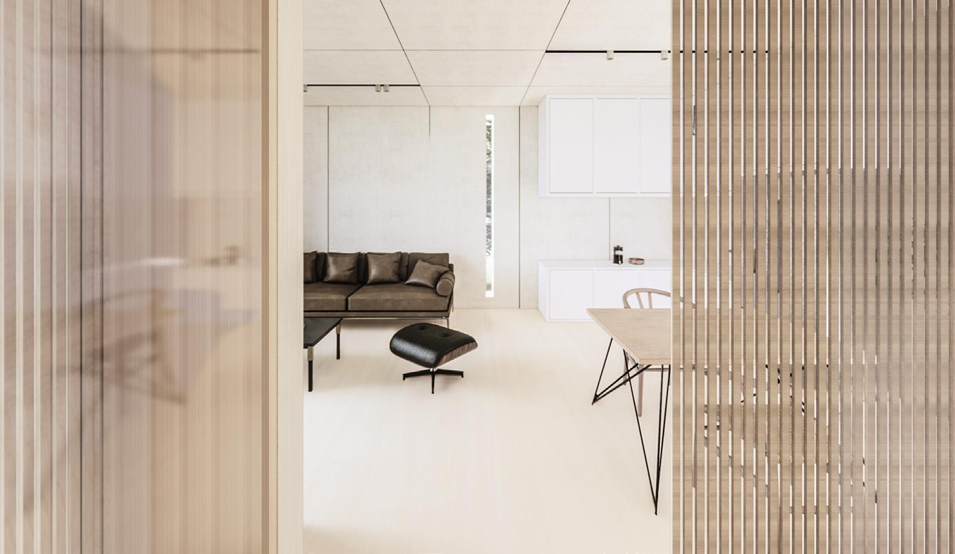
Customization options for the interior's color scheme and style offer flexibility, embracing a minimalist and elegant aesthetic that fosters a serene and cohesive environment.

Flexible Constructs VI
53
an, d ar design; z-plus facade design. panel replacement, different window - interior


Industrialization with modularity
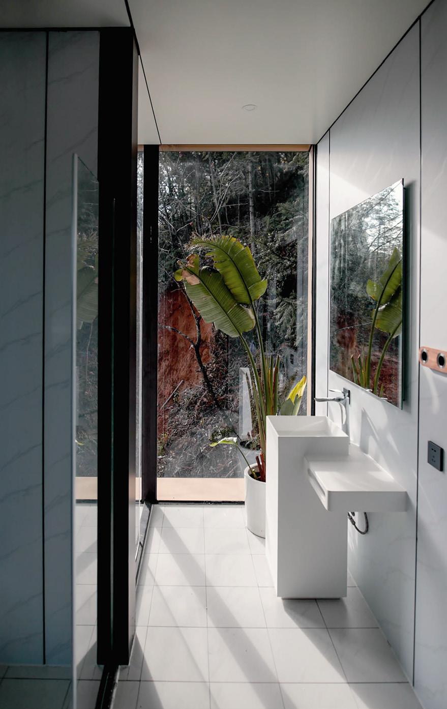
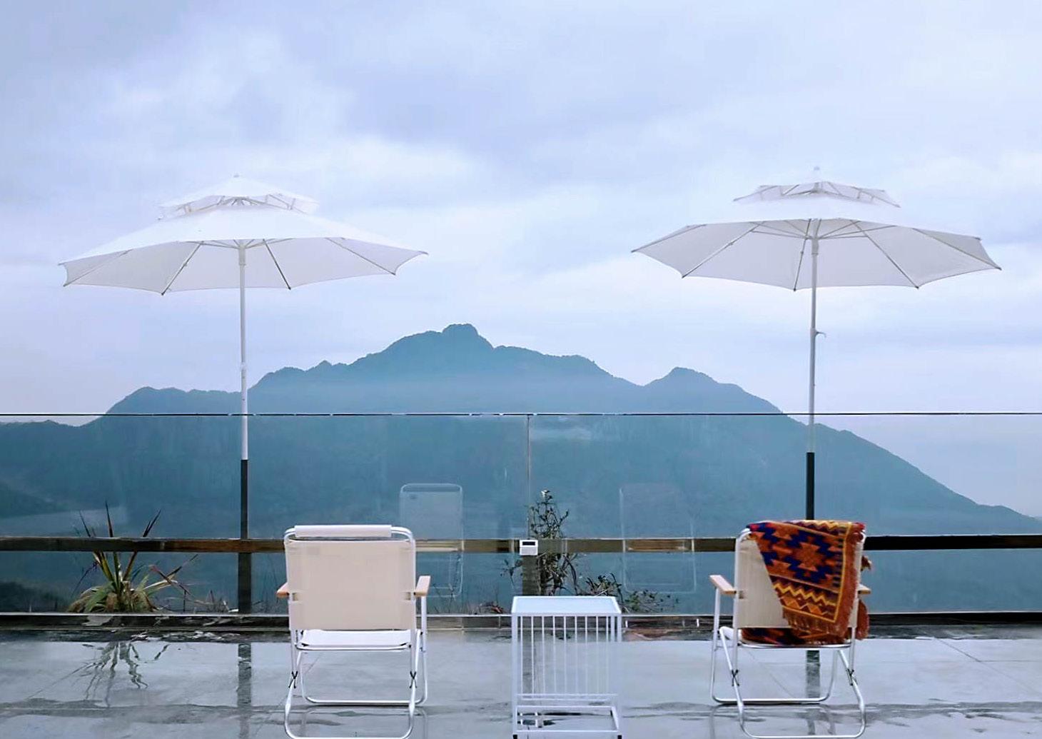
watching the mountain from balcony seeing the nature from the restroom


the yard after raining
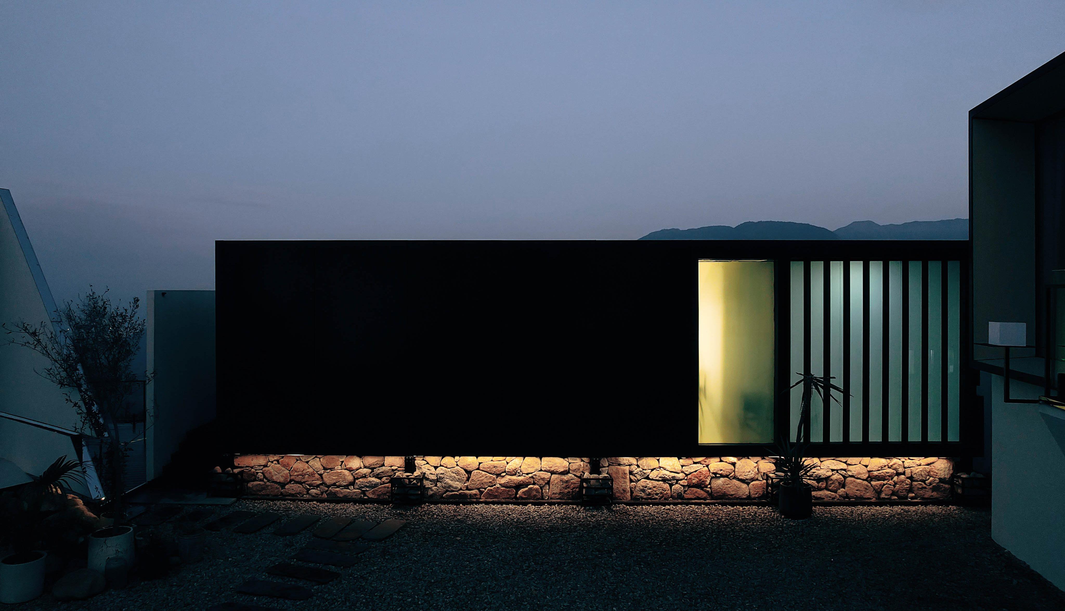
the facade night view [right]
Flexible Constructs VI
watching the bedroom fromoutside [left]
Software: Rhino 7, Grasshopper, Stable Diffusion, Lora, Chatgpt, Photoshop, Illustrator
Sci-ARC 22Spring
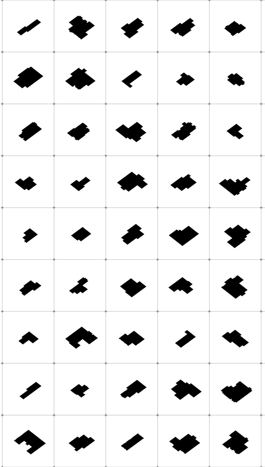
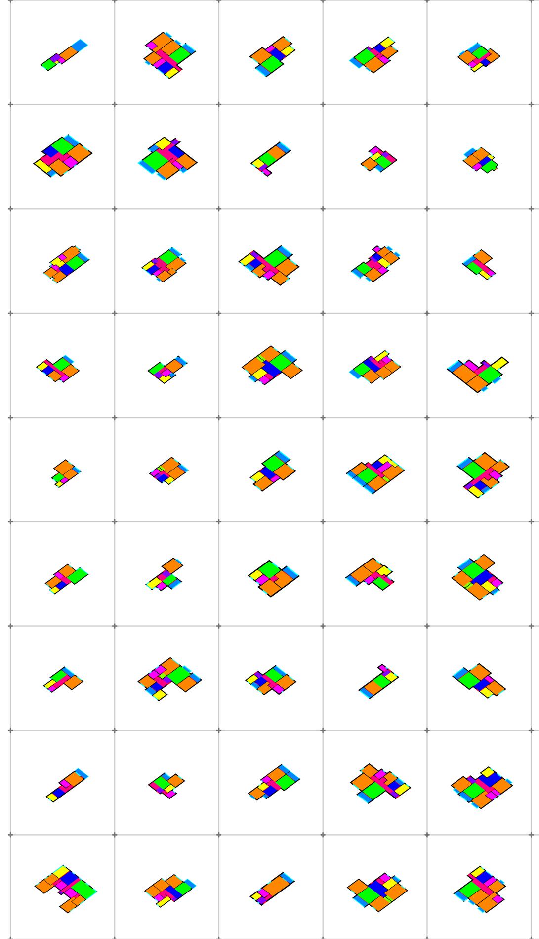
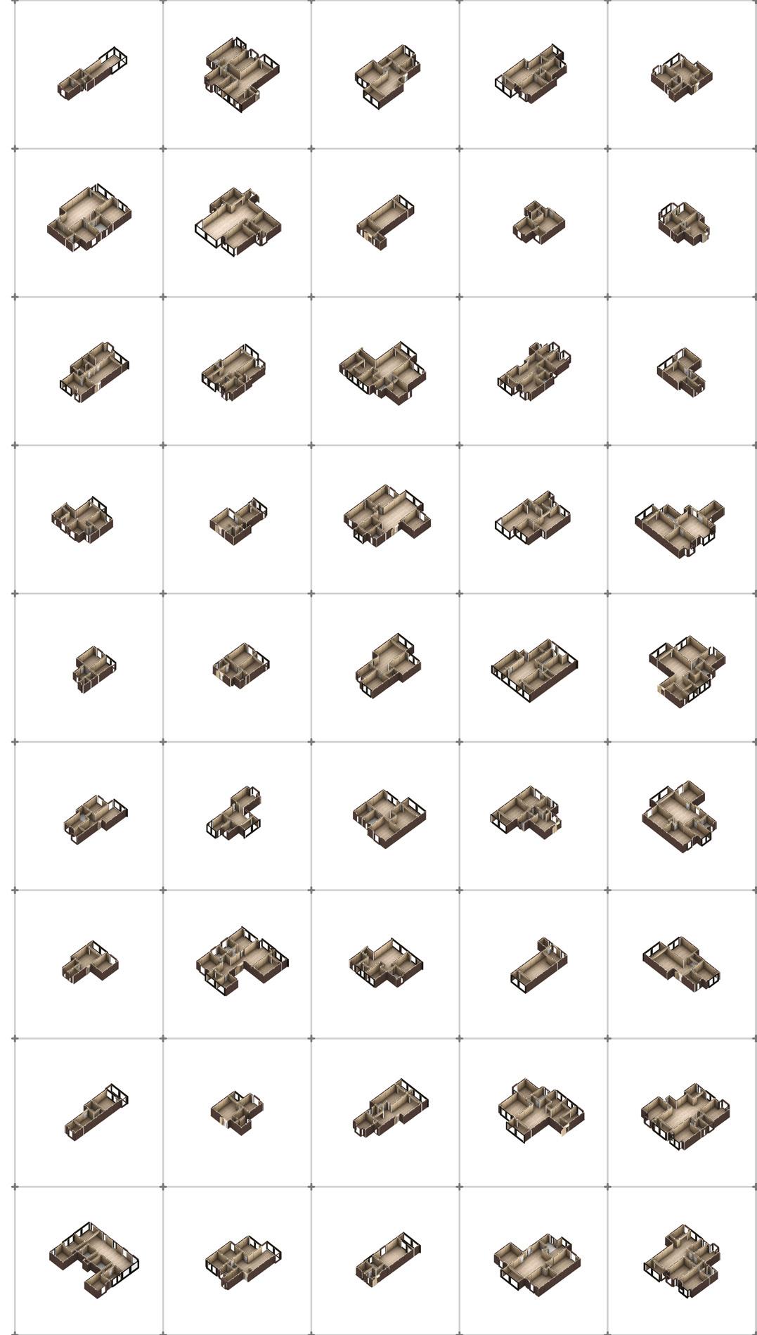
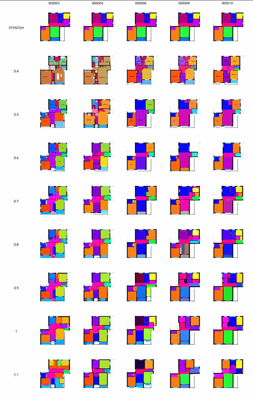
The project aims to generate single-family house floor plans using the Stable Diffusion Lora method, emphasizing its innovation and practical value.
The project utilizes the latest image generation model, Stable Diffusion, combined with Lora for training to achieve controlled floor plan generation. The process also incorporates ChatGPT, Python, and Grasshopper to assist in data processing, accelerating the workflow. This enables the automated design process for singlefamily homes.
Lora Logic
Jin
Xiao
56 VII HT 4012 Thesis Pre
AI floor plan generation
Script and AI in House Design
Individual
Status Research
Advisor Casey Rehm Micheal Rotondi
Work
Paper


57 100 Plan Program Automated Design Generation Video Outline Program BIM Model Input AI Pixels to Vector
Batch AI-Generated Plans to BIM in Two Steps
Background


Why Blocks?
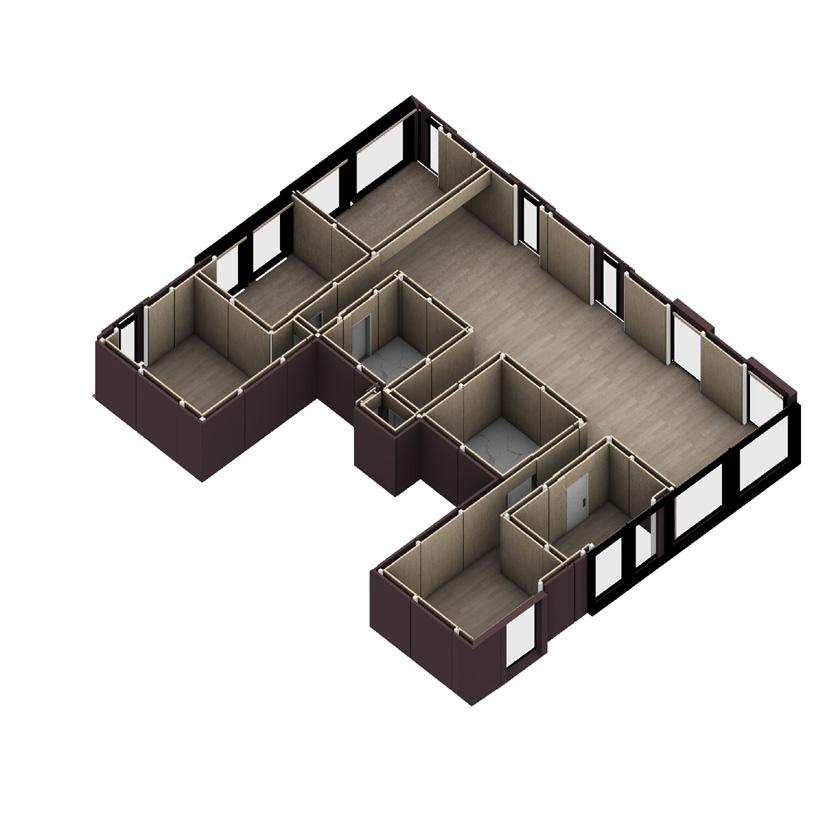
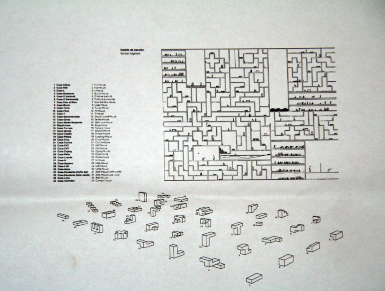
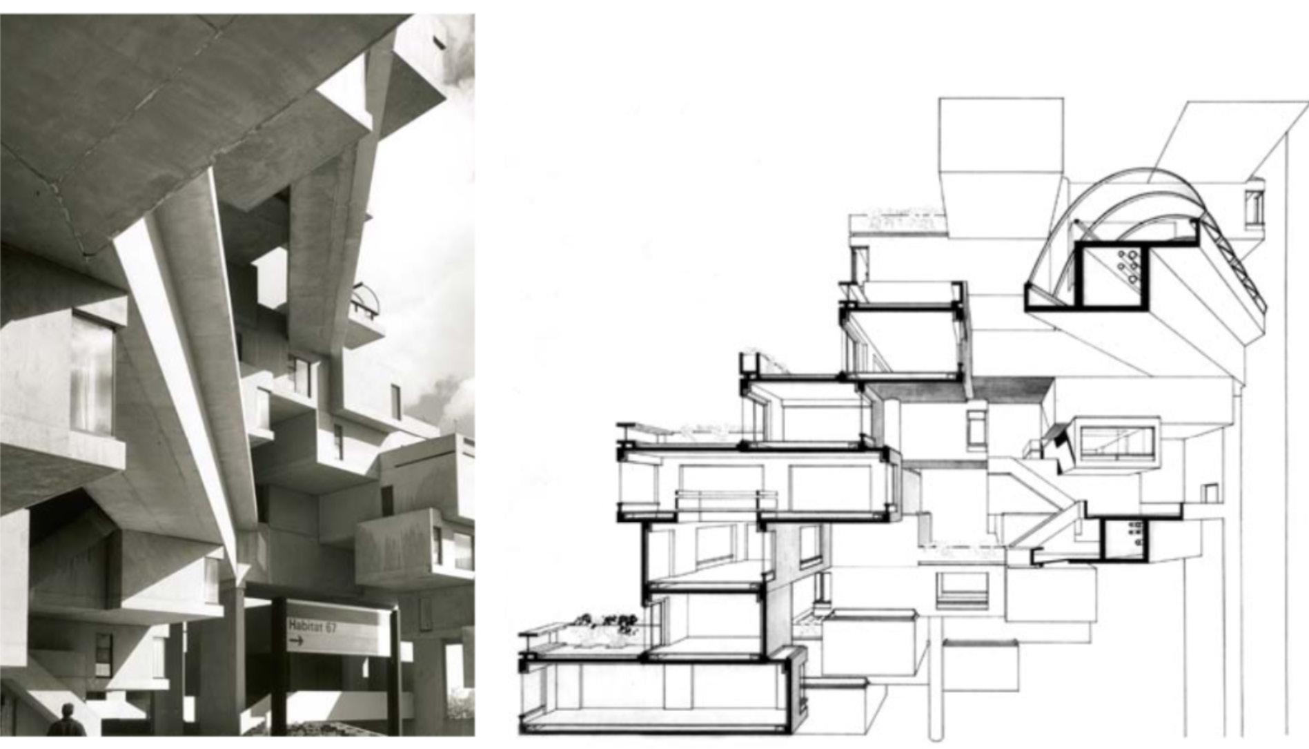
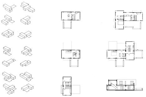
These examples illustrate my focus on single-family houses: AI image generation precisely defines the housing scope, allowing for adaptation to different architectural forms and better spatial utilization. At the same time, it addresses the specific needs of various family units, resulting in a range of detailed plans.


58 AI floor plan generation
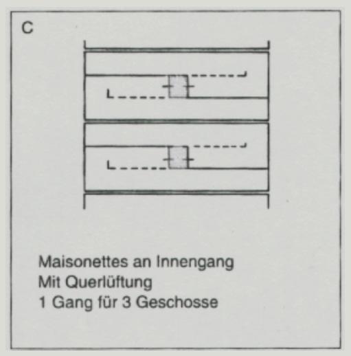
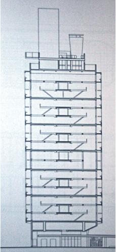
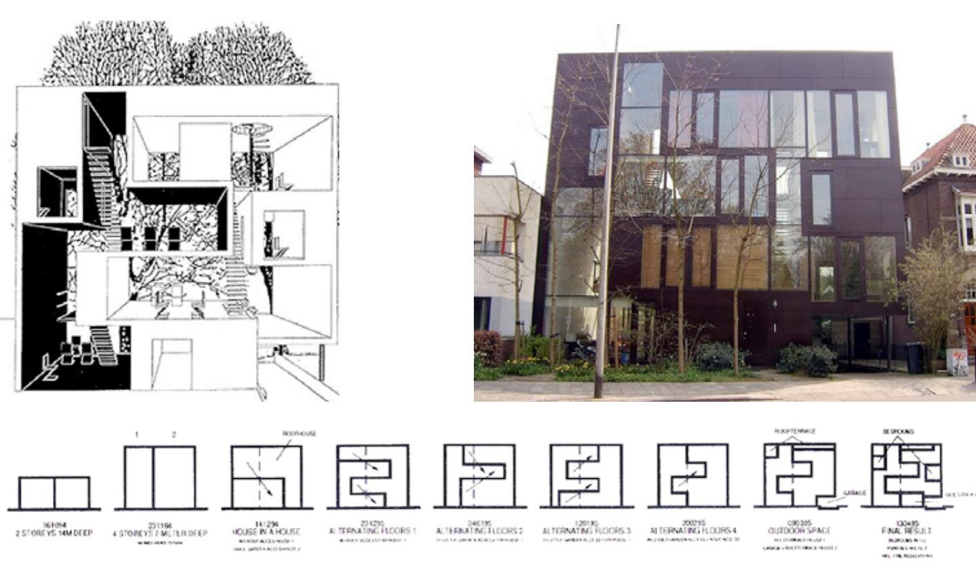
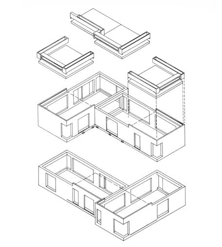
MVRDV_Frosilo-Gemini Unit d'Habitation, Marseille
seeing the nature from the restroom
Habitat 67, Unit Typologies
seeing the nature from the restroom

Workflow


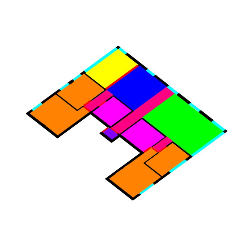
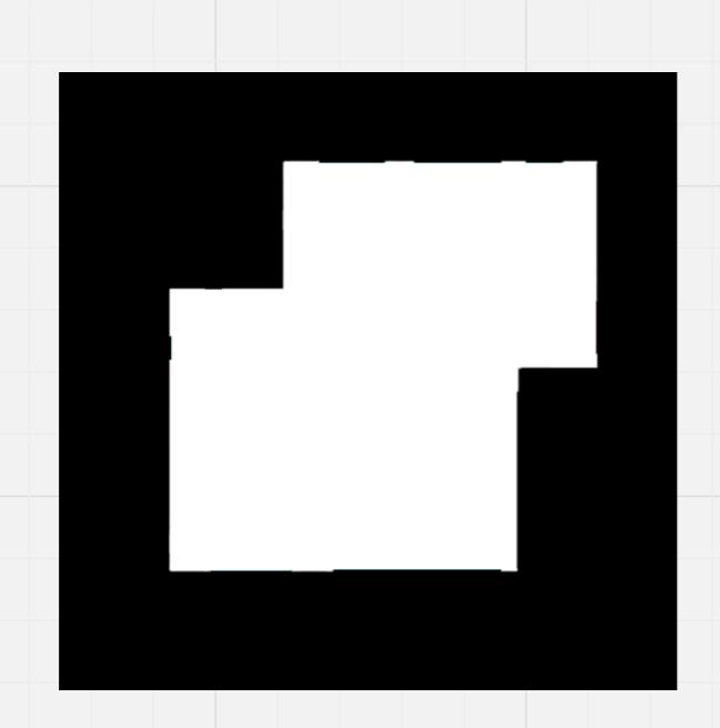
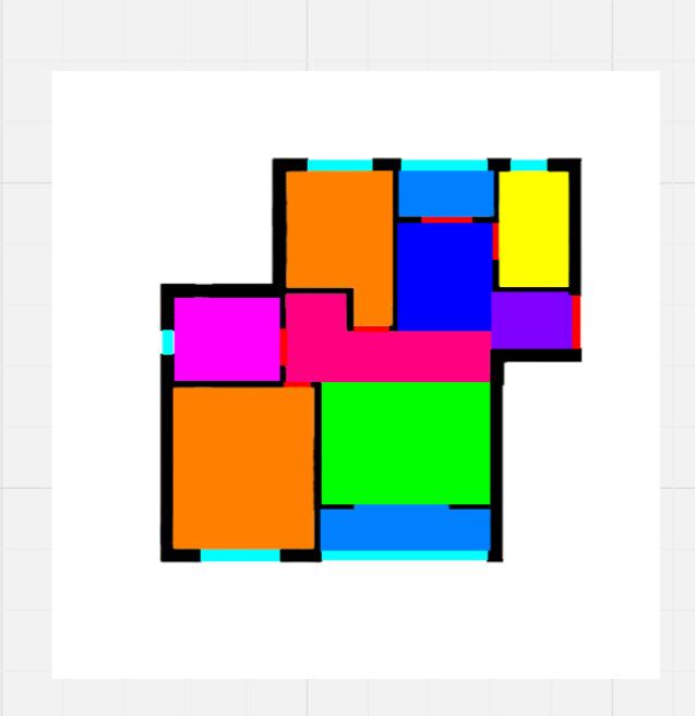
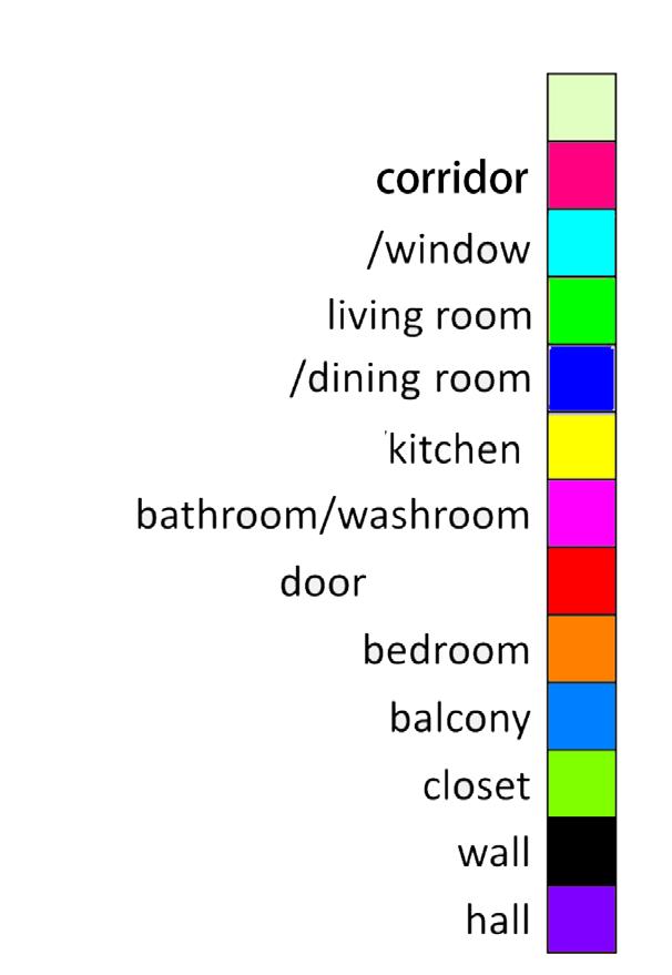
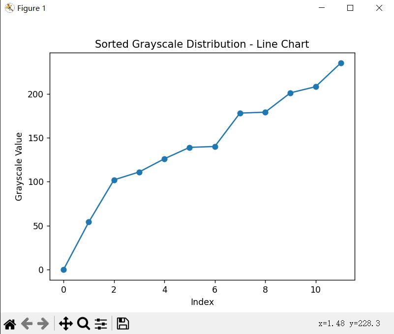
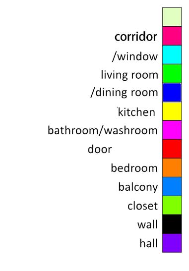
The figure above demonstrates the use of masks and labels to direct the outlines and programs of house floor plans, thereby enabling control over the quantity of rooms via tagging. With the help of ChatGPT, specific colors selected for their uniform grayscale values correspond to distinct room functions.
59 Input & Output Input 1 Input 3 Input 2 Output 100planblock, 1 living room, 1 dining room, 1 kitchen, 1 bathroom, 2 bedrooms, 2 balconys, no closet, no study room, program of a building, single family house
Logic Lora VII

Training Process


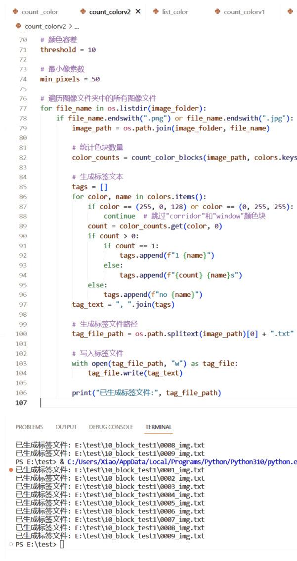
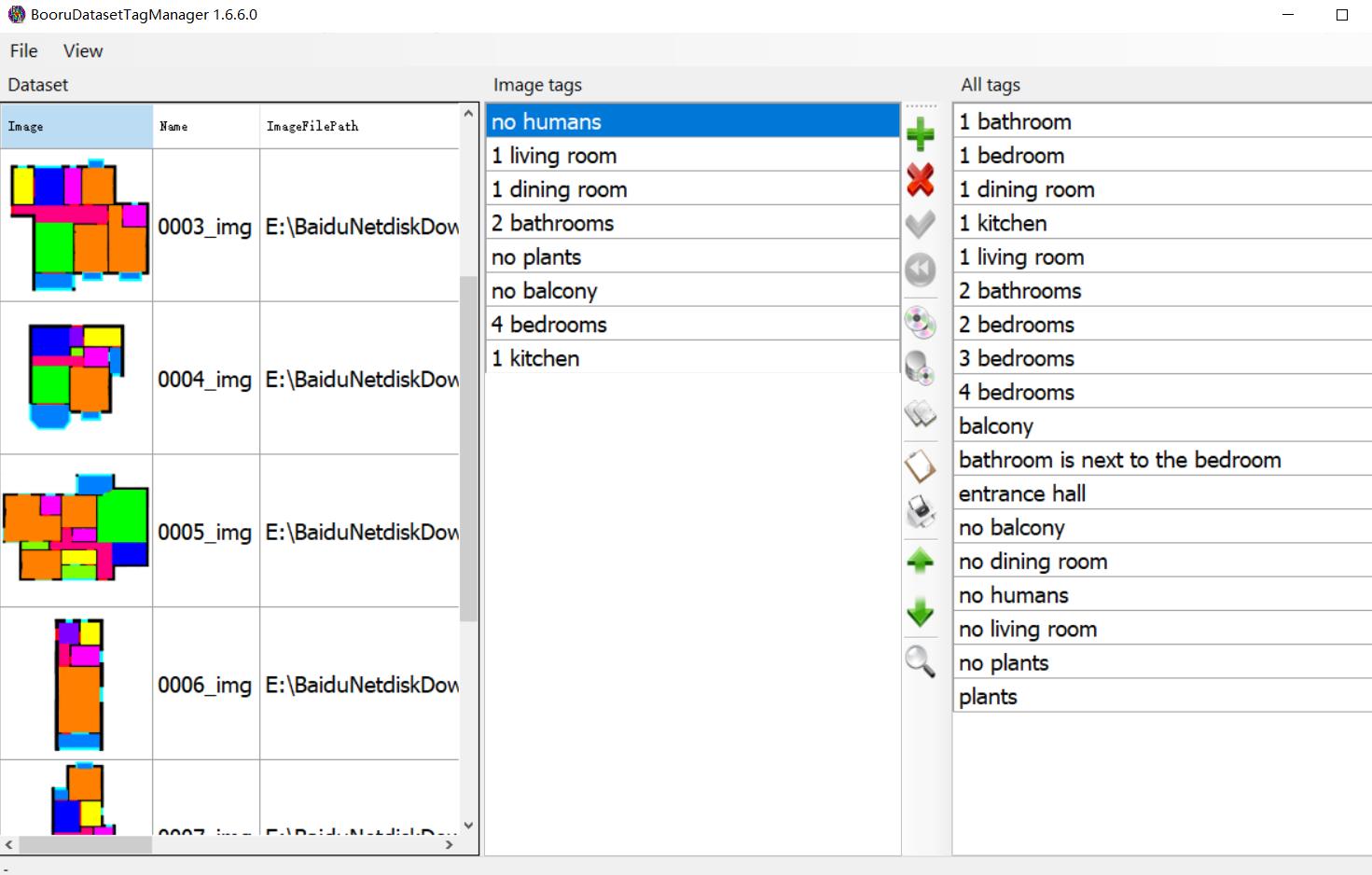
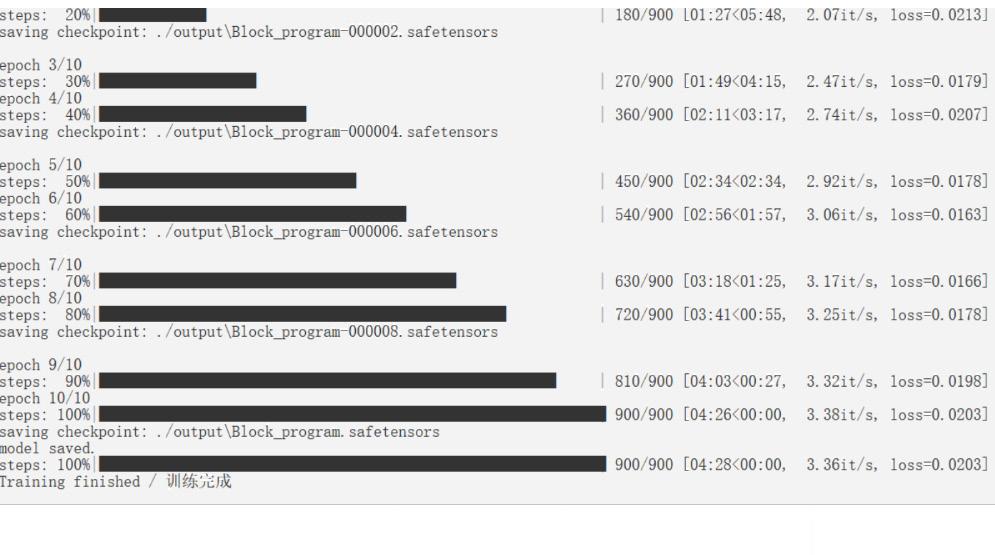
I used the assistance of ChatGPT to write code that identifies the functional attributes of color blocks, helping me to bulk identify room functions and complete labeling. The second step is to manually add general labels, which act as trigger labels. The third step is training, and the fourth step is evaluating the optimal state of different model versions and parameters.


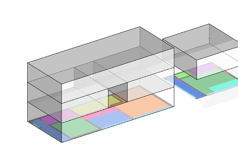
For generating the second floor plan, a method involves using masks to fix the vertical spaces, circulation areas, and bathrooms. After regeneration, unreasonable plans are filtered out using a label reading program. This provides greater freedom and speed for blocks of different shapes.
60 AI floor plan generation
Potential to 2rd Floor
Python for tagging Training Testing
Correcting tag


I referenced the ''coin change problem'' to set modules at a weight of 10, 20, 30, and 50, with additional 70 and 100 for windows. The offset between external and interior wall panels is 1.5'', impacting the calculation with a weight of 10. To manage panel gaps, each panel’s actual width is its nominal width minus 2''. Thus, considering the offset, the formula is:
Logic Lora VII
1'5''+2'': 3'2''+2'': 4'9''+2'': 8'3''+4'': 11'7''+4'': 16'8''+2'' = 10: 20: 30: 50: 70: 100.
Parametric Permutation External Wall Panel
1'5'' 1'5'' 1'5'' 1'5'' 3'2'' 3'2'' 3'2'' 3'2'' 4'9'' 4'9'' 4'9'' 4'9'' 4'9'' 4'9'' 4'9'' 4'9'' 4'9'' 4'9'' 4'9'' 4'9'' 4'9'' 4'9'' 10' 10' 10' 4'9'' 11'7'' 11'7'' 16'8'' 16'8''
Windows System Modular Design Interior Wall Panel
4'9'' 8'3'' 8'3'' 8'3'' 8'3'' 8'3'' 3'2'' WIDTH PANEL 4' 9'' WIDTH PANEL 16' 8'' WINDOW PANEL 11' 7'' WINDOW PANEL 8' 3'' WIDTH PANEL 1' 5'' WIDTH PANEL
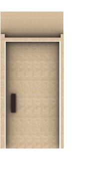
Door System
Copyright © 2024 Xiao Jin
All rights reserved. No part of this book may be reproduced or used in any manner without the copyright owner's written permission except for the use of quotations in a book review.

Jin is.jin.xiao@gmail.com xiaoojin.com
Candidate
Califorina Institute of Achitecture
Xiao
M.Arch
Southern
 Robert H. Goddard


 the deconstructivist courtyard bridge [right]
overhead view of the courtyard model


 3/8'' *1'' METAL BAR
BASSWOOD 2'' THICK
BASSWOOD 5-1/2'' THICK
3/8'' *1'' METAL BAR WELDING JOINT #10 1-1/2'' SREW #10 1-1/2'' SREW
3/8'' *1'' METAL BAR
3/8'' *1'' METAL BAR
BASSWOOD 2'' THICK
BASSWOOD 5-1/2'' THICK
3/8'' *1'' METAL BAR WELDING JOINT #10 1-1/2'' SREW #10 1-1/2'' SREW
3/8'' *1'' METAL BAR
