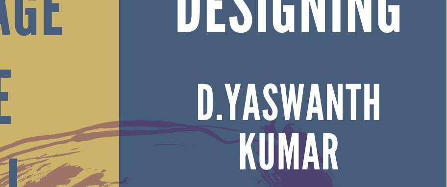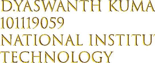
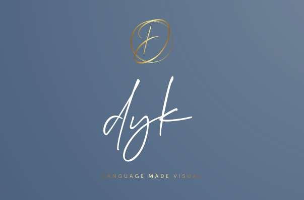
• The brand name is DYK, standing for the name of the owner of the firm, D.Yaswanth Kumar

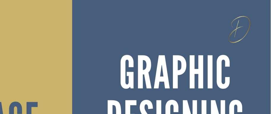
• The logo of the brand simple design of the letter ‘D’
• Tagline of the brand is “Language made visual” as the visual language is vital for any company to strengthen its brand identity and ensure consistency in its messages
• The target audience for this brand are the teenagers who are creative and curios to work in the graphic design field and want to learn about illustrations to visualize their ideas
• Strengths of the brand- Creativity and consistency of the brand are the main strengths of the brand, which are core for any graphic designer to achieve
• Reason - The main purpose of Brand is to communicate. through visual communication, using typography, images and colours and blending photography, illustration, motion graphics together to create appealing designs which can capture the attention of the viewers, convert them into sales and opening their new avenues of business.
• The colour pallete of the brand consists of the following colours
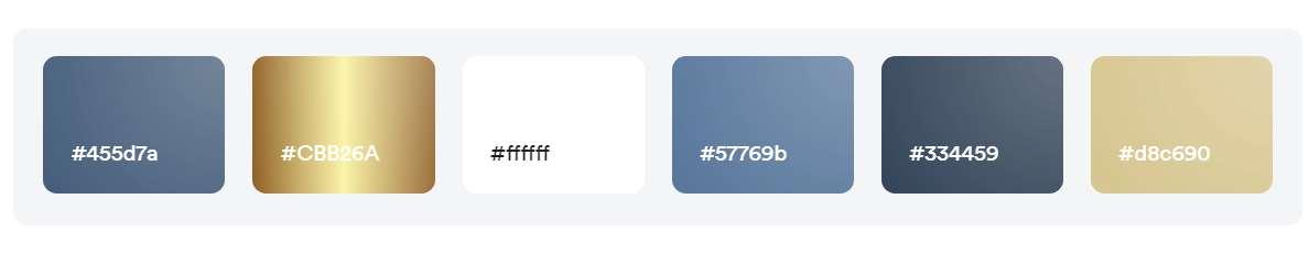
• Different shades of blue(background) and contrasting shades of golden yellow for the logo

• White detailing at some areas
The logo of the brand is the letter ‘D’ which stands for the starting name of the owner of the brand


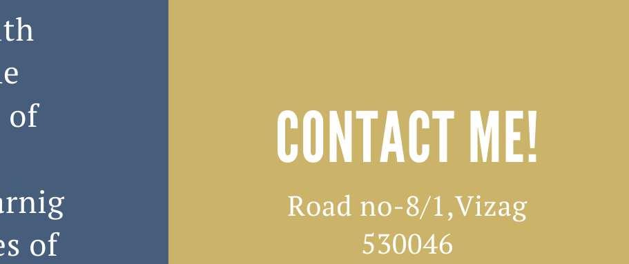
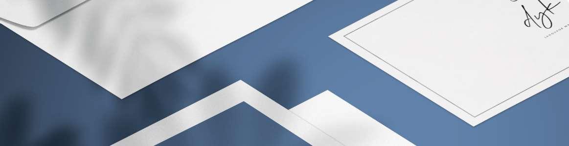
Front side- showing the brand name and the logo back side- The details of the brand mail,website and contact with a tagline of the company- Lanaguage made visual


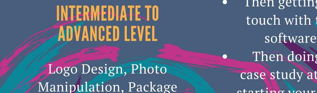
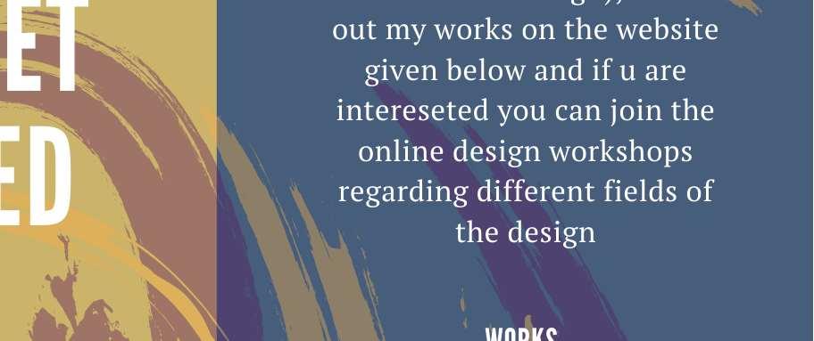
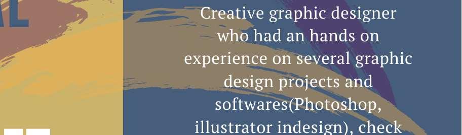
• Using the same colour pallete, the brocere starts with golden yellow(2sides and) which has taglines and 3rd side introduces me and the works of the company


• Moving on it shows the workshops and the method of teaching and finally the contact details