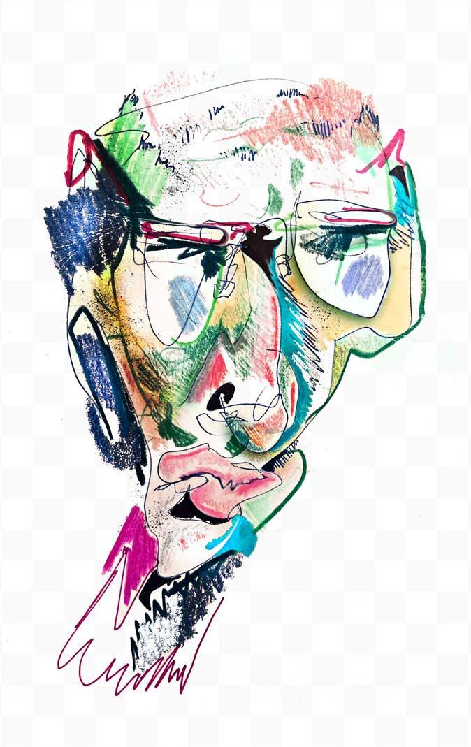
ARCH. PORTFOLIO
SELECTED WORKS FROM B. S. ARCH PROGRAM @ THE OHIO STATE UNIVERSITY
ZACHARY SLONSKY 2017-2020

"Although it may be true that 'interesting' always begins life as the judgement of those in the know (as seems in keeping with how its recognition of novelty requires a preexisting knowledge of frameworks), the demand, for justifications that it solicits from others, which in turn creates the occasion for one to supply them, suggests that this aesthetic of and about circulation is actually aimed at enfranchising outsiders and thus expanding the boundaries of the original interest group."
May you find the following work of interest.

PROLOGUE
- Sianne Ngai, Our Aesthetic Categories
0.
CONTENTS
 I. LA BREA TAR PITS MUSEUM
II. SENSESCAPE
III. (sub)URBAN HOUSE
IV. MONTESSORI SCHOOL
V. ENERGY RESEARCH LAB
VI. MATRYOSHKA SHELL
VII. FIGURE / FIELD
0
VIII. UNTITLED.png
I.
LA BREA TAR PITS MUSEUM
Team: Chang Liu and Zachary Slonsky
Role: conceptual, formal, programmatic and aesthetic development

Critic: Curtis Roth Autumn 2019
The project is to reconsider the design of the existing La Brea Natural History Museum on Los Angeles’ Miracle Mile. The site was originally used for oil extraction when it was discovered to sit atop one of the world’s largest deposits. The lands altered to accomodate this new program, and would continue to evolve as the population boomed in a liquid gold rush. Suburban houses would spring up amongst the field of oil drills, paths would be drawn in asphalt, and the extraction process would in turn lead to another discovery: fossilized remains dating back to the Pleistocene Epoch.
The same forces that produced the density and wealth of Los Angeles led to the research and cataloging of the world’s largest record of Ice Age ecology. The site has held many identities, each a representation of forces larger than itself.
Today, mounds of artificially irrigated infill cover the lake of asphalt that would visible otherwise. Our team responds to this, working under the premise that the landscape of the site is equally as fabricated as the urban architecture. As such, we treat the parkscape and museum as two parts of the same system, each manifesting to accommodate for local desires. Broader circulation paths overlay atop these local genuflections, producing a "thick 2-d" that tries to architecturally respond to the sites many ambitions.
The integrated ground approach avoids the dominating narratives of monolithic architectures, and gives space to the sites varied constituencies: the scientist, the museum visitor, and the general public.

 Southeast Entry Sequence to Central Exhibition Hall
1
Fragment Model + Conjoined Plan


2
View of Central Exhibition Hall's Path desent to the Tarpits
The formal strategy for this system starts at the scale of the site and works its way inward. First, four hotspots were created on the site to produce density, two in the middle, one for each side entry.


Primary axes run between these hotspots, with tributaries branching outward. These lines produce unbalanced four-sided geometries. Some lines extend past the boundary of a single shape, producing broader relationships. The network of lines is designed to regulate the scale and figurality of the building and landscape, contrasts are controlled through this system.
Each geometry is coded as one of the following programs: public park, museum park, plaza, building, and tarpit. Plazas are placed between entry points and landscape units. Paths connect these geometries, forming as an offset of the edge. Paths produce not only the circulation, but the interior space in general, using their variable thickness and slope to platform exhibition space and drive sectional relationships.


Isometric Site Plan 9’ Plan 2’ Plan 37’6” Plan Transitory Unit Destination Unit
3




 Pictured Below: Diagrams of the plans are illustrated to highlight the overlaps between the site's users. Blue - Administrative and Scientific Zones Yellow - Museum Visitor Zones Orange - Public Free-Access Zones
Restaurant + Path 23’6” Plan Gift
Lecture Hall
Shop
Public Interaction
4
Main Theatre Southeast Entry Sequence/ Administrative Core
Classrooms
West Pavillion:
The western part of the building houses the most active tarpits and corresponding research labs. This area gives the scientists the most privacy, with the public only getting a glipse of the activity during their passthrough.


Main Exhibition Space:


Located at the center, this unit mixes the varying constituencies through shared programs and sectional segregations. Non-paying visitors can go to the theatre, restaurant, giftshop, and have view of the tar pits, allowing participation independent of class.

South Entrance:
This portion connects the geological aesthetics of the park to the modernized stretch of the miracle mile. It’s the face of the building, and contains the museum’s administrative brain. Fundraising and admissions are managed here.
The user types scientist, administrator, park visitor, and museum visitor each produce specific relationships to one another and to the museum. To us, the museum is the performance of institutionalized knowledge. Our design posits the scientist as a performance artist, capturing the attention of curious minds through the ritual of their tasks. This voyeurism promotes education by motivating participation, with the exhibitions, presentations, and eventually perhaps as a collegue. As museum patrons observe, the collective public upon the parkscape observes them, fostering a curiousity and participation of their own. Perhaps ambivilent passersby would drift to the many free access zones of the site, or perhaps they'll be motivated to return with a ticket in hand. To whatever degree of commitment, this architecture is meant to house them, and to connect this profound scientific performance to the culture of Los Angeles.
5


 Southeast Billboard Facade
Southeast Lobby
Southeast Exhibition Space/ Administration
Parkscape Entry to Public Courtyard
Restaurant
Public Path next to Administrative Path
Left: Path to Museum Landscape Right: T-Rex, Path to Central Exhibition Hall
Panoramic Render of Cental Exhibition Hall
Gallery Theatre Path to Tarpits
Main Entry Point
6
Loose Exhibition Event Space
Second
II.
SENSESCAPE
Team: Aisha Cheema, Brenna Bierman, Andrew King, and Zachary Slonsky
Role: conceptual, formal, programmatic, and aesthetic development
Critics: Sandhya Kochar and Dow Kimbrell Spring 2020
The Sensescape is a new typology that rejects the conditions of contention embedded within quotidian urbanity, and proposes new urbanisms as sense dérives. Alternative to the linear sequencing of space found in financially efficient architectural promenades, the sensescape produces a field of zones with fluxuating and competing hierarchies. Formal output is designed to produce phenomenological contrasts with adjacencies, and these transitory contrasts are controlled through specific articulations of the edge. The edge in this project becomes the tool for mediating tensions across disparate formal, material, and programmatic inputs. Liminal spaces contrive unique juxtapositions, eliciting sensations and in turn, fostering lucidity.
The typology choreographs an interactive dance between Bathhouses, Domes, Dutch Tile, Curtains, Leather, Piles, Plastic, Laundromats, Staircases, Gardens, Pools, Club Scenes, and more, producing an anarcho-ritualized space of leisure.


This holds revolutionary potential, a mere escape is translated into a subcultural institutionalization. Upon arrival, the individual’s labor-to-live headspace, a byproduct of the existing economic model, undergoes a radical transformation to a live-to-leisure embodiment, reinforcing the Sensescape’s experimental model of social play and humanistic exploration. The meta-aestheticization of the proposal characterizes a project that is self-aware in its idealization. We posit the Sensescape as a provocation; it's a call for an exodus.
https://www.youtube.com/watch?v=7qCwfhsFXdc&feature=youtu.be

7
Smear
A zone gets categorized as a motif, and repeats, echoing a sensation.
Edges blur, drifting the boundaries of one zone into another.
A planar or linear intrusion penetrates a zone, producing a threshold.
Superimposition

Two zones operate simulataneously, overlapping program, material, and/or form.

A zone produces a linear or planar break, shifting to produce openings or straight lines.
Zones trade occupany with one another, trading tensions as one passes this edge.
8
Slice
Shear
Swap
II. L ANDSCAPE OBLIQUE
The physical reality of the Sensescape is contingient on local spatial and scalar conditions. The Sensescape is more than anyone of these following realities; its primary identity is as a method for space making. In order to illustrate the characteristics elicited by this design method, four possible manifestations are explored.
II. Infinite Landscape -


How does the sensescape produce planimetric organizations? The landscape illustrates the overlaps and slippages that occur between systems in pluralistic space.
III. Low-Rise BuildingWhat are the sensescape's sectional attitudes? The Low-Rise explores how to blend the edge while producing vertical density
I. PavilionThe hardest letter to write is a short one. The pavilion shows the sensescape in its most reduced form. Domes close space, piles drive circulation and section, program drifts across borders.
IV. Infinite TowerImagine a vertical city with 300,000 residents. How do you accomodate civic programming vertically? This is an exercise in scale, and of sensescaping from within a metastructure.
I. PAVILION AXONOMETRIC

9


 III. LOW-RISE AXONOMETRIC
10
IV. TOWER CITY AXONOMETRIC
Formal Elements :

Pools -
Learning from the social rituals induced within Islamic Hammam and California's queer bath culture, we utilize the pool as a means of producing social situations, slowing time and altering body temperatures.
Curtains -
Like millions of little theatres, curtains backdrop zones and produce interiors. They encourage a boundary without rigidly enforcing it. Curtains are used to create fluid poches, dampen sound, and produce verticality.
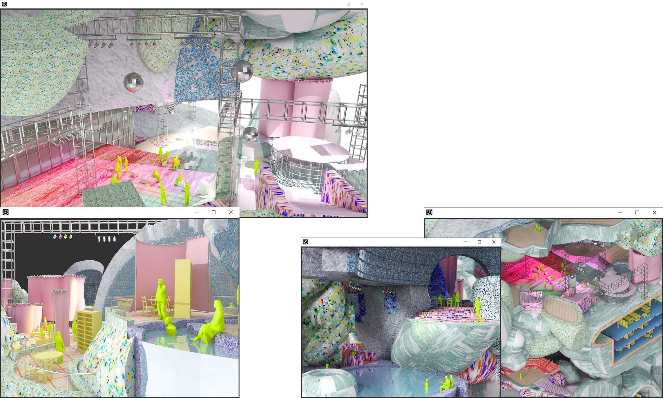
Domes -
These occasionally monolithic outcrops work well to distinguish zones within crowded fields of content. They capture space, producing moments of interiority. Their mass cools the air and produces echoes.
Piles -
These bulbous forms control the circulation across the sensescape without producing organizing datums. They mediate sectional differences and scalar shifts, all the while producing local zones themselves.
TOWER PAVILION TOWER
BUILDING
LOW-RISE
11


PAVILION
LANDSCAPE LANDSCAPE 12
TOWER
Inhabitants pass through platforms of program as they circulate through the tower. Grand staircases may lead to a bath, curtains flow across gardens, the cavespace of a dome shelters a club, laundrymat steam blows plumes of heat atop a pool surface.
Poche is utilized for social rest space. The material thickness dampens the sound emanating from around these zones. Here, inhabitants can resign from the stimuli of the outside, exiting when ready to continue their journey up, or down.
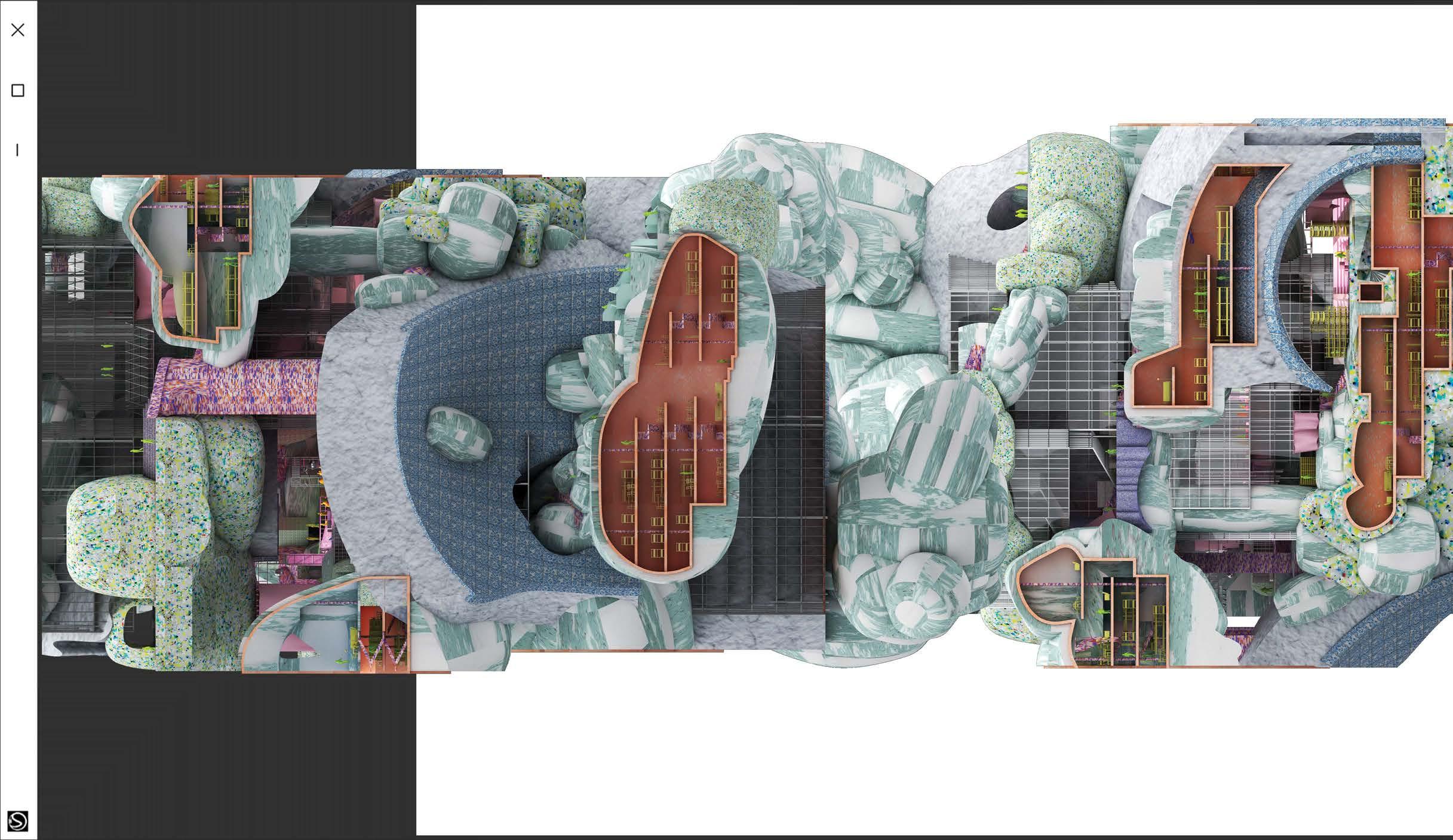

INFINITELY TALL TOWER ELEVATION
13
Outward facing domes push space to the facade of the tower. Inward facing domes shelter occupants from the outside's gaze. The former houses performative progams, acting as a stage set. The latter promotes introspective rituals.
The Sensescape isn't so dramatic as to say any program associated with efficiency is irrelevant. Since the Tower City requires civic program, namely, spaces for the productive exhaustion of creative energy, we intregate an orthogonal system. These spaces are designed to be in service to the sensescape, not vis versa.


14
HOUSE

Critic: Anastasia Congdon Fall 2018
When this project was pitched, Columbus, Ohio had one of the fastest growing Real Estate markets in the country. This project is sited in Franklinton, a neighborhood adjacent to the downtown alongside the Scioto River. This neighborhood has a history marked by floods, redlined disinvestment, and urban isolation. As a result of low rent prices, infrastructural fixes and a growing young professional interest in Columbus, Franklinton has been gradually finding new investment through the arts.
Columbus leadership wants to build on this cultural opportunity and rebrand Franklinton as a new arts district. While this could be a beneficial investment for the neighborhood, it could also suffer the same fate as many similar neighborhoods in the area already have in Columbus' effort to be as their website gleefully describes, "Developer Friendly".
Critiquing the gentrification symptoms issued by international style implants (an image of luxury with rent prices to match, an aesthetic that "others" vernacular architectures), this project aims to invest in the art culture of Franklinton without replacing the aesthetics that residents know to define it.
This project posits the Franklinton house as a fellowship residency. Two artists are to be housed here, one local one not, with formal organization driven to prompt social exchange between the two parties.
The aesthetic investigation stems immediately from the adjacent houses, mixing their material assemblies to code zoning, sidedness, and directionality within and upon the house. This practice enables the house to accommodate work, play, and home-- for two residents-- all under one roof.

(sub)URBAN
III.
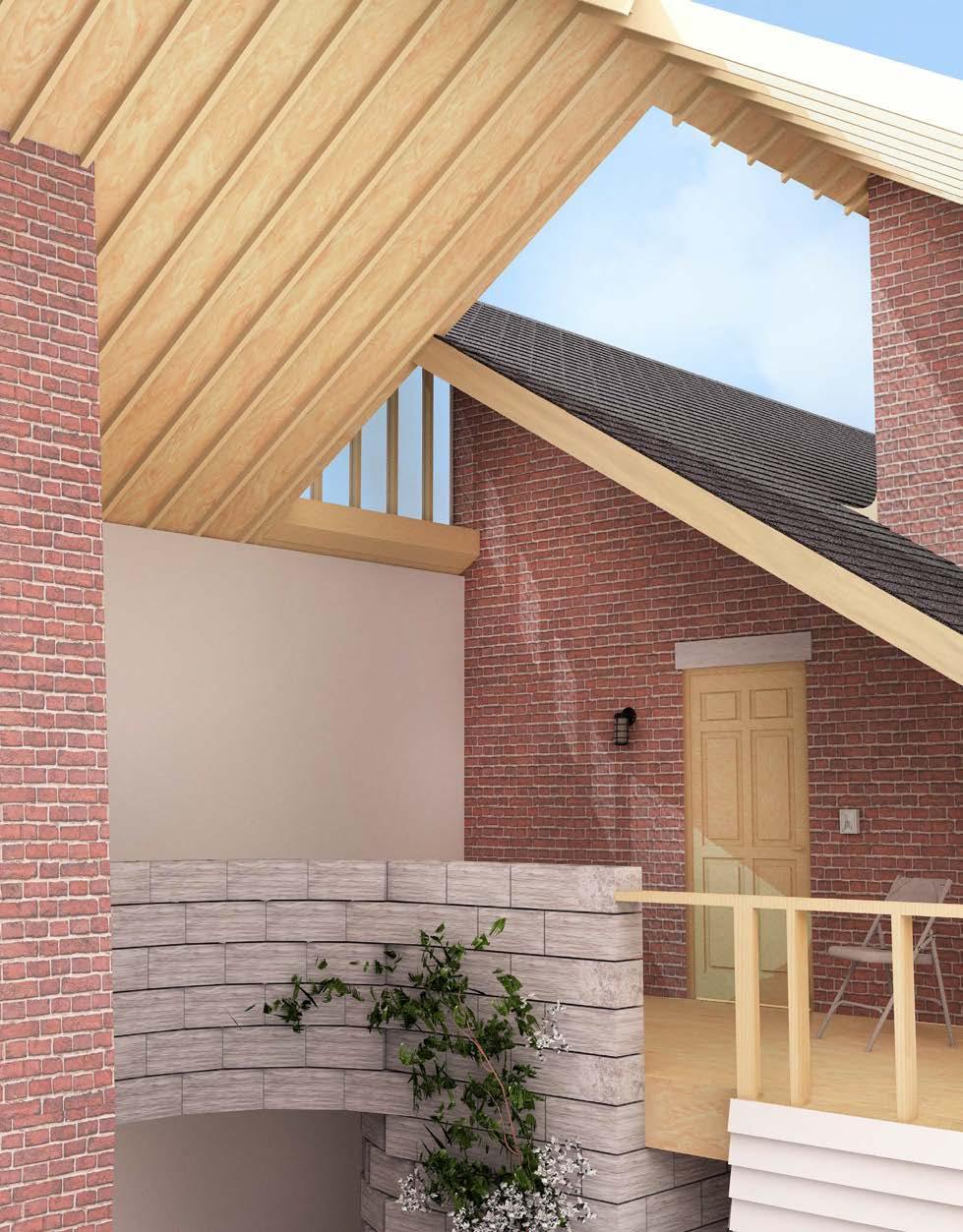
2nd Story Cross-Courtyard View
15
West Street Elevation
Program Catalogue:


By recontextualizing the suburban aesthetic into new spatial configurations, cultural associations can begin to break down. Post-war suburban expansion was involved with notions of standardization, assimilation, xenophobia, and gadget driven consumerism. These themes needn't be inherently suburban, however. This socio-psychological baggage can be shed by exercising the aesthetic within new methods of space-making. The goal of this project is to subvert the conventions in an effort to rebrand suburban normativity.


1. Storage 2. Half bath 3. Studio Extension 4. Studio 5. Courtyard Living Room 6. Dining 7. Kitchen Drawing Room 8. North Porch 9. Foyer 10. Drawing Room 11. Entry 12. Potemkin Facade 13. Dining 14. Mudroom 15. Garden 16. Half Bath 17. Visiting Artist's Quarters 18. Cigarette Patio 19. Back Porch 20. Cigarette Patio 21. Resident Artist's Quarters 22. Bathroom 23. Lounge 24. Bathroom
1 2 3 4 5 6 7 8 9 10 11 12 14 15 16 17 18 19 20 21 22 23 24 N 16
1: Courtyard
The roof extends over the property as an organizing datum, altering to accommodate for the activities underneath. Here, the roof terminates on one

2: Front Entry


The roof begins, sheltering the entry patio. This patio is the houses' most vertical exterior space. The resident artist's living quarters float here, compressing the

3: Nexus
The suburban gable roof icon inverts into a sawtooth arrangement, producing south-facing clerestory that light this central gathering space.

1 6 3 4 5 2 17
4: Space Between Place
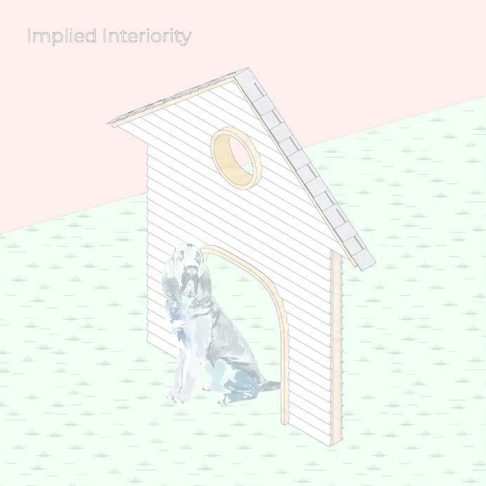

Vinyl often faces the interior of the inbetween spaces because its assumed sidedness implies interiors on its alternative side. This assumption is made because of its conventional use, and enables its communicative potential.
5: Trope
Bathing and nature have a long relationship. In suburbia, houseplants grow in the shower, and bathtubs house plants in the garden. This approach collapses the symbols in a new way, using the bath as irrigation for the garden.
6: Departures
The roof slants fully. The compression of the space pushes bodies toward its outerwall. Spaces away from the circulation exist in stasis, enabling prolonged programs to unfold. Work, Dining, and Contemplation happen toward the innerwall of this section. 3 circulation paths diverge from the nexus here, one for work, one for play, one for sleeping.
Borrowed from the adjacent houses, these material systems contrast, utilizing their distinct qualities to produce zones.


Exposed stud walls reveal the wizard behind the curtain. Spaces enabling the houses performance are left unfinished.
Some aesthetics carry spatial expectations. In this project they're manipulated to materially code interior zones.
18
MONTESSORI SCHOOL
Critic: Anastasia Congdon Fall 2018
This project aims to situate an elementary school on a site in Columbus just north of the university's campus. This site is a ravine and a ledge, with the ledge sitting between the ravine and one of Columbus' busiest streets. This particular elementary school is designed as a Montessori model, a teaching style that treats the teacher as collaborator and a coach to a students self-motivated education.

Drawing from the Apollo Schools built by Herman Hertzberger, the formal strategy of this project uses the Roman palazzo typology, introducing light, and reducing corridorization. These courtyard modules chain together to


produce a mat building. The same system that produces planometric organization allows for sectional shears, enabling the mat to respond to the sites grade.
Each module is tuned for a particular subject. Students will spend the first half of their day in one module, break for lunch and recess, and spend the latter half of their day in another module space. Twice a week, students will venture out to the forest module, a folly in the landscape dedicated to dance and art. This folly is gazed upon from the school, and gazes upon the school, centralizing the ravine landscape.
 Render/ Collage of the School from the Forest Folly. Made in style of Elementary Art.
IV.
Massing Model
19
Detail Module Model


Main Floor Plan with Forest Folly Upper Level 20


Sections 21
A cluster of four 7x7ft. units is defined as being a "classroom unit". These are spaces for pausing, and group learning. 7x7 was decided upon for being a minimum threshold for space making, based on the kids' size.


A 7x28ft attachment is the circulation component. The width can be halfed for minor circulation paths. Major circulation paths are coded in hard wood, and use the grain of the slats to code directional relationships.
The combination of circulation and pause produce the basic unit for interior aggregation. Any unused portion of the circulation can be used to increase the scale of surrounding classrooms.
Circulation locks together around an interstitial space that is left to produce a courtyard, or in the case of larger programs requiring more interior space, this space appears on the roof as a sun cannon.
Each basic pause/circulation unit has the freedom to move sectionally. The exercises spatial segregations via raumplan, reducing wall use and increasing voyeurism.
Interior collage showing the scale of the smallest aggregate unit. (7x7ft)
As these units shear in section, they produce wall gaps, enabling more opportunities for light to enter the interior space.
Lastly, the smallest scale returns, appearing on the perimeter of the modules. These units are used to produce intimate space, and connect modules.

Site Plan 22
V.
ENERGY RESEARCH LAB
Critic: Michael Baumberger Spring 2019

This project is to envision a new Energy Research Laboratory on The Ohio State University's west campus. This section of campus has been largely dedicated to private/ public partnerships, and focuses on utilitarian innovations.
Laboratories are spaces where scales of inquiry collapse. Global abstractions are designed to physically present themselves in these spaces, taking form through experimentation. Yet, the production of knowledge doesn't end with the results of an experiment. The scientific act can only be solidified by the additional production of public discourse. To legitimize the results of the experiment, peers must review, duplicate, and multiply experiments across new territories. Once reliable witness is produced, for this local performance to have a global effect, knowledge must be proliferated amongst global audiences. Change stems from the agency of the audience. Thus, the scientific act is intimately engaged with an oscillation of scale; the global must become local, and the local must become global.
The design strategy for this laboratory aims to integrate the building with the greater scales of the campus and city, all the while compounding scale internally to produce its own urban microcosm. This mini-urbanism consists of four buildings:

1 - Dedicated Research Unit: Glass walls produce hermetically sealed zones within a large, social infrastructure.

2 - Loose Study & Administration: Meeting rooms, offices, and an open lab floor for preparation work.
3 - University Engagement Unit: Circulation nexus/ lecture hall
4 - Service Unit: Material logistics, electric transformer station, water collection, heating, and a cafeteria.
As systems integrate with the building to enable its program to perform, they draw relationships across the space. The liminal space is forefronted because of this, for it is here that the broader networks are reasserted, and their relationships are drawn in asphalt, wire, and ductwork.
23
Southeast Axonometric Connectivity Diagram: (starting left) systems, minor/major circulation, minor/major carpath


Plan 3 Plan 1 Plan 2 24


25
Section: (left) Service Unit and (right) Loose Study Administration Unit


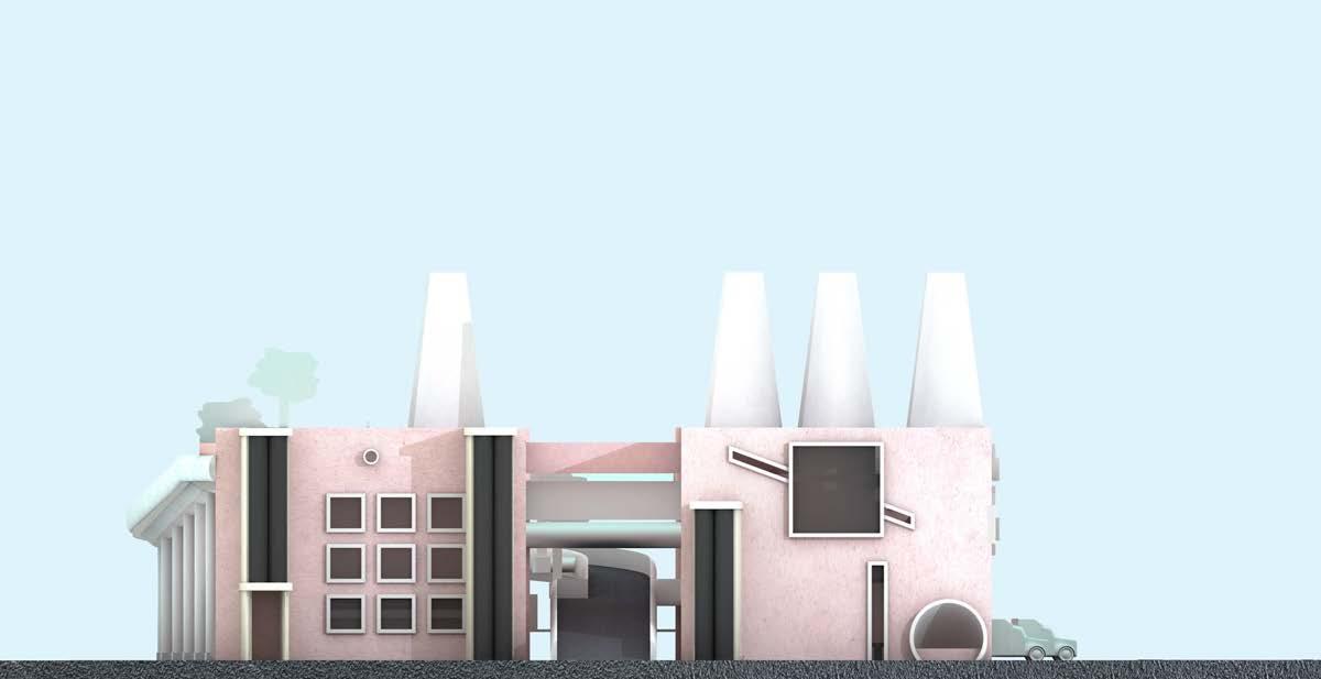


East Elevation South Elevation Ramp to Dedicated Research Unit 26
MATRYOSHKA SHELL
Critic: Justin Diles Spring 2017
This project is two fold. First, students are to aquire three small toys with divergent characteristics. For each of these toys, we are to abstract their qualities, be they formal or operational, and reconstruct these abstractions as a shell capable of housing the toy it is representative of. Included in each of these shells should be viewports, enabling the toy to be seen through its shell.
The second exercise is to design another shell, one which is able to house each of the three shells, designed with a logic that allows for conceptual cohesion between the disparate parts. This shell should also include viewports, enabling the visibility of its subsumed shells.


This particular project used a Pez Dispenser, a Harmonica, and a Gag Paper Clip (pretending to be a
Formal Logic of Each Shell:
Pez - Appropriates its massing from the toy and mimics its hinge to produce a viewport.
Harmonica - Wood/tin material binary becomes smooth/rigid tactility binary. Viewport dimensions vary in scale to parallel the pitch variations.

Paper Clip - Abstracted as connective and performative, this shell becomes an infrastructure with a stage for each toyshell. The toy, a metal line with a gap in it, is housed in this infrastructure's gap.
Outer Shell - Stretches tightly around this infrastructure, highlighting tensions between shells. One major viewpoint turns the three stages into a theatre set, each shell a performer. Paths of fenestration stretch across the surface, dappling light spots across the stages.
VI.
X-ray Diagram Model
27
Full scale model. Photograph highlights fenestration/ shadowplay.


 Pez Shell Elevations
28
Harmonica Shell Elevations + Sections Model Photographs
VII.
FIGURE / FIELD

Independent Project

Critic: Curtis Roth Fall 2019 - Summer 2020
This project started as a preliminary study for the La Brea Tar Pits project. The brief was to study the formal qualities of certain geological formations, and to make artifacts that mimic aspects of them through either plastic or plaster.

These artifacts had to be produced through a design system, wherein instructions given to another classmate could, and ultimately would produce the final models.
Two scripts were to be made for each geological formation: one meant to model the formation as a figure, another as a field. The system was tasked with abstracting the logics of pre-existant phenomena, and reapplying it in a way that satisfied specific formal expectations. The toggle between figure/field, and the nuances found between would go on to influence the formal system behind the natural history museum.
Following the semester, I pursued this project further. As individual objects, each artifact contained both figural and field like qualities. Various operations produced these qualities, oftentimes with some contradicting or competing with the operations of others. Surface articulation can produce these effects, but additionally so can coloration, slope, crops, and contrasts.
All of these operations can be found on the interior of a single artifact. Yet, as these artifacts array, another layer of figures and fields form. Some reinforce the figurality of the individual sculptures, others extend fields across the larger painterly composition. It's three dimensionality produces shifting interpretations as one looks at it from different angles, areas that once split at the threshold of the grid might be shown to blend seamlessly together.
This project is now in a private collection.
29
DUNES, Approx 21x35" (plaster, adhesive, insulation foam, carbon)
Detail: Carbon deposits form when chemical flames drag across the surface; the concavity in this model results in this plaster plume's widespread soot.


Detail: Edges between sculptures produce poche figures. Slope matching can connect fields across a diagonal, even when these figures intrude. DUNE

30
# 7,
VIII. UNTITLED.png


Independent Project 2020
These images are a part of a project I’ve been developing since the beginning of quarantine. Using portraiture as a framework, the goal is to cultivate an aesthetic that pays homage to the interplay between analog and digital mediums.
The physical is messy, improvisational, and subject to the whims of peoples’ moods. Each drawing unfolds quickly and records an imprint of my particular headspace at the time it was made. Mania translates into quick lines, jagged bursts, and contradictory layers. Clarity translates into patient pen fills,

cohesive coloring, and balanced proportions. All of these physical artifacts pervert when they pass through the digital.
Our digital identities are more cautious; we plan them ahead of time, prune out inconsistencies, and readjust images to fit the narratives of new contexts. The digital asks us to become curators of our own existence.
Each product works in a similar register to Cindy Sherman’s Untitled Film Stills. They’re nameless representations of stories never played out, open to any number of interpretations by ‘the other’.
31
Detail: Eye - textures interact as pixels approximate analog strokes. Untitled_13.png


32
From Left: Untitled_06.png, Untitled_09.png, Untitled_07.png

THANK YOU.


 I. LA BREA TAR PITS MUSEUM
II. SENSESCAPE
III. (sub)URBAN HOUSE
IV. MONTESSORI SCHOOL
V. ENERGY RESEARCH LAB
VI. MATRYOSHKA SHELL
VII. FIGURE / FIELD


 Southeast Entry Sequence to Central Exhibition Hall


 Pictured Below: Diagrams of the plans are illustrated to highlight the overlaps between the site's users. Blue - Administrative and Scientific Zones Yellow - Museum Visitor Zones Orange - Public Free-Access Zones


 Southeast Billboard Facade
Southeast Lobby
Southeast Exhibition Space/ Administration
Parkscape Entry to Public Courtyard
Restaurant
Public Path next to Administrative Path
Left: Path to Museum Landscape Right: T-Rex, Path to Central Exhibition Hall
Panoramic Render of Cental Exhibition Hall
Gallery Theatre Path to Tarpits
Main Entry Point


 III. LOW-RISE AXONOMETRIC


 Render/ Collage of the School from the Forest Folly. Made in style of Elementary Art.


 Pez Shell Elevations


