ZAINA MURAD


01 02 03 04 05 06
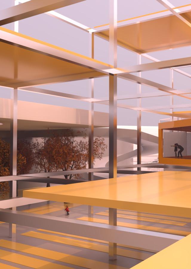

The Food Factory is an urban food park where people, food, and adventures meet. It is an environment that creates a self-sustaining food system which intends to vitalize and enrich the community, both physically and socially. On the outside, the park is made up of gardens, fields, and terraces that are integrated within a jungle of concrete columns. The inside, where all the food production & dining happens, connects to the surrounding functions with a colorful pedestrian bridge that dictates the journey of visitors through the park.
The concept of this project is entirely based on my thesis research done in the previous semester that is named “Commensality: Exploring Urban Gastronomy”. Both the research and project are my attempt at sharing my knowledge and portraying my passion for my main interests of food & design combined.
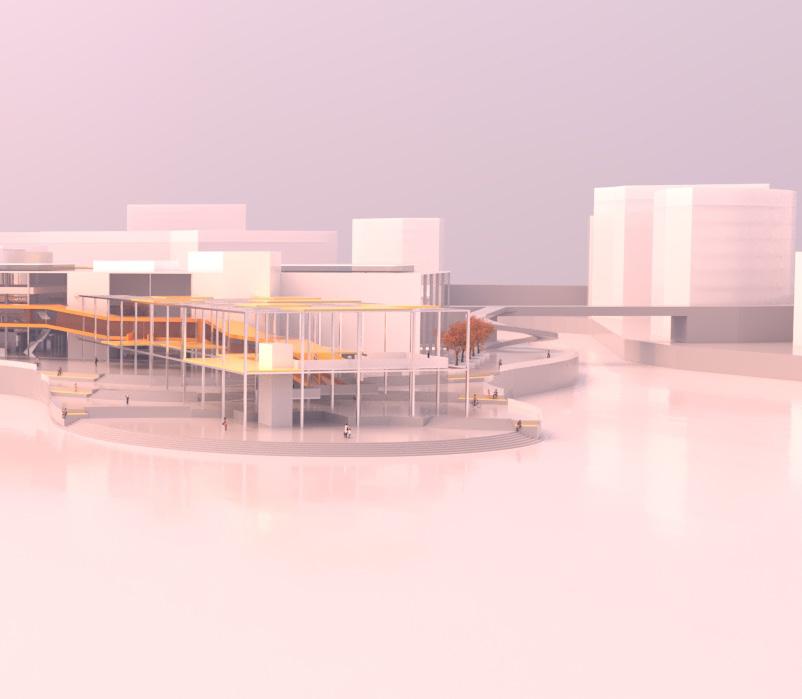

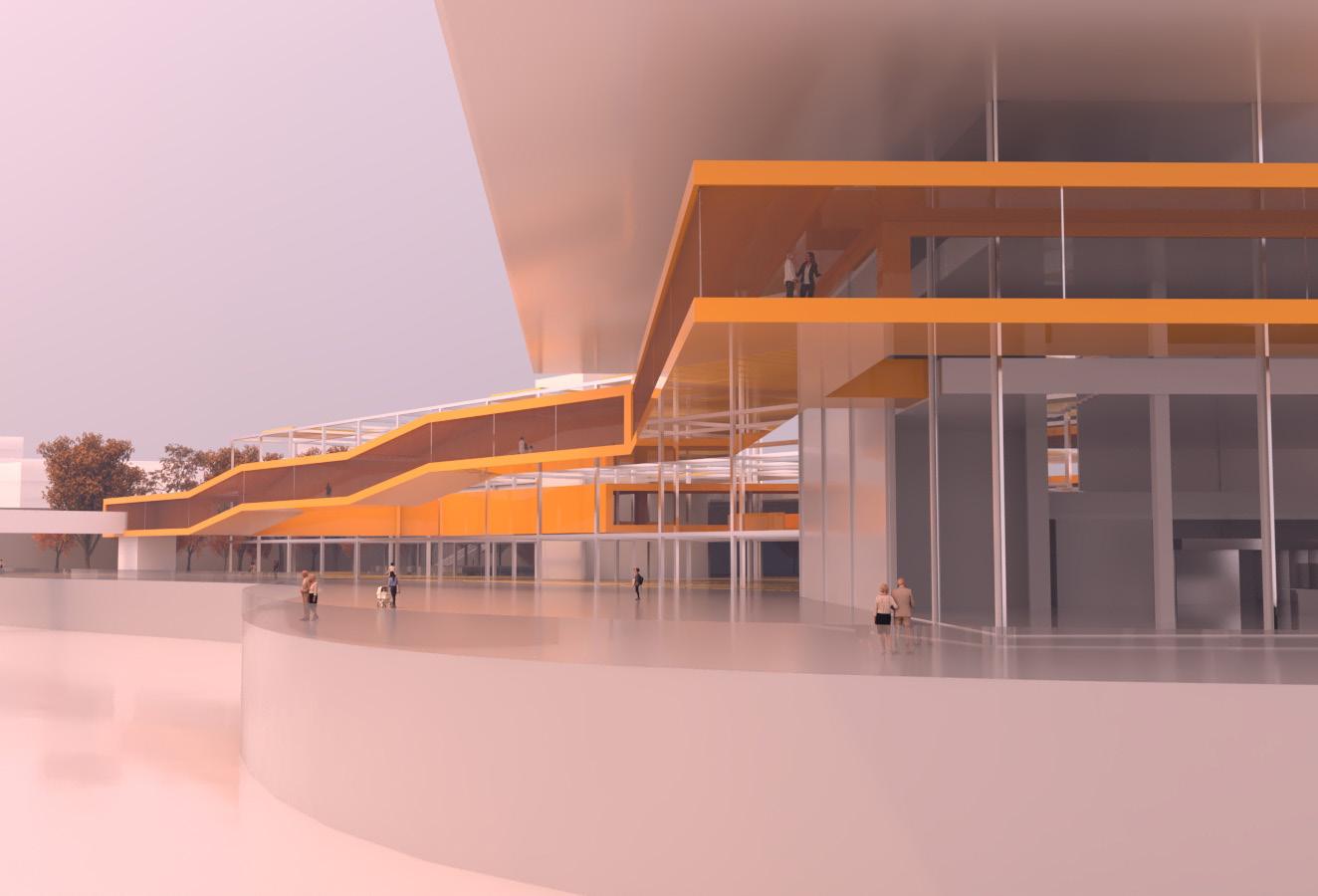
Eating together is one of the most intimate activities to engage in with someone, whether it means sharing the food, or just having a meal in each other’s company. Food is the necessity that dictates the quality of people’s lives. People need a place where they can properly interact with their food, away from the fast-paced life in the city, while also having the opportunity to interact with other people of the same interest.
As the metropolitan fast-paced life asks for more convenient produce to be supplied to the people, the food production cycle has shifted into a system that is mainly relying on import and export to constantly provide cities with the products they need. This push for faster and more is the leading factor for the majority of food waste in this day and age. This project proposes a self-sustaining food system which will lead to a healthier community, both physically and socially. The Food Factory is an urban food park where people, food, and adventures meet.
Overlooking the creek, the hub is isolated from its surroundings while also being located in the heart of the city. The location is strategic also because the area surrounding it lacks in f&b and retail options, but also has a high density in hotels and apartment buildings. Also, its situation at a waterfront property means tourists and residents alike would be highly attracted by the view and creek.
The aim of the project is to create a space for people to interact and flourish by learning more about the food they consume, through the journey taken through the building. Walking through all of the stages of food production shows people first hand how their health is affected by their food. It also motivates people to be more inquisitive and looking forward to exploring what goes on in each stage, while also providing them with new experiences through different types of interaction with food.
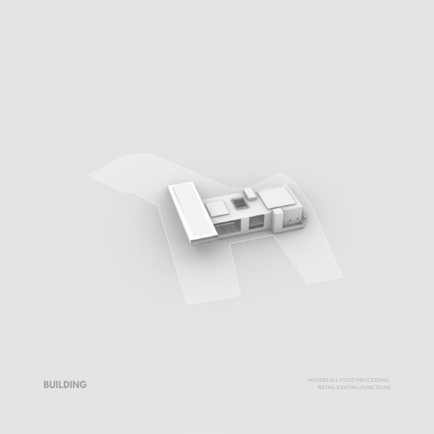
There are many different functions in the project so I blocked them out into groups of categories which represent the stages of the food cycle. Each category has multiple types of functions, eg.: indoor vs. outdoor farming, kitchen incubators vs. single kitchens, and so on.

This chart is a comprehensive relationship diagram that emphasizes the connections between characteristics of different restaurant typologies and food service outlets. Since there are many typologies of restaurants and food-selling venues, an exhaustive diagram like this encapsulates the essence of the types by highlighting aspects such as their dining style, convenience, the formality of the setting, and the level of privacy.
Remote describes the types of restaurants where interaction between consumer and establishment is minimal. Full service restaurants have staff that directly take care of customers, unlike self service establishments where customers pay for their food at the cashier then seat themselves and are not waited on. And lastly, the typologies labeled as self-sufficient produce the food that they serve in-house.


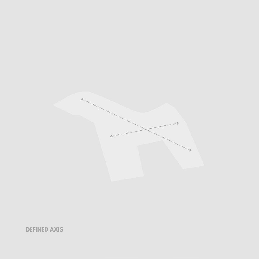
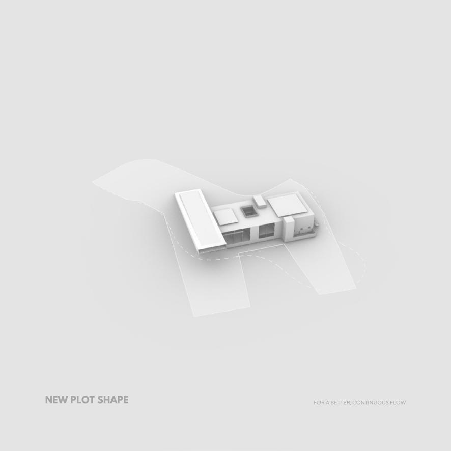

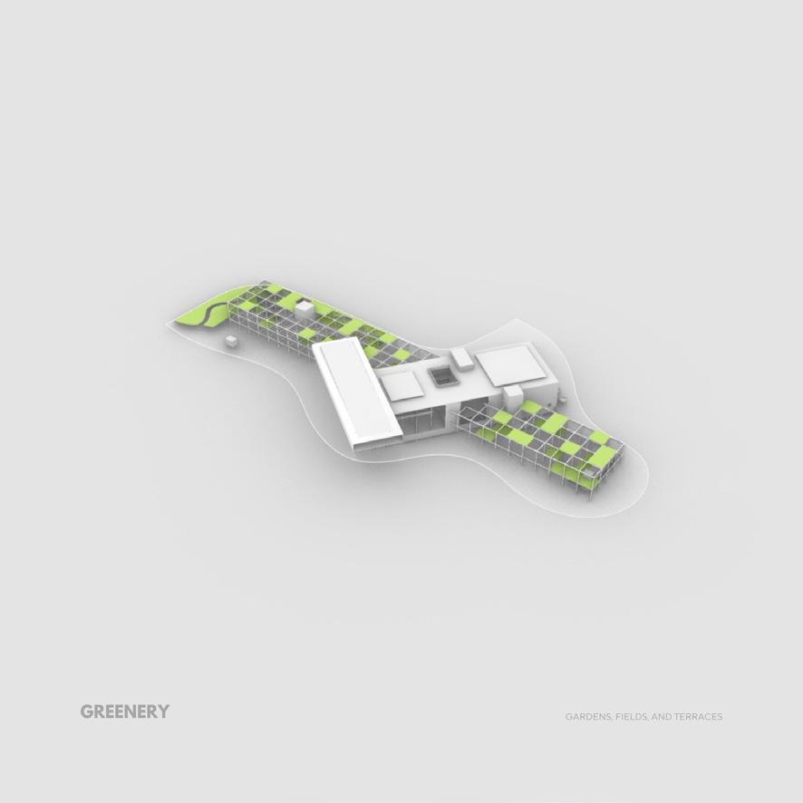

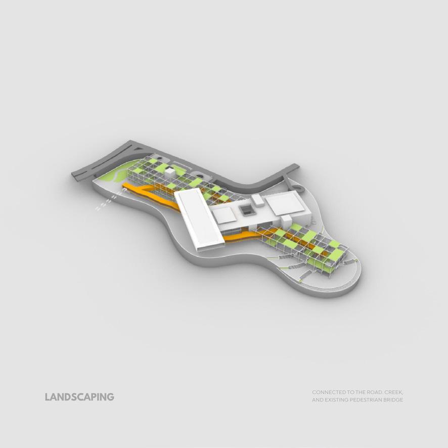

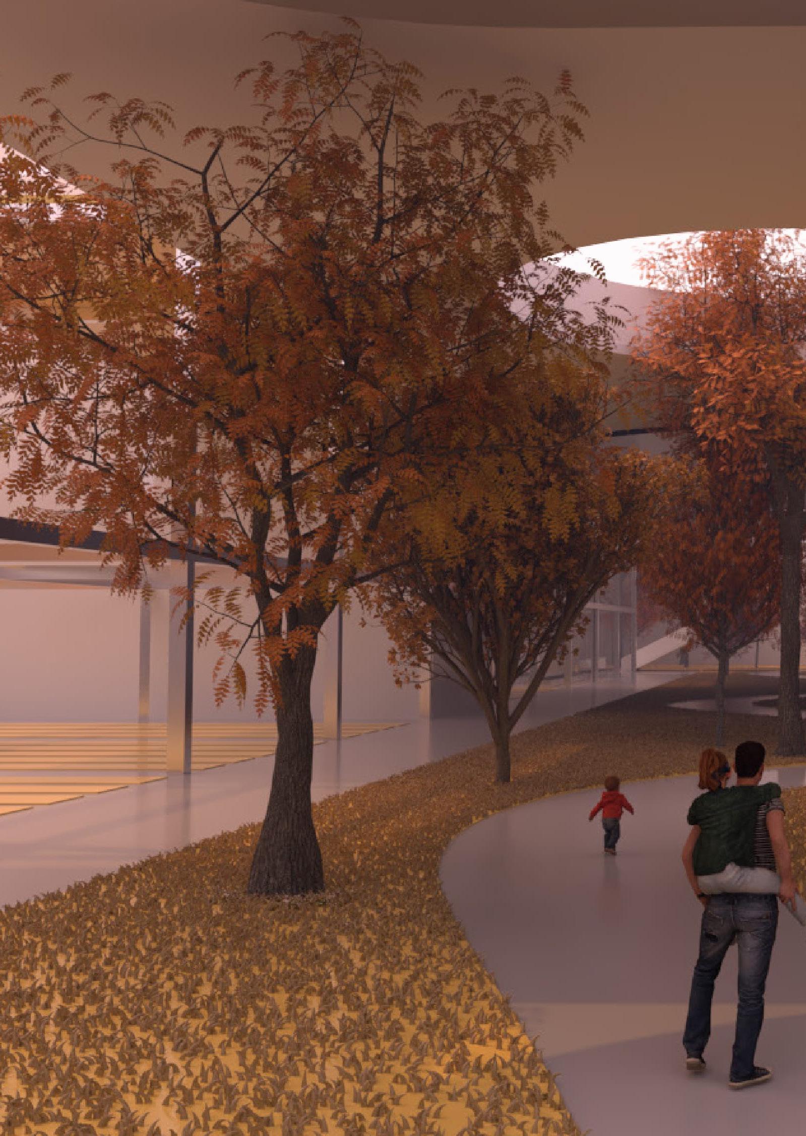
WORKING ON THIS PROJECT WAS VERY INSIGHTFUL AND FUN BECAUSE IT WAS BASED ON MY OWN RESEARCH, ON A TOPIC I AM VERY PASSIONATE ABOUT. THAT WAS THE ULTIMATE MOTIVATION: TO PRODUCE VISUALS THAT REFLECT MY DREAMS. A PLACE MADE FOR FOODIES, ENVIRONMENTALLY CONSCIOUS CONSUMERS, EXPLORERS, FAMILIES, AND EVEN THE AVERAGE PERSON WHO JUST WANTS A COOL NEW PLACE TO HAVE DINNER AT.
TO SEE MORE ABOUT THIS PROJECT, VISIT MY BEHANCE PAGE LINKED AT THE END.


ARCHITECTURAL DESIGN STUDIO 6 XX ARCHITECTURAL ANIMATION AND RENDERING XXI
Cars and sustainability are not typically associated with one another, so for this project we were assigned to create a showroom for cars that would be energy efficient. Using Tesla’s own solar panels in my design, I created a building that looks like a Tesla dealership, but functions better than your average showroom.
Using environmental calculation software, I deduced the impact the building has on the environment from CO2 emissions, to the amount of daylighting it has within the space, and the efficiency of the floor plates.
The same project was also used in a rendering and animation course the year later to create more realistic renders which appear more warm and lively.
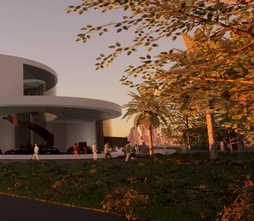
The concept captures the essence that makes up the Tesla brand, which is electric motors. The motor is made up of 2 pieces which are connected with a long element, so I took these basic shapes and reconstructed them into the building. The building is separated into two parts, the lower part is for the front of house, and the upper part is for the back of house and headquarters.


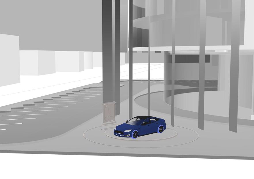
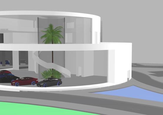
A shaft runs through both these parts and connects them to one another, visually and functionally. The last element taken from the motor concept is the vertical fins, which act as a shading device on the southern facade.

The showroom conforms to some of the standards of the Sa’afat sustainability rating system which include:

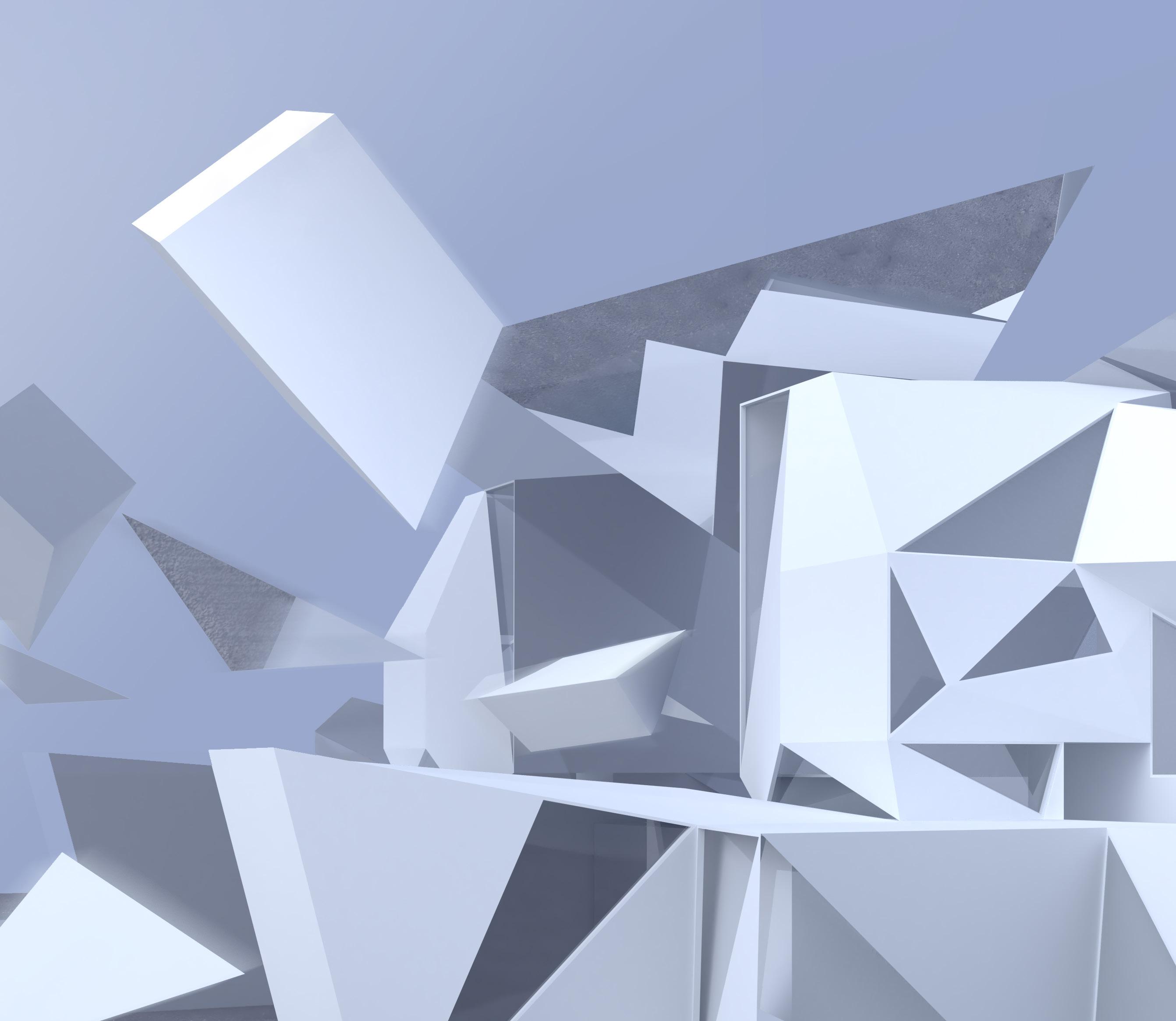
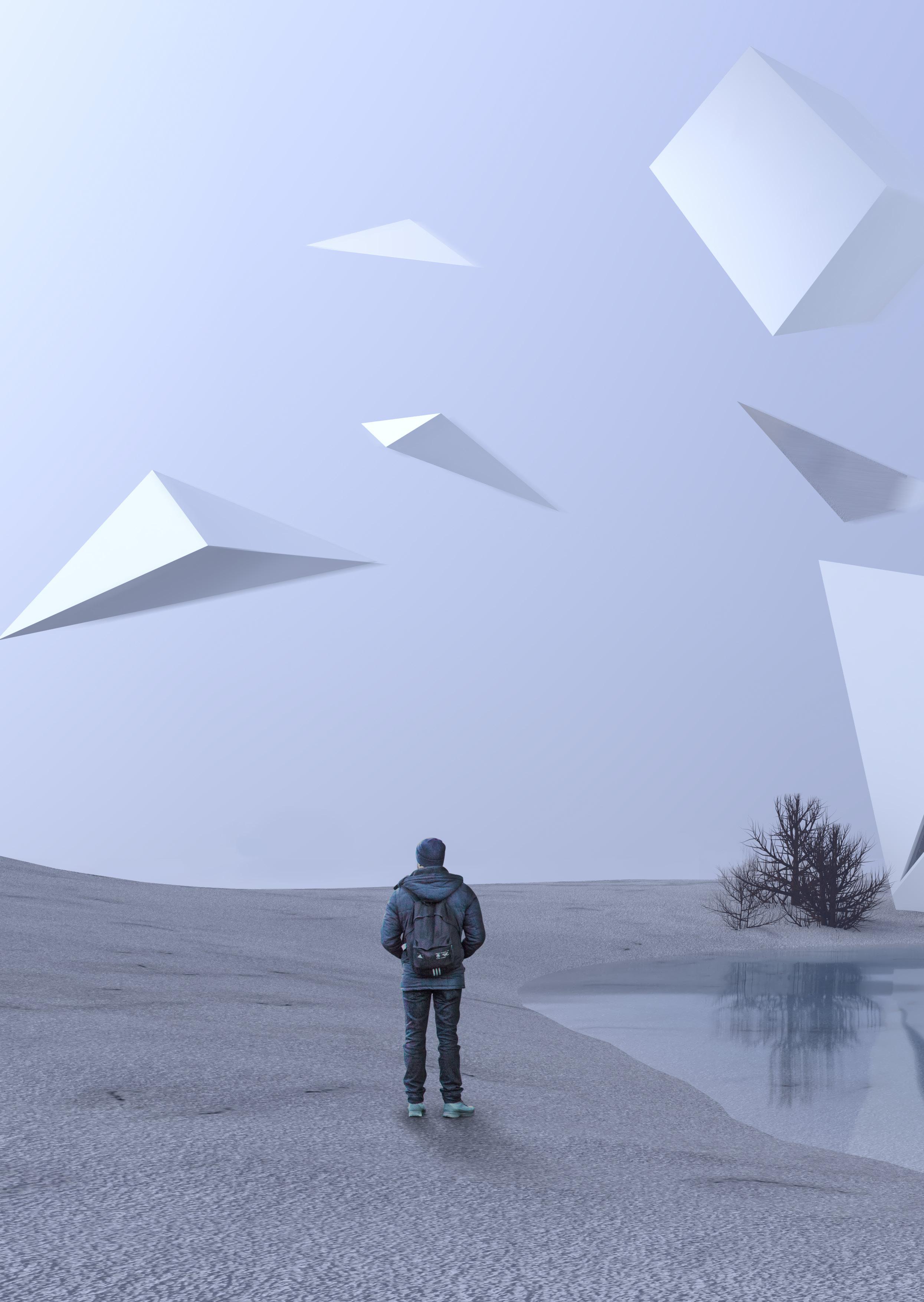
Parkour parks and music schools are venues filled with life and activity, unlike the scenes we see here in the alternative visuals. Here I took the phrase “Frozen Music” which is the concept of the original music conservatory project I designed in 3rd year, and used it literally, creating a cold, gloomy, dark environment where all movement has stopped.
The renders are meant to impose self reflection on the viewer/visitor, while also giving off a dry post apocalyptic energy through the lack of representation of life and color. The mirrors and water intersect with the geometries and environment, creating new details in their reflections.

STRIDE ALTERNATIVES IS A CONCEPTUAL RENDERING PROJECT THAT IS MEANT TO REPRESENT THE ANTI-MUSIC: FROZEN MOVING VOLUMES, SHARP COLD EDGES, AND THE LONELINESS OF AN EMPTY STRETCH OF LAND.


 Sunset Shot
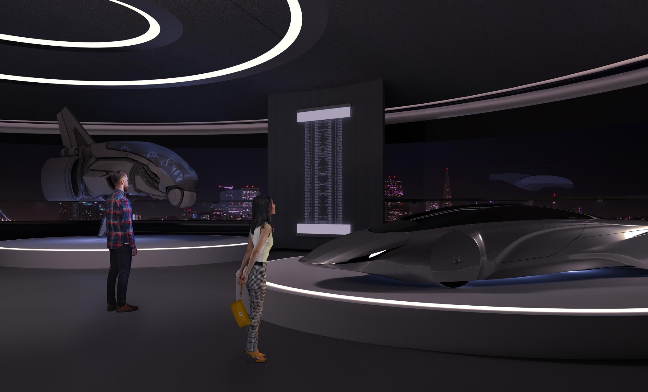
The mobility pavilion is a thematic pavilion in Expo 2020, designed by Foster + Partners. The pavilion is designed with a seamless trifold shape, cladded in aluminum and reflective glass. The building and it’s surroundings have built in lighting which establishes the importance of the building. It is the main event in itself, and it is supposed to look futuristic and extraordinary.
The goal in this exercise was to create renders realistic enough to immerse the viewer in the beauty of what is yet to be seen in the built version of the building. In the renders, the materials are highlighted while keeping the surroundings clean and minimal for contrast and true representation of the currently unbuilt site.
In the night shot we see that the pavilion is self-illuminating which creates a very subtle but modern looking ambience. The moonlight also provides some soft lighting as a halo around the building.
The Mobility Pavilion showcases many futuristic technologies and explores the possibilities of sci-fi creations coming to life, such as flying cars, self-driving cars, and holograms.

The following diagrams illustrate the method used to come up with the 3D form of the project, and the conceptual output I estimated. This exercise was done prior to the real life execution of the building so the challenge was to be as accurate as possible in depicting the form without any drawings or real references provided.

TOP VIEW


Worked on multiple project concepts including Jeddah Corniche Tower and Novotel Hotel. As an intern I was tasked to design & create presentations, analyze site conditions, and 3D model building elements. Programs used include Adobe InDesign, Photoshop, Rhino 3D, and Grasshopper.


Being part of a family business means my role as an architect is more flexible and can mean multiple different things. I usually tend to be reponsible for the concept design of certain projects, but for others my role is as simple as creating 3D models and visuals, or be involved in more technical tasks like checking and modifying construction documents. For this project, I created the 3D model and all the visuals, as well as added my input for materials & furniture during the design process.


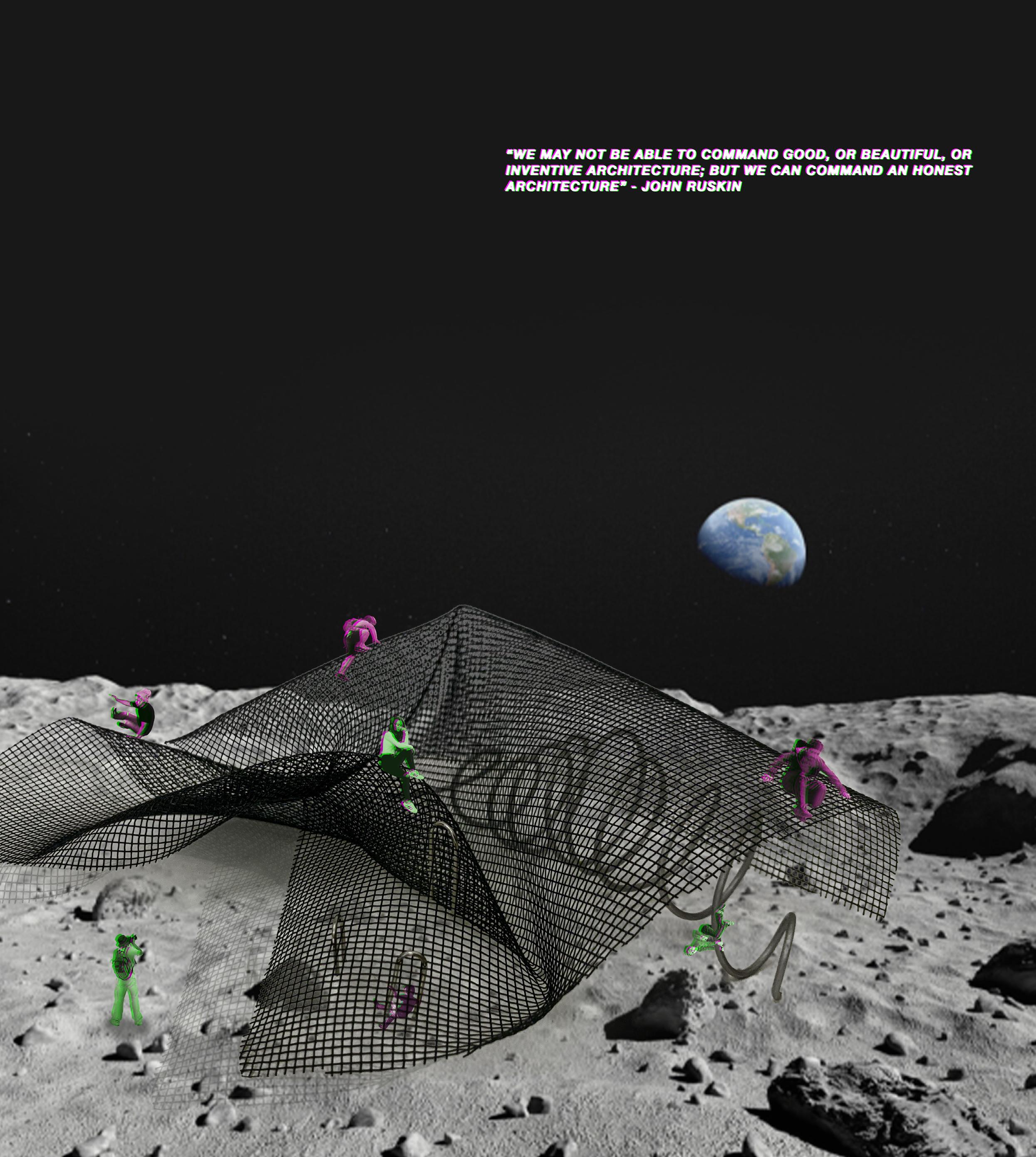
After reading John Ruskin’s Seven Lamps of Architecture, we were asked to create a building representing deceptive architecture as part of my Theory of Architecture (XXII) class.


A design competition organized by “UNI”, a global architecture competition platform where we were tasked to design a Bauhaus themed bus stop which is located across the street from the Bauhaus school in Weimar, Germany.


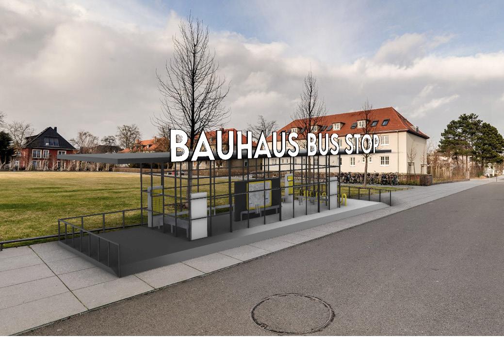
The Bauhaus movement affected the understanding of common design principles like color theory, and composition by highlighting certain aspects such as harmony, balance, (a)symmetry, abstraction, and geometric shapes. The bus stop is a functional structure that integrates those design principles in a simple envelope.

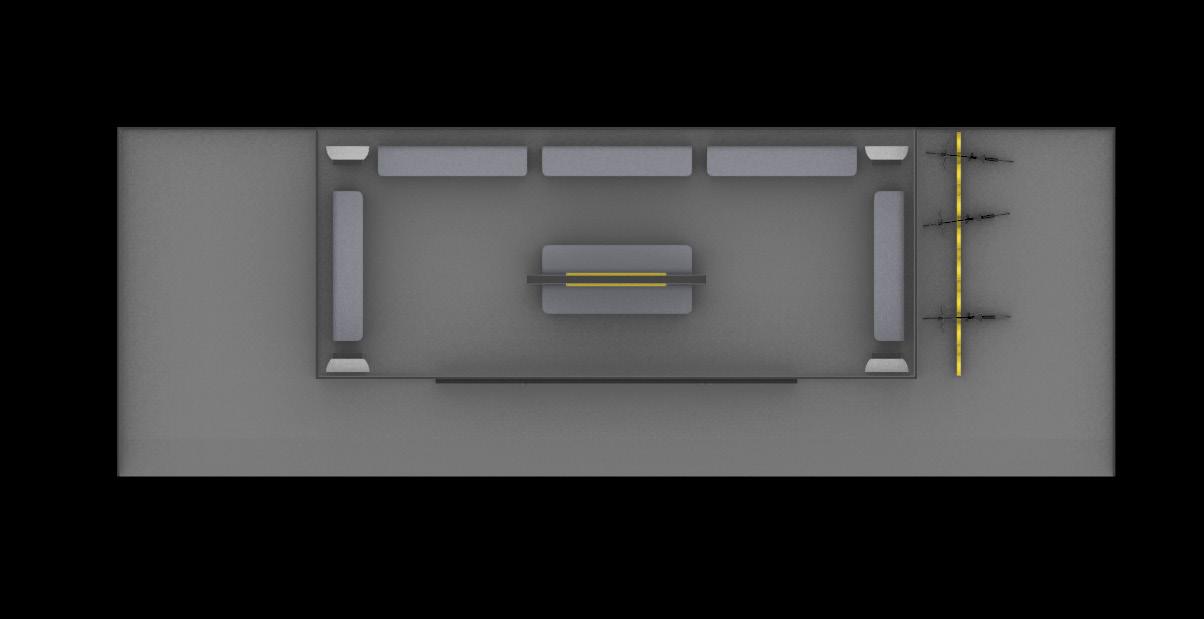
Germany has a temperate climate year round, which means it gets cold in winter and hot in summer. This is why the plan is divided into three sections: outdoors, indoors, and the intermediate space. The indoor space being the conditioned/heated space, and the intermediate being a buffer zone.

The platform raises the shelter off the ground to create a barrier against the cold/heat gain. The glass facade is the central design element, complimented with the use of black steel in the platform, roof, and mullions.

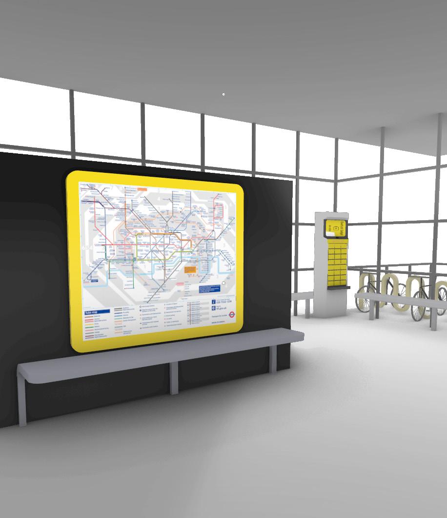
The indoor space has charging stations between the seating, and a big transit map in the middle acting as an information screen for the upcoming passengers. There are also easily accessible bike racks on the platform. Front

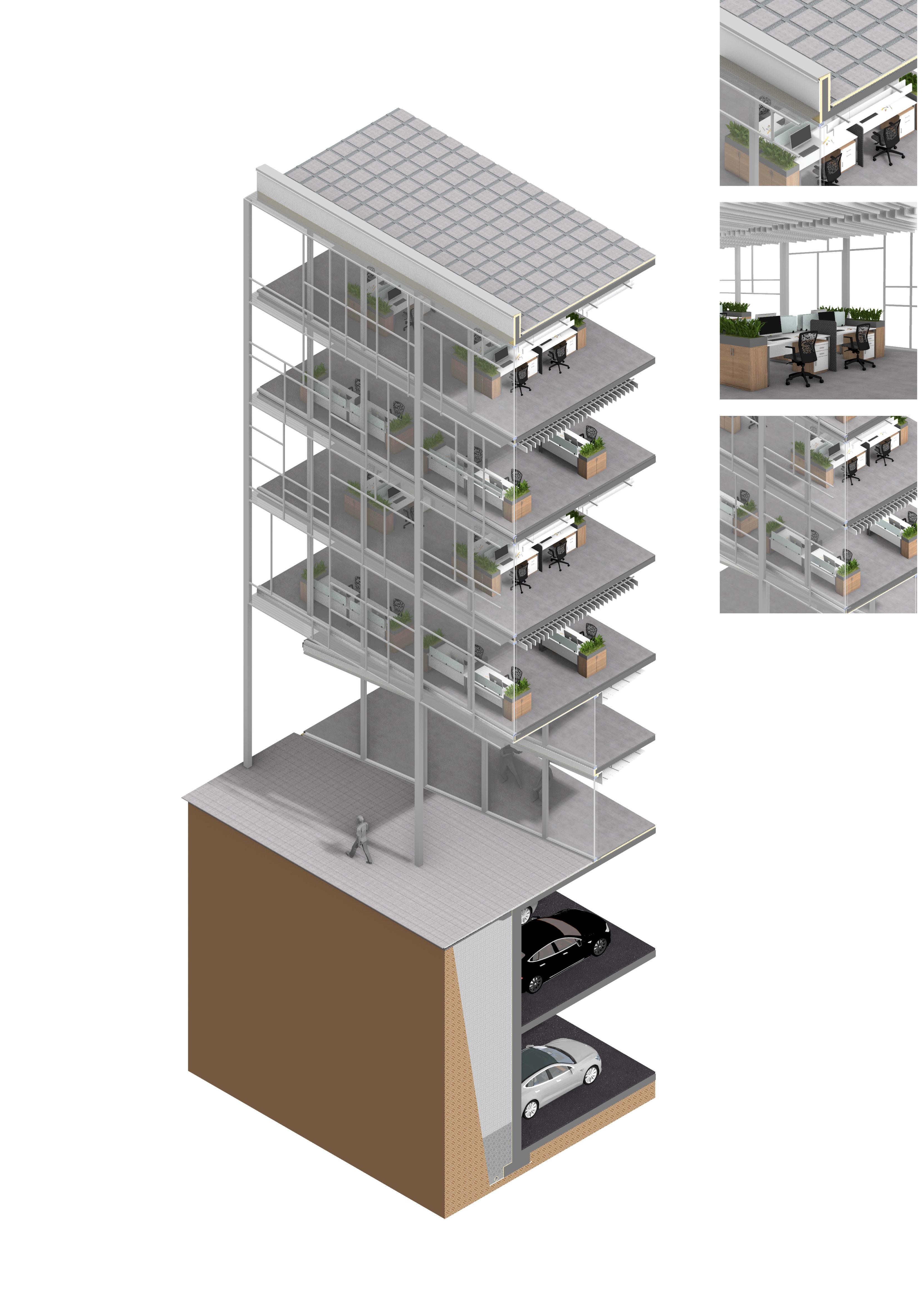
A 3D section created for my studio 8 (Architectural Design Studio 8 - XXI) office project.
TO CHECK OUT MORE OF MY WORK, VISIT: HTTPS://LINKTR.EE/ZAINAMURAD