ARCHITECTURE URBANISM VISUAL ART PHOTOGRAPHY
PORTFOLIO YU CHEN

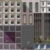
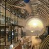
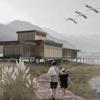
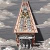




SHANGHAI INDUSTRIAL MUSEUM CONTENT 3 7 10 4 2 1 8 12 5 11 6 9 EAST LAKE MONTAGE VAN NELLE MOVES BRIDGE PLAZA ASSOCIATION & ASSEMBLAGE DE ZONNEHOF 2.0 PEOPLE’S PARADISE WITHOUT BOUNDARIES FILME A DESHENG-BRIDGE WANDER
PROTOTYPE PHOTOGRAPHY E-mail chenyumax2333@gmail.com Tel +31 (0)633726808
1:1
“This street used to be alive with noise and excitement three decades ago, but nowadays, it’s almost deserted. You won’t find any young folks shopping here.”
得胜桥街
dé shèng qiáo jiē victory bridge street
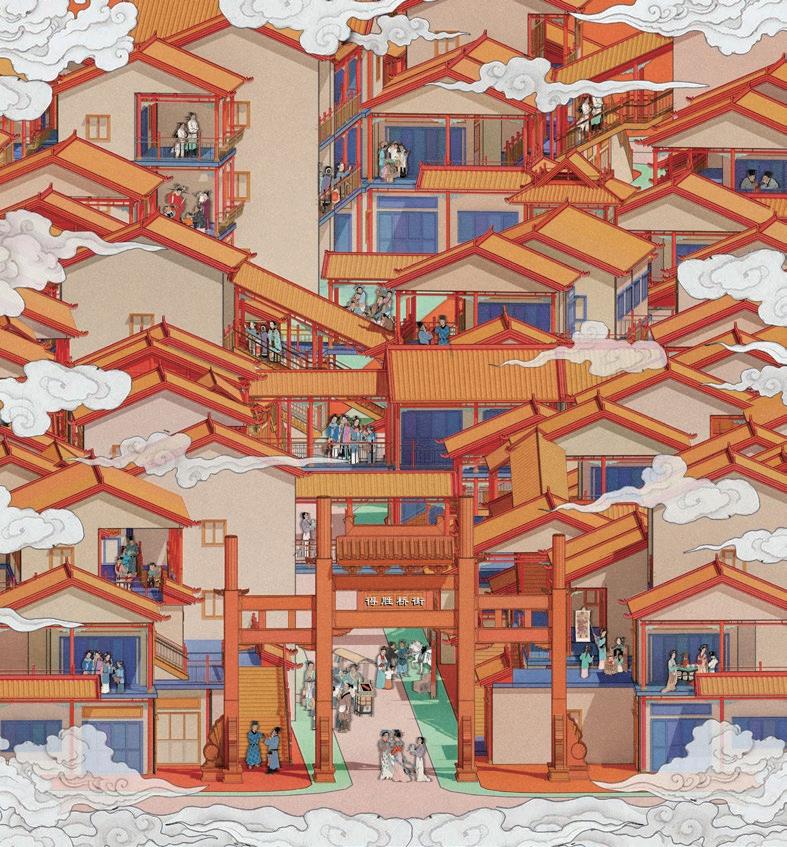
Desheng-Bridge Street, which was once famous for its commercial trade a hundred years ago, is being replaced by new shopping malls and commercial districts nearby. Wander down Desheng-Bridge Street and you’ll find that traditional skills of making food, clothing and craftsmanship are disappearing, along with the shops that carry them.
A DESHENG-BRIDGE WANDER
REVITALIZING HISTORICAL STREET THROUGH ENHANCED PEDESTRIAN EXPERIENCES
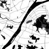
Site Desheng-Bridge Street. Wuhan. China
Tutor Prof. Zhao Kui
Contact yuyu5199@126.com
Individual academic project 2020
QING DYNASTY
PUBILC ECONOMY
REFORM AND OPENING UP
ECONOMIC EXPLOSION
As the main traffic road in the north of Wuchang city, was 1012 meters in width with 1-2 stories of shops on both sides. It was a bustling and lively street
Individual commerce was banned and replaced by public ownership. Shops were replaced by dwellings. Meanwhile, The demand for housing increased
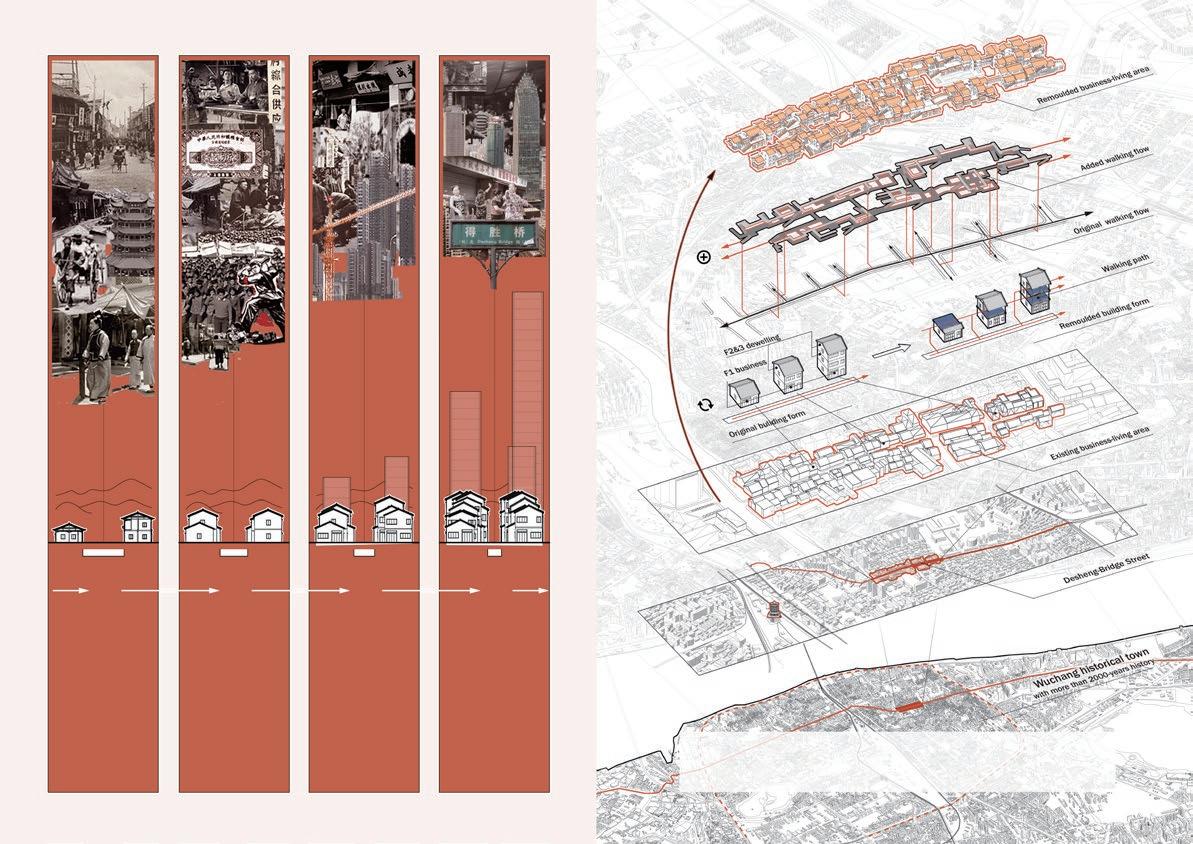
Individual economy came back to life.
The the first floor of the house became a commercing space. More houses were built to ease tight housing demand
The street is compressed to 4-5 meters. The government is leading a renovation program to provide a better environment for residents
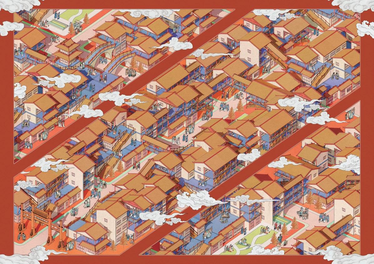
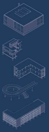
By transforming the roadside structures along Desheng-Bridge Street, we’ve innovatively re-purposed the second and third floors into elevated walkways. These elevated walkways, linked by staircases and interconnecting corridors, effectively create a new above-ground pedestrian system, seamlessly connecting different sections of the street while preserving its overall continuity.
12 m 1920s 8~10 m 1950s 6~7 m 1990s 4~5 m 2020s
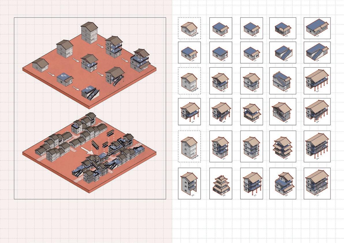
REMOULD TYPOLOGY REMOULD STRATEGY
Original buildings can be generally divided into three categories according to the number of floors. The scale and facade of each building are different and appropriate remoulding strategies can be made accordingly.
From closed boxes, to horizontally connected boxes, to vertically and horizontally connected boxes. From single-line streets on the ground, to multi-line streets in space.
“People’s Paradise used to be the artistic hub of the entire nation, and performing here was the ultimate dream come true for every artist.”
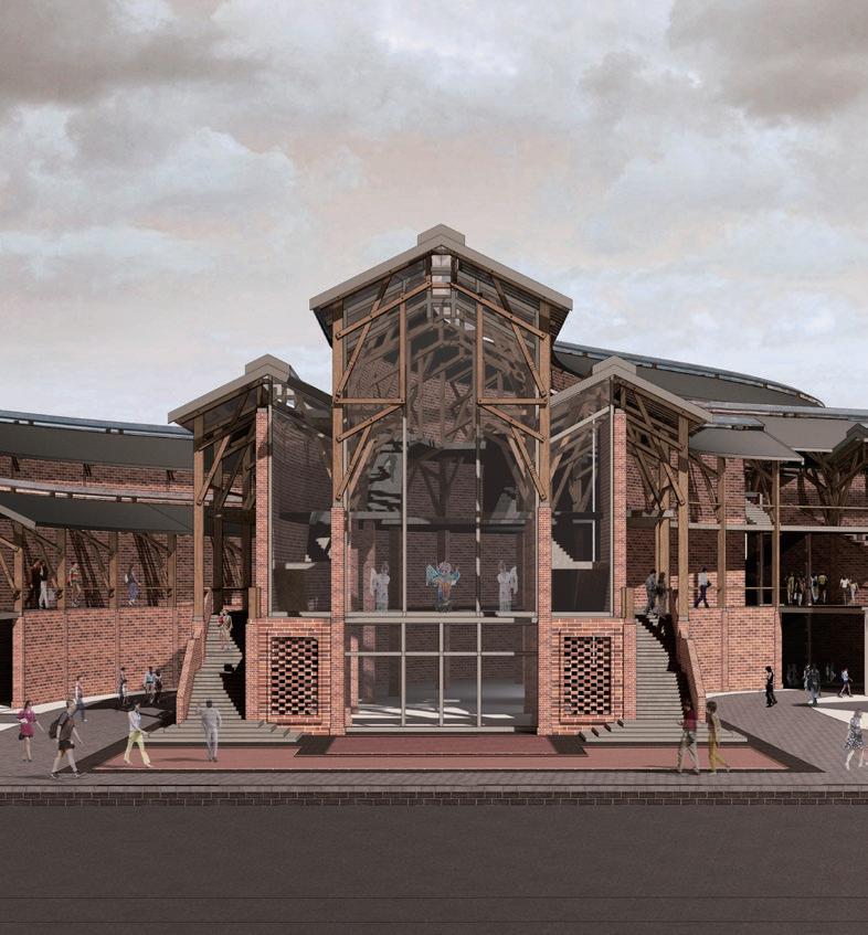
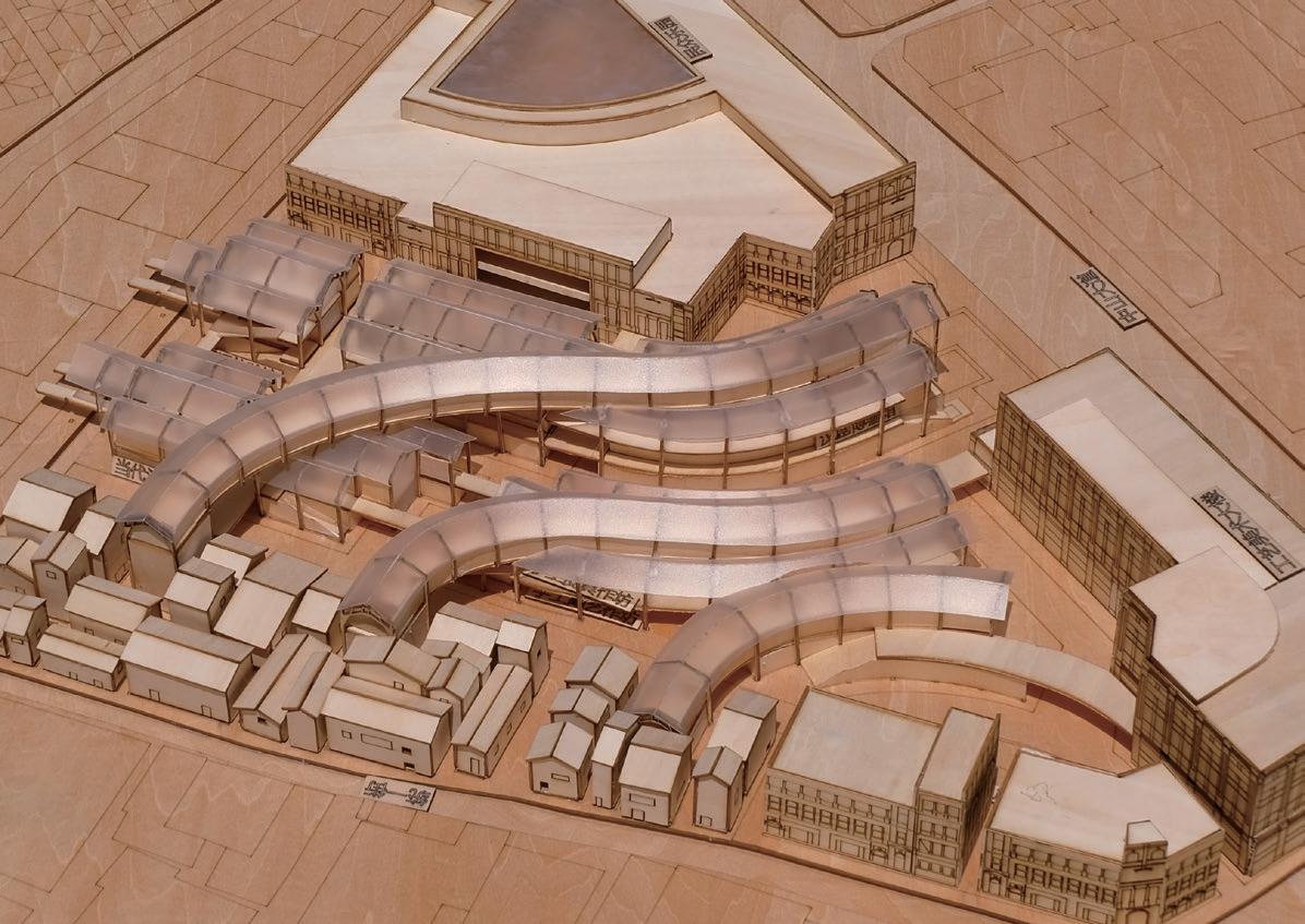
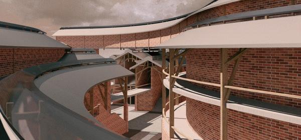
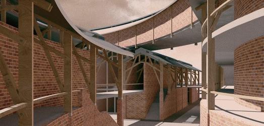
The People’s Paradise and the Handicraft Hall, two important Classic architectural heritages, had represented the prosperity of Hankou’s performing arts and handicrafts respectively for the last century.
Nevertheless, the triangular site’s interior has grown markedly congested due to recent heightened building density. Alongside the influence of contemporary culture and new cultural activities, the People’s Paradise area is no longer paradise for artists.
PEOPLE’S PARADISE
TRANSFORMATION FOR REVIVING HANDICRAFTS AND PERFORMING ARTS
Site People’s Paradise. Wuhan. China
Tutor Prof. Zhao Kui
Contact yuyu5199@126.com
Bachelor’s Graduation Project 2020-2021
 URBAN
URBAN
HandicraftHall(gallary,retail,1951)
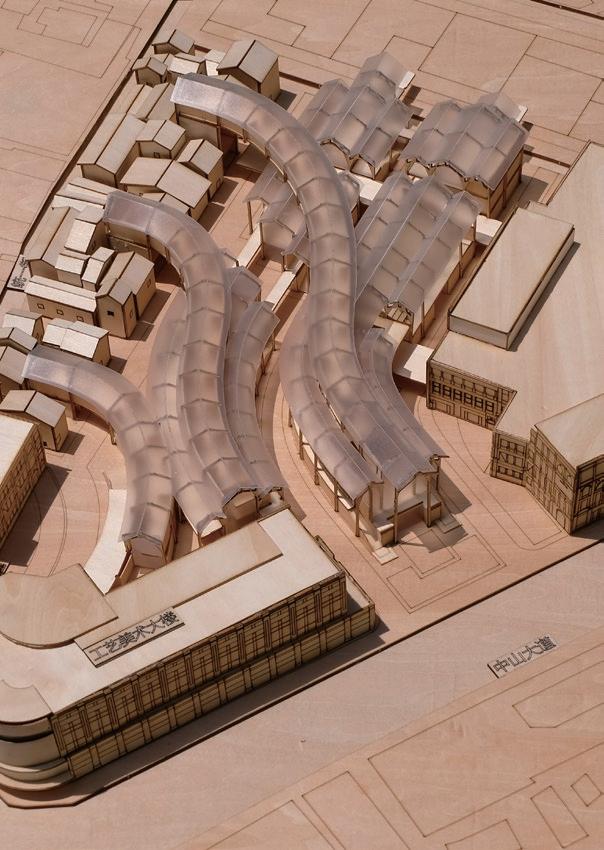
TRANSLUCENT ROOF
Light comes in from the middle of the roof, guiding the flow
People’s Paradise (theater, 1919)
SERPENTINE GALLERY
Collection of Wuhan Handicraft artworks
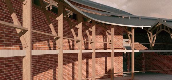
TIMBER & STEEL
Sourcing from traditional Chinese timber structure, strengthen by steel planes
ZhongShanAvenue
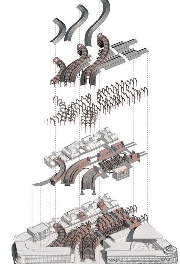
RED BRICKS
Red Brick walls are the main feature of Wuhan traditional buildings, for both dwellings and public buildings
People's Paradise
Handicraft Hall
Artists' Home
Han Museum
Handwork Studio
Live Theater Talk Show
People’s Paradise (theater, 1919)
ZhongShan Avenue
Handicraft Hall (gallary,retail, 1951)
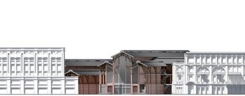


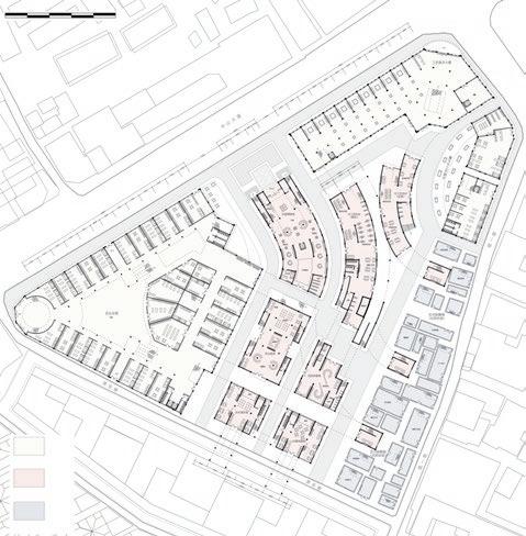
GROUND FLLOR PLAN People's Paradise Handicraft Hall Han Museum 21,00 13,00 5,00 17,00 9,00 0,00 A A Heritage 0 10 50m
Transformed
ELEVATION A-a
New-Built
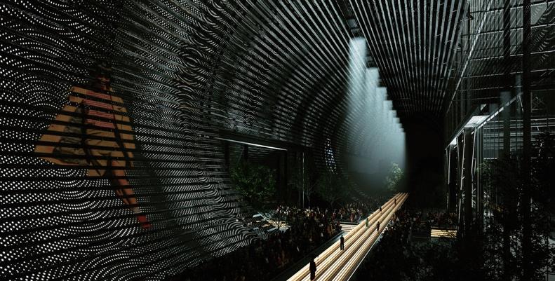
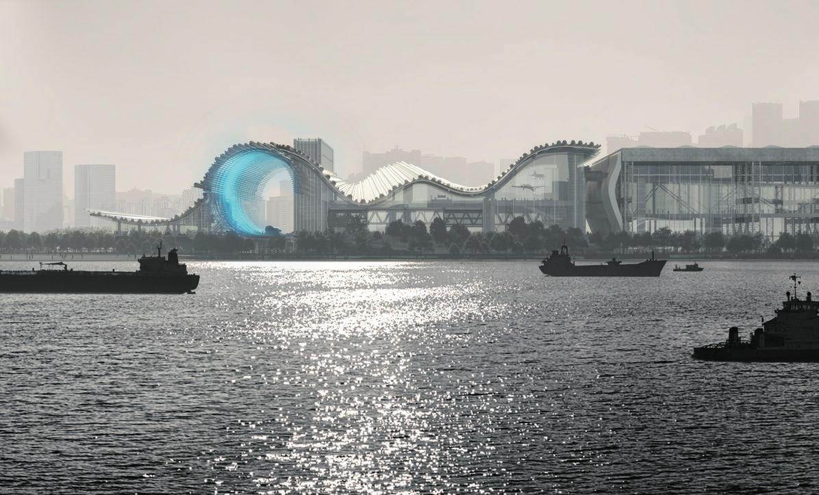
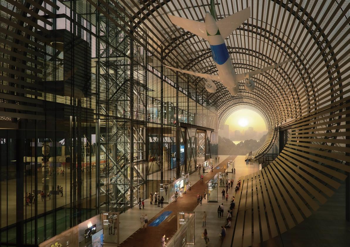
“An industrial museum in the origin of Chinese modern industry, connecting the future with the past.”
My internship at Kengo Kuma & Associates starts with this ambitious project. A project located at the riverbank of Huangpu, hoped to be the new cultural landmark of Shanghai.
The process of industrial modernization in China has started since the 1910s and most milestones took place in Shanghai. This is a city with honour and memory for industrial workers. This giant building will contain models, images, videos and archives to memorise the past. Meanwhile, interactive methods will bring visitors a marvellous vision of the future industry.
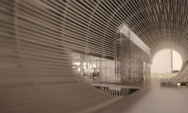
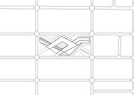
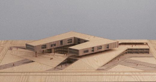
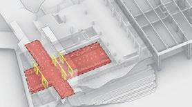
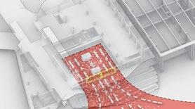
The scope as a connector between the riverbank and inner urban areas, avoiding this large scale building from being an urban blocker. Citizens would walk through the scope 24h in a day.
SHANGHAI INDUSTRIAL MUSEUM
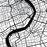
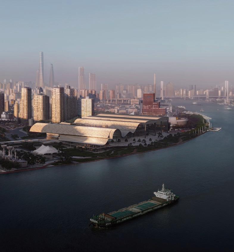 Site Huangpu Riverbank/ Shanghai
Role Design Assistant
Main work Modeling, Diagram drawings, Physical model
Shanghai Industrial Museum Design Competition 2023-2024
Ship Museum China (Pre-existing)
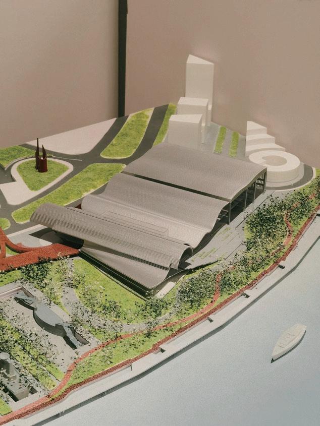
Industrial Museum Shanghai (Design proposal)
上海工业博物馆 Industrial Museum Shanghai

上海工业博物馆 Industrial Museum Shanghai
上海工业博物馆 Industrial Museum Shanghai

上海工业博物馆 Industrial Museum Shanghai

上海工业博物馆 Industrial Museum Shanghai
上海工业博物馆 Industrial Museum Shanghai


上海工业博物馆 Industrial Museum Shanghai
PHYSICAL MODEL 1:1000 BY YU CHEN / YISHU CAI
LOGO DESIGN BY YU CHEN
SEGMENTS OF-
CONCERT
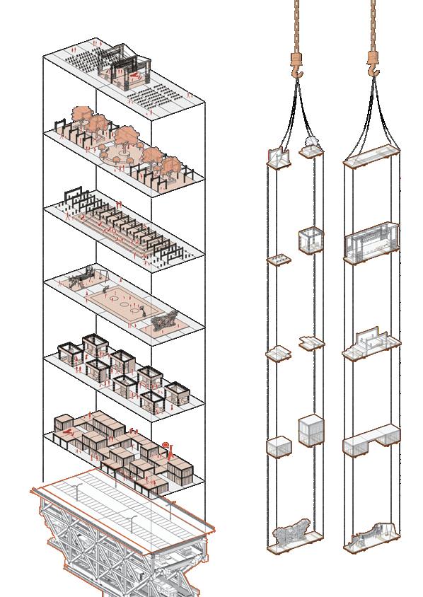
GREEN PARK
THEATRE
PLAYGROUND
EXHIBITION
STREET MARKET
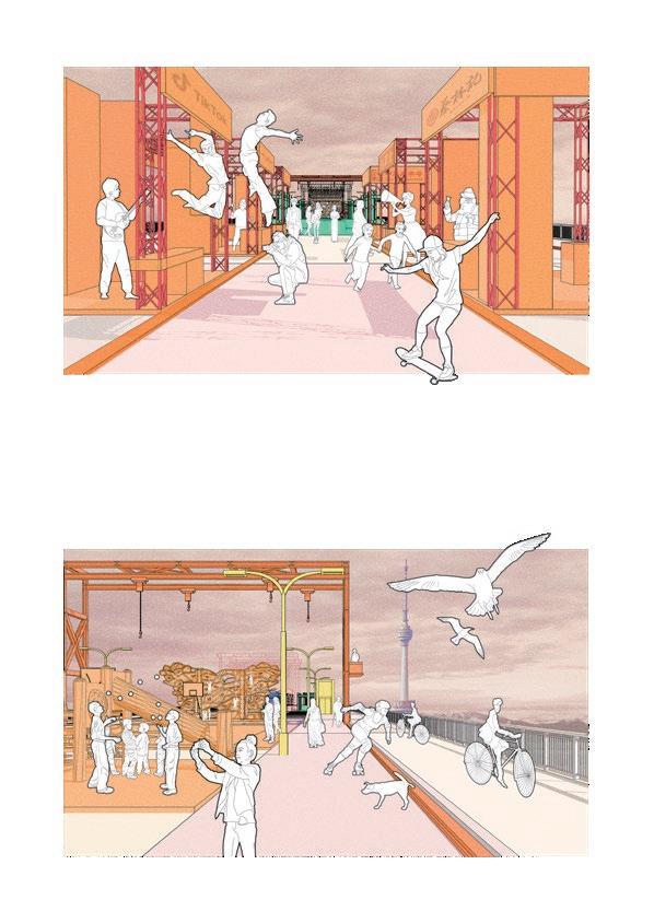
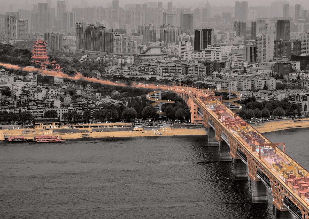
NO MORE CONCESSIONS
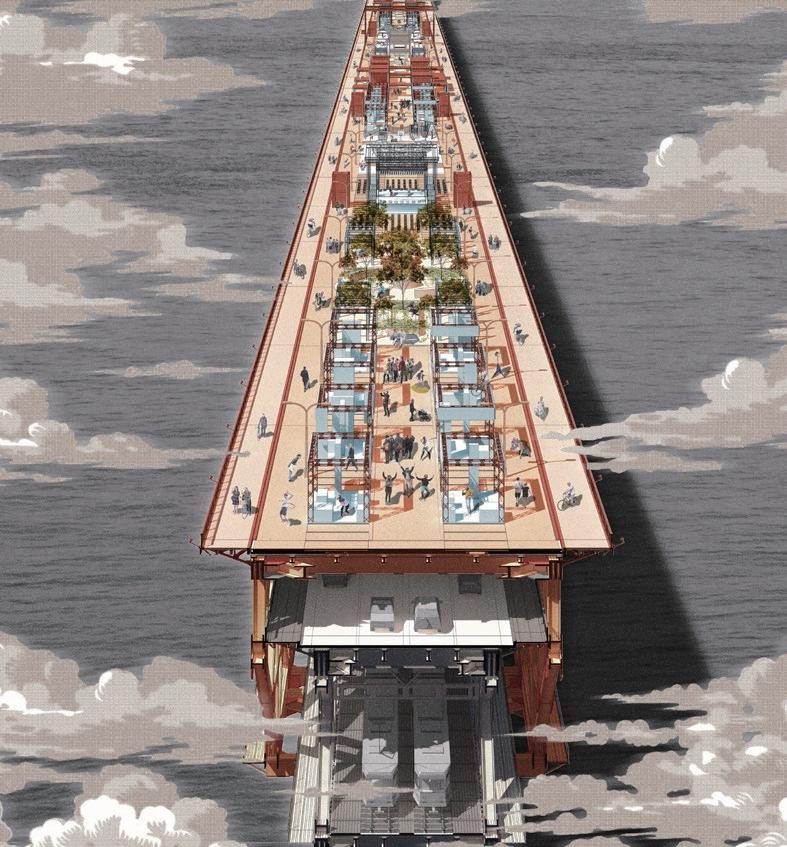
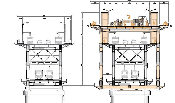
In Wuhan urban evolution, bridges reflect the concession of pedestrian space to economy and efficiency. This is rational at a certain stage of development, but it must be acknowledged that Wuhan is fundamentally a people-oriented metropolis. The city’s cultural fabric thrives on dynamic interactions between residents rather than the pursuit of mechanical efficiency.
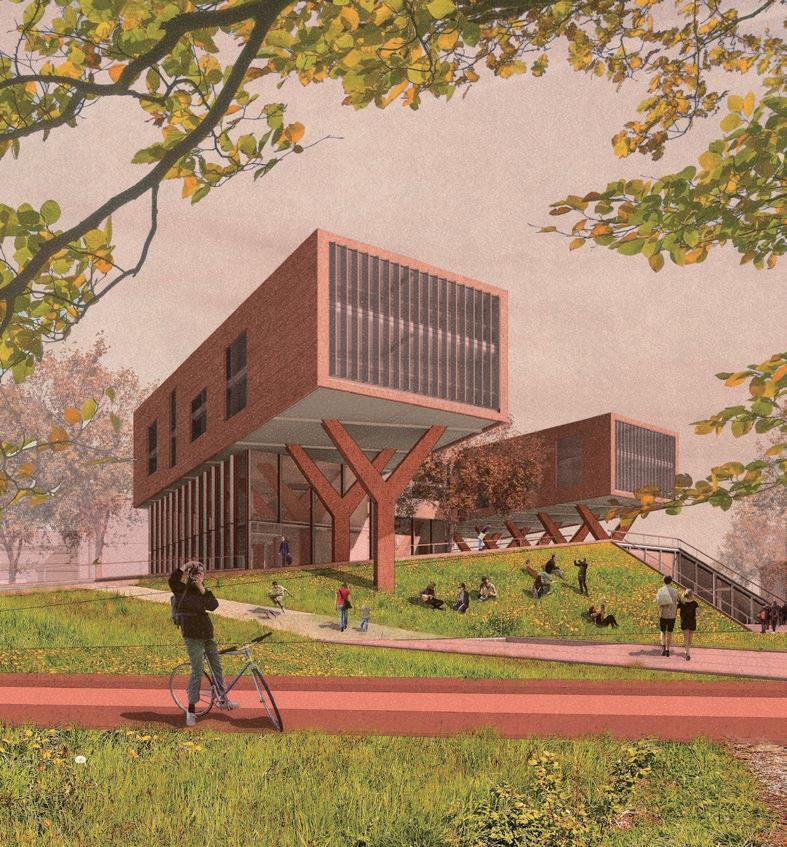
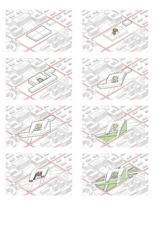
“While schools in a university could be independent from each other, a mix-used learning centre will pivotal to break boundaries .”
What are these boundaries in HUST? Within a gridbased urban planning framework, Huazhong University of Science and Technology (HUST) presents a configuration resembling a composition of discrete functional units, divided by orthogonal corridors. At the same time, most buildings follow the Soviet architectural style of the 1950s and 1960s, with square plans and façades. Therefore, the road grid and building façades form the external boundaries.
The university contains a variety of individuals, academic departments, and building structures that are independent of each other. The learning spaces and learning modes within the buildings are all different, and there is little communication and connection in learning activities. Therefore, isolated learning spaces and learning modes form internal boundaries.
WITHOUT BOUNDARIES
A CROSSOVER LEARNNING CENTRE IN GRIDPLANNED HUST CAMPUS
Site HUST campus. Wuhan. China
Tutor Prof. Qiuyu Chen
Contact chenqiuyu@hust.edu.cn
Individual academic project 2019
HOW TO BREAK BOUNDARIES
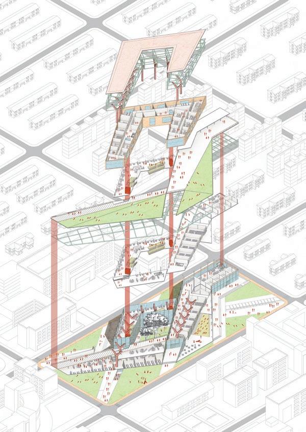
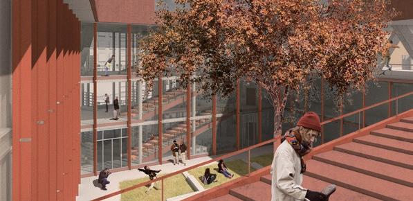
Site entry and public access align with student traffic patterns. To accommodate various learning methods, the building’s layout features distinct openings and boundaries, promoting an open atmosphere. Multiple building segments encircle interactive courtyards, facilitating internal cohesion.

? discussionself-studyexoerimentlecture S D L canteen E S D E L E S D E L S D E L E S D E L E E S D E L E S D E L E E
Entery Entery Elevator Frame Frame Open Lab Roof Terrance Green Slope Existing Canteen Group meeting Function Sunlight Flow Yard Existings Wind Enterance Green Self-study Lecture Hall Entry
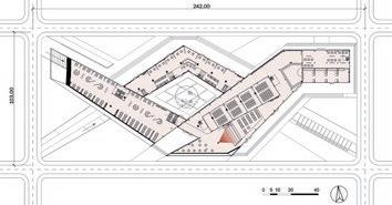
GROUND-FLOOR PLAN
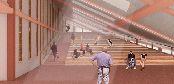
In the lecture hall, the teacher-centered learning method will act in a semi-open space, where more emphasis is placed on knowledge sharing and interaction between teachers and students.
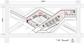
FIRST-FLOOR PLAN
In the meeting room, the team-research learning method will be supported by equipments such as round table, writing walls, display screens and shelvings.
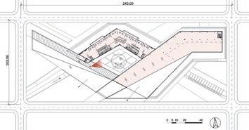
SECOND-FLOOR PLAN
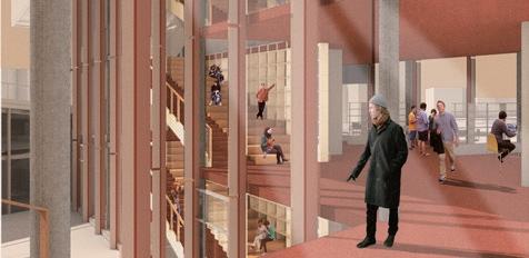
In the open courtyard, diverse student activities are visible, encouraging interdisciplinary interaction. The semi-outdoor rooftop platform also accommodates student engagement.
Growing medium--
Permeable layer--
Filter fleece/ root repellent--
Drainage layer--
Insulation layer--
Waterproof membrane--
Structure support--
Foam heat-insulating layer--
Covering layer--
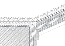
Green Roof Detail
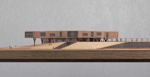
The third and fourth floors consist of distinct, open laboratory spaces, containing specialized equipment accessible by appointment. Prominent display windows enable public viewing of hands-on production, experiments, and manual processes.
Aluminium alloy sunshade
Aluminium alloy frame
Control column
Rotor
Support frame
Waterproof filler
Concrete beam
Alloy suspended ceiling
Low-E double-layer glass
BUILDING AND CLIMATE

Facade Detail
Wuhan’s climatic extremes necessitate thorough energy-efficient architectural planning. Strategies such as green roofs, while structurally demanding, effectively regulate indoor temperatures by providing thermal mass. Furthermore, window shades, strategically oriented, mitigate summer heat while harnessing winter sunlight.
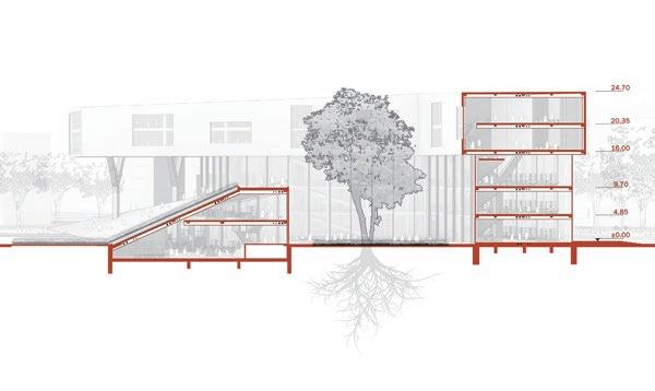
The sloped design seamlessly connects the building’s ground and roof, creating a harmonious flow and enriching the architectural experience. Green spaces are readily accessible, regardless of one’s location or approach within the structure.
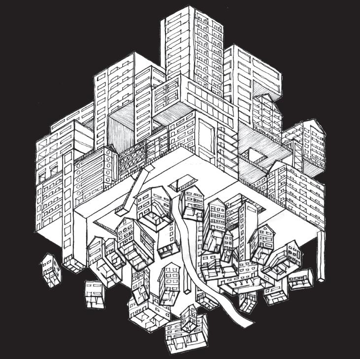
“High-rises of Istanbul are erasing its remarkable landscape, while offers nothing meaningful.”
The architectural design Associations and Assemblages-A Patternbased Housing Complex, are followed by research on existing housing patterns in Istanbul. Three types of housing forms: Self-built, Street apartment and High-rise.
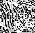
The research finding can be concluded as: By figure ground plan, self-built houses are more dense in land occupation, but have less demolish on original topography than street apartments and highrises. The collision of three patterns in my site Yenidoğan, the most over-populated area of Istanbul, guides me rethinking how they can coexist in a more topo-friendly way and create possible new housing group form.
ASSOCIATION & ASSEMBLAGE
A PATTERN-BASED HOUSING GROUP FORM IN ISTANBUL
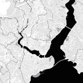
Tutor Dr. Marc Schoonderbeek
Contact M.G.H.Schoonderbeek@tudelft.nl
Master’s Graduation Project 2022-2023
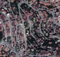
 Site Yenidoğan. Istanbul. Turkey


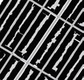
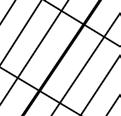
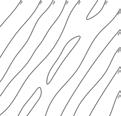


HOUSING PATTERN
ISTANBUL

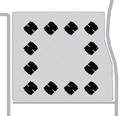


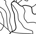
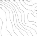
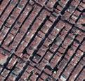
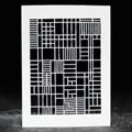
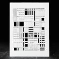
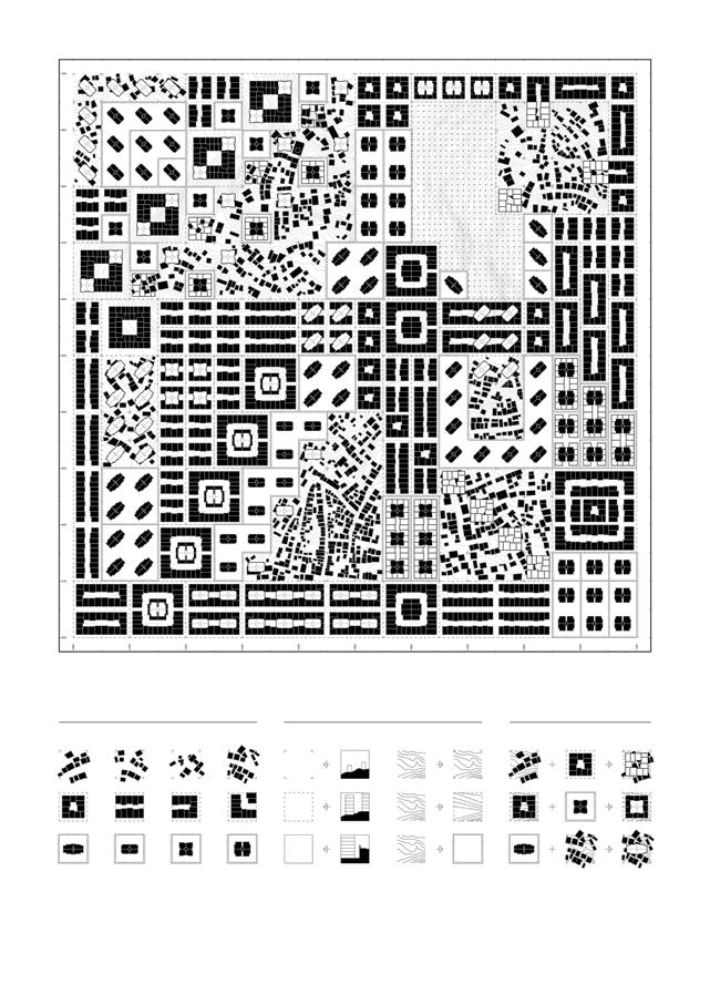
The architectural design Associations and Assemblages-A Patternbased Housing Complex, are followed by research on existing housing patterns in Istanbul. Three types of housing forms: Selfbuilt, Street apartment and Highrise. For individual housing units, they are different in scale/volume/ facade composition/land occupation. When grouped housing units land on the terrain of Istanbul, they form different patterns in plan and elevation.
The research finding can be concluded as: By figure ground plan, self-built houses are more dense in land occupation, but have less demolish on original topography than street apartments and highrises. The collision of three patterns in my site Yenidoğan, the most overpopulated area of Istanbul, guides me rethinking how they can coexist in a more topo-friendly way and create possible new housing patterns. Therefore, experiements on both plan and elevation of houses association are necessary to develop possibility.
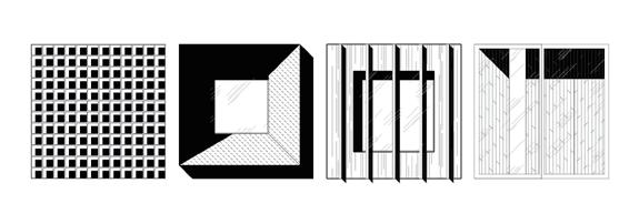
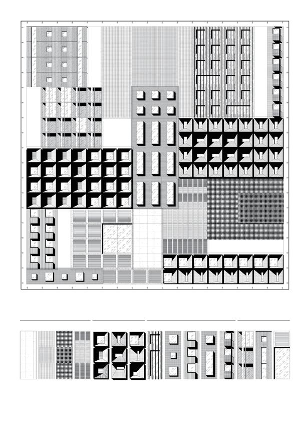
Experiment trying associations & assemblages on housing patterns in plan and elevations, is a radical and effective approach to generate possible combinations of housing patterns. Continuously, I apply this approach to the facade patterning and spatial composition on my architectural design.
SCALE
Architectural intervation are followed by research and experiments of housing patterns on three different scales.



URBAN 1000M ARCHITECTURAL 50M
300m
300m
300m
1-SELF BUILT BALTALIMANI, SARIYER
2-STREET APARTMENT KURTULUŞ, ŞIŞLI
3-HIGHRISE
IMAGE FIGURE-GROUND ROADS CONTOURS PATTERNING
KUCUKCEKMECE MUNICIPALITY SATELLITE
HOUSING PATTERN EXPERIMENT Ⅰ
ASSOCIATION & ASSEMBLAGES IN PLAN

HOUSING PATTERN EXPERIMENT Ⅱ
ASSOCIATION & ASSEMBLAGES IN ELEVATION


Existing Pattern Variations 0m 50m 1000m Self-Built Open Section Terrain Remained Borders Association&Assemblage Street Apartment Semi-open Stagenized High-Rise Colsed Flatnized Dimension W 3-10m, H 3-10m Dimension W 3-20m, H 15-22m Dimension W 20-50m, H 30.5+m Self-Built Street Apartment High-rise 0m 50m 1000m
ASSEMBLE PROCESS
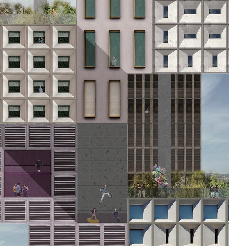
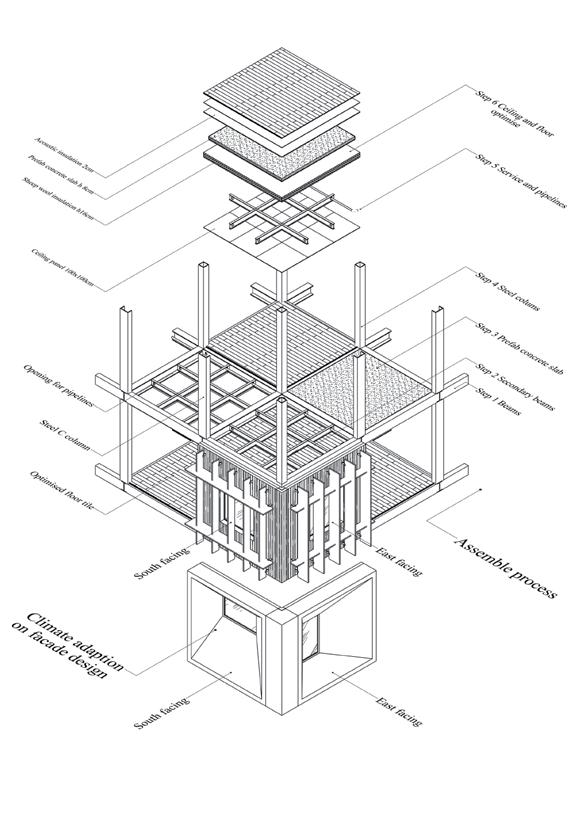
With 3 meters square grid, each piece of facade panels can be assembled and replaced depending on further need. Modular secondary structure will allow the optimise of facade, floor and ceiling as well. Ventilation system inside dwellings engaged in facade panel is independent from collective space
HOUSING PATTERN EXPERIMENT Ⅳ
ASSOCIATION & ASSEMBLAGES IN FACADE
0m 3m 50m
Enclosed Sculptural Sculptural-Flat Open-Flat
“A building without functions cannot be used, however, without memory it ceases to exist.”
The memory about mountains and lakes is wonderful to the older generation in Wuhan. With the development of infrastruction, lake reduction, water pollution, deforestation all come up, so that the new generation of urban residents get more and more difficult to contact nature, the most terrible thing is, the loss of awe and imagination about nature.
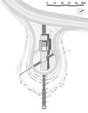
A rest station on East Lake Heart Island, like a film projector, projecting montage scenes with natural memories to visitors, combineing architecture with landscape, presenting visitors with the vastness of the universe and the smallness of humanity, triggering awe of nature and a reverie of space-time changes in the scene.
EAST LAKE MONTAGE
Site East Lake/wuhan
Tutor A.Prof. Yiwa Sheng
Contact hustshen@edu.cn
Individual academic program 2018

EAST LAKE ISLAND
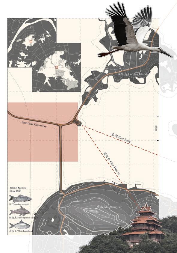
East Lake remains one of the largest urban lakes in the world, even though its surface area is shrinking year by year. Along the northeast coast of East Lake is Luyan Island, a peninsula where wild geese from the north are allowed to settle down. South of the lakeshore is Mo Mountain, thousands of years ago in the Chu cultural relics here.
Over the past 100 years, The East Lake has gone through a process of pollution and re-mediation, and many of the creatures that once thrived here no longer exist. Now the island in the middle of the lake, as an important node of the East Lake Green-way, almost every tourist will stop here to enjoy the broad view and eliminate the busy urban life.


ARCHITECTURE/ SCENE/ MEMORY
we can not decide who will come here and what would happened here, they are random and subjective. But we can design the relationship between architectural elements and landscape elements, which are objective. With specific structures and materials, visitors will experience similar memory, which we call ‘emotional resonance’.
Human Landscape Event Architecture Scene Time Memory Brain Think Like Value Life project generate Buildings Land Water Mountain Sky Architecture elements Landscape elements
Pill up
抬 Terrain
Lift up
Frame
Water&sky
Squeeze
Mountain
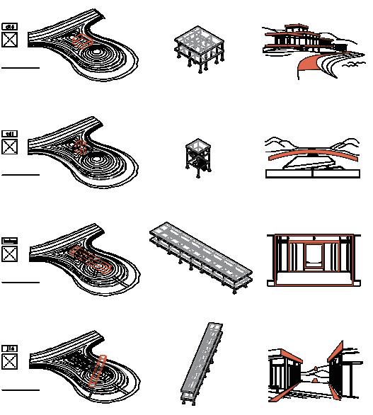
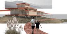
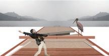
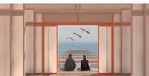
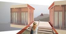
• A vision collage. Approaching the island from either the south or the north, you find the buildings stacked on top of each other, and they seem to blend in with the distant mountains and the nearby terrain.
• A upheaval scenario. Climbing up the steps the light comes through the translucent partition, like swimming out of the underwater world The head just extends out of the building, and the horizon is occupied by the water and the sky.
• A frame-worked scene. The distant mountains, water, and people are all in the frame formed by the building window. The dynamic changes outside the frame trigger the visitors’ reveries on the spatio-temporal transformation of the scene.
HOW TO BUILD SCENE
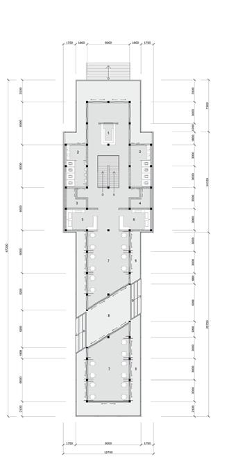
1 Information desk
2 Public lavatory
3 Clean storage room
4 Food storage room
5 Drinks
6 Simple meal
7 Dining area
叠 Buildings Seating platform
• A centralized attraction. Through the subtraction of a volume, the sight leads to the Chutiantai in the distance of Mo mountain, a relic of a thousand years ago with huge span of time and the insignificance of human beings here.
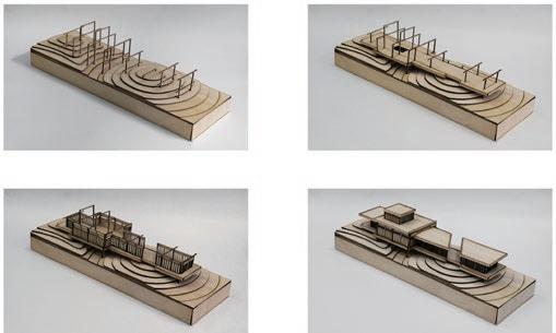
Four verbs in Chinese ‘叠’‘抬’‘框’‘夹’, indicates how form varies to correspond to different types of landscape element. Some volume adds, while some volume subtracts, to pill up, lift up, en-frame, or squeeze architectural elements.
8 Outdoor platform
9 Semi outdoor-
FORMS BUILDINGS
MONTAGE
SCENES
夹
框
Al-Mn-Mg alloyed roof sheet
High polymer waterproof sheet
10CM foam heat-insulation
1.5CM synthetic wood board
5’10CM secondary beam
5’20CM double primary beam
24’24CM wooden column
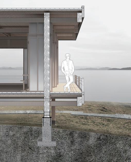


Wooden column
Screw fixation
Beams & columns

Structural unit
Movable partition
Secondary structure
STRUCTURAL SYSTEM
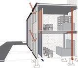
Natural materials and traditional structure. The point-shaped concrete foundation greatly reduces the occupation of the ground. The modular structure and partition greatly reduce the consumption of building materials. Movable translucent partitions make the layout more flexible and at the same time make the building more transparent inside and outside.
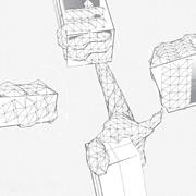
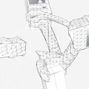
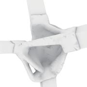
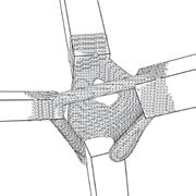
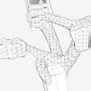
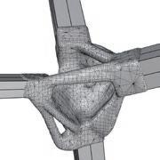
“Assisted assembly structure prototype design, based on mechanical simulation and computer vision.”
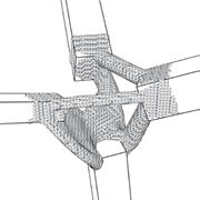
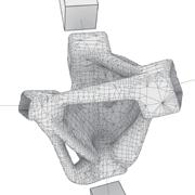
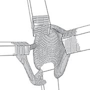
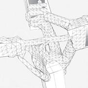
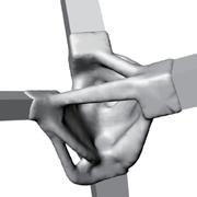
Generating efficient natural form nodes, based on mechanical simulations via Karamba3D and Topos.
3D printing, computer-vision identification, and robotic arm-assisted assembly on structural components
The course brief has challenged us to use a multi-faced design approach utilizing innovative Design-to-Robotic-ProductionAssembly and -Operation (D2RPA&O) techniques as well as Computational Design (CD) process and a Human-Robot-Interaction (HRI).
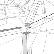
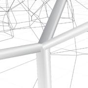
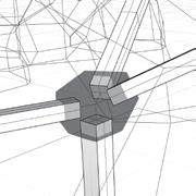
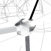
1:1 PROTOTYPE
A NATURAL-FORM NODE DESIGN IN ROBOTASSISTED ASSEMBLY STRUCTURE

 Site Campus. Delft. Netherlands
Tutor Henriette Bier
Team Fabio Sala, Thomas Kaasschieter, Yiyin Yu, Jakob Norén
Role Node Designer
2021
PROTOTYE FROM STRUCTURE ANALYSIS
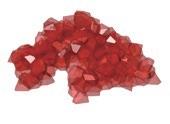
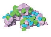
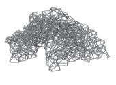
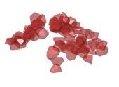
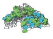
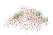



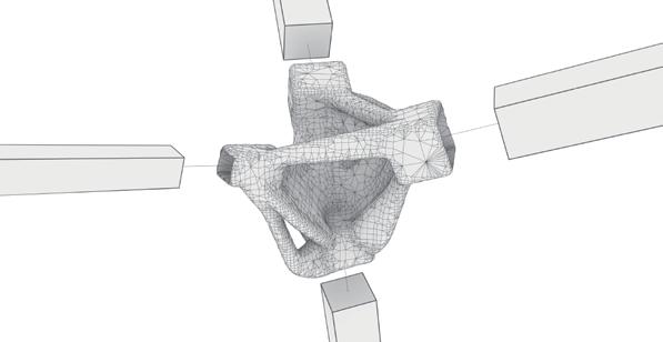
Now the beams are generated by Karamba, I optimised the node by setting three different load cases that will generate three shapes made by from three different vectors. As the final step, a boolean union is made over the three different shapes to get the final node.
The main crucial aspect in the optimization process, is deciding the amount and orientation of the load vectors acting on the node through the beams. To get an accurate result, the simulation must be split into different load cases. In our optimization we used three load cases oriented in polar directions. Thus, for each load case, the vector must be rotated 120° in the same plane, perpendicular to the beam. Using four load cases would mean steps of 90° instead.
NODE GENERATION STEPS 1-6
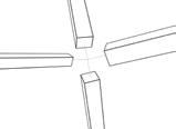
STEP 1: BEAMS BY KARAMBA
The size of beams depends on material, loads on the structure.
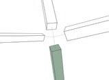
STEP 2: SET SUPPORTING BEAM
Choosing the one below

STEP 3: SET LOADING BEAMS
Choosing the three remaining ones
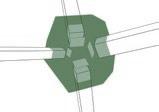
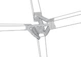
STEP 4: SET NODE FRAME
Generating a polyhedron by extending the capsurfaces of beams in order for Topos to limit the node
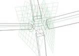
STEP 5: SET FORCES AS VECTORS
Set vector on capsurface and also perpendicular to the centerline. Rotation 120° for the next beam.
STEP 6: GENERATE RESULT BY TOPOS
Connect all elements to the Topos script to get one result for a load case.
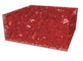
VORONOI BOX DISPATCHING CELLS SEATING AND VEGETATION
LOAD SETTING
SORTED CELLS FORCE VISUALIZATION
PIPING OPTIMISE NODE SELECTION
CREATING PLANT HOLE
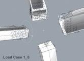
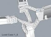
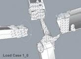
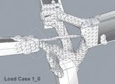
MECHANICAL SIMULATION_LOAD CASE 1
NODE GENERATION STEPS 7-9
STEP 7: REPEAT THE PROCESS WITH THE OTHER TWO LOAD CASES


9: SMOOTH

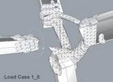
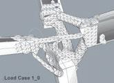
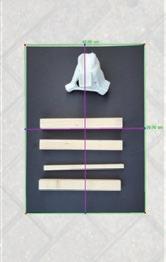
COMPUTER VISION
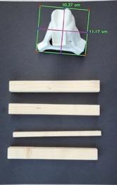
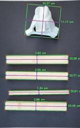
COLLABORATIVE HUMAN-ROBOT ASSEMBLY
STEP 8: JOIN THREE SHAPE RESULTS AND FORM A UNIFIED SHAPE
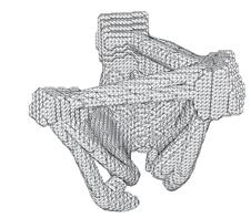

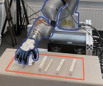
The KUKA robotic arm is a particular arm, equipped with a human-shaped hand and its seven joints make it possible to be maneuverer with large flexibility.
The robotic arm grabs the wooden beams placed on a small table in front of the robotic arm, and place the beams to the designated location, where the collaborative assembly will take place. Humans in this process will manoeuvre the robotic arm when necessary to enhance efficiency.
STEP 1: SYNCHRONIZE

STEP 2: COMPUTER VISION

STEP 4: HUMAN-ROBOT INTERACTION

STEP 3: GRAB AND ASSEMBLE
0 1/3 2/3
STEP
THE NODE’S SURFACE AND SPLIT IT WITH THE BEAMS
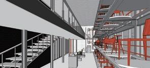
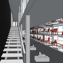
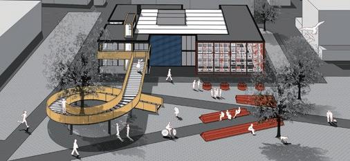
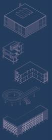
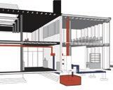
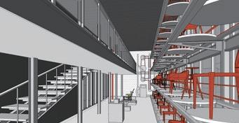
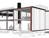
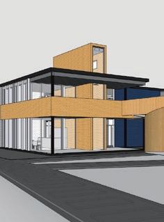
Rietveld 2.0 is about writing the next chapter of the Zonnehof in a logical and continuous way. Inspiration can be drawn from Rietveld’s detail and important design subjects, such as composition and rhythm. Rietveld 2.0 honors Rietveld’s design and use it as a base and inspiration.
DE ZONNEHOF 2.0
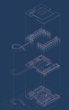
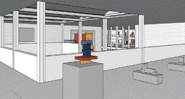
Designed in 1957 by Gerrit Rietveld, De Zonnehof Pavilion has worked as an art gallery for over sixty years. Times flies, context changed, art itself and how to exhibit artworks might have totally different from his time. With the demand of being more funcational, more sustainable, more educational, this pavilion moves towards its revonation.

SUSTAINBALE AND INTERACTIVE EXTENSION PLAN FOR RIETVELD PAVILION DE ZONNEHOF
“With new need on its function and sustainability, an renavotion and extension is necessary to De Zonnehof Pavilion.” Site

Tutor Lidy Meijers, Thomas Offermans
Individual academic project Heritage&Architecture Studio TU Delft 2021-2022









Introduction Designed by Yu Chen Tutor Lidy Meijers & Thomas Offermans Value Assessment Light De Stijl Color Monumental trees Community Exhibition Green park White column Roof windows Exhibition space Attitude Concrete Artworks Glazed brick Rietveld welcome locals and visitors Fundation Plan Roof Plan Designed in 1957 by Gerrit Rietveld, De Zonnehof Pavilion has w Times flies, context changed, art itself and how to exhibit artworks might have totally different from his time. With the demand of being more funcational, more sustainable, more educational, this pavilion moves towards its revonation...... Northeast Elevation 1:100 Southwest Elevation 1:100 Rietveld Pavilion Revonation-De Zonnehof DAI Museum Towards An Interactive 3220 6550 6550 section section 3220 6550 6550 280 3220 section 2 space space 3220 6550 280 3220 section 1 section 3220 6550 280 3220 4340 4340 1610 3220 280 6550 160 temporary exhibition space 160 3220 3220 section temporary exhibition space library lecture room conservation studio 1450 6550 280 3220 1610 4220 220 1000 1000 1000 section section installation room staff room temporary exhibition space storage room 6550 280 3220 1610 3220 1000 1000 220 1000 1000 section installation room staff room temporary exhibition space temporary exhibition space storage room 4340 6550 280 3220 1610 4220 1000 220 1000 1000 160 3220 section installation room temporary exhibition space 4340 6550 280 3220 1610 section section garderobe staff room temporary exhibition space storage room 1 2 3 7 8 Original zonnehof Coffee & library Office & storage Ramp Exhibition space storage and office original zonnehof pure exhibition with perfect visiting floor coffee floor library to the city individul from exhibition connecting the enterance Air-based heating-cooling system. putting installation room outside the original zonnehof. heating-cooling system of the extension part shares same devices with original zonnehof but keeps indenpendt from it. red pipe- exhausted air blue pipe- fresh air upgrade in four aspects --new double layer facade --new roof with more insulation --new wall with more insulaiton --old wall filled with EPS Stone cycling works as very thin subtitude for bricks, with more meanwhile making the whole wall not so thick. with red, blue, yellow color glazed stone cycling, hopes to looks columns remian white painted in extension part, however beams electrics. In general, will save space height which is quite important double layer glass extension part keep in and out Explosion Space Structure First Floor Ground Floor ground floor coffee first floor library public to the city individul from exhibition space connecting the enterance ground floor coffee first floor library public to the city individul from exhibition space connecting the enterance ground floor coffee first floor library public to the city individul from exhibition space connecting the enterance for staff and lecture individual enterance southeast door on the back connecting the park with building attractive and interactive method to the zoonehof showing windows on facade interactive surface people in the park read First Floor Plan 1 old brick wall & new wall 2 old roof & new roof 6 new double layer wall 3 new glass windows 7 old chimney & new roof Heating-cooling System old wall filled with EPS Insulation Layer Upgrade Matericality Brick Glass
Rietveld Pavilion Amsterfoot/Netherlands
TO REMAIN COLORS AND PROPORTATION TO MAKE A GREEN PARK
TO WELCOME LOCALS AND VISITORS TO INTERACTIVE TO SHOW TO THE ZONNEHOF AS AN ARTWORK


De Zonnehof 1.0
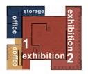
move storage&office out keep a pure exhibition space
Coffee&Library
Office&Storage
Ramp
Exhibition space
ground fllor coffee first floor library 24h open to community for staff and lecture with spreated entry connect park with building as a more interactive entry key show windows as open interface towards the zonnehof
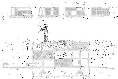
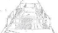
Conceptual sketch
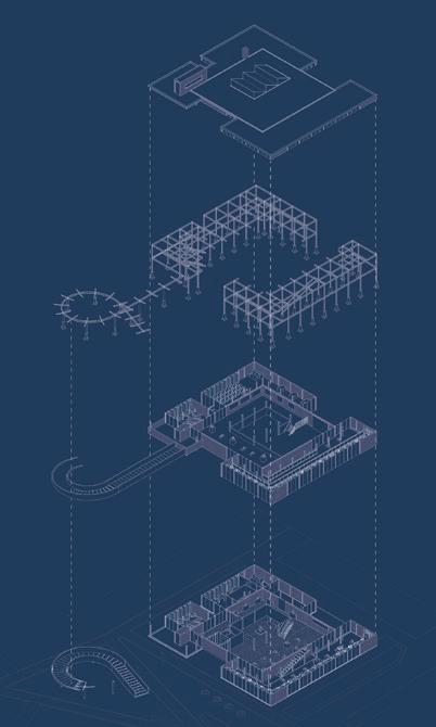
DE ZONNEHOF 2.0 SPATIAL EXPLOSION
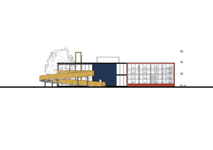
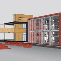
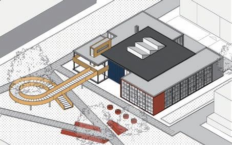
By adding several box colse to the existing Zonnehof, I extend the flat regular facade into irregular. However, not randomly, but according to the initial attitudes which Rietveld presented on its facade.
Red is for echibition space also means active.
Yellow is for the enterence, library and coffee also means positive. Blue is for meeting, studio and staff offices also means calm.
&
Grid & limition Interface optimise Interactive park New volume Interface optimise New fundation Key windows Interface optimise New structure
Zonnehof 1.0
Program Green area
trees
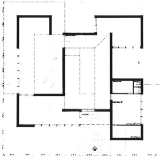
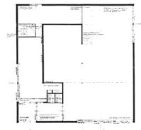
21X21Meter proposal of the Zonnehof Pavilion was the final constructed version. Before that, Gerrit Rietveld proposed a more compleate and multe-functional plan layout, called DE ZONNEHOF 0.0, which failed to be realize because of limited budget. DE
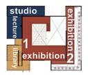
280 4340 1450 4340 280 1000 1610 1450 280 1000 1610 4340 1450 4340 280 1000 1610 1450 280 1000 1610 1610 3220 1450 6550 1610 3220 280 6550 1450 32760 3220 3220 4220 270 1000 1000 1000 220 1000 1000 1000 220 1000 3220 3220 160 160 19640 19640 temporary exhibition space 1000 220 1000 1000 1000 220 1000 1000 1000 220 1000 1000 270 1000 1000 1000 270 1000 1000 270 19640 section 1 section 2 270 section 1000 1000 1000 section 220 1000 1000 1000 220 1000 1000 1000 220 1000 1000 1000 220 1000 1000 1000 220 1000 1000 1000 270 1000 1000 1000 220 1000 section section 1000 1000 220 section section 1000 section 2 section 1 1000 1000 220 1000 1000 1000 220 1000 1000 1000 2220 220 enterence garderobe information tickets office coffee installation room archive staff room temporary exhibition space temporary exhibition space permanent exhibition space permanent exhibition space temporary exhibition space storage room permanent exhibition space library lecture room conservation studio wc 4340 4340 32760 1450 6550 280 3220 1610 6550 1450 280 3220 1610 1000 1000 220 1000 220 1000 1000 220 1000 1000 270 4220 3220 3220 2220 3220 3220 160 160 19640 19640 section 1 section 2 section section section section 1000 220 1000 1000 270 1000 220 garderobe office coffee installation room archive temporary exhibition space temporary exhibition space permanent exhibition space permanent exhibition space temporary exhibition space storage room 1000 4340 1450 4340 280 1000 1610 1450 280 1000 1610 32760 32760 1450 6550 280 3220 1610 6550 1450 280 3220 1610 1000 1000 1000 220 1000 1000 220 1000 1000 1000 220 1000 1000 1000 270 4220 3220 3220 2220 3220 3220 160 160 19640 19640 section 1 section 2 270 section section 1000 1000 1000 section section 220 1000 1000 1000 220 1000 1000 1000 220 1000 1000 1000 220 1000 1000 1000 220 1000 1000 1000 270 1000 1000 220 1000 1000 wc wc 270 1000 1000 220 enterence garderobe information tickets office coffee installation room archive temporary exhibition space temporary exhibition space permanent exhibition space permanent exhibition space temporary exhibition space storage room 1000 280 28320 1450 280 1000 1610 1450 280 1000 1610 28320 1450 280 1000 1610 1450 280 1000 1610 1610 3220 1450 6550 1610 3220 280 6550 1450 32760 32760 1450 6550 280 3220 1610 6550 1450 280 3220 1610 3220 3220 4220 270 1000 1000 1000 220 1000 1000 1000 220 1000 3220 1000 3220 160 160 19640 1000 temporary exhibition space 1000 220 1000 220 1000 1000 220 1000 1000 1000 1000 1000 1000 220 1000 1000 1000 220 1000 1000 270 1000 1000 1000 270 1000 1000 270 220 1000 1000 1000 270 4220 3220 3220 2220 3220 3220 160 160 19640 270 section section 1000 1000 1000 section section 220 1000 1000 1000 220 1000 1000 1000 220 1000 1000 1000 220 1000 1000 1000 220 1000 1000 1000 270 1000 1000 220 1000 1000 1000 1000 1000 220 1000 section 4 1000 1000 220 section 1000 1000 1000 220 1000 1000 1000 220 1000 1000 1000 2220 270 1000 1000 220 220 enterence garderobe information & tickets staff room temporary exhibition space temporary exhibition space permanent exhibition space permanent exhibition space temporary exhibition space storage room permanent exhibition space library 1000 280 4340 4340 4340 4340 1610 3220 1450 6550 1610 3220 280 6550 1450 32760 32760 1450 6550 280 3220 1610 6550 1450 280 3220 1610 3220 3220 4220 270 1000 1000 1000 220 1000 1000 1000 220 1000 3220 1000 3220 160 160 19640 19640 160 160 3220 3220 3220 1000 temporary exhibition space 3220 3220 1000 220 1000 220 1000 1000 220 1000 1000 1000 1000 1000 1000 220 1000 1000 1000 220 1000 1000 3220 1000 1000 270 220 1000 1000 1000 270 4220 3220 3220 2220 3220 3220 160 160 19640 19640 160 160 3220 3220 3220 3220 3220 3220 section section section section section section 1000 1000 220 1000 1000 section section section 2220 270 1000 1000 220 garderobe office coffee archive staff room temporary exhibition space temporary exhibition space permanent exhibition space permanent exhibition space temporary exhibition space storage room permanent exhibition space library lecture room conservation studio 1000 280 28320 1450 1610 1450 280 1000 1610 28320 1450 280 1000 1610 1450 280 1000 1610 1610 3220 1450 6550 1610 3220 280 6550 1450 32760 32760 1450 6550 280 3220 1610 6550 1450 280 3220 1610 3220 3220 4220 270 1000 1000 1000 220 1000 1000 1000 220 1000 3220 1000 3220 160 160 19640 160 160 3220 3220 3220 1000 temporary exhibition space 3220 3220 1000 220 1000 220 1000 1000 220 1000 1000 1000 1000 1000 1000 220 1000 1000 1000 220 1000 1000 3220 270 1000 1000 1000 270 1000 1000 270 220 1000 1000 1000 270 4220 3220 3220 2220 3220 3220 160 160 19640 160 160 3220 3220 3220 3220 3220 3220 section 1 section 2 270 section section 1000 1000 1000 section section 220 1000 1000 1000 220 1000 1000 1000 220 1000 1000 1000 220 1000 1000 1000 220 1000 1000 1000 270 1000 1000 220 1000 1000 1000 1000 1000 220 1000 section 1000 1000 220 section 1000 section section 1000 1000 220 1000 1000 1000 220 1000 1000 1000 2220 270 1000 1000 220 220 garderobe office coffee installation room archive temporary exhibition space temporary exhibition space permanent exhibition space permanent exhibition space temporary exhibition space storage room permanent exhibition space library lecture room conservation studio 1000
ZONNEHOF
the idea of 0.0 by adding modular volume acording original grid.
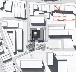
plan by Gerrit Rietveld at 1956 GROUND FLOOR PLAN SITE PLAN
2.0 is an renovation and extension proposal based on 1.0, regarding
Sketch
DE ZONNEHOF
FUNDATION & ROOF
DE ZONNEHOF 0.0
2.0 DE ZONNEHOF 1.0 FIRST FLOOR PLAN
PLAN 21X21 METER

SUSTAINABILITY STRATEGIES
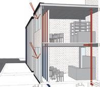
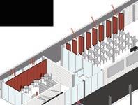
HEATING-COOLING SYSTEM UPGRADE
AIR-BASED EXTERNAL SYSTEM
partly
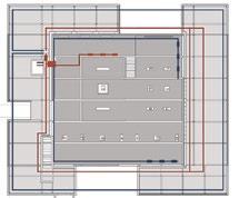
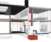
Air hole will hide in the cavity next to where floor and wall meets. Red pipelines for exhausted air, bile pipelines for fresh cooled air.

INSULATION LAYER UPGRADE
DOUBLE LAYER FACADE

MATERICALITY UPGRADE
BRICK
Stone cycling works as very thin subtitude for bricks, with more sustainablity and less weight. Saving more space to insulation layer


STEEL
columns remian white painted in extension part, however beams with holes will be used in new part, for making space for pipes and electrics.


PIR GLASS EPS
Insualtion filled in walls for extension part

Double layer glass windows for extension part

Insulation filled in old walls for Zonnehof 1.0
 Next to the original installation room, external heatingcooling system will be build while using old pipelines
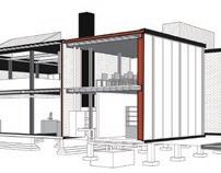
South-faced atrtight sliding curtains, creavting warm cavity, with water pre-heat pipeline
Underground watertank to keep water cold or warm, for cooling air.


KEY
3 NEW GLASS WINDOWS
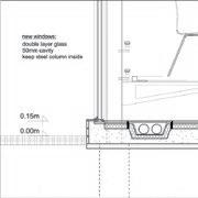
6 NEW DOUBLE LAYER WALL
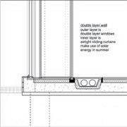
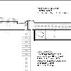
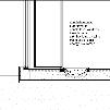
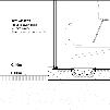
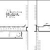
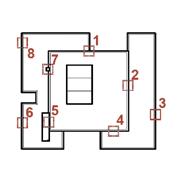
WHERE OLD MEETS NEW
1 OLD BRICK WALL & NEW WALL
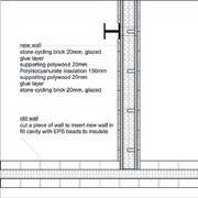
4 OLD WINDOWS & NEW ROOF
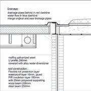
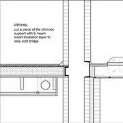
7 OLD CHIMNEY & NEW ROOF
2 OLD ROOF & NEW ROOF

5 OLD ROOF & NEW WALL
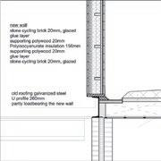
8 NEW WALL
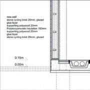
MARK ON ROOF PLAN SUSTAINABILITY STRATEGY
WINDOW SECTION 4-
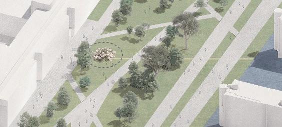
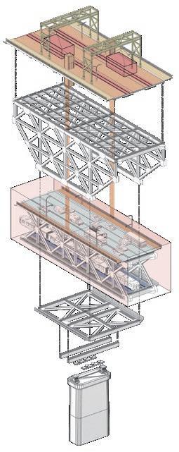
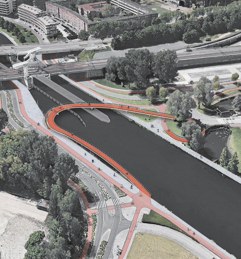
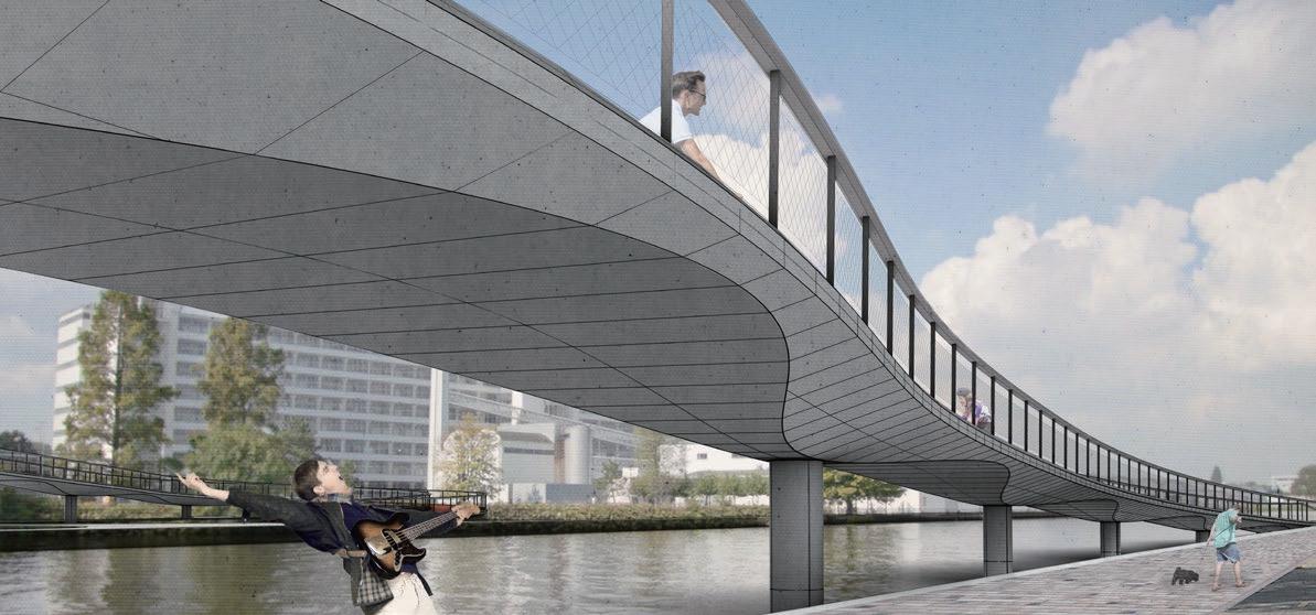
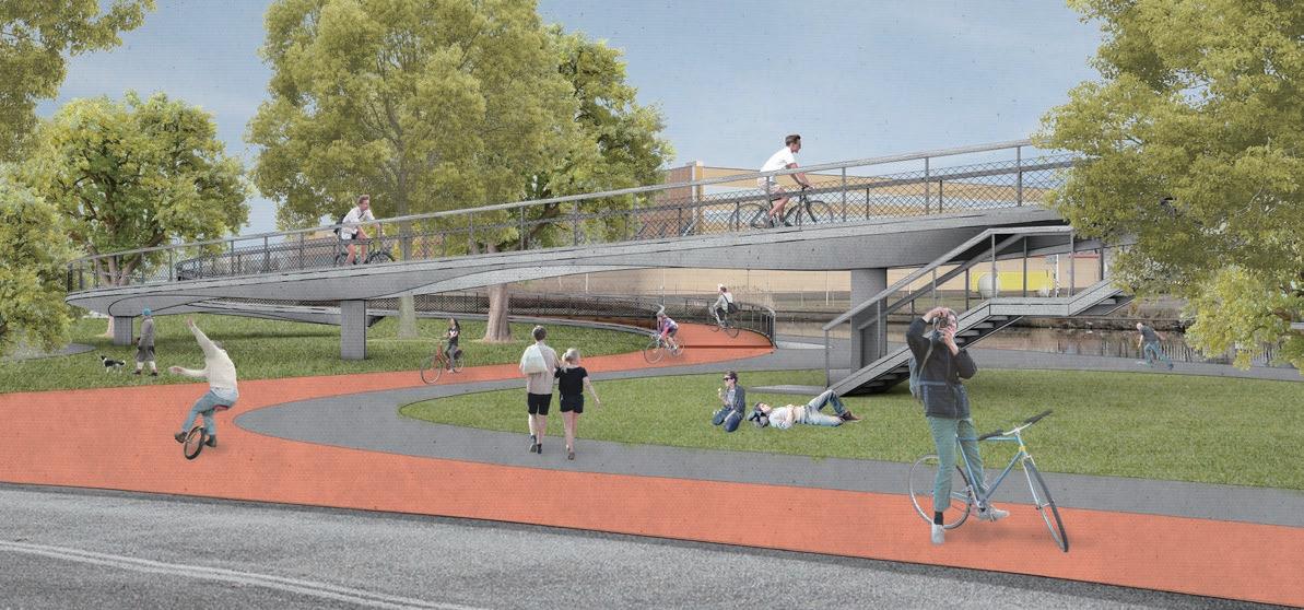
“A bridge is expected here, connecting the left bank to the right, connecting the neighborhood to the center of Rotterdam, as well connecting the current condition to future development.”
On the left bank, the monumental old factory Van Nelle turned into a future working hub. On the right bank, the prison building De Schie stands with its orange facade and strong characters.
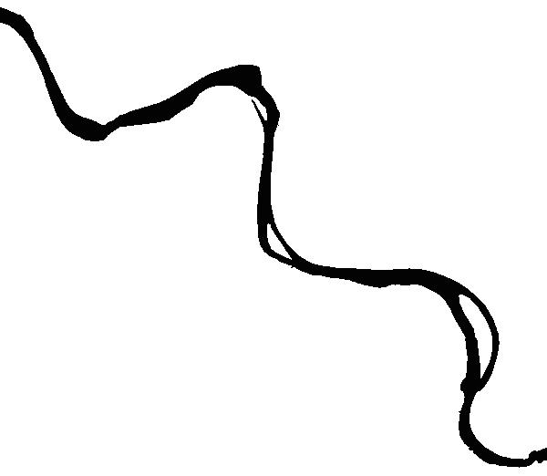
The site is located at the Delfsehavense Schie, surrounded by several neighborhoods and local spots. The spaanse polder area was previoulsy an industrial site with heavy water traffic, and is currentlly transforming into innovative start-up hub along with the redevelopment of the Van Nelle Fabriek. The prison at the Blidorpse Polder has been known as a criminal area, but it’s now transforming to incorparate with the large greenery and landscape park around.
The new bridge is proposed to serve the cyclists and pedestrians, connecting the west and east bank, along with the existing railway bridge and road bridge adjacent to it.


 URBAN
URBAN


 Site Huangpu Riverbank/ Shanghai
Role Design Assistant
Main work Modeling, Diagram drawings, Physical model
Shanghai Industrial Museum Design Competition 2023-2024






 Site Yenidoğan. Istanbul. Turkey


 Site Campus. Delft. Netherlands
Tutor Henriette Bier
Team Fabio Sala, Thomas Kaasschieter, Yiyin Yu, Jakob Norén
Role Node Designer


 Next to the original installation room, external heatingcooling system will be build while using old pipelines
South-faced atrtight sliding curtains, creavting warm cavity, with water pre-heat pipeline
Underground watertank to keep water cold or warm, for cooling air.





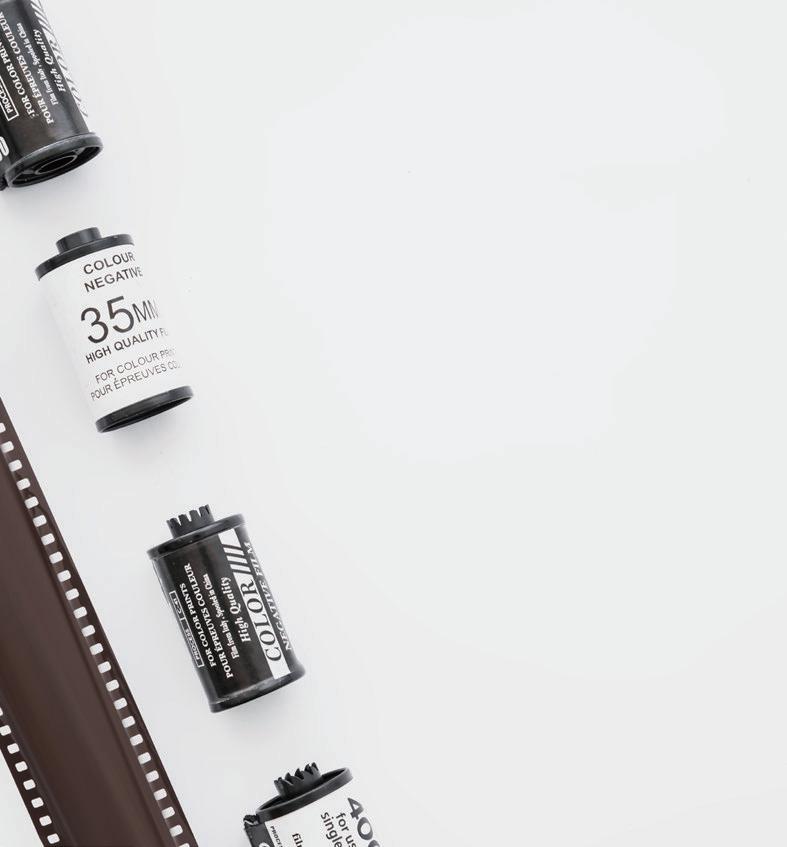
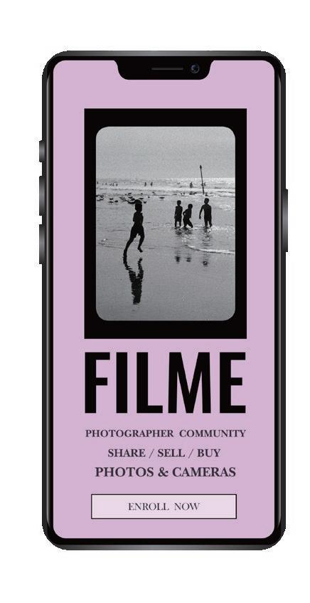
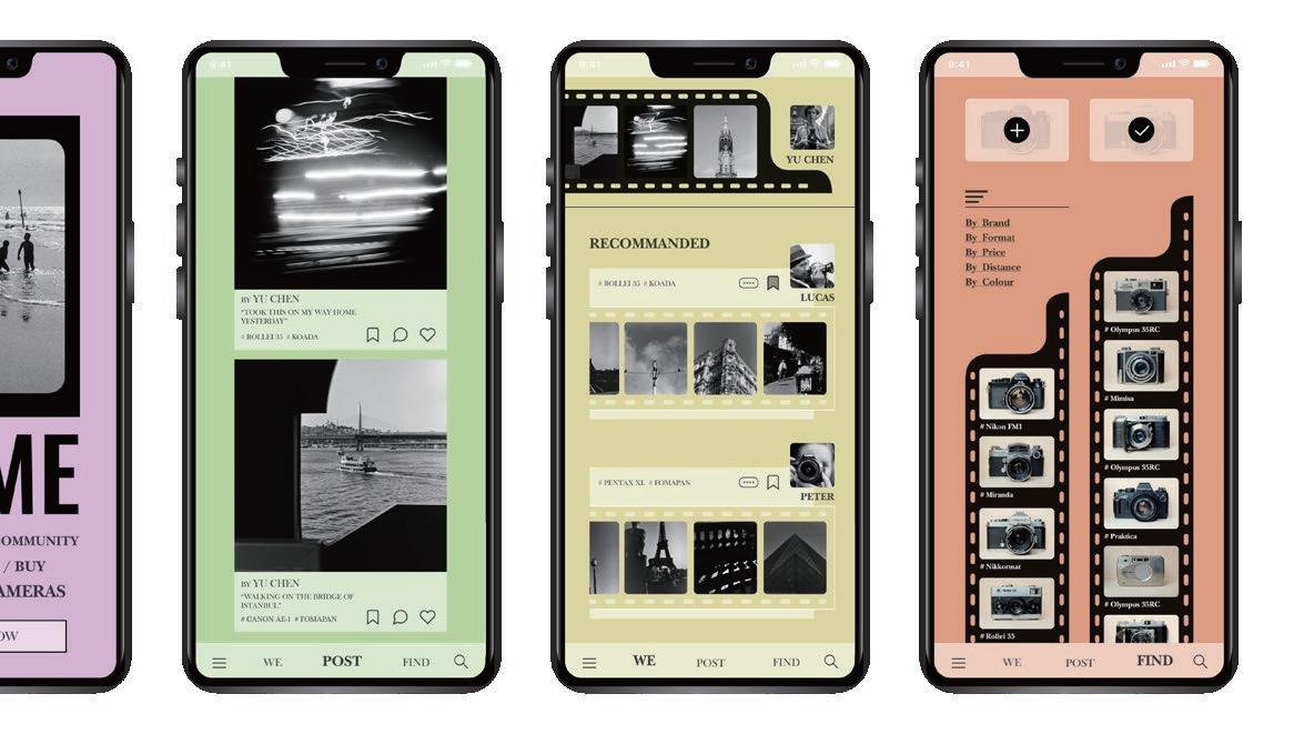


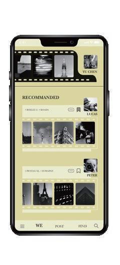

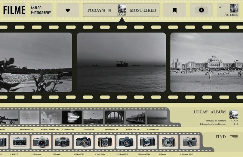
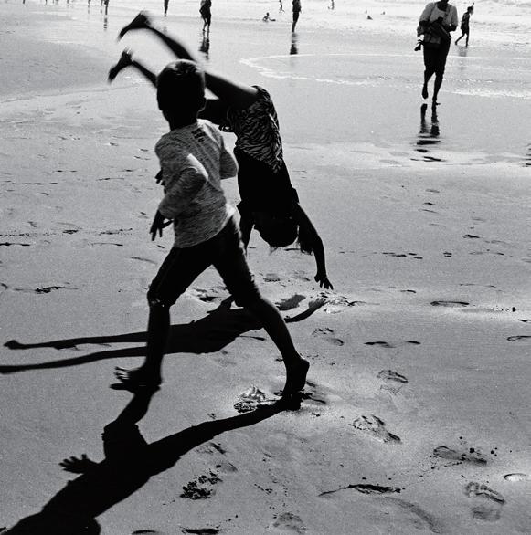
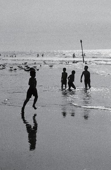
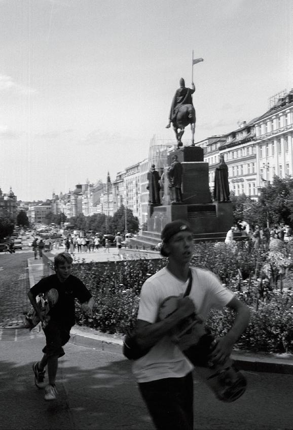
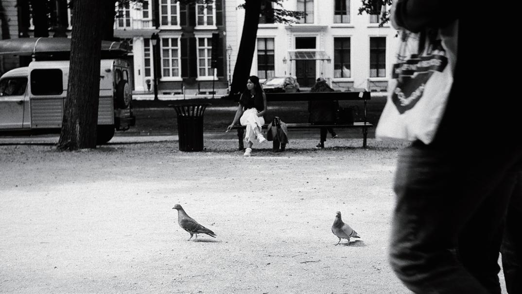
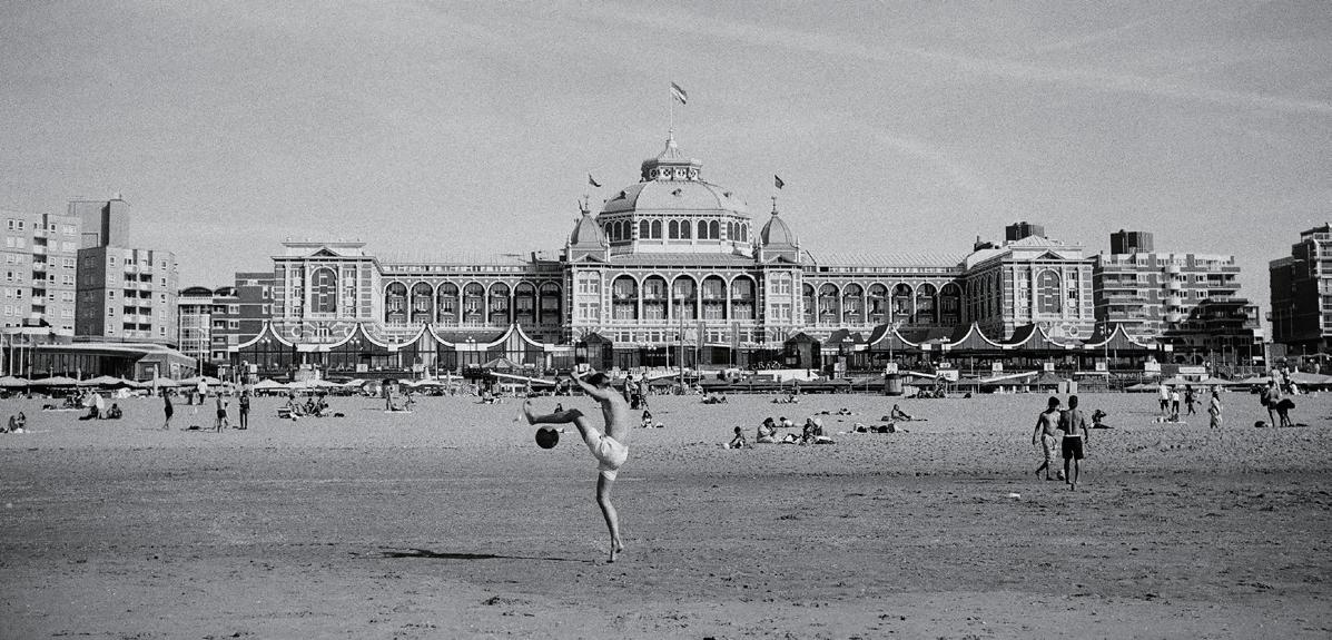
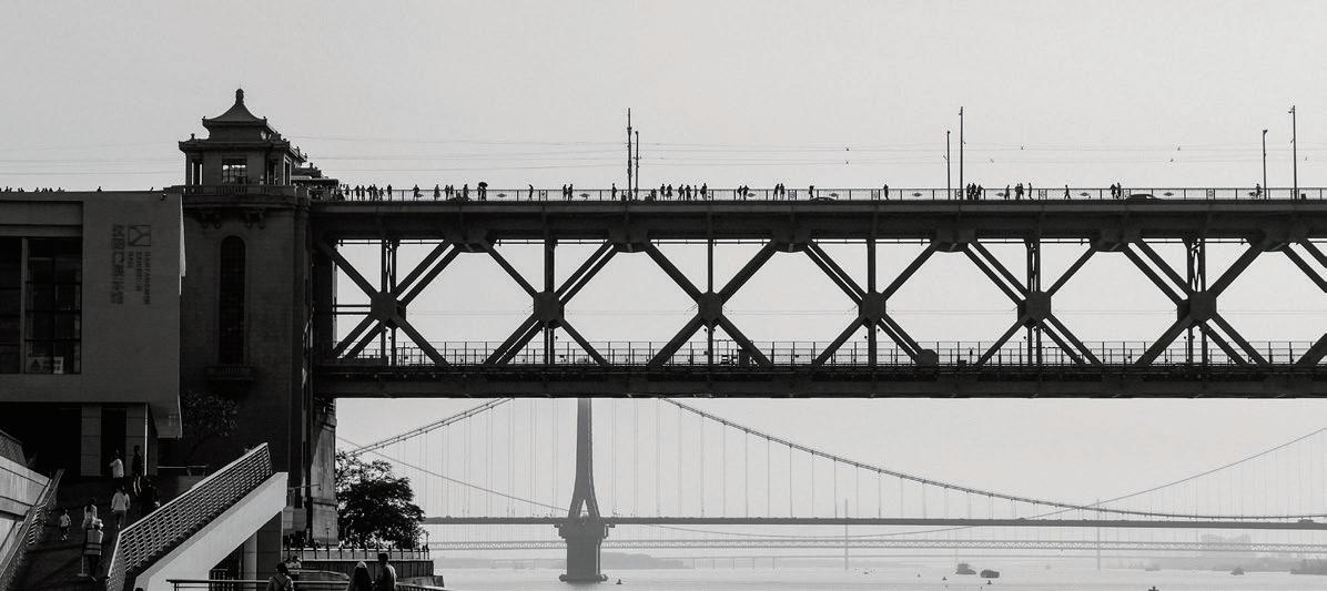
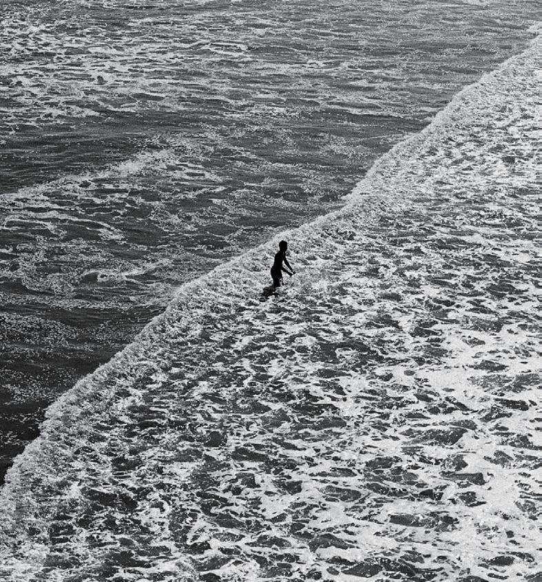 FILM FOMAPAN 100
CAMERA ROLLEI 35T/PENTAX ME/PETRI COLOR 35
