
3 minute read
Final Solution

by 木子蘋
Prototype Refnements
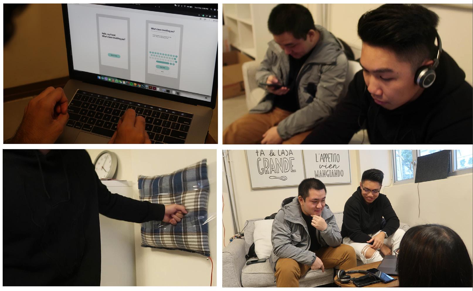
Based on the feedback garnered from the usability test, we revised the high fdelity prototype once more for the fnal solution. Many features were discussed and weighed against each other. Some future improvements were not feasible given the physical, fnancial, and time constraints, but we have iterated one last time to produce the fnal solution.
Advertisement
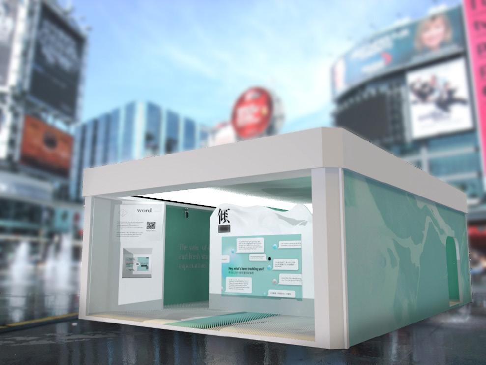
Exterior Space
- Rename all the spaces
Telling Board->Word, Shouting Board->Sound, Punching Board->Force - Enlarge the space by a factor of two A bigger area is needed in order to aford more people at a time. - Change the texture on the outside wall as well as move the logo from outside to the inside board to make it less like a cosmetic shop. - Improve the visual texture and make it look more artful and abstract.

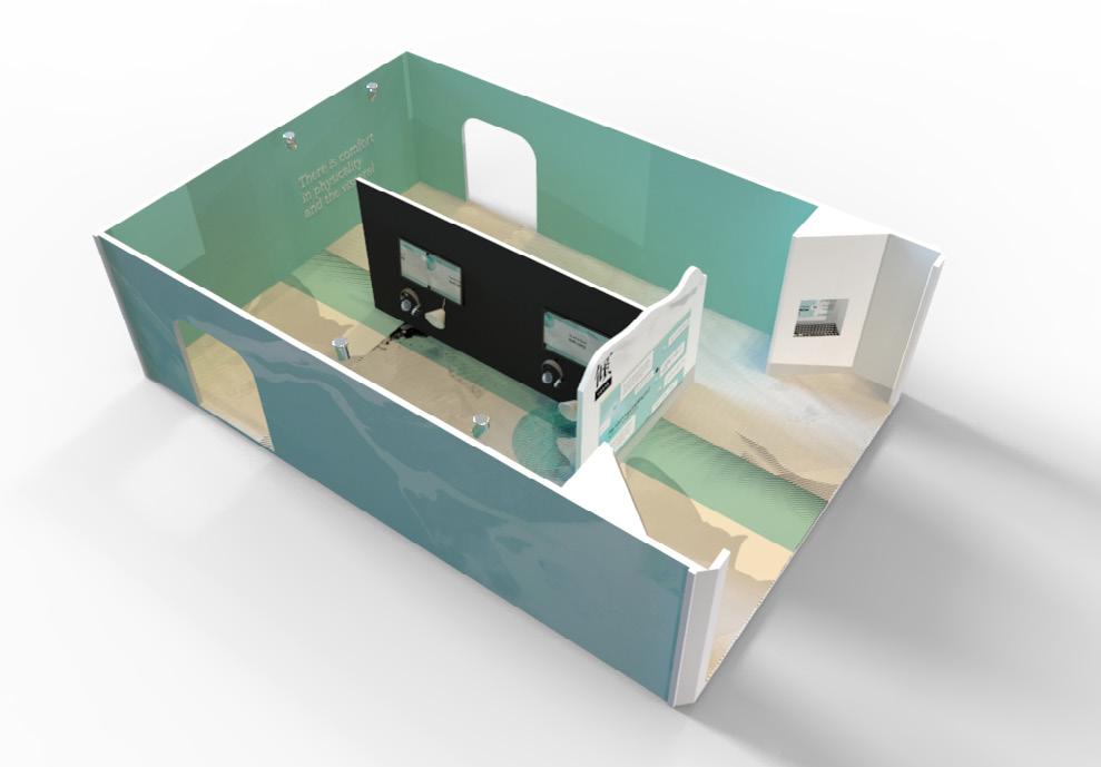
Word Space
- Add the logo and change the shape of the main board, visitor can easily recognize the theme by walking pass the entrance. - Move kiosks from open to an insidious space to protect user’s privacy. Due to ergonomics concerns, we modifed the shape of the input device into a vertical screen and physical keyboard.
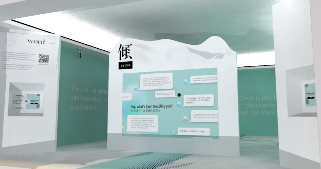

The word space has been revised to accommodate, translation, the new horizontal screen and to make the writing and commenting separate tasks. The main screen has also been updated with an enhanced visual design. For writing we made sure to revise with new user input, such as a toggle to delay posting, an input box for email and a tagging feature to categorize stories into diferent groups. For browsing, we made an additional screen to let users choose what type of comments they would like to read. Long and short stories can be accommodated as the boxes can be collapsed and expanded.
Word Space: Writing a story mobile UI
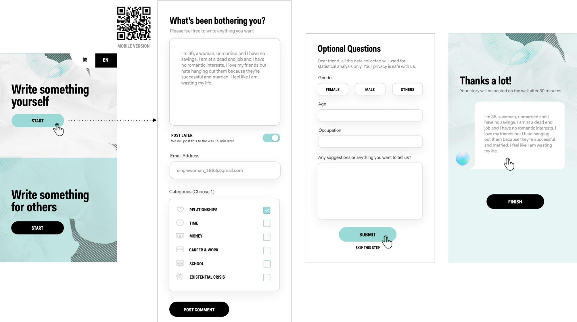
Word Space: Commenting on a story mobile UI

Sound Space
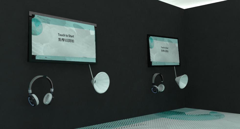
- Leave more space between the two sets of devices for privacy concerns. - Originally, the instructions are merely displayed on the screen. We added voice instructions to make the human-machine interaction smoother and more like talking to a person.
- Allow users to choose topics before listening to others’ stories. - Changed the way of the interaction of listening to others’ stories. Before, users can only listen to one recording and it plays automatically. Now, they can select three from a playful bubble display. - The instructions are more detailed and refned. The interaction of the recording and listening to others is improved.
Sound Space: Screen Instructions and UI

In the sound space, we focused on streamlining the experience from recording to listening. the main revision we made is to add a listening screen that sorts recorded messages by category, and a playful bubble interface where people can press to play any message randomly.

Force Space
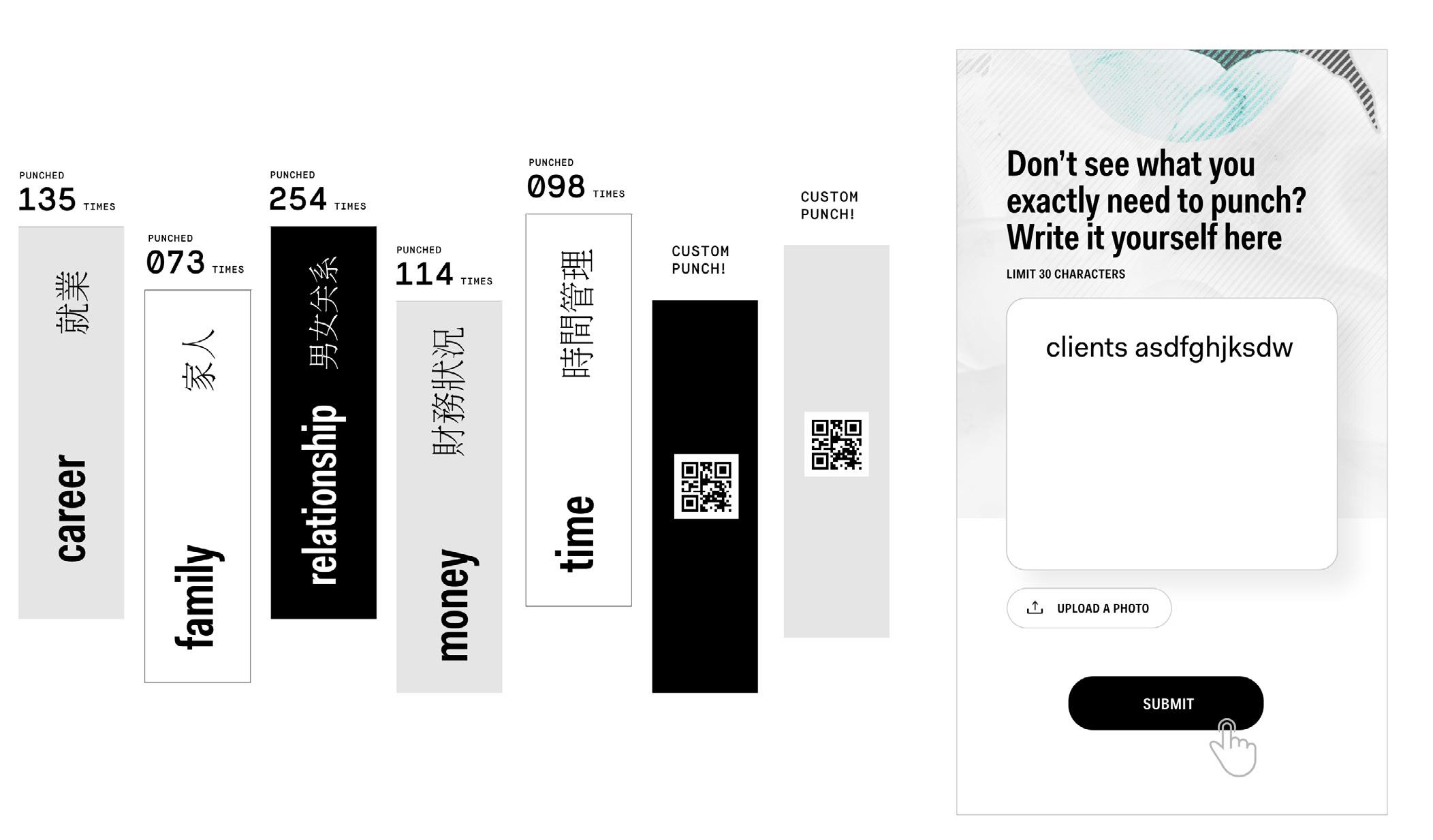
- The original punching board looks not comfortable to punch, replaced it with a softer cushion, besides, it built with a counter to calculate how many times of punch. - Instead of printing prompts on the board, there will be a projector hanging on the ceiling to project on the cushion so that people know where to punch on the “source/s of their anxieties”.
Finally, in the punching space, we revised the punching surface to be more 3d. We also added a counter that could detect the strength of the punch. To clarify, this punch strength value is only visible once because we don’t want to turn this into a competition. Another major revision was to add a customizable board with a QR and mobile input so users can personalize the board they want to punch.
Force Space: Prompt projections with punch counter and strength gauge

Force Space: User-generated customization on the prompt, mobile UI
Final Solution
Final Scenario


