aahana miller portfolio

Aahana completed her Masters of Architecture at The University of Pennsylvania (PennDesign) with a Minor in Historic Preservation. This complemented her Bachelor of Fine Arts in Interior Architecture from Rhode Island School of Design, which focused on adaptive re-use.
At PennDesign she was the Director for Penn Student Design, liaising with graphic designers to produce creative materials for various marketing projects. She was also the Graphics & PR Chair of PennDesign’s Women in Architecture group, an organization that aims to increase the incidence and visibility of women in the architectural profession.
At RISD, she participated in a study abroad program to Kyoto Seika University in Japan for four months. In her last year, she visited Costa Rica where she built a prototype for a sustainable classroom for rural schools.
She strives to incorporate a unique amalgam of her Indian roots as well as her contemporary education into her design style, aiming to synergize an eastern cultural ethos with modern living.
Currently, she is Principal Architect at ABM working with her father Alfaz Miller, designing a wide range of commercial, residential, retail and institutional projects. Apart from the many awards the firm has received, Aahana is on the 2023 Forbes India The Bold Club - The Design Next Gen ’30 under 45’ list. She also curated the Urban Design and Architecture Vertical of the Kala Ghoda Arts Festival in 2023 & 2024.
With her experience in Fine Arts and Graphic Design, Aahana brings some freshness to the style ABM has been known for. She not only handles the day-to-day workings of the office, she has also been key in bringing new technologies and software to the firm such as building information modeling (BIM), parametric modelling and fabrication techniques.
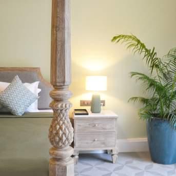
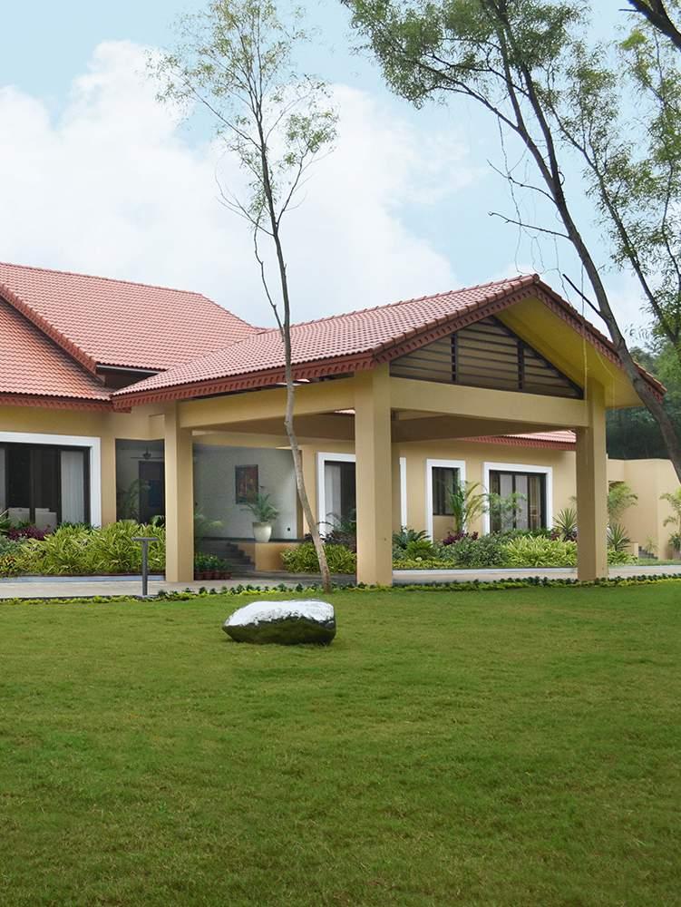
Her design philosophy is echoed in Bungalow at Jajpur and Bangalore International Airport T1 Domestic Lounge, where the use of colour and a combination of eclectic materials with wood brings in a beautiful blend of traditional Indian aesthetics with modern sensibilities.
about
contents 1 SYMPHONIOUS Architectural Drawing using AI 2 ANTONYMOUS Mixed income housing in Red Hook 5 WARP AND WEFT Design and build a pavilion 6 SUPER SATURATED Designing a distillery 3 SKEIN Exhibition space in Manitoga 4 LIGHT IT UP Intervention of Spring Garden Station 7 DESIGN + BUILD Classroom prototype 8 5+1 MEMOS FOR THE NEXT MILLENNIUM Expansion of the RISD Museum 9 VORONOI Intervention at a homeless shelter 10 TRAVELER Adaptive Reuse of a hotel 11 BOMBAY DECO Restoration of an Art Deco facade 12 BOMBAY DECO Restoration of an Art Deco facade 13 P2P SITELESS HOUSE Home fabricated by robots 14 DESIGN THE WORLD Design of an alternative world 15 CHAOS THEORY Designing a carnival THE TROPICAL-PARSI HOME Architecture and Interiors of home in Jajpur, Orissa 15
Symphonious
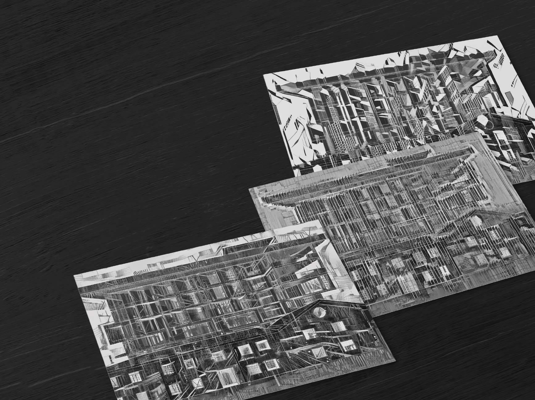
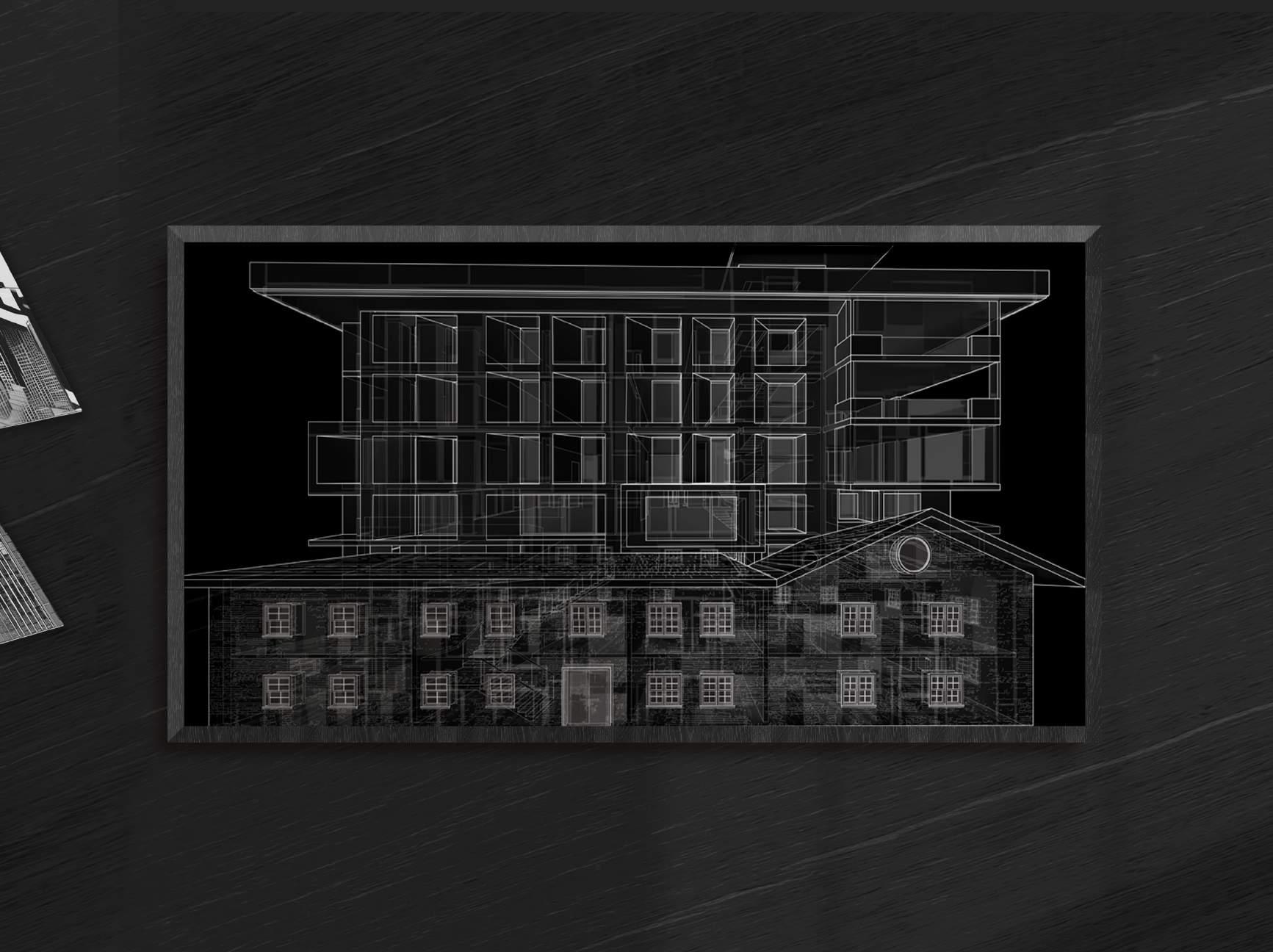
In its constantly (d)evolving meanings, Building Ruins aims to generate an archive of objects and ideas by RISD practitioners that demonstrates the inherently interrogative nature of artistic endevours. Through the archive, the curatorial ambition of the show is to present enquiries embedded within the practices of RISD alumni in India. It takes a closer look at their investment in the range of materials, techniques and processes that they constantly engage within their everyday.
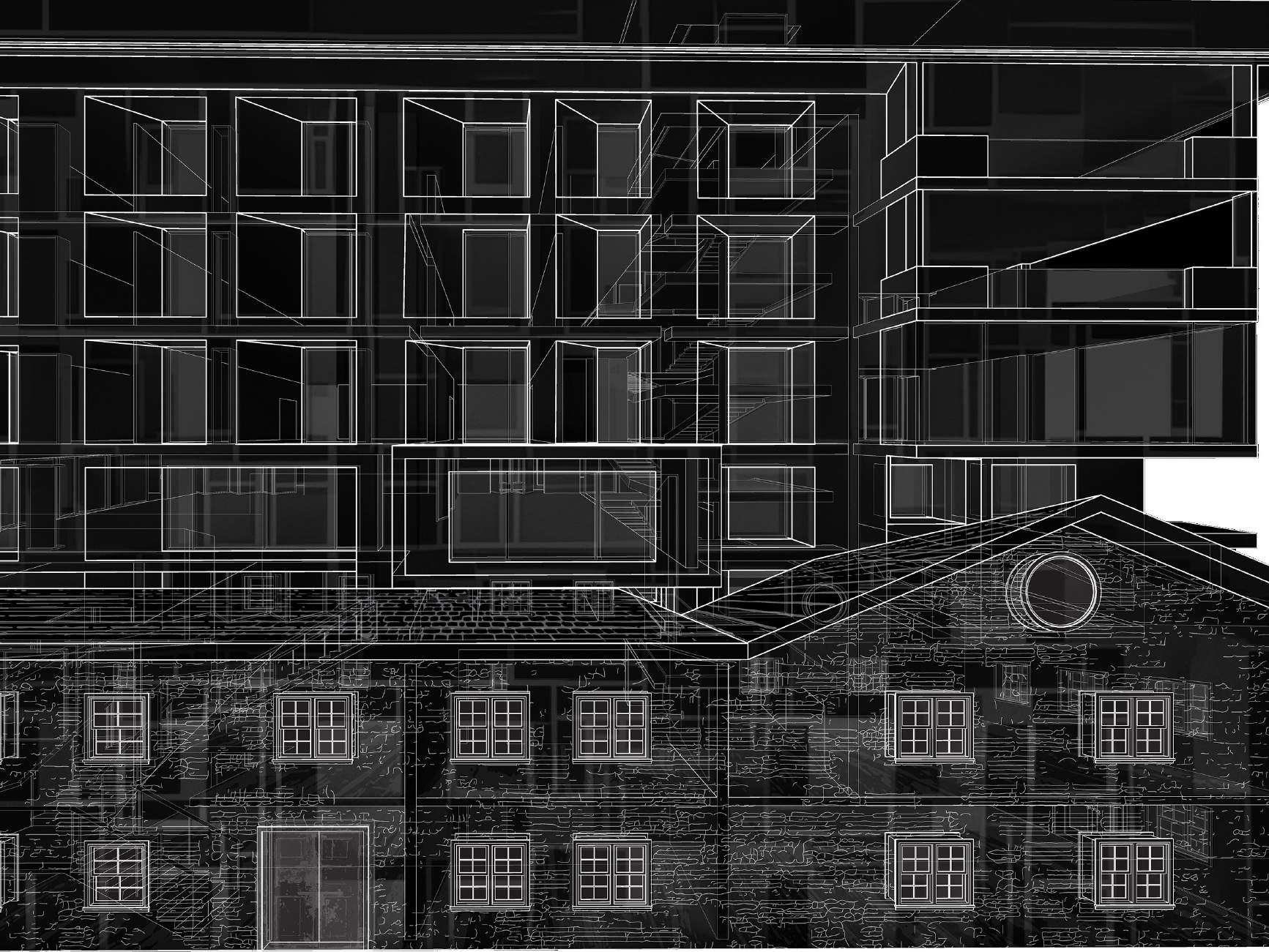
Building ruins manifests itself in an architectural section perspective drawing. The drawing depicts the mashup of two buildings – An old English building that is now demolished creeping over a contemporary multi-storey home. Overlaid with images generated by a neural network AI software, the images bridge the new and the old, and builds into the ruin. The drawings are a digital representation that uses 3 dimensional models, 2 dimensional line work and collage.
4
2011 2012 2013 2014 2015 2016 2017 2018 2019 2020
5
Antonymous
University of Pennsylvania, Second Year Studio
Instructor - Ben Krone
Project Duration - 4 Months
Project Brief - This studio explores housing in Red Hook, Brooklyn.
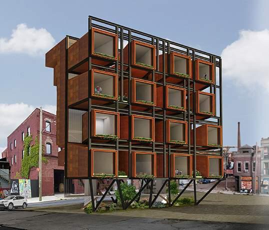
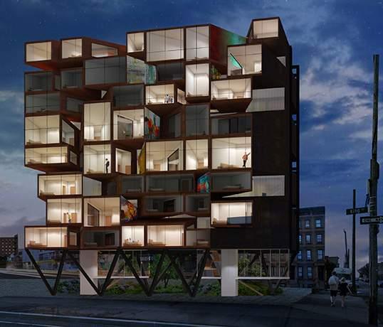
Concept - Housing trends have been changing towards co-habitat housing where common spaces are interspersed within every floor and private dwelling areas are segregated, unitized, and placed adjacent to common areas.
The diagram illustrates how the units are divided, organized and priced with the living, dining and kitchen spaces on one side that are connected to the bedrooms on the other side.
The units are priced in such a way that the more bedrooms that share a living room space the less expensive the apartment. Each apartment has 1-4 bedrooms that share one living room space.
New York’s existing 80/20 program incentivized affordable housing but created the poor door problem creating separate entrance for low-income residents, effectively segregating them from the market-rate residents. However, this arrangement of units challenges this issue by interspersing the units allowing for a mixed income community. Hence there is no “poor door” and market-rate and low-income apartments co-exist.
There are two circulation systems, one that is common and another that is within each apartment. The central circulation connects the living spaces to the bedrooms. By separating the two sides the center becomes a space for interaction and a mixing of the tenants of various incomes. Every other level has a garden space which is shared between four apartments and becomes individual lobby spaces for those residents.
1 2 3 4 5 6 7 8 9 10 11 1 2 2 2 3 4 4 5 6 7 7 7 8 6 6 6 12 14 15 16 13 5 9 10 10 10 11 11 11 12 12 14 14 15 15 15 16 16 13 13 13 9
6
$ $$ $$$
2011 2012 2013 2014 2015 2016 2017 2018 2019 2020
DIAGRAM ILLUSTRATING APARTMENT CONFIGURATION Living, Kitchen and Dining Bedrooms and Baths DIAGRAM ILLUSTRATING HOUSING CONCEPT Circulation BEDROOMS AND BATHS CIRCULATION Private circulation within each apartment Common circulation for all apartments LIVING / KITCHEN / DINING
Translucent walls allow light to enter the circulation spaces
APARTMENT TYPE 1
There is a direct connection from one side to the other
APARTMENT TYPE 2
Forms are extruded inwards and overlap to create a volume for circulation
Artwork on exterior walls continues on to the interior walls
Windows from bedrooms allow one to view the murals on the opposite walls
APARTMENT TYPE 3
There is a greater vertical displacement of the apartments
P U U U U DN U P U U U UP 7 FLOOR PLAN LEVEL 4 FLOOR PLAN LEVEL 1
Four apartments share one garden space between them
Greenery starts from the lobby level and makes itself up through the building
Level 1 25’ - 8" Level 2 35' - 11" Level 4 52' - 7" Level 5 62' - 10" Level 6 69' - 2" Level 3 42' - 3" Level 7 79' - 6" Level 0 0' - 0" Leve 9 107' - 5" Level 8 96' - 2" Level 10 123 - 0" Level 11 132 - 4” Level .5 10' - 0” Level 1 25’ - 8" Level 2 35' - 11" Level 4 52' - 7" Level 5 62' - 10" Level 6 69' - 2" Level 3 42' - 3" Level 7 79' - 6" Level 0 0' - 0" Leve 9 107' - 5" Level 8 96' - 2" Level 10 123 - 0" Leve 11 132 - 4” Level .5 10' - 0”
SOUTH ELEVATION NORTH ELEVATION 8
Murals are painted in the interstitial spaces of the bedrooms


Level 1 25’ - 8" Level 2 35' - 11" Level 4 52' - 7" Level 5 62' - 10" Level 6 69' - 2" Level 3 42' - 3" Level 7 79' - 6" Level 0 0' - 0" Level 9 107' - 5" Leve 8 96' - 2" Leve 10 123 - 0" Leve 11 132 - 4” Level .5 10' - 0” Level 1 25’ - 8" Level 2 35' - 11" Level 4 52' - 7" Level 5 62' - 10" Level 6 69' - 2" Level 3 42' - 3" Level 7 79' - 6" Level 0 0' - 0" Level 9 107' - 5" Leve 8 96' - 2" Leve 10 123 - 0" Leve 11 132 - 4” Level .5 10' - 0” SECTION 1 SECTION 2 9
Skein
University of Pennsylvania, First Year Studio
Instructor - Eduardo Rega
Project Duration - 2 Months
Project Brief - Design an exhibition space to house Russel Wright’s objects that will be located in Manitoga, New York.
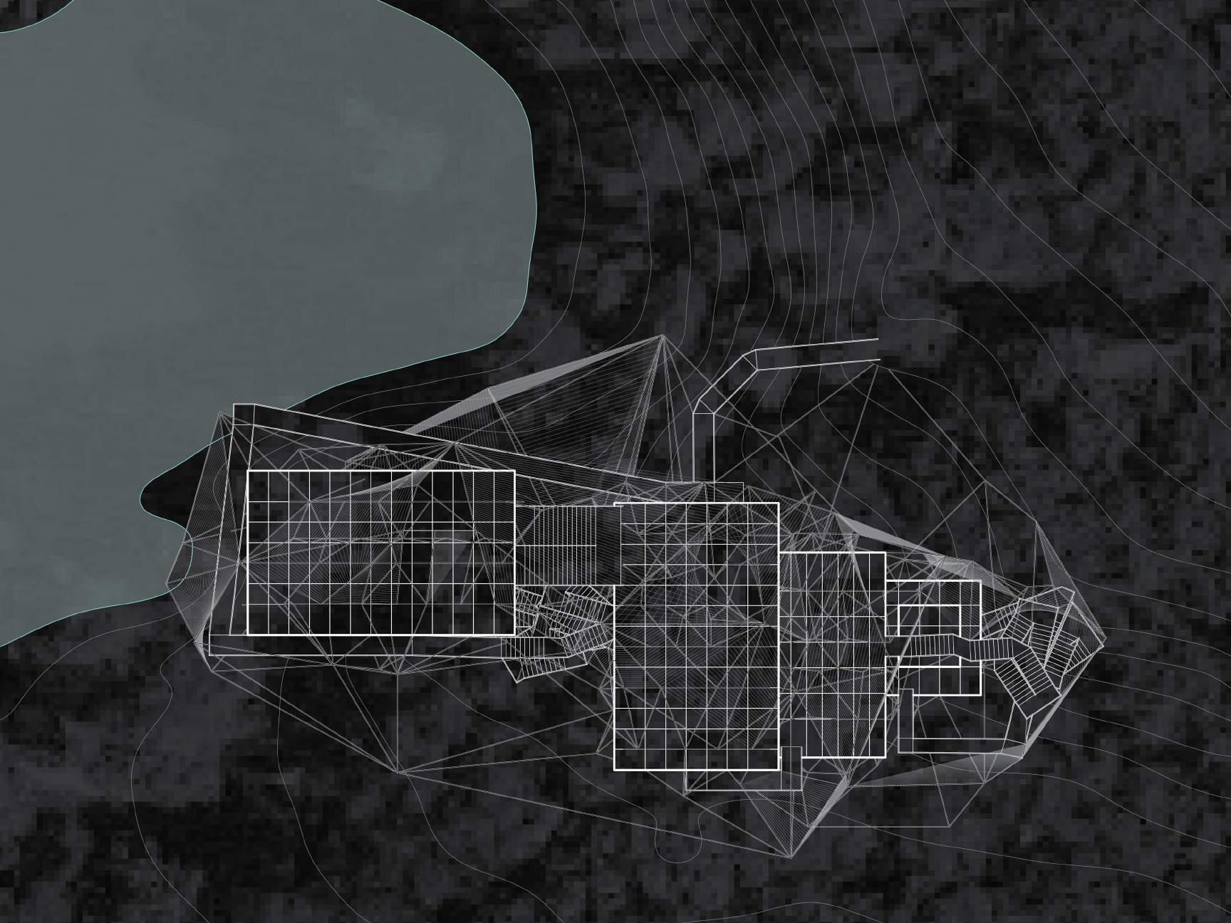
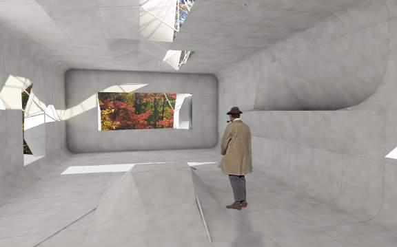
Concept - This project is based on the film Mon Oncle and Louis Kahn’s idea of served and service spaces. I explored the relationship between a flexible served spaces that can be manipulated by the service spaces, based on the user’s needs.
Is it possible to create a flexible space which one can manipulate based on their personality?
Is it possible to push the spaces to a limit to create intentionally highly uncomfortable spaces versus highly open, flexible spaces? Are there spaces that can be served and service?
10 2011 2012 2013 2014 2015 2016 2017 2018 2019 2020
ROOF PLAN
The service envelope acts as the structure to support the served spaces
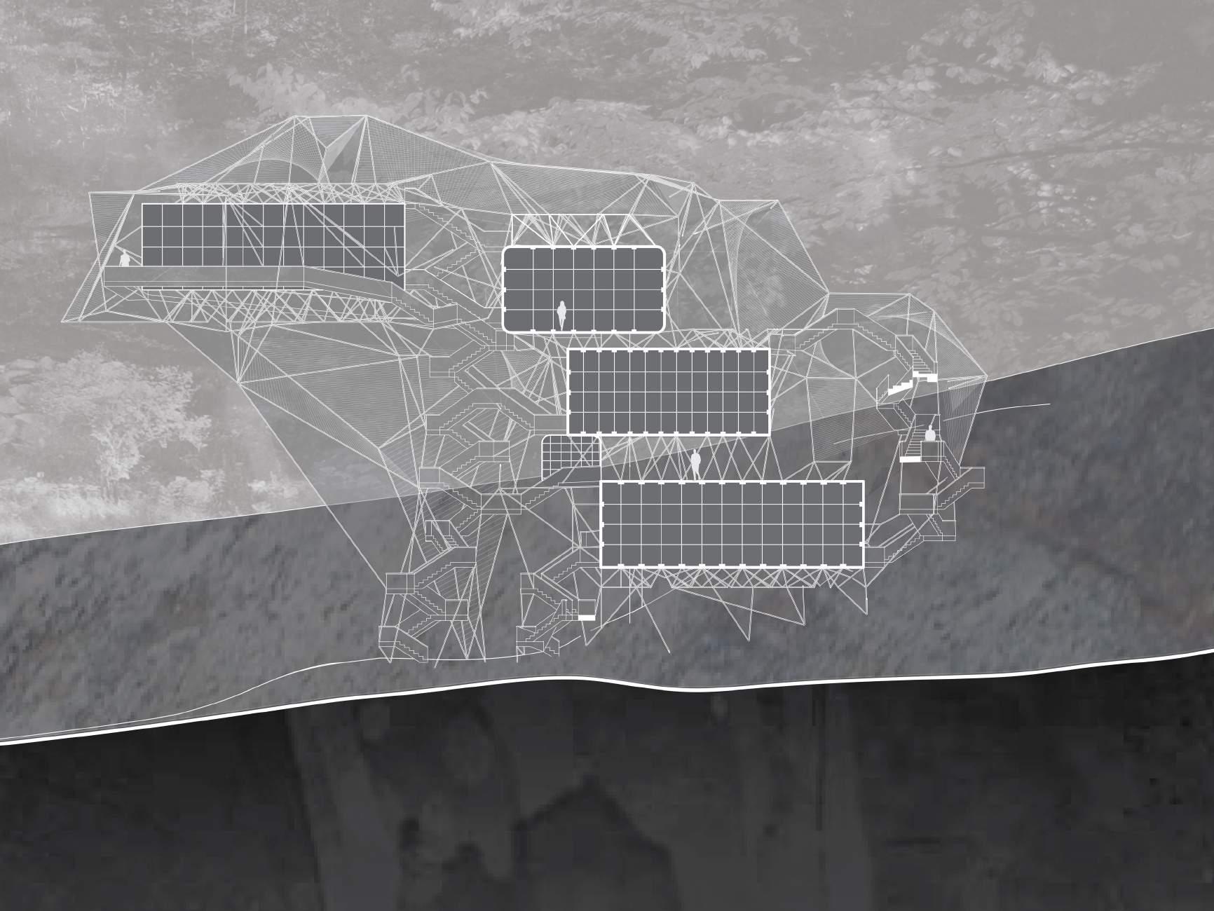
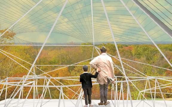
The woven membrane acts as a roof to shade as well as block certain views to maintain privacy
The minimum service space is 20 inches
Generic served spaces
Maximum area 1500 sq ft
A minimum height of 8 feet of service space allows a person to occupy it, making it a service space as well as a served space
The bathroom is a service space housed in a served space
11
LONGITUDINAL SECTION
Structural framework
Woven roof membrane

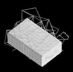
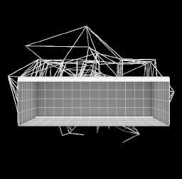
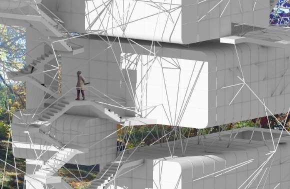
< The exploded axonometric dissects the complexity of the structure.
The framework serves the served spaces by manipulating its skin making each generic space flexible with the help of this structural envelope.
Generic served spaces
Circulation comprising of stairs, ramps and an elevator SECTION PERSPECTIVE AXONOMETRIC
12
EXPLODED AXONOMETRIC



13
The served space can be opened up to create windows, skylights and doors. The floors and walls can be manipulated to create furniture and shelving.
Doors Furniture Shelves Windows Skylights
IN: Ramps and stairs move in and out of the spaces
UNCLE HULOT ENJOYS THE CIRCULATION: The circulation has strategic viewing points
WALKING IN BETWEEN: One can walk between the served spaces
WOVEN MEMBRANE: The woven membrane not only shades but also blocks views
INTERIOR: The interior of the space can be manipulated by the user
VIEW FROM THE TOP: Spaces on top of the served spaces are occupiable

Light it Up
University of Pennsylvania
3rd place winner of the Schenk-Woodman Competition, Group Project
Project Duration - 1 Week
Project Brief - Design an intervention for the Spring Garden Station in Philadelphia.
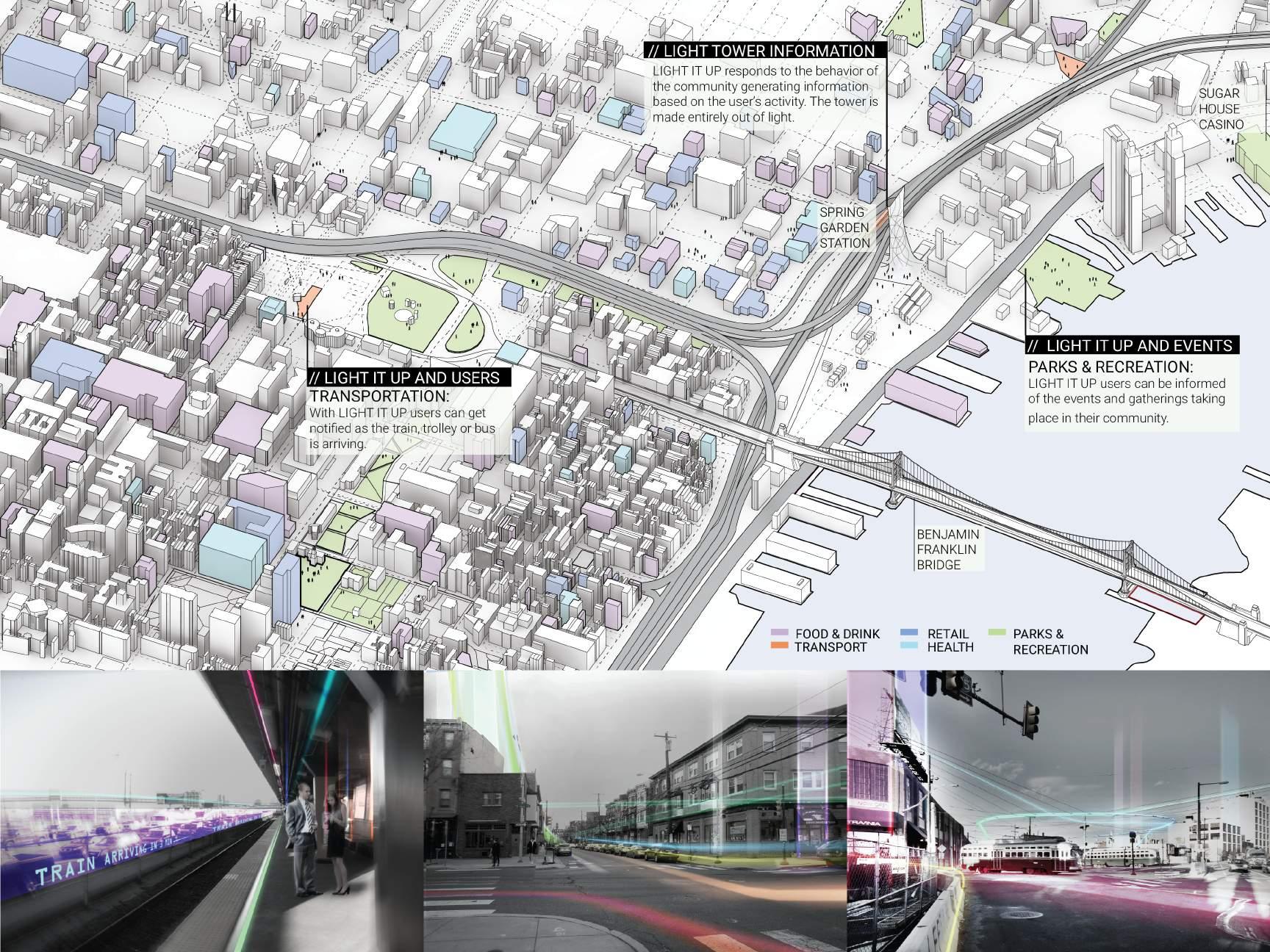
Concept - LIGHT IT UP organizes information through virtual reality in the site surrounding Spring Garden Station. The collective information generated by each user’s behavior takes on a physical form as a system of lights that animates the neighborhood. Using mind-reading technology and mobile devices, users can access and control LIGHT IT UP and a system of lights will then guide them through the area, providing way-finding, safety and delight. A light beacon, made entirely of light, would appear and change locations depending on the activities, emotions and needs of the constituencies that inhabit the neighborhood.
14 2011 2012 2013 2014 2015 2016 2017 2018 2019 2020
15
University of Pennsylvania, First Year Studio
Instructor - Eduardo Rega, Group Project
Project Duration - 2 Months
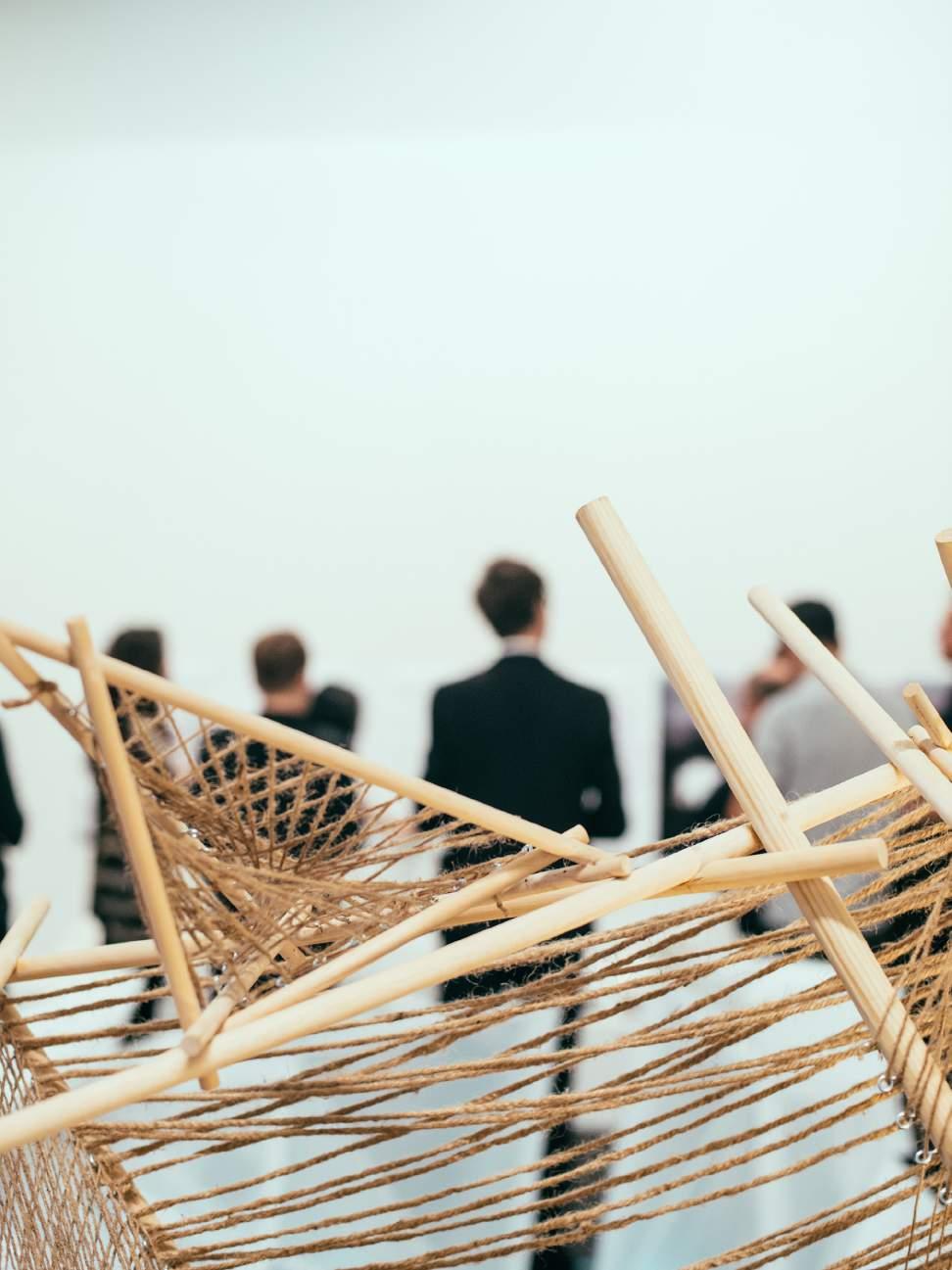
Project Brief - Design and build a pavilion for Russel Wright’s home in Manitoga.
Concept - We were interested in Russell Wright’s notion of a modern home that he writes extensively about in his book Guide to Easier Living. He advocates for a home being a space of personal expression, not a place where comfort, ease and spontaneity are sacrificed.
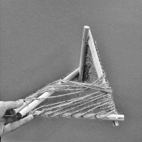
On further studying Wright’s home in Manitoga, we noticed that he declassified spaces by creating loose boundaries between areas that would have otherwise been delineated, had they been built with the mainstream aesthetic of the time. We found that his extensive use of glass in his home helped him achieve this sense of openness, as well as his strategic placement of furniture to help imply space. With our pavilion design, we aim to achieve some balance of privacy, movement and openness by establishing woven boundaries through folded frames and multi-planar weaving. Weaving either closer together and further apart influences the kinds of views and movement we can endure, as well as the quality of light and shadow.
TYPE A - 1” THICK TYPE B - 3/4” THICK TYPE C - 1/2” THICK TYPE 1 - 6’ LONG TYPE 2 - 5’ LONG TYPE 3 - 4’ LONG TYPE 4 - 3’ LONG TYPE a 1/2” Spacing TYPE b 1” Spacing TYPE c 2” Spacing TYPE d 1” Alternate Spacing TYPE e 1/2” Half Rod Spacing TYPE f 1” Half Rod Spacing #208 EYELET SIZE #212 EYELET SIZE STRUCTURAL JOINERY TYPE 5 - 2’ LONG WOODEN DOWELS OVERLAY DOWELLED JOINT CREATING CONCEALED JOINERY THREADED STUD USED TO LENGTHEN DOWELS KIT OF PARTS TYPE 6 - 1’ LONG 3-PLY ROPE 2-PLY ROPE
PRINTED JOINT MITERED BUTT JOINTS JOINT EXPLORATION 2 JOINT EXPLORATION 1 16 2011 2012 2013 2014 2015 2016 2017 2018 2019 2020
3D
Warp and Weft
2 DIMENSIONAL SINGLE
3 DIMENSIONAL CROSS WEAVING WEAVING PATTERNS
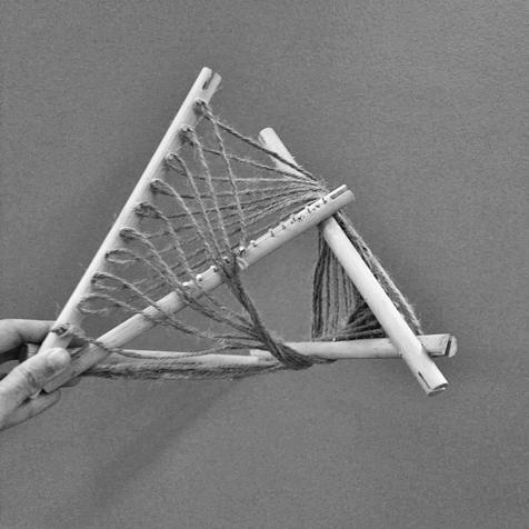
Woven boundaries are able to create a variation of conditions within each individual plane created. Weaving either closer together and further apart influences the kinds of views and movement we can endure, as well as the quality of light and shadow. Overlaying these already composite woven frames can produce an even greater amount of complexity in how these properties are experienced. Additionally, these experiences are able to differ depending on where an individual interacting with our pavilion is located spatially. By creating an active boundary, we are able to reiterate and further explore the kind of versatility of design that Wright advocated for in his life and works.
We arranged these woven boundaries to create a triangulated, three dimensional structures out of wooden rods that join and notch together as they cross one another. These triangulated components are able to aggregate together, being further dissolved perceptually by the type of hidden joinery that allows these crossing wooden rods to come together.


PARALLEL WEAVE LOW DENSITY CROSS WEAVE PARABOLIC WEAVE WEAVING AGGREGATIONS HIGH DENSITY CROSS WEAVE MORE LIGHT LESS LIGHT
WEAVING
PLANE
PROCESS MODELS 17
COMPONENT 1

COMPONENT 2
COMPONENT 3

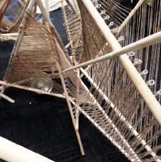
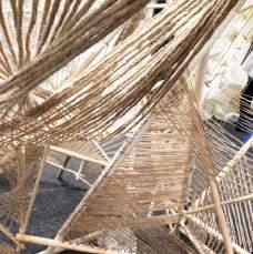
AGGREGATIONS OF COMPONENTS
The arrangement of triangulated woven frames gives rise to pockets of space on either side of the boundary that are able to foster different types of activity. The performance of the newly dissolved and woven boundary is able to trigger multiple appropriations and uses, beyond, but also included and inspired by domestic ones. By this method of aggregation, we create three discrete units that are connected with removable magnetic joints. This allows those interacting with the space to reorient and adjust the built environment to best suit the kinds of activities they would like to engage in.
 Magnetic Joint
Rare earth magnets
Components oriented to create a singular semi enclosed space
Components oriented to create linear space
Components oriented to create pockets of space
18
DETAILS


19
Super Saturated
University of Pennsylvania, Second Year Studio
Instructor - Abby Hume, Group Project
Project Duration - 4 Months
Project Brief - Using “huddled bodies” found in food to generate architectural forms for a distillery in upstate New York that will be tethered to an existing hotel.
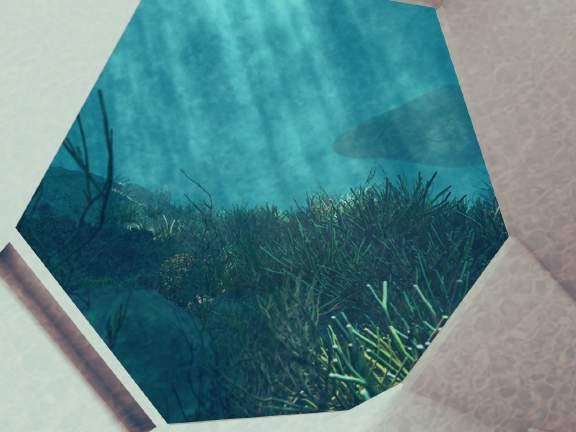
Concept - Using alcoholic beverages and berries, we experimented with effervescence and buoyancy in the different liquids. From this we developed a cascading structure that envelopes the berries. These berries become equipment for the distilling process floating around the staggering floor levels.
Careful consideration is taken to treat the facade to include ETFE pillows, rainwater/mist harvesting, solar panels and passive cooling as the fog rolls in.


A B iv. RESTAURANT viii. OUTDOOR BAR vi. DISTILLERY iii. HOTEL LOBBY ii. ADMINISTRATION OFFICE i. VISITOR CENTER / EDUCATION CENTER v. EVENT SPACE vii. TASTING ROOM vi. vii. ETFE SOLAR SHINGLE FOG HARVESTER GLASS WITH ALUMINUM MULLION 20
2011 2012 2013 2014 2015 2016 2017 2018 2019 2020
CUTAWAY DRAWING ROOF PLAN LEVEL 3 FLOOR PLAN

6 '0" 4’ x 6‘’ MESH FOG CATCHERS CONDENSE WATER VAPOUR GLASS CURTAIN WALL 1/4” LOCK NUT CONNECTS PANEL TO TUBULAR STRUCTURE MULLIONS GLASS FRAME AND WATER-CHANNELING PIPING STEEL MESH PIPE TO UNDERGROUND CISTERN AND WATER TREATMENT WATER VAPOUR CONDENSES ON THE MESH WHICH IS THEN CHANNELED UNDERGROUND VIA THE PIPES TIMBER FINISH POURED CONCRETE BASEMENT TIMBER JOISTS WOODEN FLOOR MDF INSULATION RIGID INSULATION STUD WALL WITH DRY WALL FINISH FOR FIREPROOFING BRICK 1" AIR CAVITY 1 1/2" RIGID INSULATION 6 MIL VAPOR BARRIER CMU 1/2" INTERIOR FINISH GYPSUM BOARD ANCHOR BOLT FLASHING STEEL ANGLE POURED CONCRETE FLOOR SLAB RIGID INSULATION GRAVEL DRAINAGE LAYER 4" FOOTING DRAIN 21 FOG HARVESTER DETAIL WALL SECTION NORTH ELEVATION SECTION AA COMPONENTS DETAIL WALL SECTION


22 SECTION BB


23
P2P Siteless House
University of Pennsylvania, Third Year Studio
Instructor - Robert Stuart Smith
Project Duration - 4 Months
Project Brief - The design, robotic fabrication and construction of a hard and soft pre-cast house.
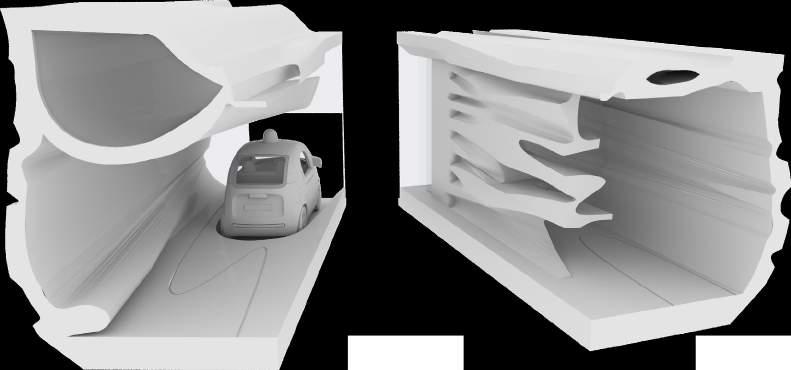
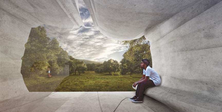
Concept - I envision the primary purpose of the siteless house to house fruit pickers in California. These homes can also be used by tourists looking to stay near the farms making revenue for the farming co-op. The home is mobile allowing it to be moved easily.
The experimental process of creating the form work for casting using a robotic arm involves cutting overlapping curves that produce beautiful surfaces.

CONSTRUCTION PROCESS
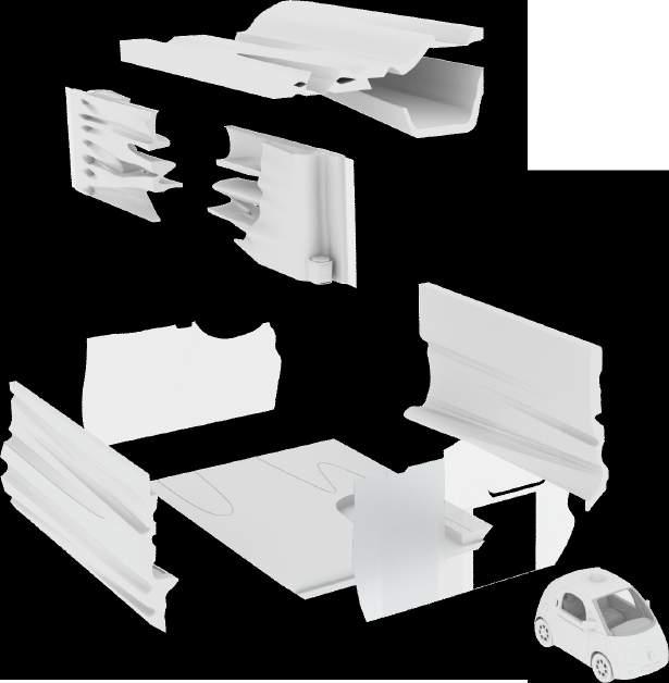
The construction of the house is very simple. It starts with the placement of the floor slab, followed by the interior walls. After that the long side walls are positioned to allow for the glass walls to be inserted. Once all the walls are secured the roof can be lifted into place.


24 1 2 3 4 5 EXPLODED AXONOMETRIC 2011 2012 2013 2014 2015 2016 2017 2018 2019 2020
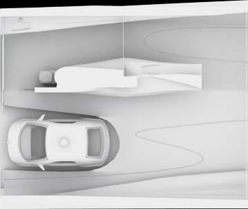
Kitchen Seating “Incinolet” Combustible Toilet Rainwater “Pillow” Glass Facade Sliding Glass Door Groove Driverless Car FLOOR PLAN REFLECTED CEILING PLAN SECTION
Flat Plane Cut S Bend
The cutting strategy used is 4 curves, 2 joined curves and 2 joined straight lines Overlapping curves create a void
Lofted sleeping space above car
Seating integrated into the wall
Creating a double wall to create interstitial spaces between the walls, varying the amplitude of the curves created a greater variance


Skylights in the roof bring in additional light into the space and also allows for views of the sky
Voids in the roof allow for a lighter structure
Solid walls on either side allow for structural stability
A shared kitchen wall acts as a counter as well as a storage space, it continues into the bathroom
CUTAWAY DIAGRAM OF THE HOME

25
Glass facade
CUTTING FORMWORK USING ROBOTIC SOFTWARE
Chaos Theory
University of Pennsylvania, First Year Studio
Instructor - Annette
Fierro
Project Duration - 2 Months
Project Brief - The carnival: an ideal conceptual framework for rethinking the urban environment, challenging the future of cities and expanding architecture’s cultural project.
Concept - The big idea for the carnival is “chaos theory”, which examines and redefines the existing function of interstitial spaces. The grasshopper script that generated the digital diagram was first used on puppets. This script was then applied to interstitial spaces to follow the puppet’s trajectory.
The translation of these interstitial spaces onto the site, transforms an abandoned plot into a public realm humming with activity. This helps to mitigate any phobias and insecurities that may arise in these interstitial spaces. Forms are created by the negative spaces crated by the interstitial spaces, which become the programmatic spaces.
New in between spaces become the open outdoor spaces, passages form spaces for markets and food, and bridges are formed to create new circulation paths.
Spaces that are both public and private depending on how you interpret them, they can either belong to the residences or the streets
Streets less than 8’ become private for pedestrians but not for vehicals Analysis
1910
NARROW STREETS 6’- 8’ SPACES < 8’ SPACES 13’< 30’ SPACES 8’< 13 COMMERCIAL/RETAIL RESIDENTIAL PUBLIC + PRIVATE AMBIGUOUS PRIVATE PUBLIC
1895
2016
of
of
analysis of
26
in between spaces based on their dimensions Analysis
in between spaces based on privacy Site
the block morphology
2011 2012 2013 2014 2015 2016 2017 2018 2019 2020
DIAGRAM ILLUSTRATING PATH OF PUPPET SHOW
SITE ANALYSIS DIAGRAMS
The site analysis looks at the interstitial spaces formed by the buildings around the site. These spaces are interesting because their shapes and forms have the ability to incite fears. Most of these in between spaces exist in the residential areas of the city. However, these interstitial spaces are discarded and only exist as private spaces.
PASSAGES NOTCHES COURTYARDS
Smaller abandoned unused spaces
Large vacant plots of land
Some empty spaces are used as parking lots
Analysis of in between spaces based on privacy
PRIVATE PUBLIC
CIRCULATION DIAGRAM
This diagram illustrates the pathways and intersecting passages.
Analysis of in between spaces based on privacy
27
Analysis of in between spaces based on typology
RETAIL
RETAIL

RETAIL
BLACK BOX
THEATER BACKSTAGE
CONCERT HALL
BACKSTAGE
BACKSTAGE
CENTRAL
CONCERT SPACE
CULTURAL
BACKSTAGE

28
FLOOR PLAN LONGITUDINAL SECTION
RETAIL VISUAL ARTS GALLERY
GROUND LEVEL


Narrow passages between forms

SECTION PERSPECTIVE
Larger outdoor spaces for larger programs
Viewing Box Pedestrian Passageway
to Backstage Backstage Understage Practice Space
of transparencies, translucent and solid surfaces 2000 Seat Concert Space
Entrance
Layering
29
Design the World
Kyoto Seika University, Japan, Third Year Studio
Instructor - Takayuki Suzuki
Project Duration - 4 Months
Project Brief - To design a new world which can have its own rules.
Concept - In the world today, there is an imbalance between the individual and society. However, the individual is as important as society and has the right to choose their relationships. People move continuously in and out of their homes. I wanted to design adaptive housing that changes with every families’ day to day living.
The norms for this new world would be :
There is no such thing as a “marriage”
The world is accepting of same sex partners and open relationships
People change their job every 10 years
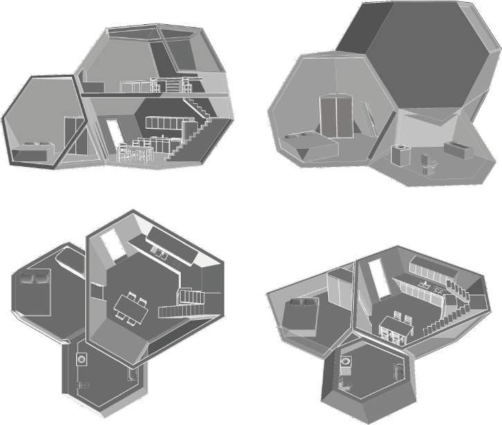
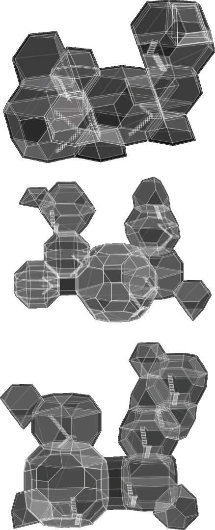
Plato referred to polyhedra as the basic building blocks of creation and credited their “structural harmony” while bringing “order out of chaos.” These forms will create order and will also allow free and flexible movement. Each unit is a polyhedron which can be attached to other polyhera as people form relationships.

INDIVIDUAL’S SPACE - space for 1 person or one function

HOME - Individuals’ space can be combined to create a family space

COMMUNITY - Families’ homes can be combined to create a community
Dining / kitchen Living Bathroom Bedroom Study 30 2011 2012 2013 2014 2015 2016 2017 2018 2019 2020


31
OF COMMUNITIES
CONFIGURATION
Small spaces for individuals and larger spaces for families
Example of individual’s home with furniture

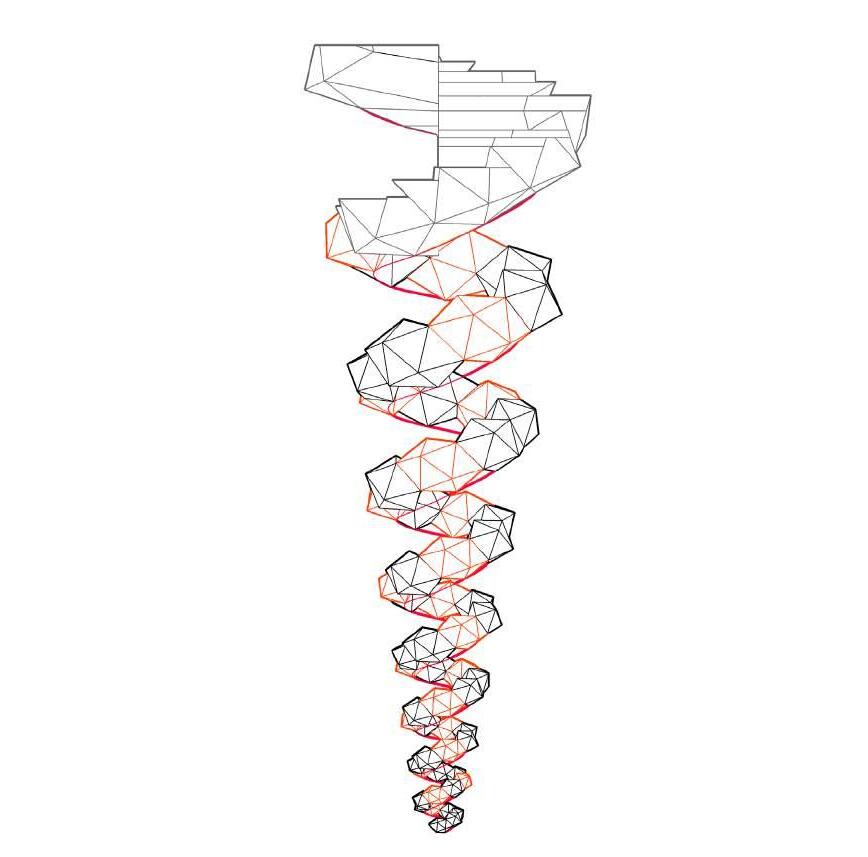
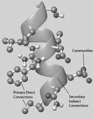
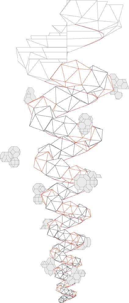
Proteins are made up of a string of molecules that are bonded together. The design of the public space is based on the structure of a Protein. Like polyhedra, proteins are also the building blocks of life. Their structure is such that they continuously change and yet keep their function and order constant. The spiral form that I created is also made up of individual units that are interconnected; the individual units and communities can plug-in to the spiral. The helical form gets larger at the top, thus the communities are more concentrated at the bottom. The main spiral is a closed pressure system and is airtight and sealed.
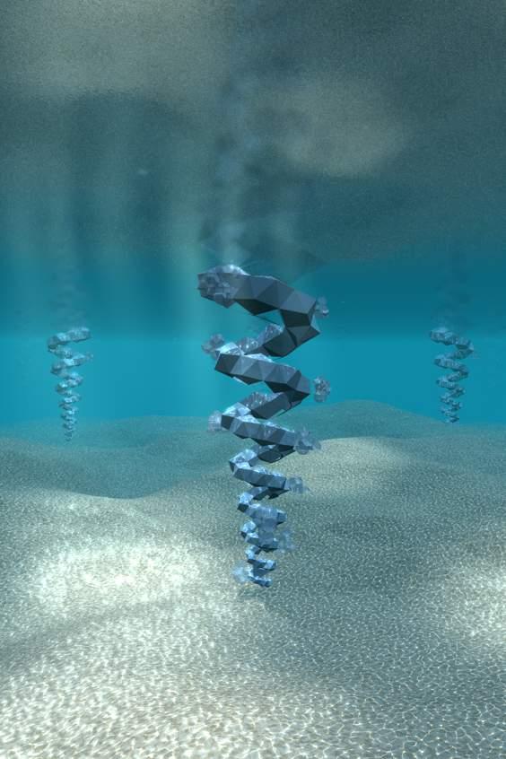
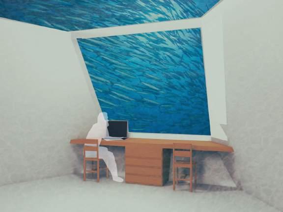
In the future, land will be scarce, man will have to start building in the sea thus this is where ‘my world’ is located. It is completely self sufficient and gets its energy from solar panels, wind turbines, bio-fuel and wave power.


Nodes:
Communities can only plug into nodes to get electricity, water, food etc

Flat open space for energy systems (wave, wind, current, solar, bio-fuel) and space to generate food through farming, agriculture, aquaculture and hydroponics
Track for transportation of trolley and units
Public space for school, work, shopping, restaurants, entertainment etc.
Nodes are stations or hubs for socializing


Public spaces are interconnected- a connection of spaces creates space for a greater social environment
Max Depth 650 ft. sunlight zone ends here
32


33
Design + Build
Rhode Island School of Design
Wintersession Studio, Costa Rica
Instructor - Colgate Searle
Project Duration - 1.5 months
Completed - February 2014
Collaboration with RISD Students and Earth University
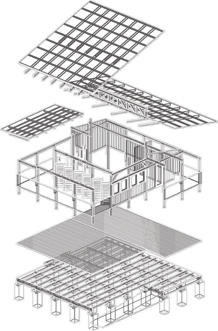
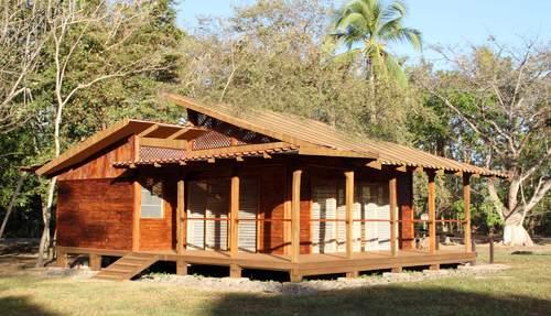
Project Brief - To design and build a classroom prototype that will serve as an example of sustainable building practices in the dry tropics. RISD has been engaged, since 2007 in collaborative studios with EARTH University, the world’s foremost school of sustainable agriculture.
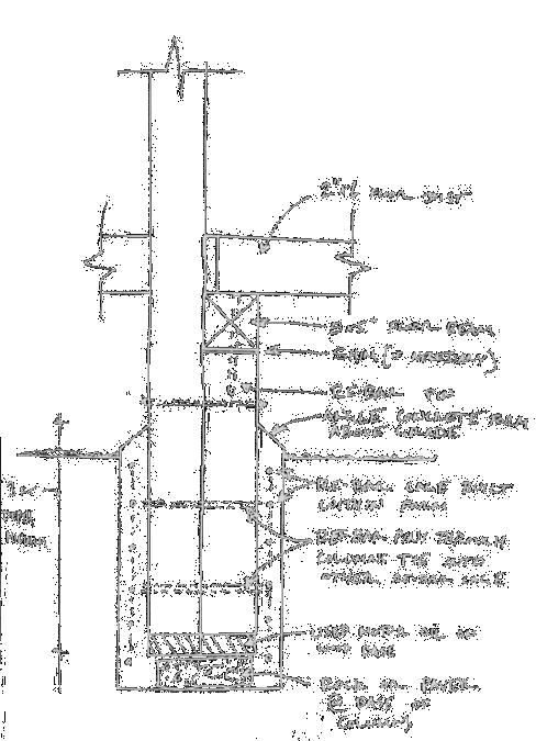
Concept - This studio was a culmination of a year of research and design study on the development of this off the grid, hi-tech/ low-tech classroom for rural schools in the dry tropical region of Costa Rica. We built the learning environment at the La Flor Campus of EARTH University.


34
2011 2012 2013 2014 2015 2016 2017 2018 2019 2020 PROCESS SKETCHES

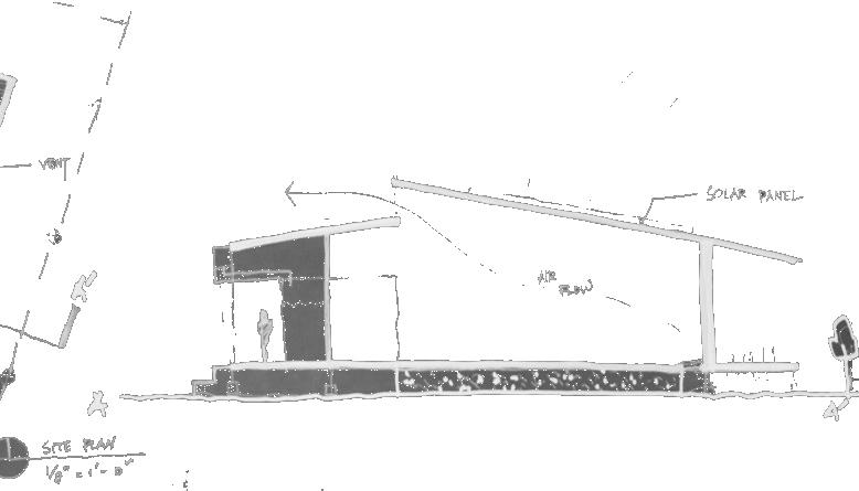
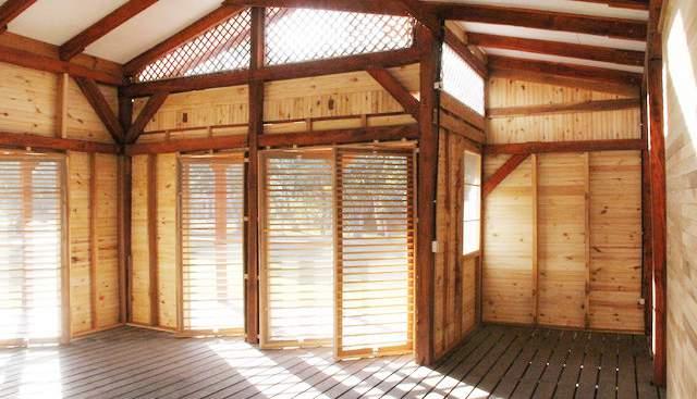
The plan is based on a 2x2m grid. The program primarily includes a classroom space for 20-22 students, an outdoor deck, a lockable storage space and two bathrooms.
The building offers shading and is naturally cooled taking into account the direction of the wind. During the monsoons, rain water is collected and stored for further use and the building is raised to prevent occasional flooding. The pivoting walls can be opened and closed depending on the weather. There is place for solar panels on the South roof, and a wind turbine system can also be implemented.
35
FLOOR PLAN NORTH ELEVATION
LAG BOLTS
NOTE: FOR ALL INTERIOR RAFTERS AT TRUSS ONLY RAFTER TIE DOWNS

5” x 5” COLUMN 2”x6” TOP AND BOTTOM TRUSS CHORDS
LONG WEST RAFTER 3” LONG SPIKES 2”x5” BLOCKING
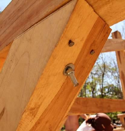
ANGLE IRON 1/2” THREADED ROD THROUGH BOTH RAFTER AND COLUMN 1/2” THREADED ROD 2”x6” RAFTERS 3” LONG SPIKES
1/2” THREADED ROD THROUGH RAFTER
Truss Joists
MINIMUM LENGTH OF 6’-10’
1” x 5” STRAPPING
DOUBLE 1”x 5” STRAPPING
5” x 5” CROSS BRACING
5” x 5” HEADER 3/4” WINDOW FRAME
PIVOT SHUTTER
WINDOW SILL
1” x 5” BOARD 1” x 5” 2” x 5” EVERY HALF INCH 2” x 5” SIDING SIDING
3’
3/8”x2”
3/8”x2”x8”
Ramp Decking Columns Concrete footings
SECTIONS EXPLODEDAXONOMETRIC 36
Railing Rafters Pivoting doors DETAILED


37
RISD Studio - Narrative Museum
Project Duration - 1.5 months
Completed - June 2013
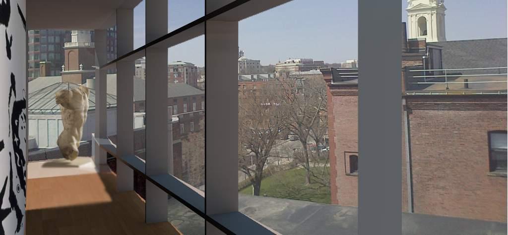
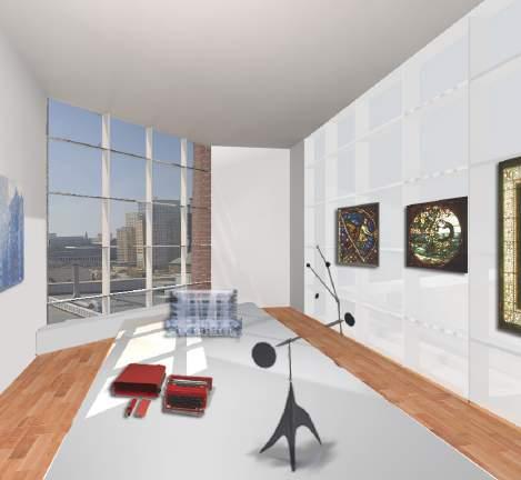
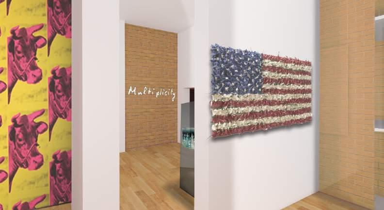
Project Brief - To design an exhibition space as an expansion of the existing RISD museum based on Italo Calvino’s book Six Memos for the Next Millennium.
To give flexibility to the museum’s curators to allow for the special exhibits of guest curators.
Our ‘collector’ is not a real person, but instead exists in our minds as a 21st century version of the flâneur.
Concept - To create a montage of interconnecting spaces. Using Calvino’s book as the inspiration for my design, I thought of each of the six memos as separate spaces in the museum, which are connected by a narrative or a circulation system; between them and through the museum.
The RISD museum itself is a montage of different buildings, built at different times, and its existing alleyways and bridges continue as a concept in my design.
The first memo is lightness which starts right at the top and is connected to the existing bridge of the RISD museum.
The last chapter on “Consistency”, which was left incomplete, is the special exhibition space. I also played with the idea of duality of each memo. For example “lightness” vs “darkness”.
Quotes above the doors guide the flâneur through the space.
SITE-NOTCHINTHERISDMUSEUM 38 2011 2012 2013 2014 2015 2016 2017 2018 2019 2020


vs Darkness/Weight
Purity, whiteness, weightlessness, get rid of heaviness, lofty
“One should be light like a bird not like a feather”

vs Slowness
Cyclic, repetition, time, traveler, progression, rush of ideas
“The theme that interests us here is not physical speed, but the relationship between physical speed and speed of mind.”

vs Inexactitude
Precision, incisive, clarity
“My discomfort arises from the loss of form that I notice in life.”

vs Invisibility
Voyeurism, vista
“The only thing I knew was that there was a visual image at the source of all my stories.”

vs Individuality
Infinity “system of systems”
“multiplying the details”

vs Inconsistency
?
Flexibility: Since he left the last chapter incomplete it can be interpreted in any way
39


EXPLODEDFLOORPLAN 40


41
Voronoi
RISD Studio - Housing Affects
Instructor - Eduardo Duarte
Project Duration - 3 months
Project Brief - To design an intervention for the Woonsocket homeless shelter, keeping in mind the importance of personal artifacts of the residents.
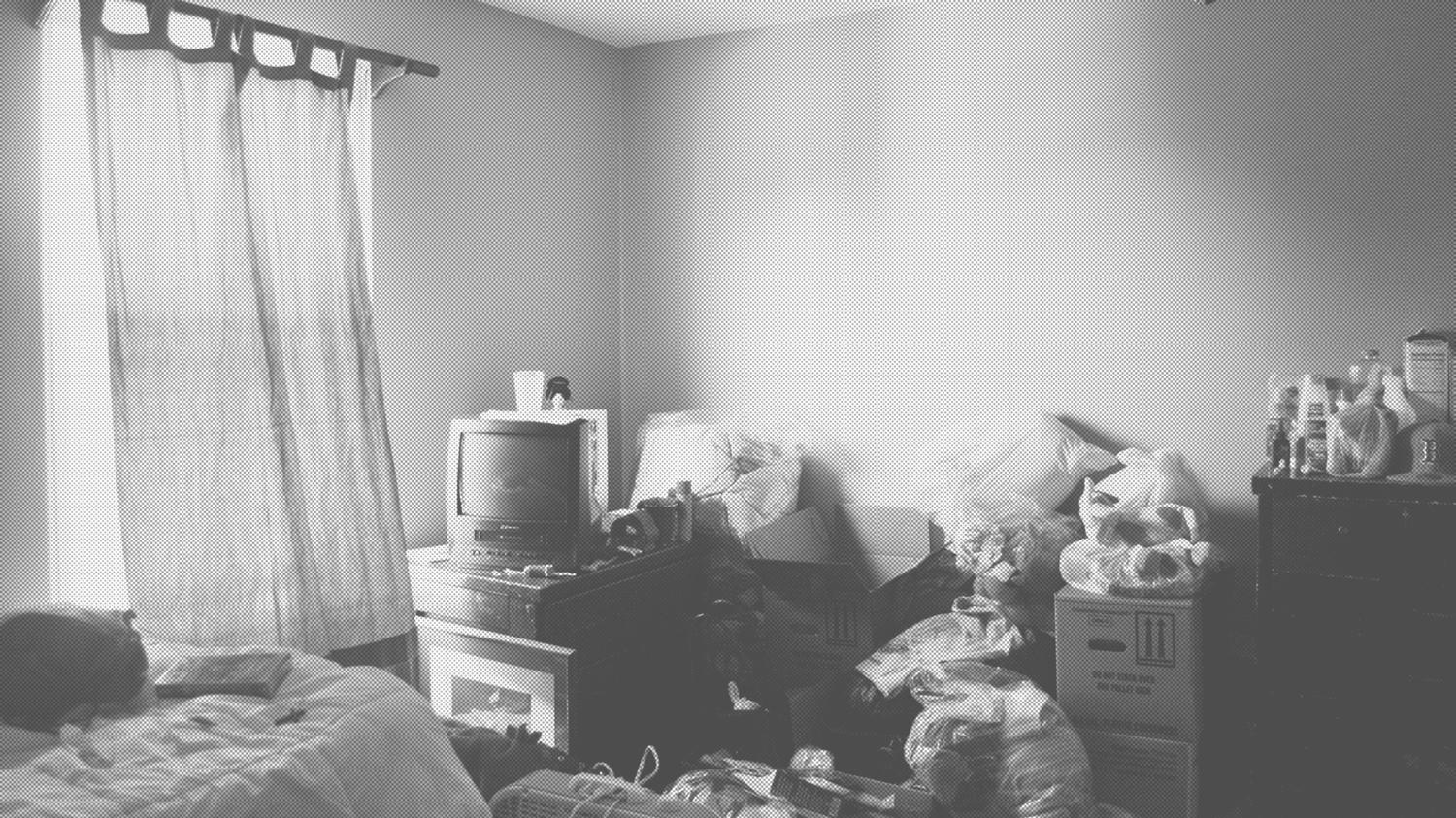
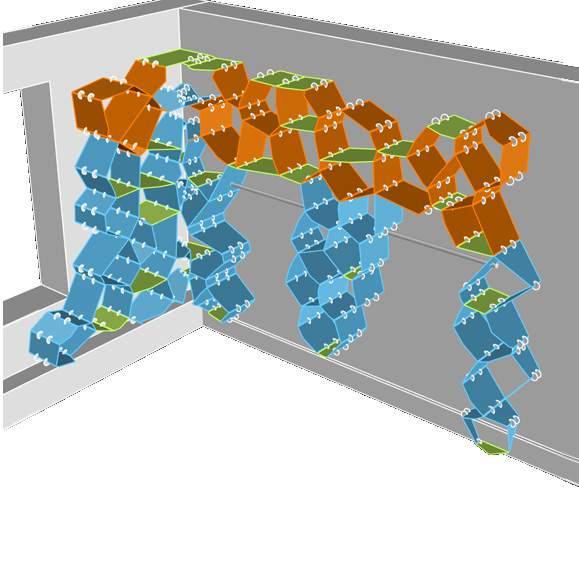
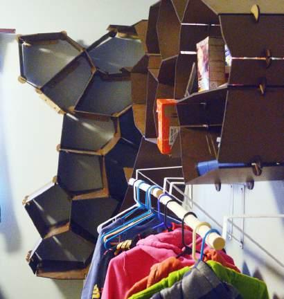
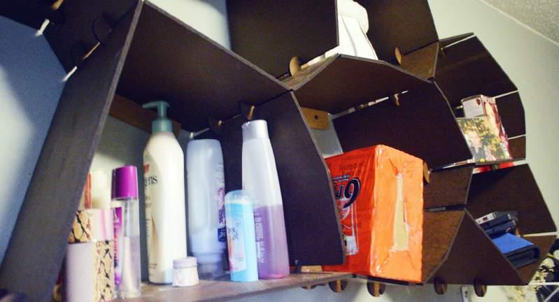
Concept - The room in the shelter that I chose had no storage system and objects were precariously piled on top of each other. The residents required a storage system that organized their belongings. Playing around with the software program Grasshopper, I discovered Voronoi diagrams which are a way to subdivide space systematically. Along with possessing structural properties, Voronoi diagrams’ resemblance to natural formations add life to the homeless shelter, making it one with nature. It is interesting to see the transition from the computer model to the final Masonite installation on site.
Installation Video - http://vimeo.com/user12078591/shelvingvideo

Space before the intervention
OBJECTS
Random points in space or points that map specific objects in space
EFFECT
Connecting the points
AFFECT
Creation of a Voronoi diagramdecomposition and systematic division of space into polyhedra determined by distances to points in space

42 2011 2012 2013 2014 2015 2016 2017 2018 2019 2020
COLOR CODED SCHEME TO ORGANIZE OBJECTS
FLAT SURFACES
Flat voronois for small objects like toiletries, cleaning items, bottles etc.

VORONOIS ON TOP
Voronois on top for storage boxes or items that will not be used often
ANGLED VORONOIS
Voronois at an angle for items that do not need a flat surface like clothes, boxes, small books, dvds, food etc


Voids for closet space VOIDS

43
RISD Third Year Studio
Instructor - Janet Stegman
Project Duration - 3.5 weeks
Completed - March 2011
Project Brief - To explore the accommodation of a traveler with the intent of guiding his/her perceptions and interactions with other unknowns.

Concept - The building plays with light and shadow using voids to filter the light through the building. These voids are placed over the corridors and the lounges where the movement of people will be the greatest in order to draw people out into the common areas. Translucent glass covers the voids to maintain privacy. The program is inverted so the public spaces are on the roof and 5th floor of the building. There is a swimming pool on the roof, so that light passing through the water creates an interesting effect in the lobby and dining areas. There are also voids in the walls around the staircases, some of which are back lit. In addition, the floating stairs allow light to pass through them to form shadows in the stairwell.
I also considered peoples’ sleeping habits. The North facade gets the morning sun and North side rooms could be for early risers. The West facade gets light in the evenings, and hence those rooms will be for people who like to sleep in late.
SITE MAP SHOWING SHADOW LINES 6 5 4 3 2 1
Lobby, dining and kitchen Entrance Pool
West side rooms
North side rooms
FLOOREXPLODEDPLANS 44
2016 2017 2018 2019 2020
Lounges on each floor
2011 2012 2013 2014 2015
Traveler


SECTIONS SHOWING LIGHT AND SHADOW

45
The Tropical - Parsi Home Bungalow at Jajpur
At ABM
Project Duration - 1 year
Project Brief - o design a guest house in Jajpur, Orissa for the client and his family.
Jajpur, located three hours from Bhubaneshwar, is an industrial town in Orissa. The home, located near the Jindal Stainless Limited plant, is nestled between natural sights, overlooking a pond on one side and the forest on the other. The layout is simple and almost symmetrical: the four bedrooms, the living, dining, study and kitchen are on the ground floor with the gym on the upper floor.
Each space of the house has an unbeatable vista of lush green landscapes and vegetation. To enhance the panorama, the entire bungalow was raised by 10 feet to get a view of the pond from the interior spaces.
While the layout may be simple, the real challenge was constructing the home in a remote location with virtually no resources around. The project was successfully completed in under one year.
While the home is secluded from public eye, it is porous and at one with its natural surroundings. As one enters the home through a wide double door, a picture window at the entrance, allows one a clear view straight through the living room, to the outdoor sit out, all the way to the pond. The double-height living room is at the heart of the home, while the bedrooms and more private spaces are on the periphery. All of the rooms facing the pond have a sit-out space to pause and take in the sights.
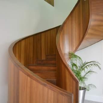
The kitchen, pantry and servants’ quarters are appended to the dining and form a separate wing. A sculptural spiral staircase, clad in wood, forms the focal point of the passage space, connecting the ground level to the gym on the upper level.


46
2011 2012 2013 2014 2015 2016 2017 2018 2019 2020 2021 2022

47
The objective was to make this a home away from home, the architectural style is thus reminiscent of a tropical style house. The elements on the exterior capture this essence with its sloping roof with a custom fascia and overhangs along with sit out spaces, custom wooden railings, stucco, and terracotta roof tiles, to name a few.
To enhance the feel of a traditional Parsi home, materiality plays a key role in the interiors. Terrazzo tiles have been used extensively through the space; with each area displaying a different pattern, color, chip and texture of a very versatile material. The ceiling has ornamental grooves and faux rafters.
The nine-foot-high panelled doors too are evocative of an old Parsi home, with a meticulously crafted profile for the frame. This same profile is found in other elements of the home like the skirting, mirror frames and mouldings.
The furniture is carefully curated and is a combination of heirloom furniture sourced from Mumbai, along with contemporary antique-style furniture. The design fuses the best of the old world with modern design sensibilities, needs and comfort.
Each room has a unique color story with elegant patterned fabrics to complement the color scheme. The palette is kept soft and light, and the ample natural light in the house makes the spaces feel airy and inviting.
Lighting is restricted to decorative fixtures, from coloured table lamps, floor lamps and artistic pieces, creating a glow through the house at night-time making the space feel more homely and warm.


48


49

aahanamiller@gmail.com | www.aahanamiller.com


 Magnetic Joint
Rare earth magnets
Components oriented to create a singular semi enclosed space
Components oriented to create linear space
Components oriented to create pockets of space


