Red earth is the common thread connecting us to the first humans, and to the most diverse cultures, places and times. Earthly red is pivotal in ancient rituals around life, love, birth, initiation, disease, authority, war and death, and was and still is, used everywhere on the colour palette. Due to its magical attributions, red was the first of the colours to be named.
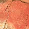
Red earth, wrongly called red ochre, is ferrous clay or sand in which the iron
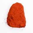
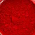
A lump of red earth is rubbed into pigment
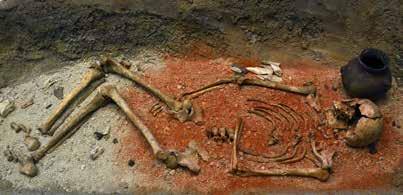
A Neolithic grave of a young man, c. 4500 BC, Musée Remi, Reims
Mineral Inorganic Natural earth
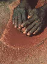
rusts. It is found on all continents, within a spectrum from pale red to dark violet. The robust haematite, from the Ancient Greek haima (blood, bloodstone), is the primary mineral building block of red earth. It exists in a red and blackish (iron lustre) form. Haematite is the same material to which the red planet Mars owes its colour and was called lapis rosso, the red stone, during the Renaissance. Malleable and plastic types of earth are suitable for ceramics and as bole ground. Pure haematite is easy to cut into shape, making it an ideal tool for the polishing of gold leaf. The gold that in part owes its warm glow to the underlying red bole ground. Since the beginning of time, red earth has been the colour to adorn and coat the skin of both the living and the dead. It is a signal colour and body paint, with the additional advantage of suppressing body odour
while hunting. A mixture of red earth and fat served, and is still used in various cultures, as an effective protection of skin and hair against the sun, insects and pollution. Metal and timber objects were similarly coated with red earth, to name just a few of its many uses. Red earth has been a universal burial gift from early prehistoric times, as shown in the photo featuring a Neolithic grave from 4500 BC In its fired form, it is called terracotta, meaning ‘baked earth’. Fattier earth is ideal modelling clay. Therefore, it is the basis of many forms of ceramics and pottery used worldwide for domestic, architectural and industrial purposes, and even special luxury products.
As paint, red earth is a quick dryer and more sparkling than the rather lifeless contemporary synthetic iron oxides. Which, very confusingly, are frequently
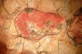
offered under the same names. Red earth is for the taking in many places and, if necessary, can be purified quite effortlessly before use. Throw a scoop of earth into a bucket of water, stir it vigorously, and let it settle. Once the earth has sunk to the bottom, drain the dirty water. If you want, this can be repeated several times. Red earth becomes paint by mixing the pigment with water, blood, marrow, lard, milk, fish, hide or bone glue, flour, plant or flower sap, oil, resin, gum, beeswax, honey, manure or saliva. And, nowadays, a synthetic binding medium. We should not overestimate the quantities of paint people were making and using in the past. Little was needed to decorate figurines or to paint the extraordinary animals and symbols in prehistoric caves. The paint is quite thinly applied, as seen in the bison of Altamira, where the bulge of the rock is masterfully incorporated into the shape of the buttocks.
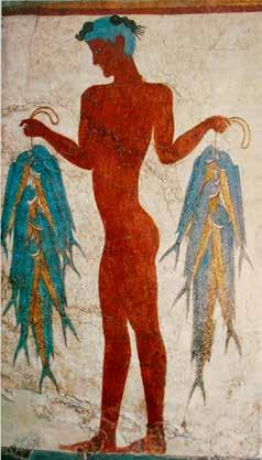
Mural of a fisherman, c. 1650 BC, Aktrori, Santorini
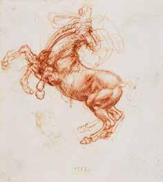
Leonardo da Vinci, Rearing Horse, c. 1503
< Painting of a European bison in the Altamira cave, c. 15,000 BC, Spain
Naphthol Red & Quinacridone Red
Two different shades of red that are iconic in the modern street scene. Easy to use and far less toxic than historical reds such as vermilion and cadmium, they are both substitutes for diverse historical pigments.
Naphthol red is a genuine azo pigment. The word azo derives from the French azote, the historical name for nitrogen (which it contains), and literally means
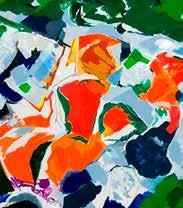
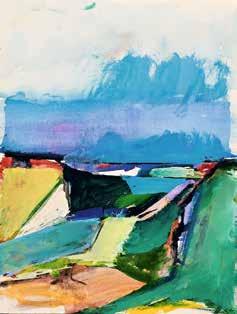
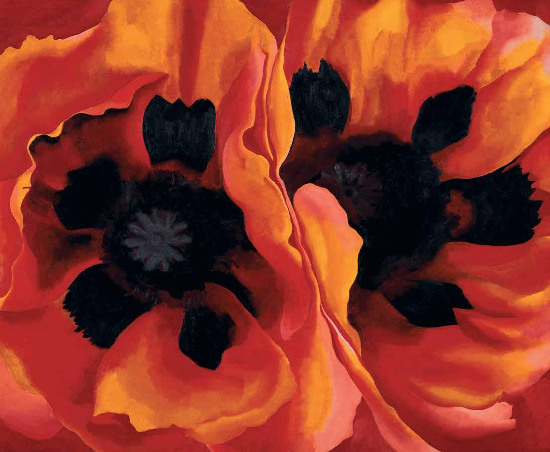
no (a) life (zoe). It is a member of a large group of organic pigments including browns, blacks, blues, yellows and reds, that defines much of the current artist’s palette. Naphthol red is yet another pigment developed in the 19th century. As an artist’s paint, it is principally used as an alternative for cadmium. While it comes close, it lacks cadmium’s tinting strength. This is evident in its name, ‘Cadmium Red Hue’, with hue indicating its role as an imitation of, rather than a replacement for, the original. My own red Summer Ocean is built up out of circa 12 layers of paint, for which I used two differing naphthol reds, supplemented by a quinacridone to depict the seawater. Azo pigments are broadly used for numerous products, from foodstuffs and medicine to paints, inks and textiles. Worldwide, they make up about 70 per cent of all dyes.
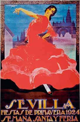
Francisco de Castro, Sevilla, 1924, poster
Saint Nicholas costume
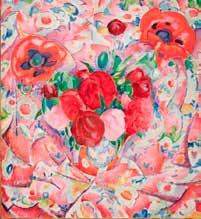
Leo Gestel, Pionees, 1912, oil on canvas, 100.5 x 90.5 cm, Kunstmuseum, The Hague
1911 and 1958 to this day
Quinacridone red likewise has its roots in the 19th century but was not marketed as a paint pigment until 1958. An exquisite, transparent red, it forms the modern-day replacement for carmine and madder and is lightfast, in contrast to its historical forerunners. A bit more expensive, but its capacity to preserve colour intensity
should negate any objection to the higher costs.
Like rose madder and alizarin, it covers a wide colour spectrum: from deep magenta to violet to brownish red. Quinacridone’s cool, bluish undertone makes it perfectly suitable for the making of purples and violets.
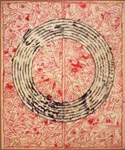
Pierre Alechinsky, Octave, 1983, private collection
Maurice Wyckaert, Composition, 1979, oil on canvas, 80 x 70 cm, private collection
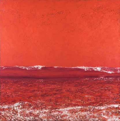
monica rotgans, Summer Ocean, oil on canvas, 180 x 180 cm, artist’s collection
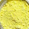
Lead-Tin Yellow & Massicot
Lead-tin yellow is also called the ‘yellow of old masters’, as the word is a 20th-century invention. It was given the nickname because, when it was rediscovered through research in the last century, it was found in a significant number of historic works of art. It is, as the name suggests, a lead and tin-based, hence toxic yellow.
Why the pigment vanished so ingloriously remains a mystery. It was affordable, lightfast and more consistent than its successor, Naples Yellow. Moreover, the two are very similar. Nevertheless, it disappeared from painters’ studios around 1750 and then quickly from the collective memory. It was not until 1938 that Richard Jacobi of the Doerner Institute in Germany rediscovered it. Lead tin-yellow is the default translation of the term he introduced: Bleizinngelb. An attempt at reconstructing its history is not made any easier by, once again, the randomness of its name in historical recipes. The variety of original and forgotten names could not be more different: in German, it was Plygall; in Spanish, it was genuli, giallorino in Italian; in Portuguese, mecchim; and English, general
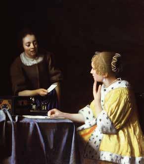
Johannes Vermeer, Mistress and Maid, ca. 1666, oil on canvas, 90.2 x 78.4 cm, The Frick Collection, New York
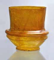
The Munich Cup, Roman glassware, 3rd-2nd cen. BC, Staatliche Antikensammlung, Munich
Because they are so difficult to tell apart, massicot, Naples yellow and what is now called lead-tin yellow were habitually mixed up.
Lead-tin yellow is a convenient and practical colour for painting. It is not obtrusive and very suitable for depicting a warm glow of light. It colours the light-catching chamber coats in Vermeer’s paintings When one sees an opaque, unblended and calm light yellow, there is a good chance it is the ‘yellow of the old masters’. And this applies to both easel and wall painting. The very closely related massicot is as old as lead white, but unlike its kin lead-tin yellow, a pure lead yellow. It is crafted by heating lead white until it turns yellow. It is not a particularly favourable or robust colour on the painter’s palette, but quite suitable for glazes and colouring glass, resulting in a striking golden yellow in the latter.
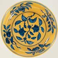
< Anonymous, dish with pomegranate blossom and sprigs of fruit, c. 1506-1521, porcelain, Rijksmuseum, Amsterdam
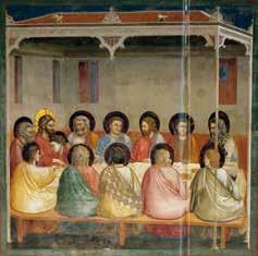
Giotto, The Last Supper, c. 1305, fresco, 200 x 185 cm, Cappella degli Scrovegni, Padua
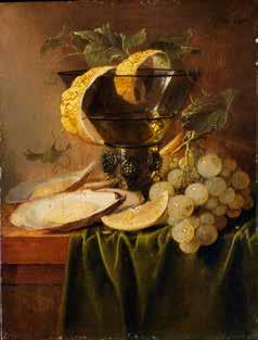
Jan Davidsz de Heem, Still-Life with a Glass and Oysters, c. 1640, oil on panel, 25.1 x 19.1 cm, Metropolitan Museum of Art, New York
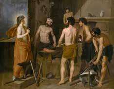
Diego Velázquez, Apollo in Vulcan’s Forge, 1630, oil on canvas, 223 x 290 cm, Prado, Madrid
So far, massicot has been found as pigment in, among others, Pompeian wall paintings and as a glaze on ancient Egyptian pottery.
Neither pigment is suited for making strong mixed colours. They will sooner dull those. A vivid green or orange cannot be made with them.
Indigo & Woad
Indigo is born and dies, to be born again. Essentially, this means the metamorphosis from plant to colour, where the basic indigo-white changes from green into a deep blue. In many cultures, it is seen as the representation of the spiritual growth in a human life.
Indigo and woad have become practically synonymous, even though they are members of distinctive plant families from different geographical regions. The common denominator is that both
belong to the group of historical blue-dyeing plants. And, as with purple, contact with oxygen causes their fairly colourless fluids to turn blue. Indigo blue signified power and might – supremacy in religious, social and political fields. This was presented, for example, in the form of innovative textiles or embroidery, a body painting, a tattoo, or an exclusive fabric –the more exquisite the fabric, the purer and richer the colour. In the sixth century BC, the prophet Ezekiel describes the beautiful blue attire and embroideries of the wealthy merchants of Seba, present-day Yemen.
Indigo derives from the ancient Greek indikon, meaning ‘from India’. In the fourth century BC, India formed the eastern border of the greater Greek Empire. It also refers to the raw material originating from this region (present-day Pakistan and northwest India), dried indigo pulp, which the Greeks highly valued.
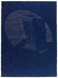
Sian Bowen, Gaze, 2006, drawing, laser-cut indigo painted blue paper and applied silver line, 66.4 x 48.8 cm, artist’s collection
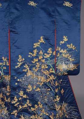
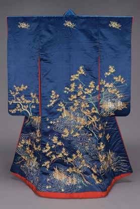
Kimono (furisode), Japan, c. 1900, satin and embroidery with gilt-metallic yarns on silk, 173.4 x 125.1 cm, Museum of Fine Arts, Boston
Until the opening of sea routes to Asia via the Cape of Good Hope, indigo was known in Europe as Baghdad blue. Named after the city selling the best qualities and which, for centuries, was the bustling crossroads for transhipment goods from Asia, Europe and Africa, giving it a mythical reputation. Indigo blue – we are all familiar with it. The original colour of denim jeans, conquering the world from the United States, is a cool blue with a greenish or black nuance. In everything the counterpart of the shimmering ultramarine. Indigo-based inks and paints have been around for thousands of years, as the pigment combines well with traditional binders such as egg, hide glue, honey and resin. It is a versatile multi-purpose colour. Unfortunately, when mixed with linseed oil, the paint darkens to a blackish blue, which can be resolved by adding a white pigment.
In Europe, indigo blue was employed as an oil paint in Scandinavian panels as early as the 13th century, which shows how widely branched international trade was. With a growing supply by the various East India Companies, indigo became more common and affordable, and a more prominent colour on the painter’s palette.
At the start of the 17th century, the port of Antwerp handled forty percent of the world trade, making it an important transhipment point for the Portuguese indigo from Asia. Hals visited his native Antwerp in 1616 and, from then on, included indigo in his palette. He thus starts a trend in the northern Netherlands. First with colleagues in his hometown of Haarlem, followed by others such as Vermeer in Delft, and Steen in Leiden.
Johannes Verspronck, Andries Stilte as a Standard Bearer, 1640, oil on canvas, 104 x 78.5 cm, National Gallery of Art, Washington D.C.
Levi’s-jeans
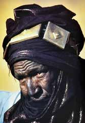
A Tuareg with a litham
Manganese Blue
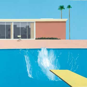
Ice blue. The coolest light blue the chemical industry can produce. It’s better known as pool blue, that almost luminous blue that suggests paradise with tropical seas and palm trees. We know it thanks to Hollywood movies, basically the birthplace of the modern, luxury, private swimming pool. Tinting the cement for pools is one of the most popular uses of manganese blue in architecture, hence its moniker cement blue.
This will be a short chapter on the extremely short life of a colour unlike any other. In 1907, German chemist Bong developed the pigment basis, which was enhanced by IG Farben around 1935. After that, its production as an artist’s paint took off. Lefranc introduced it in 1938 as a new pigment in its assortment under the name bleu azural, followed by the other paint manufacturers.
By 1970, production had already been phased out due to the high costs and environmental and health risks. Contact with the pigment via inhalation, the skin, or swallowing dried dust can have serious and negative effects on the nervous system. Manufacturers naturally searched for a less hazardous alternative. An imitation manganese was developed with the harmless, greenish phtalo as its base. Even though it comes close, it misses the intensity of the original pigment.
David Hockney, A Bigger Splash, 1967, acrylic paint on canvas, 242.5 x 243.9 cm, Tate Britain, London
Some paint manufacturers can still offer the original pigment from remaining stocks, under the motto “last chance!”. As with cobalt blue, the price tells you whether you are dealing with the real thing: cheap original manganese blue pigment does not exist.
Toril Kojan, Struggle, acrylic paint on panel, with manganese blue/hue, 2019, 30 x 30 cm, artist’s collection
Richard Diebenkorn, Untitled, from sketchbook #10, p. 13, gouache and watercolour on paper with artificial manganese blue, 2nd half 20th cen., Kantor Arts Center, Stanford
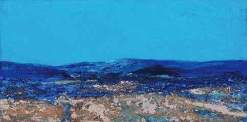
monica rotgans, Breathless, 2020, manganese pigment, natural ochres and acrylic paint on panel, 60 x 30 cm, artist’s collection
Scheele’s Green & Schweinfurter Green
The true poisonous greens, with arsenic as their base. They are, therefore, related to the historical orpiment and realgar. Suitable for horror stories, as there are probably no other pigments that have claimed so many victims in such a short time.
Nevertheless, I can easily imagine an artist ignoring the risk due to the chronic and frustrating lack of bright greens. These are the first intense, opaque greens. Tints that are impossible to make by mixing the blue and yellow pigments available at the time.
Scheele’s green was developed in the 18th century by the Swede Carl Wilhelm Scheele. It was soon replaced by the better-quality Schweinfurter green, invented by Wilhelm Sattler of Schweinfurt, Germany. Sattler maintained a monopoly on his recipe until 1822, after which others succeeded in copying the procedure.
More and more small factories sprung up, and the colour spread like an inkblot, first across Europe and then to the other continents. Due to the many trade routes, the new, extremely popular emerald green came into the possession of anyone who worked with paints, inks and dyes via the
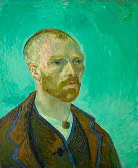
Vincent van Gogh, Self-Portrait, dedicated to Gauguin, 1888, oil on canvas, 60 x 49 cm, Fogg Art Museum, Cambridge
Odilon Redon, Sita, c. 1893, pastel over charcoal, 53.6 x 37.7 cm, Art Institute of Chicago
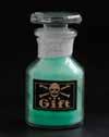
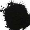
Bottle of Schweinfurtergreen pigment
‘colourmen’ and pigment traders. This journey can be traced through works of art in the Americas, Africa, Oceania and Asia. Due to its high production, Schweinfurter green was not expensive. It was employed by most artists until the 19th century when it was taken out of production as pigment. Turner painted with it as early as around 1830, Constable followed a bit later. It can be found in Manet’s Déjeuner sur l’herbe, in works by Arnold Böcklin and Vincent van Gogh, to name but a few of its many users. This pure green must have been quite a miracle for the Impressionists and their later colleagues, allowing much more direct and powerful work. Especially in the increasingly popular en plein air painting. Yet many, often ghastly, examples can be found showing the consequences of the indifference or ignorance with which the two pigments were handled. Causes
James Shaw, South Australian Parliament; the House of Assembly, c. 1867, oil on canvas, 64 x 93 cm, Art Gallery of SA, Adelaide
of victims’ suffering and death included green-dyed sweets, cakes and confectionery, green candles, as well as paper, carpets and rugs, wallpaper, and garments. Additionally, something as simple as a green price tag on a batch of plums at the greengrocer’s could cause the poison to seep from the label into the moist fruits. After its use as a pigment was banned, it was still available as a pesticide and poison control for both winged and wingless pests. It took some time before its effects on humans and the environment became apparent, and its production was completely prohibited.
Paul Cézanne, Mont Sainte-Victoire, 1902-1904, oil on canvas, 73 x 91.9 cm, Philadelphia Museum of Art
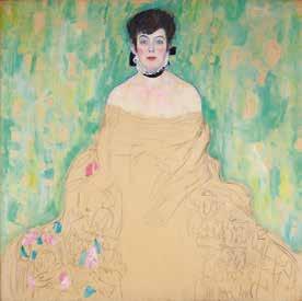
Gustav Klimt, Portrait of Amalie Zuckerkandl, 1917, oil on canvas, 128 x 128 cm, Galerie Belvedère, Vienna
Bone Black & Ivory Black
In any case, they are both of animal origin, regarding the names, it is a confusing mess. Verifying whether you are dealing with true ivory black or bone black, is extremely difficult. The latter is significantly cheaper than the former, but ivory black was and is also called bone black and vice versa.
The pigments and paints that pass for ivory black these days are usually bone
black. You can easily make both using slaughterhouse waste such as bones and teeth. For water-based wall-painting neither bone nor ivory blacks were recommended because of the bleeding, inherent to fine-grained pigments. In the past, the pure and original bone black was recognisable by its typical brown hue. It was originally (and still is) made from charred animal bones. A variant would have been made by replacing the bones with the skeletal remains of fish. Believed to be the main ingredient of the historical Chinese ink.
Bone black has a deeper tone than soot black and can be found in abundance on the palettes of painters since the 16th century. Unlike bone black, high-quality ivory black has a blue tinge and is somewhat transparent. The Greek painter Apelles called it elephantinum, perhaps because it was made from elephant tusks,
Diego Velázquez, The Jester Don Diego de Acedo, c. 1645, oil on canvas, 106 x 83 cm, Prado, Madrid
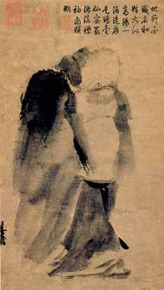
Liang Kai, Immortal in Splashed Ink, 13de cen., ink on paper, Nationaal Paleis Museum, Taipei
of the waste remaining after they were turned into ornamental objects. Like bone black, it has been found in prehistoric paintings. To make it yourself, you roast pieces of ivory in a pan. These can be all kinds of teeth, objects made from ivory, such as combs, and the waste of ivory carvers. Horns and antlers were occasionally used, despite them not being ivory. Kurt Wehlte provides a fine description of the firing of real ivory after visiting the factory in Schweinfurt, founded by Wilhelm Sattler in 1925. At the time, the factory was renowned worldwide for its excellent ivory black and Wehlte arrives to gather information for his standard work on artists’ materials. He notes that the remains of ivory are heaped in iron pots as airtight as possible and then sealed with clay. Once the kiln has reached the right temperature, the pots are put in. He obviously wants to know at what
(Circle of) Jan van Scorel, Portrait of a Venetian man, c. 1520, oil on panel, 45 x 33.5 cm, Niedersächsisches Landesmuseum, Oldenbrug
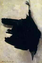
Floris Verster, Dead Crow 1907, oil on canvas, 55,5 x 37 cm, Dordrechts Museum
temperature and how long the firing time needs to be and inquires with the old and experienced fire master.
In reply, the latter wordlessly places the back of his hand up against the kiln, at shoulder height: it is all about feeling, listening and experience. Four years later, the curtain falls on the factory, and the celebrated ivory black disappears from the palette.