

Pinning down the essential ingredients that comprise a London interior is much like trying to reduce the vast metropolis into one ordered architectural reference point – a near impossible task. Just as the city blends traditional Victorian and Georgian housing stock with new builds, converted warehouses, social housing, tower blocks and landmark post-war estates, so its interiors comprise a fusion of decorative influences. The relaxed elegance pioneered by Colefax and Fowler in the mid-twentieth century, the softly modern, design-led rooms of Terence Conran a decade or two later, and the restrained schemes of interior architects such as John Minshaw have each made their mark. More recently, the capital’s interiors have favoured a return to the playful, loosened up look it has long flirted with: blowsy florals, clashing colours, vibrant prints and plenty of frills and fringing. Add to that a preference for natural materials including timber, rattan or marble and a delight in the exotic, from Ikat designs to bold geometrics and you have something approximating London living: loose, imperfect, unpretentious and just a little bit rebellious.
The questions of what makes a home, why its interiors matter and how living in a city plays out are all at the heart of this volume. More intrinsic is the issue of how we live
in London itself as opposed to other key capitals such as Paris, Rome or Madrid. What makes an interior belong uniquely to its city and why? The answer lies not so much in a sense of uniformity but in the reverse: behind every ubiquitous London terrace lies a deeply individual home; beyond each formerly industrial space, an eye for adaptability and behind every high rise or Victorian house conversion, a desire to live among the fray. London is not laid out in formation like some cities, nor is it easy to read. A series of villages stitched together over time, every borough has its own personality, from the urban appeal of Clerkenwell to the gentile, sometimes staid, streets of Chelsea. Social housing mingles with affluent, traffic-packed streets with quiet mews. Every area is subject to unexpected changes of fortune: some, such as Notting Hill, were once coveted, then neglected and now considered deeply desirable, others, formerly ignored, now under the spotlight. 1930s homes on the outer western reaches of the city offer a pull to growing families once located in more central neighbourhoods and long overlooked period properties in East London are the subject of renewed appeal.
The city’s interiors reflect this spontaneous approach – on first glance, unlike our European neighbours, it can be hard to spot any follow through or theme – botanical prints
“I like the decoration of a room to be well behaved but free from too many rules; to have a sense of graciousness; to be mannered, yet casual and unselfconscious; to be comfortable, stimulating, even provocative...”
~John Fowler, British interior decorator, 1906-1977

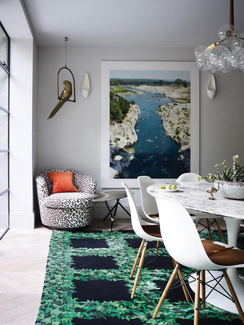
As anyone who lives in the capital will tell you, London did not win the lottery when it comes to light. Often flat and grey, it lacks the uplift of southern European climes. So, injecting this townhouse with a hit of sunshine required considerable thought on the part of its Parisian-born owners. Their southfacing home already had plenty of benefits – tall windows, access to a communal garden and a more generous width than usual. But it needed some punch. In collaboration with K&H Design, they worked on a confident combination of colour and pattern intended to combat’s the city’s overcast days.
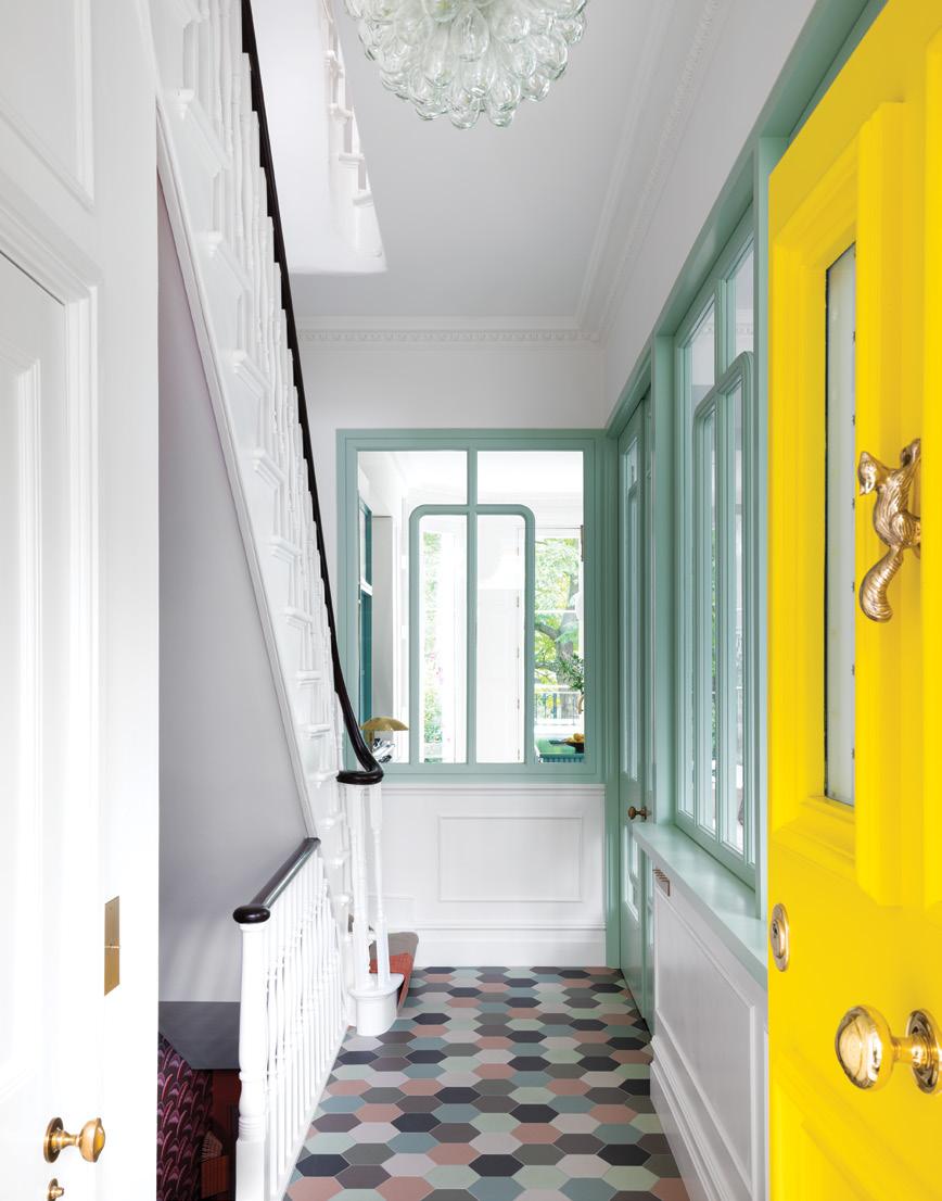
‘ The light here can have the effect of sapping the energy of Mediterranean colours such as a bold Greek blue or a Moroccan red,’ says K&H’s founder Katie Glaister. ‘So we couldn’t rely on those hues. Instead, it was a case of drilling down and finding tones that were a little more knocked back.’ The result is a considered palette that lifts the spirit as soon as you step across the threshold – via a sunshine hued front door. Thanks to glazing instead of solid walls throughout the ground floor, the eye can travel freely from front to back,
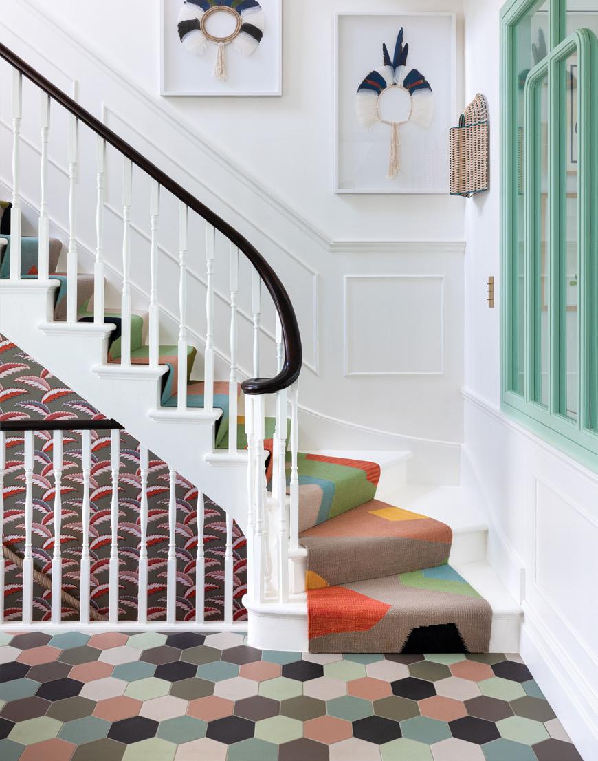
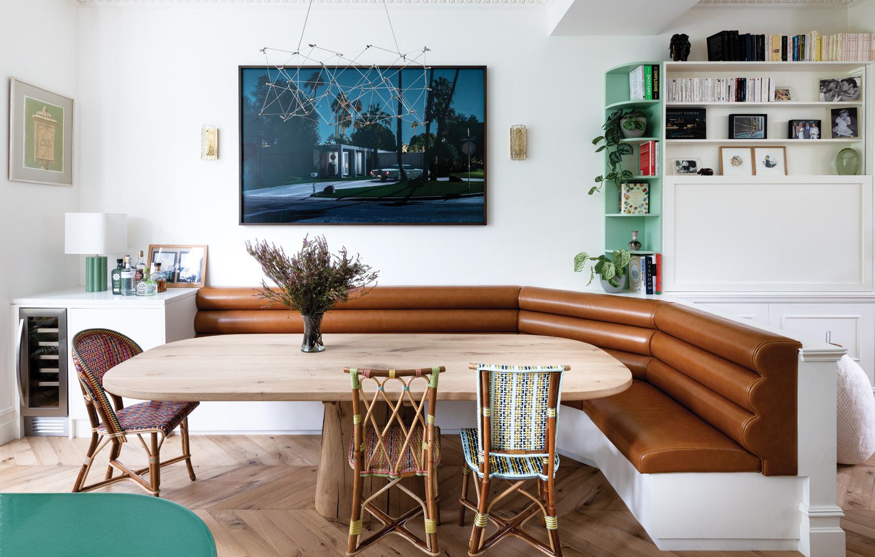
taking in the garden at first sight. Shades of green and blue appear in abundance, from mint-framed internal glazing to the celadon pop of the kitchen island or a powder-blue coated sliding pantry door. ‘Though our white walls, herringbone floors and interior windows are all Parisian design motifs, the bold colour pops are definitely more eccentric,’ says owner Louise Baladi. ‘It’s the kind of clash that suits London more than Paris, but it works because there’s instant uplift.’ That mix-and-match sensibility is one of the reasons that Louise wanted to collaborate with her interior design team. ‘Being short of inspiration was not the problem,’ she reflects. ‘Instead I needed a guiding hand to curate my ideas, because I love wallpaper, print and geometrics. I wanted to combine that aesthetic with a dash of classicism.’ The result is a mix of patterns that pull together like a tapestry: in the hallway, multicoloured tiling, a colour-block stair runner and a densely-patterned wallpaper are captured in one striking vignette. Meanwhile in the principal bedroom, a

‘In the children’s bedrooms on the top floor, ceiling heights have been opened up to the rafters so that they feel like principal rooms, rather than secondary attic spaces’

 COSMOPOLITAN
It takes vision and a dose of courage to imagine living in a gritty space that was once, rather incongruously, occupied by cows. But for two serial renovators, this unlikely backstory only added to the appeal. Sandwiched between a row of ordinary South London terraces, their home was formerly an unprepossessing dairy, then an ice-cream store, and latterly a down-at-heel workshop.
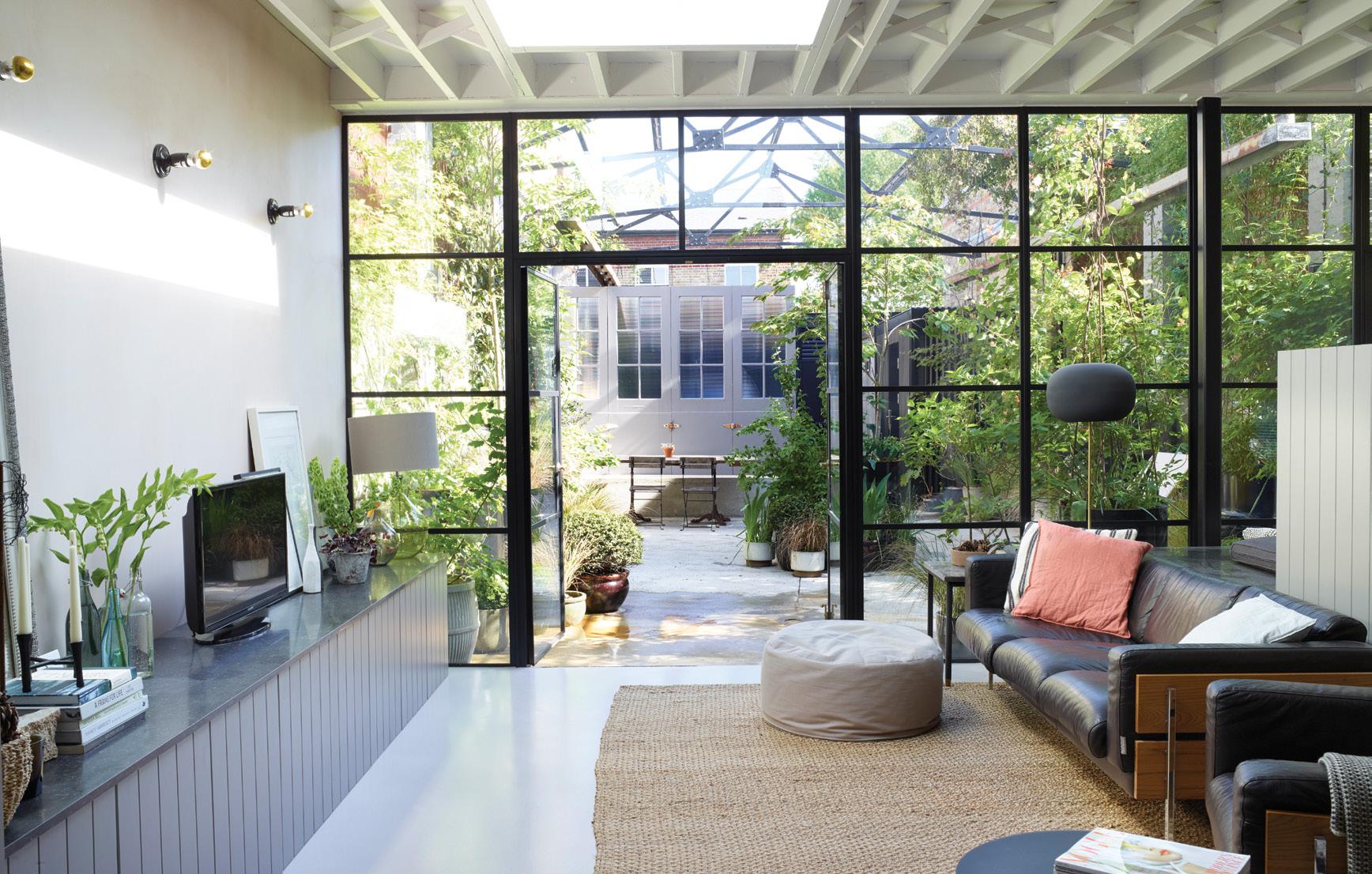
Nothing indicates to the casual passer-by that beyond a modest metal shuttered frontage lies a jewel of a courtyard inspired by the communal gardens hidden behind austere doorways all over central Paris. ‘If there’s an opportunity to take a peek through a gap in a gate, I can’t resist,’ says Beth Dadswell of her first glimpse of the unusual home she shares with partner Andrew, a graphic designer, and their son Louis. The fashion stylist-turned-interior designer was on her way home from a shoot when the site caught her eye. ‘I peeked through the gates and saw a derelict courtyard with a corrugated plastic roof and a crumbling building beyond. It was a commercial venture and so unusual that I knew we had to take a look.’
The sight that greeted them would have deterred many, but Beth knew exactly how it could be transformed. The faded front yard would be turned into a verdant garden, hidden from the street; the ground floor would be extended out to accommodate flexible living space, while the first floor, with its unique gambrel roof, would be exposed to the rafters and tweaked to house two bedrooms and two shower rooms. ‘The most obvious choice was a double-height extension, but we were determined to preserve the raw beauty of the place and so our approach was less radical,’ says Beth.
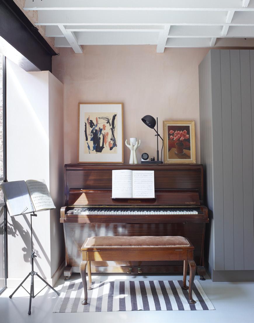
That softly industrial aesthetic is evident throughout, from the less-than-perfect cracked concrete flooring in the courtyard and rusty fittings repurposed to train plants up the walls, to the roughly polished plaster finishes within. The building’s former rear refrigeration area has been turned into a multifunctional snug, with Beth’s office beyond, looking over another, smaller courtyard. With less square footage to play with, Beth has been clever with her


In the hands of this jewellery designer, a once quotidian terrace now pops with unexpected colour combinations and a clutch of Latino influences
Having grown up in a 1970s-house filled to the brim with tone-on-tone colour, pattern and collected artefacts, it’s no wonder that Barcelona-born Sandra Barrio von Hurter gravitated towards impactful interiors in her own home. When she and husband Felix moved into this London terrace, its mushroom-hued interiors needed a serious uplift. Thanks to the couple’s love of collecting, Sandra’s Spanish heritage and a passion for travel, it’s now populated with personal vignettes and playful colour combinations.

Sandra’s influences are diverse and unexpected. Regular childhood visits to the Boqueria market in Las Ramblas has given her ‘a lifelong passion for groceries’ evident throughout this home via clutches of ceramic lemons, a bowl of Murano glass fruit gathered and gifted by Felix, and plates of life-like plastic vegetables sourced from Tokyo. ‘I often joke that Carmen Miranda’s hat is my go-to,’ says Sandra. And that vibrancy is repeated on the walls too: the kitchen is painted in the perfect shade of knocked-back orange; the sitting room
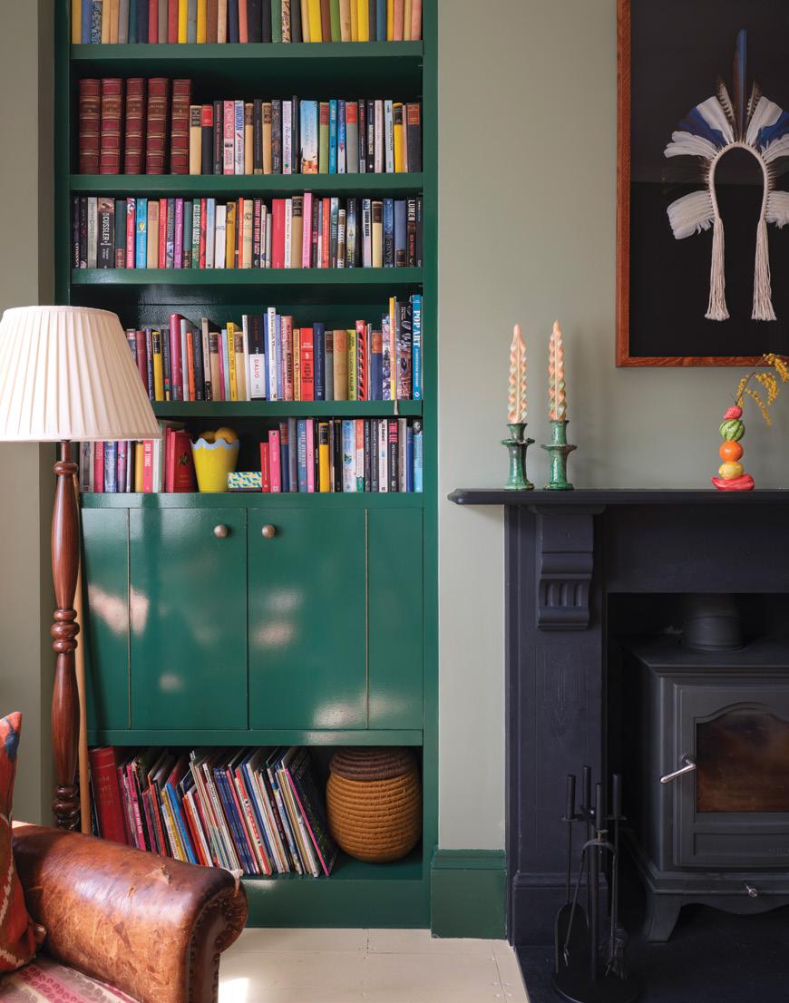
contrasts deep green gloss woodwork with a softer matte shade; the guest bedroom features terracotta walls framed by forest green and Sandra’s home studio is finished in a tone that sits somewhere between sunshine and lemon. ‘I’m used to colour,’ says the designer, whose love of fruit has also been transposed to her playful jewellery collections. ‘As I child, I grew up with vivid tones, from zingy mimosa to the birds of paradise flowers in the garden.’
However, choosing the right tones to uplift a classically Victorian space required a discerning eye. None of the colours here are rainbow hued; instead each is one or two shades softer or deeper than its primary colour counterpart. To get it right, Sandra took photos of every room before decorating, and made a PowerPoint slide of images. Then she used Photoshop to swap in various wall colours and Pinterest images to add furniture. ‘It was a great way to visualise the space,’ she says. ‘The key was to mix finishes and tones –
matte with gloss; plaster pink with pomegranate, rustic textiles with classic British prints.’
This is a relaxed, loosened up home, inspired by the creative colour confidence of artists like Frida Kahlo and Georgia O’Keefe, whose work Sandra refers to often. But it’s also a personal representation of this couple’s approach, which never takes itself too seriously. In the sitting room, two generous vintage olive oil cans have been repurposed as playful lamp bases; a Brazilian headdress is framed above the fireplace; a ceramic salamander from Ibiza lounges lazily on the coffee table. Tomato tins filled with flowers or pencils are studded throughout the house and walls of ever-rotating art, prints and family photos create plenty of visual interest.
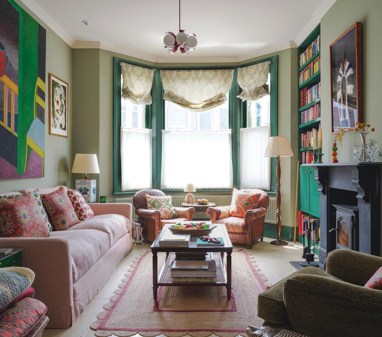
There’s a constant interchange of inspiration at play: the two-tone sitting room and main bedroom prompted the shades of a recent earring collection, while that love of groceries has recently resulted in a colourful fruit-inspired edition of homeware. ‘It’s always objects, books, museums and artists that inform both my designs and these interiors,’ Sandra says. ‘It’s all an extension of myself.’
As for the question of how the capital city has influenced this home, it’s clear that a sense of diversity has crept into these interiors. ‘Here, I mix things up in a way that I probably wouldn’t in Barcelona,’ reflects the designer. ‘I look around and see that metal co-exists with rattan, vintage pieces with abstract prints, ethnic textiles with floral. To me, that’s a very London thing and I’m glad I’ve been exposed to that ‘undone’ look. It seems to represent the layout of the city itself which merges Victorian architecture with modern; social housing with new builds for a slightly messy but culturally-rich feel.’
‘For us, work and home is the same world: both involve being inspired by colour, texture and travel’The couple’s love of repurposing is evident in this space, where a pair of tables from a mechanic’s workshop have been topped with glass. Atop sit two Greek olive cans wired to accommodate lampshades. Gathered half-height linen window treatments add a European feel

This Victorian villa in West London may share the same slim multistorey configuration as so many other neighbouring terraces, but behind its classic front door lies a host of confident design choices. Interiors fuse contemporary detailing, midcentury elements and an American preference for colour and pattern with just a sprinkling of English decorative style for good measure.
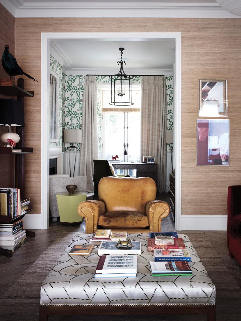
Here, florals are paired with nubby grasscloth wallcovering; inky tones and plush textiles with design-led prints. The home of Kentucky-born Michelle Hagemeier and her German husband Jan reveals the eclectic imprint of a well-travelled family, yet every element co-exists easily, resulting in a space that is tactile, cocooning and adventurous in equal measure.
The pair lived in this house for a year with their daughter Lilli, before undertaking a renovation. ‘It was a good opportunity to see how its bones settled around us,’ says Michelle, whose first restoration 25 years ago was a modest maker’s bungalow in Portland, Oregon.
Accustomed to large spaces and lateral living, Michelle’s initial instinct had been to buy a period maisonette. But at the eleventh hour, this terrace, with its elegant mouldings and generous windows, persuaded her otherwise. Though the couple virtually gutted the interior in order to refresh the building’s steel reinforcements, living there had taught them that they needn’t unduly alter the layout. ‘We started anew because we didn’t want to band aid structural issues, but we respected the internal configuration,’ says Michelle. The lower ground was a dug little deeper to accommodate a kitchen and snug; the ground floor preserved its flow of double sitting room; the first floor was turned over to a master suite, while three bedrooms and two bathrooms were carved out of the top storey.
When it came to the interiors, the couple’s preferences diverged, with Jan favouring wholly classic schemes and Michelle drawn to more contemporary spaces featuring the odd colour or pattern clash. Their first thought was to hire an interior designer to bridge that gap, but
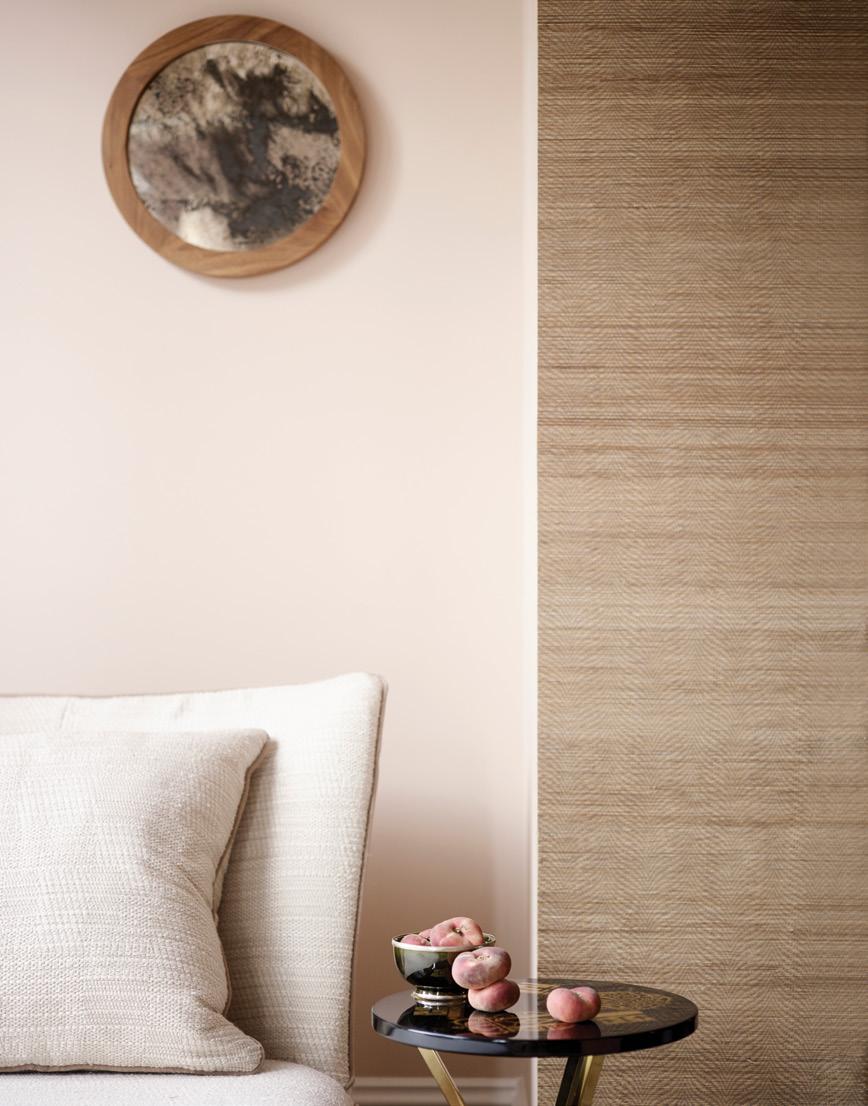
A creative combination of pattern, print and texture shows that this family’s approach to their traditional terrace is far from run-of-the-millA walnut framed mercury glass mirror introduces a softening note to this simple scheme
