

Building God’s house, to beautify and enrich a place of worship, was considered a part of a parishioner’s privilege and duty. America’s late-nineteenth- and early-twentieth-century religious edifices are among the nation’s forgotten treasure houses of art and interior decorative design. No matter the diversity of religious practices, or the size and wealth of congregations, methods and techniques of painted interior decoration are relatively straightforward. Before a painter is able to work, a plasterer had to prepare the wall—first with a scratch coat, then with a brown coat, and finally with a third, or finish, coat of plaster. The painter would often sand the plaster to achieve a smooth surface on which to apply primer, then the second, final coat of paint. At this last stage, the painted surface decoration would be applied. The simplest form is plain painting. Specially mixed colors to meet the tonal requirements of the sketch or rendering are usually applied to the wall as a large sample, in situ, for the approval of the client— priest, pastor, rabbi, architect, or church committee.
Finishing methods can vary. Glazing is the application—usually with a brush of another contrasting color— after the plain-finish coat is dry. The glaze is wiped off by hand with a rag while the paint is still wet, leaving a residue and a hint of the other color. More or less of the glaze remains, according to the desired effect. In contrast to the subtle effect gained by glazing, stippling gives a textured effect to the surface. A brush with stiff hairs is struck repeatedly on a tacky surface. A crude variation in the finished effect occurs when using crumpled paper or a sponge instead of the stipple brush.
Decoration on plain or glazed surfaces can be applied in several ways. In stencil decoration, a series of patterns are cut on specially prepared waxed and stiffened paper,
and one stencil is used for each color of the design. The stencil is positioned on the wall and color is applied, perhaps with a special, stiff boar’s-hair brush onto the wall through the perforations in the paper. The stencil is carefully removed and the paint allowed to dry. The procedure is repeated until the multi-colored border or wall decoration is complete. In a complex design, as many as fifteen stencils might be required. The visual result is a repetitive, measured, two-dimensional design.
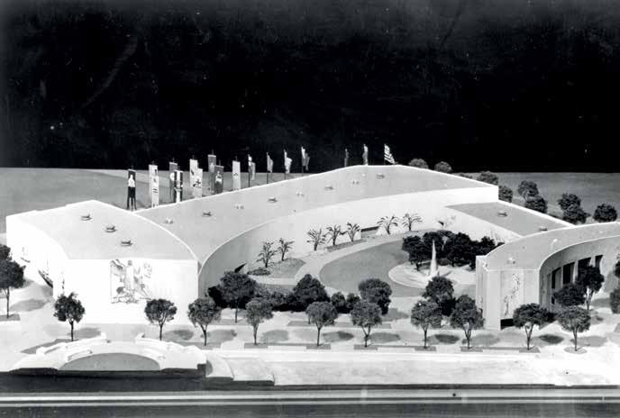
Stencils cut to simulate the tiny half-inch-by-halfinch mosaic tesserae are often used in ecclesiastical design. Gold or bronze can be painted through the stencils, one tessera abutting the other, to create rows of mosaic-like borders or entire fields. This technique was used as late as 1988, when Rambusch painted the baptistery ceiling of Saint Bartholomew’s Episcopal Church in Manhattan. The firm created a model (fig. 2-1) to study the design issues of this decision. The final result of the painted and decorated ceiling represented a measure of economy because executing a true mosaic ceiling was deemed too costly.
Another decorative technique that results in a freer, more fluid, sweeping design is the pounce method. It utilizes a full-size drawing, or template, of a design made on a piece of paper cut to the size of the space to be decorated. First, the paper is attached to the wall. Then a metal wheel, with sharp, pin-like projections on its circumference, is run along the outline of the design, piercing the paper and leaving tiny pin holes. A bag of pounce, containing chalk powder or charcoal dust, is dabbed along these dotted lines. When the paper is removed, the outline of the design is visible on the wall. These dotted lines are a guide for both outlining the overall design and understanding its scale. Then the decorator is able to

paint directly on the prepared wall, filling in the design with shadows, highlights, and color, giving it a three-dimensional quality. Sometimes, parts of it are highlighted with Dutch metal, which is composed of brass and other elements, or even true gold leaf. Other special free-hand techniques can also be used. Marbleizing and woodgraining are but a couple of the other options in the repertoire of a competent, well-trained decorator.
A common feature of all these techniques is that paint is applied to a dry wall. Creating a traditional “buon fresco” in the Renaissance tradition of such masters as Paolo Uccello (1397–1475) or Benozzo Gozzoli (ca. 1421–1497) necessitates painting directly on wet plaster, with specially ground dry pigments or tints dissolved in lime water. These are absorbed by the surface as it dries, penetrating the wall and becoming part of it: the pigment and the wall essentially become one. Before World War II, Rambusch craftsmen executed a number of church interiors in this true fresco technique, a most demanding job.
The vaulted ceiling loggia at the Rochester Art Museum was done in true fresco for architect George Gade. Saint Patrick’s Church, Bay Shore, New York (fig. 2-2), designed by Gustave E. Steinback, is another example. The mosaic at Saint Clement’s in Rome was
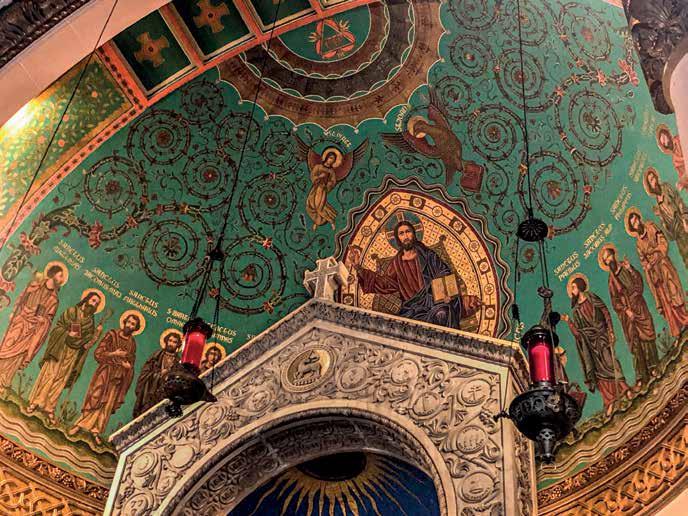
the inspiration for the traditional fresco decoration executed by Johannes Morton. At Bay Shore, to guard against moisture seeping into the apsidal semi-dome, copper sheathing was installed before laying on plaster and lathe. A working model of the apse was shown in the exhibition of 1925 at the Architectural League in New York. Woven in with the S and C scrolls are such symbols of new life as the peacock. Note the small, dark bronze light shields on each side of the chancel with repoussé images of the angels.
Still other examples of Rambusch frescos can be seen at the Holy Name Church, Columbus, Ohio (fig. 2-3), designed by Edward A. Ramsey. A sketch for these frescos was included in the exhibition of 1930 at the Architectural League. The Scandinavian American Steamship Lines also commissioned two frescos for its New York offices in the late 1920s. One was of the skyline of Copenhagen and the other of New York, so passengers would see them when arriving in, or departing from, port.
During the period from about 1930 until after World War II, many commissions were completed using “fresco
secco” techniques. Related to true fresco, it requires the same binder—lime—but the colors are applied to dry mortar or a dry surface that has been moistened with a solution of lime water. With either technique, the irregular surface of the mortar-covered walls or ceilings enhance color compositions with a subtle, penetrating vitality. No gloss or sheen is evident as with oil-based paint. Johannes Morton, a trained artist, was the meticulous master of both buon fresco and fresco secco at Rambusch.
Saint Agnes Church (no longer extant), Cleveland, Ohio, was a masterpiece of Gothic revival design by architect John Theodore Comes of Pittsburgh. It was completely decorated in the fresco secco technique. Harold Rambusch, fresh out of art school, had designed and painted approximately thirty shoulder-length portraits of saints in the spandrels between the arches in the nave. At the Annunciation of the Blessed Virgin Mary Church, McSherrytown, Pennsylvania (fig. 2-4), an older church, Comes oversaw a phase of redecoration in fresco secco. Saint Pancras Church, Glendale, Queens (figs. 2-5
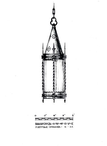


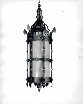

he wrote, “To provide twentieth-century engineering facilities within the ornamented framework of eighteenth-century architecture accepted by architects and engineers alike; the finished result [was] of interprofessional collaboration in a mutual challenge.” All the stakeholders in the project were pleased with the outcome.
Curiously, the documentation for an entire set of fixtures fabricated for the Alabama State Capitol came from a doodler. In 1852, an inattentive state senator sketched the chamber and a wall sconce. His notebooks were found 132 years later in the state archives. Using this miniature reference, Rambusch designer Jesus Gonzalez-Rio made scale drawings, specifications, and shop drawings from which the fixtures were made.
Small-scale settings have not been the only contexts for their lighting work. In 1978, Rambusch was asked to create a strong decorative feature without sacrificing floor space because of the need to accommodate crowds in a new building that had been constructed at the University of Wyoming. The Art Center held two theaters under one roof and shared a narrow lobby. Rambusch’s solution (fig. 4-31) was to utilize the entire ceiling. A horizontal grid exactly the size of the ceiling was made. Variously shaped, four-sided pieces of brass, copper, and bronze were suspended from the grid at regular intervals. Each piece was hand hammered and either polished or given a satin finish to reflect the uplight from nearby wall-mounted units. The highly polished, trapezoidal shapes hung on a two-point suspension, and they ranged in size from two to two and a half feet. This method of suspension allowed for slight, though restricted, movement, creating a subtle shimmering, scintillating effect.
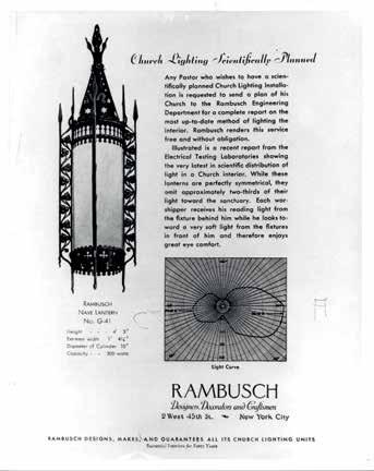
The way in which light is emitted imparts a distinctive character to the illuminated space. It also determines what we see and how we see it. Light can be categorized according to the atmosphere it creates. Task lighting provides illumination for completing a job such as assembling parts, looking at a work of art, or reading a hymnal. Architectural lighting, often produced by recessed fixtures, compliments the architectural features of a room and defines a space. Festive light, resembling the sparkle or flicker of a candle, can often be produced by the introduction of chandeliers. Special lighting refers to unusual situations that call for high levels of illumination, such as television filming, movie making, disco dancing, and particular requirements of gambling casinos.
firm’s lighting division, begun in 1919, are revealing on several levels. They reflect trends in the technology, inventions, design materials, manufacturing processes, and fabrication techniques. They show a range of aesthetic approaches, varying types of lighting solutions, and social and historical developments in architecture as well as preservation and restoration. These threads constitute a whole cloth, with technical, practical, and artistic outcomes, showing that Rambusch lighting is an innovative industry leader committed not only to art but the needs of its clients.
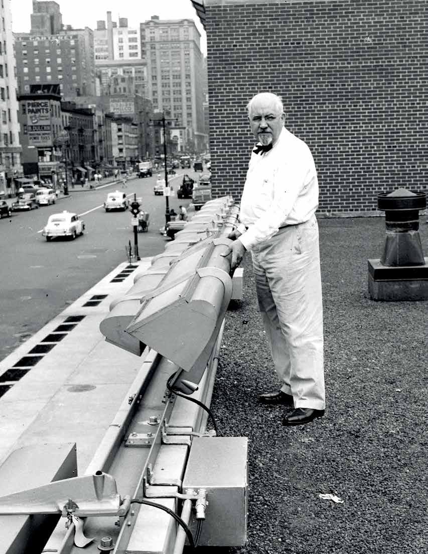
One can even turn to the developments of Edward V. A. Rambusch, for examples of how some lighting was used in the context of public space in New York. In the late 1940s he developed a design for a special program of Consolidated Edison to supply even lighting of entire sidewalks, with the added feature of being able to replace lamps without scaffolding (fig. 4-32). The units operated until 2008. These examples illustrate the multifaceted lighting solutions that the company has been able to pursue in public and other spaces, which is addressed further in chapter X.
Early ledger books confirm that from its outset, Rambusch designed and fabricated fixtures that produced all these types of illumination. Files of the 4-32
Edward V. A. Rambusch, with his design for the Consolidated Edison
1948.


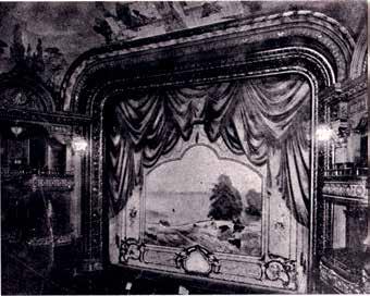
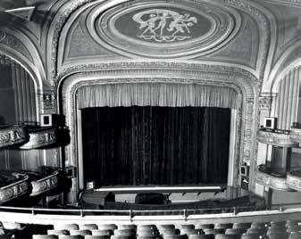
Within the first decade of its existence, the Rambusch Decorating Company was embellishing theaters. That undertaking is not surprising because theaters have many characteristics in common with churches, a building type with which the firm had vast experience. In an advertisement of 1906 in Sweet’s Indexed Catalogue of Building Construction, the Cincinnati Grand Opera House was listed as a completed commission. The driving force behind this spectacular project was the politician and businessman Mark Hanna. Borders, ceilings, and cornices were painted with Renaissance-inspired decoration. Frode Rambusch designed the pattern for yellow cut velvet that was specially woven and stretched, over a base of flannel, onto the walls of the opera house. Family lore has it that a yard or two of the fabric was brought home, and Frode’s wife made a shirtwaist, with leg-of-mutton sleeves, which she wore on festive occasions.
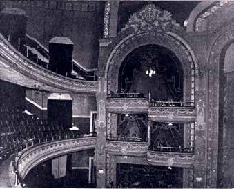
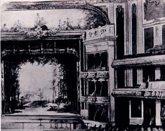
By 1910 and soon after, several commissions came in closer to home, beginning with the Orpheum Theatre, Jersey City (figs. 7-1 and 7-2). Later, there were the Crescent, Fulton (figs. 7-3 and 7-4), Broadway, Empire, and Casino theatres in Brooklyn; the Alhambra (fig. 7-5), the American (with its famed roof garden), and the Colonial in Manhattan; and Percy Williams’s Bronx Theatre in that borough. All were decorated by Rambusch. In Manhattan, theaters offering popular vaudeville shows were being constructed in the area around Union Square and on 14th Street. Entrepreneurs B. S. Moss and Sol Brill engaged Rambusch to design and decorate the interior of their flagship house, the Jefferson (fig. 7-6), located on East 14th Street. Moss and Brill owned a chain of theaters, each named after an American president. The Jefferson could be termed the first of these
deluxe theaters—a vaudeville house catering to the carriage trade. The ceiling above the stage’s proscenium arch once held an oval, cameo-like roundel where three Muses had been painted by Frode in 1913. But, sadly, their frozen attitudes of playful dance are now gone. The building, with its elegantly proportioned dome, was demolished in 2000.
The vitality and glamour of vaudeville was shortlived, pushed out by a rapidly developing motion-picture industry in nearby Fort Lee, New Jersey. First introduced as additions to live vaudeville acts, movies soon took over the whole stage. Just as the Jefferson was opening in 1913, Thomas W. Lamb was putting the finishing touches on The Strand, on Broadway between 47th and 48th Streets, for Mitchell and Moe Mark. It was designed specifically for showing movies: it was the first of the great movie palaces.
In less than two decades, film shorts that had originally been introduced as extra features would take precedence over vaudeville acts and eventually push those entertainers off the stage altogether. By the late 1920s, the Rambusch Decorating Company was creating sumptuous movie palaces for such architects as Lamb, along with Walter W. Ahlschlager, C. W. and George L. Rapp, and promoters Fox, Warner Brothers, William Brandt,
Top, left to right: 7-1 Partial view of theater and 7-2 Proscenium arch: detail, Orpheum Theatre, Jersey City, NJ, 1910. Middle, left to right: 7-3 Partial view of theater and 7-4 Proscenium arch: detail, Fulton Theatre (William H. McElfatrick, architect), Brooklyn, before 1908. Bottom, left to right: 7-5 Partial view of theater, rendering, Alhambra (originally known as the Harlem Auditorium, John B. McElfatrick & Son, architect), Manhattan, before 1905. 7-6 View of stage and roundel above proscenium arch, Jefferson Theatre (George Keister and Thomas White Lamb, architects, 1913), Manhattan, photograph from ca. 1955.


The noble public interiors of dignified courthouses and distinguished state capitols are the American, democratic versions of the palaces of Europe. Beginning in 1920, with a commission for painting, decorating, and lighting in the Virginia State Capitol, which had been designed by Thomas Jefferson, Rambusch has provided similar services in thirty-four of America’s state capitol buildings. Rambusch painters and decorators, stained-glass artisans, and lighting experts move carefully, with easy confidence in the heady atmospheres of these spaces. Stage upon stage of scaffolding is an integral part of decorating them.
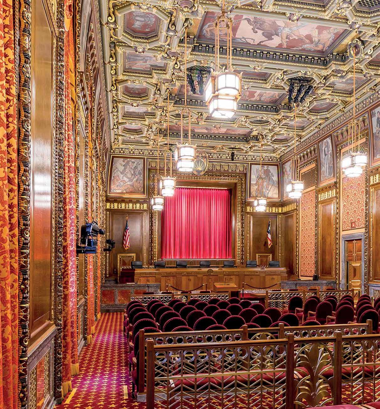
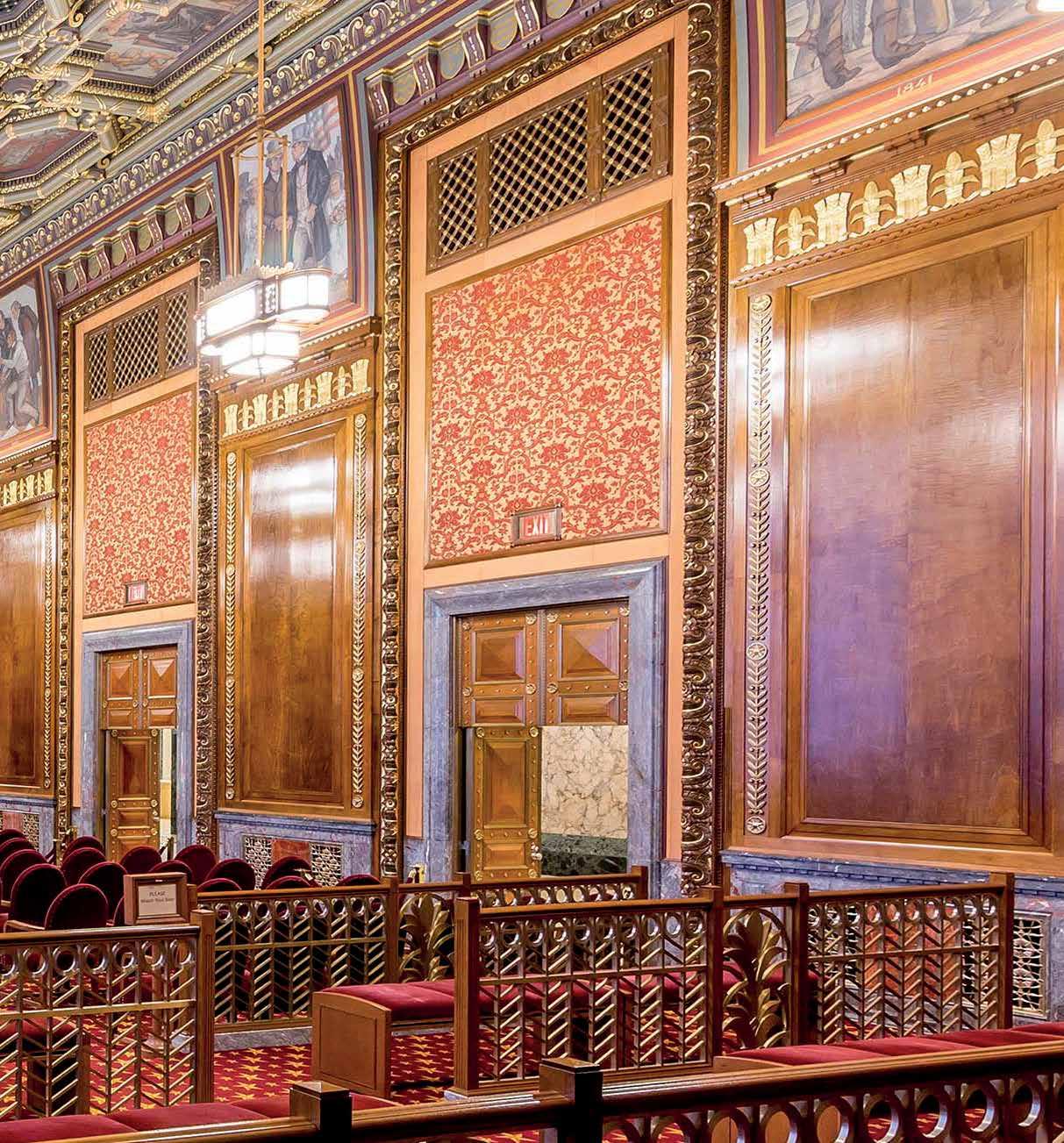
In the 1930s, and subsequent decades, the firm completed various works in this realm in the Midwest and West. Designed by Bertram Goodhue, the Nebraska Capitol is a prime example of Rambusch’s collaboration with artist Hildreth Meière (fig. 10-1) beyond the New York World’s Fair of 1939. From 1931 to 1932, the firm executed her designs. It also gilded the 400-footlong frieze in that capitol’s House of Representatives. Ledgers indicated a total bill of $7,887 for this job. In 1936, the company completed work on the Ohio State Office Building, now known as the Thomas J. Moyer Judicial Center (figs. 10-2 and 10-3). From 1958 to 1974 Rambusch in that state’s capitol provided a range of services: it set color schemes for public areas; lit the House, Senate, and Rotunda; and restored and moved enormous murals. A five-phase lighting program was devised for the Illinois Capitol from 1978 to 1980 (figs. 10-4 and 10-5). And, at the Colorado State Capitol, in 1984, when the lead-glass skylight was leaking, it was taken down, piece by piece, and repaired in the firm’s stained-glass studio. Sturdy bronze lighting fixtures— some weighing a half ton—from the capitol’s chambers
and halls were cleaned, rewired to modern standards, and reinstalled.
An apogee of custom, handmade work coming out of the Rambusch workshops was a commission for the New York State Capitol, Albany. It took 600 craftsperson hours to complete five yellow-brass chandeliers that measured six feet nine in size, with an additional hanging stem of six feet (fig. 10-6). All of the fixture’s cast elements, including decorative leaves that measured three and five-eighths inches square, went through ten steps of preparation. Attaching these leaves in the final stage of assembly demanded an extra hour of highly demanding precision handwork. Each of the related two-armed wall sconces have 101 parts that were made by hand. Period photographs and extensive historical research helped determine the final designs, carried out under the supervision of capitol architect Albert C. Brevetti.
Besides state capitols, public spaces in many other government buildings were decorated by Rambusch.
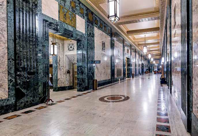
In the early 1930s, Cass Gilbert designed a thirty-story skyscraper for the US Courthouse at Foley Square, Manhattan. Elevator lobbies of each floor have identical, ornate, and deeply coffered plaster ceilings (fig. 10-7). Institutional green paint once masked the crisp classical details of their lovely rosette motifs. Rambusch’s task was to remove layers of paint and prepare six different color schemes to differentiate each floor’s lobby. The firm also painted the area behind the columned portico of the vast main lobby and installed new lighting.
10-1 Hildreth Meière, designer; House Chamber: gilded frieze, Nebraska State Capitol (Bertram Goodhue, architect), Lincoln, NE, 1931–1932. 10-2 Grand Concourse, Thomas J. Moyer Judicial Center (Harry Hake, architect), Columbus, OH, 1936, photograph from 2017.
This massive fixture was installed on a mirrored ceiling that created the illusion of an entire ball of crystal. Other design details and motifs evoked the cultural history of Saudi Arabia, such as the symbols of crossed swords and palm trees. Cast in bronze and hand chased, these ornaments were juxtaposed to the crystal. At the Royal Reception Lounge, Jedda Airport, Saudi Arabia, Rambusch again designed a very large half sphere out of crystal and mounted it on a ceiling mirror to create the effect of a complete crystal ball (fig. 12-11).
These large Saudi commissions had two parts: design and fabrication on the one hand and installation supervision on the other. Several teams of Rambusch craftsmen went to Saudi Arabia to help install these massive lighting fixtures. It was like working at the Tower of Babel, with crews from all over the world. Koreans, Filipinos, and Vietnamese lived in compounds, doing this work in lieu of accepting national military duty in their home countries. Rambusch maintained a business relationship with an established large Saudi family firm. For generations I. E. Ahmed and Mohammed Saleh Kaki have been an integral part of the commerce of their growing country and their country’s expanding economy.
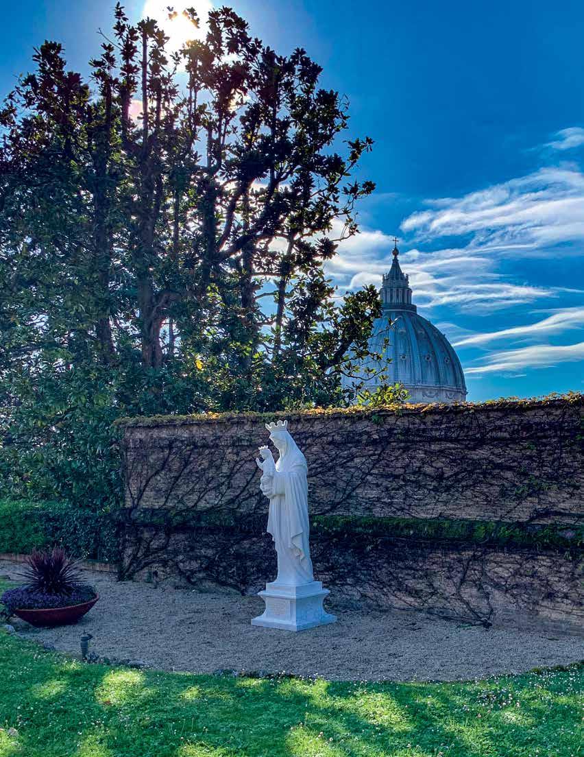
For a small family company, one that has never actively sought work outside the North American continent, the record shows a surprisingly wide geographical spectrum and diversity of commissions. Indeed, after its first 100 years, in 2018, the fourth generation of the Rambusch family was commissioned to create the Mater Ecclesiae (fig. 12-12) for the Vatican Gardens, in Vatican City. The company’s wide-ranging work in interior decoration and design, art metal, lighting, and stained glass in diverse private and public spaces constitutes a century-long commitment to art and craft that continues to this day.
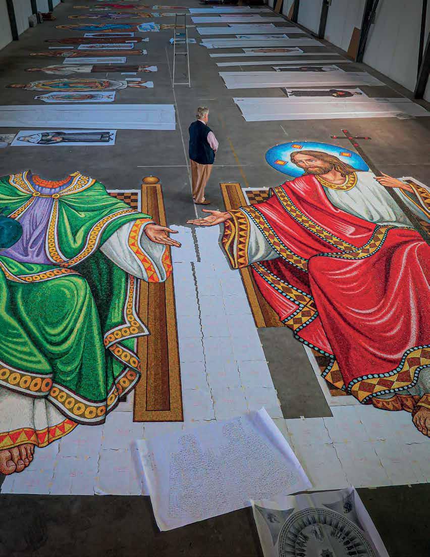
E-3 Leandro Velasco, designer; Viggo Bech Rambusch, reviewing finished mosaics of God the Father and the Son [left to right], with design represented in reverse on paper, at workshop in Spilimbergo, Italy, for the Great Upper Church, Basilica of the National Shrine of the Immaculate Conception, Washington, DC, 2016.
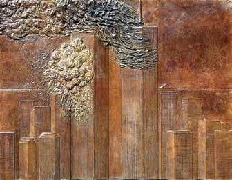
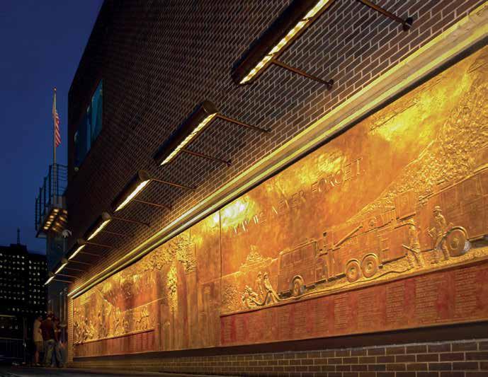
E-4 and E-5 Viggo Bech Rambusch, concept designer; Joseph A. Oddi, delineator; Joseph Petrovics, sculptor; Bedi-Makky Art Foundry, fabricator; FDNY Memorial Wall of 09.11.01 and Detail of Twin Towers, bronze bas- relief, FDNY Ten House, Ground Zero, Manhattan, 2006.
