8 minute read
Tertiary Color
(3) Neutral Color System
Black, white, gray and gold are all neutral colors, they are allocated between three primary colors and belong to neither warm color nor cool color. It can moderate any color to bring people a feeling of relaxation and calmness.
The application of different hues can completely change the atmosphere of a space. There are several common color schemes in wedding floral design.
(1) Color Scheme with Monochrome System
Flower materials only in the same color system are chosen and arranged from dark to light to present the harmonic beauty of layering effect and a sense of gentleness. The bouquet with various pink hues designed by Holly Heider Chapple Flowers is rich in colors and harmonious in vision.
(2) Color Scheme with Adjacent / Similar Color
On the color wheel, two or more colors within 90° are adjacent colors or similar colors (generally 30° is adjacent and 60° is similar). Here the color scheme for bouquet is red, pink and rose. It is one of the most popular color combinations that can create a mild and harmonious effect. Neutral Color System
A banquet with integrated pink hues.
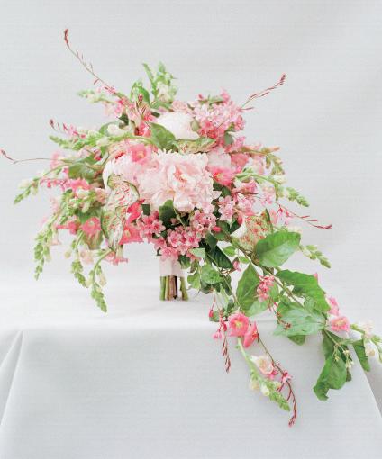
Design by Holly Heider Chapple Flowers

2.4 Contrast and Echo
“Contrast” is one of the forms of beauty, which emphasizes the foiled objects. But “echo” is that one coordinates and corresponds to the other to make the union of different elements more harmonious. During the wedding floral arrangement and design process, the contrasts between light and shade, color, texture and quality of the flower materials should be carefully considered. In the meantime, the “echo” between stage floral art and table floral art should also be handled to produce diversified and layering adornments for various environments in different styles, so as to enhance a sense of fun in the space.

Design by Stonekelly Events & Florals

The famous “seven-second law” states that people can determine whether they will be interested in something within seven seconds, with color accounting for 67 percent of that time.
different colors with different meaning should be meticulous cause different Color is one of the perceptual materials achieving the beauty of form, and it is
colors contain different meanings, which expresses not only the best wishes also the most expressive element. It is a unique life and language that conveys
and blessing, but also a good impression to the guests. flower materials, and color is even richer, therefore, that the work is good or not is determined by the application of color. And when it comes to wedding floral design, beyond the new couple’s preferences and taboos, the use of different emotions to people silently. In floral art, there is a wide variety of
3.1 Basic Classification of Colors (3) Tertiary Color
Some basic knowledge about color should be understood first before knowing color collocation.
Color has three characteristics, namely hue, lightness and saturation. According to the basic characteristics of color hue, it can be roughly divided into the following four categories.
(1) Primary Color
In chromatics, primary color is the color that cannot be obtained by mixing other colors, but can be mixed in different proportions to produce other new colors, it is the origin of all colors. In the color collocation of art works, the three primary colors in the pigment are usually taken as standard, namely, red,
(2) Secondary Color
Known as the “secondary color”, it is a mixture of two of the three primary colors, for example orange produced by mixing red and yellow equally, purple produced by mixing red and blue equally, and green produced by mixing blue and yellow equally.
yellow and blue.
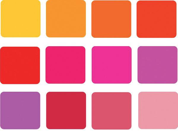
Tertiary color is a mixture of primary color and secondary color, or secondary color and secondary color. It is the richest in the four color categories, including all colors except for primary colors and secondary colors, and has buffering and harmonic effect.
Three Primary Colors: red, yellow and blue. Secondary Color Tertiary Color
(3) Color Scheme with Contrast Color / Complementary Color
On the color wheel, taking one color as a reference, any two colors that are 120°~150° apart are contrast colors, and any two colors that are 180° apart are complementary colors, such as yellow and purple, orange and blue. Such color combination gives a strong sense of jumping and impact to make people feel lively and sprightly and enhance its layering effect.
180° complementary colors 120°~150° contrast colors
(4) Color Scheme with Colors on a “Triangle”
On the color wheel, three colors that are evenly spaced at a distance of 120° can be connected to each other to form an equilateral or isosceles triangle, such as orange, purple and green. Florist should match the three colors unequally and soften the transition between any two colors to create more bright and strong effect, comparing with contrast color matching method. A good match of complementary colors (yellow, purple).
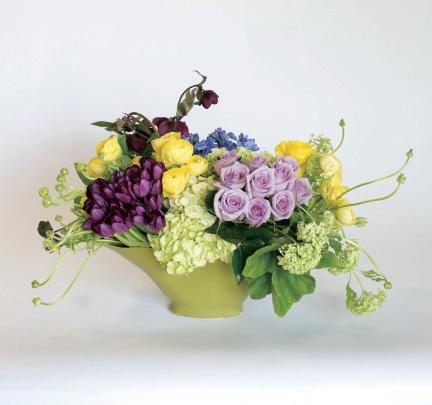
Design by Eddie Zaratsian

(5) Color Scheme with Colors on a “Square” or “Rectangle”
Draw an arbitrary rectangle on the color wheel, if it is a square, the colors on its four corners are “square” colors, such as purplish red, bright orange, yellowish green and bluish violet; if it is a rectangle, the colors on its four corners are “rectangle” colors or complementary colors, such as bluish green, bluish violet, bright orange and orange red. In terms of wedding floral art design, the combination of the above colors can form a strong contrast and make the space colorful.
(6) Color Scheme with Cool, Warm and Neutral Colors
Both cool colors and warm colors can go with neutral colors. Any color matches with black and dark red such as red and black, orange red and dark red will give a sense of maturity and nobleness, which is suitable for older

A good match four colors on a “Square” or “Rectangle”
Design by McQueens Florist
(purplish red, bright orange, yellowish green, bluish violet). new couples. However, any color matches with white such as pink and white, green and white will give a sense of freshness and purity, which is suitable for younger couples.


(4) Season
As seasons change, color scheme changes. Florist needs to consider what color scheme each season should be adopted.
Warm color scheme is suitable for spring and autumn. No matter in the flourishing spring or fruitful autumn, a rural style wedding can always choose warm colors. White, light pink, light green and light blue flowers that look gentle and delicate vividly present the prosperous and lively spring scenery. However, golden yellow and reddish orange are indispensable colors in autumn. For example, the combination of red rose, leucadendron, maple leaf and berry can make the whole wedding full of autumn colors, ripe and generous.

Photo by Erik Stine
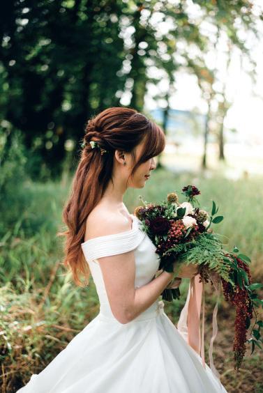
Photo by chuttersnap
People tend to be fretful in the hot summer. So cool color like blue, light purple and white is the best solution, which refreshes one’s eyes and relaxes one’s mind. Nevertheless, there are few flower materials in the silent and
(5) Customs
No matter what form of wedding, customs and religious beliefs should be taken into account. Different regions have different wedding customs, for example, lotus is a taboo for Japanese; white lily is a symbol of death for British and Canadian; and chrysanthemum is an ominous flower for Italian and Spanish. Hence, when florists and new couples are choosing flower materials, they cannot only think about their own preferences, and have to considerate the maximum obtainment of guests’ enjoyment and comfortableness. After all, the wedding itself is a festive event, guests’ feelings cannot be ruined due to the inappropriate arrangement of the scene. cold winter, so intense red flowers can be chosen to create warm wedding atmosphere. Of course, for the couples that seek personalized weddings, black

Photo by Floral V Designs
and white can be chosen to make a winter wedding mysterious and luxury.

Photo by Alvin Mahmudov

Photo by Annie Spratt
Lily and Kevin’s Wedding
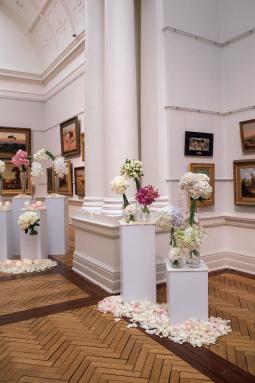
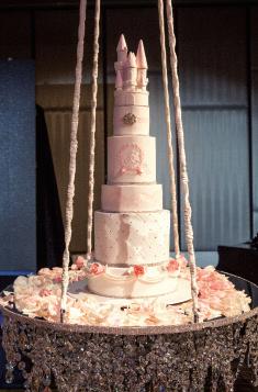
Design agency: P.S. Floral Design Location: Art Gallery of New South Wales & Shangri-La Hotel, Sydney Client: Lily and Kevin Photographer: Puregraphic
Flower: roses, hydrangea, and other seasonal flowers
Color Schemes:

Lily and Kevin’s wedding in Art Gallery of New South Wales. It is the first time for the Art Gallery of New South Wales to open their venue to our special couple to show their appreciation of our couple’s continuous support and generosity contribution they have made in the past years. Reception is in Shangri-La hotel Sydney, with bridal table featured gorgeous candelabra, and beautiful pink roses, baby blue hydrangea were used to create a waterfall feature, with beautiful white and pink petals with candle, to create this romantic and luxury wedding for our special couple.






Acknowledgements
We would like to thank all the designers and companies who made significant contributions to the compilation of this book. Without them, this project would not have been possible. We would also like to thank many others whose names did not appear on the credits, but made specific input and support for the project from beginning to end.

