008
Wedding Floral Design
009
(3) Neutral Color System
(4) Complementary Color One primary color and a secondary color mixed by two other primary colors
The above method classifies complex colors in a more easily understood
Black, white, gray and gold are all neutral colors, they are allocated between
are called complementary colors, which can also be understood as any two
way according to their hues. All hues have different lightness and saturation,
three primary colors and belong to neither warm color nor cool color. It can
colors that are mixed in proper proportions to produce white or gray. Each set
among which the primary color is of the highest lightness and saturation, then
moderate any color to bring people a feeling of relaxation and calmness.
of complementary colors is a contrast of light and dark, cool and warm, such
secondary color, and last tertiary color.
as orange and blue, green and red, purple and yellow.
Neutral Color System
3.3 Application of Color Scheme in Wedding Floral Design The application of different hues can completely change the atmosphere of a
On the color wheel, complementary colors are the relative colors that are 180° apart.
space. There are several common color schemes in wedding floral design.
(1) Color Scheme with Monochrome System Flower materials only in the same color system are chosen and arranged from dark to light to present the harmonic beauty of layering effect and a sense of gentleness. The bouquet with various pink hues designed by Holly Heider Chapple Flowers is rich in colors and harmonious in vision.
3.2 Basic Color System
(1) Warm Color System Represented by red, orange and yellow, it reminds people of the flame and the
People tend to appreciate colors with subjective feelings. All sorts of colors
A banquet with integrated pink hues.
sun, creating a sense of intimacy and warmth.
can stimulate people’s vision in different degrees and exert influences on
Design by Holly Heider Chapple Flowers
people’s mind to arouse various senses and association.
(2) Cool Color System
In chromatics, colors can be classified into warm, cool and neutral color
Represented by blue, green and purple, it reminds people of sea water and
system.
forest, which makes people feel cool or cold.
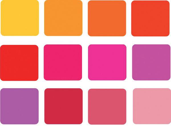
(2) Color Scheme with Adjacent / Similar Color On the color wheel, two or more colors within 90° are adjacent colors or similar colors (generally 30° is adjacent and 60° is similar). Here the color scheme for bouquet is red, pink and rose. It is one of the most popular color combinations that can create a mild and harmonious effect.
A good match of adjacent colors (red, pink, rose). Warm Color System
Cool Color System
30° adjacent colors
60° similar colors
Photo by Thomas AE


