Polyedra presents
Italian design is coming home. To Switzerland.
Polyedra presents
Italian design is coming home. To Switzerland.
Contents. Welcome to Italian Design Is Coming Home. To Switzerland. A celebration of the past, current and future generations of Swiss and Italian graphic design talent.
Celebrate the past Essays & interviews on the history of Swiss & Italian design. ENGLISH
8. A Beginner’s Guide to Swiss and Italian Design. 10. Italian Influence in Post-War Swiss Design.
FRANÇAIS
38. Design Italien et Suisse expliqué aux débutants. 40. L’inspiration Italienne dans le graphisme Suisse de l’après-guerre.
14. Italian Graphic Design Post 1945
43. Le design Italien après 1945.
18. An interview with Giancarlo Iliprandi
46. Un Entretien avec Giancarlo Iliprandi.
21. An Interview with Felix Humm
50. Un Entretien avec Felix Humm.
DEUTSCH
24. Schweizerisches und Italienisches Design für Anfänger. 26. Italienische Inspiration im Schweizerischen Grafikdesign der Nachkriegszeit. 29. Italienisches Grafikdesign nach 1945. 32. Ein interview mit Giancarlo Iliprandi. 36. Ein interview mit Felix Humm.
ITALIANO
52. Guida al design svizzero e italiano per principianti. 54. L’ispirazione italiana nel design grafico svizzero del dopoguerra. 57. Il Design Italiano Dopo il 1945. 60. Una Intervista con Giancarlo Iliprandi. 63. Una Intervista con Felix Humm.
Celebrate the present
Celebrate the future
11 collaborations between 22 of the best contemporary Swiss & Italian graphic designers.
The next generation of Swiss & Italian creative talent.
66. Studio CCRZ + Studio FM
172. Best Swiss Student
74. Erich Brechbühl + Zetalab
174. Best Italian Student
82. Bureau Collective + Jekyll & Hyde
176. Best Swiss Young Designer
94. Büro Destruct + Andrea Rauch
178. Best Italian Young Designer
102. Chragokyberneticks + Mauro Gatti
180. Highly Commended Gallery
112. GVA Studio + Tomaso Marcolla 124. Melchior Imboden + Leftloft 132. Dafi Kühne + Marco Nicotra 142. Stefan Jost + Alessandro Gori 150. Nerves + Studio KMzero 162. Oberholzer & Tagli + Paolo Palma
185. Appendix: Producing the Cover Artwork 188. Acknowledgments
Preface. Will and Tommaso. Amsterdam/Milan, 2011.
FR Quand nous avons commencé ce projet dans un jardin au nord d’Amsterdam, nous n’avions aucune idée de la façon dont il serait perçu. La réaction fut écrasante. Tous ceux avec qui nous avons travaillé, en allant de Polyedra aux 22 designers dont le travail honore ce livre, ont saisis ce projet avec un enthousiasme qui nous a vraiment touchés. Nous sommes parfaitement conscients que ça n’a rien à voir avec à quel point nous sommes charmants ou à quel point nous sommes doués au téléphone, mais avec la passion que l’Italie et la Suisse ont pour le design et la fierté qu’ils partagent au travers de leur histoire commune. Nous nous sentons privilégié d’avoir pu écrire ce que nous espérons être un nouveau chapitre dans cette illustre histoire.
ENG
DE
ITA
When we first began this project in a garden in North Amsterdam, we had no idea how it would be received.
Als wir mit diesem Projekt in einem Garten im Norden Amsterdams begannen, hatten wir keine Vorstellung davon, wie es ankommen würde.
Quando abbiamo cominciato questo progetto in un giardino nel nord di Amsterdam, non avevamo idea di come sarebbe stato accolto.
Die Reaktion war einfach überwältigend. Alle, mit denen wir zusammengearbeitet haben - von Polyedra bis zu den 22 Designern, dessen Werke dieses Buch schmücken - sind diesem Projekt mit einem Enthusiasmus begegnet, der uns wahrlich gerührt hat.
La risposta è stata travolgente. Tutte le persone con cui abbiamo lavorato, da Polyedra ai 22 designer le cui opere abbelliscono questo libro, hanno accolto il nostro progetto con un entusiasmo che ci ha veramente commosso.
Wir wissen nur zu gut, dass es nichts damit zu tun hat, wie charmant wir sind oder wie nett wir am Telefon reden, sondern mit der Leidenschaft Italiens und der Schweiz für Design und dem Stolz für ihre gemeinsame Geschichte.
Siamo ben coscienti del fatto che questo non c’entra con quanto siamo carismatici o quanto siamo bravi a parlare al telefono, ma con la passione che sia l’Italia che la Svizzera hanno per il design e con l’orgoglio che condividono nella loro storia.
The response was overwhelming. Everyone who we’ve worked with, from Polyedra to the 22 designers whose work graces this book, has embraced this project with an enthusiasm that has truly touched us. We’re well aware that it’s got nothing to do with how charming we are or how good we are on the phone, but the passion that both Italy and Switzerland have for design and the pride they share in their history. We’re privileged to have written what we hope will be a new chapter in this illustrious history.
4
Wir fühlen uns privilegiert, dieses Buch geschrieben zu haben und hoffen, dass es ein neues Kapitel in dieser glorreichen Geschichte darstellt.
Abbiamo avuto il privilegio di scrivere quello che speriamo diventerà un nuovo capitolo di questa storia gloriosa.
A word from our sponsors, Polyedra.
FR
Roberto Cavicchia, Group Marketing Manager, Polyedra. Milan, 2011.
Ce livre est une collection de travaux d’un groupe d’artistes qui ont acceptés l’invitation de Polyedra à célébrer le passé, le présent et le future de la proche collaboration entre designers Suisses et Italiens. Le résultat est une galerie d’images extraordinaires inspirée par les maîtres Suisses des années 1950 qui ont créés le célèbre Style Typographique International. Beaucoup d’eux sont allés travailler en Italie dans les années 1940, surtout au légendaire Studio Boggeri à Milan, pour créer ce qui deviendra un mouvement symbolique dans le monde du graphisme. Un mouvement qui est aussi pertinent aujourd’hui qu’il l’était hier.
ENG
DE
ITA
This book is a collection of the work of a group of artists who accepted Polyedra’s invitation to celebrate the past, present and future of the close collaboration between Swiss and Italian designers. The result is an extraordinary gallery of images inspired by the Swiss masters of the 1950s who founded the famous International Typographic Style. Many of them went to work in Italy in the 1940s, particularly at the legendary Studio Boggeri in Milan, to create what would become a iconic new movement in graphic design. One that is as relevant today as it was yesterday.
Dieses Buch ist eine Grafiksammlung verschiedener Künstler, die Polyedras Einladung akzeptierten, die Vergangenheit, Gegenwart und Zukunft der engen Zusammenarbeit zwischen schweizerischen und italienischen Designern zu feiern. Das Ergebnis ist eine außergewöhnliche Bildersammlung, inspiriert durch die Schweizer Meister der fünfziger Jahre, die den berühmten Internationalen Typografie Stil gründeten. Viele von ihnen gingen in den vierziger Jahren nach Italien, um dort zu arbeiten, insbesondere im legendären Studio Boggeri in Mailand, und kreierten eine ikonische neue GrafikdesignBewegung, die heute genauso relevant ist wie gestern.
Questo libro raccoglie le opere e le voci di un gruppo di artisti che hanno accettato l’invito promosso da Polyedra a celebrare il presente, il passato e il futuro della stretta collaborazione tra designer svizzeri e italiani. Il risultato é una straordinaria galleria diimmagini originali ispirate dal segno intellettuale e creativo delle opere dei grandi maestri svizzeri che negli anni ’50 fondarono l’International Typographic Style. Molti di loro giá negli anni ’40 andarono in Italia, specie a Milano presso il mitico studio Boggeri, per creare quelle che sarebbero diventate le icone del rinnovamento dell’arte grafica. Oggi piú che mai.
5
Celebrate the Past.
On the left: Illustration by Elena Xausa, after the work of Walter Ballmer (left).
On the opposite page: Illustrations by Elena Xausa, after the work of Josef Muller-Brockmann (right), Carlo Vivarelli (left)
6
There’s been a strong link in design between Switzerland and Italy (particularly Milan) going back to the 1940s. Max Huber, Carlo Vivarelli, Walter Ballmer were just a few of the legendary Swiss designers who crossed the Alps to help create the
International Typographic School for which Italian (and Swiss) design became renowned. This section explores the situation in both countries after the Second World War that created one of the most fruitful creative environments of the 20th century.
7
ENGLISH
Elena Xausa, after Lora Lämm
Contemporary Swiss Graphic Design The reputation that Swiss graphic design enjoys today owes much to the influence it absorbed from Italy during the 1950s and 1960s. The solid education of Swiss designers laid the foundations, but it was their inspirational interaction with their Italian counterparts that allowed Max Huber, Lora Lamm, Walter Ballmer et al to flourish. This, and the distinctly favourable conditions in Milan during this period: the economic boom, ambitious studios and enthusiastic clients all contributed to the stylistic richness in graphic design. A tradition of formal severity thrown together with an experimental curiosity, colour, poetry wit and lust for life made for a heady combination that was highly fruitful for both sides and continues to inspire Swiss graphic design today. Its aesthetic variety shows that the even in a time of political turbulence like the 1980s, the design tradition of 12
Aufbruch (departure) can still survive. The strict application of Helvetica is still questioned provocatively by designers. And graphic design in Switzerland continues to blossom through the cultural exchanges with other art forms such as music, literature, all of which are mutually enriched. These trends, which began post war, continue today and still lead to many wonderful and exciting experiments, at least as far as design is concerned.
Everything imperfect, coincidental and spontaneous can influence the everyday practice of design positively. Freehand-illustrations, handwriting, the development of new letter types, and unusual blends of letters all have their echoes in contemporary posters. Playing with other mass media, such as photography and the fine arts, reflect the various ways of dealing with the images and texts of today.
Even more encouragingly, a young generation of graphic designers has emerged since the 1990s that doesn’t restrict itself to computer-generated graphic solutions; just like their predecessors they use their hands and get back to the basics.
As regards content, contemporary cultural posters show a different understanding of the poster as mass media. The old laws of the poster as a medium of communication (such as readability and an immediate understanding of the message) no longer apply.
When touching and feeling materials, different and more creative solutions emerge, leading to a more personal, subjective and less orthodox result.
People are once again challenged to assess the traditional way of interpreting texts, messages and images.
Celebrate the past: Essays & interviews on the history of Swiss & Italian design.
Elena Xausa, after Max Huber.
13
ENGLISH
Italian Graphic Design post 1945. Maurizio Vitta
Professor of Design History and Culture at the Design Faculty of Politecnico di Milano University.
The history of Italian graphic design in the second half of the 20th century begins not in 1950, but in the first half of the century. In 1933 to be precise, when Studio Boggeri opened, the first issue of Campo Grafico (Graphic Field) was published and the fifth Triennale di Milano was held, where the German graphic design section designed by Paul Renner aroused keen interest. So right from its very beginning, Italian graphic design did not develop linearly, but grew from a series of cultural exchanges established via networks formed in two urban hubs. Through its close links with industrial design, mutual fields of experimentation with modern architecture and constant comparisons with contemporary art, Italian graphic design gained a thorough and knowledgeable professional approach, as well as a keen sense of internationalism from a lively exchange of experiences with European designers, particularly Swiss ones. This was the crucible in which contemporary Italian graphic design formed: a seething cauldron in which the long-awaited modern age would finally come into being. It wasn’t the 14
result of a search for new ways of expression, but an attempt to build the foundations of what might best be called a visual culture. This visual culture was set in the intellectual landscape of the time, yet linked back to classicism and formal balance; all the way from Luca Pacioli’s Golden Ratio and Aldus Manutius’ printing revolution, to the ground-breaking innovations of the first phase of the Futurist movement and the refined experiments of its second phase, led mainly by Fortunato Depero. After the desolation of the post-war period, the imperative for economic and social development in Italy necessitated the creation of new communication and information protocols able to cope with the demands of an industrialized and democratic mass society. It was no coincidence that the graphic design network centred on the publishing capitals of Italy, Milan and Turin; two cities that had the cultural and industrial capacity to power the rapid spread of consumerism across the country. Despite their apparent polarity, the two entrepreneurial and cultural worlds shared an ideology that united them: a
Celebrate the past: Essays & interviews on the history of Swiss & Italian design.
desire for clear, logical communication. A simple message expressed as directly as possible. Albe Steiner’s work is the most representative example of this approach. He started in 1945 with the poster designed for the Mostra della ricostruzione (The Rebuilding Exhibition) and continued with the design of Politecnico, a magazine created by Elio Vittorini to be a vehicle for the new visual culture. This desire for rationality had begun with the experiments, reflections and international contacts made in the previous decades. The brief life of Campo Grafico lived on in the memory of its protagonists, while Milan’s Triennale museum immediately established itself as a place for experimentation and new initiatives. The large group of Swiss graphic designers at Studio Boggeri before the war (Schawinski, Ballmer, Huber, Calabresi, Vivarelli, Monguzzi) not only bequeathed a rich heritage that would become the reference point for their Italian successors, but would also assure the possibility of continuity by staying in Milan. Besides the Swiss Boggeri contingent, Bauhaus was a key influence, as was the Dutch school (Bob
Elena Xausa, after Lora Lämm
Noorda moved to Milan in the early fifties) and the teachings of Max Bill. A comparison of the story of Italian graphic design with the ‘stars’ of that period - industrial design and architecture (together with cinema) - reveals how closely connected it is to the more general development of design culture. The man who most embodied this holistic approach to design was Olivetti.
the company’s dynamic nature through a rigorous graphic style - magnified by the building of the Pirelli Tower skyscraper designed by Gio Ponti - and its attention to the arts. The rapidly growing television industry gave much of its graphic production to Erberto Carboni, who interpreted the new mass medium by translating its technological complexity into a simple and appealing visual language for Rai, foreshadowing the later iconic work he would create for Barilla.
His industrial values were directly mirrored in the work he commissioned for his company: the architecture of Gabetti and Isola, the design of Sottsass, the consultancy work of intellectuals like Giudici or Volponi, and last, but not least, the legendary graphical identity for Olivetti led by Giovanni Pintori.
Thus by the 1960s, the modern age entered in the first half of the century finally came to maturity and Italian graphic design was firmly rooted in the professional establishment, its position guaranteed by the proliferation of schools, publications and public popularity.
Other large companies followed Olivetti in implementing refined brand strategies, although not on the same scale: Pirelli, for example, focused on an in-house graphic design studio (helped by designers such as Pino Tovaglia), and communicated through a magazine called simply Pirelli, which expressed
This paved the way for a new generation of designers to rise to the forefront of the visual communication industry: A.G. Fronzoni, with his absolute mastery of Gestaltung and a refined use of black and white; Franco Grignani, who conducted sophisticated optical experiments
searching for a new visual language; Pino Tovaglia, a fine interpreter of the new business landscape; Giancarlo Iliprandi, a visual language scholar; Michele Provinciali, Ilio Negri, Giulio Confalonieri and many others, including Armando Testa, in Turin, whose name began to be noticed in those early days. Each of those names conjures up a different style, but they all share common cultural influences. Beneath the subjective differences there was a homogeneous conceptual layer that made graphic design the dominion of Cartesian logic, supported by a clear set of rules: every image was constructed in a logical order through a carefully calculated geometric model. This model ensured that every image produced was minimalistic; a result achieved through a skilful metonymic process. Hence the common desire to reduce the visual discourse to its bare bones by tirelessly removing any excess material. This technique made the message emerge as if from nothing, from a silence that spoke as loudly as the message itself. 15
ENGLISH
An interview with Giancarlo Iliprandi. Italian designer working in Milan since the 1950s. The late ‘50s and ‘60s were a particularly fertile time in Italy. Everything came together at the same time: design flourished, companies were innovative and, of course, many people were attracted by the situation, including the Swiss. When they arrived we had no idea that their influence would change the history of Italian graphic design. Italians interested in design usually had an artistic background then, like Bigani, Carboni and Italo Lupi, who were all architects. On the other side of the Alps however, everything was more rigorous, formal and technical. Graphic design in Switzerland was already seen as a profession, while here we were still considered “advertising artists.” A lot of people had already tried (and were still trying) to break away from the concept of “graphic art”, like Munari, who, like many others, thought this definition cheapened the profession. The start of a real change in this situation only came when the Swiss arrived, or after their method became more widespread. For people like me, who wanted to be a designer a method, a set of rules, was essential. We felt the design process was vital, and that it should be based on a method that could match form and function throughout the whole design, and finally we’d found someone, or lots of people, who thought like us, who had even thought about it before us! 18
Celebrate the past: Essays & interviews on the history of Swiss & Italian design.
As for me, I started to think seriously about graphic design when I was working at Castiglioni’s architectural firm. That’s where I discovered this thing called visual communication and graphic design and where I met Max Huber for the first time. Before then I had studied medicine, done four years of painting and four years of set design at the Academy of Fine Arts of Brera, but I still hadn’t found something that really interested me. I was deeply unsatisfied. Sure, set design was better than painting, as it gave me the opportunity to work with music, but ultimately a set designer always works under a director, so unless you’re someone like Zeffirelli, who switched successfully from one role to another, it was limiting. At least for me. My relationship with Max was inspirational. Not that Max and I would always talk about graphics, we’d go out a lot together to jazz clubs and concerts as well. In those years, when I was always at the Studio, I had the opportunity to get to know Steiner and Boggeri and I remember that one day I said to myself “yes, this is something interesting.” That was when I really began to apply myself to graphic design. Watching Max working design displays made me want to learn, so I began to experiment with this “Swiss graphic design”, buying books, and magazines like Neue Grafik, all set
in Helvetica. I bought them at Salto bookshop, a very significant place, not just for me. The two Salto brothers (of Swiss origin) ran the shop and were very knowledgeable. You could talk with them about what was happening in other countries, and when one of them was in the shop, the other would visit the studios with a bag full of the latest books on graphic design. In all honesty, I believe that much of the influence of Swiss design is due to them, and Castiglioni’s studio of course. There was really a lot of us working there, all working on many different display design projects: Max on some things, Heinz Waibl, who at the time was Max’s assistant, on others, Tovaglia, Munari and Bianconi too. It was a place where we exchanged ideas, so we’d also go to see what others were doing. The atmosphere wasn’t competitive, but friendly and collaborative in way that would have been impossible in the pure and rigid philosophy of the various MüllerBrockmanns. Another key role in this Italy-Switzerland relationship was played by the graphic design course for assistants held at Humanitaria, the school founded in 1961 by Michael Provinciali and directed in its eight years of existence by Bauer first, and Melino later. And talking about crucial experiences,
we have to mention Rinascente, a department store that with its great exhibitions on Japan, India and Central America, taught the Milanese that different cultures existed. That affected everything from 1955 onwards. Rinascente has always provided stimuli to make exchanges possible between people, designers, musicians, graphic designers, writers and its management. There were two families who alternated in the Managing Director and Presidency chairs, the Borletti’s and the Bruschi’s, and both played an important role in all of this. They always had an eye on what other department stores in London and Paris were doing, and had a curiosity and an openness that proved fruitful in many ways and represented an ideal combination for Swiss influences, from Zurich and Basel, to leave a mark. Max Huber had a gifted hand and a benevolent eye; he appreciated everyone’s work, and it was fascinating to see him working on large displays. He’d put a colour layer on top of another using huge sheets of cellophane. Then he’d brush them with water (in which he would have diluted some glue) and stretch them with a spatula. We were all delighted to see how quickly he could fix this and that. Steiner, however, would often criticize others. For him, communication had to have a social value and if it didn’t, 19
Celebrate The Present. To bring the story of Swiss and Italian design full circle, 22 of the best designers and design studios from both countries were invited to collaborate on posters celebrating the shared design heritage of their two countries. These are the results.
TEAM 1: BIOGRAPHY
CCRZ ENG CCRZ specialises in visual communication, design and architecture, with particular expertise in graphic design, photography, illustration and exhibition design. The studio has completed projects ranging from graphic art to packaging, corporate identity to advertising, signs to interior design, web design to planning and managing communication strategies and production. The members of CCRZ have more than ten years experience in these areas at both national and international level. Thanks to its multidisciplinary approach CCRZ is able to manage even complex projects by effectively combining communicative and aesthetic values without ever losing sight of practicalities or value for money.
DE
FR
ITA
CCRZ ist auf visuelle Kommunikation, Design und Architektur spezialisiert, mit besonderer Expertise in Grafikdesign, Fotografie, Illustration und Messedesign. Das Studio beschäftigt sich mit einem breiten Spektrum an Projekten, von Grafikdesign bis zu Verpackung, von Corporate Identity bis zu Werbung, von Bildzeichen bis zu Innenarchitektur, von Webdesign bis hin zur Planung und Verwaltung von Kommunikationsstrategien und Produktion. CCRZs Mitglieder haben in diesen Bereichen über zehn Jahre Erfahrung, sowohl auf nationalem als auch internationalem Niveau. Dank seiner fachübergreifenden Fähigkeiten kann CCRZ auch sehr komplexe Projekte verwalten und dabei effektiv kommunikative und ästhetische Werte miteinander kombinieren, ohne jemals die praktische Anwendbarkeit oder das Preisleistungsverhältnis aus den Augen zu verlieren.
CCRZ est spécialisé en communication visuelle, design et architecture avec un savoirfaire particulier en graphisme, photographie, illustration et design d’expositions. Le studio a bouclé des projets allant de l’art graphique à l’emballage, de l’image de marque à la publicité, d’enseignes au design d’intérieur, du design de sites web à planifier et organiser des stratégies de communication et de production. Les membres de CCRZ ont plus de dix ans d’expérience dans ces domaines au niveau national comme au niveau international. Grâce à son approche pluridisciplinaire CCRZ est capable de mener des projets complexes en combinant communication et esthétique sans jamais perdre de vue les détails pratiques ou le rapport qualité / prix.
CCRZ si occupa di comunicazione visiva, design e architettura, con una competenza particolare nel design grafico, la fotografia, l’illustrazione e gli allestimenti. Lo studio ha realizzato progetti che vanno dall’arte grafica al packaging, dalla corporate identity alla pubblicità, dalla segnaletica alla progettazione d’interni, dal web design alla pianificazione e gestione di strategie comunicative e di produzione. Gli associati di CCRZ possono vantare oltre dieci anni d’esperienza in questi ambiti, sia a livello nazionale che internazionale. Grazie al suo approccio multidisciplinare CCRZ è in grado di gestire progetti anche complessi, unendo in modo efficace valori comunicativi ed estetici, senza mai perdere di vista i risvolti pratici ed economici del lavoro.
66
Celebrate the present: 11 collaborations between 22 of the best contemporary Swiss & Italian graphic designers.
Studio FM ENG
FR
ITA
Studio FM Milano is a Milan based graphic design studio. It was founded in 1996 by Barbara Forni and Sergio Menichelli, who were subsequently joined in 2000 by Cristiano Bottino. Today Studio FM specializes in graphic design, specifically art direction, corporate identity, books, exhibition/ installation design and web design.
Studio FM Milano est un studio de graphisme basé à Milan. Il a été fondé en 1996 par Barbara Forni et Sergio Menichelli, qui ont ensuite été rejoints par Cristiano Bottino en 2000. Aujourd’hui Studio FM se spécialise en graphisme, spécifiquement dans le domaine de l’art, de l’image de marque, des livres, du design d’installations et d’expositions et du design de sites web.
Studio FM Milano è uno studio di design grafico con sede a Milano. È stato fondato nel 1996 da Barbara Forni e Sergio Menichelli, ai quali si è unito in seguito Cristiano Bottino nel 2000. Studio FM oggi è specializzato nel design grafico, e in particolare art direction, immagine coordinata, libri, progettazione di mostre/installazioni e web design.
Les projets de Studio FM ont reçus de nombreux prix et ont été publiés à l’international à de nombreuses reprises.
Alcuni dei progetti di Studio FM hanno vinto vari premi e sono stati pubblicati a livello internazionale in varie occasioni.
Studio FM projects have received several awards and been published internationally on various occasions.
DE Studio FM Milano ist ein Grafikdesign Studio in Mailand. Es wurde 1996 von Barbara Forni und Sergio Menichelli gegründet, denen Cristiano Bottino im Jahr 2000 beitrat. Studio FM spezialisiert sich heute auf Grafikdesign, insbesondere künstlerische Leitung, Corporate Identity, Bücher, Messe-/ Installationsdesign und Webdesign. Studio FMs Projekte wurden mehrmals ausgezeichnet und wurden international mehrfach veröffentlicht.
67
TEAM 1: PORTFOLIO
CCRZ
Ufficio Cultura Comune di Chiasso Visual Identity (2009)
Ufficio Cultura Comune di Chiasso Visual Identity (2009)
68
Ufficio Cultura Comune di Chiasso Visual Identity (2009)
Celebrate the present: 11 collaborations between 22 of the best contemporary Swiss & Italian graphic designers.
Flora Ferroviria book design (2010)
Flora Ferroviria book design (2010)
Flora Ferroviria book design (2010)
69
TEAM 1: PORTFOLIO
Studio FM
Arclinea is a top-end furniture firm that produces kitchens designed by Antonio Citterio.
Trienalle Design Musuem, Milan. Studio FM worked with architecture studio Antonio Citterio Patricia
Studio FM Milano developed an illustrative language for the brand based on common
Viel & Partners to create the graphic design for the second edition Serie Fuori Serie of the Triennale
kitchen items.
Design Museum in 2009.
70
Celebrate the present: 11 collaborations between 22 of the best contemporary Swiss & Italian graphic designers.
Typographic Entomology (2010)
71
TEAM 1: POSTER COLLABORATION
Studio CCRZ
Studio CCRZ “Helvetica 1960”
72
Celebrate the present: 11 collaborations between 22 of the best contemporary Swiss & Italian graphic designers.
Studio FM
Studio FM “Helvetica 1960”
73
TEAM 2: BIOGRAPHY
Erich Brechbühl ENG
Erich was born in 1977, and grew up in Sempach, Switzerland. In 1990, at the tender age of 13, he started his career with the foundation of Mix Pictures, an organisation for short film productions and cultural events. After a typography apprenticeship near Lucerne he began an apprenticeship in graphic design at the studio of Niklaus Troxler in Willisau. He then moved to Germany for an internship at MetaDesign Berlin before returning to Lucerne to found his own graphic design studio Mixer. He has been a member of the AGI since 2007. He has won multiple national and international awards, including the Grand Prix at the 2008 Swiss Poster Awards.
DE
FR
ITA
Erich wurde 1977 geboren und wuchs in Sempach in der Schweiz auf. 1990, im zarten Alter von 13 Jahren, begann er seine Laufbahn mit der Gründung von Mix Pictures, einer Organisation für Kurzfilmproduktionen und kulturelle Veranstaltungen.
Erich est né en 1977 et a grandi à Sempach, Suisse. En 1990, au jeune âge de 13 ans, il a commencé sa carrière en créant Mix Pictures, une organisation qui produit des courts métrages et évènements culturels.
Erich nasce nel 1977 e cresce a Sempach, Svizzera. Nel 1990, alla tenera età di 13 anni, comincia la sua carriera fondando Mix Pictures, un’organizzazione di cortometraggi ed eventi culturali.
Après un apprentissage en typographie à côté de Lucerne, il débuta un apprentissage en graphisme au studio de Niklaus Troxler à Willisau. Il s’installa ensuite en Allemagne pour faire un stage à MetaDesign Berlin avant de retourner à Lucerne pour fonder son propre studio de graphisme Mixer. Il est membre de l’AGI depuis 2007. Il a obtenu de nombreux prix nationaux et internationaux, y compris le Grand Prix à la remise des prix des Posters Suisses en 2008.
Dopo un apprendistato nel campo della tipografia vicino a Lucerna, comincia un apprendistato di design grafico nello studio di Niklaus Troxler a Willisau. Si traferisce poi in Germania per seguire uno stage presso MetaDesign a Berlino, prima di tornare a Lucerna e fondare il proprio studio grafico, Mixer. È membro di AGI dal 2007. Ha vinto diversi premi nazionali e internazionali, fra cui il Grand Prix allo Swiss Poster Awards del 2008.
Nach einer Ausbildung in Typografie in der Nähe von Luzern begann er seine Ausbildung zum Grafikdesigner im Studio Niklaus Troxlers in Willisau. Daraufhin zog er nach Deutschland, wo er ein Praktikum bei MetaDesign Berlin absolvierte, bevor er schließlich in die Schweiz zurückkehrte und in Luzern sein eigenes Grafikdesign Studio Mixer gründete. Brechbühl ist seit 2007 Mitglied der AGI. Er hat mehrere nationale und internationale Auszeichnungen gewonnen, unter anderem den Grand Prix bei den 2008 Swiss Poster Awards. 74
Celebrate the present: 11 collaborations between 22 of the best contemporary Swiss & Italian graphic designers.
Zetalab ENG
FR
ITA
Zetalab is a design communication studio based in Milan. Our core business is graphic design but we also enjoy exploring different fields like exhibition and product design, film and occasionally art. Zetalab believes in design that mixes and recombines different elements, styles, media and ideas.
Zetalab est un studio de design en communication basé à Milan. Notre cœur de métier est le graphisme mais nous aimons aussi explorer différentes avenues comme le design d’expositions et de produits, de films et parfois d’art. Zetalab croit au design q ui mélange et rassemble différents éléments, styles, médias et idées.
Zetalab è uno studio di design della comunicazione con sede a Milano. Il nostro core business è il design grafico ma ci piace anche esplorare diversi campi come il design di mostre e prodotti, film e occasionalmente arte. Zetalab crede in un design che unisce e armonizza diversi elementi, stili, media e idee.
We started in 2000 making ‘pop’ graphics for clients like MTV, Levi’s, and Diesel, but we’ve grown into creating projects for Italian institutions (like the Milan City Council) and brands ranging from design (Bang&Olufsen) to stationery (Moleskine) to editorial (Italian publishers Rizzoli & Mondadori) all the way to food packaging (Ferrari).
DE Zetalab ist ein Studio für DesignKommunikation in Mailand. Das Herzstück unseres Unternehmens ist Grafikdesign, aber wir erkunden auch gern neue Bereiche wie Messe- und Produktdesign, Film und manchmal auch Kunst. Hier bei Zetalab glauben wir an Design, das verschiedene Elemente, Stile, Medien und Ideen miteinander vermischt und wieder verbindet.
Nous avons commencé par créer des graphismes « pop » en 2000 pour des clients comme MTV, Levi’s et Diesel mais nous créons maintenant des projets pour des institutions italiennes (comme pour la Mairie de Milan) et des marques allant du design (Bang&Olufsen) à la papèterie (Moleskine) en passant par l’édition (maison de publication italienne Rizzoli & Mondadori) jusqu’à l’emballage alimentaire (Ferrari).
Abbiamo cominciato nel 2000, creando grafiche ‘pop’ per clienti come MTV, Levi’s e Diesel, ma siamo cresciuti fino a svolgere progetti per istituzioni italiane (come il Comune di Milano) e marche che vanno dal design (Bang&Olufsen) alla cancelleria (Moleskine), dall’editoria (editori italiani Rizzoli & Mondadori) fino al packaging alimentare (Ferrari).
Wir begannen unsere Arbeit im Jahr 2000 mit „Pop“-Grafiken für Kunden wie MTV, Levi’s and Diesel, sind aber inzwischen zu einem Studio herangewachsen, das Projekte für italienische Organisationen (zum Beispiel dem Stadtrat Mailands) und Marken produziert, von Design (Bang&Olufsen), über Schreibwaren (Moleskine) und Editorial (italienische Verlage Rizzoli & Mondadori) bis hin zur Lebensmittelverpackung (Ferrari). 75
TEAM 2: PORTFOLIO
Erich Brechb端hl
100mal Im Schtei, 2005
Sennentuntschi, 2005
76
Celebrate the present: 11 collaborations between 22 of the best contemporary Swiss & Italian graphic designers.
Nellie Goodbye, 2010
77
TEAM 2: PORTFOLIO
Zetalab
Visual identity and poster campaign for Luoghi Comino (a lettera27 project) 2009
Visual Identity for Milan Film Festival 2010project) 2009
78
Celebrate the present: 11 collaborations between 22 of the best contemporary Swiss & Italian graphic designers.
Graphic design for Pedrali publishers, 2009-2010
Graphic design for Mixa Magazine, 2010 project 2009
79
TEAM 2 : POSTER COLLABORATION
Erich Brechbühl
Erich Brechbühl “Homage”
80
Celebrate the present: 11 collaborations between 22 of the best contemporary Swiss & Italian graphic designers.
Zetalab
Zetalab “Dinner”
81
TEAM 6: BIOGRAPHY
GVA Studio ENG At GVA studio we take pleasure in letting the most basic things that surround us capture our imagination. We work without preconceived restrictions and a confidence that uncovering those things that are hidden beneath will bring us joy. Our team makes up for its small size by opening its doors to others. Our pleasure is to create: yours to enjoy.
DE
FR
ITA
Hier bei GVS Studio finden wir Gefallen daran, unsere Fantasie durch die einfachsten Dinge um uns herum anregen zu lassen. Wir arbeiten ohne vorgefasste Einschränkungen und mit einer Überzeugung, dass uns das Entdecken versteckter Dinge Freude bringen wird. Unser Team ist zwar klein, aber unsere Türen stehen anderen offen. Unsere Freude liegt im Kreieren: Ihre Freude ist es, das Kreierte zu genießen.
Chez GVA Studio nous prenons plaisir à laisser les choses les plus simples qui nous entourent interpeler notre imagination. Nous travaillons sans idées préconçues qui nous restreignent et la confiance que de découvrir ces choses qui se cachent en nous nous apportera la joie. Notre équipe se rattrape sur le fait qu’elle soit petite en ouvrant ses portes aux autres. Notre plaisir vient de la création : à vous de l’apprécier.
A GVA Studio ci piace lasciare che le cose più semplici che ci circondano, catturino la nostra fantasia. Lavoriamo senza limitazioni preconcette e con la sicurezza che svelare quello che si nasconde ci porterà gioia. Il nostro team compensa le sue piccole dimensioni aprendo le sue porte anche ad altri. Il nostro piacere è creare, il vostro è goderne.
112 Celebrate the present: 11 collaborations between 22 of the best contemporary Swiss & Italian graphic designers.
Tomaso Marcolla ENG Born in Trento, Italy (1964) where he currently lives and work. Aside from his professional work as a graphic designer, he’s an artist who works in watercolors, oils, photography and acrylics (and he’s a published comic artist as well). His artistic inclination is to challenge tradition in search of exploring new avenues of expression. It’s part of a permanent voyage of experimentation that is difficult to capture through standard definitions of style. It’s the essential characteristic of an artist who plays in many forms of media, without ever losing his originality.
DE
FR
ITA
Geboren in Trento, Italien (1964), wo er momentan lebt und arbeitet. Neben seiner beruflichen Arbeit als Grafikdesigner ist er außerdem ein Künstler, der mit Aquarellen, Ölfarben, Fotografie und Akrylik arbeitet (und er ist ein Comic-Künstler, dessen Werke veröffentlicht wurden).
Né à Trento, Italie (1964) où il vit et travaille actuellement. Outre son activité professionnelle en tant que graphiste, il est artiste et peint à l’aquarelle, à l’huile, à l’acrylique et utilise la photographie (et il est auteur de bandes dessinés qui ont été publiés).
Nasce nel 1964 a Trento, dove attualmente vive e lavora. Oltre al suo lavoro di grafico professionista, è anche artista e lavora con gli acquerelli, gli oli, la fotografia e l’acrilico (e ha anche pubblicato vignette).
Seine künstlerischer Neigung ist es, Tradition in Frage zu stellen, um neue Ausdrucksformen zu erkunden. Es ist Bestandteil einer konstanten, durch das Experimentieren angetriebenen Reise, die man nur schwer durch übliche Stildefinitionen festhalten kann. Es ist der wesentliche Charakterzug eines Künstlers, der mit vielen Medienformen spielt, ohne dabei seine Originalität aufzugeben.
Il a un penchant artistique pour remettre en question la tradition pour rechercher de nouvelles formes d’expression. Cela fait partie d’un voyage permanent d’expérimentation qu’il est difficile de définir à travers les définitions stylistiques standard. C’est la caractéristique essentielle d’un artiste qui aime travailler avec beaucoup de formes médiatiques différentes, sans jamais perdre son originalité.
La sua inclinazione artistica consiste nel confrontarsi con la tradizione, alla ricerca di nuove forme d’espressione, in una costante ricerca di cui sarebbe arduo arginare lo “stile” entro facili schemi. È questa la particolarità essenziale di un artista che sa adattarsi alle più svariate motivazioni senza mai perdere la propria originalità.
113
TEAM 6: PORTFOLIO
GVA Studio
Ecole de Danse de GenÊve, Ballet Junior: Š FEDERAL & GVA Studio These posters for the Ballet Junior are the result of a collaboration between Federal & GVA Studio.
This design examines the themes of unity and diversity through thirty chromatic variations of the Swiss flag. For no matter their origin, every citizen expresses their own way of life in Switzerland. Here the Swiss flag relates the value of collective solidarity with the personality of each citizen.
114 Celebrate the present: 11 collaborations between 22 of the best contemporary Swiss & Italian graphic designers.
This poster was designed for the Switzerland Design For Life (A Celebration of Swiss design culture) exhibition in London. It was named one of the 100 Beste Plakate 2010.
115
TEAM 6: PORTFOLIO
Tomaso Marcolla
Penna, 2007.
Mela Invado, 2006. Risparmi, 2008.
116 Celebrate the present: 11 collaborations between 22 of the best contemporary Swiss & Italian graphic designers.
OGM, 2009.
117
TEAM 6: COLLABORATION STORY
GVA Studio + Tomaso Marcolla ROUND 01
GVA Studio Will: Good evening all and welcome to the world’s first ever live design battle between Switzerland and Italy! You’ve got live posters coming out of Trento, Geneva and commentary straight out of Marrakech. That’s how we’re rolling tonight. And speaking of rolling, GVA and Marcolla have just set the ball rolling with their first posters. Commendable efforts both, but I have to say I think Marcolla’s ahead on points at this early stage. GVA, what have you got in your engine? Apparently they’re stocked up on onions and beer, so whatever it is, it should be good…
Tomaso Marcolla Tommaso: Mentre Will mi chiede se “can you be funny?” a proposito di questi commenti, vorrei per prima cosa concentrarmi sulla qualità dei poster. Marcolla è nettamente davanti, mentre vedo gli Svizzeri già in difficolta. Due parole vanno spese per l’organizzazione particolarmente internazionale della serata: i designer vengono da Trento e Geneva, mentre al momento io e Will ci troviamo (in maniera improbabile, per lavoro) a Marrakech.
118 Celebrate the present: 11 collaborations between 22 of the best contemporary Swiss & Italian graphic designers.
ROUND 02
GVA Studio Will: Well, after the first round, Signor Marcolla is indeed ahead on points according to our live studio audience (hello! ciao! bonsai!). So let’s see what’s happened in the meantime… GVA have matched Marcolla’s colour scheme and raised it with the addition of some pencils in the middle! remarkable! and Marcolla, wow. what has he done? He looks like he’s thrown it all away… we cut now to our to our live studio guest, the distinguished french designer Fabrice Praeger. This is what he’s got to say: ‘huge boobies.’ Merci Fabrice!
Tomaso Marcolla Tommaso: Entrambi gli sfidanti vergono sul tricolore. Le proposte si stanno anche verticalizzando, ma sembra esserci confusione a centro campo. Speriamo che Marcolla si riprenda, era partito meglio. GVA deve spingere più a fondo se vuole superare la difesa dell’azzurro.
119
TEAM 6: COLLABORATION STORY
GVA Studio + Tomaso Marcolla ROUND 03 Will: and we’re back… GVA definitely pulled it back on that round, four votes each according to our Facebook friends. but what’s this? GVA have thrown a cornetto into the mixer! that’s what i call coming out of leftfield. And this (http://www.youtube.com/ watch?v=biL6zAMkOQs) is what i call great advertising. And Marcolla, well, Marcolla’s clearly a man after our friend fabrice’s heart. But is Tomaso’s poster the breast, or has it gone tits up? You decide…
GVA Studio
Tomaso Marcolla
Tommaso: GVA seguono la strada tracciata sin dal primo poster, con un rigore piuttosto degno di MüllerBrockmann. È una strategia che paga perché al secondo turno i due si sono trovati in pareggio. Marcolla invece offre una matita a simboleggiare una pacifica connessione tra Italia e Svizzera. Ci vorrà ben più del cuore di panna di GVA per far scendere il guru dalla sua montagna.
ROUND 04 Will: so alas, my friends, we face the final curtain, the penultimate round of our design battle. And it looks like melting is theme of the day; Marcolla drops the chocolate bomb (tasty, very tasty) while GVA let the sunshine in. That’s enough to bring a glow to everyone’s heart… Tommaso: Il Cervino si sta sciogliendo sotto i potenti colpi del Marcolla, sembra di rivedere Rossi vincere l’oro mentre tra le Alpi rimbomba la voce della telecronaca del Galeazzone nazionale http://www.youtube.com/ watch?v=sMz-4EtbbMo. Il sole di GVA è invece buono giusto per una tintarella di luna. Tira una brutta aria a Ginevra.
GVA Studio
Tomaso Marcolla
120 Celebrate the present: 11 collaborations between 22 of the best contemporary Swiss & Italian graphic designers.
FINAL Will: pencils down. It’s 8.06 and the battle draws to a close. Glasses chink around across the world to toast the success of the most fun I’ve had behind a monitor since I discovered porn. Luckily both these posters are something I’d be proud to show my mother; I’m particularly fond of GVA’s colourscheme here and Marcolla’s final poster is, well, sharp. To the point. You get the idea. Tommaso: L’approccio metodico di GVA sembra non essere stato capace di sviare il brio dell’estroso Marcolla. Il suo ultimo poster mostra una bandiera svizzera letteralmente polverizzata dalla matita pungente del design italiano. Mi sarei aspettato di più da GVA, ma la loro ciliegina sulla torta (o sul cornetto) arriva troppo tardi.
GVA Studio
Will: and the winner is (drum roll please)…Signor Marcolla. Bravo Tomaso. And bravi GVA. I think you’ll join me in saying that the real winner this evening has been design. No, art. And thank you too for watching, it’s been a blast. Huge thanks must go to GVA, Tomaso Marcolla, the Casablanca brewery and Luca Comino. Grazie a tutti! (oh, and you can see the results of all 11 collaborations at an exhibition or in a bookshop near you soon! check italiandesigniscominghome.ch for more details!) Peace out! (and Hello Mum!)
Tomaso Marcolla
Tommaso: Grazie a tutti per la partecipazione. Abbiamo un vincitore: Marcolla. Bravo. MA un grazie speciale anche a GVA, che hanno dimostrato comunque una grande integrità nelle loro scelte durante il match. Per la cronaca, il conteggio finale alle 20.15 è stato di 59 a 24 (tra tweets e “mi piace”). Vi ricordiamo ancora una volta che potrete vedere questa e altre 10 collaborazioni tra designer svizzeri e italiani nel prossimo futuro sia in mostra che in un libro. Per tenervi aggiornati basta visitare italiandesigniscominghome.ch
121
TEAM 7: BIOGRAPHY
Melchior Imboden ENG Melchior Imboden lives and works in Buochs, Central Switzerland. In 1972 he began his studies as an interior designer and worked in this profession until 1984. During this period he discovered a passion for design and typography that led him to study graphic design at the Art School in Lucerne. Since 1992 he has worked as an independent graphic designer and photographer, and teaches in both disciplines as well. His posters, many of which deal with the arts, have been honoured with numerous national and international awards. In 1998 he became a member of the Alliance Graphique Internationale (AGI) and has served as the President of AGI Switzerland since 2006.
DE
FR
ITA
Melchior Imboden lebt und arbeitet in Buochs in der Zentralschweiz. 1972 begann er sein Studium als Innenarchitekt und arbeitete in diesem Beruf bis 1984. In dieser Zeit entwickelte er eine Leidenschaft für Design und Typografie, die ihn schließlich dazu brachte, Grafikdesign and der Kunstschule in Luzern zu studieren.
Melchior Imboden habite et travaille à Buochs, au centre de la Suisse. En 1972 il commença des études de design d’intérieur et travailla en tant que tel jusqu’en 1984. Pendant cette période il découvrit une passion pour le design et la typographie qui l’ont amené à étudier le graphisme à l’École d’Art de Lucerne.
Melchior Imboden vive e lavora a Buochs, Svizzera centrale. Nel 1972 comincia il suo percorso di studio come interior designer e lavora in questo campo fino al 1984. È in questo periodo che scopre la passione per il design e la tipografia, che lo porta a studiare design grafico alla Scuola D’Arte di Lucerna.
Depuis 1972, il travaille en tant que graphiste indépendant et photographe et enseigne aussi les deux disciplines. Ses posters, beaucoup d’entre eux dans le domaine de l’art, ont reçus beaucoup de prix nationaux et internationaux. En 1998 il devint membre de l’Alliance Graphique Internationale (AGI) et est président de l’AGI Suisse depuis 2006.
Dal 1992 lavora come grafico e fotografo indipendente, insegnando inoltre entrambe le discipline. I suoi manifesti, molti dei quali hanno a che fare con l’arte, hanno avuto l’onore di ricevere numerosi premi nazionali e internazionali. Nel 1998 diventa membro dell’Alliance Graphique Internationale (AGI) ed è Presidente di AGI Svizzera dal 2006.
Seit 1992 arbeitet Imboden als unabhängiger Grafikdesigner und Fotograf und lehrt zudem auch beide Studienfächer. Seine Poster, von denen sich viele mit Kunst beschäftigen, wurden mit zahlreichen landesweiten und internationalen Preisen ausgezeichnet. Im Jahr 1998 wurde er Mitglied der Alliance Graphique Internationale (AGI) und dort ist er seit 2006 der Vorsitzende der AGI Schweiz.
124 Celebrate the present: 11 collaborations between 22 of the best contemporary Swiss & Italian graphic designers.
Leftloft ENG Leftloft is an independent graphic design company established in 1997 in Milan by Andrea Braccaloni, Francesco Cavalli, Bruno Genovese and David Pasquali. They met at the Politecnico University of Milan while studying architecture and urban planning. The studio now operates with a team of designers and opened a New York office in 2009. Leftloft has developed projects locally and internationally for some of the most important Italian companies and institutions including: Pirelli, Moleskine, Corriere della Sera, Emergency and Internazionale F.C. In addition the partners teach design at the Politecnico University of Milan and the studio is one of the founders of the Ministero della Grafica, a cultural association promoting design culture.
DE
FR
ITA
Leftloft ist eine unabhängige Grafikdesignfirma, die 1997 von Andrea Braccaloni, Francesco Cavalli, Bruno Genovese und David Pasquali in Mailand gegründet wurde. Die Gründer lernten sich während Ihres Studiums für Architektur und Stadtplanung an der Politecnico Universität in Mailand kennen. Das Studio umfasst heute ein Team an Designern und hat seit 2009 ein Büro in New York. Leftloft hat regional und international Projekte für einige der wichtigsten italienischen Unternehmen und Organisationen entwickelt, unter anderem für Pirelli, Moleskine, Corriere della Sera, Emergency und Internazionale F.C. Zudem lehren die Partner auch Design an der polytechnischen Universität in Mailand und das Studio ist einer der Mitbegründer der Ministero della Grafica, einer kulturellen Organisation, die Designkultur fördert.
Leftloft est une entreprise de graphisme indépendante établie à Milan en 1997 par Andrea Braccaloni, Francesco Cavalli, Bruno Genovese et David Pasquali. Ils se sont rencontrés à l’Université Polytechnique de Milan alors qu’ils étudiaient l’architecture et la planification urbaine. Aujourd’hui, le studio comprend une équipe de graphistes et a ouvert un bureau à New York en 2009. Leftloft a développé des projets localement et à l’international pour quelques unes des plus grandes entreprises et institutions italiennes y compris : Pirelli, Moleskine, Corriere della Sera, Emergency et Internazionale F.C. De plus ses collaborateurs enseignent le design à l’Université Polytechnique de Milan et le studio est l’un des fondateurs du Ministerio della Grafica, une association culturelle qui promeut la culture du design.
Leftloft è una società indipendente di progettazione grafica, fondata a Milano nel 1997 da Andrea Braccaloni, Francesco Cavalli, Bruno Genovese e David Pasquali. Essi si sono conosciuti durante gli studi di architettura e urbanistica al Politecnico di Milano. Lo studio attualmente è composto da un gruppo di designer e ha aperto una nuova sede a New York nel 2009. Leftloft ha sviluppato progetti locali e internazionali, collaborando con alcune fra le più importanti società italiane tra le quali Pirelli, Moleskine, Corriere della Sera, Emergency e Internazionale F.C. I soci inoltre, insegnano Design al Politecnico di Milano e lo studio è uno dei fondatori del Ministero della Grafica, un’associazione culturale per la promozione della cultura del design.
125
TEAM 7: PORTFOLIO
Melchior Imboden
Self-designed Poster for Permanent Exhibition of Melchior Imboden’s work. Lucerne 2009
Black and White Poster for Exhibition at the GGG Gallery in Tokyo, Japan, 2005
126 Celebrate the present: 11 collaborations between 22 of the best contemporary Swiss & Italian graphic designers.
30 Years of the Ermitage Art Gallery, Beckenried, Switzerland, 2009
127
TEAM 7: PORTFOLIO
Leftloft
Etica, the moralist typefamily project. An ongoing and evolving project born in 2000
128 Celebrate the present: 11 collaborations between 22 of the best contemporary Swiss & Italian graphic designers.
Solferino Text, the new typeface for Corriere della Sera
Visual Identity for dOCUMENTA (13), the world’s most important exhibition for contemporary art, held every five years in Kassel, Germany
129
TEAM 7: POSTER COLLABORATION
Melchior Imboden
Melchior Imboden “Neue Formen”
130 Celebrate the present: 11 collaborations between 22 of the best contemporary Swiss & Italian graphic designers.
Leftloft
Leftloft “Nuove Forme”
131
TEAM 10: BIOGRAPHY
Nerves ENG Nerves is a multidisciplinary agency that offers design and engineering under one roof. The combined knowledge of designers, illustrators, artists and engineers shapes its core competence for complete, distinct communications design. Always at the forefront of emerging techniques and technology, Nerves produces cutting edge products in both old and new media, from pocketknives to interactive multimedia terminals. Since its creation in 2009, Nerves has worked for international clients such as Microsoft, Porsche, Victorinox, Unicef, Absolut Vodka, Nescafé and the Swiss Embassy. Nerves is located in the heart of Zurich next to the Sihl river.
DE
FR
ITA
Nerves ist eine multidisziplinäre Agentur, die Design und Ingenieurwesen unter einem Dach zusammenbringt. Das gemeinsame Fachwissen der Designer, Illustratoren, Künstler und Ingenieure formt einen Kompetenzkern für komplettes und individuelles Kommunikationsdesign. Nerves befindet sich immer an der Spitze der neuesten Techniken und Technologien und produziert innovative Produkte in alten und neuen Medien, von Taschenmessern bis zu interaktiven Multimedia-Terminals. Seit seiner Gründung in 2009 hat Nerves für internationale Kunden wie Microsoft, Porsche, Victorinox, Unicef, Absolut Vodka, Nescafé und der schweizerischen Botschaft gearbeitet. Nerves befindet sich am Ufer des Flusses Sihl im Herzen von Zürich.
Nerves est une agence pluridisciplinaire qui offre design et ingénierie sous un même toit. Le savoir combiné des designers, illustrateurs, artistes et ingénieurs lui donne les moyens essentiels pour créer des design de communication complets et qui se différencient. Toujours à la tête de techniques et de technologies nouvelles, Nerves produit des produits de pointe dans l’ancien comme dans le nouveau média, des couteaux de poches aux écrans médiatiques interactifs. Depuis sa création en 2009, Nerves a travaillé pour des clients internationaux comme Microsoft, Porsche, Victorinox, Unicef, Absolut Vodka, Nescafé et l’Ambassade Suisse. Nerves se situe au cœur de Zurich, à côté de la rivière Sihl.
Nerves è un’agenzia multidisciplinare che offre e ospita servizi di design e ingegneria sotto un unico tetto. Le conoscenze congiunte di designer, illustratori, artisti e ingegneri, costituiscono la sua competenza distintiva per un design della comunicazione completo e unico. Sempre all’avanguardia nelle tecniche e tecnologie emergenti, Nerves produce prodotti innovativi usando media vecchi e nuovi: da temperini a stazioni multimediali e interattive. Dalla sua nascita nel 2009, Nerves lavora per clienti internazionali come Microsoft, Porsche, Victorinox, Unicef, Absolut Vodka, Nescafé e l’ambasciata svizzera. Nerves si trova nel cuore di Zurigo sulla riva del fiume Sihl.
150 Celebrate the present: 11 collaborations between 22 of the best contemporary Swiss & Italian graphic designers.
Studio Kmzero ENG Studio Kmzero was founded in 2002 by Francesco Canovaro, Cosimo Lorenzo Pancini and Debora Manetti. After many years experience as creative directors in advertising and web design they joined forces to create a place to experiment with graphic design, new media and digital art: a space to mix visual arts research, television advertising, 3D animation and graphic storytelling.
Their goal is to find an original way into the digital media conflux by marrying experience and professionalism with enthusiasm, curiosity and creativity. They search for a dialectic, non-conflict relationship between our cultural roots, local reality and the global influences absorbed from the online world.
DE
FR
ITA
Studio Kmzero wurde 2002 von Francesco Canovaro, Cosimo Lorenzo Pancini und Debora Manetti gegründet. Nach vielen Jahren Erfahrung als künstlerische Leiter in Werbung und Webdesign schlossen sie sich zusammen, um einen Ort zu schaffen, an dem sie mit Grafikdesign, neuen Medien und digitaler Kunst experimentieren konnten – ein Ort, an dem Recherche der visuellen Kunst, Fernsehwerbung, 3D-Animation und grafische Geschichtenerzählung miteinander verbunden werden.
Studio Kmzero a été créé en 2002 par Francesco Canovaro, Cosimo Lorenzo Pancini et Debora Manetti. Après de nombreuses années d’expérience en tant que directeurs artistiques dans le domaine de la publicité et du design de sites web, ils s’associèrent pour créer un endroit afin d’expérimenter avec le graphisme, nouveau média et art digital : un espace pour mélanger la recherche en arts visuels, publicité à la télévision, animation 3D et graphisme de l’art de conter.
Studio Kmzero è stato fondato nel 2002 da Francesco Canovaro, Cosimo Lorenzo Pancini e Debora Manetti. Dopo tanti anni di esperienza come direttori creativi per la pubblicità e il web design, hanno unito le loro professionalità per creare un luogo dove sperimentare, al confine tra il design grafico, i nuovi media e l’arte digitale: uno spazio dove unire la ricerca sulle arti visive, la pubblicità televisiva, l’animazione 3D e la narrazione grafica.
Ihr Ziel ist es, einen originellen Weg in den Zusammenfluss digitaler Medien zu finden, indem Erfahrung und Professionalität mit Enthusiasmus, Neugier und Kreativität gepaart werden. Sie suchen nach einer dialektischen, konfliktfreien Beziehung zwischen unseren kulturellen Wurzeln, der eigentlichen Realität vor Ort und den globalen Einflüssen, die durch die Online-Welt absorbiert werden.
Leur objectif est de se frayer un chemin original dans le confluent du média digital en alliant expérience et professionnalisme avec enthousiasme, curiosité et créativité. Ils recherchent une relation dialectique et non conflictuelle entre nos racines culturelles, réalité locale et influences globales absorbés du monde en ligne.
Il loro obiettivo è quello di trovare un linguaggio originale per arrivare al cuore dei media digitali, unendo a esperienza e professionalità, entusiasmo, curiosità e creatività. Studio Kmzero cerca un rapporto dialettico e non conflittuale tra le nostre radici culturali, le realtà locali e le influenze globali assorbite dal mondo online.
151
TEAM 10: PORTFOLIO
Nerves
152 Celebrate the present: 11 collaborations between 22 of the best contemporary Swiss & Italian graphic designers.
Social media campaign for the Absolut Vodka anti-prejudices claim «In An Absolut World There Are No Labels». Based on social psychology research findings, especially the Rosen- thal-Effect, Nerves decided to sensitise our fellow beings by creating the «No Label Task Force». Everybody who sees the person and not the label can join as a fighter against well-established spurious prejudices. Absolut Vodka, Sweden
153
TEAM 10: PORTFOLIO
Studio Kmzero
Alphaposter Images for the Alphaposter project from Scalacolore.
154 Celebrate the present: 11 collaborations between 22 of the best contemporary Swiss & Italian graphic designers.
Sex, power and money A series for “Italian Renaissance 2” to express the studio’s personality via personality, typography, desires and primary colours.
155
TEAM 10: COLLABORATION STORY
Nerves + Studio Kmzero
Stage 1: Knowing me, knowing you
E-mail_01
E-mail_02
On Wed, Nov 10, 2010 at 1:22 PM, Raphael Krastev wrote:
On 12 November 2010 15:24:47, Cosimo Pancini wrote:
Buongiorno Studio km zero!
Hello Nerves!
How are you? Good I hope. Finally, we did a brainstorming and we would like to explain our most-loved idea, so that we hopefully can inspire you. We considered a lot about how we can work together on one poster, when you sit in Florence and we in Zürich. However, we can make two posters and your studio will determine what is the graphic content on our poster and vice versa. Which means, you will create a Swiss poster with graphic stuff from Zürich/Switzerland, selected by Nerves and we will create an Italian poster with graphic stuff from Firenze/Italia selected by you.
What do you think? If you like the idea, we would suggest sending these 10 product labels per post as soon as possible, at best later this week. We could also send a first schedule so that we can orientate our selves.
We received your proposal and are already hunting for Italian products. In the meanwhile - we wanted to propose you an alternate collaboration route - it may be just for fun, or be part of the final project. We thought it would be nice to have a photographical comparision of similar things in italy and switzerland. We could both start a half-filled grid, so that the other studio finds the corresponding image. That would lead to have a series of double images that could have inside jokes or lead to thoughtful references. We could even think about a swiss/ita memory game, with different images... So, here is our half filled grid examples: a looser one and a tighter one, all based on photos from our studio. (since we did them without preparation, it seems our studio is really a bit messy... but it m ay be funny if you have a very clean “swiss” studio! :) . You could provide anot her similar grid with any sort of images, or we could integrate the label in the game. Let us know what you think we will be sending you a package with the products (some of them have nice packages, so we will send not only the labels but the products too) on Monday.
All the best from Zürich
Bye!
Raphael
Cosimo
How will it work? It is very simple: Both studios send each other an envelope with 10 different product labels (beermat, bag of chips, bottle label, etc.) from your surroundings of your every day life. These 10 product labels will be the graphic inspirations for the poster. Integrate them in a way. For example, you can use the fonts of the labels or you can try to imagine how the product of the label should look like, make sketches, scan, multiply and so on... The idea would also contain some sort of documentation process, where for example we would document our discovery of your product labels with a glass of fine Barolo to create an Italian atmosphere. This images/impressions could possibly be included in the book/show alongside our final works. Final format of the poster could be A1 (594 x 841mm).
156 Celebrate the present: 11 collaborations between 22 of the best contemporary Swiss & Italian graphic designers.
E-mail_03 On 12/03/2010 01:48 PM, Cosimo Pancini wrote: Hi everybody at Nerves! Just checking if our package has arrived and wondering if you already sent yours. Can’t wait to start playing with our ideas. In the meanwhile, an Italian product that didn’t make it to your package seemed fit to describe us (Cosimo is not black but if he was, he definitely would be a better jazz player). Waiting for your news! Bye!
Cosimo
E-mail_05 On 3 December 2010 15:08:43, “kmzero + design positive” wrote: Hi Dan, the address is ok, but I’m sorry to confirm that we didn’t receive it. :( Let us know! Bye bye,
Debora
E-mail_06 On Fri, Dec 3, 2010 at 4:12 PM, Dan Krusi wrote:
On Fri, Dec 3, 2010 at 2:53 PM, Dan Krusi wrote:
That’s really sad to hear... Sorry, we had some good Swiss Chocolates! I guess we will collect some new stuff and send it over as soon as possible.
Hi Cosimo!
Best,
Yes thank you very much - your package arrived well! We are already at work on our poster based on your products. We are shocked to hear you have not recieved our package yet. We sent it on the 16.11.2010, so it should have arrived by the latest 22.11.2010. We are trying to contact the postal service to see if they can track it down in any way. Do you have any ideas? Could it be you need to pick it up at the post?
Dan
Best,
thank you!
Dan
Debora (very very sad for chocolate dispersion!)
E-mail_04
(Attached - Our package in the making...)
E-mail_07 On 3 December 2010 17:13:55 CET, “kmzero + design positive” wrote: Ok Dan,
157
TEAM 10: POSTER COLLABORATION
Nerves
Nerves “Footballmania”
160 Celebrate the present: 11 collaborations between 22 of the best contemporary Swiss & Italian graphic designers.
Studio Kmzero
Kmzero “HelvEtica”
161
TEAM 11: BIOGRAPHY
Sabina Oberholzer & Renato Tagli ENG In 1983, after an internship at Rudolph de Harak’s prestigious studio in New York for Sabina, and work experience for them both in Zurich, Sabina Oberholzer and Renato Tagli decided to found their own studio in Cevio, Switzerland. It was a conscious (and contentious) decision to start a professional venture in a small village in Valmaggia, a world away from the big city focus that prevailed in the 1980s. Their pioneering spirit and love of creative contradiction has seen their work travel way beyond the boundaries of Valmaggia to win numerous national and international awards.
DE
FR
ITA
1983, nach Sabinas Praktikum bei Rudolph de Haraks renommiertem Studio in New York und Sabinas und Renatos Berufspraktika in Zürich, entschieden sich die beiden Designer, ihr eigenes Studio in Cevio in der Schweiz zu gründen. Es war eine bewusste (und umstrittene) Entscheidung, ein Geschäft in einem kleinen Dorf in Valmaggia aufzubauen, weit entfernt von den kreativen Ballungszentren der Großstädte, die in den achtziger Jahren dominierten.
En 1983, après un stage au prestigieux studio de Rudolph de Harak à New York pour Sabina et avoir travaillé pour eux deux à Zurich, Sabina Oberholzer et Renato Tagli décidèrent de créer leur propre studio à Cevio, Suisse. Ce fut une décision consciente (et contentieuse) de démarrer une aventure professionnelle dans un petit village de Valmaggia, un monde coupé du focus mis sur les villes qui régnait dans les années 1980.
Nel 1983, dopo lo stage di Sabina presso il prestigioso studio di Rudolph de Harak a New York, ed esperienze di lavoro per entrambi a Zurigo, Sabina Oberholzer e Renato Tagli decidono di aprire il proprio studio a Cevio, Svizzera. Quella di avviare un’attività professionale in un piccolo villaggio in Valmaggia è una decisione cosciente (e controversa), molto diversa da quella che prevaleva negli anni ’80 e che vedeva una particolare tensione verso la grande città.
Mit ihrem Pioniergeist und ihrer Liebe für kreative Gegensätze schaffen sie Werke, die weit über Valmaggio hinaus Anerkennung finden und schon mit zahlreichen nationalen und internationalen Auszeichnungen honoriert wurden.
Leur esprit avant-gardiste et leur amour pour la création contradictoire a vu leur travail voyager au-delà des frontières de Valmaggia pour remporter de nombreux prix nationaux et internationaux.
162 Celebrate the present: 11 collaborations between 22 of the best contemporary Swiss & Italian graphic designers.
Il loro spirito pionieristico e l’amore per la contraddizione creativa, hanno portato i loro lavori a viaggiare molto oltre il confine di Valmaggia per vincere numerosi premi nazionali e internazionali.
Paolo Palma ENG Paolo Palma (1973) is a graduate of the ISIA in Urbino, Italy, the only undergraduate university in the world devoted solely to graphic design. After two years of working with the Dolcini Associati studio in Pesaro, he joined Fabrica in 2000, before co-founding Collective Heads in 2006. His main passion is typographic experimentation and he edited a book on the work of Wim Crouwel’s typeface New Alphabet: Wim Crouwel and Experimenta Typography, that was awarded the Certificate of Excellence at the International TypoGraphi Awards 2004.
DE
FR
ITA
Paolo Palma (1973) ist ein Absolvent der ISIA in Urbino, Italien, der einzigen studentischen Universität, die sich ausschließlich dem Grafikdesign widmet. Nach seiner zweijährigen Anstellung bei dem Studio Dolcini Associati in Pesaro schloss er sich im Jahr 2000 Fabrica an, bevor er 2006 Collective Hands mitbegründete. Seine größte Leidenschaft ist typografisches Experimentieren und er hat ein Buch über die Arbeit von Wim Crouwels Schriftart New Alphabet editiert: Wim Crouwel and Experimenta Typography - welches bei den International TypoGraphi Awards 2004 das Certificate of Excellence gewann.
Paolo Palma (1973) est diplômé de la ISIA à Urbino, Italie, la seule université au monde dévoué uniquement au graphisme. Après avoir travaillé deux ans avec le studio Dolcini Associati à Pesaro, il a rejoint Fabrica en 2000 avant de cofonder Collective Heads en 2006. Sa principale passion est l’expérimentation typographique et il a édité un livre sur l’œuvre de Wim Crouwel sur la police New Alphabet : Wim Crouwel and Experimenta Typography qui a reçue le Certificat d’Excellence à la remise de Prix Internationale TypoGraphi en 2004.
Paolo Palma (1973), si è diplomato presso l’ISIA di Urbino, l’unico istituto al mondo di livello universitario, dedicato esclusivamente alla progettazione grafica. Dopo una collaborazione di due anni con lo studio Dolcini Associati di Pesaro, nel 2000 è entrato a far parte di Fabrica, prima di co-fondare nel 2006 Heads Collective. Il suo interesse è rivolto in particolar modo alla sperimentazione tipografica. Ha curato un libro sul lavoro tipografico, New Alphabet di Wim Crouwel: Wim Crouwel e la tipografia sperimentale, premiato dall’International Typographic Awards 2004 con il Certificate of Excellence.
163
TEAM 11: PORTFOLIO
Sabina Oberholzer & Renato Tagli
Angel’s Psalms. Poster for Mostafa Majidi, Poet. Tehran, Iran, 2008
Series of three stamps (wedding, birth, anniversary) designed for the Swiss Federal Post Office, 2009.
164 Celebrate the present: 11 collaborations between 22 of the best contemporary Swiss & Italian graphic designers.
Love, Art & Agony. Frida Kahlo & Diego Rivera Tribute, Mexico, 2008
165
TEAM 11: PORTFOLIO
Paolo Palma
“Four Legs Good, Two Legs Bad”, Aluminium matrix engraved for “La Granja” studio opening in Barcelona
A Box of Dreams” competition poster, Fondazione Claudio Buziol, 2008
De Industria art competition 2007-2010 retrospective exhibition poster
166 Celebrate the present: 11 collaborations between 22 of the best contemporary Swiss & Italian graphic designers.
An interpretation of a poem by Austrian writer C. W. Aigner, designed for Segni Diversi graphic design exhibition in Caorle, Italy
167
TEAM 11: POSTER COLLABORATION
Sabina Oberholzer & Renato Tagli
Sabina Oberholzer & Renato Tagli “O.p.t.i.ch”
168 Celebrate the present: 11 collaborations between 22 of the best contemporary Swiss & Italian graphic designers.
Paolo Palma
Paolo Palma “O.p.t.i.ch”
169
Celebrate The Future. To support the next generation of Swiss and Italian creative talent we organized a competition for young designers to be exhibited and published alongside the established designers. The winners (and a gallery of highly commended designers) are found in this section. We salute you all.
170
171
Best Italian Student
Giada Bobbera
www.dotbydotdesign.com
174 Celebrate the future: The next generation of Swiss & Italian creative talent.
175
Best Young Swiss Designer
Simone Zueger
www.simonezueger.ch
Posters made with Jonas Voegeli
176 Celebrate the future: The next generation of Swiss & Italian creative talent.
177
Appendix
184
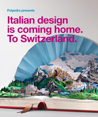
No paper was harmed during the making of this artwork. A behind the scenes look at the epic production of the cover artwork for Italian Design is Coming Home. To Switzerland.
185
No paper was harmed during the making of this artwork.
186
Production Details: Length: 2m Width: 3m Height: 1m On set: 2 men. 5 knives and 30 blades. 5 glue sticks. 30 types & colours of paper. Time of production: 350 hours Location: Studio Alberto Parise, Milan Italy Art direction: Tommaso Minnetti Photography: Alberto Parise Paper art: Alberto Parise, Giovanni Pasini
187
Everyone knows Italian design is the best in the world. But not everybody knows where the best Italian designers really came from: Switzerland. Really. Switzerland. Well, sort of. There’s been a strong link in design between Switzerland and Italy (particularly Milan) going back to the 1940s. Max Huber, Carlo Vivarelli and Lora Lamm were just a few of the legendary Swiss designers who crossed the Alps to help create the International Typographic School for which Italian (and Swiss) design became renowned.
ALLE TEXTE AUCH IN DEUTSCHER SPRACHE. TEXTES TRADUITS EN FRANÇAIS. TESTO IN ITALIANO.
Italian Design Is Coming Home. To Switzerland. is a celebration of the shared past, present and future of Swiss and Italian design, featuring:
Celebrate the past Essays & interviews on the history of Swiss & Italian design.
A veritable library of articles including: A Beginner’s Guide to Swiss & Italian Design; interviews with Giancarlo Iliprandi and Felix Humm; essays on Swiss and Italian design by Bettina
Richter (curator of the Poster Collection at the Museum für Gestaltung in Zürich) and Maurizio Vitta (Professor of Design History and Culture at the Design Faculty of Politecnico di Milano University).
Celebrate the present 11 collaborations between 22 of the best contemporary Swiss & Italian graphic designers.
11 unique collaborations between 22 of the best graphic designers in both countries, including: Bureau Collective & Jekyll&Hyde; Büro Destruct & Andrea Rauch; CCRZ & Studio FM; Christoph Frei & Mauro Gatti; Dafi Kühne & Marco
Nicotra; Erich Brechühl & Zetalab; GVA Studio & Tomaso Marcolla; Melchior Imboden & Leftloft; Nerves & Studio Kmzero; Sabina Oberholzer, Renato Tagli & Paolo Palma; Stefan Jost & Alessandro Gori.
Celebrate the future The next generation of Swiss & Italian creative talent.
A gallery of the work of the best Swiss and Italian design students and young professionals. ISBN 978-84-92861-74-3
9
788492 861743