Orange County Equity Map
INSTRUCTIONAL MANUAL


INSTRUCTIONAL MANUAL

The Orange County Equity Map (OC Equity Map) is a data platform that spotlights social and health disparities in Orange County neighborhoods across multiple dimensions with a specific focus on the impact from COVID-19. The interactive map visualizes Orange County into 580 census tracts and displays the scores from the Social Progress Index (SPI), CDC Health Indicators, and population demographic data as well as overlays additional information that can be customized for a variety of different use cases.


1 The default OC Equity Map, which displays SPI Scores for each census tract, can be filtered to narrow focus on a specific City or one of the 5 supervisor Districts.
2 The Base Layer default display is the composite Social Progress Index for each census tract; this can be modified to focus on each of its separate Dimension, Component, or Indicators. The Base Layer can also display a variety of CDC Health Indicators (see examples) and Population Demographics.
3 The Overlay allows for additional data analysis. This example shows the prevalence of COVID-19 Cases in Orange County (size of orange dots) on top of the Social Progress Index.
4 Additional information includes Opportunity Zones, County & Public Resources (infrastructure, hospitals, places of worship), and School District Divisions as a sample of different views that can be incorporated into this tool.
5 This legend displays the range for the Base Layer selected. Low scores will always be yellow and high scores will always be purple. It is incorrect to always interpret yellow data points or low scores as “bad” or as a “less desirable” outcome. For example, low eviction rates or low cancer prevalence is not “bad.” Remember to read the Legend in the context of the indicator you are analyzing.
The OC Social Progress Index (SPI) measures the relative levels of social progress for every census tract in Orange County using a sophisticated framework of standardized indicators. A census tract is a geographical unit of measurement designed by the US Census Bureau to have a population range between 2,500 to 8,000 individuals with an average population size of 4,000. Census tracts are unique among geographic units in the United States in that they are explicitly designed for statistical comparison and analysis.
Policymakers, businesses, organizations, and residents can use the Orange County SPI to compare one census tract against another or a peer group of multiple census tracts on different metrics of social progress, allowing the identification of specific areas of strength or weakness.


We combine 50 social and environmental outcome indicators to calculate an overall score for these tracts, based on tiered levels of scoring that include measures in health, safety, education, technology, rights, and more.
1 Social Progress Index Scores for each census tract is displayed on a map of Orange County. Yellow indicates lower scores, while Purple indicates higher scores.
2 The SPI summary and scorecards accommodate for multiple different languages to ensure all residents in Orange County will be able to access and analyze the data.
3 Enter an address in the highlighted field to view a summary of the SPI for your residence, workplace, or areas of interest.
4 A summary window will appear after entering the desired address. The top will display a summary of the census tract number, city, and zip code associated with the address in the search field.
5 The SPI Score and Rank of the census tract will display in the upper right-hand corner. A summary of each of the three Dimensions and a list of 5 of the highest and lowest Component scores will display below.
6 See Scorecard navigates you to a window with full details behind the Dimension and Component scores.

7 Although the SPI does not include economic indicators, the Median Household Income and Overall Rank is displayed below the SPI Score and Overall Rank for analysis.
8 A Score, Rank, and colored indicator for Relative Strength/Weakness are displayed following each Dimension, Component, and Indicator.
9 The Relative Strength/Weakness indicator (Blue for Overperforming and Orange for Underperforming) is based on a comparison to 10 other census tracts in Orange County with most similar Median Household Income.
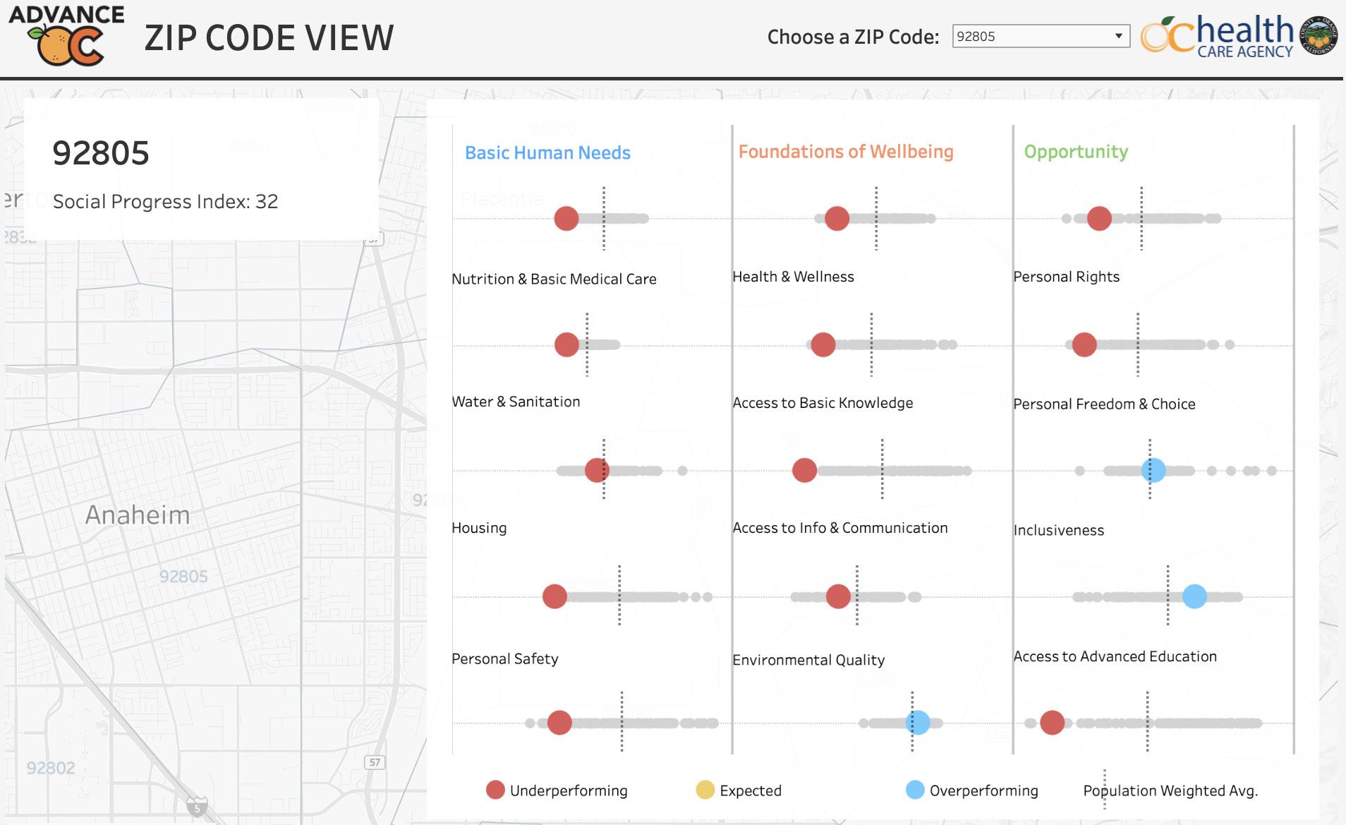
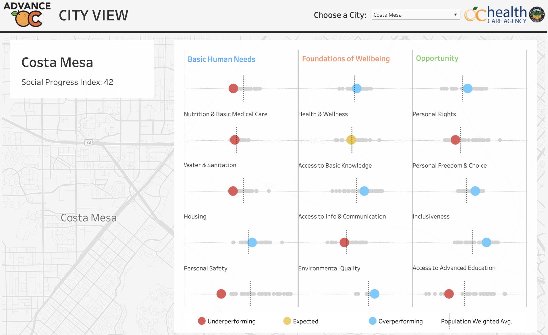
Additional dashboard displaying the Social Progress Index scores for different cities and zip codes.


1 This City View shows an example of the City of Costa Mesa as well as the population weighted average for each score.
2 This Zip Code View displays SPI Score for each census tract in 92805 which largely comprises the City of Anaheim.
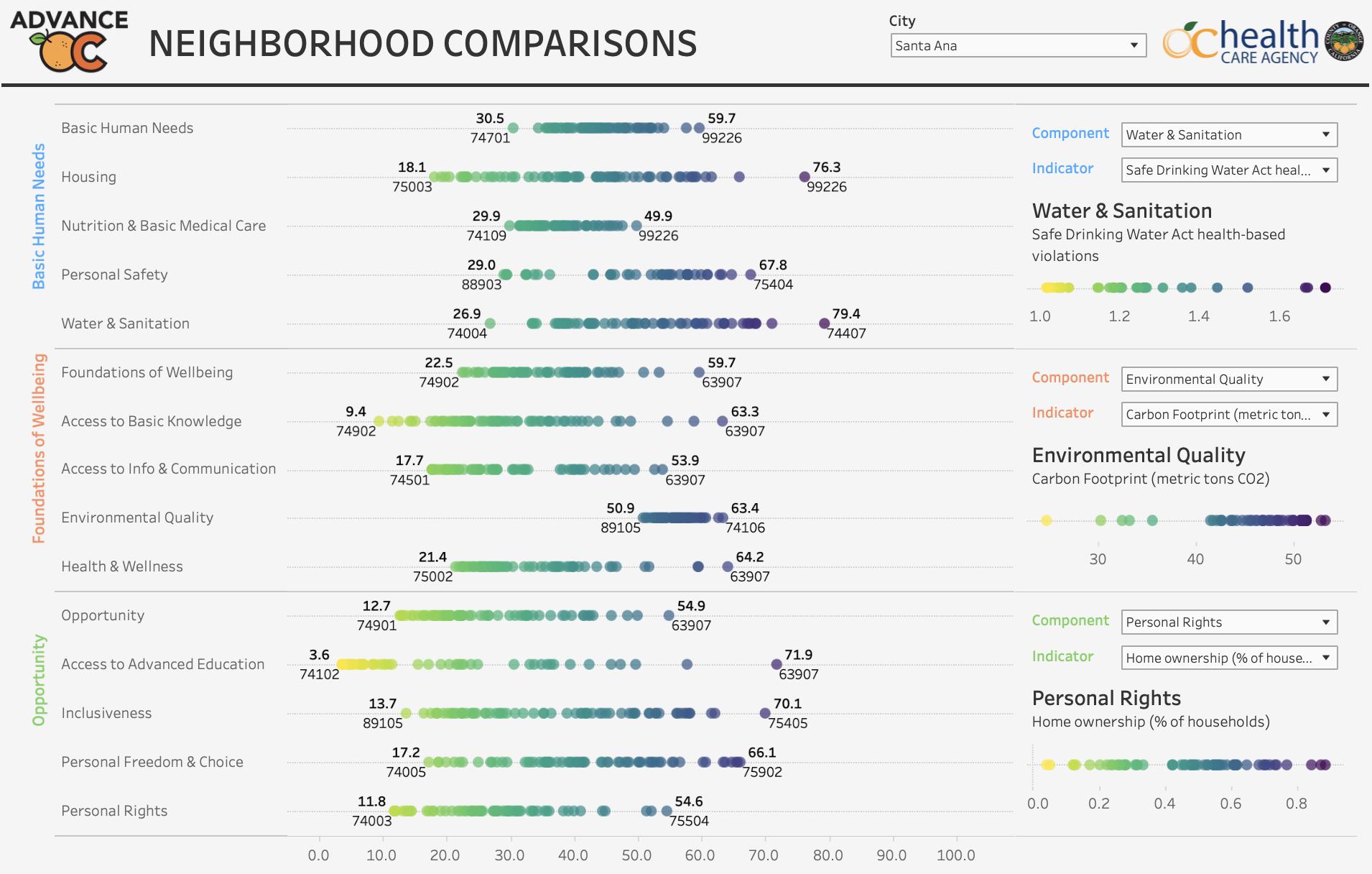
Additional dashboard displaying the Social Progress Index distribution of the lowest performing to the highest performing neighborhoods (census tracts) on a scale. The wider the distribution, the greater the disparity within that component. This Neighborhood Comparison is displaying the City of Santa Ana and each of its SPI Score.

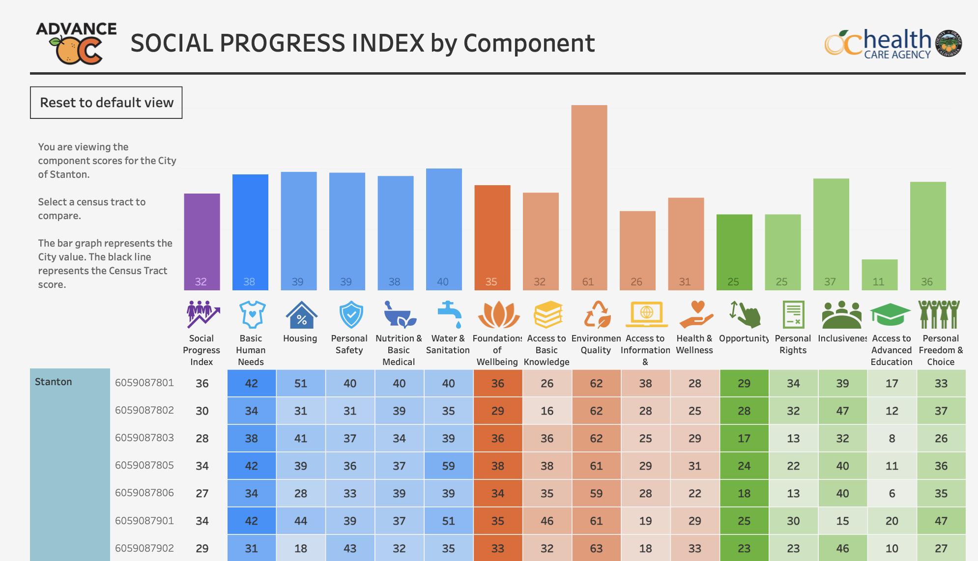
Additional dashboard showing a heat map of Social Progress Index Scores grouped by city which can be selected to display all census tracts within this city. This SPI by Component example is shows the dashboard after City of Stanton was selected to display data from all census tracts in the city.

