A Publication of the Dallas Chapter of the American Institute of Architects | Spring Vol. 30 No. 9
COLUMNS
CommuniCating arChiteCture Delineation: art and Beauty of hand Drawing 25 Years of Dallas architecture Design award Winners Storytelling in architecture
“We used an A Acme King Size Brick blend to break up the scale of the tall stadium facade and to build economicallyyy. Inside, Inside e the King Size Brick brought warmth to a highly visible main concourse and concessions. Acme m[dj je m[ e ]h[ h[Wjj [ʹe ʹehj to match the school’s school’’s existing brick blend perfectlyy. Response Res Response from all over the country has been great. A Canadian media contact even compared the stadium to one planned for a CFL team, asking how we could build so inexpensively at that iYWb[ WdZ Ód Ód__i _i^$È —Christian n Herr Herr,r, AIA, Associate Principal, PBK Architects, Dallas
Top lawyers. Building your business with strength. Individuals and businesses in the architecture and building design industry are continually creating new spaces. They’re also creating their own places on the business landscape.
Mitchell Milby
Robert Miklos
Diren Singhe
Top legal advice should be built into the plans for business growth. Expert advisors should also be there when a legal problem arises to protect your interests with strength. Milby, PLLC has the team with the strength to help you build your business for success. Each attorney on the Milby, PLLC team is a lawyer who understands all aspects of the business of buildings, and who can effectively advocate for and protect your rights and interests - in and out of court.
Ryan Starnes
Bo Wilson
Professional liability defense ■ Business litigation ■ Intellectual property litigation Products and premises liability litigation ■ Permitting, zoning and land-use planning ■ Environmental law Contracts and covenants ■ Corporate law ■ Tax abatements and credits
MILBY, PLLC 1909 Woodall Rodgers, Suite 500 Dallas, Texas 75201 Tel 214.220.1210 Fax 214.220.1218 www.milbyfirm.com
Professional Affiliate
COLUMNS | www.aiadallas.org
1
A publication of AIA Dallas with the Dallas Center for Architecture 1909 Woodall Rodgers Frwy. Suite 100 Dallas, TX 75201 214.742.3242 www.aiadallas.org www.dallascfa.com AIA Dallas Columns Spring, Vol. 30, No. 9 Editorial Team Chris Grossnicklaus, Assoc. AIA | Editor Linda Mastaglio | Managing Editor Printer Nieman Printing Design Director James Colgan
A proud neighbor of the Texas Community 800-326-1821 www.holcim.us
Communications Committee James Adams, AIA Jan Blackmon, FAIA Andrew Brown Greg Brown Diane Collier, AIA Kimberly Cundiff Williford, Assoc. AIA Nate Eudaly, Hon. AIA Dallas Ryan Flener Chris Grossnicklaus, Assoc. AIA Ana Guerra, Assoc. AIA Linda Mastaglio Nicholas McWhirter, AIA Amber Pickett, Assoc. AIA, IIDA Doug Sealock, Hon. AIA Dallas Celi Sims, Assoc. AIA Kirk Teske, AIA Ray Don Tilley
Columns Advisory Board Jan Blackmon, FAIA Yesenia Blandon, Assoc. AIA Greg Brown Myriam Camargo, AIA Mark Doty Ann Franks Chris Grossnicklaus, Assoc. AIA Ana Guerra, Assoc. AIA Kate Holliday Veletta Lill, Hon. AIA Dallas Linda Mastaglio Linda McMahon Mitch Milby Rita Moore Marcel Quimby, FAIA Kevin Sloan, ASLA Brandon Stewart David Zatopek, AIA AIA Dallas Staff Jan Blackmon, FAIA | Executive Director Rita Moore | Managing Director Lorie Hahnl | Membership Services & CE Coordinator Katie Hitt, Assoc. AIA | Communications & Graphics Coordinator Celi Sims, Assoc. AIA | Program Development Manager Becky Souter | Program Administration Manager Peaches Walker | Visitor Receptionist/ Administrative Assistant
2
SPRING 2013
Columns’ Mission The mission of Columns is to explore community, culture, and lives through the impact of architecture. About Columns Columns is a quarterly publication produced by the Dallas Chapter of the American Institute of Architects with the Dallas Center for Architecture. The publication offers educated and thought-provoking opinions to stimulate new ideas and advance architecture. It also provides commentary on architecture and design within the communities in the greater North Texas region.
Columns has received awards for excellence from the International Association of Business Communicators, Marcom, and the Society for Marketing Professional Services. One-year subscription (4 issues): $22 (U.S.), $44 (foreign). To advertise, please contact Celi Sims at 214.742.3242 or csims@aiadallas.org. The opinions expressed herein or the representations made by advertisers, including copyrights and warranties, are not those of the Executive Board, officers or staff of the AIA Dallas Chapter, or the editor of Columns unless expressly stated otherwise. Š 2013 The American Institute of Architects Dallas Chapter. All rights reserved. Reproduction in whole or in part without written permission is strictly prohibited. AIA Dallas would like to thank Blackson Brick for being an exclusive underwriter of Columns magazine.
Dallas Center For Architecture Staff Jan Blackmon, FAIA | Executive Director Greg Brown | DCFA Program Director AIA Dallas 2013 Officers Kirk Teske, AIA | President Lisa Lamkin, AIA | President-Elect Dan Killebrew, AIA | VP Treasurer Sean Garman, AIA | VP Programs
COLUMNS NICk MCWhIRTER, AIA
RIChARD ShARUM
CONTENTS Features What Makes a Good Architectural Drawing? 6 By Julien Meyrat, AIA: A great drawing captures your eye and begs you to study its detail.
Judgment Day | Why Architects Compete for Design Awards 12 By Kathryn Holliday: Do design competitions really matter?
Twenty-Two Years of the 25-Year Awards 16 By Willis Winters, FAIA: AIA Dallas recognizes icons of Dallas’ best architecture.
Talking About Cities 18 By Ryan Flener: How do you capture architecture in words?
Departments Public Arts 5
Lost & Found Dallas 37
An LED-studded grid forms a magnificent curtain for the Dallas City Performance Hall.
The preservation community experiences both loss and rebirth of century-old buildings.
Detail Matters 10
Inside 38
Reverent architecture at Dallas’ most famous temple
A special advertising segment on the latest in interior trends
In Context 22, 41
Index to Advertisers 40
Identify this Dallas landmark … if you can.
Support the firms that support Columns.
Profile | Jill Magnuson 34
Web Exclusives 41
Out-going president of the Dallas Center for Architecture shares her thoughts.
What do you get from Columns when you click on through?
Profile | kirk Teske, AIA 36
Critique 43
As president of the Dallas chapter of the AIA, Kirk brings knowledge, leadership, and a passion for sustainability.
Alexandra Lange’s Writing About Architecture
Gallery 23
A new addition to Columns you’ll look forward to every issue … check it out!
Compiled by Katie Hitt, Assoc. AIA: View the winners of the 2012 Built and Unbuilt Design Awards. Correction: In the Winter 2012 issue of Columns, four photos were misnamed. We apologize for this error. Please note the proper names of each residence, as shown here:
Last Shot 44
(Page 42) The Sidy/hartman home
(Page 43) The Sidy/hartman home
(Page 43) The Maestri home
(Page 44) The Sidy/hartman home
Read Columns online ... subscribe at www.issuu.com/AIADallas or opt for a Droid application to read Columns on your phone.
Web Exclusives Visit this one-stop spot for interesting videos and information for the architectural community: www.tiny.cc/web-exclusives-1
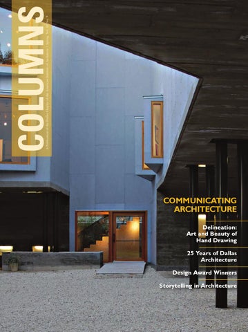
Cover: The Laura Rathe Gallery in Houston, winner of a 2012 AIA Dallas Design Award—Built award, was designed by Albert Marichal.
COLUMNS | www.aiadallas.org
3
We’re more than a building… TOURS
EXHIBITIONS
STUDENT PROGRAMS
Join in the conversation. DallasCFA.com
TALKS AND DISCUSSIONS
By Lindsey Bertrand
Public Arts | Curtain Call
SCOGIN MAYO
Points of Life by Shane Pennington on display at the Dallas City Performance Hall.
SCOGIN MAYO
More than the usual stage curtain— the “grand drape”—of most theaters, the newly opened Dallas City Performance Hall (CPH) boasts a curtain that is at once a boundary and an invitation. Far from the traditional heavy-weight, light-absorbing velour of most theater curtains, what makes this mixed metaphor work is, in short, technology. CPH’s “curtain” is an LED-studded grid that, when activated, displays programmed images in any number of ways. What’s more, the curtain can display a video of images. Whereas traditional stage
curtains aim to block light, CPH’s curtain embraces it and uses it to create a new creative space—a new dimension—in addition to the stage. At 60-feet wide and 32-feet tall, the gridwork curtain consists of more than 4,300 color-mixing LEDs. When added to the LEDs on the theater’s walls and ceiling, the effect creates what the CPH calls “a distinct atmosphere into which audience members enter before performances.” When backed by a black “traveler” curtain, the LED curtain functions as a programmable art space. Without the traveler, the au-
dience sees through the curtain’s images onto the stage. When inactive, it allows complete transparency between the audience and stage. These qualities will surely prompt CPH to integrate the curtain into some of its stage productions, engaging the curtain as a new form of scenery. Until then, the curtain will display video pieces by artists commissioned by the City of Dallas’ Office of Cultural Affairs. ■ Lindsey Bertrand is a writer with RTKL Associates.
COLUMNS | www.aiadallas.org
5
By Julien Meyrat, AIA
WhAT MAkES A GOOD
ARChITECTURAL
DRAWING?
In keeping with tradition, the 38th annual Ken Roberts Memorial Delineation Competition (KRob) came to its usual conclusion on a cool November evening, but this time things were different. Broadcast online to its growing international audience for the first time from the Dallas Center for Architecture, the jury presented the winning entries to the public and shared its views about the current state of architectural drawing. Two of the world’s best-known figures in the contemporary scene of architectural visualization served as jurors: Jeff Mottle, founder of the popular CG Architect website, and Carlo Aiello, publisher of eVolo magazine. They were joined by Dallas architect Michael Malone, AIA, to answer questions such as where architectural delineation is headed and what role hand drawing plays in the new digital reality. The discussion proved to be very fitting for an event that, at its core, highlights the countless ways architecture can be visually represented. Browsing the works submitted throughout the history of the Ken Roberts competition visibly magnifies the degree
6
SPRING 2013
to which this fundamental discipline in the profession has evolved in the last few decades. Yet, looking at the group of winning handdrawn entries selected by the jurors earlier that day, it appears the criteria used to judge the merit of an architectural drawing has not changed all that much. This is probably because the most important question when judging the works has not changed: What makes an architectural drawing successful? Given the rapid pace of technological change that has influenced architectural delineation in recent decades, it may initially appear that the standards from which to judge an image today ought to be quite different from what they were a generation ago. However, soliciting the thoughts of individuals whose careers are deeply immersed in the visualization of design concepts (whether in the classroom or in the studio), a consistent agreement on what makes an architectural drawing great emerged instead. Their responses affirm that an effective architectural image fulfills a basic pair of characteristics that transcends the techniques and media and forms used.
Drawings that Embody Life The first characteristic is that drawings need to embody life. James Richards, an associate professor of landscape architecture at UT Arlington and author of a book on freehand drawing for designers, believes that a drawing should have evidence of life. According to Richards: “A successful drawing goes beyond an accurate rendering to capture, as designer Milton Glaser said, ‘something of the energy of the subject and its maker.’ It has an authentic life and freshness that a viewer sees and relates to, whether consciously or not.” By embodying this authenticity, a drawing begins to speak to us, inviting us to engage with its ideas and absorb us into its own world. Kevin Sloan, a former KRob juror whose landscape architecture firm sponsors the competition’s travel sketch category, succinctly describes what a drawing should do: “A good presentation drawing persuades. A good exploratory sketch converses with its author meaningfully. A good technical drawing constructs.” There is a profound conversation that takes place once a drawing establishes a liveliness that makes it instantly relatable. It should therefore not deceive the viewer, masking the architectural idea with sophisticated technique, now made easier with digital tools. If there is one way to lose a viewer’s ability to connect with a drawing, it is by relying too much on technical virtuosity and effects. Hand drawing, by contrast, lends a drawing an imitable authenticity since it is the most direct manifestation of the author’s mind. Sloan reminds us: “Michelangelo always asserted that the job of the artist [or architect] is to get the ‘hand to obey the mind.’” The author’s touch must be evident with the squiggle of a line or a brushstroke, endowing a drawing with a humanity that beckons the viewer to identify with it. Richards refers to one 20th century master who does this well: “Look at the concept sketches of Aalto, for example. You can almost feel his arm and shoulder movements expressed in the lines as he searches for form.”
Above: Stephanie Bower’s drawing of an old Mughal-era city won the inaugural Kevin Sloan Prize for best travel sketch. beLoW: Steven Quevedo’s most recent KRob submission shows his ongoing investigations of space, form, and composition.
opposITe pAge This companion image to Nathan Freise’s KRobwinning entry “Fallen Silo” from 2009 sets the standard in storytelling and the use of digital postproduction techniques that lend it a human touch.
Preserving the human Touch Preserving this human touch becomes quite a challenge the more one works with computers. Though computers allow for a broader range of techniques to express a concept, they cannot compensate for the immediacy of the hand drawing. Steven Quevedo, professor of architecture at UT Arlington and one of COLUMNS | www.aiadallas.org
7
2012 KeN RobeRTs MeMoRIAL DeLINeATIoN CoMpeTITIoN AWARD WINNeRs: besT IN CATegoRY Professional hand Gary Schuberth, AIA
besT IN CATegoRY Student Digital/Mixed Ross Jordan | University of Sheffield
JURoR CITATIoN Professional Digital/Mixed Anna Boldina
besT IN CATegoRY Student hand Andres Jaime | Syracuse University
KevIN sLoAN pRIZe FoR besT TRAveL sKeTCH Stephanie Bower | Stephanie Bower Architectural Illustration
JURoR CITATIoN Student hand Michael Cincala | Virginia Tech
besT IN CATegoRY Professional Digital/Mixed Robert Gilson | RG_CC
RICHARD b. FeRRIeR pRIZe FoR besT pHYsICAL DeLINeATIoN Chris Cornelius | Studio:Indigenous
JURoR CITATIoN Professional Digital/Mixed Maj Plemenitas | LINkSCALE
the competition’s most prolific winners, explains the shortcoming of relying too heavily on technology. “Technique is only one component of architectural skill,” Quevedo says. “So many renderings with digital technology advance only a pretense for drawing. They seem to be more and more about a specific function made possible with digital programs. Such drawings often lack poetry and spirituality. If a drawing is just about itself and technique, it can be engaging, but a great drawing has many layers that go beyond technical skill. The drawing is an artifact of the architectural design process, so it contains within it the spirit of the work of architecture it conveys.” From my observations in watching KRob jurors deliberate in the past few years, it is clearly evident that they are drawn to the entries that seem to contain many layers of information, and this engages continued interest in subsequent rounds until those drawings are selected as winners. Recently, many submissions show evidence of post-production in which the author deliberately added hand-drawn line work and textures inspired by physical media over a pure digital rendering. This effectively humanizes the image. The best drawings work on multiple levels with the viewer, revealing layers of information and detail over time. The first layer quickly draws the viewer’s attention. The next layer reveals detail to maintain that attention that begins to develop a more profound connection to the drawing. Additional layers of information build meanings that both complement and contradict a drawing’s initial impression. 8
SPRING 2013
Lucy Richards, a founder of the graphic design firm StudioLR in Edinburgh, Scotland, observes this pattern among this year’s winners. “I notice with interest that all of the 2012 winners use a strong focal point that is successful in engaging the viewer. In many cases the detail fades out to nothing around the focal point. This is especially successful in creating impact and an emphasis of both form and concept.” It appears that the rules that govern Richards’ award-winning environmental graphics apply to the best examples of architectural delineation. Quevedo’s experience as a teacher confirms this view. He tells his students that “A great drawing must immediately capture your eye when you see it at a distance, attracting you to study its details. The detail and craft must create a sense of awe in that the viewer is amazed.” Eventually the viewer’s focus shifts to the details, which can be achieved by the skillful mix of technique, tones, and forms. “From the drawing, we will gain an impression of the character of the place and we may feel quite a distinctly emotional response,” James Richards says. “Color, medium, intensity, and style all play a part in this.” How the idea relates to its sense of place forms the basis of a narrative, which becomes essential in augmenting an image’s impact. Richards’ view on effective graphic design seems to have much in common with architectural delineation. “Graphic design describes visual communication, which often involves a narrative in the form of words or pictures. The more of a story or narrative that a drawing can communicate, the richer and more engaging the outcome,” he adds.
LeFT: University of Sheffield’s Ross Jordan produced this highly detailed depiction of London’s future to win in the student category for best digital/hybrid media.
beLoW RIgHT: The skillful use of
light, shade, and detail brought to Gary Schuberth, AIA the KRob prize for best hand delineation by a professional.
beLoW LeFT: Last year’s Best in Show winner was Kevin Scott’s portrayal of a future Chicago with its details and captivating atmosphere.
Into the Details If there is one phrase that KRob jurors most frequently use to describe almost all of the winning entries, it is that they tell a story. This is the second key characteristic common to all successful delineations. Indeed, many of the best submissions were part of a series of storyboards for film, depicting scenes with buildings as one of many elements, such as nature, people, and atmosphere. Works in recent years vividly represent time and place, and in this way they lead some viewers to wonder if they evoke the actual prevailing moods of the times. Observing that “drawing has a surface structure,” Sloan says, “The narrative or story a drawing tells is the deep structure and this aspect has the capacity to draw the observer into the picture and get the head and heart involved. Although narration seems to be popular today, a picture has always been worth a thousand words.” One trend particularly noticeable in the digital/hybrid media categories is the post-apocalyptic scene in which buildings are in a state of decay, and yet reconfigured to function differently through technology. This year, Ross Jordan’s winning entry in the digital/hybrid media category shows a re-imagined future for London’s Regents Row. Last year’s Best in Show entry by Kevin Scott masterfully uses cool colors and renders snow and ice to produce a dramatic effect, while the scene’s richly detailed buildings provide a sobering yet moving glimpse of city life in the future. These examples share a deeply embedded structure that successfully engages us at a deep emotional level.
It is in the portrayal of a detailed and compelling narrative that we can glimpse the future trajectory of architectural delineation. Panelist Jeff Mottle observed that the up and coming generation of visualization artists has been increasingly transitioning into digital animation. A good example is Nathan Friese, a former architect and two-time winner of KRob’s Best in Show prize who operates a digital animation studio, Freisebrothers. The impressions of his slick short films not only portray an architect’s natural storytelling talents, but also an ability to wield sophisticated tools in service to a concept that was first drawn by hand. Computers have expanded the means by which architects can develop their concepts, but only hand delineation can generate the concept’s most genuine expression. To get the most from the hand and the computer, they must therefore work symbiotically. Freehand proponent James Richards finds this ultimately liberating: “Computers don’t eliminate the need for drawing, they free drawing to become a more creative mode of expression, to say things that can’t be better said any other way.” ■ Julien Meyrat, AIA, is an associate at RTKL Associates Inc.
Would you like to learn more about the art of architectural drawing? See Julien’s expanded article at www.tiny.cc/arch-drawing. Also, view the kRob entries at www.tiny.cc/kROB-2012. Additionally, learn about the history of kRob at www.tiny.cc/krob-history or by following this QR code: COLUMNS | www.aiadallas.org
9
Detail Matters | Temple Emanu-El
“Completed in 1957 by noted architects Howard Meyer, Max Sandfield, and William Wurster, Temple Emanu-El in Dallas has long stood as one of the most revered religious structures in the Southwest. The sacred centerpiece of the campus, the Olan Sanctuary, is an inspired cylindrical domed space enlivened by the contributions of storied artists Gyorgy Kepes, Anni Albers, and Octavio Medellin. Diffused natural light enters through patterned colored art glass at the rectilinear base and glass block insertions ringing the top of the cylinder. Both sources dramatically frame elegant vertical wood slats and custom pendant light fixtures set at varying heights. This exemplary collaboration of art and architecture never ceases to elicit awe from all who enter the space.” —RIZI FARUQUI, AIA, OF CUNNINGHAM ARCHITECTS, DALLAS Temple Emanu-El was awarded the Texas Society of Architect’s 25-Year Award in 2012 and received the AIA Dallas 25-Year Award in 1991. Contributed by Kimberly Cundiff Williford, Assoc. AIA, design development manager with Brinker International
10
SPRING 2013
CRAIG D. BLACkMON, FAIA COLUMNS | www.aiadallas.org
11
By Kathryn Holliday
JUDGMENT DAY
WHY ARCHITECTS COMPETE FOR DESIGN AWARDS
12
SPRING 2013
LeFT: A visitor to the Solar
beLoW: The 2012 AIA Dallas
Decathlon 2011 takes a closer look at a model for one of the entries.
Unbuilt Design Awards jurors Thomas Christoffersen, Anne Rieselbach, and Jonathan Segal, FAIA, are deep in deliberation.
Imagine a group of architects, inspired by imagination and ambition, submitting their work for public scrutiny. Often, they compete in the hopes, however distant, that their work may garner some special recognition. Sometimes there is prize money, sometimes not. Sometimes there is publication, sometimes not. Sometimes the design gets built, sometimes not. Given the uncertainties and ambiguities of competition, what draws architects to compete? Competitions set architecture apart from other professions and they come in varied forms: • Invited competitions for high-profile projects like the Guggenheim Bilbao that pit the best known practitioners against each other; • Open competitions the AIA Dallas-sponsored Ken Roberts Memorial Delineation Competition (KRob); •Student competitions, like the U.S. Department of Energy’s biennial Solar Decathlon, that give young designers a chance to test their work against their peers; and • Design awards, like the annual TSA awards, strucMATThEW CRUMMEY, AIA tured to acknowledge excellence and encourage good design. In all their guises, competitions are an important part of architectural tradition. They allow practitioners to take risks, to showcase work that people might never see, and, especially for young practitioners, they offer opportunities for publicity and exposure that might otherwise never materialize. While competitions have their origins in the humanistic traditions of the Renaissance, American competitions today really have their roots in two practices—one in architecture education and the other in practice. While both modes of competition have changed, especially in our more globalized and interconnected world, they have left a firm imprint on how we understand them. That concept is worth exploring. STEFANO PALTERA/U.S. DEPARTMENT OF ENERGY SOLAR DECAThLON
COLUMNS | www.aiadallas.org
13
RIgHT: Competition drawings by
architect Maya Lin of what became the winning design for the Vietnam Veterans Memorial, Washington, DC.
LIBRARY OF CONGRESS
Competitions in Education In education, competitions were a central piece of the curriculum that developed at the Ecole des Beaux-Arts in Paris in the 19th century. At the Ecole, each term began with a single design problem put to all enrolled students. At the end of the term, the students presented their designs for judgment and the ultimate prize was the prestigious Prix de Rome. All education centered on competition, on pitting one student against another to motivate them to produce their best work. When American architecture schools first started in the decades after the Civil War, they relied on the Beaux-Arts system for a basic teaching framework. Students competed against each other within single programs, but they also competed against other universities. Through the 1930s, students from all American architecture schools competed against each other as part of their standard curriculum. The New York-based BeauxArts Institute of Design (BAID) sponsored multiple national competitions between university students as a capstone to their educational experience. In 1930, the BAID judged 9,560 entries from students from across the country. These annual competitions, though, became a point of criticism for American architects by the end of the decade. Paul Cret, 14
SPRING 2013
the immensely successful designer of UT Austin’s Main Building and the Eldon B. Mahon U.S. Courthouse in Fort Worth, wrote in 1941 that competitions discouraged innovation because they “tended to place emphasis on what was most likely to please the judges.” After World War II, competitions were no longer an essential component of the curriculum at most architecture schools. Today, there is still a culture of student competitions, but it is more informal and widely dispersed. Most are sponsored by universities, architecture firms, businesses, cultural organizations, and museums. They are not part of the formal system of education, but they provide opportunities for students to have their work recognized outside the classroom. The Association of Collegiate Schools of Architecture remains the most central sponsor of student competitions; this year’s include the annual Steel competition and a “Timber in the City” project. But there are others. UT Arlington senior Elizabeth Bigler, for example, recently won honorable mention in the 14th annual Shelter International Competition for Students by designing a prototype for an urban birdhouse. The competition—sponsored by Shelter, a Tokyo housing company—features jurors from Japan and the United States.
Competitions in Practice On the other hand, open competitions for professional architects, especially in America, developed as a way of soliciting highquality designs at low cost in an era when there were relatively few architects. The Texas State Capitol, for example, was designed through competition in 1880-81 at a time when there were no practitioners available in Austin to design such a monumental structure. The prize offered for the winner was $1,700, a small fee even in 1880. As a result, the competition did not attract the best-known American architects. The winner was an itinerant architect named Elijah Myers who specialized in entering competitions for capitols and courthouses along the western frontier of America. Competitions were a source of much frustration to early architects. In its first decades, the newly created AIA led the way in defining clear standards for professional competitions by calling for adequate compensation and clear, honest standards for judging. Problems included bribes that passed from competitors to judges and the refusal to pay the promised fees to the winning designer. Many AIA members boycotted high-profile competitions, like the 1866 proposal for a new War Building in Washington, DC. As a show of professional solidarity, 114 architects signed a letter of protest against the terms and pledged to boycott (though many signees still entered the competition). Professional competitions remained something of a free-forall until terms became more transparent and standardized by the 1920s. The passage of the federal Tarsney Act in 1893 promoted the implementation of clear standards for competitions for federal buildings. Despite its short-lived tenure (it was repealed in 1913), the legislation did much to promote a level playing field for American practice. The competition for the state capitol of Nebraska, held in 1920, is considered a watershed for free and open competitions in America since architects and politicians worked together to select Bertram Goodhue as the winner. Open competitions remain a vital part of architectural practice and are often the most effective way of ensuring that a democratic, open spirit informs our public designs. The World Trade Center Memorial competition elicited 5,201 entries from 63 countries, a testament to the vital investment of designers around the world in creating a place of reflection. Just as important as the large number of entries was the online exhibit of all the entries for everyone to see and discuss.
Today’s competitions bring publicity to clients and suggest creative solutions to big urban problems. They also start conversations about what’s important in design. Seattle’s 2001 competition for the Olympic Sculpture Park jump-started a much larger and longer public conversation about the role of the waterfront in Seattle’s future. The Architectural League of New York’s Greatest Grid competition suggested myriad ways of reinvigorating the city’s old gridiron for the 21st century. More than Just Winners and Losers Open competitions provide a way for little-known or young architects to get their feet in the door. When the Guggenheim Museum wanted to design a new home, not everyone was invited to the table in 1991, even while luminaries like Frank Gehry, Arata Isozaki, and Coop Himmelb(l)au were invited. But it was an open competition in 1981 that allowed a 21-year-old architecture student—the then completely unknown Maya Lin—to design the most iconic war memorial in generations. From the more than 1,400 anonymous entries, a jury of eight architects and sculptors selected her design for the Vietnam Veterans Memorial in Washington, DC, transforming both her career and the way we think about the design of contemporary memorials. On the other hand, it’s not always the competition winner that gets the attention. The second-place entry for the 1922 Chicago Tribune competition for the design of what would be called Tribune Tower was the one that got architects and critics talking. Eliel Saarinen’s design for a stripped down, streamlined tower captured the profession’s imagination, even if the winning design by Hood & Howells did not. In the end, architecture competitions today are about the free flow of ideas, celebrated in a public setting. More than 100 years ago, William Ware, founder of the architecture program at MIT, wrote pessimistically that competitions were “cruel and heartbreaking” because “all but one have labored in vain.” But the continued vitality of the tradition suggests otherwise. Competitions provide opportunities for fresh, creative thinking outside the confines of day-to-day practice and are evidence of the continued creativity of the profession. ■ Kathryn Holliday is director of the David Dillon Center for Texas Architecture in the School of Architecture at the University of Texas Arlington.
STEVE RILEY
Above: 2012 AIA Dallas Built
Design Awards jurors Brian MacKay-Lyons, Hon. FAIA, Anne Schopf, FAIA, and Michel Rojkind discuss their selections. LeFT: The 2009 U.S. Department of Energy Solar Decathlon opens in Washington, DC. STEFANO PALTERA/U.S. DEPARTMENT OF ENERGY SOLAR DECAThLON COLUMNS | www.aiadallas.org
15
By Willis Winters, FAIA
TWENTY-TWO YEARS OF
ThE 25-YEAR
AWARDS
25-Year Awards are commendations bestowed as part of AIA Dallas’ Community Honors program. They are given to recognize exemplary architecture that has withstood the test of time.
The title of this article would be a little more clever, perhaps, if it were to be written in three years—2015—when AIA Dallas’ 25-Year Awards program marks its silver anniversary. Imagine an exhibition at the Dallas Center for Architecture entitled “25/25,” which would chronicle the city’s most important works of architecture dating back to the second half of the 20th century. Let’s take a brief look at some of the projects that will be featured in this show; but first, an overview and history of the program. Most readers are familiar with the American Institute of Architect’s 25-Year Awards, which annually recognizes the icons of American architecture since the program’s inception in 1969. The list of architects and firms receiving this accolade includes the usual suspects: Frank Lloyd Wright, Phillip Johnson, Eero Saarinen, and SOM. Closer to home, honored projects include Louis Kahn’s Kimbell Art Museum; Bruce Goff’s Bavinger House in Norman, OK; and the Thorncrown Chapel in Eureka Springs, AR, by Fay Jones. The national window of eligibility is a sliding 10-year 2012’s 25-YeAR DesIgN AWARD:
Key Cataract and Surgery Center, 2801 Lemmon Ave., Dallas; The Oglesby Group, 1985 This 28,000-square-foot office building combines an ambulatory surgery center with lease and retail space on three floors over three levels of at-grade and CRAIG D. BLACkMON, FAIA
below-grade parking. The designer utilizes green glass and two textures of Texas limestone that complement its surroundings. The indigenous materials contrast with the contemporary and sleek appearance of the exterior. The project received an AIA Dallas Honor Award in 1985 and a TSA Design Award in 1987.
19
20 0
5
91
selected 25-Year Award Winners
Temple emanu-el, 8500 hillcrest Road, Dallas; howard Meyer, FAIA; Max Sandfield; William W. Wurster, FAIA, consulting architect; 1956
summers Residence, highland Park, TX; Robert Johnson Perry, 1962 16
SPRING 2013
Richland College, 12800 Abrams Road, Dallas; The Oglesby Group with Perkins+Will, 1972
time frame encompassing projects that are 25 to 35 years in age. In Dallas, this window is a slightly wider 25 to 40 years. The Dallas 25-Year Award program was initiated in 1990 by Nestor Infanzon, FAIA, as an adjunct function of the AIA Dallas Design Awards Committee, which he chaired at the time. Over the years, the program migrated away from this committee’s responsibility to a stand-alone group of jurors composed of committee emeriti, and eventually was led by a small group of former committee chairs with a consummate interest in design, history … and books. Each year, for the past 15 years or so, a varying core group of 25-Year Award jurors has embarked on an annual summer pilgrimage to Archer City, TX, on a book-buying expedition to Larry McMurtry’s famed bookstore—Booked Up—which features rare and out-of-print books. The two-and-a-half-hour long road trip down the Jacksboro Highway has been marked typically by passionate discussion of Dallas’ greatest post-war buildings and architects, and the ultimate prizes were determined during the return trip to Big D (the jurors laden with cherished book purchases). Over the years, McMurtry and the Archer City economy (boosted by lunch at the Walter Benjamin Dairy Queen) have profoundly profited from these AIA Dallas 25-Year Award junkets. This brings us back to the AIA Dallas 25-Year Award program. Since the program’s inception in 1990, 20 different buildings have been the subject of awards. In addition, 12 residences have been recognized, including the first award in this category, bestowed in 1996. At least 10 different building types have been honored with the 25-Year Award with office buildings leading the pack (seven awards), followed by ecclesiastical (four awards), and municipal facilities (three awards). In all, 21 architects have received the 32 total awards that were bestowed. Multiple winners include O’Neil Ford/Ford & Swank (four awards); Oglesby Group/Oglesby Greene (three awards); and Harrell & Hamilton/Omniplan (three awards). Howard Meyer, Harwell Hamilton Harris, Glenn Allen Galaway, I.M. Pei, and George Dahl have each been recognized with two 25-Year Awards. Of the 20
awards bestowed in the main category, 14 were designed by Dallas architects. In the residential category, 10 of the 12 winning projects were designed by the city’s illuminati. Enough statistics. Let’s talk about a few of the buildings and houses. It can be assumed that the earliest winners of the 25-Year Award represented the very best post-war structures built in Dallas during the 1950s and 1960s. The first three projects honored with the prize include the Texas Instruments Semi-Conductor Building, designed by O’Neil Ford and Richard Colley (Frank Welch, FAIA, in his first job, worked for Ford as the construction inspector on this project); Temple Emanu-El (honored with the Texas Society of Architects 25-Year Award in 2012); and NorthPark Center (the greatest shopping mall on the planet). Interspersed among the recognized icons of Dallas architecture are the smaller buildings and houses that have been overlooked due to their secluded, out-of-the-way locations. A few of these projects that come to mind are the Granger Center in Garland, a municipal recreation center by Fisher and Jarvis (the predecessor firm to Fisher and Spillman and Jarvis-Putty-Jarvis); the marvelous Houseman-Webb residence by a little-known, but talented, Dallas architect, Glenn Allen Galaway; and St. Stephen’s United Methodist Church in Mesquite, an extraordinary project by Pratt, Box and Henderson. Each of these projects deserves the full attention of Dallas architects. The award for St. Stephen’s, announced in 2001 at the AIA Dallas awards banquet at the Dallas Museum of Art, was presented to James Pratt, Hal Box, and Philip Henderson in a rock-star-reunion moment where the former partners of one of Dallas’ greatest design firms were publicly reunited for the first time since the dissolution of their office in the 1970s. Enough for now. Work commences on “25/25”—the exhibition commemorating the 25th anniversary of AIA Dallas’ 25-Year Award program in 2015. ■ Willis Winters, FAIA, is the assistant director for the Dallas Park and Recreation Department.
11 20
10 20
09 20
20
07
PhOTOS: CRAIG BLACkMON, FAIA
Dallas statler Hilton Hotel, 1914 Commerce St., Dallas; William Tabler, 1956
galaway Residence, University Park, TX; Glenn Allen Galaway, 1969
general Automotive parts Corporation Headquarters (currently Church of Scientology), 451 S. Decker Drive, Irving, TX; Ralph kelman/Environmental Space Design, 1979
Fountain place (originally Allied Bank Tower), 1445 Ross Ave., Dallas; I.M. Pei & Partners; Designer: henry Cobb, FAIA; Associate Architect: harry Weese, FAIA; Plaza: kiley-Walker, 1986
COLUMNS | www.aiadallas.org
17
By Ryan Flener
TALkING ABOUT
CITIES
“I really enjoy forgetting. When I first come to a place, I notice all the little details. I notice the way the sky looks. The color of white paper. The way people walk. Doorknobs. Everything. Then I get used to the place and I don’t notice those things anymore. So only by forgetting can I see the place again as it really is.” NARRATOR (DAVID BYRNE), TRUE STORIES, 1986
18
SPRING 2013
Cities don’t talk. Spaces don’t talk. Buildings don’t talk. We can talk “about” architecture and planning, but we can’t talk to them. As cities like Dallas continue to grow, our conversations about them become complex and ambiguous, and they happen with others or within a mirror as a guiltless projection of oneself onto a place. We talk “about” cities and buildings because they, like words, are tools for communicating to each other. We talk to each other because we want to know more about ourselves. We talk to each other because our beliefs are formed by argument, and because, whether or not we like someone, we often support that person when we know why he or she holds certain beliefs or dispositions. For this reason, architects and planners are needed
PhOTOS BY NICk MCWhIRTER, AIA
LeFT: 2220 Elm St. reveals a memory of what once stood in this vacant parking lot. Above Top: The billboard and roadside lights are directed towards the interstate in Deep Ellum, where attention is granted
to lead the discussions currently unpackaged in the public sphere to help communicate why cities are the way they are. Last November, the Association of Architecture Organizations (AAO) convened in Dallas under the theme “Connecting People and Place” as a heroic effort to connect the living to the built in the form of communication. Two of the speakers were Will Doig, author of Salon.com’s “Dream City ” blog, and Brent Brown, AIA, of the buildingcommunityWORKSHOP and Dallas CityDesign Studio. Doig aimed at connecting with cities while Brown exposed his process of communicating with people. “We have confused relationships with our cities; we either love them or hate them,” said Doig, “but we are always talking about
at night. Here we see that communication is more important for the interstate above than the pedestrian below. Above boTToM: A printmaker works in the night in his new work space in Deep Ellum.
them, and it’s not just architects and designers.” Most people defer their voice to an architect or planner in the room on topics of “urbanism,” claiming they don’t know much about it. Yet every day people talk about the functions of a comprehensive city: how long a commute might take, where they might want to live next, who will teach their children, or where their dog might play outside. “I call them ‘armchair urbanists,’” he said. “They know everything and nothing. They enjoy the follies of their neighborhoods, and they are emotionally attached to them.” The trick is not convincing people to talk about their environment, but convincing them that they’re already talking about it, to real people, in real places. There is a curiosity in the human imagination that is unparalleled. COLUMNS | www.aiadallas.org
19
PhOTOS BY BCWORkShOP beLoW: Representatives from
RIgHT: Community-involved
bcWORKSHOP talk with locals to document and communicate the reality of our built environments.
exhibit, constructed and directed by the bcWORKSHOP
NICk MCWhIRTER, AIA
With an economic downturn came a reassessment of the way our cities function. As younger generations buy fewer cars and houses, they quickly gain a voice in urban centers. They are thrown into a wide range of demographics and speak among each other as neighbors and citizens. Even the older generations in suburban homesteads are excited to experience the marvels of an urban renaissance. While taste, style, or design may differ from one generation to the next, the needs are still familiar, and through verbal and visual communication, all generations are focusing on a reductive approach to create great places to provide those needs. Grassroots organizations, neighborhood associations, and the like are communicating on much smaller platforms, but do so more often. Designing From the Ground Up With any flux in population or size, there comes a multitude of outsider views onto the existing setting. Each new person has a new idea about that setting, and her or his respective agendas help describe it. Especially in large cities like Dallas where profes20
SPRING 2013
sions are varied and specialized, our feelings about a place are personal and important. Architects and planners may talk about architecture in a different way, but the truth behind it all lies in the streets, in the hands of the public, the end user. Brent Brown and the bcWORKSHOP have worked endlessly with neighborhoods and communities to communicate needs effectively and distill them from wants. “There are defensive positions in some neighborhoods,” Brown said. “For example, when we went to La Bajada in West Dallas before the construction of the new Margaret Hunt Hill Bridge, there was a lot of tension. The key is staying calm and listening.” This requires patience, humility, and an open mind, and it is pertinent that architects continue to do so. Brown described it as “practice” that has proven healthy for his clients, owners, and staff at-large. The bcWORKSHOP is less interested in planning than it is in understanding and knowing the neighborhoods that already exist. Brown’s team filters through layers of process in understanding place-time specifics. First, they begin with stories—asking “What is your neighborhood?”—filming citizens and their reactions with
no strings attached. The stories teach the young office (bcWORKSHOP has an average employee age of 26) how to listen, and what to listen for. Then, the process of engagement is developed. Charrettes, guerilla exhibits, and community events allow the planning process to function from the ground-up as opposed to 20,000 feet. The public forum is no longer centrally located. Rather, it is dispersed throughout the city grids. It takes a group like Brown’s to set the stage for the forum to reassure members of the public that they are not forgotten. Upon that stage are citizens like you and me. Some are transplanted. Others have been there for decades. All of them, however, are knowledgeable of their surroundings and value similar traits in the quality of a place. Neighborhoods like La Bajada have come together in crisis and have accomplished great things without the luxury of financial backing. They face more challenges as West Dallas is developed, yet they are confident that it will become everything it needs to be and more. know your Neighborhood Dallas has a lot to talk about, and people are definitely talking. Go out to Klyde Warren Park this weekend and look at how many people point into the glare of Museum Tower, or look out towards the white noise of the rising interstate. Look at how many people interact, smile, or formally meet. Look at the people looking up at the skyscrapers wondering if anyone is looking back. Look at the faces on people as they drive by safely in the cabins of their cars. Go to Deep Ellum and see the opposite: rejecting façades with frequent vacancies and few people roaming the streets in
the day. Here, neon signs and tattoo parlors are celebrated more than a park, for example. Absurdly, secured doors and small peep holes deprive the pedestrian of transparency, yet all is somehow still beautiful. Deep Ellum communicates to us our desire for imperfection, depth, time, and quirky craft. It has made great efforts to become the unique neighborhood it is today. True stories are told here because it is a place we can collect. It’s a place we may call our own. We can watch each other and contemplate on our own childhood leisure. We learn about ourselves and discover common interests, no matter the differences in taste or style. Klyde Warren Park allows two neighborhoods, uptown and downtown, to converge in a place where new things can be seen, heard, smelled, and experienced. These experiences ground us—away from the television and out of the automobile—and provide the space for conversation and communication in the public realm. Perhaps it is true that our conversations in a city are personal projections onto it. We share experiences from other places to make sense of the unfamiliar ones we enter. The same can be said for planners and architects, where designs are personal projections onto a setting, designing for ourselves as opposed to the user. While we are optimistic in thinking this untrue, we are also aware of the culture that we are currently designing in. We want so much and need so little, and therefore should continue the conversation with neighborhoods and citizens. We shouldn’t have to forget where we came from to redefine who we are. ■ Ryan Flener is an intern with Good Fulton & Farrell Architects.
NICk MCWhIRTER, AIA
in context |
What is it? Where is it? Can you identify this North Texas building? See page 43 for the answer.
Michael Friebele, assoc. aia
GALLERY
DESIGN AWARDS
2012 AIA
DALLAS DESIGN AWARDS
The Dallas chapter of the American Institute of Architects (AIA) has announced the recipients of the 2012 Design Awards in both the “built” and “unbuilt” categories. Now in its 45th year, the Design Awards competition was developed to recognize Dallas architects’ outstanding work both in the metropolitan area and around the world. Recipients were announced at a cocktail reception and awards ceremony at the Horchow Auditorium of the Dallas Museum of Art. DESIGN AWARDS | BUILT The “built” category of the Design Awards is the highest recognition of works that exemplify excellence in projects that have been designed and constructed by Dallas architects. Six recipients were selected from nearly 70 total submissions. The 2012 competition was juried by a distinguished group of internationally known architects: Brian MacKay-Lyons, Hon. FAIA, of MacKay-Lyons Sweetapple Architects; Michel Rojkind of Rojkind Arquitectos; and Anne Schopf, FAIA, of Mahlum. The jury voted to recognize projects ranging in both scale and project typology from a small residence with a challenging site to an urban gallery to a sprawling hospital campus. View the “built” entries and award recipients at www.tiny.cc/2012-built-awards. DESIGN AWARDS | UNBUILT The AIA Dallas’ Unbuilt Design Award is the highest recognition of works that exemplify excellence in “unbuilt” projects. Five recipients were selected to receive the award from a field of nearly 40 submissions. Jurors for the 2012 competition included: architect and developer Jonathan Segal, FAIA; architect Thomas Christoffersen of Bjarke Ingels Group; and Anne Rieselbach, educator and curator for the Architectural League of New York. Selected projects range from a small network of 430-squarefoot cottages in Dallas to a 165,000-square-meter hospital complex in Sengkang, Singapore. Each of the designs selected for an award uses a different method to achieve success. All, however, focus on the project’s contribution to enhance the community and the end user’s experience. View the 2012 gallery of “unbuilt” entries and award recipients at www.tiny.cc/2012-unbuilt-awards.
COLUMNS | www.aiadallas.org
23
GALLERY
RIChARD ShARUM PROJECT: Auberty Ranch FIRM: NIMMO American
Studio for Progressive Architecture
CLIENT: Melissa Auberty LOCATION: Glenrose, Texas AREA: 2,650 square feet
HONOR AWARD | BUILT
CoNsULTANTs: CONTRACTOR: Rocker M
Construction INTERIORS: Chuck Alexander
2012 AIA DALLAS DESIGN AWARDS
DesCRIpTIoN: Auberty Ranch was developed by a local artist to be a studio, residence, and retreat for artists in the hopes that it would provide a place of inspiration and reflection. The celebration of life and its experiences is a key theme of the project. The artists are fortunate to be surrounded by nature and numerous wildlife species. These native residents are a vital component of the Auberty Ranch experience. Rooted in the vernacular, the design incorporated building techniques familiar to the local craftsman and materials of the region. The integration of numerous sustainable strategies was of the utmost importance. Water reclamation, recycled/recyclable materi-
24
SPRING 2013
als, porous site materials, and natural ventilation were some of the methods used. JURoR CoMMeNTs:
• It shows great restraint and refreshing modesty. • The project lets the majestic surroundings complete the project.
GALLERY
LUIS AYALA, ALL PhOTOGRAPhY, © ShW GROUP 2012 PROJECT: kathlyn Joy Gilliam Collegiate Academy FIRM: ShW Group CLIENT: Dallas Independent School District LOCATION: Dallas, Texas AREA: 110,000 square feet
CoNsULTANTs: CONTRACTOR: Satterfield and
ELECTRICAL ENGINEER:
Pontikes Construction
LANDSCAPE ARChITECT:
PROGRAMMER/PLANNER:
Linda Tycher & Associates CIVIL ENGINEER: Pacheco koch STRUCTURAL ENGINEER: AG&E ACOUSTICAL DESIGN: DP Acoustics
Roz keck MEChANICAL ENGINEER:
Dale Bitting, P.E.
HONOR AWARD | BUILT
Charles Culbertson
PLUMBING ENGINEER: AACE FOOD SERVICE: JMk Food
Service Consulting ROOF: Dry Tech Roof Consultants ThEATER: Texas Scenic
2012 AIA DALLAS DESIGN AWARDS
DesCRIpTIoN: Gilliam Academy is a progressive, 21st century educational environment tailored primarily to first-generation college students. The facility mirrors a collegiate environment while maintaining the supervision appropriate for high school students. Higher grade levels are housed on the first floor, allowing for more freedom and unstructured time. The lower grade levels, which are located on the second floor, have a more structured learning environment. The building is made up of academic and social spaces centered around a common area. These separate areas give the facility the feel of a multi-building collegiate campus. Open visibility provides transparency and accountability, while encouraging self-directed learning.
The school’s curriculum combines high school and college courses, allowing students the opportunity to graduate with up to 60 transferable college credit hours. JURoR CoMMeNTs:
• Large roof form speaks to the scale of the neighborhood, while the unconventional spaces sheltered within spark learning to happen everywhere. • Project is an environment for learning which is youthful and vibrant, but most believably, collaborative.
COLUMNS | www.aiadallas.org
25
GALLERY
ChARLES SMITh, AIA PROJECT: hallam Residence FIRM: Morrison Dilworth + Walls
LOCATION: Dallas, Texas AREA: 4,300 square feet
CoNsULTANTs: CONTRACTOR: Steve hild
STRUCTURAL ENGINEER: Datum
Engineers Inc.
Custom Builder
MERIT AWARD | BUILT
2012 AIA DALLAS DESIGN AWARDS
DesCRIpTIoN: This is the residence of a single man who entertains frequently and is building a modern art collection. The house and walled courtyard work together to take advantage of the available site area and provide generous spaces for gatherings and the display of art. The design of this house is in direct response to its context, i.e. a corner lot that must accommodate two front-yard setbacks. These setbacks result in a long and narrow buildable area that runs along the northern property line. The architect responded to this circumstance by designing the house as a simple two-story form that opens from both levels to a continuous courtyard that occupies the
26
SPRING 2013
larger of the two front yards. The courtyard, which contains a swimming pool, spa, and fireplace, effectively expands and enhances the livability of the home by integrating its indoor and outdoor spaces. JURoR CoMMeNTs:
• This house is the “full package” with a rigorous plan, clear entry sequence, and restraint. • It beautifully addresses a difficult site in a way that meets the needs of both the streetscape and the resident.
GALLERY
ChARLES SMITh, AIA PROJECT: San Antonio Military Medical Center (SAMMC) FIRM: RTkL Associates
(RENOVATIONS, CEP): halff Associates CIVIL ENGINEER: halff Associates MEP ENGINEERS: Smith Seckman
CoNsULTANTs: CONTRACTOR: Clark hunt Joint
Venture STRUCTURAL ENGINEERS: Walter P.
CLIENT: U.S. Army Corps of
Engineers LOCATION: Fort Sam houston, San Antonio, Texas AREA: 750,000 square feet
Moore and Associates; Campbell & Associates Consulting Engineers Inc. (Garage, Renovations, CEP); and henderson + Rogers Inc. (Garage) LIFE SAFETY CONSULTANT: Aon Fire Protection Engineering Corporation ARChITECTURAL CONSULTANT
MERIT AWARD | BUILT
Reid Inc.; CNG Engineering, PLLC; and k.M. Ng & Associates Inc. (Garage) LANDSCAPE ARChITECT: halff Associates SPECIFICATIONS: INSPEC TRANSPORTATION CONSULTANT:
kITChEN CONSULTANT: Inman Foodservice Group, LLC COMMISSIONING: SSRCx LLC COST ESTIMATORS: Cumming Clarke; Apex Cost Consultants Inc.; and Vamos Project Controls Inc. QUALITY REVIEW: Wilson Associates VE Inc. AVIATION: heliExperts International LLC
Lammers and Associates Inc.
2012 AIA DALLAS DESIGN AWARDS
DesCRIpTIoN: Per the base realignment and closure initiative, this project was designed as a major addition and renovation to Brooke Army Medical Center. A 750,000-square-foot addition nearly doubles the size of the existing hospital and includes the Department of Defense’s only Level 1 trauma and burn center, expanded operating room capabilities, a new bed tower, a 5,000-car garage, ancillary support, and infrastructure. Thus the campus has been transformed into the San Antonio Military Medical Center, the DOD’s largest inpatient facility. Rather than mimic the original brick-laden architecture, existing bricks were metaphorically extrapolated and “grafted”
onto the addition in the form of terra-cotta sunscreens. The result is a deliberately lighter building that balances the existing structure. New and old are now in dialogue, compatible yet distinguishable. JURoR CoMMeNTs:
• This re-interpreted the past and took the opportunity to upgrade it to the present. • It greatly enhanced the existing building by extending the program and stitching the two together.
COLUMNS | www.aiadallas.org
27
GALLERY
ALBERT MARIChAL STUDIO PROJECT: Laura Rathe Gallery FIRM: Albert Marichal, Architect
CLIENT: Evelyn Gorman and Laura Rathe LOCATION: houston, Texas AREA: 4,500 square feet
CITATION AWARD | BUILT
CoNsULTANTs: CONTRACTORS: Fretz Construc-
tion and Forest Design Build
SPRING 2013
Paul Wottring, P.E. MEP ENGINEER: Bill Tower, P.E.
2012 AIA DALLAS DESIGN AWARDS
DesCRIpTIoN: Located on Houston’s Gallery Row, Laura Rathe Gallery commingles with a unique collection of prominent art boutiques that together create a special street of interconnected spaces dedicated to beauty. The building is organized around a series of public garden spaces: an entry courtyard, an indigenous garden, and a rooftop terrace. A progressive gallery dedicated to modern fashion and works of art, the building’s architectural vocabulary is easily understood and speaks a language of authenticity. Emphasizing the simple beauty of its construction and the natural pleasures of space
28
STRUCTURAL ENGINEER:
and light, tectonic expressions reveal the art and science of construction practices common in the United States. Intersections of the tectonic, the natural environment, and the human senses reveal a presence of place and affect the psyche in positive ways. JURoR CoMMeNTs:
• This project creates true sense of place. • The design lifts the building to create a direct connection to the public realm.
GALLERY
PETER CALVIN PROJECT: Watermark Community Church FIRM: OMNIPLAN CLIENT: Watermark Community
Church
LOCATION: Dallas, Texas AREA: 150,000 square feet CoNsULTANTs: CONTRACTOR: Rogers O’Brien STRUCTURAL ENGINEER: L.A. Fuess
CITATION AWARD | BUILT
MEP ENGINEER: Blum Consulting
ACOUSTIC CONSULTANT: Acoustic
Engineers Inc.
Dimensions
CIVIL ENGINEER: Pacheco koch LANDSCAPE ARChITECT: Talley &
LIGhTING: Scott Oldner Design FF&A: Dana Foley Design
Associates
2012 AIA DALLAS DESIGN AWARDS
DesCRIpTIoN: The architecture of Watermark Community Church evokes the client’s core values of authenticity, warmth, and simplicity. The worship, chapel, multi-purpose, and town center addition represents the final phase of the campus master plan, completing the composition of buildings around a baptismal pool and courtyard. The new addition contains a 3,500-seat worship space, a 500-seat multipurpose loft, an intimate 300-seat chapel, and an expansive 25,000square-foot interior space, which acts as the multi-functional heart of the urban campus. This expansive space provides 360-degree visibility to the entire campus, and connects to the courtyard through large sliding doors integrated into the curtainwall. This is a place of connec-
tion and community. The space is made intimate through a series of secondary spaces such as the loft, living room, and exterior patio at the foot of the baptismal pool. The materials and detailing are simple and unadorned, reflecting the humble character of the community. JURoR CoMMeNTs:
• The nature of the interior urban environment knits together the worship and fellowship spaces into a cohesive whole. • Formal relationships and even the building’s materiality help to blur the line between these two aspects of the church’s function in our society.
COLUMNS | www.aiadallas.org
29
GALLERY
BCWORkShOP PROJECT: The Cottages at hickory Crossing FIRM: bcWORkShOP CLIENTS/PARTNERS: Communities Foundation of Texas; Caruth
Foundation; Central Dallas Community Development Corporation; Metrocare Services; CitySquare; Dallas County Criminal Justice Department; and UT Southwestern Medical Center
DESIGN AWARD | UNBUILT
LOCATION: Dallas, Texas AREA: 25,500 square feet CoNsULTANTs: LANDSCAPE ARChITECT: hocker
SPRING 2013
TMBP | Click MEP ENGINEER: MEP Systems Inc. CIVIL ENGINEER: kadleck and
Associates
Design Group
2012 AIA DALLAS DESIGN AWARDS
DesCRIpTIoN: Located on a three-acre site less than a half-mile from downtown, the Cottages at Hickory Crossing will provide an innovative union of permanent housing and support services for the 50 most chronic cases of homelessness in Dallas. The integration of thoughtful design and robust services become a comprehensive approach to overcoming the chronic challenges that residents face. To best understand the needs of future residents and service providers, the pre-design process included research, focus group charrettes, and comprehensive engagement with stakeholders. The design has three primary components: 50 individual cottages, a series of court-
30
STRUCTURAL ENGINEER:
yards and a common green, and a 4,000-square-foot building for support services. The project will serve as a model for sustainable urban living; preliminary modeling anticipates a LEED Platinum rating. JURoR CoMMeNTs:
• This project deals with supportive housing in humane and respectful way. • Thoughtful planning encourages unified independence and accountability and creates a sense of true community.
GALLERY
hkS INC. PROJECT: The Next Generation FIRM: hkS Inc.
CLIENT: Metropolis Next Generation Design Competition; Metropolis magazine
DESIGN AWARD | UNBUILT
LOCATION: Los Angeles, CA AREA: 450,000 square feet
2012 AIA DALLAS DESIGN AWARDS
DesCRIpTIoN: This project aims to renovate an existing General Services Administration building in Los Angeles to reach net-zero emissions. HKS Inc. identified the existing problems of site and function and sought practical and expressive solutions to last for the next 50 years. Like reconstructive surgery, this application addresses the core issues of an unhealthy building and seeks to revitalize the site into a vibrant part of society. First, the design removes the existing center core and lifts the exterior building envelope, or skin. Obsolete offices are replaced by cloud-computing servers, allowing employees to work from anywhere. Next, the skin is opened to allow
prevailing breezes into the core and to provide a welcoming pedestrian entry. Finally, the atrium hosts the mechanical system, exposed and celebrated as functional sculpture within the building. JURoR CoMMeNTs:
• The design successfully modernizes and heals existing building. • It improves the quality of life for its occupants.
COLUMNS | www.aiadallas.org
31
GALLERY
RTkL ASSOCIATES INC. PROJECT: Tianjin Binhai Art Center FIRM: RTkL Associates Inc.
CLIENT: Jiaming Investment LOCATION: Tianjin, China
DESIGN AWARD | UNBUILT
AREA: 90,400 square feet
2012 AIA DALLAS DESIGN AWARDS
DesCRIpTIoN: The Tianjin Binhai Art Center is a community center that will display a variety of works ranging from modern painting and calligraphy to large sculptural pieces. The main programmatic elements include a flexible gallery space, private artist studios, a café, and an exterior sculpture garden. The design for the Art Center is a balance between opposing relationships. The building itself is a display case for art and, at the same time, must protect the contents inside it. This implies that it must be both solid and open simultaneously. The exterior of the building is a harmonious balance of stone, which represents strength, and glass, which has a light and delicate nature. The separation of pub-
32
SPRING 2013
lic and private functions inside the building suggests a sequence of concealing and revealing experiences as one explores the building. JURoR CoMMeNTs:
• The design is classic, timeless, and elegant. • It displays impressive restraint and purity of form.
SPECIAL JUROR COMMENDATIONS | UNBUILT
2012 AIA DALLAS DESIGN AWARDS
GALLERY
PERkINS+WILL PROJECT: Fire Station #27 FIRM: Perkins+Will
CLIENT: City of Dallas LOCATION: Dallas
AREA: 23,600 square feet
PROJECT: Sengang hospital FIRM: hDR
CLIENT: Singhealth/ SkGh Competi-
LOCATION: Sengang, Singapore AREA: 1.7 million square feet
hDR + RSP ARChITECTS
tion; Singapore Ministry of health
COLUMNS | www.aiadallas.org
33
Profile | Jill Magnuson
NAShER SCULPTURE CENTER 34
SPRING 2013
The director of external affairs for the Nasher Sculpture Center, Jill Magnuson, has spent her career elevating the Dallas arts district’s reputation on an international level. Throughout the process of planning the AT&T Performing Arts Center, she gained an appreciation for design that melds art and architecture. She is also past board president of the Dallas Center for Architecture (DCFA). She has a strong devotion to both of these disciplines and has found her niche by communicating that passion to the general public.
amount of support because it is not bound by a membership. There is no reason why everybody in the community can’t support the concept of a center for architecture. In essence it has no limits, which is the great news, but the challenge is the time that it takes to develop supporters, grow a board, and grow the knowledge that it’s a charity needing support. The purpose of the Dallas Center for Architecture is inspiring conversation about why architecture is important and that’s something that should excite a lot of people.
What one accomplishment are you most proud? The opening of the AT&T Performing Arts Center. I really don’t think of it as an accomplishment, but more of an honor to have served. That’s a legacy project for Dallas that has changed the face of this community and I think also changed the cultural reputation of Dallas around the world.
It seems that’s a conversation architects have with clients all the time. Well, I sit in this room [at the Nasher] and I look at the door and how the door is designed and all of this makes a difference in our workplace. It makes a difference in our ease of living and our environments. It can make us safe and keep us healthy. When people walk into a space, they may not know why it makes them feel the way it makes them feel, but ideally over time maybe they can have a better appreciation for that. At the Nasher, we constantly have people saying “I just love the Nasher,” and we ask why and they say, “I don’t know. It just makes me feel good.” Well, I can probably tell you that part of it is because of the design of this building. That’s okay if you don’t know how to articulate it. Appreciating it is a different thing and that’s what we want. We want people to appreciate good architecture and design. Hopefully, we’ll also help them develop that vocabulary and understanding so they can describe it.
With a background in communications, what was your role at the DCFA? Officially, I was the first lay person that served as board president for the Dallas Center for Architecture. One of our key goals or missions is to convey the message of why architecture is important to everyone and to reach a wider audience. What do you see as the biggest hurdle in getting DCFA to make that next leap and really have a greater presence in Dallas? Super simple. It’s money. Essentially, without increased financial support, the organization can’t meet its goals. I think the organization has the capacity for a great
has there been a lot of study into other cities’ centers for architecture? Absolutely. In fact, the Association of Architecture Organizations (AAO) conference was held here in Dallas in 2012. Interestingly enough, we have a lot of models to follow, not just Chicago’s and New York’s. Also, even though our center is quite new, we are already doing some innovative things that make other organizations look to us as a model. Whereas I think we have a lot to do as we grow, we’ve already been perceived as a successful center and that’s why the AAO came from all over the world to Dallas in November. For those who may not be familiar with the Dallas Center for Architecture, what are some of the organization’s goals and why was it founded? It is essentially a “new” organization with legacy roots. AIA Dallas knew it in the beginning as the foundation that provided grants and scholarships to future generations in the field of architecture. That is still a very important part of its mission and DCFA still spends a great amount of our time nurturing that part of its legacy. The “new” part happened when the founding partners gave money to build a physical space, the Dallas Center for Architecture, and opened the opportunity for the organization to be the public face for architecture and design in the City of Dallas. That is now the place for conversation and dialog about what architecture and design is and how it affects our lives on a daily basis. The Dallas Center for Architecture is very multifaceted, despite its modest staff size and budget. It presents signifi-
cant exhibitions, including the recent one on Lost Dallas, for example, which was also featured on the front page of The Dallas Morning News and discussed on the radio and in the national press. DCFA is hitting the core of the things people want to talk about in Dallas. It has everything from exhibitions to the real grassroots efforts like the walking tours both of the arts district and Main Street. … We’re influencing the general public. The panels and conversations at the center are typically about topics related to the exhibitions, but then on top of that DCFA is layering opportunities for families and future generations such as its summer camp, Destination Architecture, in collaboration with the Nasher. One of the new exciting programs that the organization has recently launched is a program in collaboration with the Klyde Warren Park called Skyline 360 Tours, or “standing tours,” of the great architecture that you can see from the park. ■ Interview by Jenny Thomason with Corgan Associates Inc. and Audrey Maxwell, Assoc. AIA, of Michael Malone Architects.
LEARN MORE! What is the biggest issue influencing contemporary architecture? What does Jill do with her free time? Which architect would Jill really like to meet? Visit www.tiny.cc/magnuson-profile or scan this QR code.
COLUMNS | www.aiadallas.org
35
Profile | Kirk Teske, AIA
The founding chair of the U.S. Green Building Council’s North Texas chapter, Kirk Teske, propelled green issues into the forefront of local architectural dialogue. As the Chief Sustainability Officer at HKS Architects, Kirk leads the DesignGreen studio, delivering energy-efficient design to an expansive list of clients and promoting internal sustainability education efforts. In his new role as president of the Dallas chapter of the AIA, Kirk brings knowledge, leadership, and a passion for sustainability.
You obviously have a strong commitment to sustainability. Where did this passion originate? I worked for an architect when I was in the 10th grade. This was in 1977 and the architect was Mickey Eager in Longview, TX. He was doing green design before green was cool. Passive design was popular in the late 1970s, of course. That’s when Ed Mazria’s The Passive Solar Energy Book came out. That book and the work I did with Eager really got me interested.
What is your role as president of the AIA? I am working with the AIA Dallas staff to implement the chapter’s new strategic plan. That is my primary goal. Ensuring that members get value out of their membership is a strong focus for me. We want to help improve their relevancy to the profession and make them better, more productive architects.
Is there anything else people should know about you? I will tell you that unlike some of my colleagues, I have a passion for sustainability, but I don’t necessarily have extremely liberal political viewpoints. I get aggravated that the topics of sustainability and environmentalism get polarized politically. I think we should all be working together to promote cleaner air and less dependency on foreign fuels. Whether you believe in climate change or not, you have to know that our oil dependency is causing political unrest around the world. ■
The strategic plan is a significant undertaking. Besides this effort, is there one issue you’d like to address during your term? If not for the strategic plan, then I would focus on establishing an eco-district in Dallas and still might if there’s a big enough volunteer base. It’s really important for the city and a valuable contribution to the city from the AIA. What does an eco-district entail? We would identify a district in the city and focus on trying various strategies (like bike lane systems) in that district to test it and see if it would work for larger districts. It might mean getting all the building owners to track their energy and water consumption and monitor their progress.
SELSO GARCIA, ASSOC. AIA 36
SPRING 2013
Interview by Jenny Thomason with Corgan Associates Inc. and Audrey Maxwell, Assoc. AIA, of Michael Malone Architects.
LEARN MORE! What did kirk do last year to prepare for his AIA Dallas presidency? What fuels his passion for sustainability? What will the strategic plan bring to AIA Dallas members? Read the full interview in an online exclusive available at www.tiny.cc/teske-profile or by scanning the QR code here.
By Greg Brown
Lost & Found Dallas | Century-old Buildings The work to preserve our architectural heritage in Dallas is sometimes a “one step forward, two steps backward” game. Recently, the preservation community experienced a loss and a victory—both having to do with century-old buildings related to Dallas’ heritage as a center of trade. The Thomas Building was built in 1924 by cotton tycoon Mike Thomas during a time when Dallas was the largest inland cotton market in the United States. Located next to the Cotton Exchange Building on Wood Street, the eight-story building was constructed to house Thomas’ business and other cotton brokers needing office space near the exchange. Designed in brick and stone by Dallas architect Anton Korn (who also de-
signed many residences on Swiss Avenue and in the Park Cities), the building included chutes to transport cotton samples. The structure was placed on Preservation Dallas’ 2004 Most Endangered list; but there was recent hope when the owners, who had agreed originally not to demolish the structure, worked to seal the exterior to prevent further deterioration. However, in October 2012, a demolition permit was issued and the building was razed in November. On a much more positive note, the Butler Brothers building, long an eyesore across from Dallas City Hall, has a new lease on life. Built in 1910 as the Chicagobased wholesaler’s warehouse for the Southwest, the building was expanded in
1917 and 1932 and became the “Merchandise Mart of the Southwest” in 1953. However, it lost tenants in the 1960s to the new Market Center, and despite an updated façade in 1960, the building saw a steady decline over the decades. In October 2012, building owner Mike Sarimsakci unveiled plans to turn the building into an extended stay Hiltonbranded hotel with 250 residential units and 21,000 square feet of retail space. This project will hopefully continue to expand the revitalization of downtown’s southeastern section, which is experiencing a renaissance around the Farmers Market and neighboring townhomes. ■ Greg Brown is the program director for the Dallas Center for Architecture.
ThE BUTLER BROThERS BUILDING; CITY OF DALLAS PhOTO COLUMNS | www.aiadallas.org
37
Inside
FEATURED ADVERTISING
INNOVATIVE
FEATURED ADVERTISING
Viracon Viracon, the nation’s leading single-source architectural glass fabricator, provides high-performance glass products including tempered, laminated, insulating, silkscreened and high-performance coated. We’re proud to have supplied VNE19-63 for San Antonio Military Medical Center, awarded the AIA Dallas Built Design 2012 Award. Thank you for selecting Viracon as the glass fabricator! www.viracon.com
Loewen LiftSlide The Loewen LiftSlide allows expansive glass panels to roll smoothly and easily during operation. The result is a wonderful panoramic view, which extends the living space of your home. The doors glide easily on a “Barely There™” stainless steel track that only protrudes 3/16” above the finished floor so your interiors and exterior finishes flow seamlessly. The LiftSlide can be manufactured in straight, radius, serpentine, corner and angled configurations and is fully compatible with the Loewen product portfolio. Other items by Loewen are BiFold doors, multiple styles of Casement and rotating Access windows. Available through Bentwood of Dallas. www.loewen.com
Bentwood of Dallas Bentwood excels in the design and crafting of exceptional cabinetry. As a leading manufacturer of fully custom cabinetry, Bentwood’s expertise spans from Traditional inset cabinetry, to the most modern Contemporary styles. Whether your project is a remodel or new construction, partnering with the experienced design consultants at Bentwood is your best next step. Manufactured in Dallas, and distributed nationwide, we see our projects from conception to completion in an aggressive global market. www.bentwoodofdallas.com
Celebrating 20 Years of Serving Design and Environmental Professionals. LET MCLAUGHLIN BRUNSON INSURANCE BE YOUR PERSONAL RISK MANAGEMENT PARTNER. FOR 20 YEARS, WE HAVE PROVIDED CUSTOM INSURANCE SOLUTIONS, LOSS PREVENTION EDUCATION AND SPECIALIZED SERVICES TO MANY OF THE TOP ARCHITECT, ENGINEERING AND ENVIRONMENTAL FIRMS IN THE
What our clients say: “McLaughlin Brunson Insurance has served our firm for years with excellent technical knowledge of the A/E industry. Their service levels are unrivaled.” – Chris W. Barnes, AIA, Principal BOKA Powell, LLC “Dedicated, respected, knowledgeable and responsive, the people at McLaughlin Brunson are everything one could want from a business partner. I have relied on their expertise for most of their 20 year history and greatly value the relationship.” – Hollye C. Fisk, Principal Fisk & Fielder, P.C.
GREAT STATE OF TEXAS. BECAUSE WE KNOW YOUR BUSINESS INSIDE AND OUT, OUR QUALIFIED ADVISORS CAN HELP YOU AVOID LOSSES BY DELIVERING KNOWLEDGEABLE ADVICE THROUGH IN-HOUSE CLAIMS ASSISTANCE, CONTRACT REVIEW SERVICES AND MORE.
Index to Advertisers Acme Brick www.brick.com Bentwood of Dallas www.bentwoodofdallas.com Blackson Brick www.blacksonbrick.com Dallas Center for Architecture (DCFA) www.dallascfa.com holcim www.holcim.us Jaster-Quintanilla www.jqeng.com L.A.Fuess Partners, Inc. www.lafp.com McLaughlin Brunson Insurance www.mclaughlinbrunson.com Milby Attorneys & Counselors www.milbyfirm.com Ponce-Fuess Engineering, LLC. www.ponce-fuess.com Purdy-McGuire www.purdy-mcguire.com The Center for Building Performance www.tcfbp.com Viracon www.viracon.com
IFC 39 OBC 4, 40 2 39 1 40, IBC 1 41 42 42 39
Why Advertise?
Advertising in Columns means your firm will be well positioned to get in front of an array of subscribers, readers and leaders who have come to rely on the premier publication in North Texas devoted to art and architecture. Contact Celi at 214.742.3242 or csims@aiadallas.org.
Dallas Center for Architecture
Visit DallasCFA.com for information on all of our programs, including our weekly walking tours.
40
SPRING 2013
By Michael Friebele
In Context Continued from page 22
Web Exclusives TRANSITIONS|COMPETITIVE EDGE
Design competitions provide opportunities to experiment, work with experienced colleagues, formulate independent design responses, and learn how to critique one’s own work. It allows experimentation with new technologies and new ways to communicate designs. Besides ... what’s a strong architect without a little competitive nature? www.tiny.cc/transitions-1 CREATIVE ON ThE SIDE
ELIOTT MUNOz
The Foundry is one of the finest examples of reclamation being put to use in Dallas—but in a manner that is unexpected yet evocative of the rich history of Dallas’ past. From the use of shipping containers as private spaces to the marquee stage composed of re-used shipping palettes, the space pays homage to the Dallas known for its role as one of the largest inland ports in the United States. It connects strongly to the historically rich industrial area along west Commerce Avenue. Although industrial in feel, the aesthetics still manage to be intimate by utilizing the reclaimed objects in a way that defines the space in a manner that caters to large events as well as intimate moments. The Foundry was the vision of Chris Jeffers, owner of the restaurants Smoke and Bolsa, and of artist Gary Buckner. ■ Contributed by Michael Friebele, Assoc. AIA, a project designer with Laguarda Low.
The AIA Dallas Women in Architecture Committee hosts the annual Express Yourself competition, an opportunity for women architects and designers in Texas to be published and recognized for their creative work. See some of the winning entries. www.tiny.cc/creative-1 ThE ART OF ARChITECTURAL DRAWING
Did you enjoy reading Julien Meyrat’s article on architectural delineation? Would you like to learn more about the art of architectural drawing? See Julien’s expanded article in the online version of Columns at www.tiny.cc/arch-drawing. Also, view all KRob entries at www.tiny.cc/KROB-2012. PEOPLE, PLACES, & ThINGS
Enjoy learning about your friends, colleagues, competitors and cohorts! Who’s been promoted? What firms are winning awards? Who received their AIA designation? Find out at www.tiny.cc/dallas-ppt. EVENTS OF INTEREST
See what’s happening in the art and architecture communities in the days ahead. www.dallascfa.com/events
PROFILE: JILL MAGNUSON
Get more from Columns interview with this thought leader. For instance, what is the biggest issue influencing contentemporary architecture? www.tiny.cc/magnuson-profile PROFILE: kIRk TESkE, AIA
The interview continues with the new president of AIA Dallas. What did Kirk do last year to prepare for the new leadership position? What fuels his passion for sustainability? What will the chapter’s strategic plan bring to AIA Dallas members? Read the full interview: www.tiny.cc/teske-profile.
COLUMNS | www.aiadallas.org
41
Clearly safer surfaces Cleaner air and safer surfaces begin under your feet when you stand on antibacterial, self-cleaning ACTIVE™ photocatalytic tiles. When touched by light and moisture, titanium dioxide in these floor and wall tiles activates to repel pollution and bacteria for beautiful, healthy living. StonePeak Ceramics’ ACTIVE™ is available in Texas only from American Tile & Stone. With five Texas showrooms for ceramic tile, porcelains, and natural stone, as well as Acme Brick stocking locations across the Southwest, American Tile & Stone delivers a worldwide creative collection backed by attentive service.
Quality products from the Acme Brick family of companies.
42
SPRING 2013
Visit americantile.com for more information, and to search locations; or contact your sales representative.
Carrollton. . . 972-620-1866 Richland Hills 817-284-4787 Houston. . . . 713-939-1077 Austin . . . . . 512-837-2843 San Antonio . 210-490-1927
Critique | Writing About Architecture
Alexandra Lange’s Writing About Architecture is a short primer that reminds us of the great power and importance of words for design. While architecture is certainly visual and experienced, we share our experiences and ideas by talking and by writing. To neglect our ability to use language to understand, explain, justify, and critique diminishes the power of architecture to create a sense of shared community. Lange collects a series of six classic essays by greats like Lewis Mumford and Jane Jacobs, and uses each essay as an example of a particular kind of critical writing: formal, experiential, historical, and activist. This is a useful approach as it clarifies the basic ways that architecture writers think about buildings as visual objects, as places to be experienced, as examples of a particular way of thinking, or as solutions to particular social problems. If it has been a while since you took a
crack at writing about architecture, this book provides an easy and enjoyable way of thinking about what you might want to say and why you want to say it. What moves you about a particular place or building? Is it just you being there? Or does it represent a particular moment in time, an argument for a different way of doing things? The shortcoming of the book for readers in Texas is that the essays, with the exception of Charles Moore’s “You Have to Pay for the Public Life,” all focus on New York. Mumford’s 1952 review of the new Lever House, Jacobs’ 1961 essay on the sidewalks of Greenwich Village, and Michael Sorkin’s passionate 1985 plea to protect Marcel Breuer’s Whitney Museum are all essays deliberately grounded in place and they prove the importance of a local sensibility in architecture criticism. Part of the larger argument is that writing about design whether as a casual blogger
or a professional critic can have a dramatic impact on public policy, making criticism decidedly local in its impact. Ultimately, this suggests that we create a series of localized guides to design writing, each calling on the traditions particular to a sense of place. Here in Dallas, we might create a primer that suggests the themes that have shaped our own urban and suburban landscapes, such as David Williams’ 1931 “Toward a Southwestern Architecture,” Hal Box’s 1962 essay in “The Prairie’s Yield,” and David Dillon’s 1986 “What Makes Dallas Architecture So Bad?” In reading and writing about the places we know and experience every day, we can more clearly create a persuasive argument for the city’s future. ■ Reviewed by Kathryn Holliday, director of the David Dillon Center for Texas Architecture in the School of Architecture at the University of Texas Arlington. COLUMNS | www.aiadallas.org
43
Last Shot | The Tried-and-True Napkin Sketch When architects get together outside work, inevitably the conversation eventually gets back to design. And much of how we speak to each other involves sketching. Hoping to tap into this potential, we asked firm leaders to take a group of designers out and share what happens when they get together to talk, drink, and sketch. Bernbaum-Magadini Architects’ (BMA) take on this assignment was to design a small vacation house on a river that would integrate an Airstream trailer into the design. The Airstream was to be used as a guest house that could also still be pulled out and used as a trailer at other times. The results of BMA’s efforts were sketches by Bruce Bernbaum, AIA, Tricy Magadini, AIA, Bob Borson, AIA, Scott Taylor, Young Chung, and Michelle Williams. ■ To see more images—from Bernbaum-Magadini as well as some other firms—visit www.tiny.cc/last-shot-1.
BERNBAUM-MAGADINI ARChITECTS
We’re Dedicated to Your Success MCLAUGHLIN BRUNSON INSURANCE AGENCY HAS BEEN DEDICATED TO SERVING DESIGN PROFESSIONALS FOR MORE THAN 22 YEARS. AND BECAUSE WE KNOW YOUR INDUSTRY INSIDE AND OUT, WE ARE UNIQUELY QUALIFIED TO BE YOUR TRUSTED BUSINESS PARTNER. WE’LL HELP YOU BUILD A SOLID FOUNDATION OF WORKABLE RISK MANAGEMENT PRACTICES THAT BALANCE RISK AND REWARD, AND STRUCTURE A COMPREHENSIVE PACKAGE OF INSURANCE COVERAGES FROM THE TOP CARRIERS, AT THE RIGHT PRICE. WHAT’S MORE, WE DELIVER CONTRACT REVIEW SERVICES AND AIA/CES EDUCATION PROGRAMS THAT EARN YOU THE CONTINUING EDUCATION CREDITS YOU NEED.
CELEBRATING TWENTY + YEARS OF PROUDLY SERVING THE DESIGN COMMUNITY WWW.MCLAUGHLINBRUNSON.COM