Championing Policies, Empowering People
RightWalk Foundation


RightWalk Foundation
The household is the foundation of our society. A nation cannot progress until all its people are empowered. For this change to take place, we have to create sustainable households where people have access to quality education, livelihoods, and health services.
While working to bring about social change, a simple, targeted intervention in a school or hospital would change a few lives, but leave the underlying social and economic causes intact.
There was the realisation that working to unlock public funds could be the key to creating lasting, sustainable change. And influencing and changing Public Policies was an effective way to unlock these public funds at scale.
That was how the idea for the RightWalk Foundation was born.
RightWalk Foundation (RWF) started with a focus on making Public Policy interventions that promote social justice. Our first challenge and success was with implementing the Right to Education Act in Uttar Pradesh.
RWF’s solution-oriented approach — rare in the Public Policy domain — increased government spending on RTE multi-fold, and saw a dramatic rise in enrolments in school. Our work in apprenticeship and skill development completed the circle, giving youth the chance to earn a dignified livelihood.
This experience with leveraging Public Policy has impacted all of RWF’s subsequent work, even as we foray into new domains.
We exist to multiply impact.
Challenges like lack of access to quality education, employment, or healthcare can all be traced to gaps in the public system, leading to poor governance.
A lot of development policy work focuses on band-aid solutions to deep, structural issues.
Tackling the symptoms makes for good press. But nudging the system in the right direction can create monumental change.
Our work to improve the efficacy of Public Policy has the potential to unlock crores in public spending. Our policy work is aimed at making public welfare programmes more accessible to communities on the ground, while promoting inclusion and social justice.
We work in Public Policy to make lives better.
RWF works end-to-end in the Public Policy value chain, connecting the corridors of power to communities on the ground, and ensuring that public spending on social and developmental programmes is properly used. Our Public Policy work is geared towards improving outcomes in the fields of education, livelihoods, and health.
We have a systems-thinking approach.
We work across the Public Policy chain, from the corridors of power where the policies are made to implementing that policy in the the last home.
We don't work for people who make the laws but those for whom the laws are being made.
Thus, our understanding of issues is not muddled by our perception but is rooted in reality.
Philanthropic contribution: Re. 1
1 deployed the right way
Systems approach could save Rs. 99 philanthropic capital which could be used to impact more people.
Government money unlocked: Rs. 75
75 public finance unlocked
Private money unlocked: Rs. 24
25 private money unlocked
100 enabled for disadvantaged groups
Shaping public policy
We research and evaluate Public Policies to find opportunities to promote social justice and inclusivity.
Strengthening public systems We liaise with government bodies, industry associations, and philanthropic foundations to bolster existing government systems.
With The Aim Of
Mobilising community partnerships We work with private institutions and other NGOs to build capacities on the ground.
Measuring social impact We are performance-oriented and outcome-focused. We constantly measure outcomes and correct course when necessary to maximise impact.
Impacting 10mn peoplePromoting good governanceUnlocking $1bn of public funds
We want equal opportunities for all. We want people to have a say in the decision-making processes that shape their lives.
We understand the problems of communities on the ground
We are creating a socially and economically inclusive society, one where no one is left behind. Where people who don’t play a role in the decision-making process have equitable opportunities to better their lives.
We are transparent in our work
Organisations, especially in the social sector, have a responsibility to uphold and adhere to a moral code. We have a firm ethical stance and follow through on our commitments.
We work to a very high standard
Anything worth doing, is worth doing right. We live by this adage in the workplace. Whether it is designing programmes or delivering projects, we stick to the committed timelines, while ensuring a high quality of work.
We are ready to do the difficult things
The battles that matter are not easy. When it comes to social change or the pursuit of truth, we always do what’s right.
We create ecosystems of change
We don’t work in silos. The journey of social change requires all parties involved to work together. We partner with lawmakers, government officials, social enterprises, and communities on the ground to drive institutional change.
We are solution-focused in our work
We come up with unique, technology-based solutions to traditional social problems that improve access to services and change conditions for communities on the ground.
RightWalk Foundation isn't just inspiring. We represent action and change. Our voice should inspire hope and reflect our work in furthering social justice and inclusivity.
And our language should reflect that authenticity. We speak simply and clearly, so people understand us. We speak our mind about the issues we are engaged in, clearly communicating our vision for change. And while we advocate change, our tone is neither combative, nor wheedling.
We want to inspire people, not guilt or anger them
Avoid guilt-inducing phrases like 'Help us' or 'Without your help'. Instead, construct compelling narratives that showcase our work.
We
are accomplished in our work
Our public voice should reflect our proficiency. We have a fast-paced work culture. We are smart and professional, with an emphasis on high performance and delivering quality.
We are engaging, not melodramatic
The occasional exclamation mark or superlative can help liven up a conversation. But we avoid trendy abbreviations or a 'Lol' or 'Bro' in our communications.
We always have informed opinions
In our public communication, we avoid jargon-heavy language that comes across as cold and impersonal. We always speak with the welfare of grassroots communities in mind.
Logo
Our brand consists of a number of visual assets. In isolation, they have individual meaning but together they create engaging and recognizable communications.
Because we work in the social space, some of our brand assets have fixed rules. Others have a more flexible interpretation, allowing us to design communications tailored for all audiences.
Tagline
Championing Policies, Empowering People
Photography Style
Colour
Typography
Avenir Font Family
Spectral Font Family
Illustration Style
Ink Pen
The pen represents advocacy ability and intellectual approach of RightWalk Foundation.
The pathway represents the journey of systemic change adopted by RightWalk Foundation.
Circle
The circle represents the long lasting mark that RightWalk Foundation leaves on the community.
Monochromatic Logo
Our logo can be used in our primary colours that is Powerhouse Red and Logical Yellow as shown here or as a Reverse logo. Since the pen and the pathway are formed out of the negative space the design creates, it is recommended to use a completely white logo when being used against cluttered, crowded, textured, or colourful backgrounds.
Sizing
Logos are usually measured in pixels. Based on the platform they are being used, here are the dimensions you should be referring to:
Website header dimensions: height: 30px, width: 101px
Instagram dimensions: height: 75px, width: 252px
Facebook dimensions: height: 95px, width: 320px
Complementary Logo
Three variations of the logo have been designed for use in different circumstances. Depending on the size available and the usage, we can choose between the full version or the light version. The monogram symbol shouldn’t be used alone unless we are sure that it’s related to the RightWalk Foundation initiative.
RightWalk Foundation’s monogram should not be used without a specific context or among other logos. However, this version of the logo can be used on the website in the header or footer, or in the annual report where confusion is likely to occur.
The light version without the tagline must be used when it takes up a small space, under 60px for screen or 20mm for print, like when appearing among other logos on a list.
When the size exceeds 60px / 20mm and whenever the tagline is readable, the logo in its full version must be used. For instance, the full version should be used on a presentation board or the front page of a printed annual report.
Logo Size
Size
While working on any collateral, always maintain a margin of 50px from the border and the height of the logo should be 75px.
Spacing
Always leave a space of 12px between lettermarks and symbol.
Placement
You can place the logo on all four corners of your collateral after leaving a margin of 50px. Avoid placing the logo in any other position.
RIGHTWALK FOUNDATION
Always use lettermark and symbol together.
Use logo with tagline only when needed. RIGHTWALK FOUNDATION
Use the full version of the logo in its reversed form if the background is sufficiently dark to make it readable.
Don’t play around with the sizing of the tagline. Always keep it relative to the logo.

Don’t use the logo with a drop shadow.
Use the white monochrome logo on a complex colourful background.
Don’t change the spacing between lines or letters.
RIGHTWALK FOUNDATION
Don’t rotate the logo.
RIGHTWALK FOUNDATION
Don’t use colours other than those specified in this document.
RIGHTWALK FOUNDATION
Don’t use an outlined version.
RIGHTWALK FOUNDATION RIGHTWALK FOUNDATION
Don’t stretch or skew the logo.
Presents the idea of long-term systemic change through policy advocacy.
Links policy work with measurable, impactful change for communities on the ground.
Our primary brand colours are Powerhouse Red & Logical Yellow. Our primary palette is one of our core brand assets. The bold colours give our brand a distinctive visual identity, and provides a point of focus in advertising, signage, and marketing communications.
Powerhouse Red is used to bring forward our passion and Logical Yellow is to represent our knowledge. These colours will keep the brand fresh and recognizable and should be used as the main colours whenever possible to enable consistency throughout all brand communications.
POWERHOUSE RED
HEX: #8A3329
PANTONE: 18-1442 TCX
HEX: #FBC559
PANTONE: 14-0851 TCX
Our core colour palette is made up of two colours — Logical Yellow and Powerhouse Red. Our primary colour palette can also be used as tints. These tints can widen the colour options for instances where a more toned-down visual approach is appropriate.
Our secondary colour palette includes colours that can be used as complements to the primary colour palette. We have also extended the secondary palette with colours for body texts. Secondary colours should always be used in combination with a primary colour.
Avenir Light
Avenir is a sans serif typeface in the tradition of geometric type styles. Although classified as a geometric typeface, Avenir (which means 'future' in French) has some humanist features which bring warmth and openness to the typeface, in line with our work at the intersection of Public Policy and social impact. The typeface is exceptionally legible and clear to read, making it highly versatile for use in body text.
ABCDEFGHIJKLMNOPQRSTUVWXYZ
abcdefghijklmnopqrstuvwxyz
0123456789!@#$%^&*()
Avenir Book
ABCDEFGHIJKLMNOPQRSTUVWXYZ
abcdefghijklmnopqrstuvwxyz
0123456789!@#$%^&*()
Avenir Medium
ABCDEFGHIJKLMNOPQRSTUVWXYZ
abcdefghijklmnopqrstuvwxyz
0123456789!@#$%^&*()
Avenir Heavy
ABCDEFGHIJKLMNOPQRSTUVWXYZ
abcdefghijklmnopqrstuvwxyz
0123456789!@#$%^&*()
Spectral Regular
Spectral is a new and versatile serif face available in seven weights of roman and italic, with small caps. Spectral offers an efficient, beautiful design that’s intended primarily for text-rich, screen-first environments and long-form reading.
At the same time, it is refined enough that it does not seem out of place when used in print or the organisation's official documents and communications collaterals.
ABCDEFGHIJKLMNOPQRSTUVWXYZ
abcdefghijklmnopqrstuvwxyz
0123456789!@#$%^&*()
Spectral SemiBold
ABCDEFGHIJKLMNOPQRSTUVWXYZ
abcdefghijklmnopqrstuvwxyz
0123456789!@#$%^&*()
Spectral Bold
ABCDEFGHIJKLMNOPQRSTUVWXYZ
abcdefghijklmnopqrstuvwxyz
0123456789!@#$%^&*()
Spectral ExtraBold
ABCDEFGHIJKLMNOPQRSTUVWXYZ
abcdefghijklmnopqrstuvwxyz
0123456789!@#$%^&*()
Spectral bold - Sentence case
40 pt type / 20 tracking
Spectral semibold - Sentence case
32 pt type / 20 tracking
Spectral medium - Sentence case
26 pt type / 20 tracking
Spectral regular - Sentence case
26 pt type / 20 tracking
Avenir font family - Sentence case
18 pt type / 0 tracking Colour for H0 Colour for H1 Colour for H2 Colour for H3 Colour for H4
Subtitle
Body text
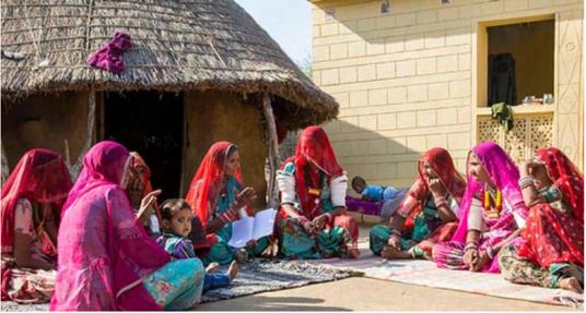
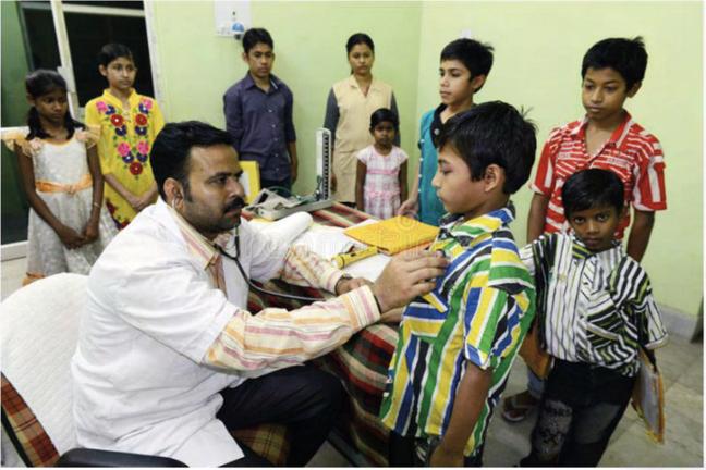
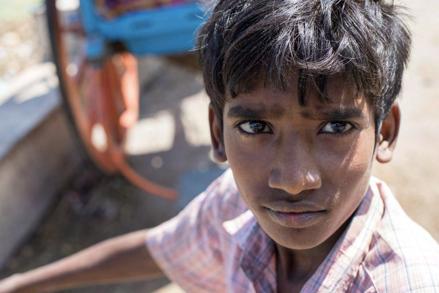
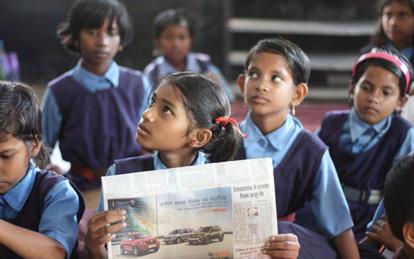
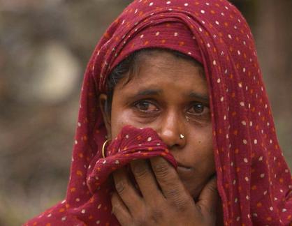
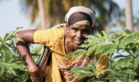
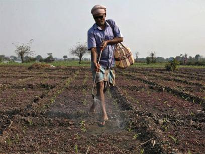
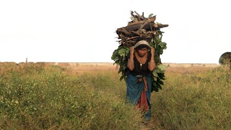
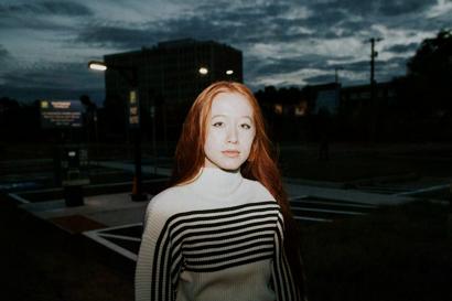
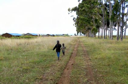
Photography associated with the development sector in the global south ends up looking the same. It is clichéd and often presents subjects in a state of distress or despondency, removed from their surroundings. We need to work to provide context to our photographs — capturing subjects in action, engaged in work, or surroundings where they live their everyday lives. While it is important to show the realities of the grassroots, our imagery also aims to show the possibility of change and its impact.
Use photos across all age groups but refrain from showing photos that exploit a person's vulnerability.
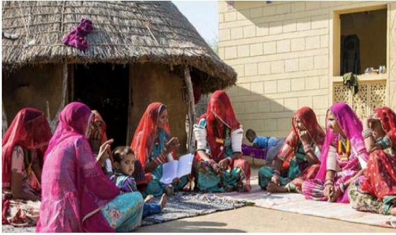
Capture action oriented life: eating, cooking, children playing/studying, income generation, etc.
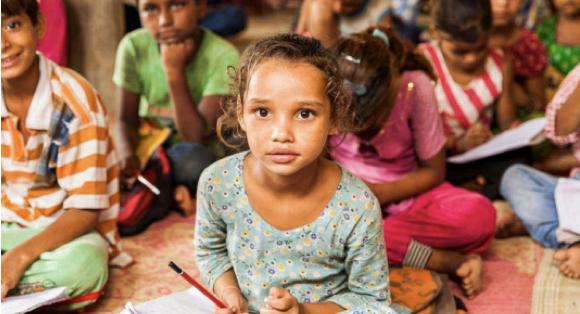
Capture kids taking part in classes or other school/ community activities.
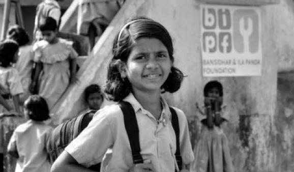
They should reflect the spirit of RWF. This includes partnership, transformation, and empowerment.
What should our photography be showing? Real people, the raw truth, and the positive impact that happens on the ground.
Natural lighting and colour
Use shadows and light to create a strong visual contrast and depth in images.

Capture people and moments as they unfold – tell the story that happens as it happens.
Focus and balance
Don’t use images that have an unclear focal point and/or purpose, as well as ones that are blurred.
Images shot within close-quarters convey our proximity and true understanding of the issues affecting people.
Honesty
We need to capture the emotional moment honestly.
Along with proximity, a natural viewpoint will show the truth, creating a better connection between our audience and the people we work with.
There are a couple of things to avoid when using photography as part of communications.
Make sure no images used in branding collateral should not be cropped out of the background impacting the context.

Stock images are unnatural, and don’t accurately represent who we are and what we do; plus there’s always the risk of repetition.
Don’t use images that have an unclear focal point and/or purpose, as well as ones that are blurred.
Use of flash
Use natural lighting and avoid too much flash, if possible.
Don't apply duotones or any other treatment to photography. Authenticity and honesty in our imagery is important.
When photographing groups or events avoid using distance shots. It’s better to get close to the action, and see the human faces.
Outline icons are even lighter in their appeal and meaning. The usage of universal ideas of forms and shapes, and the broad stroke together help eliminate redundancy of text and reduce the mental effort from the onlooker. On a larger scale, iconography can be deployed to design infographics that explain and highlight a large concept in a minimal art and style.
Rounded stroke lines.
These are simple and direct graphic icons to share a clear message across charts and diagrams. More illustrative to convey a concept, to ensure people remember them and what they stand for.
Do’s
Always use thin stroke icons.
When appropriate, use icons as the hero of the communication.
Dont’s
Don’t overuse icons, creating a cluttered look.
Don’t use icons that are combative.
Use icons if they make information more digestible.
When using our icon, complement the images and headlines.
Don’t obscure faces or headlines when overlaying icons.
Don't use icons if they get in the way of people understanding the information.