PORTFOLIO
ANDRÉ SALAZAR
20 23
proposal in a private competition for a mixed-use building. Two architects worked under my supervision.
_Residential Building_4,645m2
Façade design for a private residential project in Mexico City.
_Community Manager and Infographics Infographics and data for all of the firm’s projects. Community manager for social media. Website manager, curator, and art director for www.shoarq.com
Paraíso Animal
In collaboration with: Oriol Jutgla and Bernat Ginot.

Link: https://bit.ly/3wXVQye
Recopilación de Ensayos de Arquitectura Comparada Link: https://bit.ly/3N0g6WG
Análisis y Replanteamiento del Módulo de Vivienda de TECHO según 3 distintas Regiones de Guatemala
In collaboration with: Manuel García y Silvana Archila.
Link: https://bit.ly/3pSm54t
1 Manuel Pineda manupineda@shoarq.com Juan Gándara juanfgandara@shoarq.com Andrés Prera aprera@ufm.edu Work Experience Published Works Freelance Interior Designer Project Manager Nov 2020 - Sept 2021 Guatemala Shoarq Senior Designer BIM Manager Community Manager Apr 2018 - Aug 2021 Guatemala Short Film BARQ 2022, Barcelona FTFS Pinewood 2022, Vimeo Film Architektura 2022, Prague Essays Feb 2022 - May 2022 Barcelona Research Sept 2017 - Nov 2017 Guatemala Awards Jan 2015 - Nov 2016 Guatemala
Renovation
Design
Collaboration
_Private Residence_100m2
of a private residence with responsibility on design, rendering, construction documents, work supervision and project management. _Coffee Showroom_23m2
and execution with responsibility on design, rendering, construction documents, work supervision and project management. _Mixed-Use Building_64,065m2
in the design for a private competition. _Residential Building_27,335m2 In charge of a private residential project with full responsibility on design, rendering, diagrams, contact with clients, contact with engineers, BIM modelling and construction documents. _XPO1 Lobby_60m2 Collaboration in the interior design of a lobby. _Terrace-Bar_170m2 Collaboration in the interior design of a Terrace-Bar. _Mixed-Use Building_17,469m2 Project leader for the winning
UFM 2015
2016
2016, NYC Aquarium
2015,
2015,
Escola Técnica
Arquitectura de Barcelona Master in Urbanism and Contemporary
Urban Synergies
Urban analysis
the
of
in collaboration with TU Munich students.
Rhinoceros AutoCad Revit 3DS Max + Vray Grasshopper Lumion QGIS Photoshop Illustrator Indesign Digital Sketch Sketching Microsoft Office Spanish English German Toolset References Languages Education Alejandro André Salazar Guatemala, 02.08.1994 Phone +34 617 099 660 Mail aandresalazar@gmail.com Website https://bit.ly/3PS8p6L LinkedIn https://bit.ly/3xhnuFl Vimeo http://bitly.ws/yVIP
/
Studio Awards
and Public Waterfront2nd Place
Barrio Tivoli Apartments - Nominated
8th Street Lineal Park - Nominated
de
Project. Barcelona_Sept 2021 - Sept 2023 Architecture and Cinema Workshop Director of a short film presented at the BARQ. Supervised by Maria Mauti and Ciro Frank Schiappa. Barcelona_Feb 2022 - May 2022 Universidad Francisco Marroquín Undergraduate Degree in Architecture. Guatemala_Jan 2013 - Nov 2018
Workshop
of
city
Berlin
Photography workshop with Diego Ferrari. Berlin - Amsterdam_Jun 2017 - Jul 2017
41 -
45
2 | CONTENTS | 0 1 0 3 0
0 8 0 4 0 7 0 5
SHOWROOM
6
EXTENDING THE MOUNTAIN COFFEE
OPENNESS RESIDENTIAL RENOVATION
FREELANCE | RETAIL EXHIBITION CENTER
DESIGN STUDIO RESTORATION
MBARCH
FREELANCE | RESIDENTIAL SHORT FILM | PHOTO | SKETCHES
0 2
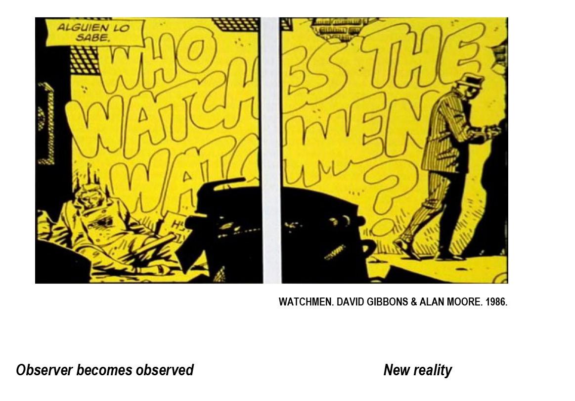
EVOLUTIVE SPACES WHO WATCHES THE WATCHMEN? PERIMETRAL
MULTIMEDIA SHOARQ | RESIDENTIAL BUILDING
|
|
SHOARQ | MIXED-USE BUILDING
| pg. 3 - pg. 12 |
WRITTEN IN THE WALLS SHOARQ | LOBBY XPO1 | pg. 17 - pg. 18 | | pg. 27 - pg. 32 | | pg. 33 - pg. 40 | | pg.
pg. 44 | | pg. 13 - pg. 16 | | pg. 19 - pg. 26 | | pg.
- pg. 56 | | ACADEMIC - MULTIMEDIA | | PROFESSIONAL |
3
EXTENDING THE MOUNTAIN
RESIDENTIAL BUILDING_PROCESSING BUILDING PERMIT
ROLE_LEAD DESIGNER AND PROJECT LEADER SUPERVISORS_MANUEL PINEDA + JUAN GÁNDARA
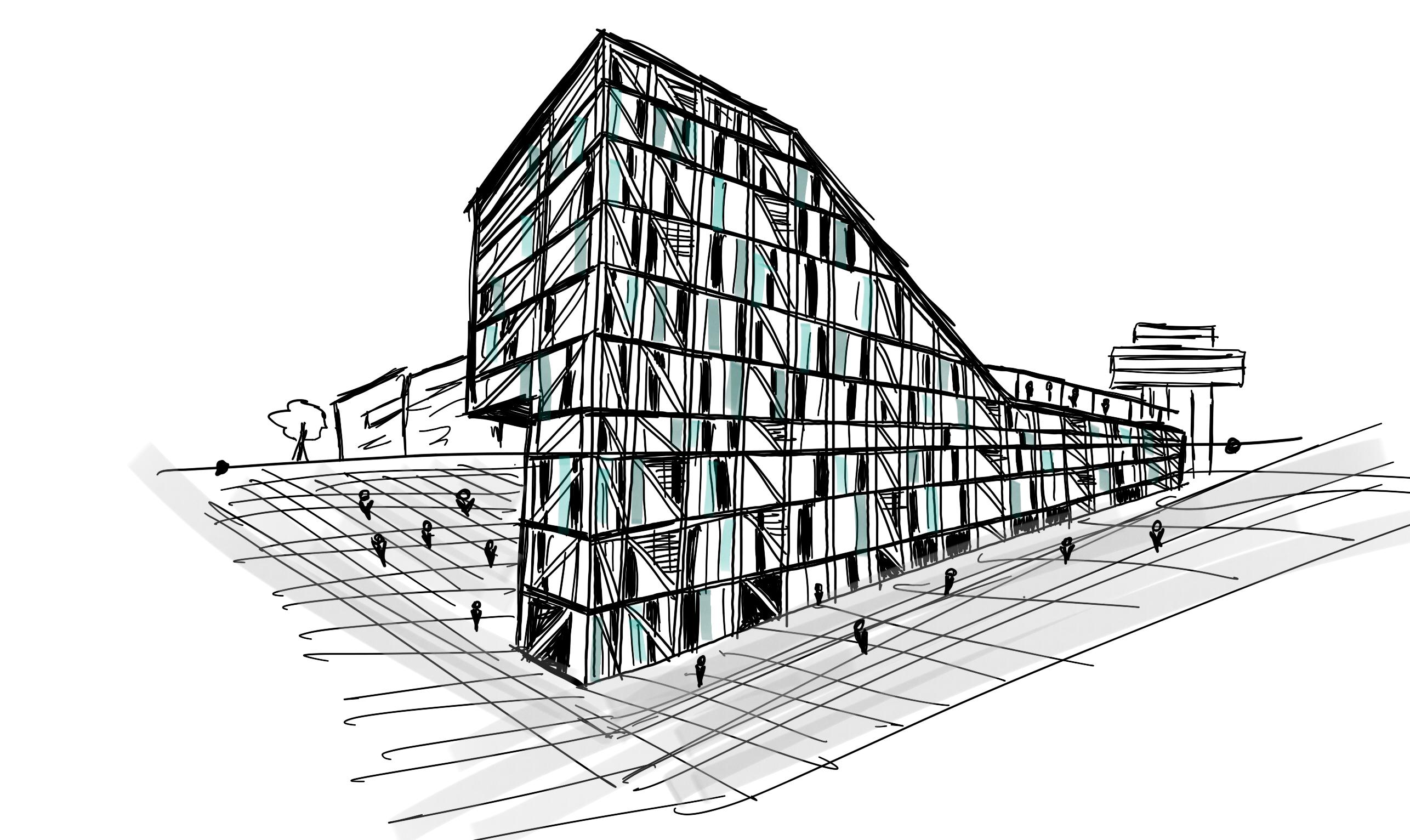
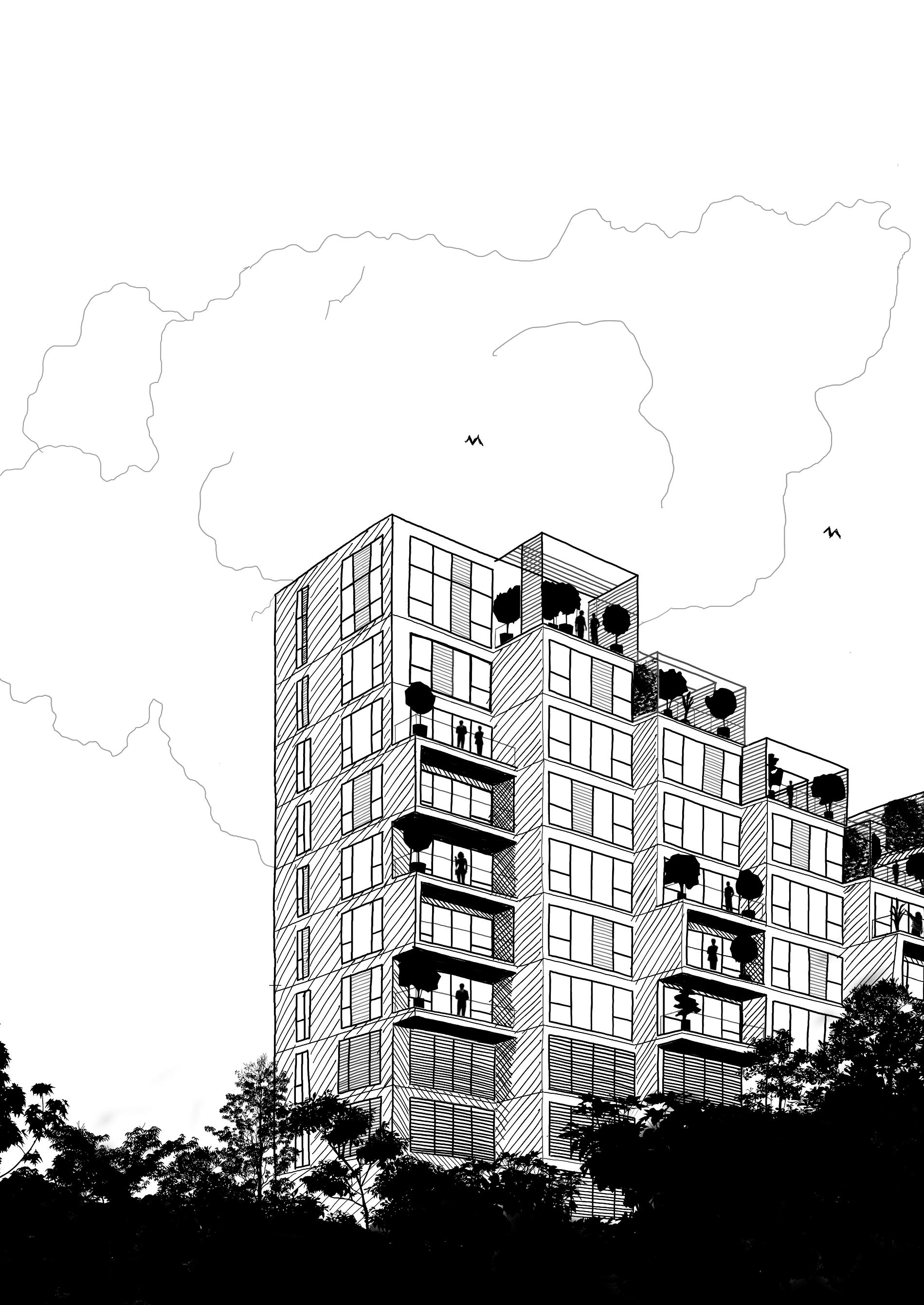
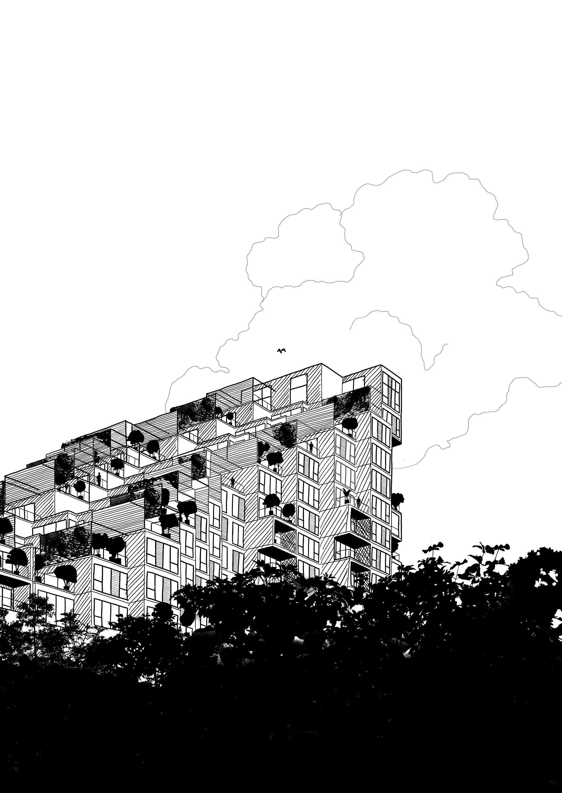
This was a challenging project since the beginning because of its irregular site, the client’s efficiency expectations and the need to have flexible and modular apartment units. There were many proposals that got to advanced stages before the outcome. The extension of the mountain is the result of an efficient modular and flexible system that was adaptable to the many geometric possibilities explored, all of which aimed to integrate to its natural and low density context, rather than invading it and the only way to achieve this was by becoming an extension of the mountain, creating an “artificial mountain”. This was the first project I was appointed on my own, so my involvement included concept, strategy, volumetric studies, structural grid studies, interior distributions, parking design, facade design, details, diagrams, building permit documents, construction documents, contact with clients, BIM modelling and management.
4
0 1
2018-2021 27,335m2 SHOARQ
THREE RECTANGULAR TOWERS
THREE SQUARE TOWERS TWO TALL TOWERS
TWO RECTANGULAR BLOCKS
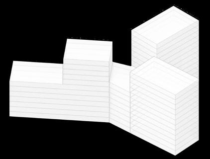
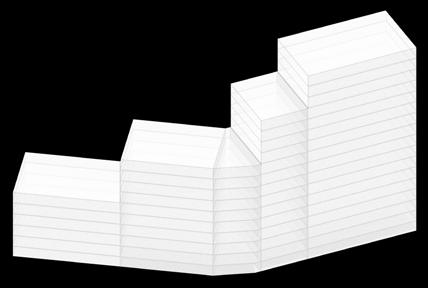
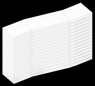
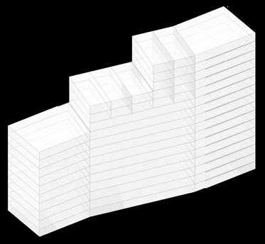
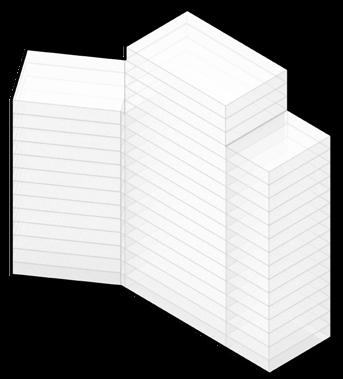
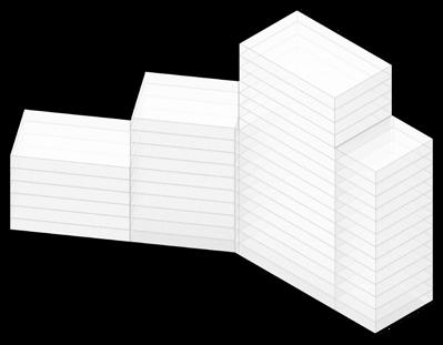
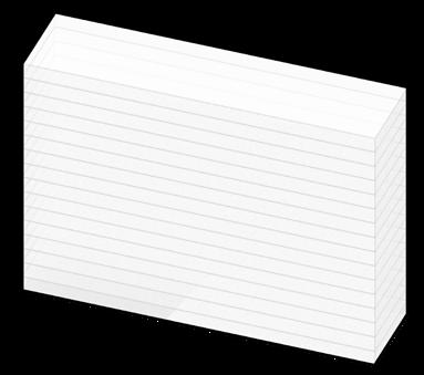
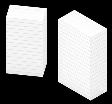
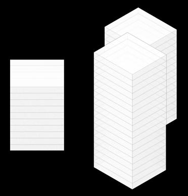
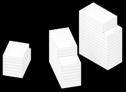
FULL BLOCK
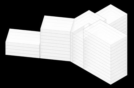
BENT AND GRADED BLOCK
GRADED BLOCK ON TWO HEIGHTS
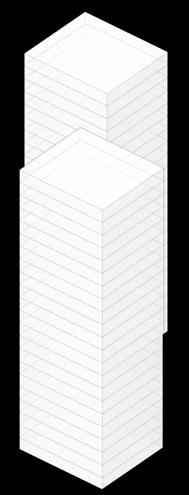
LINEAL GRADED BLOCK
BENT BLOCK
BENT AND GRADED BLOCK
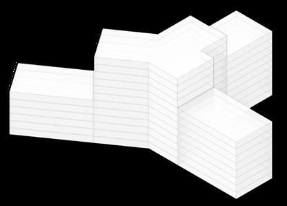
BENT AND GRADED “Y” BLOCK
BENT AND GRADED CENTRAL “Y” BLOCK
BRANCHED AND GRADED “Y” BLOCK
BRANCHED “Y” BLOCK WITH TWO CORES
BRANCHED “Y” BLOCK WITH TWO CORES
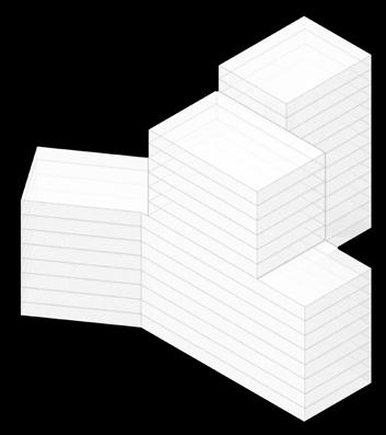
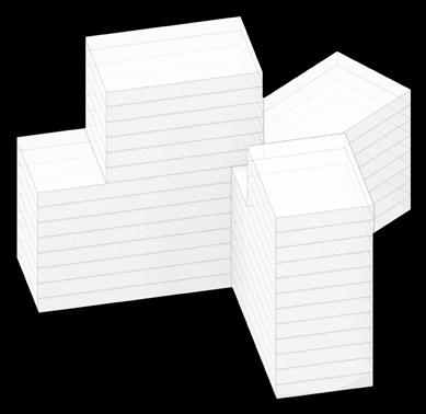
BRANCHED “Y” BLOCK WITH THREE CORES
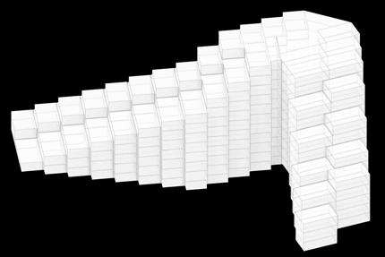
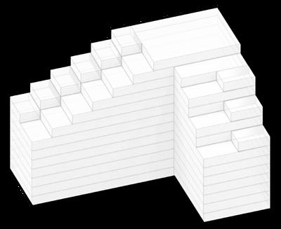
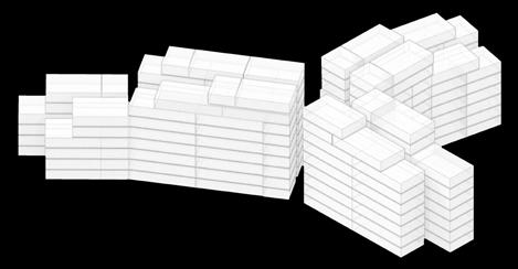
PIXELATED “L” PYRAMID
GRADED AND PIXELATED “L” PYRAMID
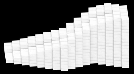
GRADED AND PIXELATED ASCENDING PYRAMID
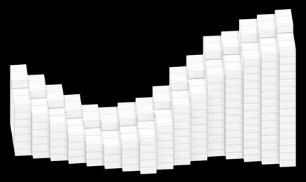
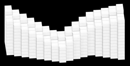
GRADED AND PIXELATED PYRAMID
PIXELATED PYRAMID
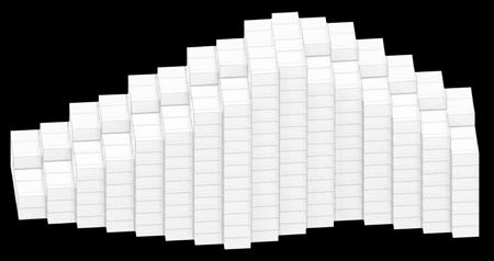
ASCENDING PIXELATED MOUNTAIN
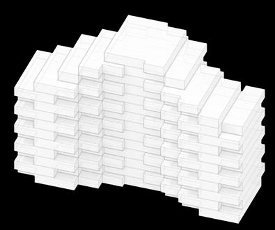
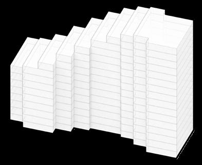
STUDIES
REFLECTED PIXELATED MOUNTAIN
UNEVEN PIXELATED MOUNTAIN
5
VOLUMETRIC
USABLE SITE
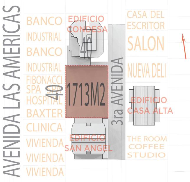
Only one third of the site’s area is usable because its mostly flat, unlike the rest of the site that’s basically a ravine.
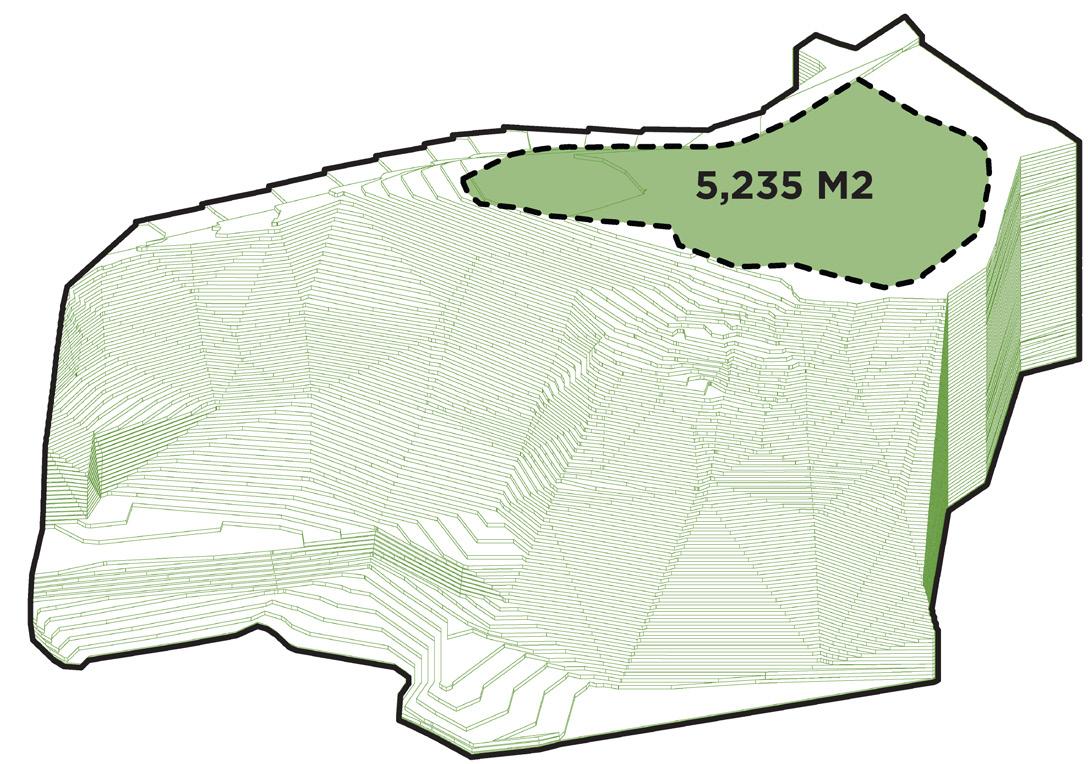
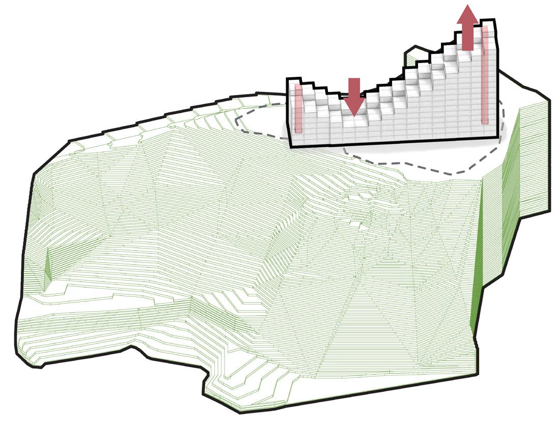
VERTICAL REDISTRIBUTION
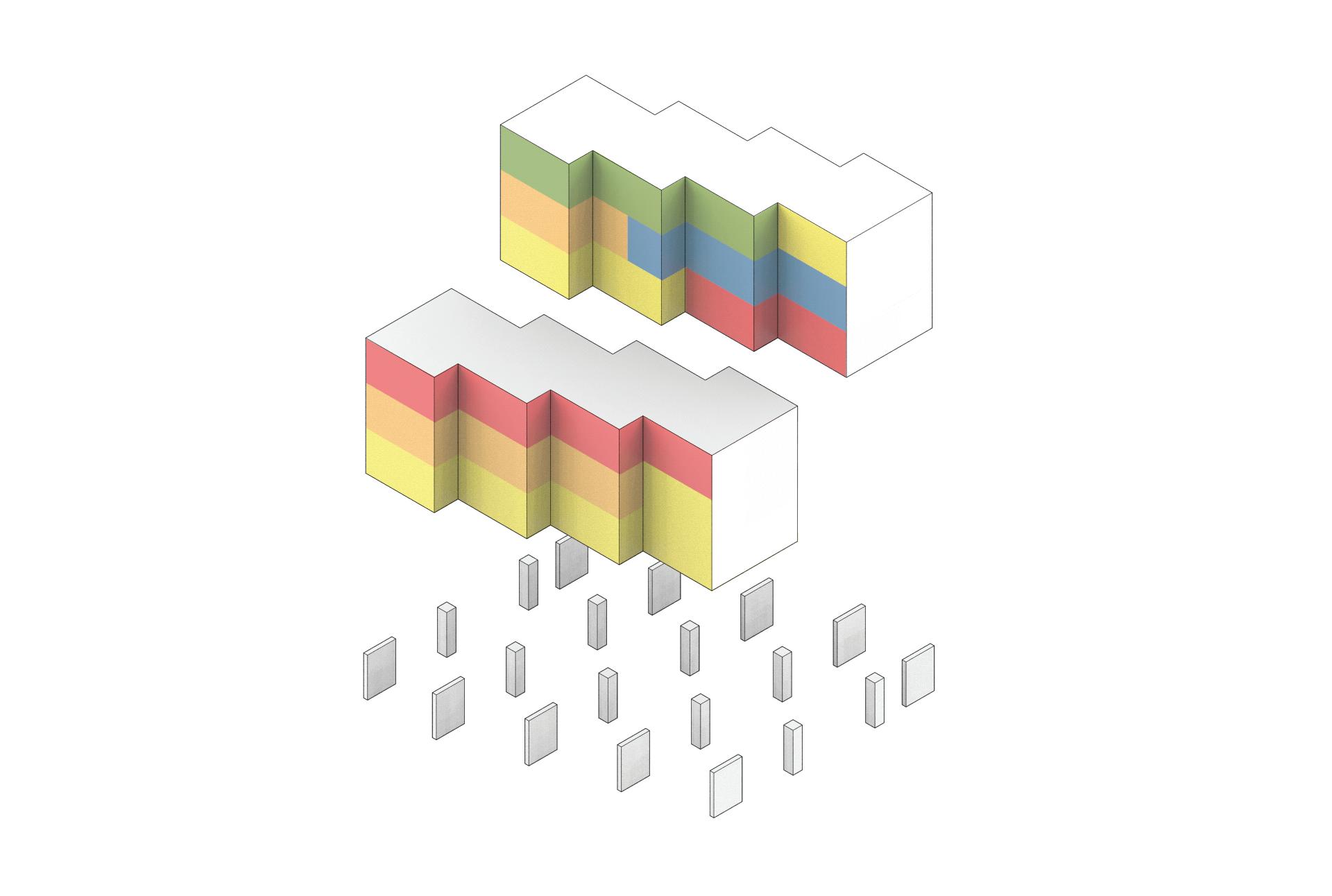
The block was graded and stretched to create a “lighter” and less imposing building. This resulted in terraces that generated more profitable area and new views. The vertical circulation is located on both ends of the building.
THE ARTIFICIAL MOUNTAIN
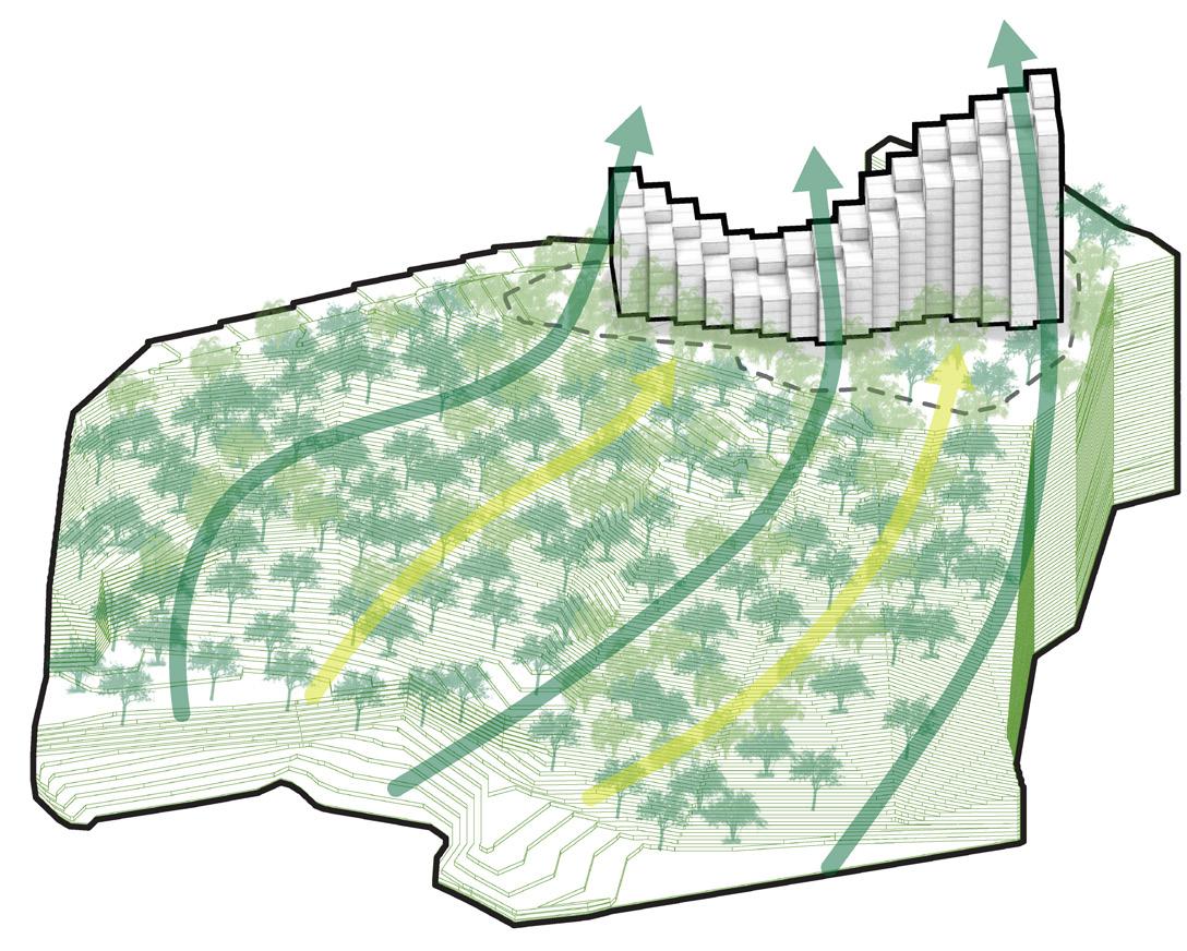
The result is what we call an “uneven pixelated mountain”. The main objective of this strategy, was to generate a building that was perceived as the extension of the mountain rather than as an alienated object.
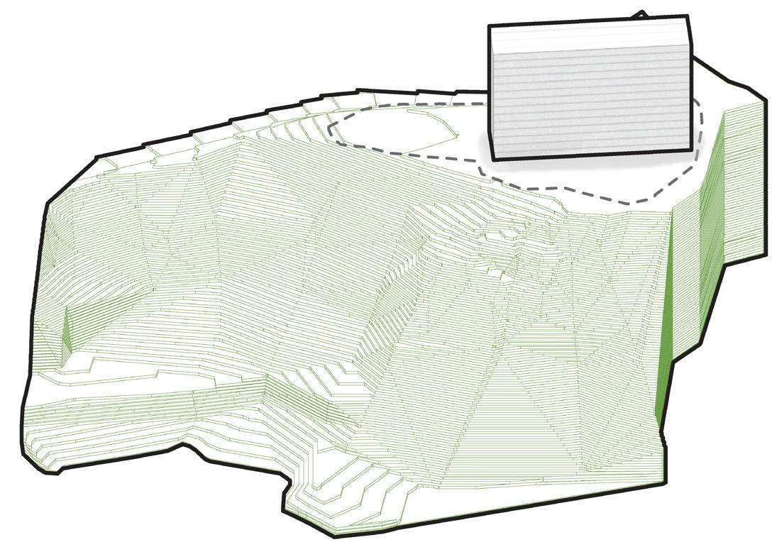
We generated a block oriented to the best views with the maximum buildable area possible.
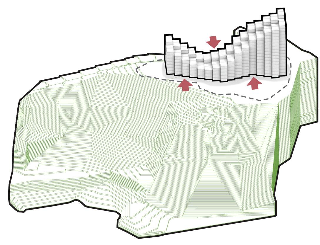
By stretching the building to generate terraces, we got out of the usable site area and the only solution was to “zigzag” the building for it to fit on the site. As a result, the building also provides shade to itself on some facades.
BASE BLOCK ZIGZAGGING BALCONIES AND TERRACES
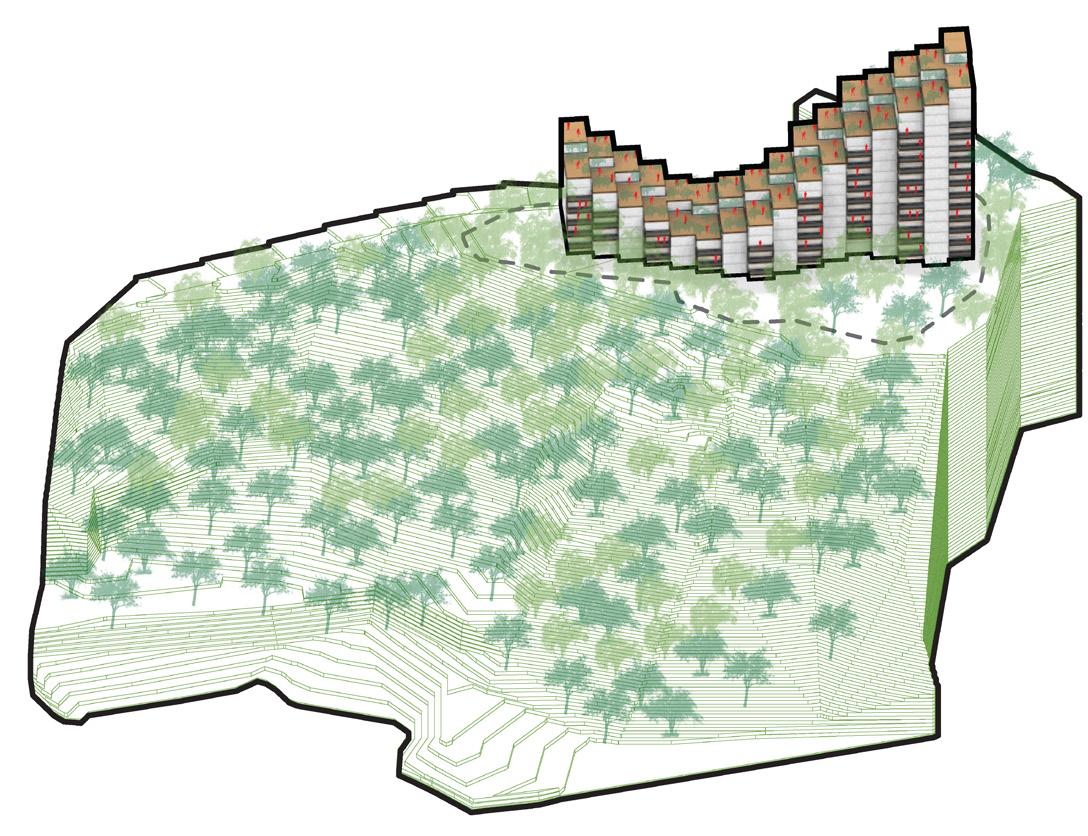
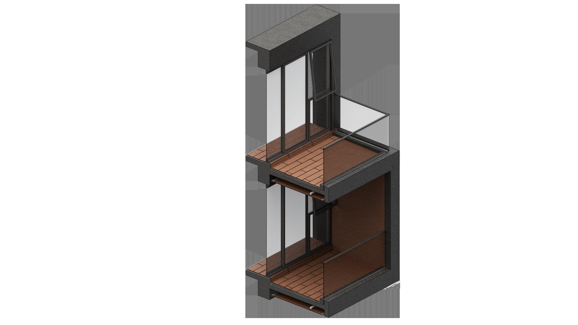
Finally, we provided the building with balconies and private terraces that increase the contact of its users with the exterior, maximizes the views and provides solar protection to the less favorable facades.
6 THE ARTIFICIAL MOUNTAIN
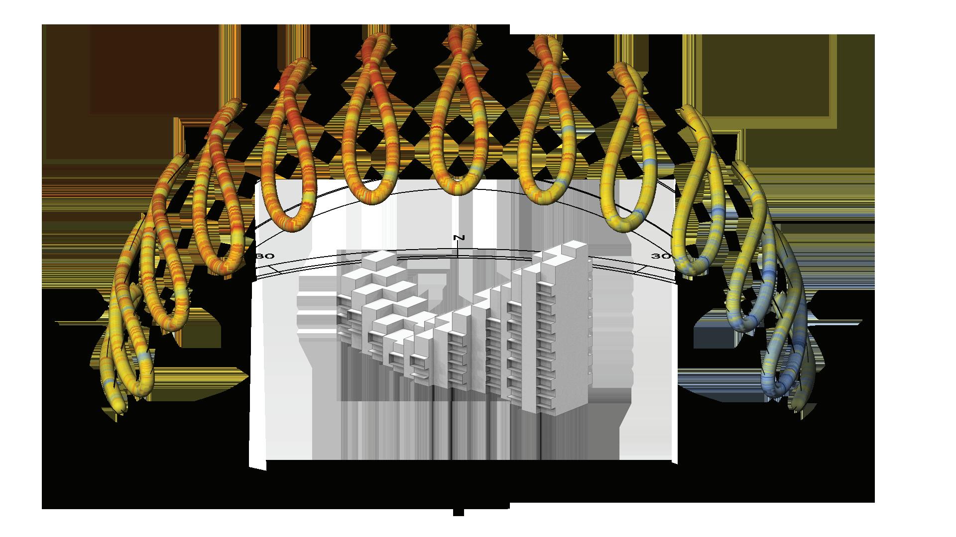
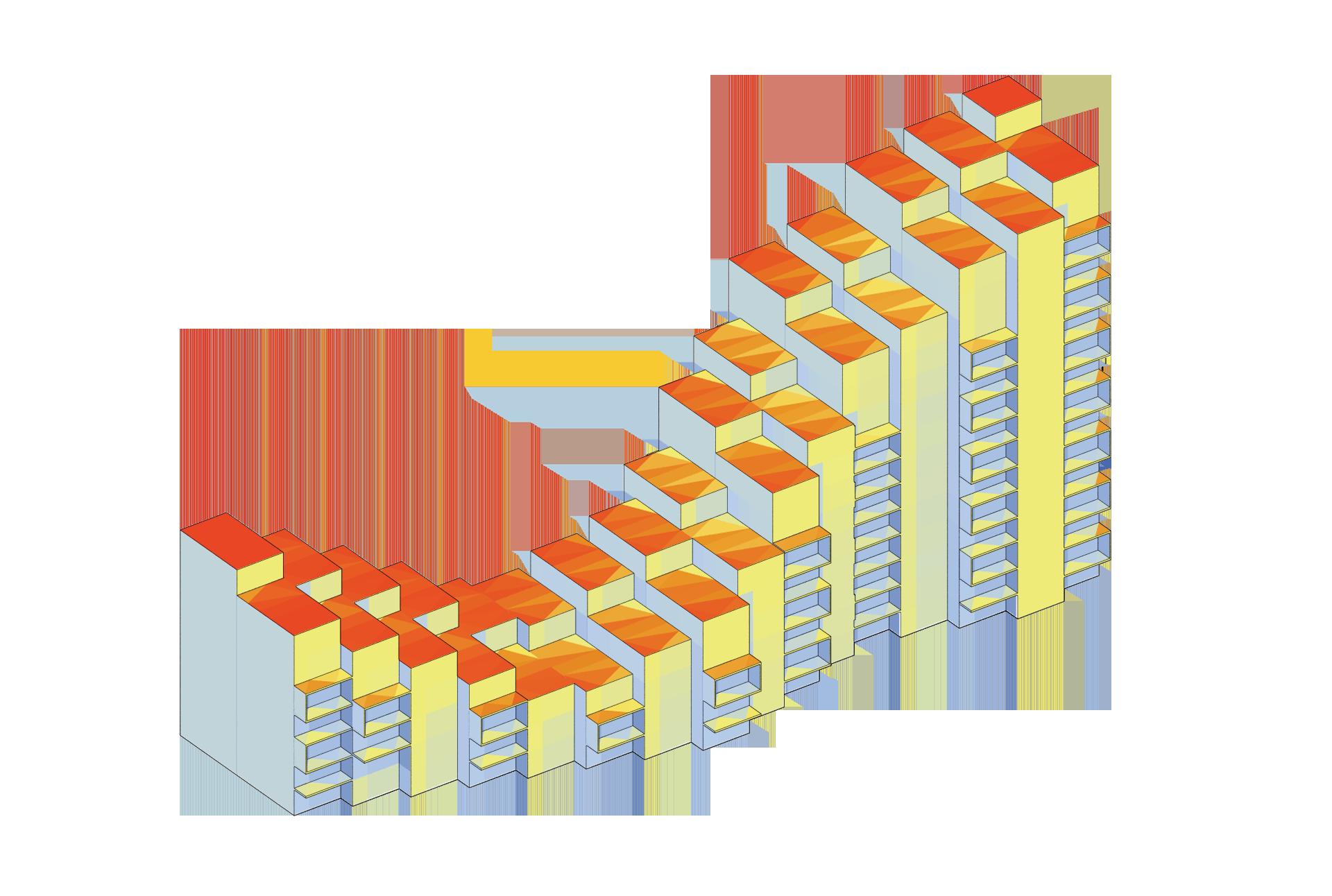
7 SUN PATH ANALYSIS RADIATION ANALYSIS Degrees Celsius Jan 1 -Dic 31 KWh/m2 Jan 1Dic 31 2 6 1800 2 4 1640 2 2 1450 2 0 1270 1 9 1090 1 7 905 1 6 725 1 4 540 1 3 360 1 2 181 >1 1 <0.00 SUN PATH AND RADIATION ANALYSIS
AIR RENEWAL
THE OPENINGS AT THE END OF THE CORRIDORS HELP TO INCREASE THE WIND FLOW WHICH RESULTS IN A CONSTANT AIR RENOVATION ON THE HALLWAYS.
CROSS VENTILATION
ALL THE APARTMENTS HAVE WINDOWS NEXT TO THE CENTRAL CORRIDORS, WHICH ARE FULL OF LIGHT WELLS ALONG THEIR PATH. THESE OPENINGS HELP TO GENERATE A NEGATIVE PRESSURE THAT TAKES THE HOT AIR UPWARDs, KEEPING THE CORRIDORS FRESH.
LIGHT WELLS
THE SKYLIGHT ON THE UPPER FLOORS PROVIDES NATURAL LIGHTING TO THE CORRIDORS.
BALCONIES
THE BALCONIES PROVIDE SHADE AND SOLAR PROTECTION TO THE APARTMENTS.
TO PROVIDE BETTER SOLAR PROTECTION ON THE SOUTHEASTERN FACADE.
1m 5m 10m
 THERMAL CAMERA GLASS
8 BIOCLIMATE SECTION


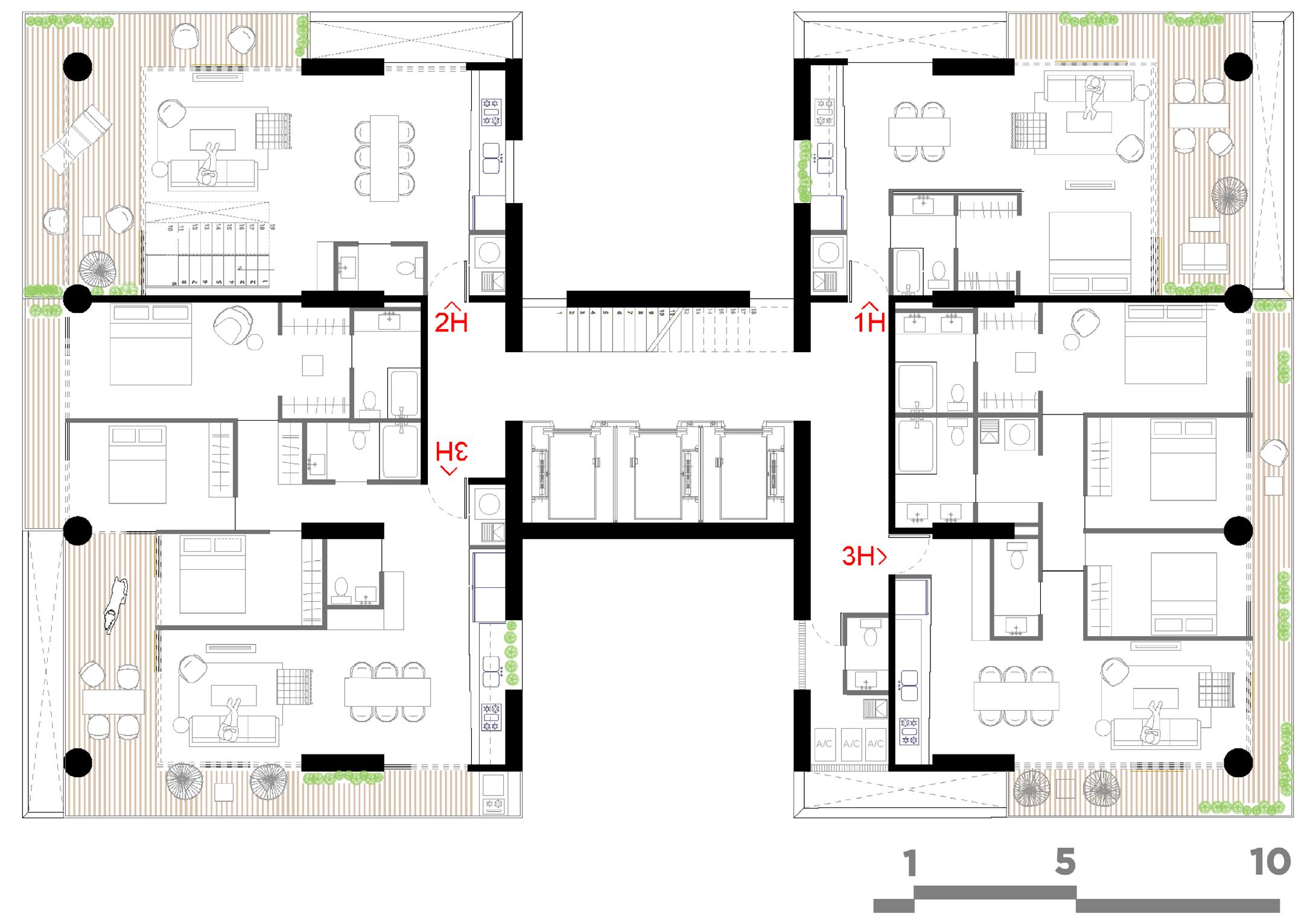
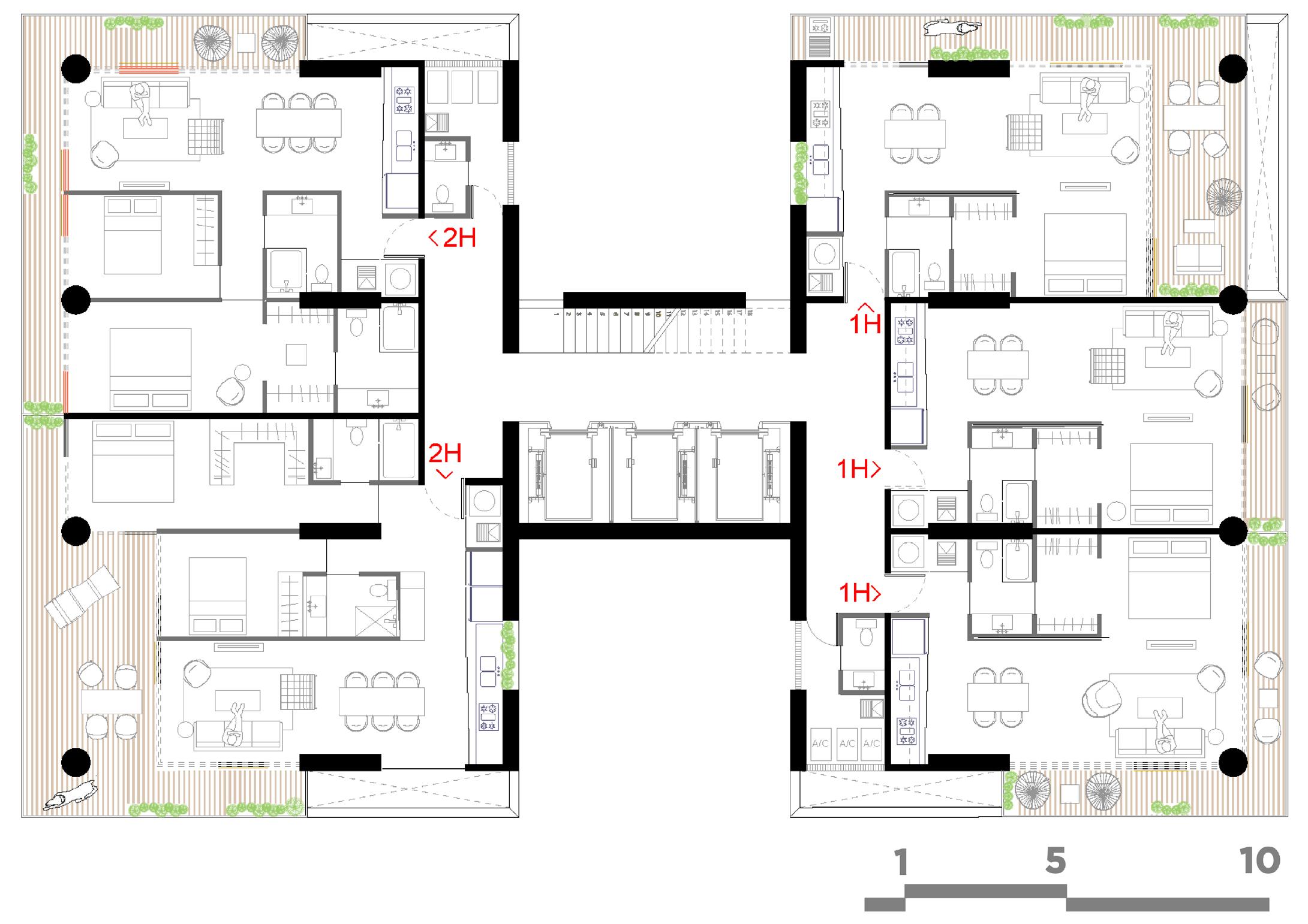
1H 1H 2H 2H 2H 2H 3H 2H 2H 2H BASURA S.S 9 1 MODULE 44M2 - 1H 110M2 - 3H 132M2 - 2H 3H 66M2 - 1H 2H 88M2 - 2H 1.5 MODULES 2 MODULES 2.5 MODULES 3 MODULES


2H 1H 1H 1H 1H 1H 1H 1m 5m 10m 1H 2H 2H 2H 2H BASURA 10 TYPICAL FLOOR PLAN LEVEL 2-3 PARKING LANE FLEXIBLE CONFIGURATIONS FLEXIBLE CONFIGURATIONS PARKING LANE STRUCTURE TRAFFIC LANE FLEXIBILITY ON APARTMENT CONFIGURATIONS


11
02_TYPICAL
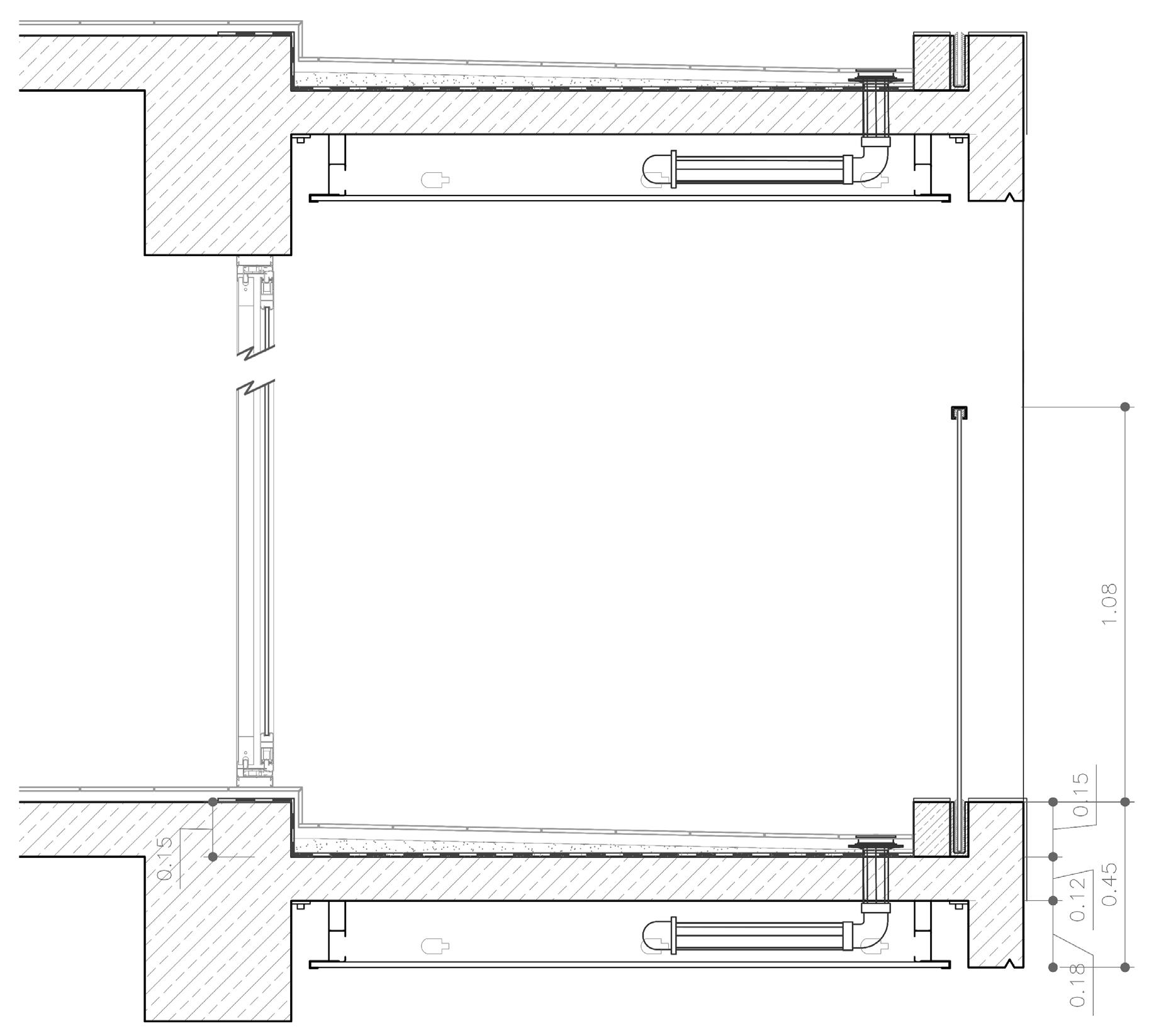
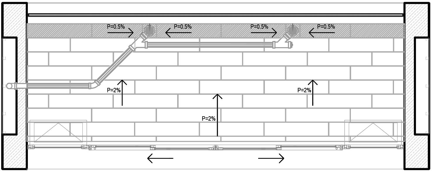
01_TYPICAL BALCONY DETAIL_PLAN VIEW
BALCONY DETAIL_TRANSVERSE SECTION
ALUMINIUM PROFILE

STRUCTURAL COLUMN
CONCRETE SLAB CONCRETE BEAM GLASS SLIDING DOOR ALUMINIUM PROFILE FLANGE J CERAMIC FLOOR PLASTERBOARD CEILING
GLASS RAILING WATERPROOFING MEMBRANE LED STRIP NEOPRENE SEAL DRAIN PIPE 12 FACADE DETAILING: AXON CHUNK
PLASTERBOARD WALL STRUCTURAL COLUMN CONCRETE BEAM TEMPERED
MIXED USE BUILDING_PRIVATE COMPETITION

ROLE_LEAD DESIGNER AND PROJECT LEADER
SUPERVISORS_MANUEL PINEDA + JUAN GÁNDARA
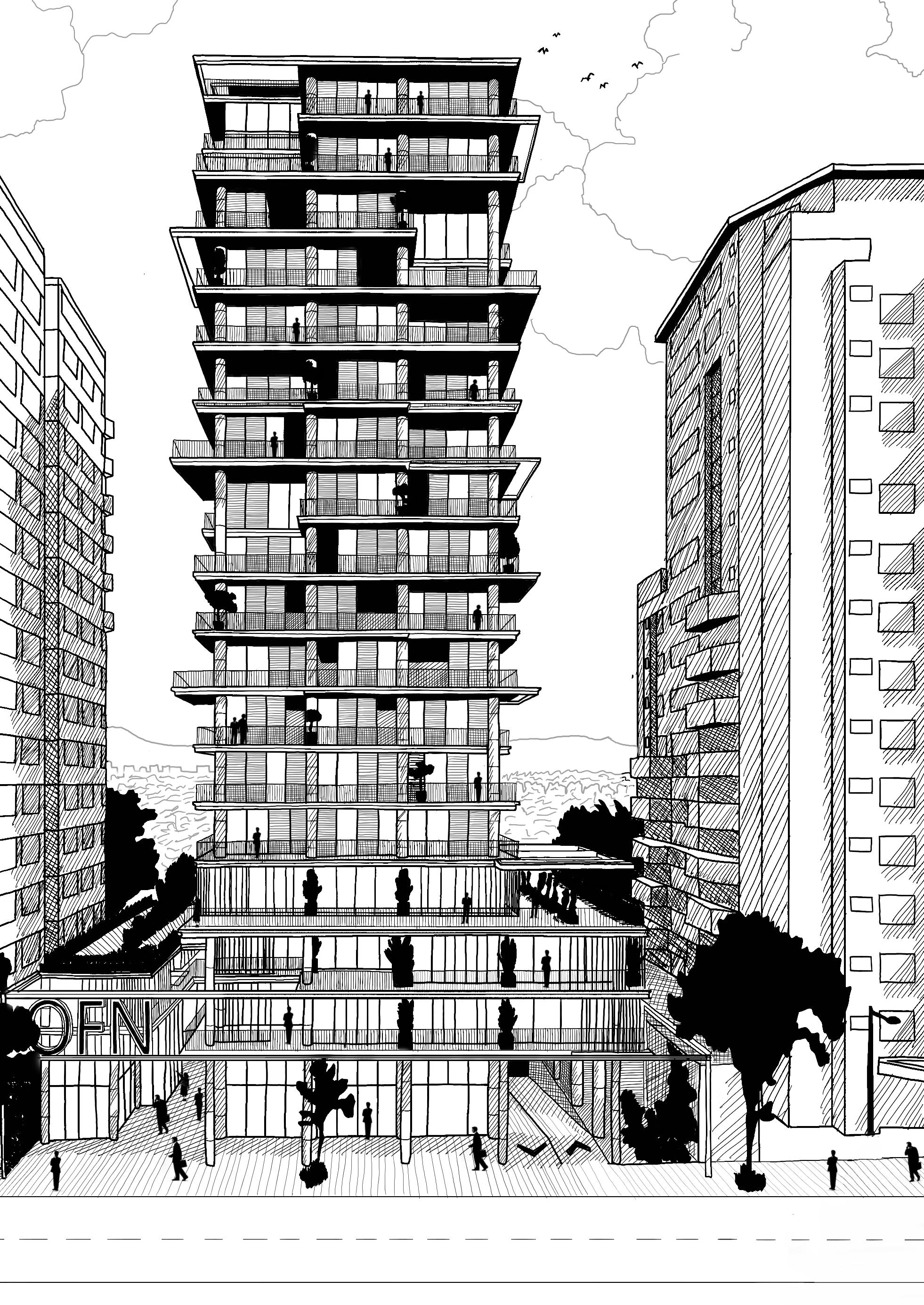
OfN
2019 17,469m2 SHOARQ
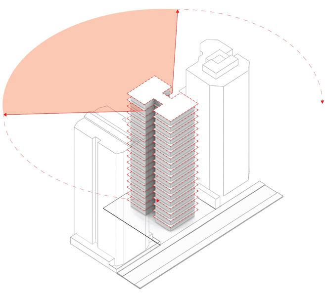
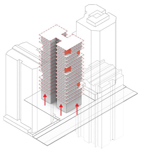
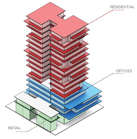
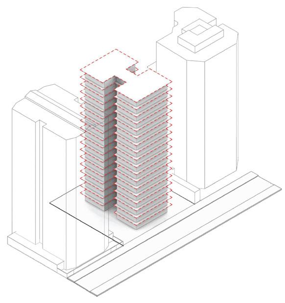
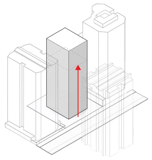
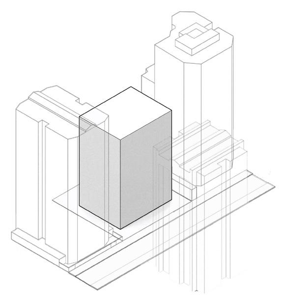
Offen means open in german, which is the name we chose for the building because we wanted the name to represent the building’s character. OfN is a residential project located in Zone 14, the most luxurious area of Guatemala City. Most buildings in the area are enclosed and have little to no contact to their surroundings, which is why we proposed a mixed-use building with direct contact to the street and open facades with full perimeter of balconies and terraces. I was the project leader for this competition which we ultimately won, but unfortunately the project was put on hold. My involvement in this project included concept, strategy, volumetric studies, structural grid studies, interior distributions, facade design, details, drawings, diagrams and the final presentation.
13
0 2

14
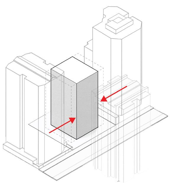
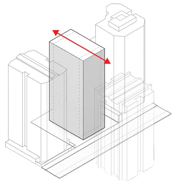
BASE BLOCK SITE AND CONTEXT


15
MIXED USE PROGRAM DOUBLE
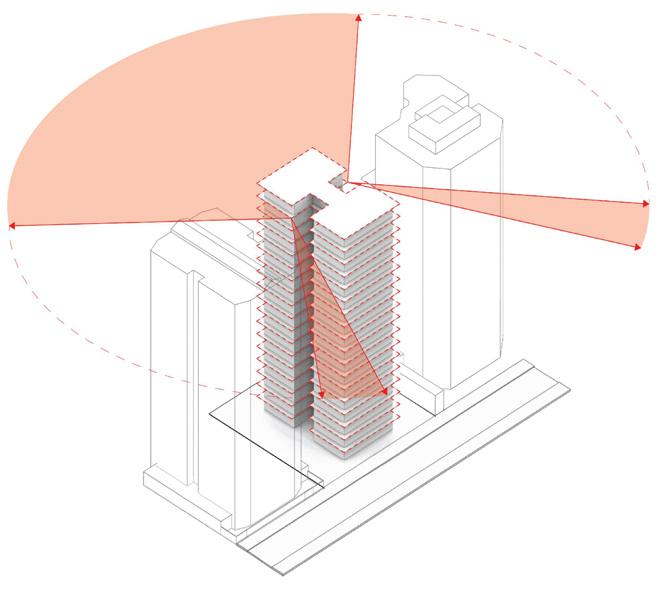
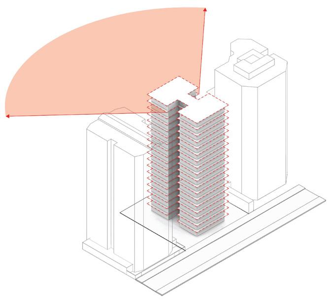
270° VIEWS
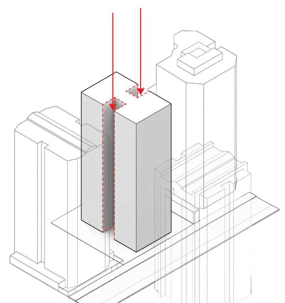
DESIGN PROCESS
MAXIMUM HEIGHT BALCONIES ON THE PERIMETER
HEIGHT TERRACES STRETCHING TO THE FRONT MAIN VIEWS SUBSTRACTING UNFAVORABLE FACADES OPENING THE VIEW ANGLE
SEPARATING FROM NEIGHBORS
TYPICAL FLOOR PLAN OPTION A TYPICAL FLOOR PLAN OPTION B


16

17
LOBBY XPO1 0 3
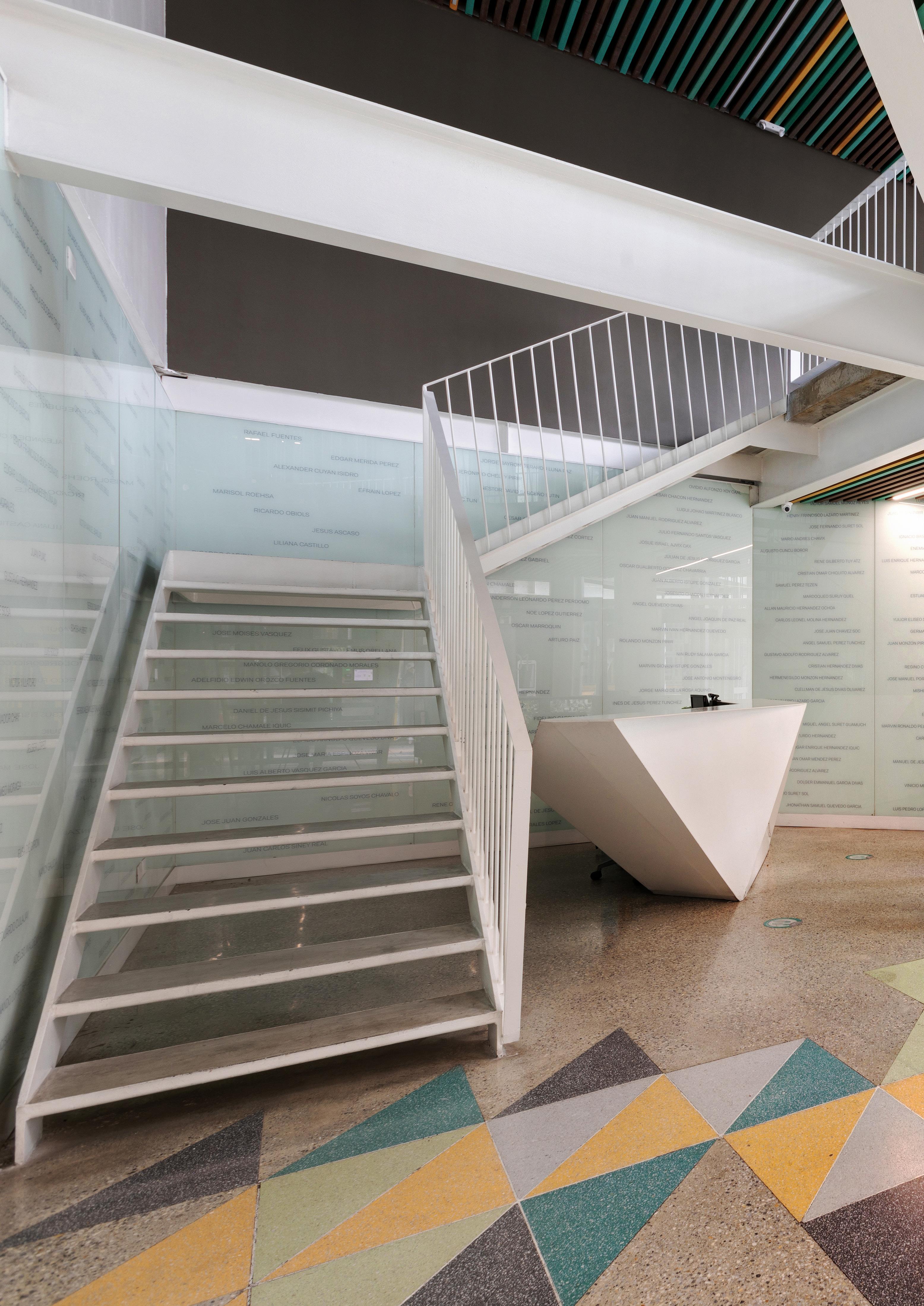
LOBBY FOR A MIXED USE BUILDING_FINISHED
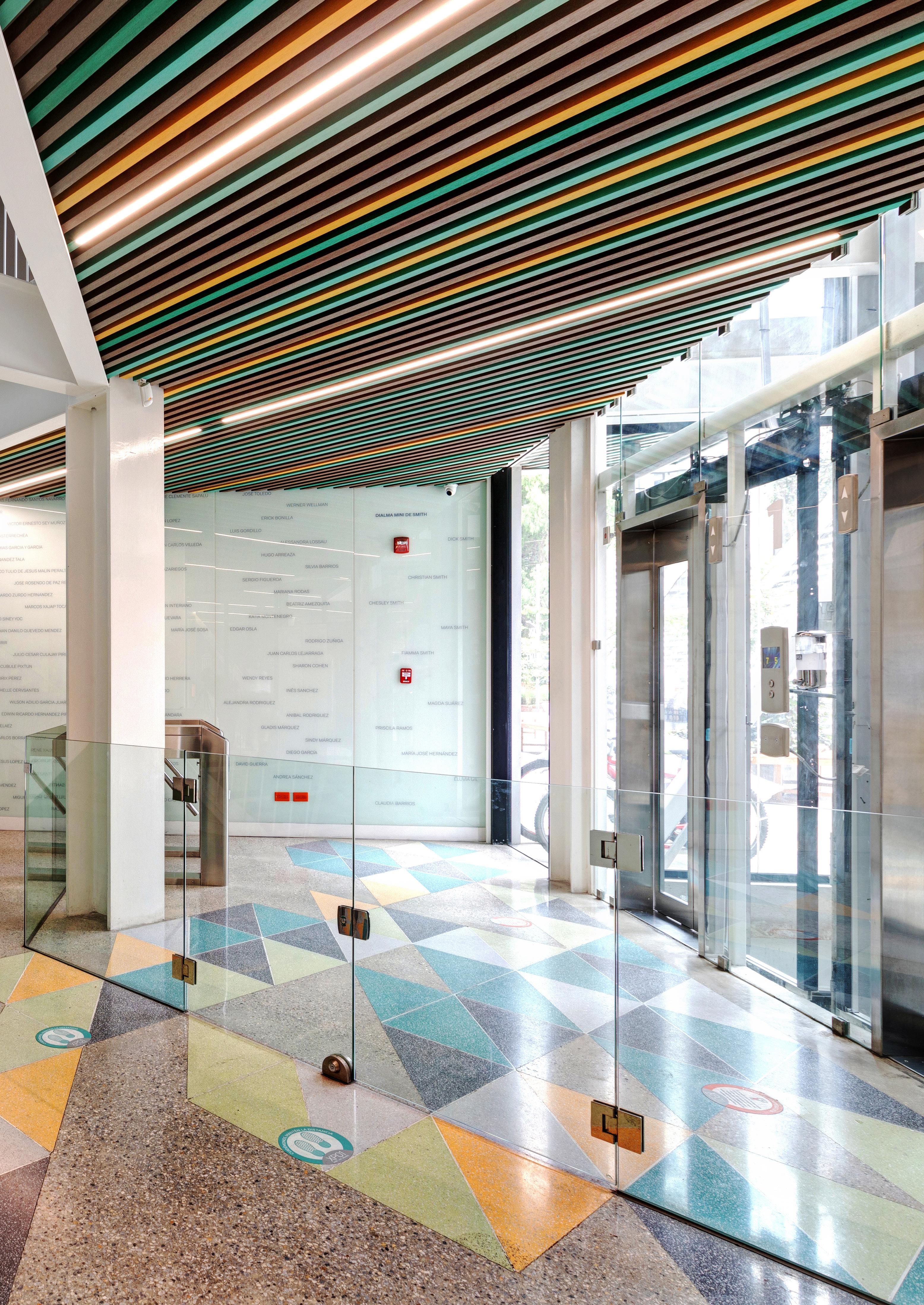
Xpo1 was the first project of its kind not only in Guatemala but also in Central America. When I got into Shoarq it was the office’s main project and having the opportunity to participate in the design of the lobby was very exciting. This space was left until the end of the construction, so there was a very low budget and we had to use the same materials that were used on the hallways (flooring and ceiling). In the end we proposed that the walls could immortalize all the people involved in the project, by having all their names carved in glass. The result is a sober yet dynamic textual landscape that gives unity to the roof and the ceiling. My involvement in this project included concept, renderings and schematic drawings.

18
ROLE_INTERIOR DESIGNER SUPERVISOR_MANUEL PINEDA, JUAN GÁNDARA AND CARLOS PRADO
2018 43m2
SHOARQ
POLISZUK RESIDENCE 0 4
RENOVATION OF A PRIVATE RESIDENCE FREELANCE PROJECT
IN COLLABORATION WITH_CARLOS BURGOS
INTERIOR DESIGN 100m2 2020-2021
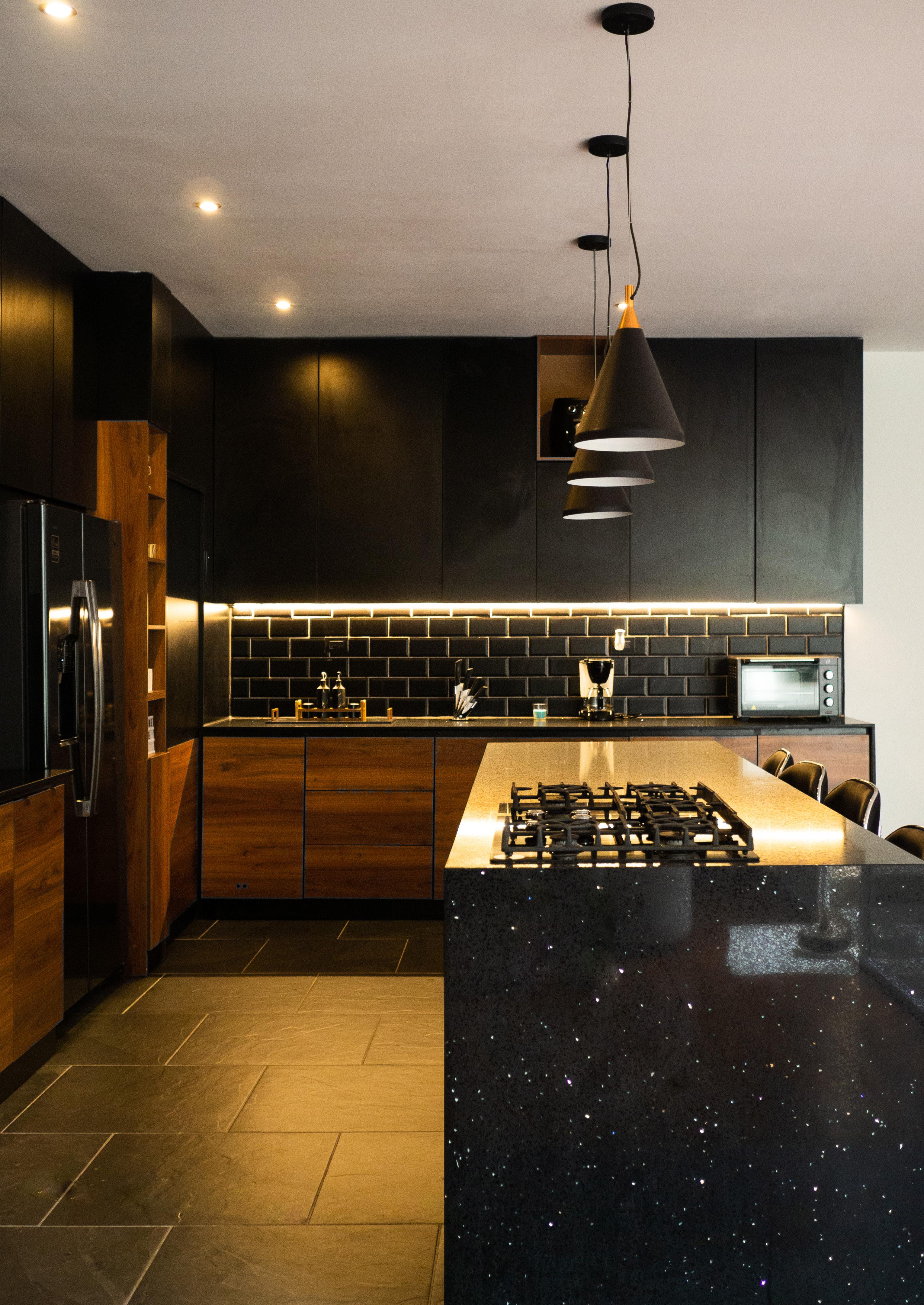
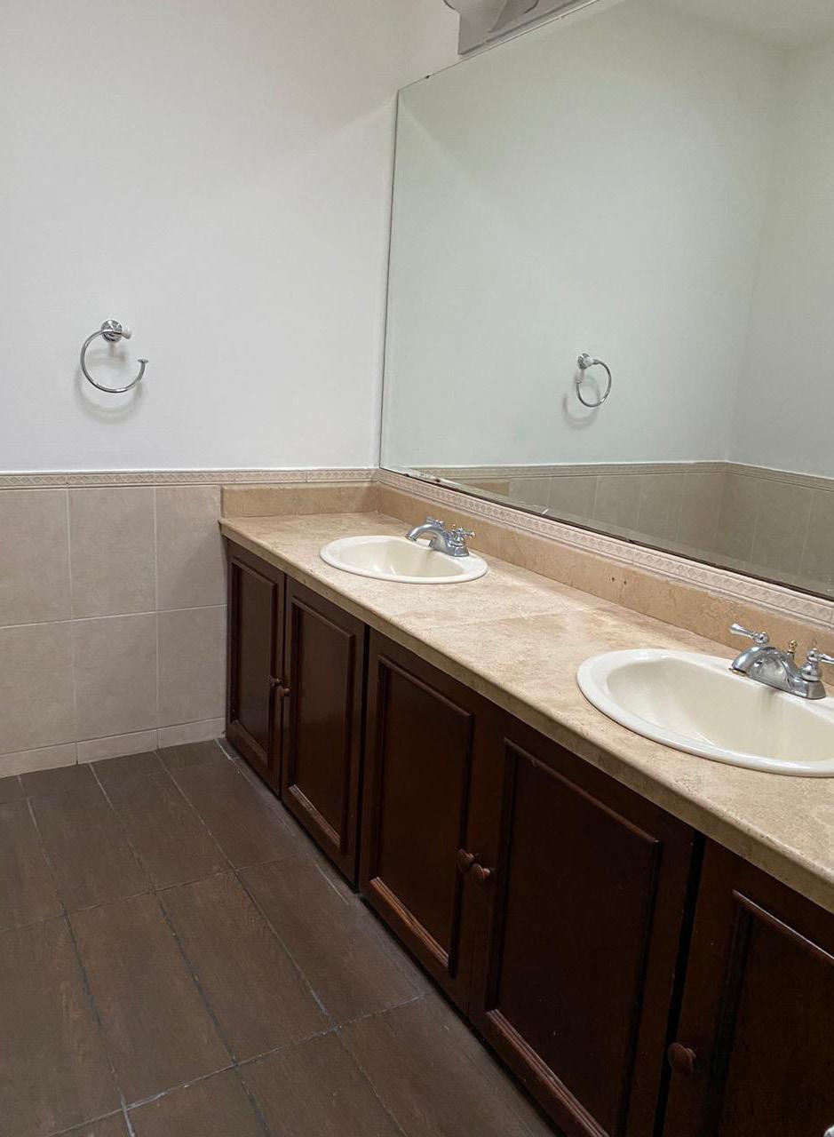
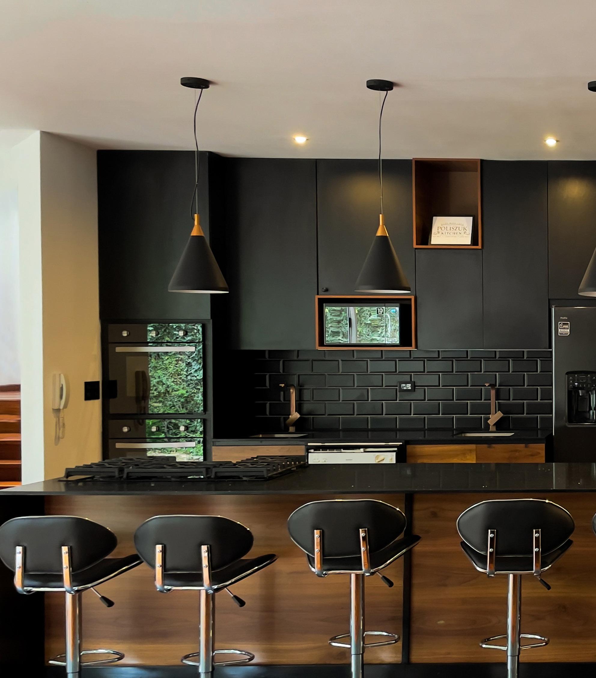
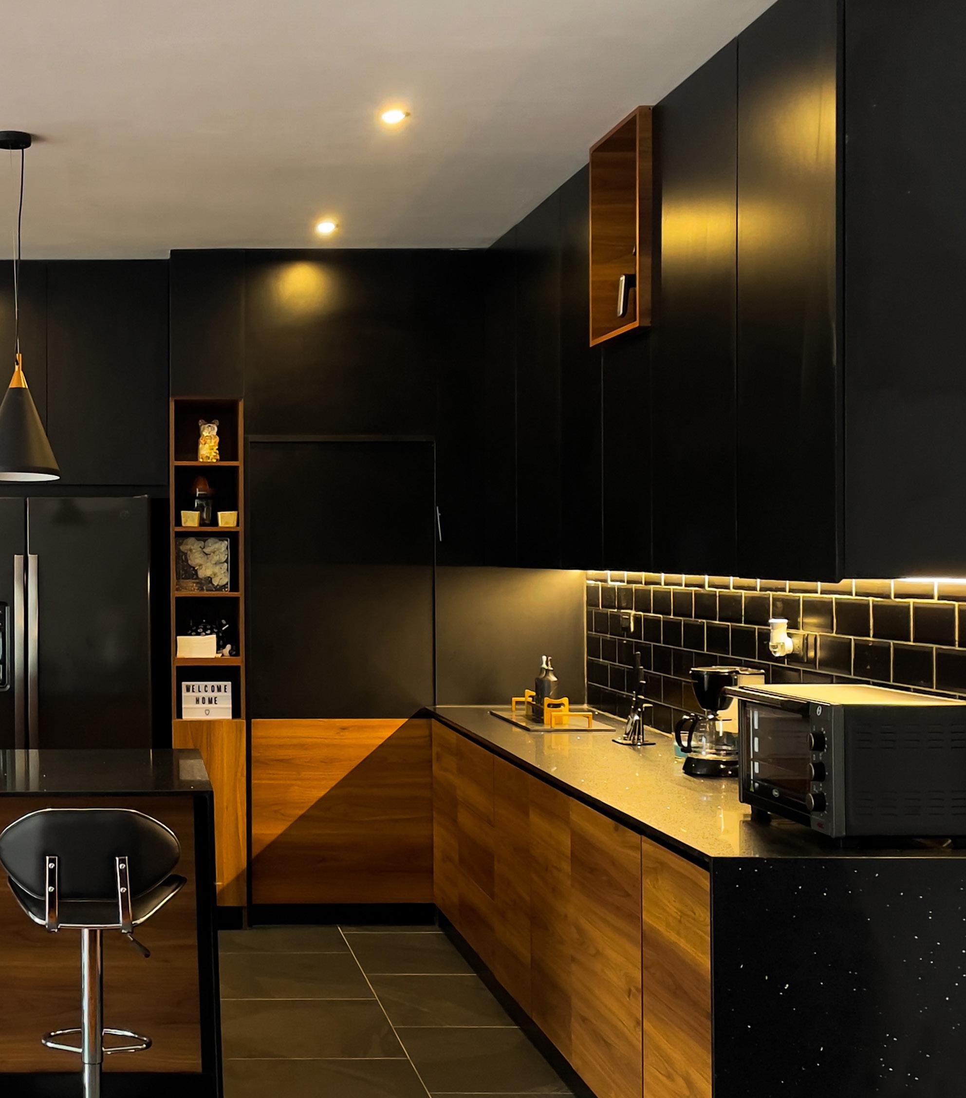
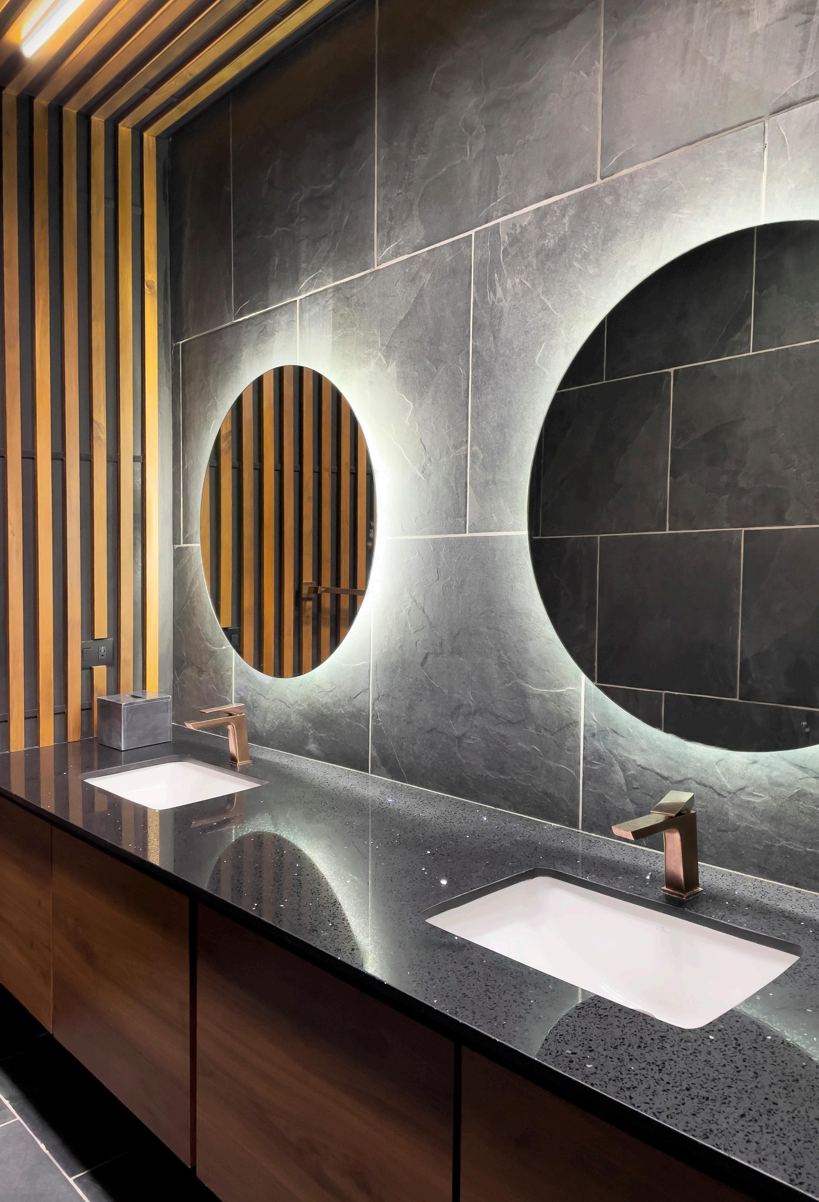
The Poliszuk Residence was the first project I designed and supervised independently. The clients bought a house built in the 80’s in the prestigious Zone 14 with approximately 360m2 and appointed me to renovate and redistribute the main areas of the house including the kitchen, service room, main staircase, main closet and main bathroom, which all summed up around 100m2 of renovation. The kitchen was to become the most important space of the house, so we had to dramatically improve its functionality while adapting to the existing structure. The textures and lightning implemented intended to complement the existing wooden floor, while giving the house a refreshing contemporary look. As my first individual project, I had full involvement on the design, renderings, and construction documents. The work supervision and project management were done in collaboration with Carlos Burgos.
19

20


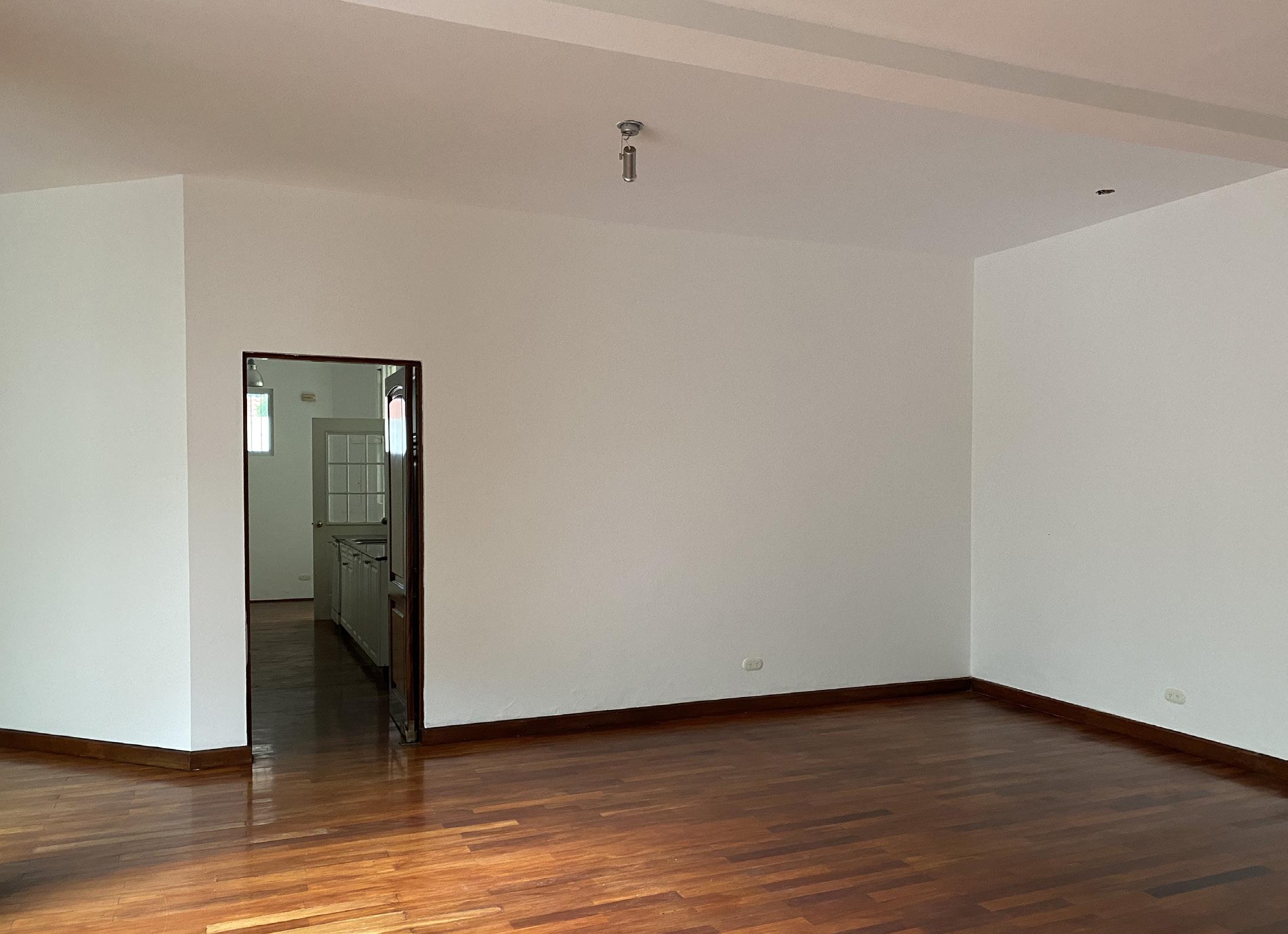
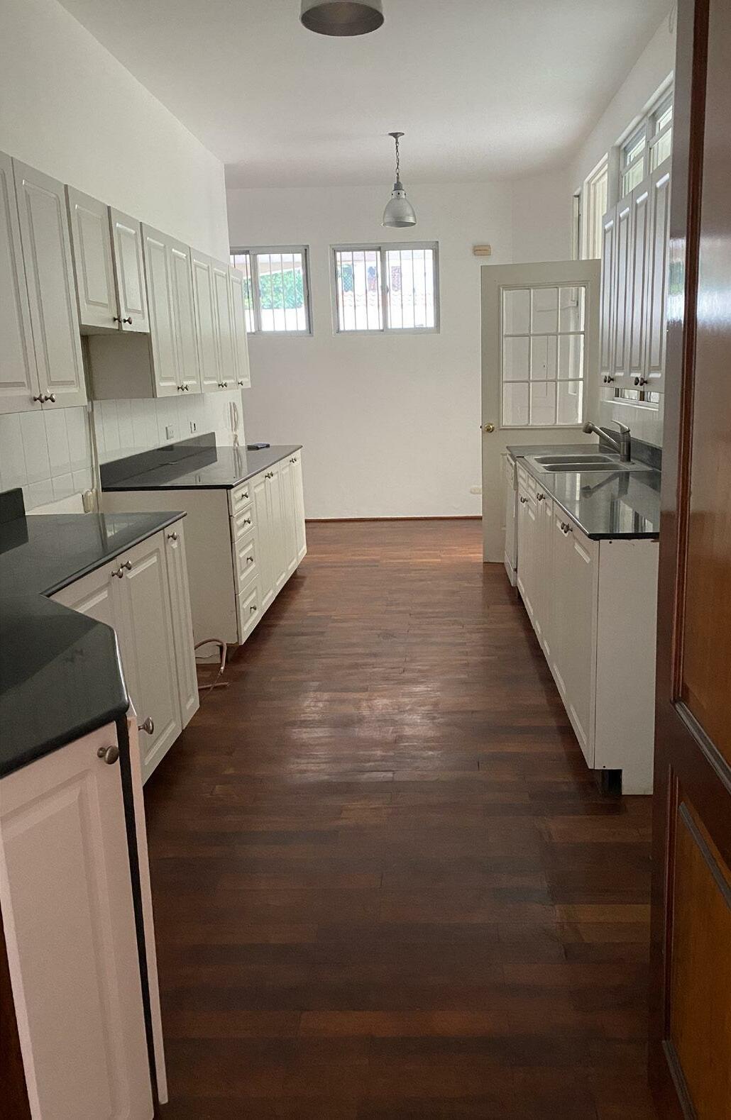
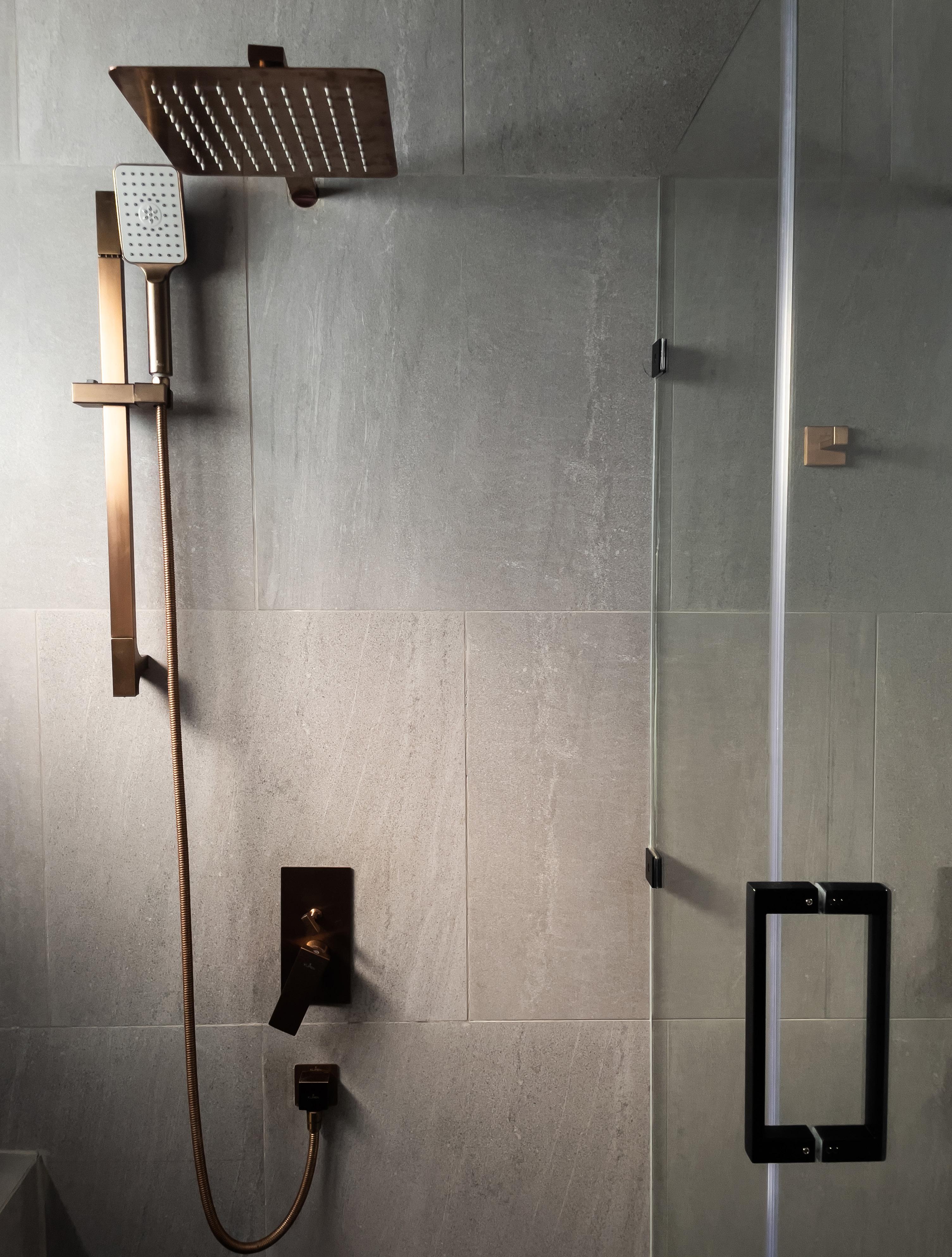
21 THE BEFORE - KITCHEN AND MAIN BATHROOM
KITCHEN STRUCTURAL WALLS LIVING ROOM DINING ROOM UP UP UP S.S PATIO SERVICE ROOM S.S LAUNDRY KITCHEN STORAGE LIVING ROOM DINING ROOM UP UP UP S.S PATIO SERVICE ROOM S.S LAUNDRY CURRENT DISTRIBUTION PREVIOUS DISTRIBUTION 1. CLOSED KITCHEN WITH TOO MUCH WASTED SPACE 2. NO STORAGE AREAS 1. MORE FUNCTIONAL KITCHEN INTEGRATES WITH THE DINING ROOM 2. NEW “HIDDEN” STORAGE AREA 1m 2.5m 5m 22

23

24

25

26

27
0 5
CAFÉ SACRAMENTO
SACRAMENTO COFFEE SHOWROOM
FREELANCE PROJECT INDIVIDUAL PROJECT
DESIGN 23m2 2021
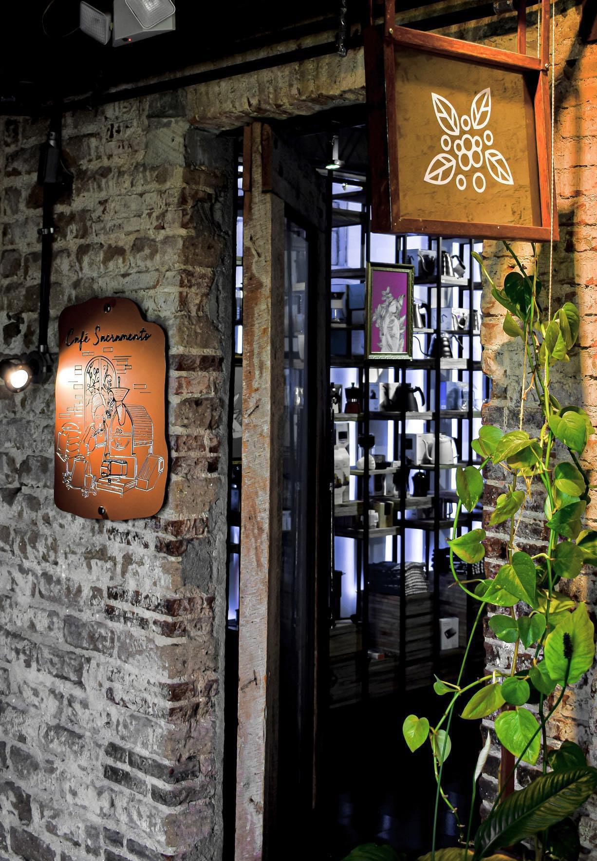
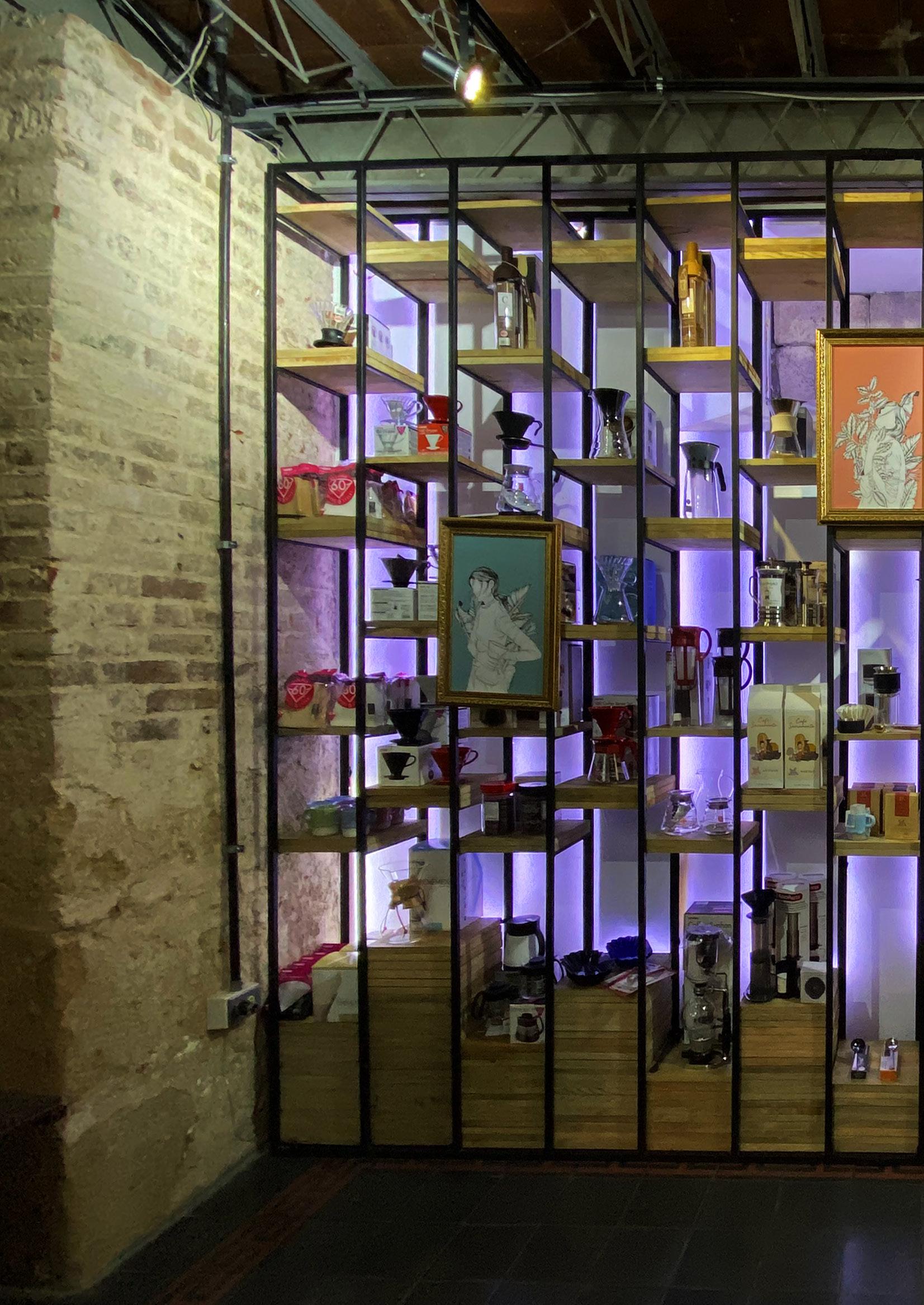
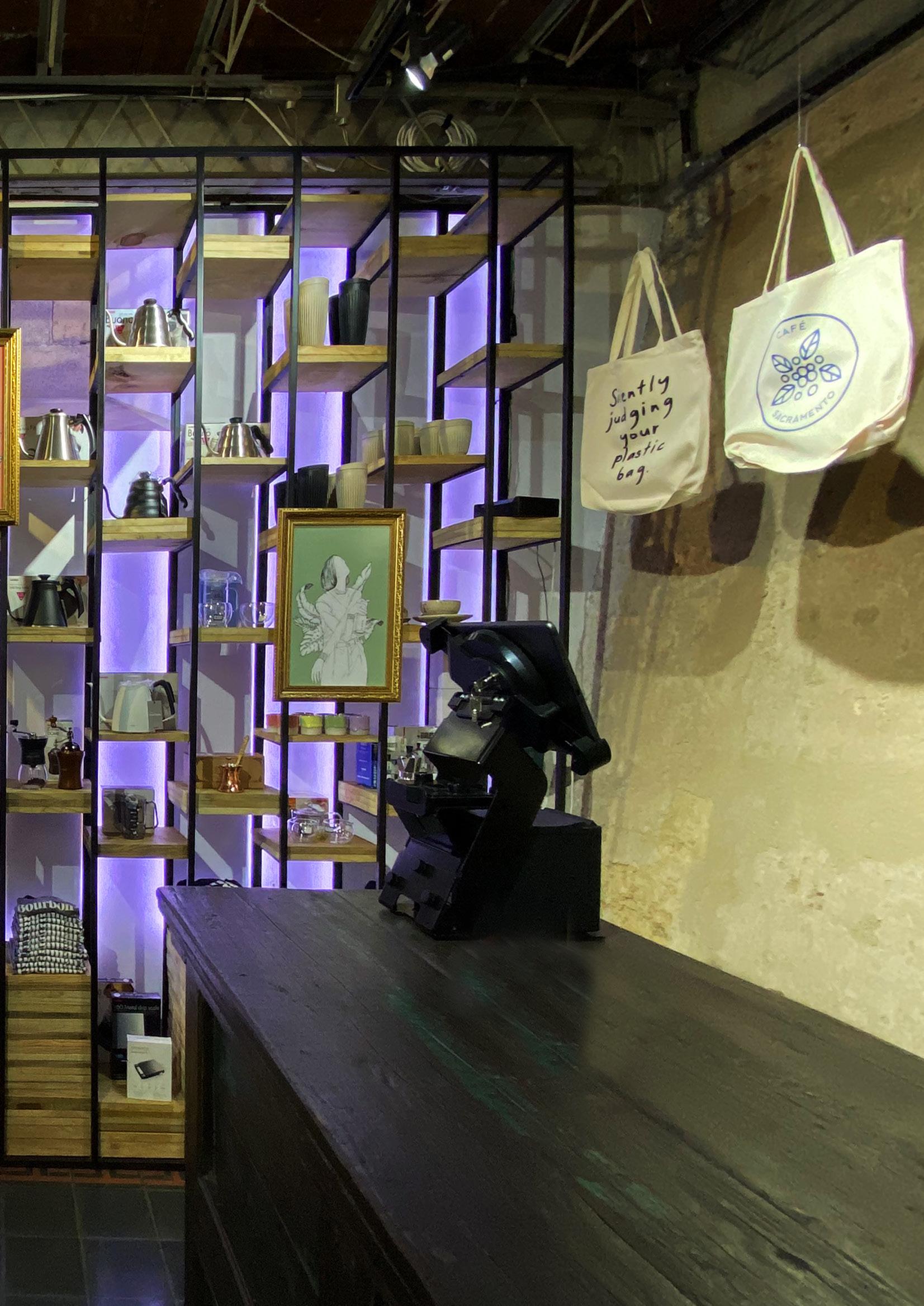
Café Sacramento is a small business that sells premium coffee from Guatemala and highend accessories for coffee enthusiasts. They initially operated online but then decided they needed a showroom area where the products could be exposed and be more accessible for customers. The showroom is located in an antique cultural space in Zone 4 from Guatemala City. The space’s structure and textures are a hundred years old, so our intervention needed to adapt in a non-intruding way to the 23m2 space. The furniture and lighting intend to expose the products in a dynamic way and the textures seek to adapt to the existing rustic textures. This was my second individual project, so I had full responsibility on the design, construction documents, work supervision and project management.
28
INTERIOR


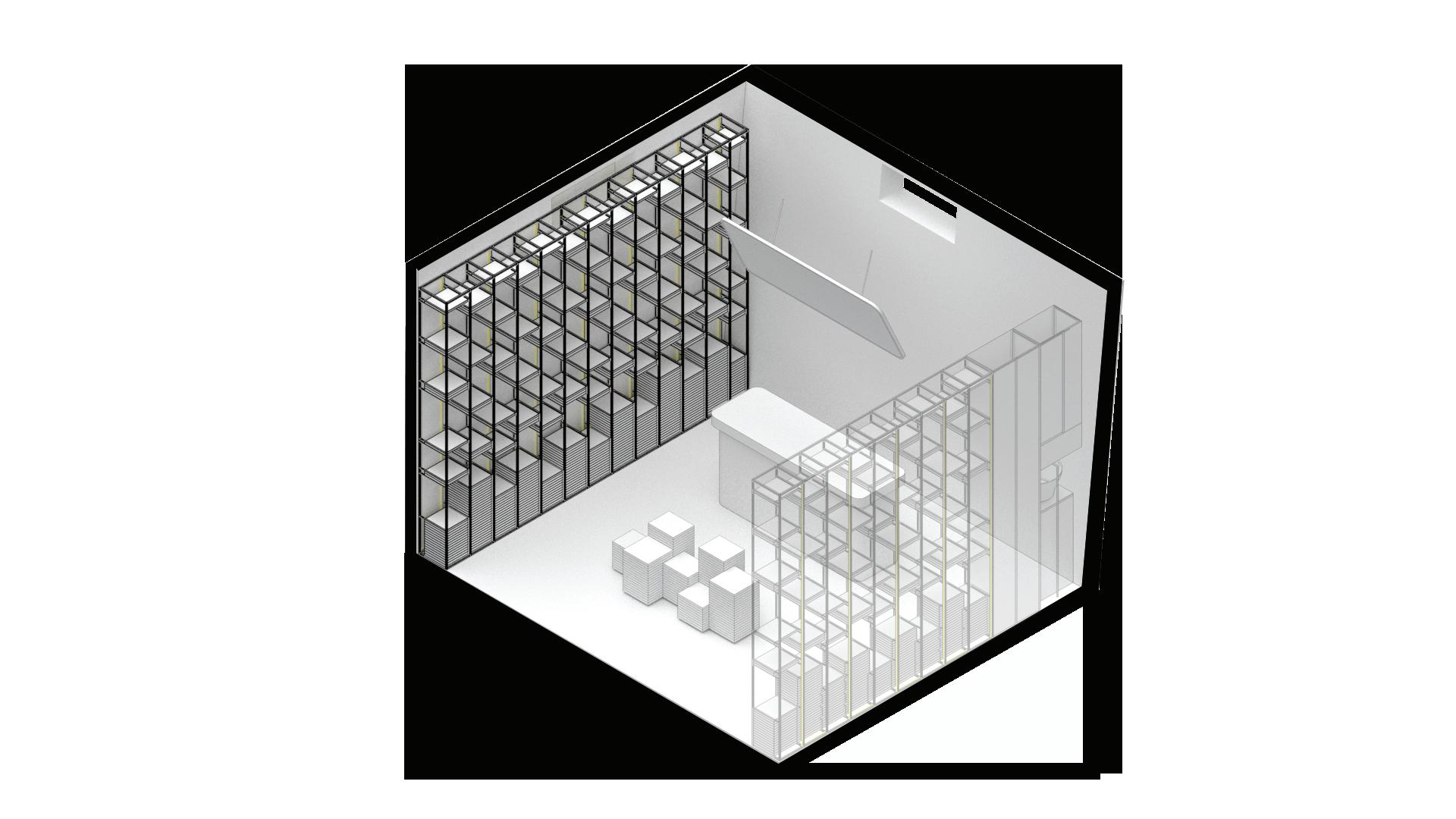
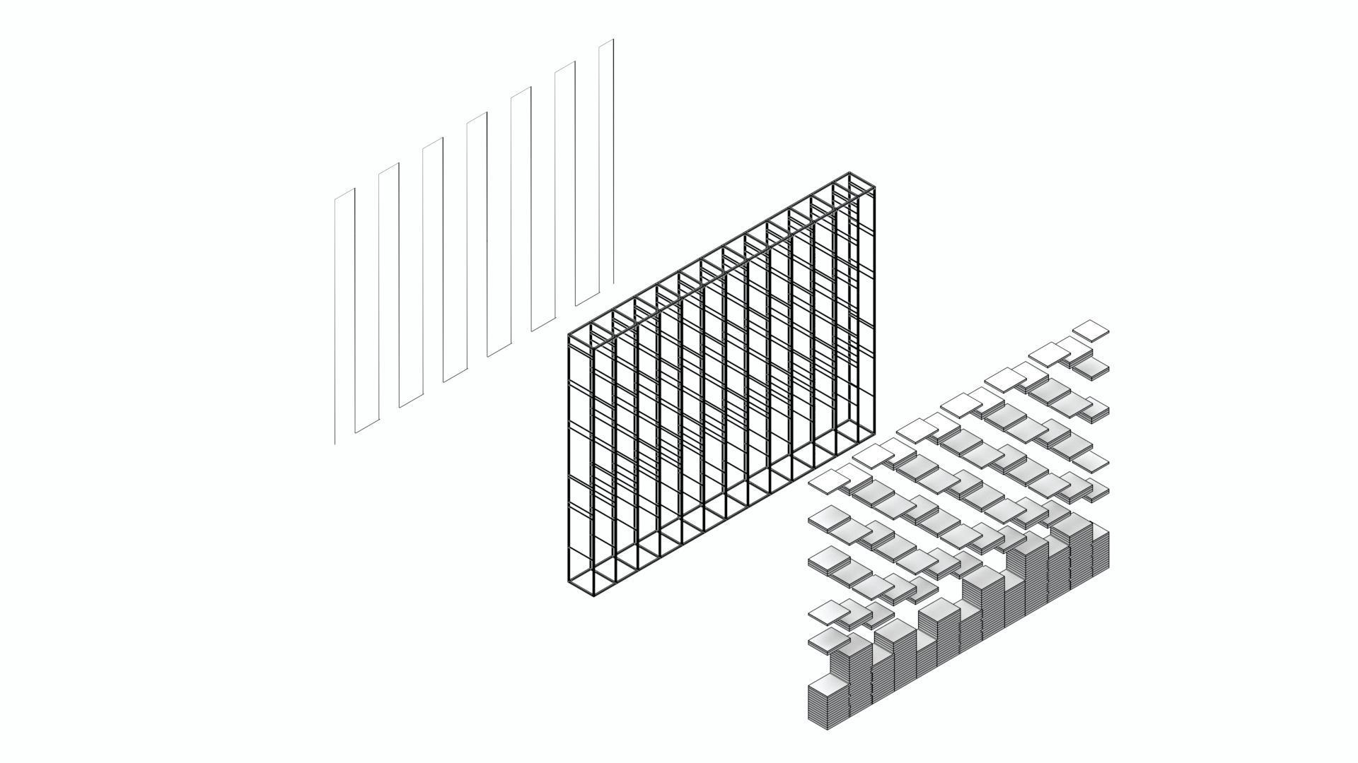
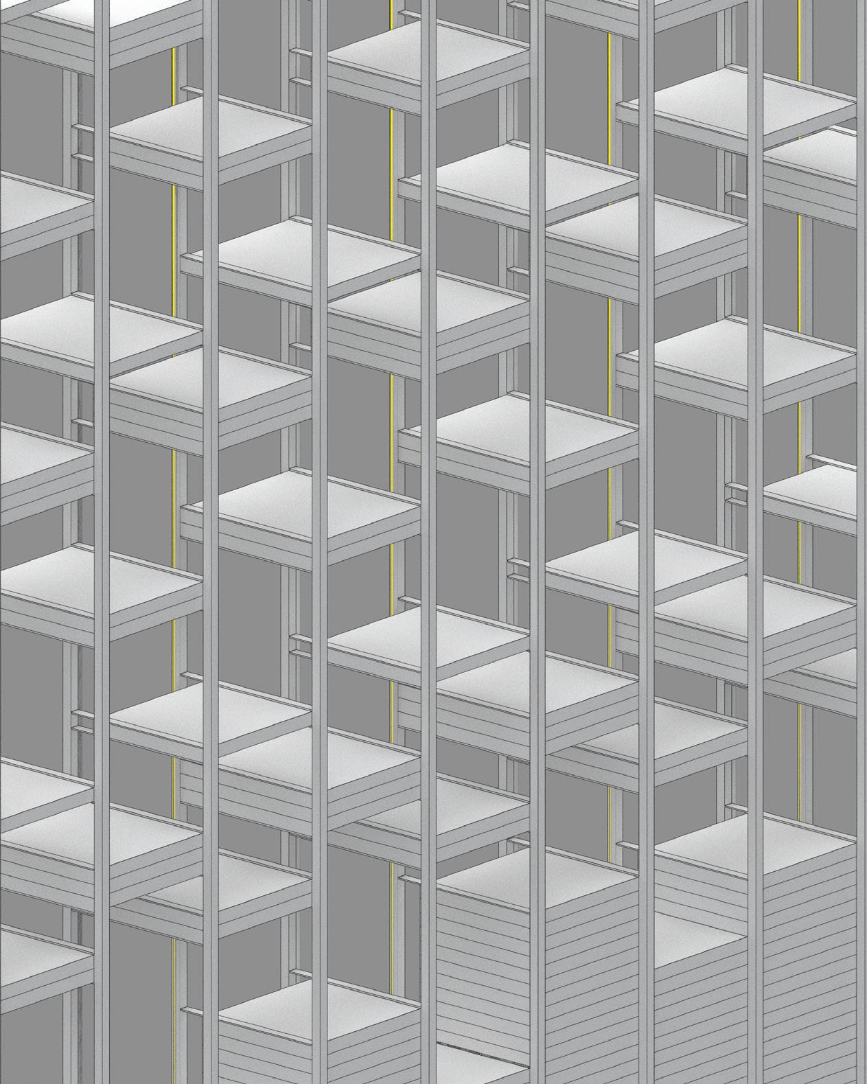
1 MAIN EXHIBITION SHELVES 2 COUNTER AND WORKING AREA 3 MIRROR FOR WORKING AREA 4 MAIN EXHIBITION TABLE 5 STORAGE AND CLEANING AREA 6 LED STRIP 7 MAIN METALLIC FRAMEWORK FOR THE EHXIBITION SHELVES 8 RUSTIC WOODEN SHELVES EXHIBIT COMPONENTS 6 1 1 2 3 5 4 29


7 8 30

31

32

33
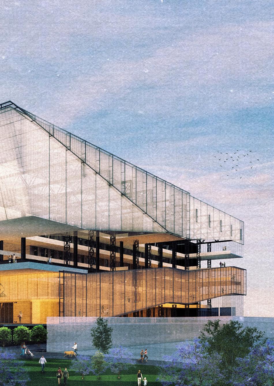
EXHIBITION CENTER 0 6
EXHIBITION CENTER AND ARENA_DESIGN STUDIO UNIVERSIDAD FRANCISCO MARROQUÍN IN COLLABORATION WITH_ALEJANDRA BALCÁRCEL
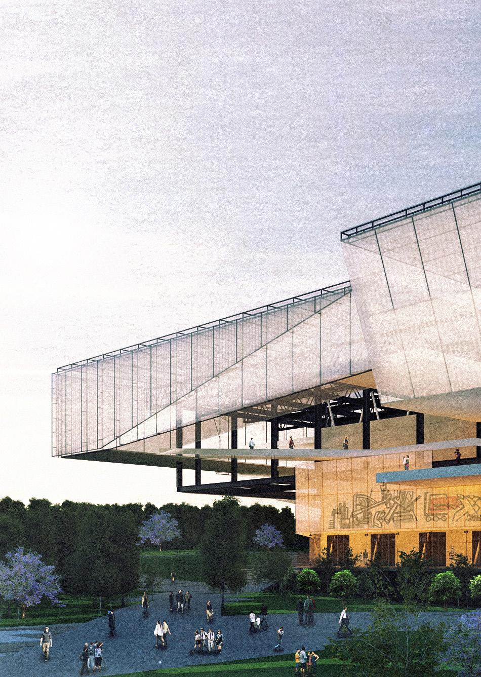
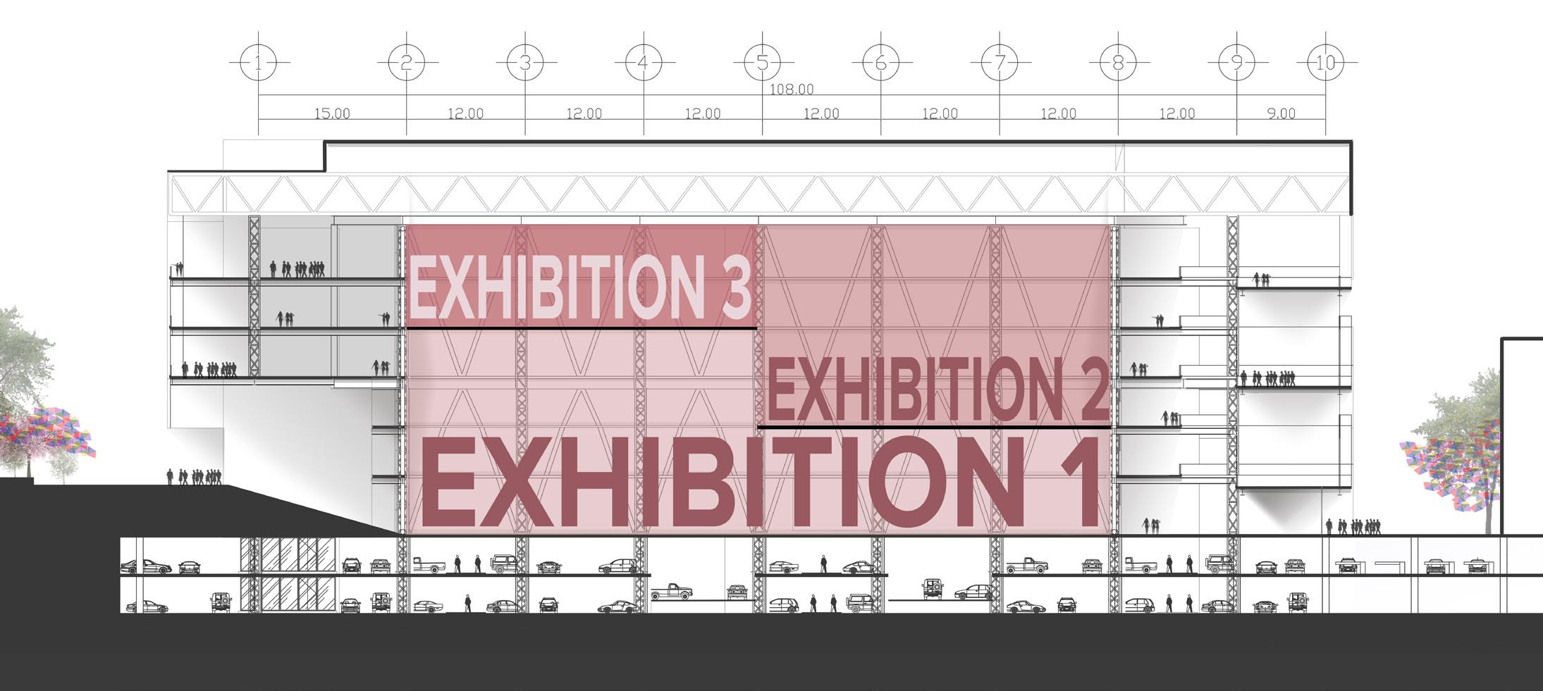
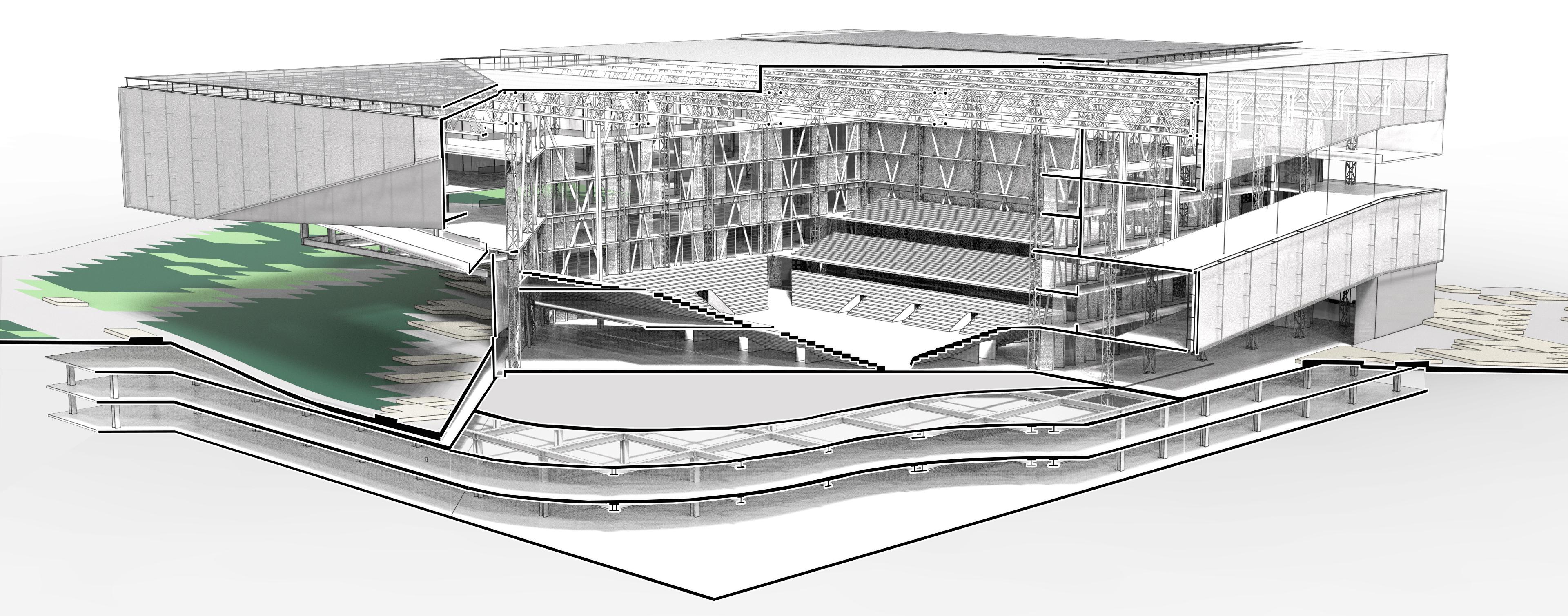
The second phase of the redevelopment of the Industrial Park consisted on designing the new buildings that were proposed on the master plan. The Exhibition Center and Arena was going to be the biggest building and it needed to have the capacity to accommodate several events at the same time. The three major aspects to consider in the design were to make a flexible space with a non-intruding structure, efficient accessibility to the central space and an interactive circulation.

34
4TH
13,700m2
YEAR
2016
SPACE - PATH - STRUCTURE |
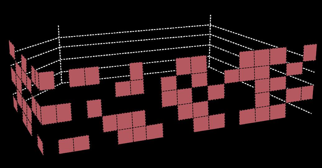
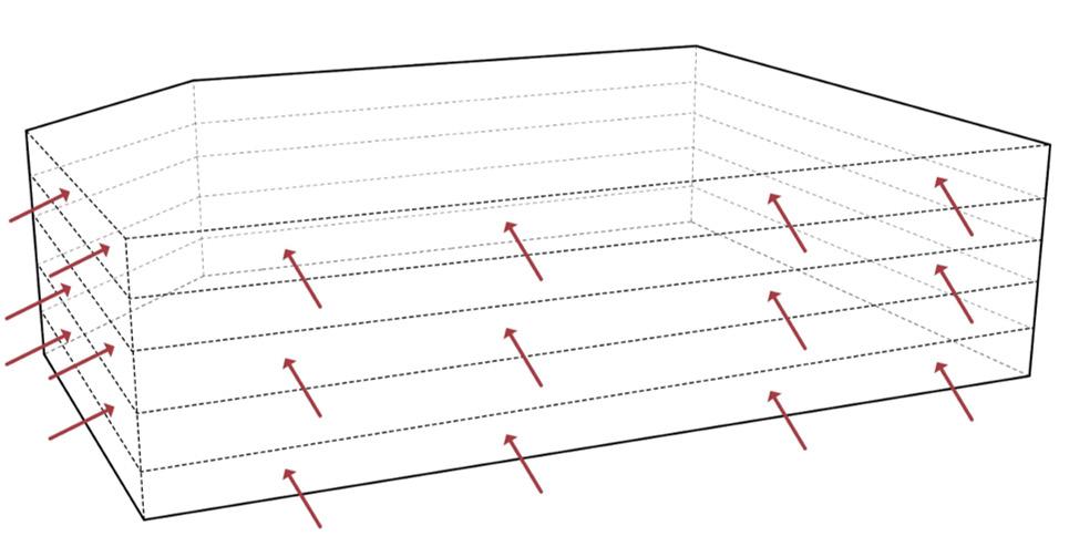
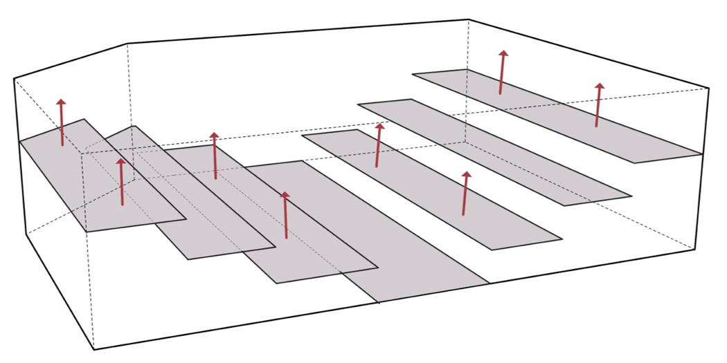
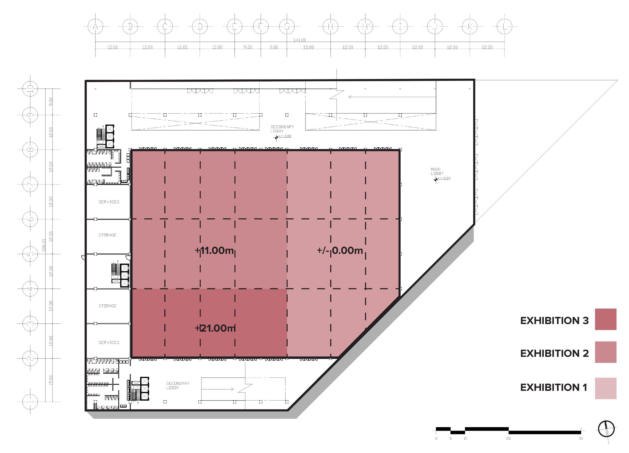
The building’s nucleus needs to be an evolutive space and to achieve it, certain parameters needed to be defined so the building could respond to the different configurations:
DYNAMIC SPACE - RIGID STRUCTURE
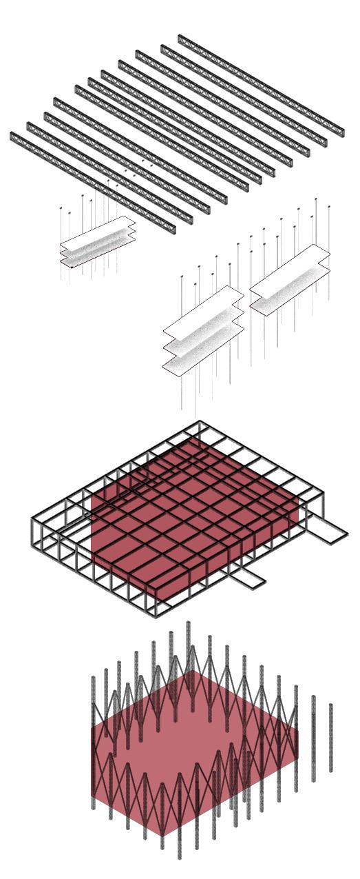
To make a limited space flexible, we generated several platforms that can be reconfigured according to the necessity of the event. The more flexible the space, the more rigid the structure needs to be, creating a solid nucleus that is expressed in the building’s structure.
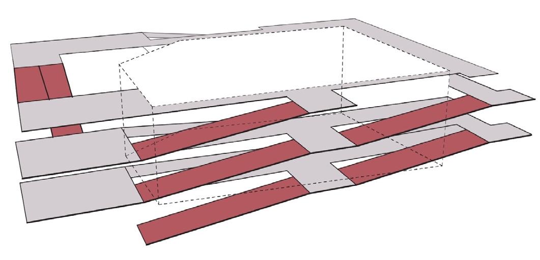
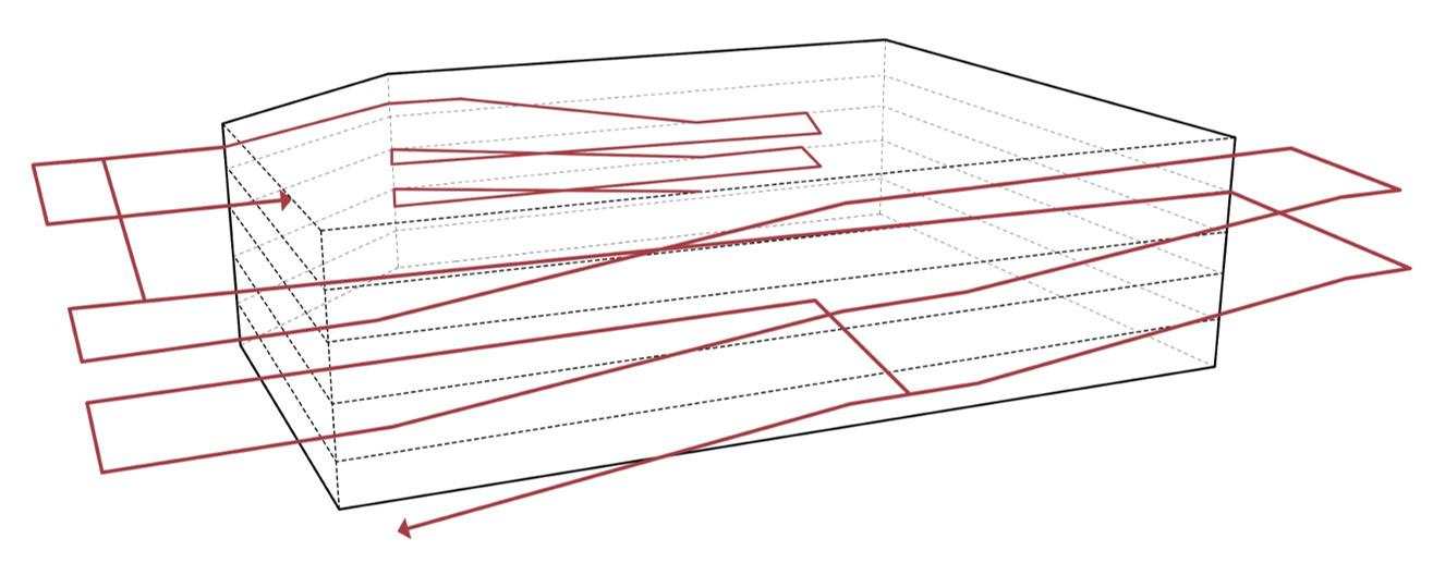
PROGRAM VERSATILITY - DYNAMIC ACCESIBILITY
The program of the building is in constant change and it may have several events simultaneously, so that’s why the central space needs to be accessible from any point of the building.

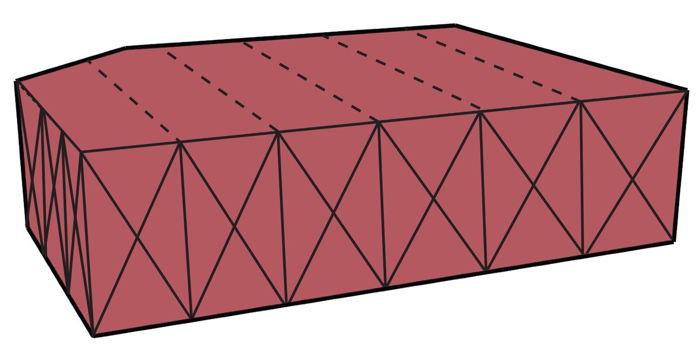
RIGID SPACE - LIGHT STRUCTURE
The central space holds all the activities of the building, so that’s why the exterior distribution is so important, because it determines how you access the central space. To make the exterior space flow, its generated by ramps supported by cables.


35 | DICHOTOMIES |
|


36 02_EXHIBITION CENTER TRANSVERSE SECTION 01_EXHIBITION
CENTER PLAN VIEW
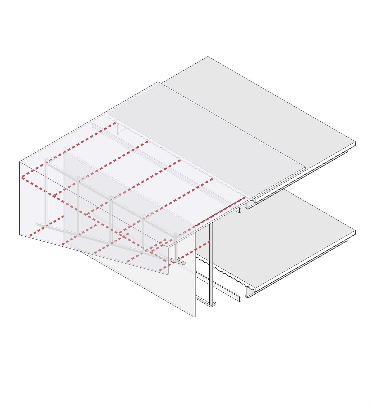
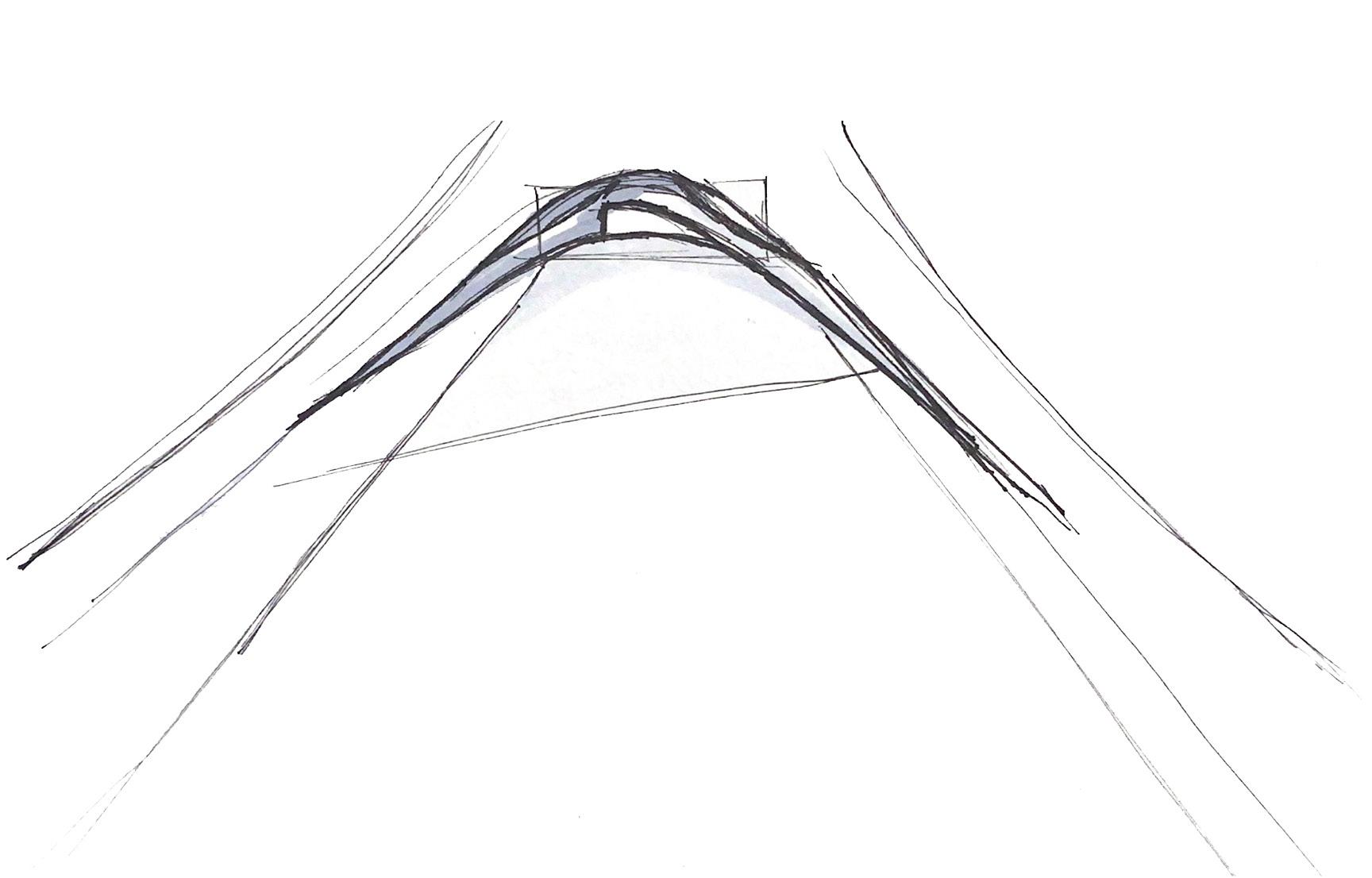
THE RAMPS ARE SUPPORTED BY CABLES TO GET A LIGHTER STRUCTURE
RAMPS
EXHIBITION AREA UPPER LEVELS
UPPER VIRENDEL BEAM COMPOSED BY STEEL BEAMS SUPPORT THE CABLES
THE RAMPS ARE SUPPORTED BY CABLES TO GET A LIGHTER STRUCTURE
RAMPS
VIERENDEL BEAM COMPOSED BY STEEL BEAMS THAT SUPPORT THE SLABS AND THE CANTILEVER

STEEL CROSSBRACES
TRUSSED COLUMNS
EXHIBITION AREA LOWER LEVELS
37
EXPLODED STRUCTURAL VIEW
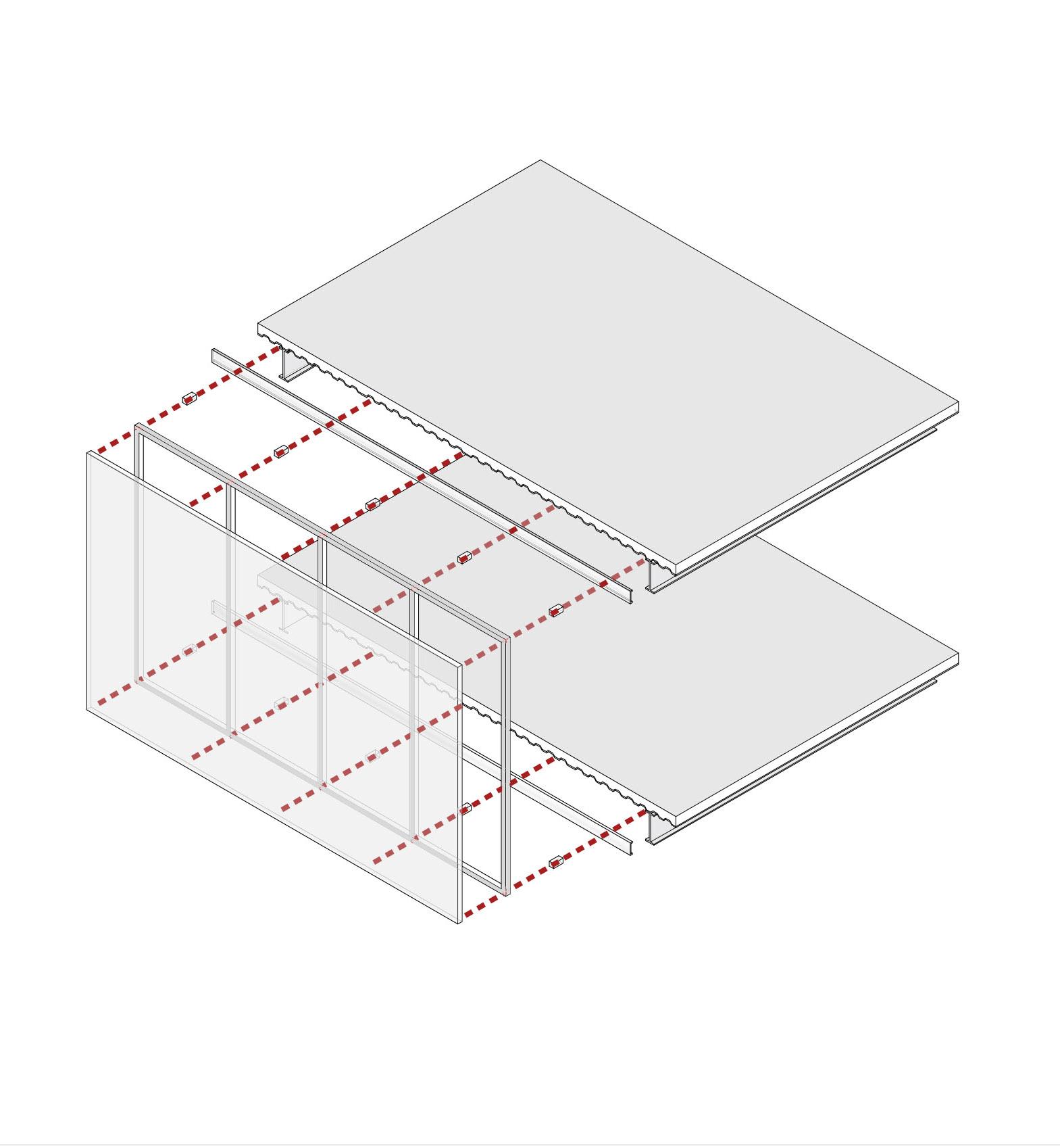
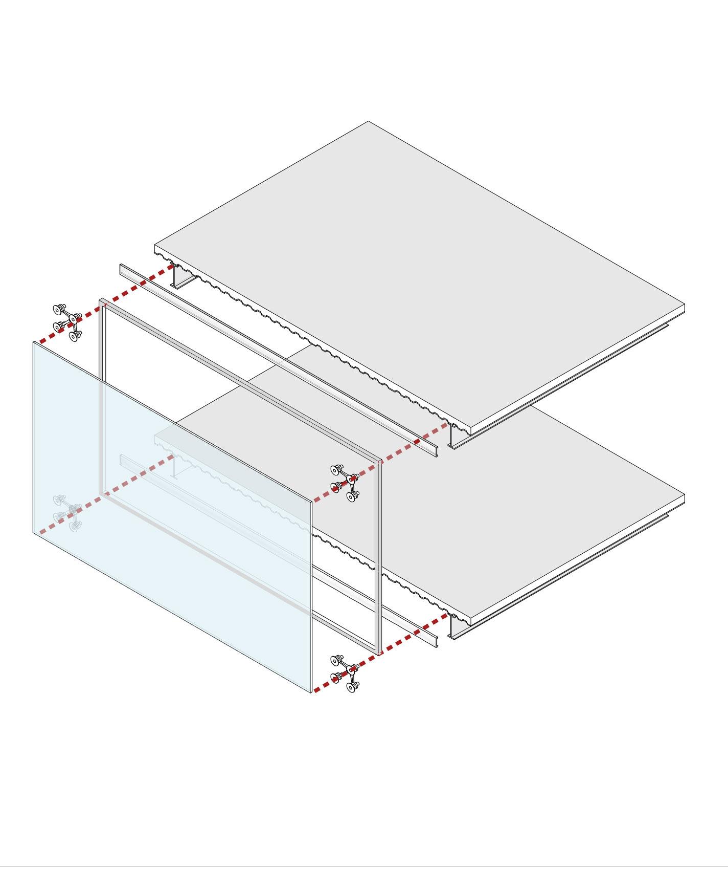
TYPE A
GLASS SCREEN DETAIL
TYPE B
POLYCARBONATE SCREEN DETAIL
TYPE C
DOUBLE POLYCARBONATE SCREEN DETAIL
CONCRETE SLAB
ALUMINIUM SUPPORT ALUMINIUM SUPPORT
ALUMINIUM FRAME ALUMINIUM STRUCTURE


SPIDER GLASS SYSTEM
CONCRETE SLAB
GLASS SCREEN POLYCARBONATE SCREEN
CONCRETE SLAB
ALUMINIUM SUPPORT
STEEL BEAM STEEL BEAM STEEL BEAM
DOUBLE POLYCARBONATE SCREEN
ALUMINIUM STRUCTURE ALUMINIUM STRUCTURE
DOUBLE POLYCARBONATE SCREEN

38
FACADE DETAILING


39 1 DOUBLE LAYERED POLYCARBONATE FACADE 2 STRUCTURAL CABLES SUPPORTING THE RAMPS 3 STEEL TRUSS COLUMNS 4 SINGLE LAYERED POLYCARBONATE FACADE 5 PUBLIC PLAZA 6 STEEL STRUCTURE FOR THE BASEMENT 7 STEEL STRUCTURE 8 SINGLE LAYERED POLYCARBONATE ROOF 9 DOUBLE LAYERED POLYCARBONATE ROOF 10 PUBLIC PLAZA AND GARDEN


40 3D MEGACHUNK
RESTORATION_ARCHITECTURAL PROJECT AND THOUGHT
ESCOLA TECNICA DE ARQUITECTURA DE BARCELONA
IN COLLABORATION WITH_FERNANDO CONTRERAS
LA MODEL
2022 20,000m2 MBARCH
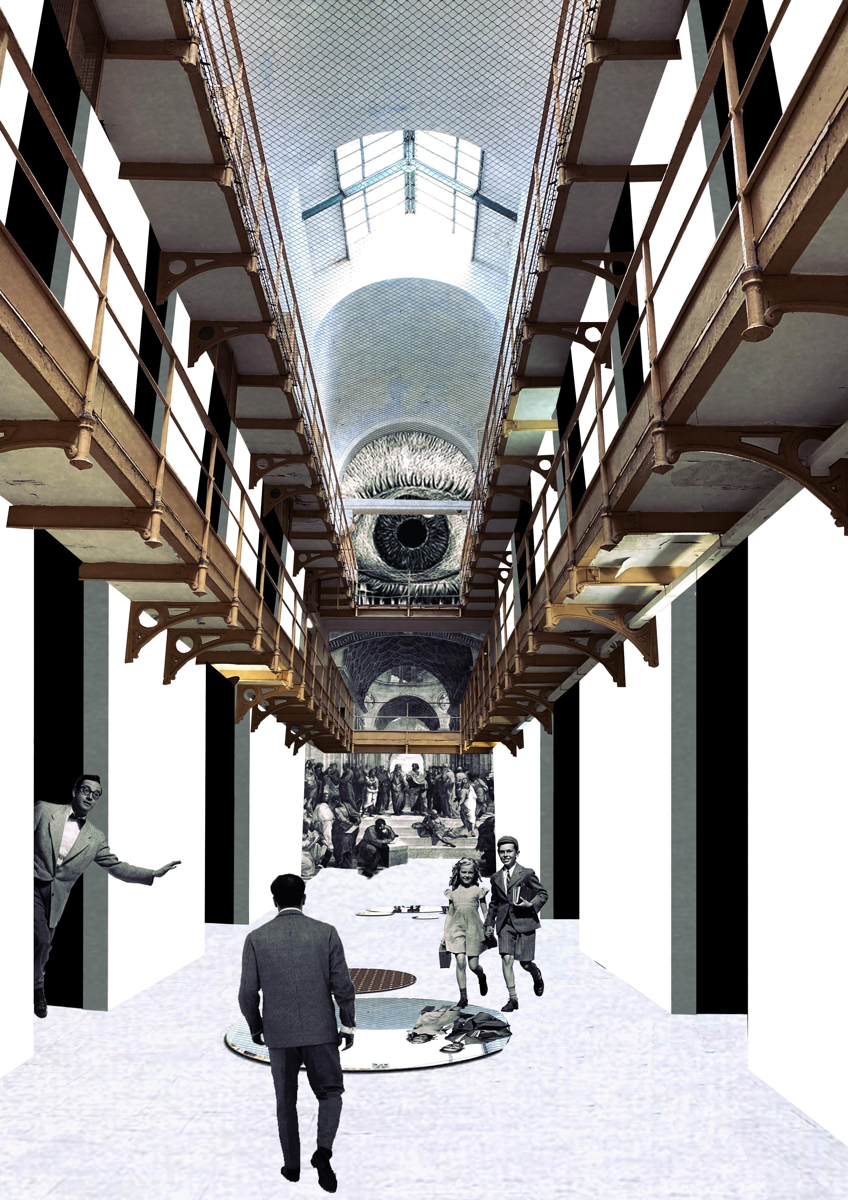
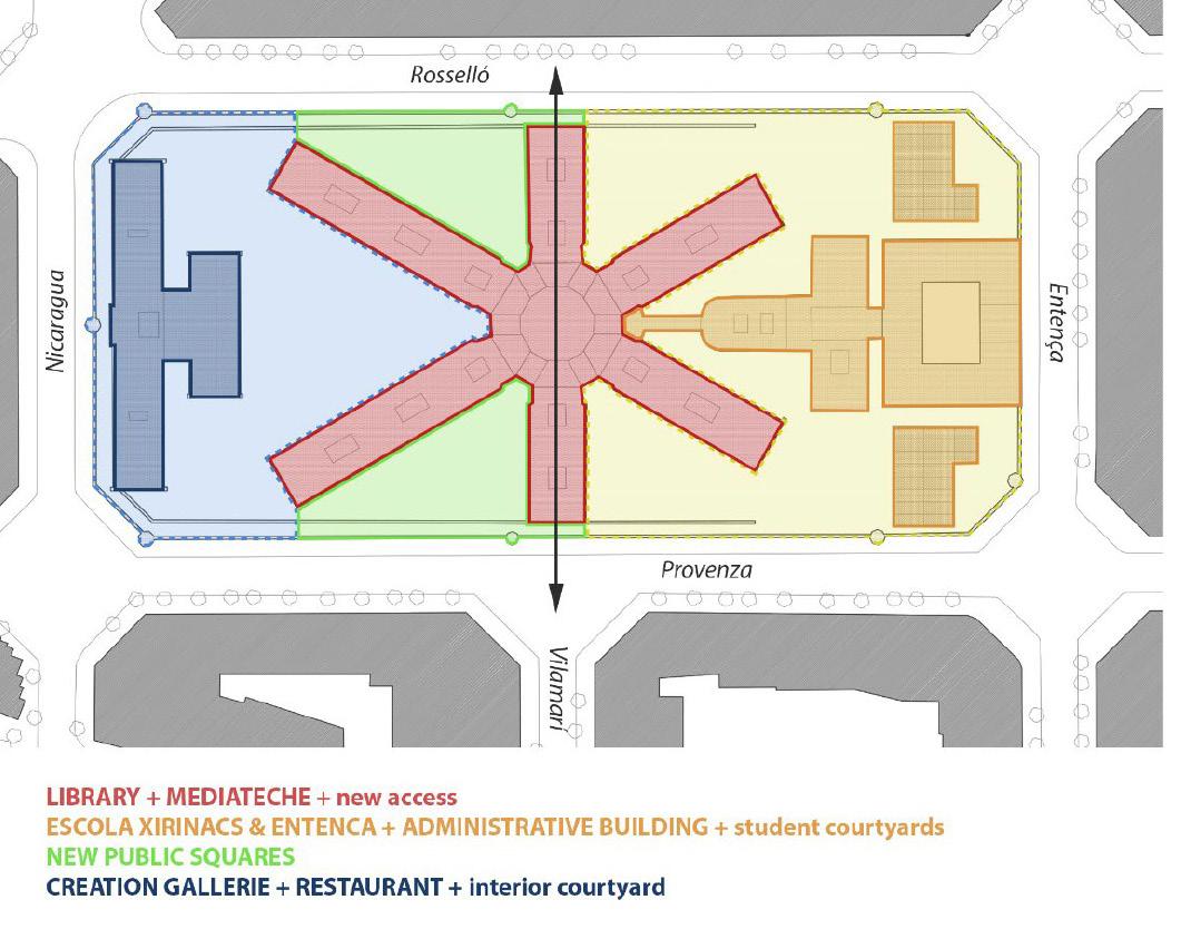
Certain buildings come with a negative historical and emotional charge due to the program they housed: The jail is one of them. Although these buildings play a significant role in society, and at first were part of the urban fabric, with the evolution of cities, security issues and because communities do not usually want them near their homes, they have been projected outside the cities. This is how these urban islands begin to appear with a solid potential to be reintegrated into the urban fabric.
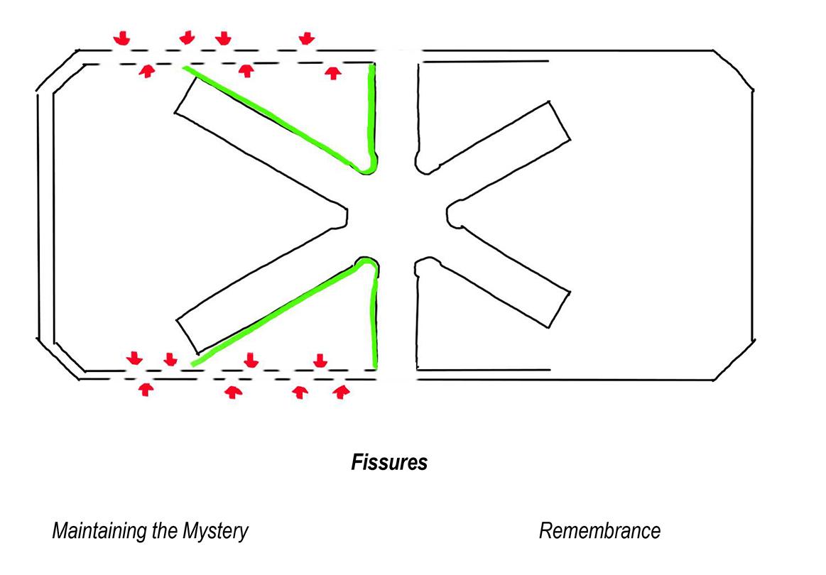
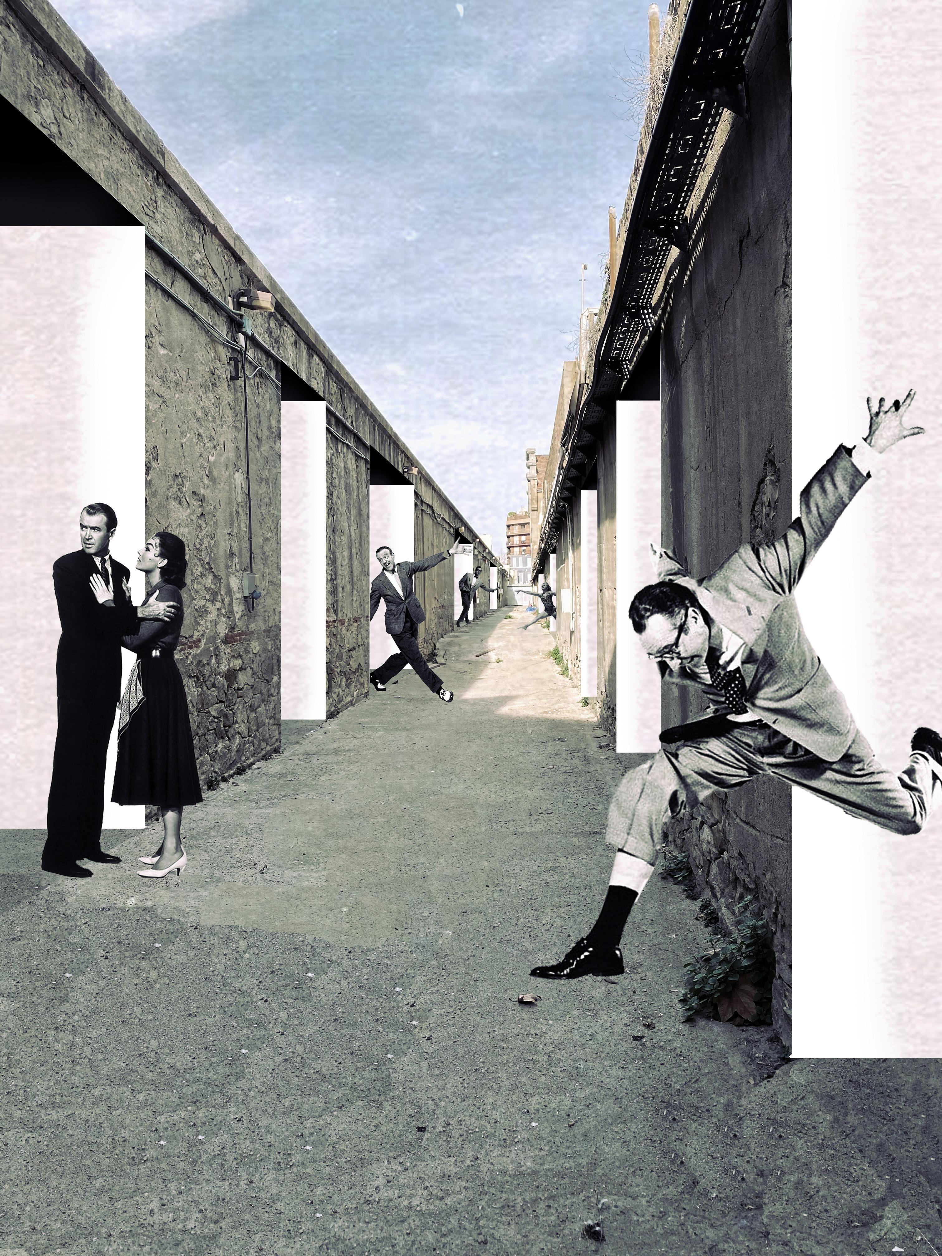
The interest that the community around La Model has towards the building obliges us to carefully intervene the space in order to connect it to the city without losing its most important architectural qualities. This becomes an exercise of cleaning and rearranging that must be done with the upmost respect. Our proposal modifies the current reality by creating new possibilities within the existing, resulting in a new exciting space that’s not isolated from the city anymore but that still has some secrets that are worth keeping.
41
0 7

42
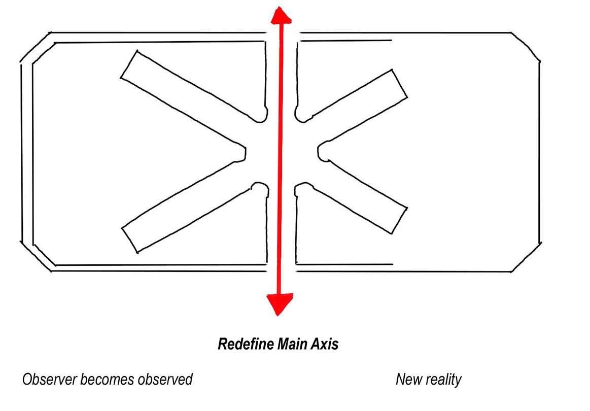
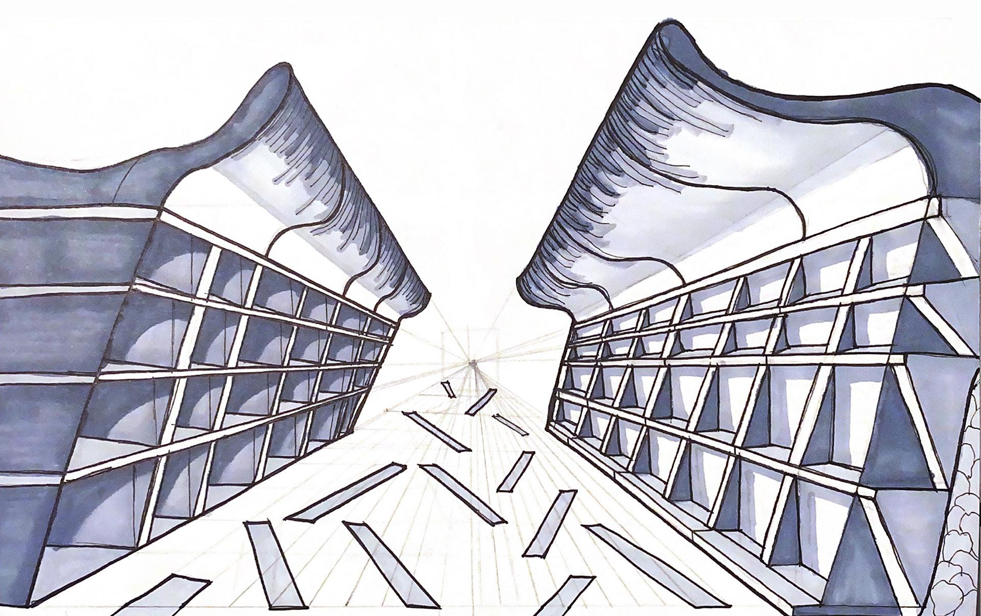
The new program of the prison responds to the urban and social necessities that were expressed by the community but, even if this interventions could have a positive impact on the way La Model interacts with its surroundings, we consider that there is two concepts that will lead us to develop a proposal that gives place to the creation of a new reality but at the same time is strongly bound to the architectural character of the building.


01_The Observer Becomes The Observed The panopticon is not only an expression of power but also a symbol of vigilance that defined the configuration of the space in La Model. The relationship between a vigilante and an observee is usually uneven and not only is one of the things that we aim to modify in La Model, but its also one of the main topics in David Gibbons
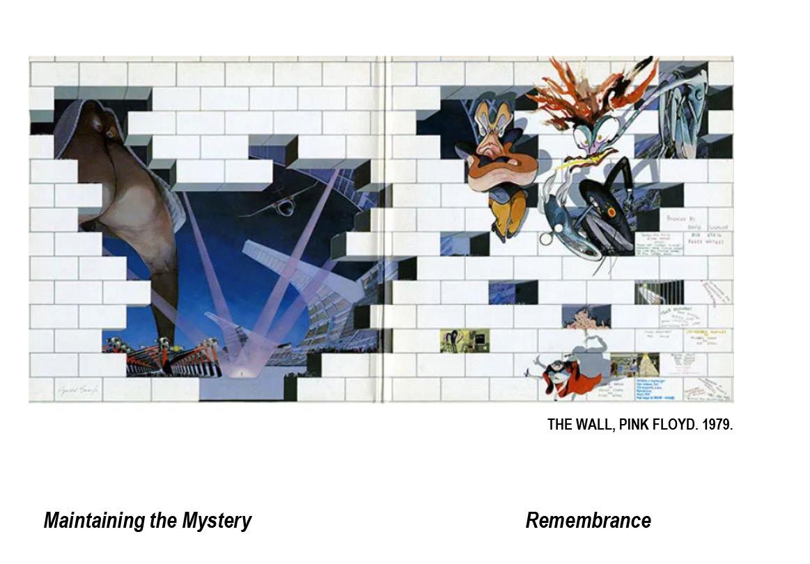
and Alan Moore’s comic book Watchmen. “Quis custodiet ipsos custodes” was a phrase wrote by the Roman poet Juvenal in a satirical way and is brought into modern times in a critical moment of the novel when people begin asking: “Who watches the Watchmen?”
02_Maintaining The Mystery Prisons are not on the checklist of places you want to visit before you die, but there is still an inherent morbid curiosity on finding out how a prison works and how is it configured. We believe that this is one of the main attractions of La Model and that’s why we want to preserve that feeling of intrigue whilst opening the newly formed public spaces. The only way to do this is by creating openings or fissures on the walls that allow us to have a glimpse of what lies beneath and sparks our

43

44
PARAÍSO ANIMAL
WRITER AND DIRECTOR OF A SHORT FILM FOR THE CINEMA WORKSHOP FILM
IN COLLABORATION WITH_BERNAT GINOT AND ORIOL JUTGLAR

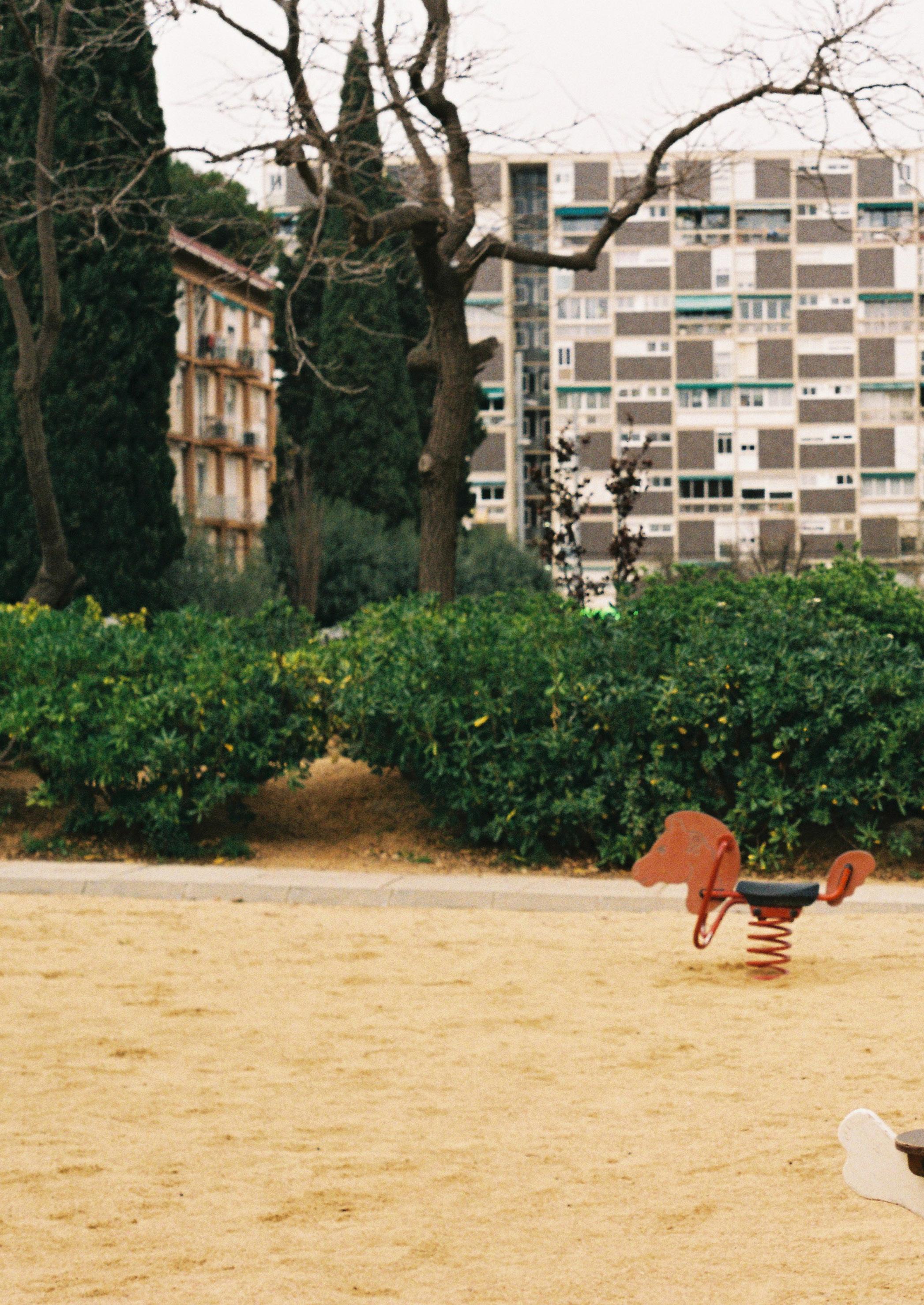
The public space in Montbau invites us to sharpen our senses in order to understand it as if it were an urban museum and for this we placed the camera in two of its main squares to create frames that exhibit the theatrical space, full of subtle and stealthy exhibitions that they are framed by the structure of the iconic modern volumes. Irony plays an important role, since there is an auditory-visual contrast that is noticeable. In a space where concrete predominates and vegetation is purely decorative, what you see and what you hear in the space have no direct relationship, thus creating a constant tension between nature and city. The peace and calm that is perceived in this suburban museum invites us to take a break from the hectic pace of the city to contemplate the ephemeral works that are exhibited. In Montbau everything happens and nothing happens and that is why there is a lot of beauty in his complex personality.

45
0 8
ARCHITEKTURA 2022 / BARQ 2022 / FFTS PINEWOOD 2022
2022


46
PHOTOGRAPHY

47
0 9
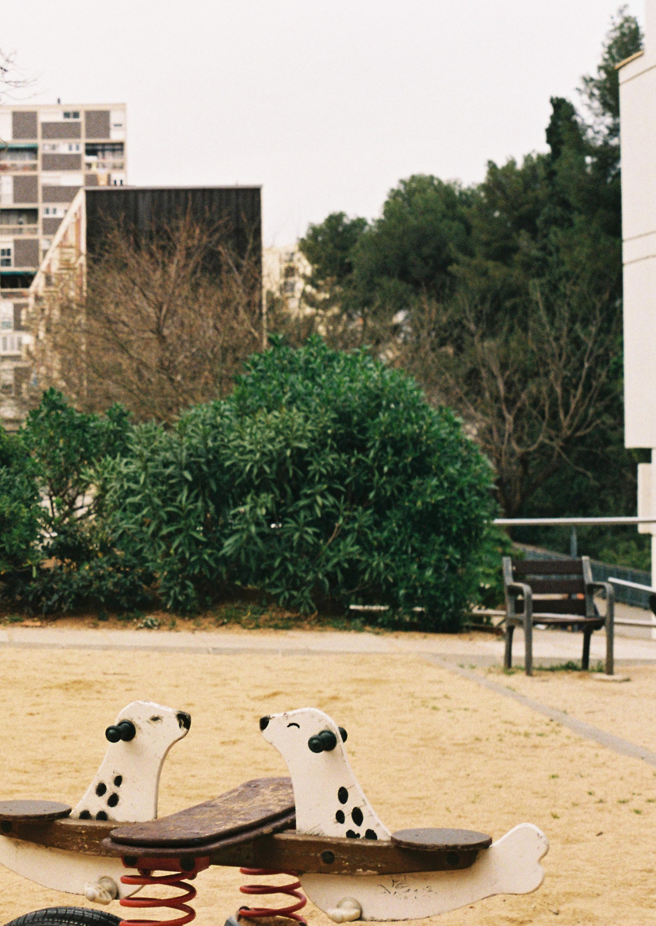
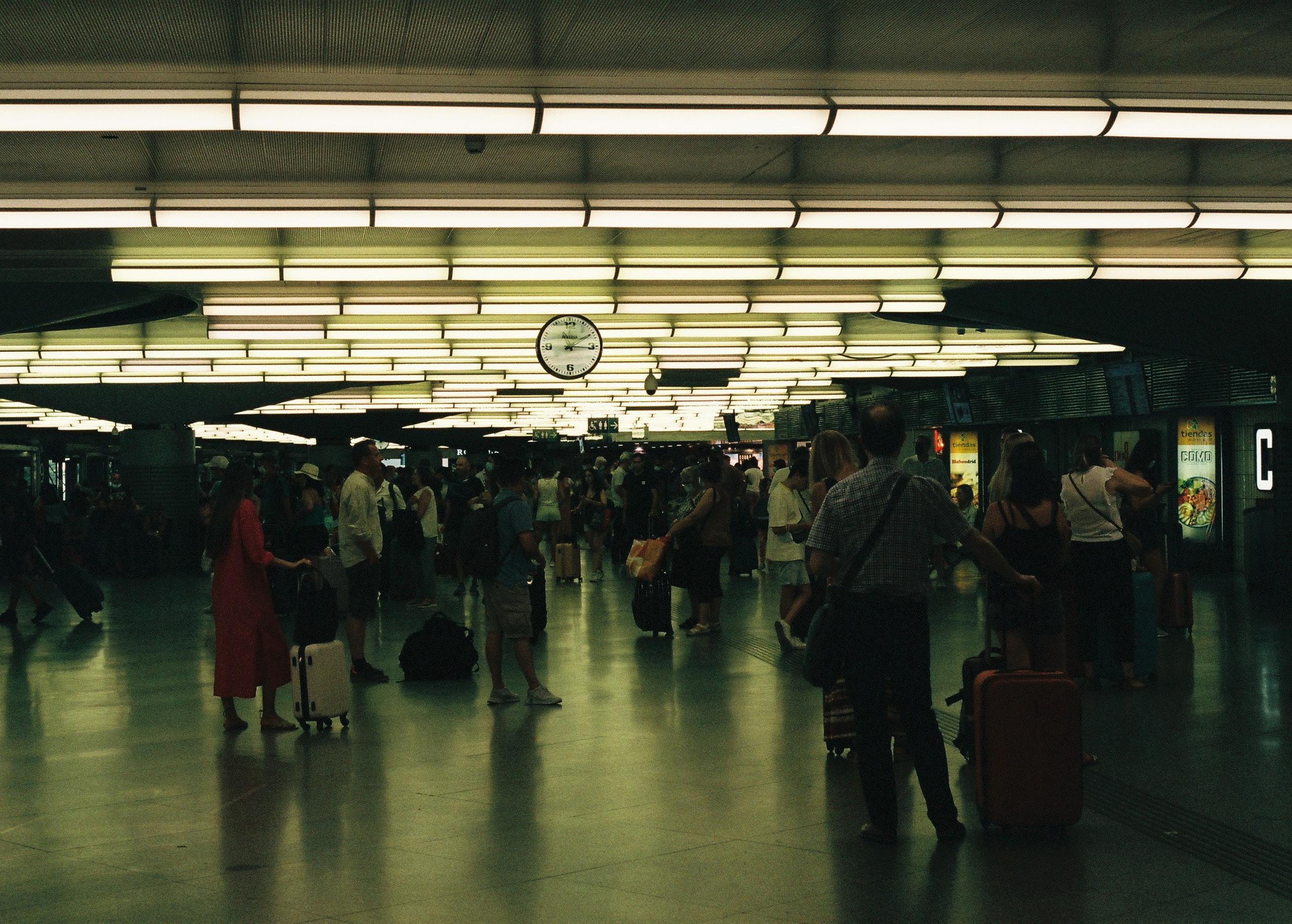
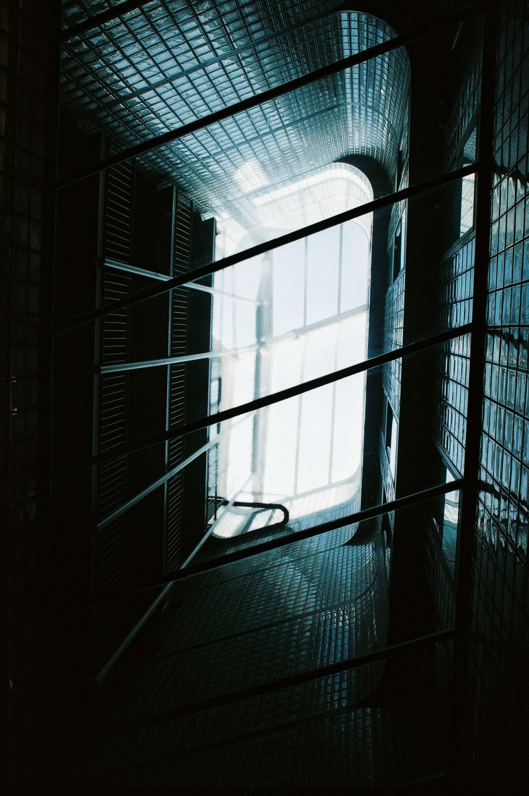
ARCHITECTURAL PHOTOGRAPHY WITH A PENTAX K1000 FILM CAMERA (NO EDITING)
AMATEUR

48
- BARCELONA
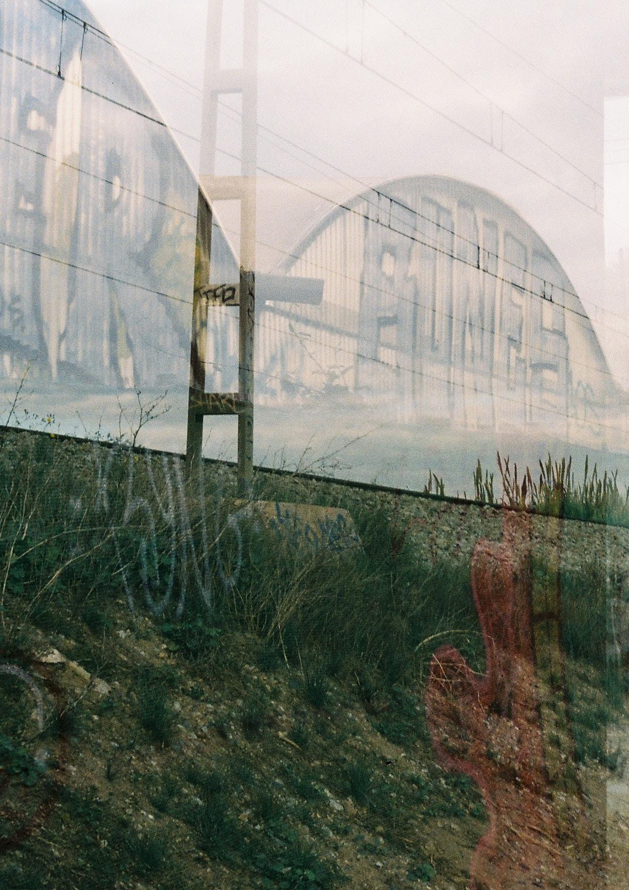
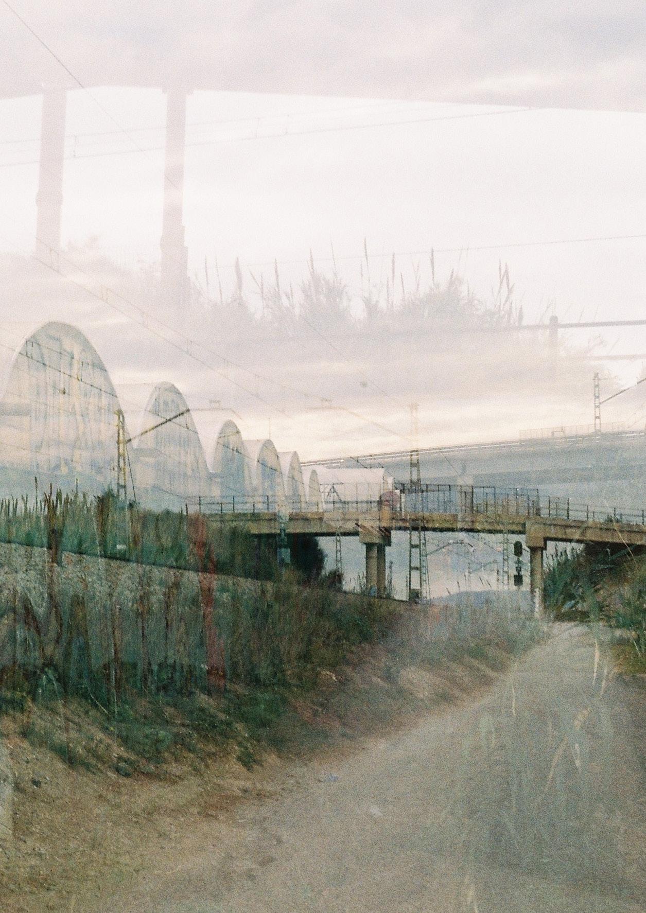
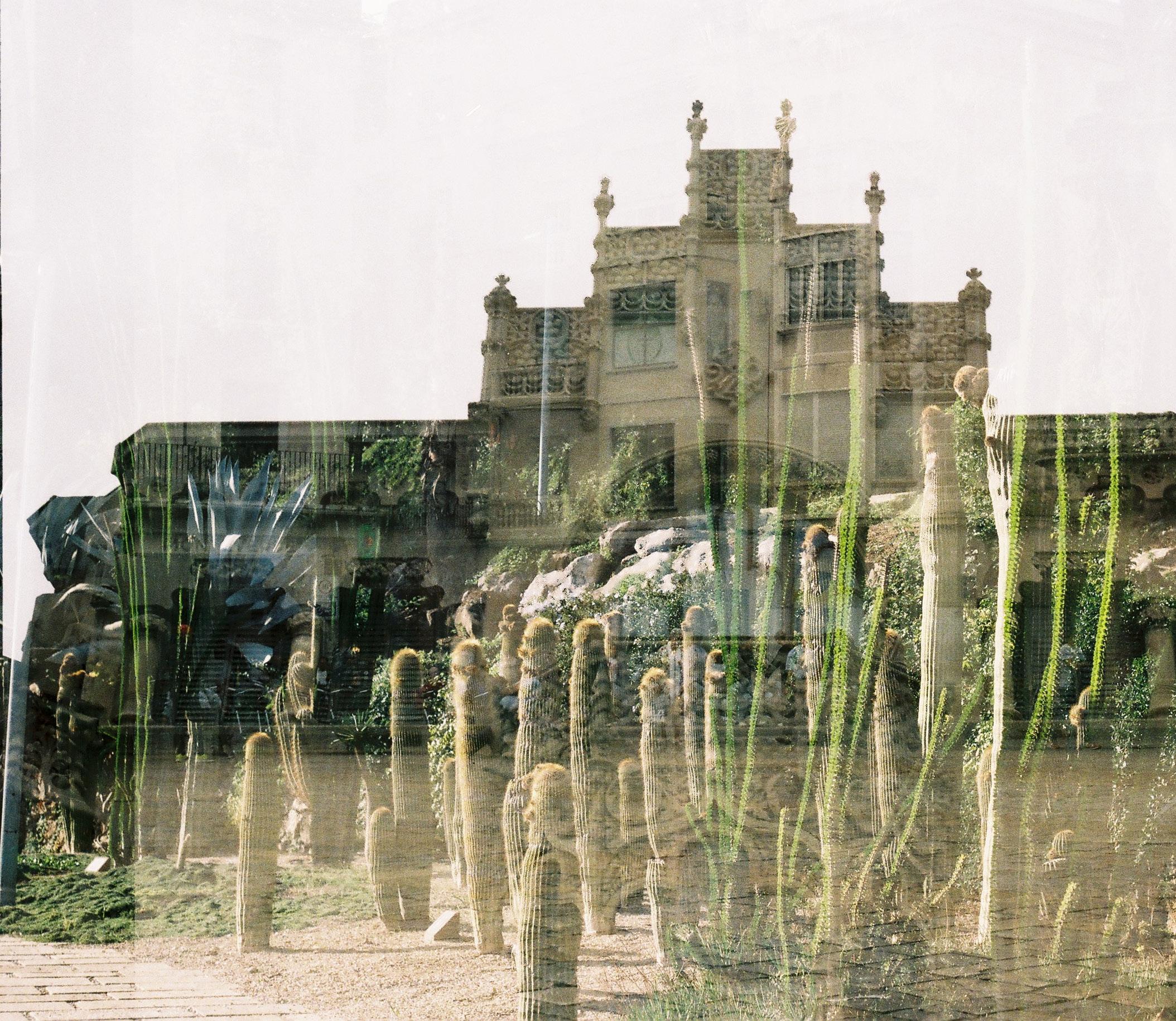
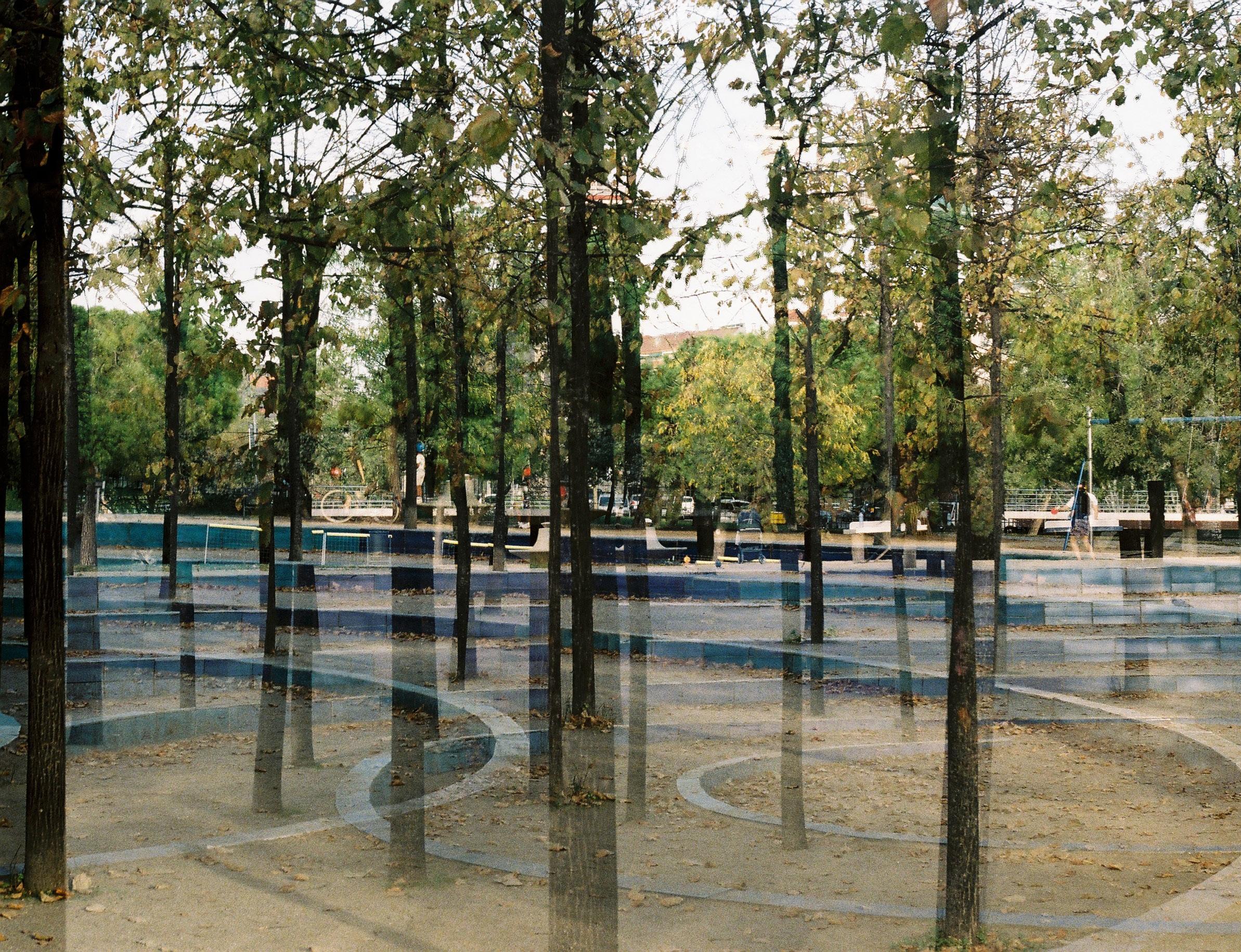
PARC AGRARI DEL BAIX LLOBREGAT - ANALOG DOUBLE EXPOSURE - 35MM


49

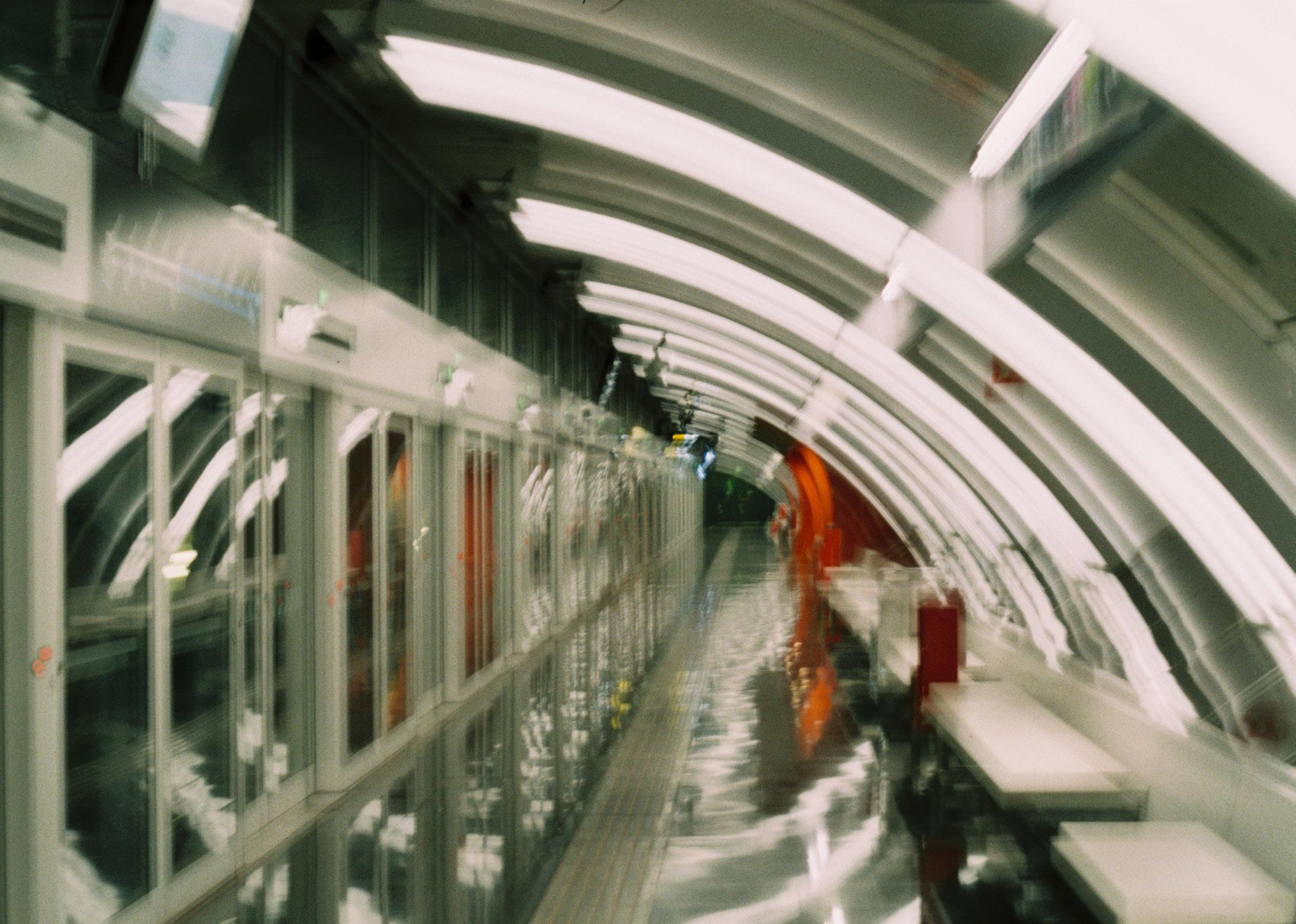
50 TRANSITIONS - PENTAX K1000 - 35MM - MADRID - BARCELONA - GIRONA 2022

51

52 ANALOG DOUBLE EXPOSURE - PENTAX K1000 - 35MM - BARCELONA 2022


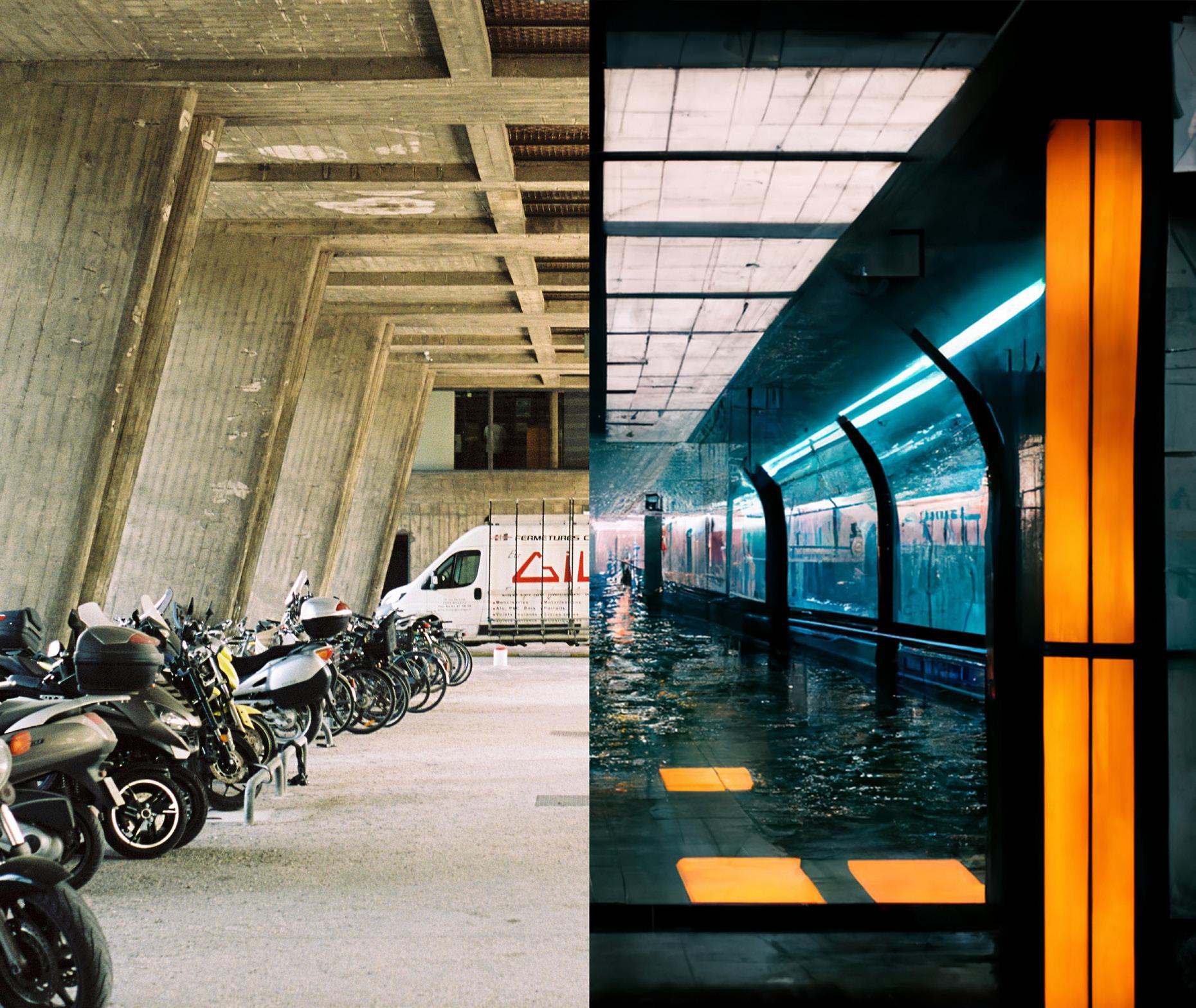
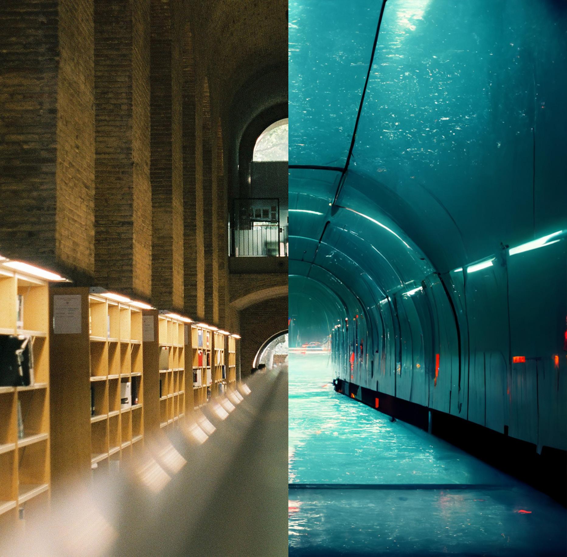
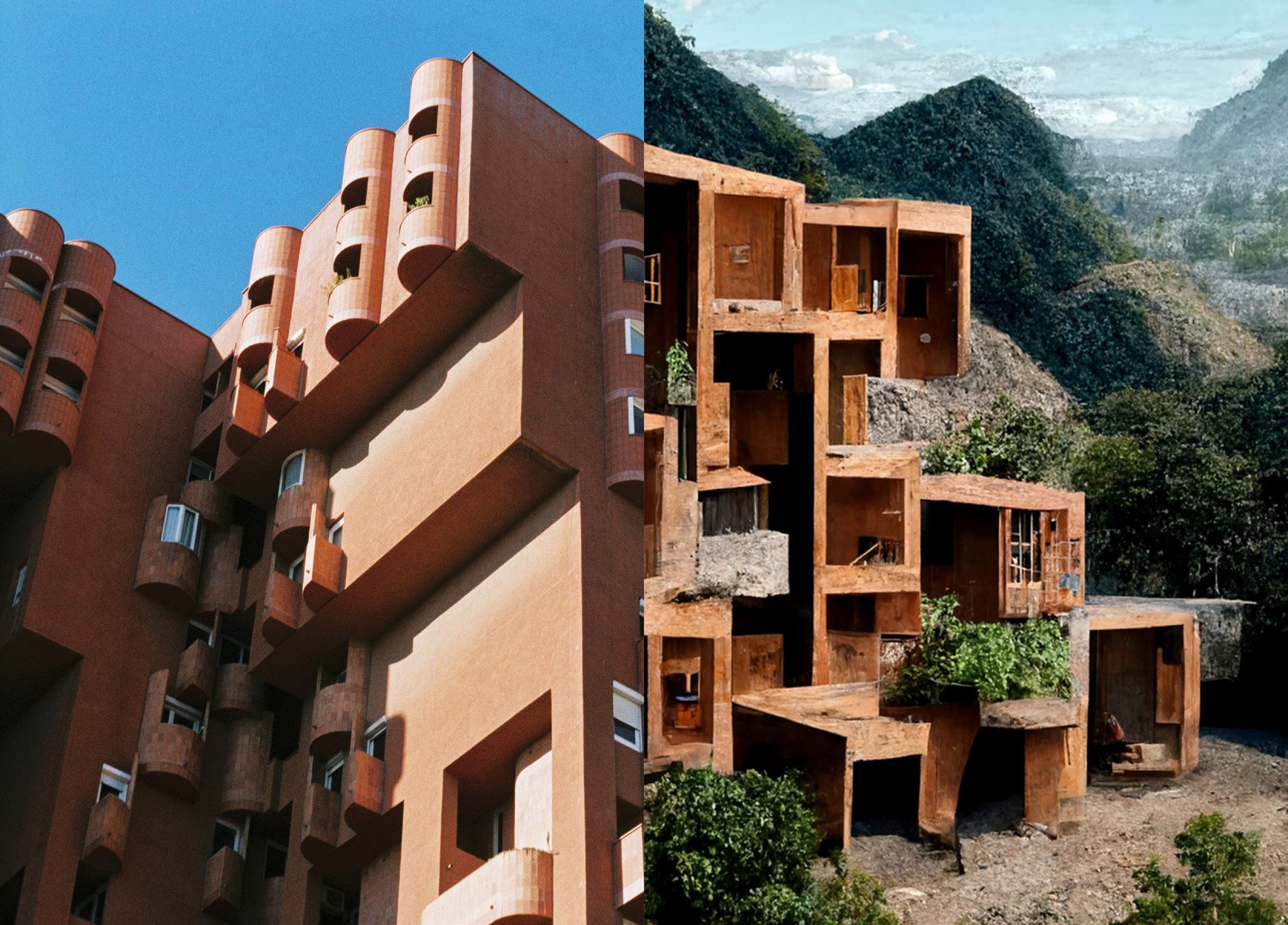
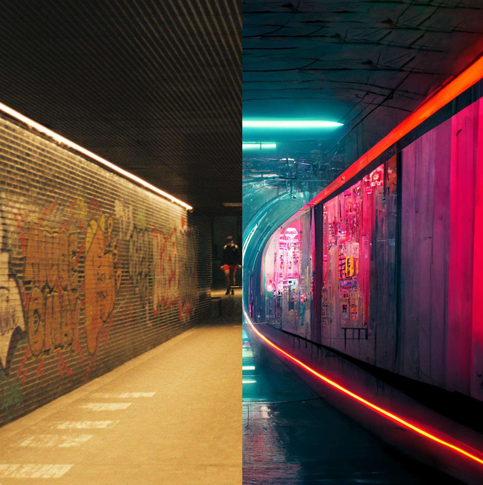
53 ANALOG VS DIGITAL. HOW I SEE THE WORLD VS HOW I IMAGINE THE WORLD


54 AI EXPERIMENTS WITH MIDJOURNEY VS 35MM FILM PHOTOGRAPHY


55


56 SKETCHBOOK

| SHOARQ 2018-2021 | | ETSAB 2021-2023 | | UFM 2015-2017 |


 THERMAL CAMERA GLASS
