
TABLE OF CONTENTS

NOBLE WEST
They’ll know us as hybrids. The ones that blend worlds. That daringly fuse art into nature. Creators of champions and mainstays.
ManFESTO
Never hung up by pomp or grandstanding, we live in the thick of it, showing patience under pressure, building endurance from longevity, and invention through pure disruption.

Fearless in our process, intentional through innovation, and unyielding in our evolution, we are the changemakers harnessing the potential of tomorrow.
Embodying the spirit of the past, we draw the blueprint of the future. Always urging progress beyond the current landscape, without losing sight of the big picture.
The conduit between attainability and the unimagined, we’ll lead by a singular triumphant touchstone— with noble hearts and westward thinking, nothing can stop us.
OVERVIEW

The Noble West style guide sets a holistic standard that defines our branding both internally and externally. How we communicate, design and represent Noble West through tone, logos, colors, visuals, word usage, and more can be found here.

“In the world of mules, there are no rules.”

Nash, American poet
THE MULE
A backbone of the agricultural world, mules are one of the most common working animals on the planet. Highly sought after, much like ourselves, mules are known for their hearty physical prowess and affable nature. They represent all that we hope to offer our clients at Noble West— sound reasoning, social prowess, pure endurance, and art that elevates nature.
Due to their inherent playful nature, mule references should be used sparingly and appropriately.
Brand
Articulation
How we communicate with our clients, peers and community directly shapes the connections we make. Sincere, experienced and fearless, we are the changemakers harnessing the potential of tomorrow through tone, visuals and voice.

POSITIONING
COMPETITIVE
Ambitious and candid, we use confident language that is always approachable yet engaging.
WHOLEHEARTED
Virtuous and determined, we galvanize our mission through language that tells a clear, authentic story.
INVENTIVE
Leaders and creators, we always use language that adds a sense of discovery and originality.
TONE PILLARS WHO WE ARE HOW WE DO IT
Purpose-Driven & Passionate
VIBRANT
Purpose-driven and passionate, our language is always meaningful, motivating and spirited.
Galvanize & Activate Soil-Born Stories
Candid & Thorough Engagement
WHAT WE DO WHY IT MATTERS
Creating Connections is How We Make Change
A collective of creative and strategic changemakers
NOBLE WEST
CORE
BRAND GUIDELINES

WORDMARK NOBLE WEST

STRAPLINE
Creators of champions and mainstays.
COMPASS MARK
LOGO MONOGRAM
NOBLE WE S T COLOR PALETTE
ABOUT OUR LOGO
Conventional or contemporary, we know clean lines. The Noble West logomark is classic, scalable and impactful. Easily identifiable, this logo is versatile and stylistically grounded ensuring it will stand the test of time.


LOGO + CLEAR SPACE
LOGO MARK + CLEAR SPACE


NOBLE WE S T
LOGO + URL + CLEAR SPACE


WEARENOBLEWEST. C O M
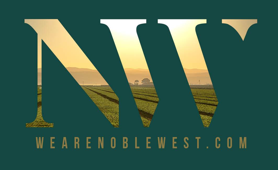
To distinguish the Noble West logo from other images, text and graphics, negative space should be utilized allowing the mark to have the fullest impact and highest visibility. The clear space around the logo must always be equal to or greater than the size of the “triangle” in the top right of “W”.

Our monogram, boxed logo mark is the definition of less is more. Used only when our branding has been clearly established, this sophiscated ‘signature’ is versatile yet substantial impact no matter its locale.
WEST WINDOW
Whether through macro images or micro, the NW windowpane will be a look into our work, our clients, and our world. Image selection can differ by season or by collateral but will be most impactful when animated or with video.


NOBLE
COLORS + Usage
Our signature colors are a warm blend of earthy tones, metallic touches and modern hues.
Forester is our main brand color and should be used in whatever we create. Not only does it work well with each of our other colors, it can be used to add dimension, depth, and contrast.
Onyx + Bedrock add neutrality and sophistication. They should be used consistently but never as the main color.
Gilded + Dusty are our secondary and most soil-born colors. While gilded is more golden, dusty is more claylike, each layering well with every color in the palette or standing alone for a richer effect.

FORESTER
R:20 G:71 B:62
C:88 M:50 Y:70 K:45
HEX: #14473e
ONYX
R:17 G:28 B:21
C:75 M:60 Y:70 K:80
HEX: #111c15
GILDED
R:145 G:121 B:65
C:40 M:45 Y:85 K:15
HEX: #917941 DUSTY 162, 104, 40
C:30 M:60 Y:100 K:15 HEX: #a26828
BEDROCK
R:221 G:219 B:219
C:12 M:10 Y:10 K:0
HEX: #dddbdb

LOGO + COLOR USAGE
Our authentic agriculture roots meet our modern mindset in both the logo and color palette. A little bit earthy with a splash of gold, our colors are tangible representations of our connection to the land. While our logo depicts our longevity in the field, the trustworthiness we have earned, and the expertise we offer.
NOBLE WE S T
WEARENOBLEWEST. C O M WEARENOBLEWEST. C O M


NOBLE WEST BRAND GUIDELINES

TYPOGRAPHY
‘‘ ”Paul Rand
Typography should be seen as a living entity; each element integrally related, in harmony with the whole, and essential to the execution of an idea.
BEBAS NEUE
Aa Bb Cc Dd Ee Ff Gg Hh Ii Jj Kk Ll Mm Nn Oo Pp Qq Rr Ss Tt Uu Vv Ww Xx Yy Zz
Josefin SansAa Bb Cc Dd Ee Ff Gg Hh Ii Jj Kk Ll Mm Nn
Pp Qq Rr Ss Tt Uu Vv Ww Xx Yy Zz
Cormorant GaramontAa Bb Cc Dd Ee Ff Gg Hh Ii Jj Kk Ll Mm
Oo Pp Qq Rr Ss Tt Uu Vv Ww Xx Yy Zz
Westward vision
Nam, aut mo quae cus sit rereces edigenis autasi ius velit am arumquodias vellabo re ruptatin consernatur, atqui dolupta des adi doluptium num lites et, arumquam faccupt

“It takes wholehearted courage to transform communities.”

Imagery

Tiusae nusam erchillam es ne esererum quam, sunt quod maximustium quis is sit velit lautem ipsantios dolecus. Soluptamusae nos et ea voluptam quaestrum aliquis aut as expelest verum ute nis simet voluptate perae cuscium, ali


OUT IN THE WILD
Nam, aut mo quae cus sit rereces edigenis autasi ius velit am arumquodias vellabo reruptatin consernatur, atqui dolupta des adi doluptium num lites et, arumquam faccuptEffrem dem, auc oc re que etius Catus horis. Graris audefau consullem quium ina, conimus peria pro habus vehebes

PRINT COLLATERAL


Lor miligent ut et exeria si dolorep eribus simin num facepro
Dear Miss Piggy,
Lorem ipsum dolor sit amet, consectetuer adipiscing elit, sed diam nonummy nibh euismod tincidunt ut laoreet dolore magna aliquam erat volutpat. Ut wisi enim ad minim veniam, quis nostrud exerci tation ullamcorper suscipit lobortis nisl ut aliquip ex ea commodo consequat. Duis autem vel eum iriure dolor in hendrerit in vulputate velit esse molestie consequat, vel illum dolore eu feugiat nulla facilisis at vero eros et accumsan et iusto odio dignissim qui blandit praesent luptatum zzril delenit augue duis dolore te feugait nulla facilisi.
Lorem ipsum dolor sit amet, cons ectetuer adipiscing elit, sed diam nonummy nibh euismod tincidunt ut

Sincerely,

Thank You
Glyph
Use the glyph to point to your presence on social media.
DIGITAL
Digital is where we let out our inner wild, wild West. Sharing our fun side and loads of personality, there is a casual nature to our language while our imagery stays consistently stunning.

A place to connect with our ever-growing agriculture community, Noble West emails should leverage stunning visuals to tell a story, supported by engaging copy that reinforces the content. We use our platform to build relationships that last and support our overarching mission.


Social
Based around informative content, our social style is always aesthetically pleasing, current and sincere.

