6 minute read
6.3 Design process


How can one be sure that the proposed design is the best outcome to reach a state of melancholic contemplation? The best degree of confidence I can achieve is through trying, testing, and using opposites (described in Section 5.4.3). The first phase was testing the projective design alternatives. Then, once a direction was chosen, each aspect of the design went through further iterations. The process illustrates the back-andforth nature of decision-making from the design guidelines to the design devices. Each decision necessitated another choice, which opened up the door to consider using the design devices to fulfill other aesthetic properties. I demonstrate the process by elaborating on two examples: Vanity Stair and Curio.
6.3.1 VANITY STAIR
Advertisement
I began with the task, which was to descend the terminal moraine to reach the water. The question was how? Trying, testing, and using opposites I narrowed down to three possibilities:
1. Traverse the moraine and drop down where there is a natural dip
2. Zig-zag down the talus slope from the viewpoint
Applying design guidelines For this task, two design guidelines appear to be immediately relevant: “orient to Haupapa” (5) and “amplify above-below connection” (6b).
g l a c i e r
t e r m i n a l m o r a i n e t e r m i n a l l a k e
A B O V E s e p a r a t e d B E L O W i m m e r s e d
3. Direct descent down the talus slope
Each option had implications for the aesthetic property:
1. No dramatic relationship between sky and earth, gradual decline, lack of orientation, simplest to build, functional. 2. Orientation keeps switching, amplifies the relationship of the path to the slope, challenging engineering (falling rocks etc.). 3. Dramatic connection between earth and sky, orientation to Haupapa, medium engineering challenge, meditative movement.
I chose Option 3 because it best met the above design guidelines. From there, I had to make two sets of decisions: how should the staircase descend and should it change in width?
How the staircase descends:
1. The staircase has no landings and descends directly down the slope. Width of the staircase:
1. Wider towards the bottom.
2. The staircase has landings and slowly moves away from the slope. 2. Same width.
3. Wider towards the top.
3. The viewpoint extends out to Haupapa and the staircase drops directly down.
Each option had implications for these/other aesthetic properties:
1. Perpendicular safety railings means that people have to weave down (their movement cannot be smooth), does not feel like there is any pause, comfortable to be next to the slope, simplest to construct. 2. Landings mean no perpendicular railings, rhythmic movement, movement away from the slope is like moving into the lost glacier, slightly uncomfortable to move away from the sense of safety of the slope, medium engineering. 3. Interesting as an art piece, attention is no longer to the glacier, but rather to the architectural feature, difficult engineering.
I chose Option 2 because it best met the above design guidelines as well as the desire for a rhythmic slowness. Each option had implications for these/other aesthetic properties:
1. Exaggerates the height, opens into landscape below, people might be tempted to climb back up, bottle-neck at the top. 2. Only room for a certain number of people side-by-side, won’t encourage people to climb up if people are coming down. 3. Diminished sense of height, funnels people down, people will be temped to sit at the top, blocked path at the top.
I chose Option 2 because it facilitated the one-directional loop. It would be disruptive to the flow of walking to have people sitting on the staircase, so seats should be provided elsewhere.
To decide upon colour and materiality, I explored the following options:
1. White 2. Black 3. A bright colour
Each option had implications for these/other aesthetic properties:
1. Angelic ascension into heaven, uplifting, monochrome 2. A dark shadow, ominous, monochrome 3. Fun, pop culture 4. Traditional New Zealand trail aesthetic 5. Changing, reflects Haupapa, reflects the weather, monochrome, camouflage, eerie 6. Dramatic effect, shooting stars
Option 5 and 6 were chosen. Option 5 elevates the stair to being much more than a functional object. Haupapa can look into the mirror as he ages. Allowing the staircase to be accessible at night allows the natural diurnal rhythms of day and night to contribute to notions of darkness, solitude, and silence.
By testing the brightly coloured staircase (opposite of melancholic), I confirmed that monochrome is an important non-aesthetic property for a melancholic aesthetic, because yellow does feel cheerful and might distract from the object of melancholic contemplation.
Final Vanity Stair combination 6.3.2 CURIO
Curio developed less methodically than Vanity Stair, but underwent its own form of trying, testing and using opposites. My task was to ensure that the design intervention was unique to this site and maintained relevance over time.
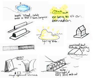
Applying projective design alternatives The concept emerged at the very beginning of the thesis as one of the projective design alternatives, “Monument”. It was a floating memorial to the glacier. The notion of a memorial generated discussion (see Section 5.1.3) that made me decide to avoid the label, but the idea of an island still seemed interesting. It expressed liminality (Bowring, 2016), interacted with the lake, was structurally interesting, could change position and perhaps be multi-sensory. I kept the idea, but put it on the back-burner.
As I developed the loop, I realized that the design needed a pinnacle, a moment that set it apart. The stair emerged first, but the stair literally moved the visitor. I wanted an element that would encourage the visitor to go all the way to the water and stop completely, the slowest state of all. The island emerged as a possibility for a pinnacle and a reason to stop.
I tried and tested many forms with different functions and associations:
Chaotically, they explored a series of opposites:
Should the element be accessible or not?
or
Should it reference natural or artificial forms?
or
Should it be skeletal or solid?
or
Or should it combine aspects (of all of them)?
I decided that the form should be an inaccessible sculptural element that can be programmed to emit different light and sound pieces. The inaccessibility prevents it from becoming a tanning island and a distracting source of envy. The sculpture embodies a melancholic solitude without people and surrounded by water. I chose a semi-natural form, namely, an abstracted iceberg because it is obvious in what it references, but uncanny because of its inherent artifice. I decided against artificial references because the feedback from my colleagues suggested that people might make distracting associations. I finally decided on a solid construction so that it would have body, not look industrial, and offer interesting possibilities for light.
For the colour(s), I explored the same palette as Vanity Stair, but arrived at a different outcome. I chose white with the possibility to be lit from the inside at night. White brings the element closest to Haupapa, making it the most melancholic of all. Light then instils it with a layer of artifice that ensures that the gesture is not misinterpreted as a ‘reconstruction’.
Final Curio combination
or or or + + + + or


