
BRAND IDENTITY

Brand Identity
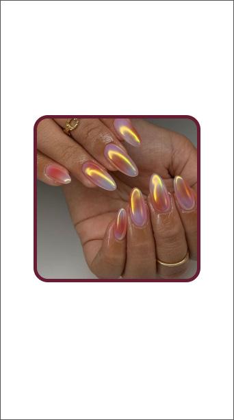
Our sunset colors evoke Outtacode’s bold and luxurious brand. A sunset color palette resembles an opportunity to start fresh. That all begins with finding your personal style.
Sunset is nature’s beauty so we want to inspire our audience to learn how to find their own unique style. Fashion sparks conversation and unfolds anyone’s authentic personalities.
Beauty is unique to everyone and can come naturally just like a sunset.
Brand Personality

Brand Personality
Authentic
Vibrant

Logo
OUR LOGO
OuttaCode logo is composed of our two fonts Proxima Nova Medium and Editor’s
Note Italic. The horizontal logo is the primary logo and should be used in most cases. The stacked logo is the secondary logo and should be used for smaller spaces like the Instagram icon. Always use the logo files. Do not re-create.
Logo

Secondary Logo

Primary
LOGO SPACING
Exclusion zone is logo spacing and it ensure legibility and recognition of the logo. This ensures proper spacing so that text and graphics don’t overlap it or placed to close to it. There should be enough breathing room around the logo. A good practice is using the size of the “O” or the height of the lettering as a guide for the spacing around the logo.
Primary Logo
Secondary Logo
USAGE ON BACKGROUNDS
Colored logos should only be used on white backgrounds and white logos should be used on colored or gradient backgrounds.


LOGO MISUSE
What not to do for logo usage
Do not use drop shadow x

Do not use gradient x

Do not rotate the logo x

Do not use two different colors for each word x
Do not use an outline x
Do not misalign the logo

Typography
TYPEFACES
Primary typeface is Editor’s Note best used for logo and headlines. Secondary typeface is Proxima Nova and it is best used for body copy and sub-copy.
Primary Typeface
Editor’s Note Regular
Editor’s Note Italic
Secondary Typeface
Proxima Nova Bold
Proxima Nova Semibold
Proxima Nova Medium
Proxima Nova Regular
Proxima Nova Light
TYPOGRAPHY HEIRARCHY
Fonts can be paired together to create visual hierarchy and emphasize headings. This can be achieved using various fonts, weights, sizes, and color. Hierarchy is one of the most important considerations in design.
Your Heading Goes Here
Lorem ipsum dolor sit amet, consectetur adipiscing elit, sed do eiusmod tempor incididunt ut labore et dolore magna aliqua. Ut enim ad minim veniam, quis nostrud exercitation ullamco laboris nisi ut aliquip ex ea commodo consequat.
Your Heading Goes Here
Lorem ipsum dolor sit amet, consectetur adipiscing elit, sed do eiusmod tempor incididunt ut labore et dolore magna aliqua. Ut enim ad minim veniam, quis nostrud exercitation ullamco laboris nisi ut aliquip ex ea commodo consequat.
art form Fashion is an
dedicated for anyone to express themselves freely and openly
This is an example to use for the website. Editor’s Note should always be used as a heading so that it stands out from body text. for the website. Eyebrow text is used is as a keyword and should be a smaller font in bold weight.
In some occasions, Proxima Nova with a bold weight can be used distinguish heading and body text. Body text should used be used with a light or regular weight Proxima Nova font.
Italics can be used to emphasize important words in a body of text for Instagram posts and website.
EYEBROW
TYPOGRAPHY DONT’S
Not all font combinations work well to emphasize information and for clean readability. Take font decorations, font size, and accessibility into consideration when pairing fonts.
EYEBROW Your Heading Goes Here
Lorem ipsum dolor sit amet, consectetur adipiscing elit,
sed do eiusmod tempor incididunt ut labore et dolore magna aliqua. Ut enim ad minim veniam, quis nostrud exercitation ullamco laboris nisi ut aliquip ex ea commodo consequat.
Do not use Editor’s Note as an eyebrow text. Eyebrow texts are often small and lighter in color so an easier font to read, Proxima Nova, is a better choice.
EYEBROW Your Heading Goes Here
Lorem ipsum dolor sit amet, consectetur adipiscing elit, sed do eiusmod tempor incididunt ut labore et dolore magna aliqua. Ut enim ad minim veniam, quis nostrud exercitation ullamco laboris nisi ut aliquip ex ea commodo consequat.
Do not use more than two of the primary colors together. Mix in neutrals otherwise the layout will be too busy.
EYEBROW Your Heading Goes Here
Lorem ipsum dolor sit amet, consectetur adipiscing elit, sed do eiusmod tempor incididunt ut labore et dolore magna aliqua. Ut enim ad minim veniam, quis nostrud exercitation ullamco laboris nisi ut aliquip ex ea commodo consequat.
Do not use all of one type of weight (except if it’s all regular) for all the different font types. This is an example to not use italics for every type of text.
WEBSITE
These are the fonts to use for the website. Apply the same suggestions for typography heirarchy to the website.
Heading
Editor’s Note Regular
Editor’s Note Italic
Subheading
Proxima Nova Medium
Body
Proxima Nova Bold
Proxima Nova Semibold
Proxima Nova Medium
Proxima Nova Regular
Proxima Nova Light
How to style outfits for concerts
Look your best and feel comfortable all summer long with our best concert fashion picks.
Lorem ipsum dolor sit amet, consectetur adipiscing elit, sed do eiusmod tempor incididunt ut labore et dolore magna aliqua. Ut enim ad minim veniam, quis nostrud exercitation ullamco laboris nisi ut aliquip ex ea commodo consequat.
BUTTON
INSTAGRAM POSTS
Font pairing suggestions and how to use fonts with images

Shanyah’s Summer Favorites
How to start your summer in style

Mix and match fonts and refer to typography heirarchy
Travel Essentials Guide

If background images are very busy, add a background color to the text so that text is readable
NYC Meet Up
Time: 4:00-6:00 PM
Where: Central Park
RSVP By: April 24 2024 with Outta Code
Break up text with right-aligned and leftaligned paragraph styles
What you wear is how you present yourself to the world, especially today, when human contacts are so quick. Fashion is instant language.
Use text over a plain background to communicate quotes
INSTAGRAM STORIES
Font pairing suggestions and how to use fonts with images


Shanyah
Styled by

Color
BRAND COLORS
HEX: #21304A
33,48,74
55,35,0,71
0,0,0
HEX: #671C32
103,28,50 CMYK: 0,73,51,60
HEX: #67356f
103,53,111 CMYK: 7,52,0,56 HEX: #D41E3F
212,30,63
255,135,69
0,47,73,0
0,86,70,17 HEX: #FF8745
#FCCEBF
252,206,191
0,18,24,1
GRADIENTS
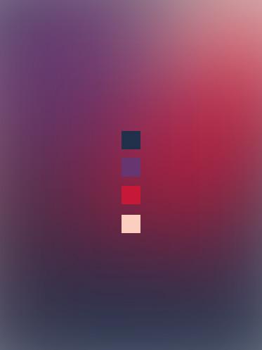
Gradients resemble a sunset. They are created in a mesh gradient style and 3-6 of the brand’s 6 colors should be used at a time.


Best Boots for Fall

ACCESSIBILITY
Color contrast should pass accessibility for web design. This also applies to graphic design because accessibility checks ensure clean readability. Darker backgrounds should be paired with a light colored foreground (commonly the font).
Light weight font with dark background
Bold weight font with dark background
Light weight font with light background
Bold weight font with light background A A A A
A A A A A A A A A A A A A A A A A A

Imagery
COLOR BLOCKING THEMES
Themes for Instagram feed will be pre-planned and coordinated in threes.
9 posts for 1 color
6 posts for 1 color
3 posts for 1 color
PHOTOGRAPHY
Photography for our brand are original images. Stock images should be avoided but only used when really have to. Create variety by using various camera angles, photos of people vs. objects, and experiment with lighting. Most of the images should also stick to a specific color palette according to the themes. Coloring for the themes don’t have to be the same as the brand’s 6 colors.


