

PAGE | 15
PAGE | 19


PAGE | 15
PAGE | 19

The French Institute in Egypt occupies an early twentieth century palace in Mounira district, South of Downtown, housing both its administration and cultural facilities. Mediatheque (its public library) was remodelled in the 1990s adding a mezzanine floor to the spacious ground floor hall. In tune with the new trend of public libraries in France and Europe in general, Mediatheque management wanted to remodel the library space to be less of a depository of books and reading tables, to become a “third space” between a reading and learning room on the one hand, and a space for social interactions, exhibits and events on the other.
The project includes a central space promoting the distinct French culture, including art and architecture, fashion and their culinary industry. The space was designed to include fewer book stacks, to allow for more exhibition areas for new releases as well as more relaxed arrangements of lounges and coffee outlets. Other spaces include children and youth spaces with state of the art display and digital learning methods. The upper floor includes a language section, as well as an area for scholarly research, social sciences and French literature.

LEAD DESIGNER AND PROJECT COORDINATOR
CLIENT: INSTITUT FRANÇAIS D’ÉGYPTE


Cathedral Hall: Lounge (GF-01b)

1. 3m shelving unit (2 levels)
2. LCD display
3. Copying machine
4. Subscription and help desk
5. Conviviality table
6. High sitting table (2 computer stations + 2 tablet stands)
7. Coffee machine
8. Magazine display (2 levels) (20 cabinet lockers)
9. Lounge seating area
10. Secure storage and charging unit
Required: 600 comic books + 20 journals
Provided: 600 comic books + 20 journals
Cathedral Hall: Entrance (GF-01a)
1. Reception and information desk
2. 1m bookshelf units on casters
3. Standing computer consultation desk
4. Glazed niche
5. Automated lending/returning system
6. Seating area
7. Movable display units (2 x 0.7 m)
8. Trolley
9. Anti-theft RFID device
Required: 6 bookshelf units (1100 books)
Provided: 6 bookshelf units
3 display units (675 books)
 New Staircase: Plans (ground floor)
New Staircase: Plans (first floor)
Niche: Plans (low cut: top, window cut: bottom)
Niche: Section A
Niche: Section B
Niche: Elevation A Niche: Elevation B
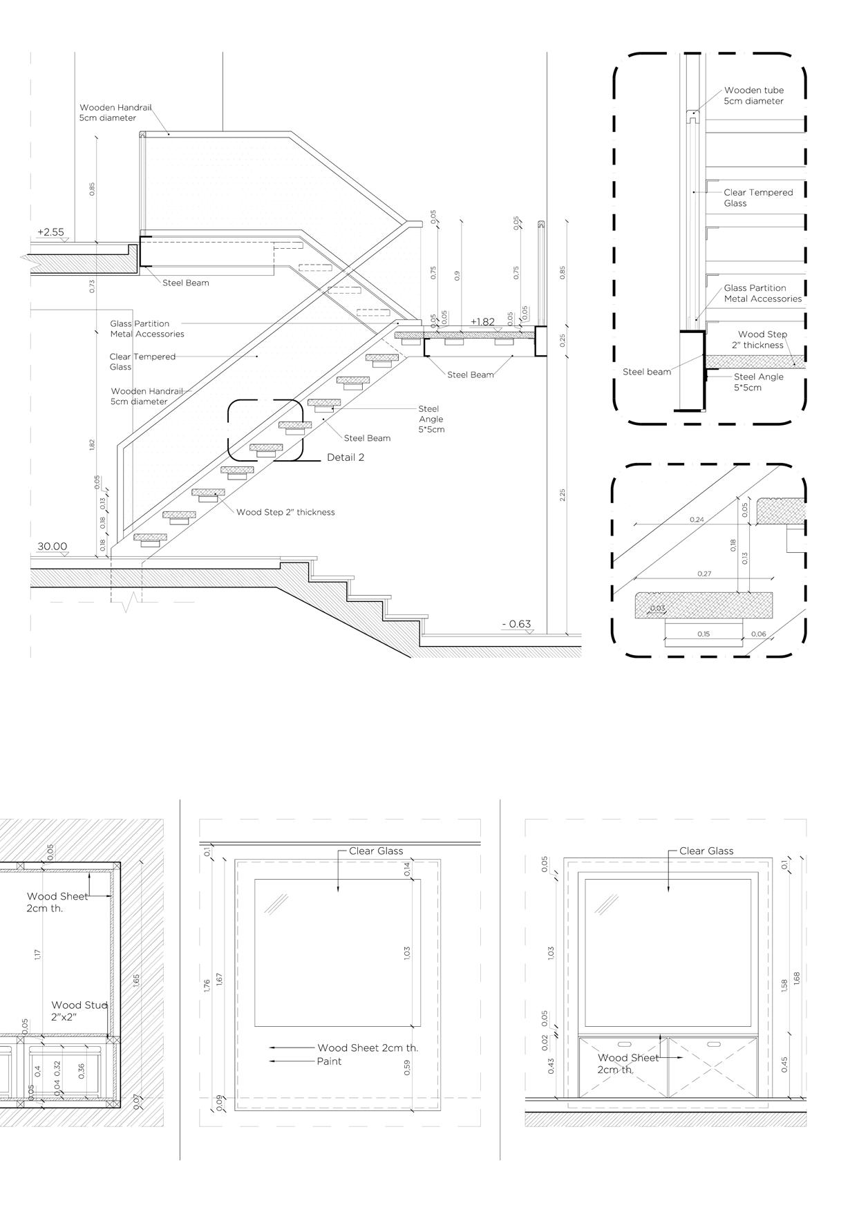
After all infrastructural work was complete, the finishing aspect of the project required the most attention from the CLUSTER team, in order to achieve the simple aesthetic so rarely implemented in the country. Where in the majority of interior design projects, corners and edges are covered and decorated in order to hide mistakes, the project sought to be as contemporary and minimally executed as possible. This is most apparent in the wooden niches, and their flat and basic connection with the plastered walls they’re nestled in, where only a thin line carved in the wood seperated the two materials. This endeavor proved a challenge and despite resistance, due to current construction trends, was successfully implemented by the end of the project.
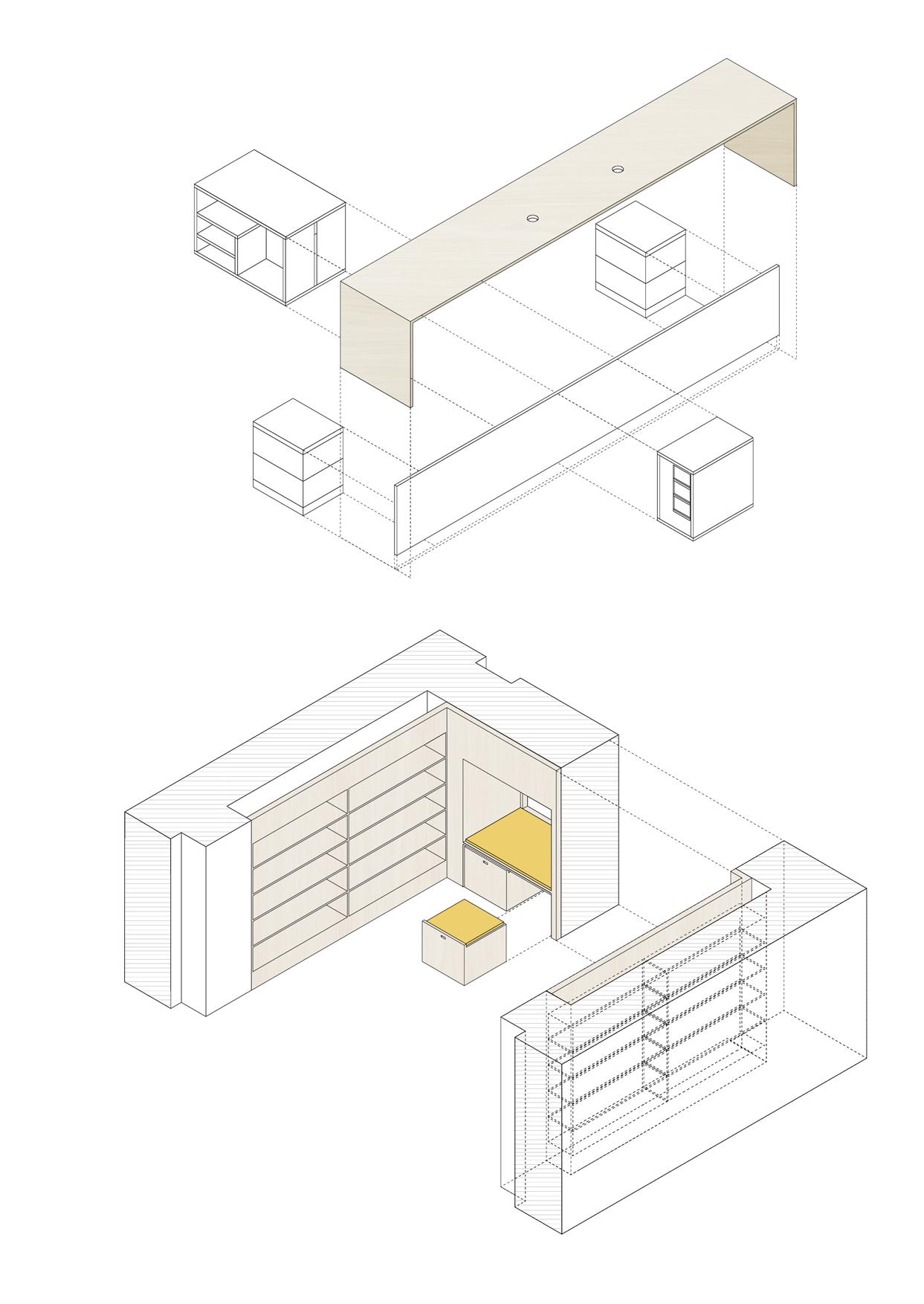
As the construction stage came to a close, it was time to see to the library’s furniture. The furniture of the library was divided into 1) custom made pieces which the CLUSTER team designed and reviewed with the users of the space, 2) local purchases and 3) purchases imported from France. The coordination required between the three categories, making certain that they all follow the same design theme and do not clash, was what made this stage a unique challenge. An exemplary piece of custom made furniture was the wide reception desk, which went through many different iterations during the team’s reviews with the management of the Mediatheque, until it reached a form that can now be said to meet the needs of the library’s staff and users.
 Cathedral hall: exhibition atmosphere
Furniture detailing: main desk
Furniture detailing: niche
“I am thinking of a complex superstring museum with at least eleven dimensions: the classic ‘white cube’ with straight walls, as well as the black box for video art; chapels, dream departments, gardens, house museums, labs, media museums, mobile museums, contemporary museums, artists museums, and antimuseums.”
—Hans-Ulrich Obrist, Artistic Director of the Serpentine Galleries in London (from The Museum of the 20th Century’s competition brief)
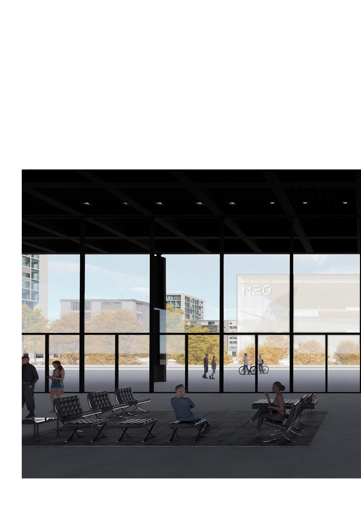
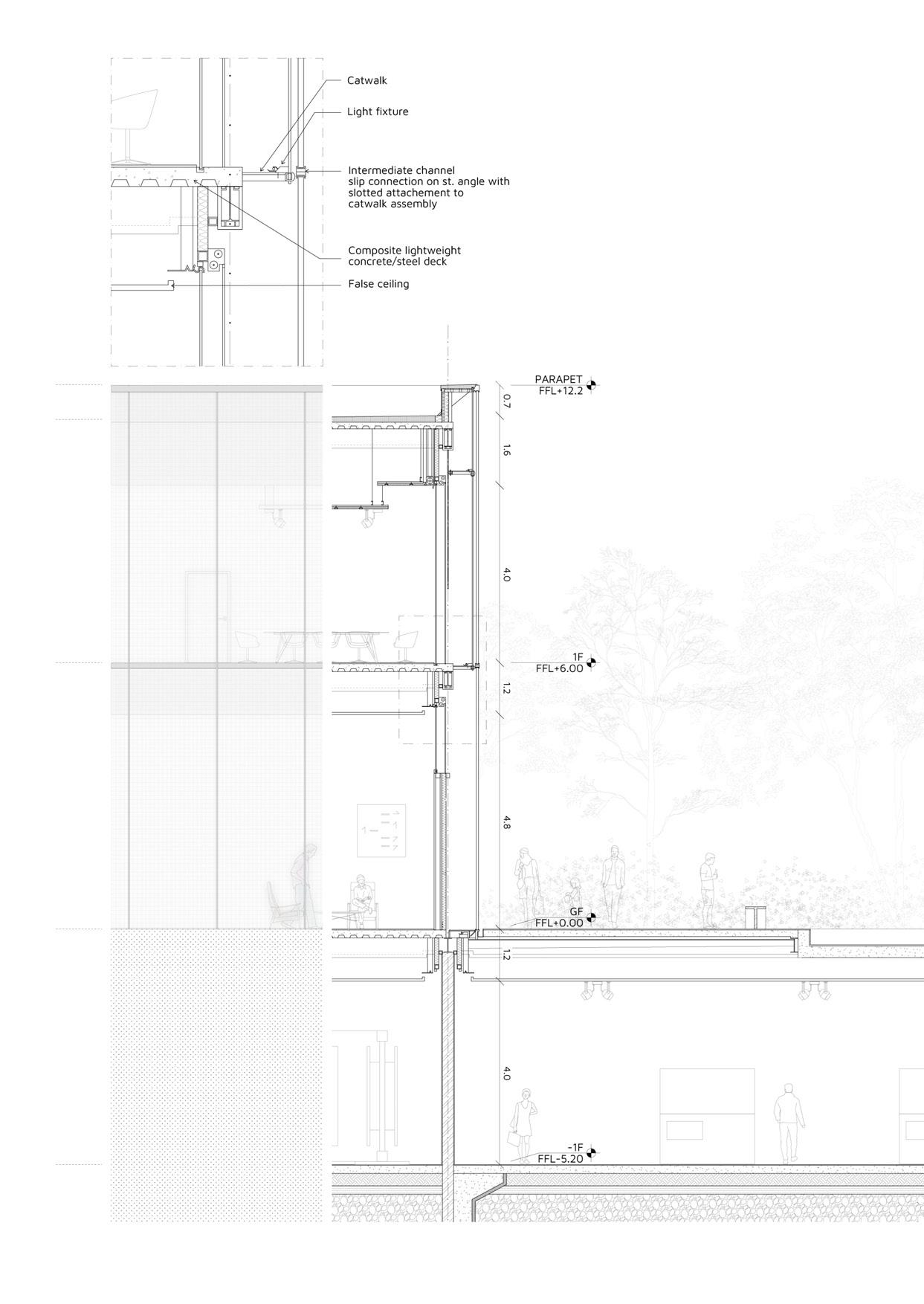
An alternative vision to Mies van der Rohe’s Neue Nationalgalerie is presented. While the existing structure is known for its transparency and simplicity in form. My proposal focuses on practicality rather than aesthetics, introducing a objet trouvé that serves the purpose of framing collections. While the Neue Nationalgalerie’s empty space allows for various exhibition formats, it actually proves to be limiting as artistic mediums diversify and museums face budget constraints. The Staatliche Museen zu Berlin, in particular, struggle to utilize the iconic space’s climate, lighting, and versatility for staging exhibitions,
and the constant transformation of this empty canvas comes at a high cost. Consequently, rather than offering freedom, the result is a feeling of confinement within a glass enclosure. To avoid this dilemma, The Museum of the 20th Century embraces a fresh concept of gallery flexibility. It sidesteps the aforementioned pitfalls by providing complete adaptability without additional operational expenses. Instead of a blank canvas, The Museum offers integrated tools that act as a backdrop or framework for curators to work with.


Triple height space for large installations Most spacious and well lit part of the M20

Winding ramps provide both an accessible movement through the M20, and an anticipatory one from light to dark spaces and vice versa
Entrance to the extensions is at the end of the Neue Nationalgalerie, transitioning from the open space of the garden to the dark underground space of sculptural work of the M20
double heighted spaces bathed in light from above, to darker more confined spaces - all accessible through serpentine ramps wrapping around the structure

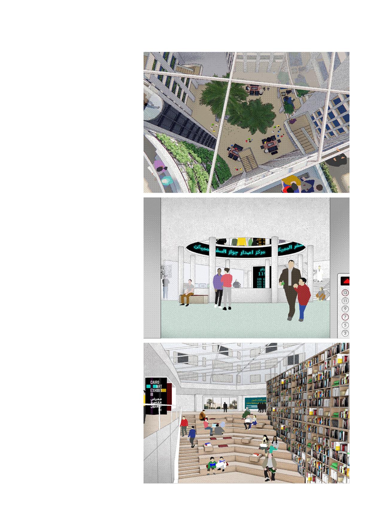
This project, created to be published online as part of Mada Masr’s provocations towards our urban reality, seeks to explore the adaptive re-use of Cairo’s largest civic service hub. This being Mugamma’ al-Tahrir (al-Tahrir Complex), which exemplifies the current process of the relocation of government functions outside the city center. This effort seeks to propose an alternative methodology for tackling urban development in Downtown and Cairo at large, highlighting different possibilities for the city’s future. Through the following series of images, we propose a mixed-use renovation for the building that seeks to re-establish it as a civic center, deeply intertwined in the city’s public life.
Through each design consideration, we present an overarching methodology, provoking questions such as: How should decisions about the urban environment be made? Who is involved? How do we understand the distinction between local and national scales? And how can a diverse ‘public’ and a private sector with multiple interests and different stakes collaborate and negotiate their needs in the city? Could the Mugamma‘, with all its symbolic meaning and historic layers, offer an example of a common ground?
 Imagining the Mugamma's multifunctionalism through a tetris-like model
CLIENT: MADA MASR ONLINE NEWSPAPER
POSSIBLE FUNCTIONS OF THE MAIN PLAZA
AFFORDABLE HOUSING


The building is recessed in such a a way that it views both valleys at either facade of the building, providing maximum views to the riprarian and forest areas present around Baltscheider. Additionally, the apartments are arranged with common social spaces in between, primarily the courtyard that would provide light, ventilation and a central green space, resulting in a structure that leaves room for residents to care for their context collectively.
Finally, with the mountainous context and the rural nature of the area, the design is envisioned with timber materiality that is locally sourced, and a concrete skeleton structure from nearby quarries. This project thus aims at creating collective methods for both social and ecological minded cohabitation.
Apartment building and shared garden visualizationCLIENT: GEMEINDE BALTSHIEDER, KANTON VALAIS


Greater Cairo, a megacity of approximately 18 million, faces daunting traffic jams and severely polluted air. Responding to the city’s transport challenges, the Cairo governorate (an administrative region, similar to a state or province), in partnership with the United Nations Human Settlements Programme (UNHabitat), Drosos Foundation, and ITDP Africa, are planning a bicycle sharing system for central Cairo. In its first phase, the system will have approximately 700 cycle lanes spread across the downtown area. Bicycle sharing has the potential to improve accessibility by extending the reach of the metro and bus systems and provide a low-cost option for short trips in the center of Cairo.
Our role was to establish a detailed design of bike lanes, retrofitted to the street infrastructure of Downtown Cairo. Through analysis of the Egyptian street design code, as well as international examples and codes, the design establishes one way bike lane movement within the street network, sensitive to the historic context, and with minimal effect on traffic. In addition, the design was inclusive of intersection design and its many aspects, such as pedestrian curb ramps and crosswalks. The outcome also included a printed user-friendly pocket guide, a proposed common Cairene bike lane design code, and a maintenance guide.
 Proposed intersection design of 26 July st. and Muhammad Farid st.
CLIENT: UN-HABITAT AND CAIRO GOVERNERATE

Cairo Downtown’s bikeways and urban furniture projects was based on a framework of social regeneration in Downtown previously established by CLUSTER. One of which is Downtown. One result of which was the successful renovation of Kodak Passageway. This design project falls within the context of a research endeavor by CLUSTER, exploring the network of Cairo’s Downtown passages. These passageways offer an alternative framework for the development and revitalization in the area.
A culmination of a four-day workshop which resulted in a design established with the local stakeholders, CLUSTER’s designs emphasize a more diverse, safer, and environmentally enhanced experience in the passageways. The “Green Oasis” transforms Kodak into a pedestrian park, a landscaped, peaceful refuge featuring the revival of original 1930’s art deco light fixtures and custom designed walkway.

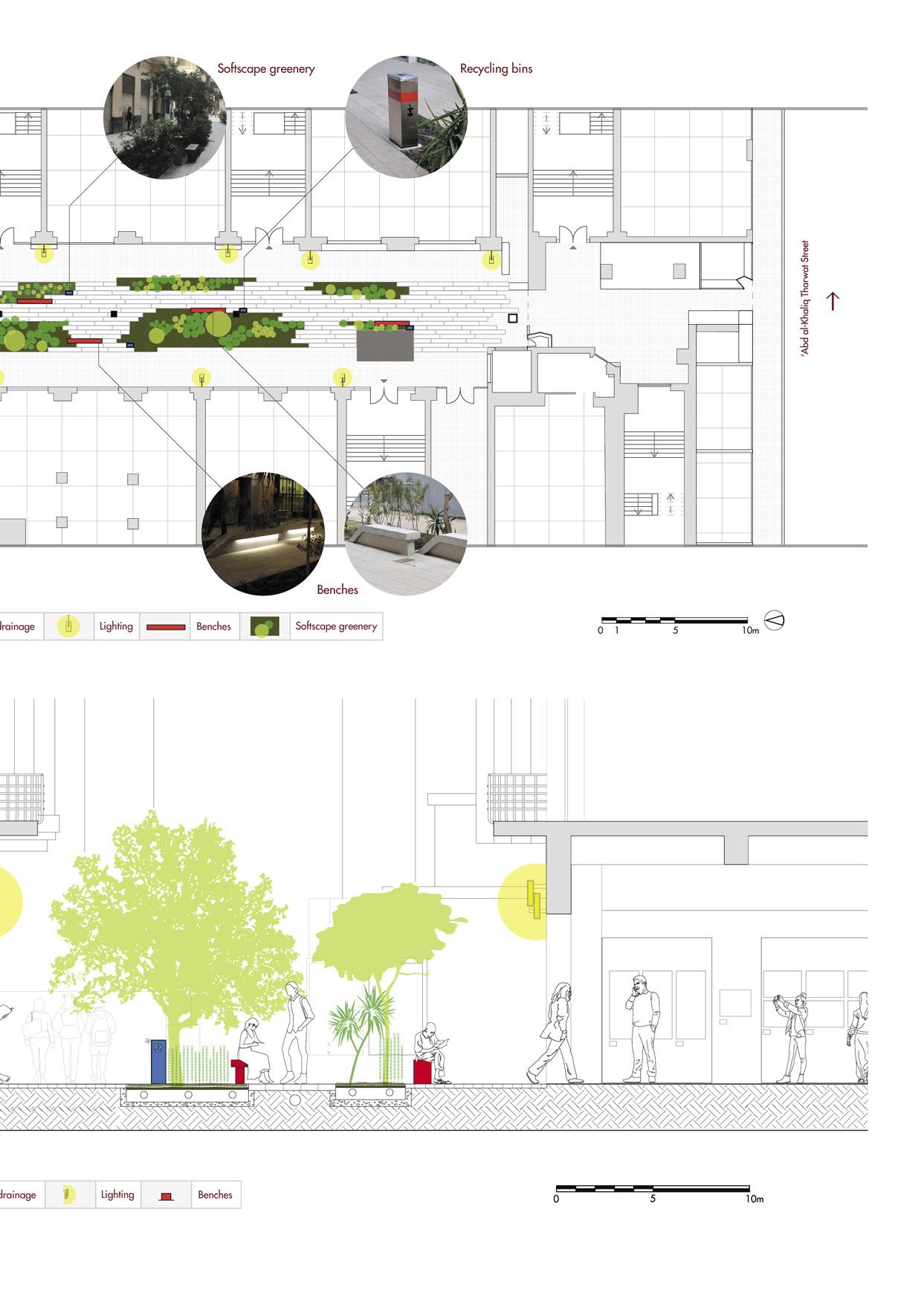 General layout of Kodak Passageway
An urban design project in the neighborhood of Karmous in Alexandria, the project aims to subvert the negative reputation of the area as a ‘slum’ with drug and gang violence issues, and restore its reputation as a center of art and culture, utilizing the infamous symbol of the Egyptian pigeon coop as they are especially dense in the area.

Existing building unit found in Karmous
Proposed building unit in the urban extension
Basic flattened levels
Variation in levels: distinction through shared spaces
Disconnected light shafts
Adaptation to improve lighting and ventilation
Separate circulation and infrastructure
Joining to create more common space and throughfare
Rethinking the informal building units design to create a unit that responds to others within its block

Karmous is a district caught in a decedant cycle, while offering spaces available its urban expansion. Our aim is to expand on the established fabric, in an effort bring forth an idea of better use informalized space. An expansion of new homes and of Karmous’ rich cultural identity, built from a perspective unlike that of the familiar yet estranging planning of the Egyptian military.

Interior courtyards, or ‘sahn’ in Arabic, are an icon of traditional islamic architecture of the area. A quality which has been lost over time as privatization and profit maximization became the main driver for informal development.
The Karmous expansion will include inner courtyard as a rule within building blocks to provide better lighting and ventilation. This forms a core to the buildings around which common rooms are oriented and where ground floor social spaces intersect.
Ground floor plan of a typical block, showing the social functions occuring in its open spaces Atypical floor plan of a typical block, showing the heterogeneity of differently sized apartmentsdecedant for expand to of new cultural unlike estranging military.
Arabic, islamic which privatization the development. an building and the rooms floor


“The city was turning single, almost unbroken mass of construction. said that in those days possible to go all from the bell tower to Santa Maria del roof to roof without to come down”
Solà-Morales, Ten Lessons on Barcelona, 1975
Rooftop network plan (left) and the different layers of intervention (right)turning into a unbroken construction. It is days it was the way tower of El Pi Mar from without having Barcelona,
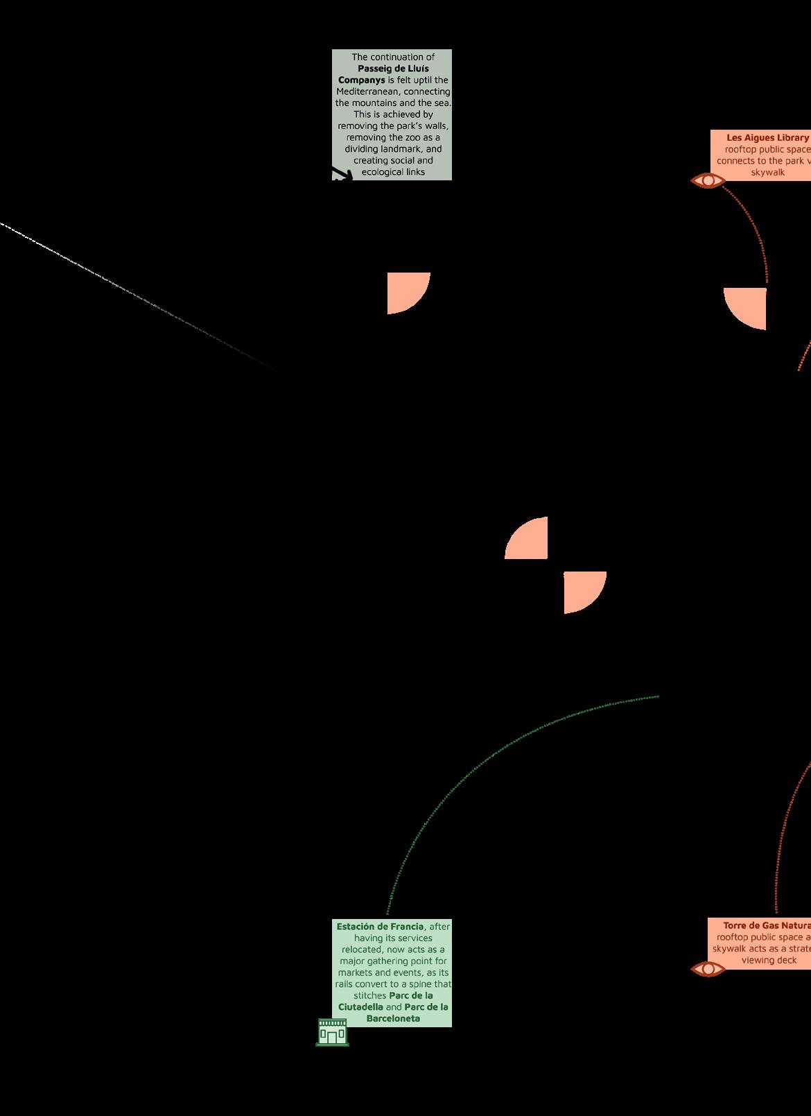
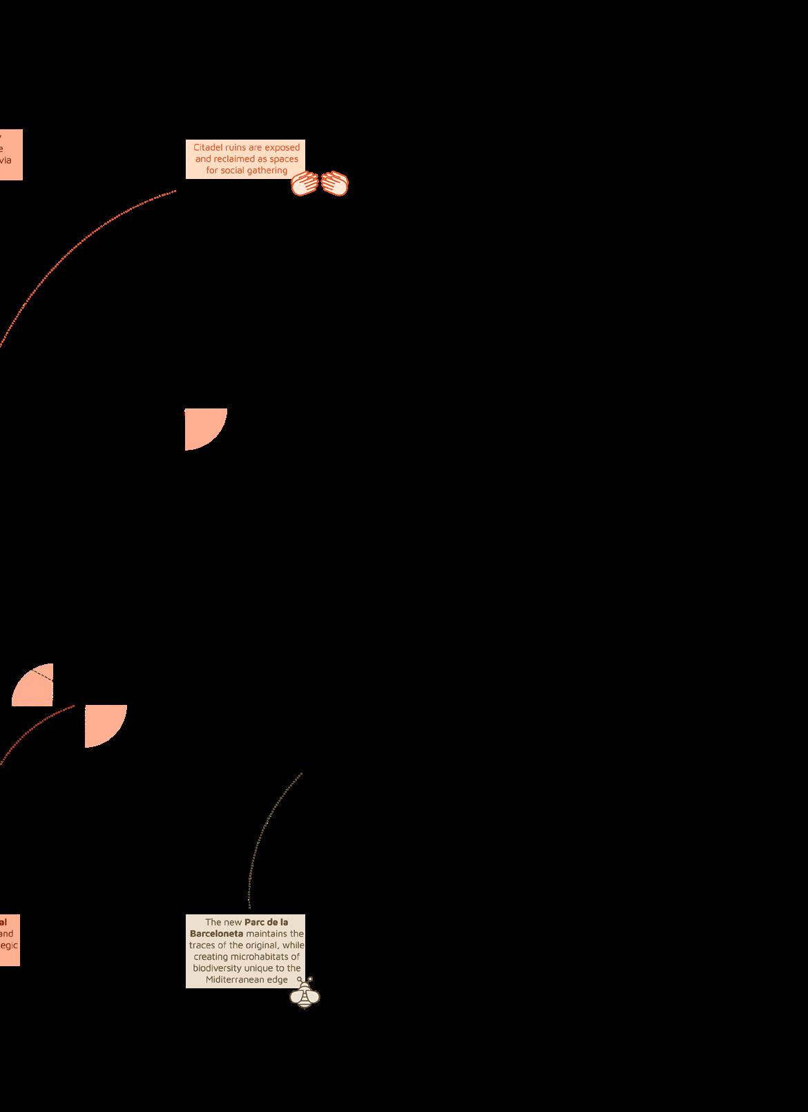
The masterplan first sought to establish the underground and ground level areas of intervention inside Parc de la Ciutadella and the removed Barcelona zoo, following the traces of the demolished citadel. The second level of intervention was at the rooftop level, and the focus of this thesis. In this arc of the proposal, certain rooftops capable of hosting public activities were targetted and incorporated in a scheme to connect Parc de la Ciutadella, it’s resurfaced walls of the first intervention, and its surroundings through a series of vertical structures and pedestrian bridges, or skywalks. The third level of intervention was to and through Estació de França, as its functions were to be moved elsewhere to another train station by the state. It would then serve as a monumental multi-purpose building in the area. The final level involved the continuation of the axis of Sant Joan, and the layout of the new Barceloneta public space. This arc of the project focused on extending this part of the beach inwards and creating an area powerful enough to be considered the end of this axis of Barcelona and a link between Parc de la Ciutadella and the sea.
Besides the show of different proposals, the group goal of connecting Sant Joan to the sea front through the train tracks and the ring road is demonstrated, as well as the idea of having the monumental buildings in this region of Barcelona play a larger role in the planning of our proposed paths, public spaces and skywalks.
 Close-up of Les Aigues Library's rooftop public space, and skywalk plan and isometric



Greater Geneva landscapes

Hydrography
Ecological corridors
Agricultural land
Current urban areas
Future urban planification
Railways
Road Networks
Quarries and Greenhouses
Today, the city and the rural remain separate entities in terms of functions, whereas ecosystem services manifest in the two areas differently, highlighting an unbalanced relationship. The city continues to act as a consumer of the rural. On one hand, the urban utilizes the gravel extracted from the countryside, while shaping it with construction waste. On the other, agriculture has evolved to be an industrial practice. In this light, food and material production, as well as waste management, become more disjointed from urban inhabitants’ daily lives, while on the ground, these areas of mass production act more and more as isolated gaps in the ecosystem at large.
The landscape of Greater Geneva is a prime example of this stark divide, where the metabolism of the expanding city is defining the shape of the countryside, dotting the border with sites of industrial extraction and utility. By leveraging soil as a tool for a bottom-up approach to production, recreation, and habitation sustained by circular cycles of material movement, the political border can become a site for reciprocation and integration with the landscape, rather than a separator.

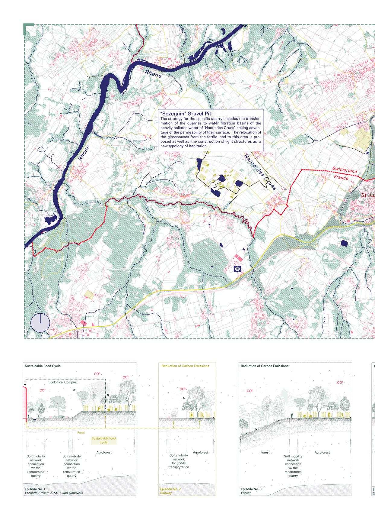 The border from a seperator to a generative connector
Sections of ecosystem services in the regenerated landscape
Glasshouses
Communal gardens
Proposed green corridors
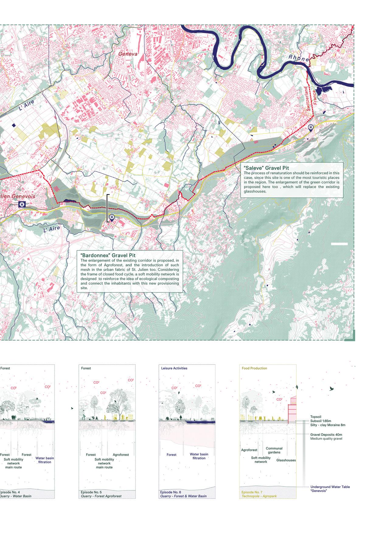
Existing green corridors
Hydrography
Urban fabric
Political border
Railway infrastructure
Soft mobility network
Proposed train stations

Urban areas
Forestry
Agricultural land
Current solidarity agriculture practices their co-operative members and their respective food depots
The been an ever-increasing continues maintained agriculture agricultural through We take its potential canton. agroecological smaller-scale
Imagined future where agroecological arms of solidarity agriculture embrace the landscape and the city

family farm, touted as a cornerstone of Swiss tradition, has been facing increasing pressures in face of contentious policies and ever-increasing market demand. While the cultural landscape continues to be thought of as a separate category of islands maintained for leisure and biodiversity in the midst of intensive agriculture in the Mittelland. Under the challenges faced by the agricultural sector, we believe an alternative future can be fostered through embracing the practices of community-supported agriculture. take the focus to the city of Zurich, its land-use categories, and potential as a socioecological driver, ultimately impacting the canton. In this vision, an agriculture of solidarity reaches out agroecological arms through the periphery, bonding between smaller-scale social hubs in the city and the agrarian countryside.
The fostered community enacts a change both in their mindsets and on the ground. This will be most evident in the more meaningful, and simultaneously productive, biodiversity connections that will weave through a polycultural mosaic of farmland, not ruled by an arbitrary percentage, but by the specificity of the context. What ecological and social landscapes emerge from a food system driven by solidarity rather than by the economy?
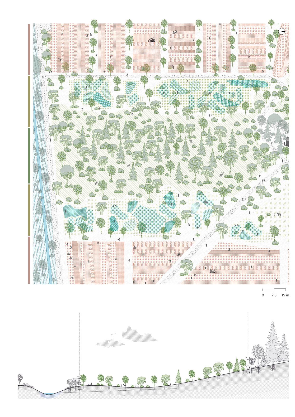
Urban: Public Neighborhood: Semi-public Neighborhood: Semi-local

Seebachplatz tram stop
Parking lots
Sealed surfaces in the process of regeneration
Self-harvesting
Pixel Agriculture SoLaWi Depot
Depots and open market
Pixel farming
Urban biodiversity hotspot
Agroecological island of Katzenbachweg