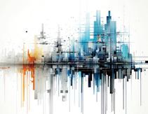
File open for jpg image to start on manipulate the image. Selection tool I used to manipulate the objects in image include, lasso tool, quick selection tool, and quick selection tool. I then use the adjustment layer, and primarily used hue saturation, to change color of the object, and black and white fill to make the image color desaturated.
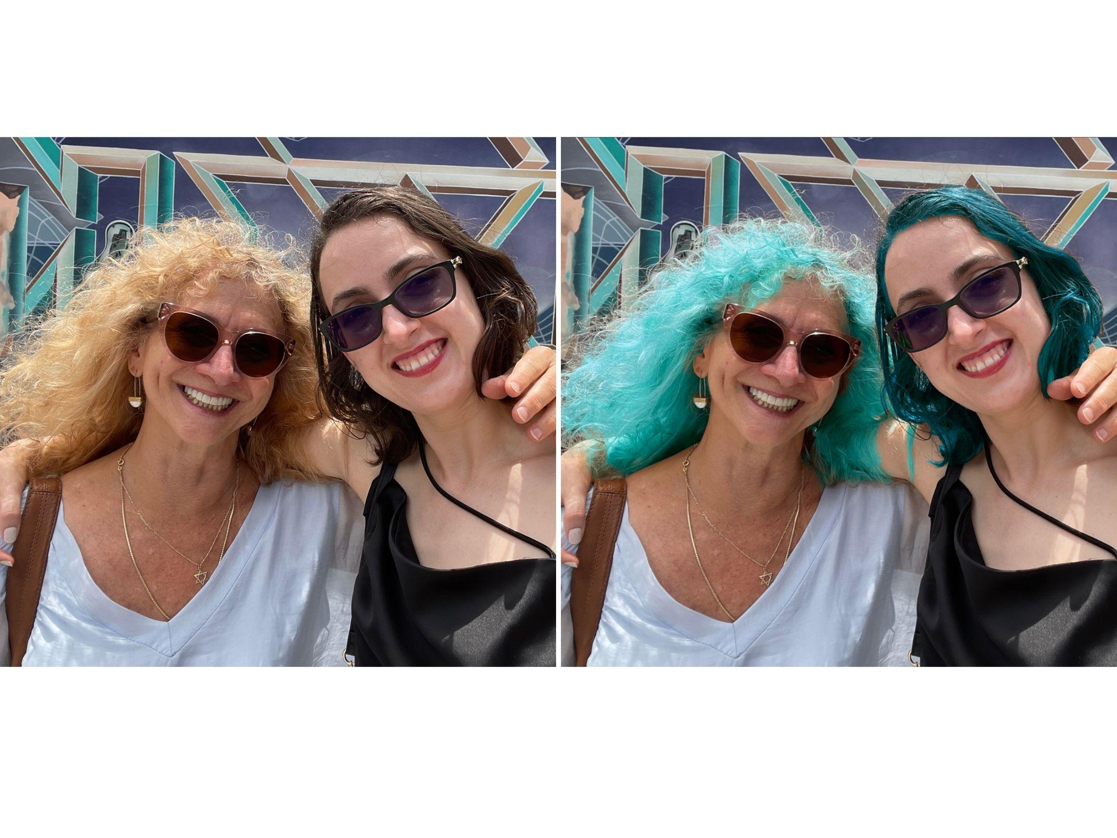
The first tool I used for the photo of my mother and I is a ‘quick selection tool’ to select the majority of our hair. Then, I click on the ‘select and mask tool’ to use the ‘refine edge tool’ to pick up small strands of my mom’s hair after which I scroll down and use the output on ‘new layer and new mask’ and finish off with the adjustment tool for ‘hue/ saturation tool’. Done the same process on my hair as well.
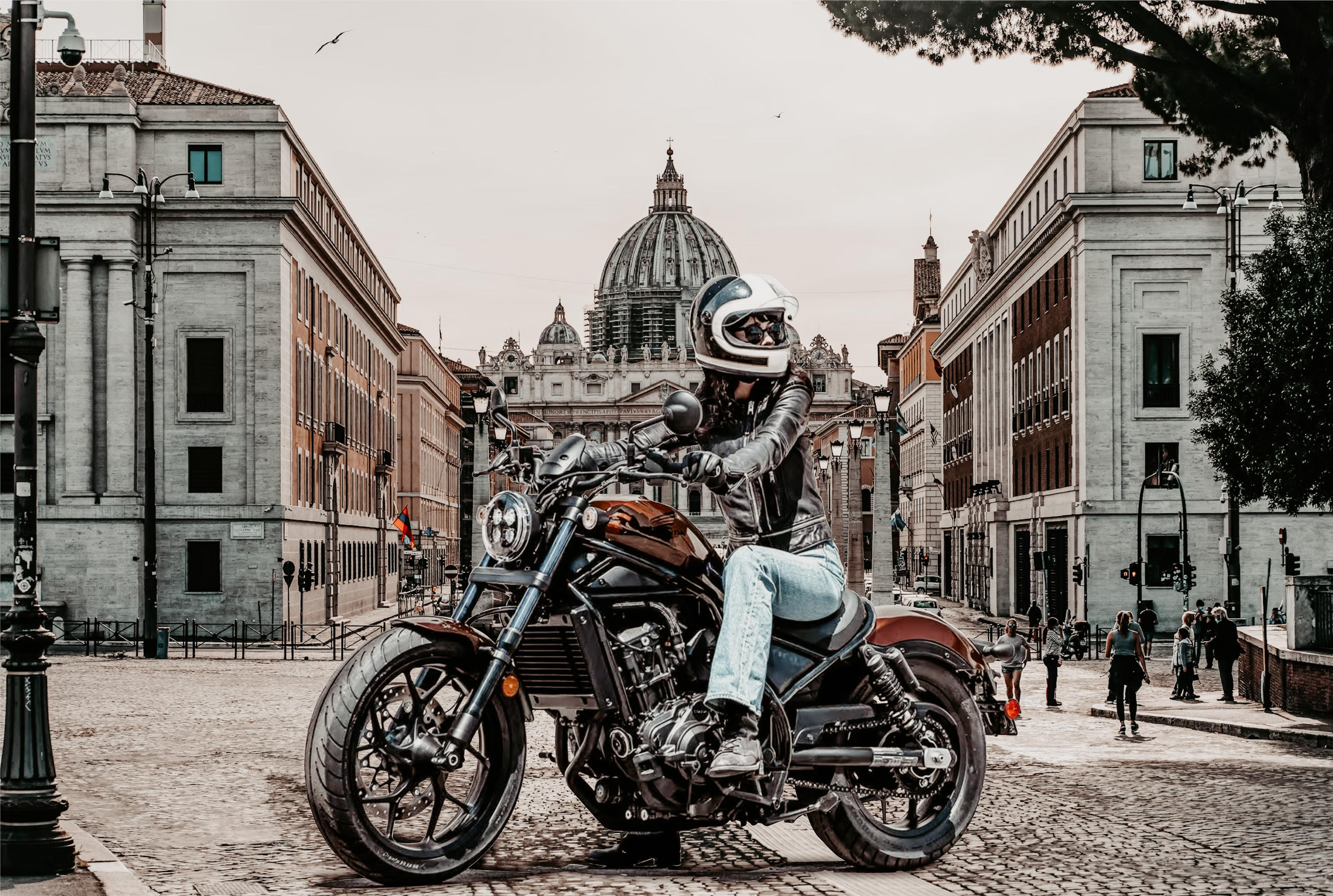
I google searched the image of the motorcycle pic as I wanted to create a challenge for myself. I first used the pen tool and made sure it was on path settings to crop as much of the object as I could.
After I masked the image and saved it as a vector image. I then added the background from one of Rome’s scenery on the road to add a sense of depth. As I saved the image as a jpeg, I’ve sent it over to the Adobe Lightroom program and made the edit adjustments to the photo to make the overall presentation much more cohesive.
FOREST NYMPH
PHOTOSHOP
Sculpture Texture
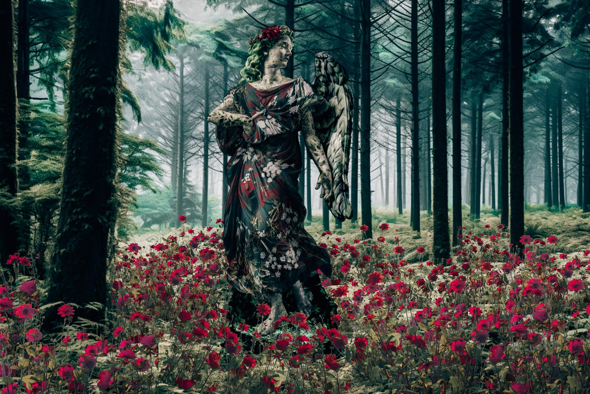
For this project, I chose my own statue that I wanted to work on for the project. The project is called Forest Nymph, I chose the color palette a stick to dark reds and greens, which I would use to pick in botanical patterns.
The tools I used consistently through putting patterns in the statue were puppet warp to move the pattern of the image that matches the movement of the statue, erase tool, blend tools, and adjustment layer. I added multiple fields of flowers and added to both in front of the statue and behind it to add depth and go along with the background. I later moved the image to adobe lightroom adjust the image color to make the presentation cohesive.
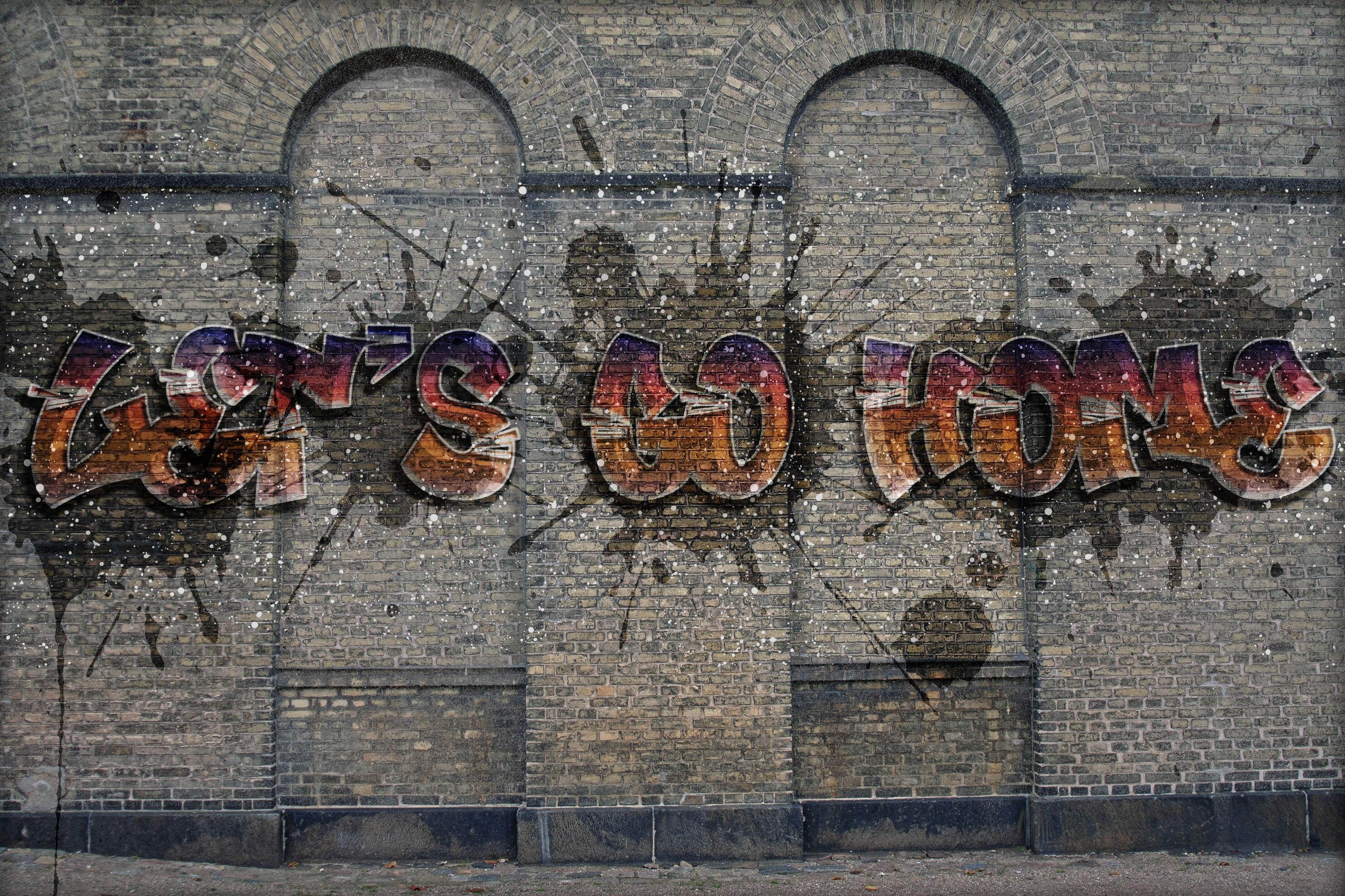
I first used the clone stamp to cover the window and then burn tool to create shadows in the now covered window trim. I then downloaded a different graffiti font and followed the tutorial to decor the font. Played around with the adjustment layer and added, drop shadow, inner shadow, outer shadow, and red gradient colors.
I picked a random illustration with a strong black outline for the assignments. I’ve used the pencil to outline bigger shapes and the pen tool to outline small shapes and lines. Later, I used the curvature tool to smooth out the shapes to make them more rounded. I then use the eyedropper tool to pick a color closer to the image and fill the shapes with the color swatches.
CALLA LILY DECO
Pen Tool Tracing
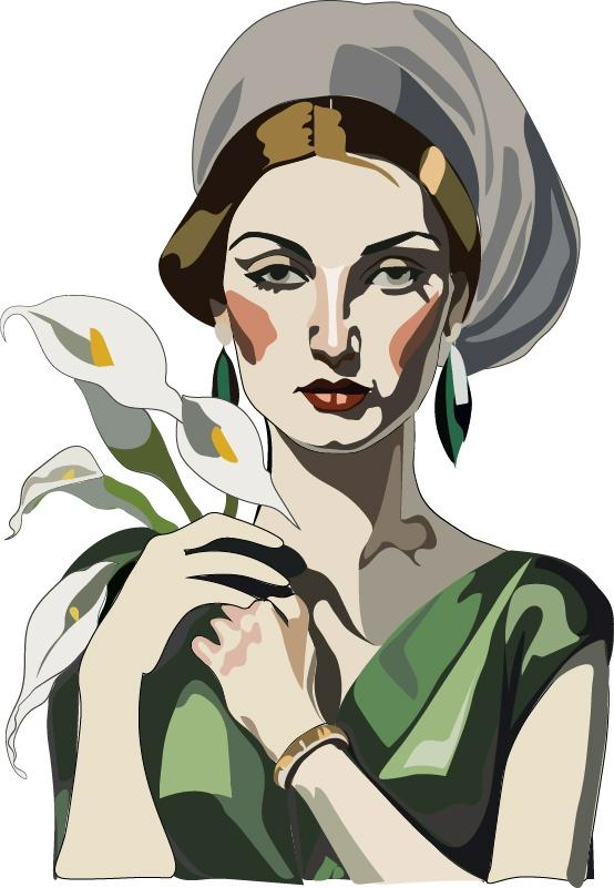
I picked a random illustration with a strong black outline for the assignments. I’ve used the pencil to outline bigger shapes and the pen tool to outline small shapes and lines. Later, I used the curvature tool to smooth out the shapes to make them more rounded. I then use the eyedropper tool to pick a color closer to the image and fill the shapes with the color swatches.
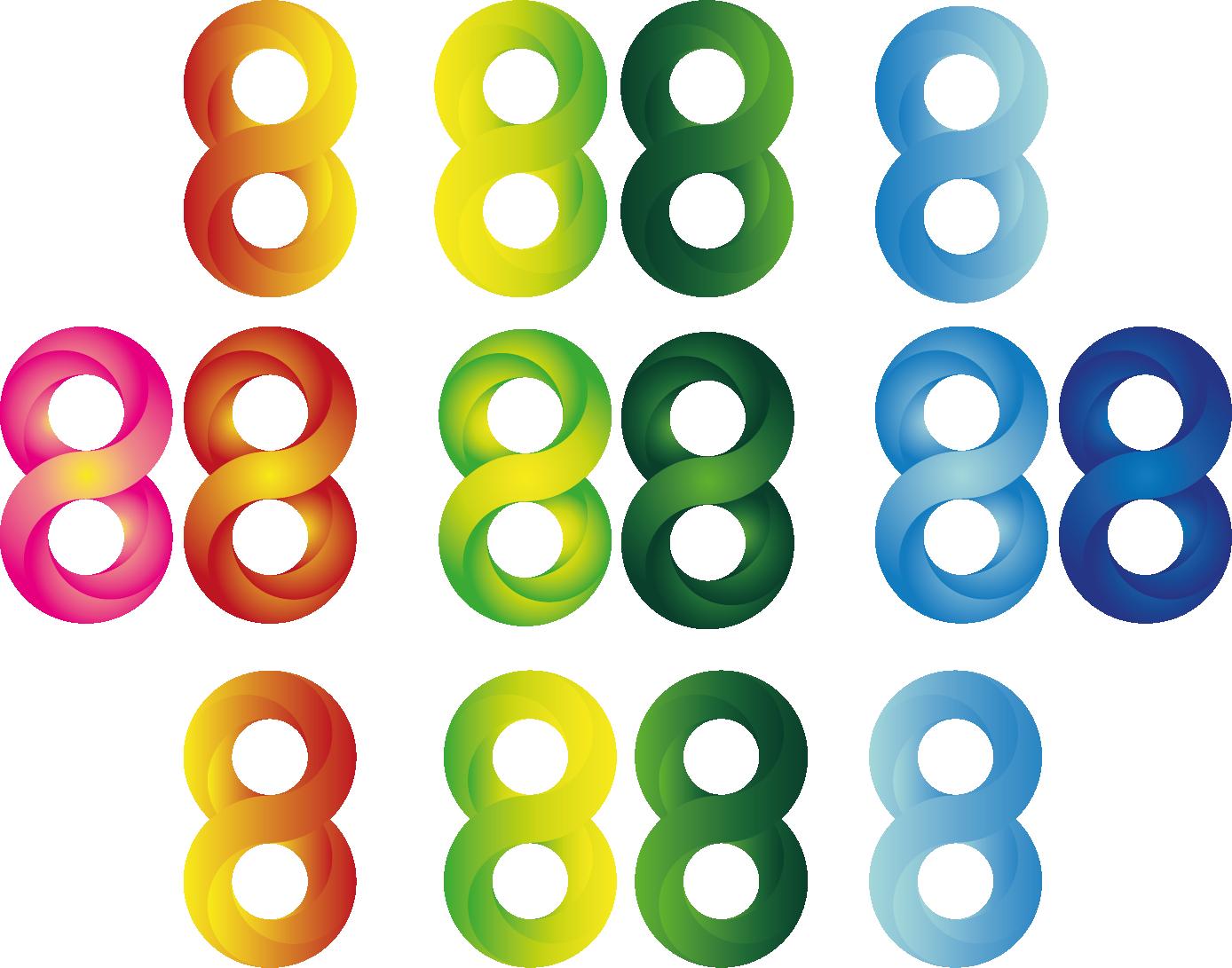
SERIES OF 8s GRADIENTS
Pen Tool Tracing
Logo Designs
ILLUSTRATOR
Shapes, Outlines, & Typography
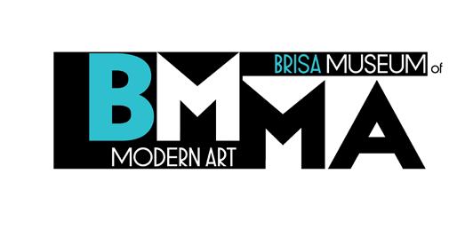
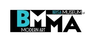
For starters, I added two more artboards to start the design of different logo ideas. I then downloaded a free font type in the sans-serifs font family as it fits the modern museum style, which either tends to be solid color, simplified, or thin or thick typeface. I then used the pen tool to manipulate the outline of the typo, rectangle shape tool, and color tool to add color.


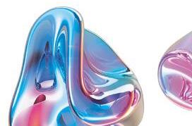
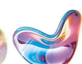
CAMPAIGN WITH MUTATIONS
ILLUSTRATOR
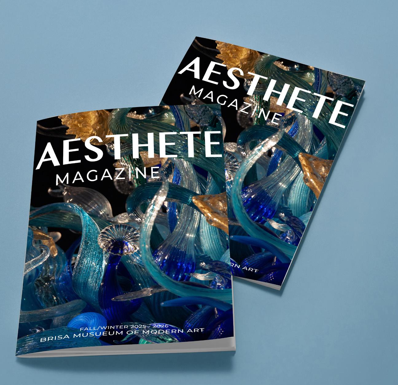
Multi Page Design Publications
“
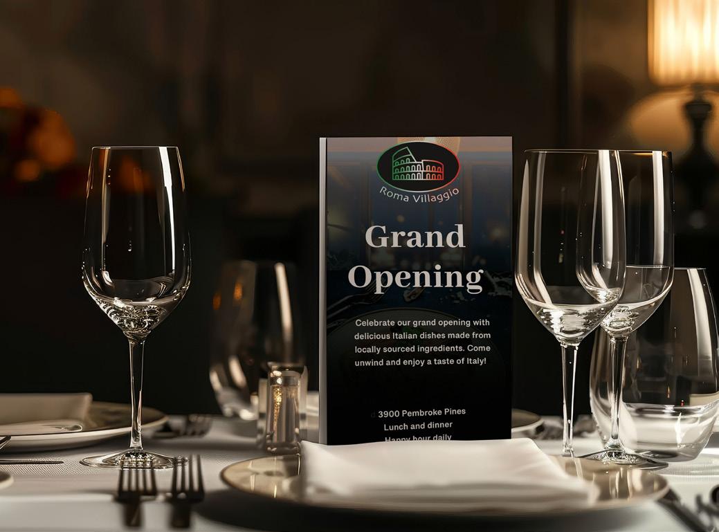
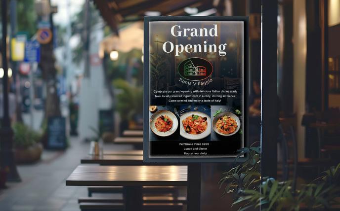
After I set the background image from Adobe Firefly of Moody Night Restaurant to darken the overall look of the magazine, I added images of three different Italian cuisines from Firefly and used them to show an example of a food menu. I then used the pen, ellipse, warp, and gradient tools to create a logo for the artboards. Added some texts and addresses showing a grand opening of the Italian restaurant.

For this assignment, I first downloaded the images from adobe stock and turned all of the images into CMYK with 300dpi. I then set a series of text boxes and placed images and design in a certain areas of the pages.
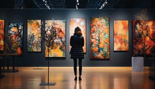
The premise of this brochure is introducing the art exhibit at a made up museum. I introduced artists, and their made up work. This brochure is useful to keep the museum visitor informed of the upcoming exhibition, their artist’s works, and art director/curator note.
I utilized various tools and features to create a professional layout for this magazine design in Adobe InDesign. These included the Text Tool for typesetting and formatting, Paragraph Styles for consistent text formatting, Master Pages for creating a uniform structure across pages, Image Frames for placing and resizing images, and the Swatches Panel to maintain a cohesive color scheme. Additionally, I used Guides and Grids to align content precisely and ensured a polished result by leveraging Preflight Checks to catch potential errors before exporting. Overall, it is one of my favorite projects I did