Lecture by Jasia Reichardt, organised by the Computer Arts Society, at the British Computer Society, The Chartered Institute for IT, London, 16 January 2024
1 5 ½ Exhibitions

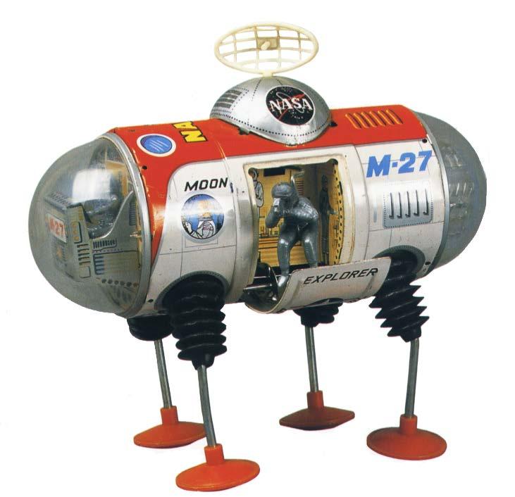
For my 21st birthday, my aunt and uncle give me a robot. It was simpler than the one you see. It was blue, had 6 or 8 legs and was a wind-up toy. Then one day, appeared a producer from the BBC and asked to borrow it because it was important for one of their programmes. He took it away and I never saw the robot again.
2
Before I start…
About a year later, I was attending lectures at the Gaberbocchus Common Room, the first club in London for artists and scientists to meet.

3
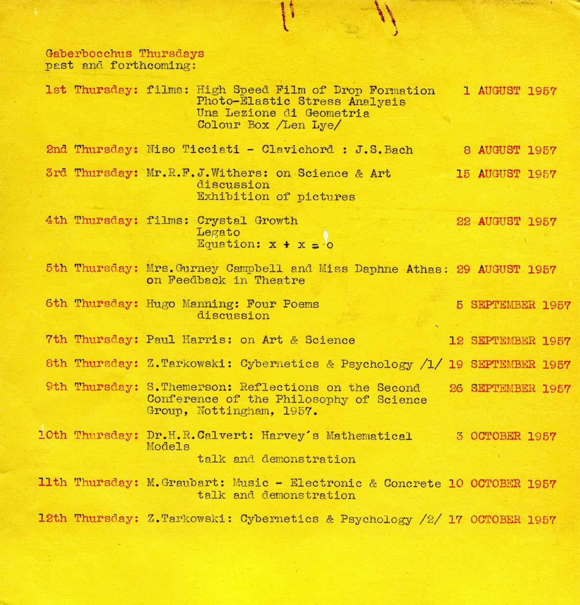
It is there that I heard lectures about cybernetics. Two are listed here. These were about cybernetics and psychology.

4
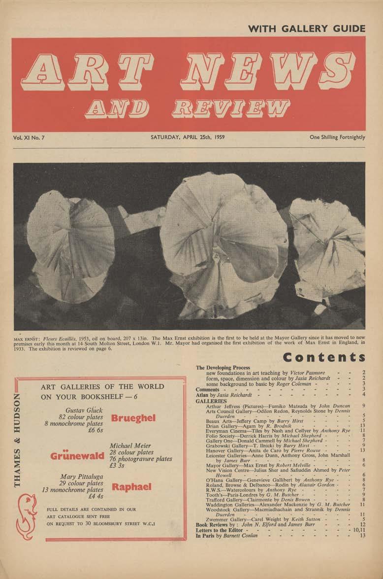
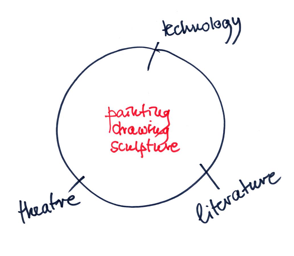
Soon after I got a job as assistant editor of Art News and Review, a fortnightly paper which covered all exhibitions ion London and some outside as well. It provided a record of what was happening in the art world. Something that was noticeable at the time was that art meant: painting, sculpture, drawing and these were the topics of the majority of the texts.

5
I was more interested in art which involved other topics, and by now, and we are now in the late 1950s, we already have kinetic art, concrete poetry, and happenings, which later become events, and later still performances. Today, the line dividing painting, drawing and sculpture from other forms of art no longer exists.

6
And so now I come to
5 ½ EXHIBITIONS AT THE ICA

7
I worked at the ICA (Institute of Contemporary Arts) for eight years, 1963–71.
During that time, I organised five and a half exhibitions. What was good about the ICA at the time, was that it was possible to work on all sorts of new projects, even when people may not have been sure what they were about. When I joined the ICA, it was a very small organisation, there were four employees. I worked part time. The fact that there was no money, you may be surprised to hear, made things easier. Budgets were not discussed, which was just as well.
All the exhibitions I was involved with had one thing in common, they were about connections between art and other fields of activity: writing, technology, music, play, and design.
8
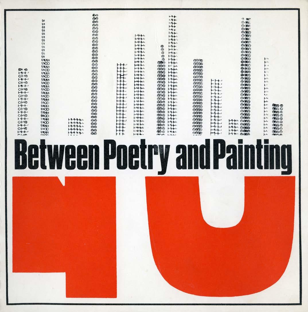
BETWEEN POETRY AND PAINTING in 1965 was the first London exhibition of concrete poetry. And we have nearly reached its 50th anniversary. Concrete Poetry serves to examine what happens to language through visual presentation, and what happens to an image that is simultaneously endowed with literary meaning.

9
1
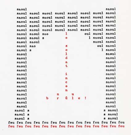
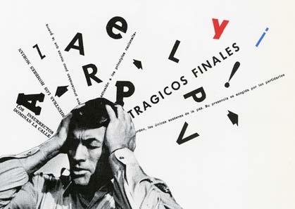
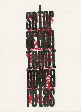
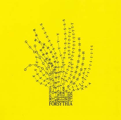
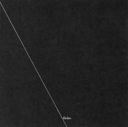
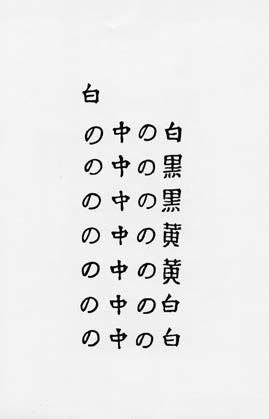
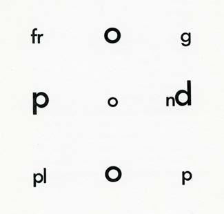
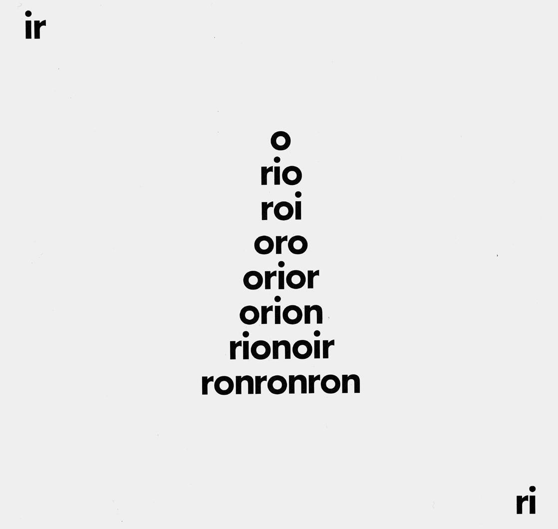
Here are six examples each one in a different language. The presentation of the text amplifies its meaning. The concrete poem is an experience rather than a description. It is a picture as well as a text, and that’s why the exhibition was called Between Poetry and Painting. What is also important about the movement of concrete poetry is that it is the first international art movement. Computer art was the second.


10
Henri Chopin, le soldat inconnu brûle (unknown soldier on fire)
Juan Carlos Jimenez de Aberasturi (an anti-war poem)
Joshua Reichert, sator arepo tenet opera rotas (Latin palindrome – meaning, he who guides the plough sows the seed)
Mary Ellen Solt, Forsythia Kitasono Katue (a surrealist and concrete poet, the poem is called white)
Gerhard Rühm, bleiben (remain, stay...)
le soldat inconnu brûle
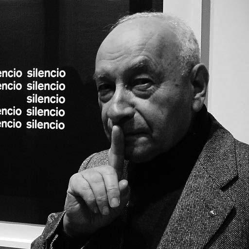
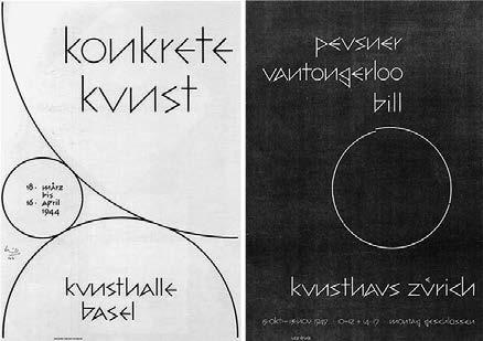
The term ‘Concrete Poetry’ was coined by Eugen Gomringer in 1954 – a term derived from Max Bill’s Konkrete Kunst. Gomringer thought of concrete poetry as the means of creating order. His single word poem ‘silencio’ has been discussed and written about at length. Gomringer is German, the poem is in Spanish, and written within the decade of the end of the World War II. The poem is simple and yet, there is so much to be said about it. And that is true of the majority of concrete poems.


11
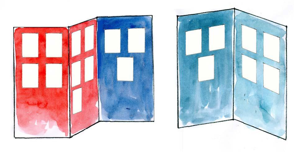
There are no photographs of the exhibition because none of us had cameras. Some concrete poems were shown in black and white enlargements on the walls. Originals and small prints were pinned onto boards of large screens, about 2.5-m high, covered in soft board and fixed at right angles. The screens were painted in red, blue, or dark blue. This image doesn’t tell you very much, but I can show you a few of the works that were on the walls in the exhibition.

12
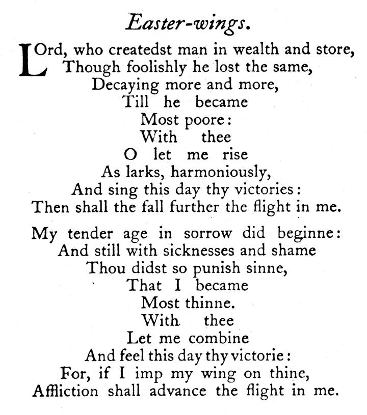
Like every art movement, Concrete Poetry had its antecedents going back, in this case, to the 17th century and George Herbert’s ‘Easter Wings’, often printed sideways in the shape of birds’ wings.

13
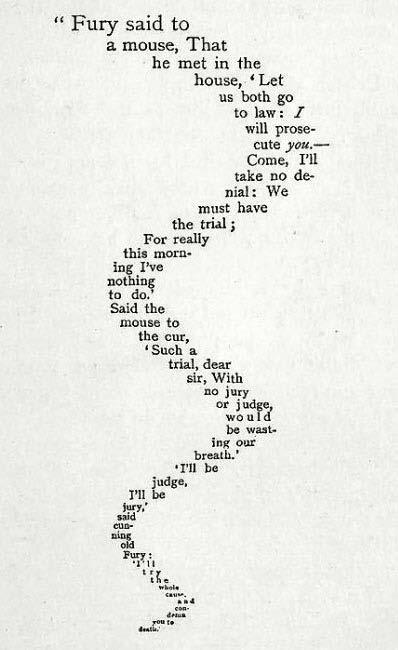
There’s the Mouse’s Tail from Alice’s Adventures in Wonderland, 1865.

14
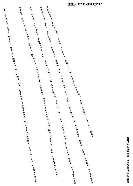
Also, one of the most beautiful poems by Apollinaire, ‘Il pleut’, 1918.
‘It rains women’s voices…’

15
And here are some more recent examples of works in the exhibition.

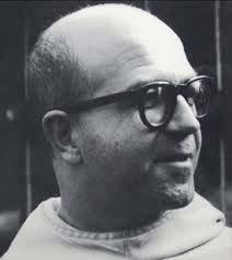
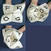
Dom Sylvester Houédard with his translation of the Basho haiku, and cat’s cradle made by John Furnival.


16

Seichi Niikuni, the poem Touch, here in a later version

17
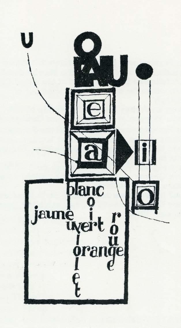
John Furnival with his French poem about colour.


18

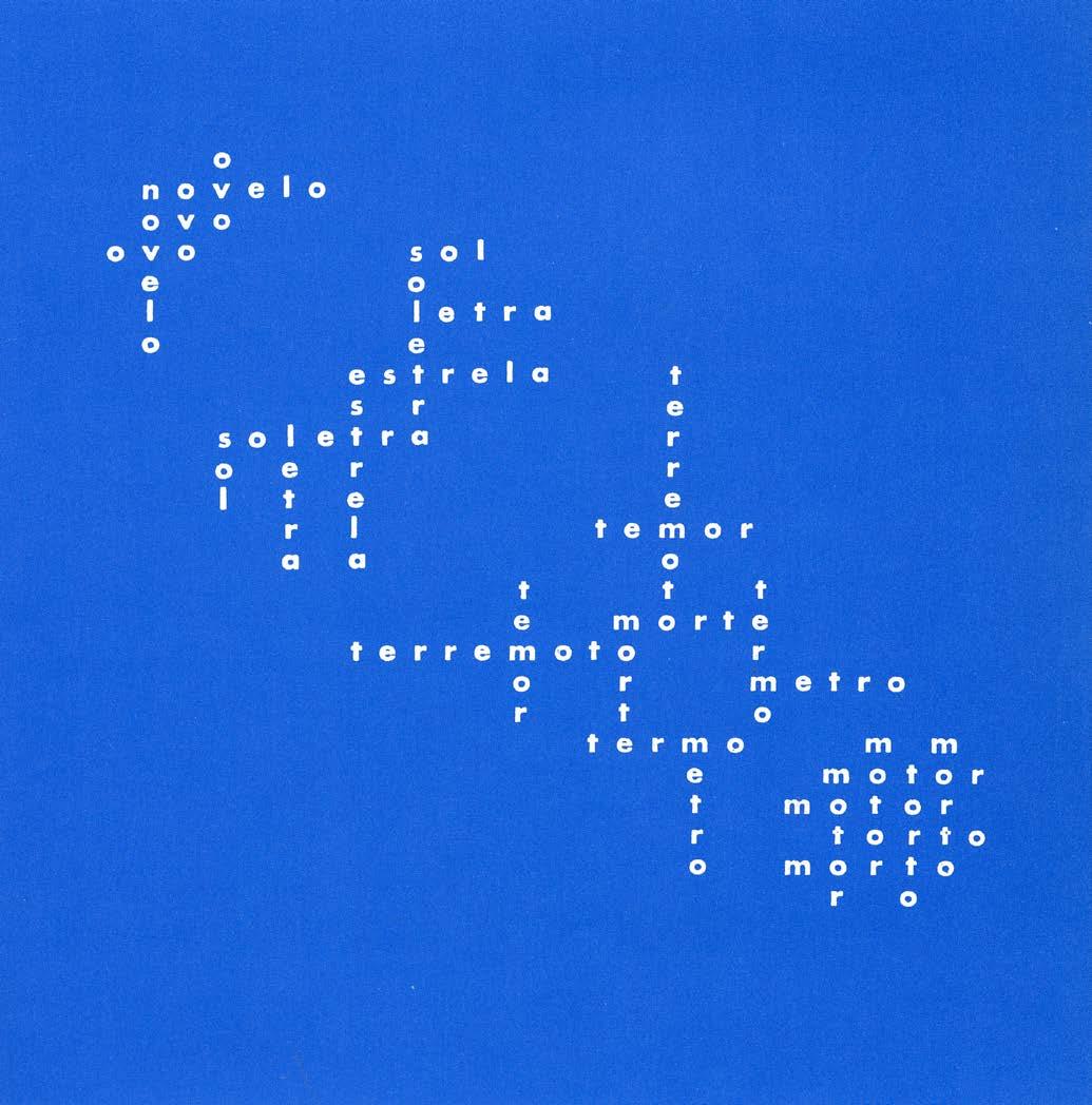
Augusto de Campos, member of the Noigandres Group, his 1957 poem, starting with ‘a ball of yarn’.

19
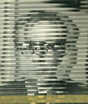
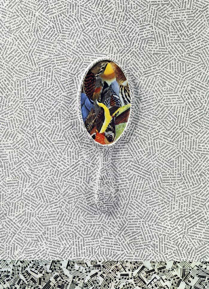
Jiri Kolar referred to his collages as ‘The End of Words’, using cut up print to create textures, or as is the case with his self-portrait, making combinations from two or three photographs.


20

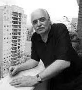
Max Bense, an important member of the concrete poetry movement, was a philosopher and writer. He came to London for the Between Poetry and Painting exhibition and asked me what I was going to do next. I told him that I didn’t know, wasn’t sure, so he suggested that I should look into computers.

21
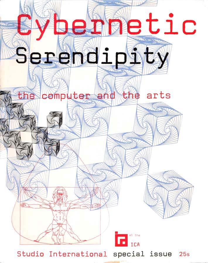
And this, of course, I did, and that led to CYBERNETIC SERENDIPITY, the exhibition about the computer and the arts which was shown at the ICA’s new premises, which were ten times the size of the gallery where we mounted Between Poetry and Painting. I shall not talk about it because there is a lecture about it on the internet and it’s printed in a little book, which you can see.
And so, all I am showing you now is the cover of the special edition of Studio International, which assumed the place of the catalogue.

22
2
The exhibition I want to talk about now followed Cybernetic Serendipity and was called FLUORESCENT CHRYSANTHEMUM . Like the other two exhibitions I mentioned, it presented new material. It was the first exhibition in London, perhaps even in the West, of new Japanese art.
This is how it happened. I was invited to be on the jury of the Tokyo Biennale organised by the Mainichi Shimbun in 1967. This was my first visit to Japan.
23
3
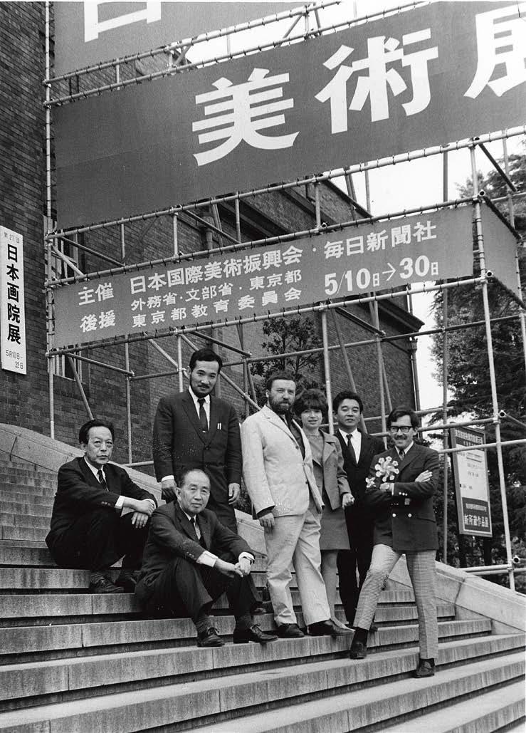
Here is a photograph with the people involved with the selection of the Biennale. The group includes Ichiro Haryu, the next person is Michael Ragon from Paris in the white suit, me, Yoshiaki Tono, and Maurice Tuchman from Los Angeles. Haryu and Tono will become my future collaborators. The other critic, who worked with us on Fluorescent Chrysathemum, but who isn’t in this photograph is Yusuke Nakahara. The two men sitting on the steps were the representatives of the newspaper, Mainichi Shimbun: Teichi Hijikata on the left, and Atsuo Imaizumi on the right.

24
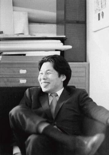
Here is the missing critic from the previous photograph, Yusuke Nakahara.

25
The Biennale was quite exceptional, the works on view were impressive and very different from what was being done elsewhere. They shone. They were exuberant, and many were fluorescent.
26
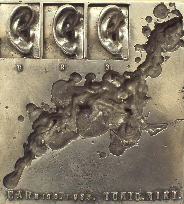
These were some of the works, which I found memorable: Keiji Usami

27
Katsuhiro Yamaguchi

28
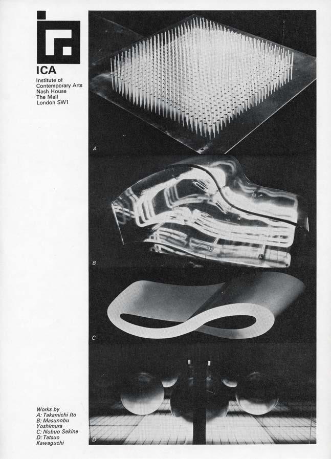
Masunobu Yoshimura

29

30
Tomio Miki
and Aiko Miyawaki.

31
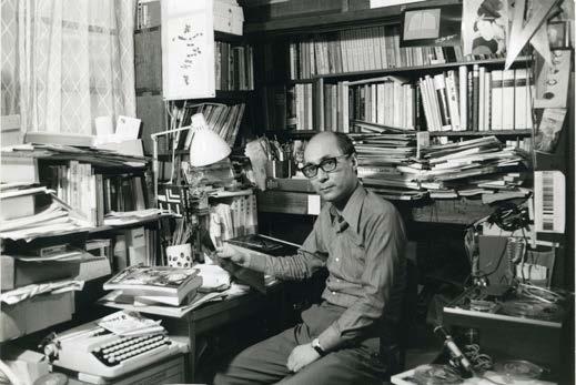
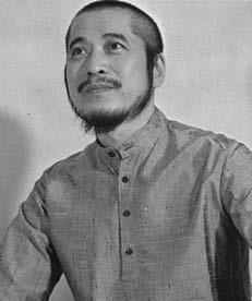
I spent a lot of time with Yoshiaki Tono, Ichiro Haryu, Yusuke Nakahara, and the music critic Kuniharu Akiyama. They were responsible for making the selection of the works for Fluorescent Chrysanthemum. I don’t remember if I had actually met Kohei Sugiura just then.
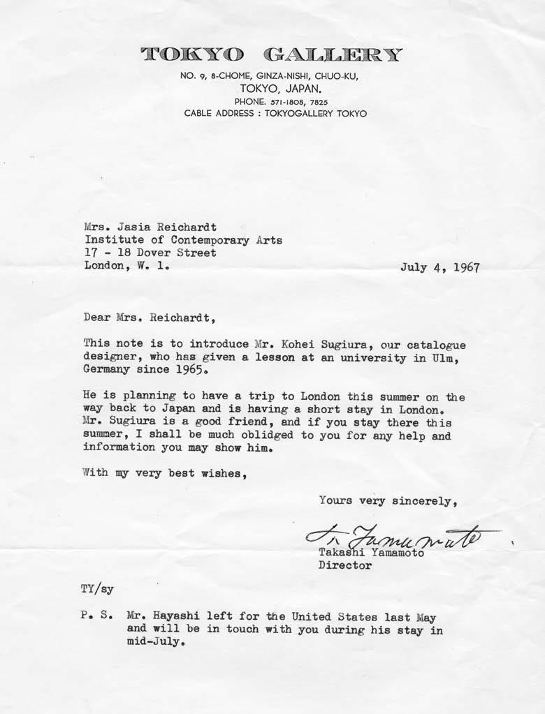
But, when I returned to London, I received this letter from Tokyo Gallery. And this was my introduction to Sugiura-san, who later became my collaborator and designer of the exhibition. And so, we met that summer. On my following trip to Japan, later that year, I discussed the possibility of a London exhibition with Tokyo and Minami Galleries.


32
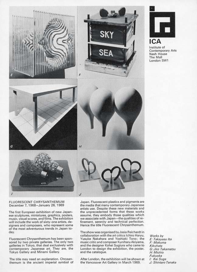
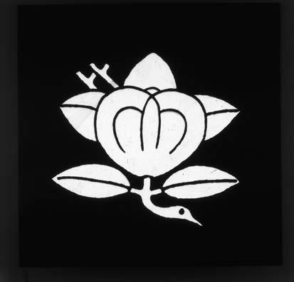
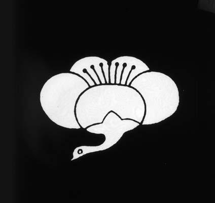
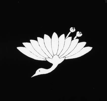
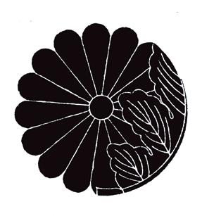
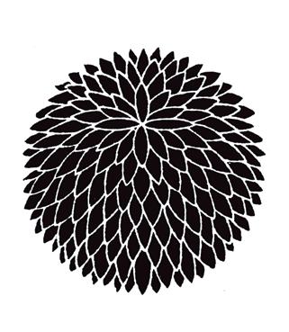
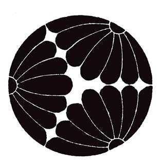
Fluorescent Chrysanthemum was to be the title, as it referred to the fluorescent effects of so many of the works, and to the Japanese monshō. When the exhibition opened a year later. It consisted of sculptures, miniatures, posters, graphics, animated films, music scores and music tapes. It included the work of 61 artists. All these artists had left behind them expressionism, tachism and informal abstraction. Their work did not refer to the war, nor to social problems but, in a poetic and exuberant manner, to the modern environment.
Tokyo and Minami Galleries not only sponsored the exhibition but also took charge of the many practical matters that such a large and ambitious exhibition involves.
33
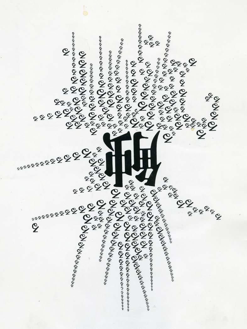
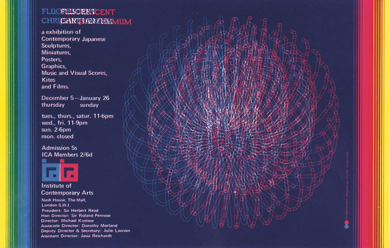
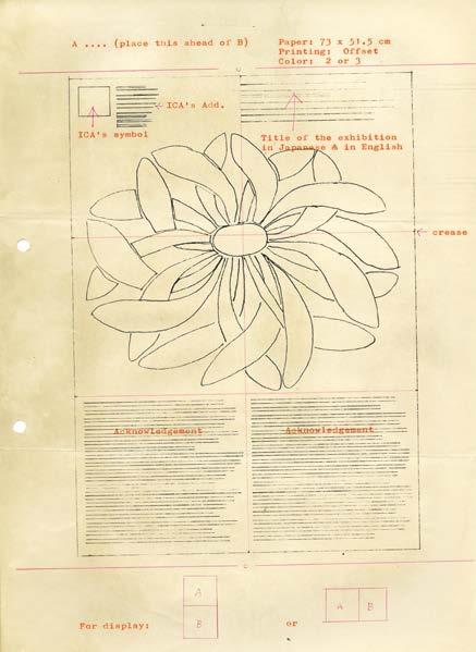
This is the first announcement of the exhibition. It is rather laid back by comparison with all the designs that followed. It was an introduction to the subject. Kohei Sugiura, who designed the exhibition, was later described by several critics as the most important artist, because they thought of the exhibition design as a work of art.


34
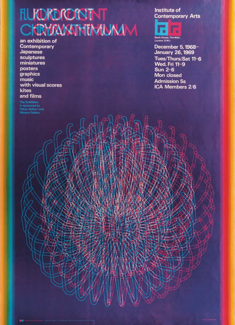
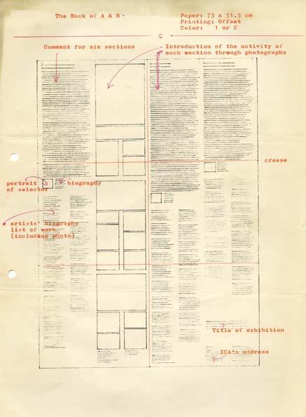
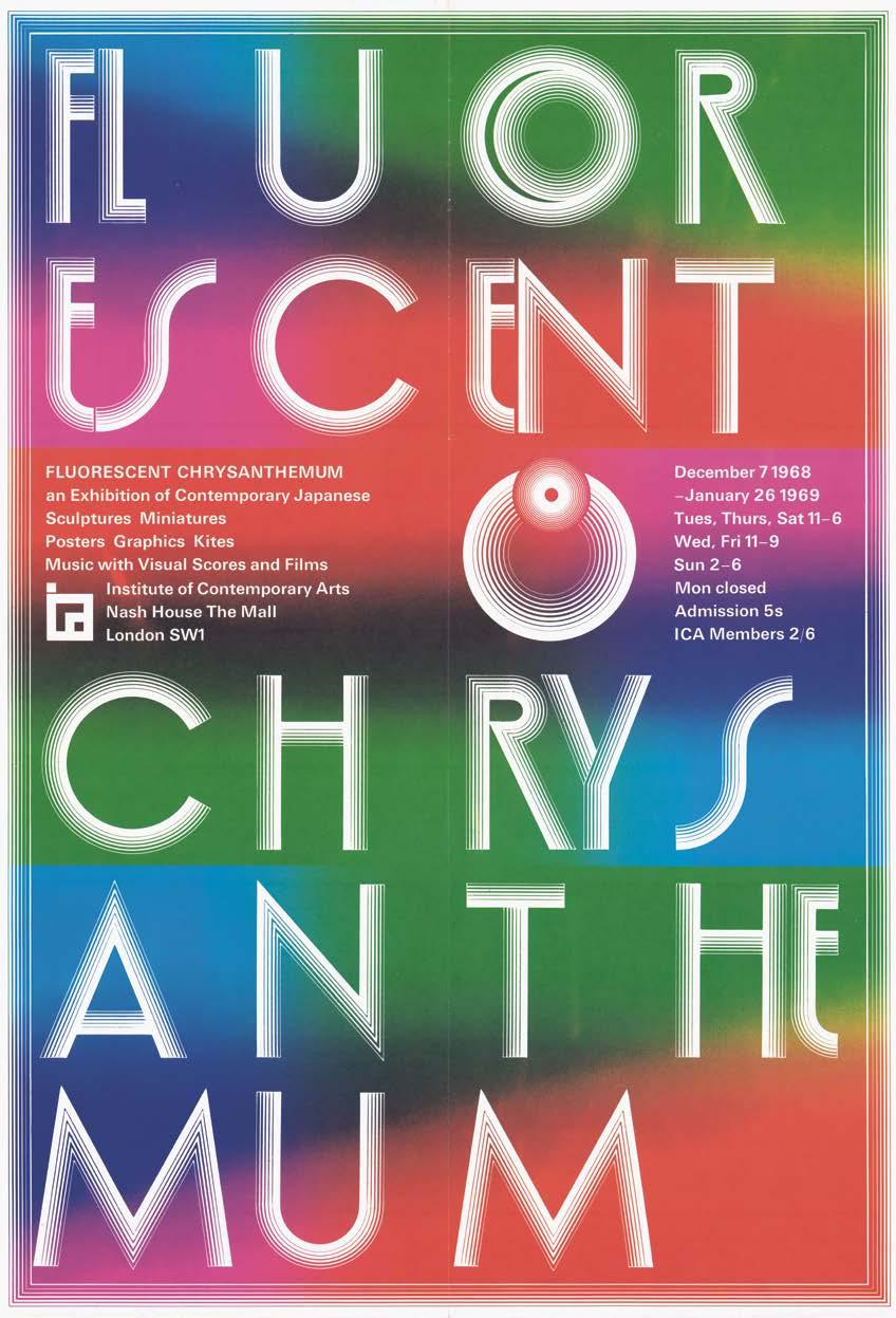
Here is one of the poster designs. There were several posters of different size, all of them very bright in the spirit of the exhibition. This one, presents information about the exhibition and who is who at the ICA.

35
Another version of this poster, just giving information about the exhibition. This is the one that was used.

36
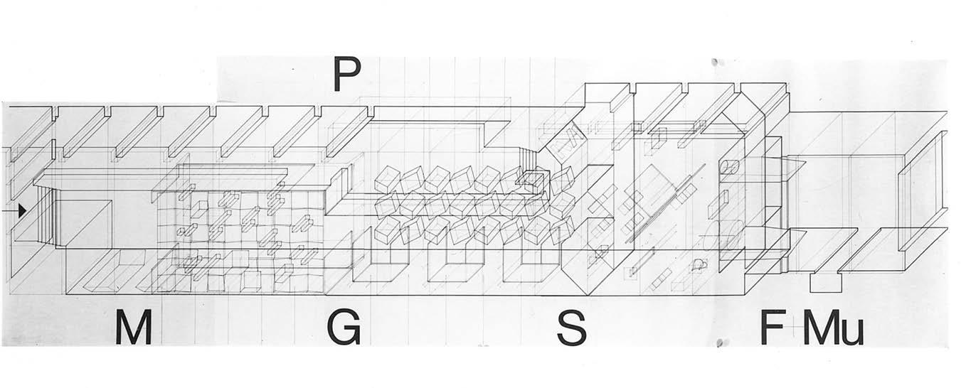
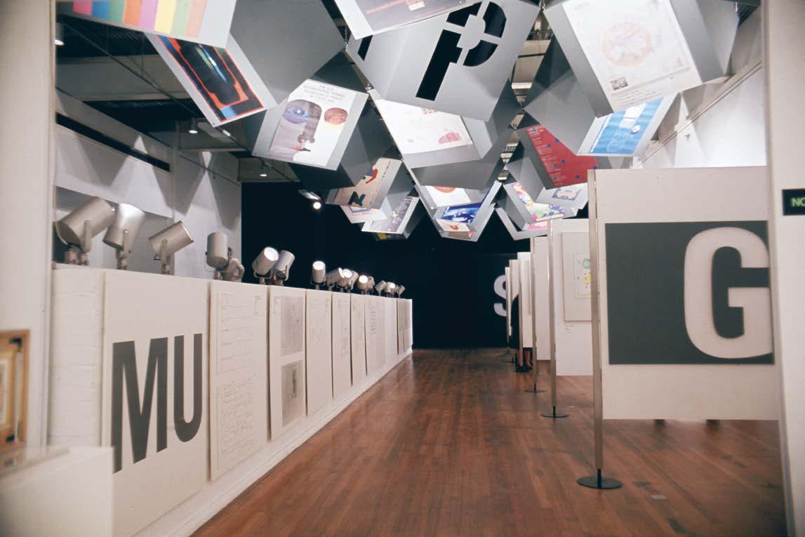
This is the plan of the exhibition, with the letters indicating the sort of work included in the sections: M for miniatures; G for graphics; P for posters; S for sculptures; F for films and Mu for Music.

37
Early sketches for the catalogue.


38
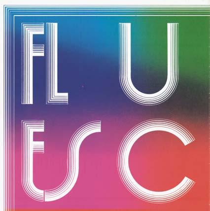
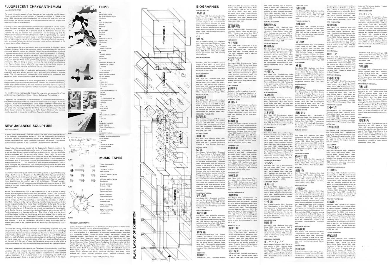
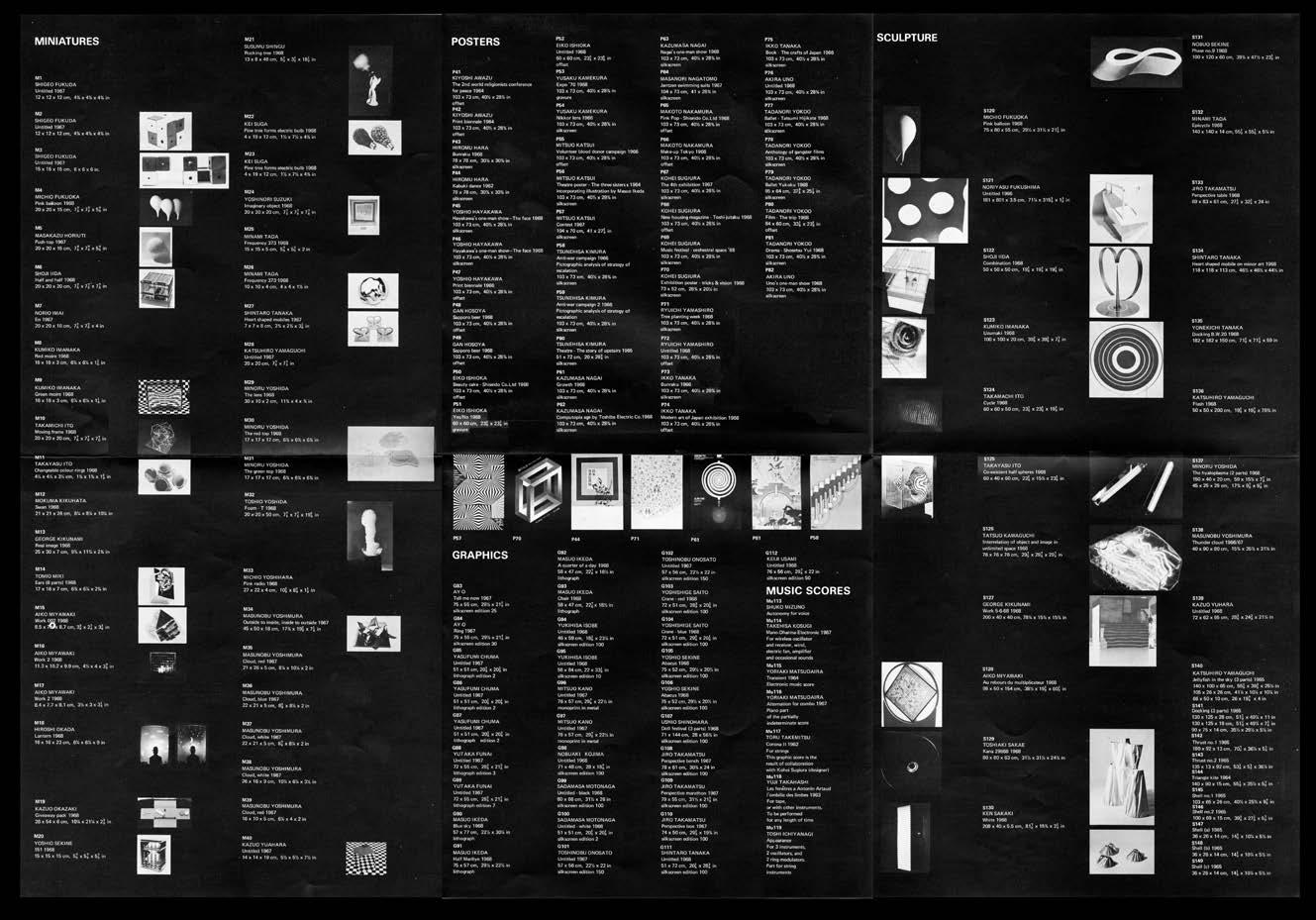
On the left is one of the covers for the catalogue. On the right you can see six catalogue covers, which together made up a poster. The catalogue was in two parts, each one consisted of this poster folded three times.


39
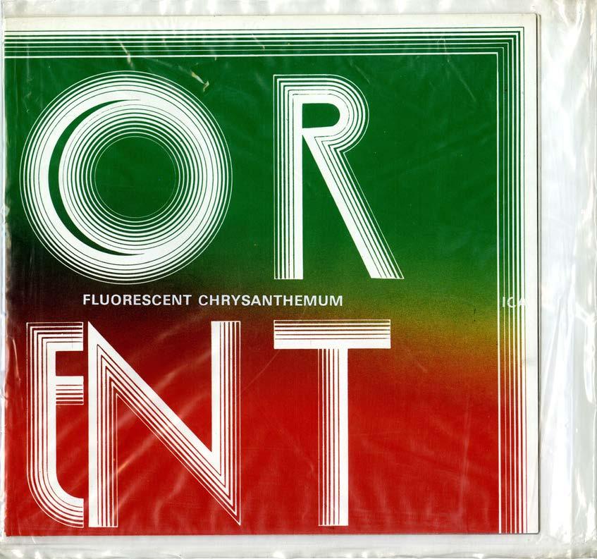
Both parts were enclosed in a plastic envelope with the title of the exhibition printed in white.

40
One part of the catalogue, when unfolded, consisted of a sheet of paper 74 × 50 cm, printed in black on white background. The text included two introductions, lists of Films, Music tapes, plan of the exhibition and biographies of the artists.

41
The second part of the catalogue with a black background had the list of works: miniatures, posters, graphics, sculptures, and kites.

42
The two parts of the catalogue in the plastic bag were very thin, less than a quarter of a centimetre. Today, it would be difficult to imagine a catalogue for an exhibition with 61 artists that would be as modest and as surprising.
43
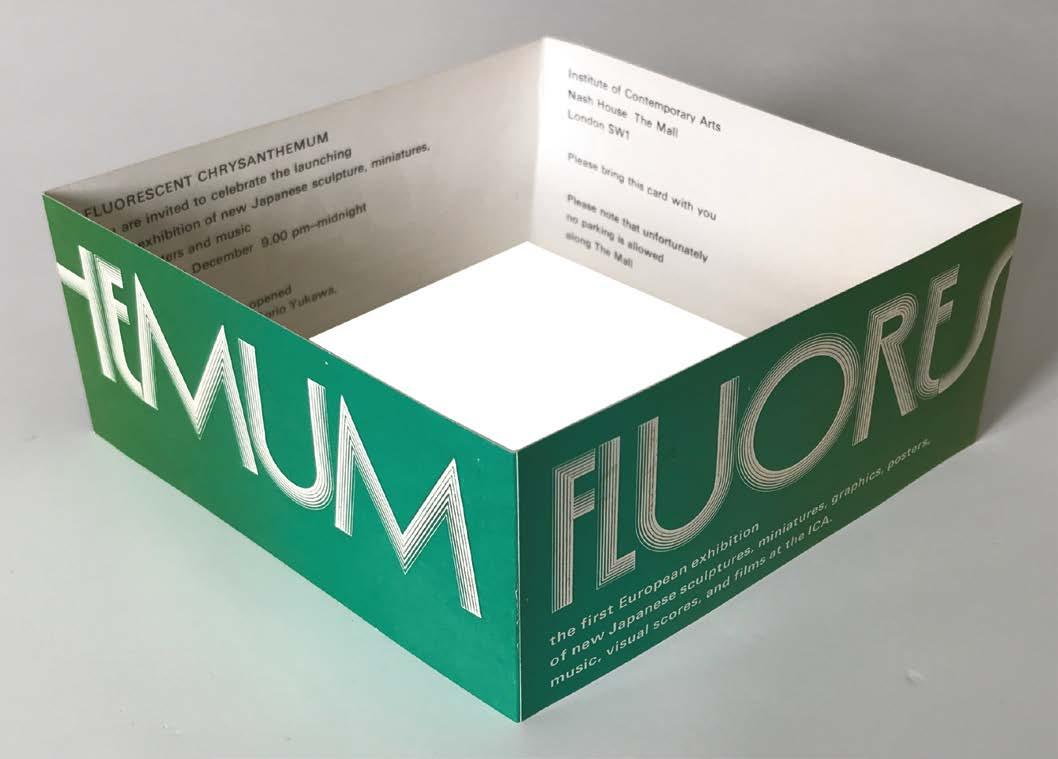
These were the invitations, which were folded. Here you see the back and front of each one.


44
If you looked inside, each one had a different text, inviting people to the press view, the private view, or the party.

45
As you entered the gallery and walked down a few steps, you would see changing images projected onto the floor of 80 Japanese monsho which changed every four seconds. Here are three of them.


Each image when projected was over a metre in diameter.


46


47
Here we have the exhibition still in preparation.

48
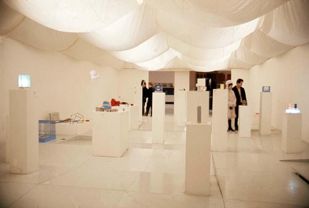
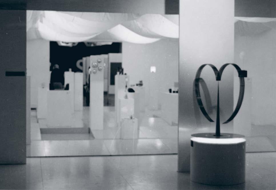
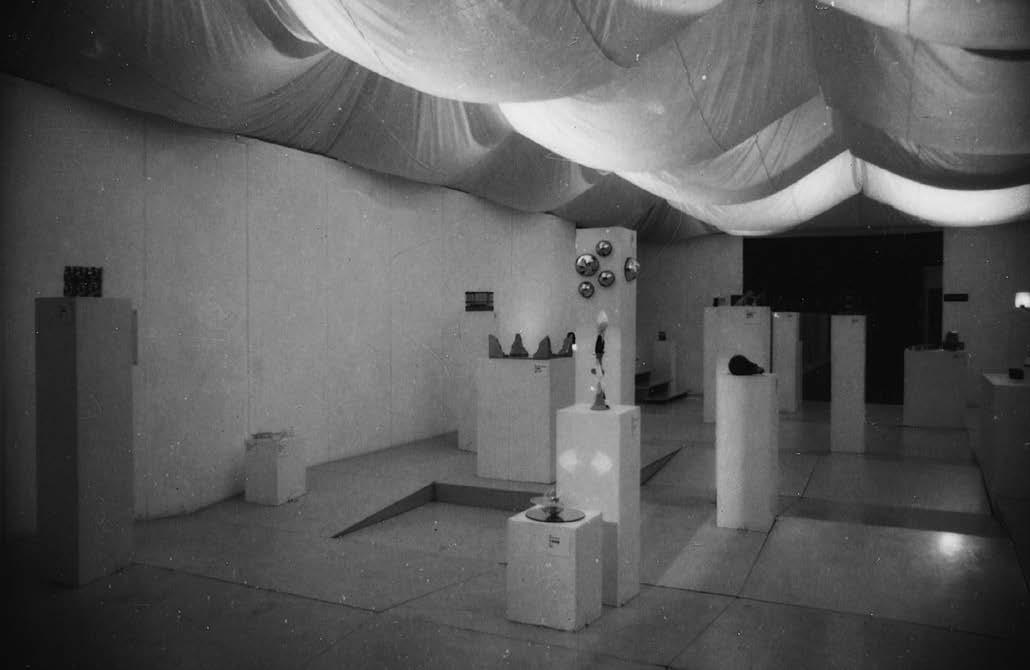
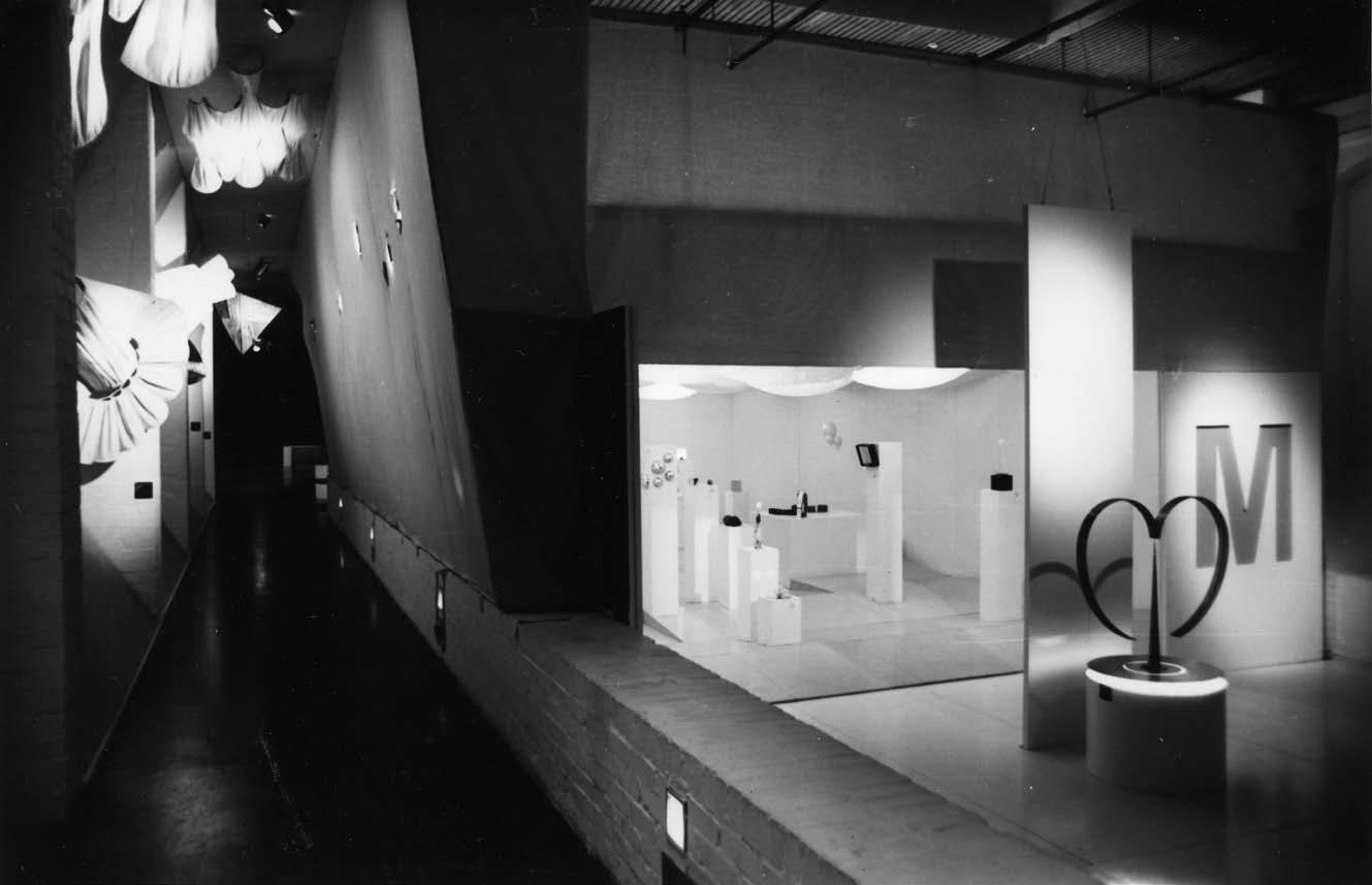
Now, everything is ready. On entering, this is what you would see first. Behind a heart-shaped mobile by Shintaro Tanaka, which cast a shadow on a white screen behind it, is the miniature section. Here the floor was made of uneven ramps surrounded by white walls with a looped white cloth ceiling above.

49
The floor was pale grey, the pedestals on which the miniatures were placed were painted white. Despite the notice: ‘Uneven floor beware’ most people tripped from time to time.

50
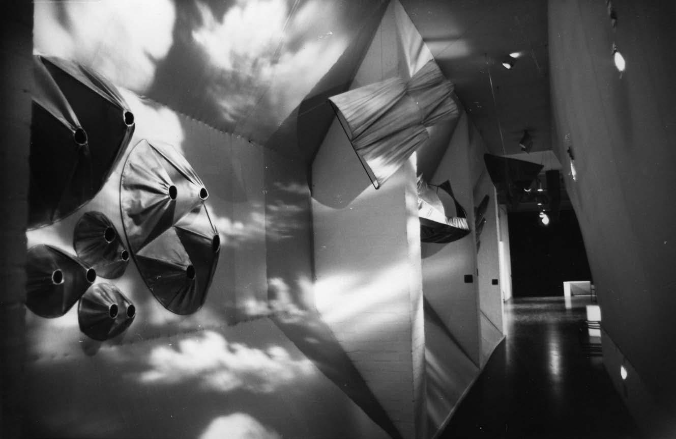
Another view of miniatures. On the left, raised slightly higher, in a narrow corridor running beside the miniature section, was a pale blue tent with Yamaguchi’s kites, some of which were hanging from the ceiling.

51
The blue light alternated with effects of floating clouds.

52
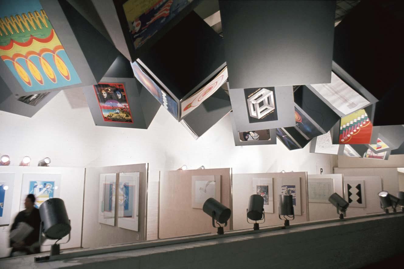
From the miniature section the visitors proceeded through displays of graphics on the right marked with a G, and music scores, indicated with the letters MU. Above hung 24 107cm grey cubes, designated with letter P, with posters. As was the case with the uneven floor in the miniature section, looking at the exhibition was not a passive experience. The visitors had to look up, walk around and bend down to see the music scores.

53
Here is a better view of the music scores.

54
And here you can see the graphics as well as the posters.

55
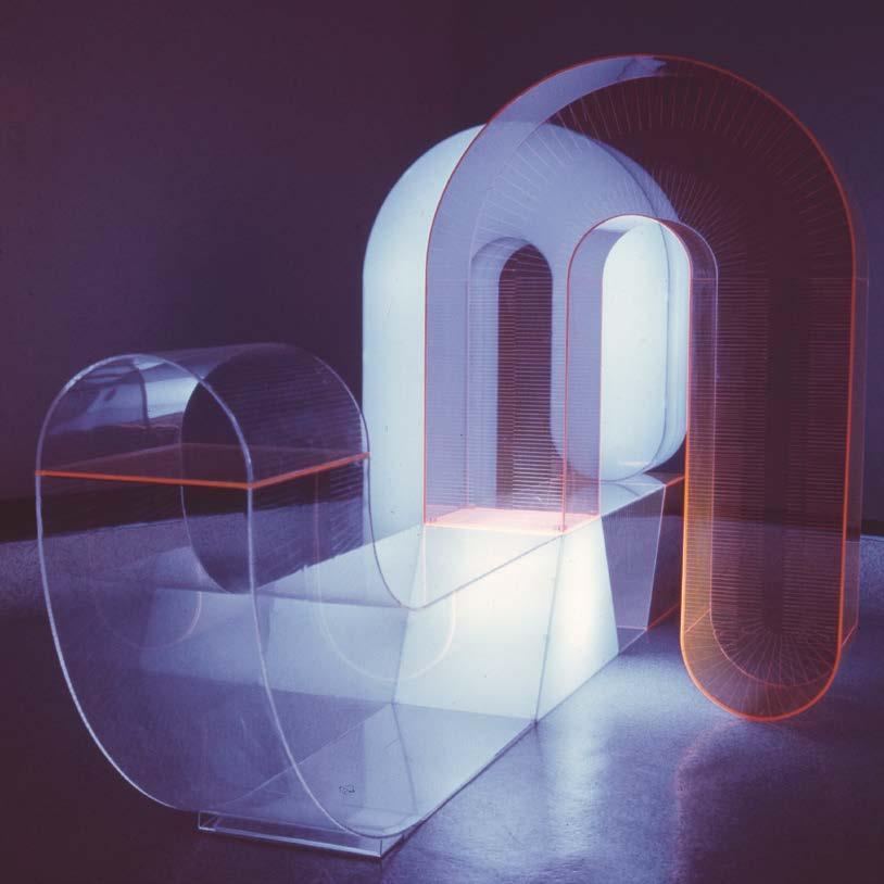
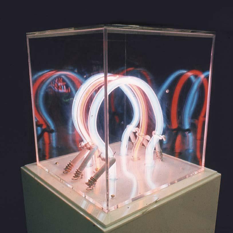
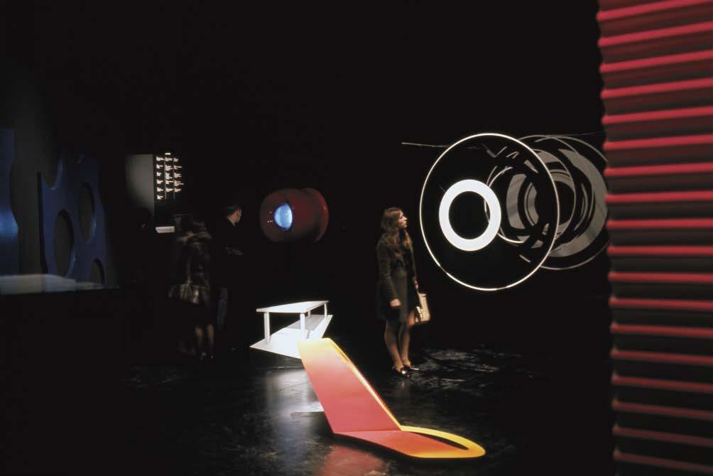
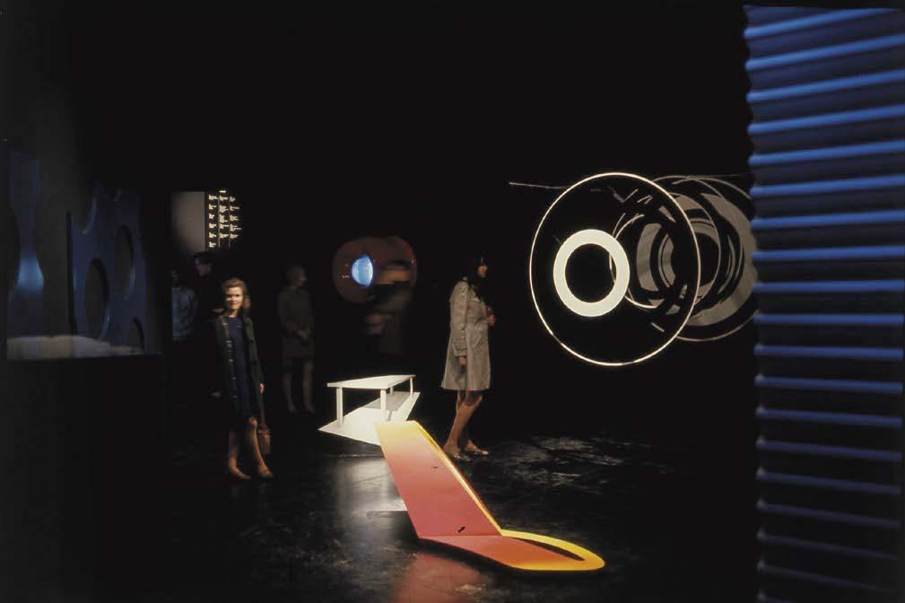
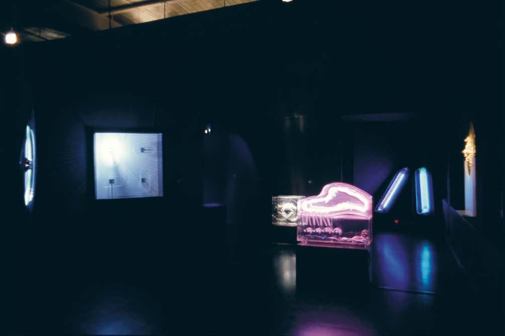
From there one entered a totally black environment with luminous and fluorescent sculptures.

56
Here the red colour changed to blue.

57
Another view of the sculptures.

58
Beyond was a space with a seating unit for watching films or projections of relevant music scores when the music was played. Each day a different 20-minute music tape was played on repeat.
59
The exhibition had good reviews. This is the comment of What’s on in London on 13 December 1968: A show of Japanese fluorescent sculptures, Japanese abstract cartoon films, graphics and kites is presented at the ICA Gallery in a superbly imaginative way. This is an aesthetic performance rather than an art show. I cannot think of a more exciting way to spend a morning or an afternoon in town.
and Oswell Blakeston writing in Arts Review
One cannot separate the contribution of presentation when one receives the excitement of what is seen here. The presentation enhances all individuality besides turning what might have been a conventional art show into an aesthetic performance.
60
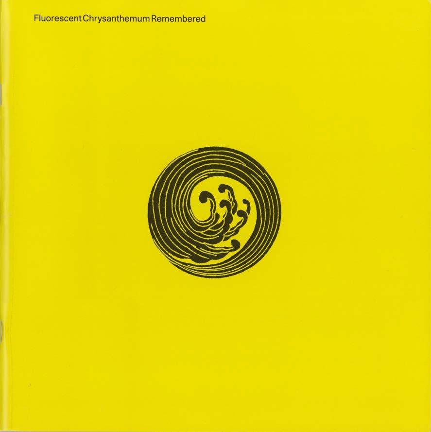
In 2019 there was an exhibition in Gdansk to celebrate the original Fluorescent Chrysanthemum called, as you see here, Fluorescent Chrysanthemum Remembered.

61
I shall now just mention very quickly the other three and a half exhibitions, which I organised for the ICA.
62
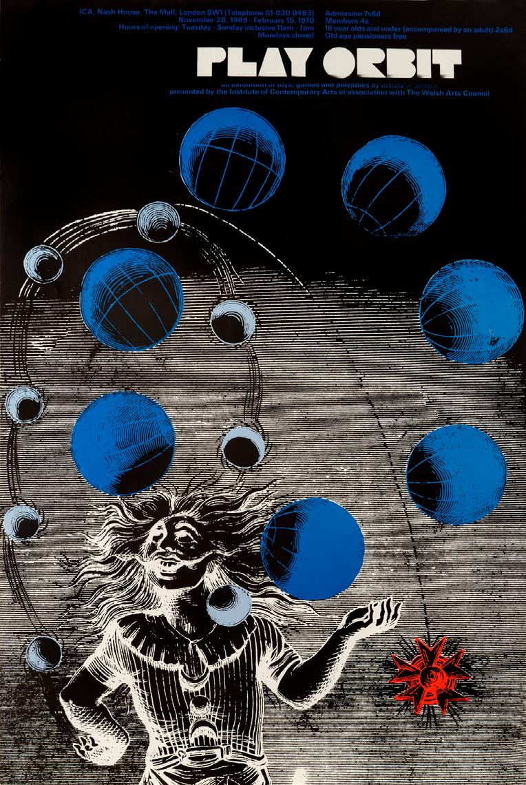
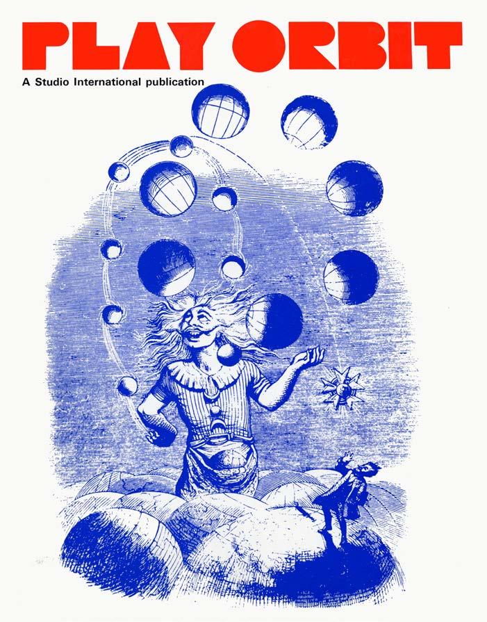
One was PLAY ORBIT, 1969 . Here is the poster. The exhibition consisted of toys, games and playthings made by artists. It was an attempt to narrow the gap between works of art and the things that fill our environment, that we treasure but which don’t have such an elevated status. Initially 100 artists were invited to produce a toy, but other volunteers were also accepted.

63
4
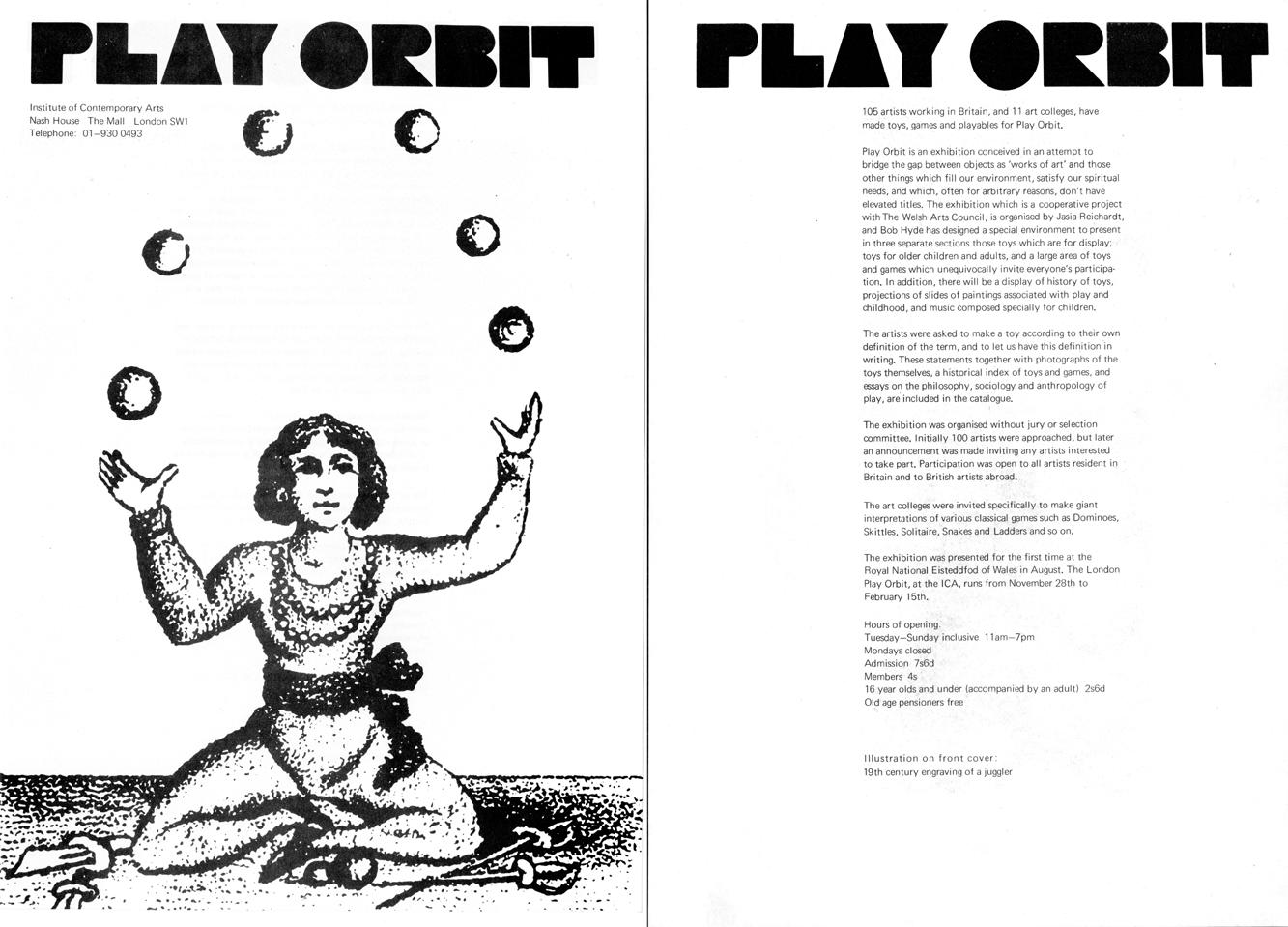
Here is the first announcement.

64
The catalogue, a Studio International publication included essays on the history and philosophy of play, as well as photographs and descriptions of the toys in the exhibition. There were many ingenious toys but the only images, which are in the catalogue, are black and white.
What was important was for the catalogue to give a background to an all-round view of leisure, its future, games, and their classification, play as a cultural phenomenon, the connection between games and rites, the relation of laughter to play. The catalogue includes essays about all these subjects. The authors are: Beaudelaire, Hans Christian Andersen, André Breton, Johan Huzinga, Roger Caillois, Lewis Mumford, Sebastian de Grazia, and others. The reason for including this material was that I couldn’t find a publication that dealt with the subject of play in the round. The catalogue also included illustrations of toys and games in different categories throughout history.

65
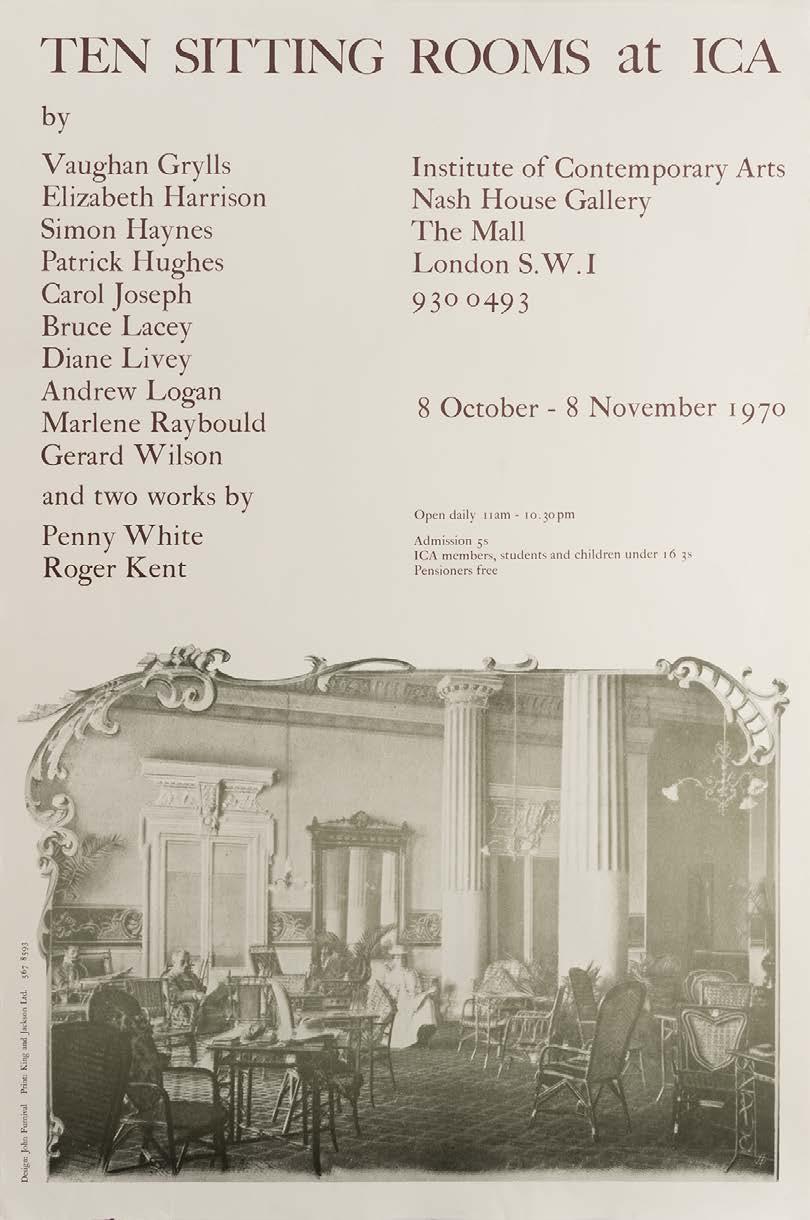
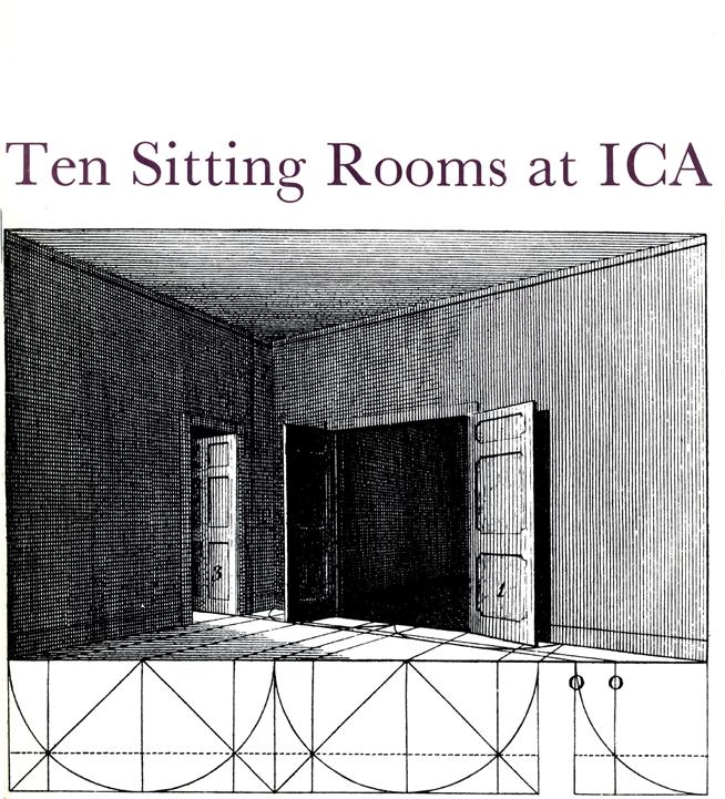
The next exhibition was TEN SITTING ROOMS . The poster lists the artists taking part, and includes an image of very old-fashioned sitting room.

66
5
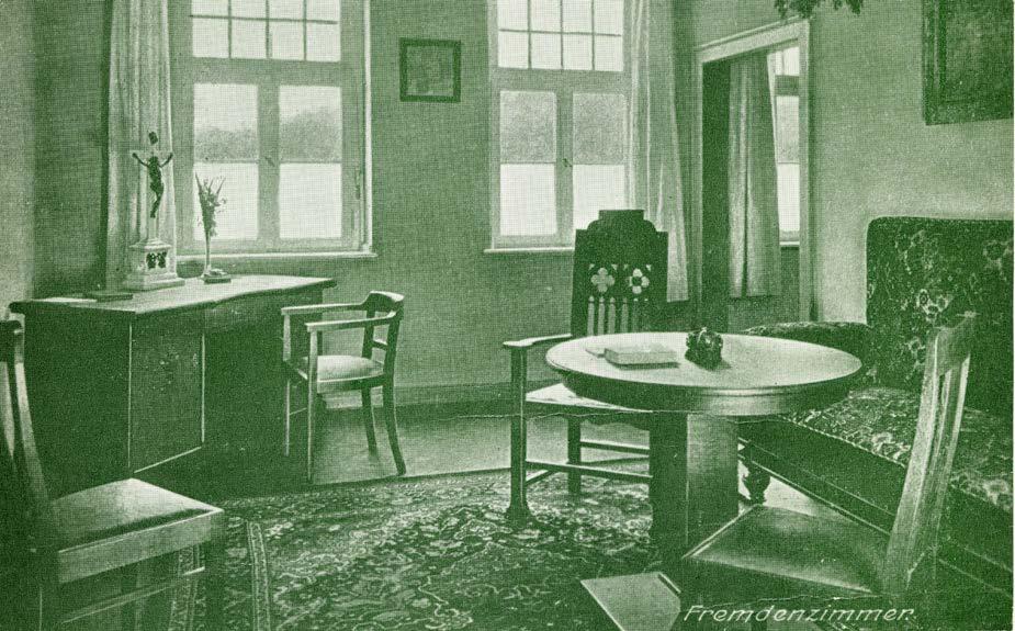
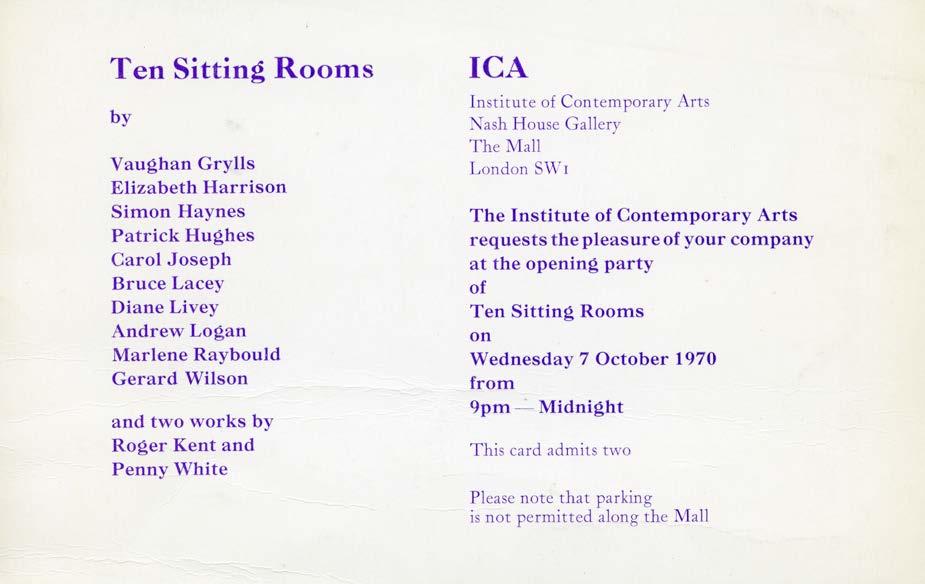
The invitation was an old German postcard. Again, something that didn’t seem to be relevant, but that was the whole point. The sitting room is an old-fashioned idea, and we couldn’t anticipate what sort of interiors the artists would create.


67
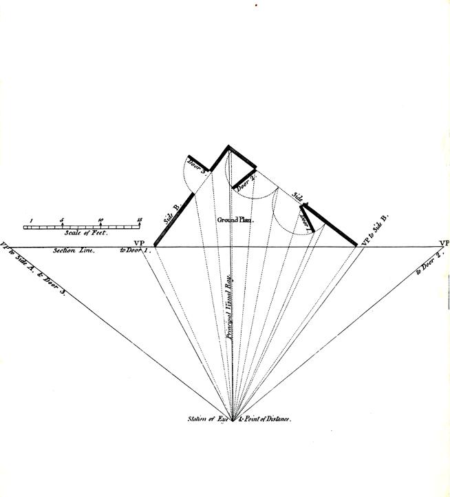
Again, the catalogue includes old images. The front and back covers come from an 1820 book on perspective.


68
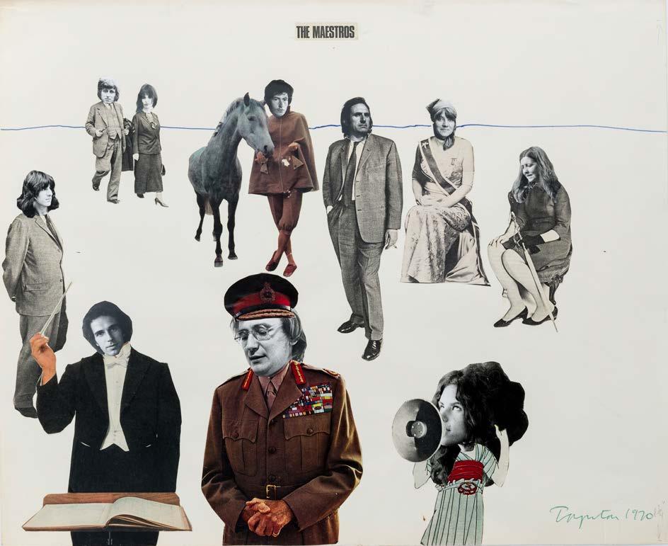
And here is a collage by Norman Toynton, which appears in the catalogue, and presents the artists in the exhibition.

69
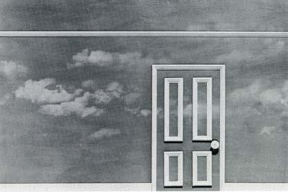
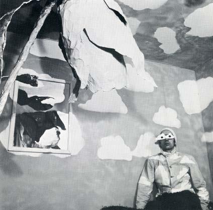
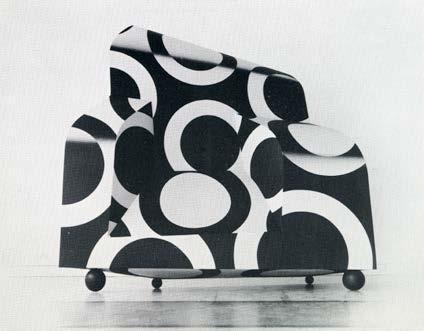
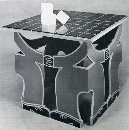
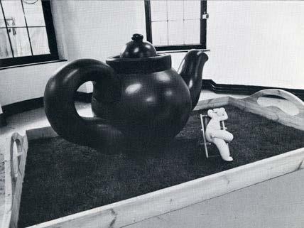
Of course, the sitting rooms made by the artists were altogether different from conventional sitting rooms and in some there was nowhere to sit. Here are views of some of them.


70
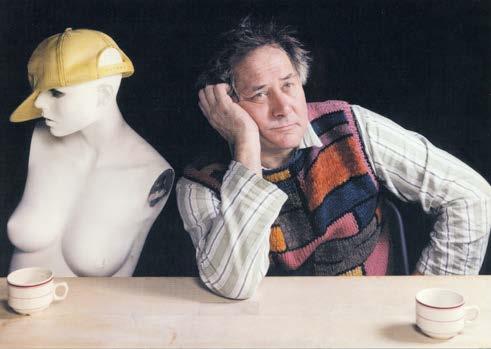
Patrick Hughes
Andrew Logan
Penny White
Marlene Raybould
Simon Haynes
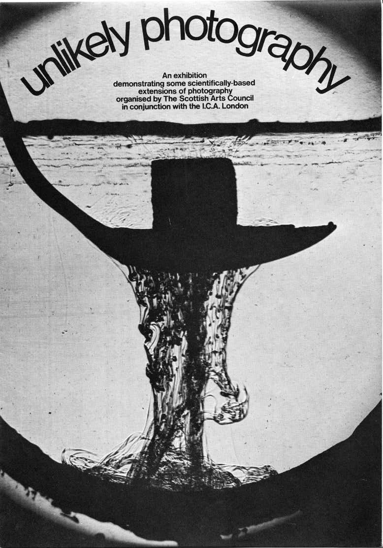
The last exhibition I worked on for 18 months, called UNLIKELY PHOTOGRAPHY, was to open in the autumn of 1971 but was never finished and I left the ICA. It was and was about the history of inventions in photography, their strangeness, and their promise. After the showing at the ICA, the exhibition was to tour Scotland, and indeed it was taken over by the Scottish Arts Council, and so this is the show to which I refer to as a half.

71
½
I have already talked about the 5 ½ exhibitions. and before I finish
I wanted to mention two more exhibitions that followed the theme of art and technology.
72
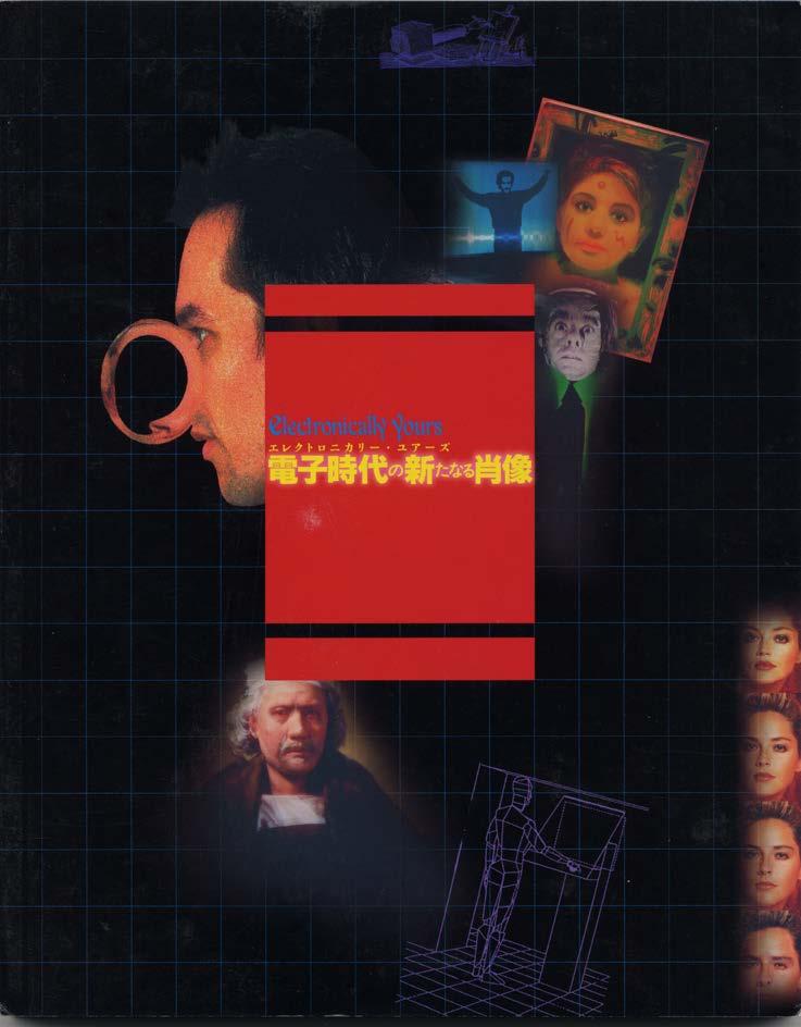
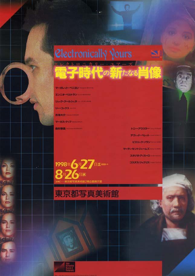
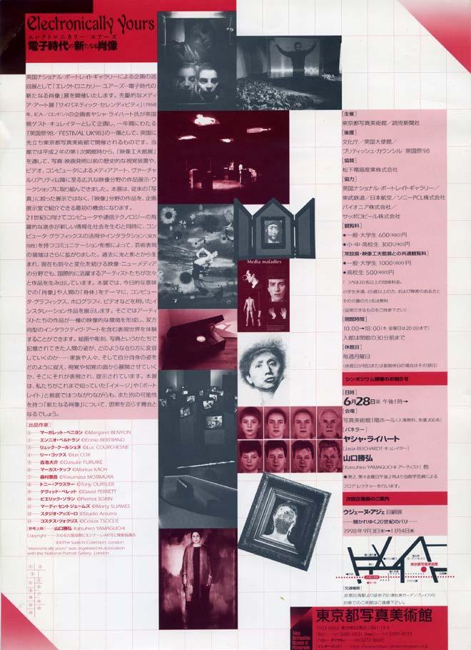
The first was Electronically Yours consisting, one could say, of portraits and figures made by artists that responded to the visitors, that talked and moved. That exhibition was shown in 1998 at the Tokyo Metropolitan Museum of Photography, and the catalogue was by Kohei Sugiura, the same artist who designed Fluorescent Chrysanthemum.

73
Originally this exhibition was planned for the National Portrait Gallery and was going to take place there, but arrangements were changed.


74
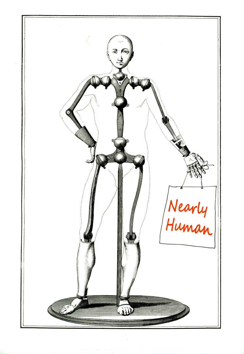
Nearly Human, was about robots and their history, and included several artists whose sculptures behaved in unpredictable ways. The exhibition was shown in Gdańsk in Poland, and in Porsgrunn in Norway in 2015

75
And now I really have finished.
76
