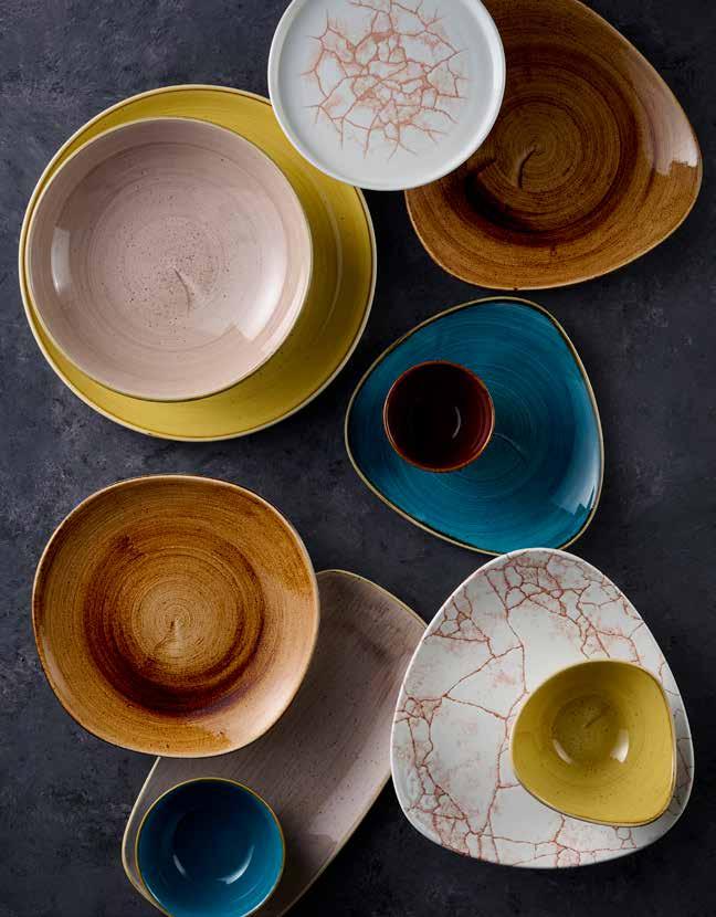
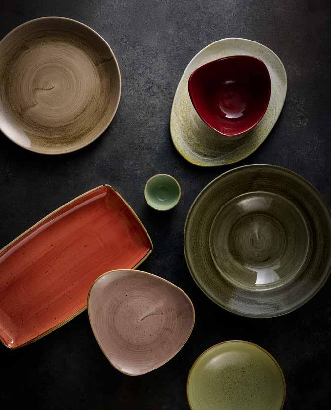
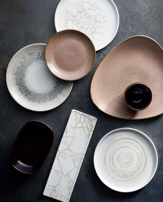
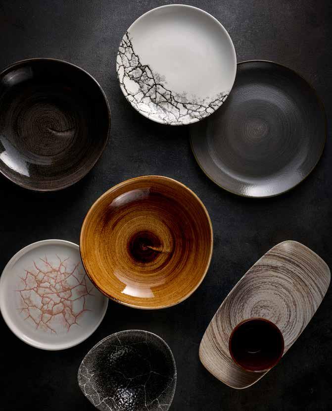
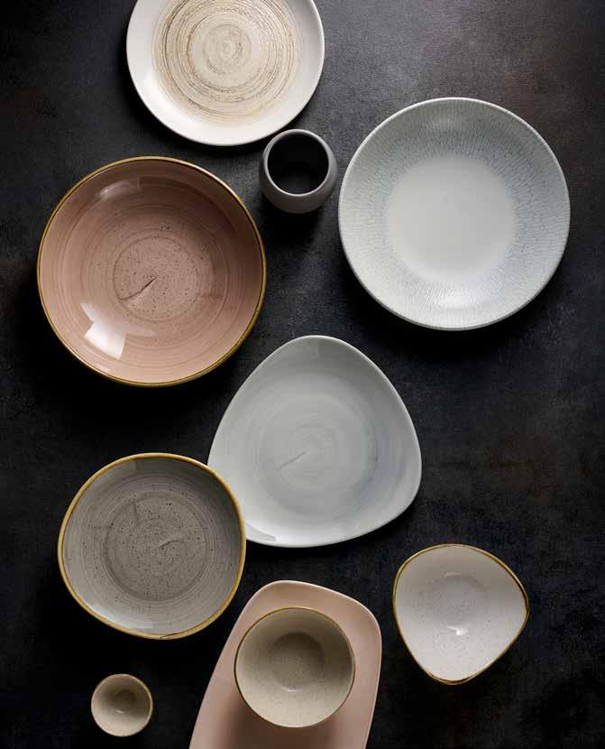
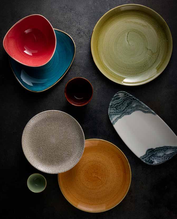
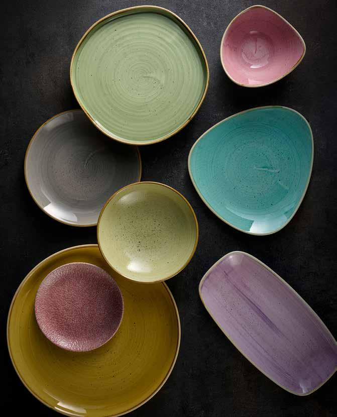
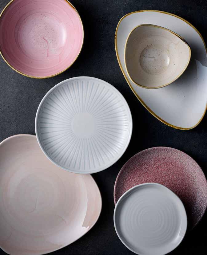
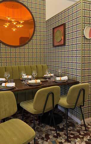
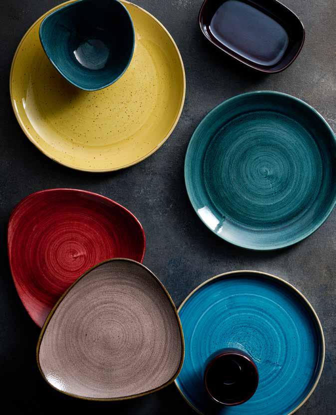
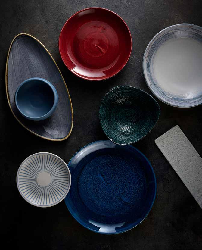
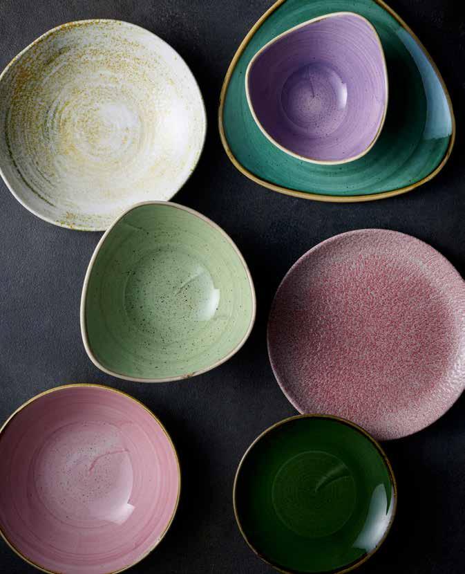
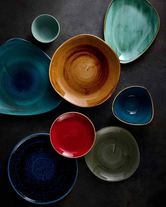
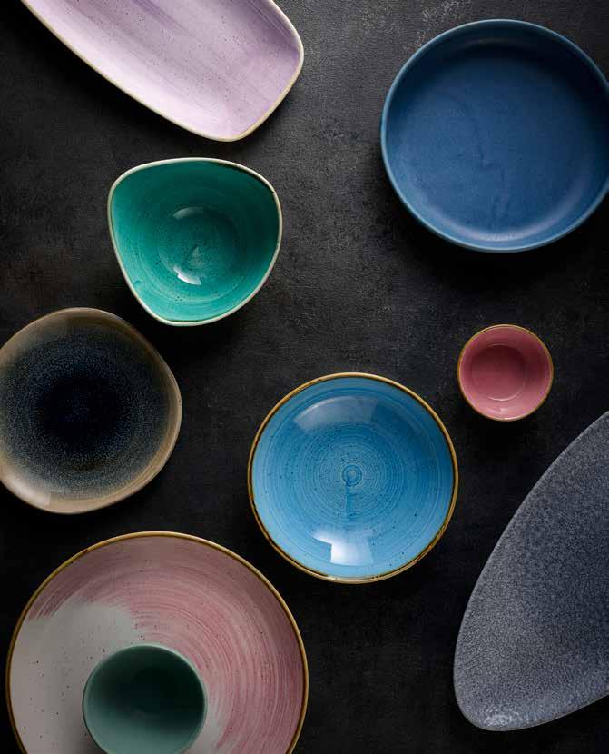
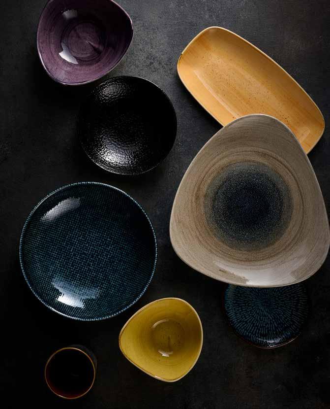
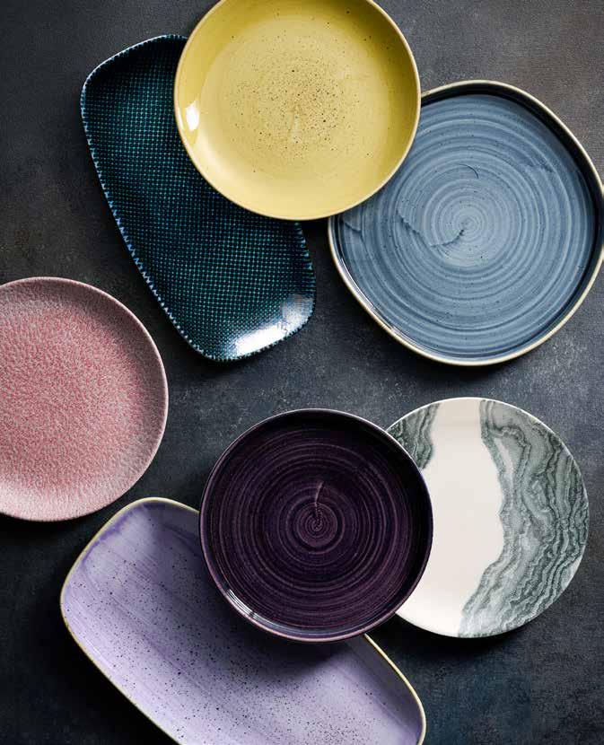
Where we offer inspiration on combining colours and textures to create striking tabletop looks, in line with the latest trends in hospitality interior design. Use this tool to explore muted, complementary tones or bold colour clashes, finding ideas to help create your unique tableware style.
REPLENISH
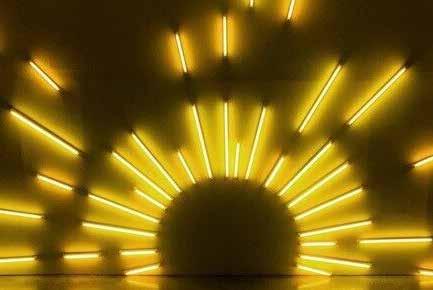
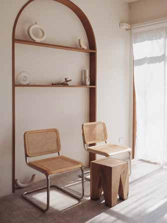
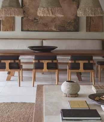
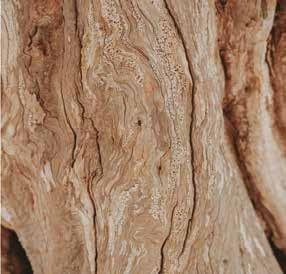
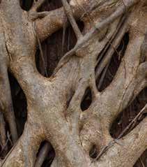
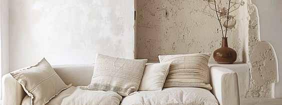
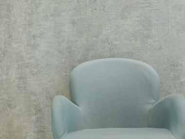
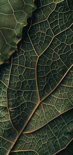
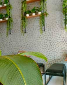
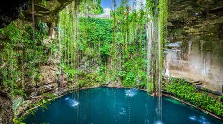
As the digital world becomes an integral part of ourdaily lives, cultivating a genuine connection to raw materials, ancestral lands, and natural sanctuaries will evoke a sense of nostalgia for simpler times, providing grounding and rejuvenation.
Designers are therefore seeking a return to simplicity by using natural textures, colours and materials to replenish our senses and soothe our minds, bringing a wellness orientated intention with the use of different colour palettes.
The following tabletop colours reflect these new trends.
REPLENISH
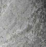
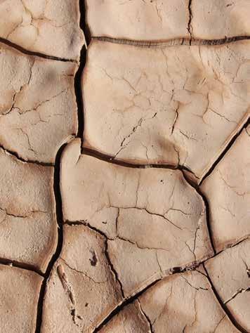
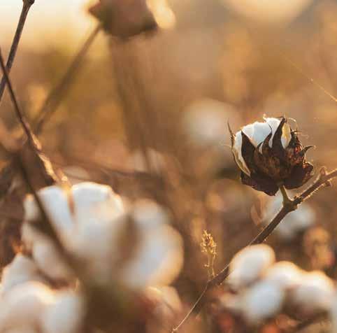
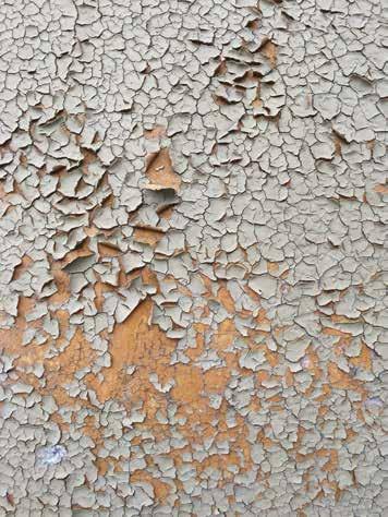
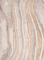
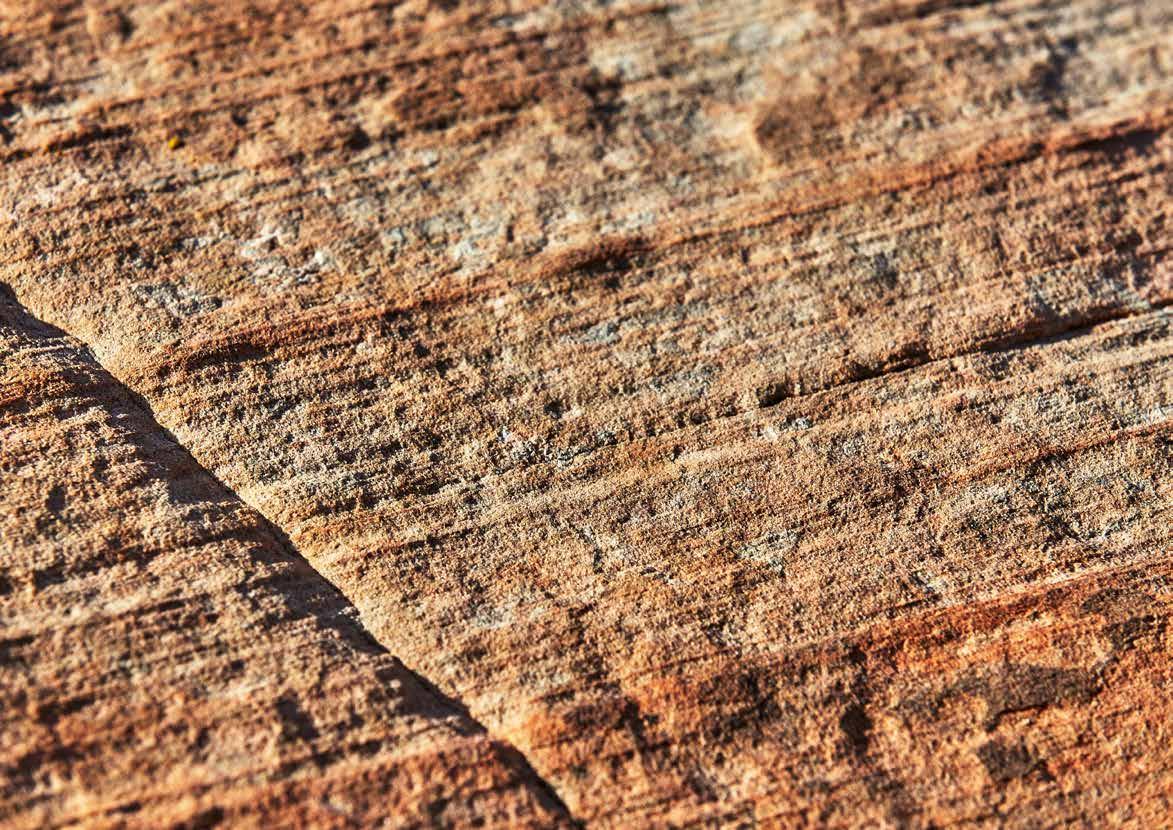
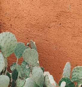
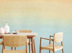
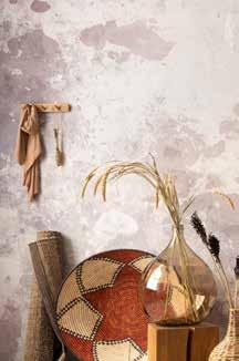
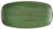
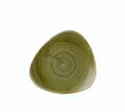
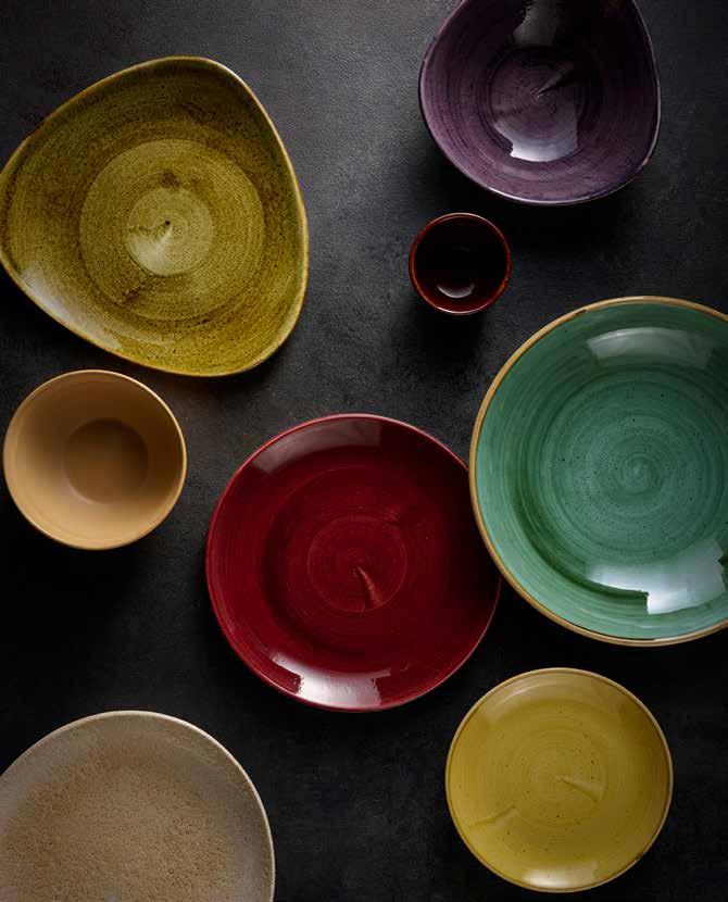
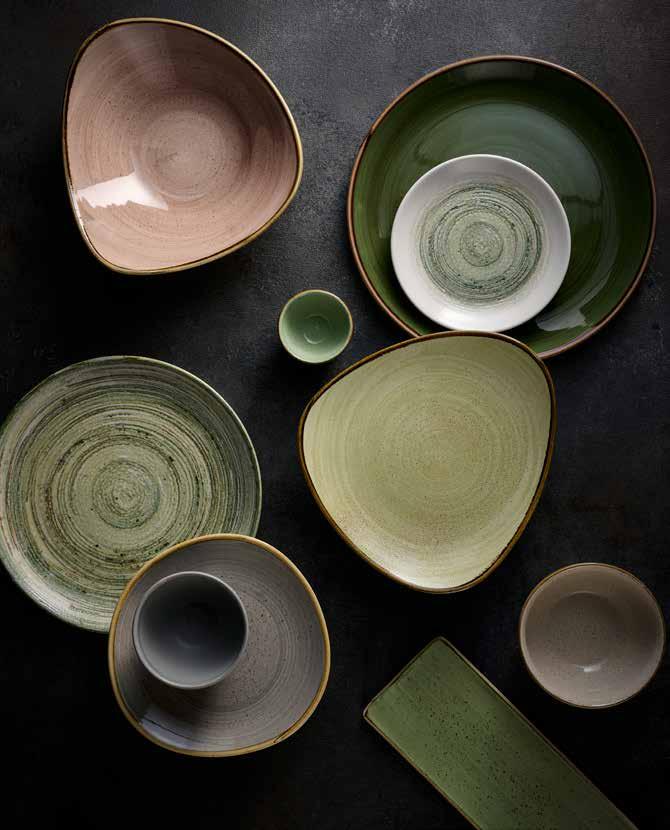
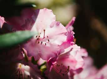
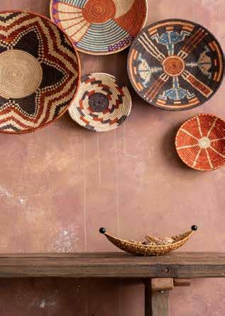
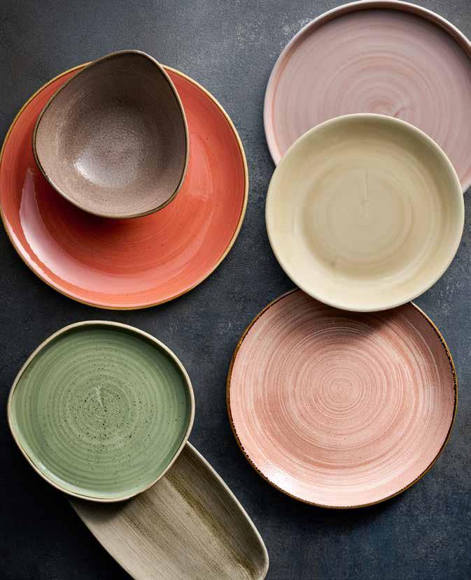
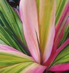
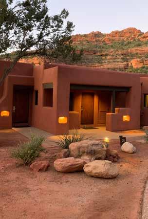
Inspired by the hues and textures of the desert, this palette seeks to deepen our connection with raw natural materials and ancestral lands, creating a sanctuary for the senses.
This colour story blends warm, muted tones of peach, taupe, and sand to evoke a sense of calm. Enhance the sandy shades with Stonecast Patina Burnished Green and introduce a touch of Patina Rust Red for a vibrant hint of colour.
Combine sandy tones with muted greens and bright terracotta for a calming desert inspired palette.
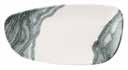
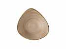
ENVISAGE Erosion Sand
STONECAST PATINA Antique Taupe
STONECAST RAW Green
STONECAST Spiced Orange
STONECAST PATINA Rust Red
STONECAST PATINA Burnished Green
STONECAST Truffle
REPLENISH
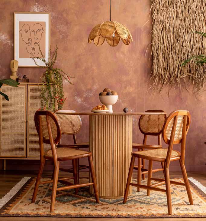
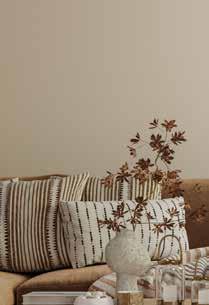
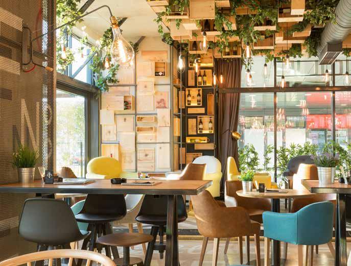
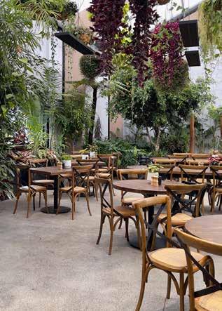
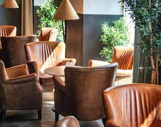
Interior design of both hospitality, home and work places has the ability to bring comfort and equilibrium during times of change or turbulence.
Designers are creating spaces focused on wellness and low stimulation, areas with unintrusive energy where consumers can make meaningful connections. Soft and neutral colour palettes, raw materials and natural light adorn hybrid spaces intended for work, rest or socialising. Create a neutral mix of off whites with Patina Antique Taupe, and Agate Grey in Studio Print designs. Add warmth to the palette with deep browns from Studio Prints Stone and Emerge.
EMERGE Cinnamon Brown
Create a cosy space with warm neutrals like browns and terracottas. Introduce lighter taupes and creams for a more tranquil vibe.
STUDIO PRINTS KINTSUGI Agate Grey
STUDIO PRINTS FUSION Agate Grey
STONECAST RAW Brown
STONECAST RAW Terracotta
Elements Dune
REPLENISH
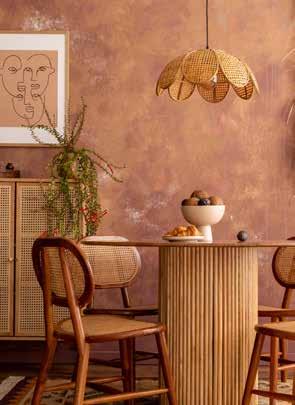
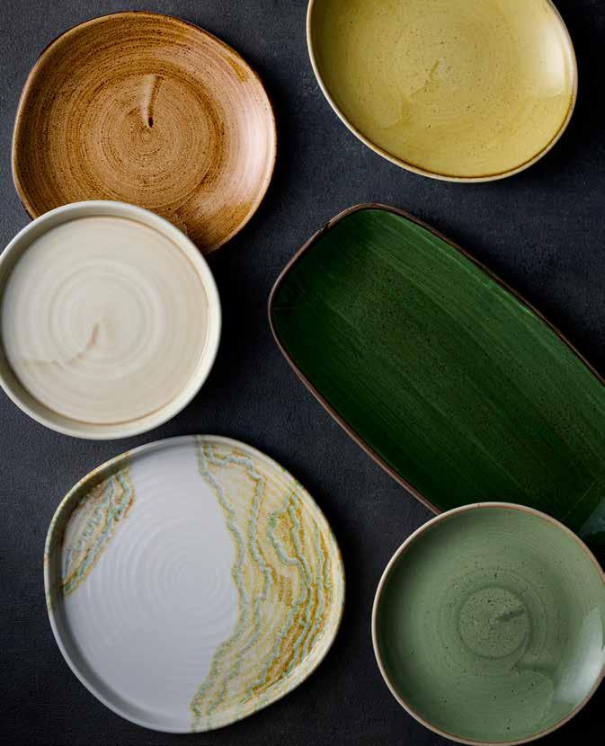
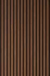
Earthy browns and wooden textures continue to feature strongly in hospitality interiors, creating a warm and rustic atmosphere.
Create this colour palette using dark grounding pieces combined with lighter grey tones and warmer cocoa browns.
Use a mixture of dark Stonecast Patina and Stonecast Raw plates blended with Studio Prints Kintsugi Accents for a striking mixture of tones and textures.
Mix muted taupe colours, warm coppery reds and textured Raku and Kintsugi patterns for a grounding palette.
STONECAST
REPLENISH
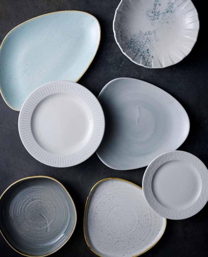
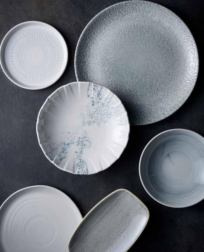
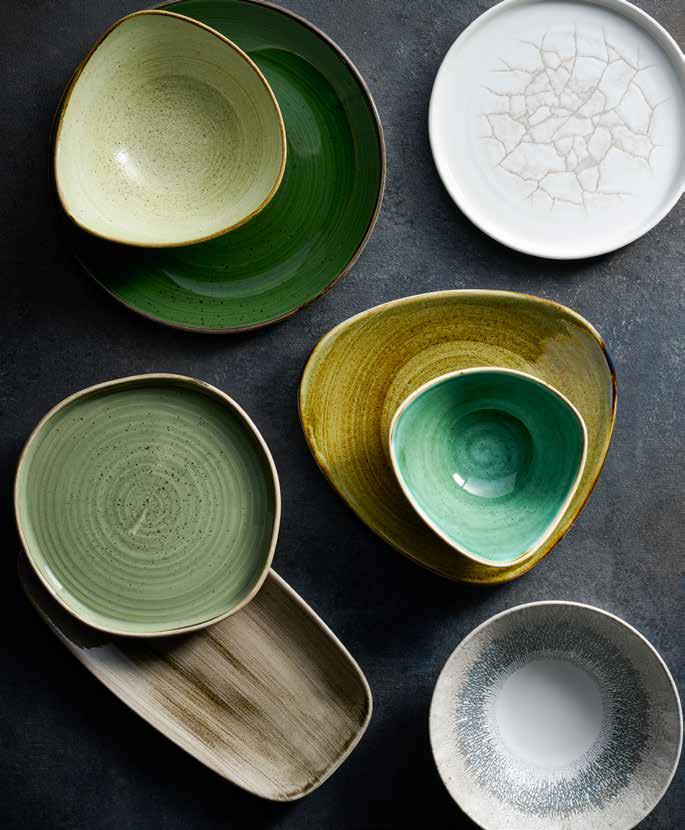
Elemental neutrals create a calming tablescape, evoking serene early morning tones and minimalist spaces, ideal for a simple food backdrop.
Build this colour palette using a range of neutral tones that will add diversity and interest to the table. Combine Inked Delta Grey, and Elements Dune with Stonecast Truffle and Peppercorn Grey to create this minimalist palette.
STONECAST CANVAS Coral
STONECAST Canvas Grey
Barley White
Peppercorn Grey INKED
Mix a range of soft neutral tones that include hints of pale blue and pink paired with stronger greys.
REPLENISH
Tranquil tones of dusky azures and powder blues create a soft and soothing atmosphere, ideal for spaces designed for relaxation.
Lighter shades of blue promote a sense of mental clarity and calm, making it an ideal trend for wellness spaces. Soft blues like Stonecast Duck Egg mix beautifully with fresh greys or whites in Era, Alchemy Smoke or Stonecast Canvas, creating a serene tabletop mix.
STONECAST Blueberry
Mix dusky azure tones with power blues or cool greys for a calming look.
ALCHEMY SMOKE Grey
STONECAST Duck Egg Blue
INKED Era Grey
Grey
STONECAST Barley White
REPLENISH
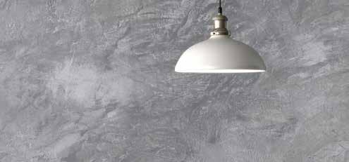
Soft and minimal grey tones create a clean, serene and balanced atmosphere in interiors.
Light grey tones mixed with simplistic white are well suited for interiors intended to promote relaxation and mindfulness. To capture this trend on the tabletop try Stonecast Canvas Grey mixed with minimalist Inked Era or Alchemy Smoke. To add texture introduce Studio Prints Raku in the contemporary Jasper Grey colourway.
Mix different shades of grey for a contemporary but tranquil colour palette.
STUDIO PRINTS RAKU Jasper Grey
ENVISAGE NATURAL White
STONECAST Peppercorn Grey
STONECAST CANVAS Grey
ALCHEMY SMOKE Grey INKED Era Grey
REPLENISH
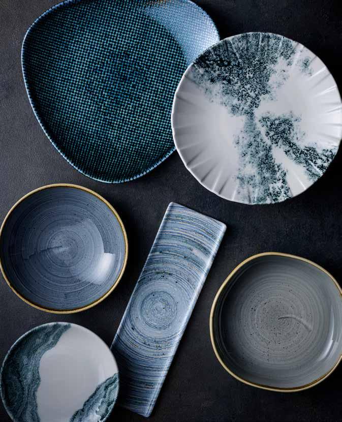
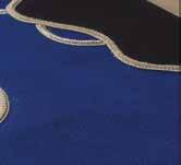
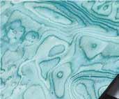
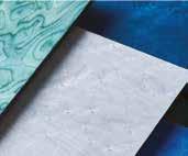
Inspired by the natural world, deeply saturated hues such as moody ocean blues, evoke a sense of luxurious serenity.
Rich shades of blue create depth and a sense of calm in hospitality interiors.
Complement this look with dusky blues in Stonecast and Elements, or add a glint of metallic with Studio Prints Astro. Or enhance an air of opulence with contemporary patterns Tide and Alchemy Smoke.
STUDIO PRINTS HOMEPSUN CHROMA Twilight
Go bold but sophisticated with a combination of dark tones or lighten the palette with more dusky shades.
ELEMENTS Coast
STONECAST Blueberry
ALCHEMY SMOKE Black
STUDIO PRINTS ASTRO Blue
INKED Tide Black
NEO - RETRO
Building on from last years theme ‘Back to the Future’, Neo – Retro continues to tell the story of heritage designs, combining the feeling of nostalgia and comfort with renewal.
There is a strong interest in reconnecting with vintage stories as they provide familiarity in turbulent times and offer a chance to reconnect with our shared heritage. These styles are revived for today’s needs in what has been termed as ‘Newstalgia’.
The following tabletop colours reflect the evolution of these retro stories.
NEO-RETRO
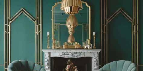
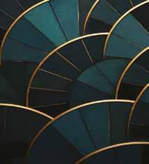
Dramatic colours create a modern vintage look and feel, inspired by the opulence and maximalism of the Art Deco era.
Opulent colours are paired with sophisticated teal and amber luxe tones. This look can include dark and striking contrast patterns such as Kintsugi and Tide to add a touch of elegance. For extra vibrancy, add Stonecast Tangerine and Java Blue.
STONECAST Tangerine
NOURISH
STUDIO PRINTS RAKU
STONECAST
Create a striking colour story mixing strong textured pieces with teal blues, pistachio greens and amber hues.
NEO-RETRO
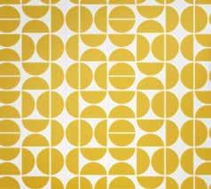
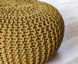
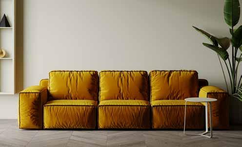
Blending vibrant bold hues with more subdued and earthy tones creates a midcentury look but with a natural feel.
Vibrant accent colours such as mustard yellow are combined with tan leather and metallic finishes like copper or brass. Incorporating botanical elements brings in deep green tones and creates the natural vibe. Try the rich Sorrel and Sage Greens in Stonecast with pops of colour from Mustard Seed Yellow. Add Patina Vintage Copper for a metallic glint.
STONECAST Mustard Seed Yellow
STONECAST PATINA Vintage Copper
STONECAST CANVAS Natural
STONECAST Sorrel Green
INKED Tide Gold
Combine earthy greens with warm yellow and orange tones, creating a mid century look but with a natural feel. STONECAST Sage Green
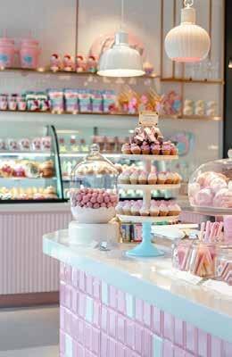
NEO-RETRO
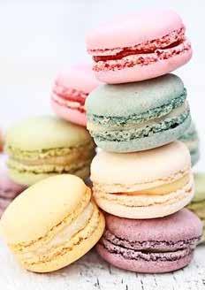
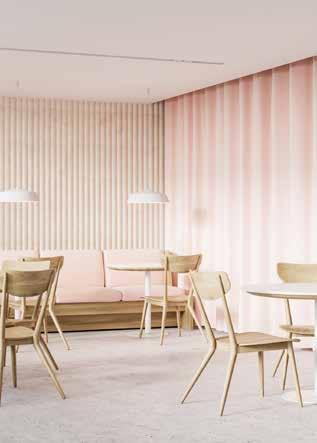
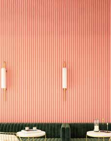
Pastel nostalgia tones add a touch of playful fun to interiors and evoke a retro vibe of old school Parisian cafés and retro diners.
Pastel colours continue to be popular in cafe culture and bring a sense of care free fun in the everyday. Create this playful palette with a combination of Stonecast colours including Petal Pink, Mint and Lavender. For textural pieces use Studio Prints Raku Quartz Pink, and Jade Green mixed with Stone in Aquamarine.
STONECAST RAW Green
STONECAST Peppercorn Grey
STONECAST Mint
STONECAST Lavender
STONECAST Mustard Yellow
STONECAST Petal Pink
STONECAST Sage Green
Create a fun and playful palette by combining a range of pastels to capture a nostalgic vibe.
NEO-RETRO
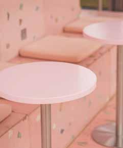
Soft pastels like pale pinks and blush tones create a retro vibe but with calming sense of lightness and fun.
Whimsical and nostalgic, shades of pink continue to be popular in hospitality interiors, drawing inspiration from the vintage charm of the 1950’s and 1960’s. Choose vibrant pinks in Stonecast and Studio Prints Raku, or softer blush tones in Stonecast Canvas and Stonecast Raw. Pair with retro-inspired pattern Era for a truly nostalgic look.
STONECAST Petal Pink
STONECAST Barley White
STONECAST Nutmeg Cream
Coral
Mix vibrant pastel pinks or soft blush tones with taupes for a whimsical and nostalgic vibe.
STUDIO PRINTS RAKU Rose Quartz Pink ERA Grey
NEO-RETRO
A retro mid century colour story creates a comforting and familiar atmosphere, reminiscent of a 1970s interior.
Wooden details, subtle geo patterns and textured rugs all create a retro vibe that takes you back to the 1970s. Build this tabletop palette by combining Stonecast Patina Rust Red and Deep Purple with Nourish Petra Sand for a tonal brown palette and Stonecast Mustard Yellow for a strong retro feel.
STUDIO PRINTS RAKU
Garnet Orange
NOURISH
Petra Sand
STONECAST PATINA
Rust Red
STONECAST Mustard Yellow
STONECAST PLUME Olive
Capture the essence of the 1970s with an eclectic mix of bright yellows and greens paired with more muted purple and sand tones.
NEO-RETRO
Designers continue to draw inspiration from the mid-century era, including the abstract forms and warm colour palettes of the 1960’s and 1970’s.
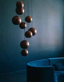
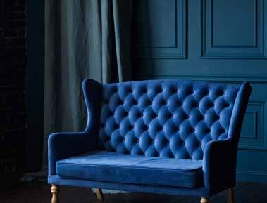
Wood panelling and tactile materials such as velvet and leather are increasingly paired with elements inspired by the space-age era such as spherical shapes and curved lines. Combine the warm tones of Stonecast Mustard Seed, Patina Rust Red and Vintage Copper with deep Patina Teal. Enhance the mid-century feel with earthy browns in Stonecast Raw and Studio Prints Stone.
STONECAST Mustard Seed Yellow
STONECAST PATINA Rust Red
STONECAST RAW Brown
Stonecast Java Blue
STONECAST PATINA Rustic Teal
Combine dusky teals and blues with earthy browns, alternatively add warmth to the palette with burnt sienna tones and mustards. EMERGE Cinnamon Brown
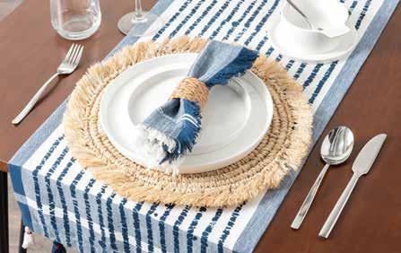
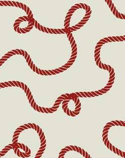
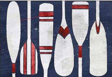
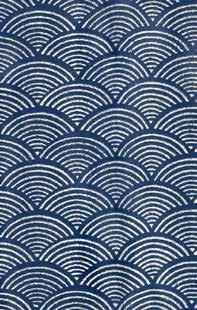
NEO-RETRO
Capture the essence of nautical charm with a fresh and breezy tonal palette.
Cool blues are combined with fresh neutrals for an understated and modern table.
Combine Stonecast Plume Ultramarine with Inked Elements Coast for a minimal ocean look, or add a flash of Stonecast Rust Red for a more classic nautical vibe.
STONECAST PATINA
STUDIO PRINTS HOMSPUN CHROMA
Create this cool colour palette with a mixture of blues and neutrals. Add vibrancy by incorporating red flashes of colour.
IMMERSIVE
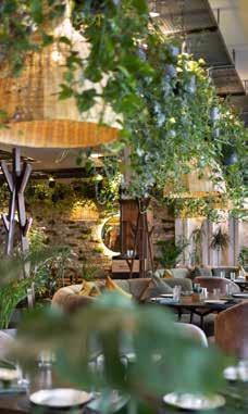
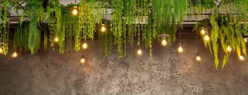
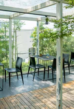
The growing popularity of experience-based events and spaces has led to a demand for more immersive environments. People are looking for multi-sensory escapism, whether through nature or virtual reality.
This trend is evident in restaurants that use unique visual installations to transforming into a novel and creative experience. Additionally, the rise of biophilic design brings nature indoors, offering a break from screen time.
The following tabletop palettes show an eclectic mix of immersive futures.
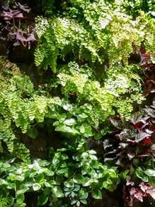
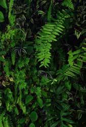
IMMERSIVE
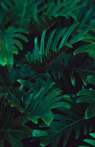
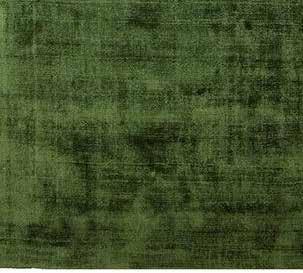
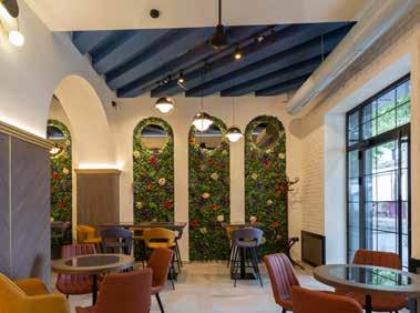
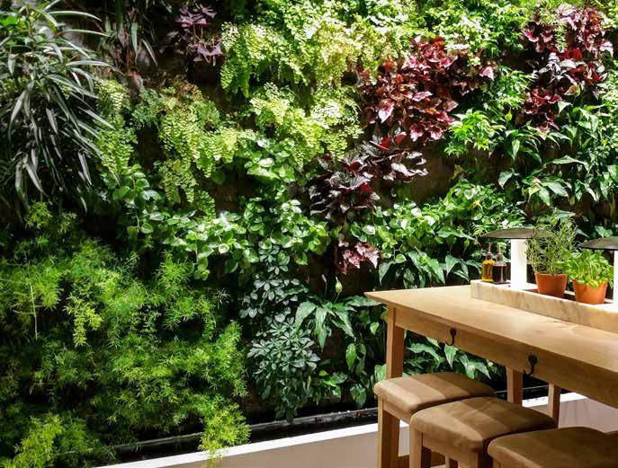
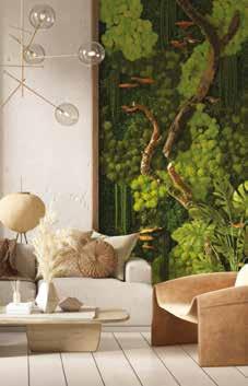
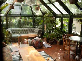
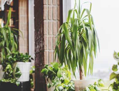
Biophillic design and nature inspired interiors will continue to dominate in the coming years. From living walls to diverse foliage in restaurant spaces, this theme celebrates the abundance of plants.
Use a variety of tonal greens and neutral browns to create a unique story that celebrates nature. Pair Stonecast Truffle with Inked Elements Fern and Stonecast Samphire for a muted forest palette.
EMERGE Seattle Grey
STONECAST RAW Green
Peppercorn Grey
STONECAST Sage Green
Embrace nature inspired interiors with this colour palette of tonal greens and soft greys.
IMMERSIVE
Designers create spaces that reconnect consumers with the natural world, feeding the desire to live with intent and consume consciously to protect planet.
Circular thinking means we’re seeing more regenerative or salvaged materials, as well as natural colour palettes intended to be long-lasting and trans-seasonal. Fresh ingredients look great on tableware that emulates the natural world, and green is now a hugely popular tableware choice.
Get the look by pairing the greens in Stonecast and Patina with off whites and organic textures like Studio Prints Stone.
STONECAST PATINA Antique Taupe
STONECAST RAW Green
STONECAST PLUME Olive
Deeply saturated green tones create the rich feel of a dense forest, alternatively use lighter greens paired with taupes and creams for a fresher look.
STONECAST Sorrel Green
STUDIO PRINTS KINTSUGI Agate Grey
STUDIO PRINTS FUSION Agate Grey
IMMERSIVE
Fresh and rejuvenating, the Natural Re-Gen trend celebrates the beauty of nature.
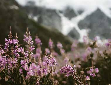
Designers bring the outside in and create a tropical feel with deep forest or mossy greens, combined with pops of floral pinks and purples. Mix the Stonecast green tones with Petal Pink, Lavender or Studio Prints Raku Rose Quartz. Or for a more earthy vibe mix in Erosion Sand or Stonecast Sage Green.
Combine deep forest or mossy greens with pops of floral pink and lavender tones for a botanical look.
ENVISAGE COLLECTION EROSION Sand
Lavender
STONECAST
Sorrel Green
STUDIO PRINTS RAKU Rose Quartz Pink
STONECAST
Petal Pink
IMMERSIVE
Bohemian interior design embodies the trend for wellness, creating relaxed spaces that celebrate free-spirited lifestyles, wanderlust and creative expression.
Layers of texture, pattern and colour, paired with global influences create relaxed and comforting vibes. While the incorporation of greenery and natural light reduces stress, positively affects mood and improves air quality. Use warm neutrals for a perfect Boho palette, like Patina Terracotta and Raku Agate Grey. Mix in earthy tones like Raw Brown and Patina Antique Taupe, add a splash of natural freshness with Stonecast Sage Green.
Brown
Spiced Orange
STONECAST Sage Green
Combine browns and blush tones for a laid back boho look, introduce pops of green to create that link with the natural world.
STONECAST CANVAS Coral
STONECAST RAW Terracotta
STONECAST PATINA Antique Taupe
IMMERSIVE
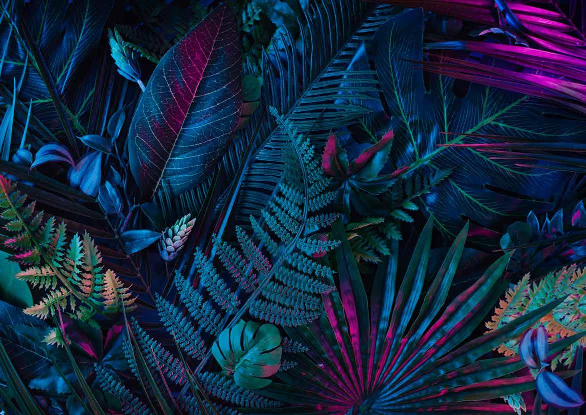
An eclectic mix of hothouse brights celebrates the diversity of colours found in tropical spaces. Expanding on the theme of nature inspired interiors, this palette maximises on colour.
Being bold and bright will make this colour story come alive. Mix a range of pieces that capture a tropical lagoon with bright foliage. Use Stonecast Aqueous Lagoon, Stonecast Patina Burnished Green and Berry Red to make this tropical palette work.
STONECAST PLUME
Ultramarine
STONECAST Samphire Green
STONECAST Java Blue
STONECAST AQUEOUS Lagoon
STONECAST Berry Red
STONECAST PATINA Burnished Green
STONECAST PATINA Vintage Copper
Celebrate the vibrancy of tropical brights by mixing turquoise blues with bright reds and coppers.
IMMERSIVE
As designers draw inspiration from nature they’re becoming bolder with colour, using the deeply saturated tones found in exotic or barren landscapes.
Spaces also become more immersive, surrounding the consumer with the natural world and blurring the lines between inside and outside. Find deep natural tones in Patina, such as Rust Red and Rustic Teal or the striking Chroma Marine. Pair these cooler strong tones with warm Stonecast Spiced Orange, or to create a exotic botanical vibe introduce the pinks of Stonecast and Raku.
STUDIO PRINTS HOMEPSUN CHROMA Marine
STONECAST PATINA Rustic Teal
STONECAST PATINA Rust Red
STONECAST Spiced Orange
STUDIO PRINTS RAKU Rose Quartz Pink
STONECAST Petal Pink
Use deeply saturated teals and blues to create a tropical palette. Introduce a botanical vibe with pops of rich reds, pinks and oranges.
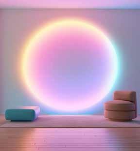
IMMERSIVE
Digital real tones and colours immerse you in an AI reality, where chalky pastels blend with ethereal gradients for a futuristic table.
This vision of a digital utopia blurs the boundary between virtual and reality creating an otherworldly experience. Mix Stonecast Lavender with Mint and Stonecast Aqueous Bayou for an eclectic style.
STONECAST Mint
STONECAST ACCENTS Petal Pink
STONECAST Cornflower Blue
STONECAST AQUEOUS Bayou
EMERGE Oslo Blue
STUDIO PRINTS RAKU Jasper Grey
STONECAST Lavender
Dive into the digital metaverse with this unique colour story that merges dreamy lavender and petal pink with fresh mint.
IMMERSIVE
A celebration of nocturnal activities lit by neon glows, this colour story dives into dark mystical purples contrasted with bright altered reality experiences.
Create this dramatic colour story by picking out pieces that add drama to the table. Envisage Cascade and Sudio Prints Astro add a futuristic blue and pair well with Stonecast Patina Deep Purple and Stonecast Mustard Yellow.
STUDIO PRINTS ASTRO Blue
STUDIO PRINTS HOMESPUN CHROMA
STONECAST AQUEOUS Bayou
ENVISAGE CASCADE Sapphire Blue
STONECAST Tangerine
Create this after dark colour story by mixing dark purples and astro blues with bright oranges and yellows for that neon glow.
IMMERSIVE
As AI revolutionises all industries and space tourism becomes a reality, designers are re-visualising the future, taking inspiration from the past and how the age of today was imagined in the futuristic illustrations of the 1950s and 1960s.
The result is a playful revival of abstract space age design, with bold and empowering colour palettes. Mix the dark tones of Patina Cobalt and Deep Purple with Raku Quartz Pink and Stonecast Lavender to create a cosmic palette. Add a pop of warmth with Stonecast Mustard Seed, a perfect retro shade for the trend Back to the Future.
STUDIO PRINTS RAKU Rose Quartz Pink
For a cosmic palette use deep purples and rich pinks. Brighten up the futuristic look with fun pops of orange and yellow.