SMALL
/ MEDIUM / LARGE AUTUMN 2016
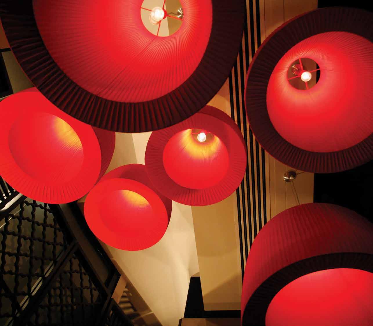

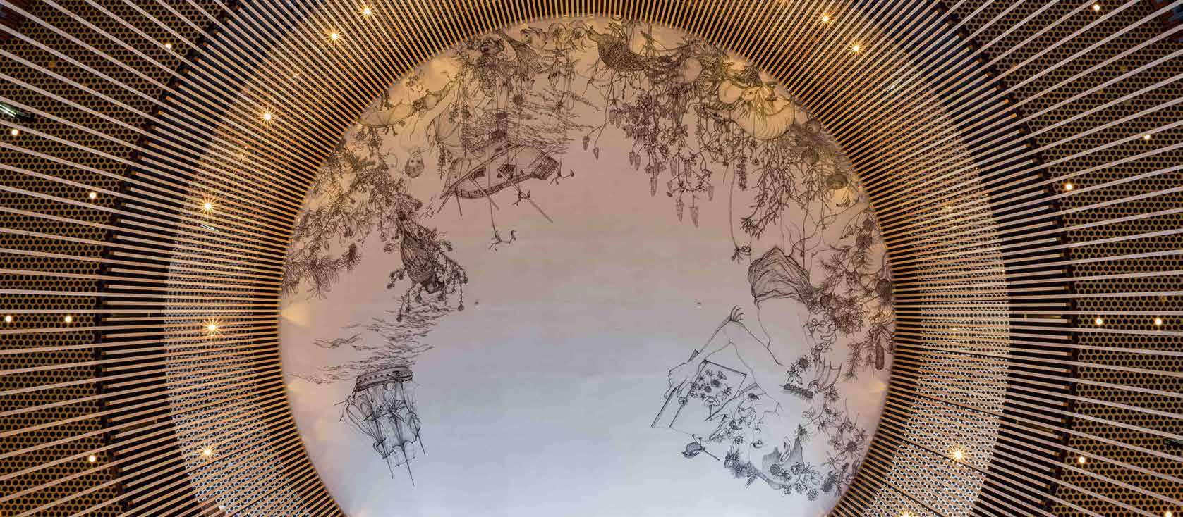
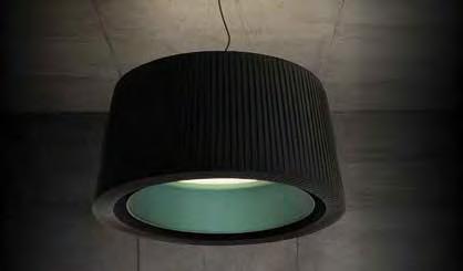
Rakumba Iris is a timeless interior pendant. Available in two sizes, 700mm diameter and 1000mm diameter, this luminaire has a black fabric pleated outer shade and an inner shade of PVC with PS bonded fabric in three colour options; copper, chartreuse and ocean. The inner diffuser is made from white fabric to provide a soft illumination to create a warm and inviting environment. The suspensions are four stainless steel cables with black decorative cloth flex.
The Rakumba Iris is available in 55W Fluorescent or 34W Tridonic LED with 3550 lumen output and is perfect for hospitality, retail and other creative lifestyle applications.
PHOTOGRAPHY Rakumba

Rakumba IRIS For more information speak to one of our lighting application specialists or visit the online project page using the QR code reader on your smart-phone. +61 8 9321 0101 mondoluce.perth mondoluce.com.au

IrI ng I nter I ors 204 stirling highway, claremont (08) 9389 6669
Insp

The Official Journal of the Australian Institute of Architects: WA Chapter
4 Contributors 5 Editor’s Message 7 Chapter President’s Message
8 Rawlinson's Costings
12 Explorations in Prefabrication
15 Tailor Made: Adelaide Terrace
18 Do 3D Printers Dream of Plastic Sheep?
22 Petition x3 + Long Chim / spaceagency
27 In Detail - Old and New: Marsala House / Iwan Iwanoff
30 In Detail - Old and New: Lovestory / MORQ Medium
34 Musterers’ Quarters / Luigi Rosselli Architects
36 Culture and Community: Walumba Elders Centre
40 Pilbara Pixels: Wanangkura Stadium
47 City of Perth Library / Kerry Hill Architects
52 Medium Density: Perry Lakes Residential Development
58 Bunbur y Catholic College - Mercy Campus / CODA Studio + Broderick Architects
62 Scaling Up: Towards Best Practice
64 Global and Local BIM Adoption - A Shared Responsibility
66 COMO The Treasury / Kerry Hill Architects
70 Ten from Ten: Perth's Public Transport Extra Large
84 The Corb Awakens
- 3 -
Small
Large
CONTENTS


Hayley Curnow
‘In Detail: Lovestory / MORQ’. Hayley is a Perth-based Interior Designer at Taylor Robinson with a strong interest in architectural theory and shifting ideas about inhabiting space.
Andrew Boyne
‘Explorations in Prefabrication’ / ‘Bunbury Catholic College – Mercy Campus / CODA Studio + Broderick Architects’. Andrew is a sole practitioner who focuses on residential and prefabricated architecture and is the recipient of the 2015 Gil Nicol Biennial Award.
Michelle Blakeley
‘In Detail: Marsala House / Iwan Iwanoff’. Michelle recently started Michelle Blakeley, Architect, and previously has worked with CODA Studio and donaldson+warn.
Marco Vittino
‘Musterers’ Quarters / Luigi Rosselli Architects’. Marco is an Associate Professor at the Faculty of Architecture Landscape and Visual Arts at the University of Western Australia and Director of vittinoAshe architects.
Fiona Giles
‘City of Perth Library / Kerry Hill Architects’. Fiona is an English Architect - almost new to Perth - and has enjoyed the welcome of the WA architectural community.
Warranty: Persons and/or organisations and their servants and agents or assigns upon lodging with the publisher for publication or authorising or approving the publication of any advertising material indemnify the publisher, the editor, its servants and agents against all liability for, and costs of, any claims or proceedings whatsoever arising from such publication. Persons and/or organisations and their servants and agents and assigns warrant that the advertising material lodged, authorised or approved for publication complies with all relevant laws and regulations and that its publication will not give rise to any rights or liabilities against the publisher, the editor, or its servants and agents under common and/ or statute law and without limiting the generality of the foregoing further warrant that nothing in the material is misleading or deceptive or otherwise in breach of the Trade Practices Act 1974.
Important Disclaimer: The material contained in this publication is general comment and is not intended as advice on any particular matter. No reader should act or fail to act on the basis of any material contained herein. Readers should consult professional advisors. The Australian Institute of Architects, its officers, the editor and authors expressly disclaim all and any liability to any persons whatsoever in respect of anything done or omitted to be done by any such persons in reliance whether in whole or in part upon any of the contents of this publication. All photographs are by the respective contributor unless otherwise noted.
Katherine Ashe
‘Tailor Made: Adelaide Terrace'. Katherine is a Director of vittinoAshe architects.
Simon Bodycoat
‘Do 3D Printers Dream of Plastic Sheep?’ Simon is a Director of Rodrigues Bodycoat Architects, a small design orientated architectural studio specialising in residential architecture.
Stephen Hicks
‘Petition x3 + Long Chim / spaceagency’. Stephen is a Registered Architect – he has an English degree and isn’t afraid to use it.
Finn Pederson
‘Culture and Community: Walumba Elders Centre’. Finn is a Director of iredale pederson hook.
Andrew Lilleyman
‘Pilbara Pixels: Wanangkura Stadium'. Andrew has been a Design Director at ARM Architecture since 2012.
Dr Robyn Creagh / Dr Courtney Babb
‘Medium Density: Perry Lakes Residential Development’. Dr Robyn Creagh is an architectural researcher, educator, creative practitioner and Research Fellow with the Centre for Sport and Recreation Research. Dr Courtney Babb
Editor Olivia Chetkovich
Managing Editor Michael Woodhams
Editorial Committee
Emma Brain Tanya Trevisan
Magazine Template Design Public Creative
www.publiccreative.com.au
Proofreading Martin Dickie
Publisher Australian Institute of Architects WA Chapter
is a lecturer in Urban and Regional Planning at Curtin University and resident researcher at the Centre for Sport and Recreation Research.
Sarah McGann
‘Scaling Up: Towards Best Practice’. Sarah is an architectural researcher and a Professor at the University of Notre Dame in Fremantle.
Nando Mogollon
‘Global and Local BIM
Adoption – A Shared Responsibility’. Nando is an architect and BIM specialist with experience in design, construction, virtual buildings and BIM technologies since 2001.
Janine Symons
‘COMO The Treasury / Kerry Hill Architects’. Janine holds a Master of Architecture from Curtin University; she has previously worked at Palassis Architects and currently works at the State Heritage Office.
Craig McCormack
‘The Corb Awakens’. Craig is a PhD candidate at UWA with a keen interest in space architecture (or at least the idea of it).
Advertising Kim Burges kim.burges@architecture. com.au Kay Cohen kay@kaycohen.com.au
Produced for Australian Institute of Architects WA Chapter 33 Broadway Nedlands WA 6009 (08) 9287 9900 wa@architecture.com.au www.architecture.com. au/wa
Cover Image City of Perth Library by Kerry Hill Architects.
Credit: Nicolas Putrasia
Internal Covers
Small: Adelaide Terrace by vittinoAshe.
Credit: Rob Frith
Medium: City of Perth Library by Kerry Hill Architects.
Credit: Nicolas Putrasia
Large: Bunbury Catholic College by CODA Studio + Broderick Architects.
Credit: Peter Bennetts
AS ISSN: 1037-3460
CONTRIBUTORS - 4 -
editor’s message
Author Olivia Chetkovich
In this issue of The Architect we explore practice, process and projects across various themes: from location to purpose to resources and approach, using the measure of scale – SMALL / MEDIUM / LARGE – to further examine regional projects, aged care, the use of technology and the State Buildings precinct.
Whilst the three projects featured in respect to their regional location differ in purpose, there is a shared focus on the context of their location and environmental factors generally. This is responded to through form and materiality, speaking to the purpose of the project, the nature of the location and the scale of the project itself.
Our three stories on aged care explore two unique approaches specifically – a bespoke inner-city apartment conversion and a remote, community-based facility – and the wider, changing context of aged care philosophy and design. Whilst various examples are presented, reflecting ranging motivations, there is a common recognition of the differing requirements and expectations of the inhabitants of any such residence, and the need therefore for a variety of models and responses to address this.
There is no doubt that technology is an element of architectural practice, as in nearly all industries and social forums, that is driving significant change and is adopted in various ways. In this issue, technology in architecture is explored as a resource or design approach in three manners. At the three scales these can vary greatly in application and uptake, but variously technology is explored as a tool for concept development, communication and collaboration.

With the new City of Perth Library now open, the realisation of the State Buildings development (Old Treasury Building and Cathedral Square) is upon us. Across three relative scales within the precinct – from careful interventions to considered siting, to the hotel overhead – location, purpose and approach are each explored. Whilst each project has been guided by differing priorities, there is a shared focus on the experience of the spaces, explored respectively in terms of history and layers, views and connections, and sophistication and restraint.
We also present in the issue three feature pieces each driven by the concepts of SMALL / MEDIUM / LARGE. The ‘In Detail – Old + New’ piece examines the finer elements of two award-winning projects, presenting explorations in dichotomies of tectonic and fluid (Old: Marsala House) and the application of craftsmanship and tangibility (New: Lovestory) that are revealed. As medium density development is variously tackled across Perth, the approach and realisation of the Perry Lakes residential development is examined particularly in terms of the public realm that is being (re)created.
Our ‘Ten from Ten’ piece explores public transport in Perth – a big issue not only in terms of physical reach, but also development of the built environment and community attitudes. Public transport development is a societal, design and political issue and we have endeavoured to pull together the thoughts of respondents across these fields1
Not quite aligning with Rem Koolhaas and Bruce Mau’s S, M, L, XL (1995) categorisation of small to medium as the domestic to public scale, large as ‘the architecture of bigness’ and extra large as the urban scale, our projects reveal their own realms and scales across SMALL / MEDIUM / LARGE (and also EXTRA LARGE). Present in each story, these concepts are particularly relevant in the feature stories. The realm of SMALL tends towards domestic and retail, at the scale of the individual; the realm of MEDIUM tends towards civic and communal, at the scale of the public; the realm of LARGE tends towards public and urban, at the scale of the collective; and our EXTRA LARGE piece sits in the realm of science fiction, at the galactic scale, but identifies the endurance of a design imperative recognisable in more terrestrial endeavours…
Whilst the practice, processes and projects may change, what is observable in the stories in this issue is the importance and evidence of an outcome that is responsive and considered. In using whatever resources, context, materials, spatial understanding or experience available, architects are able to create unique and important projects that add value at any scale or perceived level of impact. •
- 5 -
Please note that Hon Dean Nalder MLA (WA Minister for Agriculture and Food; Transport) and Hon Angus Taylor MP (Federal Assistant Minister for Cities and Digital Transformation) were approached for this piece and keen to offer their thoughts but due to time constraints were unable to participate.
1
Specialists in large scale planters, water features, architectural screening, vertical garden systems and furniture for commercial projects.

- 612-14 Drake St, O SbO rne Park | P 9443 7993 | O P en M O n – Sat 9-5 | www.watergar D enwareh OuS e.cOM.au
chapter president’s message
Author Philip Griffiths
Welcome to the 2016 Autumn edition of The Architect. To date we have met with enormous success on some broad ranging topics and now it is time to look at what we do – the business of making projects. This issue focusses squarely on the business of making buildings.
We are a diverse profession practising across a huge range of buildings types and projects, small through to large. The size of project lines up pretty much with the size of the practice.
By far the largest number of practices are small with one to three members undertaking lower value commissions each year. By illustrating some of this work, we demonstrate to clients the value of architects on smaller projects and seek to dispel the notion that the profession is only interested in large projects. This is an area of practice

that needs strong promotion to make potential clients aware of what is being done, what can be done and the value of engaging an architect.
The next size of project is medium and numerically this is also where a large number of firms devote their time. These projects are spread across the state and are sometimes significant in the context of regional locations, as

demonstrated in this edition. In the metropolitan area they are perhaps a little less well known, sometimes being over-shadowed by their larger sisters.
Large projects are the show stealers. This is not to diminish their importance to the profession in any way. Providing they are properly acknowledged, this is the work that tends to self promote both the profession and authors. Why are we promoting large projects? Well in part to show the range of practice, but also because architecture and its authors are often lost in the hype that surrounds the design and realisation. There are some excellent large projects in this issue.
In short, this issue aims to promote the profession and its range of practice. Now it's up to you. I will distribute it to clients, leave it in cafes and it would be great if you did the same. •
- 7 -

COSTINGS
ESTIMATING AND CONSTRUCTION COSTS COSTINGS COURTESY OF RAWLINSONS, EDITORS OF RAWLINSONS AUSTRALIAN CONSTRUCTION HANDBOOK
ESTIMATED BUILDING COST PER SQUARE METRE, PERTH – FEBRUARY 2016 PRICES PER SQUARE METRE GIVEN UNDER THIS SECTION ARE AVERAGE PRICES FOR TYPICAL BUILDINGS AND, UNLESS OTHERWISE STATED, EXCLUDE FURNITURE, LOOSE OR SPECIAL EQUIPMENT AND PROFESSIONAL FEES. IT MUST BE EMPHASISED THAT ‘AVERAGE’ PRICES CAN NEVER PROVIDE MORE THAN A ROUGH FIRST GUIDE TO THE PROBABLE COST OF A BUILDING. PRICES QUOTED ARE FOR THE METROPOLITAN AREA. THE MEASUREMENT OF THE SQUARE METRE AREA OF A BUILDING IS IN ACCORDANCE WITH THE METHOD ADOPTED BY THE NPWC: THAT IS, LENGTH AND WIDTH MEASUREMENTS
TO BE TAKEN BETWEEN THE INNER FACES OF THE OUTER WALLS. COSTS EXCLUDE THE GOODS AND SERVICES TAX (GST) EXCEPT RESIDENTIAL HOUSES AND FLATS.
OFFICES AND BANKS
SUBURBAN BANK
$ per square metre
Maximum 2 storeys, including standard finish, air conditioning, bank fittings, no lift 2,610.00-2,815.00
OFFICES
Low rise 3 storeys, air conditioning, lifts, standard finish 2,145.00-2,310.00
Medium rise 4 to 7 storeys, air conditioning, slow lifts, standard finish
2,315.00-2,495.00
Medium/high rise 7 to 20 storeys, air conditioning, medium speed lifts, standard finish 3,255.00-3,510.00
High rise 21 to 35 storeys, air conditioning, multiple high speed lifts, standard finish 4,305.00-4,640.00
High rise 36 to 50 storeys, air conditioning, multiple high speed lifts, standard finish 4,750.00-5,120.00
CIVIC ETC
CIVIC CENTRE
Main hall 300/500 capacity and suitable for cabarets, conventions, anterooms, small kitchen, no air conditioning
$ per square metre
2,005.00-2,160.00
Main hall capacity 500/750, lesser hall, library and kitchen, including air conditioning 3,035.00-3,270.00
LIBRARIES
Maximum 3 storeys, air conditioning, good standard finishes, excluding loose fittings 2,710.00-2,920.00
SUBURBAN POLICE STATION
Single storey, partial air conditioning, standard finishes, small cell block 2,565.00-2,760.00
INDUSTRIAL
FACTORY OR WAREHOUSE
$ per square metre
Simple single storey with small span, including office accommodation 780.00-840.00
Single storey with large span, for heavy industry, including administration office and amenities area (factory 85% of area)
Multi-storey, maximum 6 storeys, including goods lift and office accommodation
MOTELS AND HOTELS
MOTELS/HOTELS
Motel, single or double storey, standard travellers-type accommodation, individual toilet facilities, dining room, unit air conditioning (cost per bedroom unit
1,190.00-1,280.00
1,550.00-1,670.00
$ per square metre
Motel, single or double storey, high standard accommodation, restaurant and lounge facilities, swimming pool and other amenities, fully air conditioned (cost per bedroom unit
$98,900.00–$106,600.00) 2,710.00-2,920.00
Tavern, including air conditioning 2,570.00-2,775.00
City hotel, medium to high rise, including air conditioning and lifts, having 60-65% accommodation area (cost per bedroom
$337,500.00–$363,500.00) 4,995.00-5,385.00
RECREATIONAL $ per square metre
CLUB PREMISES, SQUASH COURTS, RECREATION CENTRES ETC
Social/sporting club building, maximum 2 storeys, air conditioned, bars, kitchen and dining area, dance area, club offices, limited carparking
$73,100.00–$78,800.00) 2,250.00-2,425.00
2,525.00-2,720.00
Single storey sports pavilion with toilets and changerooms, minimum finish 2,340.00-2,525.00 Basketball centre 1,270.00-1,370.00
Squash courts, basic developer standard (cost per court $122,800.00–$132,300.00) 1,365.00-1,470.00
Squash courts, high standard (cost per court $221,000.00–$238,000.00) 1,840.00-1,985.00
Community recreation centre, basic standard 980.00-1,055.00
Community recreation centre, medium standard 1,230.00-1,325.00
50 metre x 21.0m wide x 1.0/2.4m deep pool, fully formed, including filtration and pool siteworks but excluding heating and ancillary buildings (total cost $) 1,572,500.00-1,695,000.00
CINEMAS $ per person
Cinema, group complex, inner-city, including seating, stage equipment and air conditioning 12,220.00-13,170.00
CARAVAN PARKS $ per bay
Basic standard caravan park, including communal facilities, electric power to all bays, small office, roads and parking 20,070.00-21,630.00
Medium standard caravan park, including communal facilities, electric power to all bays, office and retail, laundromat, barbecue areas, small swimming pool, roads and parking 28,300.00-30,500.00
High standard caravan park, including individual facilities and full services to each bay, office and retail, laundromat, barbecue areas, small swimming pool, roads and parking 38,600.00-41,600.00
- 8 -
RESIDENTIAL $ per square metre
HOUSES (including GST)
Standard project home (medium standard) 935.00-1,010.00
Medium standard individual house 1,655.00-1,785.00
High standard house, no air conditioning but with built-in furniture and good standard finish
2,365.00-2,550.00
Prestige standard, partly air-conditioned 3,175.00-3,420.00
Townhouse, medium standard, 2 storey 1,780.00-1,915.00
FLATS (including GST)
One and two bedroom units, maximum 3 storeys, no lift, minimum standard (cost per flat $97,200.00–$104,800.00) 1,620.00-1,745.00
Multi-storey with lift and prestige standard of finish (cost per flat $646,500.00–$697,000.00) 3,405.00-3,670.00
AGED PERSONS’ HOMES (including GST)
Single storey housing units and additional central care units
(cost per unit $125,800.00–$135,600.00) 2,095.00-2,260.00
Multi-storey units + min. lift service (cost per unit $123,300.00–$132,900.00) 2,680.00-2,890.00
EDUCATIONAL, SCIENTIFIC AND CULTURAL SCHOOLS
$ per square metre
Primary or secondary, maximum 3 storeys, standard finishes, buildings only 1,665.00-1,795.00
Laboratory block, maximum 3 storeys, including fittings
UNIVERSITY
Administration block, including air conditioning
2,225.00-2,400.00
2,285.00-2,465.00
Tutorial staff and lecture rooms block, including air conditioning 3,005.00-3,240.00
Lecture theatre (250 seats), including air conditioning
3,275.00-3,530.00
Library, maximum 3 storeys, including built-in fittings and air conditioning but excluding moveable furniture 2,985.00-3,215.00
Laboratory + science block, maximum 3 storeys, including air conditioning
Residential college
HOSPITALS AND MEDICAL CENTRES
HOSPITALS
3,940.00-4,250.00
2,415.00-2,605.00
$ per square metre
District, single storey, 60-bed, operating theatre and partial air conditioning (cost per bed $196,600.00–$211,900.00) 3,640.00-3,925.00
General, multi-storey, 200-bed, including air conditioning and lifts (cost per bed $507,500.00–$547,000.00) 5,640.00-6,080.00
Maternity, multi-storey, 100-bed, including air conditioning and lifts
(cost per bed $227,900.00–$245,700.00) 4,560.00-4,915.00
General practitioner medical centre, single storey, consulting rooms, surgery and small theatre, partial air conditioning
1,865.00-2,015.00
SHOPPING CENTRES AND DEPARTMENT
STORES $ per square metre
RETAIL PREMISES
Single storey retail/showroom type, standard 'shell' construction, excluding air conditioning and fitting-out work
735.00-790.00
Super market, single storey, air conditioned but excluding fitting-out work 1,545.00-1,665.00
Regional complex, single or 2 storey, medium standard, including air conditioning, malls, circulation areas, excluding shop fitting-out work and carparking 2,030.00-2,190.00
Arcade shops under office tower 3,670.00-3,955.00
Suburban store of large chain, single storey with large open-plan sales area, including air conditioning but excluding carparking 1,800.00-1,940.00
City store, low to medium rise, fully air conditioned, served with escalators and lifts, inclusive of shopfronts but excluding shop fitting-out work
2,630.00-2,835.00
Parking areas, bitumen paved including lighting and storm-water drainage (per car $2,675.00–$2,870.00) 81.00-87.00
MISCELLANEOUS $ per square metre
ECCLESIASTICAL Church hall 1,090.00-1,170.00 Chapel or church, simple
2,200.00-2,370.00 Chapel, church or synagogue, high standard 3,125.00-3,370.00
CARPARKS
Multi-storey, basic finish with slow passenger lift (cost
car $23,700.00–$25,500.00) 845.00-910.00 Basement carpark under office tower 1,650.00-1,780.00
PRICE INDEX
This index is not valid for housing, small projects or remote country work.
standard
structure 1,465.00-1,580.00 Chapel, church or synagogue, medium
per
Building Building Building Building Date Price Date Price Date Price Date Price June Index June Index June Index June Index 1993 106.04 1997 113.65 2001 123.58 2005 163.87 1994 106.04 1998 115.34 2002 126.07 2006 180.45 1995 107.63 1999 117.08 2003 133.10 2007 200.20 1996 111.42 2000 122.38 2004 147.24 2008 216.14 2009 2010 2011 2012 2013 2014 2015 2016 March 224.46 228.95 232.39 234.71 236.47 239.42 245.42 250.31(F) June 224.46 232.39 232.97 234.71 237.06 240.61 246.63 Sept 226.70 232.39 233.55 235.88 237.65 241.80 247.85 Dec 228.95 232.39 234.71 235.88 238.23 242.99 249.06 Example – to assess the percentage variation in cost between June 1999
2002: Jun-99 = 117.08 Jun-02 = 126.07 = 8.99 x 100 = 7.68% 8.99 117.08 1 - 9 -
and June

- 10 -

I REGIONAL I AGED CARE I TECHNOLOGY I STATE BUILDINGS - 11S M L XL


- 12 -
Augusta Beach House by Andrew Boyne. Image: Andrew Boyne.
Augusta Beach House by Andrew Boyne. Image: Andrew Boyne.
explorations in prefabrication
Author Andrew Boyne
Andrew Boyne won the 2015 Gil Nicol Biennial Award in recognition of his significant contribution to the built environment through innovation in prefabrication.
From the outset the Augusta Beach House was an exploration into prefabricated design and construction. The client for the project happened to be a boat builder whose business in Bibra Lake, Vikal International, has become the world’s most prestigious brand of superyacht tenders. He had observed how typical home building tended to use substandard materials, wide tolerances, and often less than perfect workmanship, and he thought that by drawing on boat-building practices it would be possible to create better homes.
Prefabrication offers advantages in Cost, Time or Quality, but just as in conventional construction it is not possible to prioritise all three at once. Prefab has traditionally been chosen for cost or time reasons, but this project presented an opportunity to explore prefab for the advantages it offered for improvements in quality. Quality improvements can be achieved in a factory environment through a very clean indoor building area, good lighting and stable working conditions, availability of better infrastructure such as saws and gantry cranes, easily accessible material storage and a very skilled workforce.
The Augusta Beach House was always intended to be a prefabricated building designed from first principles. We avoided using conventional construction on top of a steel chassis,
typical of transportable homes, and instead began the design process by searching for a building system that would be perfectly suited to constructing the house in the boat factory. Oriented strand board lined polystyrene panels (SIPS) were chosen for their light weight, rigidity, excellent thermal performance and workability. These panels were used for all walls, floors, and the roof to create what is essentially an esky, bound by very rigid structural exoskeleton.
The house uses three primary modules, with the deck and an infill hallway also completed in the factory. The primary modules are arranged in a ‘U’ shape to absorb maximum northern sunlight and shelter the deck from prevailing winds. Each unit was designed to fit on the back of a truck and be rigid enough to be manipulated into position without the use of a crane.
All cladding materials are of a very high quality and chosen to avoid corrosion. Flashings and facias are 1mm copper, folded to shape and welded at the joints to avoid water ingress. The roof is sealed with fiberglass which is laid directly onto the SIPS panels to avoid adding additional weight. Large inert double glazed panes make up a significant portion of the façades and are complemented by blind-fixed weatherboard that has been scarfed using boat building techniques to remove joints. Advanced marine
adhesives are used throughout the house and all mechanical fixings are 316 stainless steel.
The low thermal mass / high insulation strategy that was adopted for the house works perfectly in its location and for its use as a sporadically occupied holiday home. Data collected over the first year shows that in summer the house can be rapidly cooled to the prevailing temperature by opening the windows and flushing out any warm air. This works in Augusta where summer temperatures seldom broach 25°, but with high insulation and no thermal mass the air can also be rapidly cooled mechanically without much energy usage. In winter the house can hold 10°C above the outdoor temperature without using any mechanical heating, and will only cool off slowly at night when people are asleep and cool temperatures are preferable.
The Augusta Beach House is a successful proof of concept for using prefabrication with the intent of improving construction quality. It has resulted in a corrosion resistant, thermally passive house to a level of finish that is unlikely to have been achieved on an in-situ build. It has also formed the basis for further development. The lessons learnt in the Augusta Beach House have been adapted to three subsequent transportable homes, the third of which will be installed in Toodyay in March 2016. •
I REGIONAL I AGED CARE I TECHNOLOGY I STATE BUILDINGS I FEATURE I
- 13 -
S

the humble brick + imagination
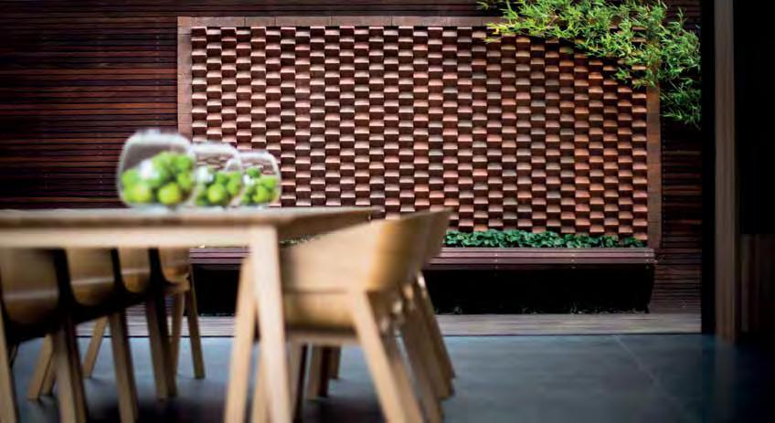
The possibilities are endless
Making a striking contemporary impact is not always about using the latest high-tech material.
Today we see stunning visual effects, breathtaking architecture and extraordinary innovations all inspired by the humble brick. This outdoor feature wall is a perfect
example, showcasing just how flexible and creative bricks can be. All you need is a little imagination and great bricks.
To find out how we can help you bring your creative ideas to life, call Midland Brick on 13 15 40 and talk to one of our special project consultants or visit us at midlandbrick.com.au
midlandbrick.com.au
- 14 -
vittinoAshe architects converted a Krantz and Sheldon apartment into a space tailored for the owner to be able to age-in-place. Emma Brain interviewed Katherine Ashe on the development and approach of this bespoke project.
What was the brief that you were provided with when you first met the client?
The client for this project was an elderly woman downsizing from a four bedroom, two bathroom house with a swimming pool to a one bedroom inner city apartment close to her family. She wanted some of her personal belongings to be taken into consideration in the design; her love of cooking acknowledged in the finish of the kitchen and the character of the apartment to be retained (or reinstated!). The brief really became a conversation around ‘quality over quantity’, of refurbishing rather than building anew and about ways of ageing gracefully in one’s own home.
What aspects of the client’s life did you take into account as you developed the design?
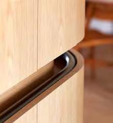
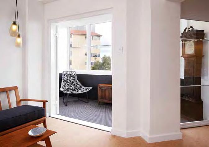
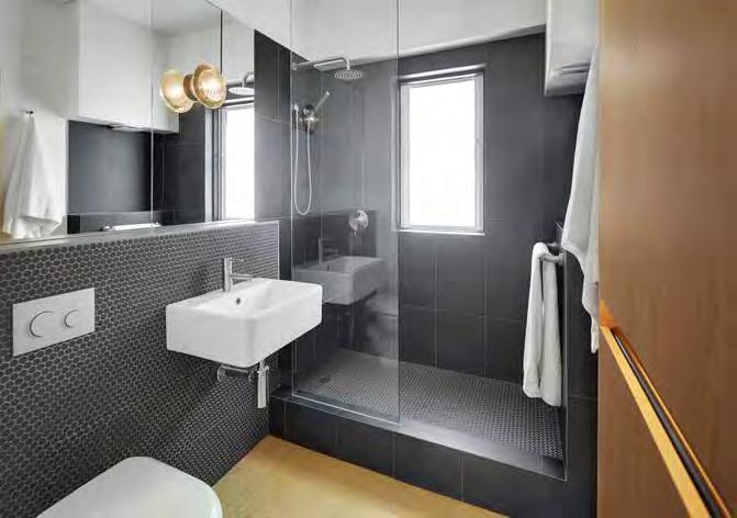
Personal background, age and existing possessions. The cabinetwork responds at an intimate scale to the immediate and future needs of our client with the provision of a handrail, continuous light source and curved surfaces so that the apartment can be comfortably navigated along its shortest possible route. The materiality of this piece is used to separate and differentiate it from the solid load bearing structure and shell of the apartment and it grounds itself through a similarity in tone to the floor.
tailor made: adelaide terrace
Author Katherine Ashe
All other ‘cranky’ surfaces and in particular the outer shell are left intact and simply painted. The client’s personal ‘treasures’ were listed, drawn and curated and further furniture pieces sourced and restored to purposely fit the small space. Other elements such as the softness of cork flooring, a shower bench with hand shower, and widths of openings were design considerations that will allow the client to inhabit the space for many years to come.
How involved was the client in the design process?
The client had continuous involvement in the design and during the construction process. Her ability to give input when necessary and trust when required was commendable and she is a true matron of architecture. We met regularly to talk about forms, materials, colours, objects, furniture pieces and buildability. She was always interested in the renovation as a meeting of aesthetics and functionality.
For me, the joy of this project is its surprising combination of location, scale and material choice; what do you love about it the most?
The space, while small, is plentiful. It imparts delight and the product is a reflection of the process undertaken by all parties: the client, the builder, the tradespeople and us. We feel that the project, although small in scale, was quite complex in terms of design and challenging in its construction. It was only really made possible by the positive and engaged involvement of all these people.
What role do you think architects can play in improving the lives of West Australians as we age?
Architects have an important role to play in the design of spaces for ageing. In particular, through considered design or alterations to houses that will allow people to live in them for much longer, we can contribute to the integration of our aging population into the social network of a city. This is preferable to forcing people to be relocated to specific accommodation that is often alienating and disengaged from their life as previously experienced. Good design should consider how spaces can accommodate the changing needs of their users over time - how it can adapt and change with them is critical.
Architects can also play an important role in challenging current models of housing for our ageing population. Ideas such as co-housing and other flexible housing typologies allow for innovating solutions when it comes to our ageing society.
In what sort of space do you imagine yourself living as you grow old?
I believe that being part of a community will be one of the most critical constituents of being alive as we grow old. I imagine myself in a ‘designed’ space that can accommodate minimal but important things, one that is close to amenities and which has its own inherent amenity.
I REGIONAL I AGED CARE I TECHNOLOGY I STATE BUILDINGS I FEATURE I
- 15 -
• S

- 16 -
Adelaide Terrace by vittinoAshe. Image: Robert Frith.
Adelaide Terrace by vittinoAshe. Image: Robert Frith.

I REGIONAL I AGED CARE I TECHNOLOGY I STATE BUILDINGS I FEATURE I - 17 -
Adelaide Terrace by vittinoAshe. Image: Robert Frith.
Adelaide Terrace by vittinoAshe. Image: Robert Frith.
- 18 -
Cottesloe House by Rodrigues Bodycoat Architects. Image: Tim Lofthouse.
Cottesloe House by Rodrigues Bodycoat Architects. Image: Tim Lofthouse.
do 3D printers dream of plastic sheep? (apologies to philip k dick)
Author Simon Bodycoat
As both a design tool and a means of architectural communication, the physical architectural model has been an integral part of the design, review and client presentation process for as long as complex buildings and structures have been constructed.
‘There is a rumour that I can’t draw and never could. This is probably because I work so much with models. Models are one of the most beautiful design tools, but I still do the finest drawings you can imagine.’
- Jørn Utzon
The history of architectural model making is well documented. Creating a physical model enabled Brunelleschi to guide his craftsmen in the construction of Italy's Florence Cathedral dome; Gaudi's stereostatic hanging models based on the theory of the 'reversion of the catenary' were used in the structural design of the Spanish Colonia Guell Church; and Utzon used a simple wooden model to prove that the geometric form solution for the shells of the Sydney Opera House could be constructed1
As students of architecture we are required to develop basic skills in manual conceptual model making that is further developed through the use of computer aided design (CAD) software with access to component machining tools such as CNC (computer numerical control) routers and laser cutters.
Through the resources provided by the universities, exposure to current model making technology now also includes access to mid- to low-end 3D printers.
3D printing became accessible in the late 1980s through the availability of Rapid Prototyping technologies which were developed as quick and cost-effective means of prototyping for product development. New prototyping technologies continued to develop with diversification through both high-end expensive 3D printing and the stand-alone cost-accessible RepRap (Replication Rapid-Prototyper Project) printers with the goal of providing open-source, DIY Printers for hobbyists. It wasn't until early 2009 that affordable 3D printing technology was available to the broader market with the first commercially available 3D printers based on the RepRap concept available for purchase through the Bits from Bytes RapMan and the MakerBot Replicator printers2
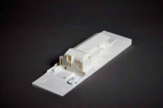
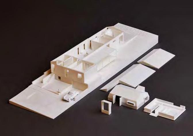
It can be a challenge to consistently maintain the production of physical models in smaller architectural studios due to issues of resourcing, time constraints, and project fee structures that do not support the use of a professional model maker. Rodrigues Bodycoat Architects (RBA) were interested in extending the capability of their investment in CAD software to enable project Building Information
1 Astbury, J. 2014. ‘Architects do it with models: The history of architecture in 16 models’, Architectural Review, February 25. 2 'History of 3D Printing: The Free Beginner’s Guide’, May 2014, 3dprintinghistory.com
Modeling (BIM) files to also be utilised to produce physical 3D models for inhouse conceptual design review, client presentation and marketing purposes.
In 2012 RBA undertook a comprehensive review of entry level desktop 3D printers suitable for use in the printing of architectural models. At the time there was little information specific to the use of low-end printers within the industry and no information on the processes required to prepare and transfer base CAD models to a format suitable for printing.
In early 2013 RBA purchased a MakerBot Replicator 2 for $2,500. A similar 5th generation 3D printer is now valued at $4,050. The printer was acquired to provide a means to explore both the use of conceptual small scale design models and final 1:100 scale presentation models that could be utilised with clients, consultants, contractors and authorities. The display of physical models in the studio would also contribute to the presentation of the office environment.
Manual sketching and drafting techniques are used by RBA in part at each project stage to develop, test and confirm design intent prior to committing to the detailed rigor of CAD software. Delaying a commitment to the computer controls the concept design of a project through to client
I REGIONAL I AGED CARE I TECHNOLOGY I STATE BUILDINGS I FEATURE I
- 19 -
• S
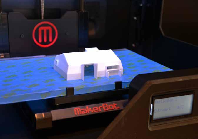
review and approval and enables the efficient turnaround of design options and alternatives typically required in residential architecture.
RBA’s experience is that manual presentation drawings possess a quality that is reflective of the design process since clients are more comfortable with the feel, softness and tactility of a hand drawing - a hard lined computer drawing is too final and doesn't encourage involvement and engagement in a collaborative process.
For over 20 years RBA have had a commitment to the Graphisoft ArchiCAD BIM software package and have established a well proven project concept design review and presentation process that involves traditional manual sketching and drawing board-based drafting that is then supported by the 3D capability of the software as a design presentation and documentation tool.
ArchiCAD allows BIM models to be exported to a self-executable interactive BIMX fly-though that can be viewed on a computer desktop or through an iPad application. BIMX is used as an in-house design and review tool and is issued to clients to allow familiarisation with a project without the requirement for complex software. Until recently BIMX in association with rendered computer still images using Artlantis and Photoshop software have been used as the RBA 3D presentation tools.
The opportunity for RBA to produce a 3D printed physical model has complemented rather than replaced computer technologies and currently, with architectural fees not supporting the preparation of 3D models (or clients not willing to pay a disbursement), a decision is made as to whether a printed model can be justified for each project. It is estimated that a 3D model for an individual house will take in the order of 30 to 36 hours to complete (including remodeling, software translation and setup, printing, and assembly). There
is currently an additional 10 to 12 hours in lost or abortive time attributed to the reliability and inconsistency of the printing process.
Since acquiring the MakerBot Replicator 2, the RBA 3D printing experience has been influenced by ongoing learning and on-the-job-training resulting in an increased understanding of the capabilities of the printer following completion of each model. A fluid set of in-house 'rules' has been established to ensure that there is a progressive improvement in printed 3D model detail and quality. These rules will be specific to the type and complexity of the model required and the printer used.
The raw RBA ArchiCAD BIM model, even at the project schematic design stage, is far too complex for direct translation to the MakerBot printer software. The individual modeled building elements result in a model that is overly complicated with loss of clarity at 1:100 scale. Remodeling is required to both
- 20 -
Cottesloe House by Rodrigues Bodycoat Architects. Image: RBA
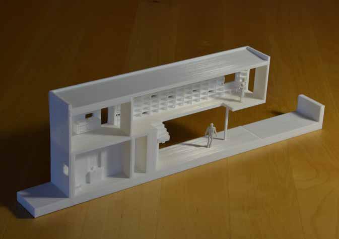
simplify the base model and to split the model into portions to suit the size of the printer build plate and the number of building levels.
For 3D conceptual modeling RBA is investigating the use of Trimble SketchUp as an alternative to ArchiCAD. This will provide a simplified model that will enable faster front end modeling and direct translation to the printer software.
The decision to purchase a 3D printer requires consideration of a wide range of issues - the following are based on RBA experiences to date:
• Research - thoroughly investigate available printer options. Seek advice from others within the industry. Online independent product reviews and summaries can be useful.
• Budget - set a maximum budgetyou generally get what you pay for. Identify all associated costs including a comparison of in-house printing versus outsourced printing. Do not
underestimate the time to prepare and print a 3D model.
• Software - review office CAD software systems and the level of detail in the CAD model against the ability of the 3D printer software to process and print this information. Low end modeling software is better suited to simple 3D modeling. Architectural BIM models are generally large and complex and may require simplification or remodeling to achieve the required output.
• Try before you buy - insist on a demonstration using a CAD model produced in-house.
• Support - ensure that local product backup and on-site product support is available.
• Champions - nominate a Principal / Director to champion the review, purchase and use of the 3D printer. Assign a staff member to take responsibility for the use and maintenance of the printer.
• Restrictions - identify and assess the restrictions of 3D printing prior to purchase based on the anticipated
outcomes. This may include size of model based on build plate dimensions, model quality, speed, complexity of model, single or twin filament colors, filament type and printer reliability.
• Reliability - acknowledge that the learning curve will be steep and that the fail rate attributed to the user, the software or the printer may be high. The office 3D printing ‘graveyard’ may be substantial.
The use of 3D printing in the architectural studio environment is mesmerising and can reinvigorate interest in model making though the extended use of existing office CAD software technology. 3D printing was developed as a means to quickly and accurately prototype an idea or concept. This attitude should be adopted in the assessment and use of 3D printing technology in the architectural studio.
‘If a picture is worth a thousand words, a prototype is worth a thousand pictures.’Unknown •
I REGIONAL I AGED CARE I TECHNOLOGY I STATE BUILDINGS I FEATURE I
- 21 -
Cottesloe House by Rodrigues Bodycoat Architects. Image: RBA
- 22 -
Long Chim by spaceagency. Image: Robert Frith.
petition x3 + long chim / spaceagency
Author Stephen Hicks
Small projects
This isn’t really a review of a small project. Years in the making, with an ambitious client vision and a complicated construction sequence, spaceagency’s work at the State Buildings precinct is small only in the context of the 33-storey office tower that looms over it.
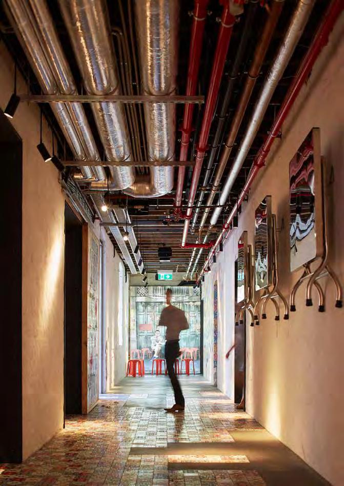
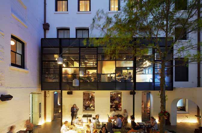
Working within the 135-year old buildings, spaceagency were engaged to design four hospitality venues: Petition Kitchen, Petition Wine, Petition Beer Corner and Long Chim, and the public spaces that join them. Significant, less glamorous work was also done to create service spaces at the basement level.
For every gleaming restaurant kitchen at ground level there is a concealed dishwasher sweating somewhere below the floorboards, both literally and metaphorically.
Small histories
One of the most exciting things about the State Buildings, and Petition Beer Corner and Petition Kitchen particularly, is simply in the act of
inhabiting them. Looking out at the street from this brand new (very old) vantage point feels transgressive. Locked up for so long, like set dressing for the City, the Old Treasury buildings are now somewhere you can buy a cheese plate.
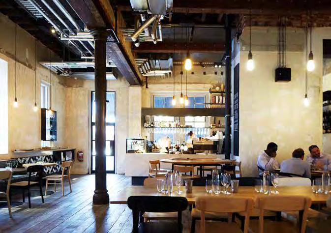
Moustachioed public servants in timber-partitioned cubicles, typewriters clacking, tea ladies sashaying… The Petition venues invite reveries about the building’s former lives as public offices, police court and cells, and a plethora of civil service departments. The many layers of the building’s past are preserved on the walls, the various historical ceiling heights marked by the points where the plaster stops. Time and significant effort has gone into preserving the building’s history, warts and all. This has, in turn, given the interiors a casualness that is welcoming. Don’t be afraid to take your children here.
Small details
To spaceagency’s credit, it can be difficult to tell exactly what they have
done to the interiors. The piping and ducts criss-crossing the ceiling are definitely new, the raw timber flooring is defiantly old, but almost everything in between feels ambiguous. The walls are a gorgeous mess of peeling paint and crumbling plaster but one assumes that this required skill to retain and conserve.
The clearest evidence of the architect’s hand is in the new openings cut through walls, lined with oversized black steel reveals that fold onto adjacent walls. Bronze mirrored panels sleeve into the steel, reflecting one space into the next. Clearly, where they have added materials, spaceagency haven’t been afraid to have fun.
Small theory
Architecture is a dependent profession, argues British academic Jeremy Till, but it perpetually idealises itself as autonomous. Architecture is, in Till’s phrase, ‘buffeted by uncertainty and contingency’ at every stage1. Clients, regulations, history, budgets, and fire
I REGIONAL I AGED CARE I TECHNOLOGY I STATE BUILDINGS I FEATURE I
- 231 Till J. 2009. Architecture Depends. MIT Press: Boston. • S
engineers push and pull while the architect tries to maintain a project’s ‘purity’. Till proposes that, rather than attempting to control outcomes, the architect should instead see uncertainty as an opportunity for imaginative interpretation; the architect as the person who ‘gathers the conflicting voices of a given situation and makes the best possible social and spatial sense of them’.
Small review
Instagram
Tiffie_c
Cant get enough of the interior. #petitionbarcorner #interiorporn #perthlife #weekend 14 Likes
Small spaces
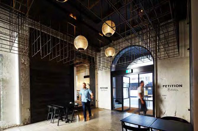
Architecture, at its best, can be disarmingly scaleless: large one moment, intimate the next. And so it is here. If you arrive through the grand Barrack Street entrance you will climb five shallow stairs within the arched vestibule of the original building.
The subsequent foyer is compressed, an implied ceiling of open steel boxes hovering not far overhead, with the choice of turning left to Petition Kitchen or right to Petition Beer Corner. If you’ve never visited before then ignore them for a moment and push on to the basement courtyard, accessed from an oversized staircase directly in front through a quite modest door. Suddenly, having gone up into the building and been squeezed slightly by the weight of its history, you are dropped into the sunken courtyard, a mature tree offering an almost surreal touch of green to proceedings.
Elsewhere one finds a succession of different sized and shaped spaces, flowing purposefully from one to another. In Petition Kitchen, for example, a long thin dining space runs the length of the restaurant, served successively by smaller ‘rooms’ into which a corridor has been cut. It sounds confusing but isn’t, the layout inviting discovery and moments of delight.
Small Steps
Perth has a tendency to knock its heritage down or, where it can’t bowl it over, resolutely ignore it. The considered rejuvenation of the State Buildings, however, suggests a city that is confident enough in its present to engage with its past. spaceagency’s work in making sense of the building’s history, and in adding their own layer, is a signal of both their talent as architects and our city’s quiet evolution. •
- 24 -
Long Chim by spaceagency. Image: Robert Frith.
I REGIONAL I AGED CARE I TECHNOLOGY I STATE BUILDINGS I FEATURE I - 25 -
Petition by spaceagency. Image: Robert Frith.
Petition by spaceagency. Image: Robert Frith.
Design Studio. for Architects
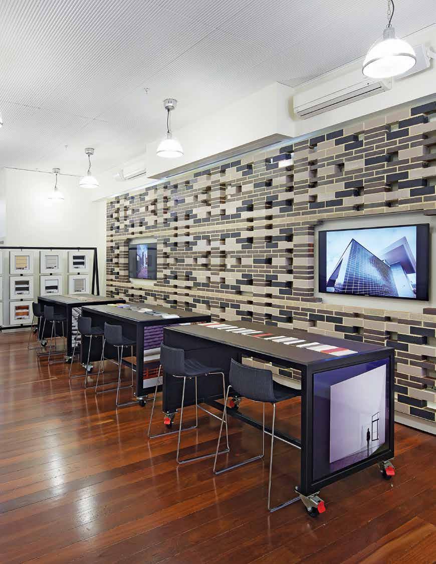
Brickworks Building Products have recently opened their new Design Studio located in Perth which showcases the entire range of Brickworks Building Products, including Austral Bricks, Austral Precast, Bristile Roofing and Auswest Timbers.
Our innovative product displays help to ease the selection process and we offer professional advice for product specifications on site.
The studio also offers networking events and opportunities for architects, designers and developers ensuring you are kept up to date and informed on all available industry and Brickworks Building Products developments.
To make an appointment or to obtain a schedule of events, feel free to visit any time or contact us on the following number.
67 King Street, Perth WA 6000 Tel. 08 6332 5800
www.brickworksbuildingproducts.com.au
in detail – old and new: marsala house / iwan iwanoff
Author Michelle Blakeley
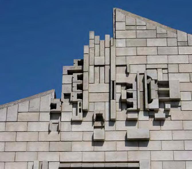
Iwan Iwanoff’s Marsala House in Dianella is often described as an iconic example of late 20th century Brutalist architecture. Indeed, it is. On the outside. However, step inside and the powerful tectonic that Iwanoff created with monochrome concrete blocks is displaced by an intense palette of curves, colours and materials, delicate detailing and meandering spatial relationships. The temptation is to explain the exterior as masculine and the interior as feminine. However, if we eschew the controversy of gender stereotypes, Iwanoff’s response to exterior and interior could be labelled yin and yang; hard and soft; rectilinear and curvilinear; raw and polished; public and private. The contrast is selfevident, but it can be overlooked due to the house’s overall representation of the architecture of its time.
The JS Battye Library has archived 59 drawing sheets of the house. Amongst these are plans and elevations which show the design evolution through several radical iterations. When the
Marsala family was interviewed during the preparation of the Conservation Plan for the house, they confirmed that both client and architect changed their minds several times and the early plans were sometimes too extravagant. Features and details were also changed or eliminated during construction because of dwindling funds1
Iwanoff’s drawings also show a progressive shift to a more rigorous rectilinear geometry externally. Early on, the façade relief patterning had more freedom of shape, including a circular motif below the apex of the front parapet wall. The original design for the screen which shields the lounge room glazing from the afternoon sun began as a fluid, organic pattern which is unlikely to have been fabricated using concrete blockwork. The north Z buttresses, which now read as tilted rectangles of blockwork, were shown with an arch to the underside in the earliest drawings. Until the final construction drawings, the entry stairway was at the south end of the
front elevation. The stairs turned at two landings which created a gentler, more fluid entry than the imposing linear central access we see now.
It would seem that the concrete block construction was directing this subtle but significant transition. The block coursing dictates the push-and-pull of the façade relief pattern. Iwanoff used various sizes and shapes, such as lintel and sill blocks, to explore the plasticity of the blockwork but, ultimately, the underlying block coursing sets the rules. The gentle curve of the parapet wall that reaches towards the central apex is all the more graceful because it appears to defy the rules and is a gesture to what we’ll find inside.
The interior of the house is adorned with curves, ellipses and circles in the cabinetry and doors as well as fretwork in the timber screens which delineate spaces in the living areas. The strongest curved expression is in the floorplan. It begins as a circle in the dining room with its centre point at the intersection
I REGIONAL I AGED CARE I TECHNOLOGY I STATE BUILDINGS I FEATURE I
- 27 -
•
S
1 Fiona Bush (Heritage & Archaeology) and John Stephens (Curtin University). May 2008. Conservation Plan – the Marsala House.

of north-south and east-west axes. This circle has a single step down to a circular recess in the floor, sufficient to accommodate a circular dining table and chairs, and a ceiling dome above. The earliest drawings show a curved wall with a servery between the dining room and kitchen, a curtain and balustrade enclosing the circle and a curved planter box. However, the curved wall was replaced by straight cabinetry and the planter box disappeared. At some stage after construction, the recess was filled with concrete and covered with a round carpet. The dining room is central to circulation through the house and it is likely that the recess was not practical and could have been a trip hazard.
The interior materials are sensual: natural timber, gloss Laminex, Perspex, textured ceramic tiles, mirror panels, chrome, glass doors and shelves in the cabinetry, moulded plastic wall tiles, brass trims. Purple synthetic suede covers the wall behind a circular bathroom mirror. The wall behind the bar is lined with silver plastic bubble tiles and purple Perspex. Recessed cabinet handles are lined with brass
sheet. The interior colour palette is rich but restrained. Iwanoff kept white as a constant background for olive, mustard, purple, black, dark blue, bronze, brass and chrome.
Iwanoff often used materials in a way which was intended otherwise. This is evident in the metallic painted concrete soakwells placed in the garden beds to collect stormwater from the concealed downpipes, the moulded polystyrene ceiling above the music corner of the lounge room which is also finished with metallic paint, the jarrah ply soffit of the south terrace which is trimmed with a row of scalloped plate metal straps and of course the innovative way he created his façade patterns from a catalogue of concrete blocks.
The Marsala House demonstrates two very different architectural expressions of whimsy and flamboyance: one sculpted within rigorous rectilinear constraints, the other responding to a playful exploration of curve, colour and texture, by an architect who was master of both.
Michelle Blakeley was the Project Architect responsible for the Marsala House refurbishment at donaldson+warn. The refurbishment received the 2011 Western Australian Heritage Council’s Award for Outstanding Residential Conservation and 2012 Australian Institute of Architects Award for Conservation or Restoration of a Heritage Place. •
- 28 -
Marsala House by Iwan Iwanoff. Source: State Library of WA.

- 29I REGIONAL I AGED CARE I TECHNOLOGY I STATE BUILDINGS I FEATURE I
Marsala House by Iwan Iwanoff. Source: State Library of WA.
Marsala House by Iwan Iwanoff. Image: Michelle Blakeley.
in detail – old and new: lovestory / morq
Author Hayley Curnow
Few retail interiors reflect the essence of the products they house quite like Lovestory. Tucked away in George St, East Fremantle, MORQ has dramatically transformed a small, traditional building shell into an immersive retail space that thoughtfully reflects the fine, textural and detailed qualities of Lovestory’s boutique labels.
Commissioned with the intention of attracting an exclusive European label, the brief was to create a unique and identifiable character for Lovestory, while displaying a sense of craftsmanship and quality comparable to the finest international clothing stores. MORQ responded with a neutral, sophisticated and impeccably crafted interior with an inward focus.
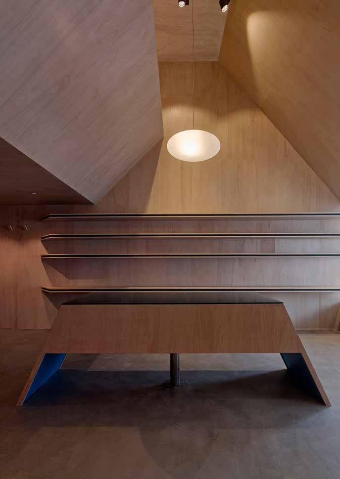
The building shell is dramatically sheathed by a textural ‘inner skin’ of plywood that unifies the ground and mezzanine levels. Skilfully crafted to form walls, shelves, ceilings and accessories, the skin creates a striking, raked volume and a distinct sense of enclosure. To enhance the tactility of this principal finish, the plywood has been lightened with white-wash and hand-finished with natural, burnt umber wax. The result is a highly textural surface that softens the light qualities of the interior and imparts a mellow warmth and tangibility. The substantial insulated cavity between the existing perimeter walls and the soffit provided by the skin also enhances the thermal and acoustic performance of the interior.
The ground level’s generous vertical volume is punctuated by an angular sales counter that doubles as a jewellery display case. A delicate pendant floats gently overhead, while a resinous cement finish to the floor and stair anchors the space, wrapping to form a window dais for mannequins and displays. Stretching across one plywoodclad wall, a series of linear, plywood shelves feature a stacked veneer edge, a black MDF infill and a gentle radius to each corner. Clothing rails in waxed, mill finished stainless steel display Lovestory’s boutique clothing, the garments adding an accent of colour and pattern to the otherwise neutral interior.
The underside of the mezzanine offers a reduction in the spatial volume of the ground floor. Nestled here, a series of matte black wall panels conceal two change room alcoves, treated as small, dark and introverted vessels. Black MDF lines the change room walls, giving a porous, chalky quality and drawing the focus to a well-lit mirror and solitary cork stool. The change rooms cleverly conceal utility and storeroom spaces that lie beyond the operable back wall.
Cement stairs with a mill-finished stainless steel handrail lead to the semi-private mezzanine, where a deep, plywood ledge thrusts out over the entry level. This display platform visually isolates the space from the entry level and streetscape, yet permits an acoustic connection via the moulding of the spatial volume. Storage is concealed behind sliding, plywood-clad panels, with bespoke wall hooks doubling as
pull handles. The mezzanine offers an elevated view of the dramatic raked ceiling, serving as a reminder of the store’s scale and proportion. Complemented by track lighting with simple, matt black canister fittings, the waxy finish of the plywood ceiling is illuminated with a wash of warm light.
Designed as a unified plywood unit, the project required a limited number of quality building trades, and the majority of works were completed by a single cabinet-maker. The thoughtful detailing and craft of bespoke plywood and stainless steel accessories give each item for sale a presence akin to an exhibited artwork. The quality of the project and its positive effect on Lovestory’s retail environment is testament to the collaborative approach between architect, builder and key trades, who were led by a rich architectural vision.
Through the choreography of a series of unique and memorable spaces, Lovestory’s emotive and sensorial qualities are instilled by a unique sculpting of space and a restrained palette of finishes. The store’s sophisticated and understated aesthetic provides a subdued atmosphere that sits amicably within the store’s East Fremantle context. Despite its small scale, Lovestory provides a deeply immersive atmosphere, augmenting and engaging public experience.
Lovestory received a Commendation for the 2015 AIA Award for Small Architecture, and won the 2015 AIA (WA Chapter) Award for Small Architecture •
- 30 -
I REGIONAL I AGED CARE I TECHNOLOGY I STATE BUILDINGS I FEATURE I - 31 -
S
Lovestory by MORQ. Image: Peter Bennetts.

- 32 -

I REGIONAL I AGED CARE I TECHNOLOGY I STATE BUILDINGS - 33S M L XL
- 34 -
Musterers’ Quarters by Luigi Rosselli Architects. Image: Edward Birch.
Musterers’ Quarters by Luigi Rosselli Architects. Image: Edward Birch.
musterers’ quarters / luigi rosselli architects
Author Marco Vittino
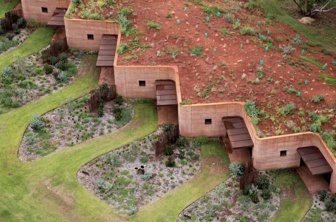
The site on which Musterers Quarters is located, on a remote station in the western Pilbara, exemplifies some of the harshest conditions of the Australian outback, as well as its most remarkable natural beauty. In their linear arrangement, the twelve accommodation units which borrow their name from the historical gatherings of itinerant workers that once carried out the mustering of cattle on horseback, Rosselli illustrates how he takes on these intricate contradictions. The outcome is a beautifully minimal intervention that responds to, respects, enriches and re-presents the surrounding context in a specific and sympathetic manner.
The underlying environmental research further elevates this project to being an outstanding example of sustainable small scale building technology. The conceptual setting and the selection and use of materials are guided by a concern for, and response to, the environment. The project, developed around preexisting terrain, was conceived as a kind of shelter that backs itself into the hill, resulting in a structure that performs exceptionally well even in the most adverse climatic conditions. On the day that I visited the project, with temperatures in the high thirties, the units felt as if they were air-conditioned. This is a notable achievement with only passive means.
The localised sourcing of the main construction material not only achieves a reduction in the embodied energy but also allows an indulgence of excess in
terms of quantity. The walls are almost half a metre thick to ensure thermal separation between inside and out and were verified to be adequate only through extensive modelling. This local earth, literally excavated from a nearby site, rammed and folded into a long wall, together with the idea of interring the building not only ensure that the visual impact of the built form is minimised and the landscape emphasised but also establish a clear way of dealing with the extreme conditions. The geometry of the wall becomes the directive for the simple gardens which are developed as a kind of strange abstraction of manicured lawns punctuated by rusty ‘found objects’ which create a peculiar relationship with the natural ‘bush’ beyond.
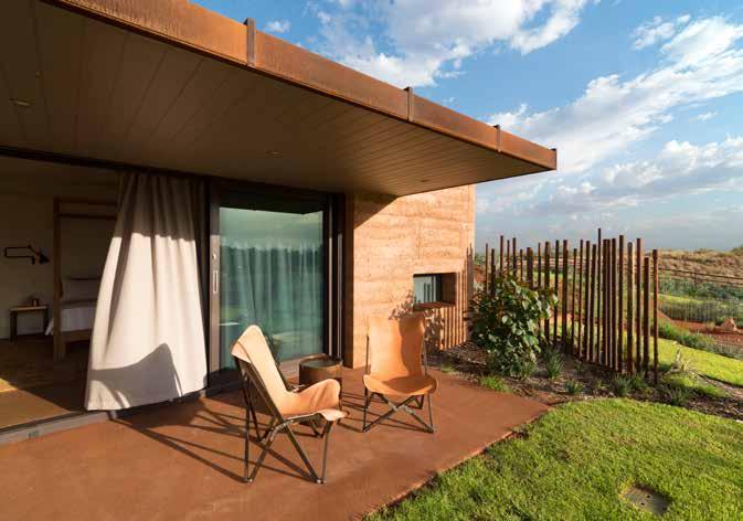
The planning of the units is quite luxurious yet contained. They vary in size and level of amenity, with a third offering bathtubs and the remainder not. Each has an outdoor covered entry terrace which mediates the private and public domains ensuring both an appropriate level of privacy and social interaction. The layout provides an immediate connection with the landscape beyond and the differences in unit sizes and configurations ensure that the continuous wall remains irregular and less imposing. An asymmetrical split of the units into two wings again ensures that the scale of the walls is controlled, especially in terms of walking distances from the rest of the station.
The ‘chapel’, a beautifully conceived and sculptural component at the top of the hill, is the ordering element of the
entire site and reaffirms the status of the property and its history. Taking on both religious and prosaic roles it states its prominence through its unique and distinct form and symbolises power on a number of different levels. This building is capped by a skewed conical, ‘golden’ ceiling that invites the eastern sky into the space through an oculus. It is a place of importance, of contemplation, of gathering and social exchange. The chapel connects the accommodation units to the rest of the station but it is also a strong gesture towards the small graveyard that is located at the bottom of the hill, between the two wings of rooms. This building, initially conceived as a religious chapel was later adapted to become a space for multiple functions. The level of detailing throughout is simple and of a very high standard, particularly considering the remoteness of the site. Rough and smooth materials come together comfortably and either reflect or contrast the colours and textures of the surroundings. The choice to use materials that can be left to weather naturally, such as the rammed earth of the walls and terraces and the steel clad canopies and roofs, reinforces the architect’s multilayered approach which is both poetic and rational.
Rosselli Luigi speaks very fondly of this ‘place’ and has been doing work on the property for a number of years. His association with it is clearly much more than commercial and this project affirms a genuine spiritual connection with this amazing part of the world which in so many ways couldn’t be further removed from his own origins. •
I REGIONAL I AGED CARE I TECHNOLOGY I STATE BUILDINGS I FEATURE I
- 35M

AVAILABLE NOW. PHONE 1300 730 117 OR WWW.RAWLHOUSE.COM Rawlinsons Keeping score on construction costs Rawlinsons Australian Construction Handbook
Guide 2016. HAND BOOK $410 INC GST COST GUIDE $278 INC GST
and Rawlinsons Construction Cost
culture and community: walumba elders centre
Author Finn Pederson
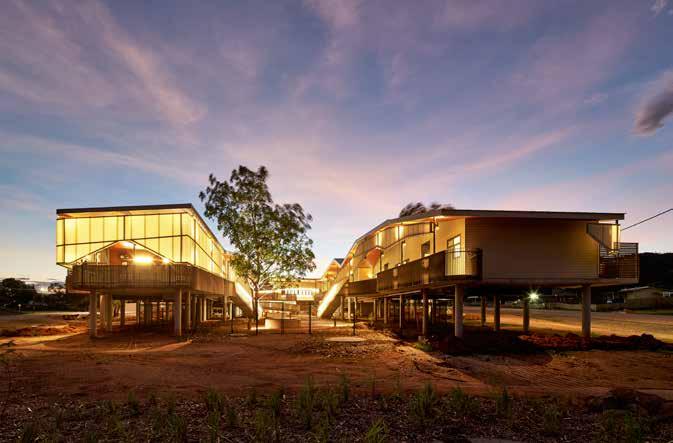
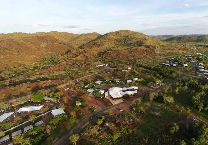
Following a devastating flood in 2011, iredale pederson hook designed the Walumba Elders Centre to specifically respect the Cultural needs of the Giga people. Emma Brain interviewed Finn Pederson on the development and approach of this remote project.
How involved was the local community in the design process?
The Gija community, represented by Elders, local aged care workers, and Community Council members were fully involved in the site selection and design process.
How did you negotiate between providing an inviting and familiar space for residents with the clinical requirements of an aged care environment?
Unusually, there was no aged care service provider in the design team so one key task was to liaise closely with the Commonwealth and State health agencies to ensure that the facility met the licensing requirements of the expected level of aged care delivery. This did not dominate or drive the form of the facility - in fact the main driving factors were the Gija Community’s requirement for the Elders Centre to be a place to celebrate, transmit and practice Gija Lore and Culture.
The notion of 'familiar’ spaces for the residents is a complex one. Gija Elders would have experienced a great range of dwelling types, from traditional bush camps, cattle station dwellings (often rudimentary dirt floor huts or ‘bough-
shelters’), through to the various public housing solutions produced over the past four decades. Our hope is that the residential spaces are inviting and appropriate, giving the residents control over privacy, outlook, comfort and lifestyle.
What was more pressing, the cultural and social requirements of the residents or the environmental demands of the location?
The lessons from our late mentor Paul Pholeros, who we tragically lost this February, show that these elements are strongly interconnected. We must provide shelter and health-hardware that responds to the socio-cultural requirements of the residents within the context of the extreme environmental conditions of the site.
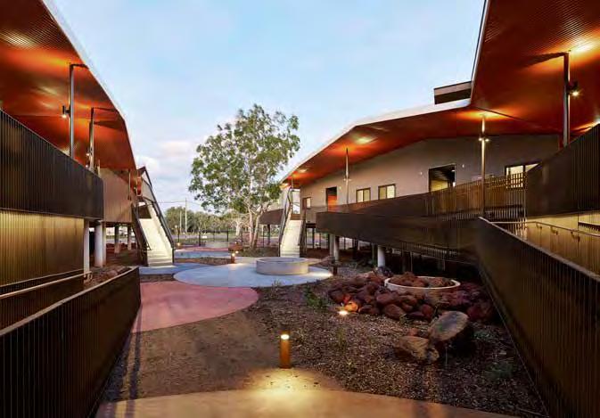
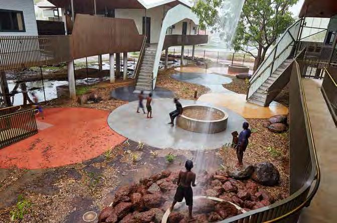
In this case, building an aged care facility in a flood zone necessitated a building on legs which led to interesting opportunities for steps and ramped movement, and the creation of a courtyard building that provided shelter both under its roof and between the wings of the building.
The Cultural requirement for fire, both for ceremony and for cooking bush foods, led to a series of concrete-ringed fire pits on the raised verandah and on the ground. The rings are high enough to provide some level of protection for young children and older people with mobility issues and we hope will alleviate the operators’ concerns around the risk of fires.
Please describe your favourite aspect of this project.
The courtyard - where Elders can sit and watch the children of the community play under the wet season waterfalls, and the ability of this space and the verandahs to accommodate the whole community during a ceremony.
What role do you think architects can play in improving the lives of West Australians as we age?
We can produce spaces that deinstitutionalise aging, whilst still solving the very practical needs of mobility and health care. Our role is to provide society with homes that allow us to age with dignity.
In what sort of space do you imagine yourself living as you grow old?
An ocean view would be nice! And connection to family and friends in a beautiful small home. My uncle in Denmark lived in Utzon’s Fredensborg Houses… something like that would be a nice place in which to grow old.
The Walumba Elders Centre received the 2015 World Architecture Festival Health Award, an Honourable Mention for the Plan Awards (Italy) Health category, BPN Australian Sustainability ‘Best of the Best’ and Multi-Residential Awards, AIA (WA Chapter) Colorbond Award for Steel Architecture, and Commendations for AIA (WA Chapter) Public Architecture and Residential Architecture Multiple Housing categories. •
I REGIONAL I AGED CARE I TECHNOLOGY I STATE BUILDINGS I FEATURE I
- 37• M
- 38 -
Walumba Elders Centre by iph. Image: Peter Bennetts.
Walumba Elders Centre by iph. Image: Peter Bennetts.
I REGIONAL I AGED CARE I TECHNOLOGY I STATE BUILDINGS I FEATURE I - 39 -
Walumba Elders Centre by iph. Image: Peter Bennetts.
Walumba Elders Centre by iph. Image: Peter Bennetts.
- 40 -
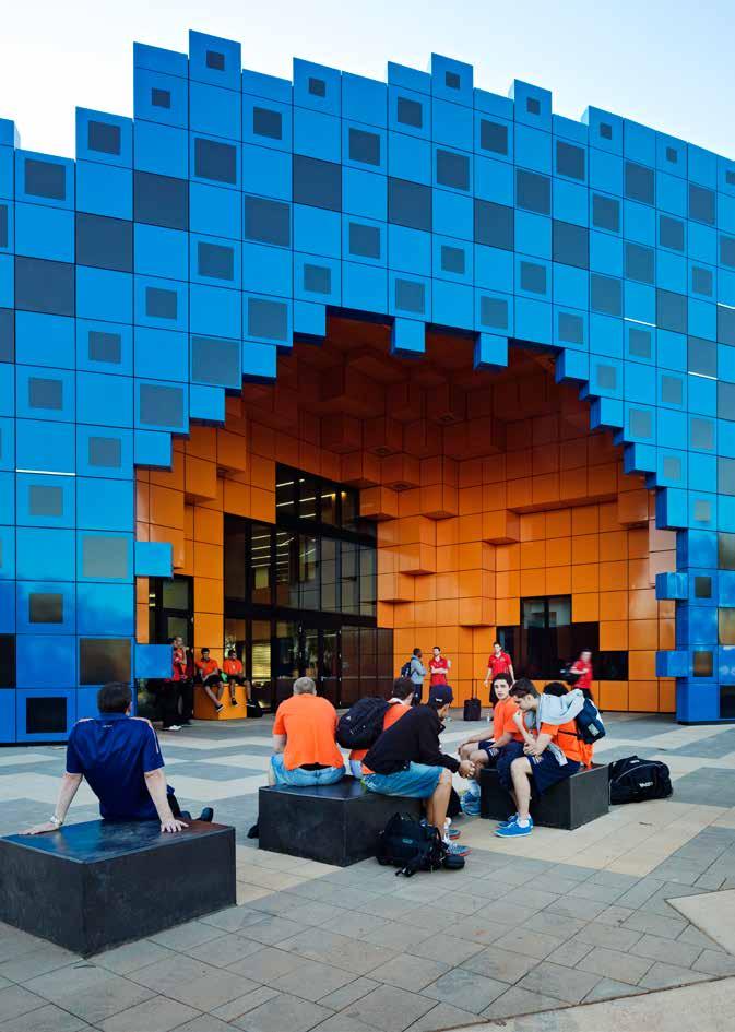
Wanangkura Stadium by ARM. Image: Peter Bennetts.
pilbara pixels: wanangkura stadium
Author Andrew Lilleyman
In the northwest corner of Western Australia is the town of Port Hedland. Part of a long chain of regional centres within the Pilbara, it is some 1,400 kilometres from Perth. The town is significant to the State as it is the mining port for the iron ore industry and the largest tonnage port in Australia, exporting some 14 million tonnes of raw material per year, heading mostly for China, Japan and South Korea. The natural geography of the landscape, its expansive deep water inlet and its proximity to the main mining sites in Newman, Marble Bar and Tom Price, have developed the town as the regional centre for the Pilbara.
The presence of big industry within Port Hedland has provided financial support for local infrastructure projects and improvements to the town that aim to create a better place to live and work. The iron ore industry also brings with it a significant population of FIFO workers, creating an infrastructure quandary for the Council. This largely transient population requires the development of enormous housing complexes, usually in the form of temporary encampments made from demountable housing stock surrounding a central building for entertainment and meals. The quality and enclosed nature of these developments does little to imbue the town with a sense of permanence, engendering a lack of both community pride and long-term commitment to the area. Developments such as LandCorp’s revitalisation of the South Hedland
Centre and more medium density housing are making efforts to remedy the issue.
In addition to this, much like the mining booms of the Victorian gold rush era, the creation of major public buildings becomes a symbol of long-term settlement of the town. The Council’s intention for Wanangkura Stadium was to create a significant community centre on par with, if not better than, those found in any major city as a clear attempt to retain population. The State Government’s Royalties for Regions scheme also supported the project, targeting funding to regional towns to make them better places to live: ‘wanting to stay, not having to stay’ (to quote their website) says it all.
The Kariyarra people, the traditional owners of the region, live in both the town and outside its border and have their own cultural beliefs and traditional law practices. Like the mining groups, there are difficult social issues that surround the housing of the Kariyarra people within the town which segregate rather than integrate them into the community. The Reconciliation Action Plan, established in 2008 by the State Government, promotes the need for sport and sporting facilities to create healthy lives and healthy communities. This plan sees sport, particularly football, as a direct route towards reconciliation, the hope being that it will bring the various cultures together to work as a team. It identifies sport as integral to the understanding of ‘culture’
within Indigenous groups, rather than separate from it. Sport in general is a significant social focus for Port Hedland. Played in the cool of the evenings, it is a release from the toil of the mining industry and the weather.
The mining industry has a tremendous physical presence in the town. It creates a colossal backdrop of structures, cranes and noisy machinery. The constant movement of raw materials generates clouds of dust which blow into town and coat everything in a thin veil of red. A white building will turn pink in a matter of weeks, giving the town a coherent and distinctive purple/ochre tone which contrasts against the region’s persistently blue skies. It is a significant concern for residents of the town due to related respiratory health issues.
For the visitor approaching Wanangkura Stadium for the first time, it emerges almost like another infrastructural artefact from the landscape. The site for the Wanangkura Stadium is in South Hedland, the main housing precinct located some 18 kilometres from the port. The original South Hedland masterplan, created in the 1960s, is based on the ideals of the American Radburn plan: a conceptual model for new towns created in favour of the car. The heat and vast distances involved in travelling around Port Hedland make cars a necessity, but the result of South Headland’s Radburn-inspired planning is iterative concentric street layouts, with inward-facing housing developments and cul-de-sacs. From
I REGIONAL I AGED CARE I TECHNOLOGY I STATE BUILDINGS I FEATURE I
- 41• M

- 42 -
Wanangkura Stadium by ARM. Image: Peter Bennetts.

above, the overall plan recalls the swirling, meteorological forms of the cyclones that invade the region every year, or perhaps the fronds of a plant curling up in the extreme heat. The Pilbara climate, of long hot summers and apoplectic wet seasons, leaves such an indelible impression on the landscape that its architecture and planning too seem to reflect it.
The initial step towards designing the new stadium was to look at the overall masterplan for the site and sporting grounds. It seemed obvious that our approach to the masterplan should take on some of these concentric forms of local planning and landscape. On the flight up to Port Hedland from Perth we could also see long chains of concentric lakes and pools in the landscape, which again provided us with inspiration. Like the Radburn plan, we had the idea of pulling together the functional brief into contained loops, using a road circulation system and allowing for cars and pedestrian access to all parts of the site. This self-imposed edge gave us the immediate advantage of something to design against (a boundary!), as well as
intensifying the planning and the public space. The planning also created the positive conceptual idea of an ‘oasis’; a rich and vibrant concentration of activity surrounded by desert.
The stadium building itself became a wedge shape in the southeast corner of the loop. To the north, the building connects to additional outdoor basketball/netball courts and a children’s playground with surrounding landscape. A number of pedestrian links were created to activate the entire site, connecting drop-off zones to the ringroad and a football oval, and one link which runs through the new building.
The design of the stadium itself began with researching the town’s history and design-testing within the context model. It would become apparent that the dilemma for the project was trying to design something civic where there wasn’t anything contextually to integrate, reflect or contrast it with. Each design option tested, like the Mars explorer, appeared to have landed from somewhere else. So we began to shift our
thinking. Perhaps this building should somehow emerge from the landscape like a mirage.
To conceive of a building from an ephemeral idea, we started by animating forms, which literally bubbled up from the site, simulating the rippling and distorting effects of a mirage. We used iso-surfacing programs, similar to those used to document weather patterns, to create the animations. The intention was that we were not just creating an outer shell for the building, but more a volumetric map of pressure values – like a cyclone perhaps. These types of deep structures meant that we would have both the overall 3D forms and other layers of complexity internally that, when sliced open, would reveal more spaces or patterns.
For the exterior, we investigated cuberille modelling - a process of creating Lego-like versions of original forms. It simply involves duplicating a fixed volumetric pixel or ‘voxel’ across the original mesh, within a grid, creating an approximate interpretation of the form. From a distance, this lends the building the appearance of a
I REGIONAL I AGED CARE I TECHNOLOGY I STATE BUILDINGS I FEATURE I
- 43 -
•
Wanangkura Stadium by ARM. Image: Peter Bennetts.
blurred, low-resolution object, which fitted with the effects of heat-haze or mirage on an object within view. Close up, though, the process adds a whole other level of complexity to the design. Like castle construction or the ancient ruin, the form is built from a unit, a cube, approximating a mesh into a ‘rubbly’ form. This topology of parts accumulated into a greater whole is arguably a local aesthetic. Much as the local iron miners ready their ore, the salt industry scrapes the nearby dried tidal flats to sculpt enormous ski-slopes of salt outside the town.
The pixilation strategy addressed the basic problem afflicting the sports centre as an architectural type — its typically large, blank and boxy form. The strategy does this mostly using 2D graphics. We treated the front elevation of the building as a cut section through the pressure model, creating a sectional pattern made of swirling isoparms1. The patterns align with the 3D elements so it is difficult to tell what’s flat and what isn’t. The pattern also pulls everything together into one integrated idea; the large entry space, covered walkway, window openings, loading areas, seating and even services are all embedded within the overall design and help boost the depth of the facade.
The method also suited the environmental requirements and construction methods of the region. Materials needed to meet the BCA codes for a Region D Category 4 cyclonic area
(the most severe in the country) which meant that the skin of the building needed to withstand the impact of debris flying at high velocity. The most widely accepted building materials in the region for this purpose are concrete panels, blockwork walls and reinforced roof sheeting. The community also needed to be able to use the facility as a disaster relief centre during and after cyclone events.
The façade system we chose consists of 900x900mm low-carbon steel panels with a vitreous enamel coating system, providing a highly durable, scratch-resistant finish and a surface able to withstand the extreme climatic conditions. It is a rain screen façade system, which means that it provides adequate protection and creates a ventilated wall cavity to control incoming heat during the hotter months.
During these months, all sport is played at night when the temperature drops, under lights. Mining is also a 24-hour industry, with workers occupying every minute of the day, so we had to consider this a public building for night as well as day. The enamel coating on the panels helped here. In full sunlight, the panels can appear pale blue and quite flat and in shade or low levels of light, the panels become very reflective, almost glasslike. The façade integrates a field of LED stripes which provide further spectacle in the evenings.
The façade pattern generated a suite of panel types in varying percentages of black and blue which created an overall halftone image within which the dots coalesce. The bubbling pattern created portal openings along an arcade leading to the main entry space: a 3D-domed ‘interior’. Like the Pantheon in Rome or the Duomo in Florence, the interior dome includes an ornately detailed ceiling in voxels which holds a skylight at its apex. Inside, a central ‘street’ creates the main thoroughfare to the playing courts. As with the façade, the pixelated voxels create a rough interiora narrow space akin to the rocky gorges of the region. The management staff inhabit this area, with clear sightlines to the main hall, crèche, gym, public facilities and squash courts.
WA Premier Colin Barnett opened the building in 2012. His comments that it was ‘a spectacular piece of architecture that will become a landmark for Hedland’ echoed the original desires of the Council to have a facility that ranks against the best of its kind in any major city in Australia, demonstrating that regional centres are as important as their metropolitan counterparts. Regional projects are important litmus tests for the basic value of civic architecture and how we should approach designing for the local condition. There would appear, with smaller communities, to be a lot more at stake, a lot more scrutiny, but also a lot more to be gained at a project’s completion. •
- 44 -
1
for
curves
Lines on a Non-Uniform Rational Basis Spline (NURBS) surface connecting points of constant U or V co-ordinate values, and representing crosssections of the NURBS surface in the U or V directions. NURBS is a mathematical model commonly used in computer graphics
generating and representing
and surfaces.
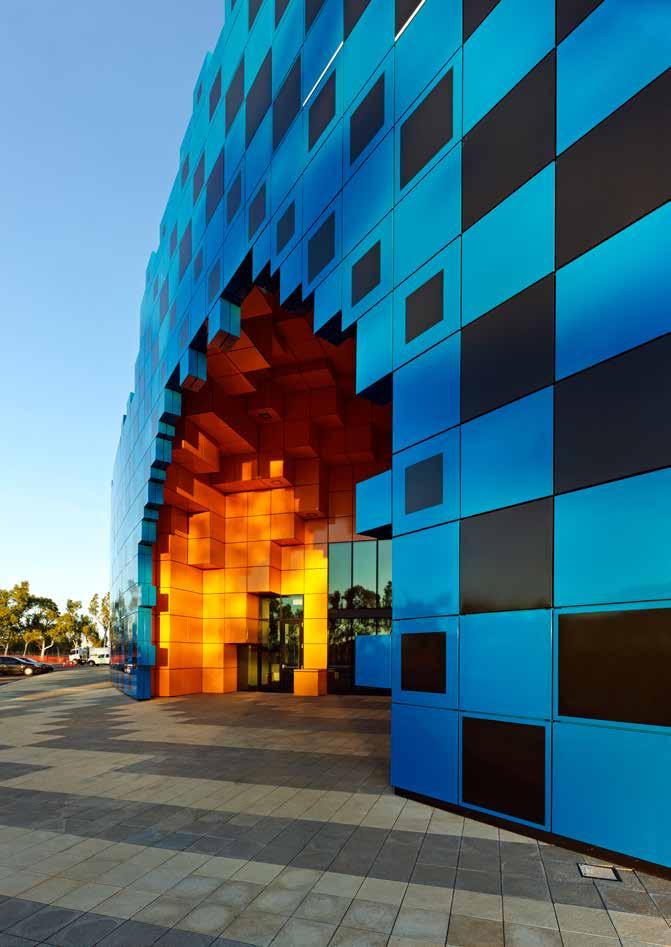
I REGIONAL I AGED CARE I TECHNOLOGY I STATE BUILDINGS I FEATURE I - 45 -
Wanangkura Stadium by ARM. Image: Peter Bennetts.



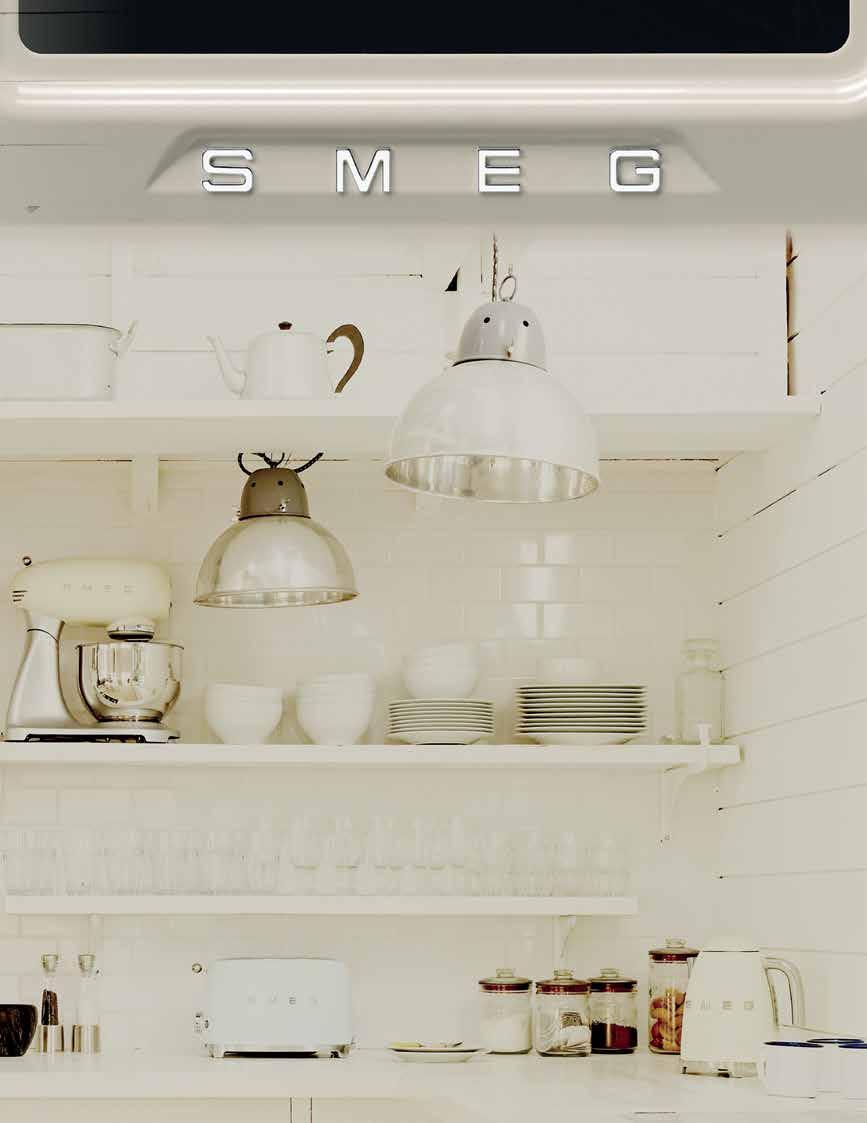

SMEG VICTORIA COLLECTION. THE SOPHISTICATION AND STYLE OF YESTERDAY, TODAY. smeg.com.au YES TODAY AVAILABLE IN PANNA (CREAM), BLACK OR WHITE ENAMEL AND STAINLESS STEEL WITH MATCHING COOKTOPS AND RANGEHOODS

city of perth library / kerry hill architects
Author Fiona Giles
Set slightly back from Hay Street, the first impression of the library is a strong architectural statement. Its cylindrical Platonic form is wholly different from its rectilinear neighbours, yet it manages to sit comfortably within the urban fabric and humbly defer to the surrounding heritage context. Kerry Hill Architects (KHA), commissioned by the City of Perth after they won a public competition, have created a building about which the Council exults, ‘our vision has been achieved beyond expectation’. The site was a complicated puzzle to be untangled: it is located within the heritage heart of Perth and had strict design constraints including an existing basement car park and the need to entice winter sunlight into a south-facing plaza. KHA have risen to these challenges, providing a design which delights and draws in the public.
The overall vision was set by the City of Perth in partnership with the State Government, the Public Trustee, Mirvac, FJM Property and the Perth Anglican Diocese. They sought to enrich the Library’s current service by extending beyond a simple book depository into a visible, welcoming and active community hub. The resources and spaces were to encourage life-long learning and give opportunities to connect with others. An urban designer was employed to establish the site’s design parameters and a schematic design was undertaken to ensure the budget was realistic. This feasibility work was particularly valuable in creating accurate descriptions of both
site conditions and client objectives. Notwithstanding this base, the brief was allowed to develop once KHA was appointed.
Architect procurement was through an open competition with a two stage submission process. Stage One requirements refreshingly excluded building design or rendered drawings and instead sought volumetric design studies to demonstrate the design approach and problem solving methods of each applicant. An informed jury, including the City Architect and chaired by the Director of Planning and Development, evaluated the 18 entries and short-listed three firms: Cox Architects, donaldson+warn with Denton Corker Marshall, and KHA. After four weeks and an interim presentation, KHA was unanimously chosen.
The Cathedral Precinct has recently been given a new lease of life after weathering two decades of vacancy. The City of Perth Library is one of the more unassuming players in this renovation; it is however essential to the scheme as a whole. Nestled behind St George’s Cathedral, it brings life to the previously dark and empty plaza in the heart of the block, whilst the larger development of the 140 year old Treasury Buildings feeds off the busier streets. Cathedral Avenue cuts through the site on the Northbridge-river axis and opens out into the square which was also part of this commission, tacitly understood in the continuity between the library's architecture and the landscape design
of Cathedral Square. Levels have been lowered so that the Cathedral has room to breathe and sits as an object in space. This is echoed in the way that the library stands aloof from the State Administrative Tribunal Building, creating a gap which allows narrow views to be glimpsed across the new green wall to the tower of the Cathedral.
The library bows to the scale of the surrounding heritage buildings by means of a sloped roof, angled towards the Cathedral, allowing winter sun to enter the plaza. From Hay Street the curved exterior wall of the library gradually reveals the Old Treasury Building façade, entreating pedestrians to circle off the thoroughfare and into the café.
The turning timber façade on Hay Street terminates in transparency and the edges cast a sight line to the Cathedral. Curved glazing welcomes the visitor into the foyer where a generous double height volume awaits. There is a visual connection to the plaza and City outside, as well as views to spaces above. A mirrored finish to the structure creates a telescopic effect serving to further welcome in the outside; although inside, one still belongs to the public realm.
Now begins the second experience of façade: the internal. Uncoiling around the perimeter, stairs ascend to the first level and the journey is one to enjoy. Intense Perth light is diffused through stone fins, creating gentle shadows
I REGIONAL I AGED CARE I TECHNOLOGY I STATE BUILDINGS I FEATURE I
- 47 -
• M
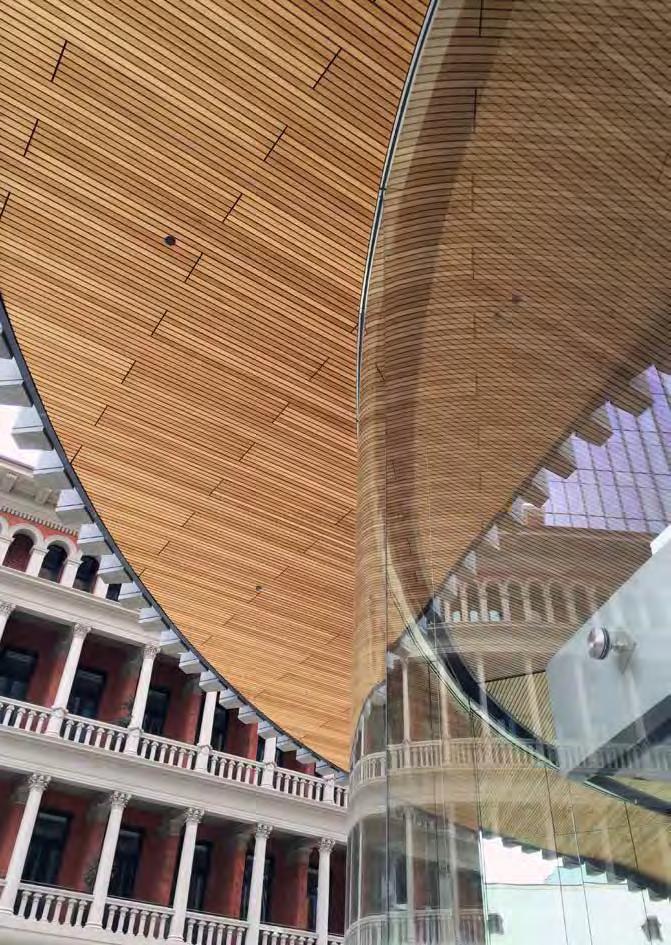
- 48 -
City of Perth Library by Kerry Hill Architects. Image: Angus Martin.
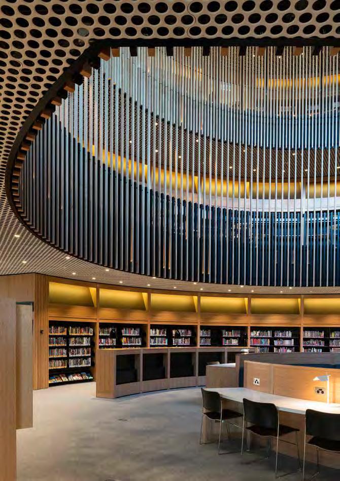
I REGIONAL I AGED CARE I TECHNOLOGY I STATE BUILDINGS I FEATURE I - 49 -
• City of Perth Library by Kerry Hill Architects. Image: Angus Martin.

and an almost sacred light. Although the focus is upwards and inwards, snatched glances outside are possible through the simple stone shafts. On closer examination, careful detailing of the fins is revealed, necessary to produce the effortless effect. The stone is the same Norseman granite used at Elizabeth Quay. It was shipped to Shanghai for cutting and assembly, now returned to WA for fantastic aesthetic effect as well as contributing to the environmental concerns of the building, mitigating solar heat gain and glare. It is undoubtedly a feat of design.
At the centre of the first floor, an earnest reader is treated to another generous volume, this time a triple height cylindrical void – its crowning glory an enlarged, highly detailed, printed drawing by WA artist Andrew Nicholls, whose monochromatic intervention successfully complements the space. At the perimeter sit meeting rooms available to all; this provision of private formal space providing a rare solution to the requirements of contemporary working patterns.
Also found on the first floor is the City of Perth History Centre, a nod to the Library’s past and its foundation in 1851 as the Swan River Mechanics' Institute - Perth’s first cultural hub. The reading room has an internal and studious focus, with moments of release in a small number of window seats where the outside can be contemplated. Timber screens run through the void, preventing procrastinating eyes diverting from study with a visual break between floors. The third floor glazing was initially a reluctant fire engineered solution but it produced the unexpected benefit of acoustic separation and the brief was adjusted to incorporate a function room which links to the public roof terrace, a benevolent gift for the library visitor.
The staircase reduces in width towards the summit where there is a den for young adults. Here, proving it is a truly modern library, books are mostly eschewed for computers, bean bags and video games. The space makes the most of the sloped roof with attic ceilings and views out. However, the childrens’ library on the penultimate floor has the
best aspect through louvres to a winter garden, in which sits a single tree. To understand the importance of this tree we need to appreciate the historical context of Cathedral Square. It was the genesis point of (white settlement) Perth where Mrs Helena Dance struck the first blow with an axe and a tree was felled to mark the City’s foundation. A romantic notion and one now reversed with a new tree, five floors above – emblematic of learning and the architect’s vision of the ‘idealised origins of storytelling below a tree in the shade’.
The library is a building which, despite paying deference to the heritage surroundings, also stands on its own as a beautiful object in a large city development. The spaces within the building are interlinked, generous in size and have visual overlap with the exterior, allowing an important connection to the City. Every detail works to emphasise the spaces, even the circular perforations in the ceilings speak of the building form. Volumes are manipulated into clean simple 3D shapes, delighting all and certainly compelling a return visit. •
- 50 -
City of Perth Library by Kerry Hill Architects. Image: Angus Martin.
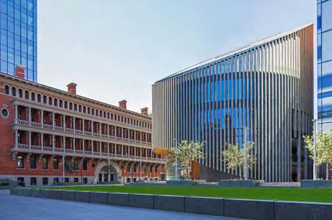
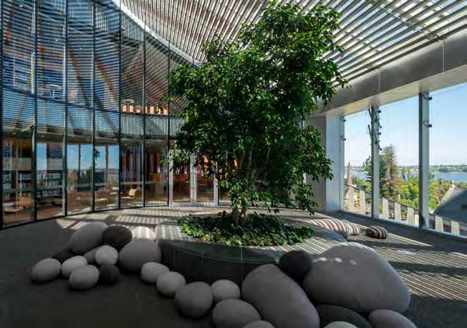
- 51 -
City of Perth Library by Kerry Hill Architects. Image: Angus Martin.
I REGIONAL I AGED CARE I TECHNOLOGY I STATE BUILDINGS I FEATURE I
City of Perth Library by Kerry Hill Architects. Image: Angus Martin.

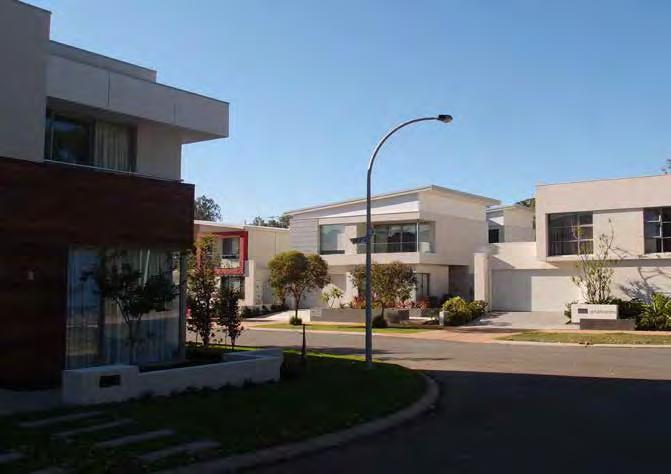
- 52 -
Podium Terraces by TRG Properties with CNN. Image: Courtney Babb.
Perry Lakes Residential Development. Image: Courtney Babb.
medium density: perry lakes residential development
Authors Dr Robyn Creagh and Dr Courtney Babb
The new Perry Lakes development is located on the site of the Perry Lakes stadium and former 1962 Empire (Commonwealth) Games buildings. The Games provided global exposure to Perth and the architecture of the competition arenas and adjacent athletes’ village reflected a desire to showcase Perth as vigorous, modern, and international in outlook.
After familiarising ourselves with some of the site history and the 2009-2012 CODA / LandCorp Design Guidelines and Detailed Area Plans, on a February afternoon we went for a walk around the new residential development. We were particularly curious to see how the density, history and desire for a showcase development turned out in the public realm ‘on the ground’.
Like other State Government led urban regeneration projects, Perry Lakes was developed with a set of comprehensive and very deliberate planning and urban design controls. The design guidelines primarily sought to respond to the modernist residential experimentation of the athletes’ village, the garden-city
suburban landscape of Floreat, and the history of the athletics stadium, while introducing a higher density scenario than had yet been seen in this area. The guidelines describe building envelopes, building elements and a colour palette inspired by a modernist vision and a sense of place based in the established adjoining suburb and the stadium complex.
Site planning responds to the stadium footprint, incorporating significant elements of the stadium and public art as landmarks. Street names reflect the history of athletics on the site (Relay Lane, Finishline View). Four character areas are described within the overall site: Apartments, International Style and Track and Field (where multiresidential and town houses provide higher scale development) and Garden Belt, consisting of single residences to integrate with the surrounding suburban area.
In Track and Field, developer TRG Properties with Cameron Chisholm Nicol have taken the guidelines at their intent: the Podium Terraces
development is a highlight with a balanced and graceful façade which responds to the stadium curve. The material restraint and considered street interface results in an inviting individuality of residences within the set. However not all other developers have been as generous to the public realm, nor the occupants. Much in evidence are large unarticulated facades, unshaded windows, crude chamfers in response to site curves, and blunt walls projecting into pedestrian pathways. The contrast in quality invites further discussion of how to best achieve great outcomes for multiresidential development in Perth. As the landscape matures there is the potential for some special places to emerge. A pedestrian access way linking the Track and Field precinct to the Garden Belt is lined with frangipanis (with a large number of benches) and will grow into a lush, shaded space.
The established feel of the ‘garden belt’ streetscape is dependent on the play between the clean forms of the homes, established gum trees, and unfenced front gardens. The absence of front
- 53I REGIONAL I AGED CARE I TECHNOLOGY I STATE BUILDINGS I FEATURE I
• M
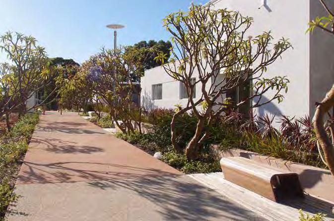
fencing deliberately references the garden city aesthetic of nearby Floreat and City Beach. However, as the houses have limited setback from the boundary the reference is tenuous, resulting in a new urban form of block-gobbling homes with a theatre-set garden out front, rather than a reproduction of the Australian modernist philosophy connecting indoor and outdoor living spaces. However, the retention of the huge gums which tower over the large, flat-roofed homes effectively shifts up the scale of pedestrian experience of the street, placing the white-box houses back into a landscape context.
Rather than a formal conclusion let us consider a ‘what-if?’… Stadium Drive is a place for car circulation rather than active bodies and it is disappointing to see such a passive public realm in an area with a rich history of human movement. Memories of Perry Lakes include both communitywide celebrations of elite athletics and personal stories of less elite childhood escapades. Any potential for a celebration of human movement on
the old track is now diminished by the corralling of pedestrian circulation to the edges of the two-lane street bordered with narrow verge gardens.
Imagine instead a wide expanse of landscape along the old track which invited human movement first, and enabled cars to pass through as a secondary consideration. As a looped road, Stadium Drive would be an ideal shared street. This active landscape would be a fitting remembrance of Perry Lakes stadium, the garden-city aesthetic of Floreat, and the design and lifestyle idealism of the athletes’ village homes. Importantly, such a rethinking of the streetscape could build a continuing sense of place through an enacted celebration of an active and outdoor lifestyle. •
- 54 -
Perry Lakes Residential Development. Image: Courtney Babb.
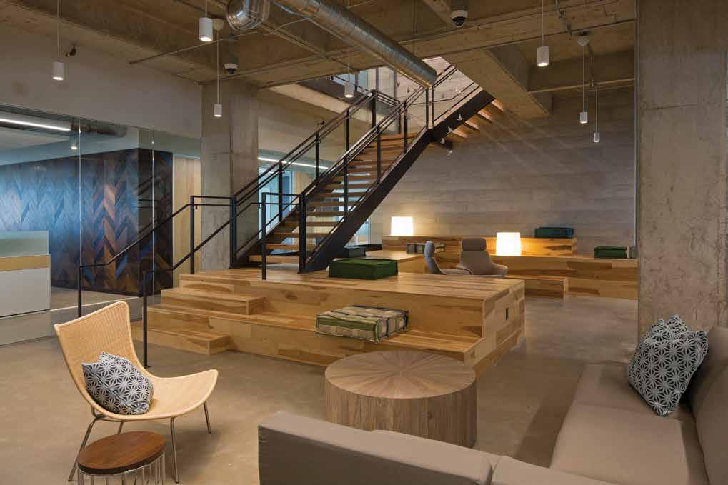

STUNNING INNOVATIVE CREATIVE


Since 2003 the experienced master craftsmen of Polished Plaster have been delivering high quality, bespoke surface finishes to suit every style for both interior and exterior application.
With an ever growing range of sustainable decorative surface solutions, Armourcoat’s products are both durable and versatile.
Created from natural wooden planks with an exposed grain detail, 'Timber-Effect' panels are designed for decorative wall cladding. The panels are ideal for a shuttered concrete look for interior theming and branding.
Available in two metre lengths, four standard colours and four textures (Original, Rugged, Cinder and Shuttered), 'Timber-Effect' panels can also be custom colour matched. The panels are tough and durable, cast from a polymer modified gypsum mix with post-consumer recycled material.
Authorised applicator of

T: 08 9331 1569 M: 0424 260 367 E: info@polishedplaster.com.au
Showroom viewings by appointment www.polishedplaster.com.au
- 55 -
PUBPP05/16 MAIN PHOTO: HOMEAWAY INC, LAUCKGROUP, © PAUL BARDAGJY

- 56 -

I REGIONAL I AGED CARE I TECHNOLOGY I STATE BUILDINGS - 57S M L XL
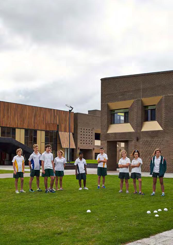
- 58 -
Bunbury Catholic College by CODA Studio + Broderick Architects. Image: Peter Bennetts.
bunbury catholic college – mercy campus / coda studio + broderick architects
Author Andrew Boyne
When approaching the new Mercy Campus of Bunbury Catholic College, large brick structures cut a striking figure amongst low-lying pastoral land and sandy undeveloped residential lots. Their strong double storey form, shimmering gold window reveals and the bright green splashes of neatly mown lawn all seem to clash with the surrounding fields of grey sand and dry scrub. The campus is accessed via a newly minted road, lined with grass and newly planted saplings, forming a linear incision straight through the surrounding landscape. But for all the contrasts that this first impression conjures, the architecture of this new educational facility is very much a response to a context.
Bunbury Catholic College has occupied an 8.4 hectare site in the City of Bunbury for more than 40 years. The site has been haphazardly expanded and comprises white-painted buildings of various innocuous styles positioned in a confusing piecemeal cluster. Faced with growing enrolments and a site that was reaching capacity, the College looked to engage a new architect to develop a way forward for further development on the site and for new work on the Mercy Campus, a 10 hectare site 15km to the north in the locality of Australind. A joint venture between Broderick Architects and CODA Studio was chosen to develop masterplans for the two sites and to design subsequent structures which have so far included a new learning centre on the original campus and three of the 11 buildings planned for the Mercy Campus.
The buildings on the Mercy Campus not only anchor the masterplan for the school, but are part of a residential subdivision which will eventually see the campus surrounded by swathes of suburban housing. Plans for the immediate area do not envision shops or community facilities, and as such the school, a private institution, has taken on a role as civic centre for the surrounding community, inevitably helping to solidify the local community and give it identity.
In response to the need to anchor unbuilt plans, in retort to the haphazard nature of development on the original campus, and perhaps in reaction to the influence of the church, actual or implied, the buildings are weighed down with a surprising sense of formality. The rectangular brown brick facades, capped with an expressed cornice detail, are punctuated by deep regular openings and adorned with gold infills that heighten the sense of depth and add mass to the building. Tall, curved walls are expressed throughout the building but exhibit regular radii and are set against tangents at sensible 45° angles. Even the colour scheme used to differentiate the three existing structures is dialled back to burnt reds, honey yellows and steel blues - a far cry from the vivid colours that are often applied to buildings occupied by children. Built with similar proportions, the two-storey Young Adult Learners centre (YALs) and Learning Commons buildings face each other across an open square. Both are adorned with balconies which allude to some form of hierarchy
and appear to give opportunities for a speaker to address students below.
Formality can often be seen as a criticism in contemporary architecture, but in the case of the Mercy Campus it is a thoroughly appropriate way to approach the design. The establishment of these first formal buildings of the masterplan provides an established core from which the school can grow. They help to anchor the identity of the place and establish a set of architectural rules that will inform future development on the site, and as the additional buildings envisioned in the masterplan are fulfilled around the central core, their expression is expected to become freer.
The campus is currently occupied by year 7-9 students due to the operational requirements of the school, but in time the YALs buildings will accommodate senior students. The Learning Commons building will provide facilities such as IT, canteen, and library services, and classrooms for younger children will eventually be built on the periphery. The serious nature of the year 11 and 12 curriculum that will eventually be taught in the centrally located buildings is not only reflected in the architectural form, but in the sensible interior planning and fitout with neutral colours, plywood accents, white perforated plasterboard ceilings and splashes of coloured glazing. The rooms are fitted with automated blinds, fans and lighting which ensure that operation of the rooms is environmentally responsible.
- 59I REGIONAL I AGED CARE I TECHNOLOGY I STATE BUILDINGS I FEATURE I
• L
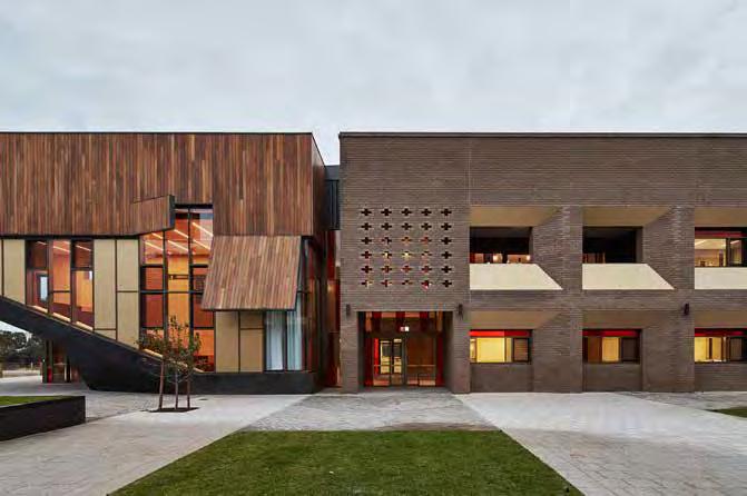
The rest of the school facilities provide spaces which are engaging and thoroughly considered. The library, strikingly devoid of hardcopy books, provides a quiet lounge space with alcoves for discussion and laptop work spaces, whilst being bathed in filtered yellow light. All communal spaces are bisected by a circular path of travel which cycles through both floors of each building, helping to tie every space into the day-to-day lives of students. The canteen facilities are of a commercial kitchen standard, and the facilities provided in the Technology and Enterprise building, including woodworking, metal working and cooking infrastructure, are functional and of exceptional quality.
For a set of buildings that embrace their civic and institutional role so enthusiastically, the selection of materials and the interior detailing act as counterpoints. The material palette of plywood, off-form concrete, brown brick, and anodised bronze aluminium window frames was chosen for texture and the ability of the materials to
naturally age, but it is also a palette that leans towards recent trends in Australian residential architecture.
The parallels with residential architecture are further evident in the external expression of a performance space that forms part of the YALs building: a small tiered theatre which acts as an exclamation point on the corner of the building. The building is softened by its external form of a timber-clad box with openings and scoops, reminiscent of prevailing residential design. The domestic feel generated through the use of residential materials and forms manages to comfortably balance the more formal components.
In many ways this is a project of balance. Born out of what appears to be a fruitful partnership between architectural firms, involving ten architects between them, the project benefits from multiple inputs. This is not a design of individual genius, but is instead a thoughtful response by a design team that has clearly been concerned with functional
requirements and rational planning. The architecture that has emerged from this collaborative process is deliberately expressive and very much of its time. It picks up on contemporary architectural cues whilst ensuring the history and the context of the buildings will be well understood as the planned additions to the campus are completed and the surrounding suburb is built up.
The temporary accommodation of year 7-9 students in a building that speaks in a language which reflects the formality of higher levels of senior school education may provide learning opportunities for architects and educators. Over the coming years it will be of some interest to see how successfully the younger children who attend the Mercy Campus react to their new surroundings. With a cohort of children who are often provided with bright colours and an informal architectural language, the thoughtful and sensible design of the buildings they now occupy are bound to have an impact on their education. •
- 60 -
Bunbury Catholic College by CODA Studio + Broderick Architects. Image: Peter Bennetts.
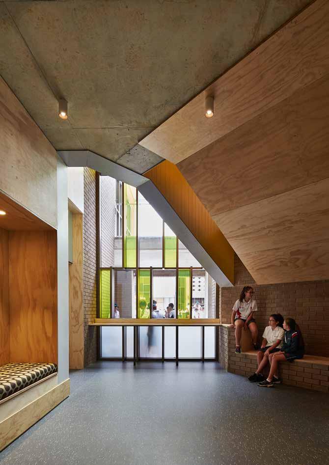
- 61 -
I REGIONAL I AGED CARE I TECHNOLOGY I STATE BUILDINGS I FEATURE I
Bunbury Catholic College by CODA Studio + Broderick Architects. Image: Peter Bennetts.
scaling up: towards best practice
Author Sarah McGann
On consideration of an exemplar large-scale aged care facility, Emma Brain interviewed Sarah McGann on best practice in this field and Western Australia’s progress in the provision of this type of facility.
A common architectural language seems to dominate the aged care market in Western Australia. What is your reading of it in its current state?
Building and typology development generally happens in distinct eras based on the trends, needs and practices of the time. In the aged care arena this is particularly apparent. The geriatric ward arrangements of the 1960s to 1970s was a particularly low point in the sector; often with separate male and female wards, where 70 beds might share only eight toilets. This institutional-style spatial organisation resulted in practices that included an over-reliance on bedpans and on being bedridden. As a result of concerns raised, the 1986 Commonwealth Nursing Homes and Hostels Review led to reforms to assist people to stay at home longer and for nursing homes to become a last resort, used only when other options failed1
The 1980s and 1990s was a period of rapid development in Perth that was in stark contrast with the geriatric ward solution and, instead, focused on
the ‘village’ big-home style. Architect Brian Kidd led the field at the time with developments such as Inglewood’s Brightwater, which was considered as an international exemplar at the time. These kinds of developments, with many still fully operational, were deliberately de-institutionalised, with decentralised services and designed for a normalised routine for residents.
More recently, the rise of the ‘retirement village’ looks toward the American resort-style model with clubhouses and fun-loving senior activities often featuring in the advertising. These developments tend to be on the outskirts of the suburbs where planning concessions and land are cheap and readily available.
How does this compare with your experience working in the sector overseas?
Ageing-in-place and age-friendly cities are key themes developing worldwide. In response to critical demographic predictions on population ageing (with potentially nearly 40,000 centenarians by the year 2055 according to the 2015 Government Intergenerational Report), the push is to stay working longer and at home longer. However, the fastest growing population age is those aged over 80 who are likely to be more dependent and, potentially, in need of assistance for longer periods
with proportionately less family or informal carers available. In addition to this, there is an expected proportionate growth in people suffering from dementia. Currently there are over 350,000 Australians with dementia and this is predicted to rise to nearly 900,000 by the year 2050. Currently three in every ten Australians aged over 85 have dementia and most are in need of some form of care or support2. So it is reasonable to predict that the nursing home typology is in need of complete rethinking.
European exemplars are leading innovation in the aged care field at the moment. In Aalborg, Denmark, the Nursing Home of the Future (by Thomas Norkaer of the Aalborg Care Consortium) is one example that combines an urban architecture and site with public space and state-of-theart technologies for contemporary aged care. Technologies are integrated into the building such as under-floor sensors that pick up falls, or conversely a lack of movement. This helps resident safety while maintaining levels of privacy and independence. The free wifi throughout the building encourages greater community use and interaction in restaurants and public areas. The provision of preloaded tablets helps resident connectivity with family, friends and community activities or news.
1 Gare, D 2001 Lady Onslow’s Legacy: A History of the Home of Peace and the Brightwater Care Group. Brightwater Care Group Inc: Osborne Park.
2 Alzheimer ’s Australia 2016 ‘Key Facts and Statistics 2016’. https://fightdementia.org.au/about-dementia/statistics
- 62 -
Another interesting example is De Rokade (by Arons en Gelauff Architecten) which combines a highdensity apartment tower with an ensuite-style, street-level nursing home. This type of concept has the potential for the vertical circulation to provide future nursing home services to the apartments as residents age without leaving home or the city amenities. The street-level nursing home also enables service provision to those needing help while living at home, which, in turn, breaks down some of the boundaries between community, residents, day attendees and staff.
Radio National recently profiled an aged care provider in Queensland who is reshaping the way in which care is provided within their homes. In a program entitled ‘Dedicated Staff Assignment’, the same three staff are appointed to care for each individual resident around the clock. According to the interview, the program has had a tremendously positive effect on the emotional and physical health of the residents, and also on staff satisfaction. How important is architecture, do you believe, in enhancing our wellbeing as we age?
Dedicated Staff Assignment is a new care concept based on a traditional family care model, where the same staff care for the same residents each week, and is being trialed by many aged care
providers in Australia. The continuity of care in this smaller-scale care model is showing improved satisfaction for residents, staff and family members. At the same time, current research is showing that residents engaged in day-to-day familiar activities such as laundry, cooking and gardening promotes greater wellbeing, particularly for dementia sufferers.
There is a clear correlation between the provision, size and quality of spaces (such as larger, brighter laundries and kitchens) and the ability of residents to be included in such activities. We are currently conducting research into the spatial implications of these practices on briefing decisions to improve levels of resident participation and their perceived quality of life.
Another aspect of aged care that irks me is that the facilities are often pushed to the periphery of our suburbs with gated access. Do you think there is any capacity or reason for aged care to be moved back into the heart of our communities? // And finally, what is your vision for the sector in Western Australia?
There is a definite capacity and need for a true variety of both living and care models. Peripheral gated suburbs maybe a choice for some people, but more often we are seeing a pushback from people who want to be in the heart of activities of their choosing, such
as demonstrated in the vittinoAshe Adelaide Terrace project in the city centre, or within familiar rural communities as shown with the iph Walumba Elders Centre project.
Classifying older people as a single type requiring cookie-cutter living solutions is a mistaken approach. Choice of place, site and amenity is a key factor influencing design, whether for living at home with the potential for adjacent future-care or for care now. There have been many studies conducted with current aged care residents on nursing home arrangements that document quality of life and levels of satisfaction. While these studies are clearly valuable to ascertain the success of care models and practices, future users and residents (potentially us and all our friends) may well have very different expectations of the spatial configurations.
I would suggest that valuable architectural research might ask future generations how and where we want to live down the track, to ensure that the regulatory planning frameworks and standards are in place and that higher levels of innovation and less riskadverse solutions are being developed right now. •
- 63I REGIONAL I AGED CARE I TECHNOLOGY I STATE BUILDINGS I FEATURE I L
global and local bim adoption –a shared responsibility
Author Nando Mogollon
From the planning and design phases of a project, through to building life cycle, cost management and facility operation, building information modeling (BIM) consists of the generation and digital representation of physical and functional characteristics of building elements. The bringing together of information from a variety of disciplines with new and emerging software represents a significant technological and methodological leap for the architecture, engineering and construction (AEC) industry. Globally, BIM uptake is increasing – as it is here in Australia. Nando Mogollon is an architect and BIM specialist who has worked in China, South Africa Colombia and Canada. Now based in Perth, Nando examines BIM adoption in Australia and how we compare internationally.
To understand where Australia is positioned globally as the AEC industry adopts and implements BIM, we need to first understand how BIM adoption is measured and what these measures mean in this context. Most surveys,
from the initial SmartMarket Report in 2007, to National Building Specification reports (UK) and a more recent survey from Yonsei University (Korea), have focused on the measures BIM adoption rate, depth of implementation, level of proficiency and years using BIM. The 2015 Yonsei University survey analyses several additional factors, shedding further light on the status of BIM implementation in the AEC industry: hype cycle, technology diffusion and use of BIM services1. Here I would like to extend my thoughts to the incorporation and interpretation of these additional indexes.
The hype cycle measures the maturity and potential of a certain technology in terms of phases of uptake, with Australia and New Zealand impressively scoring a 70% adoption rate across the last two stages of the cycle (slope of enlightenment and plateau of productivity). This places our region just below North America at 89%, but above the Middle East and Africa at 64%, Europe at 55%, Asia at 48%, and South America at 17%. The
most developed phase across countries and continents varies: design in Australia and New Zealand, Europe, and the Middle East and Africa; construction in North and South America and Asia.
The technology diffusion index is used to measure the perceived major user of BIM. Again, Australia and New Zealand sit towards the front of the field with a 40% rate of early adopters, after the Middle East and Africa at 43%, and followed by Europe at 37%, South America at 33%, North America at 27%, and Asia at 22%.
Lastly, the use of BIM services index measures a defined range of uses: 3D coordination, cost estimation, existing conditions modeling, design authoring, structural analysis, maintenance scheduling and building system analysis Although this range is limited and omits some uses, it is interesting to note that Australia and New Zealand lead in uptake for 3D coordination, existing conditions modeling, and design authoring - ranging from 89% to 100%. Roughly
1 Jung, W. and G. Lee (2015) ‘The Status of BIM Adoption on Six Continents.’ World Academy of Science, Engineering and Technology International Journal of Civil, Environmental, Structural, Construction and Architectural Engineering 9 (5): 448-452.
- 64 -
level with North America as leaders for structural analysis at approximately 90%, Australia and New Zealand fall below this region for cost estimation (67% vs 96%) and maintenance scheduling (33% vs 55%). Compared with overall global uptake, Australia and New Zealand still sit within the mid range for these uses, but at the low end of the field for building system analysis at 11% vs 33%.
Given these findings, how do we increase BIM adoption and implementation in Australia? How do we consolidate our strengths and improve on our weaknesses? What is our role? And whose responsibility is it? As with the adoption of many other technologies, there are a few major approaches - at least in theory: the ‘bottom up’ approach, the ‘top down’ approach, and the ‘middle out’ approach. With each of these, all actors will have a role to play. These actors are anyone in industry who wants to take advantage of the benefits the technology offers, defines and uses the workflows, or develops policy and sets mandates.
At one end are the users - the people who operate and maintain the buildings and the users of the technology itself. These are the demanding groups, the ones that can create enough critical mass to ignite the process from the bottom up. Then there are the for-profit organisations – private companies across the spectrum of the AEC industry, whose responsibility it is to embrace the technology and workflows in order to harness the benefits. This group includes designers, engineers, consultants and IT-related organisations.
Perhaps somewhere beyond lie the non government organisations - including professional associations and interest groups and parties, whose role it is to develop the guides, standards and protocols that will eventually set the base for mandates. At the top we have the national, state and local authorities, whose responsibility it is to write policy and mandate minimum requirements whenever necessary to ensure appropriate baselines for public
projects are set. They also have the role of observing and supervising the overall adoption and implementation of new technology nationwide, focusing on and measuring the benefits.
Every actor has an important part to play if we are to generate the benefits BIM technology, workflows and mandates can bring to the AEC industry. As with the use of BIM itself, this cannot be a lonely effort, it needs to be a social one. Do your part. •
- 65I REGIONAL I AGED CARE I TECHNOLOGY I STATE BUILDINGS I FEATURE I L
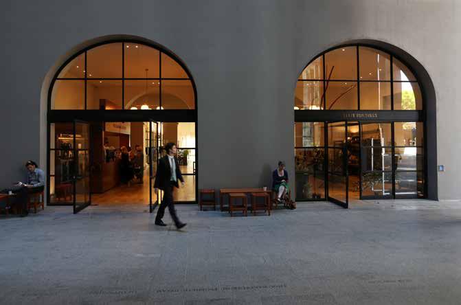

- 66 -
COMO The Treasury by Kerry Hill Architects. Image: Janine Symons.
COMO The Treasury by Kerry Hill Architects. Image: Janine Symons.
como the treasury / kerry hill architects
Author Janine Symons
In the winter of 2011, along with my colleagues at a specialist heritage architectural practice, I spent some considerable time surveying and documenting the Old Treasury Buildings. The project we were engaged on, in its early stages, was the reincarnation of the Old Treasury Buildings, vacant for over 20 years, as a boutique six-star hotel. However, given that there had been a number of schemes over the years to redevelop the buildings, nothing at that stage was assured. Over several weeks each of the over 400 rooms and spaces were measured and photographed. It was fascinating and a privilege. And also cold, dirty, smelly, vaguely unsafe, and definitely unsanitary. The sensation of standing on several inches of pigeon poop whilst measuring is not to be forgotten: crunchy on top, but a definite disturbing softness underneath. Nor will the disconcerting beauty of fungi growing from the carpet in the ‘Mush Room’.
Cut to late 2015, and we are drinking in the achingly trendy and subtly distressed Petition Beer Bar, the latest iteration of spaceagency’s signature style, where a
hip young thing is overheard saying to his hip young companion, complete with wide eyes, ‘I think this is the coolest bar I have ever been in.’ I recently received an email from the State Buildings a week or two ago, offering a Valentine’s Day weekend of indulgence at COMO The Treasury, from just $1,595 per couple –times have changed.
The Old Treasury Buildings, an interconnected and integrated complex of buildings largely constructed between 1877 and 1904, were designed by the senior Planning and Works Department architects of the day, including Richard Roach Jewell, George Temple Poole, Hillson Beasley and Henry Grainger. For over a century they accommodated government services, but since the 1980s had been empty, the standard of their accommodation no longer being suitable for government administration.
Designed as separate buildings, later connected, the complex is a diverse group, including the Treasury Building in the Victorian Second Empire style, and Temple Poole’s gloriously idiosyncratic Federation Free Classical Titles Office. Despite their differences,
their co-location and similarities in scale and materials create a harmonious composition.
Clearly a large-scale transformation has been wrought – from Mush Room to COMO The Treasury. The complex includes hand selected hospitality and retail outlets located off the central Postal Hall, in the basement, and along the ground floor of the western wing. The remainder of the building is given over to the hotel, a 48 suite six-star boutique indulgence. A new annexe adjacent to the Lands Building contains a rather swanky infinity pool and gym, and a restaurant has been located on top of the building, in a simple, metalframed glazed box.
Public access, at least at the ground floor level, is facilitated with north-south access from the Terrace through the Postal Hall to the new 33 storey tower behind and the Town Hall; and east-west access through the existing Cathedral Square and Barrack Street entries. Early anecdotal evidence suggests that the new retail and hospitality outlets have been enthusiastically embraced.
- 67I REGIONAL I AGED CARE I TECHNOLOGY I STATE BUILDINGS I FEATURE I
• L
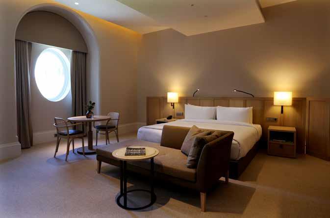
A trio of architectural practices are responsible for the transformation. Kerry Hill Architects (KHA) designed the hotel and the multi-storey tower behind; Palassis Architects are responsible for the conservation of the heritage buildings; and spaceagency designed the Petition hospitality outlets.
The hotel is quiet and sophisticated, in the understated way that we expect of KHA’s work. The layout of the building, in the opinion of Simon Cundy, Project Architect, made it ideal for a hotel: generously proportioned rooms, none quite the same, laid out along corridors, with windows to all rooms.
Each room has high ceilings, perfectly proportioned windows, deep timber door reveals and timber skirtings, clearly signifying the age of the building. Over this KHA have applied their signature sophisticated style. Services and air conditioning are above dropped ceilings, located so as not to interrupt views of the tall windows. Colours are soothing creams, greys and greens; furniture is custom
designed limed oak; bathrooms are tiled generously in pale travertine marble; accessories are all high end. Furnishing and décor is restrained and peaceful, and double glazing ensures that even the Terrace rooms are whisper quiet. A single room on the first floor, overlooking the Terrace, serves no other purpose than to accommodate a massively oversized light, visible across the Postal Hall mezzanine – space as luxury.
Interventions to the building are clearly delineated in a black steel – new glazing to arched openings to the rear wall; fire place surrounds; the floor-to-skylight mesh barrier that elegantly serves to make the Titles Building staircase compliant, illuminated room numbers in long tubes.
Circulation for the hotel has been cleverly handled, with lift access from the Cathedral Avenue entry and the east-west corridor allowing guests to negotiate the changes in level, in addition to the original staircases.
The ground floor north-south running corridor is a particular delight with levels going up and then down half a floor - the only obvious internal clue that you are moving through different buildings. Darker than the rooms, the hallway’s wide, oiled timber boards, with brass bordered thick carpet insets, is a pleasure to travel.
From the rooftop, not only are there views across Cathedral Plaza to Council House and the river, but the complex and beautiful roof forms are revealed in their refurbished glory, the result of rigorous investigations, and using traditional materials and skills. 60 000 Welsh slates clad the steeply pitched roofs, the mansards have new copper roofs, and the dormers have been reconstructed, as has the lacework ridge cresting, the pattern discovered in a pattern book found on the internet.
Externally a cloying pistachio and cream paint scheme has been painstakingly stripped from the joinery and concrete render, and the brickwork repaired and cleaned. The revealed beauty of the aged
- 68 -
COMO The Treasury by Kerry Hill Architects. Image: Janine Symons.
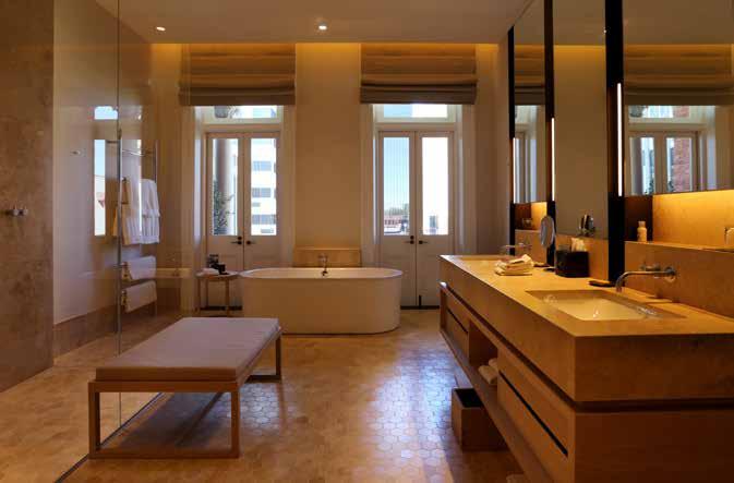
concrete render is a thing of joy, worth every moment of the effort that went into achieving it, and the black window joinery a sophisticated choice. Temple Poole’s marvellous balconies, at risk of collapse from concrete cancer, have been restored and revealed after years behind hoardings. There are moments, in the right light, when you could imagine yourself in Paris.
To accommodate the central tower, the oldest portion of the place, the Police Cells were demolished and interpreted in the paving treatment. Whilst it might be a popular attraction, there are those who question why the most exceptional portion of the heritage buildings was permitted to be demolished.
The tower, although not connected to the Treasury Building, butts up hard and looms over it. The passage between the two buildings is covered and currently somewhat dark and lifeless. Hopefully when the tower is populated foot traffic and activity will change this.
Along with the Cathedral Plaza redevelopment, the transformation of the Old Treasury Buildings has brought activity to the area, previously lifeless outside working hours, in the same way that the recent conservation and redevelopment of the Brookfield Place heritage buildings changed the way the City was used after hours. The conservation and refurbishment has been extremely well done, with an emphasis on quality materials and appropriate conservation.
The hotel is stylish and understated, but in buildings of this era an opportunity was perhaps lost to add some carefully considered punches of colour or texture referencing their Victorian heritage - although KHA regard it as highly coloured for them.
Curiously, when in the hotel, there is no sense of what the buildings used to be, and they read as perhaps an old hotel or grand manor and not the government and administrative offices that they were. There is a risk of losing this history which is not clearly interpreted.
Access for the public, apparently a key element of the winning pitch, is generous, and there are multiple ways to traverse the building, at least at ground and basement level. Planning cleverly separates the hotel without the need for physical barriers whilst maintaining permeability and connecting to the larger precinct and the City.
From its dilapidated condition only five years ago, COMO The Treasury is a wellconsidered and conserved outcome, offering many moments of joy. •
- 69 -
I REGIONAL I AGED CARE I TECHNOLOGY I STATE BUILDINGS I FEATURE I
COMO The Treasury by Kerry Hill Architects. Image: Janine Symons.
ten from ten: perth's public transport
We asked ten thinkers, architects and decision makers ten questions about Perth’s public transport.

SENATOR SCOTT LUDLAM
GREENS SENATOR FOR WA
In what way is transport most important to the development of cities?
Transport shapes cities in fundamental ways, and has done for thousands of years – so much so that urban form is frequently categorised in terms of the underlying transport mix. While this debate is sometimes hung up on arguments over technology, it is fundamentally about community: whether we serve the needs of private cars or the needs of people.
In what city have you experienced the most successful public transport system and why?
Tokyo is phenomenal. Dozens of intersecting rail lines that allow you to get almost anywhere across the city, running at high frequency and with seamless integration.
Given the current budgetary constraints, if the State Government could only investigate one new public transport offering, what do you think we should
prioritise? Light rail? Heavy rail? Highfrequency buses? Something else?
Perth is missing the ‘middle tier’, the transport mode that ties together the secondary hubs like Fremantle, Mandurah, Joondalup, the universities. I would prioritise getting started on the Perth Light Rail network, which has suffered years of unnecessary delays, but equally important is better network planning with high-frequency feeder bus services. Budgets are always constrained, of course, but billions have been squandered on poorly planned urban freeways and it’s time those resources were freed up.
With Elizabeth Quay opening in January of this year, a significant step has been taken to connect the City with the Swan River. Should we be making more use of the River with ferry transport – opening up connections to, and development opportunities in, Perth’s eastern and southern riverside suburbs?
I have to say, I really loved the ferries that went from the City to Fremantle, serving as train replacements while the Freo line was being maintained. I’d love the River to be used more effectively for transport, but for it to be worthwhile, more medium density dwellings need to be built nearer to the River.
In the context of Transit-Oriented Developments, apartments are favoured by developers. Are these the ideal and only housing typology we should be pursuing? I’m more interested in pursuing housing typologies favoured by the people who will have to live in them. Grattan’s
‘Housing We’d Choose’ research shows a dramatic undersupply of semidetached housing and apartments because a range of factors have forced an oversupply of outer-metropolitan detached dwellings. These more diverse dwellings are certainly better suited to compact settlement patterns around transit nodes, but I think we have to resist swinging the pendulum too hard back in the direction of high density, which frequently pits existing residents against high-rise newcomers.
In denser cities, there is often a greater interaction between public transport infrastructure and the surrounding architecture. How would you like to see this develop in Perth?
We’re starting to see it happening in the CBD at last – there’s an underground bus-port embedded in the Citylink development for example, and the way the Esplanade bus and rail hubs integrate with that part of the city shows a pointer. We need to get architects, developers, and transport planners out of their silos and into the same room, and then amazing things can happen outside the handful of examples we can point to.
Perth is undoubtedly car-centric. In what ways do you think urban design and development strategies can change this mindset?
We need Perth to be people-centric. There are some transport tasks that cars are uniquely well suited to, but a twice-a-day commute at the same time as everyone else isn’t one of them. In
- 70 -
my view, the most important leap is to get the Light Rail project back on the rails and then reorient meandering bus routes toward a high-frequency masstransit system, and channel subsequent medium density development along these priority corridors. That was the thinking behind the Transforming Perth project.
Where does architecture hold the most potential to contribute towards public transport (and associated precincts) developments?
In promoting beautiful design. Reversing the lowest-commondenominator trend towards throwaway tilt-up, and instead designing communities that our kids and grandkids will want to have heritage listed. If architects know that policymakers, politicians and planners are working to deliver high-frequency mass-transit, they can begin to let go of the design constraints imposed by cardependence.
Perth’s public transport – your greatest outrage?
Having our Perth Light Rail project slip through our fingers right at the point where the project was about to get the green light.
Perth’s public transport – your greatest delight?
The run down the coast on the Fremantle line when the late afternoon sun is lighting up the Indian Ocean.
 PROF PETER NEWMAN PROFESSOR OF SUSTAINABILITY, CURTIN UNIVERSITY
In what way is transport most important to the development of cities?
Transport has always shaped cities: first walking cities, then tram and train cities, then automobile cities. The spread of cities throughout history has been to go no further than being ‘one hour wide’, ie 30 minutes in and 30 minutes out, on average. This means walking cities have a radius of 2km, transit cities 10-20 km and automobile cities 40-50 km. This is based on the universal travel time budget that is evident in all cities. The task of planners is to ensure that we don’t go beyond this average travel time budget. It is what the Prime Minister called the ’30 minute city’ in a recent speech. This 30 minute city has now been exceeded in all the big Australian cities, especially Sydney, and more recently - Perth. This is why we get upset about traffic. Globally we have studied this phenomenon and most cities are now coming back in faster than they are going out and
hence densities are going up as people try to keep within their travel time budget. This means we must redevelop much faster than we have been doing as the market is clearly there. Instead, 70% of Perth’s growth remains on the fringe. From our understanding of urban history we can predict that these new far-flung suburbs will decline very rapidly unless new fast trains can go past the traffic or else new activity centres can be built out in the suburbs – preferably both. If these things do not happen through changing investment patterns, and nothing is suggesting they will, then we must focus on redevelopment.
In what city have you experienced the most successful public transport system and why?
We have 100 cities in our Global Cities Database and the best transit occurs in cities like Tokyo, Hong Kong, Singapore and Mumbai. They are not comparable to our low-density, car-based cities in Australia so we tend to look for the best of Europe and North America. Zurich and Vancouver are stand out leaders in public transport from our perspective, but most cities can teach us something. In Perth the world can learn from our Southern Railway that has shown how to make a successful train go deep into car-based suburbs, carry eight lanes of traffic equivalent and make a profit in terms of operations without any capital cost as well. The whole rail system was paid off through the sale of Alinta Gas and is a model of how to recycle assets to help pay for such investments.
- 71I REGIONAL I AGED CARE I TECHNOLOGY I STATE BUILDINGS I FEATURE I • L
Given the current budgetary constraints, if the State Government could only investigate one new public transport offering, what do you think we should prioritise? Light rail? Heavy rail? Highfrequency buses? Something else?
Light Rail in America has grown 190% in the past 20 years and buses have declined 3%; heavy rail grew some 68%. Why? Because it’s cheaper in operations and capital per passenger kilometre, by about 50% over buses and 20% over heavy rail. Light rail also lends itself to private sector investment as developers like to build around it. My Entrepreneur Rail Model suggests that State Governments don’t have to pay any capital or operating funds if they used this approach1
With Elizabeth Quay opening in January of this year, a significant step has been taken to connect the City with the Swan River. Should we be making more use of the River with ferry transport – opening up connections to, and development opportunities in, Perth’s eastern and southern riverside suburbs?
Ferries rarely work well in cities except on short trips between very dense centres. Perth-South Perth is getting there. Nowhere else is close to such density though a few places are starting to get there like East Perth and Burswood. It will be more important to get heavy rail stations fixed: South Perth to get their stop which has been set aside since the first plans for the Southern Rail, and Burswood/Stadium as they are being sorted out over the next few years.
In the context of Transit-Oriented Developments, apartments are favoured by developers. Are these the ideal and only housing typology we should be pursuing?
Medium density development has been virtually stopped in Perth with City of Stirling now phasing it out. The only thing left is high rise and the spots for this are being reduced all the time; even South Perth is reducing heights. We need a much firmer policy on density with land assembly being used by the Metropolitan Redevelopment Authority or LandCorp or Department of Planning, someone, anyone to create sites where redevelopment can happen easily and with community support through positive engagement strategies. We give up way too early because we feel that deep down density is not good for us. It's critical for a city like Perth, which will stop growing soon, as the far flung edges become totally dysfunctional and no real density options are available. It’s not hard to see the supply of density sites running out very soon.
In denser cities, there is often a greater interaction between public transport infrastructure and the surrounding architecture. How would you like to see this develop in Perth? Design guidelines that embrace high rise and create walkable amenity around new light rail as well the old heavy rail lines.
Perth is undoubtedly car-centric. In what ways do you think urban design and development strategies can change this mindset?
It’s not as much cultural as structural. Millennials and baby-boomers are happy to relocate at higher densities into quality density that is well located. It’s too costly and mostly not having the amenity or desirability of places like Europe or even Sydney. We have surveyed the last 27 dense developments in Perth: over half the residents wanted to see sustainability amenities as part of their choices and where this was done they really commented on this. Why do we cut them out so easily?
Where does architecture hold the most potential to contribute towards public transport (and associated precincts) developments?
New light rail or heavy rail can unleash the potential for redevelopment in significantly denser activity centres as they create the amenity that the market is looking for. Without light rail or heavy rail TODs struggle.
Perth’s public transport – your greatest outrage?
Not building MAX Light Rail after making it the number one election promise. It rivals the closing of the Fremantle Railway which first got me into transport planning and discovered that the reasons for closure were all completely false.
Perth’s public transport – your greatest delight?
The return of the railway, its electrification and extensions to the north and south, all of which have been successful beyond the planners’ dreams and mine as well.
- 721 www.sustainability.curtin.edu.au/publications
 DR RYAN FALCONER TRANSPORTATION CONSULTING LEADER (CANADA), ARUP
In what way is transport most important to the development of cities? Transport enables movement of freight and people. It allows a market to function and facilitates peoples’ daily activity. A healthy city needs a diverse transport system that allows people to make choices about how they move, to where and when. Some built-in redundancy is also required: there’s nothing worse than a city at standstill because a major link fails. As cities grow, the transport system needs to become more diverse and dense, and focus more on people-trips. Car-centric systems don’t work. Perth still has a long way to go in this regard.
In what city have you experienced the most successful public transport system and why?
There are different ways to measure success, of course. For example, I’ve visited some cities with excellent coverage but relatively poor service
headways [measure of frequency] and hours of operation. All things considered, Zurich comes out on top but then again, transit in Switzerland generally is exemplary. There’s great coverage, and good operating hours and headways but in my view, the best things are service integration (rail-street carbus) and reliability. There are significant fines if transit does not run to schedule.
Given the current budgetary constraints, if the State Government could only investigate one new public transport offering, what do you think we should prioritise? Light rail? Heavy rail? Highfrequency buses? Something else? Tough question! I say this because all three levels of transit investment are required depending on where in the city we’re looking. That said, I think the immediate priority is light rail transit, which has the greatest potential to focus redevelopment along strategic corridors. Perth’s experience with heavy rail is that it follows paths of least resistance. It has its benefits, but these are related more to regional travel patterns (based on park-and-ride supply) than land use intensification.
With Elizabeth Quay opening in January of this year, a significant step has been taken to connect the City with the Swan River. Should we be making more use of the River with ferry transport – opening up connections to, and development opportunities in, Perth’s eastern and southern riverside suburbs?
I’m a bit cynical about this. It’s a bit of a romantic idea with a range of practical
issues. For example, Perth currently lacks a lot of the necessary berthing infrastructure and ferries themselves to support an expanded ferry network. Investment in network expansion would need to be weighed up against the value of investing instead in landbased solutions, and a sense-check never hurts regards travel times. For example, transit connectivity between Perth and Fremantle is more likely to be improved through investment in better rail headway than in trying to kick-start commuter ferry services. This all said, there may be potential to provide ferry services between nodes where landbased transit options struggle to be efficient. While I have not seen any work on ridership potential, Matilda Bay to Canning Bridge makes the most sense.
In the context of Transit-Oriented
Developments, apartments are favoured by developers. Are these the ideal and only housing typology we should be pursuing? Not at all. TODs should provide housing choice although the range of choice will depend on location. For example, a downtown station precinct shouldn’t include row housing because this does not respect land scarcity; however, in inner- and middle-ring locations, development densities should taper off towards the edges of TOD precincts. I’d add that I am not in any way a fan of the practice we see in Perth and elsewhere of developers ‘providing affordable housing as part of infill’ with this component simply being small product (eg one-bed or studio units). These don’t cater to families.
- 73I REGIONAL I AGED CARE I TECHNOLOGY I STATE BUILDINGS I FEATURE I •
In denser cities, there is often a greater interaction between public transport infrastructure and the surrounding architecture. How would you like to see this develop in Perth?
I’m going to cheat here a bit and answer this and question eight at the same time. [Where does architecture hold the most potential to contribute towards public transport (and associated precincts) developments?] Two things. Firstly, much better use of air rights! We’re looking at this a lot in Ontario and Quebec where developers are hungry to integrate their developments with transit because they know it suits their tenants. Plainly, though, use of air rights is tough when we keep locating our rapid transit infrastructure along freeways and highways, and don’t want to invest in cut-and-cover. Secondly, the Perth development community needs to get over the idea that ‘buses are bad’. I’ve heard of cases where developers want bus stations out of their developments because they are considered antisocial and noisy. This is a massive missed opportunity for better land use and transport integration, and quality architecture can help ameliorate negative perceptions of bus facilities. Curtin University is doing some great work in this regard.
Perth is undoubtedly car-centric. In what ways do you think urban design and development strategies can change this mindset?
There’s a lot of value in projects done really well with respect for urban design, public realm and architectural
outcomes. They show politicians and the wider community that density is not the spectre that it is often made out to be and may have been in the past. There is a challenge though, and that is to make sure that well-designed, transitoriented and walkable developments are inclusive and don’t price out people who aren’t wealthy.
Perth’s public transport – your greatest outrage?
Deferment of Stage One Light Rail transit. While I would argue about some of the details, Government determined that things like Gateway WA, NorthLink and FreightLink are more important for Perth’s future. Meanwhile, the AuditorGeneral reports that our transport planning priorities are misplaced! I also question the prioritisation of Perth Airport Link. I agree that the airport is underserved for transit but I don’t see how this project stacks up (in terms of priorities) next to some others.
Perth’s public transport – your greatest delight?
The wonderful results that Transperth achieves with its bus services. Their planning and operations guys do an excellent job with allocation of resources given the area they have to serve and contending priorities including political pressure, service for sprawl communities, social needs and demand along key corridors.
 JOE CHINDARSI DIRECTOR, CHINDARSI ARCHITECTS
In what way is transport most important to the development of cities? Transport is fundamental to the experience of a city. It can make or break a city in terms of the user experience, and efficient transport systems also mean more productivity, and better economic and social outcomes…
In what city have you experienced the most successful public transport system and why?
I’d have to say the New York Subway which I had the pleasure of experiencing for the first time last year - it’s old and no frills, but it goes everywhere you want it to, is low-cost, and it works extremely well.
Given the current budgetary constraints, if the State Government could only investigate one new public transport offering, what do you think we should prioritise? Light rail? Heavy rail? Highfrequency buses? Something else?
- 74 -
I think a good light rail network like Melbourne is still the way to go. We need to focus on density within the inner city rather than the suburban sprawl we currently have. Light rail paired with density corridors is ideal.
With Elizabeth Quay opening in January of this year, a significant step has been taken to connect the City with the Swan River. Should we be making more use of the River with ferry transport – opening up connections to, and development opportunities in, Perth’s eastern and southern riverside suburbs? Yes definitely – a great example for this is Sydney. Perth is built around a spectacular estuary, and fast and affordable ferry services to alleviate pressure on peak-hour road congestion to my mind would make sense and be a tourist attraction in itself.
In the context of Transit-Oriented Developments, apartments are favoured by developers. Are these the ideal and only housing typology we should be pursuing? Apartments are a good typology, but certainly not the only one to pursue. Providing a mix of typologies provides variety and interest in relation to built form and an alternative product within the broader market. Within our practice, we have been exploring hybrid townhouse / apartment typologies which have the benefit of apartment density on some sites with the advantages of a compact home in terms of size, individuality and private gardens.
In denser cities, there is often a greater interaction between public transport infrastructure and the surrounding architecture. How would you like to see this develop in Perth?
It would be great to see more microbusiness and smaller scale development which facilitate an increase in the density of street-life… perhaps a smaller, tighter-grained architecture at the footpath level which would possibly be more financially sustainable. Maximising opportunities to interact with pedestrians both commercially and by offering amenity through rest and green spaces should be the focus.
Perth is undoubtedly car-centric. In what ways do you think urban design and development strategies can change this mindset?
I guess the continued enhancement of development opportunities by further increasing density provisions along public transport corridors. Pairing that with removing the requirement to provide on-site car bays would literally mean removing the car entirely from the equation in targeted areas. That would be a good start.
Where does architecture hold the most potential to contribute towards public transport (and associated precincts) developments?
The obvious answer is in the design of stations, and within this there’s often an obsession with form and architectural expression. But the most important contribution would be to ensure these stations are designed to facilitate fast,
smooth flows of people in and out of the services, and anticipating future needs and growth requirements as much as possible within site constraints.
Perth’s public transport – your greatest outrage?
Constant election promises and lies in relation to a variety of light and heavy rail projects… not one new rail project since the Mandurah line was opened in 2007. Lots of money being spent on roads though.
Perth’s public transport – your greatest delight?
The sinking of the railway line as part of the Perth City Link project is just such a great thing for the City. It will help give the City a beating heart.
- 75I REGIONAL I AGED CARE I TECHNOLOGY I STATE BUILDINGS I FEATURE I •
 PROF DAVID CADDY
EXECUTIVE CHAIRMAN, THE PLANNING GROUP
PROFESSOR OF URBAN AND REGIONAL PLANNING, UWA
In what way is transport most important to the development of cities?
Transport is perhaps the biggest issue in Perth at the moment. Congestion, Light Rail and Roe 8 are all topical. Good transportation links facilitate growth through the efficient movement of people and freight.
In what city have you experienced the most successful public transport system and why?
London – easy to access, effective, legible and efficient.
Given the current budgetary constraints, if the State Government could only investigate one new public transport offering, what do you think we should prioritise? Light rail? Heavy rail? Highfrequency buses? Something else?
Light rail is more cost effective than heavy rail and has a far longer
amortisation period than highfrequency buses. It is more flexible in terms of being retro-fitted to the existing suburban landscape.
With Elizabeth Quay opening in January of this year, a significant step has been taken to connect the City with the Swan River. Should we be making more use of the River with ferry transport – opening up connections to, and development opportunities in, Perth’s eastern and southern riverside suburbs?
If we are going to get serious about river transport as a means of commuting to the Central Area then there needs to be a commitment towards highspeed ferries. River access is fettered by the clearance under bridges such as Canning Bridge and the Garratt Road Bridge. The estuarine environment is not accepting of high-speed ferries that create wash.
In the context of Transit-Oriented Developments, apartments are favoured by developers. Are these the ideal and only housing typology we should be pursuing? TOD development is not about typologies but is about appropriate density and housing diversity to take advantage of the transport hub.
In denser cities, there is often a greater interaction between public transport infrastructure and the surrounding architecture – how would you like to see this develop in Perth?
We need to build over the rail lines and particularly the stations, not tokenistically as in the case of Subiaco
but holistically as in the case of Singapore.
Perth is undoubtedly car-centric. In what ways do you think urban design and development strategies can change this mindset?
We need to promote high-frequency public transport along activity corridors and high density housing opportunities along the length of these corridors.
Where does architecture hold the most potential to contribute towards public transport (and associated precincts) developments?
Designing apartment buildings without car parking spaces would be a start yet the market would not be accepting of it. Designing great public spaces and places and creating destinations may encourage public transport use.
Perth’s public transport – your greatest outrage?
The train experience involved in commuting to an AFL game in Perth –woeful.
Perth’s public transport – your greatest delight?
That there may be a train to the airport soon like all mature cities.
- 76 -
 KEN ADAM CHAIRMAN, CITY VISION
In what way is transport most important to the development of cities?
Transport is the lifeblood of cities. The balance between modes, the directions they take, and the degree of integration between them are the things that determine how cities function socially and economically, and shape their form.
In what city have you experienced the most successful public transport system and why?
Among large cities, Paris, because of the coverage and close integration of the Metro, regional train and bus systems, and their connections also to the main line trains and airports. Among smaller cities, Bordeaux, with its integrated light rail and bus systems.
Given the current budgetary constraints, if the State Government could only investigate one new public transport offering, what do you think we should prioritise? Light rail? Heavy rail? Highfrequency buses? Something else?
I think we need now to prioritise provision of a light rail/tram system to complement and integrate with our heavy rail suburban system.
With Elizabeth Quay opening in January of this year, a significant step has been taken to connect the City with the Swan River. Should we be making more use of the River with ferry transport – opening up connections to, and development opportunities in, Perth’s eastern and southern riverside suburbs?
We should be maximising the use of the River as a public transport artery, especially for city centre commuters.
In the context of Transit-Oriented Developments, apartments are favoured by developers. Are these the ideal and only housing typology we should be pursuing?
In the immediate vicinity (walking distance) of significant public transport hubs (mainly heavy and light rail stations) we should focus almost exclusively on apartments.
In denser cities, there is often a greater interaction between public transport infrastructure and the surrounding architecture. How would you like to see this develop in Perth?
Our suburban rail stations are physically distant from the housing that serves them. I would like to see the gap closed as much as possible - a much closer integration of building form.
Perth is undoubtedly car-centric. In what ways do you think urban design and development strategies can change this mindset?
I think we need to seriously bite the bullet on redevelopment at higher densities (not necessarily high-rise) in the inner and middle suburbs, most especially along the existing public transport arterials.
Where does architecture hold the most potential to contribute towards public transport (and associated precincts) developments?
We need imaginative urban design and architecture that makes the connection between residence and public transport facilities an enjoyable part of daily life, including opportunities for social interaction and daily shopping.
Perth’s public transport – your greatest outrage?
A small-scale example perhaps, but indicative of our constant failure to think in integrated design terms. When North Fremantle rail station was built, why was an underpass connection not provided, to provide safe and direct pedestrian and bike connections to the station platforms and between the Stirling Highway and Leighton Beach sides, including the potential, at least, for the connection to pass under (the then future) Curtin Avenue and direct to the beach? A failure made even more obvious when the Leighton development was planned and built.
Perth’s public transport – your greatest delight?
The undergrounding of the railway through Subiaco and the integration of the station and the Subi Centro development.
- 77I REGIONAL I AGED CARE I TECHNOLOGY I STATE BUILDINGS I FEATURE I •
 KYLEE SCHOONENS
DIRECTOR, FRATELLE GROUP
WA EMERGING ARCHITECT 2015
In what way is transport most important to the development of cities?
An efficient transport system is essential if we want to create not only vibrant cities, but to also ensure that services are accessible to all. Transport corridors drive the growth of density around urban villages and ensure that cities remain sustainable by reducing urban sprawl.
In what city have you experienced the most successful public transport system and why?
Three cities are equally successful for different reasons. Singapore to me has a fantastic public transport system, so easy to use and always on time, but with a large reliance on heavy rail. London’s tube system is second-to-none, and the fact that it has been established for so long and removes so much pedestrian congestion from street level is to be commended. Finally, Melbourne’s combination of buses and heavy and
light rail to me is the most successful system in Australia. The frequency and distribution of the system makes it so user friendly. Their system has allowed an increase of density around transport corridors that I believe Perth needs to emulate.
Given the current budgetary constraints, if the State Government could only investigate one new public transport offering, what do you think we should prioritise? Light rail? Heavy rail? Highfrequency buses? Something else? Definitely a combination of light rail and high-frequency buses. Our current metropolitan heavy rail system is so city-centric - we need to be able to connect the outer ring suburbs and also provide an improved timeframe into the city. Improving these transport networks along transport corridors would then drive urgency for higher density and in turn reduce the urban sprawl of Perth.
With Elizabeth Quay opening in January of this year, a significant step has been taken to connect the City with the Swan River. Should we be making more use of the River with ferry transport – opening up connections to, and development opportunities in, Perth’s eastern and southern riverside suburbs? We have such a valuable asset in the Swan River that has been largely overlooked for transport options until now. Sydney’s ferry system is a perfect example of how we can look to develop a much needed robust ferry system here. Not only would it be a picturesque
way to move east-west, it would open up new business and development opportunities along the river.
In the context of Transit-Oriented Developments, apartments are favoured by developers. Are these the ideal and only housing typology we should be pursuing? It would be dangerous to limit ourselves to only apartments, as vibrant urban villages need different types of housing stock to cater not only for different demographics, but to also provide visual interest within the village centres. Apartments are obviously appropriate when located adjacent or above amenities such as train stations and shopping centres as they allow a great number of people to easily access these facilities. However, we need to also consider other accommodation options in these areas. For example, grouped dwellings are needed to buffer the apartments against single residential developments. It is also important to consider our aging population and locate facilities such as vertical lifestyle villages and low cost housing within urban centres to ensure that all demographics are catered for.
In denser cities, there is often a greater interaction between public transport infrastructure and the surrounding architecture. How would you like to see this develop in Perth?
The land around and airspace over our current train and bus stations is such a missed development opportunity in Perth. The Government asset sales program that is currently underway
- 78 -
could look to include the sale of these areas. Certainly the development of new train and bus stations could be included into new housing or TODs.
Perth is undoubtedly car-centric. In what ways do you think urban design and development strategies can change this mindset?
The Property Council released the strategy document Transforming Perth in February 2013 which outlined a proposal for light rail in Perth’s metropolitan area and the densification of the land around these corridors to assist Local Governments meet their future Directions 2031 density targets. Unfortunately, as light rail was taken off the Government’s agenda this proposal has not seen the light of day. However, I believe that in order for Perth to change our reliance on cars we need to have a policy such as this implemented. Light rail (or high-frequency buses) along with an intense densification of the land for housing along these corridors, plus the encouragement of new village centres to allow people to work where they live, is essential for Perth to have a viable transport future.
Where does architecture hold the most potential to contribute towards public transport (and associated precincts) developments?
Architecture creates places for human interaction and ensures the users of that space are inspired, feel safe and can carry on with their day without disruption. The integration of architecture with public transport
allows a greater acceptance of patrons to use public transport, with ease of access encouraging use of the transport system.
Perth’s public transport – your greatest outrage?
No light rail – and the fact that we once had light rail which was removed in the 1950s that we now need to replace.
Perth’s public transport – your greatest delight?
That the debate for a new system of transport is back on the agenda – although my delight has not yet been realised. Once the Government commits to a new pedestrian transport system, this will be my greatest delight.
 LINO IACOMELLA EXECUTIVE DIRECTOR, PROPERTY COUNCIL OF AUSTRALIA (WA)
In what way is transport most important to the development of cities? Outside of essential water, energy and communications infrastructure, public transport is rated by property developers in Perth as the most important form of infrastructure for successful projects today.
In what city have you experienced the most successful public transport system and why?
I like the public transport system in Milan, Italy. It is a good example of a transport system that successfully mixes a variety of forms that Perth is considering, including heavy rail (above and below ground), light rail and busses.
Given the current budgetary constraints, if the State Government could only investigate one new public transport offering, what do you think we should prioritise? Light rail? Heavy rail? Highfrequency buses? Something else?
- 79I REGIONAL I AGED CARE I TECHNOLOGY I STATE BUILDINGS I FEATURE I •
In addition to projects currently underway, my priority new public transport system for Perth would be the Max Light Rail project beginning with the east-west link between Curtin University and the University of Western Australia through the CBD.
With Elizabeth Quay opening in January of this year, a significant step has been taken to connect the City with the Swan River. Should we be making more use of the River with ferry transport – opening up connections to, and development opportunities in, Perth’s eastern and southern riverside suburbs?
Perth should absolutely be making more use of ferries on the Swan River, starting with connections from the CBD to the New Perth Stadium and Crown in Burswood, and to the new Waterbank project at the eastern edge of the CBD.
In the context of Transit-Oriented Developments, apartments are favoured by developers. Are these the ideal and only housing typology we should be pursuing? Generally, high density apartments are ideally suited to TODs because the cost of TOD infrastructure can be more equitably offset against the higher yielding apartment projects.
In denser cities, there is often a greater interaction between public transport infrastructure and the surrounding architecture. How would you like to see this develop in Perth?
Perth is ideally suited to high density housing developments along our major transport corridors, like Stirling
Highway, Scarborough Beach Road and Canning Highway.
Perth is undoubtedly car-centric. In what ways do you think urban design and development strategies can change this mindset?
Perth will always be highly reliant on cars, however the key to growing Perth effectively is to have a better combination of private and public transport, including heavy rail (above and below ground), light rail and busses.
Where does architecture hold the most potential to contribute towards public transport (and associated precincts) developments?
Architecture can best contribute to good TODs through the creation of high quality street level amenities to sustain high housing densities above.
Perth’s public transport – your greatest outrage?
Limited service outside of business hours.
Perth’s public transport – your greatest delight?
The free transit service and the CAT buses in the CBD.
 ANDREW LILLEYMAN DESIGN DIRECTOR, ARM
In what way is transport most important to the development of cities?
I think a city’s transport system projects an image to the rest of the world – good cities have good public transport.
In what city have you experienced the most successful public transport system and why?
I like the intense experience of the London Underground. What I find staggering is the foresight projects such as this have at their inception – the scale of investments which revolutionise the way cities work for hundreds of years.
Given the current budgetary constraints, if the State Government could only investigate one new public transport offering, what do you think we should prioritise? Light rail? Heavy rail? Highfrequency buses? Something else?
I don’t understand the need for dedicated bus stations in the centre of the City - underground or otherwise. Buses can use the streets - save that
- 80 -
money and commit to a long term connected public transport system such as light rail.
With Elizabeth Quay opening in January of this year, a significant step has been taken to connect the City with the Swan River. Should we be making more use of the River with ferry transport – opening up connections to, and development opportunities in, Perth’s eastern and southern riverside suburbs?
Of course. Our river is underutilised for public transport, compared with Brisbane and Sydney. Ferry transport is an extremely nice, leisurely way to view the City and it might, in turn, encourage more development around the River.
In the context of Transit-Oriented Developments, apartments are favoured by developers. Are these the ideal and only housing typology we should be pursuing?
Density is a good thing. Diversity is better. Working on the Murdoch TOD with LandCorp, we were keen to pursue things other than housing, to create a new precinct made up of many things.
In denser cities, there is often a greater interaction between public transport infrastructure and the surrounding architecture – how would you like to see this develop in Perth?
Architecturally I think Perth needs a high profile exemplar project for public transport infrastructure. It’s always a good outcome if architects understand transport engineering, and that transport engineers and the decisionmakers understand how a city operates
and the broader urban benefits of public transport.
Perth is undoubtedly car-centric. In what ways do you think urban design and development strategies can change this mindset?
I’m not anti-car. They clearly provide for the city. For good urban design however, we shouldn’t be allowing road systems (existing or new) to dictate the design of public spaces, to their detriment. For example, at Elizabeth Quay we moved Riverside Drive in order to create a unique urban water body that feels connected to the city.
Where does architecture hold the most potential to contribute towards public transport (and associated precincts) developments?
Probably by providing amazing destinations for public transport, which add to the experience of travel – be it functionally, aesthetically, sustainably etc. There appears to be a very utilitarian approach to designing transport centres which makes them feel very bleak. More could be done.
Perth’s public transport – your greatest outrage?
Watching a disabled person move to let an elderly person sit down, whilst three other able-bodied people sitting still…!
Perth’s public transport – your greatest delight? Getting home.
 MARK POWNALL HEAD OF CONTENT, BUSINESS NEWS
In what way is transport most important to the development of cities?
The number one priority, in my view, is the need to ensure people can commute to their places of work. Public transport between major dormitory areas and industrial / commercial areas is needed to reduce the strain on roads which are required for journeys that don’t follow the mass commuting paths. Number two is access to key cultural places and entertainment areas.
In what city have you experienced the most successful public transport system and why?
The obvious cities with big populations such as New York, London etc work well but in cities that were less dense where I have ventured beyond the inner core I thought Portland, Toronto and Melbourne all have good public transport mixes.
- 81I REGIONAL I AGED CARE I TECHNOLOGY I STATE BUILDINGS I FEATURE I •
Given the current budgetary constraints, if the State Government could only investigate one new public transport offering, what do you think we should prioritise? Light rail? Heavy rail? Highfrequency buses? Something else? I think light rail is a logical next step and the MAX project was sensible –especially if the State can part-fund it by taxing the increase in property values in affected areas. I also think a laissezfaire attitude to privately owned ‘public transport’ is critical. We could plug gaps in the State owned public transport network with lightly regulated, taxilike transport (cars, mini-buses or boats) that can (as an option) charge passengers via their Transperth smart cards to allow seamless journey payments. Let consumers find the best ways to get around their own city.
With Elizabeth Quay opening in January of this year, a significant step has been taken to connect the City with the Swan River. Should we be making more use of the River with ferry transport – opening up connections to, and development opportunities in, Perth’s eastern and southern riverside suburbs?
Yes. Many river suburbs already have jetties that are fit-for-purpose. Residents might not like it though! And, we’d need to relax speed and safety rules on the river (at least in key channels)… that might suit private commuters too. The State needs to make sure there are not too many rules – previous attempts at water taxis and seaplanes have drowned in red tape. Furthermore, I’d put more apartments along the Swan and create river transit-orientated developments.
In the context of Transit-Oriented Developments, apartments are favoured by developers. Are these the ideal and only housing typology we should be pursuing? To make traditional, fixed public transport work efficiently you need the density that apartments deliver. I’d be open to alternative ways of delivering the same outcome… I just can’t think of any.
In denser cities, there is often a greater interaction between public transport infrastructure and the surrounding architecture – how would you like to see this develop in Perth?
I’d allow buildings to extend or be built over existing roads, railway lines and, of course, stations - do we need to see them? Water TODs… riverside apartments (as above) could have jetties built into their basements. How cool would that be?
Perth is undoubtedly car-centric. In what ways do you think urban design and development strategies can change this mindset?
It’s politically divisive to just close off motorists’ options. However, if new major roads are built, I’d make reclaiming key public land part of the deal. When the Northbridge tunnel was built, for instance, Riverside Drive should have disappeared as major commuting route. I think Mounts Bay Road should be restricted to be a service road and public transport route for apartments which could be built along that route.
Where does architecture hold the most potential to contribute towards public transport (and associated precincts) developments?
Some of the best architecture is using forgotten / out-dated spaces to add life and spice to a rundown area. Perth’s CBD is better off with the laneways and some older buildings in use – often adding density and improving walkability (and cycle-ability) at the same time.
Perth’s public transport – your greatest outrage?
Cycleways are inconsistent – they could be done so much better, and the rules should be relaxed to make cycling a more efficient prospect for commuting. Also, dare I say this, public transport fees need to better reflect the true cost – the closer buses and train services get to breakeven (at the moment they deliver 25% return on the cost), the more governments will be able to afford to expand them.
Perth’s public transport – your greatest delight?
In my experience the trains and buses are clean, on time and, generally, have very polite people on them. •
- 82 -


Emerging Architects + Graduates Network [EmAGN] is a supporting network of the Australian Institute of Architects and has committees in all States & Territories.
EmAGN WA runs a range of events specifically for Graduates and Emerging Architects in WA, providing networking opportunites, education, support and fun! All are welcome to attend events, and the door is always
emagnwa@architecture.com.au

- 83I REGIONAL I AGED CARE I TECHNOLOGY I STATE BUILDINGS I FEATURE I
SANDCASTLES COMPETITION 2015 EMERGING ARCHITECT PRIZE NATIONAL TOUR WRAP UP TALK (BY NIC BRUNSDON) 2017 EMERGING ARCHITECT PRIZE NOMINATION SITE TOUR SERIES REVIT TUTORIALS NATIONAL ARCHITECTURE CONFERENCE: ADELAIDE • UPSCALE – SONA • EMAGN + SONA BAR TOUR • AWS EMAGN BREAKFAST REVIT TUTORIALS SUPERSTUDIO COMPETITION URBAN SCREENING SMALL BAR TOUR FEBRUARY MARCH APRIL AUGUST SEPTEMBER OCTOBER NOVEMBER CALENDAR OF EVENTS 2016 REGI(FRU)STRATION 3 OVER / 4 UNDER ANNUAL FORUM Student Organised Network fo Architecture Student Organised Network fo Architecture Student Organised Network fo Architecture Student Organised Network fo Architecture Student Organised Network fo Architecture Student Organised Netwo fo Architecture Student Organised Network fo Architecture 2016 EMERGING ARCHITECT PRIZE TALK (BY KYLIE SCHOONENS) REGI(FRU)STRATION MAY FILM NIGHT TALK ON A PRACTICE SERIES JUNE . .. .......... . . . . . ............. ........... . . . . ......... –CPD–GET POINTS GOLD MEDAL TOUR JULY .. ........... . . . . .......................... . . . . ......... –CPD–GET POINTS ............... . . . . . ........... ............ . . . . ......... –CPD–GET POINTS
open to new committee members. Dates shown are a guide only. For further details email:
the corb awakens
Author Craig McCormack
As Craig McCormack strolled through QEII Medical Centre site, looking upward into the naked structure of the new buildings, all slab and column, prior to the façade application, he was momentarily reminded of a similar aspect within the trailer for Star Wars Episode VII…
Although not a project that is particularly specific to Perth, the recently released seventh instalment of the Star Wars space opera, The Force Awakens, is not particularly specific to anywhere. Perhaps it is more specific to everywhere1
In a blink-or-you’ll-miss-it scene (approximately at 1:09 of the 2:35 official trailer), there are a couple of TIE fighters hot on the tail of the Millennium Falcon as they aggressively dogfight through the remains of a derelict Star Destroyer marooned on an alien desert planet. Although to some this scene might raise speculation on the remarkable similarity of the Falcon to Otto Wagner’s
1880 Vienna Giro competition entry, and the Star Destroyer to that of the skeletal remains of Hans Hollein’s 1964 Aircraft Carrier City in Landscape, of particular note is the revealed structure of the Star Destroyer itself 2. Or at least I was reminded of this whilst lazily drinking in the QEII’s construction on the way back to my desk.
In its derelict state, the Star Destroyer on Star Wars revealed a familiar and ubiquitous structure, at least for a fraction of a second as it played host to an intergalactic action scene. At the heart of this ship lay a typical slab and column construction complete with either suspended floor or suspended ceilings, or both3. Le Corbusier’s heart would have presumably skipped a beat to see his Maison Dom-ino structural prototype at the heart of the Empire’s fleet of Imperial spacecraft.
But this structural system (or method) is not Corbusier’s alone (as evidenced
by Costa and Niemeyer et al.). It is everywhere. It’s most certainly in Perth. Simply look upwards, as the city is slowly but surely going that way. It is all over the planet, and now it seems throughout the popular fictional universe. This familiar structural system has now been firmly established at the heart of all architecture. Forget about what buildings look like from the outside when they are finished, they all look the same underneath. Imagine any building being destroyed (or being built, but mainly being destroyed, which is another issue altogether…) in recent films. Architecture has been reduced to the physical equivalent of a JJ Abrams lens flare, a Wilhelm scream, or a Christopher Nolan ‘Inception Horn’ sound. Architecture has been reduced to such ubiquity (at least in popular culture) that there is need only for one. At least that’s what I thought for a fraction of a second watching a trailer for a movie that happened… a long, long time ago. •
1 While I am writing this article prior to the Australian theatrical release of the film I can safely assume that there have been more than a few box office records broken to help reinforce the movie’s specificity to ‘everywhere’.
2 Let us also not forget the remarkable similarity of Rem Koolhaas’s RAK Convention & Exhibition Centre (2007) and Casa da Musica (2005) to the Death Star and the Sandcrawler, both of Star Wars: Episode I, A New Hope (1977), in seeking to perpetuate the hijacking of significant cultural icons in order to appeal subconsciously to the masses. Or maybe it was the other way around… The scene is also reminiscent of photographs that document the construction of Brasilia, with structural frameworks emerging from a greenfield site.
3 Of course this structure has been ‘techno-sized’ with a certain complexity (greebled surfaces, excessive trusses, and pointy bits) necessary to convincingly portray some alternate future-past (…a long, long time ago…) technocracy.
- 84 -
S M L XL


 PROF PETER NEWMAN PROFESSOR OF SUSTAINABILITY, CURTIN UNIVERSITY
 DR RYAN FALCONER TRANSPORTATION CONSULTING LEADER (CANADA), ARUP
 JOE CHINDARSI DIRECTOR, CHINDARSI ARCHITECTS
 PROF DAVID CADDY
EXECUTIVE CHAIRMAN, THE PLANNING GROUP
PROFESSOR OF URBAN AND REGIONAL PLANNING, UWA
 KEN ADAM CHAIRMAN, CITY VISION
 KYLEE SCHOONENS
DIRECTOR, FRATELLE GROUP
 LINO IACOMELLA EXECUTIVE DIRECTOR, PROPERTY COUNCIL OF AUSTRALIA (WA)
 ANDREW LILLEYMAN DESIGN DIRECTOR, ARM
 MARK POWNALL HEAD OF CONTENT, BUSINESS NEWS


