IN CONVERSATION

WINTER 2018
AUTUMN /
SHOWROOM


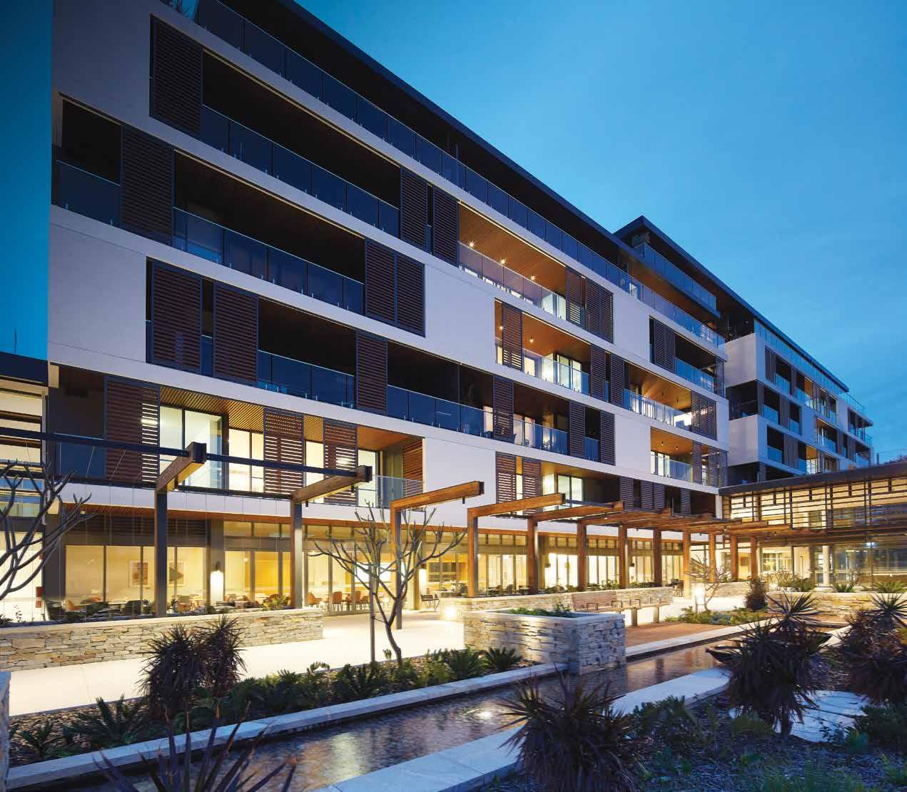
St Ives Retirement Living engaged Wood & Grieve Engineers to find lighting solutions to accommodate the design aesthetic of the apartments as well as the multi-function shared spaces, whilst providing visually comfortable illumination that is also safe for all residents.
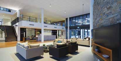
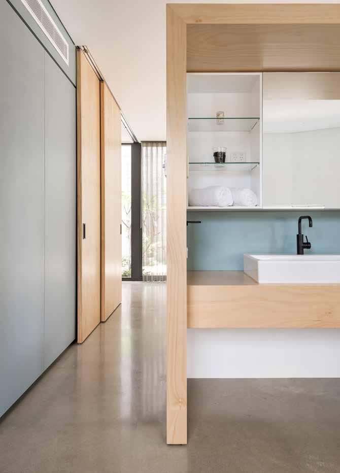
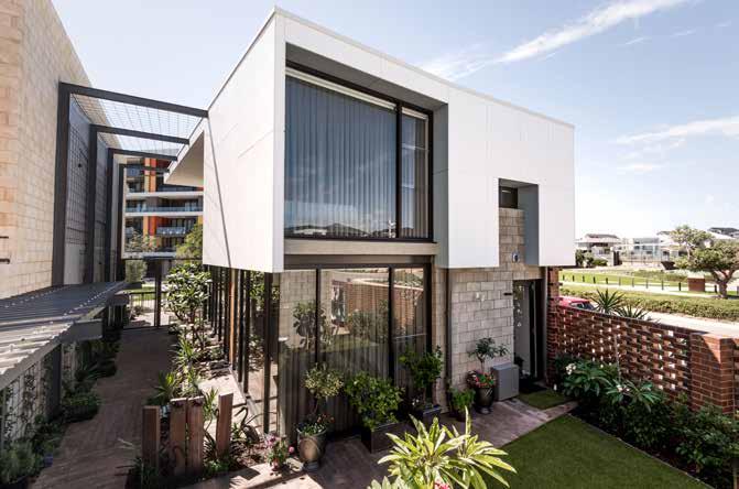
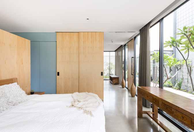
At the heart of St Ives Carine the luxurious shared spaces are designed to be enjoyed as an extension of the magnificent apartments. Beautifully considered and decorated throughout, the entry plaza makes an impressive welcoming statement featuring iGuzzini Underscore to highlight the ceiling space, and iGuzzini Front Lights to illuminate the lounge in front of the stunning double height glass feature wall.
Beyond reception is the intimate mezzanine library and restaurant with outdoor terrace overlooking the central village gardens. The landscaping, provides areas to explore both day and night including the pond, pool, gym and giant chessboard with pathways illuminated by iGuzzini Twilight post tops and iGuzzini Light Up Walk.
St Ives Carine sets a new benchmark in luxury living for retirees with stunning architecture, interiors and beautifully landscaped amenities.


HASSELL Studio ARCHITECT For more information speak to one of our lighting application specialists or visit the online project page using the QR code reader on your smart-phone. +61 8 9321 0101 mondoluce.perth mondoluce.com.au
CLIENT St Ives Retirement Living ARCHITECT HASSELL Studio ELECTRICAL ENGINEER Wood & Grieve Engineers BUILDERS BGC Construction ELECTRICAL CONTRACTOR Lindquist Electrical Services PHOTOGRAPHER Ron Tan
AN INSPIRING LESSON IN BRICK DESIGN
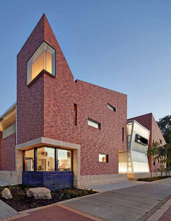
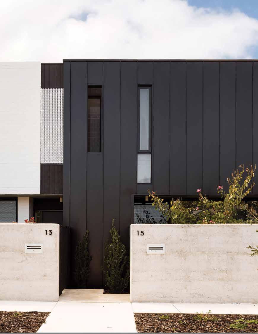
Highgate Primary School’s new double-story early childhood centre turns the familiar into the unexpected to create a surprising and adventurous place of education. Midland Brick sat down with Adrian Iredale from iredale pedersen hook architects to learn more about this striking project.
Q: Being a project for many varied occupants and stakeholders, how did you approach the design and project management?
A: We did our homework! From the very beginning, we set out to ensure that everyone was consulted throughout the process – from the client and builder to parents, teachers, the local community and the Heritage Council of Western Australia.
We knew we had a responsibility to create something that was to become an integral part of the community; a building that related to the school’s historic past, as well as its future.
It was a journey of discovery. We had to consider everything from a child’s perspective and create an environment that was a place of adventure and learning. We also had to reflect on how the teachers operated and engaged with the children, all whilst working within an established planning structure set out by the Education Department. So, on one hand we had massive creative freedom and on the other, strict guidelines.
Q: What gave you the inspiration for the unique style and use of brickwork?
A: Understandably, the existing buildings and immediate backdrop, and indeed the neighbouring streetscapes all had a significant bearing on our design.
PROJECT: Highgate Primary School Extension
BUILDER: Broad Construction
We also wanted to add to that, not just simply blend into the landscape – to make the familiar unfamiliar and surprising. One of these surprises was to engage the new building directly with the street, rather than the normal practice of fencing it off. This has created a unique community connection with the school.
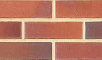
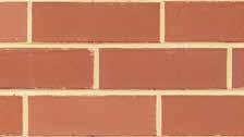
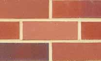
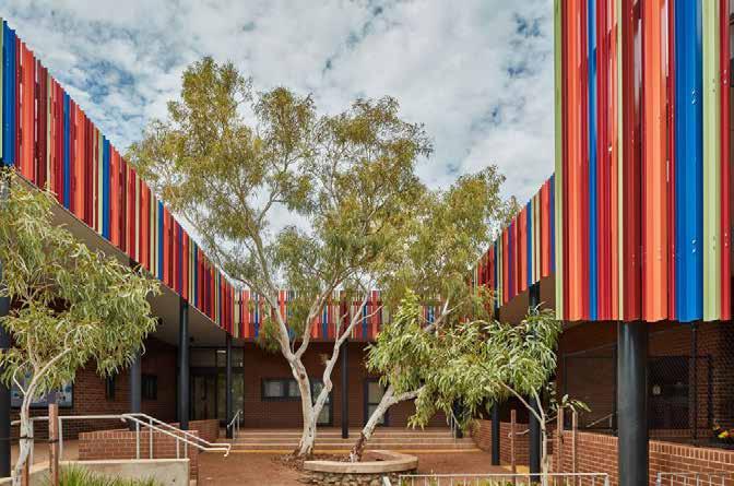
From an external perspective, the brickwork has contributed greatly to the integration of the school with its surrounds. Although the brickwork appears very complex, in reality it is a simple blend of three Midland Brick reds – plus the exceptional skills of the bricklayers!
The actual blending of the three different coloured bricks was probably the most critical factor. We didn’t want a pattern to evolve, but a randomness that harmonised with the schools existing weathered brickwork. What we achieved were walls of random patterns where children can discover their own shapes and outlines in brickwork that is almost three-dimensional.
Q: What do you believe has been the most pleasing outcome of this project?
A: Definitely the widespread acceptance and the sense of community involvement. We had amazing support throughout from everybody involved, which lead to the project coming in under time and under budget.
ARCHITECT: iredale pedersen hook architects BRICKS USED: Burnished Red, Heritage Red, Kalbarri
CLIENT: Department of Education and Department of Finance Building Management and Works
- 2 -


- 3BRICKS BY
BURNISHED RED
HERITAGE RED
KALBARRI THE RESULT
PHOTOGRAPHY BY PETER BENNETTS
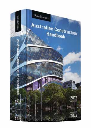
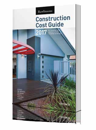
Rawlinsons Australian Construction Handbook and Rawlinsons Construction Cost Guide 2017.


Rawlinsons HAND BOOK $420 INC GST COST GUIDE $285 INC GST Reflect on the budget
PH 1300 730 117 OR WWW.RAWLHOUSE.COM AVAILABLE NOW
The Official Journal of the Australian Institute of Architects: WA Chapter
CONTENTS
contributors
7 editor’s message
9 WA chapter president’s message
people
13 bev’s house 17 client liaison
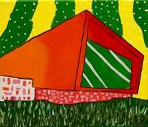
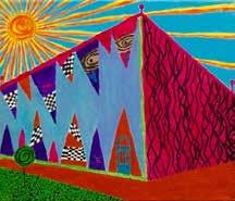
23 imagined worlds 25 optus stadium
29 the living knowledge stream
31 north west community buildings
35 conversations on heritage
39 ronnie nights
43 weight = mass x gravity
place
49 guardians of place
53 grey street house
59 can you hear me?... you know what I'm saying?
63 in conversation with fremantle’s built heritage
69 roscommon house
73 conversations in time
77 a conversation through buildings
81 creating sustainable relationships
85 coming to perth as a migrant
extras
16 rawlinsons costings extract pull-out postcards
The Architect has been in circulation since 1939 and is highly valued by both Institute members and the broader design professions. Generous financial contributions from architects over the years have helped sustain the magazine and we thank the following practices:


- 5 -
6
CONTRIBUTORS


Janine Betz is a German architect with a passion for placemaking & sustainability. She is a founding member of SCCANZ’s ‘Emerging Innovators’ and works for Lendlease.
Michael Gay is the 2017 WA Emerging Architect Prize Winner and a director of MSG Architecture.
Andrew Boyne is a sole practitioner who focuses on residential and prefabricated architecture. In 2015 Andrew received the Gil Nicol Biennale Award.
Olivia Chetkovich is an architectural graduate with an interest in architectural education and publishing. Olivia is the immediately preceding editor of The Architect.
Neil Cownie is a Perth-based architect who incorporates landscape and interiors into his projects in a holistic way, responding to each project’s unique context.
Philip Gresley is a founding director or Gresley Abas and a believer in what good design can bring to a community.
Hannah Gosling is an architect currently residing in New Zealand who enjoys exploring new places (both physical and virtual). She is a previous editor of The Architect.
Rosie Halsmith is the co-director of To & Fro Studio, a Perth based design and communications agency. She has a background in landscape architecture and community design.
Valerie Schoenjahn is a graduate of architecture. She works in small practice and as a tutor.
Geoff Warn is a director of With_Architecture Studio. He is also the Western Australian Government Architect.
Eddie Marcus (MA Cantab, MA Lond Met, PGDip Curtin) is a professional historian and heritage consultant, with a sideline in blogging about Perth’s more unusual historical tales.
Brett Mitchell is a creative practitioner working between academia and small practice.
Pip Munckton is a landscape architect, studio manager at vittinoAshe architects and works in research and design education at Curtin University.
Kylee Schoonens is Co-Director of Fratelle Group.
Bernard Seeber is a Perth architect working across residential and commercial projects.
Annette Seeman is an artist and academic living in Fremantle currently interested in borders and boundaries, working through drawing, print and photographic processes.
Alice See-Hoo works at Armstrong Parkin Architects in Fremantle. A Scottish transplant to Perth, Alice has lived and worked in Western Australia since 2013.
Kelwin Wong is an architect and graphic designer in Western Australia.
Warranty: Persons and/or organisations and their servants and agents or assigns upon lodging with the publisher for publication or authorising or approving the publication of any advertising material indemnify the publisher, the editor, its servants and agents against all liability for, and costs of, any claims or proceedings whatsoever arising from such publication. Persons and/or organisations and their servants and agents and assigns warrant that the advertising material lodged, authorised or approved for publication complies with all relevant laws and regulations and that its publication will not give rise to any rights or liabilities against the publisher, the editor, or its servants and agents under common and/ or statute law and without limiting the generality of the foregoing further warrant that nothing in the material is misleading or deceptive or otherwise in breach of the Trade Practices Act 1974.
Important Disclaimer: The views expressed in this publication are those of the individual authors and do not necessarily reflect the position of the Australian Institute of Architects. Material should also be seen as general comment and not intended as advice on any particular matter. No reader should act or fail to act on the basis of any material contained herein. Readers should consult professional advisors. The Australian Institute of Architects, its officers, the editor and authors expressly disclaim all and any liability to any persons whatsoever in respect of anything done or omitted to be done by any such persons in reliance whether in whole or in part upon any of the contents of this publication. All photographs are by the respective contributor unless otherwise noted.
Clancy White is founding director of Whitehaus Architects and a member of the Institute's WA Chapter Council..
Kate Woodman is an architect who previously worked for CODA Studio and COX Architecture in WA.
Joshua Wright is a game concept artist from Perth living in the eastern states.
Editor
Robyn Creagh and Fiona Giles
Managing Editor
Michael Woodhams
Editorial Committee
Holly Farley
Sarah McGann
Kelwin Wong
Magazine Template Design
Public Creative
Copy Editing
Gerard McArtney
Proofreading
Martin Dickie
Publisher Australian Institute of Architects
WA Chapter
Advertising Kim Burges kim.burges@architecture.com.au
Produced for Australian Institute of Architects WA Chapter 33 Broadway Nedlands WA 6009 (08) 6324 3100 wa@architecture.com.au www.architecture.com.au/wa
Cover Image
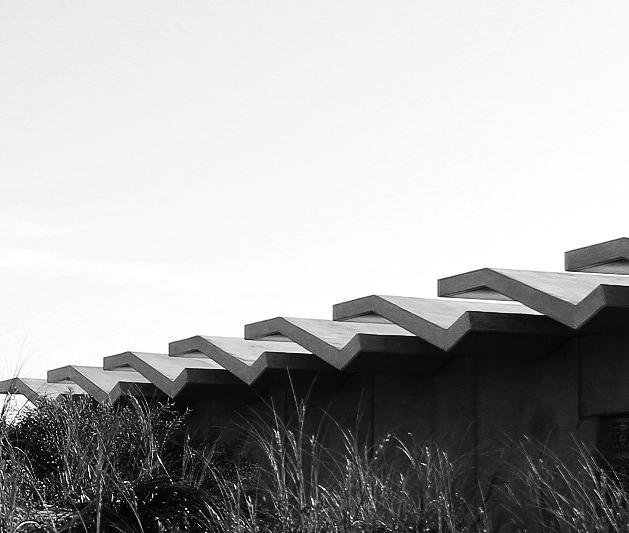
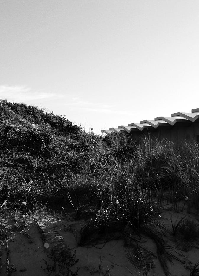
Leighton Beach Facilities by Bernard Seeber Architects. Image: Douglas Mark Black. Internal Covers
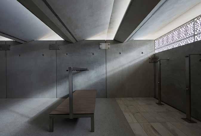
Leighton Beach Facilities by Bernard Seeber Architects. Images: Douglas Mark Black and Brett Mitchell.
Price: $12 (inc gst)
AS ISSN: 1037-3460
- 6 -
editors’ message
Robyn Creagh and Fiona Giles
Is the art of conversation being renewed in our day to day lives? When we take advantage of a ride-share, for example, we agree to be reviewed on our ability to give and receive hospitality. This sudden re-emphasis on transient verbal exchange is a un-looked-for delight. Have you had the experience of surprising yourself mid-conversation? That moment when you speak words to express something less than half admitted to yourself, or when you jump into an entirely new (to you) thought through collaboration with another. What a gift!
In these moments, through the help of others, we re-locate and re-define ourselves. Perhaps these responsive and interactive edges are where we are most interesting (not the deep dark crevices after all). And of course, as we move through the world, those edges are always shifting, and sometimes catalysing external changes. Perhaps we only exist in any meaningful way through the activity of our relationships: social, networked, urban…
Conversations are important from the very local, to the national and global scale. Practicing conversation — listening, empathising, sharing — is going to help us make space for more people to have a say. To hear the richness of stories and voices we’ve been missing. To recognise problems


and injustice and start finding ways forward. In our interconnected world, just avoiding metaphorical eye contact is not going to work. Uncomfortable conversations need to be had to negotiate a way forward. The headlines lately show we’ve started: change the date; #MeToo; institutional abuses; victims are being heard.
The continuing development of the built environment is inherently political, requiring conversations at every stage. Project inception needs careful consideration especially if it is government funded, many stakeholders need to be aligned and ready. Throughout the design process key conversations are required to understand client needs and to explain how the building will work — it is what architects are known for and what we can do best. Even beyond practical completion, successful building
management needs communication between users and operators. You might say that through (and within) architecture we have the opportunity to talk not only to people but also to places. Whether big or small players, at every step in the process there is negotiation. In this arena architects bring more to the table than just some fine-tuned aesthetics.
With this issue we ask questions to illustrate those other skills and hear about the value architects can bring to refine and define a brief, big picture thinking, achieving delight in unexpected places, and bringing people together to get a project over the line. Truly, architecture is a social endeavour. In this issue we’ve experimented with some new formats and voices. We’ve captured conversations between architects, feedback from clients, provocations from edges, and moments from continuing conversations with place and practice. And of course we have invited reviews and visual reflections.
If The Architect is part of a continuing conversation about architecture in Perth, then perhaps your voice has been missing? If so, please speak up. We’re listening.
Thanks to our amazing collaborators: the editorial committee and contributors. •
- 7 -

The Fielders Finesse range includes five unique profiles, Boulevard™, Shadowline 305™, Prominence™, Grandeur® and Neo Roman® that have been designed to combine the aesthetic appeal, durability and flexibility of steel cladding. All profiles are available in a diverse range of materials including traditional COLORBOND® steel and high-end COLORBOND® Metallic and Matt steel finishes, offering options to suit any style.

fielders.com.au/finesse
wa chapter president’s message
Author Suzanne Hunt
This edition’s theme of In Conversation resonates with me because one of my key goals as President is to broaden the conversation about architecture and architects, and the important role we play in cities and towns across WA.
Hopefully you have noticed the Institute being much more visible in the media via regular columns in The West Australian and The Post, and in June and July, I’ll be sharing the screen with other architect-presenters from around Australia as the second series of Australia by Design goes to air.
In a year of firsts for the Institute, this year’s WA Awards entries will be exhibited at Garden City Shopping Centre; part of our concerted effort to engage more productively with community. We’re hopeful that the associated school holiday activities will open the eyes of some school children to the power of design to effect real change and perhaps get them thinking about a career in architecture for themselves. Entries and winners will also be published in a newspaper liftout for Saturday readers of The West Australian the day after the awards and visitors to the exhibition will get a copy to take home, keep and use as a reference the next time they need an architect.
The other new thing is our choice of venue for awards night, somewhere more fitting and architecturally significant for our biggest event of the year. Cathedral Square has been an outstanding development in the heart of the city and we are thrilled to be holding

the events among the splendour of St George’s Cathedral and the Postal Hall.
Less visibly, but of equal importance, are the conversations we are having with state and local government — elected representatives, ministers, agencies and policy makers — to lobby for the inclusion of architects in key decisionmaking processes, and to improve procurement methods. We viewed the recent establishment of Infrastructure Western Australia and the MetroNet Industry Advisory Group as great initiatives, but continue to press for architects to be included at those tables.
The Institute’s strategic plan clearly identifies leadership and high impact advocacy as its main priorities, and we were delighted in April to host the State Government’s special inquirer John Langoulant AM in conversation at a forum of large practices. The thrust of the meeting was his findings of the Inquiry Into Programs and Projects (to which the Institute made a submission) and how better procurement processes will enable higher quality design and delivery of
public buildings. Mr Langoulant urged architects and our professional friends to argue as strongly as possible for the necessary changes. This involves raising awareness of our profession; reinstating architects as the lead consultants in the built environment; identifying and removing barriers that prevent us from achieving best practice outcomes; and highlighting the unique skills that architects offer — our holistic perspective and design thinking skills.
To a conversation that is of pivotal importance to our profession, one of fairness, safety and equity in workplaces. Our second #WorkWomenWisdom event, held in May just after this issue goes to press, builds upon the platform of #TimesUp, the US based movement with a vision specifically focussed on workplace issues. I’ve been heartened by the response to #WWW and while this occasion is for women only, I acknowledge that unhealthy work environments, bullying and inequality can be widespread and not limited by gender. Next time we will broaden the discussion to include the whole profession.
It has been a real pleasure to look at stories and projects featured in this issue, which demonstrate that we as architects are continuing to reach out to others in conversation — clients, end-users and collaborators — and to make valuable contributions to the built environment and society as a whole. •
- 9 -

- 10 -

people
- 11 -

- 12 -
Bev's House by Gresley Abas. Image: Dion Robeson.
In the Port Coogee development south of Fremantle, where proactive design guidelines have again failed to hold off a sea of rendered facades, feature brick and reconstituted limestone, Bev’s House by Gresley Abas feels like an anomaly.
The house is built on a 333m² lot that fronts a park, a street, a laneway and abuts the two-storey parapet wall of a neighbouring house. The parkland immediately in front of the house comprises a triangular lawn with perimeter planting that allows clear views over Cockburn Sound and toward Carnac Island. Just 20 meters away and running the entire length of the opposite side of the triangular park, a six-storey building by Cameron Chisholm Nicol with 101 apartments, provides height and volume that is in stark contrast to the two-storey homes which make up the bulk of the existing subdivision.
Bev’s House is an idiosyncratic name for a house which perfectly reflects the vibrant personality of its owner. It differs from the surrounding single-residential landscape through its avoidance of cement render and a pitched roof, but it does take on the Box-on-Base format that seems synonymous with Western Australian architecture over the last decade. This style has also been adopted by the opposing apartment building which stacks two rows of white box frames over dark-grey bases above each other. In Bev’s House, the base is constructed from a combination of
bev’s house
Author Andrew Boyne
concrete block and chocolate brick which is laid with relief brick detailing along the street frontage. The upper box is clad in white painted fibre cement with expressed joints.
With views in all directions, ocean breezes, and the sound of breaking waves, it feels as if the architects struggled to hold down the box form. It seems that the box has received gun-shot damage with a neat penetration on the street elevation resulting in the complete destruction of the box on the opposite side. Across the building, opaque fibre cement gives way to floor-to-ceiling glass, openness and views.
The Port Coogee development is typical of contemporary sub-divisions. It deploys a mix of medium-rise multiresidential buildings amongst small two-storey single-residential lots. On these small lots, which vary between 250m² and 400m², there is a tendency to build each house to the boundaries to maximise floor area. This results in tunnel homes with air and natural light only available from the front and rear elevations. By accommodating a three-bedroom, two-bathroom home in a footprint of just 7m x 10m, and by utilising the corner lot, Gresley Abas has pulled the two-storey structure from the boundaries to allow natural light into the home and air movement around it. This effect is further enhanced by separating the concrete block garage from the house proper and allowing a tropical resort style garden, complete
with a goldfish pond and an array of pink frangipanis, to encircle the ground floor. The interior spaces are each afforded views onto these gardens which transfer tranquillity into the home and provide a rare luxury of space atypical for small lot residences.
The house is arranged around a central two-storey service and stair core, painted in an ocean-inspired steel blue and accented beautifully with hoop pine detailing. On the upper floor, the open plan kitchen, dining and living spaces are placed on the park side of the building. These have ocean views through floor-to-ceiling glazing and spill onto a wide, covered deck. A guest bedroom and a small bathroom are positioned to the rear with views over the gardens. The ground floor accommodates a large open-plan master suite also with ocean and park views, while the laundry and a small guest bedroom are positioned to the rear. The desire to accommodate the lively spaces upstairs is complemented by a construction methodology which deploys masonry on the ground floor, creating a cooler, calmer atmosphere and light framing upstairs that feels warmer and brighter.
Despite its strong form, it is the transparency of this building that makes it particularly distinctive. It is fundamentally a public residence. The master bedroom is clearly visible from the public park and the apartment buildings across it. The visible bedroom also forms part of the entry sequence that comes off the park, runs along
- 13 -
•


- 14 -
Bev's House by Gresley Abas. Image: Dion Robeson.
Bev's House by Gresley Abas. Image: Dion Robeson.
the fully glazed bedroom, through a gate and to a front door fitted flush into the curtain glazing system. Upon opening the door, the stairway rises directly ahead, with the two ground floor bedrooms completely unobstructed and visible on either side. This transparency is carried through to the main living spaces that have full height glazing and are all visible from the park. Subtle privacy is achieved via glittering drapes that remind Bev of the shimmer of the ocean and which introduce some reflection into the glazing during the day while all windows are fitted with recessed roller blinds, this is ultimately a very public residence.
Earlier this year, the UK appointed its first Minister for Loneliness in response to an ‘epidemic of loneliness’. In the United States last year, the Surgeon General published an article addressing workplace loneliness, and increased risk of heart disease, arthritis, Type 2 diabetes and dementia have recently been attributed to loneliness. When considering the typical arrangement of housing around the Port Coogee development it gives pause to consider
the role contemporary homes have played in the rise of social isolation and loneliness.
With automatic garage doors, houses built boundary to boundary, deep boxed-in decks, tiny low-maintenance irrigated front gardens and curtains pulled closed for privacy, there appears little opportunity for occupants to interact with the community around them. If this type of housing isn’t a major contributor to social isolation, it certainly cannot be helping.
By destroying the box form and opening the house to the views, Gresley Abas have also opened the house to the community. Bev happily described her first night in the home when she held a glass up in her living room and toasted with a neighbour in the apartment building across the park. She described cricket games on Christmas day with the neighbourhood and how she liked to wake to the yoga lessons occurring outside her bedroom. She was pleased as a young boy walked in front of the house, hands full with flippers and snorkel on his way to the beach. She described how she has now learnt the
bus schedule simply by watching and hearing the bus drive by, and she spoke of a Facebook page that she shared with residents of the neighbourhood, including the apartment residents that look into her home and how they provide an additional layer of security. The house is surrounded by parks and the movement of people and cars through those surrounding spaces bring action and vitality that lifts the home.
This is a beautifully detailed house but its great success is in the lifestyle it has afforded its occupants. By allowing an open connection between the occupants and the community, the lives of both are enriched. If architects are to acknowledge the significant impact their work has on the wellbeing of the people who occupy their buildings, perhaps Bev’s House by Gresley Abbas could act as a case study in how architecture might be able to facilitate community and ultimately promote wellbeing. •
- 15 -
1 COSTINGS
ESTIMATING AND CONSTRUCTION COSTS COSTINGS COURTESY OF RAWLINSONS, EDITORS OF RAWLINSONS AUSTRALIAN CONSTRUCTION HANDBOOK ESTIMATED BUILDING COST PER SQUARE METRE, PERTH – FEBRUARY 2017 PRICES PER SQUARE METRE GIVEN UNDER THIS SECTION ARE AVERAGE PRICES FOR TYPICAL BUILDINGS AND, UNLESS OTHERWISE STATED, EXCLUDE FURNITURE, LOOSE OR SPECIAL EQUIPMENT AND PROFESSIONAL FEES. IT MUST BE EMPHASISED THAT ‘AVERAGE’ PRICES CAN NEVER PROVIDE MORE THAN A ROUGH FIRST GUIDE TO THE PROBABLE COST OF A BUILDING. PRICES QUOTED ARE FOR THE METROPOLITAN AREA. THE MEASUREMENT OF THE SQUARE METRE AREA OF A BUILDING IS IN ACCORDANCE WITH THE METHOD ADOPTED BY THE NPWC: THAT IS, LENGTH AND WIDTH MEASUREMENTS TO BE TAKEN BETWEEN THE INNER FACES OF THE OUTER WALLS. COSTS EXCLUDE THE GOODS AND SERVICES TAX (GST) EXCEPT RESIDENTIAL HOUSES AND FLATS.
OFFICES AND BANKS
SUBURBAN BANK
Maximum 2 storeys, including standard finish, air conditioning, bank fittings, no lift
OFFICES
Low rise 3 storeys, air conditioning, lifts, standard finish
Medium rise 4 to 7 storeys, air conditioning, slow lifts, standard finish
Medium/high rise 7 to 20 storeys, air conditioning, medium speed lifts, standard finish
$ per square metre
2,665.00-2,870.00
2,185.00-2,355.00
2,445.00-2,635.00
3,320.00-3,580.00
High rise 21 to 35 storeys, air conditioning, multiple high speed lifts, standard finish 4,410.00-4,755.00
High rise 36 to 50 storeys, air conditioning, multiple high speed lifts, standard finish
CIVIC ETC
CIVIC CENTRE
Main hall 300/500 capacity and suitable for cabarets, conventions, anterooms, small kitchen, no air conditioning
Main hall capacity 500/750, lesser hall, library and kitchen, including air conditioning
LIBRARIES
Maximum 3 storeys, air conditioning, good standard finishes, excluding loose fittings
SUBURBAN POLICE STATION
Single storey, partial air conditioning, standard finishes, small cell block
INDUSTRIAL
FACTORY OR WAREHOUSE
4,870.00-5,250.00
$ per square metre
2,045.00-2,205.00
3,095.00-3,335.00
2,765.00-2,980.00
2,615.00-2,820.00
$ per square metre
Simple single storey with small span, including office accommodation 795.00-855.00
Single storey with large span, for heavy industry, including administration office and amenities area (factory 85% of area)
Multi-storey, maximum 6 storeys, including goods lift and office accommodation
MOTELS AND HOTELS
MOTELS/HOTELS
Motel, single or double storey, standard travellers-type accommodation, individual toilet facilities, dining room, unit air conditioning (cost per bedroom unit $74,600.00–$80,400.00)
Motel, single or double storey, high standard accommodation, restaurant and lounge facilities, swimming pool and other amenities, fully air conditioned (cost per bedroom unit
$101,000.00–$108,800.00)
1,210.00-1,305.00
1,580.00-1,705.00
$ per square metre
2,295.00-2,475.00
2,765.00-2,980.00
Tavern, including air conditioning 2,625.00-2,830.00
City hotel, medium to high rise, including air conditioning and lifts, having 60-65% accommodation area
(cost per bedroom $345,500.00–$372,500.00)
RECREATIONAL
CLUB PREMISES, SQUASH COURTS, RECREATION CENTRES ETC
Social/sporting club building, maximum 2 storeys, air conditioned, bars, kitchen and dining area, dance area, club offices, limited carparking
Single storey sports pavilion with toilets and changerooms, minimum finish
Basketball centre
Squash courts, basic developer standard
(cost per court
$125,200.00–$135,000.00)
Squash courts, high standard (cost per court
$225,500.00–$243,000.00)
Community recreation centre, basic standard
5,120.00-5,520.00
$ per square metre
2,575.00-2,775.00
2,390.00-2,575.00
1,295.00-1,395.00
1,390.00-1,500.00
1,880.00-2,025.00
1,000.00-1,075.00
Community recreation centre, medium standard 1,255.00-1,350.00
50 metre x 21.0m wide x 1.0/2.4m deep pool, fully formed, including filtration and pool siteworks but excluding heating and ancillary buildings (total cost $) 1,604,000.00-1,729,000.00
CINEMAS
Cinema, group complex, inner-city, including seating, stage equipment and air conditioning
CARAVAN PARKS
Basic standard caravan park, including communal facilities, electric power to all bays, small office, roads and parking
Medium standard caravan park, including communal facilities, electric power to all bays, office and retail, laundromat, barbecue areas, small swimming pool, roads and parking
High standard caravan park, including individual facilities and full services to each bay, office and retail, laundromat,barbecue areas, small swimming pool, roads and parking
RESIDENTIAL
HOUSES (including GST)
Standard project home (medium standard)
$ per person
12,460.00-13,430.00
$ per bay
20,500.00-22,100.00
28,880.00-31,130.00
39,370.00-42,430.00
$ per square metre
945.00-1,020.00 Medium
Townhouse, medium standard, 2 storey 1,815.00-1,955.00
FLATS (including GST)
One and two bedroom units, maximum 3 storeys, no lift, minimum standard (cost per flat $99,100.00–$106,800.00) 1,650.00-1,780.00
Multi-storey with lift and prestige standard of finish (cost per flat $660,000.00–$711,500.00) 3,475.00-3,745.00
AGED PERSONS’ HOMES (including GST)
Single storey housing units and additional central care units (cost per unit $127,600.00–$137,600.00) 2,125.00-2,295.00
Multi-storey units + min. lift service (cost per unit $125,800.00–$135,600.00) 2,735.00-2,945.00
EDUCATIONAL, SCIENTIFIC AND CULTURAL SCHOOLS $ per square metre
Primary or secondary, maximum 3 storeys, standard finishes, buildings only
1,700.00-1,830.00
Laboratory block, maximum 3 storeys, including fittings 2,270.00-2,445.00
UNIVERSITY
Administration block, including air conditioning 2,330.00-2,515.00
Tutorial staff and lecture rooms block, including air conditioning 3,065.00-3,305.00
Lecture theatre (250 seats), including air conditioning 3,340.00-3,600.00
Library, maximum 3 storeys, including built-in fittings and air conditioning but excluding moveable furniture 3,045.00-3,280.00
Laboratory + science block, maximum 3 storeys, including air conditioning 4,020.00-4,335.00 Residential college 2,465.00-2,655.00
HOSPITALS AND MEDICAL CENTRES $ per square metre HOSPITALS
District, single storey, 60-bed, operating theatre and partial air conditioning (cost per bed $200,500.00–$216,200.00)
3,715.00-4,005.00
General, multi-storey, 200-bed, including air conditioning and lifts (cost per bed $520,500.00–$561,000.00) 5,780.00-6,230.00
Maternity, multi-storey, 100-bed, including air conditioning and lifts (cost per bed $232,600.00–$250,700.00) 4,650.00-5,015.00
General practitioner medical centre, single storey, consulting rooms, surgery and small theatre, partial air conditioning 1,905.00-2,055.00
SHOPPING CENTRES AND DEPARTMENT STORES $ per square metre
RETAIL PREMISES
Single storey retail/showroom type, standard 'shell' construction, excluding air conditioning and fitting-out work 750.00-805.00
Super market, single storey, air conditioned but excluding fitting-out work 1,575.00-1,700.00
Regional complex, single or 2 storey, medium standard, including air conditioning, malls, circulation areas, excluding shop fitting-out work and carparking 2,070.00-2,235.00
Arcade shops under office tower 3,745.00-4,035.00
Suburban store of large chain, single storey with large open-plan sales area, including air conditioning but excluding carparking
City store, low to medium rise, fully air conditioned, served with escalators and lifts, inclusive of shopfronts but excluding shop fitting-out work 2,685.00-2,890.00
Parking areas, bitumen paved including lighting and storm-water drainage (per car $2,675.00–$2,870.00)
81.00-87.00
MISCELLANEOUS $ per square metre
ECCLESIASTICAL Church hall
CARPARKS
Multi-storey, basic finish with slow passenger lift (cost per car $23,700.00–$25,500.00)
1,080.00-1,165.00
860.00-930.00
Basement carpark under office tower 1,685.00-1,815.00
PRICE
- 16 -
standard individual house
standard house, no air conditioning
built-in furniture
good standard finish
1,680.00-1,810.00 High
but with
and
2,400.00-2,590.00 Prestige standard, partly air-conditioned 3,220.00-3,470.00
1,835.00-1,980.00
Chapel or church, simple structure 1,495.00-1,610.00 Chapel, church or synagogue, medium standard
Chapel, church
high standard
2,245.00-2,420.00
or synagogue,
3,190.00-3,435.00
index is not valid for housing, small projects or remote country work. Building Building Building Building Date Price Date Price Date Price Date Price June Index June Index June Index June Index 1994 106.04 1998 115.34 2002 126.07 2006 180.45 1995 107.63 1999 117.08 2003 133.10 2007 200.20 1996 111.42 2000 122.38 2004 147.24 2008 216.14 1997 113.65 2001 123.58 2005 163.87 2009 224.46 2010 2011 2012 2013 2014 2015 2016 2017 March 228.95 232.39 234.71 236.47 239.42 245.42 250.31 255.06(F) June 232.39 232.97 234.71 237.06 240.61 246.63 251.55 September 232.39 233.55 235.88 237.65 241.80 247.85 252.80 December 232.39 234.71 235.88 238.23 242.99 249.06 254.04 Example – to assess the percentage variation in cost between June 1999 and June 2002: Jun-99 = 117.08 Jun-02 = 126.07 = 8.99 x 100 = 7.68% 8.99 117.08 1
INDEX This
client liaison
We asked people what they thought of their new spaces… and of their architect.
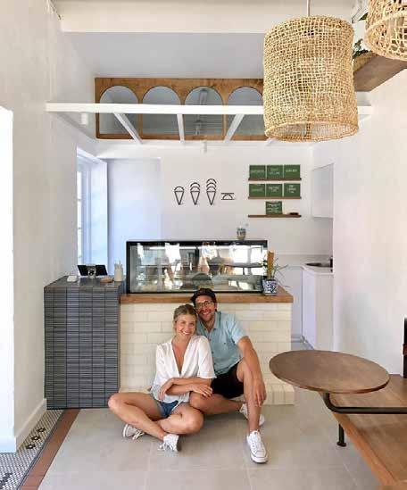
Mati & Kaitlyn
KULD CREAMERY
Architect: ARCADIA
Describe the feeling of being in your new space?
Overwhelmingly, there is a sense of fulfilment and pride. Everything came together as we had wanted and some things even better than we imagined. It feels homey and loved even though it’s new and crisp, which is something we aimed for.
How did you meet your architect?
Word of mouth. A fellow business owner in Highgate had worked with ARCADIA on the design of their house. On their recommendation we contacted them for some design consultation, and once we had seen some of their work we were happy to proceed. Also they had really big, excited eyes and liked the project from the beginning.
What was unexpected about the process of working with your architect?
There were a few things. Firstly, the way they could read us and include little touches they knew we would like or would be meaningful. Also, the logical and simple solutions to problems that seemed pretty big.
And seeing everything in three dimensions took some of the fear out

of the process and helped removed the unexpected. Working with Amy, Sal and Mitch definitely took some of the weight off and allowed us to feel comfortable in the process.
Oh, and we had fun…
Before you started, what did you think ‘an architect does’?
Mati — I have been spoilt. I have four family members that are architects, so I had a pretty good idea.
Kaitlyn — I thought they built houses
and strictly did the bones of the building, the structural stuff.
What was the most pleasant surprise of the outcome?
How close the finished space was to everything we had been working towards. There weren’t any surprises. It was so seamless in how the design transitioned from computer-generated space into actuality. Everything was where it was supposed to be, and everything fitted. It was a pretty cool final experience.
- 17 -
•
Mati and Kaitlyn at Kuld Creamery by Arcadia. Image: Kuld Creamery.
Valerie Paul RESIDENCE
Architect: VittinoAshe
Describe the feeling of being in your new space.
I think one of my first feelings was that everything that had been chosen by us in conjunction with the architects fitted so perfectly together. It worked so well and provided me with exactly what I needed when I had downsized from my large family home of 40 years. My new space has now survived nearly two and a half years and I still have the same feelings of comfort, safety and convenience that I had when I moved in.
How did you meet your architect?
Initially we had numerous unsuccessful contacts with builders, architectsonline and draftsmen. My son and his partner had seen a 35m 2 unit that Katherine Ashe and Marco Vittino had designed and completed, which was included in a Perth Open House Scheme. They had both been very impressed by the Vittino/Ashe design for a small space and suggested that I should contact them to see whether they were interested in my 45m 2
Early in 2015 my family and I met the architects on site and after a short time we realised that we had the same ideas for my small project in an

iconic building and an agreement was reached.
What was unexpected about the process of working with your architect?
I was surprised that Marco and Katherine had each drawn up a separate plan then combined them to include the best features of both plans. Their attention to detail and understanding of my needs as an older person were paramount during the whole process of planning and the special features incorporated were not obviously just related to an older person. For example the continuous rail from the lounge to the bathroom, which was incorporated in the built-in cabinetry as a feature, and the built-in seat in the shower amongst others.
My family and I felt that this was not just “another job” for the architects or builder, but that we all had an interest in making the finished project as special as possible. We were included throughout in the choice of finishes, and nothing was included without consultation. In this way, everything that was included fits the design and the requirement for me to have a comfortable and easy-care home.
Before you started what did you think ‘an architect does’?
As my brother had been an architect in the UK, so I was aware that many duties
of the architect were dependent on what the owner required. In my situation, when we first met and discussed the project I asked questions about what they were prepared to do and the costs involved so that there were no surprises or misunderstandings.
What was the most pleasant surprise of the outcome?
With so many horror stories of renovations going wrong or not completed and cost blowouts, I was very happy that the project was completed in the twelve-week time frame, and within budget. It was completed in time for the 2015 Open House Perth Scheme and we had numerous visitors during the four hours that it was open to the public. Everyone who visited the unit expressed surprise and positivity at what had been achieved in such a small space to make it light, airy and extremely liveable. I still get a thrill to see other people’s reactions when they visit and I am able to say that without a doubt this unit has exceeded my expectations in comfort, affordability and ease of maintenance.
- 18 -
Valerie Paul in her home by VittinoAshe. Image: Robert Firth, Acorn Photo.
Abigail Barry
PROJECT LEADER, ASSET MANAGEMENT DIRECTORATE,
WESTERN AUSTRALIA POLICE FORCE
BALLAJURA POLICE STATION
Architect: TAG Architects
Describe the feeling of being in your new space.
The new Ballajura Police Station feels great to be in. TAG Architects has designed a tidy and functional building, with nice spaces for staff. I’m extremely proud of the work that we’ve done with TAG because there aren’t a lot of creative opportunities with a station, they are mostly built around operational efficiency, but with Ballajura Police Station we’ve achieved it all.
How did you meet your architect?
TAG Architects was appointed to the WA Police Force by Building Management and Works (BMW). They were already working on the Mundijong Police Station at the time.
What was unexpected about the process of working with your architect?
These two stations were TAG’s first contracts with the WA Police Force, so I’d say they were more surprised than I was! Police contracts involve using our Accommodation Standard, so architects might think that it is similar to schools, but it’s not. Stations are both very specific and flexible all at the same time!

A positive was that we gave them a brief and they came up with really good ideas. You hope for that, but it doesn’t always happen. If you relay the same information to a bunch of different architects you get different solutions and sometimes there’s magic — we got that with TAG.
Before you started what did you think ‘an architect does’?
I came into this role as a client representative for the WA Police Force, with a career background as a registered architect. That gave me a really interesting perspective on working with architects, as I have a firm expectation of what an architect should do.
In my role for the WA Police Force, I try not to prescribe the aesthetic brief, only the function. Sometimes, I worry that I might be too specific, I don’t want to limit creativity! I expect a lot in terms of communication, and sometimes initially my expectations aren’t met. But I find when I push a couple drawings across the table at a meeting, something shifts. Things just open up when the architect realises that I’m not trying to do their job, but that I understand sketching is the quickest way to describe things, from one architect to another.
What was the most pleasant surprise of the outcome?
Feedback from the frontline police officers has been the most pleasant
surprise. I build a relationship with station staff over the first year of occupation. Because part of my job is to get them settled in, it’s not a case of giving them a building and the keys, then walking away. Our Directorate recently did post-occupancy station evaluations with the BMW Building Research and Technical Services Team. It has been really nice receiving considered, positive feedback from people who have been officers for 30 or 40 years, who tell me “This is the nicest and the best police station that I have ever worked out of” or “There are things I’d like to change and here are some things to consider, but we really like our home base. We’re really proud of it, and we like working here.”
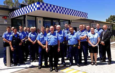
There’s a creative tension in designing police stations — trying to balance functionality with comfort and aesthetics, while meeting exact programs and very specific operational outcomes, and still delivering an ‘agile’ building. But that’s us, that’s the WA Police Force as a client, really! There isn’t a lot of scope for delight, unless you work really hard at it. TAG did, and the delight at the Ballajura Police Station comes from natural light in unexpected places, the feeling of belonging and of operating out of a safe haven; all very well-designed. My photo is of the inaugural team in front of their new home; they are the people I represent and advocate good architectural outcomes for.
- 19•
Ballajura Police Station staff. Station by TAG Architects. Image: WA Police Force .
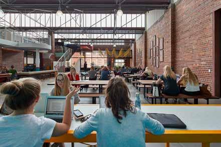
Ana Ferreira Manhoso
PRINDIVILLE HALL
STUDENT SPACE @ NOTRE DAME
Architect: COX Team
Describe the feeling of being in your new space.
At times I find myself thinking about what the space used to look like, and it is certainly nostalgic to think of the 'dinginess' of memories in the old space — but now there is new life in here, and it feels very refreshing and sophisticated. Seeing the blend of all the new features with aspects of the old is exciting.
How did you meet your architect?
We discussed the priorities, services and uses of the old space, and then explored ideas, additions, and wishes for the new space. I remember we had an opportunity to really delve into how the space is used, by us as student council/ club representatives but also for the general student population. We visited each campus of all other universities in WA prior to this meeting, so we had photographs and ideas prepared to share with the architects and university staff.
What was unexpected about the process of working with your architect?
One of the most notable experiences I remember from collaborating with and

meeting the architects was the quick transition from simply discussing ideas to seeing a complete floor plan. The fast pace of this progress was really unexpected and it was inspiring to see our discussions come to fruition so quickly and accurately.
Before you started what did you think ‘an architect does’?
I was pleasantly surprised with the extent to which architects strive to incorporate their clients’ vision in the work.
What was the most pleasant surprise of the outcome?
Seeing the final touches come together and watching new students take in the beauty of our campus.
- 20 -
Notre Dame Prindiville Hall by COX Team. Image: Peter Bennetts.
Year 8 Students
PAUL RAFTER CENTRE AT IRENE MCCORMACK CATHOLIC COLLEGE
Architect: Parry and Rosenthal Architects
Year 8 Students react to the new Paul Rafter Centre at Irene McCormack Catholic College.


- 21 -

- 22 -
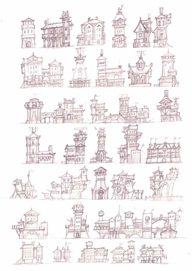
Concept Sketches, HalfArch buildings, Tin Man Games 2018, Table of Tales. Image: Joshua Wright.
imagined worlds
Author Hannah Gosling
I am an architect currently residing in New Zealand who enjoys playing games in my spare time. I think games offer ways to explore worlds in ways not available in other art media. I sat down for a chat across time zones with Joshua Wright, a game concept artist, to find out more about how he designs virtual environments. Within the conversation were some poignant reminders of things too often left to one side in architectural practice.
Josh, how do you go about designing a space or environment?
First you need to establish the visual style for the world the project will be set in. It must be unique and should be able to be used universally. This includes establishing what type of lines, shapes and forms are going to be used. The design objectives must be clear, and the design intent should be able to be distilled down to a simple sentence or word. It is important to spend time researching and establishing a strong style guide. As well as being a guiding document, it becomes a pot of visual ideas to draw upon, check against, and can become shorthand for communicating and explaining the design intent.
It makes me wonder, is enough time spent in architectural practices setting up visual reference documents? Are they provided to, and used by the designers, makers and stakeholders of a project?
To what extent do you draw inspiration from the real world?
Generally, everything has a real-world reference. You often borrow shapes and forms from different styles and experiment with mixing different styles and ideas together. Creativity is generally an iterative process and if something becomes too abstract then it becomes difficult for people to connect with. At the end of the day, the success of the project is determined by whether people connect with it and have a compelling experience. It is also important to spend time testing the environment with real players and observing people in, and engaging with, the created environment. Inevitably people will perceive and use the environment in ways that one has never considered and their perception or use should be considered to be as valid and valuable an experience as those that the designer intended.
There are questions that this raises for me: Can architects learn from the experience of the everyday person, and is the experience of the vernacular valued? What can be learned from ordinary spaces and extraordinary uses?
How do you create an impression of space, and how much detail do you include?
You have to remember that one thing on its own may not make a big impression or even be specifically noticed. But, one hundred things together help create the sense
of something. You can create a compelling experience without necessarily using photorealism, and even when photorealism is used, one has to be strategic about where detail is added and where detail is left out. Low resolution visual descriptors can still go a long way towards creating an atmosphere, especially when combined with audio or tactile descriptors.
A designed space or environment is essentially a collection of subtle and nuanced cues and gestures. As in any creative medium, you have to pick out what is described and what things are left for the imagination to fill in.
Think about your favourite book, painting or film. What is actually described and what only exists in your mind? This also raises the question: How many designed details and design decisions are actually noticed by the everyday user? And on the other hand, what real or imagined details make up the spaces and environments that people remember and love? •
- 23 -

- 24 -
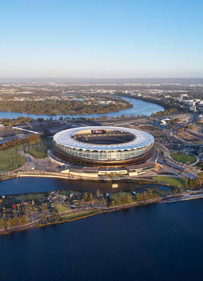
Optus Stadium by HASSELL, COX and HKS. Image: Peter Bennetts.
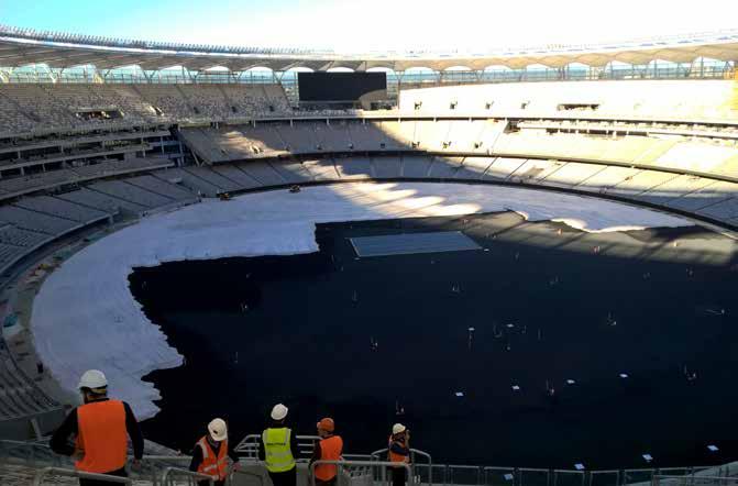
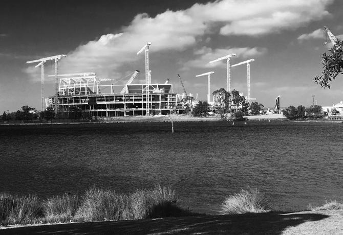
During the Final Stages of Construction, we took a bus to site from the carpark. As it came into view, the stadium looked almost complete, but for the landscape of hoarding and construction traffic.
After the safety briefings, we made our way onto site through the mess hall. This was not just any site mess, thousands of workers ate lunch here. The number of workers was not apparent until a shift ended, and our tour group was overwhelmed with the stream of people passing us — the hoarding was not quite designed for the mass exodus.
We passed through the service areas and waited for one of the construction elevators. After exploring the various and novel entertaining rooms on offer (you can listen to the coaches strategising if you leave your phone at the door, watch the players warm up or simply enjoy views of the Swan River…) we then made our way to the main event.
Sitting in the stands watching the trucks levelling the pitch was something else. From our high vantage point, the diggers zoomed around like Tonka trucks moving the sand from piles to the pitch.
I came away from the visit very aware of the importance of individual cogs in the very big construction machine.
optus stadium
Author Fiona Giles
The building and the landscape.
Post Practical Completion
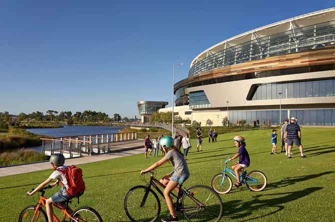
Another visit, another car park. This time I snuck in on foot from Burswood and followed the yellow brick road across the former golf course. I walked down the meandering path under the direct sunlight, and enjoyed the view of the vertical city skyline that acts as a counterpoint to the horizontal slice of the stadium. Somehow, the building sits comfortably in the landscape and the sprawling grass plains allow its bulk to be unobtrusive on the horizon. As details of the cladding come into focus, the inspiration of the Pilbara is obvious. Its colourful earth-toned strata is a subtle way to give the building a Western Australian identity.
The number of bus stops was impressive, however, there wasn’t a mass exodus to witness their effectiveness, so I’ll have to come again. It was great to see the number of people just having a look, and enjoying the new public space — drinking at the converted Golf Clubhouse overlooking the river (no longer members only club), grabbing an icecream from the truck on the bank, or simply cycling around.
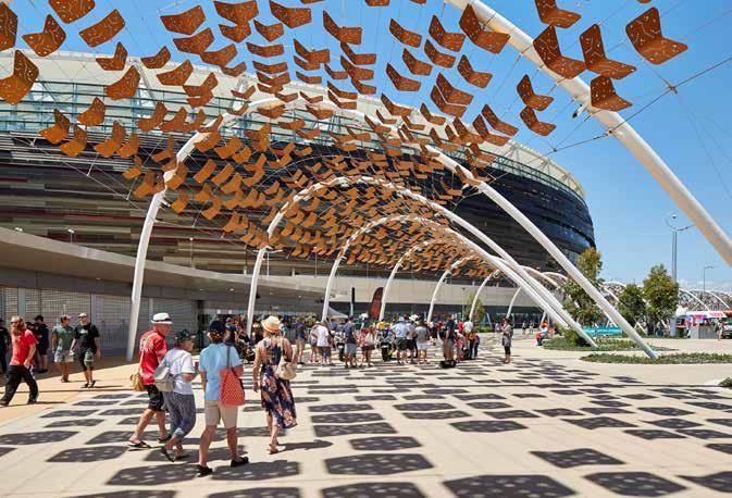
The Arbour was the highlight. It is a semi-covered walkway that creates a link to the Swan River and represents Noongar Community stories. Inscriptions along the way tell stories in two languages and encourage cultural understanding. The gentle undulations
create a sense of movement that compels visitors to pass through from bridge to station whilst enjoying the journey.
Any sporting venue, and context, needs to pay consideration to movements of people en-masse. The risk is that, on off-days, these spaces can feel empty and cavernous. Optus stadium, however, manages to take full advantage of the riverside location. Ripples come from the circular footy pitch and create a landscape with human scaled spaces that work as a weekend cycling destination.
Once the bridge is finished, and the plants have some time to grow and be shady, I may add this to my river route. •
- 25 -
•


- 26 -
Optus Stadium by HASSELL, COX and HKS. Image: Fiona Giles.
Optus Stadium by HASSELL, COX and HKS. Image: Peter Bennetts.


- 27 -
Optus Stadium by HASSELL, COX and HKS. Image: Peter Bennetts.
Optus Stadium by HASSELL, COX and HKS. Image: Peter Bennetts.


- 28 -
Living Knowledge Stream. Image: Paul Verity at Syrinx Environmental.
the living knowledge stream
Author Pip Munckton & Rosie Halsmith
Bringing Curtin’s water story to the surface.
In recent years, universities have seen a new wave of landmark buildings, university greens and cultural facilities that aim to attract students, build profile, blur the edges and bring the outside — along with its beanbags and food trucks — into historically cloistered grounds. As student numbers continue to grow, institutions are certainly seeing the value in place making, but what does it mean for a campus to truly be connected to its place?
The future vision for the Curtin University campus in Bentley, Perth is driven by Greater Curtin — a plan for an expanded and renewed campus and activity hub. Following the 2013 Greater Curtin Master Plan, Syrinx Environmental, Dr Noel Nannup, and cultural engagement consultants Sync 7 were engaged to build upon one of the central ideas, that of a living stream network through the site.
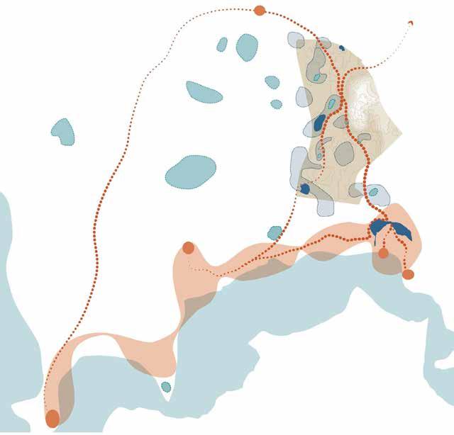
In its current iteration, the vision for the Living Knowledge Stream is a greenblue infrastructure and indigenous cultural trail network, underpinned by the path of local Songlines and water movement across the future Curtin site. Each Songline (or dreaming trail) is rich and expansive in cultural meaning. The Kujal Kela (Twin Dolphin) tells a story about linkage and unbroken connections to ancestral land and the river through cycles of change, and Djiridji (Zamia) trails tell the story of
seasonal journeys from river to hills and the abundance of food and water. It is not a built outcome; rather, it is a site-specific, research-based strategy and guideline for the design of the public realm.
As practitioners in the built environment we have a responsibility to work together with the traditional owners of the land. In the case of the Living Knowledge Stream the strategy is grounded by the layering of traditional ecological knowledge, mainstream science and design. A conversation between team members brought sacred places to the forefront, as well as invisible water flows, long forgotten by many.
The team, under the guidance of respected Whadjuk Noongar Elder Dr Noel Nannup, mapped two local Songlines that run through the Greater Curtin site. These paths follow both underground and overland water flows — a petrified tributary, or paleochannel of the Canning River and a historical chain of wetlands. These Songlines become structural threads that tie the Living Knowledge Stream framework together, the end result being a network of green-blue infrastructure across the Greater Curtin site — a landscape of ephemeral wetlands and swales. Distinct endemic planting and material palettes represent places and paths of cultural significance, history and the invisible ecological layers of the site. The idea is
that designers will refer to the Living Knowledge Stream guide as a key resource for future works in the Greater Curtin public realm.
In aiming for a whole-of-campus vision, collaboration appears as the crucial element to unearthing a true and complex understanding of the Greater Curtin site. Syrinx Environmental, Dr Noel Nannup and Sync 7 have together uncovered layers of cultural and ecological significance, creating a strategy that is grounded in its place. The success of this project, however, will depend on further conversation and collaboration. With careful management of future phases, there is potential for the significance of the Greater Curtin site to be brought to the surface.
This strategy offers a new perspective on the values that might instil a sense of campus identity and create value for students and university communities in coming years. Rather than a one-off event or a shiny new building, a wholeof-campus infrastructure can increase ecosystem services, bring cultural layers to the forefront, provide a platform for education and ultimately enhance the student and community experience — all while acknowledging the stories of the landscape. With change comes opportunity and a chance for universities to consider their landscapes as an asset — to consider what truly makes their place unique. •
- 29 -

- 30 -
Dampier Community Hub by Gresley Abas Architects. Image: Acorn Photo.
north west community buildings
Author Phil Gresley & Clancy White
The Architect talked to Phil Gresley and Clancy White about their experiences as architects for community buildings in the North West — the Dampier Community Hub (Gresley Abas) and Youth Involvement Centre (YIC) in South Hedland (Whitehaus).
Designing with clients and responding to place
Phil Gresley: Consultation is where the seed of a community project is planted, where things grow. If architects really listen, then the community gets ownership of the project. Architects also gain the opportunity to share their knowledge — and this is not just in the North West.
Clancy White: I think you’re right, the process is really important. It’s easy to have expectations of what the client wants before you go in, but I’ve arrived at project consultations up north expecting to be going in one direction, and come out of that process realising we will be going somewhere completely different.
PG: It can be interesting when a client is connected to a community group, or groups, and they all might want different things. I’ve found myself in the situation where you need to bring quite disparate opinions together…
CW: That has been my experience too. Say local or state government, or a mining company, is paying for the project. A community group, or fifteen
community groups, will actually use it and sometimes not all those ideas for the project align. Luckily, in our Port Hedland project this was not an issue.
PG: Delivering on community expectations is about providing good quality, functional, comfortable space. For the Dampier Community Hub, they needed an early learning centre, library, and multipurpose spaces. So, we’d talk to all the different groups — sports groups, yoga, arts and crafts, and the like. And because the City was to manage the venue timetabling, we’d work with them to understand how to best group those activities, and then we’d wrap space around those categories. We tested our design by imagining there’s a new group, or there’s an event that needs a large space.
It’s not rocket science, it’s part of the briefing process. You make sure everyone knows they’ve been listened to by providing what they’re asking for.
CW: The YIC project was for at-risk youth, and the briefing and planning was particularly complicated on that project. There’s a childcare centre for kids under five, a teenager’s drop in space, and an adult training centre. These three completely different user groups are all thrown together — we found that the building could help control the flows of people. It was important to avoid young adults getting mixed together with infants when they are socialising and learning.
After our initial chat with YIC, and some youth representatives there was a lot of back and forth. We’d be asking each other, “How will this work on a typical day?” Because it was such a massive expansion for their facility we had some unknown territory. Sometimes the answer was, “We’re definitely going to need this space, but we don’t exactly know how we’re going to use it until we move in.”
CW: Some of these bigger Pilbara towns have already carried out larger strategic visions, which makes it easy to slot into. The whole community is already thinking into the future, and being part of the bigger plan.
PG: We found the City of Karratha to be a really sophisticated client. They’ve become that way because of the amount of community development in the Pilbara over the past 10 years. They’ve upskilled to deal with it. We appreciated working with people who understand how to get something done.
PG: The Pilbara vernacular handbook that Landcorp developed has done a lot of that work. It helps in understanding what people in the North West are wanting to achieve with the new architecture. They’re trying to build cities, and build community.
Building for climate: the extremes and the everyday
PG: Before reverse cycle airconditioning became ubiquitous,
- 31 -
•
architecture in the Pilbara was working hard to manage the climate through passive solar design. The Port Hedland TAFE campus, the Dampier Salt building, the old High School at Wickham, are examples of buildings that were managing people’s comfort through simple architectural design techniques to achieve really good outcomes.
And then, in the 80s with the introduction of air conditioning, that all went wrong. It became acceptable to just build a box with a big airconditioner and to have it on 24hrs a day, 365 days a year. There is so much lost in terms of architectural opportunity when a building is just a box. We lost all the large shaded outside spaces that let the breezes come through and could achieve a temperate drop of 6 or 7 degrees.
I remember a great moment on the Dampier Community Hub when construction was nearly finished, a couple of the workers were laying in the shade at lunch time having a bit of nap — Outside! They could have been inside in the air-conditioning. It was 36 degrees that day, but they were outside,
laying there letting the breeze come through. At that moment, I knew we had achieved some success.
CW: We design buildings in a way that is going to be relatively straightforward to build. For example, a detail for a roof in the Pilbara involved carefully wrapping a roof truss with insulation. It was a really important part of how we were managing the condensation for the building — it absolutely had to work. So, we stopped and thought about it. Is someone crawling around in a roof, in probably 50-60 degrees, really going to make sure that this thing is done properly? Probably not. Alright, let’s start again. We need something easy because if it doesn’t go in right it’s going to be an ongoing issue.
PG: We used brick for the external walls of the Dampier Community Hub to bring a comfortable module to the experience of the users, something of a small scale in a place of enormous objects and infinite landscapes. Brick is not that unusual in the Pilbara, but not common. We found out that a single layer of brick does not meet the new cyclone codes for object penetration.
CW: Yeah, that’s always a big concern.
PG: We ended up out at Curtin University with one of the brick suppliers and the city of Karratha to carry out the cyclone testing.
CW: They’ve got the cannon that shoots a steel ball and it will just punch a hole straight through a brick wall.
PG: It’s counter intuitive and concerning if buildings are being constructed without taking the performance of brickwork into account. Working up north you’ve got a lot of issues like this to consider — the climate, the place, transporting the material. You’ve got the heat, the wind, cyclones, storm surge and water.
CW: We had a recent discussion with an engineer about designing for a 1 in 2,000 year storm event up there. And I’m saying, “That is literally a storm of biblical proportions! Do we really have to design the building for that?”
PG: But you know you do, because when it rains, it really rains. It’s phenomenal. It’s like nothing down here. •
- 32 -


- 33 -
Dampier Community Hub by Gresley Abas Architects. Image: Acorn Photo.
Youth Involvement Centre by Whitehaus. Image: Clancy White.

- 34 -
Protest signs. Image: Fratelle Group.
conversations on heritage
Author Kylee Schoonens & Eddie Marcus
One Thursday afternoon at the Guildford Hotel, The Architect Magazine met with Kylee Schoonens and Eddie Marcus to talk heritage architecture.
Background
Kylee Schoonens: After the fire in October 2008, although the owner received a Development Approval they did not have a tenant to take over running the hotel. With building use uncertain, the project went into a holding pattern until Fratelle Group came on board in 2013. Fratelle’s motto is ‘connect to create’ connecting people to get projects across the line. We identified the Publican Group who came over from the East Coast, embraced our vision and became the eventual tenants in 2014.
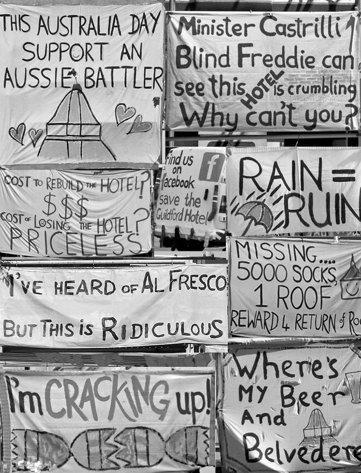
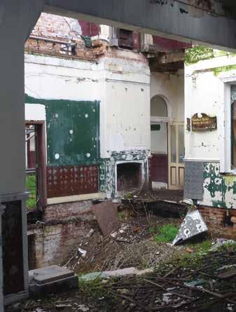
After the fire there had been quite a lot of community angst and anger due to the roof remaining off, and the building staying in a state of exposure for seven years. There was a lot of protest socks tied to the hoarding and protest signs — all trying to get the owners to act.
We engaged with the Heritage Council from the outset. They initially wanted all the cornicing and ceilings to go back in, and to bring back the plasterboard and period features.
Eddie Marcus : But which period?
KS: Well, that's the thing. The original hotel was built in July 1885, with an extension in 1914.
EM: It's a typical story of a hotel extension, done for the same reason that anybody spends money — they were forced to by government! Liquor licencing wouldn't renew the license in 1914 until they met code. Liquor licenses are useful tools for historians, which along with the call for tenders tell me the architects were Wright Powell and Cameron (still going as Cameron Chisholm Nicol). For James Wright it must have been one of his last projects as he died in 1917.
The Swan Brewery took over in 1929, implementing their standard bigchain look. ‘Period design’ could mean restoring it to this, or we could remove Wright’s frontage and restore it to its 1885 original red brick façade…
KS: That would never happen!
It was renovated in the 90’s. So, before the fire, it was faux-federation heritage — everything dark green and maroon. They had the dado rails and scotias as the period features! It was underutilised. The front façade suffered from severe concrete cancer so they installed steel columns. We managed to remove these, we took plaster casts of the original columns and rebuilt them. We received a heritage grant to restore the front façade and for the reinstatement of the belvedere (cupola). The Heritage Council was supportive as they wanted to see action. They brought ideas but our vision prevailed.
Plasterwork on the upper level suffered seven years of weather exposure and was coming off in sheets. We decided not to replace what fell off. Downstairs a lot of the stuff had been stolen, but as the staircase was lost in the fire, luckily the period features upstairs were almost all intact. Many single leaf walls had collapsed so, rather than rebuilding, we kept what we found. We were conscious to define what is new and what is old. For example, steel straps were required so we expressed them. We also stepped the ceiling away from the edge of the brickwork.
During demolition the builder retained everything. They had two shipping containers full of material for reuse — jarrah beams as benchtops, and the fire-warped steel from the belvedere and the staircases was used in light fixtures and installations.
The Belvedere
EM: In those days a belvedere was quite common, if you could afford it — you will find many more on plans than were actually built. Everybody designed belvederes, but during construction owners would cut back! There are several pubs in the CBD which should have had belvederes but never got them.
KS: That was one of the elements where the Heritage Council was adamant we be faithful to the original design. Watercolours from the 1914 renovation
- 35 -
•
The Guildford Hotel.


- 36 -
The Guildford Hotel by Fratelle Group. Image: Fratelle Group.
The Guildford Hotel by Fratelle Group. Image: SQUINT PHOTOGRAPHY.
showed the belvedere with a lookout access. We wanted to allow everyone to see the belvedere, so left the floor out to allow it to be experienced from the bar below. It was constructed in the rear car park and craned into place one Saturday morning — we had about 500 people come down to watch it! Everyone in the local area has a connection to the building, and quite an emotional connection as well. That's what I love about architecture.
EM: A cliché historian’s definition is: “Heritage is the awkward conjunction of history and memory.” A building embodies history, whereas human memory is flawed. You get all sorts of stories about places that can't possibly be true. It's what makes it heritage, but also what makes it incredibly difficult to work with as emotions can trump economic realities. Economically it was possible this place would be demolished, or it could have had a five-storey block of flats out the back.
KS: …We have designed that 5 storey block of flats! The hotel's viability does indeed need it.
Respectful design
EM: Heritage buildings are not just buildings. They are connected to the community and sometimes, they are buildings heritage architects just love! Respect for a building is a difficult term to implement. In Perth you often end up with facile ‘façadism’. Don't change it too much on the front, but gut everything else.
Restoration, renovation — everything except preservation — is creating a story as much as it is telling a story; it is a decision by the architect and developer to compromise between commercial necessity and what's there. If you want to go ‘full respect’, take out your modern bar and refrigerators because that's what it would have been like in 1915! Not viable today. No one wants to drink warm beer in a non-airconditioned room...
KS: and you probably wouldn't get your liquor licence either!
EM: There is not infinite flexibility to be respectful, but you can develop an outcome which people agree works as heritage, which is why keeping the community on side is a good idea. Respect for fabric can be not ripping down more than you have to, but sometimes you cannot avoid this in order to meet the commercial necessity required to reactivate a space. It's a compromise.
KS: Yes, exactly. We haven't recreated a chapter, we've created a new chapter. Downstairs, where we needed to cut holes in walls, we restricted the opening height up to three metres and put in a steel beam to express it.
We needed to make it a modern-day facility, so the new bar cuts through an original dining room and staircase. We've moved the stair to make it flow. There are also new elements in the place of existing elements to reduce the impact on the building.
EM: Creating a new narrative rather
than grabbing a period in history and trying to replicate it.
KS: If you are copying the heritage then you are not respecting it.
EM: The core principles are: retain as much as you can and do not introduce new openings or entrances where possible on key façades. Respect is not very scientific. But we can ask, does it work as a heritage building? In this case yes it does. Would James Wright recognise it? He'd probably say, "What have you done with the space I designed? A lovely 1915 space, and you ruined it!"
KS: I'm going to have the ghost of James on my shoulder now! •
- 37 -
•

- 38 -
Ronnie Nights Bar by spaceagency. Image: Detail MC.
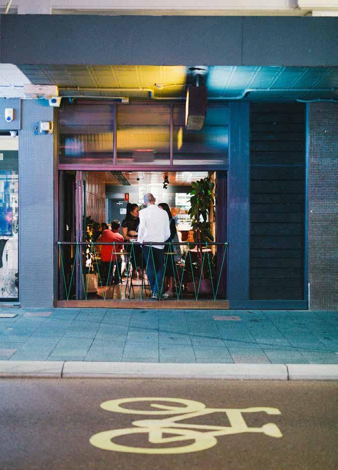
Ronnie Nights is the quirky new cousin of backstreet bar ‘Strange Company’. Sharing the same client group and architect, together they represent the beginnings of a network of venues envisaged by the proprietors for Fremantle. The offerings and audiences of these two venues must be distinct so they can complement, rather than compete with one another if the proposed collective is to succeed. Located at the bend in Fremantle’s ‘main drag’, Ronnie Nights sits in a row of retail at the gateway of the dining strip. Its open front attracts the foot traffic of locals, tourists and out-of-towners.
For the architects at spaceagency, the project represents a deliberate departure from the sophisticated, moody venues, such as Bread in Common in Fremantle and the Treasury Buildings in Perth, towards something more playful and thematic. Ronnie Nights is an eclectic bricolage of patterned surfaces, collected items and bold monochrome graphics that are craftily composed using a string of coloured insertions. It is a space that takes decorative clues from Fremantle’s sharehouse culture to recreate the fun loving familiarity of a Freo house party.
The building was previously occupied by Indian restaurant ‘Aunty G’ and, prior to that, another Indian restaurant ‘Maya’ whose single dining space spanned two shopfronts. The new bar counter is located along the intersection of these
ronnie nights
Author Kate Woodman
shopfronts, dissecting the space and making sense of the existing ceiling heights. This double sided, centrally located bar services all areas of the venue. Running perpendicular to the street, the theatre of drink preparation is visible to passersby. Within the venue, views across the bar connect and layer the space. Clever, focused lighting illuminates surfaces rather than spaces and the apparent effortlessness of this spatial planning and servicing belie the skill and budget required in its execution.
The street frontage has been retained and recomposed through the application of a couple of swift decorative forms. A powdercoated yellow portal with black and white tiling below and window film above denotes the understated entry. Behind the existing full height bifold doors, a simple steel pipe and coloured rope balustrade creates an open and connected street edge. This rope, sandwiched between mission brown mosaics, evokes nostalgic memories of 1980’s macrame.
The existing building and the planning strategies of the architects have resulted in four distinct but connected rooms, each with uniquely different volumes. The design exploits this diversity in spaces, applying a novel decorative approach to each.
Straight off the street you enter into a high and narrow space that links the
various rooms visually and physically. A heritage stair leading to the first floor lounge is visible overhead, a dipped in green ‘Garden Room’, complete with its own disco ball, is visible beyond the main space, and the warm glow of the street facing lounge can be seen across the bar to your left.
In the entry space the patterned surfaces of printed acoustic panel, the glossy black of pressed tin ceiling and the existing tiled floor lay backdrop to the bold graphic of terrazzo coloured in red, black and white. This enviable finish forms the rectilinear counter top of the bar as well as a standing bar that meanders along the entry wall.
The active pedestrian edge at the front and the hum of the kitchen at the rear bookend the venue. The adjoining ground floor lounge is a compressed space with uniform black walls and tangerine coloured cable tray. Throughout the venue a combination of purchased, collected and custom designed furniture sits amongst copious pot plants, retro nostalgia and family photos that were found on site.
The project combines pattern, texture and colour, each reminiscent of different eras and different points in the building’s occupation. It is a careful balance that takes equal parts of bravery, restraint and experience, yet results in a space that feels at once dynamic and youthful. And conversely, as if it has always been there. •
- 39 -
•
A new old local.

- 40 -
Ronnie Nights Bar by spaceagency. Image: Detail MC.

- 41 -
Ronnie Nights Bar by spaceagency. Image: Detail MC.

- 42 -
At the bottom of the mountain. Image: Michael Gay.
weight = mass x gravity
Author Michael Gay
Resilience in architecture and checking you are ok.
This article is for those who sometimes feel the gravity of our profession is ten times that of the earth. I’m no scientist, and yet I’m sure I notice space-time bending whenever I walk into my office. But recently I’ve concluded architecture is actually ok.
When you are ok in yourself, everything else tends to look a bit better. You can take a few steps back from architecture’s influence and see things for what they are. We are a profession struggling to achieve balance and equity. This is taking a toll on all of us in lost potential, lost careers and sometimes lost minds.
Next time you are approaching your limits while grinding through a design submission, tagging thousands of wall finishes or processing RFIs, remember to ask yourself a couple of questions: “What do I think is ‘normal?’” and “Am I ok?” I can’t answer these questions for you, but I can tell you my story.
Checkpoint #1 Architecture School
Having survived the attrition of first year university I started to believe sleep deprivation was a means to obtaining creative genius. My definitions of ‘normal’ and ‘ok’ were becoming skewed by a culture of long hours and in third year, while attempting to achieve architectural enlightenment, I fell asleep at the wheel of my car and parked it on top of a light pole. Help wasn’t far away, the State Police headquarters was
across the road, but my story of studying all night was treated with contempt until a breathalyser reading came back zero. A cup of tea and a telephone then appeared.
There was some excitement in doing late nights — building questionable camaraderie, reverse engineering the vending machine and blue carpet cricket amongst other things. After time though, it became excessive and wasteful. It is also the worst possible condition for doing good work or driving a car. Maybe universities should lock the doors and send everybody home once in a while. I decided it was time for a break. I deferred study to travel and work for a while.
Check point #2 First Aid
Architecture made a lot more sense after three years off. Even the ‘tedious’ units had taken on a new relevance. Old habits die hard though. I’m not sure if it was denial or ignorance but I did not see the wall coming until I had hit it. I just couldn’t reconcile my life outside architecture with the self-imposed load inside architecture. Architecture had nothing to do with it. I just wasn’t ok… For the first time ever, I conceded I needed some help.
For those predisposed to mental illness, the mid-twenties are a time when the cracks start appearing. Not great timing given the length of our apprenticeship
(five years in uni plus two in the office). Most of us are too young to account for the symptoms in any meaningful way. Even those aware there is a problem usually avoid help because of stigma and a lack of support. I was fortunate to have people around me who helped and I eventually completed my studies with relative balance and success. Despite that, I hadn’t really addressed my approach to architecture, or life. I had antiseptic, painkillers and bandages that would only see me through for so long.
Check point #3 Starting Work
Transitioning from university to practice was daunting. After the novelty of a pay cheque wears off, you realise you are at the start of another monumental journey. If you blamed universities, you’d say they do little to prepare students for reality and, at that time I would have agreed. In hindsight though, work experience during study was a great remedy for my expectations but I still expected more. Parallel to this, I had failed on a few home fronts and also contracted a bad case of ‘Perth-itis’ which exacerbated the situation. I made the only logical choice available to me… run.
Check point #4
London Bike Rage
I ended up in London and discovered big cities aren’t geared towards moderation or restraint. This was initially great. My days were spent between the office and
- 43 -
•
the pub doing long hours in both. This was my new ‘normal’ and I thought I was ‘okay’, but after a particularly long week, my commute home ended in a fit of cyclist road rage. Not completely unwarranted but it was way out of character and a clear sign that things were not ok…. My poor bike and my state of mind were both a write off.
This brought me great clarity that faded all too quickly. It took my girlfriend (now wife) to intervene and bundle me off for a professional conversation. I was hoping I’d be told architecture was evil and to leave the profession immediately to study Pilates or take up truck driving. Instead, I was told I needed to work at building my resilience and achieving more balance in my life.
I was also diagnosed with Bipolar Disorder and given a roadmap to manage it. Turns out I am only wired for the extremes. Balance and resilience were going to have to be learnt. Luckily, they aren’t extraordinary things — they are very achievable with a shed-load of hard work. To make things easier, I permanently stopped drinking and, keen to seek some lifestyle balance, after five years I landed back in Perth and restarted my career.
Check point #5 No More Full Time
I recommitted to architecture, became a registered architect and honed my skills. I still occasionally did too much work and lost patience with architecture, but I continued regardless. After five
years I had reached another impasse. I still have a piece of paper in my drawer with: “THE TURNING POINT. NO MORE FULL TIME” scrawled across it. This is irrelevant now but reminds me that I very clearly decided to search for a different way of practicing architecture.
I left my ‘nine-to-five’ and co-founded a small practice, MSG Architecture. It was a compromise between flexibility, security and career, and I knew it wouldn’t be without stress or anxiety. The trade-off was that it would give me choices that aren’t available to most architects working in traditional practice. It gave me the flexibility to work when I was best able to, and when my twin sleep-thieves arrived a few years later, it allowed me to share the parenting duties. We are still going five years on.
Ongoing conversations…
Despite spending my early career oscillating between mania and meltdown, I ended up here: trusted to write an article to encourage you to check your ‘normal’ and manage your ‘ok’. My story might be an example of what not to do, but I know there are architects out there enduring relatable situations in silence and without support, hence my determination to lend them a voice and encourage them to stay with us.
Self-management and regularly checking that you are ok is essential to maintaining balance and building
resilience, but we cannot do it all on our own. We can all help ourselves and others achieve rewarding careers. We need to encourage all our colleagues, at whatever point in their career, to climb new mountains. We need new tools to change and counter the weight of our culture, and we need to individually build resilience — our anti-gravity. ...
If you have any personal or professional issues related to mental health, gender equity or small practice that you would like to discuss with me, please get in touch.
Some more reading:
‘An Anxious Discipline’, Byron Kinnaird, Parlour, 2016.
‘Long Hours, Go Hard or Go Home!’, Lee Hillam, Parlour 2017.
‘Managing Mental Health’, Timothy Horton, ArchitectureAU 2016.
‘Literature Review, Architects and Mental Health’, Connetica / NSWARB, 2017.
‘Supporting Mental Health in the Workplace’, ACA 2017.
‘Mental Health for Small Business Owners’, ACA 2017.
For support try:
beyondblue.org.au 1300 224 636 life.curtin.edu.au 1800 651 878 lifeline.org.au 13 11 14 headsup.org.au ruok.org.au matesinconstruction.org.au •
- 44 -

- 45 -
Summit. Image: Michael Gay.

- 46 -

place
- 47 -

- 48 -
New York. Image: Janine Betz.
guardians of place
Author Janine Betz
Thinking beyond the building envelope to shape the future of our cities.
Every evening when the train takes me over the mouth of the Swan River and Fremantle Harbour comes into view I feel a real sense of place and belonging. Cycling down the Cappuccino Strip to the sounds of screaming seagulls, busking musicians and casual chatter, and the smell of wood fired pizza, is a perfect sensory experience and one I don’t tire of. It’s like waking up in the bush. You can smell the sweet eucalyptus, hear the laughing kookaburra, and be blinded by the sun; you know you are unmistakably in Australia.
The best places celebrate their identity and invite us to immerse ourselves in their embrace. The level of participation is up to us. We can watch, listen, smell, touch, feel or be entirely transient. Sadly, the latter is becoming increasingly common as awareness shifts from the present place to the virtual places created by the rise of the internet. It is easy to be disconnected, to miss the rich experience offered by the natural and built environment that surrounds us. The human layer that nourishes the souls of our cities and breathes life into our places is wearing awfully thin.
Like many industries, architecture has readily embraced technology and it has changed the way we work. The drawing board has become obsolete, and the ability to sketch has become
as secondary as neat handwriting. The language of architecture is increasingly spoken through virtual reality where imagination takes a back seat and software drives the process. While technology has an important role to play, one could argue that its ready availability has diluted the quality of design outcomes: now anyone can come up with a so-called ‘architectural design’ with limited regard for the urban fabric or the human experience. Architects are losing their specialty and it is increasingly important that we explore new ways to remain relevant. To me, this means thinking beyond the building envelope and joining the global conversations about the greatest demographic shift in human history — Urbanisation.
As Jonathan Lake so aptly put it in the 2017 Autumn Edition of The Architect, “architectural education is about exposure of students to the full breadth of potential experience that could occur in the built environment.” It goes beyond merely teaching the practical aspects of designing buildings; it introduces us to the diverse roles of architecture and the sensory experience it can evoke. Architecture school instils in us a sense of responsibility towards society that is measured by our contribution to civic life. Architecture is about buildings conveying a sense of place.
The way architects think about and perceive the built environment seems different from other people’s approach. We touch walls, wonder what floor tiles were specified or where to buy that fabulous lamp. We comment on the acoustic properties of spaces, and drive any non-architect travelling with us insane. My brick addiction is a constant stop-and-go performance for my scientist partner as I linger in front of walls and footpaths to expand my growing photographic library. This curious mindset acts as catalyst for our imagination and pushes our ability to envision places and describe the way they look and feel, beyond that of many other professionals in the built environment. We are therefore well placed to, and must, assume an active part in the conversation about future cities.
Being part of a global business with a diverse project portfolio and regional head offices in Sydney, New York, Singapore and London has confirmed my belief that we need a considered approach to urbanisation that puts people first and accelerates sustainability. Everyone is talking about the same things; concerns about affordability, liveability, transport, and climate change are common to all regions of the world. Concurrently, big data is cementing its status as a new pillar of society. ‘Smart Cities’ and the ‘Internet of Things’ afford possibilities
- 49 -
•


- 50 -
Milan Expo. Image: Janine Betz.
Hanoi, Vietnam. Image: Janine Betz.
of phenomenal scale, and cities, governments, and industry around the world are racing to secure their share of this multi-trillion dollar market.
Today, already half the world’s population lives in cities. What will this look like in 2050 when we are expected to hit the 70% mark? Can we find a collaborative approach to urbanisation involving different industries that considers the triple bottom line and promotes community over individualism? How can we create liveable places that are enhanced through technology, not robbed of their unique identity?
As one of the world’s most urbanised countries, Australia has long failed to recognise and properly respond to its rapid urbanisation. But recently the Federal Government has made cities a national priority, clearing the way for a number of exciting initiatives. In 2016, the Australian Government prepared a Smart Cities Plan, which received 131 submissions including from the Australia Institute of Architects, the Urban Development Institute of Australia, and the Property Council of Australia. The government subsequently committed $50 million funding to support innovative projects with eight WA projects successful in the first round. Last year the Green Building Council of Australia developed a carbon-positive road map and the Smart Cities Council Australia & New Zealand (SCCANZ) released a number of guidelines which were developed in collaboration with government, private
sector and industry representatives. In February this year Consult Australia collaborated with SCCANZ to publish Australia’s first ‘Smart Cities Guide for Built Environment Consultants’ to provide a “support framework… to better understand how technology, data and intelligent design can enhance a city’s liveability” (Adam Beck, CEO SCCANZ). Major developers now aim to “promote sustainable communities as places that people like living in, and want to stay in, because their neighbourhoods have real character and a sense of place” (Tony Lombardo, CEO Lendlease Asia).
Urbanisation and its associated challenges and opportunities have begun to spin a web of collaboration among government and industry, centred on liveability in an urban development context, not just on profit margins and maximum density. This is a call for placemaking and codesign on a scale Australia has not seen before, thus increasing the level of influence the industry enjoys in terms of policy making and the way people live, work and play. Perth is trialling its first 80sqm ‘micro lot’ while the ‘Envi’ project in Brisbane, developed by architect-planner duo Amy Degenhart and Nicole Bennetts, impresses with a lot typology that includes a thirty-eight square metre lot. The latter project is particularly innovative, not just because of its size but its architectural merit and consideration of the urban setting. It demonstrates density done well.
The door to shaping the future of our cities is wide open. The market is ripe for disruption and, as architects, we must not limit our circle of influence by holding on to the traditional role of our profession. As part of a collective we can lead change and reinvent ourselves as Guardians of Place. The trajectory for urbanisation is set; failure to get involved in creating the respective parameters contradicts our desire to leave a positive legacy. It will be those with the loudest voice whose agenda will drive urbanisation and, despite best intentions, the outcomes may disappoint. Working with the wider industry we need to find a language other than ‘good architecture’ to communicate the qualities we seek to instill in our cities. It is my hope that the cities of tomorrow are the result of active, empowered citizenry and convey a sense of place that is uniquely Australian.
The views expressed in this article are solely those of the author. For more information visit www.betzie.com.au •
...
- 51 -

- 52 -
Grey Street House by Local Architecture. Image: Dion Robeson.
grey street house
Author Olivia Chetkovich
Local Architecture and Local Building.
In Grey Street House, Natalie Hill (Local Architecture) wanted to do a brick project ("really do a brick project") and as architect-owner-builder its realisation included many, many conversations. Natalie wanted to explore how much you can do with one element and pursed this with passion across a range of scales. At 1:500 the brick relates to its Fremantle built context, at 1:50 the patterned elevations are in dialogue with the neighbours, at 1:5 it’s in the material detailing, and at 1:1 it’s the human experience of texture, colour and light. Through dedication to her design, and in constant dialogue with everyone involved in the project, Natalie has not only created a beautiful and unique house, but also skilfully established a conversation between the house, in all its red brick glory, and its new neighbours.
Riding through Fremantle a few years ago, Natalie spotted the site: a rare affordable back block just 200 metres from Success Boat Harbour. Tight site conditions, zoning regulations, a focus on creating a space that is robust and liveable, and a desire to work with brick led to the design of this refined yet intricately detailed home.
A 350mm cavity wall creates a shell around the house, housing all the services and allowing for the free manipulation of the internal volumes, including the pivotal double storey
volume of the living area. The result is a spacious and light-filled yet compact home with intersecting volumes borrowing space, light and breeze from each other. Internally the material palette is restrained, emphasising the visual clarity of the design and allowing the key building material — the brick — to come to the fore.
Flemish bond coursing has been used throughout the house to delightful effect, particularly on the striking patterning of the facades through the manipulation of the headers. Where the headers are extruded the façade is transformed by shadows throughout the day, and where the headers are removed completely the wall is used as screening, creating a playful patterning of light entry into the living space.
This is a brick project. Really a brick project. Observably, all internal elements align with the strata of the house set out by the brick coursing: kitchen bench tops are at 943mm; and all internal volumes intersect on clean lines of the Flemish bond. An apparently unintentional relationship also exists: the intersecting nature of the internal volumes, such as the ‘free block’ of the ensuite and the mezzanine study over the living area, is reflective of the push-pull manipulation of the Flemish bond on the exterior. This push-pull relationship of intersecting internal volumes establishes a use
pattern of central orientation, rotation and interaction within the shell of the house, allowing the inhabitants to be in constant spatial dialogue.
Considering Grey Street House in terms of the theme ‘in conversation’ two types immediately leap to mind: the conversations with others involved during design and construction and the conversations established between the house and its environment.
Much of the success of this project lies in the tight detailing and use of materials, particularly the brickwork. As builder, Natalie put herself in a position of direct control of the construction. But where Natalie had the vision, the ultimate realisation of her design lay in the skill of her tradespeople. Cue the first type of conversation: between owner-architectbuilder and every tradesperson, supplier, fabricator, delivery truck driver…
Whether it was to resolve a detailing issue, or negotiate the tight back lane, success lay in asking questions and understanding exactly what was required for every element of the build. It was not only Natalie’s commitment to the design, but an extra level of dialogue she achieved which increased engagement and meant the integrity of the design was maintained.
- 53 -
•


- 54 -
Grey Street House by Local Architecture. Image: Dion Robeson.
Grey Street House by Local Architecture. Image: Dion Robeson.
With no question too silly to ask and a dedication to her passionately detailed design (Natalie drew every brick in the house), problems were solved through collaboration. Conversations drew out knowledge and story sharing; pride in work was mutually understood and brought to the fore.
Much of the success of this project is due not only to the relationships established throughout its construction, but also in the thoughtful relationship with its surrounds. Cue the second type of conversation: between the house and its environment.
Natalie wanted to build in the area, and build of the area. She was raised on Fremantle stories, and she spent a lot of time in the area while growing up, especially while working on a commercial fishing boat in her father’s dry docks. Red brick became a key link to the historical built context of the wider area and in the brick’s pushed-tothe-limits use, Grey Street House feels representative of a Fremantle house, as much as simply being one. And whilst this is really a brick project, it isn’t just a brick project. The bricks have been used
to beautiful effect, not only in the house itself, but in the layering of elements in the landscaping, such as the familiar hit-and-miss wall providing screening at the entrance to the yard.
At the human scale, this screening works to diffuse the boundaries of the site, which is very closely surrounded by neighbouring houses. And, at a slightly larger scale, a key dialogue is explored. The brick façade is no joke — it is bold and, in its form, almost unforgiving. Almost. The application of the push-pull patterning of Flemish bond that has been used to beautiful effect for light entry into the house has been applied with satisfying and bold consistency across all facades. As shadows are cast throughout the day, the red walls are animated and provide an element of beauty and interest for neighbouring properties.
Yet it is a two-way conversation between Grey Street House and its neighbourhood that Natalie has created. In the more intimate spaces of the upstairs bedrooms the low windows provide ‘edited’ views to the surrounding area. Rooftops are foregrounded and the
tight suburban context is celebrated, rather than hidden. This is a private conversation but one that helps to further ground this new home in its surrounds.
This project’s genesis is as a back block — someone’s back yard. The site was cleared when purchased, except for an old olive tree right where the carport needed to be. The tree was left in its place for as long as possible and the third-generation resident of the front house still came to water it and pick its olives throughout the design phase. The tree was eventually relocated on the site, allowing the neighbour to still pick olives off the large branch that now extends over the shared back fence. It is a recognisable neighbourhood relationship and a gesture reflective of the grace with which Natalie has explored how this house can truly belong in its surroundings.
In 2017 WA Architecture Awards Grey Street House received an Architecture Award for Small Project Architecture and a commendation for Residential Architecture — Houses (New). •
...
- 55 -
•

- 56 -
Grey Street House by Local Architecture. Image: Dion Robeson.

- 57 -
Grey Street House by Local Architecture. Image: Dion Robeson.

- 58 -
PROTOTYPE. inland areas. Image: Jacek Dominiczak.
can you hear me?... you know what I'm saying?
Author Geoff Warn
Architecture’s essence, in contrast to building, is its deliberate embodiment of meaning beyond function. Operating simultaneously, and at several levels of a meaning framework, architectural signification is a weave of complex social and political conventions within the project’s vision and intentions. In signifying socio-cultural values, architecture forms relationships and elicits emotional responses from its audience, often through the deployment of the poetic devices of personification and anthropomorphism. Good designers demonstrate an impressive command of signification in all of its heterogeneous nature. Their projects are meaningful, emotionally engaging and purposeful.
When facing a new design, architects confront familiar challenges: what can a design contribute to a building’s context? Will the architecture communicate positive messages? And will the architecture yield edifying experiences and aesthetic responses?
These are important questions for anyone interested in the communicative function of architecture and the identity of a city, and in seeing architecture’s purpose beyond its contribution to real-estate transactions and subsequent developments. Responses to questions like these are often sought in design reviews as the topics of orderly growth,
city image and ‘neighbourliness' are increasingly at the core of planning policy.
Semiotics decodes meaning from language, social patterns and material culture through the study of sign systems which are essential for human communication and social cohesion. For example, the French word "façade" signifies a building’s primary elevation, or "face". Architecture is portrayed as having human qualities. Through personification we forge a relationship and attach meaning to architecture, its form and appearance. The building is perceived to have character and personality, is judged to be serious or formal, elegant or refined or is just dull and boring.
But, how can a building be boring or exciting?
The answer lies in our propensity to construct meaning. Humans need a shared sense of the world. We ascribe human values and characteristics to non-human entities (buildings, cities) to better understand them, something that is considered to be an innate tendency of human psychology.
Jacek Dominiczak, a Polish architect and educator, conducts research on what he refers to as Dialogic Space, the theoretical foundation of his Local
Identity Codes prepared for several cities. As with a country’s language and dialects, cities have a unique and authentic architectural character. Dominiczak’s Local Identity Codes are detailed guides for architects to better understand the formal structures that underpin a place’s outward expression.
By explaining a city’s compositional grids and demonstrating the slight deviations between a façade and its neighbours, the Code establishes the distinctive identity of a particular urban form. Strategic sites within a city are marked with a flamboyant counterpoint. In an imperial city, this is often religious architecture or a beautiful urban square, and in a commercial city, such interventions are usually a public building or the headquarters of an organisation that is proud to flaunt its civic duty. Dialogic Space is derived from Mikhail Bakhtin’s semiotic research and Emmanuel Levinas's philosophy of the pre-cognitive relations conveyed in face-to-face encounters between people. According to Levinas, encounters of this kind are social experiences with ethical overtones. Dominiczak maps these linguistic and philosophical insights onto architecture, which is in turn conceptualised as the voice of buildings, effecting conversations with each other and their audience.
- 59 -
•
With the help of students from Curtin University and collaborator Monika Zawadzka, Dominiczak prepared a Local Identity Code for Fremantle in 20081. The Code's analytical methods better equip architects to maintain and enhance the unique quality and character of a place when adding new interventions into the city’s fabric.
Cities that have an attractive identity — generally described as having ample amenity, a varied culture, a vibrant street-life, and a unique appearance — are popular, and popularity tends to attract economic activity. City identity is now broadly recognised as a valuable economic asset that attracts political interest. Increasingly, governments see urbanism, architecture, landscape and interior design as playing important roles in the way society functions, in shaping the city's identity, and in generating prosperity and well-being.
We live in an ‘era of the city.’ With the flows of global capital, unprecedented human migration, and increasingly stressed natural resources, the scale, nature and character and performance of cities everywhere is changing, and Perth is no exception. We are demolishing and rebuilding, back-filling established suburbs, grappling with diversity and density, and sprawling in all directions to meet the contemporary
1.
2.
3.
demands of urbanisation. While we celebrate our liveability and struggle with our identity, we construct an image of the city that conveys meaning and speaks back to us and out to others.
So, what messages are we projecting? How is our environment shaping our futures? What is our architecture saying to us and to those who visit? Do we like what we see and hear?
Fascinating questions, but they might seem like dusty concerns of aesthetic scholarship and at odds with the vitality of the economic drivers that are transforming our cities today. Recent decades have seen the private sector playing a more dominant role in city building. Schools, hospitals, housing, sporting venues, and public transport — once the core responsibilities of government — are now increasingly delivered by private entities. And global capital's attention is understandably drawn to profitable ventures, introducing a new dynamic that is affecting the nature of the city and our relationships with it.
Today, with disciplinary interests focused on big, complex issues, there seems little time or appetite for the type of sustained critical debate that will help us construct a shared narrative about the city. We are not saying much
about the social and cultural identity of the architecture and urbanism of our time and place. Firmly grounded in the ‘century of the self’ 2 contemporary society lauds individuality and novelty. Louder is better and, amplified by neo-liberal economics, we now have architecture as spectacle in what’s known as the ‘Bilbao Effect.’ The combination of large budgets, advanced technologies, talent and adventurous patrons has produced some genuinely stunning architecture. But with all that ‘noise,’ the conversations between buildings have become difficult to hear.
Are there common messages that we can understand and engage with? Not according to Giampaolo Cantini, the Italian Ambassador in Cairo, who claims "globalisation has shattered the dialogue between architecture and its context." French anthropologist Marc Augé, in his book Non-Places, notes the proliferation of transient spaces "where the human beings remain anonymous and that do not hold enough significance to be regarded as places".3 The non-places of Augé's super-modernity include motorways, hotel rooms, airports, convention halls, supermarkets and shopping malls. In this architecture, traditional concerns of interpersonal relations, cultural heritage, and identity are silenced or erased. According to Augé, these ambivalent spaces lack
- 60 -
Local Identity Code for Central Fremantle (2007-2008), Jacek Dominiczak & Monika Zawadzka.
The Century of the Self (2002) directed by Adam Curtis, for the BBC.
Non-Places: Introduction to an Anthropology of Supermodernity (1995), Marc Augé.
authenticity and a sense of belonging; they are what Rem Koolhaas identifies as the junk-space of generic, bland contemporary cities.
So we have arrived at a meeting place for two paradigms: a fiscally driven super-modern architecture of spectacles competing for attention, calling out loudly in a hectic and increasingly transient city of non-places; and a culture-driven architecture of continuity that speaks of a more stable urbanism, grounded in familiar stories, poetic utterings and palimpsests of past eras.
Can these two paradigms converse, or only compete? What is the nature and validity of an authentic experience in an architectural or urban context? In this post-critical, post-truth era is authenticity at all possible or even relevant? •
- 61 -

- 62 -
Arcs D’Ellipses by Felice Varini, 2017. Image: Sarah McGann.
in conversation with fremantle’s built heritage
Author Annette Seeman & Sarah McGann
Felice Varini’s Arcs D’Ellipses.
Felice Varini is a Paris-based Swiss artist who transforms urban spaces by fixing an impermanent paint-like foil to buildings, walls, streets and objects, creating a geometric form completely and coherently visible from only one vantage point. From other viewpoints only ‘fragments’ can be seen.
The seemingly arbitrary yellow sections of Varini’s Arcs D’Ellipses formed the centrepiece of last year’s Fremantle’s High Tide Festival. Fragmented lines and shapes intersected and engaged with aspects of the surrounding historic building facades to create intriguing details that invited participation and curiosity. Public engagement with this artwork has continued to intrigue visitors well beyond the festival dates. Every day this engagement is seen through people looking up, taking ‘vignette’ building photos and the conversation generated with locals about the vantage point.
The project was launched in October 2017 with support from all lessors and lessees of properties between No 1 and No 107 High Street. The work spans 800 meters and, interestingly, attracted only two objections by High Street residents. Both objections could be described as ‘revenge rejections’, with one owner being previously refused permission by the Fremantle Council for a mural on the door of their shop. The second rejection, a last-minute change of heart, waited for the day of install to withdraw support in the hope of creating negative press for the Mayor; perhaps a case of attempted political revenge. Arcs D’Ellipses has now been extended for a further two-month period and, except for one resident, there is full support for the extension.
The installation required four weeks of install, a small army of volunteers and mobile work platforms. Night work,
considerable expense, plus remarkable amounts of commitment, ambition and determination enabled a lot to happen. Remarkable amounts of good will from Fremantle residents produced almost one hundred percent support for placing art at the centre of the conversation in this most public of spaces. •
- 63 -
•

- 64 -
Arcs D’Ellipses by Felice Varini, 2017. Image: Sarah McGann.

- 65 -
•
Arcs D’Ellipses by Felice Varini, 2017. Image: Sarah McGann.


- 66 -
Felice Varini. Image: Harris Architects.
Arcs D’Ellipses by Felice Varini, 2017. Image: Sarah McGann.

- 67 -
Arcs D’Ellipses by Felice Varini, 2017. Image: Sarah McGann.

- 68 -
Roscommon House by Neil Cownie Architect. Image: Robert Frith, Acorn Photography.
roscommon house
Author Neil Cownie
Conversations with context: past, present & future.
As an architect who was raised and educated in Perth my first experience of feeling a ‘sense of belonging’ occurred as a graduate during a visit to the former home, and later museum, of neo-classical architect Sir John Soane in Lincoln’s Inn Fields, London. Soane rebuilt, remodelled and extended three townhouses between 1794 to 1824 to display his collection of artworks and artefacts.
The first time I walked through his house, and I’ve been back on a number of occasions, several rooms evoked this feeling of belonging through the manipulation of space, proportion, texture, access and detail. The room that resonated most strongly with me was the breakfast room — a centrally located ‘inward’ room where the manipulation of its square form, slightly domed ceiling, richly layered wall treatments and outlook to an internal courtyard created a living space in what is essentially a circulation space in the plan. That experience with interior spaces and how they affect an external built form which is also informed by, and relates to its context, is something that has influenced the way I consider design to this day. Furthermore it is the holistic combination of architecture and interior design with these aspirations that drives my studio.
Fast forward to 2015, when I received a client brief for a new family home with an underlying appreciation of this ‘sense of belonging’, the Roscommon House. In my search for the unique attributes of the site in Floreat I looked to the history of the suburb and surrounding areas — their town planning, architecture and ideals of the original subdivision.
It was one of several places that benefited from the shared vision and passion for the ‘Garden Suburb Movement’ of then Perth Town Clerk, William E Bold and surveyor Carl Klem. They implemented this progressive approach in Dalkeith (1913), Lathlain (1920), Menora and Coolbinia (1922), and Floreat and City Beach (1925). However, the Floreat and City Beach subdivisions were sparsely populated with new houses until the 1950s and 1960s, until the 1962 British Empire Games called for the construction of the new athletic stadium and 150 new modernist houses to accommodate the athletes. At that time, Australian Home Beautiful magazine boasted of the Games Village: “It is an experiment in living that will rank with Burley Griffin’s development of Canberra, and Castlecrag in Sydney, and Eaglemont in Melbourne”.1 In Floreat you find the trace of many modernist architects.2
With a significant legacy of modernist and brutalist buildings still remaining in Floreat and City Beach I felt a responsibility to produce a design for this new house that not only served the needs and desires of my clients, but was also in conversation with the ethos of the suburb without mimicking or replicating the past.
As I began the design process, the iconic Brutalist concrete shell roof structure of the City Beach Surf Lifesaving building was demolished and the Town of Cambridge threatened to demolish the much-loved Brutalist concrete South City Beach kiosk. This is a blatant disregard and misunderstanding of our unique architectural heritage’s importance by the local authority. It led me to take particular inspiration from those two buildings, and to promote the longterm appreciation of the suburb’s built history to the local authority and the general public.
Other primary drivers of Roscommon House included passive solar design principles and cross ventilation, harking back to the ideals of the original modernist architecture of the suburb, where: “Faith in science and technology, aided by a resurgence of rational interest in climate as a determining factor, was seen as central to optimising modern housing
- 69 -
•
design”3. The first and ongoing series of ‘Notes on the Science of Building’ and ‘Sunshine and Shade in Australia’ by the Commonwealth Experimental Building station were published in the 1950s and were influential new ‘tools’ for early modernist architects.
The Roscommon House was opened up to allow winter sun and ventilation to penetrate the ‘pocket courtyards’ of the building mass. These ‘pocket courtyards’ reinforce the ‘Garden Suburb’ ethos by bringing the feel of the garden into the home. Furthermore, the essentially single-storey house doubled the usable garden area by introducing an accessible roof garden.4
It’s worth noting that the South City Beach Kiosk — which had been threatened with demolition by Council — was saved as a result of overwhelming public support around the time Roscommon House neared completion. Last year, Council undertook a community survey which generated 1,300 responses, 95% of them in favour of repairing and retaining the iconic building. That result indicates that people see the value in preserving buildings from our shared past. Interestingly, the kiosk has been a popular spot for skateboarders, who access its kidney-shaped bowltype roof and perform their moves for all to admire. It was therefore a
special experience to witness local skateboarders on the roof of the Roscommon House as we conducted our first photo shoot earlier this year. It gave me the sense that the project had come full circle: it was inspired by its surroundings and is now being embraced by locals as an intrinsic part of the neighbourhood.
And that’s an outcome that gives me great joy. •
1. London, Geoffrey, Philip Goad, and Conrad Hamann. 150: An Unfinished Experiment in Living: Australian Houses 1950-65. Crawley, Western Australia: UWA Publishing, 2017.
2 There were many architects who contributed to the modernist movement in Perth at the time including Iwan Iwanoff who, like Jeffrey Howlett, brought his interests from abroad, and Raymond Jones, who was educated by Robin Boyd; John White, Tony Brand, Geoff Summerhayes and Jim Johnson who were all educated in Perth. Some local architects had travelled abroad and experienced firsthand the works of the French architect Le Corbusier, and European-Americans including Richard Neutra, Raphael Soriano, Phillip Johnson, Eero Saarinen, Ray and Charles Eames and others. (Western Towns & Buildings by Margaret Pitt Morison and John White.) According to local architects and writers Margaret Pitt Morison and John White, Le Corbusier was probably the most influential international architect in relation to the early use of concrete in Western Australia (Pitt Morison, Margaret, and John White, eds. Western Towns and Buildings. Nedlands, 1979.) and his work has certainly influenced the use of concrete and its forms – as well as the interior colour palette – at Roscommon House. Outside influences aside, Western Australian architecture of the period ‘led to a regionally distinctive form of architectural modernism, independent from the rest of Australia’. (London, Geoffrey, and Duncan Richards. Modern Houses: Architect-designed Houses in Western Australia from 1950 to 1960. Nedlands, W.A.: School of Architecture and Fine Arts, 1997..) The Brutalist architectural style is also represented in these suburbs, starting with the concrete structure of the Hale School Memorial hall by Marshall Clifton and Anthony Brand, with Brand Ferguson and Solarski in association, completed in 1961. That project appears on the RAIA WA Chapter’s list of ‘Significant Twentieth Century Architecture’ and was the winner of RIBA’s Bronze Medal in the 1960s (1961, 1962 or 1965 depending on your source: The Architect (1962), Molyneux, Ian. Looking around Perth: A Guide to the Architecture of Perth and Surrounding Towns. East Fremantle, W.A: Wescolour Press, 1981, or Pitt Morison and White (Nedlands, 1979) respectively)
3. Pitt Morison, Margaret, and John White, eds. Western Towns and Buildings. Nedlands, 1979.
4. Interestingly this connection to landscape was identified in earlier examples of Western Australian architecture as ‘bringing the outside in’ (London, Geoffrey, Philip Goad, and Conrad Hamann. 150: An Unfinished Experiment in Living: Australian Houses 1950-65. Crawley, Western Australia: UWA Publishing, 2017.)
- 70 -


- 71 -
Roscommon House by Neil Cownie Architect. Image: Michael Nicholson.
Roscommon House by Neil Cownie Architect. Image: Michael Nicholson.

- 72 -
Paganin House by Iwan Iwanoff. Image: Robert Frith Acorn Photo.
conversations in time
Author Kelwin Wong
Architectural Archives and records.
On December 22 2015 a fire destroyed a Floreat home — Paganin House. The news resonated through the community with public outpouring of grief that a well-known icon on The Boulevard was lost. Designed in 1965 by Perth architect Iwan Iwanoff, it was built as a family home that would also showcase the Italian owner’s marble and timber business. The property had only changed hands twice by 2015 and its Modernist styling remained largely intact.
Architect Tim Wright has assisted the home’s current owners, Tim and Lisa Church in recreating the original design. They have chosen to restore the home to its former glory and their journey of reconstruction appeals for architects to consider how we manage our archives, and why they matter.
Wright was able to access the original Iwanoff architectural drawings deposited at the State Library of Western Australia. The drawings included perspective sketches, floor plans, sections and cabinetry details. The handwritten call-out notes reveal Iwanoff’s aspirations for the design of this family home.
However there were discrepancies between the architectural drawings and what was built on site. A stair leading from the garage up to the ground level, clearly evident on site, is missing on the architectural drawings.
Wright also used hundreds of photographs from the three families who have lived in the home. A thick photo album sits at the construction site broken down into spatial categories ‘Family/ Living’ and ‘Study’; each photograph numbered for easy cross referencing. These aren’t necessarily beautifully composed architectural photos, but rather, candid shots of a child’s birthday party where you are encouraged to look past the cake and examine the junction of the brass weather bar against the terracotta tiles in the background.
The house had featured in television commercials, a music video and a movie. Frames were extracted from these movies and filed within the archives. “Inadvertently there is lots of detail in the background,” says Wright.
Today the architectural industry straddles the analogue and digital, where the scanned pages of our swift felt pen sketches sit alongside their computer aided counterparts. I spoke with Adrian Bowen, an archival collections specialist at the State Library of Western Australia about what archives mean for architects.1
Architects produce a wide range of materials; hand sketches, physical models, admin notes, emails, and countless revision drawings. How can we decide what to keep?
There’s no single right answer to this.
As archivists we look at the purpose, functions and outputs of the entity which created the collection and think about which materials are vital to their story. For architects, certainly the final design for each project is a key record. However, the whole design process is also important and it tells the story of how the architect and client arrived at the final product. Key stages in the brief, sketch design and documentation are worth capturing as well. This varies depending on the architect and their process as some may have a unique design process; think of Zaha Hadid’s paintings.
Good archiving often has its roots in good recordkeeping. Architects have long periods of legal liability, so I would expect they would want to retain evidence of anything with contractual or legal implications for at least as long as their liability period lasts.
The Iwanoff collection is drafted on a variety of paper stock such as bond paper, tracing and ‘butter paper’. Can you describe some of the challenges in conserving such materials?
Paper is not actually that fragile if stored and handled appropriately. The larger risks to paper are in its chemistry, and the process of producing the drawings. A lot of 20th century papers can be acidic; slowly burning up the paper from the inside causing it to turn
- 73 -
•
yellow and brittle. This can be slowed by storage in appropriate temperature and humidity ranges and in acid-free containers. One particular issue with older architectural plans is often they are blueprints or diazo prints. These can be chemically unstable. They may give off gases which damage other materials and are sensitive to fading from light exposure. These should be stored separately to reduce the risk of harm to other materials and away from light.
Architects output work in digital formats such as PDFs and BIMX 3D models. What considerations should architects have in the archival practices of their work?
Digital formats are actually much more fragile than physical formats. They depend on applications which read the file, an operating system which will be able to run that application, hardware for the operating system, and so on.
CAD and BIM software makes it difficult to ensure archived projects will be available and useful into the future. Almost all drafting software seems to be proprietary, non-interoperable, and even the same CAD package is not backwards-compatible. Even if you haven’t changed your drafting software it may be difficult to work with project files from ten years ago, and migrating between versions or formats is not always successful.
Good archiving means knowing what files you have, what is important to you, and following good storage practices. Another rule of thumb is that the files should exist in three different copies, preferably in at least two separate locations, and be checked at least once a year. It may also be worth keeping the different formats produced for the project — for example the master BIMx file, but also the transmitted PDFs. This way, if one format can’t be opened, there is still some information available in the other.
What cultural contribution is there in making architectural work available through public institutions?
It’s important to understand why things are the way they are now and public collections in archives, museums and libraries provide this evidence. Architects have a direct impact on built environments but it can be impossible to understand the choices made, the briefs they were working with, and the problems they were trying to solve, without access to materials which document this.
Broadly, public collections become a shared pool of information and resources for everyone, not just historians and researchers. They can provide seeds for developing new ideas, create efficiencies for individuals and businesses by understanding prior art and accessing specific information more readily, and even drive economic activity by enabling older content no longer under
intellectual property controls to be repurposed and remonetised. Archives help people understand themselves and their world around them
Back at the Paganin House much of the home is being restored thanks to information from the archive, including details that may have otherwise been overlooked, for example, a custom ceiling shadowline detail or a specific cabinetry item designed for each room. While photographs and people’s memory of the home contribute towards the bigger picture, without the archives restoration would prove challenging. For our industry today, as we move into more digital realms, we should consider the value of our outputs for future generations. It is for architects (now) to take a proactive position in ensuring our legacy is available for use and study.
As Wright takes me through the site which is slated for completion later in the year, he seems gratified that materials have stayed true to the original, down to sourcing the veined gilded marble from an Italian quarry. He jokes about how the new inset marble panelling looks too shiny at the moment, but will dull in time. As I chat with the tradesmen working on the house, there is a real sense of pride in their work. I get the feeling that the aspirational spirit of the house will too be restored.
...
• - 74 -
his own
not necessarily represent the official policy or position of the State Library of Western Australia. 2
House archives available by the generosity and assistance of the Estate of Iwan Iwanoff. Archival materials remain the copyright of the Estate of Iwan Iwanoff and its trustee and are not to be copied or re-produced in any way without the express permission of the Estate. State Library of Western Australia ACC 4400A/129
1 Disclaimer: Bowen’s views and opinions are
and do
Paganin

- 75 -
2
Paganin House archives available by the generosity and assistance of the Estate of Iwan Iwanoff.

- 76 -
Leighton Beach Facilities by Bernard Seeber Architects. Image: Brett Mitchell.
a conversation through buildings
Author Bernard Seeber & Brett Mitchell
Bernard Seeber and Brett Mitchell in Conversation: starting from Leighton Beach Facilities, 26th of February, 8am.
Brett Mitchell: At a lecture about the Fremantle Crematorium Buildings your description was: “The crematorium is a place for a group of people to come and gather and watch a 'stiff' be put into a fire.”
Bernard Seeber: (Laughter)
BM: It’s very direct, and honest. Can you describe the Leighton Beach Change Facilities in a similar manner?
BS: Jonathan Strauss (in the case of the Crematorium) and Georgina Willis (in the case of Leighton) and I approached the process in that way. It is a constant philosophy that we have, particularly for working in teams; it is a mechanism for people to work together: getting the fundamentals in place and making decisions from there. People can make complementary decisions if they are all in the same frame of mind.
BM: And the client? If they challenge things in a certain way, do you go back through the logic that preceded it?
BS: That’s exactly right, clients are receptive contributors, as you would expect. However, often they receive architecture as 3D imagery. The production of ‘attractive’ three-
dimensional images as a start-up frequently persuades that the architecture is ‘done.’ By starting from the ground up and bringing the clients with us, there is a shared understanding of what and why. They (and we) don’t need to see a building until the logic has been worked through and everything is on the table. Then the building just turns up.
BM: And it is what it is. And they can accept it.
BS: Buildings can have an immediate impact and everyone jumps up and down. But then they drive on by and forget it — like a great ad on TV. Buildings and spaces can grow into our psyche. You may not notice them there and then, but after a while ask where did that come from? We like our buildings to get absorbed by people over time. Like here, we have got people out of the sea breeze, addressing the public space, so they can all sit around and enjoy themselves in a planted landscape. And they go, “Isn’t this how it always was?”
BM: This leads me onto the Fremantle Pool facilities. For me, the thing that always jumps out is: it ticks the boxes of privacy, air and light. But there is also an acute sense of the life of the pool. The sounds, smells and more importantly the atmosphere of the pool. The building is more than just
built logic — it’s a backdrop to the life of the place. The 'stuff' you don’t see in the drawings.
BS: It should always be about what you don’t see. The pool building at the Leisure Centre was meant to last for 10 years — I think it is now into its second decade or more of use. The building’s openness is about the experience, it is about avoiding corridors, rooms and compartments and hearing the splashes from the pool.
The experiential aspect is also true when you are inside the Leighton Beach Facilities change rooms and hearing voices outside, and feeling the air. It’s not an incidental shape that provides it. It took a lot of thinking to decide on exactly what that would be.
BM: So, it was never considered from an aesthetic starting point? It wasn’t “We like that shape!”
BS: It’s all about wind and light and how to stop rain from entering. Dealing with the storm rain we did our own experiments. Managing appropriate natural light was a challenge that informed the roof shape. Resolving air, light, water and sound can be instinctive, or solved through reference. There are a number of buildings (such as Tony Brand’s Floreat Beach Kiosk and Change Rooms and other mid last century coastal
- 77 -
•
architecture) that have a degree of solidity, where they don’t have windows, or lights on all day...
BM: ...You just have to look at the gaps.
BS: Our eyes are much smarter than we really understand; they are a primary interface with our experience of space. They adjust rapidly to changes in light levels in order to navigate dark space. So if you provide a large overhang and keep the glare or direct source of light away, then our eyes can adjust remarkably well. You do have to take some risks but I think all significant designers, those who moved design forward, did so on that basis; instinctively and by managing risk.
BM: So learning from precedents is critical for you?
BS: That’s right. You go and look. You don’t even need to leave Perth. Everything you want to see is right here. Locally, people talk of John Duncan, Raymond Jones and their comrades at their time whose works were not only technically crafted buildings, but also showed just how much opening and where is needed for light, and where to punch a hole to let the sea breeze through. And that is it. That’s all you need.
BM: You make it sound so simple. (Both laughing)
BM: At the Cancer Centre in Cottesloe there is a contrast between metal clad buildings against the existing solid red brick heritage buildings. It’s clearly new work. With your work here at Leighton, it recalls the concrete coastal projects of Tony Brand whilst he was at Forbes and Fitzhardinge. Is that because these buildings are made from the same logic, or are you being directly referential?
BS: The short answer is no — it’s not referential, but there is a similarity between each project and the way it understands existing place and activity. So we should have the facilities at the beach and you should be able to walk in with your bare feet and then later kick around near the beach. I admired how they organised the place to suit beach activity, not to mention the sculptural excellence of the work.
I grew up thinking that architects made decisions fearlessly. The bit that 'we' are involved in — whether you are called an ‘architect’ or a person doing the same thing within the industry — is the bit where somebody always has to be responsible for the logic and design of a space.
When as a student I saw what architects did. Those local, clear, works convinced me. The greater portion of those are gone. I don’t know where our replacements for those brave buildings are.
Postscript — a parting conversation
BS: I was speaking to Raymond Jones the other day, because we are planning to work on one of his buildings. I rang him and asked, “Have you got any drawings? What can you tell me about this building?” And he said, “That's just how we did things in those days.” He said it like it was so obvious! “It's all there, just take a look at it!”
BM: I think this might make a good conclusion because I had that exact same thought this morning; that I would try to ask you deep and insightful questions about a toilet block and you would reply: “It's all there. Just go look at it.” •
- 78 -


- 79 -
Leighton Beach Facilities by Bernard Seeber Architects. Image: Douglas Mark Black.
Leighton Beach Facilities by Bernard Seeber Architects. Image: Douglas Mark Black.

- 80 -
Ningaloo Centre by Site Architecture. Image: John Gollings.
creating sustainable relationships
Author Alice See-Hoo
Ningaloo Centre.
The Ningaloo Centre design considers a series of spaces and functions from different points of view. From March through to September the favourable weather attracts many tourists and visitors to the Coral Coast — a UNESCO World Heritage area.
SITE Architecture understood early on that the central west coast is quite different from October until midFebruary when the weather is not as comfortable and far more humid. A sharp juxtaposition plays out in the series of spaces that make the Ningaloo Centre, from saturation in the peak visitor season to its natural counterpoint in the low season.
Understanding the effect that dramatic seasonal changes have on the local area, the design was developed to consider different users visiting the building at various times of the year. While visitor numbers to the region may fluctuate, the constant is the local community members, as well as marine researchers, who dictate the support function areas that are fundamental to the brief — a café, library and tourist information centre.
Community facilities are located to the north with the northern entry. While the main visitors entry is to the west of the main street. The placement of each entrance is considered in relation to
how a local or visitor might arrive at the building.
Housing so many functions, rather than being separated from one another, zones intentionally overlap to create opportunities for glimpses into other goings-on within the Community Centre. Integrating a range of purposes without corralling people into separate spaces is a key theme as Paul Edwards of SITE Architecture explains.
The museum is shaped as a curated path that ramps up the middle of the building. While moving along this path visitors can learn about the local area and pass through exhibits that peer into the research spaces below and the large tanks full of fish. Small nooks along this path serve as rest points, whilst also providing a view to the landscape beyond. The end of the museum path leads the visitor to the top of the building, a summit with an outlook towards the ocean. This is not just a space for exhibition, it is an open area that can also be hired out as a function space for events.
These flexible spaces are essential for busier times of the year when tourists and locals are likely to share the entire building. But it also works for the reality of the day to day operations during quieter months. The reception desk is strategically placed so that, should
there only be a single member of staff working, they can serve a customer, sell tickets to an exhibit and then nip over to the other side of the bar to make a coffee in the café. This is just one example where SITE Architecture have sought to make spaces work harder to serve multiple purposes.
Placement of areas was tested through diagrams and imagining being within the space. When designing the centre SITE Architecture imagined walking through the centre as a visitor, a local, a backpacker or an elderly tourist to see what varying paths visitors to the centre may take. The result of this approach is a unique form that accommodates many of the centre’s competing uses.
Ningaloo Centre is a design incorporating a series of complex relationships that stretch beyond the limits of the building, whilst being mindful of the reality of how a building functions over the course of a year. Its design hopes to ensure that the building will not only last, but be used. •
- 81 -
•


- 82 -
Ningaloo Centre by Site Architecture. Image: John Gollings.
Ningaloo Centre by Site Architecture. Image: John Gollings.


- 83 -
Ningaloo Centre by Site Architecture. Image: John Gollings.
Ningaloo Centre by Site Architecture. Image: John Gollings.

Subtle moment of Perth architecture, No. 1.
- 84 -
Image: Valerie Schoenjahn.
coming to perth as a migrant
Author Valerie Schoenjahn
Learning to appreciate the art of subtlety.
sŭ'btle: adj. delicately complex and understated
Reading Australian subtlety (as a German)
Subtlety is not a characteristic commonly engrained in Germans. Often thorough and precise (to list some positive qualities), as Germans we are also most eager to impart our views on others in a bid to improve things.
In many ways I expected Australian culture to have similarities to German culture, bold and forthright — unsubtle. On reflection, this expectation was formed from an understanding of Australia to be a country of extreme landscapes; deserts, oceans and large monolithic rocks, as well as a celebration of everything big; big houses, cars, fridges; we even have a big banana, a giant shrimp, an oversized pink and grey Galah, and so on. Architecturally we know Australia for the big highlights such as the Sydney Opera House and the Harbour Bridge.
Since coming to Perth, my search for the big and bold highlights has rendered few results. Analysing structures in terms of height, size and national or international recognition we are not left with many noteworthy examples. Instead, finding and understanding Perth architecture has been a slow but rewarding process.
Architectural highlights are often hidden. They are not published sufficiently or at all, they are old, not officially recognised or almost demolished. This makes the journey of discovery all the more interesting.
Subtlety in the landscape
It is my observation that size is perceived to be more impressive than age. Size stands out visually and therefore is easy to recognise. We are in awe, and we can communicate this awe easily through imagery which has become architecture’s most popular means of communication. In contrast, age is not easily communicated; it usually requires some background knowledge for the reader to understand the subject matter. So, between size and age, we can assume the latter to be the subtle characteristic.
At first glance, the landscape around Perth is very nondescript. The beaches are beautiful, but few dramatic features call for an excursion into the Perth countryside. The Perth Hills seem more like undulations and the scenery changes slowly. When observed from the window of a car, the shift in the horizon line is only gradual, but if we remind ourselves that any awe inspiring mountain is much younger than our West Australian plains, then this ancient landscape is fascinating.
Subtlety in the built environment
The built fabric of Perth is no older than 187 years: the Round House, built in 1831, is the oldest remaining building of the Swan River Colony. Today Perth has around 2.2 million residents and a current growth rate of 2.8%. Indulging in the above theory of size verses age, Perth is neither old nor big, but growing. Like age, growth can be counted as a subtle characteristic — complex and initially understated, but it has a great impact. Currently the growth of Perth can best be experienced through the car window as you watch the rhythmic changes between rooftops, rooftops, rooftops, oval, rooftops and so on.
So Perth may not possess the landmarks that would, on the surface, inspire an architectural pilgrimage from interstate or overseas. But it can be an enormous pleasure stumbling upon a hidden treasure in an inconspicuous alley or in the otherwise deserted suburban landscape. Often it is unexpected or without a renowned author, making these experiences all the more valuable. •
- 85 -
•

Subtle moment of Perth architecture, No. 2.
- 86 -
Image: Valerie Schoenjahn.

Subtle moment of Perth architecture, No. 3.
- 87•
Image: Valerie Schoenjahn.

Subtle moment of Perth architecture, No. 4.
- 88 -
Image: Valerie Schoenjahn.

St Ives Retirement Living engaged Wood & Grieve Engineers to find lighting solutions to accommodate the design aesthetic of the apartments as well as the multi-function shared spaces, whilst providing visually comfortable illumination that is also safe for all residents.
At the heart of St Ives Carine the luxurious shared spaces are designed to be enjoyed as an extension of the magnificent apartments. Beautifully considered and decorated throughout, the entry plaza makes an impressive welcoming statement featuring iGuzzini Underscore to highlight the ceiling space, and iGuzzini Front Lights to illuminate the lounge in front of the stunning double height glass feature wall.
Beyond reception is the intimate mezzanine library and restaurant with outdoor terrace overlooking the central village gardens. The landscaping, provides areas to explore both day and night including the pond, pool, gym and giant chessboard with pathways illuminated by iGuzzini Twilight post tops and iGuzzini Light Up Walk.
St Ives Carine sets a new benchmark in luxury living for retirees with stunning architecture, interiors and beautifully landscaped amenities.
CLIENT St Ives Retirement Living ARCHITECT HASSELL Studio
ELECTRICAL ENGINEER Wood & Grieve Engineers BUILDERS
BGC Construction ELECTRICAL CONTRACTOR Lindquist Electrical Services PHOTOGRAPHER Ron Tan
HASSELL
ARCHITECT For more information speak to one of our lighting application specialists or visit the online project page using the QR code reader on your smart-phone. +61 8 9321 0101 mondoluce.perth mondoluce.com.au
Studio
