[WA AND] BEYOND
SPRING 2015


SHOWROOM

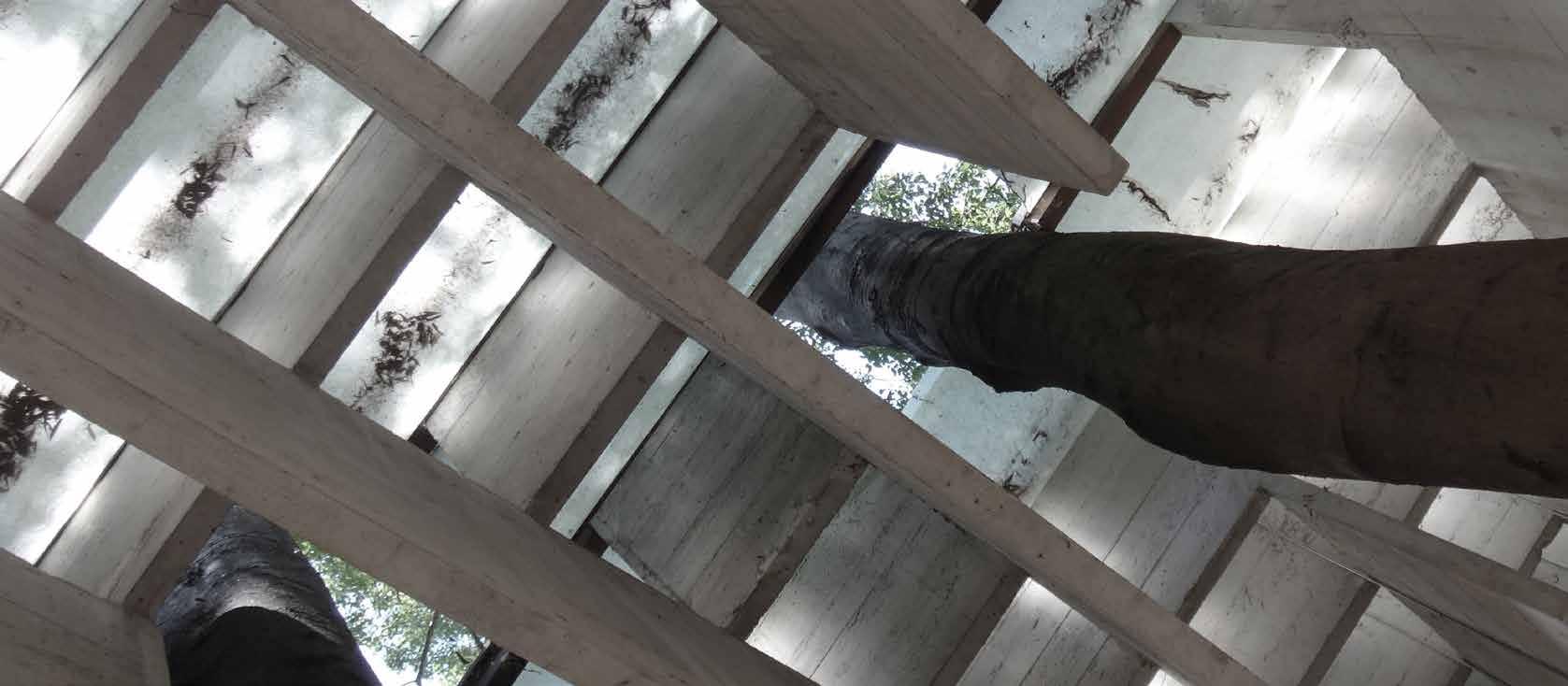
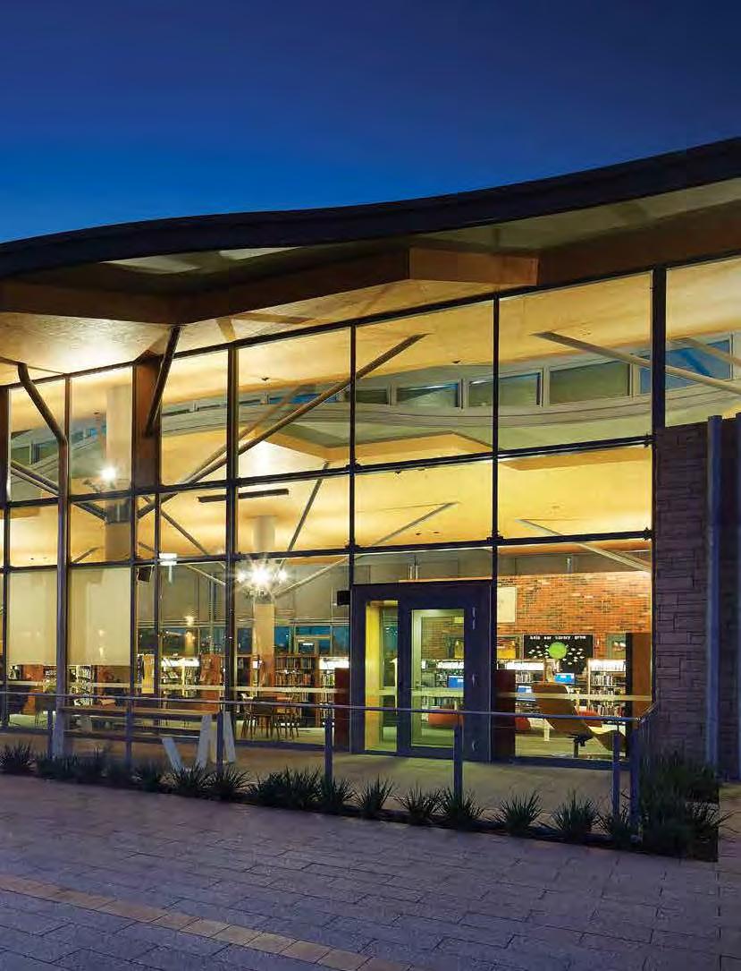
The Mary Davies Library and Community Centre has provided Baldivis not only with new community facilities and a new found identity, but also provides the visitors with an inspiring sensual experience. It blurs the lines between indoors and outdoors, nature and building, new technology and tradition, intimate restrained retreats and large expressive spaces.
A key feature of the design concept of the library and function hall spaces are the structural trees and uninterrupted timber ceilings or ‘canopies’. The lighting design and Mondoluce’s light fittings achieve the vision of a clean, services free ceiling by using the iGuzzini Le Perroquet projector up-lights to indirectly illuminate the large open flexible spaces. Equally set around each structural tree column these expressive light fittings add to the overall design feature and have become an integral part of the design. The design approach allows easy accessible servicing of all light fittings, even within large open spaces and ceiling heights up to 9 metres.
CLIENT City of Rockingham ARCHITECT Site Architecture Studio LIGHTING AND ELECTRICAL SERVICES CONSULTANT
Engineering Technology Consultants Pty Ltd / ETC BUILDER
PACT Construction ELECTRICAL CONTRACTOR ADCO Electrics PHOTOGRAPHER Ron Tan



ARCHITECT
ELECTRICAL
To visit the featured Project
get a taste of the Living Showroom
the excellence in design
which Mondoluce
renowned, use the QR code reader on your smart-phone. +61 8 9321 0101 mondoluce.perth mondoluce.com.au
Site Architecture Studio
Engineering Technology Consultants / ETC LIGHTING AND
SERVICES CONSULTANT
and
and
and execution for
is

The O cial Journal of the Australian Institute of Architects: WA Chapter
4 Contributors
5 Editor’s Message
7 State President’s Message
8 MAP ONE - Our Contributors: Architecture in the Beyond import.
13 Reflections from Donald Bailey AM
19 MAP TWO - Making Place: A Reflective Mapping
20 Between the Sheets
28 Vocational Migrants: SMAR A Nomadic Operability export.
35 From Ideology to Image
42 Proactive Naivety
45 Venice and Beyond
48 MAP THREE - Transecting Tokyo
63 Ten from Ten
73 A Site Visit to Remember exchange.
80 Into Asia Out of the Cloud
84 Go Away and Come Back
88 MAP FOUR - [WA AND] Berlin: Defining what is Beyond
92 Beyond the Bunkum
- 3 -
CONTENTS
CONTRIBUTORS
Don Bailey
‘Reflections from Donald Bailey
AM’. Don is a sometime architect and amateur golfer.
Dr Fernando Jerez
‘Vocational Migrants: SMAR A Nomadic Operability’. Fernando is Associate Professor in Architecture at UWA and founder and Director of SMAR Architecture Studio.
Kate Woodman
‘From Ideology to Image’. Kate is a graduate architect at CODA.
Sarah McGann
‘Making Place: A Reflective Mapping‘. Sarah is an architectural researcher and a Professor at the University of Notre Dame in Fremantle.
Brett Mitchell
‘Between the Sheets’. Brett is a creative practitioner who currently works between academia and various small practices.
Jennie O cer/Trent Woods
‘Venice and Beyond’. Jennie and Trent are Directors of O cer Woods.
Georgia Taylor-Berry
‘Transecting Tokyo’. Georgia is a graduate architect who has worked in practice and is now enjoying an extended holiday through Asia.
Garry Lawrence
‘Into Asia Out of the Cloud’. Garry is Director of Lawrence Architects and a published novelist.
Sarah Besly / Marc Greco
Craig McCormack
‘Proactive Naivety’. Craig is a PhD candidate at The University of Western Australia, with a keen interest in space architecture (or at least the idea of it).
Robyn Creagh
‘Go Away and Come Back’. Robyn is an architectural researcher and designer and post-doctural research fellow at the Centre for Sport and Recreation Research at Curtin University.
Warranty: Persons and/or organisations and their servants and agents or assigns upon lodging with the publisher for publication or authorising or approving the publication of any advertising material indemnify the publisher, the editor, its servants and agents against all liability for, and costs of, any claims or proceedings whatsoever arising from such publication. Persons and/ or organisations and their servants and agents and assigns warrant that the advertising material lodged, authorised or approved for publication complies with all relevant laws and regulations and that its publication will not give rise to any rights or liabilities against the publisher, the editor, or its servants and agents under common and/ or statute law and without limiting the generality of the foregoing further warrant that nothing in the material is misleading or deceptive or otherwise in breach of the Trade Practices Act 1974.
Important Disclaimer: The material contained in this publication is general comment and is not intended as advice on any particular matter. No reader should act or fail to act on the basis of any material contained herein. Readers should consult professional advisors. The Australian Institute of Architects, its o cers, the editor and authors expressly disclaim all and any liability to any persons whatsoever in respect of anything done or omitted to be done by any such persons in reliance whether in whole or in part upon any of the contents of this publication. All photographs are by the respective contributor unless otherwise noted.
‘A Site Visit to Remember’. Sarah is an Associate at CODA and Marc is founder of Engineering Consultants Australia.
Shane Winter / Drew Penhale
‘[WA AND] Berlin: Defining What is Beyond’. Shane and Drew are Directors of Penhale and Winter; Shane is based in Berlin and Drew in Fremantle.
Ian Dewar
‘Beyond the Bunkum’. Ian is Director of Ian Dewar and Associates Architects.
Editor Olivia Chetkovich
Managing Editor
Michael Woodhams
Editorial Committee
Emma Brain
Tanya Trevisan
Magazine Template Design Public Creative www.publiccreative.com.au
Proofreading Martin Dickie
Publisher Australian Institute of Architects WA Chapter
Advertising Kim Burges kim.burges@architecture.com.au Kay Cohen kay@kaycohen.com.au
Produced for Australian Institute of Architects WA Chapter 33 Broadway Nedlands WA 6009
(08) 9287 9900 wa@architecture.com.au www.architecture.com.au/wa
Cover Image Tanya Trevisan
Internal Covers
Michael Patrick Timmins AS ISSN: 1037-3460
- 4 -
editor’s message
Author Olivia Chetkovich
In this issue of The Architect we are exploring the theme [WA AND] BEYOND. Beyond what? Mostly we have insights from a geographical understanding of ‘beyond’, but a thread that appears to run through this issue is a notion of experiences, ideas and representation beyond the page. In travelling, we ‘see’ the built environment in the context of site, users, climate, sounds, smells. I’m lucky enough to be writing this introduction whilst on holiday in New York, and in doing so have been considering what is it about heading beyond that we seek. For this trip it’s certainly to have a good time, but as a first-time visitor it’s also to fill in some of the gaps of my understanding of this city: the architectural education, stories from friends, and of course representation in film and television. Walking through the city it all seems –to borrow a term – strangely familiar. Maybe I’ve just been watching too much Seinfeld.
But to complete the ‘picture’ with sounds, smell, pace, grit, sunshine, rain and luck is a unique and variable experience, lifting the understanding of this built environment off the page. And it’s something I will take back with me to Perth.
And bringing back, or in, experiences and perceptions is something key to this issue. Many of the pieces are stories – of travel to places beyond WA and of ideas and understandings brought here from another place or way of working. In going beyond WA and beyond the page,
be that into new lands, methodologies or technologies, ideas surrounding how an Australian architectural identity is understood, how other places are viewed, how environments are mapped, how works are represented, and how global connections are maintained or influence work, are presented in this issue.
On this holiday (or ‘vacation’ as I have learned to say to avoid confusion) I have been reading Michael Sorkin’s Twenty Minutes in Manhattan, a compelling and comprehensive mapping of the author’s walk from his Greenwich Village apartment to his studio in Tribeca. The insights (extending from the elements of the built environment he encounters daily to the sociological implications of these) have greatly enriched my perspective as an outsider; my generalised and unavoidably touristic mappings of three weeks walking through Manhattan and Brooklyn augmented by his intense and deliberate mappings of 20 years as an engaged and critical resident of a distinct part of the City.
Since undertaking architectural education, it feels impossible to now experience a new place, especially a city such as New York, without seeing it through an architectural lens; not just continually gazing up at buildings, but also seeking to understand how the city works through its built environment. Travels before this had elicited perhaps more emotional responses, rather than academic or scientific understandings or interpretations. Both have value for me – although I know that naïve perspective is now a thing of the past.
Going beyond Perth, I bring back new experiences and perspectives that will, to varying degrees and with varying applicability, influence the way I read or appreciate my own city. In an age of increasingly accessible travel, I prefer not to think about being permanently in once place or in another, but continually between – supplementing my experience of home with that of places and experiences beyond. (The post-holiday blues inevitably prompting future travel plans).
As an ‘import’ to or ‘export’ from Perth, architects bring with them motivations and interpretations influenced by their ‘beyond’. They may seek the familiar, or interrogate the differences – or in some cases operate in a space between the two. This issue of The Architect explores this phenomena through various understandings of [WA AND] BEYOND –we hope you enjoy. •
- 5 -

Design Studio. for Architects
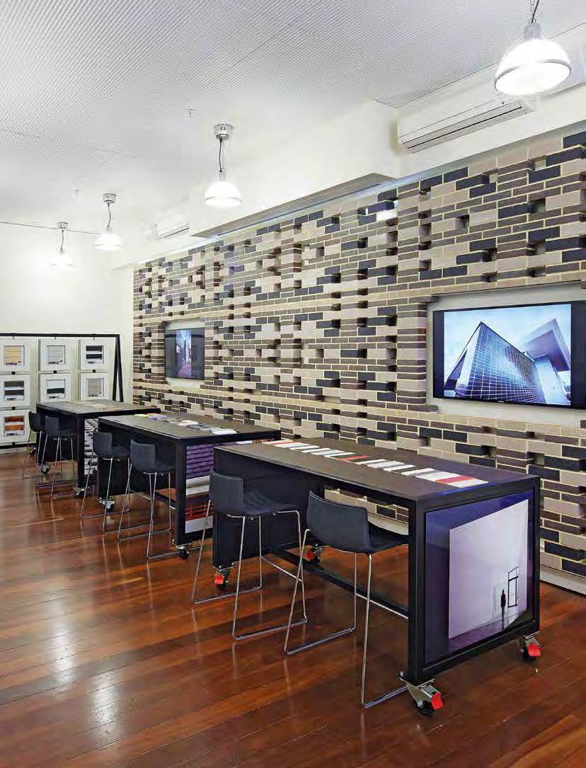
Brickworks Building Products have recently opened their new Design Studio located in Perth which showcases the entire range of Brickworks Building Products, including Austral Bricks, Austral Precast, Bristile Roofing and Auswest Timbers.
Our innovative product displays help to ease the selection process and we offer professional advice for product specifications on site.
The studio also offers networking events and opportunities for architects, designers and developers ensuring you are kept up to date and informed on all available industry and Brickworks Building Products developments.
To make an appointment or to obtain a schedule of events, feel free to visit any time or contact us on the following number.
67 King Street, Perth WA 6000 Tel. 08 6332 5800
www.brickworksbuildingproducts.com.au

state president’s message
Author Philip Gri ths
This edition has an international flavour. It has long been a feature of the development of young architects to complete their studies and flee to all parts of the globe to widen their horizons. It wasn’t always so, as the relative cost of travel was prohibitive and the lucky ones who did mange to travel were the beneficiaries of travel scholarships. They were few.
A good, but small, number of West Australian architects have made practicing abroad their careers, while some have built a name in the international arena and returned to Western Australia to establish successful practices. There is no doubt that seeing the way architecture is practiced in a different climate and professional environment broadens capacity and skills.
In my early career I travelled to England for a six week holiday, with the intention of working for a short time with Peter Falconer and Partners in the picturesque Cotswolds. Thirteen years later, with a young family and an unknown future we decided to make Australia home.
Many of our contributors have overseas experience, either working, teaching or being a part of the Venice Architecture Biennale. It has fired their souls and given them renewed enthusiasm for their professional careers and I share that experience.
I travelled with few expectations and finished up completing my studies in
London, working for a good number of practices varying in size from six professionals up to a practice with 120. The sizes of some of the commissions were daunting to the point of self doubt about capacity before realising that there is a process for every project and that it is a matter of up- or down-scaling to suit and to build teams for the specific task. Doesn’t sound much different from what we all do now. The difference is the exotic environment, the enormous importance of some of the cities that one gets to work in, the approvals environment and the vast differences in building economics.
One of the other benefits of working abroad is the ready access to new work. One is not confined by what it suits publishers to promote and so getting beyond the darlings of the architectural press is much more possible.
Enjoy the second edition of the new look Architect. Use it to promote the profession. Read it conspicuously and sigh loudly at what you see. Make your fellow travellers curious. •
PAUL GRIFFIN
In 2006 Paul became the Curtin representative on the Institute’s Practice Committee. He had recently left Jones Coulter Young and had a great deal to contribute not just on education but on many aspects of practice. Paul agreed to become WA’s representative on the National Practice Committee (NPC), a role he took to with enthusiasm and thoroughness. Without neglecting his students he reviewed all the Acumen content and provided much of the missing information himself. In 2010 Paul took on the Chair of the NPC. He understood the need for contributions from practising architects, bringing his practical perspective to both Practice Committees, National and State. The architectural and student community have benefited greatly from the commitment of this quiet-spoken and engaging man. - Martin Dickie
MARCUS COLLINS
Marcus was amongst the original ‘bohemian’ graduates from the School of Architecture UWA, and during his last twenty years he produced many award winning educational buildings for which he is noted, including works for Notre Dame. Marcus campaigned to save the Swan Brewery, did voluntary heritage advisory work, lectured students and wrote for architectural journals. Last November he was awarded the Architects Board Award. - Maxine Canning
- 7 -
VALE
- 8 -

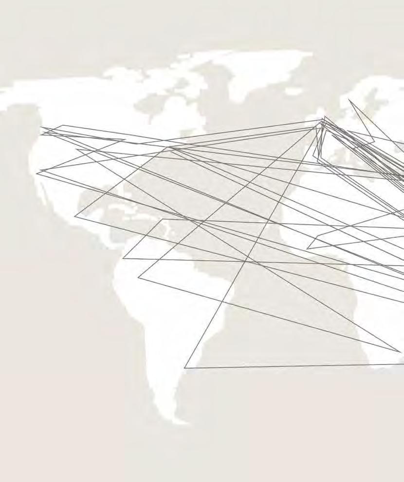
OUR CONTRIBUTORS: ARCHITECTURE IN THE BEYOND
- 9 -

- 10 -


- 11import.

Specialists in large scale planters, water features, architectural screening, vertical garden systems and furniture for commercial projects.

- 1212-14 DRAKE ST, O SBO RNE PARK | P 9443 7993 | O P EN M O N – SAT 9-5 | WWW.WATERGAR D ENWAREHOUSE.COM.AU
reflections from donald bailey AM
Author Donald Bailey AM
B.Arch(MU); Dip Arch (RMIT); LFRAIA; Hon FAIA;(USA), RAIA Gold Medallist 1991; Architect
Perth’s place in the world from an architectural perspective On February 20, 1962 John Glenn became the first American to orbit the Earth in the Friendship 7 spacecraft. Glenn flew over Perth and the people of Perth turned on their lights to acknowledge his mission. He observed that the city was clearly visible from space and Perth became known worldwide as the ‘City of Light’. This early space exploration mission set the stage for the Gemini and Apollo programs which culminated in NASA landing men on the moon. Now how about THAT as a promo for WA! Though this drew worldwide attention to Perth, it also demonstrated that Perth is the most remote capital city in the world.
In reality, this can be a like the Curate’s Egg — ‘good in parts’— because due to the tyranny of distance, innovation often became a necessity. This remoteness is also quite possibly the main reason why so many Western Australians are inveterate world travellers, and architects are surely near the top of the list.
I recall having to fly from Melbourne on a Vickers Viscount aircraft in 1961 that needed to stop at Kalgoorlie to refuel. Now it takes around a mere three hours, and visuals and spoken word via the celestial internet are instantaneous.
There was of course another big moment in Perth’s social history. I was on a self-drive barge on the Canal du Midi in France in 1983 and, having just started the engine for hot water
for a shower, on a crackly portable radio I heard the news that Australia (representing Royal Perth Yacht Club) had won the America’s Cup. On a small vessel moored behind, the Skipper, who was the head of Dole Plantation, Hawaii, generously shouted: ‘If the Cup had to leave America, it could not have gone to a better home’.
I believe these events, together with the onset of the minerals boom, had the effect of giving unheralded confidence, which brought concomitant but also dubiously beneficial social change. The business of architecture flourished however, with the aid of Alan Bond’s developments.
The Perth connection!
As a graduate from the Melbourne University in 1950, this of course was the end of the beginning. In those days it was all but compulsory to round off an education and, like John Ruskin, do a ‘Tour of Europe’, and particularly, Scandinavia where good design is ubiquitous! In January 1951, as there was no economic option to allow us to fly, three of us chaps set forth from Melbourne on the SS Orcades: new then, but since scrapped, and called for an overnight in Fremantle. I had a cousin, Reg Bond, who was Public Service Commissioner, also on the Swan River Conservation Board, and Commodore of the Royal Perth Yacht Squadron. He showed us around Perth and said that on our return we should stop off again and he might find jobs for us, as architects were needed.
Instead, we returned to Melbourne, and I was employed by Bates Smart & McCutcheon for five years, learning about ‘fast-tracking’ high-rise commercial office buildings, and working on the beginnings of Monash University located in open paddocks in Clayton, Victoria. By a strange quirk of fate, it was exactly ten years later when I returned to Perth in January 1961 to set up practice with Jeffrey Howlett, my colleague from BSM, on the competition-winning Council House.
But I digress...
Post-grad education for hands-on practice!
It seemed a good idea to head for London as this was the year of the Festival of Britain, and a resurgence of building activity in London and around UK following the demolitions in the Blitz. Coventry Cathedral was a victim and Basil Spence, the Scottish architect, designed a new cathedral which broke new ground.
My drawing board was in the office of Riches and Blythin who would take on any Oz architect without question! The office was in the sharp end of a wedgeshaped building with a dress circle view of the South Bank site where we could observe progress of the building of a Dome of Discovery, a Skylon, and Royal Festival Hall. At lunch breaks we would walk across the Hungerford Bridge with a sandwich from Garveys, ‘Underneath the Arches’ (a well-known Cockney song made famous by Flannagan and Allan) and get a close
- 13 -
•
- 14 -
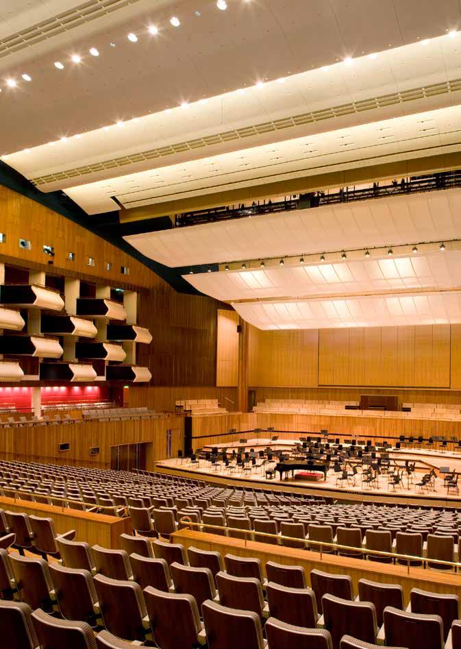
Royal Festival Hall auditorium. Image: Morley Von Sternberg.
up view of many buildings nearing completion by Fry, Drew and Partners, and other emerging stellar figures of the day.
It’s no accident that the Perth Concert Hall has been rated (by an ABC ‘Limelight Magazine’ survey in September 2011) best overall of 25 concert halls in Oz, because its internal proportions follow those of the empirical Musikverein in Vienna. Nor that its innards resemble the Royal Festival Hall in London, a hall that I often visited in Festival of Britain year in 1951. Jeffrey Howlett also visited as an undergraduate of the Architectural Association, from which he gained Dip.Hons. and attended acoustic tests conducted by Hope Bagenal and his colleagues from the Building Research Station who formed an integral part of the design team.
When I joined the office of John B Parkin in Toronto in 1952, I was given the job of working on the design development and working drawings for the Headquarters of the Ontario Association of Architects. John C Parkin, was one of the cohort which included Harry Seidler at the Harvard Graduate School of Design at MIT directed by Walter Gropius of the Bauhaus. This building, and a number of other projects, mainly schools and industrial buildings, all derived from the orderly open planning and geometry of Mies van der Rohe, and Finnish-American Eero Saarinen, the latter’s style being machine-like rationalism.
‘Great oaks from little acorns grow’ When I arrived in Perth in 1961, I was befriended by Professor of Surgery, Brian Vivian, and we were golfing mates. Brian’s first-born, Philip, became my Godson. I would take him onto building sites and he developed a liking for architecture as a career. Philip is now Director of the Sydney arm of Bates Smart, the firm from which Jeffrey Howlett and I left to start the Perth practice in 1961, and so the wheel has turned full circle. Jeffrey Howlett’s son Greg, Director of Cox Howlett & Bailey Woodland, is involved with a number of major international award-winning projects. A recent one is the Renaissance Cultural Museum for the Sultan of Oman. A landmark project for fellow Applecross Senior High School and WA Institute of Technology (WAIT, now Curtin University) 1970s graduates, Senior Directors Greg Howlett and Steve Woodland. Howlett recently stated, ‘I realised in the early 90s it was a case of 'get big, get small or get out' and get big was what I aimed to do.’ 1 Does ‘getting big’ mean looking beyond?
A note about design integrity!
Harry Seidler’s 1987 QV1 Office Tower, like all of his vast body of work exemplifies total integrity, design of furniture and fitout being under the one hand. Though Harry is now ‘beyond’, I’m certain that H&B owe a debt to him in particular as a member of the Jury which assessed the Perth Town Hall competition in 1960. The reason surely would have
been the original design submission which included the (unbuilt) Public Suite, each element complementing the other.
Having had five years of work experience in Bates Smart and McCutcheon, Melbourne in the post-war late 1950s, when well-designed ready-made furniture and furnishings were just not available, ‘Oz’ McCutcheon ensured that all interior furniture, partitions and fitout were specially designed.
Although at the time David FoulkesTaylor on Riverside Drive had a number of imported contemporary pieces, the furniture for Council House (and the Concert Hall) had to be designed and installed locally. So it was that in 1961 in Perth, H&B insisted on such integrity in Council House. This required innovation, seeking out local skills for manufacture and supply of elements like ceiling panels, partitions, carpets, and so forth. Curtains were screen-printed by Helen Grey-Smith.
Alan McInnes Green, (then) Town Clerk and ‘Renaissance Man’ was a ‘Committee of One’, the ideal educated client, who generally allowed us as architects to have a free hand. As the raison d’être for the Council House was to host international visitors to the Commonwealth Games in November 1962 in style, one cannot overlook the enormous contribution of Rose Skinner, of the Skinner Gallery in Malcolm Street, to the Perth cultural scene. It was Rose who encouraged and promoted artists, particularly from WA.
- 15 -
Bishop: I'm afraid you've got a bad egg, Mr Jones.
Curate: Oh, no, my Lord, I assure you that parts of it are excellent!
• 1 'WA firm wins big Oman deal', The West Australian, 16 April 2015
’True Humility’ by George du Maurier, originally published in ‘Punch’ 9 November 1895 (source: Wikipedia).
When Council House was near completion, Rose lent numerous works by Sydney Nolan, Albert Tucker, Guy Grey-Smith, Wim Boissevain, Robert Juniper, Charles Blackman, Arthur Boyd, John Brack, Ray Crooke, Len French, Sam Fullbrook, Margaret Olley, Fred Williams et al., to enrich the travertine walls of the reception areas. On one occasion the Rockefellers were passing through Perth en route to pastoral holdings in Esperance. They purchased a number of these and later, on a visit to New York’s Manhattan Bank building, there in a board room were beds of daffodils, the walls being adorned with huge Nolans and Fred Williams paintings!
Rose used to have soirées and Jeff and I were invited to join with Sydney and Cynthia Nolan, Hal Missingham, and author, Alan Moorhead. Dinner was at separate tables with what was known as ‘intercourse shuffles’ for change of
discussion! Rose brought Sid Nolan down to view the Concert Hall’s St Georges Terrace foyer wall. She then sent to his London home bunches of WA wildflowers, for Syd had decided to offer the City of Perth permanently on loan a series of 64 paintings of wildflowers for hanging in the Hall.
Reflections on ‘beyond’
In the ‘beyond’ of architectural practice, a word on behalf of Gil Nicol and Ross Chisholm, who deservedly each received a Royal Australian Institute of Architects Gold Medal from their peers in 1983, for very significant contributions to Perth’s CBD makeover of the late 20th century. I’ve ever been drawn to those who possess a sense of humour, or even ‘quirkiness’ in the otherwise generally solemn profession of ours. Reminds one of Ian Athfield of Auckland with drunken candy coupled columns almost but not quite supporting a church portico;
and the late (also) sorely missed Peter Parkinson (aka Sir Benjamin Buzzard) of Perth. When I paid a return visit to Gil Nicol’s home down in the ‘Up-lands’ south of Perth, I came away having had a joyful experience, and lasting admiration for the quirkiness of his house on his own manmade lake. I do hope the present occupant enjoys this daily experience. •
- 16 -
Balloon released from Skylon, South Bank, London. Image: Holland.
Council House Building. Image: Greg Hocking.



SMEG AUSTRALIA PROUDLY SUPPORTING AIA: WA CHAPTER VISIT OUR SHOWROOM 59 CARRINGTON ST NEDLANDS 9389 8000 SMA15781


- 18• CommerCial LIFTS • residential lifts Phone: (08) 6363 5953 6 Brolo Court, O’Connor, WA 6163 www.octagonlifts.com.au lifting your expectations a range of quality eu ropean solutions • DUMBWAITERS • DISABILITY aCCess lifts
making place: a reflective mapping
Author Sarah McGann
Reflecting on Perth from a Dubliner’s perspective, Sarah McGann talks about the potent mix of villages, place-makers and dirt.
‘What’s a village?’ asked the student, ‘is that like something you get in England in the countryside?’ ‘We don’t have villages in Perth,’ concluded the group, ‘Perth just has shopping centres and strips’.
Discussing the idea of Perth as an age-friendly city, I’d asked if suburban villages had an important role to play in social inclusion. Their response was a surprise. Moving to Perth from Dublin some twenty years ago, I’d obviously imported my own understandings of a city made up of suburban villages and, as many migrants do, sought out familiar spaces. I moved to Mount Lawley and adopted it and North Perth as my local villages. So I was interested that the interdisciplinary students didn’t see their city in the same way and questioned if mine is purely an architectural reading of the city. However, after a quick internet search, the student view would seem to be confirmed. The terms ‘village’ and ‘Perth’ sadly only brought up multiple entries for ‘retirement villages’. To me, these faux-villages seem to be socially exclusive and mainly located nowhere near an actual community.
Dublin is often described as a ‘city of villages,’ each with its own personality and even accent. Suburban villages
evolved historically, often formed within the space triangulated by the postoffice/shop, pub and church. Today, organic greengrocers, artisan butchers, Pilates, cafés and restaurants are just as likely to be interwoven into the local village fabric. Importantly I think, it is the familiarity and sense of community, of being known and of knowing people, that makes a place feel like a village. Most of us would like to live in a place where we are known. Returning recently to Dublin I noticed many changes, but I also saw familiar people, some now quite elderly, sitting with the same old friends in the same seats of the same old local pub (telling the same old jokes). It looked pretty age-friendly to me.
Despite my brief internet search, I still think of Perth as having a village structure. Looking along train lines, many of the associated precincts feel like village communities. Similarly there is a strong community emphasis in the hills. On the other hand I am interested in Perth’s widespread adoption of the concept of ‘place-making.’ I wonder, perhaps naively, if place-making for the suburbs is really village-making. One place-making consultant describes their role: ‘Thorough research into a location’s cultural narrative enables us to build its future story’.1
The term place-making conjures the impression of strategies which are forced, divisive or image-marketing, akin to gentrification, and equally in danger of creating pastiche. I find myself questioning why, in Perth, we need new professionals to make place for us. In Dublin, a city known for its liveliness, it seems that places develop through council support, relaxed policy for competitive private enterprise, naturally social people and population density.
Perth is a very different city now to the one I moved to twenty years ago. When I first moved I was told, and agreed, it was a very clean city - quite a contrast from ‘Dirty Dublin’. Recently I am fascinated with Mary Douglas’s discussion of dirt as ‘matter out of place’.2 Applying her logic to a city presents some interesting readings of the city, villages and placemaking. In the last few years Perth seems to have accumulated more dirt, but in a good way. More matter is out of place: bars in laneways, lounges in sea containers (Bakery RIP), cinemas in car parks, parks in car bays. All this dirt, and associated liveliness, seems to be a good thing for Perth, for its ever-changing community villages and, particularly, for making our own places •
- 19 -
1 http://www.placepartners.com.au 2 Mary Douglas 2003, Purity and Danger: An Analysis of Concepts of Pollution and Taboo
 Image: Michelle Kar
between the sheets
Author Brett Mitchell
Architectural ideas are communicated across various media and processes before (hopefully) reaching a final outcome of built experience. The intent and affect of architecture is therefore always being projected towards a moment beyond its immediate output. As Stan Allen writes, ‘between drawing and building, the intention is to articulate architecture’s special capacity to present the ineffable, which is the paradoxical corollary of building’s material presence.’
The premise of a new architectural talk series Between the Sheets presented by graduates Tess O’Brien and Miranda Menzies asks selected speakers to reveal and discuss that which lies beneath the drawings and models behind their work. International Architects Go Hasegawa (Go Hasegawa + Associates of Japan) and Ahmed Belkhodja (Fala Atelier of Portugal) were the first invitees to present their projects and ideas to a receptive Perth audience on Friday July 10, 2015 at PS Art Space in Fremantle. The organisers and presenters here reflect on interpretations of ‘beyond’ in the context of their work and the Between the Sheets speaker series.
THE ORGANISERS
Beyond Perth: How has the Porto Academy experience (and subsequent travel) informed your development as designers?
Miranda: Funnily enough, although we were both architecture students from Perth, we only met each other for the first time in Portugal at the Porto Academy in 2013. This was the first architectural ‘summer school’ (run by the founders of architectural magazine 'Index Newspaper'). There was a very exciting sense of connectivity amongst not only the students, but the professional mentors as well. Travel and hearing other creatives talk about their work and processes are two things that I thoroughly enjoy and, I would like to think, we take a lot from these engagements without even meaning to.
Tess: Personally the experiences that I had during my two year break mid-degree, as well later at the Porto Academy, were really influential in the direction that I took my final masters thesis. I explored the notion that our past experiences and travel memories form a catalogue of ‘nostalgias’ or ‘longings’, which in turn may feed our design motives. This is a very simplified explanation - but basically without having travelled I don’t think I would have come to some of the conclusions
I did, and these are now enduring ideas that I genuinely hope to take into professional practice.
Porto Academy was eye-opening in the sense that we realised how fortunate we were to have access to 15 or so architects over the week, to hear from them and take part in their studios. Most of our fellow students were coming from, and/or heading to, other summer courses during their holidays – a sort of European summer-school tour. We were quite envious of the ease of access that European students had to an array of exciting architectural practices and educational experiences. This initially inspired the desire to have something similar in Perth. The Between the Sheets talk was definitely motivated by this and it is really important to us both that the event is a little different from a standard architectural talk.
Beyond the Individual: What is the importance of studying and communicating with architects about their works?
Miranda + Tess: Architecture is such an exciting field to be involved in because of the fact that there are so many different ways you can do it, an innumerable variety of situations that it (architecture) can ‘sit’ in and of course a unique brief in almost every instance. •
- 21 -
We think because of this variability it is really important, and interesting, to hear from architects outside our own place, culture and climatic context. Seeking knowledge from outside Perth - to go beyond our sheltered boundaries - is as much about learning how things are done elsewhere and the consequent parallels and dissimilarities, as it is about acknowledging that there are numerous solutions to the problems we may face. Perhaps there lies the stimulus or prompt to its solution in another town, city, country, culture or tradition of making.
Architecture has such a long history and a lot can be taken from precedents (whether we like them or not). So it would be incredibly unfortunate to not look to the outside for inspiration, methods of doing things, or simply to learn. It is also nice to think that through a more open, international dialogue students and practices from beyond Australia may also look to us as a country with our own very interesting architects, projects, and architectural educators.
Beyond the Building: What do feel is to be gained from looking at the outputs and e orts of design and communication rather than the work itself?
Miranda + Tess: Taking a step back from the ‘final’ built work is where we can find an abundance of knowledge and reasoning for our own use. We like to think that what makes architecture distinct in the construction industry and built environment is that there is a certain level of thought exuded to create something unique and clever as an everevolving way of dealing with common issues and otherwise obstructive regulations. It is also just nice to gain an insight into someone else’s thought process and learn why certain things in the built work are what they are.
In our profession it is also important to acknowledge the outputs of design and communication because of the fact that a physical building to inhabit and experience doesn’t always eventuate. So it is equally beneficial to talk about projects that haven’t come to light. Just as much intensity of thought and problem-solving has gone into many of those unrealised endeavours. This was
something we particularly liked about the combination of speakers we invited to Between the Sheets. Go Hasegawa had a robust portfolio of built work, while Fala Atelier are quite new and had many competition entries and proposed but unbuilt works, yet both had plenty to discuss in terms of the beginning and middle of their architectural works, and how they get their ideas to a certain point.
Beyond Here+Now: Can you elaborate on any other talks or topics you are planning for the future?
Miranda + Tess: We both got a lot out of the actual experience of designing and planning the event and are very keen on the idea that Between the Sheets will be a recurring event, most likely annual for now. It was a rewarding experience in so many ways and so nice to see everyone enjoying themselves on the night including Ahmed and Go who also enjoyed their visit to Perth. There are a couple of different ideas as to how it might be run and formatted next time so we’re hoping to build on these for future events.
- 22 -
Castelo-de-Cartas. Fala Atelier. Image: Fala Atelier.

THE ARCHITECTS
Ahmed Belkhodja – Fala Atelier www.falaatelier.com
Beyond oneself: What are the critical in uences that resonate with you and inform your practice?
I guess we have a few ‘spiritual masters’ from Europe, Japan and the USA. As we are based in Porto, Alvaro Siza is obviously an important figure among them. He truly is one of the best architects alive but we also know how paralysing this aura can be. Most of the architecture produced in our city in the last decades has not really been able to go beyond that influence in any convincing way. I don’t know if we’ll ever be able to escape that curse ourselves, but our strategy has been to focus more on ‘references’ than ‘influences’. Those references don’t have to be architectural works but they all fascinate us in some way. We see each of our projects a bit like a collage of ideas stolen from these references...
Beyond Thinking: How do you express ideas or experience of architectural space via presentation mediums other than building itself? What do you hope to communicate?
As we conceived the projects as collages, we naturally started representing them through collages as well. It gradually became an actual tool to design the projects and meant a sort of return to a 2D mode of composition to us. Also it allows us to experiment very freely and quickly with textures and colors. It eases the trial-and-error phase as compared with renderings or physical models.
Beyond building: Can you describe any criteria for communicating the intent of your work post-completion via graphic imagery or architectural photography?
We only have a small amount of built projects but we feel like once a construction process is finished, we can only rely on the eye of others to look at it. In most cases we would ask a photographer friend to document the project without giving her or him any guidelines. On our side, we tend to bring all house-made images and drawings
of all projects to a consistent graphic language. Not because of our own fetishism but because it helps us look beyond the diversity of the projects.
Beyond expectations: What ‘happy accidents’ beyond the drawings/buildings can you share?
Earlier this year, we built a temporary installation with some students, in a little park of Porto. It was a tiny mazelike structure next to a playground. It was made of large sheets of white cardboard. Each sheet was a wall and the walls were connected with a pretty simple system of joints. After having finished the assemblage of the installation, we took a short break to have lunch. When we came back we had the surprise that, in addition to taking over our whole installation, local children had also taken the initiative of building another pavilion with the remaining sheets of cardboard, next to ours. It was like a small sibling oddly placed in front of the original one. Cute and unexpected.
- 23•
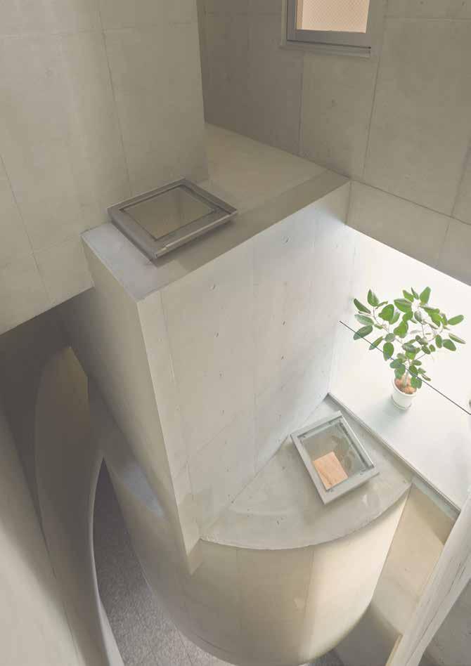
Public Library, Setubal, Portugal. Fala Atelier. Image: Fala Atelier.
- 24 -
Apartment in Okachimachi. Go Hasegawa and Associates. Image: Takaya Sakano.

Beyond now: What are your thoughts on emerging methods of architectural representation such as wearable, immersive virtual environments and 3D printing in relation to how architecture can be perceived? Do you feel there is a need to conform to certain representation methods to win competitions or communicate speci cally to clients?
Modes of representation might be dictated by clients and juries to a certain extent but it is also the architects’ role to challenge them if they want any evolution to happen. Ideally, these decisions should emerge naturally out of the intentions of the project. Obviously our experience is a bit short to draw any conclusion on this question but we still believe that dry and generic modes of representation are not a fatality.
Beyond home: What are your impressions of Perth/Australia? And what ideas or insights from your brief time here might you take back with you?
There is a lot of similarities between Perth and Porto. But Porto is a much older city. Architects in Australia tend to
protest about the demolition of 30-yearold buildings with the same tone that Porto architects use to complain about the impossibility to build anything new in the city. In other words, it might feel like Europe has a lack of space while Australia has obviously too much. After two weeks in Australia, I’m sharpening the conviction that both situations can be very inspiring. They’re somewhat extreme and extreme is good.
Go Hasegawa –Go Hasegawa and Associates www.ghaa.co.jp
Beyond oneself: What are the critical in uences that resonate with you and inform your practice?
I think I got an influence from many people, many things. But especially I learn a lot from the works by three architects — Kazuo Shinohara, Kazunari Sakamoto, and my teacher Yoshiharu Tsukamoto. They seemed to have a big perspective to buildings. These three architects are each different, but all of them have designed architecture which have a relationship not only with architect’s works but
also normal buildings - many other architects ignore normal buildings and just sophisticated their own works.
Beyond Thinking: How do you try to express ideas or experience of architectural space via presentation mediums other than building itself? What do you hope to communicate?
Models from 1:500 to 1:1 of scale. Models are objects, and also could be very objective to the project. We architects and clients need physical models in order to understand and share the issue ‘what is the most important thing in this project?'. We need to care to be objective in the process.
People. Life. Time.
Beyond Building: Can you describe any criteria for communicating the intent of your work post-completion via graphic imagery or architectural photography?
I prefer the images which is something mysterious. Architectural photography needs to express what architect thought and also needs to make people imagine and think about that building. It’s important for building to be interpreted freely and creatively. •
- 25 -
Faria Guimaraes House. Fala Atelier. Image: Fala Atelier.

- 26 -
House in Kyodo. Go Hasegawa and Associates. Image: Iwan Baan.
House in Komazawa. Go Hasegawa and Associates. Image: Iwan Baan.
Beyond Expectations: What ‘happy accidents’ beyond the drawings/buildings can you share?
For me 'happy accidents' means ‘beyond me’. I always go beyond myself. I hope to fly beyond what I know already. It’s shame and pity if we would just make what we have ever seen. I always want to overcome what I thought yesterday.
Beyond Now: What are your thoughts on emerging methods of architectural representation such as wearable, immersive virtual environments and 3D printing in relation to how architecture can be perceived? Do you feel there is a need to conform to certain representation methods to win competitions or communicate specifically to clients?
People like to think new technology have ever changed architecture and nowadays it's changing a lot. They can say like that, I mean, it might be true. But on the other hand I think architecture have never changed a lot.
It’s still very local and analogue creation. Almost of all buildings don’t move at all, and they need to be strong and stable. Firstly we should understand
these character of building which had never been changed in the history. And as I told already, I think it’s shame for architect to make a project which gets popular just with new ‘methods’ — but unfortunately many projects are like that today.
I never feel such a thing. But I know people love to talk about ‘methods’. It’s necessary to think how to represent each project every time, but it’s boring for me to fix ‘methods’. It’s much more important to search and think ‘purpose’ of each project. ‘Purpose’ should be discovered by architect every time. On the other words, I trust architects who think ‘Why’ much more than ‘ How’ of their project.
Beyond Home: What are your impressions of Perth/Australia? And What ideas or insights from your brief time here might you take back with you?
Nature. Relax. Sun light. I hope more young ambitious Australian architects are coming such as Tess and Miranda. •
- 27 -
- 28 -
Guggenheim Museum. Image: SMAR.
vocational migrants: SMAR a nomadic operability
Author Fernando Jerez
In June of 2014, the Solomon R. Guggenheim Foundation launched an open, anonymous international design competition for the proposed Guggenheim musuem in Helsinki, Finland. This was the first time the Foundation has undertaken such a process. Of the 1,715 Stage One entires, six finalists were selected – one of which was the entry from SMAR Architecture Studio out of Perth. Here, Fernando Jerez, founder and director of SMAR, discusses the perspective and approach that took them to the final stage of the competition.
The distance between Perth and Helsinki is about 13,000km and takes about 19 hours with a stop in Singapore, and around 24 hours with stops in Dubai and Madrid. The distance between Perth, where we live and practice, and Madrid where we come from, is about 14,000km and 20 hours of flights with stops in Doha or Dubai. Since we were shortlisted in the international competition to design the next Guggenheim Museum of Helsinki among 1,715 entries from 77 countries in December 2014, we have travelled around 60,000km, catching 12 aircraft and about 90 hours of flights...
Somebody might think we are nomads... or we practice a kind of nomadic architecture; we prefer to call it a nomadic operability
All those who move around like us start to realise that even in places that are less suspicious of provincialism there are powerful forces to eliminate the ‘foreign’, drifting elements. When you pass more time ‘outside’ than ‘inside’ you know that you won't be local anymore, not even in your ‘mother’ country, and therefore it is more intelligent to declare this condition of ‘migration’ an advantage, to turn the negative connotation of ‘migrant’ into
a positive quality. So we are a kind of ‘vocational migrants’ and this condition of exteriority to the local orders, forces us to develop an extraordinary awareness that is not bound by local conventions.
Coming from Madrid, having studied in London and New York, developing our practice in Perth and working in Helsinki in this case, produces a kind of automatic de-codification of precepts and concepts that we regard as a potential source of interaction with a given environment. The fact that most of the Finnish architectural firms entered the competition and the five finalists were foreigners, leads us to reinforce the idea that exteriority, displacement and de-territorialisation might be operative models, challenging the accumulation of local experience and the rhetorical manipulation of well-established codes as the basis for our actions and for the production of knowledge. As a reverse of the same coin it is interesting to think that the most acclaimed building in Australia, the Sydney Opera House, was designed by a foreigner, a Scandinavian architect.
Until recently, before what we understood as globalisation, global,
economic or political forces seeking to exert control over a certain extension unfolded techniques of homogenisation, erasing the existing structures and singularities in order to eliminate all resistance to occupation. The resulting type of space was appropriate during the times when capitalism operated under a colonial expansive regime. The Guggenheim Museum has been perceived from Finland, before the competition, as a kind of colonialist operation. Paradoxically, however, entering the competition as a potentially colonial foreigner, one immediately feels the pressure to cater for the local idiosyncrasy more than if we were designing in our own country.
This interest in the local conditions versus a supposed colonialist thinking is very important in our Guggenheim proposal. During the process we established conversations from our practice, SMAR with different agents, artists, curators and institutions about how museums have to change from top-down institutions with colonial connotations where information is directed in only one way into bottomup institutions that increasingly create conversations with the user increasing the share of local idiosyncrasy.
- 29 -
•
We proposed an Interior Street Lab, an additional un-programmed space not included in the original brief which opens the building up to citizens’ appropriation. A set of unique spaces contains the almost unlimited number of conditions and situations that public space normally offers to provoke the people that enter it, whatever form it takes. It is a critical shift from the idea of a building as a static object to a building that can accommodate the flux of daily life. It offers back to the City of Helsinki an Interior Street, a public space at no additional cost, able to be used also in the seven cold months of the year.
In contrast with the current understanding of the museum as a curatorial controlled space, the project intended to propose innovative uses of space and technology that empower citizens in the process of actively contributing to their built environment. In a recent exhibition at the American Institute of Architects in New York,
they asked us what conditions caused us to search for an alternate model of practice. In an age of reformulation of the discipline of architecture, it is important to look at science, economy, other processes, other techniques, in order to discover potential alternatives. Teaching, writing and participating actively in the discussion on architecture as a cultural construct have given us a certain distance from the immediacy of practice. They help us to think on a more abstract level. And this is very important, especially if your practice operates in a less specific domain. Structuring a text or a discourse is essentially the same as structuring a building.
That means that at The University of Western Australia we have a kind of preview of potential future practices rather than a mimesis of our activity. We understand academic activity not as a mere transference of knowledge, but rather as a mechanism for producing
knowledge in itself that allows us to explore a kind of reservoir of ideas that are produced in joint research with the students. There is of course a relationship between our practice and these other spheres, but it is never a linear one, always trying to permeate through and inform all of these details.
We are in a time of necessary review of the discipline. To understand the new context in which we live, from a social, environmental and technological perspective, we seek to find opportunities that previously had not been considered, and this can only be achieved in the hand of research in an international context. Our nomadic operability allows us to explore near-future scenarios as platforms to establish conversations that might trigger projects about urgent issues in our global world, Western Australia and beyond - from the city of Perth to megacities in China. •
- 30 -
Guggenheim Museum. Image: SMAR.
The Bedfordale House built by Gransden designed by Suzanne Hunt Architect
2015 Australian Timber Design Awards - Excellence in Timber Design - Interior Fitout - Residential
2015 HIA-CSR Australian Housing Awards - Australian Home of The Year
2015 HIA-CSR Australian Housing Awards - Australian Custom Built Home of the Year
2015 HIA-CSR Australian - People’s Choice Home of the Year
2015 Master Builders-Bankwest Housing Excellence Awards - Most Liveable Home Award
2014 HIA West Australian Housing Awards - West Australian Home of the Year
2014 HIA West Australian Housing Awards - West Australian Custom Built Home of the Year
2014 HIA Perth Housing Awards - Perth Home of the Year
2014 HIA Perth Housing Awards - John Peterson Award for Custom Built Home of the Year
2014 HIA Perth Housing Awards - Custom Built Home $2.6m and over
2014 Australian Institute of Architects (WA) - Architecture Award Residential Architecture – Houses (New)
2014 Australian Institute of Architects (WA) - Architecture Award Interior Architecture
Gransden - Architectural Builder 5/31 Broadway, Nedlands WA 6009
admin@gransden.com.au (08) 9389 1350 gransden.com.au
- 31 -
Bringing the architect’s vision to life.
Gransden




export.
- 34INSPIRING I NTER I ORS 204 STIRLING HIGHWAY, CLAREMONT (08) 9389 6669
from ideology to image
Author Kate Woodman
Australia has had a complicated relationship with its national identity, typified by a constant struggle to be distinct and sophisticated yet conflicted about being perceived as exotic or banal. The new Australian pavilion at the Venice Biennale designed by Denton Corker Marshall (DCM) comes from a significant lineage of Australian pavilion architecture, both the temporary pavilions at colourful World Expos and more permanent and restrained structures at the Venice Biennale. As images of the new building flood our magazines and screens, it is timely to reflect on the pivotal role national pavilions have played in announcing shifts in Australian national identity.
Finding a Non-British Identity
Australia’s first significant investment in pavilion design came in 1967, during a decade often termed the nation’s ‘coming of age’ or a period of ‘new nationalism’. It was a time of national reflection and with it, political action. Conscious steps were made to separate from Britain and define an independent identity. The ‘White Australia’ policy was abandoned and a referendum of the same year resulted in the Constitution being changed to be more inclusive of Indigenous Australians. In order to change perceptions of how Australia was viewed externally, the Australia Council of the Arts was established and the nation participated in the 1967 Montreal World Expo.
The Australian pavilion for the Montreal World Expo was designed by then Principal Architect for the Commonwealth Department of Works in Canberra, James Maccormick. The pavilion theme described Australia as ‘a land that had been “quickened by a spirit of youth and adventure”’. 1 Architecturally, this spirit was concretised by Maccormick in a floating glass box over native bush land. Vocal Melbourne architect Robin Boyd designed the interior exhibit with the goal of creating ‘the most luxurious and civilized salon at Expo 67’, using custom furnishing with inbuilt speakers to depict the role of modern innovation in facilitating Australia’s high quality of life.2
In 1970, the Osaka World Expo in Japan provided the opportunity to enhance post-war bilateral relations and present Australia as culturally understanding and technically advanced, rather than coarse, uncultured and highly dependent on Western Allies.3 Japan had also become an important trade partner for Australia and the World Expo was recognised as an opportunity to also promote Australian resources. The design team for the Montreal Expo was again asked to design the Australian pavilion, employing a cantilevering steel arm from which a ‘lotus’ roof hung to both reference Japanese culture and promote Australia’s innovation in engineering and manufacturing.
Finding an Australian Icon National celebrations of the Bicentenary (of settlement in Australia) in 1988 and, to a lesser extent, the later Centenary of Federation in 2001, put pressure on once again for Australia to define its image. However, with the introduction of nonAnglo-Celtic immigration in the 1950s and the elevation of multiculturalism in the 1970s under the Whitlam government, the singular image of Australia was growing increasingly hard to demarcate. Pluralism became an officially recognised source of pride for the nation, yet this is not an easy idea to distil into a homogenous national image and is commonly raised as a barrier to national image even today.
In 1988 Australia simultaneously constructed its first national pavilion in the Giardini della Biennale in Venice and hosted a World Expo in Brisbane. The Australian pavilions at these events were a portion of an immense sum of images, publications and products that flooded the nation for the Bicentenary. These pavilions mark the emergence of two re-occurring iconic aesthetics in our pavilion designs: the ‘sail’ and the ‘earth’.
The first pavilion at the Venice Biennale was designed by Philip Cox whose career ambition was to develop an Australian style that represented an ‘up-to-date and open minded Australia’.4 The pavilions’ construction, of clean white fabric stretched over white steel, in
•
1 James Curran, “Australia Should Be There: Expo ’67 and the Search for a New National Image,”, Australian Historical Studies 39, 1 (2008): 81.
2 Carolyn Barnes, Barbara Hall and Simon Jackson, “Creature of Circumstance: Australia's Pavilion at Expo '70 and Changing International Relations,” The Proceedings of the XXIVth International Conference of the Society of Architectural Historians, Australia and New Zealand (Adelaide: Society of Architectural Historians, Australia and New Zealand, 2007): 80-93.
3 Barnes, Hall and Jackson, “Creature of Circumstance,” 1-16.
4 Deyan Sudjic, “Beyond the Cringe: Australian Architecture and the Venice Biennale” The Monthly 1, 17 (2006): 42.
- 35 -
- 36 -
Australian Pavilion Venice Biennale 1988 by Cox. Image: Cox.
Australian Pavillion 1988 Brisbane World Expo by Ancher, Mortlock and Woolley. Source: State Library Queensland.
many ways interprets architecturally the characteristics adopted in the early twentieth century as descriptive of the Australian national type: independent, egalitarian and self-confident.
References to the pavilion being a ‘shed’ and ‘shack’ attest this connection to national type. The iconic ‘sail’ aesthetic championed by Cox was then reemployed in 1992 in the Seville World Expo pavilion designed by Philip Page and David Rendon.
At the 1988 Brisbane World Expo, the Australian pavilion designed by Ancher, Mortlock & Woolley was depicted as a giant corrugated iron Uluru — much like the giant Core-Ten steel landform designed by Wood Marsh at the 2010 Shanghai World Expo. The 2000 Hannover World Expo saw architects Tonkin Zulaikha Greer amalgamating the two aesthetics with the stretched sails now coloured in the deep red of the Australian desert.
While often believed to be tangible, fluid and natural, national identity is a powerful and emotive construct made up of images, speeches and events framed as national. People look to these summations of nation to understand their own national identity as well as the national identity of others. As one of the few remaining platforms for cultural differentiation, pavilion architecture is a building typology where the expectation for the architecture to speak for the
nation is most direct. As such, pavilions have the potential to influence both international and local perceptions of the nation.
Nelson Goodman in his essay ‘How Buildings Mean’ identifies four ways a building’s features can be manipulated to imbue a building with meaning. These range from direct labelling to using building elements that have an existing, loaded meaning. Additionally, Goodman recognises that meanings which come to be associated with a building as a result of its conception or occupation are often very insightful but not necessarily controllable by the designer.5 What differentiates the Australia World Expo pavilions built in 1967 and 1970 from the World Expo pavilions built between 1988 and 2010 is the way in which the buildings communicate meaning. Boyd and Maccormick were passionate promoters of Modernisman aspirational architectural language that was generalised to become descriptive of the nation’s values and characteristics. Similarly, Cox created an architectural language that he felt suitable to speak for the nation, employing it in his design for the Venice Biennale pavilion as well as many other nationally significant commissions.6 The publically known architectural agendas of these outspoken architects played an important role in their commissioning for the projects. Later
World Expo designs reproduced the established national image, rendering the voice of the architect less discernible and signifying a shift in the architect’s role in contributing to national identity through these national buildings. This shift is consistent with trends globally as made evident by nation branding expert, Tjaco Walvis’ description how World Expo pavilions since 1987 have moved away from focussing on the significance of culture and utopian themes of humankind towards ‘nation branding’, necessitating high impact designs often derived from stereotypes.7 Furthermore, when communicating through image, landscape imagery is employed by many nations as it is beneficial for representing the nation as stable, cohesive and internationally distinctive but not racially and culturally exclusive.
The debut of Australia’s post-imperial, Modernist identity at the 1967 and 1970 World Expos was highly scrutinised. James Curran describes how at the 1967 World Expo the decision to depict the nation in a way that wasn’t obvious and timeless, encouraged speculation on the validity of the new image.8 Similarly, Barnes and Jackson explain how architectural commentary following the 1970 Osaka World Expo questioned the success of the Australian pavilion at communicating its complex message.9 By resisting any obvious references to the existing national •
5 Nelson Goodman, “How Buildings Mean,” Nelson Goodman and Catherine Z. Elgin, (eds.) Re conceptions in Philosophy and other Arts and Sciences (London: Routledge, 1988), 31-44.
6 Other nationally significant projects completed by either Philip Cox and Associates or Cox, Richardson, Taylor and Partners include: Yulara Resort at Uluru, Sydney Exhibition Centre at Darling Harbour, Sydney Football Stadium (now referred to as Allianz Stadium) & Australian National Maritime Museum at Darling Harbour.
7 Walvis, ‘Three eras of World Expositions: 1851-present’, 1.
8 Curran, “Australia Should Be There, 82.
9 Barnes, Hall and Jackson, 'Creature of Circumstance, 2.
- 37 -
identity, these buildings are more open to interpretation and often attract meanings other than those intended by the design team. Subsequent World Expo pavilions with explicit and established references to the nation immediately satisfy the viewer’s expectation for the pavilion to have a meaning and reduce the need for further enquiry.
Finding an Australian ‘Reality’ The recently erected pavilion at the Venice Biennale was the outcome of a long and passionate campaign by Australia’s art and architectural community. Initial momentum was generated in 2008 through a public open ideas competition – organised by Melbourne restaurateur Ronnie Di Stasio – and attracted some 168 submissions. Whether the impact of this groundswell of interest was an instigator or not, 2011 saw the Australia Council for the Arts announce that they would be investing in a new pavilion. Almost at the same time as this announcement, an online petition signed by many prominent Australian architects argued for the selection process to also be in the form of an open competition.10 This was not to eventuate. These undertakings, as well as a commitment made by the Australian Institute of Architects in 2006 to long-term and significant investment in Australia’s participation at the Venice Architecture Biennale, are demonstrative of the Australian architectural community’s
10 Barnes, Hall and Jackson, 'Creature of Circumstance, 2.
desire to contribute to decisions regarding the nation’s representation at the event.
Australian architecture exhibitions at the Venice Biennale in 2006, 2008 and 2010 exploited increased participation in the event as an opportunity to explore Australian identity, proposing explicitly that Australian architects would like to be seen as working in an urban condition. The quantity of urban buildings and urban environments represented in these exhibitions could be read as an attempt to provide evidence of Australia’s urbanity and prove that bush architecture does not dominate. Furthermore, the starkness of the exhibited imagery kiboshes any notion of Australia as exotic. At exhibitions in 2008 and 2010, the Cox pavilion was painted in bright, bold colours, camouflaging its white sails. There is a clear disparity between the 1988 – 2010 Australian World Expo pavilions that referenced ‘earth’ and ‘sail’ icons and the unequivocal pleas of these Venice Biennale Architectural exhibitions. However, by communicating through the repetition of image, architects of recent World Expos pavilions are limited in their capacity to evolve the nation’s architectural representation to reflect changes in the architectural community’s own perception of itself.
Finding a Non-‘Aussie’ Identity
The frequency of the construction of World Expo pavilions makes them a valuable signifier of changes in how Australia has been represented. In comparison, as permanent buildings designed to house exhibits of high culture and intellectual speculation, Venice Biennale pavilions tend to be more subdued and are typically representative of the predominant architectural style at the time they are built. However as national buildings, their symbolic function is resounding and is reinforced by their relatively small size and minimal utility.
The tendency for people to interpret meaning in these buildings was evident when Deyan Sudjic provocatively described the national pavilions in the Biennale gardens as the ‘Tsarist Russian gingerbread house’ and the United States ‘air-conditioned version of Monticello’,11 just as references to the first Australian Pavilion designed by Cox as a ‘shack’ and ‘shed’ make links to the national type that are not obvious in the building’s architecture. Furthermore, an online discussion in 2012 about the selection process for the new Australian pavilion applies a non-referential meaning to the proposed design saying that ‘[the pavilion] can also be read as a protest against the silencing of Australian architects, a darker and angrier statement about the state of things’.12
11 Deyan Sudjic, “A White Cube in a Black Box: Denton Corker Marshall’s Design for Australia’s New Venice Biennale Pavilion,” The Monthly 1, 78 (2012): 51.
12 “Black Box,” Butterpaper, April 4, 2012, accessed August 8, 2012, http://www.butterpaper.com/cms/news/2152/black-box.
- 38 -

- 39 -
Australian Pavillion 2010 Shanghai World Expo by Wood Marsh. Image: Peter Bennets.
Australian Pavillion Venice Bienanale 2015 by Denton Corker Marshall. Image: John Gollings.
- 40 -
Image: John Gollings
When Simon Mordant, commissioner of the 2013 Venice Art Biennale, announced in 2011 that the Australia Council of the Arts would be investing in the new pavilion, he clearly stated the Council’s priorities regarding the building brief: ‘We need a functional exhibition space that works for the artist and complies with the Venetian authorities’ requirements. And that’s going to be something that’s far more modest.’ 13 DCM architects were later commissioned for the project with a proposal considered to be a continuation of their earlier open ideas competition submission.
DCM’s submission into the 2008 ideas competition boldly stated that the then proposed ‘white box inside a black box’ would have ‘no connotations whatsoever of “national character”, other than perhaps a refusal to acknowledge the giving of architectural form to such a concept’.14 A reassuring statement for those involved in the building’s commissioning, as it reinforced that the pavilion would prioritise art and would be the antithesis to the established national image grounded in the landscape. At their appointing,
architectural critic Elizabeth Farrelly says of DCM, having designed a number of Australian embassies, they are ‘old hands at growing up “Australia” … to mean something more serious and more urban than Crocodile Dundee’.15
The completed pavilion fiercely rejects the relevance of image as a language for expressing the nation through architecture. Its architects have embraced the opportunity to make a statement — that is to make no statement. This abrupt rejection of the relevance of national identity is disappointing given they have bestowed the role of designing a number of significant national and public works but is perhaps somewhat reflective of the context in which the building was procured and constructed. However, given the symbolic preconceptions of national pavilions, it is likely that the public will interpret meaning in the new pavilion whether it was intended by the architect or not.
In media interviews following the competition entry, and more recently since the pavilion’s opening, DCM’s tone has become less dismissive. In these
interviews, the architects do concede some relevance to nation. Director John Denton has often described the building as an ‘Australian object in a European landscape’16 as opposed to their Australian residential work he describes as being ‘essentially European objects in an Australian landscape’.17 In an interview with Robert Grace, DCM acknowledged, ‘talking about an Australian identity, you can’t pretend people won’t see the pavilion as something Australians think is good.. He went on to state ‘we don’t think there is anything remotely Australian’ but describes its confidence and gutsiness as perhaps saying something about the nation.18
There is no truth to be found in national identity, but the impact that buildings framed as representing the nation have on our own national identity is real. Whatever judgement you make of this little black box, I urge you to consider it in the understanding that it is a national building and national buildings have historically played an important role in announcing shifts in Australian national identity. •
13 Ray Edgar, “Australia to get a new Venice Biennale Pavilion,” The Age June 2, 2011 accessed April 11, 2012, from http://www.theage.com.au/entertainment/art-and-design/australia-to-get-a-newvenice-biennale-pavilion-20110601-1fgeh.html.
14 Barrie Marshall, “Denton Corker Marshall Entr y,” in Matt Ward, Anna Draffin and Stephen Mitchell (eds.,) Venice Biennale New Australian Pavilion: Di Stasio Ideas Competition (Melbourne: Di Stasio Ideas Competition Venice Biennale, 2008), 104.
15 Elizabeth Farrelly, “Pavilion Reflects a ‘Grown-up’ Australia,” The Sydney Morning Herald, April 4, 2012, accessed July 7, 2012, http://www.smh.com.au/opinion/society-and-culture/pavilionreflects-a-grownup-australia-20120403-1wb0p.html.
16 Luke Slattery, “Cutting-edge Design Offers a Window on Australia,” The Australian, April4, 2012, accessed August 16, 2012, http://www.theaustralian.com.au/arts/visual-arts/cutting-edgedesign-offers-a-window-on-australia/story-fn9d3avm-1226317996515.
17 Slattery, ‘Cutting-edge Design Offers a Window on Australia’.
18 Robert Grace, “Australia’s Venice Pavilion: Interview with Denton Corker Marshall,” ArchitectureAU July 6, 2015, accessed July 6, 2015, http://architectureau.com/articles/australias-venice-pavilioninterview-with-denton-corker-marshall.
- 41 -
- 42 -
Under construction: the 'Orange Cloud' at the Venice Biennale. Image: Craig McCormack.
proactive naivety
Author Craig McCormack
The idea of an Unbuilt Australia existed prior to the release of the Venice Biennale’s theme of Modernity 19142014. Such is the nature of the idea; it was a simple enough task to realign it to its new thematic home. We always liked the idea of presenting architecture that never made the cut; it tells a more compelling story in most cases. It’s like someone who dies to soon - they remain that way forever, an unrealistic and uncompromising edition. And so Unbuilt Australia grew the suffix of 1914 – 2014 once the theme had been determined. Our local team of Rene Van Meeuwen, Simon Anderson, Sophie Giles, Matt Delroy-Carr, and I had grown to include Melbournian Philip Goad to dilute the western waters and add his talent to the pool. We journeyed eastward to convince the powers that be of the augmented reality technology we were intent on using. This led to institute members walking around Bradfield Park inside an augmented reality pavilion we had geo-positioned there, from Perth.
Twenty three projects in all were chosen, selected to represent an alternative narrative to Australia’s modernity, including the at-the-timeincomplete Denton Corker Marshall pavilion. Eleven temporary projects were determined by voting through the institute with final choice determined by the creative directors and eleven historic projects were selected by Goad and Anderson. We knew we couldn’t please everybody and I’m pretty certain that we didn’t. Once the projects had been determined, work commenced
in earnest on digitising all of the selected projects and designing the accompanying catalogue. Including the creative directors, students that toiled on the augmented reality models, and contributors for the accompanying catalogue, numbers totalled roughly 140. This process required a patience I am still yet to manifest. But I can feign it convincingly now.
Situated across the canal from the new Australian pavilion in a sunken courtyard (a site that was fought for) bordered by Greece, Romania, Poland, and Brazil, the pavilion served as an information centre and fixed exhibition site. The ‘Orange Cloud’ was designed as the frontispiece for the exhibition; the tangible element, a physical pavilion. Having worked as a volunteer at the pavilion for a short stint during winter, a roof over my head and a seat to recline on were very welcome, even though the orange, translucent material made all that entered look like an oompa loompa. Manufactured in Perth, by two different contractors, with completion due three months prior to the opening of the Biennale (due to shipping times), we crossed our collective fingers for its successful construction in Venice as we simply ran out of time to do a test run in Perth prior to it leaving. The construction was regularly frustrating, involving more often than not the tracking down of something so common in Bunnings but rarer than rocking horse shit in Venezia. It seems a universally acknowledged fact within the Biennale that all will not go as planned. Making friends with all of your
neighbours is a wise course of action that is necessary for the completion of most pavilions it would seem.
The real achievement of our exhibition was the placement of all of our exhibited projects, positioned digitally using GPS in select sites across Venice. These projects could then be experienced using the exhibition’s augmented reality app at a 1:1 scale using a smart device as an oculus, revealing Australia’s invasion of Venice as a temporary site. Of course finalising app development and having to check each augmented project across a tourist-infested Venice with inconsistent internet coverage meant for a frustration that equalled its physical counterpart in its completion.
I don’t know if you can completely prepare for exhibiting in the Biennale, at least when you have no permanent space and intend on using technology that remains in its infancy for your exhibit. You have to role with the punches. Luckily there are far worse places to be rolling and you quickly realise that you are not rolling alone. Every now and again you get time to catch your breath, or a sliver of a vista as you hustle through the winding streets on some pavilion related crusade. There are plenty of long evenings after the site curfew to be had with other teams, mulling over the day, spritz in hand, outdoing each other with tales of near failure and narrowly averted disaster. Except for Norway. They always seemed to have everything under control. •
- 43 -
STUNNING INNOVATIVE CREATIVE


Since 2003 the experienced master craftsmen of Polished Plaster have been delivering high quality, bespoke surface finishes to suit every style for both interior and exterior application.
With an ever growing range of sustainable decorative surface solutions, Polished Plaster’s products are both durable and versatile.
Polished Plasters perfection in detail has led to clients nationwide, including high-end international retailers Gucci, Louis Vuitton, Burberry, Armani, Salvatore Ferragamo and Western Australia’s Morrison
Authorised applicator of

The Polished Plaster Company Unit 16/31 Stockdale Road, O’Connor, WA 6163
T: 08 9331 1569
M: 0424 260 367
E: polishedplaster@westnet.com.au
Showroom viewings by appointment
www.polishedplaster.com.au
- 44 -
venice and beyond
Inaugural Gil Nicol Biennial Award
2013
Author Jennie O cer and Trent Woods
The Gil Nicol Biennial Award is generously donated by Jenny Nicol. It is given through the Australian Institute of Architects and recognises a local architect(s) who is making a significant impact on the State's built environment while in the early stages of their career. The award honours the memory of Gil Nicol's passion and contribution to quality design in Western Australia. For this inaugural award, Jenny Nicol nominated that funds were to be used to attend the 14th Architecture Biennale in Venice and to experience that city in festival mode.
It was a great privilege for Officer Woods to be awarded the inaugural Gil Nicol Biennial Award in November 2013. For us, this provided a wonderful opportunity to be exposed to architecture’s international pulse, to support the largely Western Australian creative team behind the Australian Institute of Architects' 2014 exhibition Augmented Australia 1914-2014, and to observe Rem Koolhaas’s overall curation firsthand. The Institute generously arranged Vernissage preview passes for us, giving us the chance to participate in the spectacle of the Giardini over the opening days.
In early June 2014, we spent an architecture-soaked week navigating a blizzard of exhibits, each examining modernism’s legacies for the participating nation. These were anchored by Koolhaas’s Fundamentals exhibition which elementally chronicled the built artefact before erupting in the Arsenale’s Mondo Italia dense celebration of the host nation. The week was highly engaging, immersive and exhausting. Highlights were the exhibitions of Belgium,
Morocco, Portugal, Japan and Brazil; respectively humble, fascinating, polemic, messy and consistent. We were buoyed, of course, by the lovely colours of home tautly wrapped around the fantastic augmented ‘cloud’ and splashed into a spritz glass each evening.
For us, a trip to Europe is a rare and valuable treat, and so we decided to make the most of the opportunity by including a month long post-Venice architectural tour. This focused on the work of French architects Lacaton and Vassal, whose work we have long admired. We planned a circuit from Venice to Paris clockwise around France.
En route to Grenoble, and to the first of seventeen Lacaton and Vassal designed buildings, we visited SANAA’s Rolex Learning Centre in Lausanne, a marvellously precise concrete slice of swiss cheese draped on the shore of Lake Geneva in the campus of the Ecole Polytechnique Fédérale de Lausanne. The Rolex Learning Centre is both a public and student hub and institutional statement with library,
lecture theatre, cafeteria, restaurant and bookstore sandwiched in a sophisticated demonstration of the university’s capability and aspirations. A remarkably fluid building, the Rolex Centre accommodates unprogrammed and unexpected occupation inside and out. Whether intentional or a delightful by-product of its formal disposition, it results in a centre of activity for the whole campus.
Lacaton and Vassal’s work unequivocally dispenses with the precise formal complexity of SANAA, but shares a similar accommodating generosity. In university buildings in Grenoble and Bordeaux, we saw great horticultural filters between the buildings’ occupants and the surrounding campus. Simple agricultural technology is appropriated to cultivate stacked flowering gardens, tempering the environment and providing a backdrop to the buildings’ daily cycles. The adoption of agricultural and industrial technologies and principles to provide effective environmental and cultural performance in a succinct economical manner is recurrent theme in the work of Lacaton and Vassal.
- 45•
Our circuit lead us through Bourdeaux to Nantes and Saint-Nazaire, to record tertiary education buildings, residences, grouped housing as well as low and high rise multi-residential projects. Each displayed an inventive evolution of the firm’s core pursuits of providing spatial generosity and bio-climatic performance through judicious architectural economy.
In northern France, we found ourselves uncannily sandwiched between the work of SANAA and Lacaton and Vassal, visiting the extension to Louvre in Lens and the FRAC Nord-Pas de Calais in Dunkerque, respectively. Again, we found one lustrous, refined and meticulous and the other raw, direct and uncomplicated, yet both shared a great directness in respecting and celebrating the public. To us this was refreshing and liberating, standing in contrast to our observation that many public buildings are actually remarkably spatially private. Both of these ethereal buildings have been cultural catalysts
for their post-industrial, economically depressed settings and neither relies on the flashiness long associated with the ‘Bilbao effect’.
In the course of our trip we contacted Lacaton and Vassal, who readily gave us site information, publications, directions to buildings under construction and an invitation to visit their practice in Paris. We flew out of Paris after a great day exploring the Palais de Tokyo, where Lacaton and Vassal have renovated a disused 1937 building and made a contemporary art gallery which is the antithesis of a clean white box, and where, again, there is a freedom in going almost anywhere you like.
The Gil Nicol Award is a remarkable opportunity for early-career architects. We’d encourage future recipients to extend the generous prize as far as you possibly can, and join the great Western Australian tradition of enterprising ventures elsewhere. •
- 46 -
Rolex Learning Centre by SANNA in Lausanne. Image: O cer Woods.

- 47 -
Management Sciences University by Lacation and Vassal in Bordeaux. Image: O cer Woods.
Louvre-Lens by SANAA in Lens. Image: O cer Woods.
Japan, 127 million
Taiehuyo Belt Megaregion, 83 million
Tokyo-Yokohama Megacity, 37.8 million
- 481 2 3 4 5 6 7 8 9 10 1112 13 14 15 16 17 18
transecting tokyo
Author Georgia Taylor-Berry
Tokyo, the world’s largest mega city, is full of contradictions. Its bland and expansive Maranouchi streets, its bustling Shibuya crosswalk with bright lights and lanes doused with ‘Hello Kitty’ and raucous Pachinko machines sit next to low-rise traditional timber homes. It is polite, beautifully traditional and at the forefront of modernity. Its connection with nature has been written in its culture for centuries. Yet you can walk blocks without seeing a single leaf.
These nuances partly express Tokyo’s beginnings as a walled Edo town that has spilled beyond its boundaries, eventually washing up against the surrounding mountains. After being awarded the Architect’s Board Graduate Award I rode a commuter bicycle from the foot of Mount Fuji into the heart of Tokyo, where ever that may be.
First impressions are powerful. Fresh eyes can examine a city just as successfully as an inhabitant. There are few preconceptions or inhibitions. A bicycle knows no boundaries and has no status, allowing you to become completely approachable and accessible to a culture at whatever pace you choose. Stopping to take a look at the finer grain actually widens a city’s
perspective. As David Byrne wrote in ‘Bicycle Diaries,’ ‘Hidden agendas emerge, as economies are revealed in shop fronts and histories in door frames.’
After an icy start, I rode through mountains and across bridges and watched the city appear. It rose and fell around transport oriented developments and suburbs, which were often of a human scale. Because of this I always felt completely safe as a cyclist. Tokyo’s extensive public transport system is one underlying reason for this - only 9% of citizens commute by car. Cars of course exist, but they do not dominate; expressways are often raised or redirected. Allowing the urban realm at grade to feel less obtrusive and human, these transport hubs bustled with narrow streets and buildings with activated edges of connected communities that regularly catered to people and their scale.
As height and density began to encroach, this sense of scale and community was augmented; I learnt that 80% of Tokyo’s citizens lived where they spent their childhoods - no wonder the streets were so safe and meticulous. It affords a city firstly a sense of place but also no single centre
or edge. Everyone has their own village. There were planned developments next to transport systems, citizens appropriating footpaths, emergency evacuation zones and river plains or eclectic mixed use environments that manifested as the city boomed faster than policy could keep up. Often built forms were designed in isolation from one another with no coherence (except for every shade of beige), distinct character or era. Indeed, houses on average have a lifespan of 27 years. This city is forever changing and reinventing itself within an environment where citizens hold a sense of place.
These reflections are the underlying reasons why Tokyo felt so appealing. It is not overbearing like many cities of its mass. What we perceive as under-scaled busy streets filled with small polite people and a mish-mash of glowing signs and carved timber door frames is actually a multifaceted, layered and rich city filled with self-interpretations of place with societies creating their own maps and centres and infinite symbiotic relationships.
The following photo essay is an account of key or provoking observations from this urban transect.
- 49•


- 50 -

- 51•
- 52 -

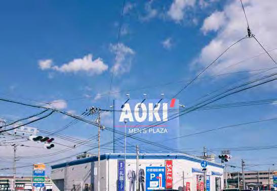
- 53•

- 54 -
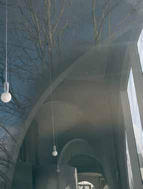

- 55•
- 56 -

- 57•
- 58 -
- 59•
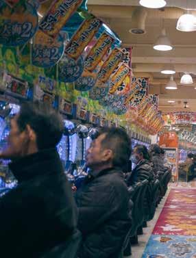
- 60 -
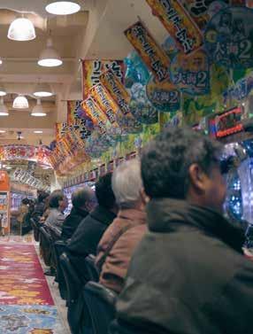
‘The city has neither a centre nor a periphery, neither beginning nor end. There is no distinction between what is infrastructure and what is not, or boundary between arti cial and natural. It is an environment with a variety of forms and relationships that far exceeds the scale of existing cities, accepts all things, and allows all things to ow, and freely blend together. No longer able to call this a ‘city’ (a place that is solely planned for people in), we can only refer to it as an ‘environment’ (an expanse that is both for and not for people).’
Japan Architect no. 82, p 66. •
- 61 -
A SELECTION OF RAVEN’S MOST POPULAR SEALS IN A HARD WEARING BLACK ANODISED FINISH WITH MATCHING BLACK GASKETS, COVER STRIPS AND ESCUTCHEONS.
- 62Cert. No. AU96/678 BACK IN BLACK
ANTIMICROBIAL PRODUCTS AT NO EXTRA COST! EXTENSIVE RANGE - FAST LEAD TIMES TESTED AND CERTIFIED TO NATIONAL AND INTERNATIONAL STANDARDS © Raven Products 2015 e: sales@raven.com.auwww.raven.com.au AVAILABLENOW!
ten from ten
Looping around the globe, we asked ten architects and graduate architects hailing from Perth and WA who are currently based overseas or ‘over east’ ten questions on living and working beyond WA.
EARLE ARNEY
LONDON, ENGLAND
What path led you to where you live now?
I recognised that to achieve my career ambitions I needed to gain experience beyond the bounds of WA. Soon after becoming registered I undertook postgrad studies at Harvard and worked in New York City. I remained working internationally while based in Sydney in the 1990s and was fortunate enough to win a competition against some Brits and Danes in Bahrain. This led me to being invited to lead the design of a luxury hotel on Park Lane in London. I jumped at the opportunity and became a Londoner 7 years ago.
When does your 'away' become your 'home'?
As soon as you mentally recalibrate and decide you are no longer a tourist in the city in which you live. I learnt from a very good mentor that it is imperative to put roots down no matter how long you remain in one place. To do otherwise results in a great sense of dislocation and un-connectedness.
In spite of Perth’s isolation, the digital world is now a small place – do you still connect with Perth/WA?
I was fortunate enough to have one of our New York clients engage me for a commercial office project in Perth in 2011. Being back in Perth reminded me of all the great things about the city.
What is your view on international architects for key Perth/WA projects? Good, bad, indi erent? We are currently working in London,
New York, Toronto and Montreal. In these global cities there is no resistance from ‘local’ architects competing against those from ‘outside’. Surely the pathway to awarding key projects in any city is either by way of a competitive process or by demonstrated exemplary design achievement – not by tenure of residence.
Does your Perth/WA background in uence your approach to your work?
Absolutely. I learnt the economy and inventiveness of materiality as I did the importance of site sensitivity and the magic of understanding place.
What's your favourite part about being elsewhere?
I am lucky enough to live in what is arguably the global capital of culture and arts. Every day when I walk the streets of London I am awed by the palimpsest of place which indelibly registers great human achievement for many of the past centuries.
What's the worst part about being elsewhere?
Taking 24 hours to get to Cottesloe Beach!
Re ecting, how has your view of Perth/WA changed since you left?
I first lived in Perth for 25 years and took many things for granted. Distance creates perspective and so it is in appreciating the beauty of Perth and the fierce independence of its people.
Do you think you need to go beyond to understand home?
Home for me is wherever I live – I have never related to that sentimental tune by Peter Allen and I don’t think you can if you are to whole heartedly assimilate with where you live.
Advice for others considering a move beyond Perth/WA?
Think expansively and when that unique opportunity presents itself, don’t let it pass you by.
- 63 -
•
BEKK CROMBIE VISTE, NORWAY
What path led you to where you live now?
I have followed the breadcrumb trail back to where my love for architecture was founded – the family home my Morfar (Grandfather) built in Viste, Norway. I am now living in that very house!
When does your 'away' become your 'home'?
The moment I can navigate, bleary eyed, the path from my bedroom through to the kitchen and make breakfast; unerringly and with confidence.
In spite of Perth’s isolation, the digital world is now a small place – do you still connect with Perth/WA?
Yes, via digital newsletters from Australian architectural publications and stalking/connecting with old colleagues on social media. It is just too easy!
What is your view on international architects for key Perth/WA projects? Good, bad, indi erent?
I have to believe in the integrity of the assessment criteria and the people judging such important key projects. Therefore a successful entry, international or local, has to be good for Perth.
Does your Perth/WA background in uence your approach to your work?
I tend to seek opportunities for indoor
and outdoor space interactions more so than my cold-fearing Norwegian counterparts. They are happy to go along with me so long as ‘koselighet’ (look it up!) is upheld.
What's your favourite part about being elsewhere?
Capitalising on my pseudo-Aussie uniqueness – haha! I love working alongside Norwegians, Swedes, Dutch and Austrian folk as we each provide new, different, good, sometimes bad and contentious angles to each project and our daily discussions.
What's the worst part about being elsewhere?
I am determined to speak only Norwegian at work which limits my ability to fully express myself verbally and can be quite draining. It means that I need to work harder and more creatively to get my point across.
Re ecting, how has your view of Perth/WA changed since you left?
I work mainly on retro-fitting heritage and existing buildings and so I am particularly excited about the potential of those wonderful old treasures in the Perth CBD. This is a great opportunity for Perth architects and designers in this current economic climate.
Do you think you need to go beyond to understand home?
I believe that you can only really understand the complex sensory nature of home - beyond the physical
attributes of a house and the familiar infrastructure of your surroundingswhen you leave and evoke those same feelings in a new place.
Advice for others considering a move beyond Perth/WA?
Do your research and find out what the prevailing CAD software is, learn the language and find out all you can about the working culture. Do not assume that European practices all speak English. Aussie uniqueness is good but do not lean on it!
RICHARD HASSELL SINGAPORE
What path led you to where you live now?
I graduated in 1989 in Australia's last construction depression, my cohorts were almost all overseas or in academia, there were no jobs in the industry.
I went to Singapore to work for Kerry Hill Architects.
When does your 'away' become your 'home'?
After five years I started to feel I was coming home when landing at Singapore airport, after 10 years Australia started feeling a little foreign. I still feel very connected to Australia and Perth, but I also feel a certain distance, after 26 years away, my mental Perth is still in the 1980s!
In spite of Perth’s isolation, the digital world is now a small place – do you still connect with Perth/WA?
- 64 -
I do, I come back at least twice a year, and I go to stay at a property near the Fitzgerald River National Park each time. The open wilderness is really a great experience after the density of Asia. I catch up with family and friends in Perth, visit the beach… the usual things!
What is your view on international architects for key Perth/WA projects? Good, bad, indi erent?
In every city there are the local architects who are excellent but are underappreciated or are not given opportunities who could do amazing things. I do find in Perth particularly there is a mindset of constraint and low aspirations - in the public, in procurement, and in the industry which can be self-defeating and negative, so if you have all those people around a table, the outcomes can be thwarted. The good thing about having an international architect can be that this newcomer arrives free of this baggage, excited, with a track record of great projects, and can become a rallying point of positivity and doing things differently.
Does your Perth/WA background in uence your approach to your work?
Yes it does. Growing up in Perth was a privilege, and in those days it was a very outdoorsy existence, riding bikes, playing in the reserves around the river, climbing trees, making furniture with my dad, going camping. This all builds into an attitude to doing and making that is very different from the urban lifestyles I see around me in Asia. This

could just be a generational thing, I don't see Perth kids roaming the streets so much anymore, they are much more online and indoors or on structured extracurricular activities.
What's your favourite part about being elsewhere?
You are more sensitive to your environment when it is different. You become more attuned to the everyday regular things, because for you they are not usual. The hot humid air, the lush jungle, the 24 hour bustle, the warm nights, the smells of spice traders in our street; these can make every hour of every day seem special.
What's the worst part about being elsewhere?
Sometimes you get a sudden memory of a perfect summer's morning and want to get down to the beach, and you wonder why you are living somewhere so far away from that beauty.
Re ecting, how has your view of Perth/WA changed since you left?
It's a quarter century ago. Perth and WA have changed and I have changed even more. It's a little hard for me to judge as I only come for very short visits and mainly to see family and go to the bush, so those things are very much the same. I do get a strong sense that the Perth conflicts of being proud of being so isolated, unique and paradise on earth, as well as being worried that it is irrelevant, boring and provincial are still as strong as when I was growing up.
Do you think you need to go beyond to understand home?
Yes, it really helps you see how much your world view is constructed socially and culturally. When you are immersed in a homogenous culture it is really hard to see how things can be different, or to understand conflicting viewpoints.
Advice for others considering a move beyond Perth/WA?
Go! If you grew up in Perth, you can always return home, but there are only certain times in your life where you are free to roam the planet. If the opportunity arises I would grab it. At the very least it will make you appreciate Perth all the more. Perhaps with broader experience you can make Perth even better.
ABBIE GALVIN SYDNEY, AUSTRALIA
What path led you to where you live now?
The desire to find new experiences led me to leaving Perth…the destination itself (Sydney) involved a man.
When does your 'away' become your 'home'?
When you realise you’ve been away longer than you’ve been home.
In spite of Perth’s isolation, the digital world is now a small place – do you still connect with Perth/WA?
I have worked on projects in many other cities in Australia and NZ but there have been very few real opportunities in Perth that have come to fruition – so
- 65•
Image: Patrick Bingham-Hall
despite digital proximity, geographical distance still presents challenges to working in Perth. Connection with family and close friends is of course always a constant.
What is your view on international architects for key Perth/WA projects?
Good, bad, indi erent?
The danger is cities become indistinguishable from one another if it’s about buying a brand. However, if architects are genuinely selected for their fresh approach to site and place then our cities can be more than a collection of ‘look at me’ buildings by international stars, and can be wonderful and inspirational places to be.
Does your Perth/WA background in uence your approach to your work?
I think it was more my university education that had a profound impact on my approach to and consideration of architecture. During my five years at UWA I was exposed to many experimental minds - my biggest regret is not taking longer to do my degree.
What's your favourite part about being elsewhere?
Initially it was the ability to be anonymous in a big city… you’re not defined by where you went to school, your family or the place you live. Rather than arriving with a whole lot of stereotypes having being established, your reputation is built based on achievements.
What's the worst part about being elsewhere?
Although I have now ‘made’ my own immediate family… it is primarily being away from family.
Re ecting, how has your view of Perth/WA changed since you left? It’s got both smaller and bigger. Smaller because it always seems like a microcosm of how I remember it; bigger because the continuous growth is phenomenal.
Do you think you need to go beyond to understand home?
I don’t think it’s necessarily about understanding… it’s more about having a new or different perspective on a place when you see it from afar and see it after having a variety of different experiences elsewhere.
Advice for others considering a move beyond Perth/WA?
I think that completely depends on where you see yourself. It’s similar in many ways to any Australian architect thinking of moving overseas – there are always going to be different opportunities, challenges, cultural differences, paces of work… it depends on what you are seeking. But whether one is contemplating a permanent or temporary move, travelling and exploring different places is of course a wonderful thing to be able to do wherever you come from.
SAM WESTON NEW YORK, USA
What path led you to where you live now? I left Perth after undergrad to travel for a while and figure out what to do next. I ended up doing my Masters in New York where I am now beginning my professional life.
When does your 'away' become your 'home'?
Almost everyone in New York is from somewhere else so we're all outsiders in a way. When I started working rather than studying it felt more permanent.
In spite of Perth’s isolation, the digital world is now a small place – do you still connect with Perth/WA?
Not as much as I could. I catch up on things on my very infrequent visits in person otherwise I really don't know what's going on there.
What is your view on international architects for key Perth/WA projects?
Good, bad, indi erent?
Ideally collaboration between local and international firms should create some friction and bring new ideas to the table. Perth still feels isolated to me so outside influence is a good thing.
Does your Perth/WA background in uence your approach to your work?
I guess Perth is small enough to feel like one project can make a difference to the city. I try to remember that now.
- 66 -

What's your favourite part about being elsewhere?
There is a greater variety of opportunities so you can focus more on doing things you love.
What's the worst part about being elsewhere?
It took a while to develop a bit of a network which is necessary to get anywhere in a large city. Eventually things started to fall into place though.
Re ecting, how has your view of Perth/WA changed since you left?
It used to feel small and lacking in opportunities. Now I see that you can do interesting work there if you make it happen yourself.
Do you think you need to go beyond to understand home?
Sure, it helps to get away and see things from a new perspective.
Advice for others considering a move beyond Perth/WA?
I would recommend it! Perth needs more people willing to get out of their comfort zone.
REBECCA PEARCE LONDON, ENGLAND
What path led you to where you live now?
I left Perth immediately after University to head to London and stayed for 13 years before returning to Australia, thinking I was done with the UK. After time in Sydney, Dubai and Sydney again I moved back to London in 2013 after being offered an Europe Middle East and Africa regional role within CBRE. The lure of ‘the Continent’ was too much.
When does your 'away' become your 'home'?
My definition of ‘home’ is quite flexible and can be more than one place at the same time. Whilst I have lived ‘away’ for 25 years, Perth’s magpies at dawn and the smell of the eucalypts will always feel like home, even if just for a holiday.
In spite of Perth’s isolation, the digital world is now a small place – do you still connect with Perth/WA?
I have always kept in touch with family and friends in Perth, but it’s so much easier to be across their day-to-day happenings now. When I first left a phone call home was carefully timed to avoid a budget blowout and was generally reserved for my parents. With Skype and whatsapp there’s no second thought so our lives are much more intertwined.
What is your view on international architects for key Perth/WA projects? Good, bad, indi erent?
I find the desire for international ‘names’ over local talent a bit vexing, and not unique to Perth in Australian cities. Even more strange is the scepticism sometimes shown towards Australians who have worked overseas and returned. The best design solution should get the commission, rather than the reputation.
Does your Perth/WA background in uence your approach to your work?
I feel very fortunate to have grown up in a place where freedom, safety, education and nature were all just part of the package. Many people do not have these luxuries. This could create fearlessness or arrogance in the way we work. I try to remind myself of the need for the former.
What's your favourite part about being elsewhere?
I love my proximity to the seemingly endless variety of Europe. And if that fails to excite, the Middle East and Africa are just a few hours further.
What's the worst part about being elsewhere?
Missing family and friends. Being so far away means I miss out on their celebrations and when they could use my support. I also miss the easy lifestyle of Australia… but not enough to come home just yet.
Re ecting, how has your view of Perth/WA changed since you left?
I enjoy being able to look at the city
•
- 67 -
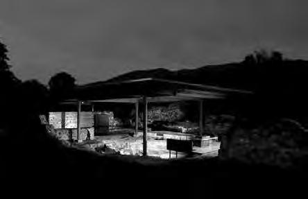
from a professional viewpoint now – understanding its fabric in quite a different way from that of an immersed university student. My first business trip to Perth in 2010 was quite exciting – the very familiar from an unfamiliar perspective. I also have new respect for WA as a place for innovation around sustainability and renewables.
Do you think you need to go beyond to understand home?
I certainly did, but I think we all have individual experiences and expectations.
Advice for others considering a move beyond Perth/WA?
Take full advantage of the opportunities life presents you… what’s the worst thing that can happen?
AVIVA SHPILMAN PARIS, FRANCE
What path led you to where you live now?
In my final years studying Architecture at Curtin I thought it important for an Australian architect to have experience in Europe. I spoke French, had been to Paris twice and loved it and thought rather than go to London, as did approximately half of my year in the following years, I would try Paris first. I thought it best to leave the year following graduation, rather than to stay on in Perth and become too involved in an office and a project.
When does your 'away' become your 'home'?
I still feel Australian and always will, I also feel Parisian, not necessarily French. I believe that it is different for each individual.
In spite of Perth’s isolation, the digital world is now a small place – do you still connect with Perth/WA?
I have remained close to a group of my Curtin Uni friends, be they based in Perth, Melbourne, Sydney or Singapore. The studio years do bond you. Also, Paris is a frequent travel destination so friends do come to visit too. I was also always keen to retain a professional link to Perth/WA and so have maintained graduate membership with the Australian Institute of Architects, thereby receiving Architecture Australia, updates for the International Chapter, etc…
What is your view on international architects for key Perth/WA projects?
Good, bad, indi erent?
The French public works system is unique. All public projects are awarded via a selected competition process, thereby allowing both small-scale and large-scale firms to have a chance to be selected. The competing firms also receive fees for their competition entry. The final entry phase is judged anonymously. This system encourages good design. I believe that is what architecture is all about. Only by selecting the best design will the urban environment improve and evolve. So with the above in mind, if an international firm competes alongside a local firm, may the best architectural solution win!
Does your Perth/WA background in uence your approach to your work?
I have specialised in fields which are rather different from the Western Australian context – large-scale cultural projects - museums, re use of heritage buildings and sites, archaeological site development… However I believe that my work ethic and training have always assisted me in my career. The site is an important aspect to the design process, building orientation, views to the landscape, enhancing a sense of space within a volume…
What's your favourite part about being elsewhere?
Paris is a special city. Culturally there is so much to offer, 365 days of the
- 68 -
year. My children have their favourite artists, they can name the museums and monuments, they do workshops in some of the most famous museums in the world, this is just a part of their life and they are aged 5 and 7!
What's the worst part about being elsewhere?
I miss the Western Australian coast, the space, the weather and family.
Re ecting, how has your view of Perth/WA changed since you left?
I always enjoyed growing up in Perth and never had long-term plans to leave. I love coming home and appreciate all that we have in Perth perhaps more now, particularly through the eyes of my children as they discover the Perth lifestyle and landscape when we are back on holidays.
Do you think you need to go beyond to understand home? No.
Advice for others considering a move beyond Perth/WA?
Don’t think too much, just pack and go. You can always come back to Perth when you are ready.
KATE MOORE PIEDMONT, ITALY
What path led you to where you live now?
Perth - Barcelona - Perth - Barcelona - Italy - Barcelona - Perth - Italy - UKItaly. Something like that.
When does your 'away' become your 'home'?
Sometimes you decide a place is home, sometimes it becomes home simply with time. That way you can have more than one home.
In spite of Perth’s isolation, the digital world is now a small place – do you still connect with Perth/WA?
I follow the websites of my favourite WA studios and read online publications and news. This means WA architecture is an ongoing, live reference, not just a memory.
What is your view on international architects for key Perth/WA projects? Good, bad, indi erent?
Good. As long as they spend the time to understand the project context, they can help bring a global standard to Perth and challenge local practices to keep standards high.
Does your Perth/WA background in uence your approach to your work?
Yes. I generally operate with a kind of naive optimism thanks to having lived and worked in Perth in a time of positive change.
What's your favourite part about being elsewhere?
I don't mind being a bit of an outsider, it gives you a lot of freedom.
What's the worst part about being elsewhere?
Missing out on being part of the change happening in WA/Perth and being far from friends and family.
Re ecting, how has your view of Perth/WA changed since you left?
I see more possibilities from the outside. Problems look smaller from far away.
Do you think you need to go beyond to understand home?
Not necessarily, but experiencing an alternative place helps articulate differences, and this can help you understand home more clearly.
Advice for others considering a move beyond Perth/WA?
Perth is a place full of energy at the moment, so bring lots of that energy with you. Looking back, you're probably going to be surprised at how easy life was there.
- 69•
 PHILIP VIVIAN SYDNEY, AUSTRALIA
What path led you to where you live now? In 1990 I left Perth to study a Masters in Architecture and Urban Design at Columbia University in New York. After working there for three years after my degree I relocated to Melbourne to work with Bates Smart in 1994. In 1998 I moved to Sydney to help establish Bates Smart Sydney.
When does your ‘away’ become your ‘home’?
I believe it’s an issue of mental attitude and can happen at different times for different people. You know it has happened when you stop thinking about ‘going home’ and start thinking about ‘visiting’ Perth.
In spite of Perth’s isolation, the digital world is now a small place – do you still connect with Perth/WA?
I make annual trips with my family to visit my parents. Architecturally I haven’t connected much, having only completed a house for my mother. Hopefully that will change soon.
What is your view on international architects for key Perth/WA projects? It is good for Perth. Architecture is now a global business and star architects are building in all major cities around the world. In Sydney we have buildings by Norman Foster, Renzo Piano, Richard
Rogers, Frank Gehry, Jean Nouvel, Rem Koolhaus, Christof Ingenhove, and will soon have 3XN & Wilkinson Eyre buildings. International architects raise the bar for everyone. There is more competition and developer aspirations are improved, which is good for architecture. The only caveat on international architects is that there should be equal opportunities in competitions for local architects.
Does your Perth/WA background in uence your approach to your work?
Yes, certainly my education at UWA remains a strong influence, with its modernist problem solving approach. Also I had formative experiences working with Ross Chisholm & Gus Ferguson.
What’s your favourite part about being elsewhere?
The personal and professional challenge of establishing yourself in a new city.
What’s the worst part?
Not being close to family, especially as your parents get older.
Re ecting, how has your view of Perth/WA changed since you left?
Architecturally Perth is more confident of its place in the world and the work that’s being done.
Do you think you need to go beyond to understand home?
Everyone should travel and explore
the world in order to understand more about their home. Living away however is a choice.
Advice for others considering a move beyond Perth/WA?
Make no little plans, they have no magic to stir men’s blood! (with thanks to Daniel Burnham).
ANDREW POWER MELBOURNE, AUSTRALIA
What path led you to where you live now?
First I lived outside Capel, then Bunbury, Perth, Brussels, London, Perth again and now Melbourne. My instinct was always to move to a bigger city, for a Seinfeld lifestyle. Now I’m trying to find a balance.
When does your 'away' become your 'home'?
This is a too complicated philosophical question for me to answer so I’ll defer to Metallica: ‘anywhere I roam, where I lay my head is home’.
In spite of Perth’s isolation, the digital world is now a small place – do you still connect with Perth/WA?
Yeah. On Instagram I see updates of Simon Pendal’s latest project. I see what my students are working on. I see what architects in Switzerland are up to. Distance no longer inhibits connection.
- 70 -
What is your view on international architects for key Perth/WA projects?
Good, bad, indi erent?
Good. But instead of being the 51st city to get a Koolhaas project we should take a chance on an emerging international office. Jørn Utzon was practically unknown when he won the commission for Sydney’s Opera House.
Does your Perth/WA background in uence your approach to your work?
Yes. Europeans I’ve worked with have an intuitive approach that comes from being surrounded by architectural history. Coming from WA I learnt architecture from books and so my approach is more analytical.
What's your favourite part about being elsewhere?
The light. Or rather the shadows are softer elsewhere. I think detailing is controlling the minor shadows that are, for example, cast in that shallow depth between a sill and an opening. In WA that shadow is cast in an unforgiving crisp black line.
What's the worst part about being elsewhere?
The beach. Beaches in Perth are beautiful. Perth’s Culture of Congestion happens on the sand between the Indian Ocean and the car park.
Re ecting, how has your view of Perth/WA changed since you left?
Colours in WA are unique. The colour of the sky is blue, really blue, Yves Klein
blue, while plants are barely green, faded like a t-shirt left on the line.
Do you think you need to go beyond to understand home?
Yeah. You can’t understand something without a frame of reference. I only really feel West Australian when I’m not in Western Australia.
Advice for others considering a move beyond Perth/WA?
Word to the wise: Victorians pronounce milk as ‘malk’ and in NSW a beer is called a ‘bēeh’. •
- 71 -
FEATURED ON GRAND DESIGNS AUSTRALIA
With a little imagination and the right bricks, you can create innovative and interesting designs in and around your home.
Take architect Ariane Prevost’s striking new home in Claremont as an example. It features bricks not only as the home’s base structure but also for the internal floors, fireplace and in exposed internal and external masonry walls. All the bricks were selected from the Midland Brick range.
Now imagine how perfect bricks could look in your new home. Whether you want the clean contemporary look of a 1960s retro classic, monochromatic minimalism or a more conventional family home, you can create it with confidence from the Midland Brick range.
For more information on creating something special, call 13 15 40 or visit www.midlandbrick.com.au
- 72The possibilities are endless with Midland Brick MBC9480
Colours and textures are indicative only due to limitations in photographic and printing processes.
a site visit to remember
Author Sarah Besly and Marc Greco
From 2004-2009 Sarah Besly worked for Hugh Broughton Architects as the project architect for the design and delivery of Halley VI, the new British Antarctic base and Juan Carlos 1, a Spanish Antarctic Research Station. Marc Greco is an electrical engineer and previously a Director at AECOM who worked with Sarah as part of the specialist engineering team responsible for the two Antarctic projects.
It's always good to visit a site and get an understanding of context. This visit was very technical. We assessed all manner of site aspects, undertook geotechnical soil tests, studied existing architectural methods, recorded storage needs and observed critical functions and engineering services. But of course for us it was a fabulously exciting opportunity to visit the elusive frozen continent.
We left London with a day temperature of minus 3 degrees, taking several commercial flights to Punta Arenas in southernmost Chile. A Uruguayan Air Force Hercules cargo plane equipped with aluminium canvas-covered seats and a site toilet hut took us to King George Island, a day later than the originally planned time. Winds in Cape Horn are such that the time of departure is when the pilot feels that the hop will be safe. You give your mobile number to check in and walk around Punta Arenas waiting for a call to take off. Important note for the site report: timekeeping to be 'by others' in our tender specifications.
At King George Island we landed on an undulating landscape, mostly covered with icy snow and a multitude of mostly single storey buildings and structures that make up various international science research stations. We were hastily transported on the back of snow cats via icy paths carved through deep snow drifts down to the sea shore. Here we were handed our hefty water survival suits, and over the next 25 minutes learned how to crawl and stretch into them. We were ready to transfer to the Spanish Navy’s ship Las Palmas.
Once again time was not under our control. Each hour that the ship waits at its destination increases the cost of fuel, salaries, and the multiple other costs required to maintain the ship in such remote locations. On ship we were greeted by the captain who suggested that we should count our lucky stars (none to be seen in a 23.5 hour day) because the sunny conditions that we encountered were so unusual that we could not expect it to last. Luckily he was wrong and all we saw was sun every day. And the temperature guage stayed
firmly on zero for the duration of our stay. But in the same zero degrees that we had experienced in London, the 50km per hour wind pierced through our clothing and bodies. Nostrils and the entire breathing circuit experienced intense pain on the first outing onto the open deck. Eventually it was no longer painful, either because the body gets accustomed or because the thermal shock is so intense that the body shuts down the pain.
While chugging to Livingston Island, to our delight we encountered numerous majestic icebergs, each a few kilometers long, graceful creaking giants with extraordinary bands of piercing whites and dazzling blues. The ship’s crew indulged our excitement and we played games based on trigonometry to size the bergs. Some stretched an incredible 3km long and 50m to 100m high.
As we approached our destination, after a pinch to remind ourselves that we had finally made it, it was back to the sea survival kit, this time in only 23 minutes. We were now experts. Joking apart, this body suit allows a person
- 73 -
•

to survive for several hours in the sea, as opposed to two minutes in street clothing.
Our arrival at the Juan Carlos 1 research station was greeted with celebrations, and not just by our project team. Our visit coincided with important events for the base: an exchange of station staff, fresh food and supplies being brought in, rubbish being taken out, simple things but all critical to survival in these locations, and so adding to the great excitement and buzz of seeing the Las Palmas. Both the ship's personnel and the base team exist in various degrees of isolation from the outside world and meeting again was a social event. For our Spanish hosts this event was celebrated in true Spanish style, with plenty of food and wine.
The existing buildings we encountered were a mixed collection of metal structures, where rusting and repairing compete at amazing speed. A few newer structures were GRP igloos with a double skin of GRP “orange sections” sitting on
an aluminium base. Multiple electric heaters work all night connected to a multiple electrical outlet. Before raising safety concerns, we noted that, as with many of the bases installations put together by highly competent site engineers to keep the elements at bay, the igloos, outlets and heaters had stood the test of time.
The new base was to be installed in the same footprint as the old station. It was easier to obtain permission to build if the construction was classified a re-fit as opposed to a new build under the Antarctic Treaty. Although the Treaty is voluntary, the Spanish government wanted to ensure compliance. The site was a flat area several metres above the sea shore. An access path from the landing berth existed, about 2.4m wide. Both sides were lined with lichens that had grown to a humble weed size at the rate of 1mm per annum, 10mm in 10 years, 100mm in a century, and so on. Some life forms down there are so slow they seem barely alive. Protecting them was
super important as they are so fragile and vulnerable.
One highlight of our trip was our visit to the neighbouring penguin colony. The trip was planned with a guide and involved climbing in snow crampons over to the next valley. Worth all the toil and sweat. To be able to get up close and personal with chatty penguins and slumbering seals was extraordinary. On land the nimble little penguins seemed to sense their superior mobility and sidled dangerously close to the seals, an advantage that can be quickly reversed in the water. On the way back we were gifted with fabulous views of the base as we descended from the top of the creek, absorbing the majesty of the place with all of its delicate ecosystems and glorious snow-capped mountains. We were reminded that our design needed to touch the land lightly.
The morning of our departure the faithful Las Palmas returned. Our team were asked to help re-fill the station’s fuel tanks. We aligned a range of rubber
- 74 -
Base Juan Carlos 1. Image: Sarah Besly.
hoses, negotiating with seals on the beach. Each interconnection had to be seated on an absorbing fabric, so a leak would be contained. The ship pumped the mix of diesel with antifreeze from her own tanks, enough to see the base last the rest of the campaign, an operation which took about three hours to complete. The previous attempt had been aborted due to bad weather but this time all went according to plan, in glorious sunshine with a low breeze.
We adjourned the final design team coordination meeting to request that the base commander officiate at a slightly unusual ceremony and a first in the Spanish base. The project architect and lead engineer requested that the base commander officiate for the closest we could persuade him to get to a marriage ceremony, without compromising the Spanish statutory authority of the commander of a research base. We learnt that such authority is not too clearly defined in the Spanish Constitution, or if it was, Daniel had not been informed.
We sat for our last lunch and looked through the windows. The weather suddenly turned grey, our local bay was filling with sea ice boulders in a range of sizes: small, medium and large. The inflatable support boats would not cope with these ice boulders and the safe working method statement (SWMS) resulted in a 'not on my watch' outcome, which lives at the bottom of the appropriate Admiralty form. The ship’s captain was uncomfortable about getting locked in by the sea ice as the ship did not have an ice-reinforced hull and wanted to leave right away, without us. Our departure was suddenly at risk. Images of children at Christmas without daddy invaded the thoughts of the parents in the group. The sequence of events was such that Christmas in London or Catalonia were on critical path.
Unexpectedly, a last minute deal allowed us to jump onto the Las Palmas if the base was prepared to risk the use of its own inflatable support boats. With the prospect of seeing Christmas
with the family in London, we got into our survival suits in 22 minutes and 50 seconds. The same journey in reverse took us back through King George, Punta Arenas and, for some lucky ones amongst us, through a warm beach stop in Chile before returning to sub-zero temperatures in London. •
- 75 -
Base Juan Carlos 1. Image: Sarah Besly.
1 – 3 December 2015
State Theatre Courtyard
Mobilia is proud to host three of the world’s leading designers at this year’s Design Circus at The State Theatre Courtyard, Perth. Sharing their knowledge, insight and experiences through workshops, lectures and intimate Q&As, the Design Circus is a must-see for any designer or architect.
*The Indesign launch event will follow Doshi Levien.
Xavier Manosa
After a short five years, ceramicist and designer Xavier Mañosa has shot to international fame for one of his ceramic creations, the Pleat Box collection for Spanish lighting company Marset. Designing and supplying his ceramic pieces for other design companies around the globe such as Kettal and BD Barcelona, Manosa is at the apex of designers adopting ceramics as a medium. Come and join Xavier Manosa as he provides an interactive experience discussing the intricate process of his creations.
TUESDAY 1 DECEMBER, 10.30 - 11.30AM
Nina Maso
Co-Founder of international lighting giant, Santa and Cole, Nina Masó is one of the most experienced member’s of the Santa and Cole team and a big part of its strong design culture. At a time where women in the industry were rare, Nina’s vision and plight to pioneer Santa and Cole to the established brand that it is today is a story that she will share with guests during her intimate Q & A. She will cover a range of topics, including the limitations she experienced starting out over 30 years ago, defending intellectual properties, and how they crusade against replica design.
TUESDAY 1 DECEMBER, 1.30 - 2.30PM
Doshi Levien*
Doshi Levien is an internationally acclaimed design studio founded by designers Nipa Doshi and Jonathan Levien. They are the recipients of this year’s Prestigious Elle Decor International Designer’s of the Year. Designing for furniture giants such as Moroso, Kettal and B & B Italia, Doshi Levien are currently one of the most sought after and established design studios. Travelling from their London Studio, Doshi Levien will conduct a lecture for a limited number of viewers, discussing some of their famed design pieces, the industry globally, and sharing their journey to design stardom.
TUESDAY 1 DECEMBER, 7 - 8PM*
To purchase tickets and to see the full schedule of events, go to: www.thedesigncircus.com.au
- 76 -
@mobilia_ mobilia.com.au
presented by
- 77 -


exchange.


into asia out of the cloud
Author Garry Lawrence
A look to the beyond
In 2011, four medium-sized projects stopped in one week, followed by another two 4 weeks later. I thought, there’s got to be something more productive. So I phoned an old friend, Peter Coney of Pure Projects, who I had worked with in Dubai and was in Asia and considering this New Dehli project. His client: Dr Modi, a lovely man and an extremely wealthy benefactor who builds public hospitals, wears a trilby, and saw the westernisation of India coming in a tidal wave of the young nouveau-riche and the relaxation of religious limitations. Dr Modi, in observing this change, saw demand for a high-end nightclub which would reflect local cultural nuances coupled with the style and feeling of medieval luxury, class and history.
The opportunity
The commission: the S Pangaea nightclub in New Delhi. The nightclub operations consultant: The Ault Group, founded by Michael Van Cleef Ault who opened his first Pangaea at the age of 19, and has reportedly opened another 30 to 40 nightclubs since. The site: 650m² on the ground floor of the Ashok Hotel in the centre of the diplomatic quarter of the city. The entrance to the hotel is a podium ramped up from surrounding topography, resulting in the ground floor sitting four floors above the streets behind the hotel. Built in 1958, the Ashok was the first 5 star hotel in India. Our role was Design Architect and Project Management with a local Architect of Record to document the
project and be responsible for statutory approvals and certification at our instruction.
Best laid plans
The construction program for the S Pangaea was 12 weeks from commencement; very tight in itself, but it was to get much tighter. I arrived for a weekend on the first due diligence trip, walked into the site and hit a wall of stench - it stank to high heaven. I learnt later that the incumbent tenant had lost the tender, and his response was to destroy the joint. Cast iron and earthenware drains, ductwork, hoods, walls - everything was smashed, and the budget now needed to include a complete infrastructure replacement.
My search for documents was fruitless: the only thing I could find being an A4 photocopy of the very old lease, with hand drawn tenancy lines. Having only this to work with, I took some key dimensions, produced a Revit 3D file and photographed everything. I developed the brief that afternoon with Michael Ault. We had the CAD drawings from the Singapore Pangaea for all the corporate standards and I used these to sketch the best fit planning that night in the hotel room – still only on yellow butter paper.
The concept design and a style based on Michael’s briefing was completed, but documentation had to follow immediately if the project program had a chance. The deal also had to be signed before we handed over design
documents to the Architect of Record as there was a risk of losing all the intellectual property. This mistrust is an unfortunate reputation of the sub-continent, but it proved to be misplaced.
Working between Perth and New Delhi
After a two-week delay in signing the contract, and no start by the local architect on construction documents, I made a decision to produce the first stage of documentation for the project before returning to the site two weeks later. The Revit file was worked up by Kristian back in our office in Perth –this was our opportunity to launch the ‘virtual office’ business model we had toyed with. Kristian was confident. I was scared stiff as I flew out, unsure if I was up to such a massive elevation into cyber production of architecture.
We started by updating the 2D CAD drawings, emailing the files backwards and forwards. This process would later be streamlined using dropbox and then cloud management. Using the Revit file we were able to produce a set of drawings for the local architects when I met the team the following Monday. They had programmed four to six weeks for this process.
The program
Continuing with the fast-paced program this project necessitated, I identified some key requirements:
• the Architect of Record needed to have documents ready to go within five days;
- 80 -

- 81•
S Pangaea by Lawrence Architects. Image: Shovan Gandhi

- 82 -
S Pangaea by Lawrence Architects. Image: Shovan Gandhi
• the builder must be appointed through a negotiated contract, not tendered, and immediately appointed;
• all financial certification was to be under my hand ;
• payments had to be made within 48 hours; and
• all contractors must accept a 24 hours a day, 7 days a week commitment to the project if necessary.
Breaking ground
The first thing I saw on the 3am site walk with the Client Director, who had picked me up from the airport, was that one quarter of the floor had been jack hammered. The light was dim and I couldn’t quite believe my eyes. The old floor was a slab poured over rubble 600mm thick above the structural slab, and due to the difficultly and high cost to have it removed, I had decided to leave it untouched. However, to help me out, Dr Modi had commenced the demolition of the floor, on my behalf, while I was back in Perth. We now had 42 labourers working 24 hours a day to carry 65 ten-tonne truckloads of rubble down eight flights of stairs, using carrying dishes on their heads. It was completed in two weeks.
Achieving Program
Getting contractors to accept the ‘24/7’ commitment was key to the program, and I started with the structural engineer. What I needed by 8pm that evening (drawings for the removal of the eight structural steel columns and their replacement with beams), he said would take two weeks to complete. The threat of using another engineer elicited his commitment.
I then moved on to the structural steel fabricator, who was to receive the drawings that night. I needed the beams delivered to site on Wednesday morning, and was again advised it would take two weeks. What was it about two weeks? I explained the engineer’s commitment, but his boss would have to agree. I assured him that if they actually achieved this challenge, he would remember it for the rest of his life. He mobilised the plant that afternoon and the raw steel was cut to size and ready to transport to site on the Wednesday morning. It took 20 men to carry each beam, shuffling each one 100 metres up the ramped entrance to the building, up two flights of stairs, and across the marbled lobby into the site.
Other contractors spread the story; it became viral, almost legend. The energy synergized across all trades and the comradery was a phenomenon I have never witnessed before in my career. I lived on the seventh floor of the hotel and I would walk through the site at three or four in the morning. Workers would greet me and smile, while contractors outside the site jostled to get work on the first Pangaea nightclub in India.
Design highlights Michael was extremely proud of his artist sister Faith who had produced an amazing collection of renaissance reproductions including the 12 x 16 foot ‘Death of Sardanapalus’ - an 1827 Delacroix masterpiece. We used all eight of her pieces, incorporated into a theme with burgundy shrouded curtains. Sadly, Faith had died of cancer several years before. The hanging of her work
was an extraordinary exposé of a life’s achievement.
Traditionally, a groom, dressed in jodhpurs, walks a steed through the streets; the broken, calmed horse a symbol of the man and his acquiescence to married life. In colloquial contrast, we installed a ¾ scale rearing, unbroken stallion over the door of the main entrance, epitomising the very opposite phenomenon and matching the thematic energy of the nightclub.
Reflections on working in a place beyond The team created a venue that sets a benchmark for nightlife in Delhi. Asia is 5 – 10 years behind western detailed construction: plans and sections are no problem, but more than that requires an extreme level of patience and supervision. The International Building Code has been adopted, but its implementation relies firstly on professional documentation, then on confidence in either the third party consultant certification or the veracity of the statutory authorities’ certifying officers.
The professional team were very much aware of the ‘Indian context’ and there was a wonderful frankness in our discussions. Armed with enthusiasm and professional aspirations, there is a tenacious struggle to succeed and, to varying degrees, there is steady and confident progress. •
- 83 -

- 84 -
‘Tehran 260 217’ by Sarvenaz Norouzy. 2013. Pinholes in bamboo paper. Image: Mel McKee.
go away and come back
Author Robyn Creagh
In October of 2013, Robyn Creagh and Shannon Lyons curated an exhibition of works exploring the experience of travel in reference to a personal and professional undertanding of architecture and place. Robyn reflects on the development of the exhibition and the body of work presented in reference to the theme [WA AND] BEYOND.
Why did you put the exhibition on?
What was the motivation?
I approached Shannon Lyons about co-curating a show with me in 2013. Looking back on it I’d say there were three things that came together at the same time. Firstly, Shannon and I had been having some interesting conversations about places: placefulness and placelessness in architecture and art. We were both doing PhDs by creative practice at Curtin and had met at a workshop there. I really liked Shannon’s work and her understanding of galleries as a site. Secondly, the previous year I’d shown some visual work from my PhD project at the Australian Urban Design Research Centre (AUDRC) and that had been such a positive experience I wanted to include other architectural designers in some further research through visual enquiry, exhibition and reflection. I was thinking of it as a capacity-building project, and Shannon and I designed the call out and the run up to the exhibition as a series of mentoring and feedback sessions for those who wanted them. The third condition was that there was an usually high number of recent Peter Hunt Travel Prize returnees in Perth at the time and I wanted to make a platform for them to talk
about their travel experience and the importance of it to their architectural work—something more than the usual powerpoint presentation. It was nice for Peter too, to see this exhibition collected around a theme he’d been championing for years.
What is it about going away and coming back that is important to our understanding of architecture?
Two main things come to mind. Firstly, going away and coming back is part of the life experience of many people in Perth. The way we live here, as a mobile and diverse population, fills the city with references to elsewhere. As designers, it is important for us to understand that context. Specifically it is crucial that we are able to recognise places as connected and malleable.
Some of the philosophies of place that underlie architectural discourse can seem politically suspect when one meaning or ‘sense of place’ is prioritised over all others. That kind of thinking is out of step with the mix of cultures and connections in Perth, in Australia, and if we’re honest really, we can see that every place in the world is connected and changing.
Secondly, the Grand Tour. It sticks to this discipline. I think it’s also important to be critically engaged with that. For me the vital question is not about what masterwork you go and see but what do you bring back, and what use is it?
That’s where the name of the exhibition came from. As I understood it, the Peter Hunt Travel Prize’s intention was to help you ‘go away and come back and contribute’. So if our contemporary architectural grand tour is a marker of cultural superiority, as it was for young men of a certain standing in the 18th Century, then that’s a bit disappointing. Of course we should tell each other about what’s great ‘over there’, but it is just as important that we talk about how it lands here. Let’s get into how an architectural idea is shifted by the particular context—like people, culture of building/procurement, climate— that’s a fascinating critical-creative process. I think we could be better at engaging with and reflecting on those networks of influences.
Were there any ndings, common links, or new understandings from the body of work on this topic?
I think it is interesting that in this exhibition images were very much a
- 85•
moment in a series of experiences. There’s no suggestion that moments represented are a condition that has been for all time, or that will endure. I think that is very different from what you might generally expect in a showing of architectural works. The photographs we saw were cut, bounded; there was no suggestion that a moment lasted any longer than the instant of taking the photo. For example, Shane Winter’s work was very quiet, but the date and time stamp, combined with the need to lift a sheet of paper to view each photo really located photography as a personal experience: a moment of a space and a person that are in motion and changing. The moment is still around, in Shane’s memory, but it’s not discrete and continuous. It’s contingent, part of his story.
Which leads into another observation from the show: there is no suggestion of a universal experience. What we see instead is a truth of a moment, or a series of moments, as part of a person. How a person might negotiate these contingent moments was something that Sarvenaz Norouzy’s work Tehran 260 217 explored, I think. This work was a fabricated map made up of cities that reminded Sarvenaz of her childhood home, Tehran, which no longer exists
in the same way as she remembers it. You can see a layering of places into everyday experiences, and the crossrelation of places to make our own image of ourselves in a city.
The connection between places also plays out in the design process. Alexandra Mackenzie’s work drew out this relationship as it accumulated over the duration of the exhibition. New Work – Northam House moved in space and time along one wall of the gallery. In this work we can see architectural design as travel—a cycle of encounter and analysis. Thinking about architecture through the lens of travel is useful. When you are travelling you are almost forced into an awareness of your subjectivity. You are constantly in the process of trying to understand the culture that you are moving through, trying to build a new model with all this new information. I think this exhibition questioned the idea of a building as an isolated design work and located architecture instead in a network of experiences, of ‘comings and goings’ as Alexandra put it.
Is there any further work stemming from or relevant to this exhibition?
In terms of the PhDs that Shannon and I were doing at the time, it served as a bit
of a cross check. My project got wrapped up last year, and Shannon’s is almost there now. As for where the exhibition itself might still go... well this interview was quite a surprise. Given the theme of this edition of The Architect, it’s clear these issues are still being thrown about in Perth. We’ve still got audio of the peer review, and video documentation taken over the duration of the exhibition. We’d like to do something with Frazer Macfarlane and Hannah Gosling for their Blue Carpet Collective archive project.
And it’s exciting to bring architects, designers, and artists together in the same space. I think Future Histories shown at the AUDRC (12-26 June 2015) was another great example of that. Leonie Matthews and I co-curated a show at MAC (Mundaring Arts Centre, 21 August-27 September 2015) which also brought together architects, designers and artists reflecting on everyday domestic objects. The show’s called Still Life, and of course life is not still: there’s movement even at home. Objects and interiors get layered up with memories. Their meaning shifts.
- 86 -

From Sarvenaz: ‘I nd the familiar in forgeign, unpossessed places (Italo Calvino, ‘Invisible Cities’). In Havana, Santiago, Barcelona and Hanoi I found fragments of Tehran, the city of my childhood. In these chaotic cities, full of vibrant life and dark history, I feel a familiarity that eases the anxiety and absence I feel in open suburban Perth. I explore this experience through map making; time capsules which hold lessons about con ned spaces, density, essential compromises in dense urban context and the uid nature of memories.’
From Amanda: ‘In this work the strong decorative culture of Spain is understood in the context of materials and craftsmanship. ‘The mosaic tile’ is engaged with through the prism of the economic culture of Perth City. Visiting and experiencing many cities common to a region, where tradition can be continued through architectural style and form, I observed time and place connected by an urban identity. The work explores the value of a decorative urban culture combating the blandness of Perth, and confronting the theorisation of architectural modernism on ornament and crime.’
From Hannah and Lucy: ‘The globe is a log of our joint and separate travels since meeting at university. The album is a small study of a place at which our travels intersected. These contact prints literally reveal two points of view of a few days in a place. The enlarged images were those selected and displayed separately on Facebook to narrate back to others what this place, its architecture and experience was.’
From Alex: ‘I understand design as a series of comings and goings, phases of gathering and binding, and architecture as a solidi ed point on that continuum. For me this exhibition comes after recently going away to Europe and coming back keen to build something; and for a time, going to Northam weekly and returning. Every return is marked by a step in some direction. This month my brother and I bought a lot along the river in Northam. The work is a two week slice of design.’ •
- 87 -
L-R: ‘Tehran 260 217’ by Sarvenaz Norouzy. 2013. Pinholes in bamboo paper; ‘Pattern Patina’ by Amanda Hendry. Folded detail paper injet printed with images:‘The World Since Architecture School: Intersection VIII’ by Hannah Gosling and Lucy Fuchsbichler. Globe: cloth, felt, yarn and buttons. Album: cloth and paper; Map by Mark Robertson. Foam core mounted digital print; ‘New Work –Northam House’ by Alexandra Mackenzie. Photographs and drawings. Image: Mel McKee.
[wa and] berlin: defining what is beyond
Author Drew Penhale and Shane Winter
Penhale & Winter presently work from opposite sides of the world; one in a detached studio in Beaconsfield, Perth and the other in an apartment in Prenzlauer Berg, Berlin.
Residing in two hemispheres, on two continents, within two countries, in two cities, upon two streets, in two buildings and two rooms, we collaborate on several ongoing projects across Perth. Given the physical separation from one another we remain connected via the ‘cloud’, daily emails and internet telephone calls and bound through the everyday running of the practice.
The spaces we occupy and work within provide the background from which we communicate, design, problem-solve and discuss ideas. They have become personal domains that are also, for each partner, an extension of the practice and a place beyond the immediate.
Shane Winter – The Berlin Room
Elevated above a granite sidewalk, the apartment is located in a house containing eleven other dwellings. Spread over six floors, two apartments share each level, a mirrored copy of the other. The house connects to a series of neighbouring buildings, creating something typical in Berlin, a private internal courtyard.
Entering the apartment, the blue carpet of the communal stairwell is replaced by solid pine floor boards, bevelled slightly along the edges. Facing the street, a
white timber door opens into a room modest in area and generous in volume. All walls are wrapped in white textured wallpaper with a double glazed window, composed of three small rectangular glazed panels, positioned to the right of the thickened external wall. Extending along the adjacent wall, a long work desk contains a computer, several used cigar boxes, a porcelain vase holding pens/pencils, a tea cup full of coins, a telephone, layers of paper and much general clutter. Two chairs sit under the table, a printer placed atop a drawer unit and framed drawings by my daughter hang from the wall.
Framed by the window, the street is in constant flux: light, movement, noise and activity. The hum of two lanes of traffic is separated by a strip of mature lime trees and a shifting arrangement of parked cars. Beyond, the composition of balconies and windows span the length of the street. Behind the facades, dining, living and bedrooms contain the everyday spaces of others: curtains, shelving, books, folders, flowers, plants and arrangements of floor and ceiling lights adorn these rooms. Above this scene, a thin slither of sky is visible.
Looking into the apartment through the hallway, bedroom and balcony reveals
a walnut tree in the inner courtyard garden. Distinct but softer sounds emanate from unseen spaces of the apartment and courtyard: children playing, adults talking and music from the living room combine to create its own distinct score.
Drew Penhale – The Beaconsfield Room
Near the top of a limestone ridge, an unsealed lane leads from the street past vacant lots to an elevated, rendered brick house. Next to the house sits a detached room above a garage with a curved stair leading up between the two. The studio is only accessible via the main house and helps form a courtyard around an external timber deck. Five steps lead up from the court to a landing and the glazed door of the studio. A timber screen blocks views of the interior from the courtyard.
Blonde timber floorboards and white plasterboard walls and ceilings, two large full width windows face east and west with vertical blinds. Materially unassuming, the primary experience of the room is looking outwards, beyond and down.
A long table along one wall holds white folders and a printer. Another table with a computer and a notebook. Another
- 88 -


with, modelling equipment, coffee mugs and tile samples.
Outside in the courtyard the sounds of a young child playing with a dog around a trampoline set into the decking. A eucalypt and the city of Perth in the distance. From the west the sound of birds and the Port.
Suburban brick and tile houses below, stretching to the coast. Some vegetable gardens and the masts of boats in a marina. The Indian Ocean occupies the horizon and the vastness of the blue sky above.
On a chosen day, at a specific time, we decided to map the two separate rooms. Using the cardinal points to position and orientate ourselves, we sat at our desks and began charting our immediate surroundings. Extending outward and beyond, we identified fields, limits and boundaries: the desk, the room, the street, the horizon etc, each containing elements specific to our individual landscapes.
Defining and merging these observations, relationships appear. Suburban landscapes of brick and tile exist alongside an urban


streetscape of rhythmic brick facades. An expansiveness of blue sky converges with flatness of grey cloud. The sound of a house door closing occurs concurrently with the shriek of a child playing. Small seemingly disconnected moments coexist in one space.
Presently a 25mm line of masking tape wraps around the walls of the Prenzlauer Berg room, marking the height of a ceiling for an addition in White Gum Valley. Ideas from Perth are frequently tested in Berlin, discussed, refined and sent back. The potency of our collaboration lies in this exchange, to listen, test and discuss, as a way to form an appropriate response. For a large part, the way we work is determined by the separation from one another. The room is a vessel sharing common themes of the practice and a canvas on which a distant space becomes present.
- 89Engineering Consultants Australia
•
Fresh Thinking and Dedication
CommissioningManagement
Suite 2, 10 Elder PI Fremantle WA 6160 AU email@econsultantsau.com Recent Projects: • New Perth Stadium, • 480 Hay Street Development Perth CBD, • Fiona Stanley Hospital Development Murdoch, • Queens Park Station Upgrade, • Newman College Auditorium. 78 % Repeat Business Customer Satisfaction rated 84%
Designing, Commissioning Management Strategic Advisory Services
Precinct
Surveys
Electrical
BEYOND
WINDOW
BEYOND
BEYOND
- 90 -
DOOR FENCE WALL
BEYOND
WINDOW
WALL DOOR WALL
WALL
Drew
Boxes under desk A3 Printer Stapler Scale Ruler A4 project folders on desk Blinds hang from wall Books stacked on floor Computer Desklamp Balustrade
brick & tile houses houses below Blinds hang from wall Boats in
marinamasts sticking up Indian Ocean Expansive blue sky Magpies Singing Timber Screen Norfolk Pines at
Tree in courtyard
houses Walls and roofs of neighouring houses Perth CBD visible in the distance Trees swaying in breeze Timber deck Insert trampoline into ground Large eucalyptus tree Rubbish Bin People walking
alley-way below New house blocking view to Fremantle Jasmine playing
Exercise equipment Shane Winter A4 project folders stand on floor against wall A3 Printer placed on white drawer box Desklamp Scale rule Two granite stones on window sill Three glass panes & handle positioned to left Blind covers top of window Heating below Pedestrians talking Sound
suitcase
sidewalk Balcony
White curtains drawn
Orange
roof
sky Police siren Car passing Brick chimneys Hum from vehicles moving east Hum from vehicles moving west Parked Black Car Lime trees Holepunch Mobile telephone Rubbish Bin Landline telephone Backpack on
Ceramic jar holds pens & pencils Coins in tea cup 8B Pencil & Paper Pagwood
covered in Lambswool Laptop sitting on cigar box Cigar box Paper reminders pinned to Wall
STREET BUILDING HORIZON
WINDOW
Penhale
Scattering of
the
Clothes-line
Neighouring
and talking along
with Shammer
of
on
with flowers growing from planters
Neighbour moving around living room
tiled
& glimpses of
Floor
Chair
Hand drawing by Isobelle within white frame
Two canvas bags hang from hook
Sound of house door closing
Neighbours talking in stairwell
DOOR WALL
DOOR WINDOW
- 91BEYOND
Norfolk Pines at South Beach folders floor wall Sound
window banging Hand drawing Isobelle within white frame canvas bags from hook
& an umbrella hang from hook
of
Two coats
floor boards
Reflections on timber
White sheets cover bed mattress Walnut tree within courtyard Children playing Music from radio
Image: Penhale & Winter
BEYOND THE BUNKUM
Author Ian Dewar
Architecture is the art and science of Building (Collins)
Architects design and superintend Buildings (Collins)
SO GO BEYOND
Graduation
Registration
Academia
Pop media
Performing arts
Charlatan’s parts
Competitions
Exhibitions
Programs
Anagrams
Archi-speak
Gender pique
Parlour games
Quirky names
Ancient enigma
Peer group stigma
Confected passion
Current fashion
Virtual schemes
Hackneyed themes
Computer modelling
Beyoncé ogling
‘Sustainability’
Sans durability
Climatology
Architechnology
Members perks
Unbuilt works
Wanton solicitations
‘Iconic’ a ectations
AND SIMPLY MAKE A PROPER BUILDING (or two)
- 92 -
Site Architecture Studio ARCHITECT
Engineering Technology Consultants / ETC
LIGHTING AND ELECTRICAL SERVICES CONSULTANT
The Mary Davies Library and Community Centre has provided Baldivis not only with new community facilities and a new found identity, but also provides the visitors with an inspiring sensual experience. It blurs the lines between indoors and outdoors, nature and building, new technology and tradition, intimate restrained retreats and large expressive spaces.
A key feature of the design concept of the library and function hall spaces are the structural trees and uninterrupted timber ceilings or ‘canopies’. The lighting design and Mondoluce’s light fittings achieve the vision of a clean, services free ceiling by using the iGuzzini Le Perroquet projector up-lights to indirectly illuminate the large open flexible spaces. Equally set around each structural tree column these expressive light fittings add to the overall design feature and have become an integral part of the design. The design approach allows easy accessible servicing of all light fittings, even within large open spaces and ceiling heights up to 9 metres.
CLIENT City of Rockingham ARCHITECT Site Architecture Studio LIGHTING AND ELECTRICAL SERVICES CONSULTANT
Engineering Technology Consultants Pty Ltd / ETC BUILDER
PACT Construction ELECTRICAL CONTRACTOR ADCO Electrics
PHOTOGRAPHER Ron Tan
To visit the featured Project and get a taste of the Living Showroom and the excellence in design
which Mondoluce is renowned, use the QR code reader on your
+61 8 9321 0101 mondoluce.perth mondoluce.com.au
and execution for
smart-phone.


 Image: Michelle Kar


 PHILIP VIVIAN SYDNEY, AUSTRALIA

