The A rchitect WA Homes Edition
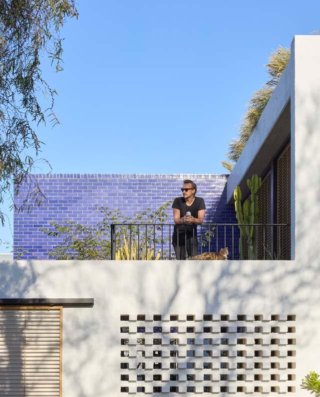


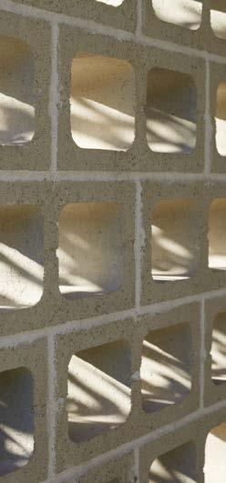
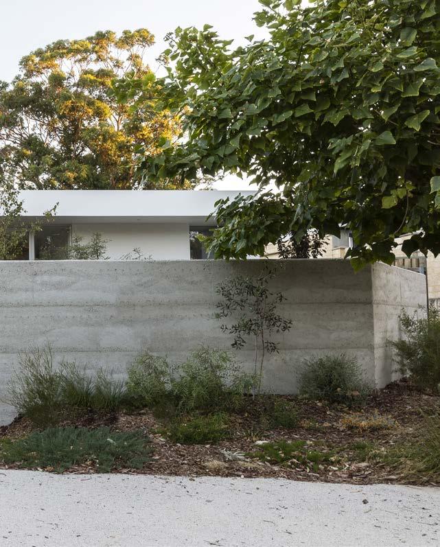
Using Midland Brick masonry blocks, leading WA architect Andrew Hagemann’s Filter House has achieved a 7.1 NatHERS Star rating. With a brief strong on environmental performance, thermal mass is employed using concrete masonry walls to create a robust and life fulfilling environment. Breeze Blocks are used to filter the harsh eastern and western sunlight through flanking filigree blade walls.

The Australian Institute of Architects is the peak body for architecture in Australia representing over 13,000 members globally, committed to raising design standards and positively shaping the places where we live, work and meet.


The Architect is the official publication of the Australian Institute of Architects – WA Chapter. This WA Homes 2022 edition focuses on West Australian homes designed by West Australian architects.
Kedela wer kalyakoorl ngalak Wadjak boodjak yaak. Today and always, we stand on the traditional land of the Whadjuk Noongar people.


Medium density focus
By Sandy Anghie
80
OPINION
What is affordable housing? Good question.
By Michelle Blakeley
Affordable housing
By Rachael Bernstone
Carbon neutral case study: Nic Brunsdon
By Nic Brunsdon Climate – What must we do?
By Ross Donaldson
94 RETROSPECTIVE James Taylor Thomas Michael Croudace Bernard Seeber 100 PRODUCT PROFILE Midland Brick 102 OUT OF THE ORDINARY Ephemeral Lookout
104 PRACTICE PROFILE Whispering Smith 110 ARCHITECT AT HOME Jimmy’s House – MJA Studio
Publisher Institute of Architects WA Chapter 33 Broadway Nedlands WA 6009 T: (08) 6324 3100 architecture.com.au @architects_wa
Warranty: Persons and/or organisations and their servants and agents or assigns upon lodging with the publisher for publication or authorising or approving the publication of any advertising material indemnify the publisher, the editor, its servants and agents against all liability for, and costs of, any claims or proceedings whatsoever arising from such publication. Persons and/or organisations and their servants and agents and assigns warrant that the advertising material lodged, authorised or approved for publication complies with all relevant laws and regulations and that its publication will not give rise to any rights or liabilities against the publisher, the editor, or its servants and agents under common and/ or statute law and without limiting the generality of the foregoing further warrant that nothing in the material is misleading or deceptive or otherwise in breach of the Trade Practices Act 1974.
Important Disclaimer: The views expressed in this publication are those of the individual authors and do not necessarily reflect the position of the Australian Institute of Architects. Material should also be seen as general comment and not intended as advice on any particular matter. No reader should act or fail to act on the basis of any material contained herein. Readers should consult professional advisors. The Australian Institute of Architects, its officers, the editor and authors expressly disclaim all and any liability to any persons whatsoever in respect of anything done or omitted to be done by any such persons in reliance whether in whole or in part upon any of the contents of this publication. All photographs are by the respective contributor unless otherwise noted.
ISSN: 2653-1445
Whether bringing aesthetic beauty or strategic functionality to a space, lighting plays a vital role. Mondoluce embraces the collaborative approach with industry professionals to provide highly-functional and aesthetically-brilliant solutions to your residential project.


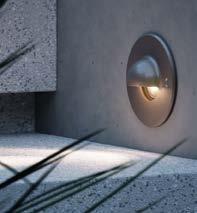
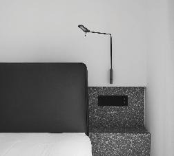
For your next project, let’s partner in light.

While Australian homes are currently the world’s largest, and West Australian homes among the largest in the country, in this edition we show how small is beautiful – and sustainable.
The projects in this edition of The Architect illustrate the many, varied interpretations of home in Western Australia – from Philip Stejskal’s renovated heritage project Higham Road House, through to Simone Robeson's Hyde Park House. But one thing all our featured homes have in common is a focus on sustainability.
On the cover for this edition is Jimmy’s House by MJA Studio with Studio Roam and Iota. Small and sustainable, this exceptional house addresses broader agendas including neighbourhood generosity, passive environmental performance and biodiversity.
While West Australian homes are among the world’s largest, with ever diminishing gardens, Jimmy’s House takes a stance against these trends. It shows how beautiful, high quality spaces can be achieved on a tight 256sqm site with an environmentally sensitive design. Incredibly the home’s planted gardens and courtyards are greater in area than its lot size.
With a move toward increased density in Perth’s suburbs, it is great to see that a focus on quality outdoor spaces is central to the State Government’s new draft Medium Density Policy. We revisit the draft policy and showcase a built example in MDC Architects’ Recreation Road Project.
This year’s federal election brought focus to the issue of climate. With the built environment accounting for 39% of carbon emissions, Ross Donaldson explains why we must be now measuring the whole-of-life carbon in our buildings, while Nic Brunsdon discusses the potential of carbon offsetting, certification and ethical practice.
As we have in each of our previous WA Homes editions, we reflect on the fact that not everyone is fortunate to have a place to call home. In opinions from My Home’s Michelle Blakeley and journalist Rachael Bernstone, we consider whether the Australian dream needs to be redefined – to be a fair and equitable housing system where all Australians have access to safe, secure and affordable housing.
As is the tradition with The Architect, the stories in the magazine have been written by volunteers, architects and writers kindly volunteering their time and talent to help us promote West Australian architects and architecture. Thank you to all of our contributors. Thank you also to our graphic designer, Felicity McDonald, for her beautiful work.
We hope this WA Homes edition of The Architect provides you with inspiration and that you enjoy our stories, with their varied styles and points of view.

Let us know what you think.
Write to me editor@thearchitectwa.com
Sandy
AnghieEmma is the editorial and publishing lead at the Australian Institute of Architects. She is a contributing editor, architectural writer, and researcher with experience in literary archives.

Felicity is a graphic designer and co-manages Public Creative with her husband Peter. Together they have been managing the design and production of The Architect magazine since 2013.
An architecture and interior photographer, Dion works with award-winning clients from large multinationals to leading-edge architectural and interior design practices.
Yang Yang is a senior architect at Philip Stejskal Architecture. He is also an artist, EmAGN subcommittee co-chair, and often teaches at Curtin University.

Rachael Bernstone is a journalist who writes for various publications. She is also the founder of Sounds Like Design, a communications and business strategy agency for architects.

Ryan is an architect at RAD architecture, EmAGN committee member and contributor to the podcast Hearing Architecture.


Michelle leads her own architecture practice developing more efficient living spaces and is founder of My Home housing delivery for people who are homeless or at risk of homelessness.

Andrew is an architect at Andrew T Boyne Architect.
Nic is one of Australia’s leading architects, being recognised with the Australian Institute of Architects Emerging Architect Prize, recipient of the Dulux Study Tour and the Gil Nicol Biennial International Study Bursary, among other awards.
Formerly group managing director and chairman of Woods Bagot from 2006 to 2016, Ross now consults on strategy.

Ric is an architect at Klopper & Davis with a strong passion for all design and constructionrelated activity. He feels a strong connection to his hometown and is actively working to assist in building a greater appreciation and understanding of architecture throughout Perth.
Reinette is a graduate of architecture at Hames Sharley. She is passionate about the future of architecture, as seen through the lens of current emerging architects, and what this might mean in working towards a sustainable world.
Amber is a former journalist with over twenty years experience in public relations and communications. As the daughter of architect George Sheldon she is genetically predisposed to an obsession with design. She is the founder and director of Pretzel Communications.

Cassandra is currently completing her Masters of Architecture at the University of Western Australia.

Pip is a Perth-based architect who has practised throughout WA for over 10 years. She is passionate about unifying all design professionals for exceptional built environment outcomes.


Having first enjoyed a career as an actor and a writer in both Australia and the UK, Jonathan retrained as an architect. He now works with the team at MJA Studio.

Domenic is a registered architect, and a PhD student and academic in the areas of architecture and urban planning at The University of Melbourne.


Trevor is a graduate of architecture at Hames Sharley, and a writer and contributor for the COarchitecture platform.


Higham Road House by Philip Stejskal Architecture has been expertly woven into the historic fabric of its neighbourhood, serving as an exemplar of how heritage, retained and celebrated, can inform and enrich design solutions to provide beautiful, functional spaces for a family to live and grow.
The clients, Kristen and Paul, had lived in the original two-room worker’s cottage for several years prior to embarking on the renovation and addition project. Having created strong bonds with their community, they knew this was where they wanted to raise a family. So, they engaged Philip to provide them with a beautiful addition to their home.
Sited on Wadjuk land, within a heritage area of North Fremantle, the original 1920s cottage was constructed on a 427 sqm block, which falls three metres from front to back.
As the 1920s cottage was built long before cars were a consideration, they decided to create a new garage space as part of the rear addition. With the fall of the site not quite sufficient to accommodate this, a step up in section from the cottage floor level to the addition was required. The resulting transitional area is described by Philip as “a blurry space” – with a bathroom, storage, playroom and places to sit.
Philip thought it “felt natural” to split the levels of the home and shift the living, dining and kitchen spaces horizontally toward the rear of the site. “We knew we had to carve out space in the middle to take advantage of the north light,” says Philip. This became a

means of providing a middle ground, where the occupants can look within to the serenity of the central courtyard, with its crepe myrtle.
Beyond the central courtyard living areas, there is another step up in section to the respite of the master bedroom suite. The level below this bedroom contains the living room which is connected to the backyard.
These shifting levels and their relationship to one another are beautifully handled in the interior spaces. Batten walls provide visual and spatial connection across the delineating stair voids knitting spaces together internally, while high-level ribbon windows and operable screens curate privacy and views to the street, the sky and the neighbourhood.
Kristen and Paul had a clear notion of the materials they wanted to use to invoke richness and texture. Below ground, the dominant materials are rammed and off-form concrete, while above ground it’s brick. Custom bricks were used with a special jointing technique, where the mortar sits proud of the wall. This means the bricks are read less in terms of the module and more as a unifying texture.


Other hardy materials used externally include fibre-cement cladding, high-performance modified wood and the standing seam zinc roof of the central courtyard. The courtyard roof serves as the fifth elevation when viewed from the crow’s nest district lookout above.
Higham Road House works well passively, with its carefully considered materials and orientation, and its array of shutters and batten screens which admit northern sun in winter to capture heat in the thermal mass, while repelling the hot sun in summer. These passive approaches and cross ventilation are supplemented in summer with three highly efficient independent high-volume dualfan condensers and underfloor hydronic heating in winter.
For anyone puzzling over the merits of appointing an architect to design their home, the award-winning Higham Road House by Philip Stejskal Architecture may well provide the answer. ■


Haldane is a modestly-sized residence on a subdivided block in Mount Claremont. Designed by Orielle Pearce Design, the home encapsulates the calmness, warmth and relaxation of a summer’s day on Perth’s beaches. Translating this into built form drove design outcomes for the home’s layout, profile, orientation and materiality.
The floor plan is restrained and economical. With a 150 sqm footprint, rooms are thoughtfully and functionally arranged to minimise corridors and liminal zones. The effective use of space returns more floor area back into the living and bedrooms, as Orielle describes it, “it’s like an apartment, but on the ground”.

The site presented both challenges and opportunities for the design. Although the block had been subdivided as part of a progressive infill initiative, the R-Code zoning hadn’t yet caught up. This meant a lengthy development approval process for the highly contextual design, even with the support of council planners. At the same time, the site’s slope offered an opportunity which Orielle resourcefully used for undercroft parking and storage. This satisfied the client’s brief for a double carport and ample space for outdoor recreation equipment, enabling all storage to be moved off the ground floor to maximise living areas, and avoided a third of the front elevation being lost to a carport.
Considerable time and research went into material selections as these were key to the post-beach calmness. The colours and textures of the natural palette are simple and paired back, providing a clean backdrop for the client to fill with colour through their art and furniture.

The exterior form and materiality of both the house and garden have been carefully designed to fit within the context of the surrounding neighbourhood. The low, wide front elevation is a fresh and minimalist take on WA’s 1960s beach shack vernacular, with the timber fins, concrete wall, limestone and rammed earth all referencing materials used throughout the area. Similarly, the client-built garden is a compilation of coastal scrub, native plants, tonal olive trees and elements of crushed limestone, inspired by the coastal landscape.

For spatial flow, the interior palette is consistent instead of differing themes between rooms. Polished concrete flooring runs seamlessly throughout, and Tasmanian oak cabinetry ties in the bedrooms, bathrooms, kitchen and living areas. Natural travertine tiles lend a coastal limestone cliff aesthetic to the ensuite, while white tiles in the smaller wet areas make these spaces feel larger than their footprint.

Haldane is also an excellent example of passive sustainable design. The building mass is intentionally pushed back to the southern boundary, maximising the northern aspect. The living area, master bedroom and study all face north with ample natural light that pours in and warms up the concrete slab floor in winter and is blocked by the verandah in summer.
Large sliding doors, operable windows and louvres on opposite walls enable the house to be opened up to the sea breeze for cross-ventilation. Another benefit of the smaller footprint is that heat can be flushed out easily in summer. With no corridors to navigate the breeze flows through the south and west doors, cooling the home down quickly.
Other sustainable features include double glazing, extensive insulation, solar panels, and a grey-water recycling system, giving water used inside the house a second life watering the garden.
Haldane is a striking yet unassuming piece of architecture, inside and out. It is both an aesthetically and functionally sustainable contribution to the evolving WA residential landscape, and a perfect example of what can be achieved when a clean design concept is executed well. ■


Approaching the renovations and additions to this home, architects vittinoAshe sought to create something that mediates the uniquely well-preserved historic fabric of the neighbourhood with a client brief centred around contemporary ideas for healthy and sustainable family living.

When the overseas garden-suburb movement began influencing Perth’s fledgling suburbs of the early twentieth century, its anti-grid sentiment transformed suburban planning. Premised on ideas around health and cleanliness, it introduced a unique mix of parks intermingled with curvilinear streets, deep home setbacks and tree-lined road verges fronting typically modest homes such as the original bungalow on this site in Daglish.
Keeping with the brief and surrounding urban scale, the entire spatial program of this home is proficiently single storey. Nevertheless, rather than resulting in uniformity, the planning and composition make for what the architects describe as “a little city”, an assemblage of varying shapes, masses and garden spaces initiated by repositioning a once enclosed kitchen from the dark core of the original home to a new open living and dining area. In reconfiguring the home this way, there is now also a visual axis created from the entry hall that deliberately extends sightlines well beyond the extent of the home’s footprint and through to a large, established eucalypt at the rear boundary.
Similarly, this consciousness for consistently generating garden views throughout the home helps to exaggerate the depth and extent of the site, making it feel much larger than what it is. The screen planting against some of the fencing and the rear grapevine pergola, designed as a place to look back at the home, help this too, and obscures the fact that the corner site is in fact bordered by roads on three sides. However, just as the gardensuburb movement believed in the stronger societal connections that could be gleaned from physically interacting with the natural environment, much of the trees planted are fruiting and having a dedicated productive garden was high on the client’s agenda too.
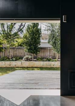
Internally, the home has come to be defined by a resolutely monochromatic interior palette that was largely employed as a means of unifying the new finishes with some of the original period-home features. The clients were keen to be involved in restoring as much as possible. The interior is also a product of the desire to create an easy to clean home. These aims are expressed, for example, in the stainless-steel benchtops and splashbacks as well as the combination of darkened timber and burnished concrete flooring.

The new living area with its blackened ceiling, rammed limestone walls and fireplace has all the archetypal spatial allusions of a lit cave. More so, however, it is a remarkable, albeit challenging, feat of structural engineering. By having the upper portions of its rammed limestone and recycled concrete walls cantilevering through to the exterior of the home it also shades part of the largely northern aspect of the living room openings. Other features centred on sustainability and passive design include, rooftop solar panels, the use of a natural-oil decking finish, low-VOC paint to the walls and openings oriented to maximise opportunities for cross ventilation.
What this house best represents then, is an evolution of thinking about what healthy living is or might be. What started as an initial product of asking how gardens and access to sunlight in suburbia could help society respond to an industrialising world has largely come back full-circle here to the same question. Only, this time, it has given the home some extra answers. ■
GROUND FLOOR PLAN LONGITUDINAL SECTION 0
WILCOCK HOUSE
WILLCOCK AVENUE HOUSE / vittinoAshe PHOTOGRAPHER Ridhwaan Moolla ARCHITECT vittinoashe.com.au Email: contact@vittinoashe.com.au Instagram: @vittinoAshe DESIGN TEAM Marco Vittino, Katherie Ashe, Kelsey Jovanou KEY CONSULTANTS Structural Engineering: Atelier JV | ESD: The Study | Landscape: Pip Munckton
BUILDER BE Projects / Completion date: February 2021
SITE 5 Willcok Avenue, Daglish / Sqm site: 647 sqm / Sqm build: 196 sqm
KEY SUPPLIERS Cabinetwork: Shepherdcraft Furniture | Lighting: Anchor Ceramics and Alti Lighting | Bathrooms: Reece Plumbing | Furniture: Cult, Living Edge, Ligne Roset | Rammed Earth: Perth Stablised Earth | Stone: CDK Stone


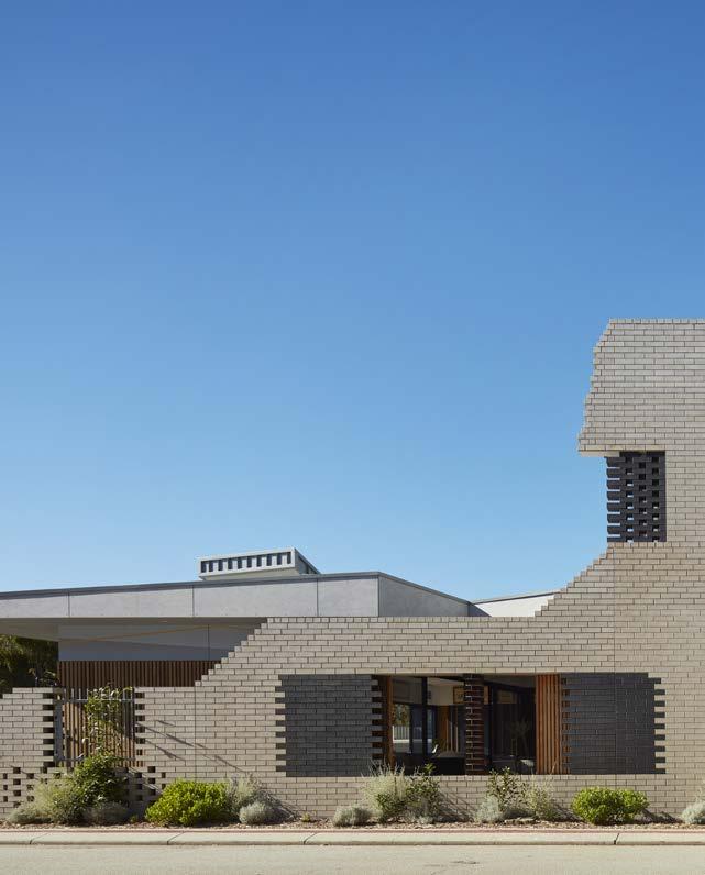
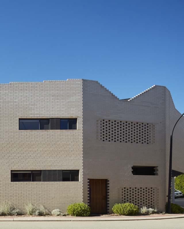
If you were restricted to using a single adjective to describe Casa Mia, the self-designed home of Adrian Iredale and Caroline Di Costa, you may well settle on ‘considered’.
Tucked away in suburban City Beach, this home goes beyond the substantially intricate brick envelope encasing it. With no stone left unturned, the designer duo have created a house and a home that exemplifies design thinking and heroes materiality.
Responding to involved local design guidelines, this home speaks to its neighbouring properties without submitting to the peer pressure of blending in. It displays qualities of a family home, all the while avoiding the stereotypical excess so commonly confused with the concept.
Borrowing from the bordering neighbourhood park, Casa Mia encourages community involvement and a shared living experience by treating the park as their front yard, a concept that is continued all along the side of the house, where perforations in the brick building mask and create visual punctuation marks that allow for intersecting glances from the outside in.
The use of both light and dark face brick to distinguish between the internal and external skin of the house, allows for a textural, pattern change, encouraging the notion that what you see on the outside, isn’t necessarily reflected on the inside. There is a sense of more than meets the eye, where you start to realise that only by getting to know the occupiers of the home, will you be subject to the spaces within.

Once inside, the manipulation and tracking of light is remarkable. The term ‘considered’ emerges once more, as the living room tiling pattern choreographs how the light dances across the floor at various times of day, paying homage to the work of Swedish architect Sigurd Lewerentz.
Architects Adrian and Caroline talk about the site as an entity that has been carved out. Where the form has been sculpted, the materiality changes to timber. This is evident both internally and
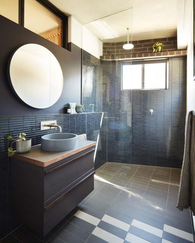
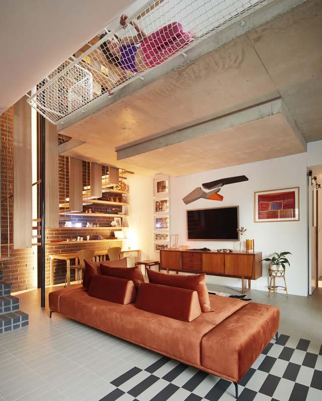
externally, notably in the living room, where soft timber battens form a backdrop for art to be displayed. Across the room, concealed cabinetry showcases a curation of timber battens, speaking to Aalto’s Villa Mairea, deemed a timber orchestration by Adrian.
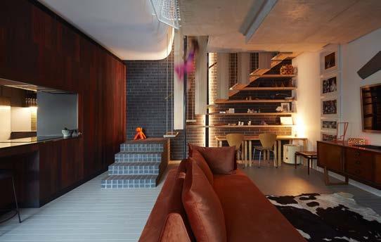
The approach was to use off-the-shelf items, simple construction methods, and personalise them, creating a space that feels authentic. “We’re not selling an aesthetic, we’re selling the way it feels,” says Caroline. “Good architecture is selling quality of space.”
Good architecture, of course, is also fun – something there is no shortage of in this family home. One such element of fun is the clever use of colour in the children’s bedrooms and bathrooms throughout the house, once again drawing on the concept of personalising simple and effective materials and creating a sense of identity.
Once truly welcomed into the space, you are also treated to the great folly of the fireman's pole, connecting ground and the upper level, of which you get a glimpse through the structural net above.
There is the more traditional travel method of the staircase, supported by hanging strings of metal rods, giving to the illusion of being suspended in mid-air and once again speaking to a certain vertical curation.
Suspended above the staircase and a guide to the upstairs library, is Caroline’s Nonna’s door. Having travelled from their previous home, the door symbolises a connection to family and memories, with a natural skylight shining from above, resulting in a profound sense of divinity.
A sunny and social rooftop space confirms the couple’s knack for easy entertaining, acting as the crown of the home. This is the last stop after being invited through the house, and acts as a denouement to the narrative embedded within. It is a home that is not trying to be anything other than a quietly sustainable, considered collective of the people who occupy the spaces within. As Caroline says, “It’s just us.” ■

PHOTOGRAPHER Robert Frith ARCHITECT www.iredalepedersenhook.com Email: email@iredalepedersenhook.com Instagram: @iredalepedersenhook
DESIGN TEAM Caroline Di Costa, Adrian Iredale, Finn Pedersen, Martyn Hook, Rebecca Hawkett
KEY CONSULTANTS Structural Engineering: Terpkos Engineering | ESD: True North Energy | Landscape: CAPA | Code: JMG Building Surveyors | Hydraulic: Hydraulic Design Australia
BUILDER Limitless Building / Completion date: June 2021
SITE 12 Gali Lane, City Beach, Western Australia / Sqm site: 325 sqm / Sqm build: 364 sqm
KEY SUPPLIERS Bricks: Brickworks | Roofing: Fielders Prominence Windspray | Windows and Doors: DGA Australia | Timber : recycled Jarrah from Fremantle Timber Traders | Tiles: Original Ceramics | Benchtops: Laminex, Essa Stone | Furniture: LOAM, Grazia & Co, Tide Design, Totem Italia for Plyroom, Angelucci Melbourne | Other : FMC Homeguard Termite Treatment
SUSTAINABILITY NatHERS rating: 6.5 stars Key sustainability measures • shared park • daylighting with roof lights and clerestory windows • cross flow ventilation • solar powered low velocity extract fan • recycled and certified plantation timber • brick waste minimised by reducing brick cutting • applied finishes minimized and low-voc or natural based.


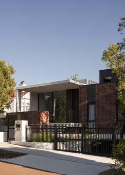
Hyde Park House is located on the busy Vincent Street adjacent to Perth’s iconic Hyde Park. On first glance the house is oddly nostalgic, its rich textures and materiality seamlessly blending into the existing heritage streetscape. However, on closer inspection it is evident that the house is the product of a robust yet delicate design process from Simone Robeson and Lauren Benson at Robeson Architects.
Much of the familiarity of Hyde Park House stems from its playful dialogue of using both familiar yet unique materials. Its integration into the heritage streetscape starts from the western side where its bone-coloured stuccoed walls transition to a richly textured reddish-brown face brick. The subtle curve to the brick facade brings a robust warmth and softness to the eastern side of the home while paying homage to the Art Deco styled houses which are prominent on Vincent Street.
One of the primary design considerations was the importance of retaining views to Hyde Park while at the same time alleviating the stream of motor and pedestrian activity along Vincent Street. For the dining terrace, this was achieved by raising it half a metre above ground level and inserting a masonry planter to screen Vincent Street while at the same time retaining views to the beautiful greenery of Hyde Park.
Another important consideration was to have generous living spaces for the family to be able to spend time together and apart. This resulted in the program of the home being split lengthways down the middle.

The eastern side of the house sits on the natural ground level while the western side is defined by a subtle level change. The western side, which contains the spaces that are most often used (kitchen, dining, lounge, and activity areas), has generous ceiling heights and volumes.
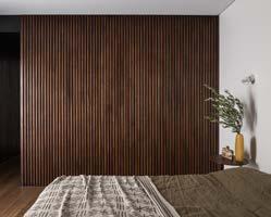
Materials used within the house are paired back and reserved. The use of walnut timber cladding on the front facade wraps into the interior of the house to create a prominent feature wall to the dining room while concealing the powder room and a storeroom. This material motif is repeated in the master suite where walnut clads the walk-in robe.
The owners of Hyde Park House placed less value on flashy finishes, having a greater focus on sustainability. The house impressively features thermally broken double-glazed windows throughout. The home is orientated so that most of the glazing is north facing to maximise the energy efficiency of the house, with minimal glazing on the east and west facades.
The house is predominantly cooled in the warmer months by utilising natural cross ventilation through strategically placed operable glazing. This is aided by the use of ceiling fans to encourage Perth’s Freo Doctor to cool the home.
The upper level of the house uses reverse brick veneer that has improved thermal efficiency over the traditional double-brick construction typically used in Perth. Extensive solar panels on the roof supply the home’s general electricity requirements and the underfloor hydronic heating system.
Looking through the catalogue of work by Robeson Architects, their projects seamlessly blend juxtaposing elements such as traditional Australian motifs in face-brick cladding with calming Zen-like ephemeral spaces reminiscent of Japanese architecture. However, the one enduring constant in their work is the focus to deliver on the desires of their clients. This is another project that does just that. ■
PHOTOGRAPHER Dion Robeson
ARCHITECT www.robesonarchitects.com.au Email: simone@robesonarchitects.com.au Instagram: @robeson_architects
DESIGN TEAM Simone Robeson , Lauren Benson
KEY CONSULTANTS Structural Engineering: Cenit Engineering | Energy Certifier : The Study | Landscape: Carrier and Postmus Architects
BUILDER Formview Building / Completion date: August 2021
SITE Mount Lawley, Western Australia / Sqm site: 578 sqm / Sqm build: 411 sqm
KEY SUPPLIERS Exterior cladding: Brickworks Custom blend tan and red, Metal Cladding by Fielders | Windows and Doors: Vitrocsa for dining room sliding door, Casver for other doors and windows | Floors: Metz Tiles, Woodpecker Flooring |
Bathrooms: Wall tiling to ensuite and bathroom by Metz, Powder room by Mutina, Pool tiles by Artedomus, Ensuite bench top by Artedomus, bathroom benchtop by Caesar Stone | Lighting: Artemide, Artek, Alti | Furniture: District Furniture | Finishings: Temple Fine Rugs, Matt Hayes Art

SUSTAINABILITY NatHERS rating: 7.4 stars
Key sustainability measures • thermally broken double glazed windows throughout • northern orientation • minimal windows on the eastern and western façade • upper level reverse brick veneer • roof top solar panels power the home • underfloor hydronic heating • ceiling fans • cross flow ventilation

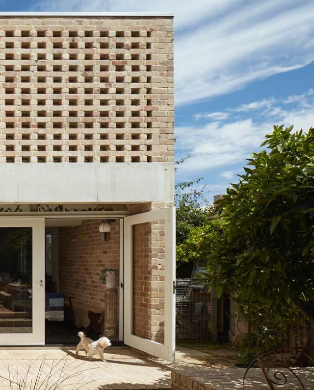
Simon Pendal Architects’ modest restoration and extension of a 1940s workers cottage in Beaconsfield pays respect to local heritage and the owners’ recognition of their roles as custodians of the area’s history.

Typical of the era, Beaconsfield House, in its original form, was a timber framed cottage clad with jarrah and asbestos. While many would have chosen to demolish the building and rebuild, the owners bravely committed to preserving and regenerating the original home. They sought the creation of extra space and the modernisation of the home that they had lived in for over 20 years. The result is a respectful exercise in integrity and sculptural simplicity.
Maintaining its basic footprint, the original house was reorganised spatially and stripped back to its frame. Its timber skeleton was reclad in the jarrah boards which were removed and carefully restored by the clients. Recycled timber that had been sitting in storage in the client’s studio for almost two decades was repurposed as flooring.
With Simon having shared a studio space with his clients for a period of time, he was able to work closely with them to achieve the desired outcome. Simon’s vision for the property mirrored that of his clients and the extension, through its mass and solidity, feels almost primitive and cave-like, providing an insular escape from the world. Yet, through clever design, and the use of large glass sliding doors and windows, the house is able to be opened up to embrace the outdoors.
The project focuses on, and respects, the relationship between the built form and nature. “We, as architects, through the use of the built form, do not need to subjugate nature,” says Simon. In his own description of Beaconsfield House, Simon has referred to the writings of early twentieth century theologian and philosopher, Romano Guardini, to describe the project’s decisive nearness to nature.
The curved volume of the ceiling has a lightness reminiscent of a billowing spinnaker. Perforations in the brickwork allow the circularity of the seasons to project onto the curved canvas of the ceiling in ever-changing patterns of light, creating movement and bringing life to the static built form. A series of cleverly placed openings in the ceilings introduce shafts of light which act as a guide through a sequence of spatial experiences which progress through the original structure into the labyrinthian form of the extension. These subtle openings to the outside maintain the cavelike nature of the extension and culminate in a large skylight in the master bedroom which frames a constantly changing night sky. In contrast, vast panels of glass heavily set into deep openings can be opened onto the gardens to let both the outside and seasonal breezes in.
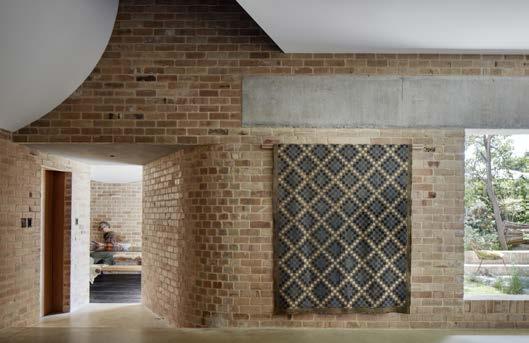
Brick has been used inside and out with grounding effect to create mass, both visual and thermal. Yet the weight of the building’s form is lightened by the texture of the recycled pressed bricks which have been left in their raw state. “We had contemplated using red recycled bricks which were going to be painted white,” says Simon. “Yet, through opportunity, the builder found the salmonhued bricks we ended up using.” Not needing to be painted, the unplanned use of bricks offered a cost-saving to the clients, and their tactile expression enhanced the principal idea and feeling of the building.
It is the small details arising from the lived-in experiences of the house that clearly delight Simon. “We always sought to preserve and protect the relationship between inside and out,” says Simon. “The somewhat primitive openings to the outside have become, in themselves, interstitial spaces that are constantly used and have become focal points of the daily routine. The deep recesses do more than house the windows. They have become a place of contemplation and morning coffee.”
More than an exercise in structural lucidity and inherent sustainability, Beaconsfield House is a home that has been, and will continue to be, lived in and loved. ■


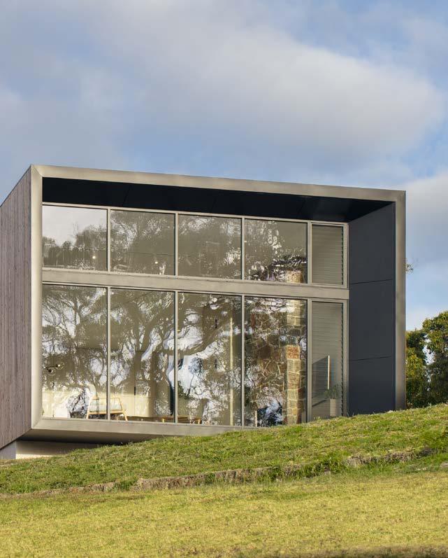

Inlet Drive Residence by PTX Architects is situated on a picturesque site, the owner drawn to the location by strong emotions linked to memories of holidays spent fishing in a tinnie on the Wilson Inlet with his father.


A long, narrow block with an east-west orientation trailing down to the inlet, along with planning restrictions on setbacks, presented challenges for David Gibson and Melanie Hoessle, co-founders of PTX Architects. However, obstacles were overcome with clever, thoughtful design, resulting in unanimous council approval and incredibly happy clients.
A 1950s house and an old weatherboard fishing shack were originally on the site. The orientation of the original house didn’t allow for passive solar gain in winter so this was demolished, but the fishing shack remains.
“Before we began planning, we sat on site with our clients, Peter Somerford and Giulia Maranta, to tease out memories of why they were so attached to the location,” David said. “Marrying that information with our understanding of the block, we constructed an overarching concept.”
David and Melanie were keen to honour the reason the client bought the property, those wonderful memories of holidays Peter spent fishing on the inlet with his dad. “We quickly landed on inspiration taken from the local environment – granite boulders lying in the water at the base of the site,” said David. “The client identified with our notion and loved it from the outset.”
The design of the new 190 square metre home resembles a series of long formed boulders. Comprised of three interconnecting spaces, each form is orientated differently, capturing extensive inlet and vegetated garden views. The forms are connected by an east to west concrete spine wall. The long driveway delivers you to the first form, a weathered timber clad garage. The second form houses three bedrooms, two bathrooms and a powder room. The final form presents a sweeping open-plan living, kitchen and dining space, featuring a double-volume wall of high-performance glazing showcasing the spectacular inlet view.
The granite boulders also inspired the materials used and colours reference those from the natural site. David and Melanie selected raw materials such as weathered timber cladding, reddish moss Corten, concrete flooring, and concrete for the spinal wall and retaining walls, all working in balance with the environment. Together with the clients, David and Melanie engaged a local artist to create something special, resulting in a series of rocks embedded in the spinal wall, adding to the uniqueness of the elegant design.
Sustainability is key to the home with clever design negating the need for air conditioning or heating. Automated louvered window sections at either end of the house cool the forms quickly in summer, while the thermal mass of the concrete spine controls the internal temperature in winter. A solar panel energy system and an efficient heat pump hot

water system are also employed. A large sliding perforated Corten steel panel is opened in winter and closed in summer. David notes, “The clients are happy to put on a jumper if they feel cold but the home performs well without heating or cooling… there is a fireplace, but it’s really for ambience.”
Client and architects together selected furniture to suit the space and feel of the home. One unique piece is an 80-year-old concrete laundry trough which was removed from the fishing shack and placed in the service nook outside the laundry. This is where Peter cleans the fresh fish he catches from the inlet at the bottom of his property – another thoughtful design ode to the location, which holds the client’s precious childhood memories. ■

PHOTOGRAPHER Bo Wong
ARCHITECT www.ptxarchitects.com.au Email: info@ptxarchitects.com.au Instagram: @PTXArchitects

DESIGN TEAM David Gibson, Melanie Hoessle
KEY CONSULTANTS Structural Engineering: Dryka Consulting Engineers | ESD: Building Physics RP
BUILDER Westruct Pty Ltd / Completion date: Late 2020
SITE Inlet Drive Denmark WA / Site: 4588 sqm / Build: 196 sqm
KEY SUPPLIERS Cabinetwork: Polytec laminates, Caesarstone benchtops | Floors: Burnished concrete | Lighting: About Space | Bathrooms: Astra Walker tapware and basins, Victoria & Albert bath, Villeroy and Boch Toilets, Oliveri sinks | Windows and Doors: AWS | Exterior cladding: Frencham Cypress Pine | Window coverings: Luxaflex, Instyle fabrics
SUSTAINABILITY NatHERS rating: Verification Method
Key sustainability measures • highly insulated building envelope • high thermal performance double glazing • louvred windows for maximum ventillation • exposed burnished concrete floor, feature internal thermal mass concrete wall • sustainable sourced cypress pine timber cladding • perforated corten sunshading screens


Built for his sister and her young family, archterra’s Paddock House is an exercise in functional simplicity. Although not limited by space, the family home is efficient in its layout and orientation.

Subtly nestled just below the crest of the property’s high point, Paddock House is only seen by those looking for it. Its restrained form is glimpsed from the road, resembling the shed typology often found in the area. Its unassuming design is a thoughtful adaptation of the rural vernacular, subtly effecting a contemporary sensibility to the site.
Situated on a slight slope, the design makes the most of valley views down towards a tributary of the Margaret River. Although exhibiting a strong connection to the external environment, the understated form of Paddock House does not seek to impose on the landscape.
From the outset, it was important to bring the outside in and to establish a close contact with nature. Expansive views of the surrounding, seasonally changing landscape are framed, encouraging both light and the outside to spill into the interior.
An outdoor room on the eastern side of the house is shielded from the environment by a large, operable polycarbonate panel which opens to create a dialogue with the site. At night, when lit
within, the translucence of the closed panel emits a warmth onto the surrounding area. Used for a multitude of functions across all seasons, this room acts as the heart of the home, the pivot point of daily life.

The floor plan is easy and fluid. With three bedrooms and an office, spaces are both intelligent and functional, driven by simplicity and sustainability. Views are maintained throughout the house through the inclusion of an east to west passageway which extends from the living areas and outdoor room on the eastern side to the private areas of the houses on the western side.
The master bedroom frames views to south west, capturing a stand of jarrah and marri trees which are typical of the area. Clever use is made of the loft space at the high end of the skillion roof which has a ceiling height of up to 3.8 metres.
In the children’s bedrooms, beds are raised on platforms creating extra space below for the day-to-day activities of the children.
“In designing Paddock House,” says Paul, “I sought to elevate the experience of daily living, wanting to cater to my sister’s young and busy family. Although its form is simple, it will adapt to the changing needs of the children as they grow.”
Paddock House’s design seeks to lessen its environmental footprint. With a predominantly northern orientation, Paul has made intelligent use of eaves on the northern elevation which shield the harsh summer sun whilst inviting the warm winter sun in.
The placement of windows and doors enables efficient crossventilation, making use of the predominantly easterly and westerly breezes in summer. The concrete block walls and the tile lined concrete floor provide a thermal mass, capturing and storing warmth in the cooler winter months and keeping the house cool in summer.

The house is not connected to scheme water, so water catchment and a water efficient garden was fundamental to its design. Rainwater runs freely over the skillion roof and is captured in 3 large tanks. A greywater recycling system enables reuse of precious rainwater on the garden and the house shares a 4.5KW solar array with an existing house on the property, which is the maximum allowed to be fed into the property’s 3kVa transformer.
“The house is lived in and loved,” says Paul. “Functionally, it works and, from a design point of view, it uses old school passive solar design to assist with keeping energy use low. This was important not only to me, as an architect, but my sister also.” ■


Nestled in coastal dunes, D_Residence by CAPA Architects is a thoughtfully articulated home that contributes to the redefinition of Scarborough as the suburb continues to undergo a transformation.
The clients approached CAPA’s Justin Carrier and Steve Postmus in 2017 with the dream of building a home that would facilitate their outgoing and playful lifestyle. With an extensive collection of artworks and artefacts, as well as aspirations for a family, there was a fundamental drive that the home would be robust and able to facilitate the couple’s changing lifestyle.

D_Residence is about the importance of our coastal landscapes and the manner in which the undulating natural topography provides protection for the landscape to endure. “Our West Australian coastal landscapes are often over-exposed to the elements, existing within harsh and corrosive environments,” says Justin. “We had to consider the harsh nature of this environment on buildings and provide something that was robust, lasting.”
The site of the home, which had been vacant since 1961, presented Justin and Steve with further challenges. In particular, a four-meter fall diagonally across the site. “The difference in levels between neighbouring lots is seven metres,” says Justin. “Due to the steep topography of the area, there is a lot of overlooking into the site from neighbouring homes and so designing for privacy and minimising suburban noise was key.”
In response to these harsh coastal and site conditions, architects Justin and Steve focused on the concept of sanctuary. Their approach to the home worked against the norm of blurring the thresholds between inside and out. Instead the design actively creates a barrier from its harsh surrounding context and, through considered internal planning and placement of openings, allows for curated views outwards as well as allowing natural elements of light and wind into the home.
Ground floor living spaces and the private rooms above are all centred around a double-height void that extends throughout the house. The void acts to visually connect spaces and allows for a lofty experience within the smaller-sized block.
The void also acts as a thermal chimney where hot air can be flushed out of openings to the rooftop terrace and drawn in from the ground and basement levels. This is assisted by natural crossventilation and taking advantage of the prevailing ocean breeze, with all living and private spaces fitted with louvers so that the house can be purged of hot air during the summer months.
The West Australian sun is harsh and in coastal locations this is exacerbated by the reflectivity of the water and white beach sand. Rather than exposing internal spaces to direct sunlight, Justin and Steve allow natural light to gently wash over surfaces by providing indirect sunlight to internal spaces. This is evident as you move through the home – where natural light washes over the face bricks and off-form concrete, or the steel treads of the suspended staircase.


At the request of the clients, Justin and Steve have created a gallery feel to the house allowing the clients to fill the spaces with their photography and art collections. The fact that the space has now been rented out for fashion and surf photography shoots is testament to the success of this approach.
This thoughtful and elegant home works beautifully with the changing lifestyles of its inhabitants, including the family doubling in size since the project’s inception. ■
RESIDENCE PLAN
SECTION 0 5 10 M
/ CAPA
PHOTOGRAPHER Douglas Mark Black
STYLIST Amy Collins-Walker
ARCHITECT www.carrierandpostmus.com Email: admin@carrierandpostmus.com Instagram: @capa_studio

0 5 10 M FIRST FLOOR PLAN
DESIGN TEAM Architecture, Interiors and Landscape Justin Carrier – Project Director | Kah Wai Leong – Project Leader | Steven Postmus | Steven Johnson
KEY CONSULTANTS Structural Engineer : ACCE | Energy Consultant & Building Compliance : CADDS Group
BUILDER Alita Constructions / Completion date: 2020
SITE Hastings Street, Scarborough, Western Australia
KEY SUPPLIERS Bricks: Austral Bricks Indulgence in French Brie, Austral Bricks Metallix in Carbide, Archistone concrete ribbed blocks | Cabinetwork: Nathan’s Cabinets, Lamitak, Laminex, Polyrey | Stone benches and external stone work: Bernini Stone | Tiles: Myaree Ceramics, Artedomus, Original Ceramics | Floors: Designer Floors WA | Lighting: Alti Lighting, Christopher Boots, Editeur | Plants and Trees: Benara Nursery, Ellenby Tree Farm, Coast Road Palms, Waldecks | Bathrooms: DevSpec, Pheonix, Rogerseller, Reece | Windows and Doors: ARCO windows | Exterior cladding & roofing: Lysaght, Fielders Paint: Dulux, Feast and Watson | Plywood Interior Walls: World Wide Timber Traders | A/C: Joondalup Air | Other : Solatube, Rockcote, Fisher & Paykel, Regency Plaster
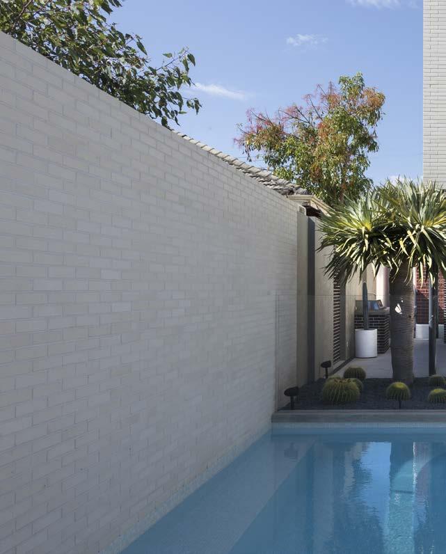

Located on a busy neighbourhood artery, Do Residence by Chindarsi Architects is a substantial renovation to an existing brick home. But from the street the extension is nearly invisible, and the streetscape is preserved.

At a time when our inner suburbs are being densified, the retention of our existing urban fabric and suburban identities is as welcome as it is important. Our neighbourhoods are our communities, our friends.
The original house consisted of four tall rooms built of brick and dissected by a wide hallway, with lean-to structures to the rear. The existing rooms have been renovated; complimented with new bathrooms inserted into the existing fabric and the lean-tos have been removed. In their place a concrete and brick addition adds 90sqm.
The approach to the house is suburban, through a black slattedgate held between white masonry posts, over a hit-and-miss concrete path submerged in a green lawn and across a slightly raised verandah, tiled in Victorian pattern. The house is tuckpointed and carefully restored.

The unusually wide 1.5m hallway is left completely open and unobstructed, it extends through the original house with its jarrah floors, and down three steps onto an expanse of ultra-white concrete. The hallway itself is lifted by new top lights installed above the doors that open into it. Float glass gives views upwards into the flanking rooms; expressing their ornate ceilings, and drawing light into the corridor. At the end of the raised passage, the floor turns to glass and the footings of the original house are exposed around a new cellar.

The lower floor is for family. An open living space, with northernlight scoop, an incredibly stripped back white kitchen, and space that falls out over a covered outdoor barbecue area and a gorgeously tiled pool.
The upper floor includes a carpeted bedroom, a stylish new bathroom and a small lounge. The braise soleil brickwork that provides shading to the main living areas is also used to good effect as a privacy screen to the upper floor bedroom. With a flat hood cantilevering over, and an open portion high enough to satisfy the R-Codes, the looming window provides relief to the box form that is perched over the outdoor space.
A glass hatch into the cellar among the original building’s footings isn’t the only fun gadget in the house. A secret door opens through a deep chocolate-coloured wall in the main living space into the laundry and out to vehicle parking.
The owners who undertook this renovation had clear ideas of what they wanted their home to be. It needed to be contemporary, clean and stylish, it needed to accommodate their family lifestyle, and it needed to be relatively low maintenance. The original dwelling did not achieve this. And it couldn’t have without an extension and a reworking that accommodated their aspirations. This family has ended up with a hip space that does what they need it to do, while preserving the streetscape, and maintaining the low-rise suburban character of a site that otherwise might have been appealing to up-zoning pressures.
When viewed from a broader urban context, this house does more than cater to the needs of a family. It preserves use and character, and contributes to the perpetuity of the community. In a context of global homogenisation of cities and architecture, of art and of culture, preservation of our places and our communities is of utmost importance. ■
PHOTOGRAPHER Abigail Harman Photography ARCHITECT www.chindarsi.com.au Email: joe@chindarsi.com Instagram: @chindarsiarchitects
DESIGN TEAM Joe Chindarsi – Design Architect | Brad Sertorio – Project Architect | Nicolas Procter – Graduate of Architecture | Benjamin Moffitt – Graduate of Architecture
KEY SUPPLIERS Cabinetwork: Inspired Cabinets | Floors: DS Grinding | Lighting: HS Reflections, Beacon Lighting, Red Box Agencies | Bathrooms: Caroma, Phoenix Tapware, Franke | Furniture: Innerspace, Cosh Living | Windows and Doors: Architectural Windows Systems | Exterior cladding: Austral Bricks ‘Bowral 50’ range | Other : Gorter Hatches

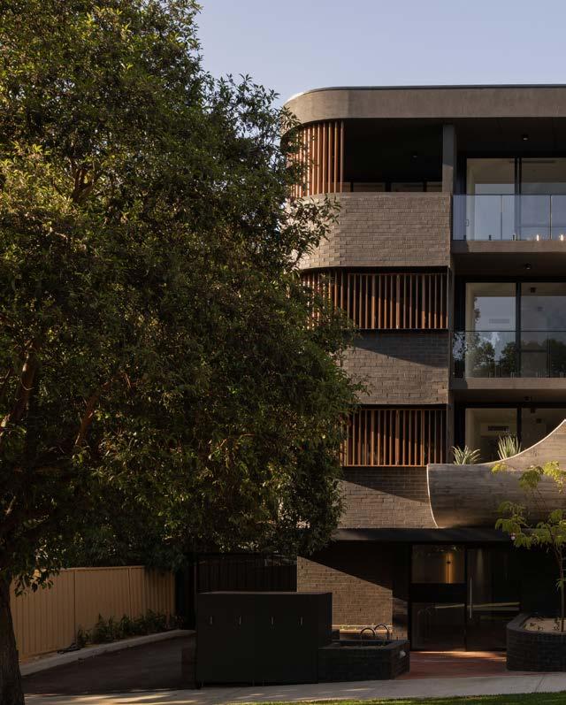

Introducing medium density into an established, low-density neighbourhood presents a variety of challenges. 95 Evans Street by MJA Studio is a respectful insertion into an inter-war neighbourhood showing sensitivity to the suburb’s existing context and character.
Located in the established suburb of Shenton Park, 95 Evans Street is a thoughtful transition point between adjacent R15 and R80 zones, subtly addressing the shift in scale between the two areas. The project needed to both respect the existing feel and form of its surroundings and set a positive precedent for future infill development in surrounding areas.

“From the outset, we had to acknowledge the difficulties inherent in introducing medium-density living into an established, low-density neighbourhood,” says design director Jimmy Thompson. “We had to maintain the integrity of the suburb, respecting its history,
but also provide a positive example of how medium-density developments, if done sensitively, can add to the neighbourhood.”
It was this challenge that prioritised the design. “We started with the building envelope provided,” says Jimmy, “and then actively sought to reduce its visual and physical impact on both the streetscape and surrounding homes.”
MJA has cut into the original building envelope to reduce both the mass and volume of the project. The building height was reduced from what was originally proposed and its spatial syntax interrogated. A carefully considered design feature, the use of a staggered setback allows the project to read as a series of townhouses. Reducing the perception of overlooking and overshadowing that would otherwise be present in a building of that size when juxtaposed against single dwellings, the staggered setback creates negative space, reducing visual mass and intelligently spanning the transitional zone between the established low-density residential area and the mid-density area closer to the railway line. Privacy is created while maintaining views across the treetops without encroaching into neighbours’ visual space. A deliberate equilibrium is struck between openness and privacy from the street.
The use of curves on the north eastern corner of the building’s street frontage further softens the building’s potentially monolithic form. The materials palette is elemental and raw, having been
carefully selected to allow the building to patina and age. The architectural context and character of Shenton Park is varied and MJA Studio sought to reference and respect the suburb’s existing architecture. The expressed elements of off-form concrete has a textural quality and is a deliberate reference to the Iwan Iwanoff , Bob Gare and Bernard Seeber projects in the area.
The built form is a play on contrasts. The use of recessive colour creates an interplay between light and dark, generating a depth of shadow, complementing the light and shade generated by the trees lining the streets. Landscaping was equally important to the project as the building itself. Newly planted trees blend in with the established greenery of the neighbourhood to become the visual focus, drawing the outside in.
Comprising a mix of one, two and three bedrooms, all of the ten boutique apartments comprising 95 Evans Street are at least dualaspect, enabling cross-ventilation and providing ample natural light. A variety of enclosed, private spaces in each apartment enables different spaces to be used depending on the time of day or time of the year. Parking is on grade in an undercroft, rather than in a basement, thereby reducing energy consumption and solar panels are used to power the building’s communal areas.
Through its materiality and conscious approach to its environment, 95 Evans Street respects the past, lives in the present and sets the standard for the future of the area. ■
EVANS STREET / MJA STUDIO
PHOTOGRAPHER Dion Robeson
ARCHITECT www.mjastudio.net Email: admin@mjastudio.net Instagram: @mjastudio
DESIGN TEAM Jimmy Thompson, Wes Barrett, Stefan Oh, Stephen Corns, Megan Cordin, Harriet Drummond
KEY CONSULTANTS Structural Engineering: Forth
BUILDER Builden / Completion date: February 2022
SITE 95 Evans Street, Shenton Park, WA 6008 / Sqm site: 673 sqm / Sqm build: 1263 sqm
SUSTAINABILITY Key sustainability measures: • passive design • rooftop solar panels • bike bays • low water garden
KEY SUPPLIERS Cabinetry: Challenge Cabinets


Eden by Hillam Architects is borne of the experimentation of Floreat’s past. The success of the apartments is not only in its functionality and built form, but also in its careful response to the context and characteristics of the locale.

Many Perth architecture enthusiasts have spent time wandering the winding and scenic streets of Floreat in search of hidden gems of the late twentieth century, post-modernist style. I strongly recommend this pastime.
Floreat established itself as the playground for post-modernist experimentation from the late 1950s and has been the grounds for some of Perth’s most notable residential architecture since. While these stunning examples of fusion between architecture and landscaping are desirable, the ever-increasing sprawl of Perth prompts a new experiment – medium density infill.
David Hillam, Principal of Hillam Architects, explains that the target audience and demographic for Eden were locals of the area who were looking to downsize. The aim of the project was to deliver a residential model that offered a variety of spacious apartment layouts that featured high-quality living spaces and engaging communal amenities.
Sited on the same grounds as the old Commonwealth Stadium stands, Eden overlooks the foreshore of Perry Lakes and the surrounding reserve. While there is a visual delineation between the lush native landscaping and built form by the avenue that separates them, there is a thoughtful consideration toward the transition between the two.
A generous verge along Meagher Drive is scattered with native landscaping, large trees, stepping-stones, and large concrete planter boxes – providing residents with their own personal gardens that also offer a more subtle solution to privacy screening. The articulation of landscaping continues beyond the ground plane – planter boxes on each residential balcony provide climbing landscaping which, from the outlook, seem to blend with tree canopies of the adjacent reserve.
The picturesque view toward the reserve has been amplified through considerate design to become a feature that can be shared and enjoyed by all residents. “There was the potential for additional apartments to be incorporated, but we wanted to take the opportunity to give back to the community,” David explains.
A wide opening on the on the west-facing elevation of the first floor gives space to an array of communal facilities, including a sunset terrace, dining room, kitchen, and wine cellar. The palette, while sophisticated and practical, is a respectful homage to the mid-century style, familiar in the locale – warm timber, distinctive off-form concrete and subtle motifs in bronze.
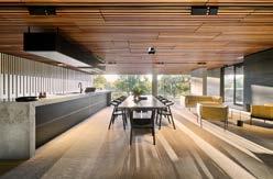
This open-air communal alcove navigates inward toward the focal point of the project – the large central courtyard. Accompanied by a lap pool, spa, and landscaping, this space leads out to additional facilities including a sauna, steam room, gym, and book retreat. While the space provides avenues for leisure and engagement by the residents, it also allows for ample access of natural light and ventilation to the innermost apartments.
The solicitous attention toward communal amenity is carried through and realised in each apartment allowing residents to generate their own bespoke style of space and living. Spacious living areas spill out toward generous balconies through stately heights of glazing. Many of the external living areas feature glimpses of the dynamic off-form concrete canopies that rise over each elevation of the building, which complement the bronze-finish screens and planters.
So, if you do find yourself venturing out on a Sunday afternoon with coffee in hand, exploring the assortment of design exemplars that Floreat has on offer, be sure to navigate toward Perry Lakes along the way to appreciate the quality architectural spaces and detailing that Hillam have produced. ■
PHOTOGRAPHER Joel Barbitta – DMAX Photography
ARCHITECT www: Hillam.com.au Email: info@hillam.com.au Instagram: @hillamarchitects
DESIGN TEAM David Hillam – Design Architect | Felipe Soto – Designer | Tom Letherbarrow – Project Architect | Neil Evans –Superintendent | Maude Pilote – Interior Designer | Jessica Henworth – Interior Designer | Georgia Donaldson – Design Architect
KEY CONSULTANTS Developer: Edge Visionary Living | Structural Engineering: Stantec | Electrical Consultant: Stantec | Mechanical Consultant: Stantec | Hydraulic Consultant: Stantec | ESD: CADDS | Landscape: CAPA
BUILDER BGC Construction Pty Ltd / Completion date: April 2021
SITE 1 Finishline View, Floreat Eden West: Site area: 6,103sqm / Build area: 35,198sqm Eden East: Site area: 4,005sqm / Build area: 17,242sqm PAW: 456sqm
KEY SUPPLIERS Cabinetwork: Jamel (Eden West) Ferguson (Eden East) | Floors: Woodpeckers Flooring (Timber), Bernini (Stone), Majool (Tiles) | Lighting: Majool & Nathan Day Design feature pendants | Bathrooms: Majool (Tiles & Fixtures) | Furniture: Loam & Nathan Day Design | Windows and Doors: Concept Windows (West), Park Glass and Aluminum (East) | Exterior cladding: Planet Acoustics and Architecture
SUSTAINABILITY NatHERS rating: Eden West: 7.88 stars / Eden East: 7.31 stars Key sustainability measures: • passive solar design

• northern orientation with screening systems • natural light
• cross flow ventilation • electrical sub-metering to monitor and manage energy consumption • automatic movement sensors for lights • 30-kW photovoltic solar energy system to power communal areas • dryling cabinets on balconies minmise energy useage from dryers • waterwise fixtures and fittings exceed BCA requirements for WELS star ratings • minimum of 60% local native flora in garden areas have low water requirements • material selections for waste avoidance and resoruce recovery • electric vehicle charging provisions installed into car bays • bike stores
The State Government’s draft Medium Density Code (SPP7.3) elevates the focus on design quality and has the potential to revolutionise the approach to medium density developments in Western Australia. Importantly, the draft code is about equity in design – making good design more accessible for all West Australians. “Our knowledge of the draft code was instrumental in the design process. All twelve units are north facing with consolidated garden spaces and deep soil zones enabling trees for every unit.”
The draft code doesn't propose a change in the construction methodology of developments, but rather demands a more considered and strategic approach to medium density which will result in homes that are more liveable, cost less to run and provide an improved quality of life.
Proposed initiatives under the draft code:
- Incentivise retention of mature trees
- Optimise the quality of outdoor garden spaces
- Optimise the quality of indoor living spaces, and
- Consider context and neighbourliness.
It’s important to note that these design improvements shouldn’t cost more, nor impact yield. And this has been illustrated by MDC Architects in a recent project.
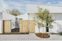
Recreation Road by MDC Architects is a twelve-unit development on a 2000 sqm site in Hamilton Hill, just south of Fremantle. This was MDC Architects’ first foray into the affordable home market so it was a steep learning curve but the successful result speaks for itself. “We were engaged from project inception and were able to generate a better yield than the developer had expected,” says practice founder Matt Delroy-Carr.
The idea of creating a consolidated green space paired with the main living room is central to the draft code and something that Matt was keen to showcase in this project. “We start all projects with the garden and living space facing north and work from there,” says Matt. “We are pleased to see this principle, together with a minimum depth of garden and deep soil zones for trees, embedded in the draft code. The State Government should be commended for these initiatives.”
Sustainability was another key driver in the design of the units. Passive design principles employed by MDC Architects in this project include north orientation, daylighting, cross-ventilation, shading and material choices. Applying these principles means the twelve units will maintain a more comfortable internal temperature throughout the year, with less reliance on mechanical heating and cooling. Less reliance on heating and cooling means less energy used, so tenants will save money on operational costs.
In fact, research by the Department of Planning Lands and Heritage projects real ongoing operational cost savings for occupants of $1460 per dwelling per year through the introduction of the draft code.
In addition to environmental sustainability principles, the development also addresses economic and social sustainability. All twelve units are 2 x 2 providing much needed housing choice, and the build-to-rent model addresses our current chronic rental shortage.
The simple aesthetic of corrugated tin and rendered brickwork is engaging for the market, affordable to build and durable. But the aim is for the houses to become a backdrop to the landscape. Native trees planted along the driveway and in the courtyards will eventually grow to six meters, and creepers will cover vertical surfaces.
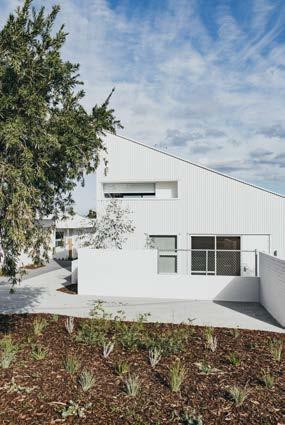
Projects like Recreation Road, which embody the principles in the draft code, will not only result in greater diversity in housing choice, but will work to allay current NIMBY attitudes to medium density that have arisen through decades of ill-considered medium density developments. ■

My Home Australasia Limited is a facilitator for housing and land developments to accommodate disadvantaged people experiencing homelessness or at risk of homelessness.
So, what is affordable housing to you? Having to move a suburb or two further out than where you wanted to live? Settling for a townhouse or unit instead of a freestanding house?
As a rule of thumb, if the cost of housing is more than 30% of gross household income then the household is considered to be under financial stress. For a couple on joint income of $120,000 that’s in circumstances where they have a mortgage repayment of $3,000 a month or more.
A single person on social welfare payments, including rent assistance, may have no more than $175 per week for rent. The average rent in the Perth metro area is currently $460 a week for a house and $390 a week for a strata home. You are not likely to find a rental for $175 a week.
A common definition of affordable housing refers to properties that are offered for sale or rent below their market value. This requires some sort of financial support, usually from government grants or subsidies to the property owner, the occupant or the property developer.
For decades, federal governments have promoted the Australian dream that all Australians should own their home. Initially the dream was for a freestanding house on a quarter acre block. This has now evolved
to include ownership of a strata home – an apartment, townhouse, duplex or home unit. There has pervaded a sense of failure if you don’t own your home.
Plenty was said in this year’s federal election campaign about the very real challenges faced by first-home buyers and homeowners already mortgaged to the hilt. The Albanese Labor Government promised to help more people buy a home sooner by cutting the cost of buying a home by up to 40%.
The Labor Government’s Home Guarantee Scheme (HGS) is now available to help Australians buy their own home. There is an annual allocation of 5000 places from 1 July 2022 until 30 June 2025. But that’s only 1666 places a year. What about all of the other home buyers who miss out?
Research by the Property Council of Australia shows that almost 70% of voters in the recent federal election fear younger people will never be able to buy a home in Australia, believing the Australian dream of home ownership is now out of reach for most Australians.1
A large proportion of Australians will never own a home. Over one third of Australians are renting their home.2 We need parity across all levels of housing for renters and home buyers and owners.
The Australian dream needs to be redefined to be a fair and equitable housing system where all Australians have access to safe, secure and affordable housing.
Actions are needed urgently to bring this redefined Australian dream to fruition, especially for people who have a low income, are disabled or on social benefits, and most especially, for people who are homeless.
Perth sits in a global list of the Top 20 Cities with Least Affordable Housing.3 We need to move off this list. ASAP. We need a broader embrace of housing stimulus beyond first-home-buyer grants and quick-fix incentives.
Let’s, at the least, start with social housing.
Social housing is the stock of residential rental accommodation provided at sub-market prices and allocated according to specific rules rather than market mechanisms.4 and 5
It’s housing provided by state governments through public housing stock or housing managed by Community Housing Providers (CHP) to assist people, often on social benefits, who are unable to afford or access suitable accommodation in the private rental market. Rent is generally set at 25% of a tenant’s income. Low-income affordable housing rent is generally set at no more than 80% of the local private rental market.
A report by Australian Housing and Urban Research Institute (AHURI) shows that in addition to current public housing wait lists, an estimated 727,300 additional social dwellings will be required over the next 20 years across Australia.6 In WA, there are currently 30,000 people on the Public Housing Waitlist.7
In part, this reflects a quarter-century of near-stagnation in social housing stock in Australia.
While the national population is now 41% higher than in 1996, social housing has expanded by just 3% over that period. We are actually going backwards with less social housing now than in 2012.8
In Australia, social housing makes up around 4% of our total housing stock. In the Netherlands it’s 32%, in Scotland it’s 23% and in England it’s 17%.9
To provide more affordable housing we don’t need to reinvent the wheel – or the house.
The Scottish affordable housing model is being applauded globally. It has a holistic approach which identifies the roadblocks and brings together the Scottish government, local government and social housing providers (the equivalent of our CHPs) to deliver housing.
Scotland's policy aims to deliver more affordable housing, tackle high rents and decarbonise homes while creating jobs. It promises to build 110,000 affordable homes by 2032. The plan is:
• Local authorities and social housing providers bid for a slice of £18 billion funding.
• They receive a £72,000 per unit government grant.
• A no-build-to-buy requirement, effectively a build-torent model.
• 70% social housing and 30% low-income affordable housing in any development.
• Government land earmarked for housing must be used for social housing not sold to private developers.
The Australian government established the National Housing Finance and Development Corporation (NHFIC) in June 2018 with a legislated government guarantee to provide additional support for institutional investment in NHFIC bonds and lower borrowing costs for CHPs.
The creation of NHFIC’s bond aggregator function has provided the opportunity for CHPs to access lowercost, longer-term debt compared with other sources of finance. NHFIC has been able to provide CHPs with fixed interest rates of around 2% for more than ten years, which is at a substantial discount and involves longer tenure than is available under conventional bank financing with cash-flow loans rather than more traditional asset-backed loans.
The new Labor government has promised to create a $10 billion Housing Australia Future Fund which will build 30,000 new social and affordable housing properties in its first five years and create thousands of jobs . It focusses on sensitive cohorts, Indigenous people including remote communities, women and children escaping domestic violence, veterans.
Canberra has replaced up-front stamp duty with an annual payment to reduce the cost of buying a home.
Victoria has established a $1 billion Social Housing Growth Fund.
Hon. John Carey MLA, Western Australian Minister for Housing, Lands and Homelessness, has brought a strong focus to affordable housing in Western Australia, budgeting $2.4 billion on social and affordable housing over the next five years.
There is change happening. But in my view it is too slow.
Demand for affordable housing for Australians dangerously exceeds supply.
The current vacancy rate in Perth is 0.5%. Effectively, there are no homes to rent. We are relying on one tenant moving out to enable another tenant to move in, assuming the rent is affordable. For many it is not. So where do they live? Increasingly, for many the only option is homelessness.
We need a system where people require less help not a system that manages more help for people who can’t afford to rent or buy a home. This translates into incentives to increase housing supply not handouts to enable people to afford unaffordable homes.
In my view, subsidised entry to home ownership and subsidised rents will not help in the long term. They will
push the cost of housing up to meet demand. High prices mean landlords increase rents.
We need more homes. It’s as simple as that.
We need to open our eyes to new housing delivery models such as collective housing and build-to-rent. Build-to-rent is certainly an option currently being explored by many developers and the state government. The recent reduction in land tax and stamp duty for build-to-rent projects is a worthwhile incentive. We should remember that build-to-rent is not new to Western Australia. CHPs have been using this model for years.
We know there is no return for investors to deliver social housing. A mix of social and low-income affordable housing will still not deliver the returns that developers might reap from other classes of housing. If we expect developers to deliver housing to these cohorts, they need incentives, whether that is subsidies, grants, exemptions or land.
The City Futures Research Centre in 2019 showed that removing the upfront cost of land and providing cheaper NHFIC finance to CHPs through the bond aggregator could significantly improve the financial feasibility and cost-effectiveness of new community housing developments.11 I can attest to this.

The "My Home" housing model is based on a PPP model using vacant government land at a peppercorn lease which significantly reduces the project cost.
We need engagement from private capital investment. To do this we need to provide subsidies to CHPs to lead targeted housing development, including subsidies for support services for residents if needed.
The National Rental Assistance Scheme (NRAS) introduced in 2008 was a very workable incentive for increasing rental supply by providing federal and state government subsidies to investors who rented homes at 20% below the local market value. Unfortunately, a few abused the program and, instead of closing the loopholes, NRAS was abolished.
A NIFIC 2017 report identifies stamp duty on property purchases as an inhibitor of activity in the housing sector. The report calls for stamp duty reforms such as abolition or annual payment rather than an up-front lump sum, or introducing annual land tax.
Many, economists, even the OECD, say stamp duty is an outmoded concept and impinges on efficiency in the market. It’s not just a barrier for first home buyers but also for people who have to move for their work and people downsizing. And it’s unfair. Moving five times means you pay stamp duty on five transactions whereas someone who stays put only pays for one transaction.
Local governments can play a role
Local government in Western Australia traditionally has not provided housing, unlike local authorities in many European countries. However, local government can play an active and essential role in increasing housing supply by:
• overhauling local planning policies to encourage a diversity of housing typologies
• easing zoning restrictions to allow greater infill and more productive use of land, and
• responding to the lifestyles of today’s occupants and household demographics. For example, Nightingale housing projects in Melbourne have done away with car parking because the sites are close to public transport and people are using (electric) bicycles for local travel.
In recent years, there has been a font of research, analysis, reports, seminars, workshops, discussions and strategies from government, authorities and the community housing sector. Statistics buzz around my head like bees swarming for attention.
Despite all these efforts to enlighten, we have not risen to the challenge of alleviating the demand for affordable housing.
Project by project, initiative by initiative economic stimulus needs to be captured within a holistic framework to deliver tangible outcomes. And we need all three levels of government working together within this holistic framework.
What we need is more homes in areas where people want to live.
Affordable housing deserves the same care and consideration that goes into a big budget home build. If we are truly to deliver the Australian Dream of fair and equitable housing system, affordable housing must be high performance, energy efficient, net zero and comfortable, enjoyable living spaces. ■
1 https://www.propertycouncil.com.au/Web/Content/Media_Release/ New_data_reveals_extent_of_housing_affordability_concern.aspx
2 Australian Institute of Health and Welfare, Home ownership and housing tenure 22/06/2022
3 https://www.canstar.com.au/home-loans/housing-affordability-inaustralia-2022/
4 Australian Institute of Health and Welfare, Housing assistance in Australia 2019. https://www.aihw.gov.au/reports/housing-assistance/housingassistance-in-australia-2019/contents/socialhousing-dwellings
5 Salvi Del Pero et al., OECD Social, Employment and Migration Working Papers No. 176 Policies to promote access to good-quality affordable housing in OECD countries2016.
6 AHURI, Social housing as infrastructure: an investment pathway, 2018.
7 Shelter WA https://www.shelterwa.org.au/knowledge-hub/informationfact-sheets/
8 https://amp-theguardian-com.cdn.ampproject.org/c/s/amp.theguardian. com/australia-news/2022/jun/29/social-housing-stock-barely-changes-aswaiting-lists-blow-out-and-rental-stress-doubles-across-australia
9 OECD Affordable Housing Database 2020 figures – http://oe.cd/ahd.
10 https://www.nhfic.gov.au/media-resources/media-releases/australiangovernment-home-guarantee-scheme-40-000-new-places-released-on-1july/
11 Professor Bill Randolph, UNSW City Futures Research Centre, Dollars to Dwellings Financing Affordable Housing, presentation to the National Housing Conference, Darwin, 2019; Dr Laurence Troy and Professor Bill Randolph, UNSW City Futures Research Centre, Estimating need and costs of social and affordable housing delivery, March 2019. Assuming CHPs are able to access NHFIC finance at a 1.5% discount, based on a commercial interest rate of 5%.
In 2003, Rachael Bernstone undertook the AV Jennings Churchill Fellowship to investigate sustainable and affordable housing in four countries. Here, she highlights several exemplar projects, and reviews recent developments in Australia’s housing sector.
I applied for a Churchill Fellowship just after I completed my Masters in Architecture (History and Theory). I was brimming with enthusiasm for all of the ways that architects could make an impact around social and affordable housing, which was starting to become a significant issue in 2003, as private housing costs soared.
Housing affordability was being impacted by population growth, low interest rates and an investor boom, coupled with an ongoing lack of investment in public and affordable housing, a severe maintenance backlog for public housing properties, and ballooning waitlists.
According to research published after my trip: “Between 1997 and 2007 the number of public housing properties in Australia shrunk by 30,000, but the population grew by over 2 million people. Despite the significant, but one off investment in social housing through the Nation Building Stimulus package, Australia still has fewer public housing units than in 1996. Overall there is less low cost rental housing to go around.” 1
These problems have worsened since then, according to Give Me Shelter: The long-term costs of underproviding public, social and affordable housing, released in June 2022 by Housing All Australians.
“While Australia’s population grew by more than 25 per cent between the 2001 and 2016 Census years, the nation’s stock of occupied social housing shrank by 2.5 per cent. As a proportion of all dwellings, social housing now comprises less than 4 per cent, compared with almost 6 per cent in 1996.”
In its cost-benefit analysis, Give Me Shelter found that: “every $1 the Australian community invests in social and affordable housing will deliver $2 in benefits” and that “failure to act on shelter needs will be costing the community $25 billion* per year by 2051”.
In 2003, housing sustainability was emerging as significant challenge. Australian governments had failed to formally adopt the design innovations that had underpinned Sydney’s “Green Olympics” bid, developed in 1993.
The Australian Building Codes Board was preparing to introduce energy efficiency measures for the first time. (This year, it has introduced a slightly improved standard, in the form of 7-star homes.)
I was keen to learn about the ways that housing for low- and middle-income earners – including the elderly, people with disabilities and those receiving welfare payments, as well as “key workers” such as nurses,
1 Australia’s Broken Housing System, https://www.abc.net.au/cm/lb/4895794/data/australia27s-broken-housing-system-data.pdf,
teachers and police – could become more sustainable. I also wanted to determine whether improvements in public housing sustainability could influence also the private sector.
I visited London; Helsinki, Stockholm and Malmo, and five locations in the USA: New York, Pittsburgh, Denver and Aspen, Portland, Oregon and Los Angeles to research a range of topics including:
• Procuring new sources of funding, both public and private, for the provision of new public housing
• Upgrading existing public housing stock, to enhance social, economic and environmental sustainability outcomes
• Providing affordable housing for “key” employees, or low- to moderate-income earners, in areas where market rate housing is often unaffordable
• Developing and implementing cost effective and sustainable construction methods for the provision of new public and market rate housing, and
• Improving environmental performance of all housing types, from public through to high-end privately owned homes.
Upon my return, I made a series of recommendations that related to:
• The adoption of more ambitions sustainability goals in building codes (there has been little progress on this front, yet)
• Reviews of land use – especially publicly owned land – and increased density targets (again, lost opportunities in most states)
• Mandates for affordable housing components in private developments (have there been any?)
• Mixed-use and mixed-tenure development (there are few mixed-tenure developments, so far)

• Upgrading existing public housing stock for efficiency, comfort and health (ditto)
• Reviewing first home owners grants in favour of other financial levers (ditto), and
• Progress around prefab and modular construction (there have been some advances, mainly in Victoria).
What’s the current status of sustainable and affordable housing?
I’m disappointed by how little progress has been achieved over the past two decades. On the sustainability front, governments have bowed to lobbyist pressure and failed to mandate sustainable design measures; and in relation to affordable and social housing, more people in dire need face long waits for suitable accommodation.
However, the new Federal government announced in June that it would establish a $10 billion Housing Australia Future Fund, to build 30,000 new social and affordable housing properties in its first five years, which represents a major leap forward after years of stagnation.
And in July, at the time or writing, Minister for Housing and Homelessness, Julie Collins MP, convened the first meeting in five years of state and territory housing ministers, to progress the delivery of safe and secure housing across all levels of government.
This Federal initiative followed the largest commitment to social housing infrastructure in recent history, Victoria’s Big Housing Build, announced in November 2021. That $5.3 billion program will construct more than 12,000 new homes throughout metropolitan and
regional areas, and is expected to increase the state’s supply of social housing by more than 10% over its lifetime.
Closer to home, a new report that compiled data from 73 homelessness services across Western Australia found inadequate levels of funding and high levels of unmet demand for housing and services.
Commissioned by Shelter WA, Funding of Western Australian Homelessness Services 2022 found relatively low rates of transition from rough sleeping to permanent housing, due to the lack of social and affordable homes.
“At present there is a significant shortage of permanent housing options. In 2020-21, 57 per cent of Specialist Homelessness Service clients had unmet long-term housing needs,” said report author Professor Paul Flatau.2
I visited more than 20 housing projects in five countries, and the highlights were projects that were equally committed to affordability and sustainability outcomes. These included Greenwich Millennium Village and Murray Grove in London, BedZED in Sutton, and Highlands’ Garden Village in Denver, Colorado.
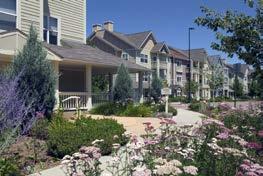
https://www.shelterwa.org.au/report-shows-funding-for-wa-homeless-services-

I concluded that it was possible to create successful sustainable communities through planning and design, by integrating housing with opportunities for employment, education, transport, health and culture. Where green technologies were incorporated into projects, developers worked hard to educate consumers about the benefits of paying more upfront to reap savings over the course of occupancy.
The most impressive project was Highlands’ Garden Village in Denver, developed by Perry Rose to a master plan by new urbanist authority Peter Calthorpe. It combined single family homes, townhouses, apartments, live/work spaces and a co-housing community, as well as community buildings, open parkland, a major supermarket and speciality shops. This genuine mixed-use, mixed-tenure community of 326 homes combined environmental building with historic preservation and urban infill, all within ten minutes of Downtown Denver.
The homes were designed to be 25% more energy efficient than local counterparts, and they incorporated built-in kitchen recycling centres; wind generated electricity for use in community buildings and parks; advanced sealing of units to minimise heat loss during winter and gain during summer; and low VOC paints and glues.
In London, the redevelopment of Greenwich Peninsula was Europe’s largest urban redevelopment project at that time; it now houses 20,000 people. The first housing project, Greenwich Millennium Village, combined environmental design with modular and prefabricated construction to produce mixed tenure housing in apartments and townhouses for private and public households.
GMV set new benchmarks for environmental building across the UK. Architect Ralph Erskine’s housing designs maximised solar orientation and cross ventilation, and reduced energy consumption through the use of low-embodied energy materials and low energy appliances. In addition, a Combined Heat and Power (CHP) system generated power onsite for central heating, hot water and electricity for all 1600 homes.
The project used innovative construction techniques, such as modular bathroom and kitchen pods, and prefabricated cladding and window solutions which
were assembled in onsite factories prior to installation, resulting in lower costs, better quality finishes, and less construction waste.
Another Peabody Trust development was BedZED in Sutton, designed by Bill Dunster to provide an environmentally-friendly, energy-efficient mix of housing and work spaces. It was originally designed to run on renewable biomass energy generated onsite, but problems with that system meant the project had to join the electricity grid.
It employed a multitude of other sustainable initiatives including reduced water consumption; water collection, recycling and reuse; transport initiatives; excellent insulation and ventilation; and sustainable material selection and procurement.
Other modular projects, such as Sweden’s BoKlok scheme, a joint venture between Skanska and Ikea, delivered impressive results. Between 1996 and 2003, BoKlok had developed and built more than 1,500 affordable, modular, timber framed homes across Sweden. Demand was so high that they were allocated by a lottery system (like the architect-led Nightingale apartments that originated in Melbourne in 2015) and the company expanded into Denmark, Norway and the UK.
For further details on these projects and to access my recommendations, please download my report at www.soundslikedesign.com.au/cf-report
And if you’d like to apply for a Churchill Fellowship, please get in touch, so I can share insights and pointers for your application. ■
 WORDS AND PHOTOGRAPHY: NIC BRUNSDON
The Australian Institute of Architects is supporting all members in their shift to carbon neutral – it’s the simplest step towards reaching zero. Principal and creative director, Nic Brunsdon discusses the potential of carbon offsetting for supporting local projects and how certification fits into a broader system of values-driven initiatives that work towards ethical practice.
Our studio has been certified carbon neutral for three years and while we think it’s very important, we understand this process is really the thin edge of the wedge. For us, this certification fits into a broader picture of ethical practice – it’s been the catalyst for a range of discussions within our team and forms part of a network of strategies we’re pursuing in order to ensure that we run the studio in a way that accurately reflects our values. We received our B Corp Certification in June of this year, we have an endorsed Reconciliation Action Plan and are also in the early stages of our Sustainability Action Plan development, where we are pursuing avenues for designing lower carbon buildings and reviewing how and where we offset.

We’re very conscious that as a consequence of the materials we specify and the supply chains that we operate within, our work for clients produces carbon. So, our behaviour in-house becomes an important place where we can control our footprint directly. It can be difficult to argue for some sustainability-based initiatives but by practicing what we preach we’re introducing our clients to the fact that those values are

instilled in our projects. We work on multi-residential, adaptive re-use, heritage, single dwellings, commercial, hospitality and resort projects.
At the moment, we’re also undertaking research and design works for a large-volume developer to create sustainable, modularised and replicable affordable housing. In everything we do, we try to build mindfully –we don’t have aspirations to be a big practice but rather to be a good practice that does good work with good people. Like-minded clients seek out architects who have invested their own time into sustainable initiatives because it reflects a commitment to delivering sustainable architecture. We recently spent time identifying the core values of our practice and agreed as a team that we will speak honestly, live generously, act responsibly and prioritise people. These values mean practising ethically and sustainably.
As our team has grown, monitoring our carbon footprint has become more complicated, but that also presents an opportunity. We now have offices in Perth, Melbourne and Denpasar. Having a distributed office means that we can service projects locally so we’re not having to get on planes and drive as much.
In the past we’ve offset with Greenfleet, which has worked well, but we’d like to have more control over where those offsetting dollars are allocated. This year, we did a deep dive into the carbon offsetting system in Australia and identified projects that share our studio’s values. After conducting an emissions self-audit, we decided to offset our unavoidable emissions through Australia’s only Gold Standard accredited carbon offset project, the Yarra Yarra Biodiversity Corridor.
The Gold Standard is an internationally recognised certification which requires projects to have environmental integrity, contribute to the UN’s sustainable development goals, create positive local community impact, and ensure the project’s effects are measurable and verifiable. We chose this project as it is independently accredited, and aligns with our intention to make an impact through socially and environmentally sustainable methods. We’re committed to this because we want to be constantly challenged and challenge the way things are done.
I also had a meeting with Emma and Kieran from the Fulcrum Agency recently, who are undertaking a planting and remediation project on a site in Denmark, WA, which has been damaged by farming. This is a project that could be directly supported by our carbon offsetting in the future. I’d really like to see that process become more local where relevant.
Architects are innovators and by the public nature of our work we’re in a position to demonstrate leadership. Our medium touches people’s lives, whether it’s their houses, workplaces or in the public realm, architects can have impact in those spaces. Whether that’s through the projects we design or by advocating for sustainable processes and outcomes for the built environment our position means that we have an opportunity to make positive change that has impact. ■
As architects and for those of us who believe the science on climate change, we must act in accordance with what the science is telling us. To not act is a form of climate denial.

A critical part of that science is contained in the IPCC’s sixth assessment report, released earlier this year titled: Code Red for Humanity. Its critical message is that our focus must be on 2030 and the imperative for decarbonising the economy by 50% as a minimum.
It is generally agreed that cities and construction account for 39% of the challenge.
As practitioners within the construction industry, our part of the responsibility for 2030 therefore represents nearly 40% of the problem and we must embrace the challenge.
For the most part we are not even measuring how much carbon there is in the buildings we are designing. If we are not measuring, how can we accurately understand how to reduce the amount of carbon by 50% within the critical timeframe?
We absolutely must be now measuring the whole-of-life carbon in our buildings.

Whole-of-life carbon is determined through a Life Cycle Assessment (LCA) measuring:
• the operational energy/carbon consumed during the life of the building
• the embodied energy/carbon consumed during the production of the materials from which the building is constructed
• the energy/carbon used in the construction process itself
• maintenance and replacement, and
• the demolition and recycling of its elements at its end of life.
The phases in the life of a building are captured in the European Standard for measuring carbon in buildings, EN15978.
If we must have a 50% reduction in whole-of-life carbon by 2030 and currently most buildings are produced without any measurement of their carbon, we will need to get cracking on accelerating our understanding of how this is done and building the consulting industry’s capacity to deliver measurement. It will be very difficult to go straight to the 50% reduction without a period of measurement and reporting.
If we are to get the whole construction industry decarbonising at this rate, we can’t expect this to happen without the National Construction Code (NCC) mandating a 50% reduction as a performance benchmark.
In my view, we will therefore need the next review of the NCC in 2025 to at least mandate reporting of wholeof-life carbon, with performance benchmarks for 2030 being introduced in the 2028 review at the latest.
This pathway is already well developed in the UK where they are advanced in the introduction of Part Z to the UK Building Regulations, their equivalent of our NCC. They are seeking to start the introduction
of reporting in 2023 and gradually elevate the carbon performance benchmarks from there. The House of Commons Environmental Audit Committee’s report in May 2022 opens with “…the single most significant policy the Government could introduce is a mandatory requirement to undertake whole-life carbon assessments for buildings.”
On this subject the UK is showing us the way. Clearly we will have to completely change the paradigm for NCC reviews.
One of the challenges is a form of complacency that sits around comfort, that if we are doing something, we are doing enough. But it isn’t.
What must we do? Start measuring.
And learning quickly how to design the carbon out –operational and embodied.
A recent spotlight forum presented by the Materials and Embodied Carbon Leaders Alliance (MECLA) on predesign strategies for low embodied carbon, which can be found on YouTube, provides a good introduction ■
In 2022 the WA Chapter of the Australian Institute of Architects was deeply saddened by the passing of three of Western Australia's leading architects – James Taylor, Michael Croudace and Bernard Seeber.

Each of their careers spanned decades and will leave a lasting impact on architecture in Western Australia. Their contributions to the profession are not only in built form, but also in their engagement with the architecture community and generosity with peers.
In this edition, their peers reflect on their contributions to West Australian architecture.
LFRAIA 11.07.1937 – 17.05.2022
WORDS: WARREN KERR AND KYM MACCORMAC
On Tuesday 17 May 2022, the Institute lost one of its most passionate advocates, when former Chapter and National President James Taylor LFRAIA passed away. Born in Scotland, James become a fervent admirer of the Western Australian lifestyle and the opportunities it provided for architects to become a potent force for change and improvement in our society through the application of professional knowledge and expertise.
James first joined the Institute in 1976 after arriving in Perth in 1972 to work for the WA Public Works Department (PWD). He was recruited to join the PWD hospital division after gaining experience as a health architect on a 1000-bed hospital in Kuala Lumpur. Prior to his Malaysian sojourn, James worked as an architect in Abadan in Iran as well as in Antigua and Barbados in the West Indies following the completion of his architectural studies in Dundee Scotland and a period of military service in the Parachute Regiment.
His passion and enthusiasm for the Institute soon resulted in his active involvement in the WA Chapter and his subsequent election as the WA Chapter President in 1987-1988. During this period, the WA Chapter operated from premises in Altona Street West Perth, only a short walk from James’ government office in Dumas House. In this role, he was responsible for appointing one of the longest serving members of the chapter staff, Norma Richwood, who developed the WA Chapter’s professional development program.
During his presidential term, James was keen to document the history of the architectural profession in WA and was instrumental in commissioning Duncan Richards to prepare the authorised history High Hopes as a record of the first 150 years of our profession. He also initiated regular Past Presidents Dinners where the history of the Institute was certainly discussed, if not recorded. The first of these dinners was the source of many of the photographs of past presidents which now hang in the council room of the WA Chapter.
In 1989 James stood down and following the Chapter Council election, handed over the presidency to a young Brian Wright to whom he provided wise counsel and support.
Following his term as WA Chapter President, James remained on National Council and was actively involved in organising the highly successful 1990 National Architecture Convention which was held in both Perth and Kuala Lumpur resulting in a strengthening of relationships with the Malaysian Institute of Architects. The conference, based on the theme “Architecture in Isolation” attracted a large range of international speakers including Henning Larson from Denmark, Paul Rudolph and Antoine Predock from the US, David Nixon and Cedric Price from the UK, Charles Correa from India, Geoffrey Bawa from Sri Lanka and Strine Design (ACT) and Troppo Architects (NT) from Australia. The conference has been hailed as one of the best the Institute has held nationally.
Based on the success of this conference and James’ active involvement in many other Institute initiatives, he was subsequently elected as the National President of the Institute in 1993-94. During his period on National Council, James was a great advocate for the introduction of Continuing Professional Development and was one of the founding Board members of the Institute’s professional indemnity Insurer.
In 1992, while serving as the National President Elect of the Institute, James reached the impressive milestone of 20 years of service with the PWD and its successor the Building Management Authority.
After his term as National President, James remained active in the Institute and undertook the role of chair of the WA Honours Committee for almost a decade. He also continued to be involved in the development of the State Government’s hospital program including projects at Royal Perth Hospital, the QEII Medical Centre and Fremantle Hospital.
When he retired from the Building Management Authority, he joined MacCormac Architects and worked on the conversion of two office buildings into 110 apartments at 2 St Georges Terrace. During the nine years he worked with Kym MacCormac, he administered the contracts for David Jones Perth store, three St Martins projects and Equus Apartments in the CBD.
Following his second retirement, he became a keen member of the Royal Perth Golf Club developing his golf skills which he had honed on the Wembley golf course as the organiser of the Taylor Group which hit off every Sunday for about 15 years. James was also a keen participant in the Architects Golf Day sponsored by Lockyer Simpson.
James leaves behind his wife Marnie, son Jamie and daughter Deb, and is fondly remembered by all who knew him during his architectural career, Institute activities or relaxing on the golf course.
LFRAIA 20.02.1940 – 07.03.2022
WORDS: PAUL ROSSENThomas Michael Croudace known to his friends and family as Michael was born in Cessnock NSW in 1940. His father Tom was a mining engineer, and the family relocated to Collie in 1949 to open Western Collieries where he was general manager.
Michael won a government scholarship to study architecture at Perth Technical College. On graduation in 1963, he was awarded the EG Cohen Medal and travel grant which allowed him to travel for two years. After arriving in London, he worked with Colin StansfieldSmith, embracing the innovation and creativity of the office environment.
While in London he married Sue and together they travelled throughout Europe.
On return from Europe he joined the Public Works Department, working on several public building projects under the government architect. Michael joined the Australian Institute of Architects in January 1966 and was active on several professional committees, task groups and awards panels.
In 1969, Michael joined Mervyn Parry and Ken Rosenthal at Parry and Rosenthal Architects, bringing new direction, new clients and new ways of practice to their office.
Michael joined the Architects Board of Western Australia in 1970 and was chair of the Board from 1976 to 1979. He was instrumental in amending the Architects Act to allow practices to become incorporated entities. This was to have significant benefits to the architectural profession and the community, allowing architects to operate in the corporate environment.

Michael introduced many new commercial clients to Parry and Rosenthal, with his innate ability to identify and assess the development potential of a site and to negotiate with the planning authorities to secure development approvals.
Michael first applied this approach to a series of highly successful multi-residential apartment developments at a time when apartment living was starting to become an attractive alternative in Perth. Examples are the Queen Street Apartments and Swan Street Terraces, both in South Perth, Mount Street Apartments in Perth, the Quarterdeck in Crawley, and several projects on the beachfront in Cottesloe and on the river in Nedlands.
In the late seventies and early eighties, when tourism was gaining momentum in Western Australia, Michael recognised the need for much improved facilities for resorts and recreation. World class golf courses, marinas, coastal resorts and hotels all attracted Michael’s attention when he undertook an overseas study tour.
Many of the ideas applied successfully abroad were introduced by him to prospective developers in Perth and resulted in new and exciting projects. New golf courses and residential developments at Mandurah and Bunbury, resort hotels at Mandurah, and the redevelopment of the Esplanade hotel at Fremantle, are enduring examples of Michael’s innovative design
approach. Perhaps the most acclaimed example of his work at this time was the Karri Valley Resort near Pemberton which won an award for best tourist facility of that era.
As the practice of Parry and Rosenthal Architects grew, Michael’s design skills were applied to a range of larger scale development projects often requiring input from other disciplines. Consequently, in the late 1970s Michael established Planning Collaborative, a multidisciplined group including statutory planning and financial modelling which, together with architecture, offered a coordinated approach to the planning of larger more complex projects.
When WA’s economy expanded in the 1980s and 90s the capital city also grew with new towers and other office developments. Michael was the lead architect for two major office towers in St George’s Terrace and many smaller boutique buildings in West Perth and Subiaco. His design for the WA Chamber of Commerce and Industry Headquarters in East Perth won the highest design award in this period.
With an eye to the future of the office and the profession, Michael always encouraged younger professionals to excel, to take responsibility, and to take the reins, encouraging them to be involved at all levels in the community and in the profession of architecture.
Michael retired in the late 1990s but remained a friend and mentor to Parry and Rosenthal Architects. He was always available and generous with his time, advice, and mentorship. He was proud of the practice and rightly saw it as a lasting legacy.
Michael’s approach to architecture was always well conceived, imaginative, and well-mannered in its contribution to the built environment. He loved to use local limestone and timber as building materials, with well-proportioned and crafted buildings that brought functionality and delight.
In 1991 Michael was awarded a life fellowship of the Australian Institute of Architects for his sustained contribution to the Institute and the profession and in1992 received the Architect Board of WA award for his contributions to the architectural profession and the community at large.
Michael Croudace will be remembered as a talented, and disciplined architect, popular and well respected by his peers. His legacy to the built environment in this state is represented by many works, large and small, which are quintessentially Western Australian in style and character.
Michael is survived by his wife Sue and children Ben, Julian and Serena and their children, and is fondly remembered by his many friends and colleagues.
01.01.1949 – 15.08.22
WORDS: DR SIMON PENDAL JONATHAN STRAUSS GEORGINA WILLIS
Bernard Seeber was a man of genuine brilliance, in full possession of incredible mental agility and clarity. Fierce, strict and principled, he worked systematically, always with an ordered logic, a love of assembly, and the careful placement of selected parts. He wanted his buildings to tell a story, to make efficient use of materials and space, and to integrate holistically with their landscape. As a result, they are as direct, optimistic and generous as their author.
Close colleagues describe Seeber as “incandescent.” Between grief and laughter, they speak of a man whose energy and determination to deliver a project challenged and pushed those who worked with him. “Hold the line” was his way of maintaining a path toward the successful delivery of a project.

Seeber eschewed the singular author-architect paradigm. Read any project description and you will find his name placed last; he encouraged his team to be seen and heard, and to be acknowledged within the public realm.
After working in Melbourne and London, Seeber returned to his hometown of Perth in 1979, and started working for John Duncan at the respected modernist practice Duncan Stephen and Mercer. John Duncan was an architect and structural engineer with a blunt, pragmatic and fundamental point of view. This aligned with Seeber’s principles and provided a rich training ground.
Seeber left Duncan Stephen and Mercer in 1983, upon the completion of conservation works to Trinity Arcade, to establish a practice in Fremantle. One can see the long strands of knowledge he received and then, wove through the office at 152 High Street and into the work of significant younger architects. May these strands continue – but please, let us also preserve their source and tell their stories, to maintain the origins of this received wisdom.
Forever generous with his time, Seeber took any opportunity to speak with students of architecture and fellow architects, conveying the careful rationale of his working, his buildings and his sense of civic concern. He was bursting with energy and his optimism was infectious. His wit and humour are broadly remembered, as is his capacity to be provocative –sometimes outrageously so, as is clear from his time as the editor of the West Australian chapter of the Australian Institute of Architects’ official publication, The Architect (1984–1987).
Fostering egalitarian tendencies, and having established frugality as a virtue, Seeber applied his architectural intelligence and rigour to many smallscale, low-budget projects. For him, all projects were equally deserving of this discipline. His lifelong interest was in community and affordable housing.
Seeber’s fascination with human behavior, patterns of social relationships and aspects of culture associated with everyday life helped him to craft spaces within buildings and the environments in which they sit. Where Seeber stopped and his buildings began it is impossible to say because he worked within a worldview that was whole and all-encompassing. His inquisitiveness led to alternative concepts in which spaces could be derived, based on his conviction that an architect’s central responsibility is to the common good of all people, without discrimination. The Fremantle Cemetery Chapels Crematorium Complex (1997) is an example of this conviction.
As noted by the writer and critic, Irving Schwartz:
“People are given the opportunity to witness the coffin at the furnace – an important aspect of Hindu and Buddhist committals.”
“Spaces are ‘open’ to interpretation, thereby accommodating the variety in our culture make-up.”
“The facilities are light, open and spiritual if you like and non-mystical.”
Some of the many highlights of Seeber’s built works are the City of Fremantle Leisure Centre Facilities (2002); the Kerman Office Building (2003); Margaret Street House (2008); Hilton Community Centre (2011); Fremantle Railway Station restoration (2011); Stockdale Road Residential Community 2012); Cottesloe Cancer Wellness Centre (2014); Kadampa Meditation Centre (2014); Leighton Beach Facilities and Kiosk (2016); and South Street Housing Community (2019).
Seeber won the George Temple Poole Award at the Australian Institute of Architects’ West Australian chapter awards twice: for the Chapels Crematorium Complex in 1997 and for the Hilton Community Centre in 2012. Few architects can claim such high levels of consistency throughout the life of their practice.
His colleagues recall Seeber’s love for the Australian landscape – in particular, salt lakes in which both the man and his architecture would breathe and rest easy. Finally, it must be acknowledged that a select group of our profession, who worked closely with Seeber in Fremantle, saw him as a mentor. To untold others, however, he was a role model for how one might conduct oneself intellectually, professionally and personally. The respect of his peers is to be one of his numerous and enduring legacies. ■
Midland Brick has been providing clay bricks, masonry pavers, roof tiles and other products to Western Australia and beyond for over 75 years. From suburban homes to Perth CBD towers, buildings constructed with bricks have stood the test of time.
According to Midland Brick general manager, Vince Scarvaci, it’s a combination of the longevity and unique craftsmanship in bricks that is a large part of their appeal. “The bricks used for the Atrium Building at 168 St Georges Terrace constructed in 1982 were specifically made for that building,” Vince said. In that project, a soaring nine-level atrium provides natural light throughout, with gardens trailing from each office level and two waterfalls cascading eight metres. The building provides a unique, earthy environment, enhanced through the use of bricks.
“The Hyatt Hotel, Perth’s first 5-star hotel, is another Midland Brick landmark in the Perth CBD,” Vince said. Designed by Australian architect John Andrews and constructed in 1984, the building is acknowledged for its brutalist design and unique use of clay-face brick.
Forty years on from these projects, bricks are still incredibly popular, particularly in residential construction. In this magazine we have featured a number of architect-designed brick homes, including Andrew Hageman’s Filter House with it’s beautiful use of Midland bricks and breeze blocks.
But with the focus now on reducing carbon emissions, and people looking at the sustainability credentials of products, Midland Brick is working on a number of initiatives to make its popular bricks even more sustainable.
“We have already moved to lightweight bricks with a reduced weight per square metre,” said Vince. “This means fuel efficiency is significantly improved.”
“Another innovation we are currently working on at Midland Brick is the creation of rectified bricks to reduce the amount of cement and mortar required.
Currently mortar is used to take up the variation in bricks due to the natural, raw materials. By rectifying bricks so that they fit together precisely we can create lightweight brick walls. This is our next big innovation which will be going to market in the next six to twelve months.”
In terms of the construction process, Vince explains that the next generation of kilns will use green energy to fire bricks, including hydrogen. But even now, it’s interesting to note that studies show that in comparison to some other popular building materials such as aluminium, engineered timber, steel and glass, bricks are lower on the scale of carbon per kilogram of product. 1
It’s also important to remember, that the fact that bricks are created from organic, natural materials is a sustainability advantage. “The recyclable nature of bricks is a very important attribute,” said Vince. “Many modern building materials are composites and difficult to separate. Bricks on the other hand can be crushed and reused for a variety of purposes. There is also a growing popularity of using recycled brick for feature walls.” Bricks can be easily reused with their original structural capacity intact. The ability to reuse a product lengthens its lifespan and ensures the energy used in its manufacturing is spread over a longer period of time.
Midland Brick has been a pioneer and innovator within the building and construction industry for decades and is one of WA’s most recognised and respected brands. It’s great to hear that the company is continuing to adapt and evolve to meet our current sustainability challenges. ■
1 Embodied energy | YourHome https://www.yourhome.gov.au/materials/ embodied-energy

The work of architects is broad. For many when they think of architecture they will think of home design. Others will think of public and commercial buildings. Every architect is different. Some tend towards writing, while others involve themselves in artistic pursuits. I tend towards the former, while Lee Yang Yang tends towards the latter.
Yang Yang graduated in 2013 and has spent the past decade working with award winning architect Philip Stejskal Architecture on residential projects. He has now made the move to international design practice Mode Design where the focus is on public and commercial work.
Throughout his career to date, Yang Yang has also taught at universities, including Notre Dame and as well as currently at Curtin University. “I enjoy helping students work out what drives them,” said Yang Yang. “That may be the social agendas of architecture, aesthetics or even the construction side of architecture. Diversity is richness.”
For Yang Yang, diversity is key to his architecture career, engaging in many architecture competitions and creating artworks. Yang Yang’s 2022 submission for Sculpture by the Sea was motivated by the opportunity to interact with the public. While he loved working on homes for his clients, the private nature of these projects meant the public rarely had the opportunity to interact with his work. “People mostly see art as something that is visual,” said Yang Yang. “But art can be spatial – such as the experience of walking through and around it.”
The idea behind his Sculpture by the Sea piece, named Ephemeral Lookout, was the notion of lighthouse
as a lookout. “While a lighthouse has a very specific purpose, designed to emit light and to serve as a beacon, most people visit it as a lookout,” said Yang Yang. “The lighthouse becomes a spatial experience as people look up, climb around the stairs before reaching the top to view out.”
The creation of this temporary sculpture was a collaboration with his friend Nguyen Thien Khiem who is a scaffolder. Both funded and built the project on their own. “I don’t have a background in construction. My only experience on site is as a project architect,” said Yang Yang. “This project was very different for me but I really enjoyed it. It was like working with Lego on a large scale.”
The only challenge in delivering the project was in relation to the footings required to anchor the sculpture on the beach. Yang Yang notes that other than these footings, the temporary sculpture was completely reusable. The scaffolding and canvas both went back to their usual use.
Yang Yang is always on the look out for more of these opportunities. Perhaps working with another trade. “I love the interactive nature of Sculpture by the Sea,” said Yang Yang. “Yes, there are some ‘don’t touch’ signs but generally the exhibition is interactive. I loved seeing people engaging with my work.”
■


Growing up on a farm in rural Victoria, Kate Fitzgerald learnt how to run a business early in life. “Mum and dad encouraged me to be a part of the farm from a young age – whether it was rounding up or shearing sheep, or driving the tractor,” says Kate. “We learnt how to solve problems creatively. There was no Bunnings around the corner!”
Another lesson from farm life was how to care for the environment. “While other kids were away on holidays, I would be at the farm planting trees,” Kate said. “We would plant thousands each year. There are now approximately 30,000 trees on the farm and an enormous variety of flora and fauna, including echidnas.”
It was these early experiences that have shaped Kate’s career to date.
While studying architecture Kate worked for a number of practices in the city but quickly realised that she wanted her independence and to run her own business her way. So straight out of university in 2010, Kate established Whispering Smith.
Kate’s first project was achieved with the help of a loan from her parents and the donation of a rundown farmhouse that she moved into a nearby town. The budget was tight, so while she engaged trades to do the work she couldn’t do, including plumbing and electrical, she learnt from the carpenter and completed many aspects of the project herself. “This first project taught me how to do the best you can with what you have,” Kate says. “There is always a budget – both financial and for the environment.”
The completed farmhouse project led to further commissions from others in the community and Kate’s Whispering Smith was up and running.
In 2013 Kate moved to Perth and started developing with her father as an investment partner. One of her first Perth projects, the carbon neutral, House A, gained widespread recognition – not only for the beautiful design, but also for its sustainability credentials and novel approach to increasing density in the suburbs –all on a modest budget.
Whispering Smith includes basic principles of sustainability in every design including careful orientation, passive solar design, considered choice of materials and aiming to retain existing structures. These are a given for Whispering Smith. However, where she can, Kate and her talented team like to push unique innovations in sustainability.
For example, with House A, Whispering Smith used a mix of concrete that has 65% of the carbon-intensive cement replaced with slag, which is an industrial waste that comes from making iron. This is a mix rarely used in the residential market, but they proved it can work.

More recently, the Whispering Smith team has been experimenting with designing for the Nyoongar six seasons. “The six seasons are more relatable than the four colonial seasons,” says Kate. “In particular, we are working towards the home capturing breezes at certain times of the year.”
But for Kate, the point of difference for her practice is not what they do but rather how they do it. “There are many great practices in Perth that apply the same principles of good design,” says Kate. “What makes Whispering Smith different is our culture.”

Whispering Smith values women, and everyone, as equals. “There is no hierarchy in our practice,” Kate says. “We are all equals, from graduate up, and we all chip in with whatever task needs to be done.” This ethos no doubt comes from Kate’s farm upbringing, where it was all about teamwork and everyone lending a hand.
Kate is particularly proud of a recent initiative that has seen her small practice pay equivalent maternity leave to ASX Top 200 companies. “In comparison to an ASX company, we have a much smaller revenue at Whispering Smith but when our first staff member took maternity leave we wanted to make sure she was looked after,” said Kate. “We looked up what ASX Top 200 companies were paying and we paid that. The team brainstormed ideas together to make it work.”
Whispering Smith also seeks to create a happy, healthy and enjoyable workplace for everyone. “We reach out to, and work with like-minded people – whether clients, builders or trades,” Kate says. “We work with legends. That’s our motto.”
Kate describes how someone once said to her that while you may not be able to change institutions, you can create your own. Kate is doing just that. ■


Jimmy Thompson’s own house, for which he won the state’s top residential architecture award this year, is a case study – and exemplar – for a battle axe block.
Jimmy and his partner Angie began the design process with three aims in mind. First, to be polite to their neighbours. Secondly, for the site to be 100% covered in garden. Thirdly, to comply with the R Codes.
These themes were based on the work of architect Richard Hassell and WOHA, with whom Jimmy was working on another project at the time. “Richard’s view was that you have to ask whether your building is a good bloke, or is it a dickhead,” said Jimmy. “Some of the criteria on which Richard measures this are civic generosity and green plot ratio.”
For urban infill projects like his home, Jimmy believes being polite to neighbours – current and future – is critical. “Historically in Perth’s established suburbs, particularly the inner city and western suburbs, the front porch was key,” explains Jimmy. “This was a space that was in part private and in part public, where you could be a part of the community, having a chat with neighbours as they pass by.”
While this sense of community has largely been lost with the design of new houses in the suburbs, Jimmy wanted to reinvent this space – creating a portal to his courtyard home where he and Angie could sit with their friends and engage with their neighbours and local community.
Jimmy’s idea for the site being covered in garden derived from the nature of a battle axe block. “What we typically see is the rear of established homes, their backyard gardens, being sold for development – resulting in the complete loss of this garden space,” says Jimmy. “Requirements for green space in Western Australia are currently low. I wanted to show that it didn’t have to be this way. I wanted to walk the talk and prove that a 100% green plot ratio is achievable.”
In terms of Jimmy’s choice of planting, this was an acknowledgement of North Perth’s migrant history. It was about a sense of self-reliance and thrift, growing things that may not otherwise be available locally.

Jimmy admits that the process of designing his own home was different to designing for someone else. It involved a process of self-reflection and self-appraisal, in terms of how he lives and how he wants to live. This process resulted in three iterations of the design of the home.
“I had come from a 65 sqm terrace home that was a very private enclosed space, so my first reaction in the design process was to do the opposite – to create a home that was very open to the neighbourhood,” says Jimmy. “On consideration I realised I would like some privacy and the second version became more of a fort. However, this version was not polite enough to the neighbours. The final scheme was a balance between the first two.”
All three versions of the home were courtyard houses, in the tradition of well-known Perth architects Julius Elischer and Marshall Clifton. They are a study of landscape and architecture.

Sustainability is central to the design of Jimmy’s home. The home’s design is based on passive design principles, with access to natural light and ventilation, to reduce reliance on mechanical heating and cooling. The home is well insulated, with the cavity brick walls wider than typical to accommodate hard-wall insulation, and the green roof having insulating properties. Materials were carefully selected for their sustainability credentials, including the blue-glazed bricks that were diverted from landfill and the timber sourced from old telegraph poles.
“Our role as architects is to be the agents of change,” says Jimmy. “If you expect your clients to do things, particularly in relation to sustainability, then you need to do these things yourself.”
While this award-winning home addresses so many issues, including urban infill and sustainability, in the end what’s key, as Jimmy says, is that “it’s just a great place to live. It’s our forever home.” ■


A creative team committed to designing imaginative, sustainable homes and urban communities. Embracing the joy of architecture in a diverse and inspired environment.

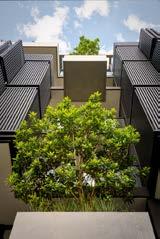
hillam.com.au info@hillam.com.au

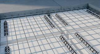


Your partner in light, since 1995.

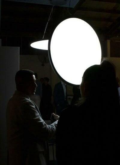
Intelligent advice, invaluable support. Meet our team

From specification to installation. We're there with you. Work with us



Architect: Hassell + OMA
Electrical Engineer: Stantec
Builder: Multiplex Electrical Contractor: Everett Smith
Lighting Designer: Stantec
Photographer: Peter Bennetts
PRODUCTS USED: ELS / Systemkanal
PRODUCTS USED: iGuzzini / Lingotto

LIGHT-MINDED

Welcome to the inaugural edition of light-minded. View story


