TILES, TEXTILES & SURFACES
These materials define our homes. Experience how textures, patterns, and finishes bring three New York City apartments to the next level.


These materials define our homes. Experience how textures, patterns, and finishes bring three New York City apartments to the next level.


General Assembly crafts a calm oasis with textural complexity on the Upper West Side.

BELOW


BELOW, RIGHT
Calico Wanderlust Unearth wallpaper adds texture and depth in unexpected places, like the entry to the

General Assembly’s Upper West Side Residence strikes a harmonic balance between grandeur and simplicity, paying homage to the building’s prewar history through intentional pairings of natural materials. Noting how the family of four uses the space, designers Sarah Zames and Colin Stief opened up the segmented floorplan to create a spacious living area where loved ones gather for annual Super Bowl parties.
Wood details, like a set of sliding doors that demarcate the kitchen, are paired with natural stone elements to create a grounded feeling. Five massive, vibrantly patterned stones are juxtaposed against wooden furnishings; slabs of quartzite and veined marble have become sinks, countertops, and a commanding kitchen island; and a custom-carved table acts as a light counterweight to complement the island’s unique shape.
General Assembly often creates custom pieces to realize its unique visions, which led the firm to open its own retail store for home renovation materials, furniture, and lighting called Assembly Line. The
living room’s modular coffee table was one of the first pieces designed for the space, and reproductions can be found at Assembly Line. The table’s curved edges and rounded shape gesture to the unique sculptural irregularity of natural forms that characterize the firm’s work.
While the open communal space is the apartment’s centerpiece, each private bedroom and guest area is a sanctuary of its own. The designers made use of the primary bedroom’s ample natural light to feature a virker plaster finish on the walls. There’s also a custom floating bed frame, which enhances the open nature of the space’s design.
“We’ve tried to bring in local designers to give a sense of place,” Stief said. Zames pointed out the dining room table from Egg Collective, which sits beneath a light fixture by Lindsey Adelman and holds pieces by Danny Kaplan. Attention to detail down to the dining table’s polished brass accents demonstrates General Assembly’s sophisticated touch when it comes to manufacturing visual harmony across all surfaces. —Katya Borkov


These soundabsorbers play with biophilia in decorative and innovative ways, from incorporating pressed flowers (and their smells) to sculpting organic forms and turning citrus into acoustic pulp.
5 Stone Textures by Turf
6 Hush Stack by 3form Elements


Inscribing new life into a historic paper factory, O-N delivers on a colorful vision through expert material sourcing and a mastery of form.


BELOW
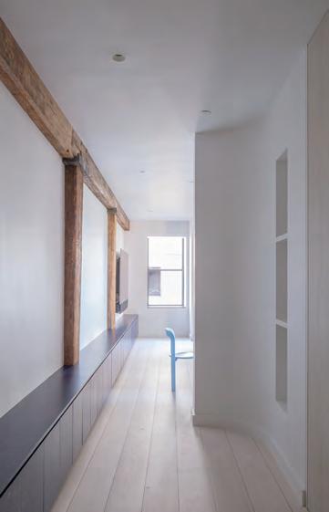
Channeling a vintage modern feel in a repurposed paper factory, Davis Owen and Irene Chung, cofounders of O-N, have thoughtfully tailored a West Village apartment to their clients’ distinct style. Large wooden beams punctuate the wall to the left of the entryway and gesture to the building’s history. One beam is marked with the number 54, perhaps demarcating a former loading dock.
This hall is lined with storage: floor-to-ceiling closets to the right and a length of cabinets to the left that, among other things, house the family’s extensive board game collection. The wall curves to a halt at the living room, indicating how far your street shoes can go.
On the other side of the curve is the star of the show: a rounded blue banquette cradling an onyx geode table, which pays homage to the client’s impressive crystal collection. She described the piece as “a dream come true.” The striking wall features Heath tiles from San Francisco, and the seating’s wooden base is stained with blue linseed oil, a process undertaken with support from expert Thor of Danish brand Linolie & Pigment.
The rest of the crystal collection is displayed across from her luxe, g old-wallpapered closet. “Play is a really big part of our design process,” said Chung. She and Owen recount sharing their clients’ enthusiasm while sourcing vintage furniture and exploring material possibilities to accommodate their unique needs. “They’re pretty big collectors, so we kept [the wall space] pared back to showcase their art,” Owen added.
The kitchen features soapstone countertops and open shelving as b eautiful as they are functional. O-N’s clients love to entertain: The family once ho sted 60 baby shower guests comfortably thanks to the flexible sectional couch, wh ich doubles a makeshift playpen to keep their puppy and baby separated.
—Katya Borkov


at fergusonshowrooms.com.


Go bold without straying into kitsch—these statement-making wallcoverings are elevated and artful without being overly noisy.
1
2
3


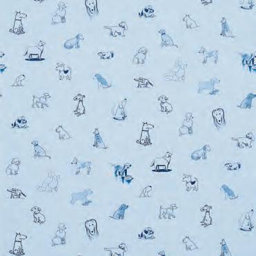
4 Good Dogs Everywhere by Schumacher
5 The Season of the Tree by House of Hackney


Curvilinear, rectilinear, or amorphous: The following rugs play with form to captivate and define a room.


BELOW, RIGHT
RIGHT
A snapshot of the natural dye process in Nepal
FACING PAGE, BELOW
An installation view at the last 3 Days of Design in Copenhagen
FACING PAGE, ABOVE
Founder Rebekka Stange

As a costume designer, Berlin-based talent Rebekka Stange knows fibers like the back of her hand—she’s created garments for theater and opera productions in France, Germany, the Netherlands, and Switzerland and for films by directors like Francis Lawrence and Roland Emmerich. Her latest venture allows her to explore their relationship to interior space.
Officially launched in 2022 after a successful presentation during Salone del Mobile the previous fall, Räkki Rugs offers handmade Tibetan loop knotted carpets, designed with Stange’s well-trained eye for hue, material, and detail. Dyed, woven, and finished in collaboration with artisans in Kathmandu, Nepal, that she met during a scouting trip in early 2020, their manufacturing process is meticulous. But, from her studio in Germany, Stange approaches each rug like a work of art.
“I'm very interested in how colors affect us,” said Stange, who recently showed a selection of Räkki Rugs pieces, each with their own personal flair—from a graphic abstraction of nature with pops of deep orange to a geometric color field in muted blue, green, and gray tones—at 3days of design in Copenhagen. Citing artists like Olafur Eliasson and Ellsworth Kelly, her own explorations in photography, and the considerations she makes when designing costumes as inspiration, she
begins every rug design with a small watercolor. The medium is appealing for its “light-reflecting” quality, one that Stange then emulates in the tactile floorcoverings.
“I try to mix different materials to get the [same] effect,” she said, an effort that includes vegetable-dyed Tibetan highland wool, Nepalese nettle for durable grip, and Chinese silk for shimmer. Woven into intricate Tibetan knots or now-rare traditional cross knots—a recent exploration Stange debuted at 3days—to make carpets, her abstract patterns literally shine. For a designer who has focused her career on nailing the details, the handmade nature of these pieces has taught her how to embrace the beauty in irregularity. She noted: “It's a little bit like painting the rug, in the end.”
—Elizabeth Fazzare


4
5


Tilemakers continue to innovate on texture and color, incorporating cutoffs—as is the case with Salvatori’s

5


7
8
10


Frederick Tang Architecture crafts the Quarry Loft through a sensitive and customized approach.


ABOVE Walls are wrapped in a green-gray paint from Benjamin Moore.
RIGHT
An assembly of objects sits atop a checkerboard wool rug from Aelfie.
BELOW
Frederick Tang’s latest project is a testament to form and multifunctionality, creating a serene space that lovingly expresses the personality and heritage of the apartment’s inhabitants. Throughout the Quarry Loft apartment in New York, Tang thoughtfully integrated delicate white oak millwork with decorative wallpaper panels and bold stonework. “The family’s grandfather was an abstract artist, so we were picking a lot of gestural textures on purpose,” said Frederick Tang, principal of the eponymous studio. “You’ll see that in the stone, [and] the fabric panels are very painterly…almost like watercolors.”
The main room features a barrelvaulted ceiling, a series of sliding screens and fabric panels, and recessed doors—a space made to be flexible. “It’s a foyer, a guest room, a library, and an office,” Tang said.
Behind cabinetry, a hidden Murphy bed can be revealed to create a fifth bedroom— perfect for hosting guests during the family’s large reunions. A desk rests behind blue panels that flank a religious altarpiece.

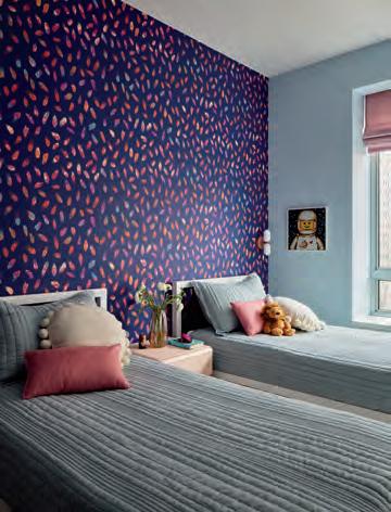
Perseid wallpaper in Twain Blue from Flat Vernacular is a fun detail. Tiles,
The dark blue, green, and pink accents of Phoenix marble from ABC Stone anchor the palette in the kitchen and main room, appearing again as a backsplash in the bar area. This repeated use of materials along with fluted millwork and metal accents brings visual cohesion to a space rich with color and pattern.
As is expected in a historic postwar building, structural columns and asymmetrical risers challenged the designers. The floorplan reveals a laundry room tucked into an alcove and closets built into leftover spaces. The integrated headboard in the bedroom is another detail influenced by the apartment’s unique geometry. But natural forms bring the whole design together. The angled shape of the dark kitchen island, for example, was created to accommodate seating for five. “It’s a sculptural pebble,” said Tang. This artful maze of natural forms fits the family’s vibrant new life into a building that’s been transforming for decades.
—Katya
Borkov


