Six architects and designers make public installations using cork for Lisbon page 10
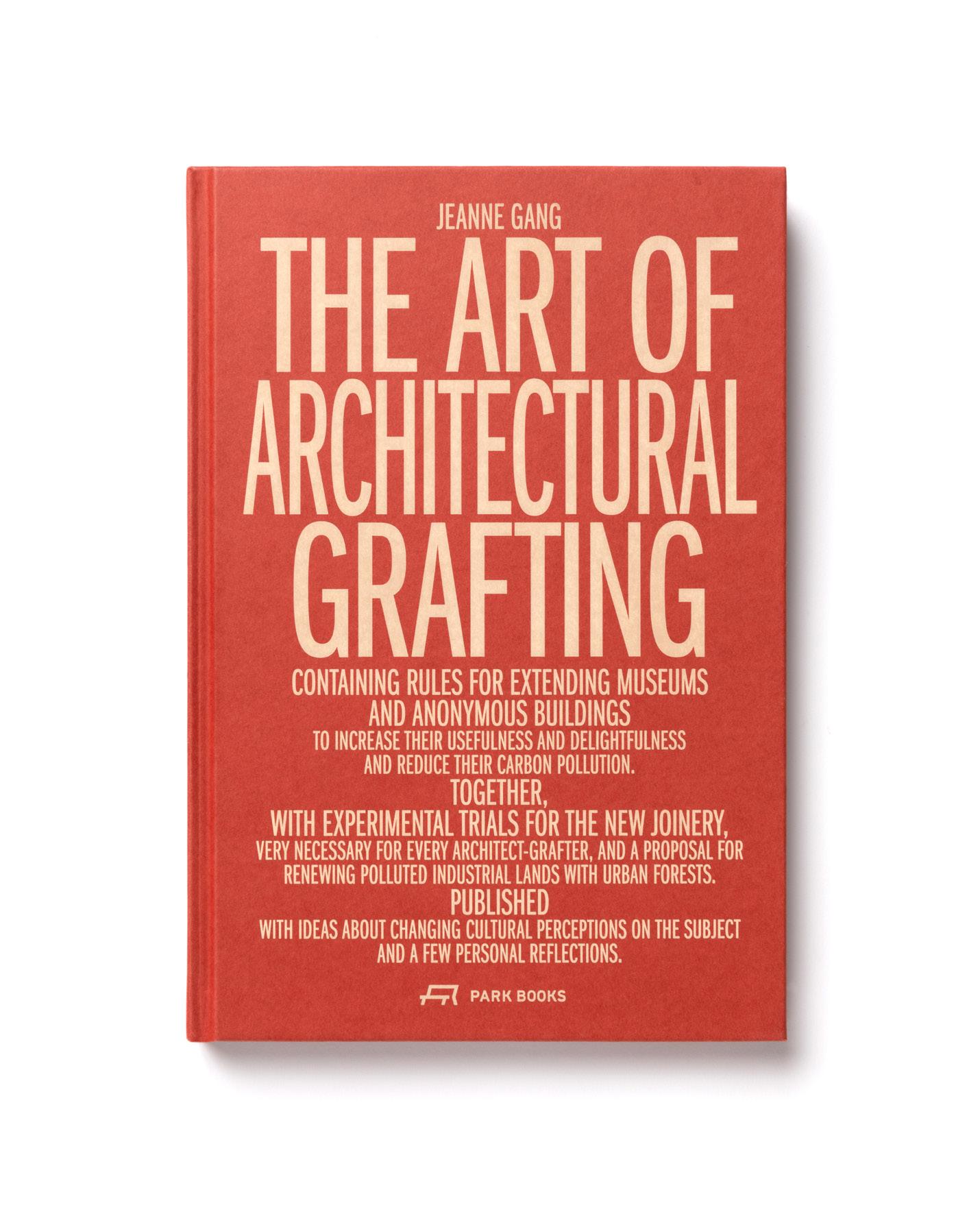
Jeanne Gang shares about her book, The Art of Architectural Grafting page 14
Álvaro Siza renovates a monastery and debuts a pavilion in white concrete page 15
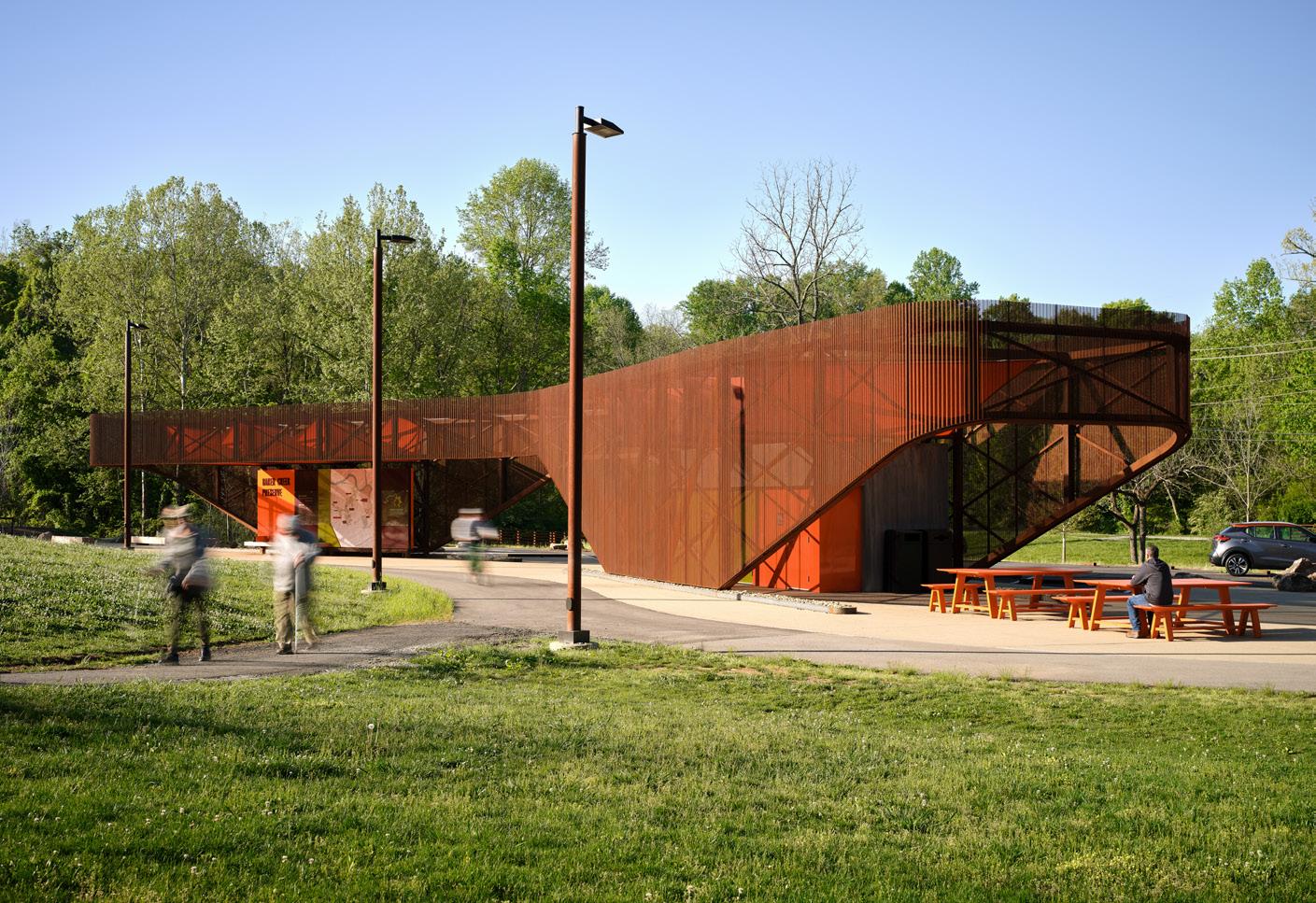
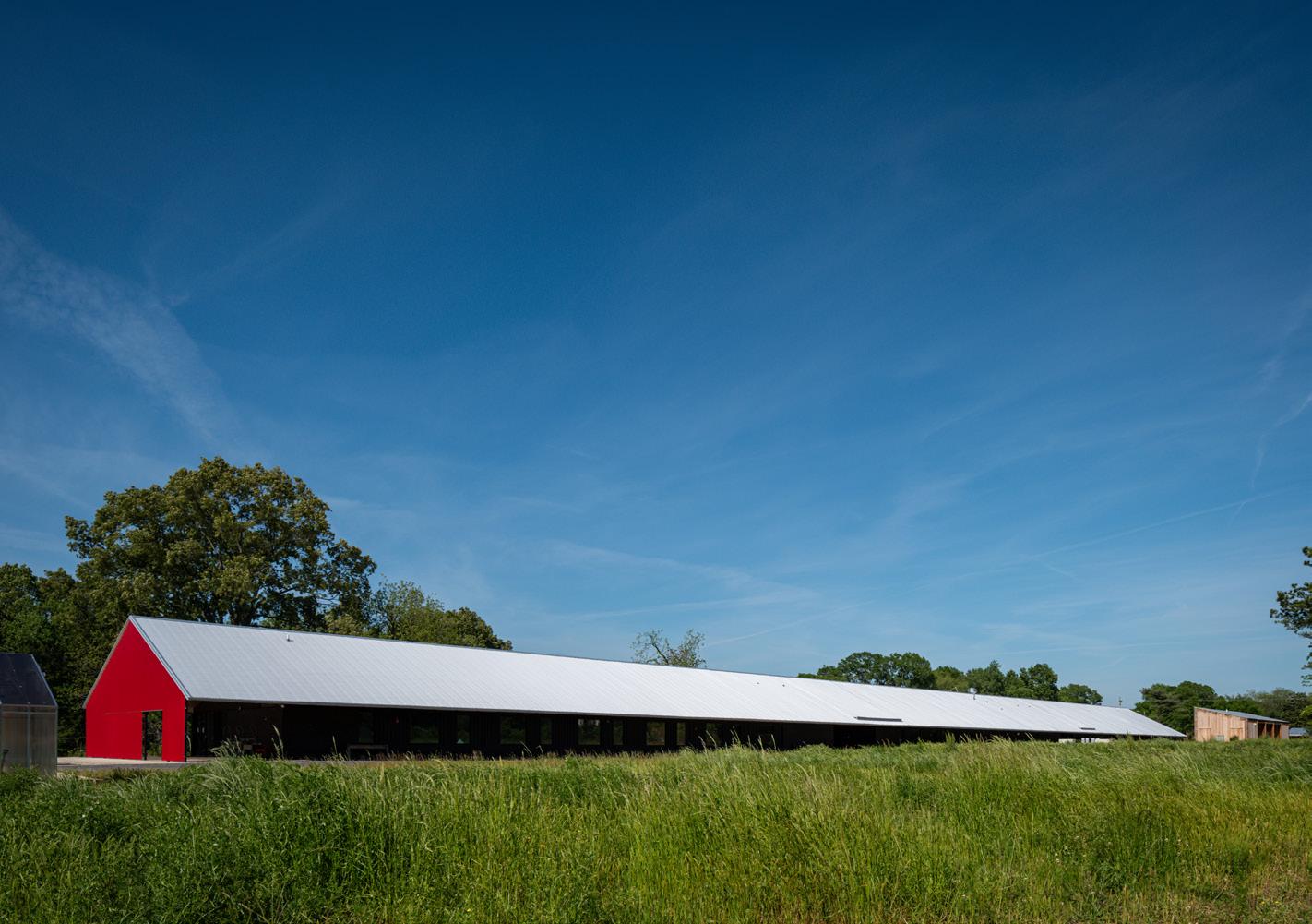
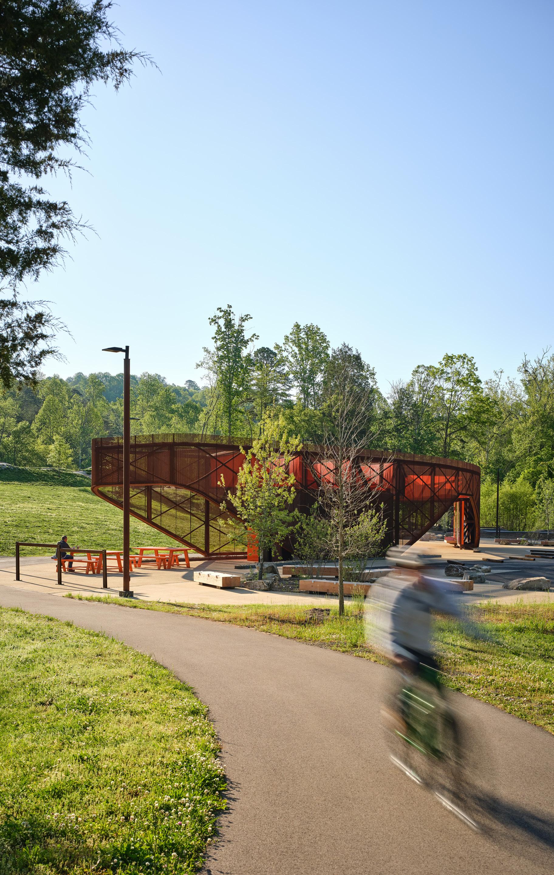
Postcard from Knoxville No More White Walls
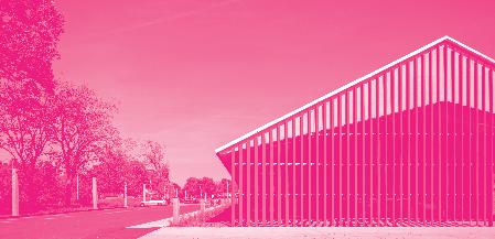
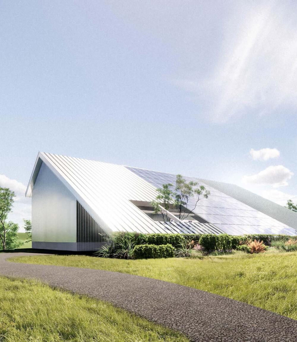
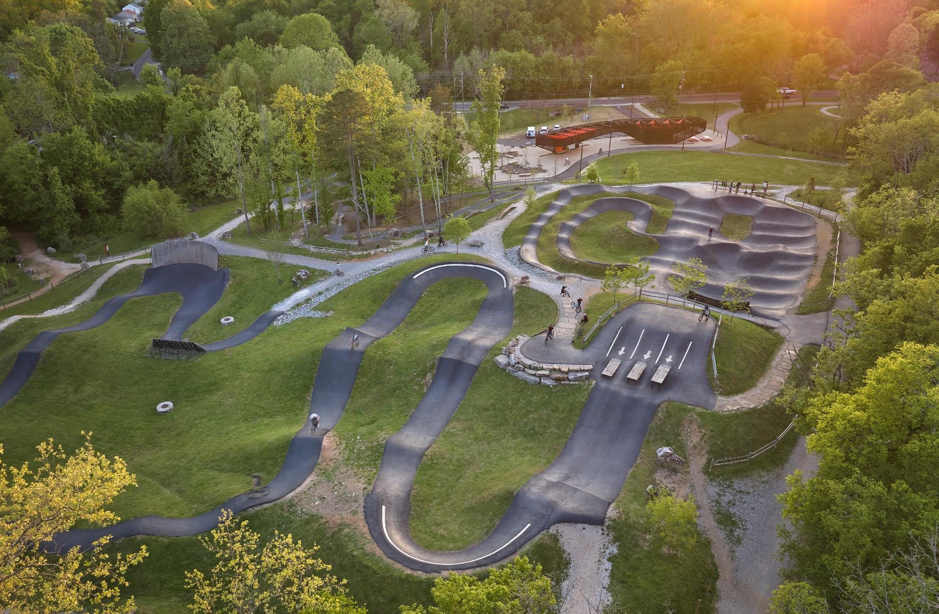
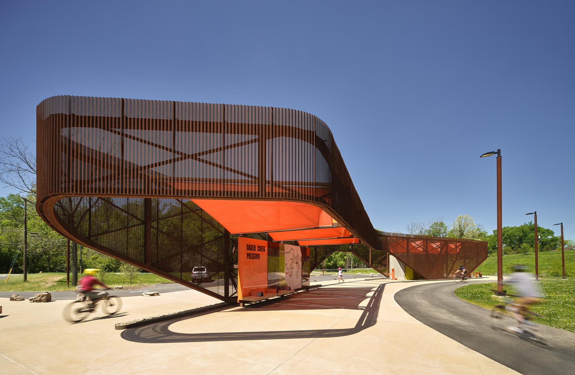
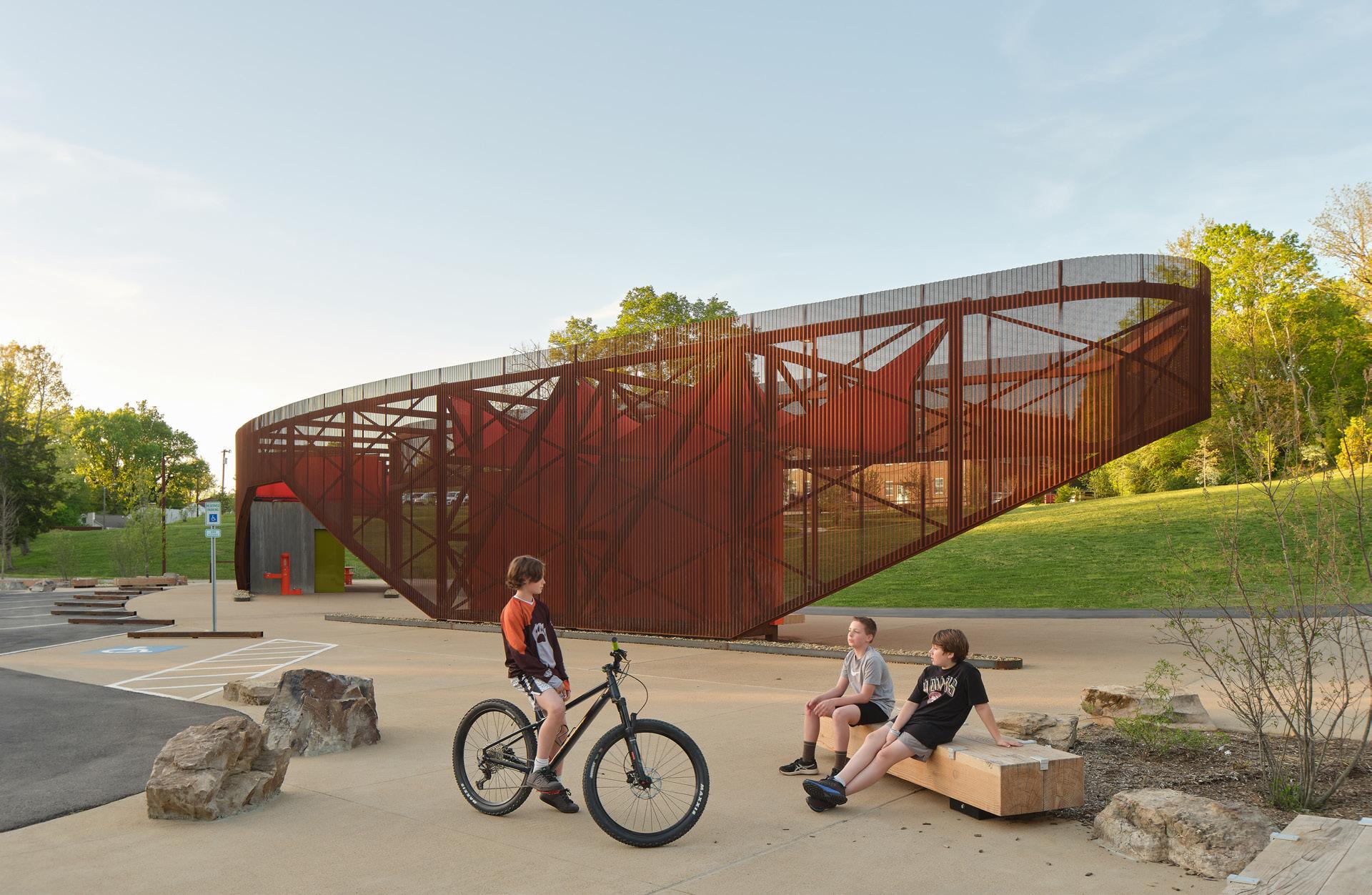
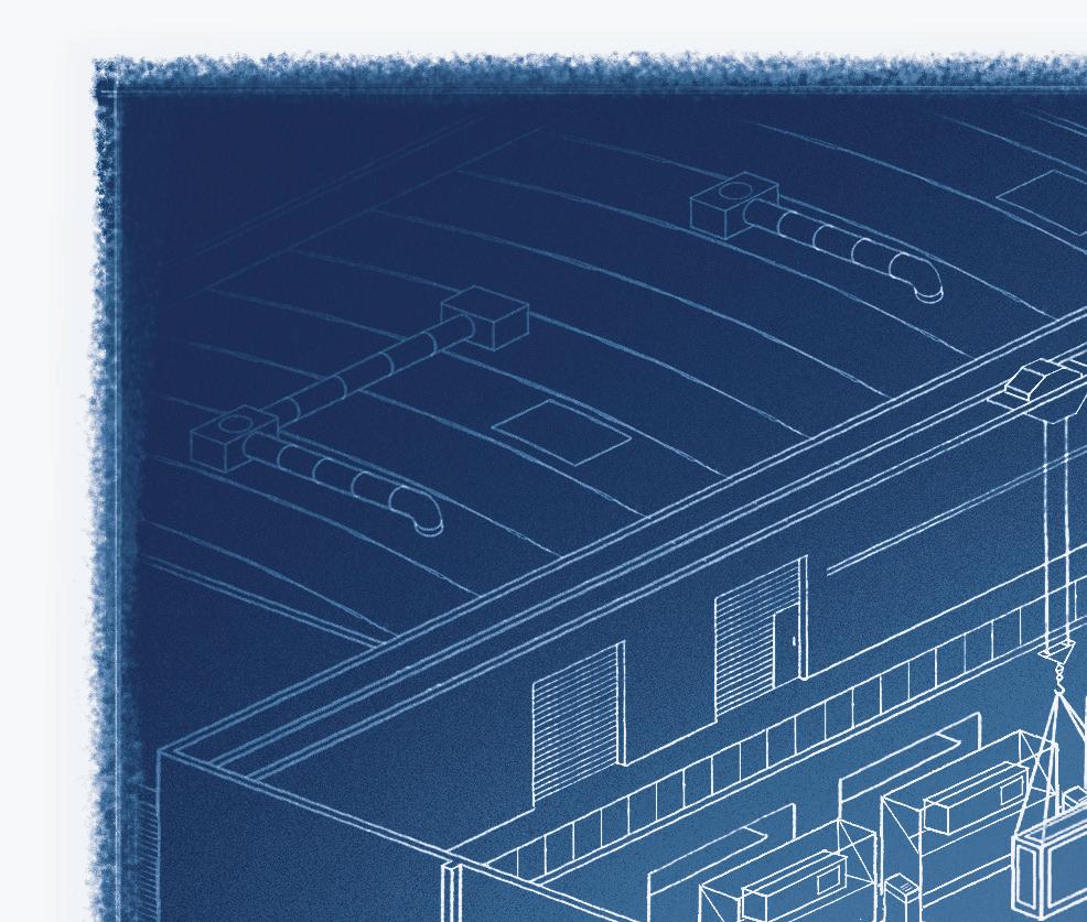
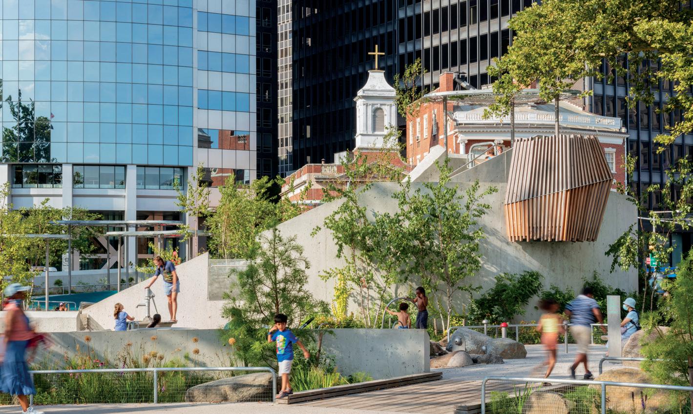
Sanders Pace Architecture completes a pavilion for the city’s Urban Wilderness Gateway Park, planned by PORT Urbanism. Read on page 30.
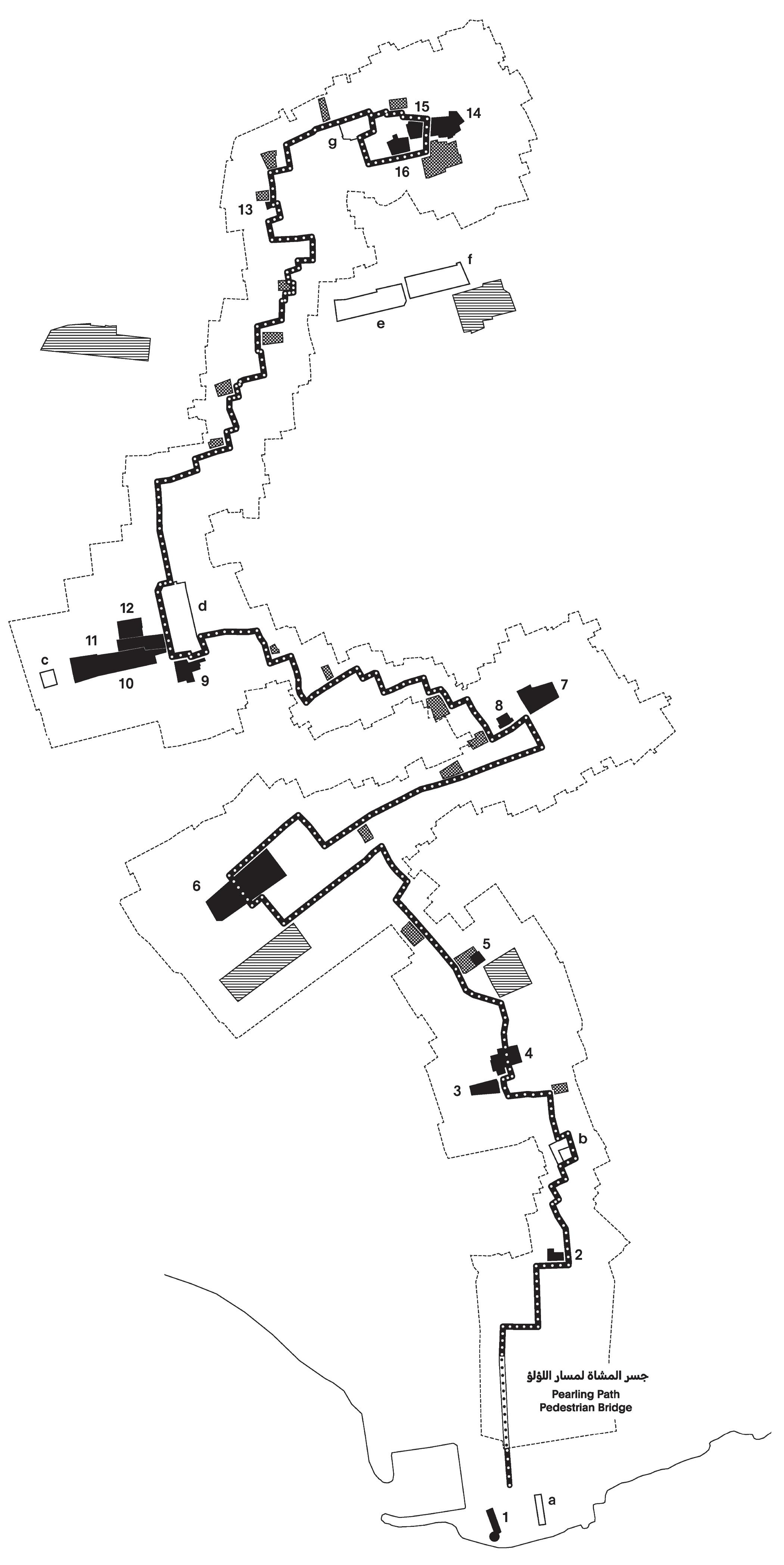
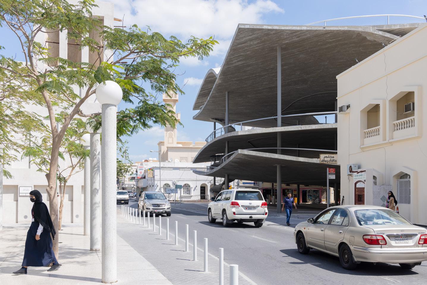
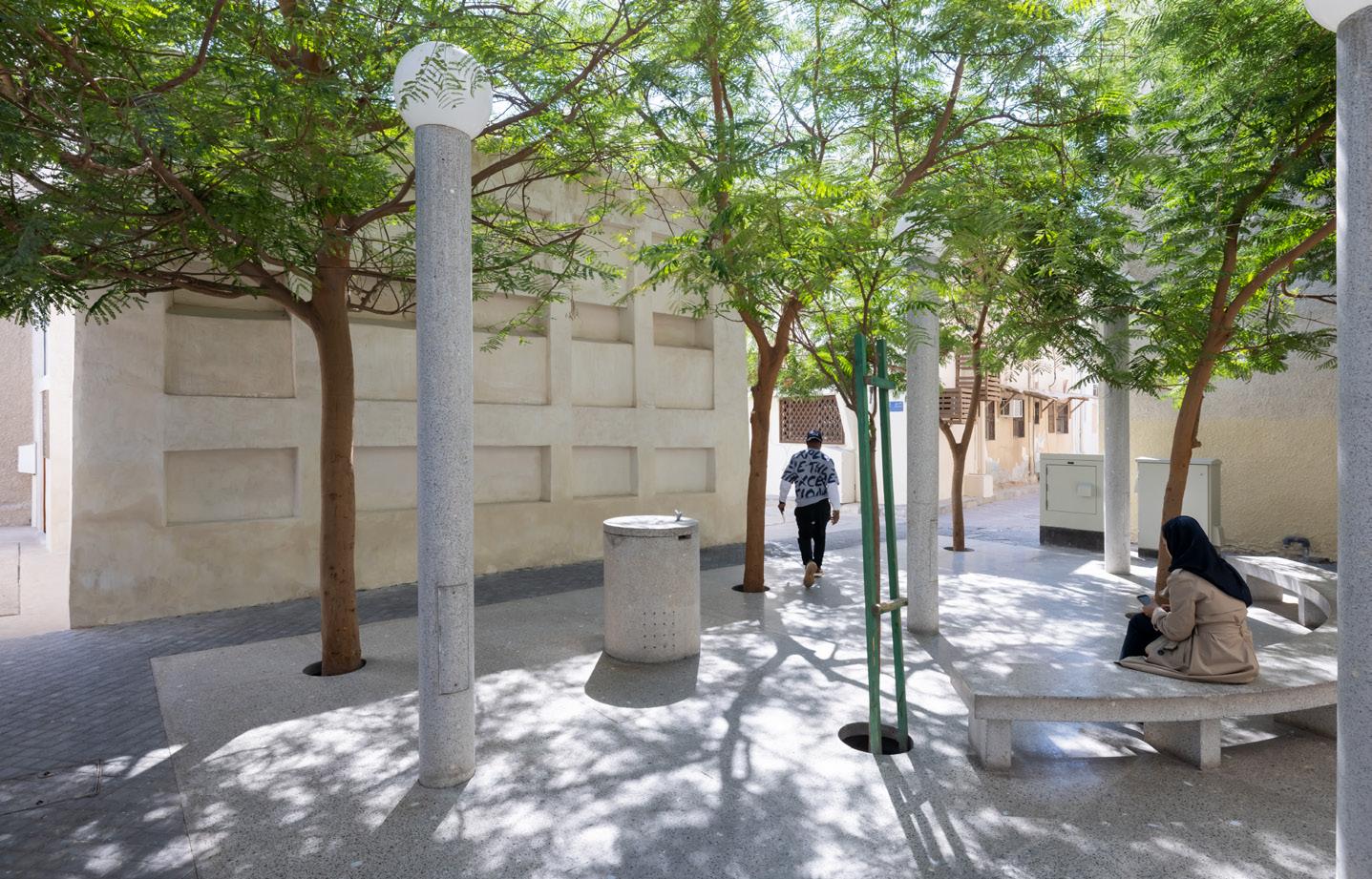
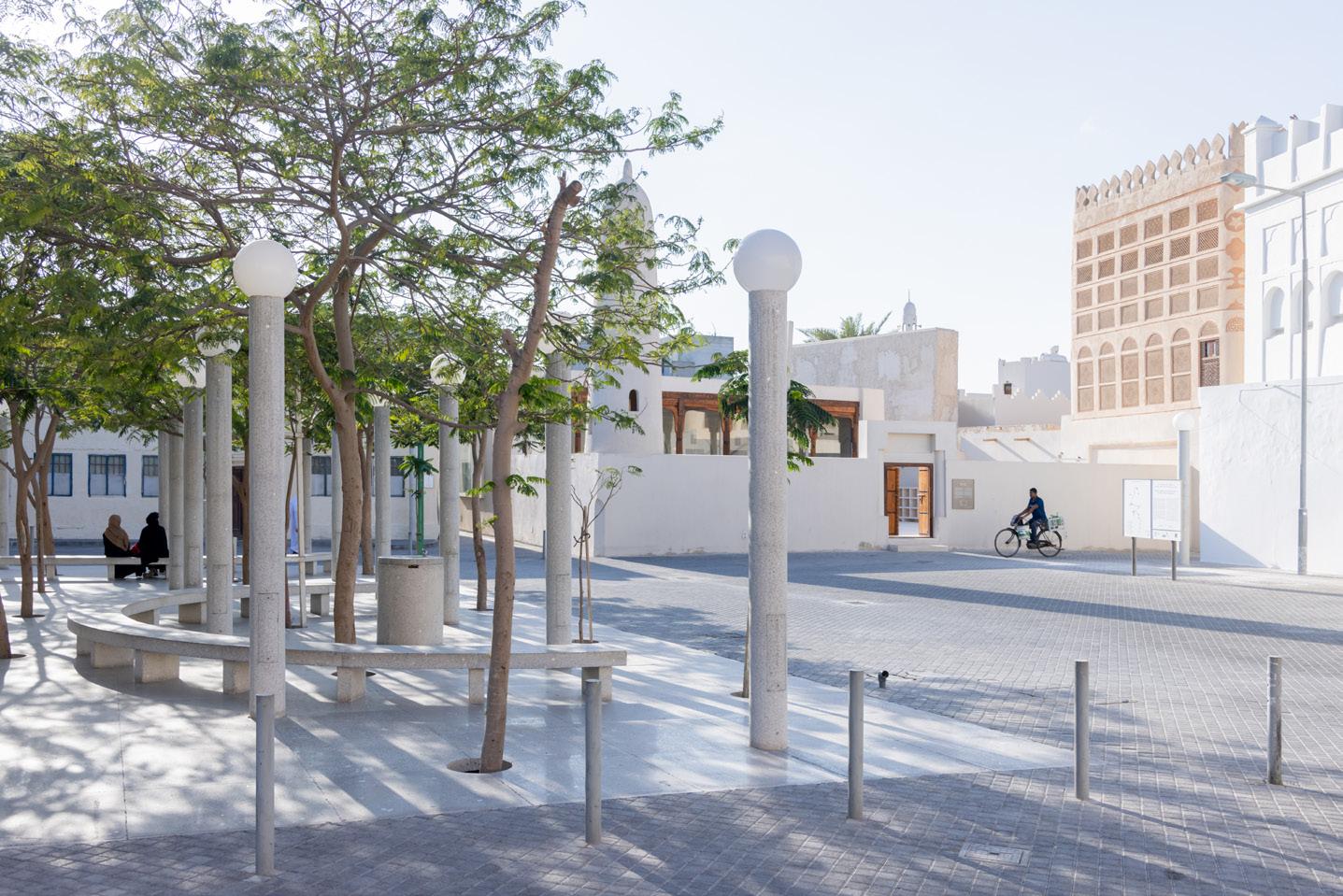
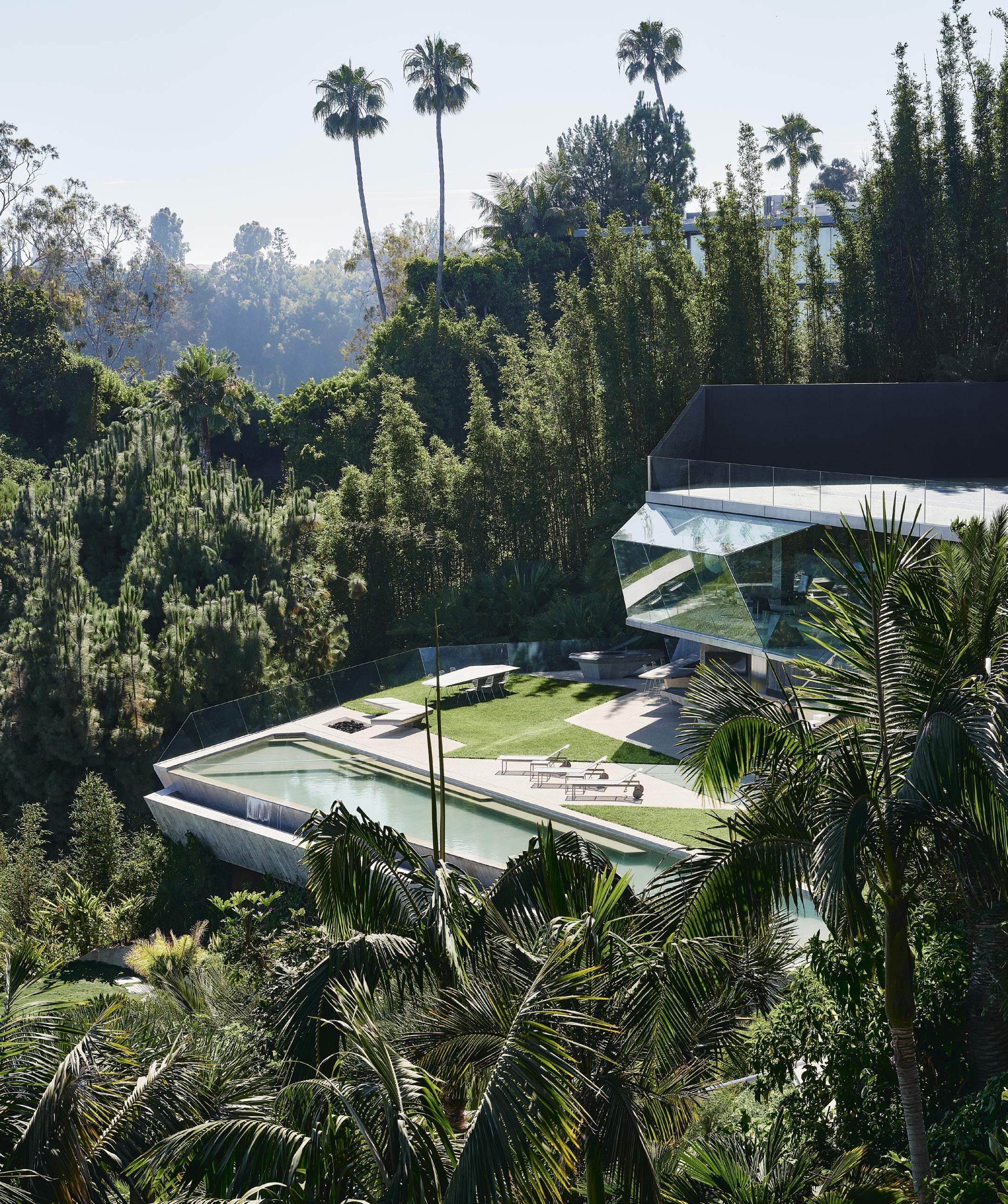
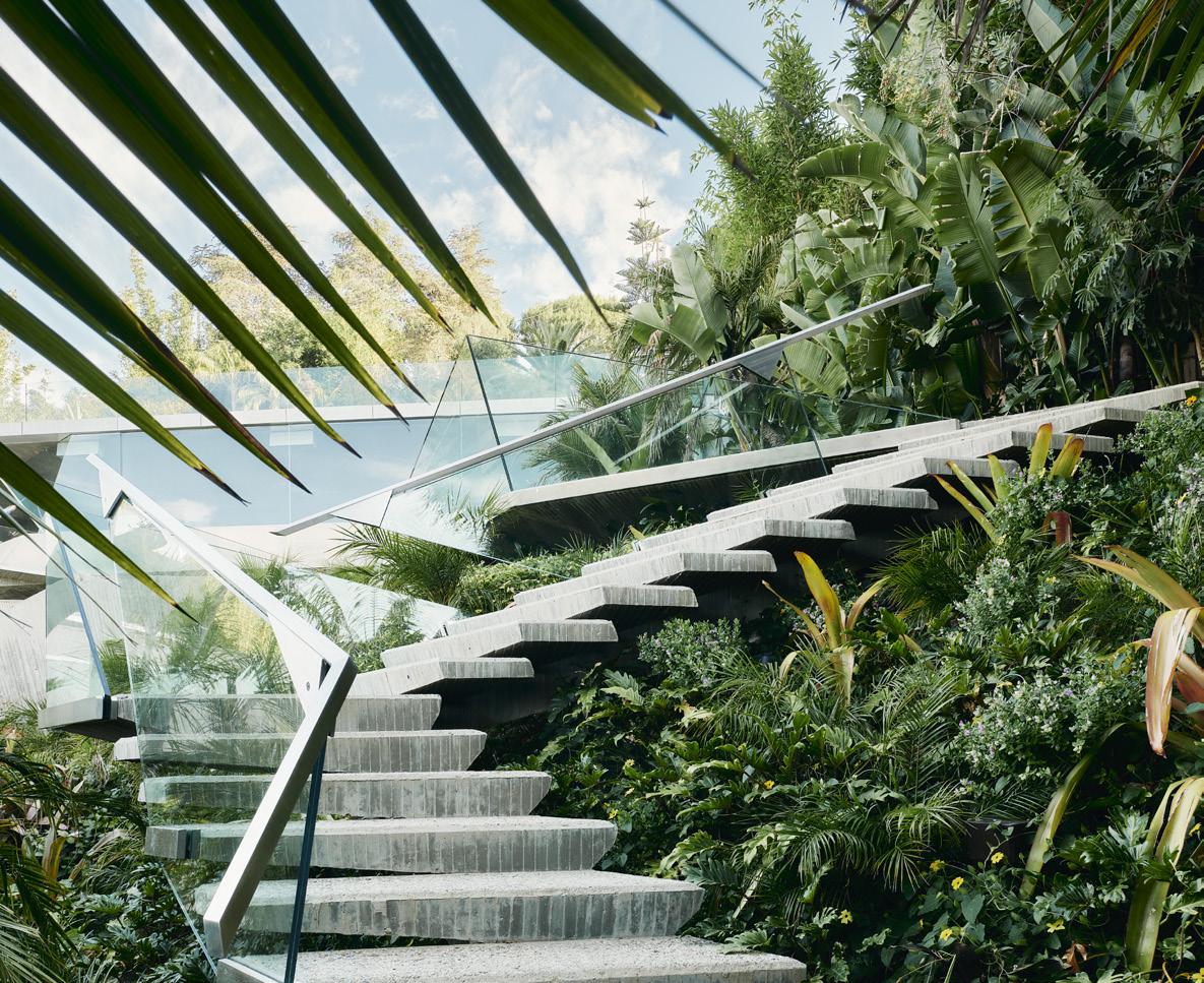
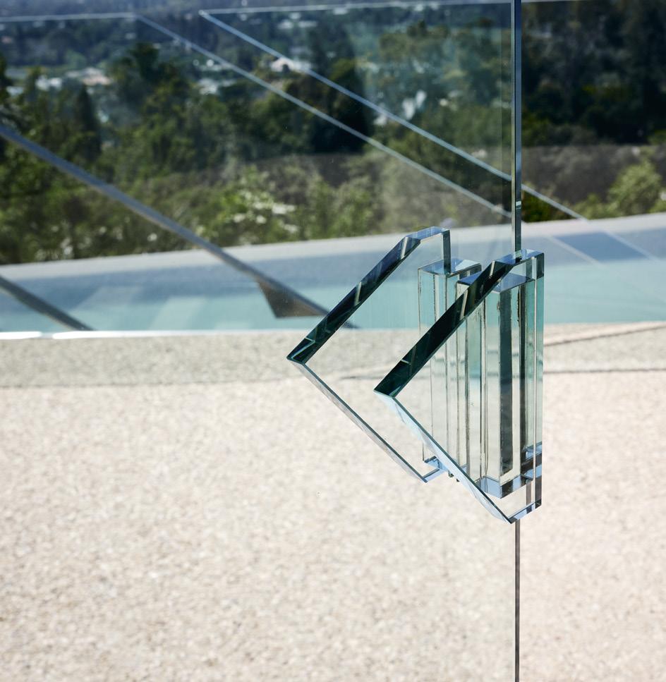
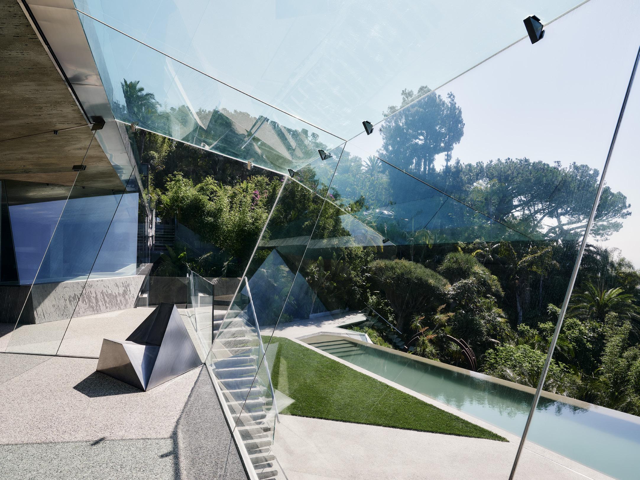
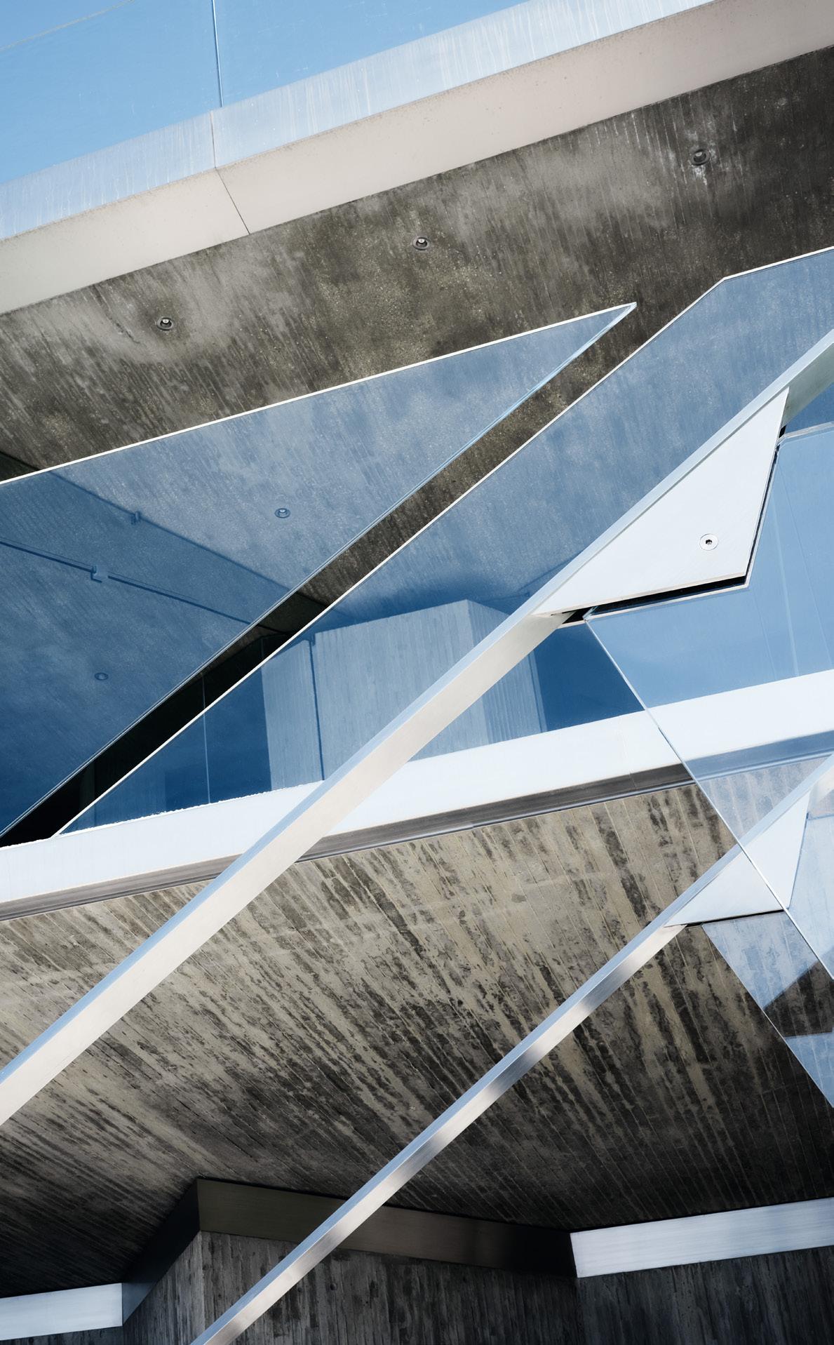
A STRING OF PEARLS
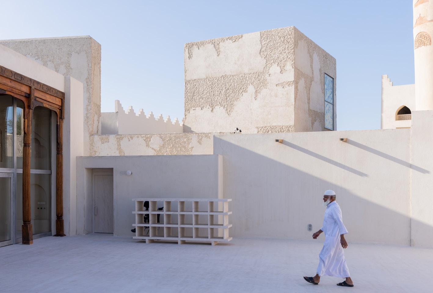
Beyond adding destinations by contemporary architects, the Pearling Path tells the story of Bahrain’s cultural heritage. Read on page 25.
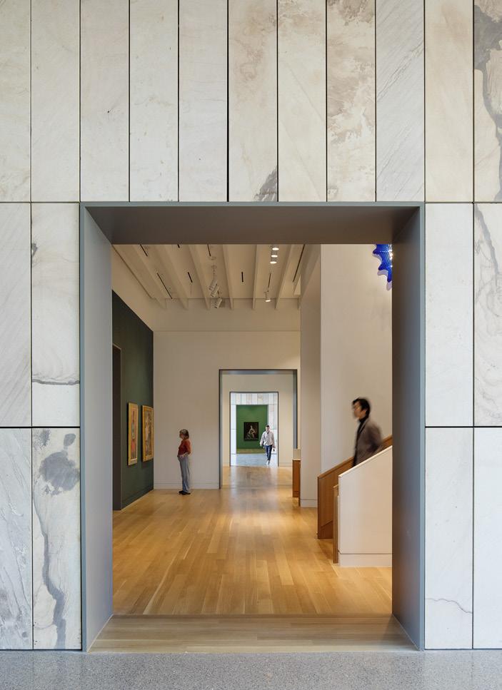
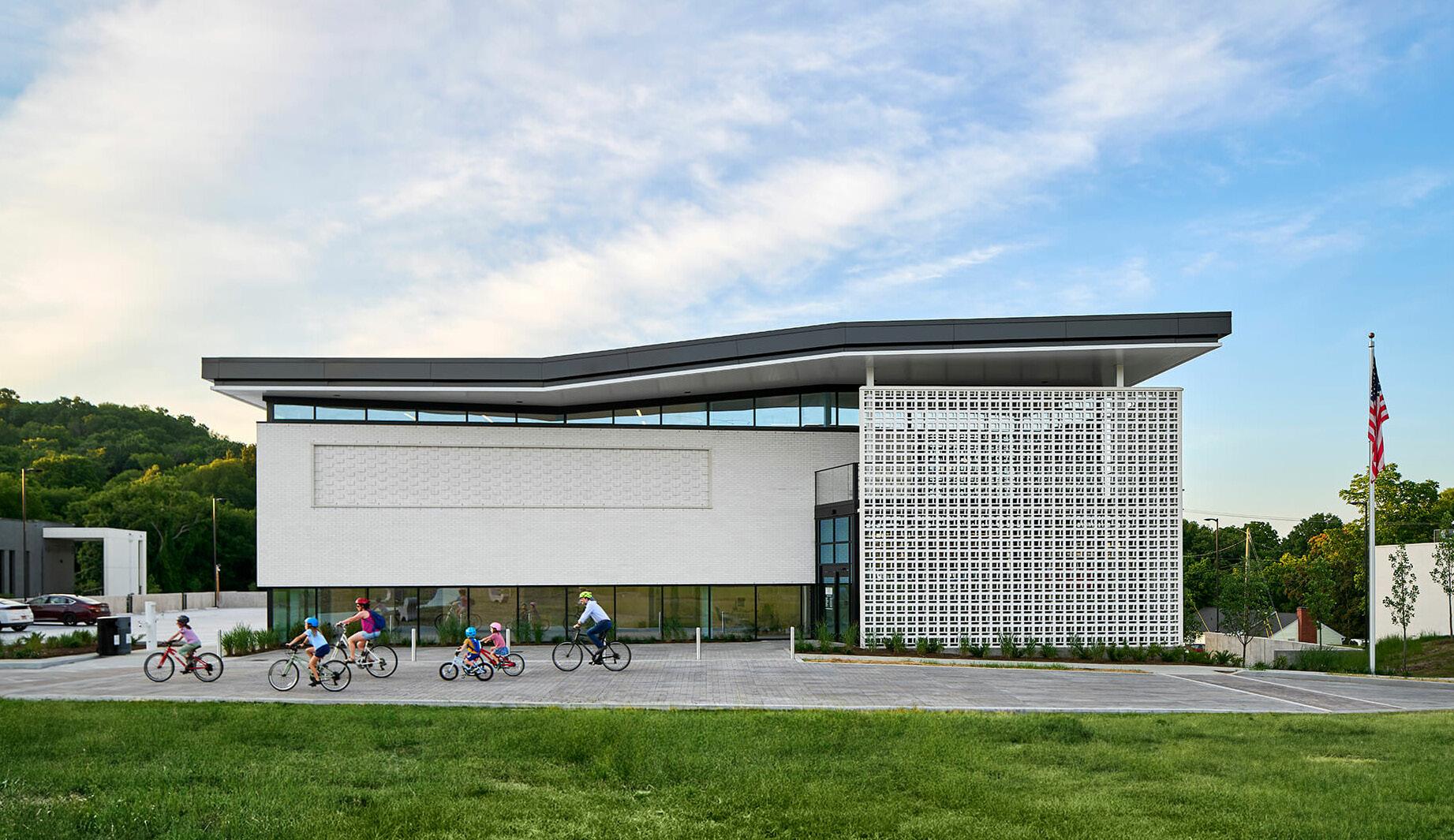
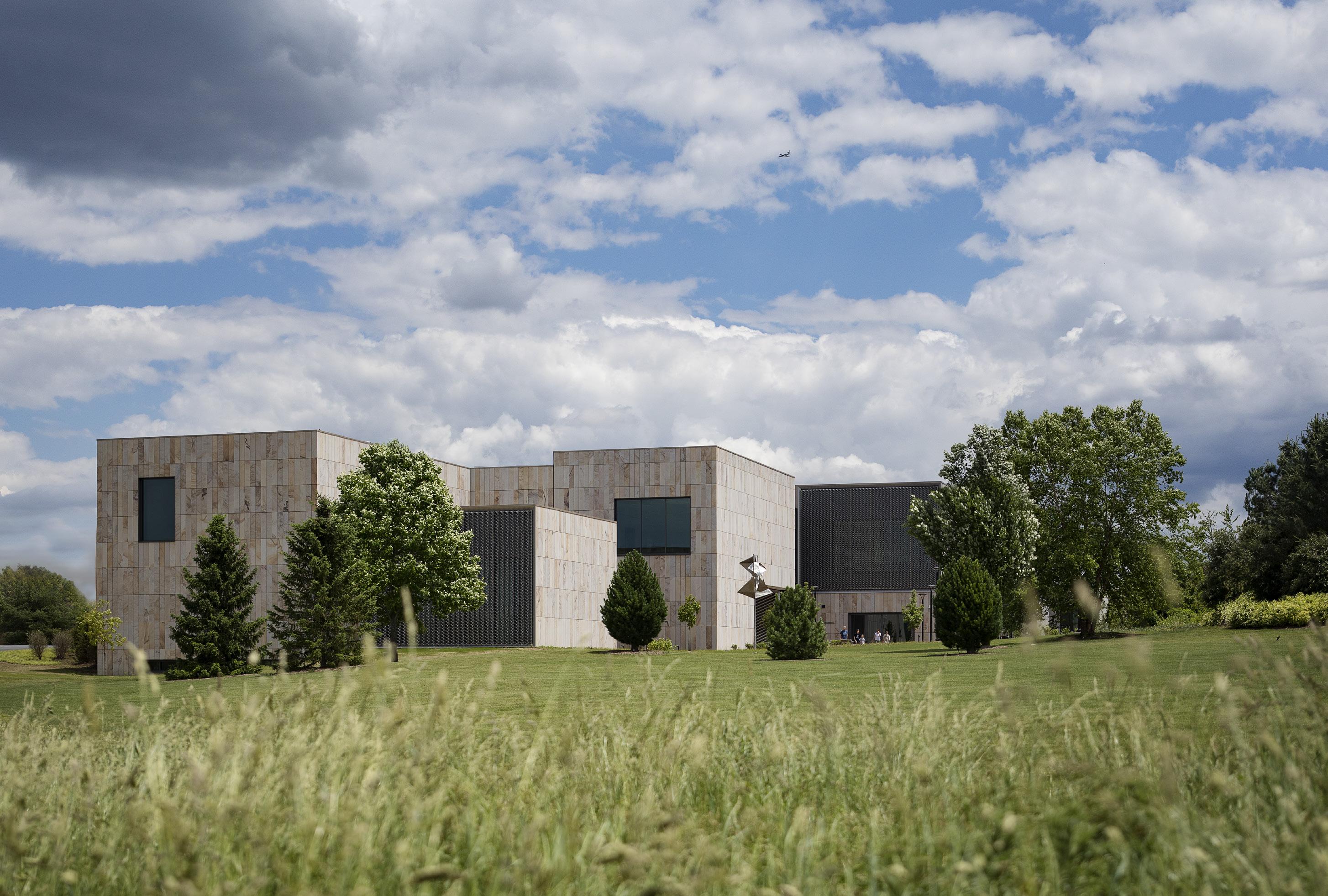
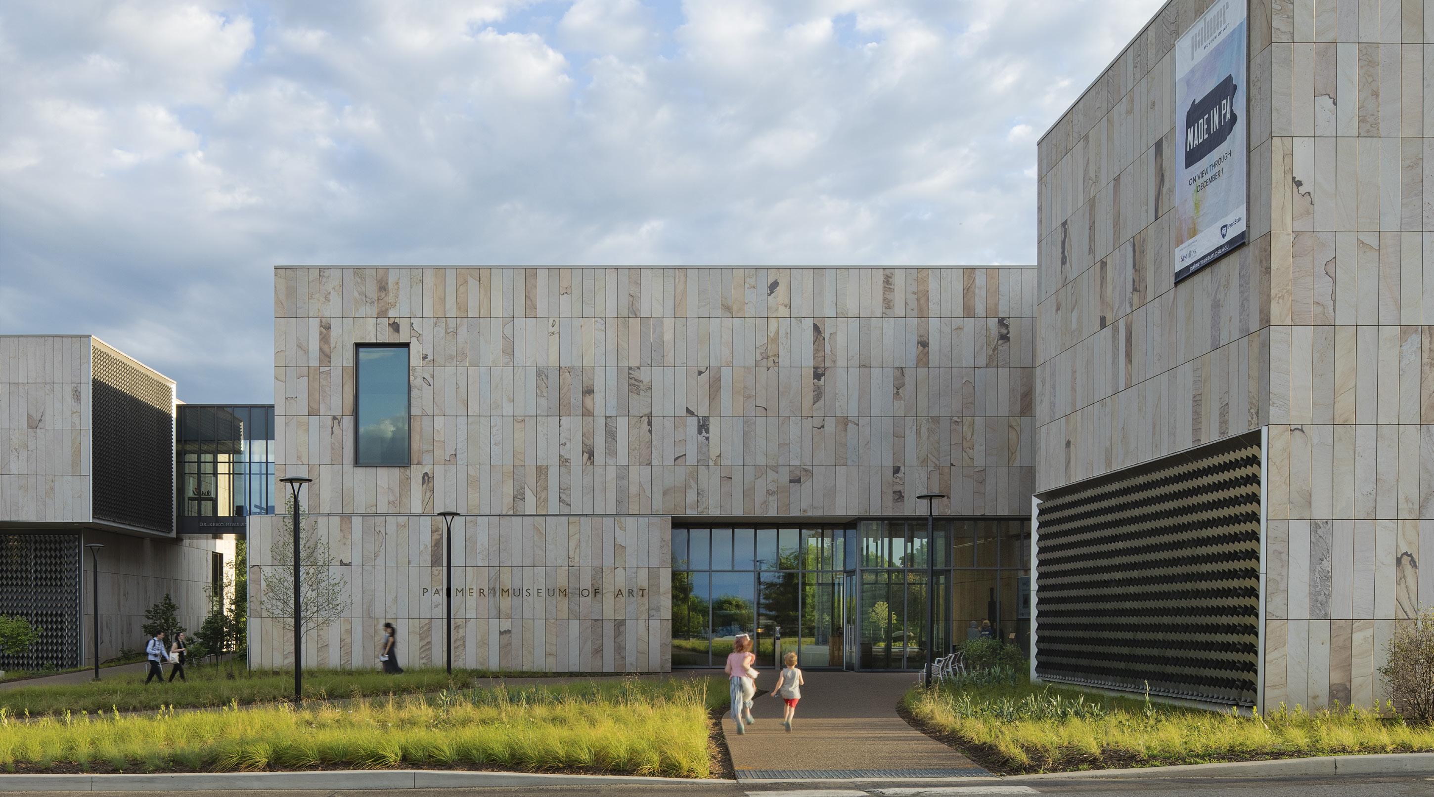
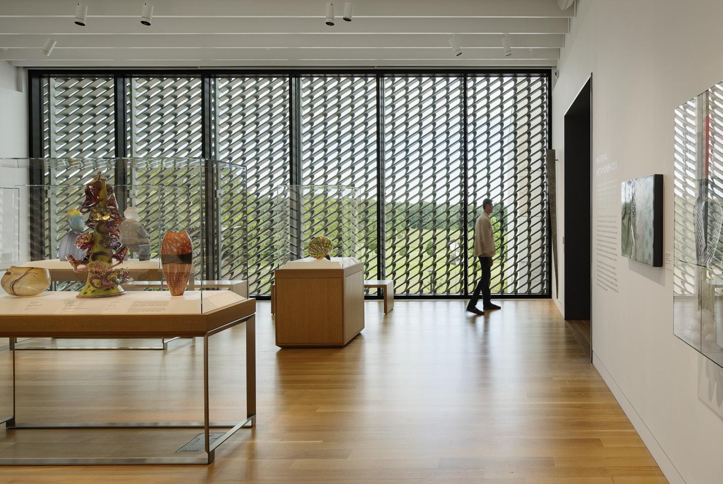
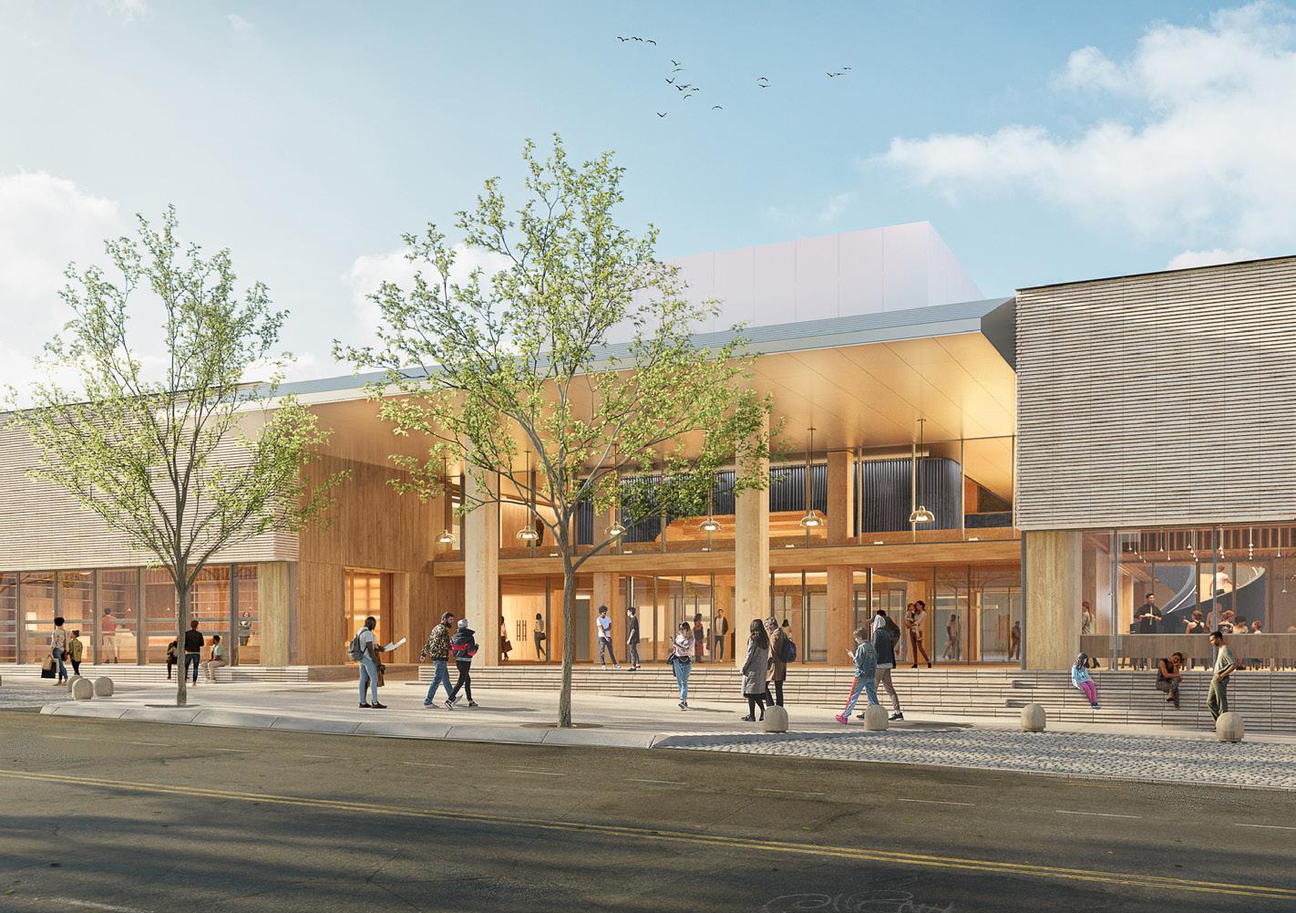
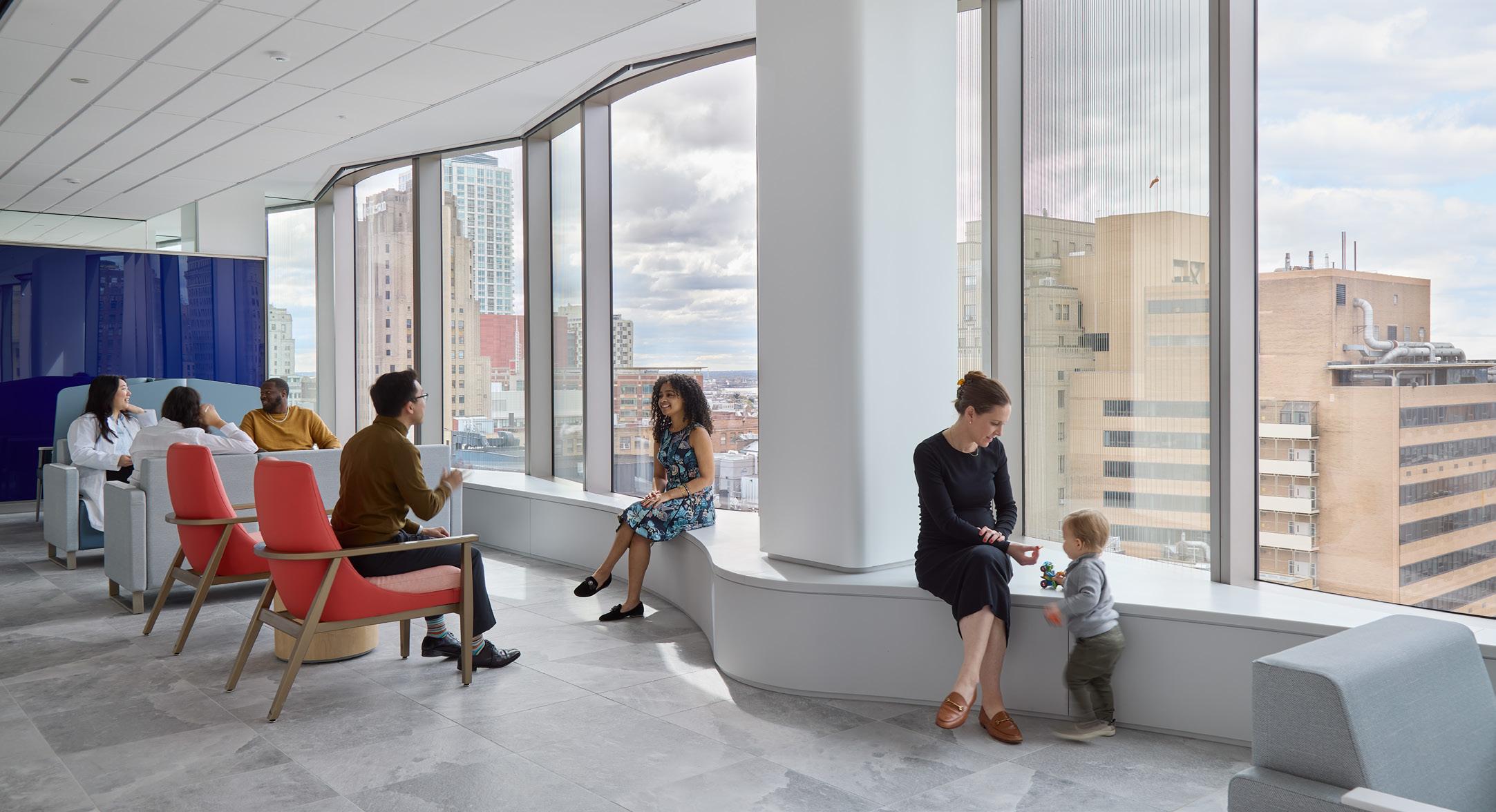
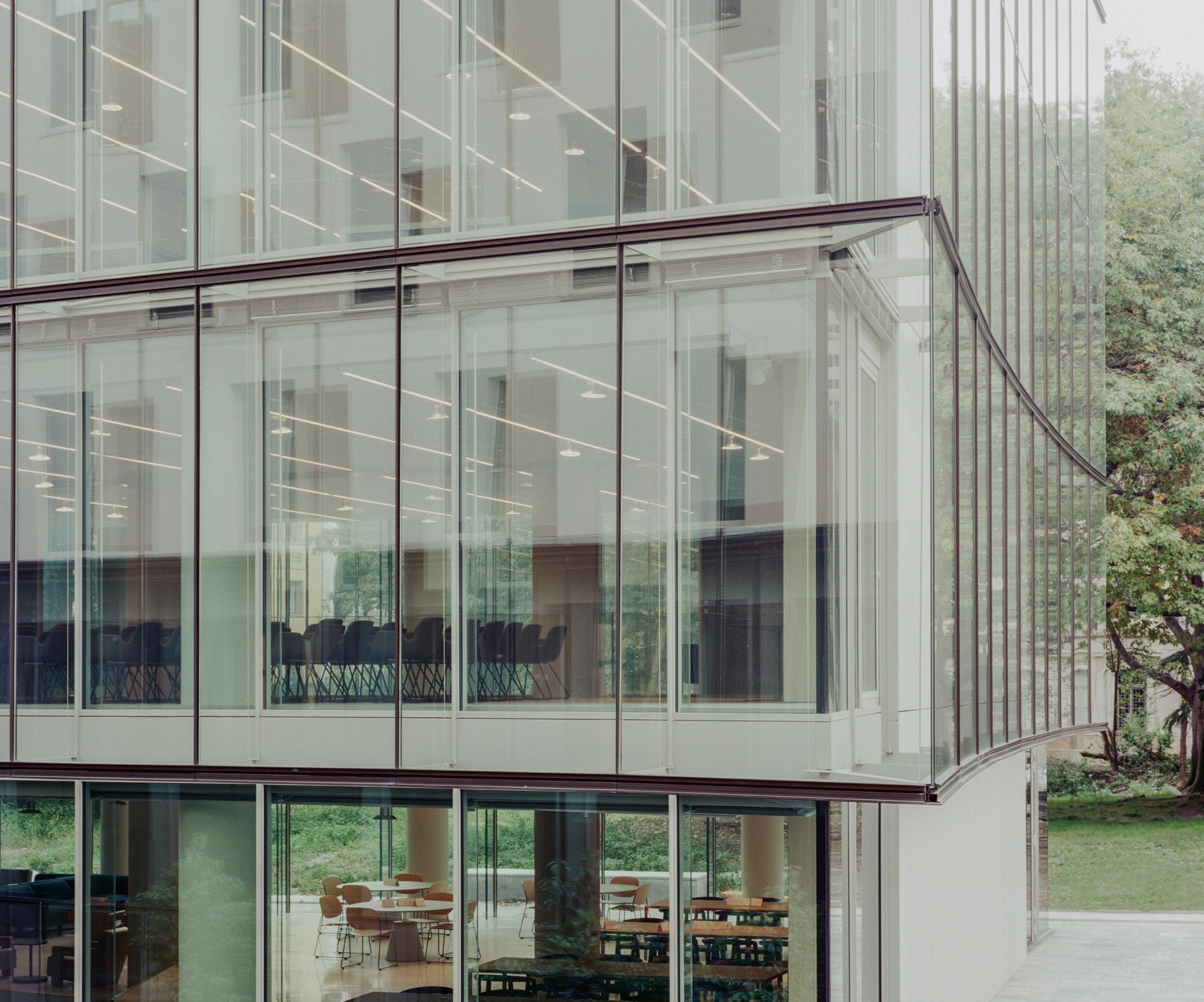
The Palmer Museum, with architecture by Allied Works and a landscape by Reed Hilderbrand, opens at Penn State University.
Art may not be among the first things that come to mind when you think of State College, Pennsylvania—but perhaps it should. University art museums are a varied lot: Some are among the grandest you can find, while others are strange spare rooms fulfilling a musty pledge to a donor to keep the Dürer etchings on display. The Palmer Museum at Penn State contains the largest art collection outside of the state’s urban centers, which might sound like faint praise, but it is not. It has 11,000 pieces, and a very healthy fraction of those (eight percent, up from four) are now on display in a brand-new facility designed by Allied Works. The Palmer was formerly housed in the university’s most interesting building, principally designed by Charles Moore, but it simply wasn’t large enough. (The university will be repurposing that building and seems serious about retaining its principal interior features.) continued on page 18
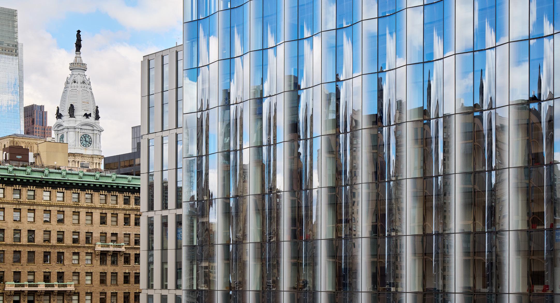
NYC at 400 Did 51N4E Demolish?
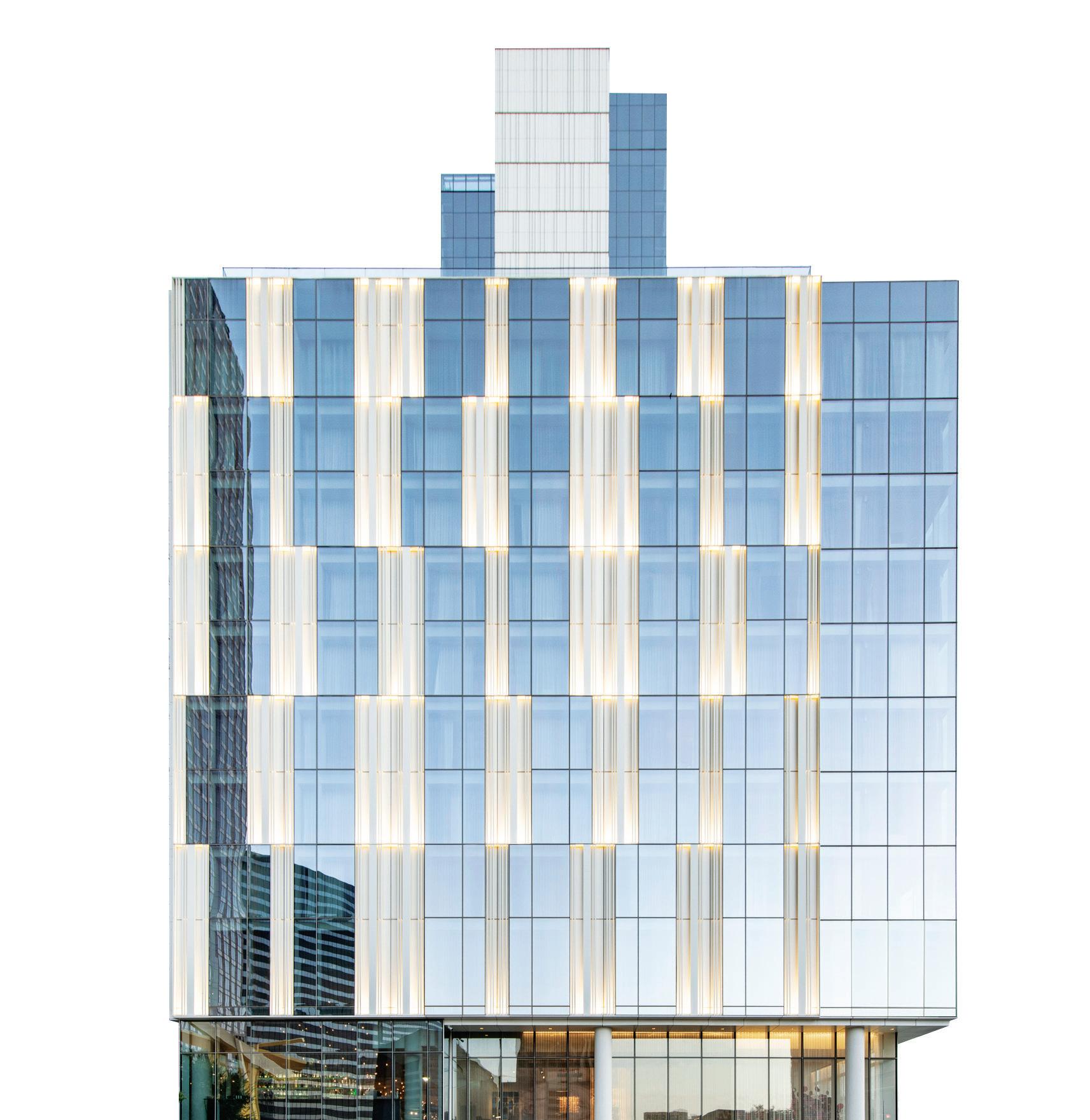
In April 2023, many New Yorkers learned of the renovation of the Brussels World Trade Center (WTC), spearheaded by Belgian office 51N4E, in a lecture hosted by The Architectural League of New York at The Cooper Union. Titled “How to Not Demolish a Building,” the lecture (and a book of the same title) outlined 51N4E’s half-decade involvement in the enormous project to modernize two obsolete office towers into a mixed-use complex of luxury apartments, a hotel, bars, restaurants, and more office space. Though presenters Olivier Cavens and Dieter Leyssen offered a litany of diagrams, spreadsheets, renderings, and photographs reflecting on years of research and outreach, many in attendance noticed a disconnect between the language used to describe the aspirations of the project and what was onscreen. At a dinner following the event, another architect broke the ice by posing an obvious question: “So did you demolish the building or not?” continued on page 12
Witness a piece by typewriter artist James Cook. Read on page 62.
JAMES COOK
KEITH ISAACS
JEREMY BITTERMANN
IWAN BAAN
MAKE YOUR M RK
Creative freedom to make your mark www.kingspanbenchmark.us
Gilbert Place at Virginia Tech Blacksburg, Virginia — QuadCore ® KarrierPanel®, Designwall 4000 and Designwall 2000
Designwall Series
Kingspan’s BENCHMARK Designwall architectural insulated panels are the premiere choice for tailor-made, one-of-a-kind façade designs. Make your mark with a variety of custom finishes and sizes in an extended color range for striking aesthetics and design flexibility combined with advanced thermal performance and energy efficiency.
For the creative freedom to make your mark, explore Kingspan BENCHMARK at kingspanbenchmark.us
QuadCore® Designwall 4000
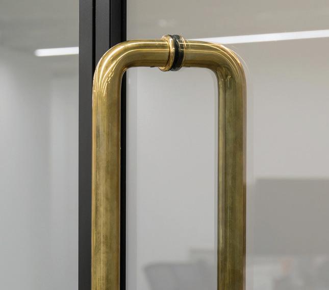
ARCHITECTURAL HARDWARE
Designed and manufactured in New Zealand
For more than 25 years, Halliday+Baillie has been designing and manufacturing architectural hardware with a commitment to sustainability. Their iconic hardware—including pocket door locksets, flush pulls, stair rail brackets, and solid brass pulls—is made entirely in New Zealand and is available worldwide in a variety of hardy finishes.
Four Hundred Years of Summer in New York
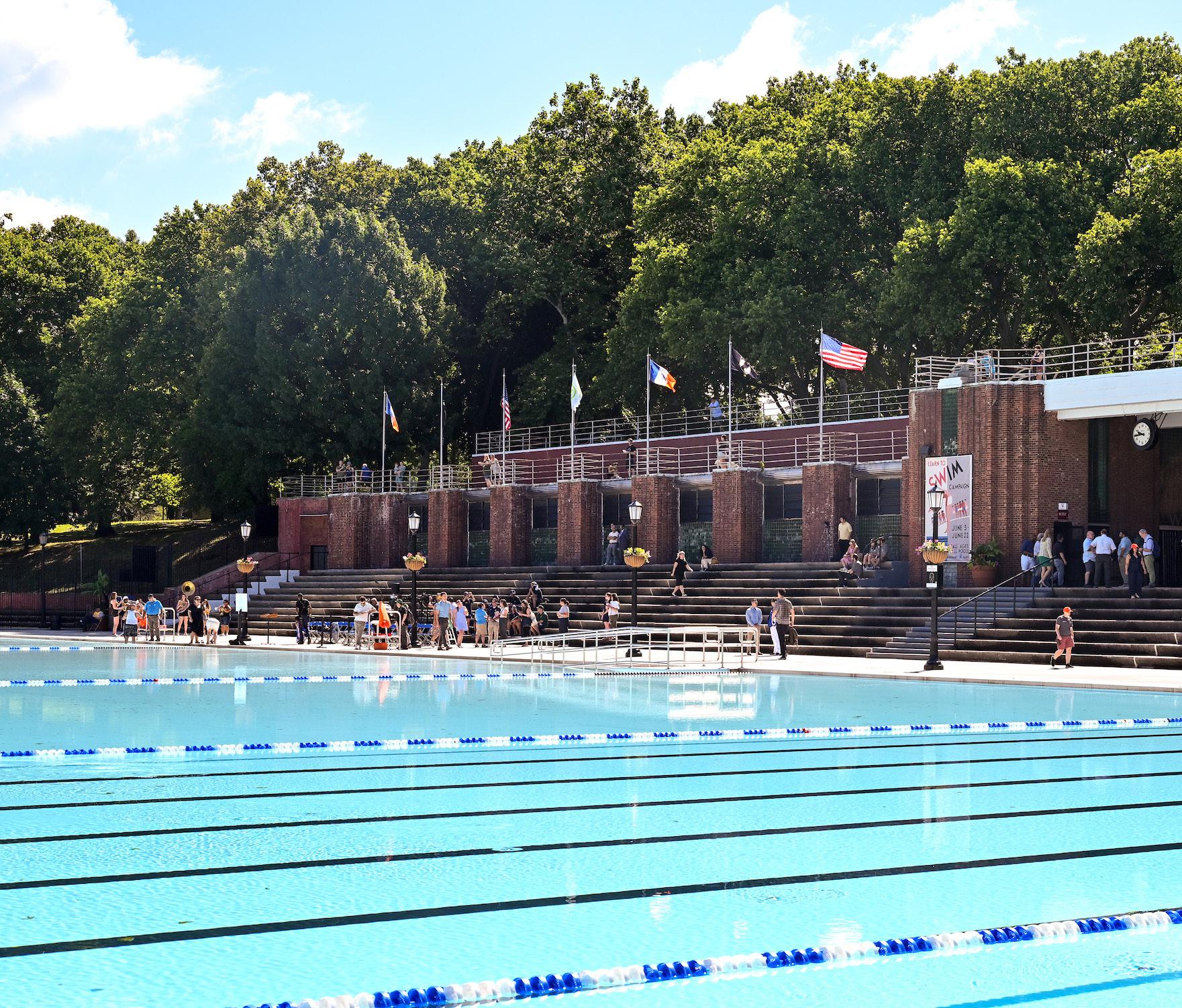
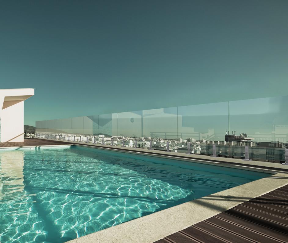
Summer supplies a humid, doldrums-like air to New Yorkers who remain in the city. Kept alive by window units, one resorts to relaxed dress codes and limited oven use to stay comfortable. There are also the cool marble insides of cultural institutions. Or the joyful arcs of a loosened fire hydrant, which seem like a stereotype until you encounter them in person, as I recently did on my street in Brooklyn. And, of course, there are New York’s miles of beaches and its constellation of public pools, the latter of which are slated to receive over $1 billion in funding through the city’s new Let’s Swim NYC initiative, part of the larger Vital Parks framework . One recently completed improvement is Astoria Pool, the city’s largest and oldest facility, which received almost $19 million in upgrades while maintaining its stately art moderne look.
“Summertime is a good time to re-examine New York and to receive again the gift of privacy, the jewel of loneliness,” E. B. White wrote in his classic 1949 essay “Here Is New York.” “In summer the city contains (except for tourists) only die-hards and authentic characters. No casual, spotty dwellers are around, only the real article. And the town has a somewhat relaxed air, and one can lie in a loincloth, gasping and remembering things.”
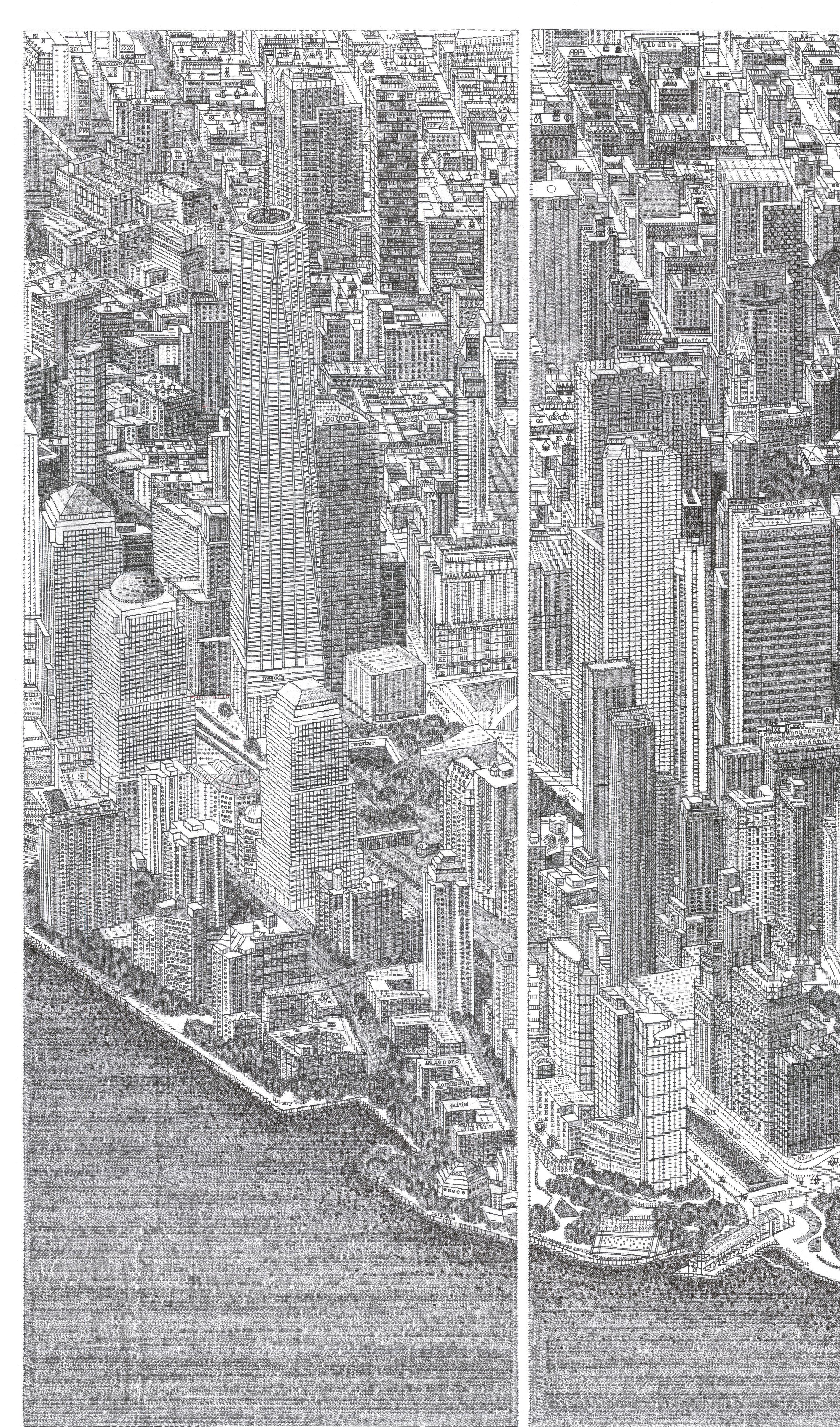
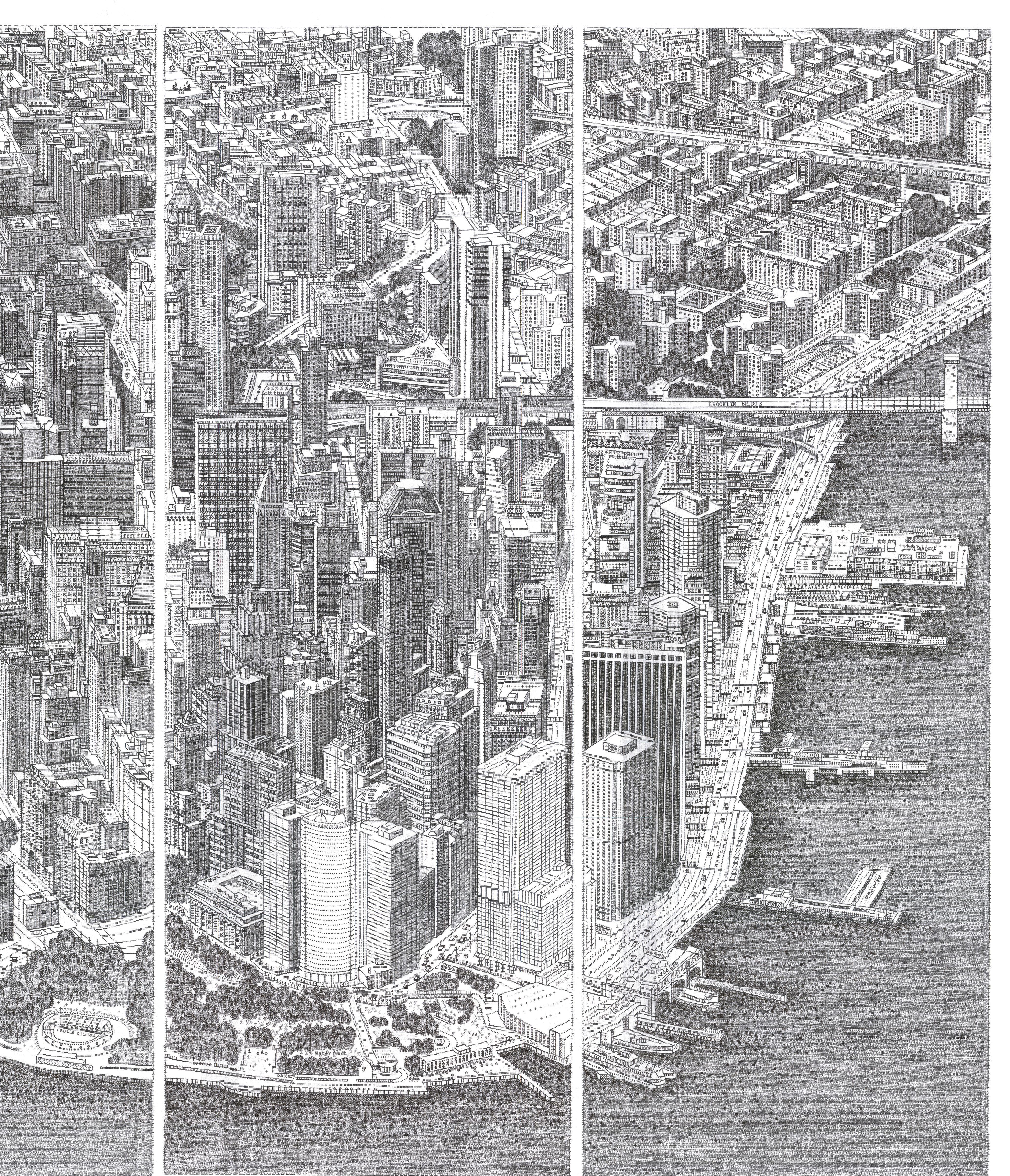
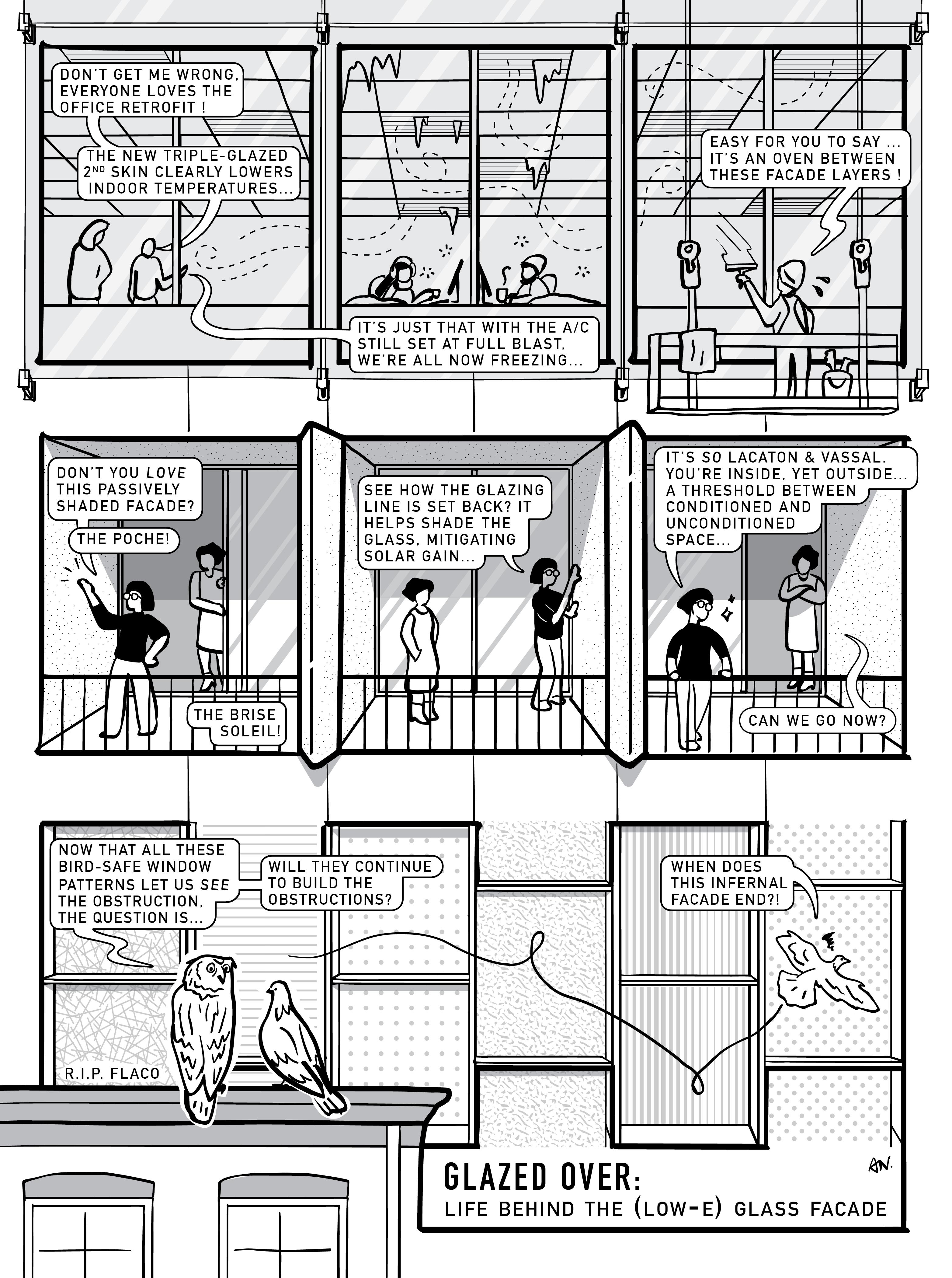
And, dressed in workplace-appropriate attire, there’s so much to recollect: This year, New York quietly celebrates its 400th birthday. In the summer of 1624, 30 Dutch families arrived to colonize what would become New York; most were dispatched to sites along area rivers (the Hudson, Delaware, and Connecticut), but some occupied what became Governors Island, and “there was at least one farm on nearby Manhattan,” according to Gotham: A History of New York City to 1898. (Because of the slow conquest, quadricentennial events are slated to continue into 2025 and 2026.) To mark the occasion, AN prints architecture student turned artist James Cook’s “typiction” of Lower Manhattan, set across pages 62 and 63 of this issue. There’s some more summer fun here in the form of a puzzle and comic, on pages 64 and 66, respectively, which both take up the Focus section’s theme of glass.
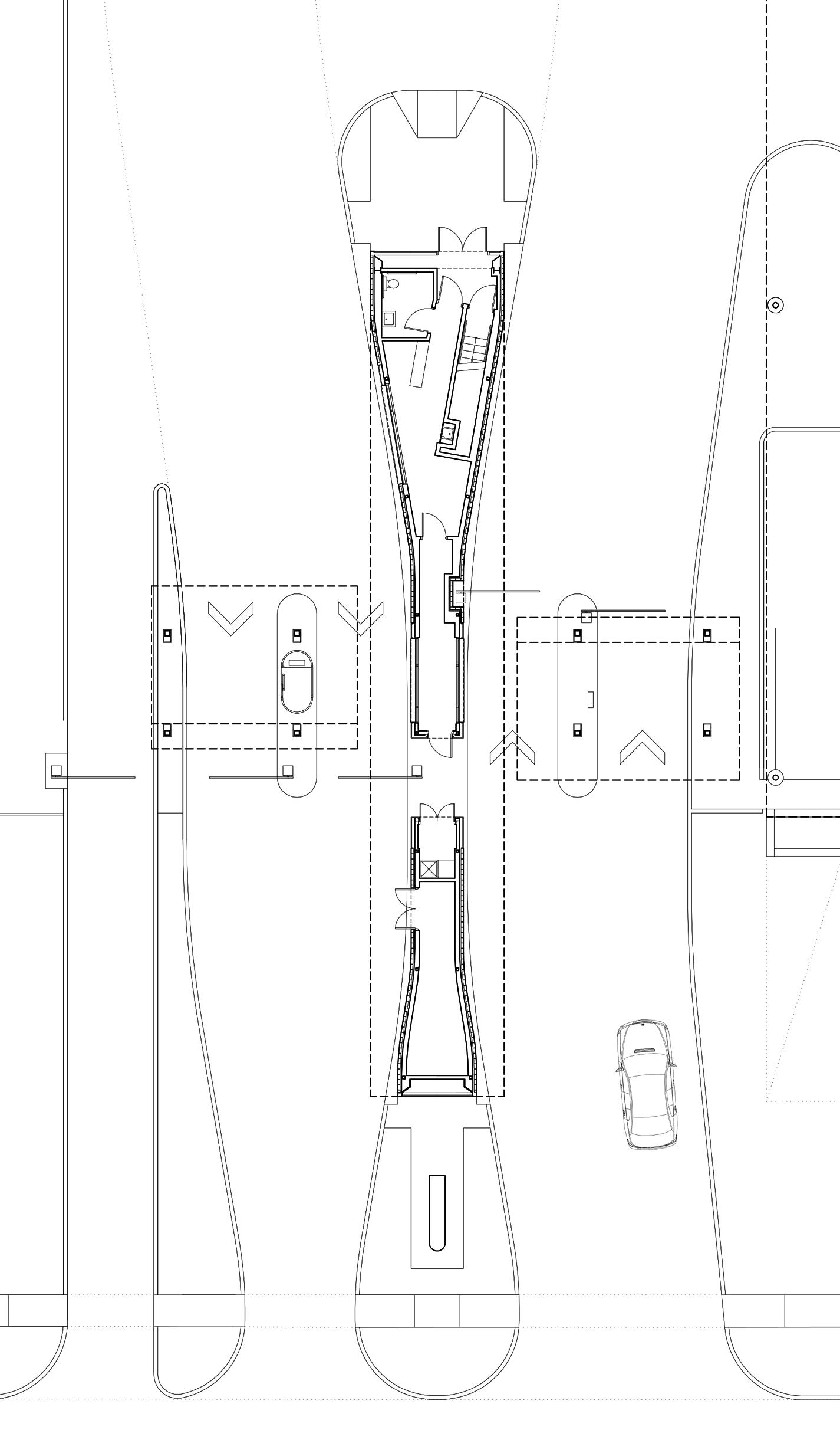
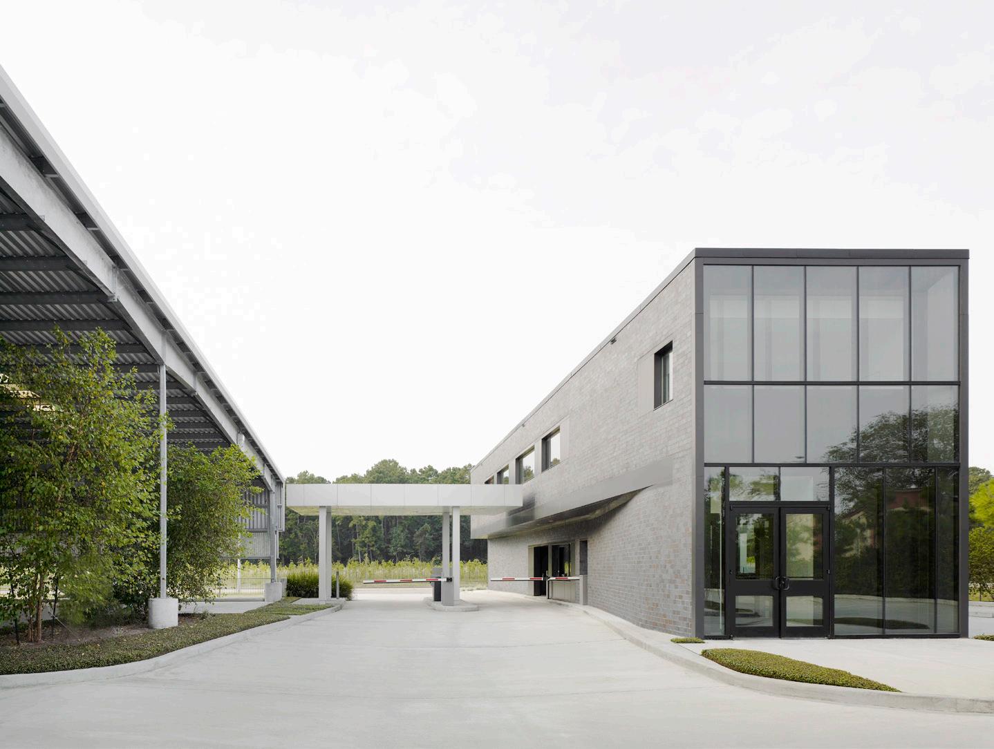
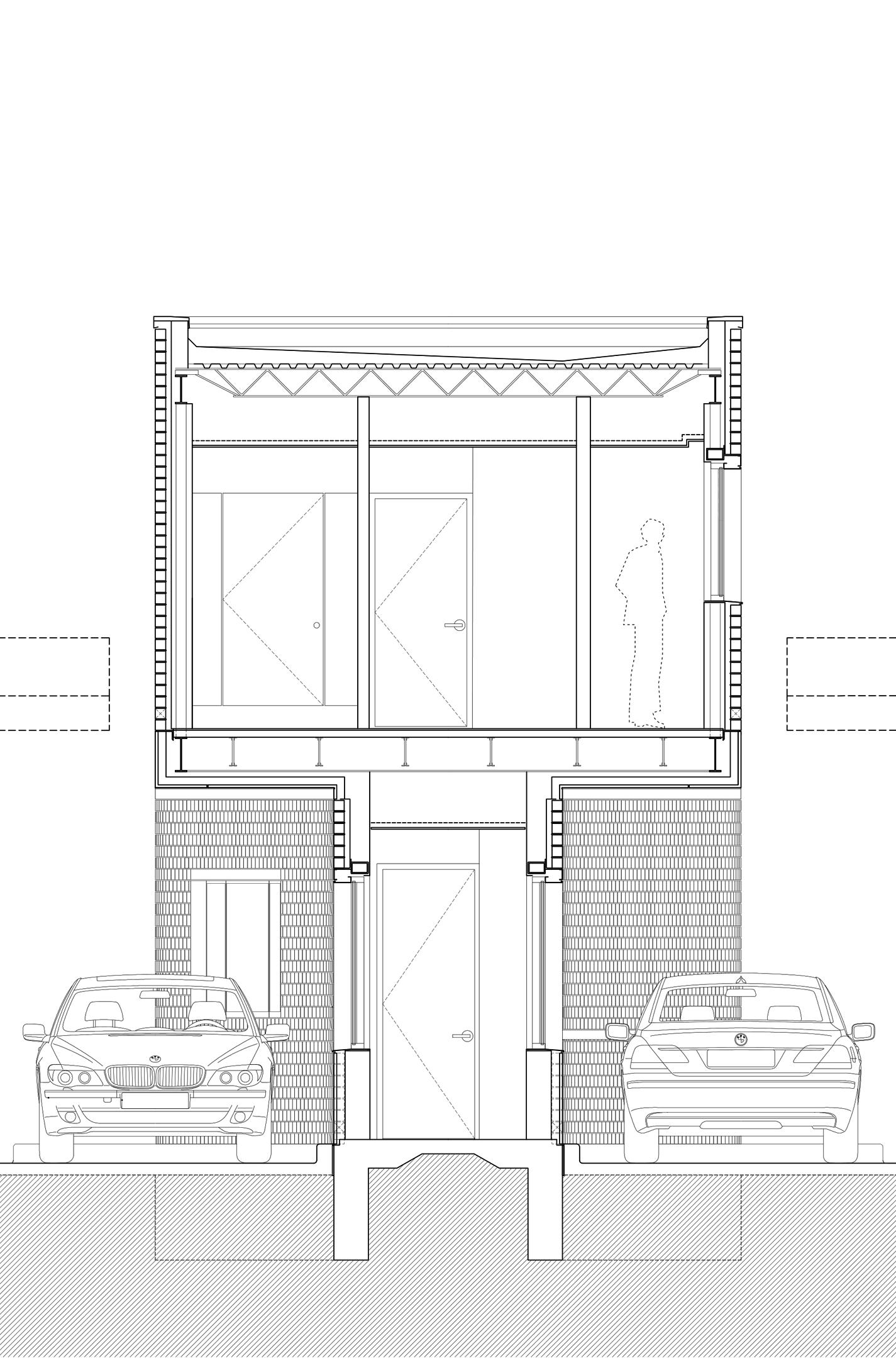
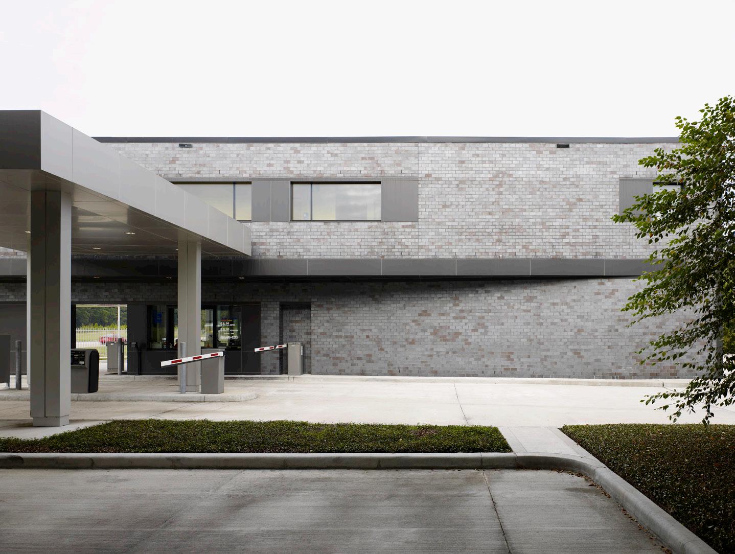
It’s good to leave New York from time to time: The features in this issue concern development as seen through the lenses of travel, recreation, and cultural heritage. Vernon Mays writes about a new pavilion and park in Knoxville, Tennessee, by Sanders Pace Architecture and PORT Urbanism (page 30), and Timothy Schuler assesses Walker
Warner’s redesign of Kona Village in Hawaii (page 28). Plus, Ali Ismail Karimi reports on the completion of the Pearling Path in Bahrain, with buildings designed by Studio Anne Holtrop, Christian Kerez, and Office KGDVS, among others (page 25). And I appreciate a roadside parking structure near Houston, designed by EASTON COMBS (page 32).
As White wrote, “it is a miracle that New York works at all.” The city is beset with all manner of crises, which include those he described in the 1940s plus fresh hells. (Perhaps now our most urgent existential threat is not nuclear apocalypse but climate collapse?) Also, the battle between the city and its handlers in Albany continues: Governor Kathy Hochul disappointingly pulled the plug on congestion pricing, leaving a $15 billion hole in the MTA’s budget. Even poolgoers to the aforementioned Astoria Pool faced lengthy wait times because only portions of the large pool were open, due to an ongoing lifeguard shortage. Mid-June, the city had 180 lifeguards for 50 public outdoor pools, while 400 are needed to fully staff the facilities, according to reporting from Gothamist . When I visited in mid-July, there was still a long line to enter, and sections of the pool remained closed to swimmers, though the water was refreshing. Across many initiatives, NYC can and should do better.
Speaking of doing better: In addition to news, studio visits, interviews, and critiques, see page 10 for reader (and contributor) responses to my interview with Pascale Sablan from the previous issue. As they articulate, the piece minimized the experiences of the victims of David Adjaye’s alleged sexual misconduct, like those of Toni M. Isidore Smart, who I wrote about in AN last August. She was one of the three women from the Financial Times investigation and later bravely chose to come forward and share her story.
Like newspapers, cities are places of collision. They can also be places of escape. “New York blends the gift of privacy with the excitement of participation,” White wrote. This city is “peculiarly constructed to absorb almost anything that comes along…without inflicting the event on its inhabitants; so that every event is, in a sense, optional, and the inhabitant is in the happy position of being able to choose his spectacle and so conserve his soul.” Maybe they didn’t get FOMO back then? In any case, I wish you success with your soul conservation this summer. Jack Murphy
CEO/Creative Director
Diana Darling
Executive Editor
Jack Murphy
Art Director
Ian Searcy
Managing Editor
Emily Conklin
Web Editor
Kristine Klein
Design Editor
Kelly Pau
News Editor
Daniel Jonas Roche
Associate Editor
Paige Davidson
Contributing Products Editor
Rita Catinella Orrell
Copy Editor
Don Armstrong
Proofreader
Joanne Camas
Editorial Intern
Alexandra Surprenant
Vice President of Brand Partnerships (Southwest, West, Europe)
Dionne Darling
Director of Brand Partnerships (East, Mid-Atlantic, Southeast, Asia)
Tara Newton
Sales Manager
Heather Peters
Audience Development Manager
Samuel Granato
Vice President of Events Marketing and Programming
Marty Wood
Senior Program Associate
Trevor Schillaci
Program Assistant
Izzy Rosado
Events Marketing Manager
Andrea Parsons
Charlotte Barnard
Business Office Manager
Katherine Ross
Design Manager
Dennis Rose
Graphic Designer
Carissa Tsien
Associate Marketing Manager
Sultan Mashriqi
Marketing Associate
Anna Hogan
Media Marketing Assistant
Wayne Chen
Mika Rivera
General Information: info@archpaper.com
Editorial: editors@archpaper.com
Advertising: ddarling@archpaper.com
Subscription: subscribe@archpaper.com
Vol. 22, Issue 5 | July/August 2024
The Architect’s Newspaper (ISSN 1552-8081) is published 7 times per year by The Architect’s Newspaper, LLC, 25 Park Place, 2nd Floor, New York, NY 10007.
Presort-standard postage paid in New York, NY. Postmaster, send address changes to: 25 Park Place, 2nd Floor, New York, NY 10007.
For subscriber service, email subscribe@archpaper.com.
$6.95/copy, $50/year; institutional $189/year.
Entire contents copyright 2024 by The Architect’s Newspaper, LLC. All rights reserved.
Please notify us if you are receiving duplicate copies.
The views of our writers do not necessarily reflect those of the staff or advisers of The Architect’s Newspaper
Corrections
In the previous issue, the article on Thomas Phifer and Partners’s MSN Warsaw incorrectly stated that Poland was part of the USSR. Poland was never part of the USSR.
In the previous issue, the Studio Visit article misstated that the Uptown neighborhood of Chicago is home to a large Chinese community. It is home to a large and culturally diverse Asian American community.
DANIEL AVILA/NYC PARKS
After years of demand, SOM leads charge to improve bus shelters throughout Los Angeles
Angelenos love their cars. Yet the bus remains Los Angeles’s unsung transportation hero. Despite an abundance of bus riders, much of L.A. lacks adequate bus shelters. Rising temperatures and a lack of shade in the city’s low-income neighborhoods resulted in a call for equitable, improved access to bus shelters. SOM has been tapped to address this problem as part of the Sidewalk and Transit Amenities Program. Alexandra Surprenant
The FTC is suing software giant Adobe over hidden fees and an “overly complicated” cancellation process
The preeminent software licensing company, Adobe, whose products include industry-standard programs like Photoshop and Illustrator, is being sued by the Federal Trade Commission for surprising customers with hidden termination fees and an “overly complicated” cancellation process. Alaina Griffin
Meet Gendo, the new AI platform used by Zaha Hadid Architects, David Chipperfield Architects, and others for inhouse renderings
Two London-based venture capital firms have successfully raised $1.1 million in pre–seed round funding for Gendo, an AI-driven visualization software built with architects in mind. The capital will be used to expand the capabilities of Gendo’s proprietary AI tools, accelerate the launch of new features for architects and designers, and scale up Gendo’s London-based team. Designers at Zaha Hadid Architects, KPF, David Chipperfield Architects, and Benoy all used the software in a beta launch. Now, Gendo is live in early access. DJR
NASA is prototyping fungal mycelium bricks to “grow homes” on the Moon and Mars
Thomas Austin appointed Architect of the Capitol after January 6–related fallout against predecessor
Thomas Austin, a professional engineer and retired U.S. Army colonel, recently started in his role as Architect of the Capitol (AOC). Austin replaces interim AOC Chere Rexroat who took power in February 2023 after the 12th AOC, J. Brett Blanton, was fired. Daniel Jonas Roche
Art Omi debuts new architect- and artistdesigned pavilions in Chatham, New York
At Art Omi, a series of new architectdesigned pavilions will stretch across a 190acre pastoral landscape in Chatham, New York. The project—officially known as Art Omi Pavilions @ Chatham—broke ground in May and will debut 18 carbon-neutral pavilions collaboratively designed with artists and collectors. The multiphase endeavor features artists such as Alice Aycock and Torkwase Dyson and architecture firms like SO — IL, Jahn/, and BKSK Architects. AS
In Nashville, Donelson Library by HASTINGS Architecture opens to the public
A new $18.8 million public library by HASTINGS Architecture opened its doors in Nashville’s Donelson neighborhood, known for its greenways, myriad transit connections, lively restaurants, and the Grand Ole Opry. The architects told AN that Donelson Library takes cues from the neighborhood’s midcentury character. DJR
Olson Kundig revamps lobby at 100 Congress Street in downtown Austin
The lobby inside 100 Congress Street in downtown Austin has undergone a renovation by Olson Kundig. The 22-story Class A tower on the corner of Congress Avenue and Cesar Chavez Street was recently renovated by its owner, Carr Properties, to help attract workers back to their offices post-pandemic. DJR
U.S. Supreme Court votes to criminalize sleeping in public spaces
The U.S. Supreme Court has overturned a bill that allows people experiencing homelessness to sleep in public spaces. The decision enables police officers to punish people “camping” on public property. It has been called the U.S. Supreme Court’s “biggest decision on homelessness in decades.” DJR
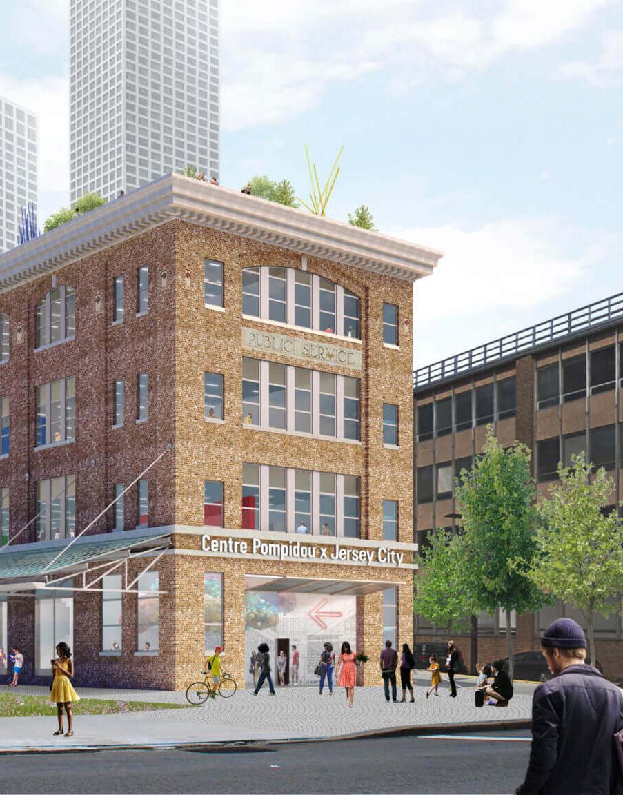
OMA’s Centre Pompidou x Jersey City paused indefinitely by New Jersey State legislature
New Jersey Economic Development Authority (EDA) officials announced that the OMA-designed Centre Pompidou x Jersey City project has been paused indefinitely. EDA CEO Tim Sullivan cited “the ongoing impact of COVID19 and multiple global conflicts on the supply chain, rising costs, an irreconcilable operating gap, and the corresponding financial burdens [the museum] will create for New Jersey’s taxpayers” as the main drivers of the decision. DJR
Scientists at the NASA Ames Research Center in Silicon Valley are experimenting with fungal mycelium to help support life on the Moon and Mars. NASA recently rolled out a concept it calls “mycotecture”—architecture made of mycelium. Mycelium is essentially mold; the underground threads that comprise the main part of fungi. DJR
Moriyama Teshima Architects and Toronto politicians slam Ontario Science Centre’s closure and say it can be saved
When it was announced that the Ontario Science Center would permanently close due to risk of collapse, it sparked outrage. Its designer, Moriyama Teshima Architects, described the decision as a “shock” in a public statement and pledged to offer pro bono services to save the building. Geoffrey Hinton, a science professor at the University of Toronto, pledged $1 million to save it. DJR
EDG leads design for new Stonewall National Monument Visitor Center
Fifty-five years to the day after the historic Stonewall rebellion, the Stonewall National Monument Visitor Center opened to the public. It is the United States’ first ever LGBTQIA+ visitor center within the National Park Service and is managed by the nonprofit Pride Live. New York–based architecture firm EDG—a firm proud of its staff of over 20 percent LGBTQIA+-identifying designers—was tapped for the project. AS
Harvard GSD officials announced that the 2024 Wheelwright Prize winner is Thandi Loewenson. A senior tutor at London’s Royal College of Art from Harare, Zimbabwe, she holds a PhD from UCL’s Bartlett School. Loewenson’s winning proposal is titled “Black Papers: Beyond the Politics of Land, Towards African Policies of Earth & Air.” DJR
An exhibition about Robert Caro’s The Power Broker debuts this fall at New-York Historical Society for the book’s 50th anniversary
This fall, an exhibition at the New-York Historical Society on Robert Caro’s The Power Broker will open to the public. The show opens on September 6, 50 years after Knopf published the 1,336-page tome about Robert Moses in 1974. Robert Caro’s The Power Broker at 50 will feature handwritten notes by Caro, and redlined manuscripts by Robert Gottlieb, among other ephemera from Caro’s archive that the institution acquired in 2019. DJR
1 Wall Street Banking Room designated interior landmark by New York City Landmarks Preservation Commission
The New York City Landmarks Preservation Commission (LPC) designated The Bank Room at 1 Wall Street—known to some as “The Red Room”—an interior landmark. The glittering space clad with elaborate tiles was once home to Irving Trust and Bank Company’s reception room. For Irving Trust, the architecture at 1 Wall Street was meant to project an image of permanence and intact wealth. DJR
Moreau Kusunoki and Frida Escobedo Studio reveal Centre Pompidou 2030 renovation plans
Jones Studio leads transformation of a burned church into a new event space in downtown Phoenix
Design Academy Eindhoven to stay in Eindhoven amid concerns over relocation to Roermond
Mithun is working on a masterplan to revitalize Seattle’s Pike Place Market
The iconic Centre Pompidou is slated for a major 5-year renovation. The high-tech art museum in Paris’s 4th arrondissement designed by Richard Rogers and Renzo Piano will soon be adapted by lead architect Moreau Kusunoki, a French office founded by Nicolas Moreau and Hiroko Kusunoki. Mexico City–based Frida Escobedo Studio is the associate designer on the high-profile commission. DJR
In downtown Phoenix, a comprehensive restoration has transformed a burned church into a “cultural garden in a ruin.” Such is Arizona architecture firm Jones Studio’s description of Monroe Street Abbey, a new event and restaurant venue located one block from Phoenix City Hall. AS
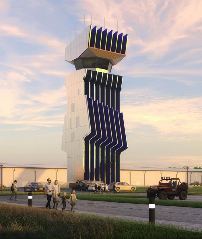
Marlon Blackwell Architects unveils design for new air traffic control tower in Columbus, Indiana
Most people don’t associate air traffic control towers with high design. This kind of airport infrastructure is typically made to perch quietly above the runway, spotted from afar. Now, a new design by Marlon Blackwell Architects for a regional airport in Columbus, Indiana, bucks this trend and makes a monument out of the utilitarian typology. DJR
Design Academy Eindhoven (DAE)—one of Europe’s premier design programs—will remain in Eindhoven, school officials shared recently. The announcement comes after ideas were floated to relocate DAE to Roermond, another Dutch city about 45 minutes south of Eindhoven. DJR
Cloud Gate reopens in Chicago after Millennium Park renovation
Few sculptures have become more emblematic of a city than Chicago’s “Bean,” now open to the public again after nearly a year of renovation. The project involved a rebuild of the plaza podium and the addition of new stairs, accessible ramps, and a waterproofing system. AS
To promote House of the Dragon, the Empire State Building displays a 270-foot inflatable dragon
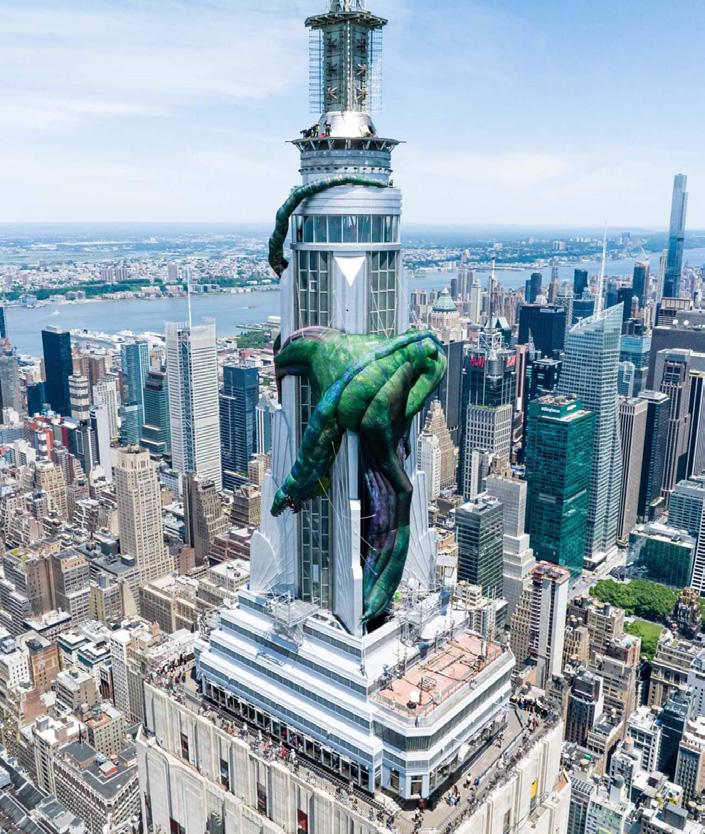
New Yorkers have spotted Queen Viseyna’s dragon, Vhagar, wrapped around the tip of the Empire State Building in what appears to be a King Kong–style homage. Max (formerly HBO) has partnered with one of the city’s most recognizable landmarks to promote the popular television show House of the Dragon , the prequel to Game of Thrones Kristine Klein
New York City Council passes legislation that combats building collapses with new inspection program
New York City Council members proposed legislation that would establish a proactive inspection program for buildings. The legislation augments Local Law 11, the Facade Inspection and Safety Program. The announcement comes after a series of dangerous residential building collapses in East Harlem, Little Italy, and the Bronx. DJR
For more than a hundred years, Pike Place Market has embodied the spirit of Seattle. It now faces a variety of challenges: the loss of local customers, costs outpacing revenues, aging infrastructure, and sustainability concerns. A 50-year masterplan from Seattle-based design firm Mithun, HR&A Advisors, BERK Consulting, and MRA International hopes to maintain the market’s character while addressing contemporary challenges. AS
LAYA Architects is revitalizing Masjid UlHaqq, Baltimore’s oldest Islamic place of worship
Masjid Ul-Haqq is the oldest Islamic place of worship in Baltimore. Today, LAYA Architects is working with mosque leadership and community members to revitalize the building with deep roots in the city’s historic Upton neighborhood. The goal is to expand the building for the mosque’s fast-growing congregation; add more capacity for classrooms, prayer, and community functions; and update the 19th-century structure and mechanical operations. DJR
COURTESY
CONICA
COURTESY LAYA ARCHITECTS
8 Open
913 Broadway, New York, New York 10010
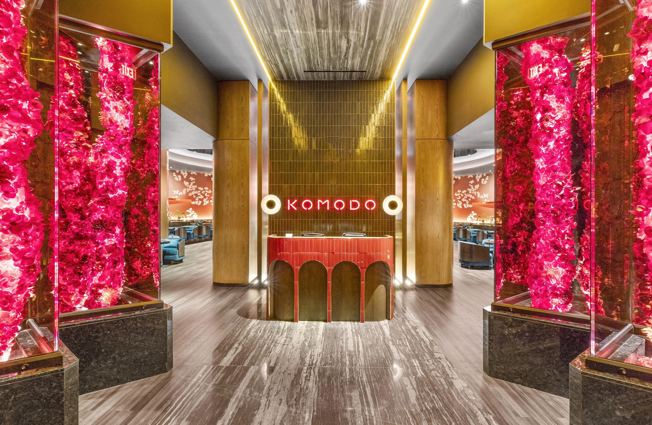
Acclaimed chef Stefano Secchi’s new restaurant, Massara Osteria Campana, is located in a historic building in New York’s Flatiron District. Brooklyn-based architecture and design firm Sarah Carpenter & Studio outfitted the 6,500-square-foot space by complementing the restaurant’s Italian fare with the country’s materials, such as Italian limestone on the walls, Carrara marble for the bar top, and irregular travertine flagstone for the floors. Rather than mimic an Italian locale entirely, the architects gave the design a sense of place, layering clay-based plaster on the walls of the dining room to accentuate the preexisting exposed brick. The open kitchen similarly embraces the historic structure: A 3-story atrium spotlights pizzas being prepared. The restaurant spans two floors with two bars and four different dining areas. All are united by earthy hues and rustic finishes—plastered walls and textured ceilings, for instance— which liken the interior to an upscale and welcoming home.
20001
Global architecture firm Streetsense approached the design of this Spanish seafood restaurant by looking to its chef, Johnny Spero. His playful character stands in contrast to his cuisine’s seriousness. The duality results in a clean and warm atmosphere with a neutral color scheme: blond wood flooring, toffee leather, moments of calming blue touches via velvet booths and drapes. But this serves as a backdrop for the 6,500-square-foot interior’s pièce de résistance: LED sculptures that evoke an abstract mountain range. They soar over the dining booths, helping define each seating area while embracing the interior’s 20-foot-high ceilings. It’s a fun touch that prepares visitors for the burst of color and play in the neon-hued bathrooms, where tinted mirrors take the shape of Pit Viper sunglasses.
900 Southwest Washington Street, Portland, Oregon 97205
ROAM Interior Design
Warm and sophisticated yet unpretentious, the design of New York’s Theodora is a balancing act. It’s defined by a visual language Home Studios has perfected over time in its hospitality projects. For the new Mediterranean restaurant, the design team drew on the cuisine’s culture through plastered walls, natural stone, and zellige tiles. These elements create sculptural moments throughout the interior, from the arched nooks to a curved ceiling—there are even porthole windows in the back room. Bespoke details further the charm of the restaurant: Curved custom tiles create columns that are used to divide the back bar; tiles were broken and reassembled to create an original mosaic for the base trim and bathroom floor; and custom wooden boxes were made to house speakers. Lit by numerous skylights, the interior is layered with Mediterranean influence and a sense of craft.
Previously HKS Hospitality, design firm ROAM Interior Design was entrusted with the interiors of Oregon’s new Ritz-Carlton Hotel, including its bar and lounge, Meadowrue. The design is informed by Portland’s abundant natural resources and the hotel’s luxury reputation. A grand staircase—whose irregular steps take after the mossy basalt falls of nearby Mount Hood— leads to a swanky, nature-inspired bar. Set beneath a canopy of vertical crystals, lighting, and greenery, the bar features a reclaimed Oregon tree trunk with a live-edge table and shimmering green panels. Behind it, handmade glass and metal mesh create storage and organization for the bar’s beverages and glassware. At the window wall adjacent to the bar, a bespoke wallcovering depicts a gold-flecked forest: It’s activated with vignettes of lounge seating, the focal point being a large communal table made of yet another reclaimed Oregon tree. Kelly Pau
Massara Osteria Campana
Sarah Carpenter & Studio
Theodora 7 Greene Avenue, Brooklyn, New York 11238 Home Studios
Bar Spero
250 Massachusetts Avenue Northwest, Suite 155, Washington, D.C.
Streetsense
Meadowrue
BRIAN FERRY GREG POWERS
COURTESY ROAM INTERIOR DESIGN
BRIAN FERRY
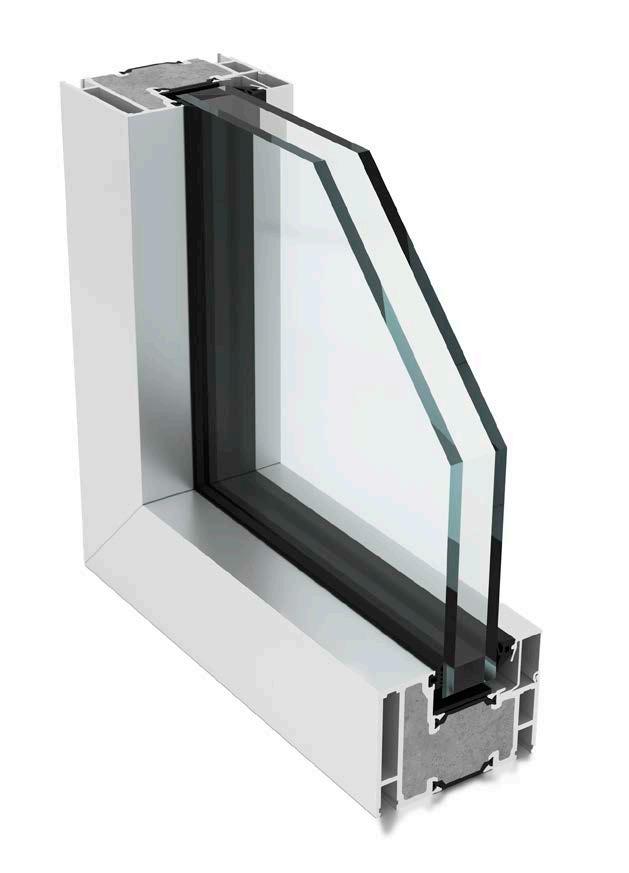
Learn More: nanawall.com/products/privasee
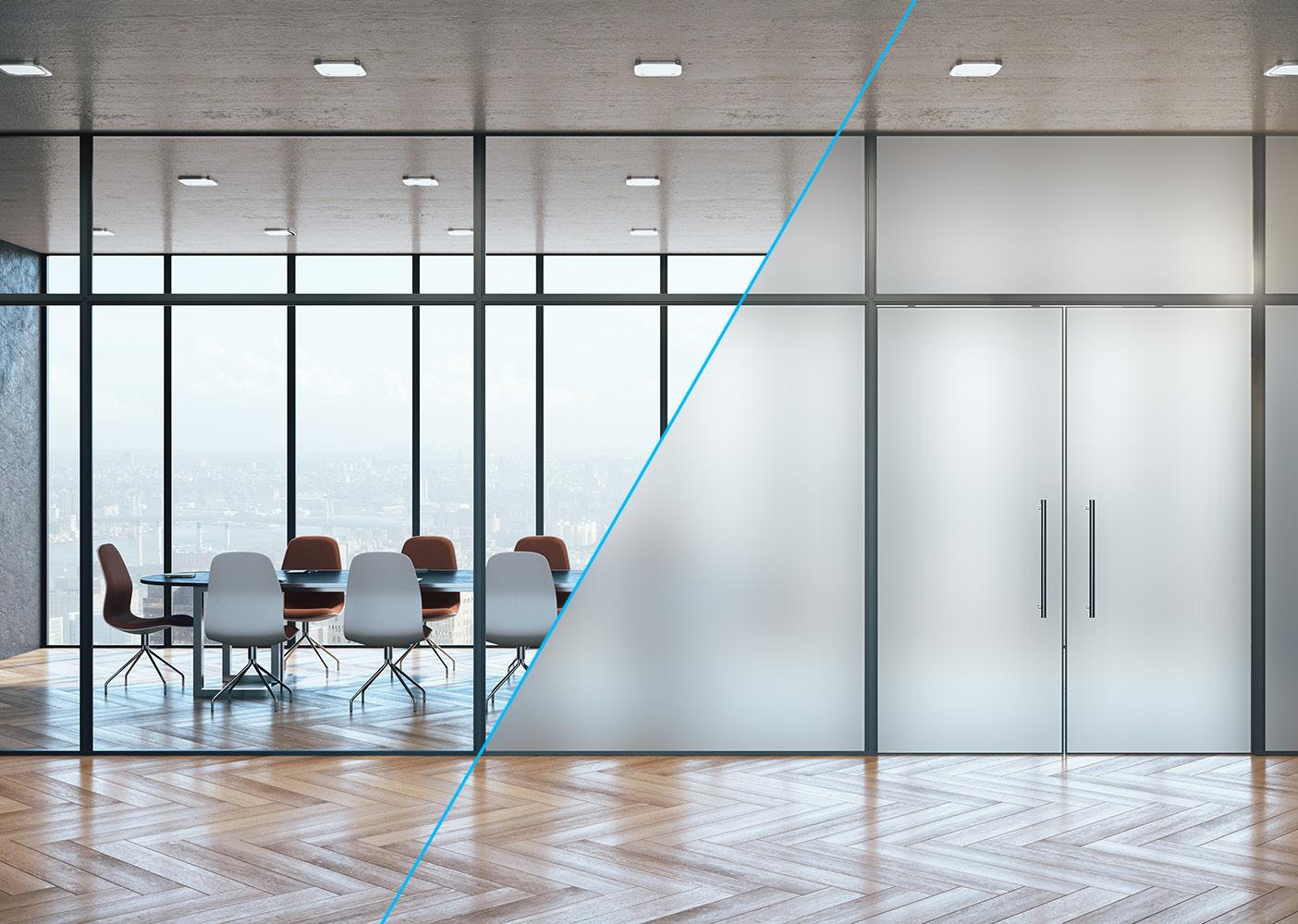
PrivaSEE is an all-glass operable wall that provides flexible space management and acoustical control.
BENEFITS INCLUDE
• Only Unit STC 36 rated operable all glass system.
• Unit heights up to 10’ 6” (3200 mm) are possible.
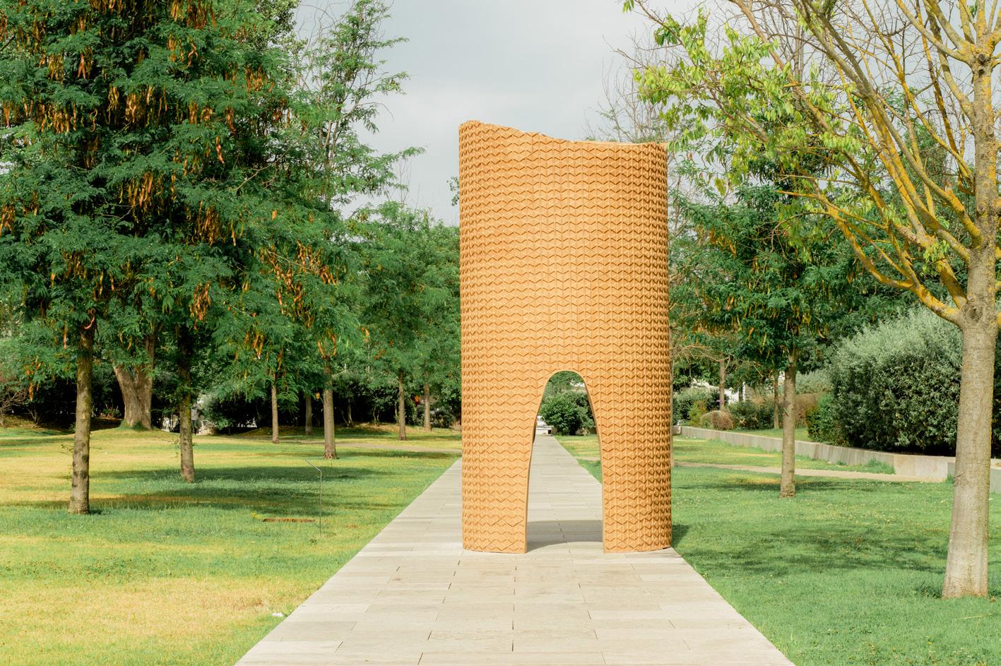
With installations by well-known architects and designers, City Cortex positions cork as a modern cultural asset for Portugal.
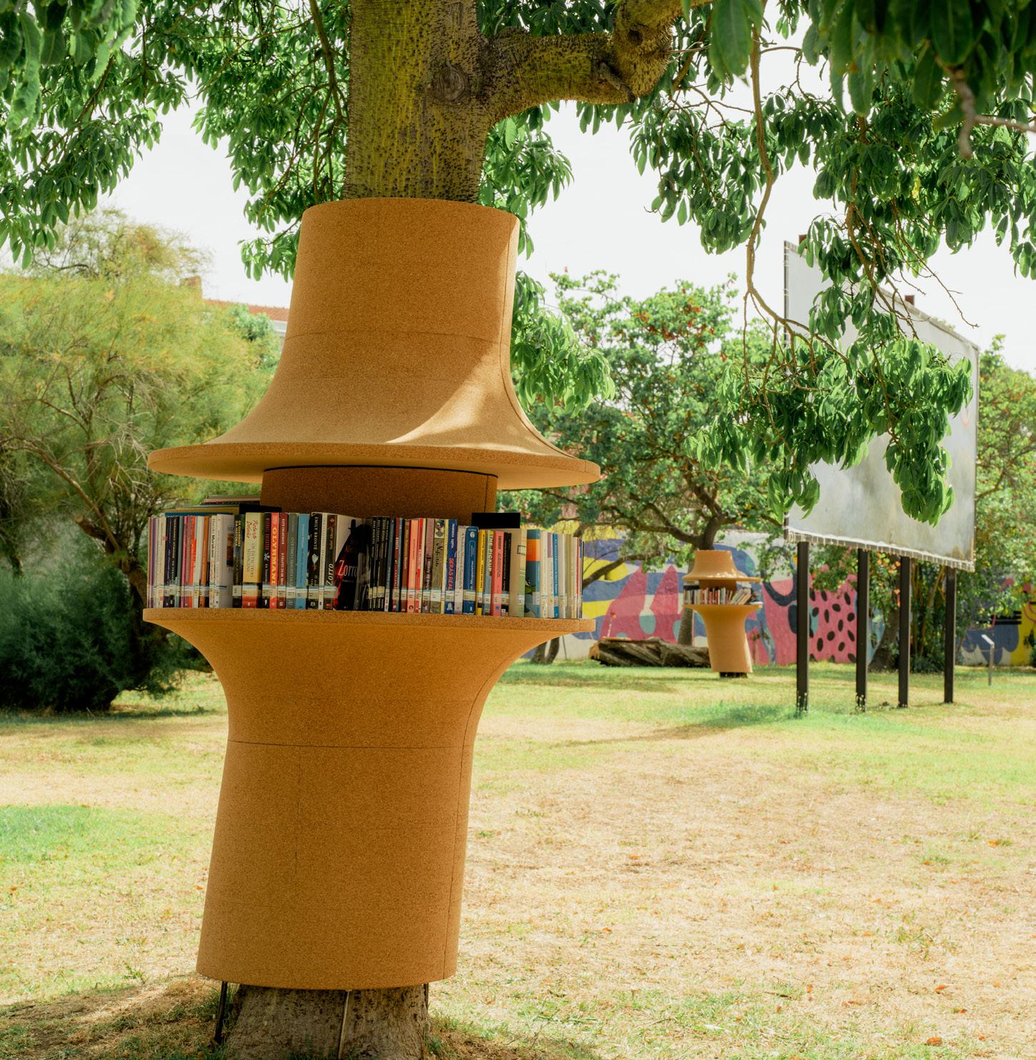
In the savanna-like oak forests north of Lisbon, guilds of axe-wielding harvesters swing their machados da cortiça to gently peel off the thick bark of cork oak trees without damaging them. This time-honored tradition preserves an important cultural practice: sustainable management of cork oak forests. Cork was used by ancient Egyptians for sandals and by monks in the Middle Ages for insulation, but today it can be found everywhere from kitchen tools to the aerospace industry.
Bridging this gap between the old and new are companies like Amorim, the largest cork producer in Portugal and the world. Familyowned since 1870, it primarily makes wine stoppers but has expanded into building materials like flooring and insulation. Amorim collaborated with Herzog & de Meuron on the 2012 Serpentine Pavilion and has engaged in cultural programming to generate new knowledge around cork’s potential uses.
In 2013, Amorim began a partnership with Lisbon-based experimentadesign and curator Guta Moura Guedes, inviting designers and architects to experiment with the material. The latest of these investigations is City Cortex, a citywide initiative that activates eight public spaces in Lisbon. The urban interventions ask questions about using cork as an outdoor material. Does cork have a role to play in making our cities softer, safer, quieter, and more hospitable?
We should hope it can. Cork has been used by some of the greatest architects— Frank Lloyd Wright, Marcel Breuer, Eliel Saarinen—to give interiors a touch of warmth and tactility. In addition to its unique material properties, it is a renewable resource that sequesters considerable amounts of carbon—qualities that make it appealing to architects concerned with a sustainable outdoor urban future. Six architects and designers were invited to participate in City Cortex: Eduardo Souto de Moura; Diller Scofidio + Renfro; Leong Leong; Gabriel Calatrava; Stefan Sagmeister; and Yves Béhar.
In recent years, there has been a proliferation of these cultural events—the “biennale”-style exhibition. They’re intended to showcase new knowledge and encourage formal experimentation. Martino Stierli described the phenomenon as “an ever-accelerating expansion of the logic of the event and of the recurring spectacle in architectural discourse and production on
an increasingly global scale.” With City Cortex, it is this “eventization” that pulls architecture media out of the gallery, off the screen, and into the city.
In the case of Souto de Moura, he simply wanted to give visitors at the Museum of Art, Architecture and Technology a soft place to sit. He devised a cork chair just for them. Stefan Sagmeister used cork in tiles to communicate a message of positivity on the ceiling of an underground pedestrian walkway. Calatrava designed a pavilion from playscape ground coating made of cork, which was repurposed for benches, a canopy, and chairs coated in the material. The pavilion was donated to the community and will remain indefinitely.
For Amorim, showcasing what cork can do not only fulfills its mission and promotes its product, but also suggests that it’s eager to contribute to the city more broadly. The company is clearly not alone in seeing cork as a national cultural asset.
In our age of mass media overload, the eventization of architectural discourse is only as good as the people who see it online.
As the American political strategist James Carville once said, “In this business, you haven’t said anything until you’ve said it on television.” Professor of corporate communication and public affairs Dan Schill, in his book Stagecraft and Statecraft: Advance and Media Events in Political Communication, describes three goals of a successfully staged media event: agenda setting (defining a problem), priming (setting up the background), and framing (curating potential solutions). The installations at City Cortex fulfilled all three by producing and broadcasting images of urban interventions, but also offered a larger message of cork’s potential role in the city.
The works on display were collaborations between Amorim and leading designers. What is next is exciting. Will they do more? Can they push the limits of these teams to produce more intimate research and collaborations? Would this project work in other places? Amorim and experimentadesign have a history of such innovation, and City Cortex could be the start of a new era for cork.
Readers respond to AN ’s interview with Pascale Sablan, CEO of Adjaye Associates.
Undermining DEI
Presenting the office of Sir David Adjaye, a starchitect accused of misconduct, as the way “FORWARD!” for diversity, equity, and inclusion, demonstrates that The Architect’s Newspaper misunderstands where wealth and power are located relative to other identifiers such as race. The paper’s uncritical show of support for Adjaye Associates CEO, Pascale Sablan, risks further disenfranchising the community of people who have suffered deeply in architecture offices by reinforcing a truth that many of us are acutely aware of: Survivors of sexual assault, sexual harassment, and/or toxic work environments are too often met with little to no industry support. If they choose to speak about their experiences, they may be forced to defend themselves from crisis management teams and high-priced lawyers, who exploit malfunctioning, patriarchal justice systems as well as manipulated or poorly informed public opinion. By insensitively sacrificing safety and care for vulnerable survivors more broadly, the frame of this article undermines the very purpose of the diversity, equity, and inclusion project.
Erandi de Silva Accra, Ghana
A Critical Lapse of Judgment
There are times to “do it for the clicks” and there are times—rarer and rarer in our media landscape—to not. The Architect’s Newspaper’s interview with Pascale Sablan, architect and CEO of Adjaye Associates’s New York office, should have been a hard pass. The decision on the part of AN editors to not only conduct the interview but also run it with the surprisingly glowing headline “People, Projects & Changing the World” represents a critical lapse of judgment.
Sablan comes off as a dynamic and driven leader, however in her comments regarding her own personal interactions with Adjaye she minimizes the experiences of his three victims. For survivors of rape and abuse, this invalidating tactic, which deflects the blame back to the victim’s lack of “due diligence,” is triggering. The editors ran a rather deferential interview without any sort of “trigger warning” to readers, instead choosing to describe the office vibe and upcoming project openings.
It has been just over a year since the Financial Times published allegations against David Adjaye, an incredibly short amount of time. My point isn’t about making sure someone who has been canceled stays canceled, it is about how the architectural press willingly participates in resurrecting a reputation and in doing so forgoes the responsibility of protecting survivors of sexual misconduct.
Mimi Zeiger Pasadena, California
RICARDO GONCALVES
RICARDO GONCALVES
RICARDO GONCALVES
Above: Port All , by Yves Béhar, creates a gateway along a path and references Belém Tower.
Below: Diller Scofidio + Renfro installed Second Skin , a bookshelf which mimics a cork tree.
Matt Shaw is a New York–based critic and author of American Modern: Architecture; Community; Columbus, Indiana
11 Eavesdrop
What Is Architecture?
We asked you, our readers, this question during our 2024 reader survey. Here are some of your responses.
A delicate balance between the necessary and the superfluous
Building go up
The world around me.
o boy
Plato: Techne, Mimesis and Eros + Vitruvius: Utilitatis, Firmitatis, Venustatis + Overall: On time and at the right price.
Is a love affair
Frozen music
Life
Ten years ago, I would have said the endless exploration and creation of human’s impact on the natural world. Now, It’s a profession with seemingly stagnated wages and benefits juxtaposed to never-ending work loads compounded by understaffed offices with unrealistically low budgets. Additionally, many of these offices are owned and operated by non-architects and non-engineers who have no care to understand our profession outside of their money made.
It’s my life
Good buildings
Mutual aid and creative expression.
REUSING BUILDINGS
trick question!
Becoming less relevant
TO INSPIRE PEOPLE WITH ITS ACCOMPLISHMENTS
Giving people what they want not what you may think they want
Everything!
Your question says it all. Architecture has a capital “A”. You didn’t capitalize it. Big. A. Architecture. Architecture makes something. It takes a stand. Event when it blends in, it still shouts. Make Architecture Great Again.
Seriously?
You are kidding right?
Architecture is an expression of a utopia and the instrument of a convenience (Roland Barthes said this). What he did not say (but suggested in his definition: ) If it is only expression of utopia—it is not architecture but “art.” If it is only instrument of a convenience—it is not architecture, but “building.” Both art and building are very important too: BUT to be Architecture, you need both.
Ideally… The poetic expression of social justice.
“What happens when you look at a building.”Walt Whitman
Inhabitable art
Architecture is a special case of Ephemera. At its best it is joy that can be left out in the rain. At its worst, it is the rain on everyone’s parade.
My envelope for living
I ask myself that question a lot these days. my life.
frozen music
Everything
What a question. Why do we wonder so hard on this? I’d like to imagine a Kmart is as much as a Foster building.
What is the sound of one hand clapping?
“Architecture is whatever our clients say it is.”
—Art Gensler
What isn’t?
A once noble profession built of innovation, ideas, and beauty. Long abandoned and neglected by the generations of Pinterest pirates and clipart conmen. Now rotting with a heavy infestation of AI.
I have only been in practice for 45 years so I am not able to answer…
Everything!
Architecture is intentional.
MY LIFE
Facilities for clients
An experience one can feel and walk away.
Love of my life
Architecture is the production of inhabitable environments that serve as manifestations of power, technology, and systems of belief.
Really?
Thoughtful assemblages
I need a few beers to answer
It’s whatever the client is willing to pay you.
It’s what you park your car next to.
A way to make a living
That’s the best you can come up with?
frozen music
Why do you ask?
An idea that people live inside. It is life.
Needs to be redefined.
omg! ;)
To me, architecture is my religion.
Fire-Rated Glass Gets a
Aluflam true aluminum framing combined with CONTRAFLAM® One glass, allows architects to incorporate much larger openings, representing an increase of up to 40%. Think bigger windows and brighter, more inviting interiors while maintaining fire-rated safety for up to 120 minutes.
The clearest – up to 90 % visible light transmission 1
Fire-rated for 60 to 120 minutes
Thinner for longer duration (90 & 120 min.)
The Lightest – up to 28 % weight savings
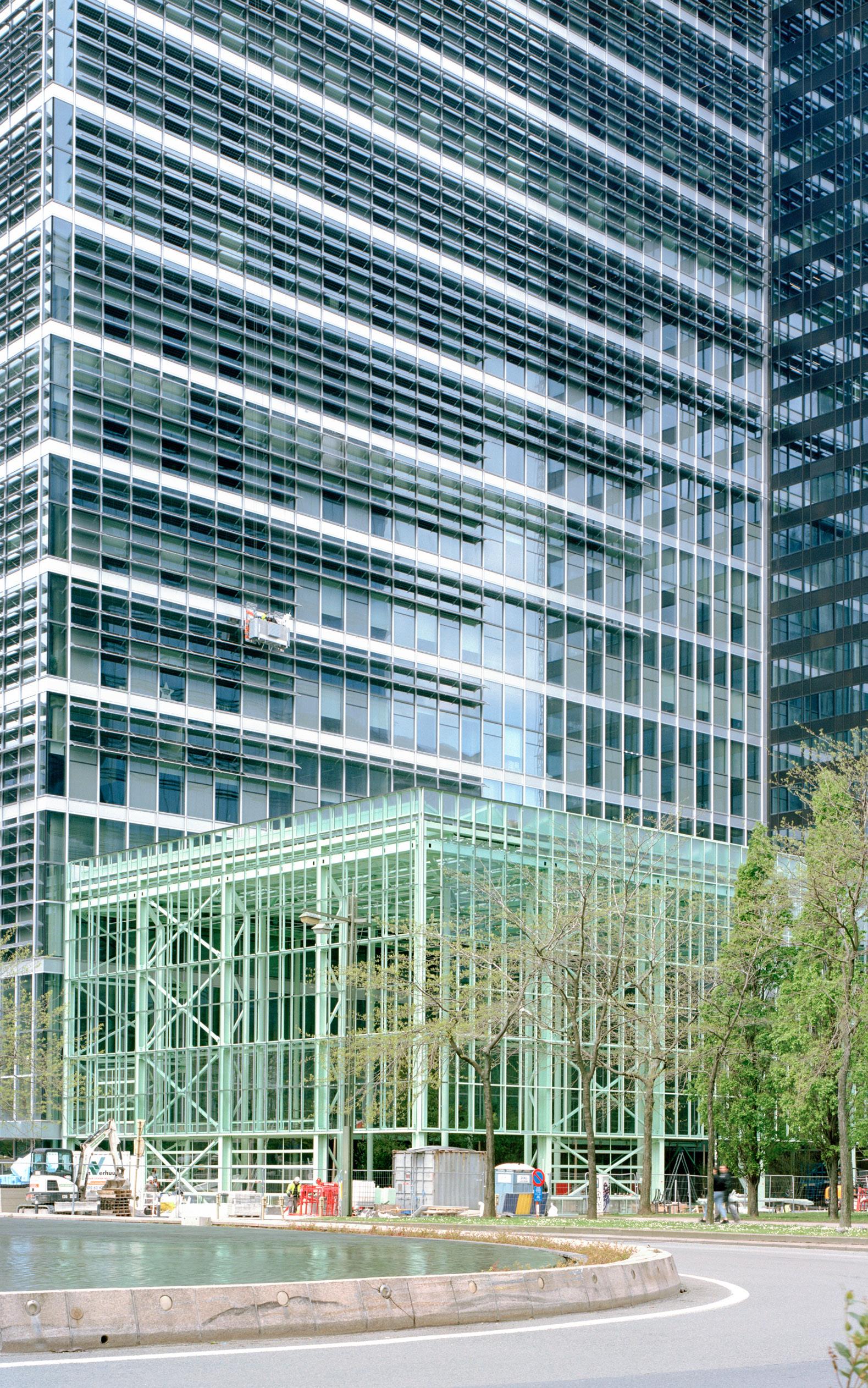
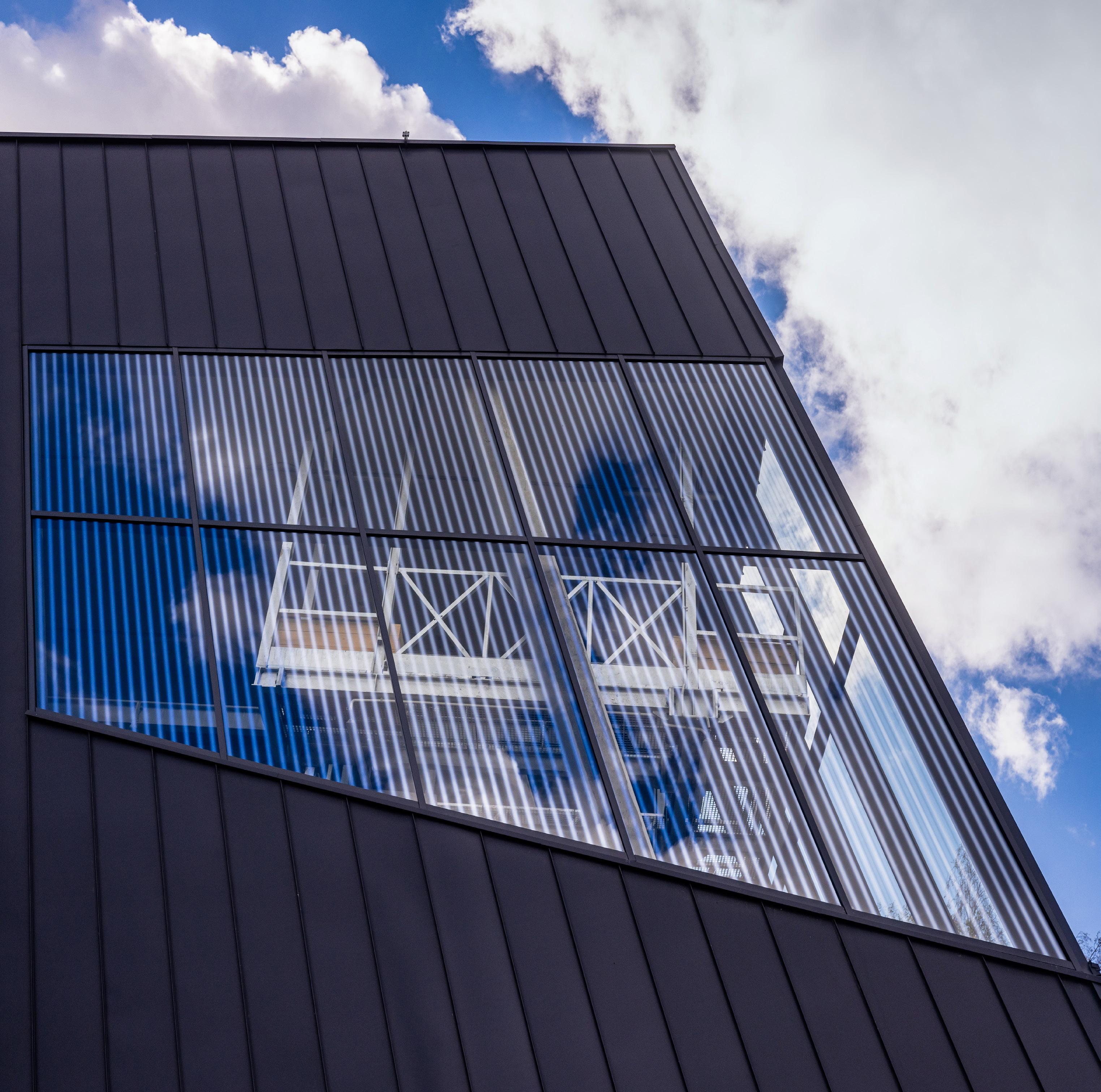
How Not to Not Demolish?
In Brussels, 51N4E adds to a fraught building site with a nearly new structure that reuses existing foundations and vertical cores.
continued from cover
The confusion stemmed from a tenuous promise to preserve as much of the original building as possible in the interest of reducing construction waste. 51N4E’s initial, competition-winning design proposed to limit most new construction to a new volume of double-height floors delicately placed between the existing twin-towered structure, offering additional leasable area and a means of delivering infrastructural upgrades to the building. This kind of “if it ain’t broke, don’t fix it” approach has been employed successfully by firms like Lacaton & Vassal, celebrated for designing careful additions around existing housing blocks that allow residents to stay in place. 51N4E sees further ecological value in designing its addition to permit multiple uses over time, theorizing that adaptability will allow the building to survive future market fluctuations and thus extend the structure’s lifespan. At the lecture, 51N4E criticized other architects in the competition who proposed demolishing the WTC buildings outright.
But shortly after 51N4E was selected to design the complex, it became clear the existing architecture could not be reconciled with the client’s requirements. Instead of aborting the project, as collaborating material-recycling consultant Rotor at one point suggested, 51N4E moved the goalposts, adjusting its definition of preservation to include any demolished material that could be recycled while relying on the metric of building weight to argue that 60 percent of the original material was retained. Work then focused on cataloguing materials slated for removal and either finding places for them in the new project or on the marketplace. Finally, with a touch of absurdity, 51N4E designed a wholly new facade to resemble the old in a way that suggests conceptual purity was maintained.
While the design decisions behind the realization of ZIN (as the completed project is named, short for zinnekes: a Flemish slang demonym for Brusseleirs) may be practical and rigorous, the site was infamous in Brussels long before 51N4E’s involvement. The original WTC project was the centerpiece of a state-developer-architect-ideated masterplan circa 1976 to “Manhattanize” the Northern Quarter of Brussels into a new commercial district reflective of Belgium’s emerging centrality to global finance. Doing so required razing the entire neighborhood, displacing as many as 11,000 working-class and immigrant residents. But the desired financial tenants never came (the banks opted to build their own towers in tonier neighborhoods), and the site had lain fallow for decades following. A friend in Belgium reminded me, “Brusseleirs are quite used to huge, failed projects,” to the extent that the Flems have a word to describe the cycles of large-scale destruction resulting from haphazard planning: verbusseling , or “Brusselization.”
The WTC would reshape both the physical and political geographies of the city and set the terms for its future rehabilitation. In response to mass evictions, land seizures, and broken promises for new housing, residents across the city organized into a constellation of community groups that were able to leverage the city government to reform the approvals processes for large projects. Balancing client demands against public scrutiny and civic review processes, 51N4E (in
collaboration with an alphabet soup of design consultants) hosted a series of local workshops, neighborhood meetings, and public-facing spectacles in the empty buildings. 51N4E would go on to present the merits of these events, but many community groups regretted their involvement or abstained altogether. Further, the community of refugees who came to live in or around the WTC buildings was systematically excluded from participation and eventually forcefully removed from the neighborhood prior to construction.
While aware of the numerous crises that flow through the site, 51N4E has the tendency to reduce its positions to quips like “Deal With the Trauma,” when organizing presentations of its work on the project. While this kind of Silicon Valley–esque sloganeering could be forgiven as an attempt to distill complex goals to the public, it can also have the effect of obscuring whether or not the public groups that participated in this project had any agency in its outcome. Given that the original buildings were built by removing a busy neighborhood and its residents, it’s not a stretch to expect that “dealing with the trauma” would involve some reparative concession to this still-living community, but the designers clarify that trauma narrowly describes the formal issue of the monolithic buildings, cured by inserting a “mixity” of luxury uses.
If the core injustice of the original WTC scheme was, as 51N4E put it, “wiping out a whole part of the city for the ‘new,’” then the consequences of building anew again for the sake of adaptability must be critiqued. The decision to demolish the old buildings stems in part from the need to incorporate a new plenum floor that facilitates converting the building from one use to another. Once the Flemish government’s lease (and the requirement to include housing in the complex) expires, the owner could choose to evict its residential tenants and convert the building to more profitable commercial use. In this way, the implementation of new technology promises that displacement of people can continue with greater efficiency as it will no longer require the physical complications and costs of demolition.
The framework 51N4E offers for recycling is also disconnected from the realities of architectural production’s cycles of extraction and waste. Recycling is not one-to-one—glass does not get reused as glass, concrete does not get reused as concrete—and every stage of recycling a material downgrades it. An old concrete building that is demolished and replaced with a new concrete building will still need new concrete along with the attendant labor to mine the aggregate, mix and transport the cement, assemble the formwork, furnish steel rebar, and pour the material in place. This conception of recycling upholds an existing class order; it presupposes that material extraction by the corporate class is both inevitable and justified because its trash is valuable to lower-class builders. Ultimately, ZIN is not really any better or worse than a dozen other new towers in Brussels. It is likely that the building would escape greater controversy and critique were it not for a fusillade of publicity taking the form of books, lectures, essays, exhibitions, research projects, and academic studios, which have the cumulative effect of both inflating the importance of ZIN while diminishing the rigorous design work undertaken
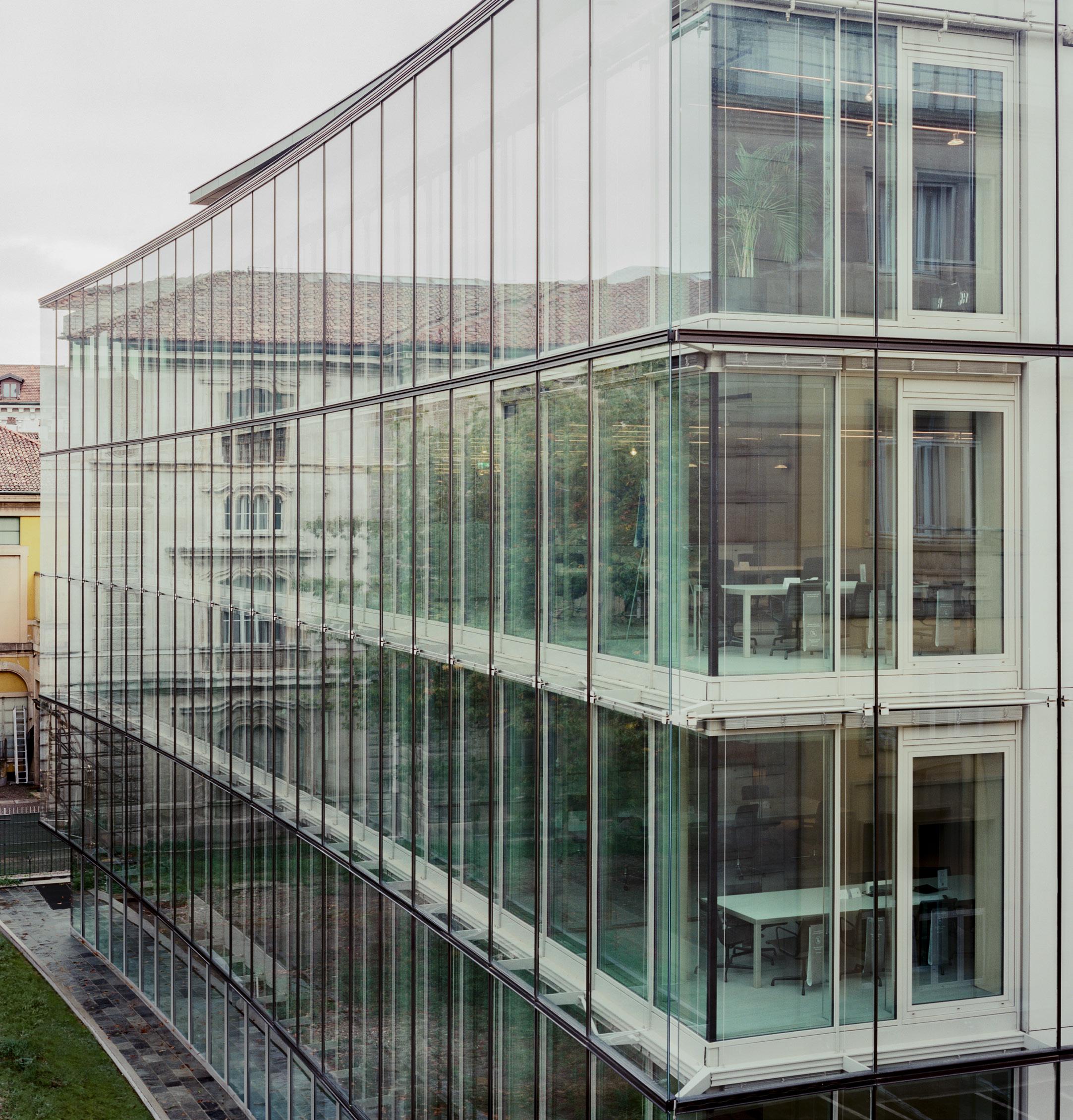
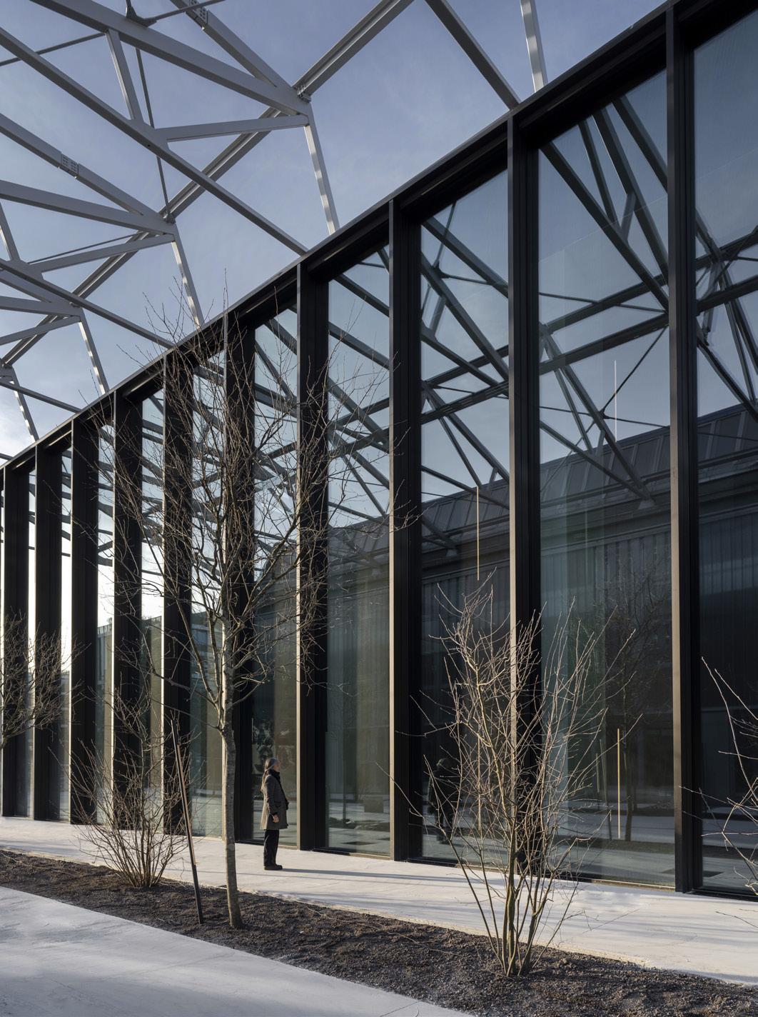
ZIN, seen while under construction. 51N4E claims it retained 60 percent of the original WTC by weight, while others argue that the realities of its construction—new floor plates and facades— constitute a form of adaptive reuse–washing.
to realize the building. The enormous volume of positivistic claims made by 51N4E requires rigorous rebuttal, deflecting energy that could go into critiquing the technical aspects of the building itself or doing actual social organizing.
Responding to a mild review of the project by Christophe van Gerrewey in The Architectural Review, 51N4E principal Freek Persyn took to Instagram to rebut: “I agree with the observation that what we do in the North Quarter raises many questions. That is why it feels strange that the effort of publishing about these questions and doubts is in itself questioned. As if we try to prove something, while in my mind we just try to share what is happening.” Persyn wants it every way: to do the project, to not be responsible for the decisions made in realizing the project, and to control the terms by which the
project is critiqued.
While new software and technologies infringe on the specialized technical services that compose architectural billing, 51N4E is experimenting with an expansive new form of practice that absorbs critical language in an effort to undermine it. As van Gerrewey noted, “It is...indicative of the pressure on architects to work in a way that appears to be ‘sustainable’ while clients often simply want a brand-new building as quickly and efficiently as possible.” Whether the project actually fulfills a stated goal of social equity or carbon neutrality is irrelevant so long as the pool of prospective clients believes it and the project meets its bottom line.
Brad Isnard is a designer based in New York.
MAXIME DELVAUX
13 Q&A
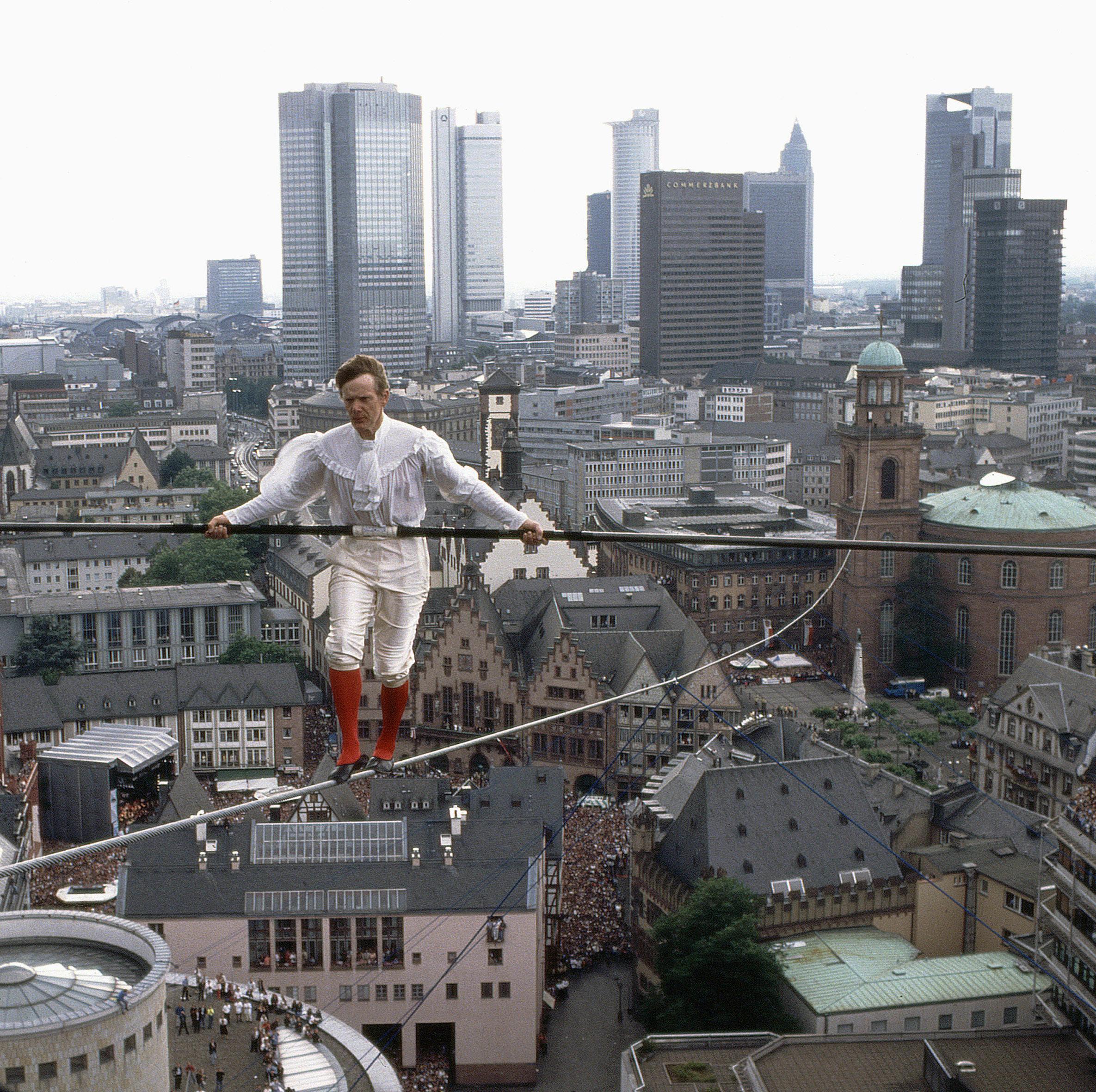
Fifty Years of Man On Wire
Philippe Petit shows AN how a high-wire career can drive a life.
This August marks 50 years since Philippe Petit traversed Minoru Yamasaki’s Twin Towers. It was a hot summer morning in Lower Manhattan when the artist tiptoed across a ¾-inch cable hung 1,368 feet above the ground, traversing the 130 feet separating the two skyscrapers not once, but multiple times. It was August 7, 1974, and New Yorkers held their breath, watching in awe as Petit walked back and forth between the towers, performing “knee bends and other stunts,” as reported by The New York Times. The whole affair lasted an unforgettable 45 minutes.
Petit began his performance career in France as a magician and street juggler at age 6. He was 24 years old when he did Man on Wire at the Twin Towers, but he started planning the performance when he was 18. Now, Petit is 74, but he has no plans on stopping. On August 7, 2024, Petit will perform a dramatic re-creation of the Twin Towers walk at the Cathedral of St. John the Divine in Morningside Heights.
AN’s news editor Daniel Jonas Roche interviewed Petit to learn why he walks on rope.
AN: Were you nervous?
Philippe Petit: No! No, I was the opposite of nervous. I was impatient!
Why did you choose the Twin Towers? What drew you to them?
I taught myself how to walk on tightrope when I was a kid. And from the time I was a kid I wanted to put my rope higher and longer between beautiful places, both natural and man-made. So of course I became enraptured by architecture and engineering after I started looking at beautiful buildings around the world. And when I heard that the Twin Towers were being built, I ran to New York. I went to study them and plot my illegal walk. What attracted me to the Twin Towers was their uniqueness. The fact that they were the tallest in the world was interesting and strange. I just found them very beautiful. And the more I studied architecture and engineering, the more I fell in love with those very unusual, futuristic structures.
It’s often been said that Man on Wire changed the way New Yorkers thought about the Twin Towers. Do you think that’s true?
It’s not so much what I think. But after my walk, journalists, art, and architecture critics all said, “Philippe changed the way New Yorkers see those two towers.” Before then, people disliked them. People said they were inhuman, and they were, in some eyes, not even beautiful. So after my walk, people started loving them because I made them human. I danced between them! As a performer, this was a great compliment to receive.
How old were you when you began walking rope?
I was a teenager. One day, I put a little rope between two trees at about the height of my chin. I had heard about the tightrope walkers. I said to myself, “That’s not a big deal.” I had climbed trees and rocks and used ropes for, you know, making bridges and rappelling. So walking on a rope shouldn’t be too hard. But actually, it proved to be very hard.
Where did you find inspiration as an artist?
I was interested in tightrope walkers, and also musicians, singers, and painters. But I don’t have gods or gurus. I admire people very much for their work. Picasso, for example, invited me to perform at his 90th birthday.
You knew Picasso?
Yes. I had a front seat at his birthday! I have a long list of inspiration, though, like the world’s greatest jugglers and ventriloquists like Señor Wences, who was a friend, and also the painter Julio Larraz. All those people inspire me to walk on the theater in the sky. It’s not a circus, what I do. It’s theater.
When I think of your work, I think about how you create suspense, similar to Hitchcock or painters like André Breton. Surrealists.
I’m happy you brought up this word, suspense. Because the word suspense means that you’re not totally in control. It means that something you might not have planned might happen! When I first put my foot on rope, I know exactly what will happen: I know that my last step will be victorious and that I’m not risking my life. So it’s a strange thing. Most people say, “Oh, come on, you’re wasting your life walking rope.” No, I say, I am actually driving my life! I drive my life on that wire. I am carrying my life. This is what I think inspires people.
Were you influenced at all by the situationists? Guy Debord? Any of that stuff? No, not really. You know, my world is very narrow. No pun intended! When I walk on the wire, I focus exactly on that. But before I walk, it’s the reverse. I open my mind to the space between each building where I’m going to install my cable. I study them. I marvel at them. It brings me joy when I know exactly where I’m going to put my cable. So yeah, I think I may be an architect and engineer at heart.
What are some other walks you’re proud of?
I don’t have a favorite. I have several favorites! My walk at Notre Dame in Paris, of course, which everyone knows from the postcards. Then I did the Sydney Harbour Bridge in Australia, the Paris Opera House, and Lincoln Center in New York. All the works are so different. Sometimes I wear a costume, other times there is music. I am an actor in the sky.
Where did the idea to re-create the Twin Tower walk at St. John’s come from?
It started two or three years ago. It seemed like a natural thing to do to celebrate the 50th anniversary of my illegal work. I have been for more than 40 years an artist-in-residence of St. John the Divine, one of the largest cathedrals in the world, so it felt natural to re-create the performance in that space. One thing
I think will surprise people is that Sting will be there. Sting wrote a song about me, and this will be the first time he sings it in front of people.
How have you been preparing?
Today I live near Woodstock on a very secluded piece of land. I have two poles about 20 feet high in my yard that are spaced 38 feet apart, connected by a cable. There, I’ve been practicing and rehearsing the show. I still want to leave room for improvisation, but I need to be in control. Hopefully the show is entertaining and inspiring, because it obviously has a lot to do with what happened that day in 1974.
Philippe Petit pictured walking a tightrope over Frankfurt in 1994.
14 Q&A Plant It Forward
AN in conversation with Jeanne Gang, author of The Art of Architectural Grafting.
“Gardening, not architecture,” reads one of the phrases from Oblique Strategies, a deck of cards created by Brian Eno and Peter Schmidt to assist with creativity. Jeanne Gang, founding partner of Studio Gang, attempts both in her book, The Art of Architectural Grafting , which offers “rules for extending museums and anonymous buildings to increase their usefulness and delightfulness and reduce their carbon pollution.” Published by Park Books, her volume digs into popular ideas about the urgency of adaptive reuse, arguing that the work of architects should be less about razzle-dazzle and more about sharing and caring.
The Art of Architectural Grafting could be described as a gentle manifesto: It contains theory, history, work by Gang’s students, built projects, unrealized case studies, and personal reflections. Beginning from the horticultural practice of grafting, which involves taking a scion cut from one plant and growing it atop a rootstock from a separate plant, Gang goes on to deliver the ten points of the architect-grafter’s credo and share how the idea is put to work throughout Studio Gang’s portfolio. The publication also shines a light on what we could do with the background buildings that largely comprise American cities.
AN ’s executive editor, Jack Murphy, spoke with Gang about her new book.
AN : Your thesis about grafting is powerful because it is both something that architects have done for a long time, and it is also part of a new wave of thinking about how to design buildings. How do you connect those trends?
Jeanne Gang: Grafting is absolutely something that architects have done in the
different libraries. The long title and the shape of the smaller essays interspersed throughout the book are some of the ways we paid homage to these archival inspirations in the design.
The book is personal at times: You write about your own memories and experiences. It also seemed like your time and work in France impacted your thinking. Can you share about that influence?
It’s all a bit organic. I was in France as an exchange student and then worked on the Maison à Bordeaux while I was at OMA. What really brought me back there was the international competition for the Tour Montparnasse , which focused on redesigning this monolithic tower from the 1970s. I spent a lot of time in Paris while we were working on our submission, which sadly came in second. However, I enjoyed working in this different context, and, in 2017, we expanded the practice with our first international office in Paris. In November, we’ll complete our first project in France: the University of Chicago John W. Boyer Center in Paris .
Another aspect might be the influence of Bruno Latour. How was his writing useful to you?
His writings have been influential for me. He beautifully combines science and the humanities to articulate social and political issues that help us to address climate change. I discovered his writing back in the early 2000s, and it was like discovering a special map that helps you navigate your way through a situation but also allows you to chart new pathways relevant for design.
Not all our projects begin with what’s already there. But for the ones that do, we now have this book. Having a shared language about grafting is helping us be clear about our approach during the design process, particularly for projects where there have been multiple previous additions by different architects. Teams can refer to examples in the book to better communicate with each other in a more precise manner. We also try to stretch the concept to different scales of projects, including urban design.
Can you say more about the Bark Belt project at the end of the book? It reads like a provocation for architects to move beyond working on buildings to designing systems. When grafting to add capacity onto existing buildings, using timber is a good choice because it’s lighter and lessens the load on the existing structure. But the issue we’ve run into with timber is that there often isn’t a lot of timber near the cities where we build, so the material travels from far away. The Bark Belt project studies how to remediate the postindustrial landscape of the Midwest and create new local forests that could supply timber for nearby buildings. At Studio Gang, we are exploring how to create a pilot forest project. Perhaps later it could be a useful model for other biomaterial systems—not just trees, but maybe other plants that also remediate soils while providing new building materials. And, yes to designing systems: To effectively respond to the climate crisis, architects will need to increasingly think beyond the building.
What are your thoughts about the rise of mass timber in the U.S.?
past. When I first started preparing courses on reuse, I was at the American Academy in Rome. It was perfect to be in Rome during this time because there are examples of reuse everywhere—not just in buildings, but also with their components.
While the idea of reuse has always been around, the book reframes and broadens it. In the U.S., we see lots of relatively young buildings demolished and replaced entirely. At a time when we’re facing a climate crisis, we need to urgently think about how to regenerate our existing building stock. It shouldn’t only apply to iconic buildings, but also anonymous buildings, because they are valuable if you put a cost on their embodied carbon.
Grafting also makes for more interesting architecture because it produces a form of asynchronous collaboration between the original architects and those who come after them. This is a form of continuity that’s lost if you just replace the building completely, which is typically perceived as the easier option in the U.S. In Europe, where there’s much less of an appetite for change and a stricter approach to preservation, we see the opposite problem: There is a resistance to adding onto existing buildings with new architecture. The two cultural contexts have different constraints.
Can you tell me a bit about the graphic design of the book? I like how it looks like an atlas.
We worked with Elektrosmog on the book’s design, which was inspired by the many historic guidebooks and gardening guides I came across while researching at
One thing I liked about the book is that you introduced the work of other architects as precedents. There are lessons from offices about how reuse can be done artfully. What did you learn from practices like Lacaton & Vassal?
I found lots of practices who think this way—as grafters. Frankly, many more people could have been included. One of the many things I appreciate the work of Lacaton & Vassal is that even when forces work against them, they find ways to creatively reuse buildings. Carlo Scarpa is another one of my personal favorites.
Even though the work of reuse exists, I was concerned about the lack of precision and nuance in the way we talk about it. So I wanted to help change that by adding new language around it, which the book does, especially in the chapter about techniques for joining. Designers need to be more precise about what exactly a project does when it reuses something. If we can better articulate these ideas, then we can explain and clarify how grafting can be deployed.
The diagrams were helpful, because part of being a grafter seems to be looking closely at what already exists and taking an inventory. Designers ought to stay close to the material conditions in which they’re working.
In teaching and practice, when we start a project, I tell students or team members, “You have to find something you love about the building you’re working on.” That appreciation for what’s already there must come out in the drawings. If you keep the existing structure at arm’s length, then you won’t find the best solution; you have to find the connection point.
The book includes case studies from Studio Gang. How are these ideas implemented in the office’s design processes?
We must work on every single possibility to reduce carbon emissions, whether it’s bio-based materials or low-carbon concrete. For the David Rubenstein Treehouse on Harvard’s Enterprise Research Campus, which is under construction, we’re using mass timber for the structure and a low-carbon concrete for the foundation. It’s hard to get over the hump because nobody wants to be first in taking a risk on new construction techniques.
Some people are solely interested in mass timber, but I think we must work on all fronts, including solutions to replace cement in concrete. For timber, though, we need to become more sophisticated about the supply chain, how trees are grown and harvested, and how forests can be designed to bring multiple ecosystem benefits. Forests shouldn’t just be a monocultural farm.
What do you hope the impact of this book will be?
In the U.S., I hope it will be useful for architects who want to make the case for reuse and prove its value against building from scratch. In Europe, I hope it will foster more acceptance of additions that are more than just replicas of what is already there. Buildings should have a chance to live as long as they can, and people need to have new spaces for new ways of living.
What are you optimistic about?
Everything we have is material that can inspire the next generation. Now, when we’re designing something new, we try to imagine how someone could add onto it in the future. For me, this moves architecture away from being a work of art frozen in time and liberates it as an unfolding, ongoing process that will have multiple authors and many identities over its lifetime.
COURTESY PARK BOOKS
15 Dispatch
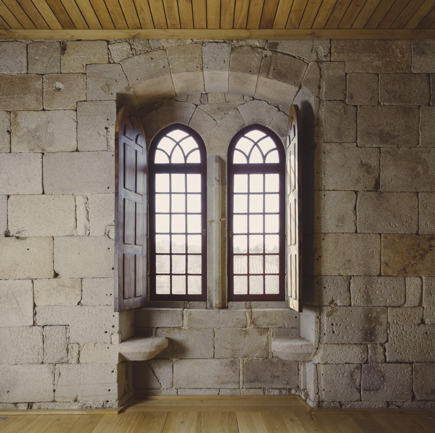
A Temple to the Arts
North of Porto, Portugal, Álvaro Siza debuts a new pavilion at the Monastery of Leça do Balio.
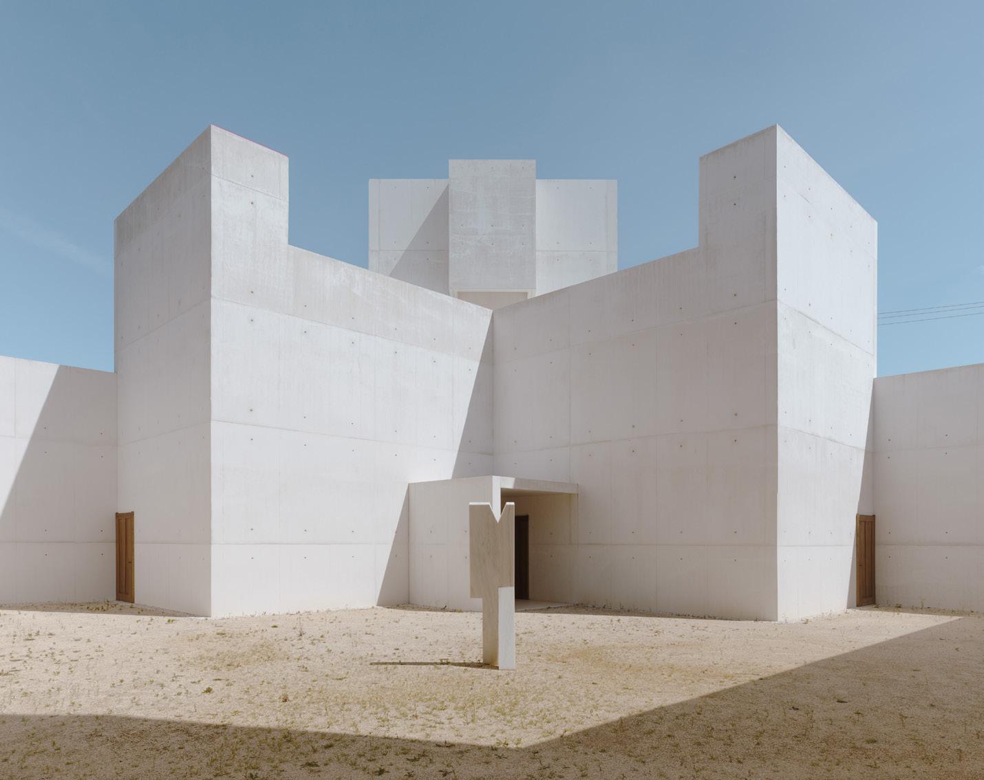
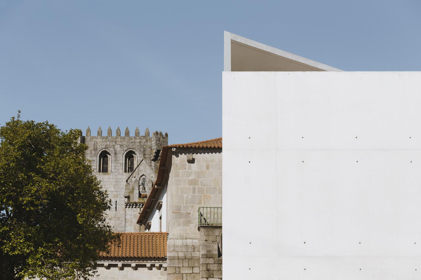
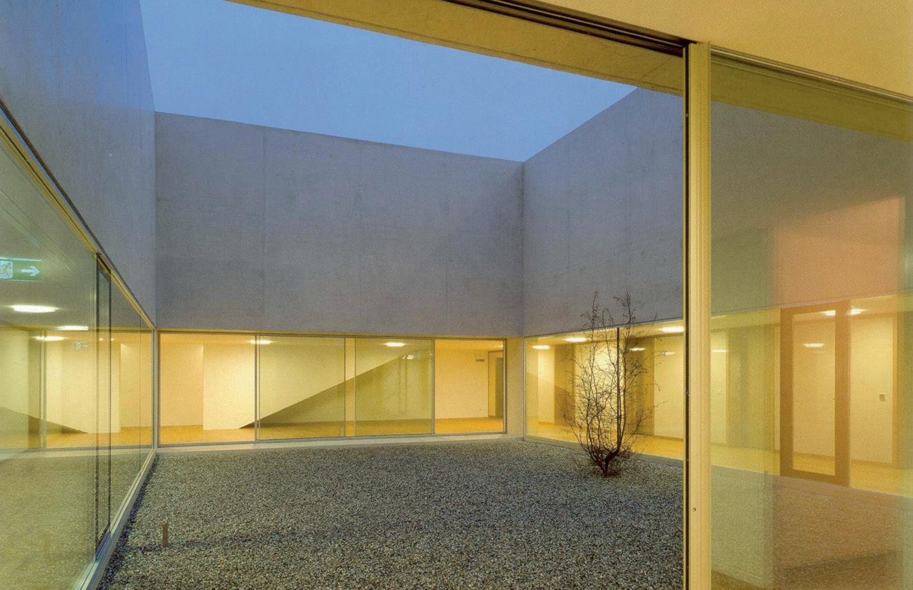
Situated at the edge of two cities, the Monastery of Leça do Balio site has a distinctly calming feel, separate yet near the bustle of Porto and Matosinhos. The complex is believed to have existed here in some form since the 10th century, offering spaces for communal worship and rest for those navigating the Camino de Santiago. Now the two forms—the monastery and its church—sit nestled together with a new, third companion: a crystalline, bone-white concrete shell.
The site has been revitalized and recontextualized for new audiences and 21st-century cultural programming by Álvaro Siza, whose sensuous, minimally invasive work is a fitting choice for Leça do Balio. The historic monastery was designated a national monument in 1910, but its program has continued to change with the times. The Livraria Lello Foundation, an institution devoted to promoting critical thinking and celebrating the arts across Portugal, purchased the monastery in 2016. Its aim was to establish a base for artistic and research-led exhibitions, redefine the monastery’s relationship with the surrounding grounds, and kick-start a cultural path of art routed from Porto Cathedral to Santiago de Compostela Cathedral in Spain.
Álvaro Siza was commissioned shortly after the site’s purchase, given his portfolio of cultural schemes and interest in painting and sculpture. The church is untouched, while the monastery and grain silo have been restored. Siza’s interventions in the monastery are restrained—new timber linings were installed overhead and underfoot, plasterboard partitions were removed, and original stonework is once again revealed. But each of these moves, while elegant and modern, reveals to visitors traces of change of use, extension, and repair. Siza’s hand is evident in the interior design and objects held in each space, too. His studio installed furnishings throughout and notably created a series of new exhibition spaces in the medieval complex.
Stepping outside the monastery’s cloister, to the southern edge of the site, guests find a newly laid square that orients one toward a winding path—which leads onto the other two pieces of architecture on-site. The first of these is the restored silo, now hosting a Siza-designed fountain. Entering the horseshoe enclosure feels akin to being within a granite sepulcher punctured only by a small, high-level window and oculus. Continuing on the processionary route eventually brings you to a final structure: Siza’s new site-specific landmark. The shell-like pavilion hosts the architect’s new work of sculpture, titled Wayfarer
Standing at the point of entry to Siza’s pavilion, one can see similarities to the entryway of the Romanesque church. Concrete planes come together to form an opening that is oversized, like a medieval portico—albeit without ornamentation or delicate carving.
As you cross the marble threshold into the open sculpture, there is a sense of entering a sacred void. Beyond, an open-air space is guarded by a the “wayfarer,” a marble
statue standing attentively. On-axis with the entrance to the pavilion, large timber doors on pivot hinges reveal a rectangle of darkness that draws viewers forward to an open cube form.
In the secondary space there is darkness. The eyes are forced to adjust, finding a dappled field mediated by three qualities of light: softened at clerestory level, delicate pinpricks through plug holes in the concrete shuttering, and finally sharp light pouring in from a triangular opening overhead. This inner sanctum has an L-shaped plan, completely free of obstruction, so one is free to wander and perambulate. The pin-sized holes in the walls not only introduce delicate light but also subdivide the space, creating a loose grid. Professor of Portuguese literature Pedro Eiras, who was invited by the foundation to reflect on the sculpture, notes the shifting nature of the solid walls: “If you move your eyes, the surface is sewn together, suddenly opaque, but if you move again, light is turned on, and then off again.”
The spatial treatment of the interior and exterior spaces combined with the movable furniture gives the pavilion an ambiguous quality. It is not a secular temple, and it does not demand any particular mode of inhabitation. Instead, the pavilion simply offers a waymark of rest for travelers, whatever guise “rest” may take. Responding to the Livraria Lello Foundation’s brief, the new space is decidedly contemporary while creating a responsive extension to the historically religious site. The expansive vision for the landscape also includes a planted “Eden,” currently in development, that will bleed into the surroundings and add more opportunities for questioning.
The pavilion oscillates between earthly and spiritual considerations: There are no overt iconographic elements, so visitors can reflect in a looser framework. Rather than demanding consumption, production, or even action, it is an architecture designed for periodic introspection and meditation.
Josh Fenton is an architectural writer and communications consultant based in London.
Above: Siza’s work is inspired by temple forms yet delivers a secular, meditative space without behavioral demands.
Center: Siza’s addition contrasts with the exterior of the historic monastery.
Right: Much of the monastery was preserved yet uplifted, with new details interspersed within the Romanesque fabric.
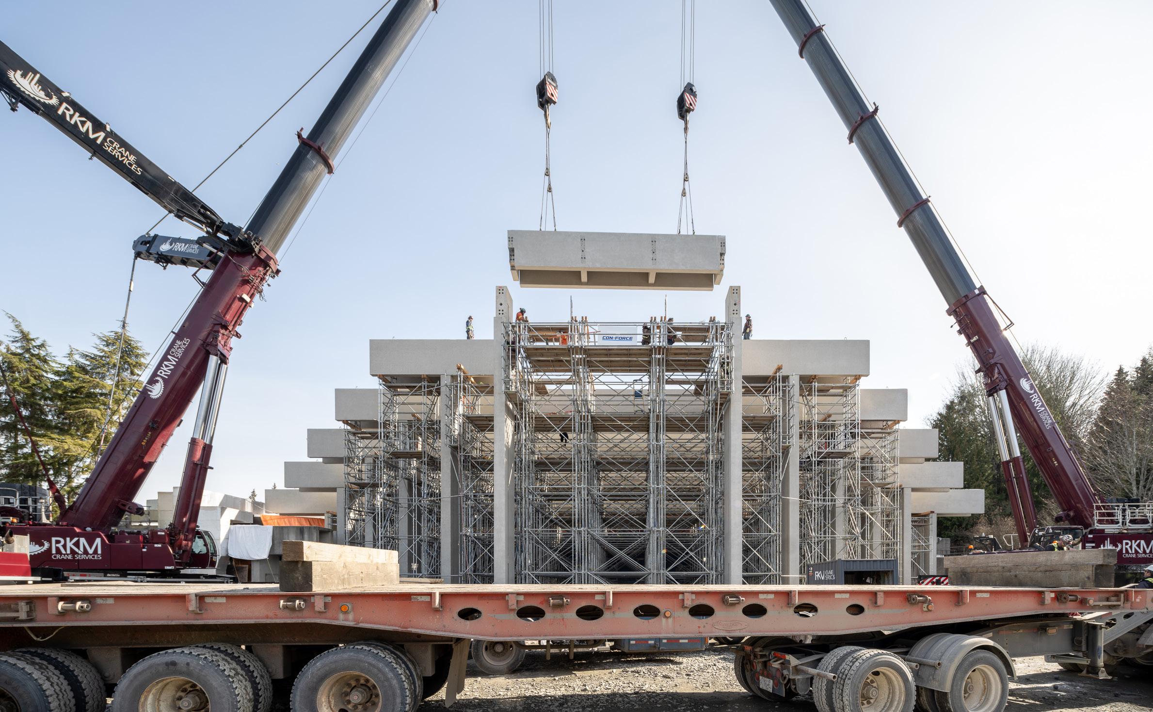
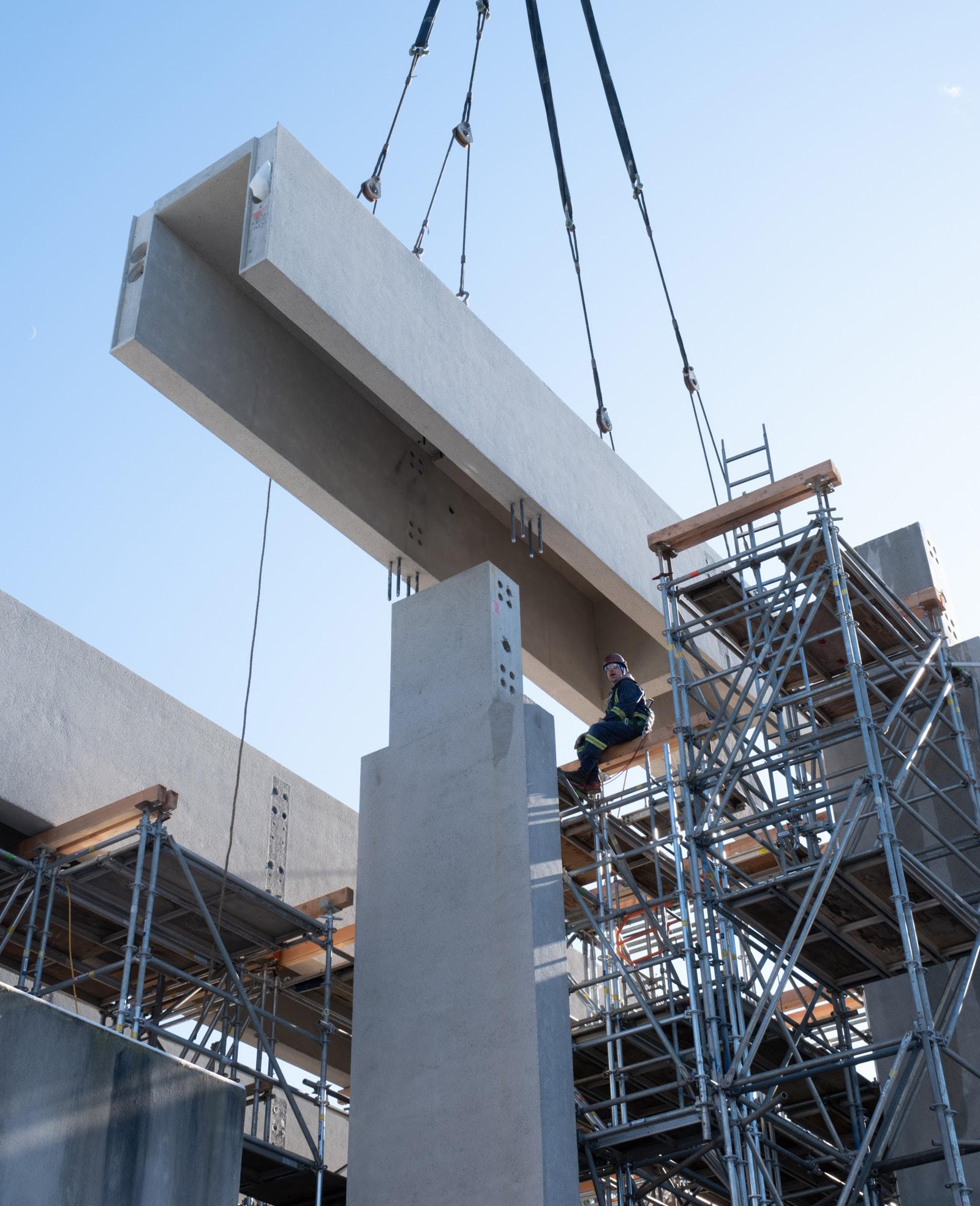
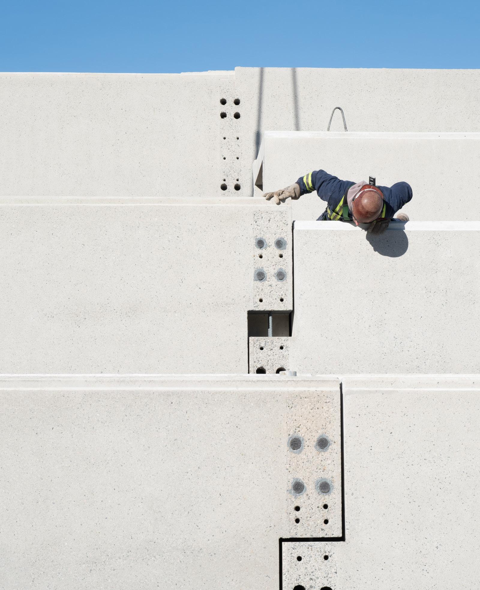
16 In Construction
New Seismic Standards
Arthur Erickson’s Museum of Anthropology in Vancouver goes above and beyond to meet new seismic standards.
Straddling the western edge of the University of British Columbia’s cliffside Vancouver campus is Arthur Erickson’s Museum of Anthropology. Constructed in 1976, the cast-in-place concrete museum, like other work in Erickson’s oeuvre, is highly responsive to its site. Following the slope of the hillside, visitors wander through a maze of inclined galleries and corridors that give way to the museum’s architectural focal point, the Great Hall: a massive exhibition space formed by a succession of post-and-beam concrete frames that climb upward, terminating in a cascading wall of structural glass.
Erickson formed the entrance to the Great Hall between two concrete cylinders— relics from the cliffside’s use as an artillery battery during the Second World War. The Musqueam Nation, the site’s original inhabitants, used the cliffside for a similar purpose as it guards the mouth of the Fraser River to the south. In reference to the First Nations people of the Pacific Northwest—whose artwork and cultural artifacts are the focus of the museum—Erickson fashioned the Great Hall’s concrete columns to resemble First Nations post-and-beam timber architecture.
“Knowing the Native use of enormous split cedar logs and their exaggerated, luxurious effect, I felt that a similar ponderous weight and disregard for structural reality could work here,” Erickson wrote, describing the Great Hall’s design in his 1988 book The Architecture of Arthur Erickson In the 1990s, scientists discovered that
the coastline of the Pacific Northwest falls along the Cascadia subduction zone, a tectonic fault line capable of producing 9.0magnitude earthquakes, the last of which is estimated to have occurred in 1700. Despite the museum’s careful attention to site and history, its architects and engineers were blissfully unaware of the structure’s susceptibility to seismic activity and designed the Great Hall’s structure independently from the rest of the museum.
Since 1994 the University of British Columbia has devoted $200 million to seismic upgrades on its existing building stock.
After Erickson’s death in 2009, the Museum of Anthropology’s freestanding Great Hall was identified as a significant seismic risk, and the university announced plans for a renovation in 2018.
Nick Milkovich, who had worked in Erickson’s office as a young architect, was selected to lead the restoration effort. First, it was determined that a base-isolation system was needed beneath the foundation.
“If we changed any of the dimensions, like the column thicknesses, we would have destroyed [the museum’s] initial conception,” Milkovich explained. “The only way to save the Great Hall dimensionally was to use base isolation.”
This necessitated the demolition and reconstruction of the concrete portals that compose the structure. Equilibrium, the project’s structural engineer, devised a 10-foot crawl space beneath the building to
hold the base isolators—rubber bearings that absorb the shaking of an earthquake and separate the concrete structure from the ground. After the structure was reinstated, featuring new reinforced columns and beams, RDH Building Science was tapped to re-create the structural glass wall that fronts the Great Hall.
“It’s obviously difficult to try to reinstate something that was built 50 years ago. You have to figure out a way of making something that you can do today look similar,” said Felix Weber, principal at RDH. “But we also have very different safety standards…. We had to basically transfer the original design into something we would accept today that performs according to the standards for structural glazing internationally.”
To improve seismic resilience, identically sized laminated glass panes were introduced—technology that did not exist in the mid-1970s—to replace the original tempered glass wall. Because laminated glass is thicker than tempered glass, a clear, low-e coating was used instead of the original green tint, allowing for the same level of transparency. The team then re-created the bronze patch fittings between individual panes—all in an effort to stay true to the original design.
RDH also replaced the building’s aging Plexiglas skylights. For years, buckets were a fixture of the interior, collecting rainwater from the perpetually leaky skylights. The original radiused skylights were replaced with new units that are waterproof and double-glazed.
“When we started working on the job, we were trying to replicate the architectural detail and quality of the structure so that you wouldn’t notice that anything was done,” added Milkovich. “I think we got there. It just feels a little bit fresher, that’s all.”
The completion of this restoration marks a significant milestone, particularly in light of recently announced plans to demolish Moriyama Teshima’s Ontario Science Center in Toronto due to related structural integrity and occupant safety concerns. In the case of the Museum of Anthropology, preservation of the campus’s architectural heritage was prioritized despite great cost and labor demands. Ontario premier Doug Ford should look to the example set here by the University of British Columbia.
Trevor Schillaci
Below: Rebuilt and reinforced structural columns were fabricated to stay true to Erickson’s original vision for the Great Hall.
Facing page, clockwise from left: Precast structural elements were lifted into place on-site; workers ensured proper connection by hand; the rhythm and column widths were maintained in the renovation; heavy-duty rebar was deployed to ensure seismic resilience.
MICHAEL ELKAN
MICHAEL ELKAN
MICHAEL ELKAN
MICHAEL ELKAN
MICHAEL ELKAN
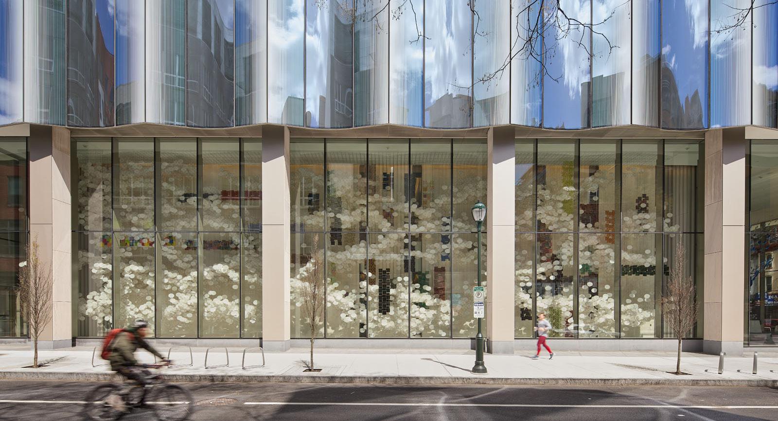
No More White Walls
Allied Works crafts a colorful new home for the Palmer Museum in State College, Pennsylvania.
continued from cover
The site offered to Allied Works was a parking lot on the edge of Penn State’s arboretum. It’s unfortunate that this site is a little beyond the point where campus morphs into a suburb, but Allied Works has made much of the plot.
The building is a series of staggered volumes that Allied Works principal Brad Cloepfil described in conversation with AN as both “a weave in plan and section” and “a ramble across the garden.” Deference to the 370-acre arboretum, which contains a botanical garden immediately adjacent, was the prime creative impulse. The surrounding landscape, designed by frequent collaborator Reed Hilderbrand, sought to deferentially link these showpieces for art and plants.
Cloepfil did not want to build a domineering structure, expressing a frustration with “shiny bauble” museums “where the galleries are small and circulation confusing.” Instead, the team produced a zigzag clad in local sandstone and pierced it with irregular fenestration and occasional stainless steel brise-soleil panels—resembling intermittent cyclopean rave glasses.
The wooden-plank-ish texture of the sandstone cladding is Norman Jaffe–esque, and the impression is accentuated by how Allied Works vertically arranged them,
making a point about their structural superfluity. Cloepfil explained: “It’s cladding; it’s not load-bearing. We didn’t try to pretend it was a Roman wall.”
This all makes far more sense once you go inside, where the sequence of galleries is superb. Cloepfil explained his conception of an art museum as “prescribing a journey,” one that in this case is exceptionally scrutable thanks to double-height atria and Nittany Valley views. The experience he intended was that one might “intimately engage the art in some small rooms, and then you’re linked to the landscape in a kind of rhythmic sequential journey.”
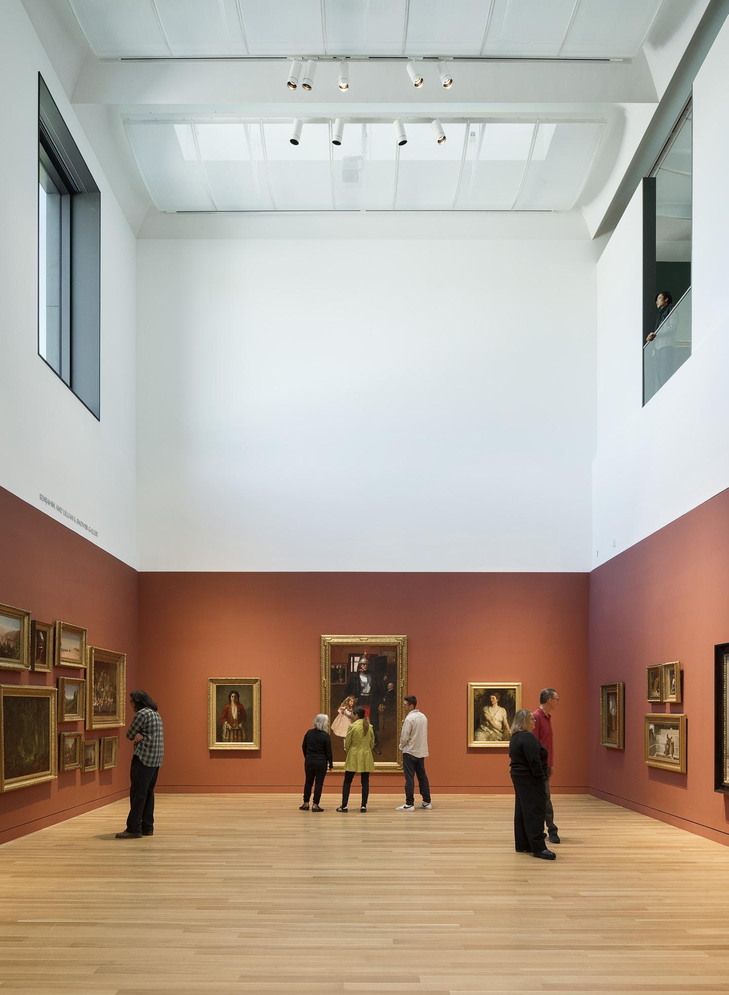
A real skill of the undertaking was designing for what the collection actually is ; contemporary galleries so often seem plotted solely with huge contemporary art in mind, leaving smaller older pieces adrift. Here, the design accommodates humanscaled pieces by Maurice Prendergast, Robert Henri, Marguerite Zorach, George Grosz, and many others exceedingly well.
Many gallery walls surprise by being brightly painted: Colors from dark blue to russet red disrupt the expectation of white. Sometimes these walls terminate short of the ceiling, and at other points paint shifts to white at a certain height. It was another product of Cloepfil’s frustration with “the white box” as
gallery default: “When you go to neoclassical museums, you see small paintings in 30-foothigh spaces, and one of the reasons it works is because of the entablatures and cornices and encrusting ornament. Now that we don’t use these anymore, you have to strike some lines.”
The most egregiously and delightfully painterly feature is a large window across an atrium from the second-floor baroque gallery, which frames rolling hills and mountains as well as George Innes might have. The principal stairway is another humanizing touch, oak-lined and homey, which Cloepfil compared to a rocking chair. “You don’t touch the art; you do touch the stairs.”
The design principally carried out the aims of museum leadership. Curator Erin Coe explained: “What I wanted to do at the new museum was remove barriers to participation.” She admitted that “some of those barriers were physical,” or architectural. But beyond the new, larger space, new acquisitions are also taking center stage: An inaugural exhibit showcases many fine Pennsylvanians, from Mary Cassatt to Keith Haring to Andy Warhol and Howardena Pindell. There are also more than 30 new acquisitions on display. Much else awaits unearthing, and now the museum has room to do it.
Outside, Reed Hilderbrand’s transitional
landscape feels just right. “This space doesn’t want to have all of the horticultural complexity of a botanical garden; it wants to feel like an extension,” said Principal John Kett. To that end, sculptures by Anthony Caro, Beverly Pepper, Seymour Lipton, and others are scattered throughout the grounds.
Cloepfil was tired of having “banal experiences in really fancy buildings.” He has deftly avoided that here.
Anthony Paletta is a writer living in Brooklyn.
Below: The new Palmer Museum occupies a site at the edge of town, overlooking views of Nittany Valley.
Facing page, above: The exterior cladding rejects a monolithic color tone, instead expressing an earthy variation through the stone’s naturally occuring palette.
Facing page, clockwise from below left: The architects chose to finish exhibition spaces with deep, resonant colors; an exterior screen shades the museum’s gift shop and cafe; the screen adds dimension to the large windows.
JEREMY BITTERMANN
JEREMY BITTERMANN
JEREMY BITTERMANN
JEREMY BITTERMANN
20 Studio Visit
What Does a City Want?
Archimania is commited to the local spirit of Memphis, Tennessee.
Archimania is a mid-size office with a fun name deeply rooted in its hometown: Memphis, Tennessee. “I came up with the name in college,” Archimania’s cofounder Todd Walker told AN “I liked Archimania for several reasons. One, because it was authentic, and it sounded creative. Two, it was inclusive. It represented a group and not a person’s name. That, in turn, sets up the firm to continue for years without being defined by a person’s name. “Archi” represented architecture and “mania” was defined as an intense desire or enthusiasm for something. We talk about passion a lot, so this seemed fitting in college and now.”
Since 1995, the studio has been known for its sensitivity to color, light, and materiality; a modernist penchant that both blends in and
stands out from Memphis’s industrial urban fabric. Today, designers work on projects small and large: from community centers and urban agriculture farms in Memphis’s underserved neighborhoods to very high-profile art museums, like the Memphis Brooks Art Museum collaboration with Herzog & de Meuron.
Notably, many “Archimaniacs” like Chloe Lane and Claire Sims are Memphis natives, and the office’s commitment to local projects and talent runs deep. “When I started this firm in 1995, my goal was to improve this city,” Walker told AN . “Memphis needs many things, and we’re committed to helping the city come together, move forward, and progress.”
1 Frontline Townhomes 2020
Construction started on Frontline Townhomes in 2018, a project Archimania developed with Woodard Properties, one of its many Memphis-based clients. Thirty homes were built on a linear 1.25-acre site between the Mississippi River and Memphis’s South Main Arts District. The 3-story buildings add much-needed density to an area defined by postindustrial sprawl. The first two floors of each building are clad in gray box-rib metal, and the third floor in bright yellow fiber cement board and batten siding, a feature that complements the yellow doors.
The design of each townhome also prioritizes
access to the outdoors and a variety of greenspaces. All homes are accessible via a shared pedestrian courtyard: This brings circulation toward the interior of the project, and shields the passage from the street. Residences all also boast their own stoop, a dogwalk, and extensive landscaping. Two lots also remain empty, used to offer semi-private patio spaces and gardens between buildings. A refreshing take on walkable urbanism, the scheme is welcome in the previously underutilized lot adjacent to a railway—now pleasantly human-scaled.
3 Girls Inc. Youth Farm 2024
Exit the Ed Rice Community Center, take a left on North Watkins Street, another left on Whitney Avenue, go straight for less than a mile, and you’ll arrive at Girls Inc. Youth Farm, a 76-yearold nonprofit that teaches girls from the Frayser community how to grow local crops, cultivate interdependent ecosystems, and develop new skills. Archimania finished a new building for the organization this year that creatively reinterprets the traditional red barn so symbolic of agriculture in America.
On the land surrounding the nonprofit’s new building, neighborhood kids tend crops
and allotments, growing produce that they can either take home with them or sell at a farmers market on-site. The organization provides a crucial community staple: “Girls Inc. is an organization that basically nurtures and educates young and mostly urban girls,” Walker said. “It provides after school tutoring and other opportunities for learning about how to provide for themselves as they get older and think about jobs and college. The girls we’ve seen come out of this program have gone on to do amazing things.”
2 Ed Rice Community Center 2022
Frayser is a historic African American neighborhood north of downtown Memphis. Like many traditionally Black neighborhoods, midcentury development schemes diverted resources elsewhere; thus the area has been marred by chronic disinvestment. Contributing to a contemporary revitalization of the place is a community-forward project in Frayser Park: At the heart of Frayser Park is the Ed Rice Community Center, which Archimania completed in 2022.
The single-story building serves Frayser’s youth and elderly; it hosts a gym, an outdoor classroom, community spaces, a computer lab,
exercise equipment, and a communal kitchen.
The building is anchored by a courtyard, and nearly every occupiable space has views to the outdoors. The structure, Walker said, can be used to sell produce from another important Archimania project just down the road, the Girls Inc. Youth Farm. “The Ed Rice Community Center is really a continuation of the Youth Farm,” Walker said. “The community center has a greenhouse for girls in the area to use at other times of the year.”
4 Memphis Brooks Art Museum 2019–
On any given day inside Archimania’s Memphis office, one may find a handful of Herzog & de Meuron employees at their computers working hard alongside Archimaniacs. The two firms have been working side by side at the Archimania office on a replacement building for Tennessee’s largest and oldest art institution, the Memphis Brooks Art Museum.
Construction on the project began in July 2023 and doors are expected to reopen in 2026. For Walker, the museum project represents a milestone for both the firm and the city at large: “As with so many of our projects,
we really care about drawing people in, and I think the Brooks Art Museum really embodies that,” Walker said. “This world-class museum will be an absolute game-changer for Memphis. It’s going to draw people in from around the U.S. and the world.” By pairing internationally recognized design talent with the local knowledge and grounding of Memphis-based Archimania, the museum promises to be tailored to longtime local supporters, new patrons, international visitors, and cultural tourists alike. DJR
ARCHIMANIA W/ HERZOG DE MEURON
COURTESY ARCHIMANIA
COURTESY ARCHIMANIA
COURTESY ARCHIMANIA
Ornare in Baltimore with Valeria Design Studio
A kitchen transformed into a functional and luxurious space by architect Valeria Coster of Valeria Design Studio meets the hectic demands of everyday life. The furnishings were carefully designed using the Shaker line, standing out with Chevron finishing that delivers a unique and sophisticated geometric pattern. It’s a place where family life unfolds, blending joy, elegance, and functionality in every detail. ornare.com
Artistic Tile and Wendy Sharp at LSU
When Wendy Sharp started designing the new locker room for LSU Tigers women’s basketball team, she wanted to create a space fit for national champions: The design had to exude the confidence, talent, and strength of the team. To complement LSU’s colors—purple and gold—Sharp defined the space with Lilac marble. The violet hued-stone was paired with metallic Martello Gold, iridescent Garden District, and custom Moons to complete the look. Sharp noted that “the connection between all the luxury stones used in the spaces and winning is hand in hand. It is something that is special and timeless.”
artistictile.com
Scavolini’s Château Capitoul
Scavolini has designed the kitchens of Château Capitoul, a luxury estate in the South of France near Narbonne, stretching from the wild Languedoc lagoon to the Mediterranean Sea in collaboration with restoration specialists Domaine & Demeure.
Set in 100 hectares of countryside, Château Capitoul combines classic style with art deco features inspired by the estate’s noble and agricultural heritage. Scavolini’s Carattere, Favilla and LiberaMente kitchen collections, each with their unique wfeatures, embellish the classic architectural style of Château Capitoul with a contemporary twist, positioning them perfectly in this dream setting.
scavolini.com
Fisher & Paykel at the SuperBungalows™
Fisher & Paykel is proud to be a partner of choice for SuperLA® and the new SuperBungalows in Los Angeles.
SuperLA’s focus on well-being and sustainability presented an excellent opportunity for partnership: Fisher & Paykel has long been committed to environmentally conscious operations, creating new products that limit environmental impact. The SuperBungalows feature Fisher & Paykel electric appliances, designed to reduce energy and water use and limit off-gassing.
With a commitment to environmentally conscious operations and innovative product design, Fisher & Paykel’s appliances enhance the sustainability of the SuperBungalows, aligning with SuperLA’s focus on occupant wellness and resource efficiency.
fisherpaykel.com
At the Architects & Designers Building you can shop 40 showrooms to create the
environment for residential and commercial projects—from a single
a complete home, or a signature hi-rise to a boutique hotel or a new restaurant—all under one roof. Discover the world’s leading brands where luxury design defies expectations.
modern and fresh kitchen plays beautifully with the historic character of the chateau, offering a dreamy getaway for visitors.
COURTESY SCAVOLINI
MADELINE TOLLE
OUT OF OFFICE
Arriving in the heat of summer, AN’s July/August issue is on theme: Our features bring you projects geared toward travel, leisure, and cultural heritage that immerse readers in cities and landscapes. Seeing new places and experiencing new spaces has long been the heart of an architect’s toolkit. Sometimes, we need to get out and learn lessons from other places, cultures, and people. From a deep dive into architecture’s role in tourism to sites where landscape prevails over car-centric development, this section is designed to inspire fellow architects and designers to wander a bit farther.
A PEARL IN THE GULF
Bahrain’s
Pearling Path offers a twodecade retrospective on history, identity, and architectural narrative.
At the 2006 Venice Architecture Biennale, OMA-AMO’s exhibition, The Gulf, presented the Arab Gulf states to the world. Depicted as a promised land for contemporary architects, the Gulf, OMA argued, was the “final tabula rasa on which new identities can be inscribed.” In the two decades since, the contender for most spectacular set of architectural projects in the region has not been the product of new financial capitals but a set of urban and architectural commissions within the historic city of Muharraq, Bahrain. Works by Christian Kerez, Valerio Olgiati, OFFICE Kersten Geers David Van Severen (KGDVS), Atelier Bow Wow, Formafantasma, Leopold Banchini, and Studio Anne Holtrop have regularly placed the small island nation in the spotlight of architectural media—all part of a plan to promote the Pearling Path and the narrative of the historic pearl trade in Bahrain. The official UNESCO listing for the path is “Pearling, Testimony of an Island Economy.” The testimony in the title refers to the initial question of how to physically tell the story of the Bahrain pearling trade through architecture. The Muharraq Pearling Path is a series of properties that narrate this history. Bahrain has exported pearls since antiquity, but the trade peaked from the 19th to the early 20th century under British maritime supremacy in the Indian Ocean. The industry boomed in the former capital of Muharraq, where many of the tawaweesh, or pearl merchants, were based. Pearls were Bahrain’s primary export until the advent of Japanese cultured pearls, and the industry collapsed in the 1930s after the discovery of oil. Muharraq continued to grow, but the cramped alleyways and traditional courtyards were abandoned by many local families in favor of newly built cities like Isa Town and Hamad Town. Finally, in 1977, Muharraq’s core was encircled by a new highway loop, cutting it off from the sea.
a Bu Mahir Visitor’s Center b Dar Jinaa and Dar Al Muharraq
c Pearling Path Visitor and Experience Center
d Sue Al Qaysariyyah
e Archaeologies of Green Pavilion
f Isa al Caber Palace g Jamsheer House
It was in response to the changing urban fabric of Muharraq that in 2002 the Shaikh Ebrahim Center for Culture and Research was established in Fareej al Shiukh, a district in the heart of the old city. There was an interest in countering the fatalism that pervaded there by bringing in cultural programming and renovating the neighborhood’s abandoned coral stone buildings. The founder of the Center later became the minister of culture and advocated for a UNESCO World Heritage listing for Muharraq, which it received in 2012.
The Pearling Path was never a defined route through the city, but a rather loose circuit about 3 kilometers long proposed for the World Heritage listing. The route connected sites like a portion of Muharraq’s shoreline, significant houses, merchant stalls, warehouses, mosques, and a fort. In addition to restoration, the Pearling Path plan defined a larger buffer zone around the path—protecting the core neighborhoods through new building codes and facade regulations.
While the Pearling Path management plan specified which buildings to renovate and what strategies to employ, there was not a design language driving the project. In 2010 a design competition was organized by the Ministry of Culture to define an urban strategy for the Pearling Path. But the competition was deemed unsuccessful, with the entries seen as “intrusive” by the committee. That same year marked Bahrain’s first participation in the Venice Architecture Biennale; it won the Golden Lion. Biennale curator Noura Al Sayeh, an EPFL graduate who had joined the Bahrain Authority for Culture and Antiquities (BACA) the year before, was then asked to recommend architects for projects in Muharraq and elsewhere in Bahrain. Al Sayeh began by recommending OFFICE KGDVS, recipient of the Silver Lion in Venice that year, to propose a design for the Dar Jinaa building, a performing space in the southern portion of the Path. After that design, the studio also issued a proposal for the Path’s urban strategy.
It was OFFICE KGDVS’s collaboration with Bureau Bas Smets on the urban strategy that first defined the Pearling Path route, creating a series of 16 public parks (Pearl Squares) and oyster-shell terrazzo light poles that weave through the dendritic alleyways of Muharraq. The driving interest was to commission architects who “had a generous understanding of publicness and whose work could play a flexible role in the city,” Al Sayeh told AN. When asked about the appropriate formal language for integrating into the city, Al Sayeh also spoke of allowing the newer concrete buildings to establish a rhythm alongside the older coral buildings: “The seriality between the buildings, parking structures, and squares has brought a kind of identity and legibility to Muharraq.”
To fund the Pearling Path initiative, a portion of the costs was covered by the Bahraini government, while the rest came via a low interest loan from the Islamic Development Bank (IDB). The loan was granted in 2014, but the IDB had several requests that would widen the scope of the Pearling Path vision. According to Al Sayeh, the IDB “had not done urban revitalization plans before, and their financial mechanisms were more suited to the singular.” The IDB mandate to fund development projects meant that in addition to issuing a loan for the conservation plan, the bank was interested in the Muharraq project becoming more than the renovation project alone. “The bank gave us the legitimacy to act on an urban level,” Ghassan Chemali, an urban heritage consultant for BACA, told AN.
There are roughly three phases to the Pearling Path. The first was the Shaikh Ebrahim Center phase, which lasted from 2002 to 2012 and focused on small-scale renovations prior to official recognition. The second phase, from 2012 to 2018, saw the implementation of the Pearling Path as a spatial narrative and the first of the architect-designed works: Studio Anne Holtrop, Leopold Banchini, Atelier Bow Wow. It was this urban narrative that won the Aga Khan Award in 2019, celebrating the “Revitalization of Muharraq.” Al Sayeh told AN that “[The Pearling Path] is not the first UNESCO World Heritage serial nomination, but it invented a way to bring together an urban site that was no longer intact.”
The third and final period, which just finished this year, saw the majority of Path properties completed, the squares installed, and larger projects funded by the IDB take shape: the visitor center by Valerio Olgiati, four parking lots by Christian Kerez, the Siyadi Museum by Studio Anne Holtrop. With the opening of the Pearling Path in February this year under the new BACA president, Shaikh Khalifa Bin Ahmed Al Khalifa, the totality of the Path vision is now accessible after over two decades of work. The opening serves as a moment for reflection, allowing visitors to both see the Path and evaluate the efforts it required. The first two phases of the Pearling Path ran counter to the Dubai strategy, eschewing grand architectural gestures in favor of tactical interventions and small programmatic additions. But the third deployed a more ambitious scale—interventions that run the risk of “jumping the shark,” or overpowering the historic center. The four parking structures occupy key sites in the city but also tower over the entry points to the historic district, prompting questions about whether a more innocuous (and efficient) parking strategy would have been more appropriate.
While the architectural and urban ambitions have been fulfilled, the long-term goal of converting Muharraq to a lively residential neighborhood and encouraging the preservation of houses by locals will be more difficult. Chemali noted that “there is now an attractive and novel quality to Muharraq, but there remains the question of how to get the community involved: It is unclear what impact the projects will have on the life of the city.”
As the community incorporates the buildings into its daily life, the top-down narrative of the Pearling Path as a set of contemporary structures with a public disposition will be reevaluated. While it garnered accolades and media coverage, the last decade of work on the Pearling Path was also conducted with little design input from local or regional
architects. The efforts to project Muharraq outward have been an architectural and marketing success, bringing on young European talents to produce exciting work in a new context. Yet the past decade and a half of architecture commissions could have been used as a platform to develop the local architecture community a similar way—the last Bahraini firm involved as designers left the project in 2012. If the Path can be praised for avoiding the starchitect craze of the neighboring Gulf states, it cannot be praised for having found an alternative.
What makes the Pearling Path exciting is not the who’s who list of your favorite architect’s favorite architects. It is the vision of a city based on the consolidation of existing urban fabric and strategic, piecemeal development. The Arab city here is not empty terrain where new identities can be inscribed, but one whose identity has been built over time and can be revealed through architectural intervention.
Ali Ismail Karimi is an architect and educator based in Bahrain and cofounder of Civil Architecture. Civil Architecture completed commissions from
Above: An aerial view of the historic area of Muharraq, with contemporary architectural insertions, notably two carparks by Christian Kerez realized in curving concrete surfaces.
Facing page:
Above left: A street view of a parking structure by Christian Kerez
Above right: A series of plazas connect the Path’s historic sites, marked by light posts by Bureau Bas Smets.
Center left: A gallery inside Studio Anne Holtrop’s Siyadi Pearl Museum is clad in gold leaf.
Center right: Numerous historic coral houses and traditional residential courtyards were renovated along the path.
Below left: Bureau Bas Smets’s plaza designs often include shade structures and thoughtful landscaping.
Below right: A street-level entrance to a new Studio Anne
Noura Al Sayeh and BACA. Karimi has worked with OFFICE KGDVS and Gulf House Engineering.
Holtrop project is defined by geology-inspired cast walls.
IWAN BAAN
IWAN BAAN IWAN
ONE PLACE, MANY HISTORIES
Walker Warner puts some cultural specificity into Hawai‘i’s revived Kona Village.
When Greg Warner was first asked to redesign Hawai‘i Island’s tsunami-battered Kona Village resort, he said no. His firm, the San Francisco–based Walker Warner, had no experience designing resorts, and he worried about the logistics and manpower required to lead a hospitality project with 150 guest rooms, multiple restaurants, and a spa. But resort owner Kennedy Wilson, a global real estate investment company led by Bill McMorrow, asked Warner a second time.
“He said, ‘I’m only going to ask you once again,’” Warner recalled. “And I decided to do it. Of course, I had to come back and convince the partners.”
Seven years later, guests can judge whether Walker Warner’s grounded interpretation of the beloved midcentury, tiki-themed outpost on Kahuwai Bay succeeds. The goal was to preserve the unique, intimate travel experience that first drew people to Kona Village while updating the property to meet the expectations of the modern traveler—and a climate-conscious state.
What neither Warner nor McMorrow could have anticipated was the challenging moment in which Kona Village would be reopening. Both the pandemic and the wildfires that destroyed the Maui community of Lahaina brought long-simmering tensions between tourists and Hawai‘i residents to the surface, spurring contentious conversations about land use, water supplies, and what many consider to be the state’s overreliance on tourism.
In spring 2020, shortly after Hawai‘i instituted one of the most comprehensive COVID-19 lockdowns in the U.S., a group of Kānaka Maoli (Native Hawaiian) activists and leaders formed ‘Aina Aloha Economic Futures, a coalition aimed at advancing social, economic, and environmental policies rooted in traditional Hawaiian knowledge and the principles of a circular economy.
“We are all questioning the impacts of unfettered tourism on our islands’ natural resources and our quality of life,” wrote coalition cofounder Kamanamaikalani Beamer, a professor in the University of Hawai‘i’s Hawai‘inuiākea School of Hawaiian Knowledge, in a July 2021 op-ed. An extractive, linear economy “wasn’t working for most of us pre-COVID-19,” he wrote, “and it won’t be better in the future without…living wages for Hawai‘i’s people and caring for our precious ‘āina (land).” This past June, the coalition’s efforts resulted in the passage of new legislation designed to foster a less-resource-intensive travel industry in Hawai‘i.
Against this political backdrop, Kona Village represents a test case for a circular economy in Hawai‘i. The resort uses 100 percent solar energy and treats wastewater on-site. Guests ride bicycles to get around the resort, and the project avoided unnecessary material waste through a partnership with ReUse Hawaii, which carefully deconstructed each of Kona Village’s 100-plus bungalows and salvaged usable materials, ultimately recycling 80 percent of the resort’s buildings and infrastructure.
Graham Hart, a cofounder of the O’ahu-based Kokomo Studio and a scholar of midcentury architecture in Hawai‘i, said he hopes Kona Village “pushes other projects to take the same steps. I would love this to happen at Coco Palms”—a similarly beloved Kauai resort severely damaged by Hurricane Iniki in 1992. “I think it’s aesthetically the right thing to do, and in principle the right thing to do.”
Kona Village originally opened in 1965, the brainchild of Texas oilman John “Johno” Jackson and his wife, Helen, who together sought to re-create a slice of the varied Polynesian cultures and architecture they had experienced sailing throughout the South Pacific. The resort’s groupings of thatch-roofed, standalone bungalows were devoid of televisions, phones, and alarm clocks and stood in stark contrast to other resorts of the day, such as the Mauna Kea Resort Hotel, a soaring concrete monolith designed by SOM that same year.
In 2011, a tsunami triggered by Japan’s Tōhoku earthquake destroyed much of Kona Village. “It was a wasteland,” Warner recalled.
The deconstruction process, though time-consuming, was instructive for the architects: “The forensics of seeing what lasted and what didn’t was helpful,” Warner said. “Metal doesn’t do well on the coast, so whether it’s a nail or a bracket holding up framing, you think about the component parts— even how many light fixtures you need, because chances are, at some point, you’re going to have to replace them.”
Re-creating certain iconic elements of the original Kona Village was a requisite, both as an homage to the original architecture and as a practical necessity. The architects also worked with a cultural advisory committee made up of lineal descendants to protect sensitive or sacred sites, including 15 acres of petroglyphs that are now accessible via a winding wooden boardwalk.
In other, equally important ways, Kona Village’s architecture departs from the pan-Polynesian fantasyland of the original resort, taking its inspiration instead from Big Island vernacular architecture. Warner explained, “We found old photographs of Kahuwai [Bay]. We researched the pili grass. We went backward into the human history there and tried to acknowledge that.”
The result is a hybrid architecture, a cross between contemporary tropical design, regional vernacular, and retro kitsch. Roofs evocative of precolonial Hawaiian hale are thatched with “grass” made from recycled plastic. Elegant wood finishes coexist with screens of rough-hewn timbers. In the latter detail, Hart sees a direct connection between Kona Village and Warner’s alma mater, Hawai‘i Preparatory Academy, designed by Vladimir Ossipoff in 1967, which makes ample use of rugged, unfinished ‘ōhi’a posts. “You could call it an homage, a copy, a connection—but they’re pulling from so many different places that they’re making it their own,” he said.
The resurrection of Kona Village is something of a Rorschach test. Where some may see a new and necessary direction for Hawai‘i tourism—a more intimate and less extractive hospitality experience, guided by an ethic of environmental and cultural stewardship—others may see the perpetuation of architectural tropes that have long fueled a tourism industry more rooted in fantasy than historical fact, with disastrous results for Kānaka Maoli and other Pacific nations. Still others would argue that no resort, however sustainable, addresses the fundamental injustice of the overthrow of the Hawaiian Kingdom. But with the state’s official pivot toward regenerative tourism, Kona Village may soon serve as a model for other hoteliers, an early example of a shift toward a less harmful form of hospitality.
Timothy A. Schuler writes about design and the environment from his home base of Manhattan, Kansas.
Above: The proximity of each resort structure to the beach is unique: It’s a novelty for guests to have such access, but a danger as the island battles ongoing sea-level rise issues.
Center: Exposed beds of volcanic rock make up the foundation of much of the resort, contributing a stark material and color contrast between the nearby sandy beach.
Right: The village winds around picturesque inlets, almost like canals that cut through the resort site.
DOUGLAS FRIEDMAN
DOUGLAS FRIEDMAN
DOUGLAS FRIEDMAN
Sanders Pace Architecture completes a new park pavilion on a site once slated for an interstate highway in Knoxville, Tennessee.
To the growing list of urban infrastructure sites that have been repurposed as community gathering spaces, like New York’s High Line and Atlanta’s Belt Line, add one more: the Urban Wilderness Gateway Park in Knoxville, Tennessee. The site of a four-lane highway that was stopped in its tracks is being reenvisioned as a 2.2-mile linear greenway that leads to more than 50 miles of trails, a nature center, historic sites, playgrounds, and five city parks.
For more than a decade, a host of public and private groups have worked to piece together various properties, easements, and land use agreements known collectively as Knoxville’s Urban Wilderness. Through collaborative planning, an extensive trail and greenway system has emerged, linking important historic and cultural sites while highlighting narratives rooted in Knoxville’s past. Now totaling 1,000 acres, the city’s Urban Wilderness has become a premier outdoor destination just minutes away from the urban core.
The initiative gained momentum in 2015 when Mayor Madeline Rogero successfully blocked a planned 5-mile extension of the James White Parkway, a controlled-access highway originally intended to connect downtown Knoxville to destinations including the Great Smoky Mountains National Park. The agreement marked the end of a struggle with the Tennessee Department of Transportation, halting construction that would have cut through the heart of the Urban Wilderness. “After the road extension project was halted, the mayor committed $10 million in capital funding to begin work on the transformation of the state rightof-way and integrating it to be the front door to the Urban Wilderness,” Rebekah Jane Justice, chief of urban design and development for the city, told AN
Two years later, the city selected a multidisciplinary design team to develop a phased plan to revamp the site into an urban amenity that would reconnect neighborhoods once cleaved by the roadway. The first phase included improvements such as the bike park at Baker Creek Preserve, which includes a well-known mountain biking trail.
The project celebrated a new milestone in March with the ribbon-cutting of the Baker Creek Preserve Pavilion. The pavilion, a contemporary shade structure located at the trail entrance, provides amenities including bathrooms, wayfinding, picnic tables, and a water-filling station. The curved structure frames a large sloping lawn that hosts seasonal events such as the Appalachian Mountain Biking Club Fall Festival, which attracts visitors from across the country.
FEWER LANES, MORE WILDERNESS
Left: The park offers more than just places to relax: The expanse is full of active programming like this BMX bike course.
Center, below, and facing page: The main architectural feature of the new Baker Creek Preserve is the Corten steel pavilion, which offers shade as well as amenitities like restrooms. Its materiality and orange color palette also serve as the starting point for the entire project’s brand identity and wayfinding scheme.
“We wanted to create an iconic symbol as the gateway into Knoxville’s Urban Wilderness,” said Brandon Pace, a partner at Sanders Pace Architecture in Knoxville. “As Knoxville becomes more well known within the mountain biking community, it’s important to have something that’s identifiable as a part of that.”
The pavilion’s primary structure consists of Corten steel columns and beams, which reference the legacy of South Knoxville industries that were once active along the nearby Tennessee River. A lattice steel substructure supports the skin, which is made of lightweight perforated Corten steel panels that diffuse sunlight. A series of bright orange fabric panels complete the roof.
Despite the pavilion’s straightforward appearance, its design and fabrication required a delicate balance of ingenuity and technology. Throughout the design process, the team tested their ideas with both digital and physical models. During construction, designers worked with a local fabricator to create ½-scale mock-ups to refine material patterns and connection methods. In addition, both the steel fabricators and shade-sail makers were given templates to clearly communicate the complex geometry of certain steel components and the unique shapes of each shade sail.
The design team also collaborated with a graphic designer to integrate Urban Wilderness branding into the building. That included a large signage panel that forms a backdrop for performances and events held at the preserve. The orange palette used in both the signage and the shade sails is derived from the park’s overall branding.
“We really tried not to create a big, heavy building… rather, to have something that’s lightweight and more fitting as the backdrop to activities that take place there,” said Pace. The architects also developed a new detail for tying the sails to the structure. Pace explained that “usually, the shade sails you see at restaurants have a turnbuckle at each corner, so you end up with a weird shape.” To avoid that, Sanders Pace devised a “shoelace strategy” that secures the edges of the sails to a rod that’s ultimately attached to the steel structure. By holding the edges taut, the maneuver ensures that sails have the desired parabolic shape.
A second pavilion, located nearby at the highway terminus, is set to begin construction this fall. Sharing the same architectural language as the Baker Creek Pavilion, it’s equipped with more bathrooms and features graphics that orient visitors to the entire Urban Wilderness Park system.
These phase 1 improvements to the gateway park project have catalyzed a much larger, more ambitious planning effort that seeks to reconnect Knoxville’s disconnected urban neighborhoods and celebrate the city’s cultural and industrial heritage. Using this project as a springboard, the city applied for a federal Reconnecting Communities grant and was recently awarded $42.6 million—money that will be used to fund phase 2 of the gateway park. During that stage, the existing section of the James White Parkway will be reduced to two lanes and the other two lanes will be landscaped and converted to a bike and pedestrian path linked to downtown.
Already one of the region’s top tourist destinations, the Urban Wilderness has proved to be an economic boon for the community. According to a University of Tennessee report released in December 2023, the site generates $24.9 million annually for Knox County’s economy.
Some say the best is yet to come. “The aspiration is to create local connections and make a place that feels like it’s for the whole city,” said Andrew Moddrell of PORT Urbanism, a public realm design and planning firm that collaborated on the gateway park. “It’s this recreational network, and there’s a lot of awesome stuff to do there—nature centers, quarries and lakes that you swim in, trails along the riverfront, and of course a ton of world-class mountain biking.”
What’s being developed now is an increasingly accessible public gateway to all those assets. As Moddrell said, “This will provide a front door to a place that never had one.”
Vernon Mays is a writer and editor based in Richmond, Virginia.
KEITH ISAACS
KEITH ISAACS
KEITH ISAACS
A carpark near Houston by EASTON COMBS takes on a second life.
SHEDS, QUEUES, AND THRESHOLDS
The median of Will Clayton Parkway, as it jogs east from Interstate 45 to George Bush Intercontinental Airport (IAH), gives travelers a sense of what this land north of Houston might have been like without human intervention. The brush is dense with low, scrubby trees and eager undergrowth. Seen from above, the thicket has been carved away in rectangular patches to make way for the logistical centers and Amazon warehouses that have clustered around the eastern end of IAH.
It’s no surprise, then, that an airport parking facility in this area, designed by the Massachusetts-based studio EASTON COMBS, draws on the two organizing logics of its context—the infrastructural shed and the car—for inspiration. Set on the north side of the road next to a two-winged Ramada Inn, the complex, which includes two large, covered parking areas and a narrow administration building, inventively makes the most of its straightforward requirements.
The large parking sheds use the familiar components of pre-engineered metal buildings, with some tweaks. Steel columns are set on cylindrical concrete footings, translucent corrugated roof panels let light in at regular intervals, and the overall profile of the canopies is a gently curved barrel vault, almost like an airplane wing. Along the roadside elevation, the metal roofing is folded down, and an additional layer of perforated material screens out the Texas sun while offering another banded articulation. The result is a subtle but distinct elevation. “What most enterprises do with signage, we attempted to accomplish with the architecture and its presence on the parkway,” Lonn Combs, cofounder of EASTON COMBS, told AN
The rear shed, accessed via a separate driveway, is tweaked at an angle to align with the cardinal directions. Out front, a typical but isolated sidewalk peters out across the overgrown lot next door—perhaps a desire path for motel guests on their way to the Shell gas station made real.
EASTON COMBS’s office building is more impressive. The 2-story bar is thin, only as wide as a highway median, yet it presides over the entries and exits. The architects call it an “architectural threshold of travel” that brings “the body, via the vehicle, into a pressured spatial relationship.” A slender barbell in plan, the building tapers to something like 6 feet or so in width to allow an inner lane of traffic to swoop by before widening again to accommodate an interior lobby and restroom. The second floor cantilevers slightly over the contoured arrangement below, and an open-air walkway and a glazed ticketing zone allow visibility in both directions.
EASTON COMBS took care with the ends of the building: Inside, the wall and ceiling thicknesses are tapered to hide behind a slim metal profile within the storefront system. The detailing heightens the appearance of the building as a curvy tube clad in urbane dark, reflective brick with glassed-in endcaps. “We were interested in a more spatialized drive-up window experience,” Combs said. Most of roadside America is built to be seen from a passing car, but in this case, the architects “wanted the gate building to be interesting and to engage the driver.” Combs continued: “Maybe as people slow down they have an architectural experience, but if they don’t, at least the linear cantilever shields them from the rain as they lower their windows to grab their parking spot tickets.”
Its second phase opened in 2016, so the $3.5 million campus isn’t new, which is fine—we ought to focus our architectural attention on more than just what is recently completed—but it is old enough to have endured changes. As an aerial visualization made by the architects suggested, additional covered zones were anticipated to expand the capacity of the facility. But it seems the economy had other ideas. In 2019, the front complex was purchased by the City of Houston and became the rideshare lot for Uber and Lyft queues. (The airport’s announcement teased that food trucks would be available for breakfast, lunch, and dinner meals.) More recently, a palm tree has taken over the front elevation.
EASTON COMBS’s work here delivers dignity to an otherwise overlooked typology. Certainly this facility is elevated beyond what a non-architected solution might entail. The firm sees significant opportunity in projects in which “private commercial works attempt, in small yet impactful ways, to elevate an architectural response that can point to its civic role, even though it exists outside of the mandate of public works.” Architects design a small percentage of the built environment, so any commission to improve mundane, everyday spaces—and to see it be realized appropriately—is worthwhile. As architects continue to reconcile their roles within the wider economies of real estate and construction, this project showcases how quiet, thoughtful structures can have an impact on the motley cityscapes most of us inhabit. Buildings like these sit patiently, waiting to catch the eye of the next distracted traveler. JM
HIEPLER, BRUNIER,
Between the administrative building and parking shed, a small canopy shelters drivers as they enter and exit the complex. Landscaping is also included in the form of trees and patches of lawn along walkways.
The second floor of the administration building cantilevers slightly over the ground floor as it is pinched, allowing for two lanes of car traffic in and out of the complex. This detail makes the narrow building even thinner, as seen in the plan and section above.
HIEPLER, BRUNIER,
HIEPLER, BRUNIER,
If the jury was out on the most important material shaping contemporary architecture today, glass would be a top contender. This shapeshifting material is the star of this issue’s Focus section. From high-end residences and preservation-forward retrofits to completely new forms, the case studies within showcase advanced, high-design installations. Also: Check out the cutting-edge products that make it all happen.
36 Case Study
A New Glass Clubhouse
John Lautner’s lineage persists with Conner & Perry Architects as his iconic midcentury home continues to evolve.
The Sheats-Goldstein Residence in Los Angeles was built to be fantastical. The angular concrete, steel, and glass enclave, tucked into a canyon overflowing with tropical plants, certainly looks like the stuff of movies—and that’s because it is. Since John Lautner accepted the commission from the Sheats family in 1962, the famous midcentury home has continued to be the site for Hollywood productions, from The Big Lebowski to Charlie’s Angels: Full Throttle , reality show Selling Sunset and even the music video for Doja Cat’s “Say So.” Its current owner, James Goldstein, is equally mythical: The 84-year-old man built his fortune by buying up rent-controlled mobile homes in California, attends over 100 NBA games per year (courtside seating only), adorns himself most often with some type of snakeskin, cowboy hat, or young woman (or all of the above), and sues cities that try to stop him from deregulating rent-controlled property. He bought the Sheats home in 1972 and hired Lautner to expand and improve upon his own commission. They developed a concept for a tennis court, guesthouse, nightclub, and office. Lautner passed away before completing these additions, and now the resulting expansion is referred to as the Goldstein Entertainment Complex. Lautner’s apprentice, Duncan Nicholson, brought the vision to fruition. Today, the property is set to be revamped again by Kristopher Conner and James Perry
Above: The Sheats-Goldstein residence cantilevers over a steep site.
Left: Stairs that traverse the site’s many levels are structured in board-formed concrete and framed by clear glass railings.
Right: Apertures and portals throughout the complex are cut from glass, even details like this door handle.
JOE FLETCHER
JOE FLETCHER
JOE FLETCHER
Create lasting moments.
38 Case Study
continued from page 36
of Conner & Perry Architects. The duo worked on the home under Nicholson starting in 2015, and is now working on the new phase: A 90-foot lap pool, spa, kitchen, and dining facilities are completed. A theater and guesthouse are forthcoming.
It can be intimidating to expand on a design that’s already so iconic, but Conner and Perry approached this with Lautner’s interpretation of organic philosophy in mind. “One of the core tenets of that is never to copy something. Every design situation calls for a unique solution,” said Conner. “We look at our new designs as an evolution of his language. We’re dealing with the same geometry and materiality, but we’re adapting it to new functions or conditions.” In many ways that manifests in pushing materials to the limit, namely glass, as Lautner would, but taking it one step further as the systems and technologies now allow.
Goldstein’s office, sited underneath the tennis court, is one such example. The desk looks out toward the city, the view framed by canted tempered and laminated glass. Glazing is hung from the post-tension concrete structure of the tennis court, and delicately clipped connections are made with tiny, angular hardware developed by the architects. It’s one of the notable moments in which glass’s expressive quality becomes the point, as opposed to the many ways glass is made to disappear.
The glass wrapping the new “infinity” tennis court, lined with frameless glass guardrails, seems almost invisible in front of the lush landscape beyond. Perry shared that “it’s a really good example of the range of what glass can do, especially in the context of these concrete structures that create these huge spans and cantilevers.”
It’s also, noted Perry, a testament to the strength of the material: “By thickness, glass is stronger than plywood.” Glass can be used to hold up a stainless-steel handrail, and the home can be furnished with glass pieces, like the glass coffee table cantilevered over a concrete pillar.
For the new additions, the architects are continuing to push the material. “We’re talking about doing these pivot doors off the theater room 18 feet high,” said Conner. For the new guesthouse, located farther down the hill, the architects are working toward a flying V-shaped glass roof supported by a triangular steel grid— an homage to the original home.
In many ways the evolution of Lautner’s design catalogues the evolution of glass. In the iconic living room where Lautner embedded the folded concrete roof with drinkware to create a night sky effect, frameless glass offers enclosure while providing a completely transparent view of the city. Originally, however, “Lautner didn’t want to enclose the living room within the house. He wanted to use an air curtain system, and immediately, when the owners moved in, it didn’t work,” explained Perry. It was replaced with framed glass back then, but when Goldstein came along, this was replaced again with now-available frameless glass.
“So much of this house is about the modernist ideal of blurring the line between interior and exterior. The technology of the frameless glass has really brought the house as close to that perfection as it can be while still being an enclosed and conditioned environment when necessary,” said Conner. The complex captures the evolution of glass as the architects push it to do what was once impossible, a design fitting for the mythical characters who inhabit it. KP
Above: Conner & Perry’s new angled glass extension peers out over the site’s cliff, allowing for an endless extension.
Left: Creative structural glazing applications play with the glass’s strength, minimizing the need for visible structural supports as seen here at the edge of a balcony. Office Glazing Wall Section
JOE FLETCHER
JOE FLETCHER
Going Global with SentryGlas®
The first SentryGlas® project in Europe was the Endesa Headquarters in Madrid, Spain. Built between 2001 and 2003, the project features a large atrium roof and facades constructed with laminated glass. The glazing on the roof is an almost horizontal glass surface comprised of 861 pointfixed laminated glass panes. It was designed and built by Bellapart s.a.u. and featured glass panels in a variety of shapes and sizes. All were a 3-layer construction with plies of 90-mm SentryGlas®. The following year, the Shanghai Oriental Arts Center opened—another example of the design innovation possible with SentryGlas®. The upper levels of the facade of this cultural venue feature laminated glass combined with perforated metal sheeting for sun screening.
Walking on Glass?
You betcha! The Skywalk at the Grand Canyon, opened in 2007, is suspended 70 feet above the canyon’s edge and 4,000 feet above the Colorado River. The U-shaped observation platform enables visitors to stand on glass flooring made with multiple plies of Saint-Gobain Diamant glass and SentryGlas® interlayer: Without any visible supports, it feels like you’re floating high above the canyon.
Twenty-five years of SentryGlas® interlayer also marks 25 years of iconic architectural projects made possible by this remarkable interlayer. Unlike previous PVB resin interlayers commercialized in the 1930s, SentryGlas® interlayer appeals to designers and structural engineers moving away from four-sided supported glazing systems.
As with any new product, the initial offering was expanded over time. From its original availability in 60- and 90-millimeter sheets, 35-mm sheets were developed for both the hurricane and architectural markets. Then, 35-mil on a roll was introduced—an amazing achievement considering how stiff the product was. SentryGlas® White was introduced in 2012, creating even more opportunities in both vertical and overhead applications.
Stiffness: A key SentryGlas® property
The stiffness of the material was invaluable for minimally supported glass applications, especially as it related to post-breakage performance. The interlayer was extruded without plasticizers and could be used in “open edge” applications without the fear of delamination. As architects moved away from traditional glazing systems, the SentryGlas® interlayer could deliver safety and performance, even in the most daring designs.
Dr. Stephen Bennison, a technical fellow at Kuraray and a member of the SentryGlas ® Venture team, noted that the stiffness of SentryGlas® enabled efficient coupling of glass thus leading to much stronger, structurally-efficient laminates. Furthermore, these structural benefits were seen to extend to temperatures of 122 degrees Fahrenheit. This feature could be exploited in the design of thinner, lighter, or even larger laminates with superior structural performance.
SentryGlas® partners with Pilkington’s Planar system
SentryGlas® team members worked tirelessly to get the word out to facade engineers, designers, and specifiers all over the globe. As projects were built using SentryGlas® interlayer rather than PVB, confidence grew in this product, and it was associated with some of the most challenging architectural projects of the last 20 years.
One partnership that developed in the mid-2000s was the Planar™/SentryGlas® system, a partnership between Pilkington and DuPont™ Glass Laminating Solutions. The partnership brought the engineering prowess of Pilkington together with the scientific knowledge of DuPont to create a state-of-the-art bolted glass system. W&W Glass of Nanuet, New York, the exclusive North America distributer of the Pilkinton Planar™ system, participated in North American installations.
According to Jeff Haber, managing partner of W&W Glass, “The introduction of SentryGlas® and our partnership with Pilkington and DuPont allowed us to meet the changing tastes of the architectural community as they were pushing the glass envelope with ever bigger panels of frameless glass with exposed edges. These wouldn’t have been possible without SentryGlas®.”
In addition, the Planar™/SentryGlas® System has residual strength, even with both plies broken. Comparing PVB to SentryGlas® laminates, Haber noted that the latter resulted in a solution that was 15 percent thinner and 66 percent stronger than traditional PVB laminate.
One of the largest projects to specify this system was the Yorkdale Mall in Toronto. A 60-foot high, 300-foot-long barrel-vaulted skylight covers the original 1964 atrium space, and now supplies an abundance of natural light.
From concept to completion of the ambitious two-year project, the building of the Skywalk meant combining the talents of architects, engineers, construction experts, glass suppliers, and laminators. High-performance materials are critical to the safety and security of people in the canyon’s harsh environment. Strength, stiffness, and optical clarity all contribute to visitors’ viewing experience.
The Future
The 25-year history of SentryGlas® has had a significant impact on the use of laminated glass. The introduction of SentryGlas® along with new design tools enabled a new class of material—structural laminated glass. Engineers can take on projects like the Grand Canyon Skywalk where the stiffness and strength of the laminate are critical to structural performance. These properties are critical to the post-breakage performance of glass that is minimally supported, such as glass fins, canopies, and glass railings. The safety component, coupled with the design versatility of a stiff interlayer, has enticed designers to use glass in ways that transcend traditional uses of the material. Last, but not least, the structural efficiency of SentryGlas® laminates has the added benefit of significantly reducing the carbon footprint of a facade by minimizing the amounts of glass and structural supporting materials. That is the true legacy of this amazing interlayer! Valerie Block
←Designed by Snøhetta, the Beijing Sub-Center Library in Beijing, China, is defined by its organic curves made possible by SentryGlas® Ionoplast interlayers from Trosifol.™
By combining Contraflam One interlayer glass technology with Aluflam True Aluminum Framing, architects can now design much larger openings. This glass contains 35 percent less embeddedcarboncontentthanpreviousgenerationsofContraflamaccordingtoVetrotech.
Entice HP+ Commercial Entrance System | C. R. Laurence Blumcraft crlaurence.com
The Entice HP+ Entrance System features a full perimeter seal around doors, structural enhancements, and thermally broken components with 1-inch insulating glass. This delivers superior thermal and wind load performance, as well as improved air infiltration resistance.
for use on the interior surface
a
When paired with a Solarban solar control low-e glass on the second surface, Sungate
glass dramatically improves U-values.
Based on a revolutionary advanced tempering process, sedak now offers tempered glass with the best optical properties from every angle and under any lighting condition for fully tempered and heat-strengthened glass.
sedak Tempered+ | sedak sedak.com
Sungate ThermL | Vitro vitro.com
Sungate ThermL low-e glass is engineered
of
typical 1-inch IGU.
ThermL
41 Products
The new Baptist Health Care campus at Brent Lane in Pensacola, Florida, features expansive windows at the hospital entrance. Multiple ProTek Systems used in concert made this design possible, helping designers achieve performance goals like impact-resistance, blast-mitigation, and window wall systems.
The new SkyLite 20 XTRM Pro
offers exceptional durability against extreme heat and severe weather conditions, a
appearance, and
daylighting with high optical clarity. Edge sealing is not required for this film, saving installation and labor time. These high-performing glass and film options provide an array of useful innovations for designers, from solar control and fire-resistance to high visible light transmittance and superior thermal performance.
Contraflam One | Vetrotech Saint-Gobain vetrotech.com
Contraflam
SkyLite 20 XTRM Pro Window Film | Avery Dennison averydennison.com
exterior window film
Rita Catinella Orrell
ProTek Systems | YKK AP ykkap.com
42 Case Study Taking Care
Ennead Architects covers a health facility in Philadelphia with “pleated” glass panels.
It may surprise you that patient privacy falls under an architect’s responsibility. But privacy as well as technical needs informed Ennead Architects’s core design decisions for the Jefferson Health Honickman Center in Philadelphia—a feat, given the building’s generous use of glass. The building sits on South 11th and Chestnut streets and is part of National Real Estate Development’s expansive portfolio in the area, a historic neighborhood characterized by low-lying masonry structures. But here, Ennead took the opportunity to create a skyline-defining building.
Many Thomas Jefferson University Hospital (branded as Jefferson Health) buildings occupy historic structures. But the opportunity for Honickman to be a ground-up project customized to the needs of doctors, nurses, patients, and students was an exciting proposition for the university.
Ennead designers were largely influenced by the school’s legacy of innovation and its humble beginnings as the Philadelphia Textile School. It was from this history that the New York–based architecture firm got the idea to have the glass treatment adopt the texture and appearance of fabric.
“Glass was a natural choice to say, ‘This is the future,’ but using glass tells a story about fabric and softness and care,” Jarrett Pelletier, a principal at Ennead, told AN
Right: The new Honickman Center is a contemporary addition to a historically lowrise neighborhood, signaling an exciting architectural future for the area.
PERCEPTION IS NOT ALWAYS THE SAME AS REALITY
Pulp Studio was just an idea hatched in a basement 28 years ago. As pioneers in the category of specialty and decorative glass we no longer represent the image of a small art glass company, and for many of you that is the perception.
Pulp Studio has transformed itself into one of the largest most technical specialty glass companies in North America producing both interior and facade related glass products.
What is your perception of Pulp Studio? If you thought nothing has changed, well then you sure haven’t been paying attention. Bent Glass Capabilities • Annealed • Heat Treated • Fabricated • Insulated • Graphics
Find out about all of the changes and our capabilities at www.pulpstudio.com/bent-glass
sales@pulpstudio.com
44 Case Study
continued from page 42
Pelletier added that the building was conceived as two volumes: Metal panels face the building on the north and west facades, while “pleated” glass envelopes the rest of the building. The program of the medical facility informed the glass treatment. On the ground floor, a double-height lobby space was created using a glass storefront system by Innovation Glass—metal strongbacks form a linear grid on the flat glass. This space acts as a large waiting room for patients and families receiving treatment or attending appointments throughout the 19-story building. The ability to see out to city streets, and alternatively let them in, makes the healthcare facility a welcoming part of the neighborhood.
On the upper floors, the glass was custom-designed by Ennead to mimic pleated fabric. The pattern is made possible by 6-foot curved panels placed between two flat 5-foot panels. The curved glass segment is completely transparent, while the flat pieces feature a frit made up of a gradient of vertical lines. The glass grows gradually more transparent as one moves closer to where the curves intersect.
This articulation is not only visually compelling from the exterior, but defines a comfortable seating area inside. There, the curved glass takes the shape of a nook, and the frit—combined with an additional coating that minimizes influx—shades occupants from the sun. It was challenging to get the coating to be seamless across the panel types, as the product used on the curved glass elements couldn’t be “colocated” with the frit.
“It’s almost like an optical illusion, because the gradient of the frit on the flat piece exaggerates visually the three-dimensional quality from the exterior,” Pelletier said.
Other references to textiles were woven into the project: Elevator cores are wrapped in etched painted glass and feature rounded corners that nod to glass extrusions on the exterior, and elsewhere mosaic tiles take cues from woven fabrics.
Ennead worked closely with local glazing contractor New Hudson Facades. Together the team of designers reviewed countless mockups of the glass panels and tested the performance of various frits.
Programmatically, enclosed spaces occupy the lower floors, while the patient-centered spaces are delegated to upper floors. Ennead ensured glass was used in patient waiting areas and staff spaces, while exam rooms are located more toward the center of the floorplate for obvious privacy reasons.
Pelletier added, “In the planning of the building, there was a lot of care taken to make sure it was organized in a way to support patient privacy, but then balanced with the benefits of having waiting spaces that have daylight.” KK
This project will be presented at AN’s Facades+ conference in Philadelphia on September 19.
Above: The facade glazing was inspired by textiles; a nod to the school’s roots.
Center: Facade movement creates dynamic internal spaces, like this patient gathering space lined with an undulating window seat.
Right: Selective frit applications create patterns, define privacy, and help to reduce thermal heat gain.
BRUCE DAMONTE
46 Products
Decorative Glass
Pure Lines | OmniDecor omnidecor.it
Designed to be printed on glass, the new patterns by Lidia Covello for OmniDecor’s Pure Lines collection features understated designs distinguished by slim, square, and rectangular lines. The collection, which supplements the DecorFlou Design family of glass, includes nine separate patterns, each developed in a transparent version and in a more block colored satin finish.
Screen-printed StoVentec Glass is a complete single-source, back-ventilated rainscreen cladding system which fuses color directly on to the backside of the glass before the toughening process, creating permanently colored images that will not wear, scratch, fade, or incur water damage.
Walker Textures Velour is a full-surface, acid-etched, mirror finish that is slightly more matte than a satin mirror, yet glossier than an opaque mirror. Velour mirror is offered in a 100-by-144-inch size in clear and Starphire glass, answering a demand from architects and designers for larger expanses of glass with fewer joints.
a
StoVentec Glass | Sto stocorp.com
Fused Glass | Lasvit lasvit.com
With
fused-glass kiln that treats glass sheets up to 3-by-6 meters, Lasvit can help its partners create bespoke outdoor skins as well as indoor installations. Lasvit’s designers work with different types of handmade molds to create many bespoke forms.
47 Products
To add the right creative touch, check out the latest direct-to-glass printing services, mirror glass designs, and glass textures and patterns. RCO
Precision Digital Printing Service | Bendheim bendheim.com
Bendheim Digital is a direct-to-glass printing service for their rainscreens, exterior railing products, Turnkey Fusion Light Wall system for interiors, and more. In addition to custom designs and artwork, the ceramic-ink-jet digital printing service will offer a range of proprietary patterns.
For the entrance of Fontainebleau Resort’s Komodo Bar in Las Vegas, Rockwell Group selected Pulp Studio’s Infinity Mirror, a product that uses a one-way reflective glass opposite to a mirror to create the illusion of an infinity object. In addition to the bronze-tinted Infinity Glass, Pulp Studio also supplied Bronze mirror wall cladding for the restaurant’s interior.
Infinity Mirror | Pulp Studio pulpstudio.com
Etched Glass Collection | 3form 3-form.com
This collection features textural glass in six new patterns ranging from delicate florals to bold curves. 3form’s unique micro-sandblasting etching
48 Case Study
Glass Masters
in on the
Architect: Park Associati
Interior design: Park Associati
Landscape architect: Arch. Franco Giorgetta
Structural/civil engineering: MSC Associati
Electrical engineering: Deerns
Lighting design: IN-VISIBLE Lab
Facade consultant: Deerns
General contractor: Borio Mangiarotti, SMV Costruzioni
Glazing Contractor: Stahlbau Pichler
Facade Installer: Stahlbau Pichler
Facade system: Stahlbau Pichler
Glass (facades): Sedak
There are workplaces that boast about amenity gardens and greenspaces. Then there is the new Luxottica headquarters, which is literally in a garden. The eyewear company’s effortlessly light glass volume is enclosed in a private courtyard in the heart of Milan. There is no noise from the street, no disruptive passersby or bus stops, only the peace and tranquility of its very own secret garden.
The headquarters is just one part of an architectural duo that Park Associati delivered for the iconic brand. Also in Milan, it completed a bold adaptive reuse scheme on Via Tortorna, transforming an abandoned factory into Luxottica’s new Digital Factory. Each building is a master class in architectural glass and a testament to the rewards of ambitious and attentive customization.
Park Associati fitted the headquarters with the lightest touch—hardware, structure, and attachment mechanisms are essentially invisible. The building resembles a tall glass of water.
The courtyard building is an auxiliary of sorts to expand Luxottica’s current headquarters, housed in an older vernacular building facing the street. While the company knew it needed more space, it couldn’t rationalize a clunky addition—and couldn’t infringe on its garden space, nor those of the other companies it shares the lot with, such as the Ministry of Culture and Preservation, and a stately apartment residence. The resulting scheme delivers the space needed while remaining almost ghostly.
“We started with a low-iron base, created by Saint-Gobain, and then that glass was treated with a product by Sedak: This was the only company willing to experiment with the four layers of stratified, vertical glass fins in the facade,” said
Above: Luxottica’s new headquarters in Milan extends an existing office into the courtyard with a light-as-air glass envlope.
Right: Transforming an old GE factory, Park Associati delivers a showroom for Luxottica that pushes glass’s properties to the max.
Park Associati hones
craft of architectural glazing in two new projects for Luxottica in Milan.
LORENZO ZANDRI LORENZO ZANDRI
INTRODUCING THE VIRACON IDENTIFICATION NUMBER (VIN):
A New Asset Management Tool for Your Glass. At Viracon, we never stop improving our glass or the customer experience. The Viracon Identification Number (VIN) is further proof of this commitment.
Discreetly printed on the thermal spacer, the VIN is a unique number that contains all the information you need about an insulating unit installed on a building, including glass type, composition, and finished size. With the Viracon Identification Number, the number of reasons to choose Viracon keeps growing. Learn more at Viracon.com/VIN.
50 Case Study
continued from page 48
Lorenzo Merloni, a designer and studio leader at Park Associati in an interview with AN.
Typically the double-height fins used here would result in lots of torsion, and traditional methods to stop this would involve adding more structural supports. But this would of course impede the designer’s clear vision. Filippo Pagliani, partner and cofounder of Park Associati, added that “in this collaboration, we were able to really push the calculations to assure the structural strength of our glass fins and the very big transparency you see today.”
The nearly all-glass envelope makes the new architecture feel barely there. You can see the old-growth trees and greenery through it, whether walking from the adjacent office or sitting at your desk. But it’s not without environmental sensibility. In true European form, the building can adjust to natural ventilation, but rather than using the traditional operable window approach (which, again, might impede absolute transparency) Merloni explained that “the double-skinned facade is engineered so we can adjust the internal facade temperature: cool outside air flows through in the warmer months, naturally ventilating that space and the interior of the building.” In the winter, however, this ventilation is closed, forming a tight seal to retain heat.
The emphasis on seamlessness extends inward, too. The offices within are engineered to be acoustically isolating, ensuring the quietest working atmosphere for employees and designers stationed here.
“The acoustic system was made by Price, and we collaborated and pushed them to generate a wholly new system: one that combines both an acoustical and a radiant system into one,” said Merloni. “This is the first time such a system has ever been tested.”
The headquarters could have been formulaic, resembling just another glass office building. But Park Associati’s high-end finishes and attention to fastener details make the project sing. The most notable detail, however, is the subtle concavity of the structural glass facade. The entire building constricts in the middle, creating a shape not unlike stretched taffy. This dynamic form makes it feel fluid and lessens any danger of appearing monolithic.
Above: The glass envelope is subtly concave, giving the new office architecture a stretched shape with plenty of visual movement.
Left: With barely any visible structural elements, the form is defined by high-end fastening systems, nearly invisible connections, and innovative treatments that reduce torsion.
Right: Located in the heart of a tranquil courtyard garden, there is no covered walk from street to new headquarters: Rather, employees are encouraged to enjoy the landscape around them. LORENZO ZANDRI
LORENZO ZANDRI
LORENZO ZANDRI
July/August 2024
Bird-friendly Glass
Pilkington AviSafe™
Pilkington AviSafe™ creates a more bird-friendly environment through a combination of our glass coating innovation with an understanding of bird vision. Pilkington AviSafe™ has been tested by the American Bird Conservancy (ABC) and provides a product leading threat factor of 12 when the coating is glazed on the exterior surface.
At the same time, Park Associati was working on another aspect of Luxottica’s spatial needs: the Digital Factory. The luxurious new showroom on the fashionable Via Tortona welcomes special clients and passersby alike and also houses the brand’s Digital Lab, a “high-tech innovation center.”
The new showroom revitalizes an abandoned factory, keeping key moments of the building’s past to evoke a feeling of lineage. The designers also show great reverence for the simplicity and power of the existing “shed” form.
“The building was originally a General Electric factory, and it was outfitted with all sorts of heavy machinery that necessitated these huge floor plates and high ceilings,” Pagliani explained. To respect this shed form, the team retained the original roofline, which they felt was strong, “but we pushed the same narrative of innovative transparency as at the headquarters,” explained Merloni. He continued, revealing that “the pieces of glass that connect the showroom floor to the Via Tortona were actually the largest in the world upon completion. Each measures 3.2 by 10 meters [approx. 10 by 30 feet].”
A courtyard was also carved out here, as at the headquarters, and ghosts of the sawtooth roofs remain overhead, punctuated by treetops. The huge ceiling heights of the industrial building allow for a loftlike feeling on the ground floor and leave space leftover for second-floor offices above the public areas.
Working with a client who so clearly understands the power of glass, light, and craft made Luxottica a unique partner in these two elevated designs. From eyeglass frames to facade systems, Park Associati connected the dots. Bringing the craft of a product into the architectural expression of a company requires astute attention to detail, lightness, and flexibility—but above all, a fine sense of style. The team delivered not just once, but twice. Emily Conklin
Above: The glass panels that line Via Tortona were manufactured by Sedak, and are some of the largest ever created.
Left: Continuing the outdoor theme, the old factory sawtooth roof structure was maintained but hollowed out to create an evocative outdoor courtyard. The supports become sculptural.
Right: Generous floor-to-ceiling glazing envelopes the entire showroom and office spaces, letting in abundant light and challenging details like doors to become architecturally elevated.
LORENZO ZANDRI
ANDREA MARTIRADONNA
ANDREA MARTIRADONNA July/August
U.S. Patent Nos. 11,060,341 and 11,187,323
The most-recognized and perhaps most-specified glass entrance system on the market is also the easiest and quickest door rail to install. Combine that with the fastest lead time in the industry and unmatched customer service and it’s easy to see why more glaziers and fabricators are choosing FHC’s HERC-DOOR ® rail and patch fittings for their projects. When quality and ease-of-installation matter, clearly there is no “or equal.”
54 Products
Specialty Glass
When something special is needed for a project, these products do the job —from bird-safe channel glass to highly efficient smart glass. RCO
Addressing the shortcomings of traditional smart glass technologies, Skyline Design introduces SDX3 SmartView powered by CLiC, a film-free design utilizing liquid crystal technology to set a new standard for clarity, efficiency, and design flexibility for commercial spaces. A large pane of SDX3 glass utilizes less energy than a 25-watt lightbulb, with no limitations on the duration it can remain clear.
Ocula is an ultra-streamlined windscreen system designed to divert wind while elevating architectural aesthetics. At guardrail height, the system can withstand winds loads up to 86 psf—eight times the amount of a standard windscreen.
July/August 2024
This pivot and swing entry system is designed for captured glass, structural-silicone glazed, and multiple phenolic
options.
The Latitude 34° Barn Door Collection offers minimalist profiles, premium hardware, and field adjustability including door stop location, track leveling, and track height. The collection includes three distinct sliding barn door systems: Hemisphere, Meridian, and Solstice.
Bendheim’s Lamberts glass is the first channel glass to earn the Bird-Smart Certification from the American Bird Conservancy. With their entire channel glass line now certified as Bird-Smart, Bendheim offers an alternative to traditional opaque building walls and flat architectural glass.
Latitude 34° Barn Door Collection | C. R. Laurence crlaurence.com
JUMBO
BY GLASSWERKS
Glasswerks is the largest fabricator of architectural glass in Southern California. Our state-of-the-art facility is equipped with brand new equipment that can handle the largest sizes available in North America and is staffed by experienced professionals. Our Jumbo Glass facility can produce oversized annealed and tempered monolithic glass, annealed and tempered laminated glass, jumbo I.G. units featuring our G3® non-metallic spacer, and low-e soft coat insulating units.
- 130" x 268" Jumbo Tempered Max - 110" x 440" Jumbo Tempered Max - 130" X 300" Laminated Max
GLASSWERKS’ GROUP OF COMPANIES
- High-Performance Insulating
- Custom Fabrication
- Heat Soak
- Bent Glass
Average Giraffe Height: 17’
56 Resources
This listing combines companies specified in case studies; product highlights from our Contributing Products Editor, Rita Catinella Orrell; and additional recommendations, all in one place.
Decorative
3form 3-form.com
Bendheim Bendheim.com
CARVART carvart.com
Faraone faraone.it/en
Galaxy Glass & Stone galaxyglass.com
Glas Italia glasitalia.com
Goldray Glass goldrayglass.com
Lasvit lasvit.com
Lunada Bay Tile lunadabaytile.com
Nathan Allan nathanallan.com
OmniDecor Glass Design omnidecor.it/en
Pulp Studio pulpstudio.com
SCHOTT North America shott.com
Skyline Design skydesign.com
Films & Accessories
Aluflam aluflam-usa.com
Avery Dennison averydennison.com
DuPont dupont.com
Kuraray trosifol.com
Owens Corning owenscorning.com
Poly Wall poly-wall.com
Saint-Gobain saint-gobain.com
STI Firestop stifirestop.com
Tremco tremcosealants.com
Saflex saflex.com
Safti-first safti.com
Unicel unicelarchitectural.com
High-Performance
Cardinal Glass Industries cardinalcorp.com
Eastman eastman.com
Erie AP erieap.com
ES eswindows.com
Faour Glass Technologies faourglass.com
Fenex fenex.com
GAMCO gamcocorp.com
Giroux Glass girouxglass.com
Heintges heintges.com
Innovative Glass innovativeglasscorp.com
Kinestral Technologies kinestral.com
REHAU rehau.com
Sedak sedak.com
Stahlbau Pichler pichler.pro/en
Sto Corp. stocorp.com
Technical Glass Products tgpamerica.com
Technoform technoform.com
Tecnoglass tecnoglass.com
Thermalsun Glass Products thermalsun.com
Viracon viracon.com
Vitro Glass vitroglazings.com
Specialty
Alumil alumil.com
ClearVue clearvuepv.com
Cristacurva cristacurva.com/en
Dlubak Specialty Glass dlubakglass.com
Formglas formglas.com
Guardian Industries guardian.com
Glasbel glasbel.com
GlasPro glas-pro.com
Halio halioinc.com
Interpane interpane.com
Multiver multiver.ca
North Glass northglass.global
Oldcastle BuildingEnvelope obe.com
Optima Systems puroptima.com
Pilkington Glass Pilkington.com
SageGlass sageglass.com
Seele seele.com
Standard Bent Glass standardbent.com
TGP Fireglass fireglass.com
Walker Glass walkerglass.com
July/August 2024
Structural
C. R. Laurence crlaurence.com
Custom Metalcrafters custommetalcrafters.com
Fabbrica fabbricausa.com
FHC fhc-usa.com
Kawneer kawneer.com
Pielle pielle.tv
Protogetic protogetic.com
Reflection Window + Wall reflectionwindow.com
Shüco schueco.com
Sentech Architectural Systems sentechas.com
Tubelite tubeliteinc.com
Vitrocsa vitrocsausa.com
YKK ykkap.com
Sahar Coston-Hardy esto.com Battery Playscape, New
BEST OF AWARDS
Elevating the year’s best buildings, landscapes, and interiors from around the world.
Submissions Open Through Friday, September 20, 2024 (midnight ET)
Subscribe
For 20 years, The Architect’s Newspaper has delivered the news, features, case studies, and reviews that have powered architecture culture in North America. Consider a paid subscription to help support independent journalism about the built environment, or claim your free subscription today if you’re a registered architect, engineer, or landscape architect.
Subscribe today:
Atlas of Never Built Architecture
Sam Lubell and Greg Goldin
Phaidon
$150
In our dreams, the world is much more vivid than what we experience when we are awake. The same is true of architecture: What we imagine, either as designers or as users, is more vivid than what is built. That is because in our imagination there is no gravity or any other constraint on form. Buildings can reach to the skies, have as many colors as the rainbow, and merge with nature without seams. There are no budgets, regulations, clients, or contractors to constrain us. Now we have a book to remind us what some architects have dreamed up: Atlas of Never Built Architecture, a hefty volume in which critics Sam Lubell and Greg Goldin have collected over 300 projects from around the world envisioned, but never realized, by architects of the 20th and 21st centuries.
In truth, the book is not the “comprehensive global survey” the publisher claims it is, nor could any such a coffee table book live up to that ambition. Rather, its title should be Never Built Brutalist Architecture or, perhaps, The Unbuilt Big Buildings Book: Most of the work Lubell and Goldin have collected tends toward a Brutalist style and an imposing scale, a set of characteristics that makes the volume both more coherent and more restricted than its title implies. While its scope is truly global, with the volume divided up into chapters that cover every continent (with Europe being cut into a Western and Eastern section), the range of projects presented is rather narrower. Most of them are large object buildings, singular in their massing, expressive either in their form or in the manner in which the architect chose to render them (often from the position of a bug staring up at a looming edifice).
Lubell and Goldin do not confess to their bias, only saying that they eliminated some projects “because it didn’t fit into the category of architecture,” without ever defining what that means except that it is not the “earth mounds” the artist Robert Smithson imagined for Dallas Fort Worth International Airport. What they do say is that what they have collected are “pure unadulterated visions” produced by “hero” architects. The implication is that more complex proposals—ones that are ephemeral or that were created by teams rather than (almost all male) utopians fell away in the editing process. Their core achievement, beyond bringing together so many beautiful drawings and (pictures of) models, is to give space to “remarkable architects who were doing remarkable work beyond the canon,” such as Eladio Dieste, Geoffrey Bawa, and Hassan Fathy. Most of these architects are now part of the canon, at least in the schools where I have taught recently, but their inclusion thus represents the fact that our list of great buildings and architects has expanded perhaps even more quickly than the authors believe.
The focus gives us a parade of monuments that leaves other forms of architecture in the dust. We have quite a few projects by Coop Himmelb(l)au and others making expressive form, but none by SANAA or Lebbeus Woods; there are plenty of concrete bunkers representing postwar optimism, but nothing from Archigram, Archizoom, Constant, or any of the other architects who tried to bring the complexities and contradictions of popular culture into architecture. The preference for the monumental overrides the influential: For example, MVRDV gets three large Asian projects, while none of its arguably more radical and influential digital projects, such as KM3 or Costa Iberica, are represented. James Stirling’s megalomaniacal project for the Siemens headquarters outside of Berlin is here, but not his much more subtle and, again, vastly more influential designs for art museums in Cologne and Düsseldorf. On the other side of the urban scale, Le Corbusier
contributes a few objects, but not his vision for the Plan Voisin wiping out Paris. Marion Mahony Griffin’s rather strange and, in my mind, forgettable King George V Memorial takes the place of her layered urban plans that were only partially realized in Canberra.
What is included overall is more than worthwhile. As is inevitable in such a compendium, there are a few rather mediocre projects that seem to here mainly to fill in geographic gaps, but there are more than enough visions, both wellknown and obscure, that are so evocative as to make the book an enjoyable and inspiring read. I just wish Lubell and Goldin had made it clear what they believe in and why they thought projects worth including.
Certainly part of the decision-making process was the question of what would sell to the wider Phaidon audience. With a no more than serviceable design by the otherwise extremely
accomplished Joost Grootens, the product is a nice-looking picture book of buildings, no more and no less. I just think that a few zap-pow images from the 1960s or some of the tactical urbanism projects created by collectives in the last ten years would have looked good in here. They would have helped construct an argument for architecture that imagines a better world, not just monuments towering over us. Images, forms, and even processes weave their way through our communities. Hopefully this fluidity will define the future of architecture— both built and imagined—rather than the ghosts of architecture’s past insistence on landing on us with a heavy thud.
Aaron Betsky is a critic of architecture, art, and design living in Philadelphia.
COURTESY PHAIDON
COURTESY PHAIDON
COURTESY PHAIDON
62 Pictorial
City of Text
James Cook types a bird’s-eye view of Lower Manhattan to celebrate New York City’s 400th birthday.
Behold—Gotham. In this “typiction,” British architecture student turned artist James Cook recreated the skyline of Lower Manhattan using an old and slightly broken 1963 Olympia SG3 typewriter. The image, which measures about 3 feet by 4 feet, was realized in four vertical panels containing over a million hand-typed letters. It took Cook 400 hours to make the piece; he typed about six hours per day, five days a week for over three months. He told AN that the piece “captures the iconic skyline but also intricately weaves in hidden typed gems like street names, coffee shops, and local businesses which tourists and locals will be familiar with if they have ever visited the Big Apple.” He made it at the end of 2023, just in time for New York’s 400th birthday. Since starting to make art with typewriters in 2014, Cook has created more than 350 typewritten drawings with 100 different typewriters, most of which have been donated to him by fans. His works often take buildings or urban scenes as subjects. In these, “each component of a building such as a windows, brickwork, doors, and roof tiles are all represented in a language that is made from letters, numbers, and punctuation marks,” he said.
Cook studied architecture at the Bartlett School of Architecture in London from 2015 to 2022, earning undergraduate and postgraduate degrees before working briefly for Metropolitan Workshop. During the COVID-19 lockdown, after finishing his second degree, he decided to take on typewriter art as a full-time job, instead of a hobby: “I felt like I had nothing to lose and from very slowly and organically building a strong following from Instagram over a decade of work, I felt like I could expand on my art practice and fulfill those ambitions and projects that I had always dreamed of doing.”
Obsessed with architecture from a young age, Cook now crafts portraits of the built environment from many scenic vantage points, including balconies overlooking London, the stage of Royal Albert Hall, and the top of Battersea Power Station. Many of his artworks use an isometric projection—a drawing style familiar to any architect. There’s also a dimensional aspect to the actual surface of his pieces: “The texture of the work is defined by the scratchiness of sharp, solid shapes of the alphabet, numbering, and punctuation of the typewriter’s typeface. It is how this jumble of information is organized onto the page that allows me to create a piece of artwork. One beauty of typewriter art is that the metal hammers of the machine leave an embossed mark on the page, giving the work almost 2.5 dimensions.”
Cook has found success via Instagram, where he has over 600,000 followers on his @jamescookartwork account. He often posts videos of works in progress. “It’s the sensation of being ‘a fly on the wall’ when watching the video, moving from camera angle to camera angle, changing positions, hearing the mechanical sounds of the typewriter, the ding of the bell, and the winding noises of the carriage return that offer an ASMR-style of viewership. It leaves people wanting to see more,” he said.
In addition to this panorama, Cook has typed portraits of New York skyscrapers like the Woolworth Building and the Empire State Building. (All are available for sale on his website.) He shared: “What I love about creating my typewriter art is watching people who see the work spend a considerable amount of time looking really close-up at the drawings, trying to identify all of the hidden typed messages that I conceal in my artwork.”
What’s next? Cook is currently working on a book project in which he is typing portraits of 50 famous authors. He is also angling for more architectural commissions. “I am hoping that architects who read this feel encouraged to reach out to me if they have an exciting project they would like me to come and type!” JM
64 Puzzle
A Glassy Head Scratcher
Looking for some beach fun? Or an airport escape? Or a Summer Friday workplace distraction?
Put your facades knowledge to the test with a summer brainteaser.
Across Down
6
13
25 A building's "face"
26 Enclosure method in which each (often glass) panel is hung from its top
28 AN Media Group's conference, lately hosted with AEC+Tech
31 Recyclable material used for facade components, car bodies, and soda cans
33 Angled slat, often found on the facades of buildings in hot climates
36 Rubber or otherwise, a seal within a window system
39 When two adjoining surfaces are aligned with each other, they are...
40 Deeply recessed mortar joint; also how FLW liked his horizontal brick joints
42 Classical porticos or roofed colonnades
44 Movable part of a window
Philadelphia September 19
Chicago
Toronto
Los
Amelyn Ng is an architect and educator based in New York City.
East Quarter Residences, Dallas, TX
Photographer: David Lloyde
THE SOLUTION FOR ALL YOUR ROOFING NEEDS
HANOVER® ROOF &
PLAZA
PAVERS
Hanover® Roof & Plaza Pavers provide environmental benefits while creating aesthetically appealing rooftops and plaza gardens. A wide range of paver styles, pedestal systems and high wind solutions are available. And with a library of over 3,800 granite-like colors to choose from, paving possibilities are endless.
GUARDIAN® PAVER SYSTEM ELEVATOR® PEDESTAL SYSTEM GRIDLOC® SYSTEM