The Architect's Newspaper
How are SO – IL, Lake|Flato, DIALOG, and David Baker Architects alike? page 7

Joan Davidson, philanthropist and preservation ally, dies at 96 page 8
The race is on to save Marcel Breuer’s Cape Cod cabin page 9
World-renowned professor, architectural historian, and curator Jean-Louis Cohen died suddenly on August 7. Read on page 8.

Admirable in Alief
Page and SWA Group deliver a new community center and landscape for a Houston neighborhood. Read on page 10.
MATERIAL MAGIC

Architects often work on existing buildings to deliver carbon-sensitive results. Four projects and an excerpt showcase adaptive reuse successes. Read on page 27.


Au Revoir, Jean-Louis Exhibit Columbus Astounds Hed Tkkt Back to School
The latest iteration of the Indiana design event opened on August 26. Read on page 11.
New academic leaders share their thoughts. Hear from Daniel Barber, Milton Curry, Julia Czerniak, Michael McClure, Quilian Riano, Mason White, and Heather Woofter. Read on page 16.

Three Ecocomments
Mark Jarzombek, Ersela Kripa, and Lindsey Wikstrom write about engaging the climate crisis. Read on page 18.

AN visits the Los Angeles studio of West of West page 12 14 Open House: BLDUS 20 Tech+ NYC preview 22 Q&A: Olivier Campagne 64 Marketplace 66 Comment: Martin Weiner
The Architect’s Newspaper 25 Park Place, 2nd Floor New York, NY 10007 PRSRT STD US POSTAGE PAID PERMIT No. 336 MIDLAND, MI September 2023 archpaper.com @archpaper $3.95
Products and more. Read on page 39.
Sustainability COURTESY HEMPITECTURE CESAR BELIO MANDANARCH/WIKIMEDIA COMMONS/CC BY-SA 4.0 © ALBERT VECERKA/ESTO HADLEY FRUITS
Neolith, one of the most sustainable surfaces in the market, made with 100% natural raw materials.

NEOLITH.COM
CENTER
CHASE
/ San Francisco, USA
Pilkington
Spacia™
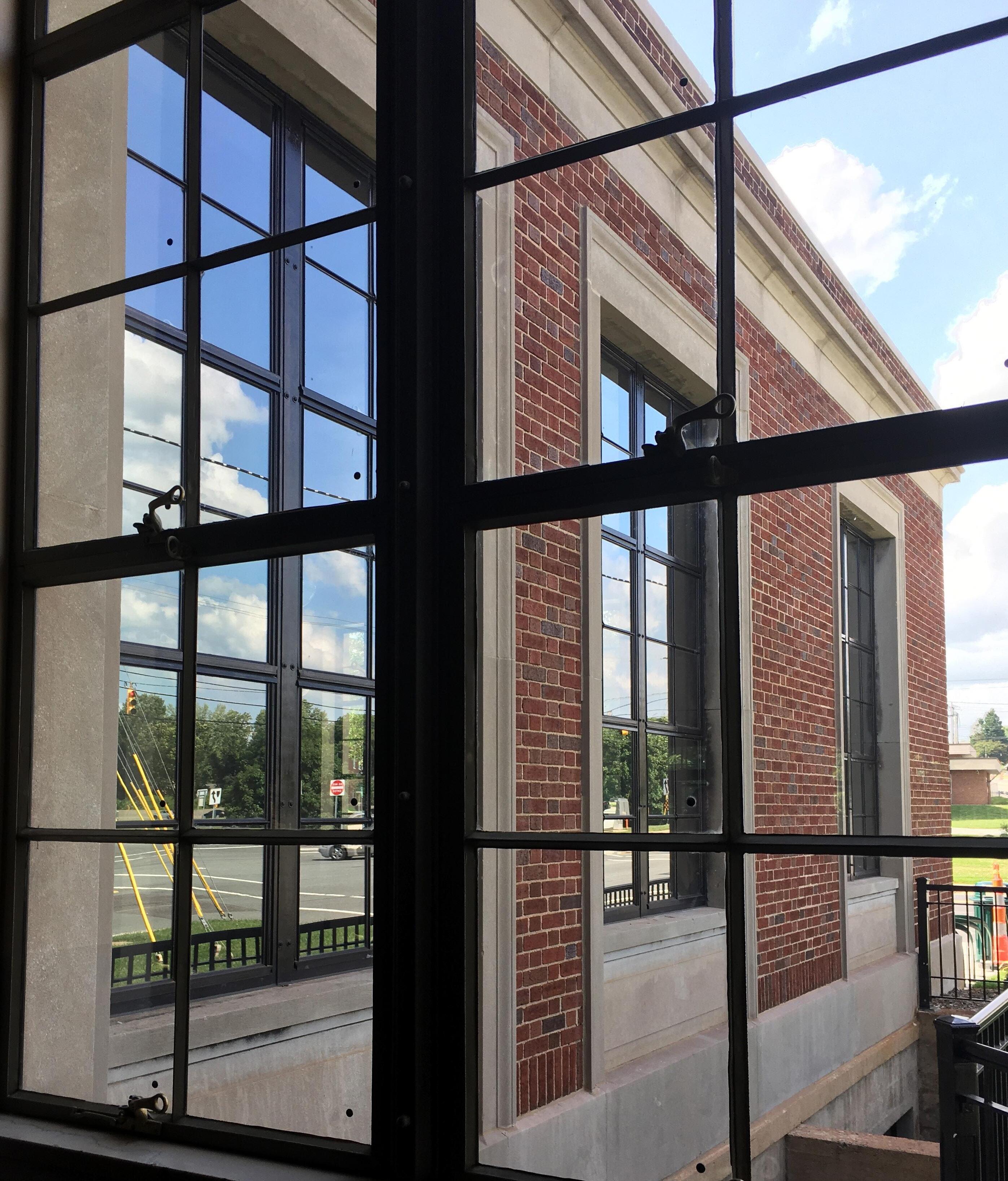
The thermal performance of conventional double glazing in the same thickness as a single pane for historical restoration. Bring your historical buildings up to code while keeping the same look and feel with Pilkington Spacia™.
1.800.221.0444
buildingproducts.pna@nsg.com
www.pilkington.com/na

Scan for more on historical restoration glass solutions
Keep the sash Upgrade the glass
How Architects Learn
CEO/Creative Director
Diana Darling
Executive Editor
Jack Murphy
Art Director
Ian Searcy
Managing Editor
Emily Conklin
Web Editor
Kristine Klein
Design Editor

Kelly Pau
Associate Editor
Daniel Jonas Roche
Associate Newsletter Editor
Paige Davidson
Contributing Products Editor
Rita Catinella Orrell
General Information: info@archpaper.com
Editorial: editors@archpaper.com
Advertising: ddarling@archpaper.com
Subscription: subscribe@archpaper.com
Vol. 21, Issue 7 | September 2023
The Architect’s Newspaper (ISSN 1552-8081) is published 7 times per year by The Architect’s Newspaper, LLC, 25 Park Place, 2nd Floor, New York, NY 10007.
Presort-standard postage paid in New York, NY. Postmaster, send address changes to: 25 Park Place, 2nd Floor, New York, NY 10007.
For subscriber service: Call 212-966-0630 or fax 212-966-0633.
$3.95/copy, $49/year; institutional $189/year. Entire contents copyright 2023 by The Architect’s Newspaper, LLC. All rights reserved.
Why did Stewart Brand have to go so hard? His 1994 publication How Buildings Learn is full of insights about how buildings discount and misuse time. He studies how buildings adapt and change over the decades, or even centuries, of their existence. He rails against “magazine architecture,” beginning with the example of I. M. Pei’s MIT Media Lab, which defies adaptation: The building isn’t unusually bad; its badness is just the norm in new buildings overdesigned by architects. (Perhaps my fondness for the book is heightened by his regular references to MIT’s campus, where I was an undergrad.) He then laments the existence of architecture as art instead of craft and addresses the still-tricky problem of architectural photography, which is often created before people begin using the buildings. These photos then often go on to be published opposite language from the “‘prismatic luminescence’ school of wine writing.”
Throughout, Brand mentions responsive and humble approaches that we might today call “sustainable,” but the term’s only index-worthy appearance—as “sustainable design”—lands in the appendix: “ Sustainable is a buzzword, meaning ‘ecologically correct,’ but it does stimulate thinking toward durability and open possibilities,” Brand wrote. (This type of hardy, DIY realization was something he had been working on for decades at the time, at least since launching The Whole Earth Catalog in 1968.) Rather than architecture as “the art of building,” he suggests the practice of architecture should be reborn with a new definition: “the design-science of the life of buildings.”
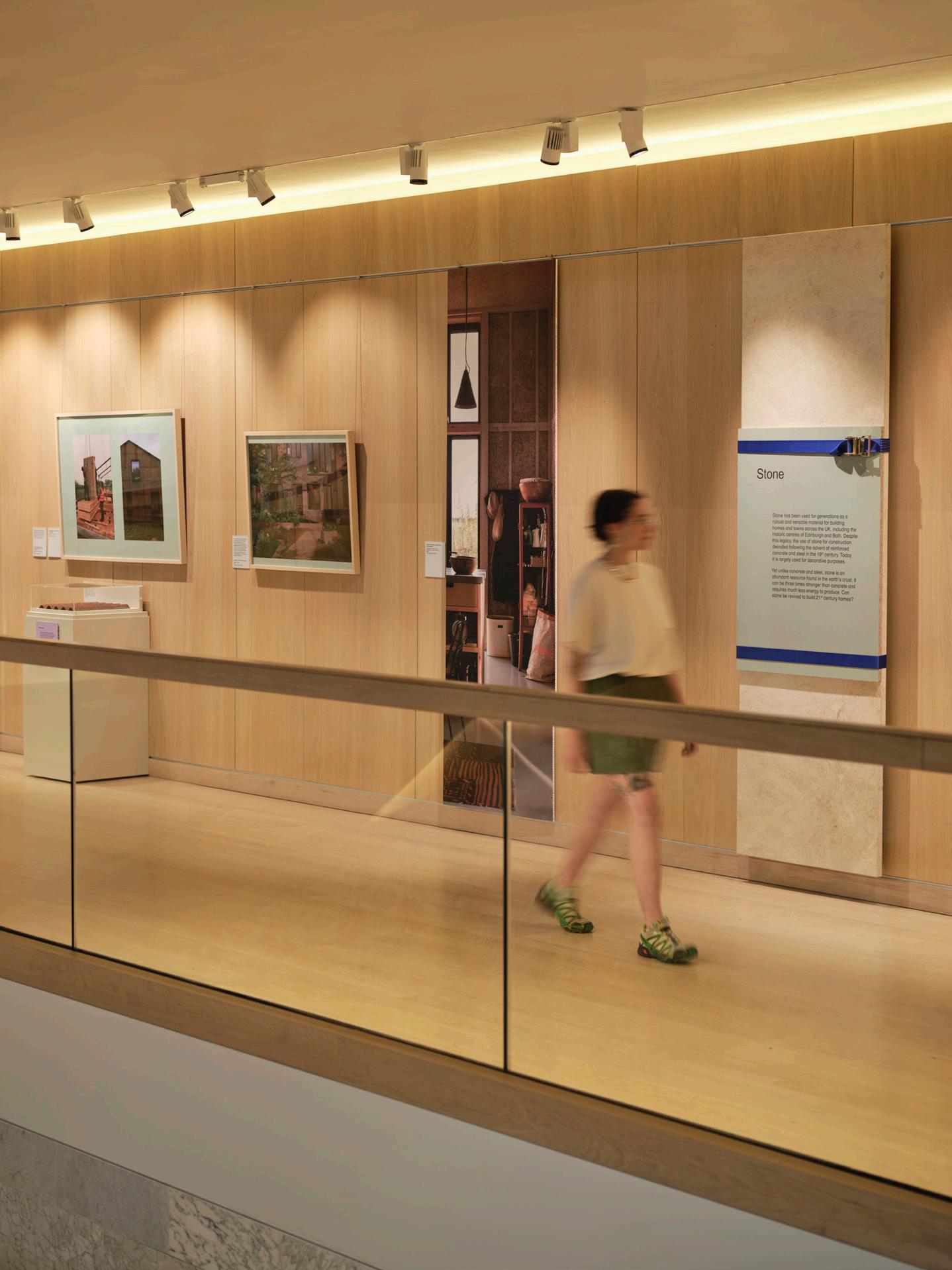
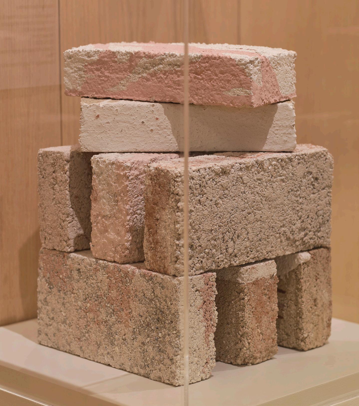
Given current knowledge about the climate crisis, this would-be new vocation has everything to do with the subject of this issue of AN: sustainability. The topic permeates most of the contents that follow, including some appropriate criticism of its shortcomings. This is most clearly seen in our material-forward Focus section (page 39), which examines new bio-cements, hears from the Healthy Materials Lab at Parsons, interviews a decarbonization specialist, reviews an exhibition about low-carbon home design, and shares products to consider specifying in your next project.
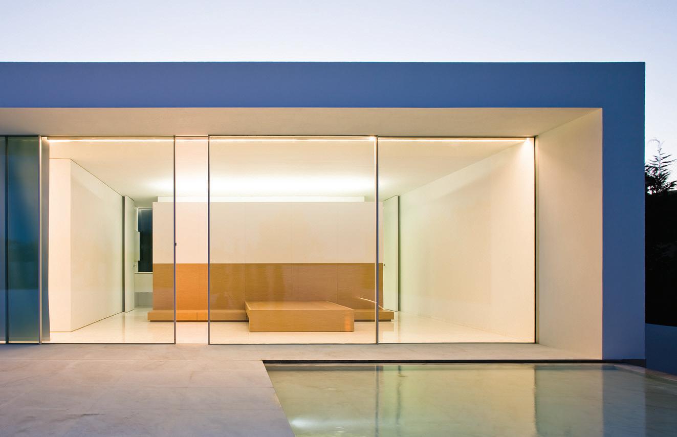
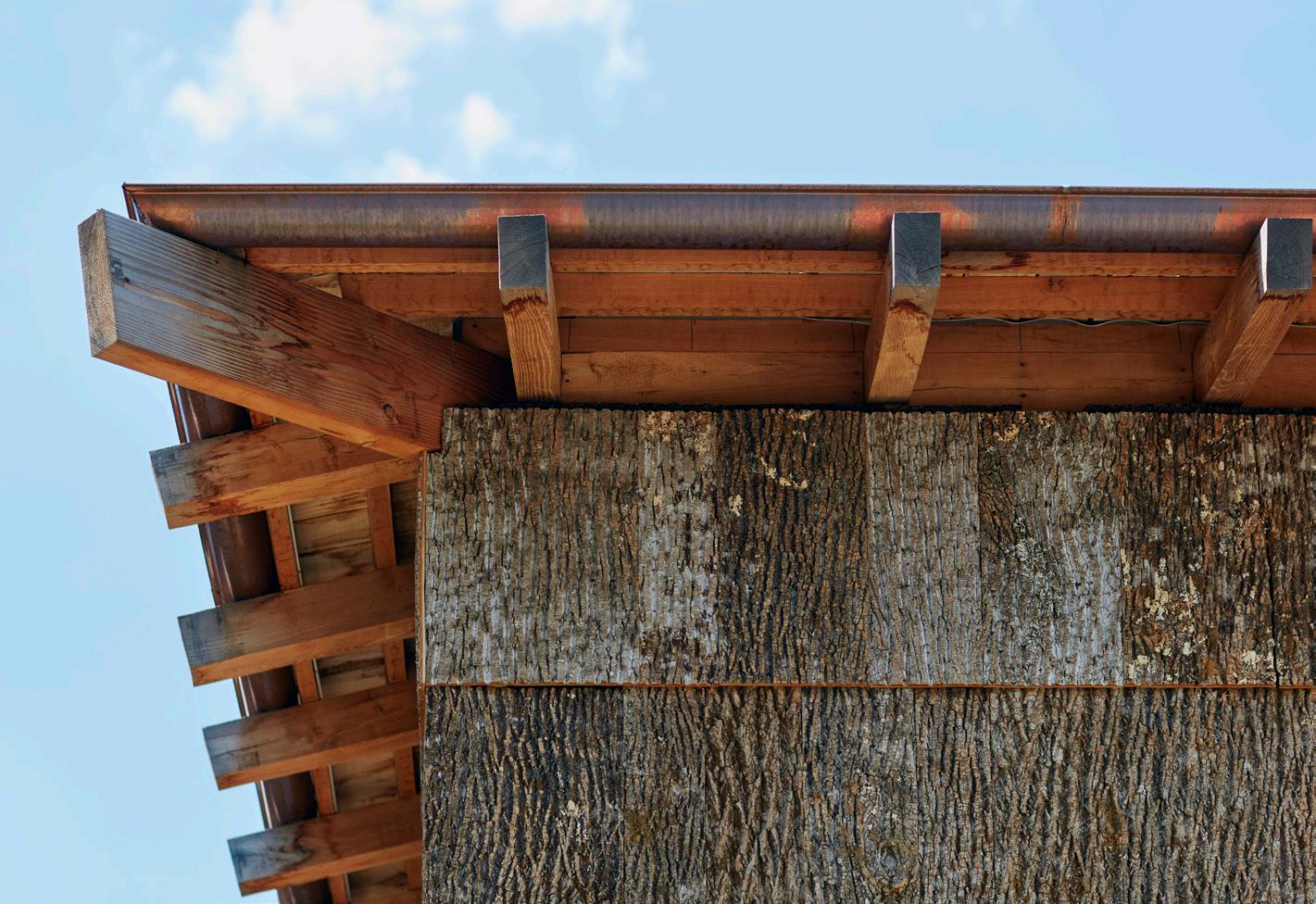
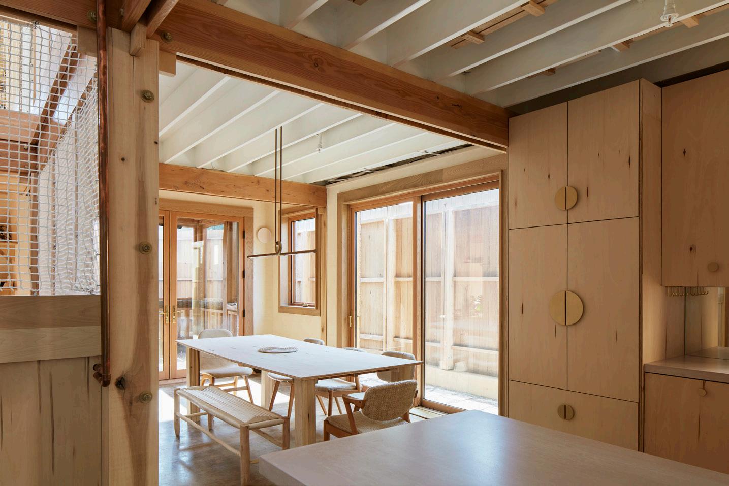
Brand might appreciate the Poplar Grove residence designed by BLDUS, seen in the photograph above and covered by Nigel F. Maynard on page 14. (Astute readers may recall that AN published the architect’s sketches for the home in 2021.) In both its contextual placement as an alley house and in its construction using natural materials, it functions as a case study for
how to build thoughtfully and lightly. But its architecture can’t escape history. The plans summon both John Hejduk’s nine-square grid exercise and the Roman domus: The interior square is given over to a staircase, above which a compluvium admits daylight instead of rain.
Brand might also enjoy the features section of this issue (page 27), which focuses on adaptive reuse, an act that has always been a regular part of making architecture. Here we share an excerpt from Deborah Berke’s new book, Transform, written with Thomas de Monchaux and published by Monacelli Press, along with worthwhile projects by GOMA, PLY+, Lorcan O’Herlihy Architects, and Bruner/Cott.
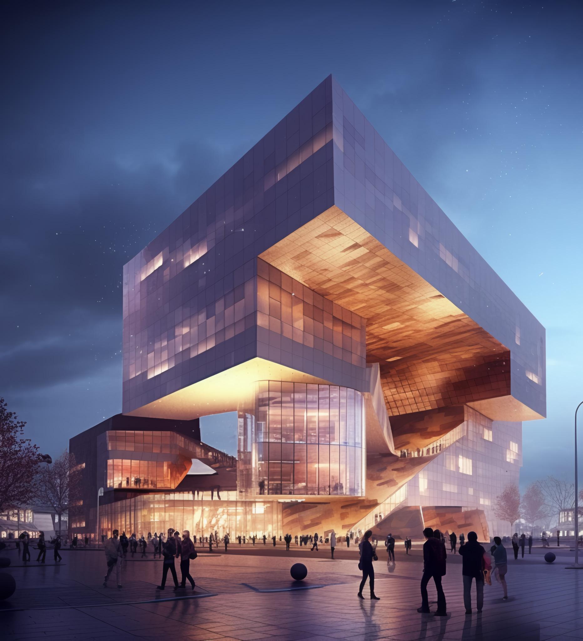
As a break, check out a few technology-focused spreads where you can preview AN ’s upcoming Tech+ conference on October 27 (page 20) and read my exchange with Olivier Campagne, a Paris-based digital-image maker who uses Midjourney to imagine new versions of the mechanical-minded worlds he’s been rendering for leading European architects (page 22).
This carbon-aware issue arrives at the end of a summer of climate disasters. Architects learn from nearly everything— education, mentorship, travel, observation, conferences, conversation, clients, and media—so this summer has been a master class in what might be our future. From floods in Vermont and India to fires in Canada and on Maui and the heat dome across the central U.S., it’s obvious that the effects of climate change are already here. This lived experience should spur action. Wider regulatory mandates are urgently needed, but regardless, architects can design buildings that use less carbon and might serve as refuge when climate change intensifies.
Writers need readers. Brand closed the acknowledgements in How Buildings Learn by listing his contact info to encourage people to get in touch with him “to make corrections for later printings and to make things happen in the real world.” Feedback still matters today.
See page 6 for a letter from a reader who was so incensed by a review published in AN that he procured a tour of the building in question and wrote to us with his own thoughts.
Following in Brand’s footsteps, I’ll leave you with my email address, should you want to make something happen in the real world: jmurphy@archpaper.com.
Jack Murphy
Vice President of Brand Partnerships (Southwest, West, Europe)
Dionne Darling
Director of Brand Partnerships (East, MidAtlantic, Southeast, Asia)
Tara Newton
Sales Manager
Heather Peters
Assistant Sales Coordinator
Izzy Rosado
Vice President of Events Marketing and Programming
Marty Wood
Senior Program Associate
Ethan Domingue
Program Assistant
Trevor Schillaci
Audience Development Manager
Samuel Granato
Events Marketing Manager
Charlotte Barnard
Events Marketing Manager
Savannah Bojokles
Business Office Manager
Katherine Ross
Design Manager
Dennis Rose
Graphic Designer
Carissa Tsien
Associate Marketing Manager
Sultan Mashriqi
Marketing Associate
Anna Hogan
Media Marketing Assistant
Wayne Chen
Please notify us if you are receiving duplicate copies.
The views of our writers do not necessarily reflect those of the staff or advisers of The Architect’s Newspaper.
Corrections
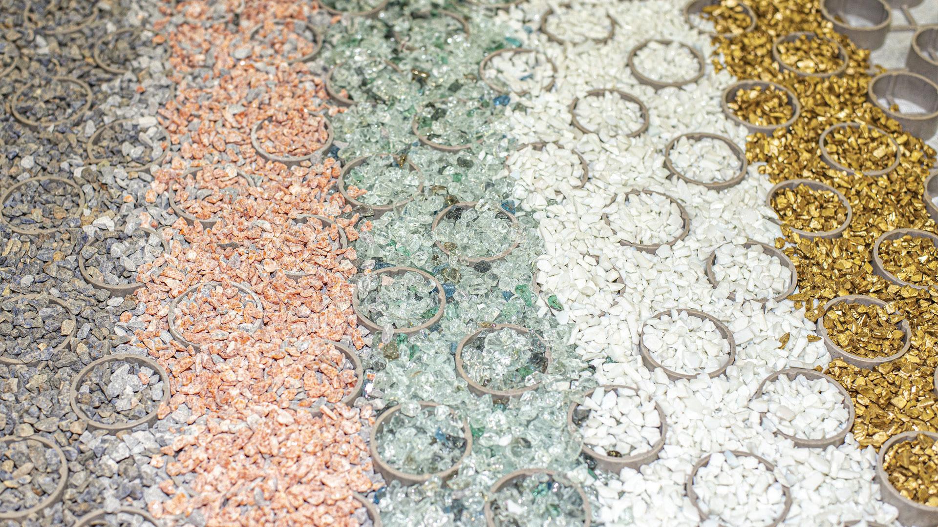
The Decorative Glass page in last month’s Focus Section included the incorrect image for Pulp Studio’s DermaAR finish. The correct image for the product is reproduced above.
Studio Ma was founded by principals Christiana Moss, Christopher Alt, and Dan Hoffman. Its work on ASU’s Manzanita Hall was completed with SCB.
The founding partner at Marvel is Guido Hartray, not Hartnay; the photos of the office’s Rockaway Village are by David Sundberg, not Sunberg.
The Architect’s Newspaper TY COLE
4 Editor’s Note Masthead Info
COURTESY PULP STUDIO



Open Mail
Aesop
2-104 Palisades Village
1052 North Swarthmore Avenue
Pacific Palisades, CA 90272
Luxury cosmetics brand Aesop has debuted another serene architect-designed store at its new Palisades location. The company tapped Odami, a Toronto-based design studio, to realize an interior inspired by the lush natural surroundings of the Palisades’ rolling hills and valleys. (WORD Design x Architecture served as the architect of record.) Odami brought these site-specific ideas inside the store, starting with an even green palette with a slightly dusky tint to it. This tone is applied in rough brushstrokes to the walls and floors but also continues through leather upholstery details as well as floor-to-ceiling curtains that pleat softly along the back wall, concealing storage. Soft concrete forms emerge to make pedestals, washbasins, and recessed shelving nooks with custom insets for the iconic amber bottles. Finally, accents of dark wood further complement the play between dark and light.
 Emily Conklin
551 North Palora Avenue, Suite B Yuba City, CA 95991
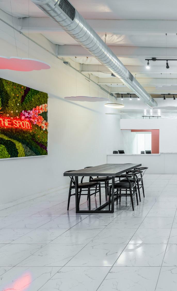
According to legend, boba, or bubble, tea was introduced to the United States out of a shop in the San Gabriel Valley in the 1990s. It’s since become a gastro culture explosion, and Endemic Architecture, led by Clark Thenhaus, has designed a compact new shop in Yuba City, California, that shows just how far the treat has risen. The high-design concept of My Boba Spot updates the “boba aesthetic” and follows as a logical extension of Endemic’s “confetti urbanism” design ethos. Dustypink paint defines the doors and circulation of the space, and special consideration is given to the pickup window adjacent to the service counter. Still, the space is largely empty, except for a circle of paint that runs between the floor and wall: My Boba Spot may be, in fact, a singular confetto . A swing hanging from the ceiling within this singular confetto is the perfect venue for an Instagram snap while one enjoys the graphic treatments of Endemic Architecture’s interior. EC
CoZy Dental
1600 18th Street
San Francisco, CA 94107
Healthcare spaces tend to evoke images of beige walls, uncomfortable chairs, and stuffy, cramped environments. The spaces that house such essential services suffer not from the practice of caregiving but from an ignorance on the part of design. Luckily, things are changing. At CoZy Dental, a new healthcare space designed by Spiegel Aihara Workshop, there is no room for scratchy folding chairs or wrinkled magazines circa 2008. The result is a space that is at once vivid and cozy. The interior is punctuated by bright yellows and pinks, abundant potted plants, and a front desk setup that feels as if you’re walking into a cafe: A teakettle is ready and waiting to serve you while you wait. Design-y touches like mirrors lined with fun tubes of light and bright textiles—reappropriated building rainscreen house wraps—hang from a frame of warm wooden beams, adding a decidedly nonsterile feeling throughout. Overall, the space uplifts the notion that taking care and being cared for shouldn’t be things to dread or put off. Health begins with intentionally creating the right environment so that improvement becomes inevitable. EC

Re: (W)rapper
A reader responds to a Crit by Ryan Scavnicky from our June issue.
One of the most intriguing new buildings in Los Angeles is a highly sculptural and visually prominent new high-rise. There is nothing else like it around.
Given its unique appearance, I had been itching to find out more about it. Are those bands that wrap it really what’s holding it up? If so, how did its designers ever figure out (and build) that geometry? When the June 2023 issue of The Architect’s Newspaper arrived with a photo of it on the cover, I eagerly looked for answers.
Instead, I found a review by Ryan Scavnicky. I was so put off by its contents that I wanted to offer readers another opinion.
To start, an obvious error: Despite Scavnicky’s claim that the building is in South L.A., it should accurately be located in Culver City, an upscale municipality within “Near West” L.A. with thriving nightlife and restaurants, a vibrant arts district, and the (sur)real estate values that go with it.
Full disclosure: Before reading this Crit, I didn’t know who designed the building or anything more than one could glean at a distance, nor did I personally know architect Eric Owen Moss or anyone who works in his office.
If I was going to respond to an article, I want to be sure it made sense, so I called the office and requested a tour, which was graciously provided by Dolan Daggett, project director at Eric Owen Moss Architects. Now, after seeing it up close and experiencing the building within its surrounding context (notably the new adjacent mass-transit line), I am even more impressed.
Architecture is a public art—a social art. Unlike music or film, it can’t be switched off. It impacts its surroundings. Architecture, since it always defines mass, is invariably sculptural. There are architects who explore the sculptural possibilities within their commissions, whether the sculpture is a Miesian box or a Saarinen-like arch. And there are those who don’t... or can’t. As in any field, buildings (in L.A., at least) range from the mundane—like its unending rectilinear stucco dingbats—to the sublime, as in Frank Gehry’s masterful and free-form Disney Hall. As sculptors of the public’s environment, architects have a duty not only to their client to fulfill functional program requirements, but also at best to the public at large to make a positive contribution to the built environment. Usually, program, function, budget, and/ or a lack of imagination combine to create the mundane. On rare occasions, these factors combine to bring about boundary-breaking buildings.
Such is the case here. Moss and his team used every opportunity to express the building’s functionality in sculptural terms. An exoskeletal structure allows for large uninterrupted floors of varying heights; stairs cantilever out from the building, linking floors of similar height; and a large sculptural stairway connects the building lobby to the adjacent mass transit.
Is this building a too-esoteric dialogue with a too-limited portion of the public, as Scavnicky implies? He mentions the disparity between architecturally attuned opinion (“insiders”) and that of those who do not possess such
awareness (“outsiders”). Most innovations in any field of the arts are met with controversy: the more departure, the more controversy. The real issue isn’t so much about educated vs. uneducated taste, as he implies, as it is about those who welcome innovation and experimentation and those who feel threatened by the unfamiliar—by new forms and new ideas, which this building is all about.
Most rule-breaking buildings come about only from that all-too-rare combination of wealthy client willing to entrust a highly creative architect with his or her vision. And that was the case here. Moss, I learned, has worked with this developer/client for the last 25 years and has transformed the Hayden Tract, a large industrial land holding, into a veritable wonderland of highly original and sculptural architecture. Any architecture student, given the uninhibited and highly diverse exploration of architectural forms that populate it, would think he or she had landed in architectural heaven.
Contrary to Scavnicky’s assertions that the (W)rapper is inappropriate to the Blackmajority areas in which he (incorrectly) says it’s located, this building is artistically and functionally well suited both to the Hayden Tract—a reflection of its architectural adventuresomeness—and to Culver City as a whole and the entertainment and tech industries that have flocked to it.
It is a remarkably innovative structure, from its visible steel-web structure to its isolation-pad foundations. How innovative is it? The structural system bears a visual resemblance to that of Herzog & De Meuron’s Bird’s Nest Stadium in Beijing. (Which building was conceived first depends on who one asks.) There is both logic and art in the structure’s configuration. Like the Beijing Bird’s Nest Stadium, the structure is derived with both function and aesthetic in mind, but it certainly isn’t “chaotic-looking,” as Scavnicky wrote.
Scavnicky presents a dark view of architecture’s future, claiming that this building “expresses its own Freudian death drive.” Why not instead recognize the life-affirming joy of designing buildings that save lives in the event of a major earthquake? Darker still, Scavnicky claims that working for firms that create new visions is essentially a dead-end professional street; that’s certainly not what I sensed during my tour with Daggett. I wonder if Scavnicky has ever felt the desire to transcend the mundane and be part of something extraordinary?
As mentioned, Scavnicky concludes with his assessment of the conflict between the cognoscenti vs. the uninitiated (my terms) and architecture’s “complicity with neoliberal capitalism.” He declares that the building is “pseudointellectual contortionism.” Given Moss’s reportedly “incoherent web” of metaphorical references and efforts to translate the language of architecture into words, I’m sure I would enjoy discussing architecture with Moss. With Scavnicky? I’m not so sure.
Roger Leib Los Angeles
The Architect’s Newspaper
6
My Boba Spot
ALANNA HALE
JUSTIN LOPEZ
RAFAEL GAMO
Duravit AG has plans to realize the world’s first climate-neutral ceramic production facility, designed by DAD Architecture/Design, in Quebec.

Noguchi Museum and Pratt Institute among 48 recipients of a $2.7 million grant from the Frankenthaler Climate Initiative.
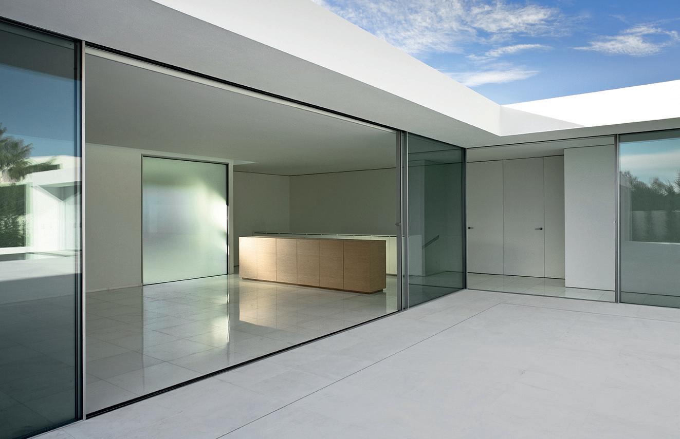

The Helen Frankenthaler Foundation, a nonprofit founded by the abstract expressionist painter, announced this week the names of 48 institutions receiving grants of $2,500 to $100,000 to fight climate change from its climate-focused subsidiary, the Frankenthaler Climate Initiative (FCI). This year, the foundation also announced an increase in annual funding from $10 million to $15 million, accelerating the initiative’s “commitment to climate action in visual arts sector.” The 2023 recipients include the Noguchi Museum, Pratt Institute, San Francisco Museum of Modern Art, SITE Santa Fe, the Wassaic Project in New York, and the
Museum of Contemporary Art Chicago. The funds support a myriad of sustainable projects, from upgrades to HVAC systems and installations of renewable energy sources to the implementation of green building envelopes and designing low-emission buildings. Lise Motherwell, director and board chair of the Frankenthaler Foundation, said in a statement that “these organizations have inspired us with their ingenuity and commitment to lower their carbon footprints.”
FCI is concurrently planning a special public program on September 22 during Climate Week NYC. DJR
Duravit AG, a German bathroom manufacturer, announced plans to build the “world’s first climate-neutral ceramic production facility” in Quebec. The new plant, designed by DAD Architecture/Design, will make ceramic sanitary ware in a roller kiln fueled by hydropower electricity. Duravit officials claim this strategy “will save around 11,000 tons of CO2 per year compared to a conventional ceramic factory.” The electric roller kiln was developed with SACMI.
“Canada will be the first country in the world to produce carbon-neutral ceramics!” said
Minister of Innovation, Science, and Industry François-Philippe Champagne.
This will be Duravit AG’s first factory in North America, and it’s part of a strategy to bring the company’s products to Canadian and American consumers.
The Canadian government provided a repayable contribution of $19 million and also issued an $11 million loan to facilitate the plant’s construction. Production at Duravit’s new location in Quebec will commence in 2025.
Daniel Jonas Roche
Ceramics Class Giving Back B Corps
More and more architecture firms are becoming certified B Corps: What are they, and what do they mean for architecture?
This summer, Lake|Flato became the 86th architecture, design, and planning firm to become a certified B Corp. The certification program is run by B Lab, a nonprofit that evaluates companies for sustainable and ethical practices in the following categories: governance, workers, community, environment, and customers.
The Texas firm joins a few other firms familiar to AN readers in the B Corp ranks, including SO – IL, DIALOG, and David Baker Architects. B Corp evaluations ask companies to disclose data on a wide range of categories, including basic standards like providing clean drinking water and toilets for workers— like those installing the work of landscape architects, for example. In a sense, B Corp designation is a way for small and midsize private businesses to signal their virtues when they do not have the disclosure responsibilities of publicly traded companies. As the buzzword circulated last year, other firms, including Perkins&Will, Stantec, Perkins Eastman, and Gensler, responded to their companies’ position within the Environmental, Social, and Corporate Governance (ESG) sphere. But if a firm’s practices are already ethically sound, chasing another corporate certification may not be the best use of resources—unless it is engaging
with a clientele that values such measures. For a firm like SO – IL or DIALOG, having the B Corp sticker might make their firm more appealing to potential clients. If this can win them work, and make some corporate practices more transparent, so be it. But it may not do much more than that.
Chris Walton was formerly an assistant editor at AN
September 2023
7 News
DAD ARCHITECTURE/DESIGN/COURTESY
DURAVIT AG
PRATT INSTITUTE LIBRARIES/WIKIMEDIA COMMONS/CC BY-SA 2.0
Green Thumbs Jean-Louis Cohen
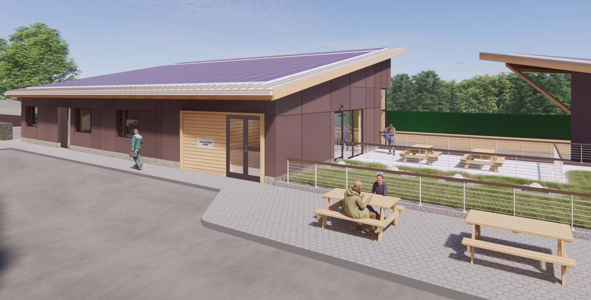
New York Botanical Garden’s new Site Operations Center will be one of the first net-positive facilities in the Bronx.
The world-renowned architecture professor, historian, and curator died unexpectedly in France at 74.
Jean-Louis Cohen, New York University Institute of Fine Arts professor in history of architecture, died on August 7 due to an allergic reaction from a wasp sting. He was 74 years old.
Cohen’s death was confirmed by the Institute of Fine Arts. News of his death was initially shared online by Isabelle Regnier, a regular contributor to Le Monde about architecture. Tributes quickly followed from across the globe.
At the New York Botanical Garden (NYBG), keeping the grass green and the flowers in bloom requires a lot of behind-the-scenes work, much of which happens at the Site Operations Center. This month, the NYBG announced it was a recipient of $2 million in funding from Mayor Eric Adams’s $117 million budget allocation for cultural projects in New York City.
NYBG will use this funding to support the design and construction of a new Site Operations Center by Mitchell Giurgola Architects that will be one of the Bronx’s first netpositive energy facilities. In order to achieve this, the building will be constructed of mass timber and feature geothermal wells and a roof

topped with photovoltaic panels to generate renewable energy, targeting LEED Platinum certification. It will also be clad with Ultra High Performance Concrete panels, depicted in a shade of brown in the renderings.
“The staff and Board of NYBG are passionate about making the Botanical Garden’s National Historic Landmark campus a welcoming, sustainable, and accessible place for the public to connect to the natural world,” said CEO and President Jennifer Bernstein, adding that the funds “demonstrate the Mayor and his team recognize the unmatched power of cultural organizations as drivers of economic strength and social vibrancy.”
Kristine Klein
Cohen was born in Paris in 1949. A trained architect and historian, he studied at the École Spéciale d’Architecture, the Unité Pédagogique No. 6, and Architecte DPLG, all in Paris. In 1985, Cohen earned his PhD in art history from the École des Hautes Études en Sciences Sociales. After a series of appointments in academia and the French government, he left Paris in 1994 to join NYU as Sheldon H. Solow Professor of History of Architecture.
During his tenure at NYU, Cohen held visiting teaching appointments at Princeton University, TU Delft, and the University of Sydney, while lecturing at other prestigious institutions around the world. A polyglot, Cohen conducted research in and on Paris, Berlin, Moscow, New York, Algiers, and Casablanca. Notable among his long list of accomplishments and publications is his research on Le Corbusier: He’s widely considered one of the
world’s preeminent experts on the icon of modernism, and he is known more generally as an international authority on 20th-century architecture and urbanism. Cohen wrote numerous acclaimed books, including exhaustive monographs on Le Corbusier and Mies van der Rohe, and organized lectures and exhibitions on diverse subjects ranging from Soviet constructivism, the radical Italian architect Bruno Zevi, Oscar Niemeyer’s work in Brazil, and international and French modernism.
Currently two exhibitions about the work of Paulo Mendes da Rocha co-curated by Cohen and Vanessa Grossman are on view at the Casa da Arquitectura in Matosinhos, Portugal, through February 25, 2024. Additionally, Cohen co-curated Paris Moderne 1914-1945: Architecture, Design, Film, Fashion with architect Pascal Mory and fashion curator Catherine Örmen, featuring exhibition design by Diller Scofidio + Renfro. The show is on view at Shanghai’s Power Station of Art through October 20. Cohen contributed obituaries for Hubert Damisch and Claude Parent to AN. Most recently, he provided commentary about the Vkhutemas exhibition at the Cooper Union. DJR
AN is collecting stories and remembrances of Cohen from friends, students, and colleagues. If you would like to share a memory, please email it to jmurphy@archpaper.com.
Joan Davidson, 1927–2023 Derby City Dispatch
She was a much-loved, New York–based philanthropist who supported both preservation and publishing.
Joan K. Davidson died on August 11, aged 96, just a few weeks shy of announcing the 2023 Alice Award. Distinguished and admired, she understood and acted on the principle that architecture and design are integral to quality of life

Louisville, Kentucky’s Beaux Arts–style Speed Art Museum is a mainstay of the Kentucky art scene. Yet following its 2016 expansion by Kulapat Yantrasast of wHY architecture, it’s readying for yet another: In 2025, the museum plans to open Speed Outdoors, a three-acre public sculpture park.
Designed by Reed Hilderbrand Landscape Architecture with PLC Management, BOSSE Construction, and K Norman Berry Associates Architects, Speed Outdoors supports a growing collection of outdoor sculptures. But Louisville historically has had scarce access to public greenspace. The addition of Speed Outdoors not only adds to the art and culture scene of Kentucky’s largest city but also creates a place for respite and recreation.
“The Speed Outdoors represents our vision for a museum shaped by dedication to inclusivity, belonging, and boundless forms of creativity,” said Raphaela Platow, director of the Speed Art Museum.
A lacquered cast-aluminum bench by Zaha Hadid; Mark Handforth’s massive Silver Wishbone; a monolithic concrete installation from Sol LeWitt; and two chairs made of rocks and steel rods designed by Kulapat Yantrasast are among the inaugural pieces that will be sited within the new sculpture park. A $22 million capital campaign supported by the University of Louisville seeks to raise money for the park’s construction and its continued operation. It’s expected to open in 2025. KK
With her crest of white hair and commanding voice, Davidson was wonderfully intimidating but unstintingly generous to the causes dear to her. Born on May 26, 1927 in New York City, she received her Bachelor of Arts at Cornell and an Education degree from the Bank School. She gave grandes dames a good name: Her career was a productive matrix of progressive activism and social connectivity stretching back to an early job as a staffer in the office of Senator Lyndon B. Johnson in Washington, D.C. But philanthropy was her calling. She was inspired by her father, Jacob M. Kaplan, who redirected a fortune made in owning the Welch’s Grape Juice company (which he sold to employees in 1956) into the J. M. Kaplan Fund.
Focused largely on New York, the Kaplan Fund has long been an advocate for preservation efforts, including Carnegie Hall, New York Garden Markets, the South Street Seaport Museum, and Westbeth’s 383 rent-controlled live-work spaces for artists. In 2022, she initiated Carriage House Events where people could come, she said, “to listen, see, think, agree, disagree, and have fun”—in other words, to partake in her recipe for a good life.
Public remembrances of Davidson are being collected on the website of the Kaplan Fund.
Julie Iovine was the executive editor of The Architect’s Newspaper from 2007 to 2013. She now lives in upstate New York.
The Architect’s Newspaper 8 News Obit
Louisville, Kentucky’s Speed Art Museum announces Speed Outdoors, a new sculpture garden to be designed by Reed Hilderbrand.
CREDIT TKTK
MITCHELL GIURGOLA ARCHITECTS
REED HILDERBRAND LANDSCAPE ARCHITECTURE
Read more at archpaper.com.
SAMIRA BOUAOU/COURTESY EPOCH TIMES
Clock’s Ticking…




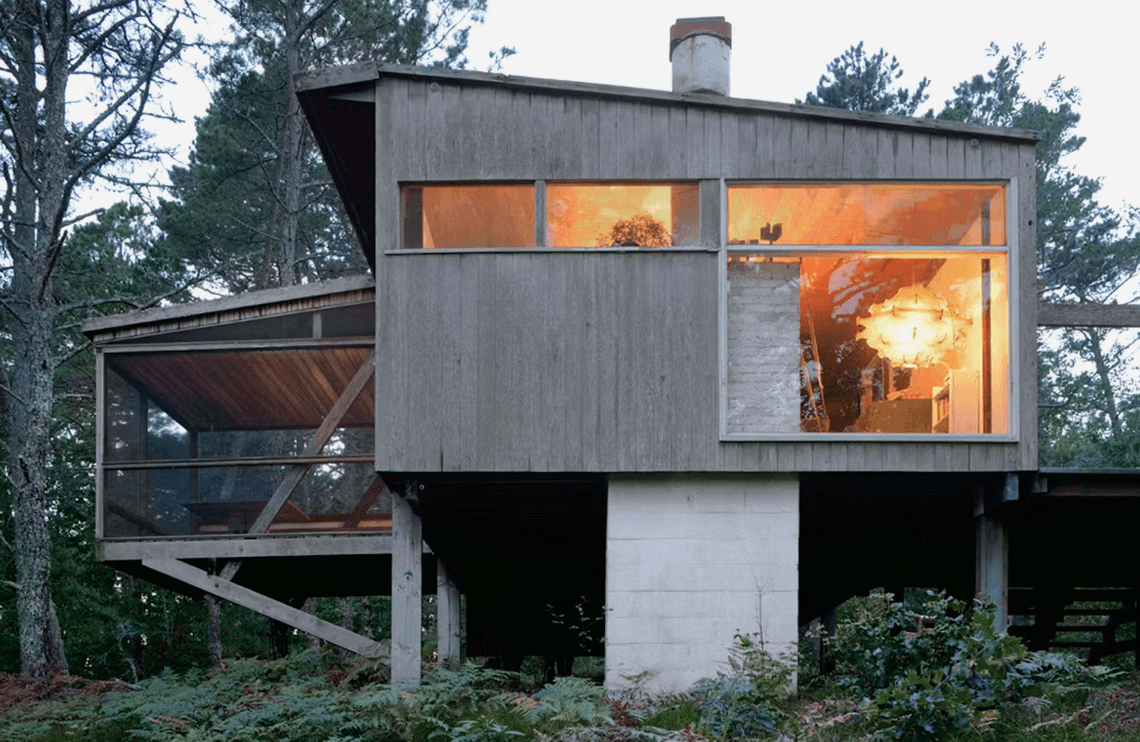
Marcel Breuer is known for iconic midcentury modern buildings around the world, but the Bauhaus-trained, Hungarian American architect spent his summers on Cape Cod, in Massachusetts, at a lesser-known, modest cottage of his own design, completed in 1949. But this month, the Cape Cod Modern House Trust (CCMHT) rang the alarm bells: The cottage may soon be demolished.
CCMHT is under contract to purchase the cottage, but the group has a little under one year to raise the funds to save this “cultural gem,” and donations are needed: $1.4 million, actually.


Breuer’s cottage contains the late architect’s books, furniture, art, photographs, and ephemera, and according to Peter McMahon, founding director of CCMHT, “It’s basically a repository of Breuer’s life.” McMahon also notes that the cottage is historically significant for a few reasons: “Breuer was really interested in the Cape’s local vernacular design, its oyster shacks, and covered bridges. And this cottage was the first time he developed what’s become known as the ‘Long House,’ which is basically a long house on stilts. It’s a New England cabin melded with a modern European design that uses pilotis made up of local wood materials.”
Preservationists and modern art lovers have good reason for concern. In 2022, Docomomo US broke the news that Breuer’s Geller House, on Long Island, was demolished overnight to make way for a new “superfluous tennis court.” Docomomo has since paired up with CCMHT to save this cottage.


“This is a once-in-a-lifetime opportunity to protect such an important home and make it open to the public,” said Liz Waytkus, executive director of Docomomo US. To get involved, go to ccmht.org. DJR










September 2023 9 News
There are just under 365 days left to save a timeless classic in Cape Cod designed by Marcel Breuer.
modulararts.com 206.788.4210 made in the USA
MARTA KUZMA Ventanas PANEL ©2019 modularArts, Inc. Shayle PANEL ©2023 modularArts, Inc. Breeze™ PANEL @2022 modularArts, Inc. Ziggy BLOCK ©2012 modularArts, Inc.
Zephyr
BLOCK ©2012 modularArts, Inc.
Seamless Feature Walls in Modular, Glass-Reinforced Gypsum. Over 60 designs!
News A New Civic Hub
A neighborhood center in southwest Houston designed by Page and SWA Group supports the lives and health of local residents.

Drivers crossing through southwest Houston on Bellaire Boulevard encounter a continuous flow of unpredictable urban elements. After passing under two of the city’s three beltways, the characteristically Houstonian thoroughfare arrives at a complex that is different. The Alief Neighborhood Center, nestled behind foliage on the corner of Bellaire and South Kirkwood, stands out. The effort dates back to 2014, when Alief’s local government dedicated itself to providing a facility that serves and embodies the diverse community’s values.
Designed by Page Southerland Page, the Alief Neighborhood Center opened in January and is a testament to community design. (The project was originally led by EYP, and finalized design efforts were completed by Page
Landgrab
after its acquisition of EYP last year.) Despite initial resistance, extensive outreach meetings during the schematic design phase allowed the community to voice its needs and desires: This project had been 30 years in the making.
“They were referred to as District F, for forgotten,” Jonas Risén, lead design architect and associate principal at Page, told AN. The first few meetings with community members were fraught with what he described as “frustrations and grievances for the way things had been handled previously.”
The result of these meetings and design schemes is a brand-new, 70,000-squarefoot community center that looks like it could be at home on a research university campus. It sits on the site of an older, much smaller
“Vulture agents” are trying to buy up real estate in Hawaii for pennies on the dollar.
Last month, Maui residents and Hawaii’s governor, Josh Green, called attention to predatory developers trying to buy up properties in parts of Maui impacted by wildfires. An official press release from the governor’s office stated that residents “are being approached about selling fire-damaged home sites, by people posing as real estate agents who may have ill intent.” Green said he’s currently working with Hawaii’s attorney general to issue a moratorium “on any sales of properties that have been damaged or destroyed.”

Hawaii has the highest cost of living in the country, and Maui has long struggled with rising rents and land values. The wildfires are
only exacerbating this: Now, the Federal Emergency Management Agency has reported that 4,500 people in Maui need shelter.
“Realtors are calling families who lost everything, offering them to buy their property and their home for pennies on the dollar,” said Paele Kiakona, a Lāhainā resident.
Since the wildfires began, Maui resident Tiare Lawrence has been an outspoken critic of the developers on her personal Instagram, using her platform to warn Hawaiians and raise donations.
“Maui is not for sale,” Lawrence told MSNBC. “It is important that the multigenerational families that come from Lāhainā get to continue to live in our hometown.” DJR
community hall. There are now new facilities for a public library branch, new parkland, and health departments, along with a complex for outdoor sports. Lifted above the floodplain in response to post–Hurricane Harvey concerns, the building sits atop an artificial hill, a plinth that conceals a parking garage.
The center spatially separates the health department from the parks department on the first floor, while the second floor houses the library department and “tech link” spaces. Despite hosting separate departments, these areas maintain a seamless connection within the building to enhance work efficiency and facilitate the use of shared meeting rooms. Conveniently located closest to the entrance, the health department sees a significant daily influx
of visitors. “We have [around] 1,200 people a day coming in,” Risén said. Elevated above the park’s tree canopy, the library offers an open view of the outdoor facilities to the south.
The outdoor scope of the project further adheres to the idea of community interaction. SWA Group’s landscape effort establishes the site as a civic gathering place for the Alief community and seizes the chance to establish a fresh, resilient development model for Houston post–Hurricane Harvey. The design intentionally shapes the parkland to absorb floodwaters while simultaneously offering essential recreational facilities: a planted seating area; courts for basketball, tennis, and a soccer field; a pool; and a skate park. Tree canopies and curved pathways lead people through the site, and sport courts are distanced—and therefore acoustically separated—from gathering spaces and playscapes.
Fittingly for its roadside context, one of the most prominent aspects of the community center is its sign. Larger-than-life lettering sits prominently on the front facade, providing an immediately visible and already-iconic boost of neighborhood pride. Five 16-foot-tall aluminum letterforms read ALIEF. The welcome sign doubles as a shade structure for the entry patio, making it “the biggest front porch in Texas,” as Risén told Texas Monthly. The space is functional, open, and surprisingly cozy.
To celebrate Alief’s diversity and community, art pieces adorn the center and its grounds. Outside, connected to the curving paths near the main entrance, stands Windbloom , an artwork by Falon Mihalic, a Houston-based multidisciplinary artist and landscape architect. Windbloom resembles an elevated, colossal flower and serves as both an overhead shading device and, from a distance, a “supersized flower map.” Inspired by the coastal prairie, it portrays prevailing winds with colorful resin “petals” set on a framework of painted carbon steel, firmly rooted in the center’s butterfly garden.
As we know, the excitement of a new building can be as brief as the scent of freshly poured concrete. But a well-designed building only gets better with time and use, outliving the initial hype. My visit to the Alief Neighborhood Center showed that the facility is actively beloved, with people of all ages running, jumping, rolling, and reading, among other actions. Page’s Alief Neighborhood Center, an emblem of local pride and inclusivity, should be a model for community centers throughout Houston.
Rodrigo Gallardo is a Houston-based designer. His writing has been featured in Texas Architect and Cite: The Architecture and Design Review of Houston
The Architect’s Newspaper
10
HAWAII NATIONAL GUARD/FLICKR/CC BY 2.0
CREDIT TKTK
© ALBERT VECERKA/ESTO
Process as Project
This year’s Exhibit Columbus raises the bar for design expositions looking to partner with local communities.
Since 2014, Exhibit Columbus has activated the small eponymous Indiana city, home to about 45,000 people. Since the mid-20th century, it has been regarded as a hotbed of architectural innovation, from iconic and formally exciting structures to experimental ways of living. The exhibition, now in its fourth iteration, offers a platform for architecture’s rising stars to display work alongside established legends.
The word on the tip of everyone’s tongue this year at Exhibit Columbus was “community.” The 2023 exposition is called Public by Design which focuses on centering the perspectives of local Columbus residents to inform 11 installations spread throughout the city. According to Exhibit Columbus executive director Richard McCoy, designers were tasked with making “meaningful connections in public space” alongside local community leaders. To that end, each of the four recipients of the J. Irwin and Xenia S. Miller Prize paired up with various city departments for their projects.
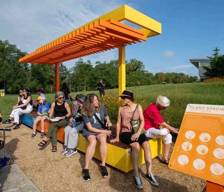
Harlem-based Studio Zewde collaborated with Columbus’s department of parks and recreation for their piece, Echoes of the Hill, located in Mill Race Park, an early Michael Van Valkenburgh project. The Mexico City firm Estudio Tatiana Bilbao’s installation, Designed by the public, posited new social potentials for local libraries in dialogue with staffers from Cleo Rogers Memorial Library, designed by I. M. Pei. New York’s PAU (Practice for Architecture and Urbanism) built InterOculus, a steel rotunda designed for dancing located at a prominent Columbus intersection, in collaboration with the department of public works. PORT, an office with locations in Chicago and Philadelphia, designed The Plot Project together with members of the Mill Race Center, a community center for active adults on the edge of Mill Race Park.
“We were part of Exhibit Columbus
from the very beginning,” said Beth Stroh, who owns Viewpoint Books, an independent bookstore that opened in 1973 on Washington Street, Columbus’s main thoroughfare. “Downtown businesses like mine were asked about what we wanted to see. The way Exhibit Columbus leadership engaged with us made us feel like valued partners in this process. It just makes our community feel alive, activated, and welcoming.” Stroh worked with local high schoolers on their pavilion, Machi, which created a “new living room for all of us to be in community” in downtown Columbus. She told AN, “We can’t wait to see what kind of programming happens. We’re already planning storytimes there.”
Communications design by Chris Grimley was beautiful and clear, and brought home the public design motif. Grimley told AN that Exhibit Columbus’s graphic identity this year built off the original design by Rick Valicenti, and that the 25 brightly colored signs planted around town orienting pedestrians were an “homage to the playful patterns and shapes of Ray Eames and Alexander Girard.”
Alongside the four Miller Prize winners were seven University Design Research Fellows who also displayed works. These included Joseph Altshuler and Zack Morrison (Could Be Architecture); Esteban Garcia Bravo and Maria Clara Morales (Purdue University); Jessica Colangelo and Charles Sharpless (Somewhere Studio/ University of Arkansas); Deborah Garcia (MIT Belluschi Fellow); Molly Hunker and Greg Corso (SPORTS/Syracuse University); Katie MacDonald and Kyle Schumann (After Architecture/UVA); Ohio State’s Halina Steiner, Tameka Baba, and Forbes Lipshetz and Iowa State’s Shelby Doyle.
Located in a sunken brick terrace outside I. M. Pei’s Cleo Rogers Memorial Library, Responder by Deborah Garcia was a family affair. In collaboration with
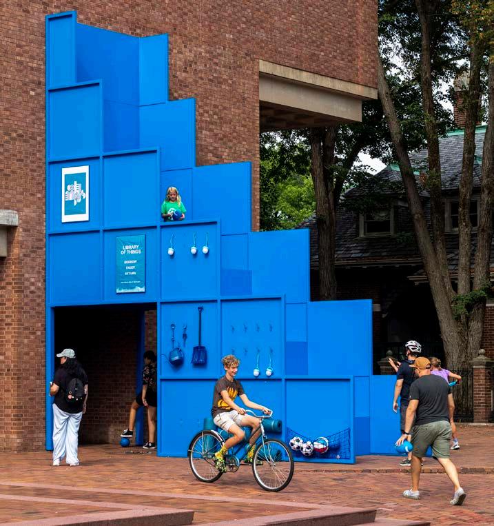
Propeller, a local production outfit, and MIT students, the piece was assembled on site by a herself, a team of local volunteers, and her two sisters, Ana and Sara. “My sisters have helped with all of my exhibitions,” Garcia told AN
On display until November 26, Responder is a throne that doubles as a boom box sheathed in gorgeous, charred wood panels. A nighttime sound performance on August 26 at Garcia’s installation gave Columbus the experimental feeling of a dissident noise show. Over the course of several months, Garcia recorded ambient noises from the Pei-designed library’s easily overlooked elements—its elevators, mechanical equipment—to compose a symphony, or “sonic register” with the building that John Cage would have appreciated. On opening night, viewers laid down on the subterranean plaza at Cleo Rogers Memorial Library after a long day of walking to take in the ambient music and observe the brutalist building in a new light.
A second happening came later that evening at Prisma by Esteban Garcia Bravo and Maria Clara Morales, an illuminated installation across the street from Kevin Roche’s Cummins HQ building. Prisma featured glowing tubes that lit up the night sky, augmented by an experimental DJ set by Liv Mershon, a Chicago-based artist originally from Columbus. A pickup truck parked in the middle of the road made it safe for viewers to sit on the asphalt and consume the sights and sounds, giving the high-art packed evening Dazed and Confused vibes.
“It was wild playing in my hometown, seeing it from a totally new perspective, and playing my totally bizarre music for an entire hour,” Mershon told AN. “What was so joyful was, as I was playing, people came inside the installation by Esteban and Maria and danced inside of it while I was performing. It became almost a collaborative experience,” Mershon said. “It felt
weird because in the 90s and early aughts, I felt like I needed to escape my hometown to explore the weirdness that’s inside of me. But it was really cool to discover that that weirdness is supported in the town where I grew up.”
Could Be Architecture’s installation, A Carousel for Columbus, was also musically inclined. A local high school garage band shredded on top of the spinning carousel decorated with a deliciously polychromatic mural by Altshuler and Morrison. A self-described “locomotive love letter,” A Carousel for Columbus builds on the duo’s track record of experimenting with bold patterns and building artful public spaces. “Taken together, the carousel, supergraphics, and performances offer a locomotive landscape that celebrates the power of shape, color, character, and sound to generate a public platform by design,” the architects said in their project statement.
And then for some, the 2023 Exhibit Columbus meant coming full circle. “Twenty-six years ago I made a pilgrimage to the design mecca of Columbus, Indiana after my then–architecture professor, Stanley Saitowitz, had completed beloved follies in Mill Race Park,” said PAU founder Vishaan Chakrabarti.

“Ever since it’s been a lifelong dream to build there, so the fact that PAU’s first built design, InterOculus, now stands proudly at the heart of downtown Columbus as a canvas for community convening is both humbling and gratifying, particularly given the extraordinary multicultural dance that launched it,” he told AN. “At a cultural moment when society feels like it is spinning apart, an architecture of urbanity can pull us together to address the big issues of our day, from climate change to inequity to the social isolation driven by technology.”
DJR
September 2023
11 News
AN is a media partner for Exhibit Columbus.
PORT’s The Plot Project became a hub for people to gather and rest. Tatiana Bilbao Estudio’s Designed by the public posited new social potentials for public libraries, itself located just outside of the Cleo Rogers Memorial Library.
HADLEY FRUITS
HADLEY FRUITS
Alleviating Alienation
“When I am in California, I am not in the West. I am west of the West,” declared Theodore Roosevelt at the turn of the 20th century. The potential for self-reliance implied by Roosevelt was felt at that time by countless western settlers, who together transformed California—particularly its southern half—into a sea of low-rise development and automobile infrastructure within a matter of decades. Yet an alternate reading of Roosevelt’s proclamation, which envisions limitless potential for new modes of living and working, became both the inspiration and namesake for West of West. A young Los Angeles–based architecture firm that responds to the western landscape of the 21st century, the studio offers fresh approaches to community building through novel design practice.
Cofounders Clayton Taylor and Jai Kumaran resist operating as a top-down design practice. Following their shared early-career experience at Morphosis Architects, they intentionally seek input from all ten people in their office throughout each step of the design process.
How do they maintain the levels of patience and humility necessary for creative equity?
“Don’t be an asshole,” Kumaran told me. We were sitting in the West of West studio space, set within a sunbaked shopping center in L.A.’s Chinatown. “We hire people who know things we don’t know, people who notice details that go over our heads.”
This faith in others extends into many of the types of projects West of West has secured over the past eight years. Operating in a city known for single-family houses, the office has amassed a portfolio of multiunit housing projects that “sneak” density into low-rise neighborhoods. Design strategies like outdoor circulation paths and spacious communal facilities help projects succeed in unexpected places by inspiring human connection and collaboration. Even when working on building types often associated with social alienation, such as the ever-daunting office campus or bank tower, the studio similarly instills opportunities for interaction through well-placed community amenities amid warm materials.
The Architect’s Newspaper 12 Studio Visit
4
West of West finds opportunity for social interaction in places with little supply.
COURTESY WEST OF WEST
Before Garrett Leight became synonymous with upscale sunglass design, he and Kumaran were college friends with disparate passions. Taylor and Kumaran’s design sensibilities are visible on the smooth, undulating surfaces of their flagship for Garrett Leight California Optical, the first of many designs West of West would complete for the sunglass company. The interior was conceived as a habitable billboard: It’s large enough that motorists speeding down La Brea Avenue can peer into its expansive glass facade. The billowing wall along the
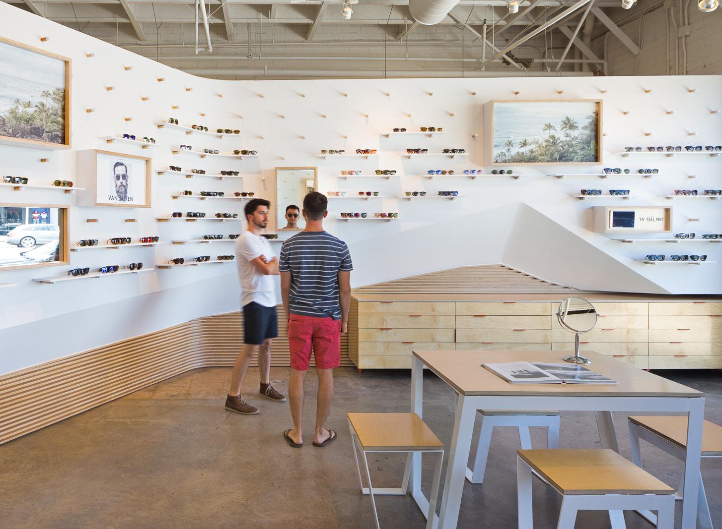
shop’s interior is visually propped up by sinuous plywood built-in cabinetry to match the clean yet relaxed aesthetic of Garrett Leight’s sunglass line. The wall is additionally broken up by a field of plywood pegs that serve as supports for shelving that can be easily modified, depending on changing collections and product quantity. The design scheme was so successful that West of West was invited to translate the same sweeping language to the brand’s SoHo, Manhattan, location later that same year.
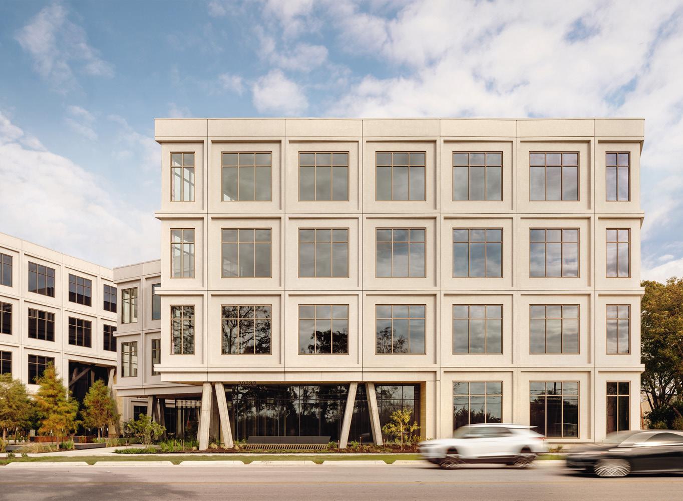
In East Austin, West of West recently completed Eastbound, a 230,000-square-foot creative campus with a number of design details that distinguish it from the typically alienating office park. The campus consists of two large industrial buildings with precast square paneled facades punctuated by newly punched square windows. Inspired by the functionalist industrial buildings across the way from the three-acre site, the treatments retain their gritty character while new interventions bring copious natural light into
expansive open floorplans. “The outdoor pathway that runs in between the two buildings is wide enough to host opportunities for socializing,” said Kumaran, “but also narrow enough to receive regular shade from the bordering facades to beat the hot inland Texas weather.” Along the pathway, the wraparound glass facade of the ground floor appears to be lifting up the concrete mass above with the assistance of dramatically tilted concrete columns.
Though it is one of the first commercial office buildings in Los Angeles to combine cross-laminated timber (CLT) with steel framing, 6344 Fountain does not wear the trendy material on its sleeve. When commissioned to add a 50,000-square-foot addition to an existing two-story commercial building in Hollywood, California, West of West chose to draw inspiration from the unique culture of the neighborhood. The result is a pile of cubes with contrasting cladding materials scattered across the block in a manner reminiscent of early Frank Gehry. While the ground floor of
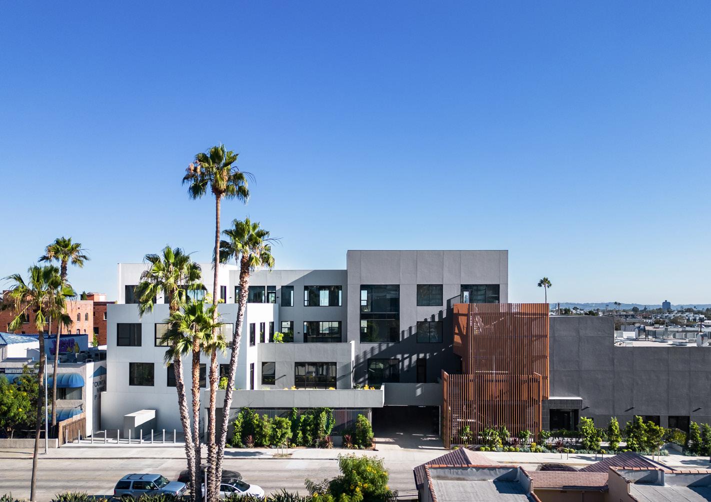
the addition is visually broken up by thoughtful landscaping, the upper floors of the addition are composed of interweaving office and terrace spaces with views of the Hills to the north. “Everyone in Hollywood wants a view,” Kumaran joked as he explained how the luxuriant outdoor spaces entice technology and film companies to lease spaces.
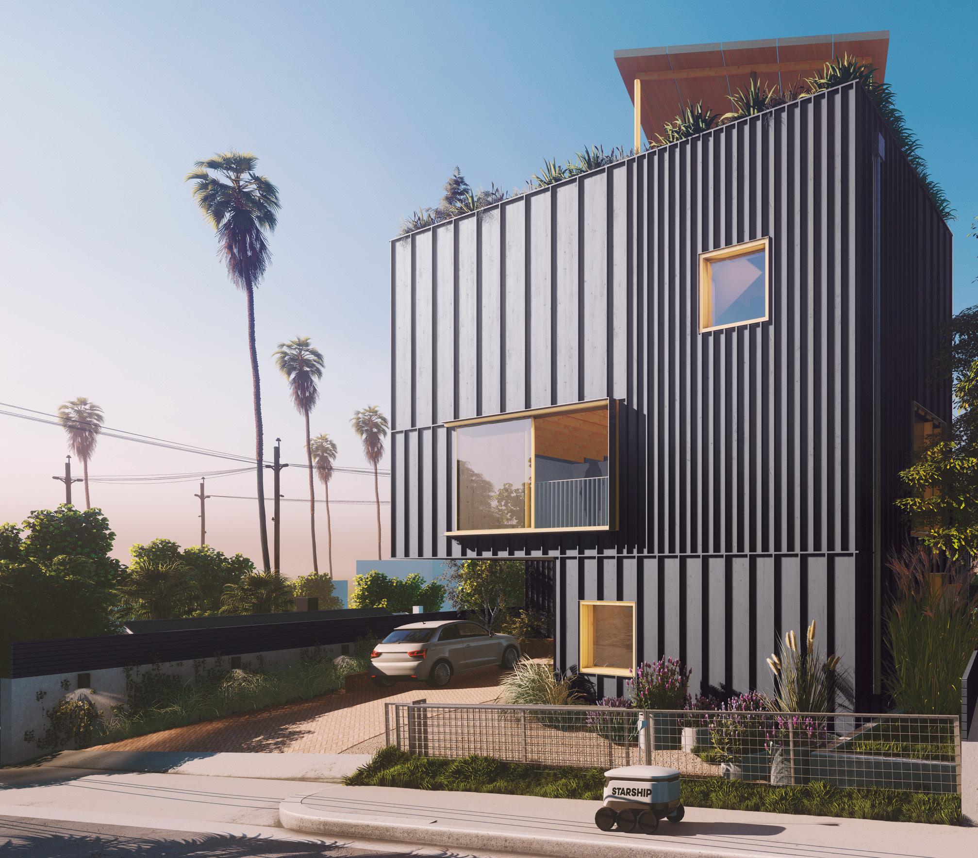
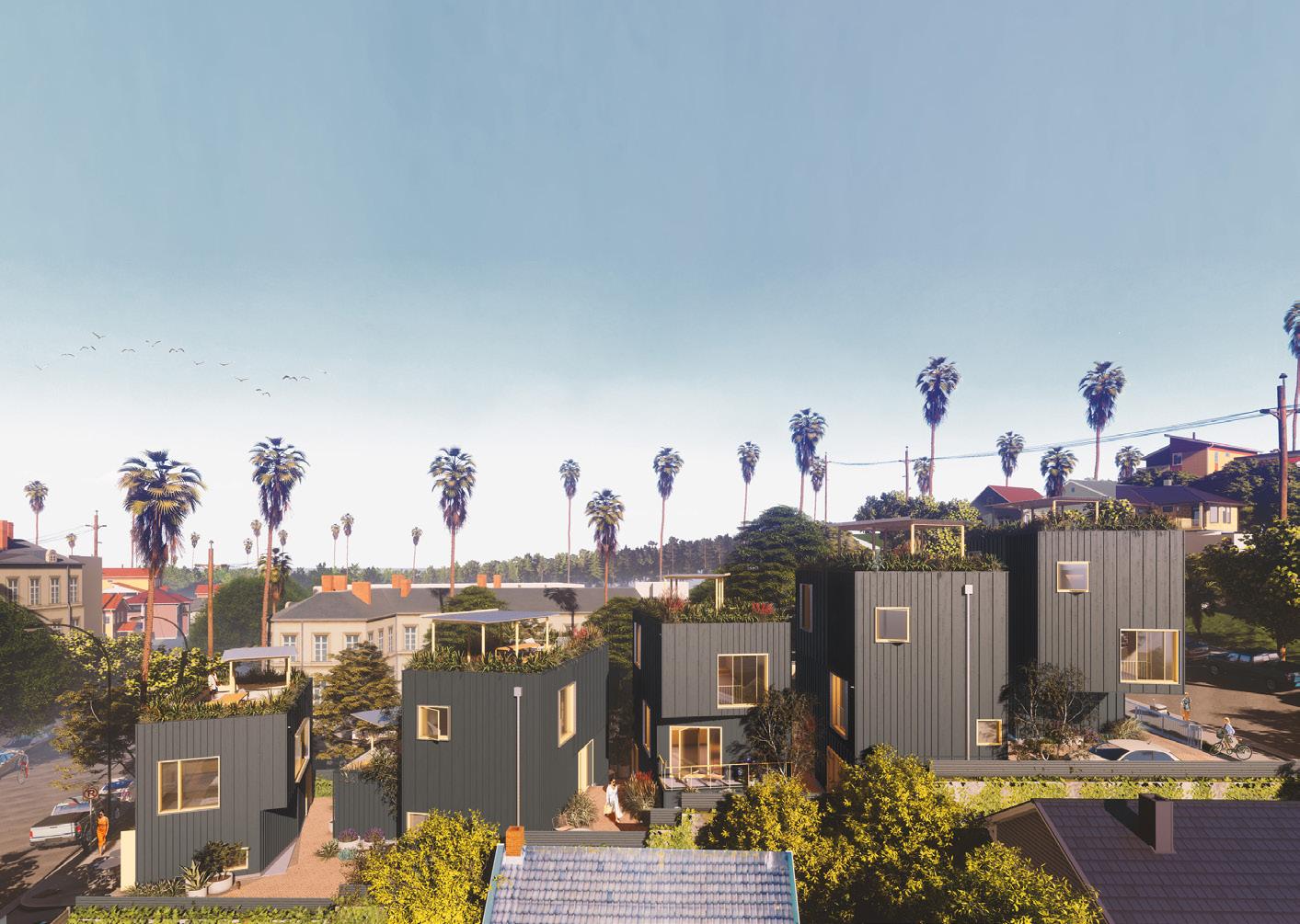
Steep slopes have been the mothers of residential invention in Los Angeles since single-family homes were first placed in the Hollywood Hills more than a century ago. When tasked with designing a five-unit housing project on a site with two distinct elevations in Echo Park, West of West devised a “slow stair street” that gently weaves the units together along a common meandering path. Like Sunset Steps, a multiunit housing project currently in the works in San Francisco, Echo Park Co-Living resolves several issues with low-rise development with a single solution:
“We wanted to reimagine how sites typically designated for single-family homes could both increase housing density while also benefiting the surrounding neighborhood through community amenities,” said Kumaran. While each stand-alone unit includes its own rooftop deck—an amenity that is far less common among homes across Southern California than it should be—each unit’s ground floor remains in dialogue across the site.
September 2023 13 1 3 2 4
LAWRENCE ANDERSON
DANIEL COURTESY WEST OF WEST
HERE AND NOW/PAUL VU
CHASE
Shane Reiner-Roth is a lecturer at the University of Southern California.
1 Garrett Leight Los Angeles 2015
3 6344 Fountain 2023
2 Eastbound 2022
4 Echo Park Co-Living 2022—
14 Open House Urban Sustainability
BLDUS designs an infill home that’s loaded with high-performance features.
Washington is a city of sandstone, marble, and red brick, so the Poplar Grove residence is the last house you’d expect to see in the nation’s capital. Andrew Linn and Jack Becker, principals in the firm BLDUS, eschewed traditional materials and instead clad Linn’s own single-family home in poplar bark, cork, and modified radiata pine. And yet, the material decisions aren’t the most interesting thing about the home. It’s also located in an alley. All of these surprising details come together for the design duo and tell their unique story.
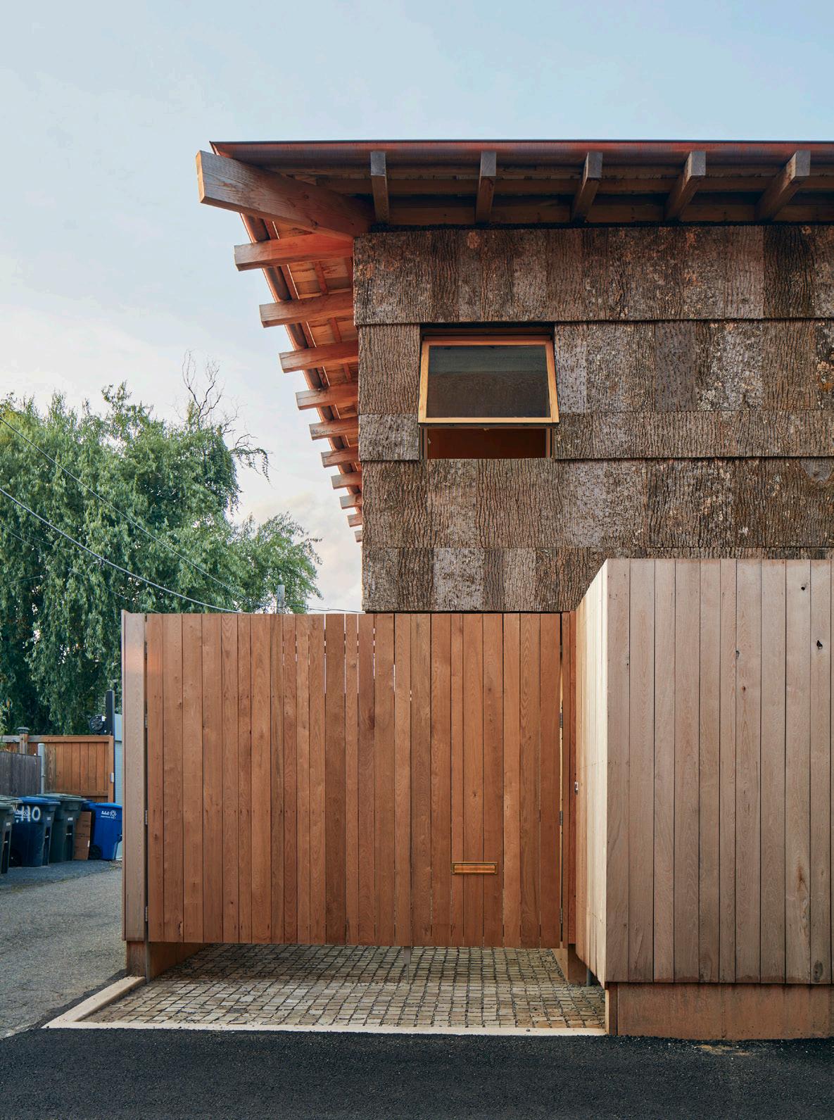
“The history of alley houses is that there were thousands and thousands of units in the District. Many of them were informal, and many of them were lower-income,” said Linn, who lives in the house with his wife, Hannah, and their young son. “In the ’30s and ’40s, the wife of one of the presidents had a big push to improve the alleys. And the alley ‘improvement’ was slum clearance.”
But times change. In 2016, Washington revamped its zoning regulations to permit alley housing. For Linn and Becker, this was an opportunity to add thoughtfully designed single-family houses to the city’s urban fabric. Poplar Grove is part of that effort and is the first in a series of projects the firm has in various stages of completion.
Linn and Becker designed the structure with a number of high-tech sustainability innovations, which amounted to a highly insulated building envelope: An energyefficient HVAC system, energy recovery ventilator, and triple-glazed windows create an efficient base for the entire home. On top of that, low-flow plumbing products save water, and a heat pump–fueled hot water tank works like a refrigerator in reverse—the unit pulls heat from the surrounding air in the house to generate hot water and conserve energy.
A final consideration was the inclusion of an automatic transfer switch in case Linn and his wife decide to add solar panels in the future.
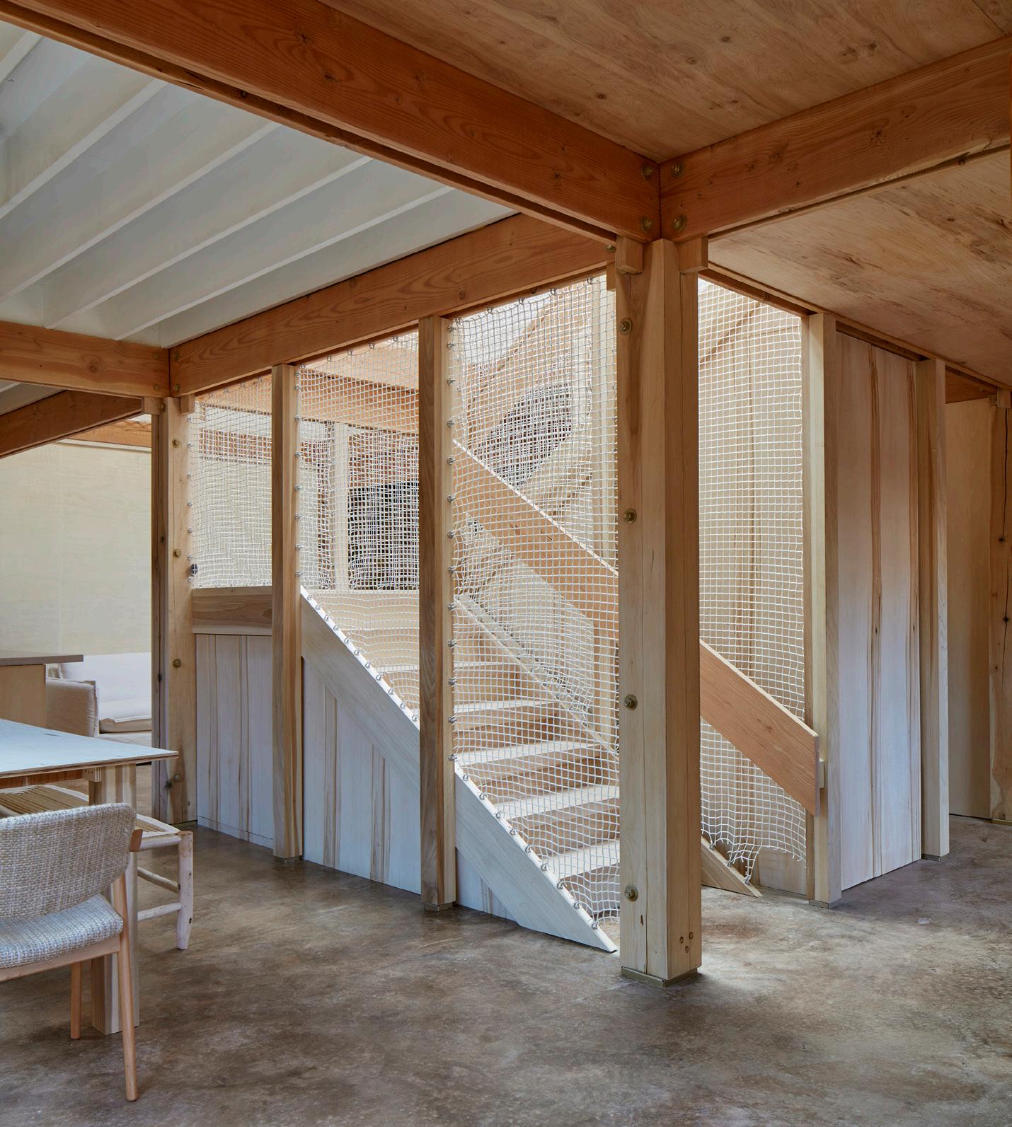
But despite all the state-of-the-art green tech embedded in the home, the designers’ most important sustainability move was their decision to use BamCore, an exterior wall framing system made up of bamboo, eucalyptus, and other sustainable woods designed to save installation time and level up the efficiency. Delivered to the job site as a kit of parts, the panelized system comes with cutouts for doors, windows, outlets, and access panels, and each includes a cavity that accepts any type of insulation. Because it eliminates traditional studs, the system reduces thermal bridging by up to 90 percent. The duo has used the system on multiple projects. “We love it,” said Linn, a professor of practice at Virginia Tech College of Architecture. “It’s basically like making a passive house without thinking too much about it. Because you’re eliminating the thermal bridges, you get a tightly sealed home that’s more efficient.”
Set on a tiny lot among traditional row houses on all sides, the 2,500-square-foot house is a perfect 33-by-33-foot square with a zero-lot line on the east side, a five-foot
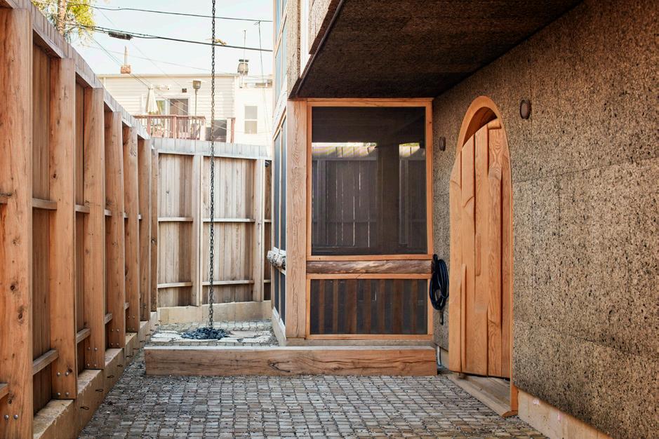
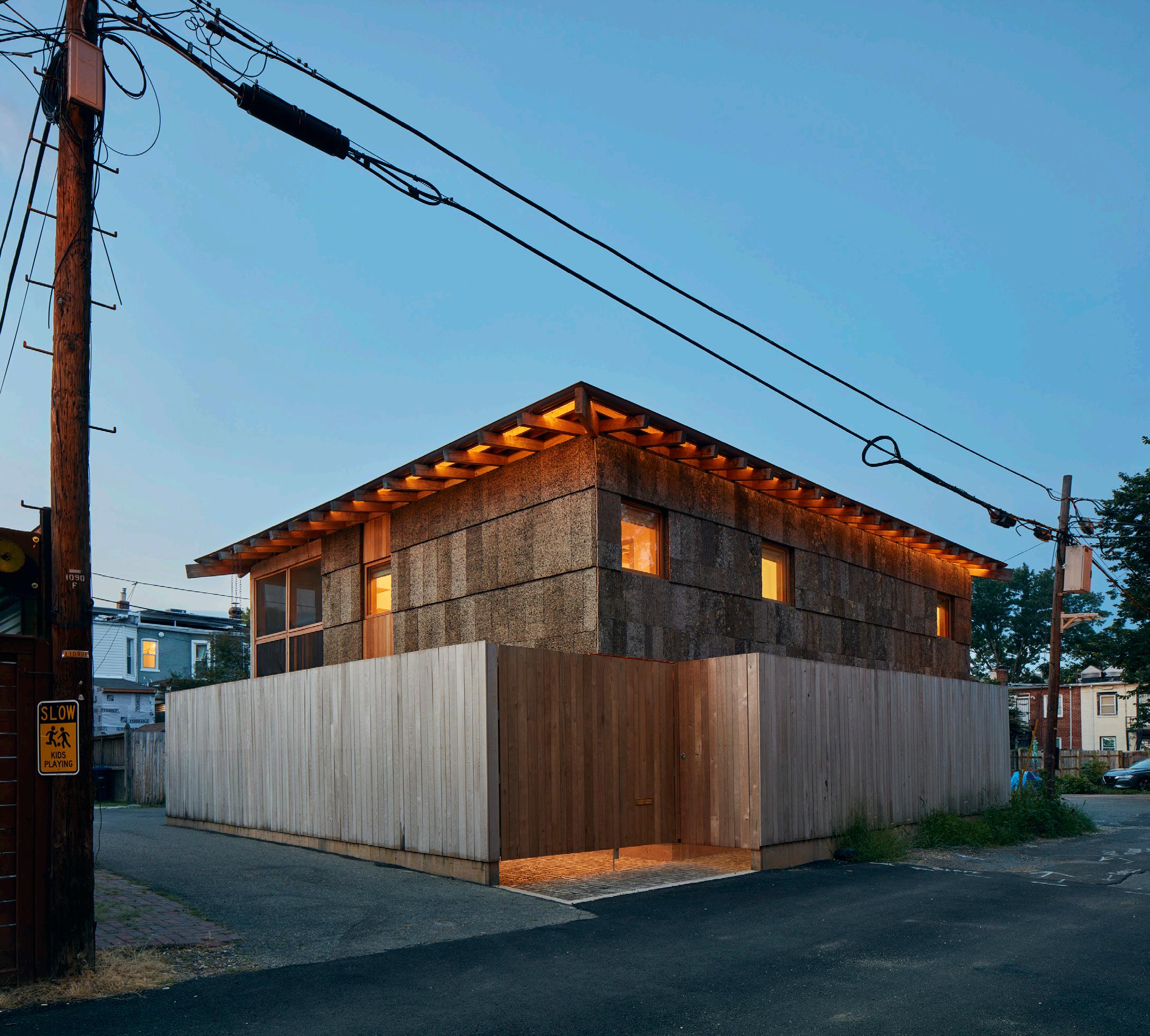
Above: The home as seen from the alley.
Left: The entrance, defined by a setback in the fence.
Above, right: The front door is set in a small front yard.
Facing page, top photograph: Interiors are all about light, sustainably-sourced wood.
Facing page, center photograph: Playful concepts like a lofted hammock extend the designer’s use of netting.
Facing page, bottom photograph: The main stair incorporates wood and net.
Facing page, top drawing: The second floor of the home in plan.
Facing page, bottom drawing: The ground floor of the home in plan.
The Architect’s Newspaper
TY COLE TY COLE TY COLE
setback on the north and south sides, and an extra 5-foot cantilever on the home’s second floor that creates an entry courtyard. The first floor is organized into three 11-foot bays: An office, dining room, and kitchen occupy the left side, while a foyer, stairwell, and living room take the middle. Bedrooms and bathrooms are to the right. Upstairs, the master bedroom floats above the kitchen and dining room, while guest bedrooms and baths are on the other side.
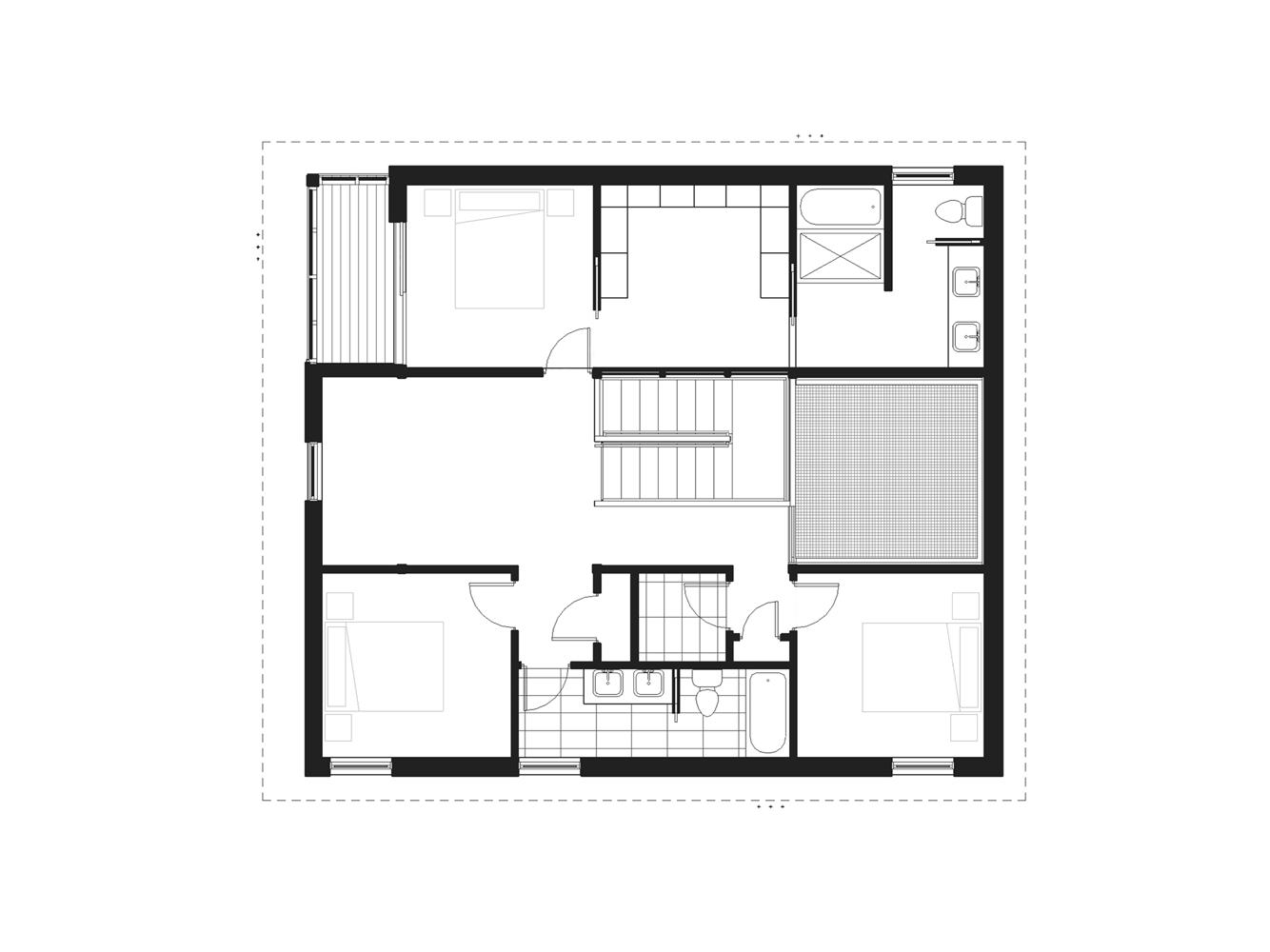
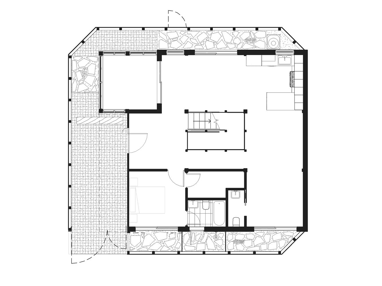
“The primary goals for this house were maximum privacy plus maximum light, which are counterintuitive,” Linn explained. “But the fences and these small side yards give us the required setbacks on this side. They’re just 5 feet, but that 5 feet gives us a grill and a place for mechanical units, for drainage and planters, and of course for trash and recycling. And we have an outdoor shower on the other side. It’s a very small but highly programmed yard.”
Linn and Becker designed the interior with a restrained hand, using simple materials in an honest way. They chose exposed poplar timber for the main structural supports, poplar plywood wall panels and kitchen cabinets, concrete countertops, and concrete floors. The inspiration behind the generous use of concrete was some collected scrap pavers Linn salvaged from a renovation at the Smithsonian’s Air and Space Museum.
One whimsical but highly practical feature of the interior is the architectural netting installed over the entire living room, which promotes light penetration and provides extra lounging space. “We use the net all the time— for naps, morning cuddles, and afternoon
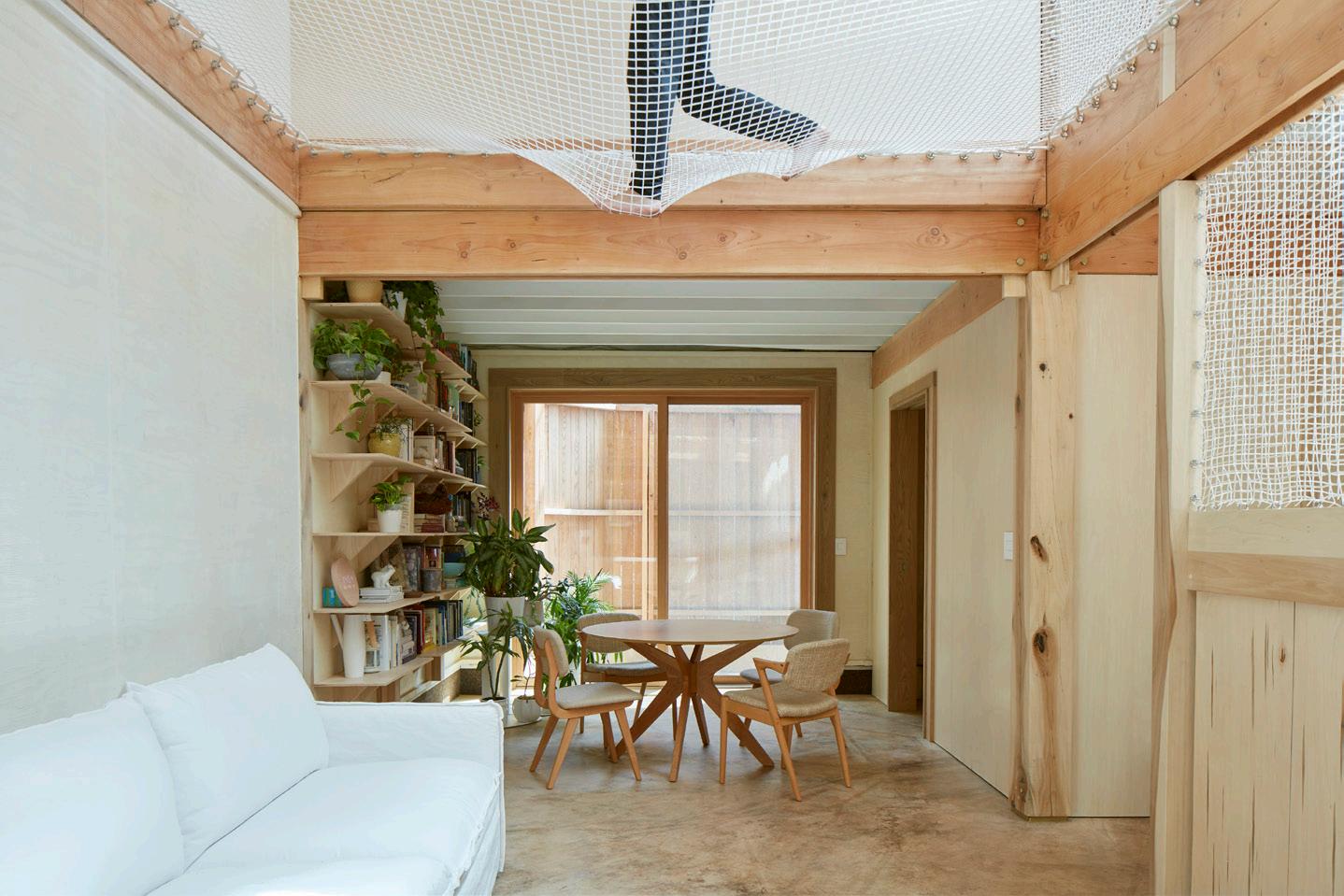
games of catch. I’ve even slept in it through the night a few times,” Linn said. “The net also illuminates the space more than if there was no net, since it’s white and catches the light.”
Strategically placed awnings over the home’s casement windows create privacy but also allow the family to move throughout the house with no artificial illumination. Skylights over the central stairwell bring in sunlight that’s free from visual noise, looking only to the sky. Additionally, the designers used generic LED strips set within the structural framing, so the house gets ambient illumination through recessed design, rather than unpleasant direct lighting throughout the home.
It turns out that living in a highly insulated, high-performance home is even more beneficial when it’s located in a dense city environment. The design choices literally allow the family to sleep longer, Linn said. “It feels better, the air feels better, it’s quieter, and it allows for living to be a pleasurable experience at every turn.”
September 2023
15 TY COLE TY COLE COURTESY BLDUS TY COLE
Nigel F. Maynard is an architecture and design writer based in the Washington, D.C., metro area. He has edited Custom Builder, PRODUCTS, Residential Architect, and BUILDER.
Back in Session
It’s the start of the 2023 –24 academic year, so that means a new crop of leaders are beginning the semester.
To check in, AN spoke with a set of leading educators about their roles. Each answered a septet of questions; a limited set of their responses appear below.
1. What are your goals and ambitions for your new role?
2. What are the most urgent topics and challenges for architectural education today?
3. How has the COVID-19 pandemic changed your thinking about being a leader in higher education, if it has?
4. What are you optimistic about as you create the future of architecture and architectural education?
2. Decarbonization, decolonization, and equity. Our fields are being challenged to transform radically. A more efficient building is not enough—we need to look at sufficiency principles as we consider our interventions in the built environment. Indigenous knowledge and the imperative for reparations resonates strongly across our fields. Modes of production and representation in architecture, as much as the buildings produced, have often been a medium of colonization and oppression. We need to be thoughtful of and focused on how to insist on other values. This includes training our students to insist on an ethical workplace. It is a whole new world.
4. For decades or longer, there has been heightened discussion about the agency of the architect. Can architects change the world? Our approach is pragmatic (the world is changing already, daily and dramatically). How, where, and when we can be most effectively involved. And how can we train our students and educate ourselves on the practical skills and critical attitudes most appropriate to these new challenges? Our ambition is to lead this process of professional transformation, provide avenues to catalyze change, and work together with partners to build a more equitable world, to put it optimistically.
three lessons that we gleaned from the past several years coinciding with the pandemic. Lesson 1: The pandemic showed us that low-wage workers and their dignity, equitable treatment, and fair pay are all critical to making our economy and our universities work. Lesson 2: The mental health of all our employees and students must be at the core of how we think about human resources and our culture in academia. Lesson 3: The pandemic taught us that the United States has a subpar social safety net whereby excess supply—of hospital beds in the case of the pandemic—is not present because it is not in the business interests of hospitals to finance it. If we extend this neoliberal logic to homelessness, affordable housing, or parks, we find the similar scenarios of either underinvestment or relying on philanthropy to meet the gap of what government and for-profit sectors are willing to provide. Architects must be more proactive in providing services that are at the front end of these policy debates so that we can see a pathway toward implementation.
4. The future is in great hands. Our students today are more diverse, more culturally open, and open to change. That allows educators to broaden and deepen the forms of intellectual engagement that we cocreate. Podcasting, broadcasting ideas via social media, utilizing video and other forms of media to communicate ideas—these offer extraordinary opportunities to use our talents and our training to reach a broader community than just connoisseurs. I find this to be a very exciting time to both reimagine architectural education and to be an architect working as what I have called a “citizen architect” engaged in public and civic actions, activations, and imaginings.
think, how to make, and how to communicate the value and impact of what we do, as well as address the environmental and social complexities of the 21st century. How we educate students in our fast-moving, informationsaturated, expanding fields is an ongoing dance between teaching architecture’s “internalities” (i.e., disciplinary knowledge) and engaging its “externalities” (i.e., issues in our world). Paying attention to activist movements for social justice and equity will continue to inspire us to reexamine what we teach, how we teach it, and by whom.
3. The COVID-19 pandemic has taught us that crises can happen quickly and—despite enormous challenges—catalyze exciting change. We felt the challenges of shifting coursedelivery modes broadly across the university community. Nonetheless, most of us have experienced some positive outcomes from these transitions. I am thrilled to see how faculty have expanded their classrooms to include national and international colleagues, catalyzing new alliances for research and creative work. I look forward to thoughtful discussions about the entangled issues of future teaching and learning modalities that will engage not only educational benefits and pedagogic possibilities but also issues of economics, equity, and politics.
4. Architectural education is a project of hope, and educators have a role to play in combating eco-anxiety by imaginatively engaging with our planet’s sometimes overwhelming issues and by showing and sharing the impact of architecture’s innovations.
Daniel Barber Head of School, School of Architecture Faculty of Design Architecture and Building, University of Technology Sydney
1. At the School of Architecture at the University of Technology Sydney, we have begun to frame three major focus areas of research, teaching, and public discourse: decarbonization and biodiversity, designing with country and valuing Indigenous knowledge, and equity and housing affordability. They are all interconnected. We are approaching openly, asking the question “What else would an architecture school do?”
I recognize that these three issues frame searing, existential questions for our field. Yet in the academy, we have the opportunity to experiment, test, consider, reflect on, and engage with these challenges. This is about a changing social role for architecture and working through the pedagogy, research, and public discussion needed to best contribute to the larger socio-ecological transformation in progress.
I am also focused on how we operate as an institution: insisting on an equitable workplace and transparent decision-making, and developing processes and frameworks that allow for consultation and engagement not only with our faculty but also adjuncts and professional staff. Pursuant to a new union contract, we are working to convert a number of casual positions to full-time roles.
Milton Curry Senior Associate Dean, Cornell University College of Architecture, Art & Planning


1. I will be engaged in expanding the College of Architecture, Art, & Planning’s influence and reach by supporting research, interdisciplinary work across campus, arts-integrated education, and online education platforms. The college, under Dean J. Meejin Yoon’s leadership, is maturing and becoming more connected to the university’s leading initiatives, including Cornell Tech in New York City and the new Department of Design Tech, co-located in Ithaca and New York City.
2. Embracing the political, socioeconomic, and cultural present that we find ourselves in. We must defend the democratic egalitarian space of the university and better understand the repair that is owed to those who have been wronged by failed policies of the past. Architecture, urban design, and planning must be leading the conversation about how to build, sustain, and maintain social order through equitable and diverse city design and urban development. Technology will not solve social, cultural, political problems without a proper humanistic lens. Architecture education provides a simultaneous humanistic and aesthetic/spatial lens from which to cohere new socialities. Architecture education, then, offers itself as a field that seeks to make the world better and more humane.
3. I don’t believe that online education will ever be the dominant delivery system for higher education, though I believe it will become an ever more important component of our pedagogical ecosystem. There are
Julia Czerniak Dean, University at Buffalo School of Architecture and Planning

1. I see a deanship as a leadership position with a disciplinary project that engages, inspires, supports, and advocates for the school, university, and city. Buffalo has a rich culture of architecture, landscape, and planning that spans centuries, and with such a legacy, I want to build a school of creative, talented, and intelligent people who discuss provocative ideas, do meaningful work, and collectively advance timely and serious projects. Buffalo, as a climate refuge city, is a fantastic environment in which to experiment. I look forward to working with such a multidisciplinary faculty on imagining the possibilities landscape architecture can bring to the existing disciplinary mix of architecture, planning, real estate, and historic preservation in the school.
2. What is so wonderful about a design education is that it moves between knowledge in the STEM disciplines, the humanities, and the arts. However, it is increasingly difficult for faculty to balance teaching students how to
I recently had two opportunities where I gained a better grasp of this aspiration. The first was a recent studio I co-taught as part of the Envision Resilience Challenge, where students learned—despite alarming predictions of sea-level rise—that strategies of retreat allowed them to see that brighter futures were indeed possible, despite overwhelming odds. Another opportunity arrived this June, when I co-taught a field studies course in the Galápagos Islands. The course studied the relationship between biodiversity and design through reimagining simple systems of infrastructure— sea walls, road crossings, shade structures— for multiple species, not just people. Students departed the islands with an entirely new way of seeing not only our discipline but our world, a more-than-human world. What we do is imagine futures. Can you get more optimistic than that?
Michael McClure Dean, Kansas State University College of Architecture, Planning & Design
1. My immediate goals are to get to know the people, programs, and aspirations of the college better so that I can join the team already in place. That understanding of where we are and where we are going is the foundation for meaningful and impactful leadership. To envision a more vibrant future, we must start with a base understanding. My goal is to provide leadership

The Architect’s Newspaper 16
Q&A
Architectural educators in new leadership positions share their thoughts.
DAVID MOJI/PIXOGRAPHY
COURTESY CORNELLA AAP
COURTESY JULIA CZERNIAK
COURTESY KANSAS STATE UNIVERSITY
that is collaborative, participatory, and visionary. My ambitions for the college are that we work together to leverage our current success toward an even more vibrant future. I’m ready to fully engage with the university’s Next Generation Land Grant initiative. We will continue to work toward even more vibrant, inclusive, and socially involved design professions.
2. In order to create an architecture curriculum for the 21st century we need to make connections between the studio and the streets, between the academy and the public, and encourage engagement with the world and its problems. We are optimistic and realistic. We are collaborative. We believe in a better future, and we are equipped to bring our visions into reality.
And this is why design professions are uniquely poised to be at the forefront of addressing the most pressing challenges facing society today. At APDesign//K-State we understand that the best work is the result of inclusive, critical, and collaborative design processes that seek to solve problems and provide solutions to the communities we serve. Because we want our professions to be more relevant to society and to offer more robust solutions, we are committed to creating professions that represent the communities we are serving.
3. The COVID-19 pandemic has had an immense impact on society. Its effects on academia will be the subject for research and discussion for generations. In design education, it broke us out of some really bad habits, and as a leader, I am committed to remembering the lessons learned and to use what we have learned to improve design education. We should celebrate our teaching and learning methods, but we need to stop conflating longer hours working with excellence in outcomes. We need to stop confusing “rigor” with unhealthy habits and biased language. Finally, as architects and designers, we need to make sure that we leverage the attention society now has to the physical and built environment. We should not squander the trust given to us as the leaders in shaping that environment.
4. The life of an architect, planner, and designer is a wonderful one. We get to make the world more beautiful, more meaningful, and more useful. Not only do we get to study an extremely wide range of issues, we get to make propositions on how to reframe, reimagine, and improve the world for all its inhabitants. We don’t have to choose between the scientific method and the creative method. Almost always, our job is to consider “‘both,” and in that way, we are inclusive by nature. We have to believe in a better future in order to envision it. It is a privilege to get to engage with society as an architect, planner, and designer. It is a privilege to be able to guide and mentor the next generation of creative leaders.
1. We are just coming out of a month in which multiple heat records were broken. In fact, there are now cities that are becoming uninhabitable without air-conditioning, and the effects of this global climate crisis are being felt by the most vulnerable communities. In my new role, I am looking forward to supporting ongoing research by faculty and students, to look at our past to see practices we can bring back to our fields, and to bring in new and diverse voices to help with these important tasks.
2. Architectural education is being challenged to show its value in a larger moment of uncertainty and change. The moment is pushing education and practice to become even more collaborative as design professionals continue to learn to work with others as well as diverse communities.
3. Being in different administrative and leadership positions during the COVID-19 pandemic has shown me that empathy is an increasingly important tool. We are all responding to this moment by refiguring our priorities, and a leadership that responds empathetically to address the changing needs of multiple constituencies can help.
4. I am very excited to see the energy of students and faculty. Many of the challenges we are facing, as per your previous questions, require this energy and acceptance. Leadership becomes easier when there is a grassroots desire for it, which I feel right now. Together we can tackle labor, environmental, and social justice issues.
knowledge, and re-asserting the importance of live discussions and healthy debate. I am trying to wean the culture of design education away from a consumption-based pedagogy mindset, often encouraged by asynchronous learning. A true design education requires direct participation and engagement with each other; it cannot be passively consumed.
4. So many exciting things are unfolding in real time and show promise for an even greater future in design education. I am most excited about new models of practice, and how education can create space to expand not only what issues design can address but, equally importantly, how we address them. Experiments in methods and modes of practice are creating powerful nonhierarchical forms of collaboration and design tools, as well as exciting new ways for designers to work with communities, nature, and technology.
3. The pandemic was a poignant, historic moment where many lost loved ones, colleagues, and community members. We were held in collective grief and, paradoxically, felt the sharpness of record-pace problemsolving. The motivation to solve problems dissolved many barriers across the university and the greater community. And, in the face of a complex, ever-changing situation, we learned to be inventive, agile, and resilient— the skills we continue to foster in ourselves and our students.
Design and planning fields understand the world is interconnected. (No building stands alone.) We also understand that our success relies on the work and well-being of others. Our charge as educators is to foster that sense of community among students as we face the reality that we are a whole, living, and related system. As neighbors helping neighbors, we experience happiness in supporting others. Likewise, we need to encourage students to consider well-being in balance with an ambitious spirit.
Quilian Riano Dean, Pratt Institute School of Architecture

 Mason White Director of Master of Urban Design and Post-Professional programs University of Toronto, Daniels Faculty of Architecture, Landscape and Design
1. First, it is to listen. So many new challenges and ideas reveal themselves when we listen to students and colleagues. Second, given how international our students are, I hope to create a welcoming global environment that fosters students learning from each other. What an incredible opportunity it is for students to bring with them their lived and educational experience here and share it rather than leave it behind.
2. There are so many urgent issues, and this can be quite overwhelming to students and teachers. But I think social and environmental equity in pedagogy, education, and the profession is the defining urgent matter of our time. Recognizing that social and environmental matters are intimately intertwined is crucial to a more inclusive and responsible design education. And within these common goals, we must continue to be deeply curious about what design can do and remain unafraid to ask questions about what the discipline is not doing.
3. We seem to still be recovering from the isolation of the pandemic in terms of access to and engagement with design education. We are re-learning how to collaborate and share
1. With disciplines across all scales of the built environment, the school has the desire and capacity to model collaborative work, embracing the ecosystem of expertise found here. From architecture to interior design and from urban design to historic preservation: Together, we will examine the potential for greater interconnectedness by increasing support for faculty research and collaborative learning opportunities, embracing practice as one of the critical foundations of design education, and strengthening partnerships within and beyond the university.
Building on the work of my predecessor, Michelle Addington, we need to continue to experiment with technology. We also need to confront the ethics of technology, living with AI, and the professional implications of both to our economies and methods of production.

I look forward to an evolving set of future goals and ambitions developed in partnership with faculty, staff, students, and alumni.
2. We are at a critical moment. Climate change, societal and cultural divisions, the dire need to create more equitable living conditions, and technological progress promise to raise questions impacting our economies and ethical boundaries. There are so many urgent challenges that some design lessons may seem less important. Yet, in all forms of experimentation, education refines our way of seeing the world. Design education impacts the built environment by teaching distinct creative expression and refined visual skills. Students need both a strong foundation to lead an impactful practice and the ability to conduct a broader scope of research for emergent and complex issues. Core design and scholarly talent also relies on the associated soft skills of critical thinking, communication, and empathy. While the urgency of world challenges weighs heavily, architectural education needs a balanced and holistic curricular approach to be most effective.
4. Education is one of life’s greatest gifts, and what happens in the academy contributes to the knowledge foundations necessary for innovation in design and practice. I’m optimistic about the ways that the UT School of Architecture can build bridges across the university to support the three broad areas of research alignment outlined in the UT Austin strategic plan: energy and environment; technology and society; and health and well-being. We are also excited about the faculty’s advocacy role in the Austin region and UT campus. As the university looks to rising housing costs, lack of access to public transit, and disparities in health access and outcomes, they have the scale and resources to collaborate with local communities, study best practices, and model thoughtful solutions. I am most optimistic about the passion, creativity, and commitment of this next generation of leaders in the architecture, design, and planning professions to the greater good. As they say at UT Austin, what starts here changes the world.
Read their full interviews online at archpaper.com.
September 2023 17
Heather Woofter Dean, School of Architecture at the University of Texas at Austin
LIZ KIM
COURTESY UNIVERSITY OF TORONTO
COURTESY UT AUSTIN
Mass Timber: It’s What’s for Dinner
The potentials and provocations of architecture’s favorite eco-material.
Wood construction is ancient, but it is also evolving more rapidly than ever before. Mass timber presents a new way to build renewable, plant-based urban density. As wood sequesters, stores, and avoids the most carbon of any structural material, it’s essential to low-carbon living.
However, withdrawing from a well-worn path of carbon-intensive materials is not easy. It takes time and money. Those who decide to venture into the unknown will inevitably confront significant challenges in forging new, nonextractive paths. As we work to improve the climatic impact of construction, is there a way for the risks associated with new materials that benefit us all, like mass timber, to be more collectively distributed?
Financial support for researching and developing new renewable (plant-based) building materials has historically come from the U.S. Department of Agriculture. Today, for mass timber projects, this tradition is again gaining momentum. One of the most influential groups supporting mass timber research and development in North America is the relatively young Softwood Lumber Board, founded after a 2008 report was published by the U.S. Endowment for Forests and Communities. This report was produced by timber industry leaders at the request of the U.S. and Canadian governments in order to prevent trade wars between our two countries, as wood moves frequently across the border. In the report, industry leaders proposed what is known as a “check-off” program, named after 20th-century USDA programs that offered a way for commodity producers to collectively contribute funds for marketing purposes through a self-imposed tax—producers opt in by checking off the box on their tax returns. The collective funds are gathered and allocated to promote a generalized commodity, like avocados, almonds, and corn, or, in this case, softwood. Checkoff funds aren’t for influencing legislation or governmental policy or promoting individual companies; they are a dependable way for farmers and stewards of natural resources to promote their crops in a way that helps everyone.
Among the best-known campaigns supported by check-off programs were ones led by still-memorable slogans: “Got Milk?”
“Beef: It’s What’s for Dinner,” and “Cotton, the Fabric of Our Lives.”
We inherited the idea that forests are part of the food and agricultural department at the turn of the century, from Germany, the place where cameralism, or land stewardship for the good of the state, was invented. The United States Forest Service’s (USFS) first chief forester, Gifford Pinchot, trained in Europe and toured the cameralist forests of France, Germany, and Switzerland in the 1890s before founding the Yale Forestry School in 1900. His views on how American forests should look and operate stemmed from a critique of cameralism’s efficiency and monoculture.
Under Pinchot, the USFS decentralized decision-making in the forests and moved toward an emphasis on a diversity of regionally ecological and visually stunning mixed-species forests.
Pinchot’s friend Theodore Roosevelt shared strong convictions about what made a good forest. He was credited
with coining the phrase “conservation of natural resources for the good of present and future generations,” but his ethos was not extended to Indigenous people. Under Roosevelt, they were forcibly removed from the forest, a move framed as a “protective” measure. These actions were mythologized by the romanticist protagonists of the day: masculine heroes valiantly defending a virgin wilderness and nation. Together, Pinchot and Roosevelt constructed a lasting image of the American forest wilderness.
Check-off campaigns are designed to influence public perception in a similar way. Not only will they begin to loosen our grip on this romanticist past but they will start to provide tangible climate solutions for the construction industry. To answer the resulting demand for mass timber, forest owners and factory owners continue a tradition of collaborating on the design of products that will provide them both with future revenue.
In 1934, a cooperative research program between a lamination plant in Peshtigo, Wisconsin, and the U.S. Forest Products Laboratory (FPL) was one of the first to apply subsidized USDA funding toward the development of glue-laminated wood for construction. FPL spearheaded the development of plywood as a solution for the housing crisis after the Great Depression, resulting in Neutra’s Super Plywood kit-ofparts, among other demountable single-family house models that grew plywood into the ubiquitous material it is today. The FPL also sponsored the design, sourcing, milling, manufacturing, and construction of glulam arches with a span of 46 feet: The first building with a glue-laminated timber structure in America was a school gymnasium. This building was used for understanding and updating life safety building codes for single-story laminated structural timber.
This effort is what transformed the innovative product called “plywood” into the backbone of the American single-family typology. Although glue-laminated arches were tested at the same time, plywood was more successful. It doesn’t require heavy machinery, large volumes fit easily on trucks, standardized sizes have been easily commodified, and people can cut them into shapes close to home.
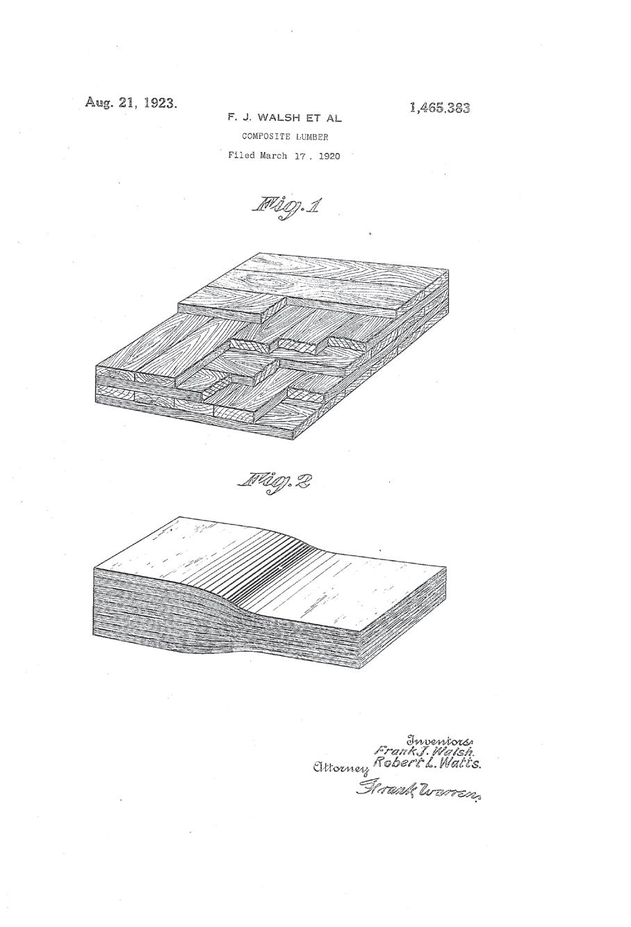
Today, this type of private and public cooperation continues, with renewed vigor in the case of cross-laminated timber (CLT), a panel form of mass timber that can replace the most fossil-fuel-intensive building materials (concrete and steel) in urban environments. Together, concrete and steel contribute 19 percent of global greenhouse gas emissions because they require so much energy to be manufactured. Melting steel and cooking clinker for cement require industrial heat that is often generated through burning fossil fuels. Plus, they are largely mined and manufactured in colonized landscapes. These materials have been the backbone of urban construction for the last 100 years, but they don’t have to be any longer. One reason why mass timber is finding footing again is because laminated panels, columns, and beams are slowly taking a page from plywood’s success: assuming the standard dimensions of truck beds to maximize fuel used in shipping, outsourcing the value-added step of CNC-milling blanks, and serving urgent
typologies like multifamily housing.
Since 2015, the Wood Innovations and Community Wood Grant programs have given more than $93 million to 381 forprofit entities, state and local governments, tribes, school districts, community-based nonprofit organizations, institutions of higher education, and special purpose districts. In June, the USDA Wood Innovation Grant program, funded by President Biden’s Inflation Reduction Act, backed 23 projects nationwide, with the goals of supporting the production of biomass-based energy sources, zero-waste production lines, structural engineering services, and burnt-wood salvage efforts; all are intertwined with the USFS ten-year strategy for wildfire mitigation. This work is bolstered by President Biden’s executive order on Strengthening the Nation’s Forests, Communities, and Local Economies. One of the largest projects to date is last year’s USDA award of $30 million to the New England Forestry Foundation to establish forestry practices that can be shared among smallholders, commercial forests, and First Nation woodlands. The goal is to build a bigger market for mass timber on the East Coast, where there is an abundance of hardwood species, and the Foundation has already launched with a new phrase: climate smart.
To rebuild—or even imagine—equitable, nonextractive living environments for humans and nonhumans, the supply chains of material production have to change. Mass timber and its underlying protocols for cultivation, making, moving, using, and reusing must be formed through new, more pluralistic imaginaries. Think collectively
owned, reparative, biodiverse forests. These can be stewarded to support all-wood, holistically healthy housing, easily reconfigured when necessary, and eventually returned to the earth. Sure, there are also low-carbon concrete and low-carbon steel alternatives on the horizon, but they are still more costly (in carbon) than wood. If we want to respond to the current and historic violences of extractivist moralities, one big step is to significantly reduce our addiction to industrial heat.
Collective risk-taking is key to real change. Demonstration projects prove to the industry and the public that new paths are viable, connecting building science, life safety research, design, and product development with a public perception campaign. The collective check-off program and resulting Softwood Lumber Board is successfully growing a new material era for plant-based cities through grants, demonstration projects, publications, and events. Its multipronged approach builds knowledge, excitement, and also revenue. Although the funding is biased toward softwoods and resists definitions for ethics in forestry practices, it seriously props up the industry’s collective risk-taking, as it requires winning teams to be already supported by manufacturers and foresters, encouraging multidisciplinary perspectives from the start.
The Architect’s Newspaper
18
Lindsey Wikstrom is a founding partner of Mattaforma, a research-driven architecture practice based in New York. Her new book is called Designing the Forest and Other Mass Timber Futures
Comment
The 1923 patent application for composite lumber, or CLT. OF CONGRESS, PRINTS & PHOTOGRAPHS DIVISION
LIBRARY
Beyond Sustainability? Ultraviole(n)t Exposure
We can’t engineer our way out of the climate crisis.
There is no doubt that capital-S Sustainability has lost some of its polish in the last few years. Greenwashing, a term coined in 1986, is now so identifiable as a “thing” that it has its own Wikipedia page. Advocates of Sustainability now have to be more cautious in their claims: A dull realism has set in. The United Nations Department of Economic and Social Affairs notes that because “so many of the components of existing economic systems are ‘locked into’ the use of non-green and non-sustainable technologies,” the bar is not going to move anytime soon.
And yet, Sustainability remains a worthy goal. After all, we have to at least try to make our buildings and cities more in line with the science of global warming, even if it amounts to playing Mozart while the Titanic is sinking. Part of the problem is that the building industry has bought into the lingo, as have many clients, with little in the way of serious changes.
Vikramaditya Prakash and I, in our Office of (Un)Certainty Research, spent three years studying a recently built house in Seattle, a modest modernist house that was designed around all the issues of Sustainability. The architect graciously let us into the inner workings of the process and agreed to be interviewed along with the other designers, contractors, and builders involved. We studied the building from four perspectives: its labor history, its mining history, its chemical history, and its atomic history. The main lesson we learned was that because of increased chemicalization of building components in the last 20 or 30 years, the building’s ecological footprint is fully global. Furthermore, much of this chemicalization was done in the name of Sustainability. (The results of our research were presented during the Venice Architecture Biennale in 2021 and in the book A House Deconstructed, published by Actar.)
My house in the Boston area, by way of contrast, was built in 1900 with no plastics. It also originally had little metal apart from the nails, cast-iron sewage pipes, and copper water pipes. Its foundation was made of fieldstone. The plate glass for the windows was the most expensive item and probably came from Pittsburgh.
The Seattle house was a different creature altogether. It used metal in the cladding, structure, framing, and detailing. There were dozens of special highend additives and coatings, even for the concrete. The more we studied the building, the longer and longer the “ingredients list” became. The glass, through the addition
of zinc stearate and barium nitrate, for example, had been developed in recent years, the same too for the concrete and steel. This chemicalization improves the life span of the material or adds strength, but the downside is that the chemicals had to come from somewhere. They had to be mined and processed, and many are toxic.
The glass has a particularly interesting story. It was made in a factory in Minnesota, in a region where huge sand strip mines scour the earth. Mining companies are there to secure high-priced sand to be used in fracking. All the other sand that is processed, about 95 percent of it, is more or less discarded and bought by glass companies clustered around the area. Glass is now the cheapest architectural surfacing material. No wonder it’s everywhere.
The ecological damage of sand mining and the human cost to locals who breathe the particles—plus the fact that the glass is fabricated completely by robots—almost never make it into architectural conversations and are certainly never brought up in architectural schools. Multiply this hundreds of times across the planet—think of the cobalt mines in the Congo, the zinc mines in China, the barite mines in Nevada, the witherite mines in Tasmania, and on and on—and we quickly get to see the incredible “reach” that the building industries have.
We have few tools with which to trace these supply chains. The plastics industry is particularly opaque, and so too steel sourcing. Recycled steel, as was used in the Seattle house, gave the owner and architect a good feeling, but the recycling process mostly happens in Bangladesh, India, and Turkey and has produced vast contamination zones with huge human costs. Alas, out of sight, out of mind.
Though there are some trying to incite change, the building industry continues to scratchproof its messaging. Without more interest from architects, there is little to stop this portion of the global economy from constructing its own positive spin while the time remaining to change slips away.
In order to bring these conversations into the open, it seems the main point of attack will have to come from academia. Hopefully courses, seminars, and workshops will be developed that teach future architects to see these broader pictures and make more-informed decisions.
Unpacking what it means to design safe shade.
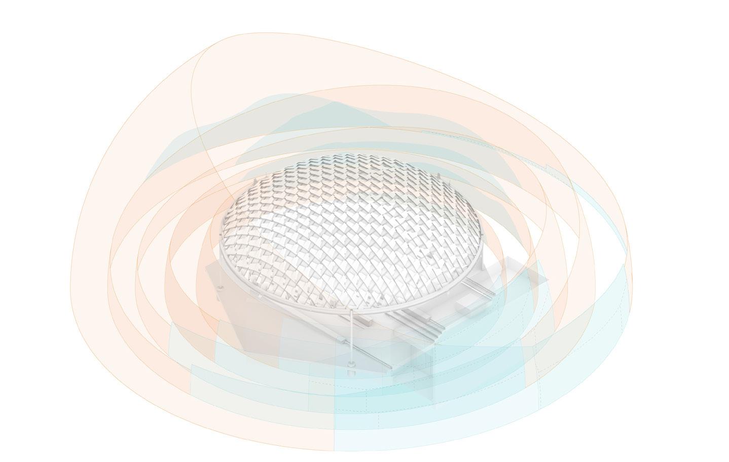
AGENCY Architecture is located in El Paso, Texas, and our work has focused largely on ideas that shape our border-adjacent desert context, with a particular sensitivity to social issues, ecological instability, and resource depletion. Current work is looking at the Chihuahuan Desert—a unique and uniquely challenged binational territory that crosses the U.S.-Mexico border. Here, climate change is evidenced daily: The combined impacts of climate migration, desertification, and urbanization exacerbate the asymmetric distribution of environmental threats and public health risks to this large (and largely underserved) area. One significant environmental threat is the hidden, subperceptual danger of high levels of ultraviolet radiation exposure, surprisingly high even within shaded conditions in public space.
Our new initiative at the Project for Operative Spatial Technologies (POST) at the Texas Tech University Huckabee College of Architecture regional site in El Paso— just steps from the border—is focused on transboundary issues of environmental and spatial justice. POST is addressing the risk of overexposure to ultraviolet radiation in the built environment through several related design and design research projects. With the support of the 2023 Columbia University Buell Center and the ACSA Course Development Prize, we are planning to work with students in the coming year to build on this work on shade, UVB exposure and its effects on communities and migration patterns, and the disparities that arise when analyzing the differences in effect on both sides of the international border. A vertical design studio will endeavor to visualize innovative and effective designs for safe public shade. Student design research projects will provide positive health impacts to borderland communities through architectural and urban design of computationally informed, radiation-aware public shade structures, designing models, and prototypes to enact regional transformations at scale.
The ongoing Irradiated Shade design research initiative develops computational mapping, drawing, and modeling tools to enable designers to uncover, represent, and protect against the unseen dangers of ultraviolet radiation in public shade. Project outcomes to date include a shade-deficitmapped analysis of El Paso/Ciudad Juárez pedestrian space that uses GIS; the development of several custom representational
analysis tools, like a spherical and cylindrical projection algorithm capable of mapping and quantifying sky exposure in any urban setting; and a sky exposure catalogue that helps contextualize disparities in public shade. The project has provided a productive and urgent context for the development of custom computational mapping and modeling strategies to address urgent public health concerns and inequities in the provision of public amenities.

In order to instrumentalize this research with a built proposal, POST is working with regional nonprofit STEAM educational organization Insights El Paso to design a “safe shade classroom” in Sunland Park, New Mexico. The project combines an outdoor classroom with a protective shade canopy designed to assist in educating visitors about strategies to counteract the harmful effects of scattered ultraviolet radiation common in the U.S.-Mexico borderland. The design endeavors to provide a safely shaded outdoor classroom for school-age children at the trailhead of a regionally significant archaeological site. The design of the shade structure focuses on an innovative yet lowcost structural shading assembly: Custom shading modules are designed to interlock as a reciprocal frame, using minimal material to achieve the required long span. The design allows for customization and adaptability to respond to sky exposure and other environmental conditions impacting ultraviolet radiation exposure.
As the planet continues to warm at unprecedented rates, mitigating the subperceptual and detrimental impacts of elevated levels of solar radiation upon human and more-than-human bodies will soon become even more urgent a task for architects and urban designers. In the high desert geography where we practice and teach, the impacts of planetary warming produce immediate negative impacts on life, which are compounded by the unpreparedness of the built environment. By creating a design workflow that visualizes and spatializes the effects of the built environment on UV exposure, we can produce and assess a taxonomy of locally adapted, protective shading geometries, enabling safer outdoor environments amid this emerging and escalating threat.
September 2023 19 Comment
COURTESY AGENCY ARCHITECTURE COURTESY OFFICE OF (UN)CERTAINTY RESEARCH
Mark Jarzombek is a professor in the Department of Architecture at MIT.
Ersela Kripa is an Associate Professor and Director at Texas Tech Huckabee College of Architecture – El Paso. Stephen Mueller is an Associate Professor. They co-direct POST, and are founding partners of AGENCY Architecture.
Coming to New York City October 27, 2023


Sponsors


Our mission at Graphisoft is to empower your team of building professionals with advanced technology and accompanying know-how to help fulfill your mission: to create great architecture. We believe that integrating people, workflows, and information in real-time is critical for your success. Our award-winning solutions provide unrivaled open BIM workflows to help get the job done. Our superior teamwork and mobile solutions help engage all project stakeholders in real-time. Our colleagues, partners, and users work with us in true partnership with the ultimate goal to change the world for the better by Building Together!
Canvas is an app that saves architects time on measuring and drafting asbuilts. Canvas replaces hours of manual measuring with minutes of scanning. The Canvas Scan To CAD service eliminates drafting by generating detailed 2D floor plans and editable 3D as-builts in as little as one business day.


Cupix delivers the industry’s most advanced 3D spatial digital twin platform, enabling building owners, general contractors and project managers to build smarter, transforming any construction site into an easy-to-manage project and creating value across the entire life cycle of a property. Requiring only a consumergrade 360-degree camera, CupixWorks is the fastest and easiest way to create and share a best-in-class 3D digital twin.
FivD embodies architectural excellence and innovation. We deliver unparalleled end-toend solutions and consultancy, customized for premier AEC firms, developers, and general contractors. We elevate design, construction, and operations with LEAN methodologies and cutting-edge tech that provides value which has measurable outcomes thus making our workflows faster and efficient.
At IMAGINiT, our focus is helping you uncover opportunities and overcome challenges. With deep industry expertise, IMAGINiT has the know-how to help pinpoint critical issues and address them through the better use of people, processes and technology. As a Leica Geosystems partner we offer HDS for surveying firms across North America and our partnership with Autodesk allows us to advise clients on best practices for data deliverables.
Our engineers, scientists, landscape architects, planners, surveyors, and technical specialists are recognized as the best in their respective disciplines. Using sound principles and proven concepts, our professionals are skilled problem solvers who deliver a high level of quality on each and every project.


Microsol Resources has been delivering integrated solutions to the architecture, engineering, and construction industries for over 30 years. The company is a recognized leader in BIM and CADbased solutions, as well as an Autodesk Platinum Partner. Besides CAD & BIM software, Microsol also provides training, consulting, staffing, 3-D printing, and data management services to help customers gain a competitive advantage and improve their overall productivity.
The architectural concepting app. The first purpose-built tool for the concept design stage of the process. We are the missing step between pen and paper and cumbersome, slow BIM programs.


SketchPro is the creative copilot for architecture and design. Every year, billions are spent on rendering services that can take weeks. SketchPro’s AI converts early designs into realistic renderings in seconds, and our vision is to automate repetitive tasks across the design process so that creative professionals focus on creativity.


Snaptrude is a collaborative 3D design tool on the cloud: Think easier than sketchup with the power of BIM and collaborative like Google Docs.


Earn 6 AIA Credits Register and learn more at techplus.co/tech23-nyc/ Presented by and DIAMOND START-UP PLATINUM
Artificial Intelligence Machine Learning Information Management


Reality Capture
BIM


Digital Twin Generative Design Automation


Digital Practices
On Friday, October 27, The Architect’s Newspaper and AEC+TECH will present the annual TECH+NYC conference. This forum celebrates the quantum leap of technology transforming the Architecture, Engineering and Construction (AEC) industries. The full-day symposium is a continuation of our national Tech+ conference series, featuring case studies and leading firms from across the country.
TECH+ NYC will be hosted at New York Law School in Lower Manhattan.
As AEC professionals strive to build more sustainable and intelligent buildings while optimizing the design and construction process, the pursuit of technological solutions is constantly evolving. TECH+ presents the vanguard of products and software, from virtual reality-aided design to rapid prototyping, additive manufacturing, smart building systems, reality capture, and more. Exhibitors will demonstrate these products, showing off the innovative ways to best utilize them. In this ongoing showcase of evolving technologies that drive the built environment forward, we will explore the latest developments with the makers themselves.
The AEC industry is evolving rapidly in its adoption of new technologies; machine-learning advancements are opening new ways to automate and reduce mundane design tasks and support increasingly sophisticated modeling, tracking, building forensics, analysis, and visualization. New ways to collaborate are emerging between designers, engineers, and manufacturers and are changing the way we work with near-real time data sharing. Even the ways in which we present our visions to clients have become more sophisticated.
The day will kick off with an opening keynote by Randy Deutsch and Matt Krissel asking important questions about how AI will transform our practices. They’ll share a behindthe-scenes look at the formation of the world's first Built Environment Futures Council (BEFC), an interdisciplinary group working to advance the discourse and opportunities for Artificial Intelligence in Design and Construction with actionable leadership, insight, and foresight relevant to practice.
Addressing climate change and reducing embodied carbon are key drivers of AEC innovation, and technology-enabled solutions are built into increasingly useful tools for tracking, modeling, and reducing key carbon drivers in our designs. National thought leaders from AIA’s Technology in Architecture Practice (TAP) will discuss the evolution of TAP, their programs, and the technology community's evolution within the profession.
Finally, our Investor Roundtable will feature a conversation around the AEC investment landscape,and the Startup Showcase will feature early-stage startups pushing the boundaries of technology for the AEC industry; members from leading design schools like Parsons, Pratt, MIT, and Columbia GSAPP will participate. Sponsors will be on hand throughout the day to both present and discuss new tools and how they can be applied to your latest projects.
Graphisoft’s support of this program spotlights industry leaders who not only use these new technologies but also develop methodologies to re-shape the built environment. There’s plenty to learn, share, and discuss, so join us on October 27th.
For more information, visit: techplus.co


tions, fueling Worldcoin user growth. CW


What you'll see at Tech+
Resonant Surprises
Olivier Campagne turns his expert eye from making renderings to generating images using Midjourney.


Olivier Campagne operates a digital-image studio in Paris. Educated as an architect, he has spent decades making renderings. Recently, he began creating AI images using Midjourney and posting them on a dedicated Instagram account, @oliver_country. The images advance the architectural imagination he’s been exploring in commissions from European architects like Bruther, Baukunst, and Arrhov Frick. Guided by his eye for mechanisms and appreciation for photography, the scenes are technical, industrial, and minimal, yet still dreamlike. Campagne said that while a handful of images were color-corrected, the vast majority of his posts are straight from Midjourney with no alterations or cropping. AN’s executive editor Jack Murphy spoke with him about his process.
AN: Can you tell me about your background and your professional work with architects?
Olivier Campagne: I graduated and then immediately began making images. I was more excited to do this than to be a practicing architect. I started to make 3D renderings, and I’ve been doing it for about 20 years now.
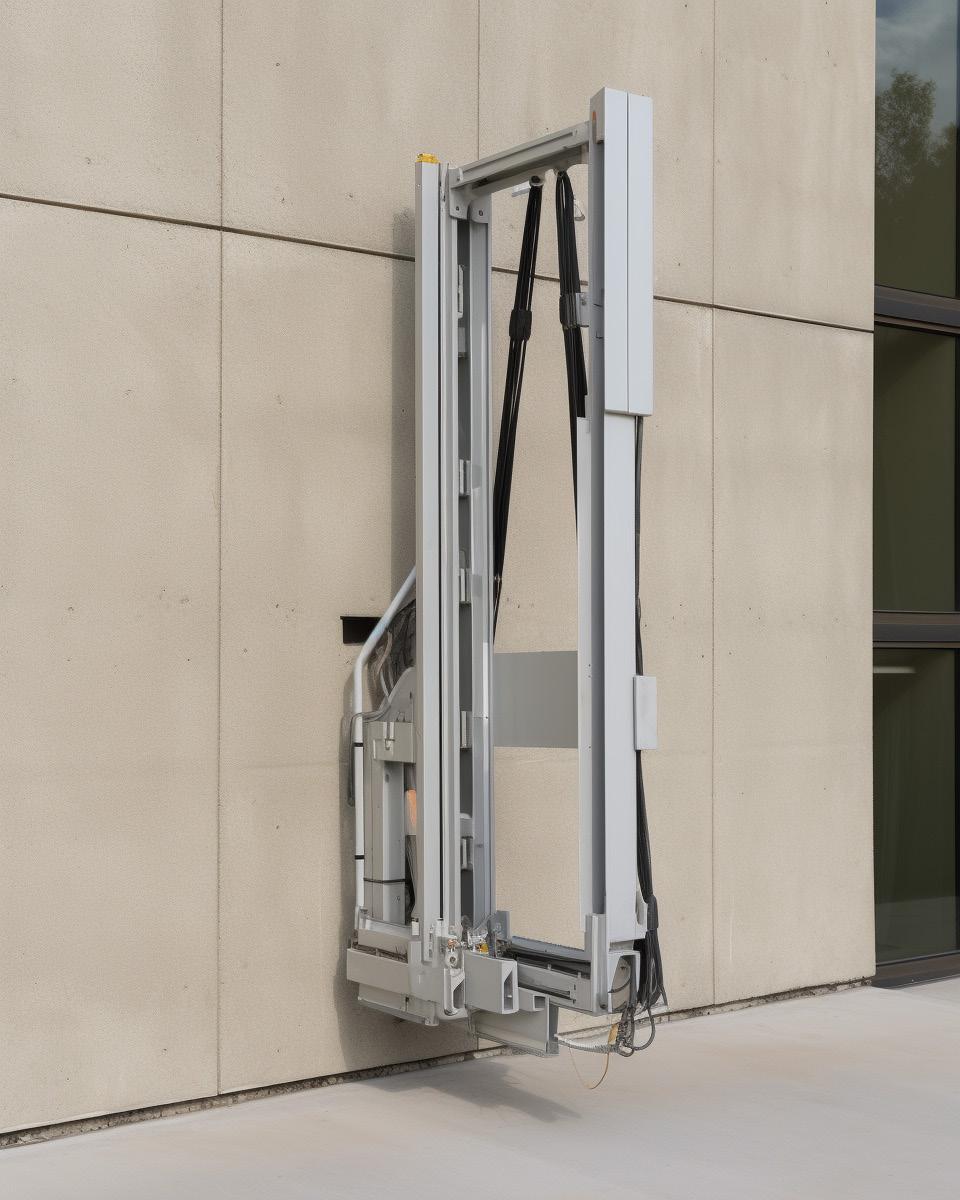
How do you work together with your clients to get the right mood or shot composition?
I receive sketches, but the bulk of my job is to look around to find and propose views, and then we discuss. I think like a photographer trying to shoot this imaginary building, so I’m looking for framing and composition. With some clients, I don’t receive 3D models, so I work out the details. I try to bring technical details into the image that may not be there yet at that stage of the project.
How did you begin exploring image making using AI?
It’s quite recent for me. There has been a lot of growth, and the quality you can produce with Midjourney is stunning. I remember DALL-E from a year ago, which was funny, because you could immediately see what was wrong with the image. It’s interesting that I’m seeing lots of things like inflatable structures or curtains, which are hard to model yourself. I was doing stuff like this, but afterward I started
to focus more on details and mechanisms and how this can mix with architectural elements. It’s hard to manipulate things exactly; it’s more like playing a game. There’s randomness involved, and you don’t get what you expect. And unless you use certain code, you won’t get the same image when you regenerate. It can be frustrating.
But I also like the surprise that arrives from throwing the dice. With photography, there are surprises that happen, like accidents you don’t expect. When you render an image, you go step by step and will not be surprised. So in a way, AI gives me what’s missing in rendering.

Have you mixed AI imagery and rendering yet?
It’s difficult to merge these two interests right now. I’m keeping these experiments separate from my work. It does raise issues about copyright. For example, you can bring in any image into the prompt. I try to avoid this, because then you’re making a photograph from another nice photograph. I don’t know by what magic it works, but then the starting point can completely disappear into the image, but somehow, it’s still there in the color.
I try to concentrate on fully formed images because I think that’s the way I get the most surprise. There’s a lot of training involved. What’s on my Instagram feed is less than 1 percent of the images I make. It’s close to programming, in that you modify the prompt and relaunch. If you like programming and ghostly visuals, it can be quite addicting.
The Architect’s Newspaper 22
Q&A
Has this started to influence your professional image making?
Maybe in a more unconscious way, because it pushes you to be more critical about what you’re doing. It sends you back to university, in a way. It helps me understand photography more because you have to have a way that you look at your work. Since I’ve been doing AI, I’ve become stricter. You’re constantly filtering images, and this trains your brain to look for the things you don’t like, so it’s refining your vision. And then when you go back to your own work, you get more severe and then you need to be more precise.
Are you using AI to generate parts of your renderings yet? I know there are tools like this for Photoshop Beta.
The main issue is resolution; it looks good on screen, but when you zoom in, it’s tricky. There are options in Photoshop Beta, and even before the use of AI to make images there was the content-aware fill tool. I’m sure there will be some development to extend AI into making 3D models. But for now, if I would use it, it would be for small things like putting people in backgrounds, because it is very good at lighting, so this would save some time.
How do you think AI relates to the relationship of architecture and photography? Is there any change to how these two creative disciplines relate to each other?



I had the feeling a couple months ago like we were living in a revolution which is maybe comparable to when photography was invented. People said, “Painting will disappear,” but that was not the case. My friend reminded me that when color photography was invented, suddenly blackand-white photography became art. Before AI there was all this old, numeric, 3D digital imagery, and that will become more like art.
To come back to the question of inflatable structures and curtains, you can ask: How was the architecture of the last years addicted to things that were possible in the computer? For example, if it’s easier to create soft or inflatable things, will architecture be directed by that? When you render glass, it’s quite easy, but it can make for a fascinating rendering. We’ve seen architecture become more and more influenced by the kinds of images that we can produce. There’s a link there, so maybe AI will introduce a new twist, and then new architectures become possible.
How could AI help create videos?
Video AI needs to be tested more because it’s not yet that good. There’s a lot of work to do in terms of consistency. I’ve tried it, but I’m not yet into it. Already, making a single image takes so much time to be happy, so making frames for a movie is something else. It takes time. To get to each image I publish, it sometimes takes hours of rendering. It’s not like automatic image processing.
You mentioned you post less than 1 percent of what you create. How do you get to what you call a finished image?
Maybe I have something in mind and then I translate it into text and hit Enter. It gives you an image, and then you say, “OK, that’s what I described but not what I had in mind.” There are frustrating things, like if you type “ceiling,” then Midjourney understands it will be an interior, because if you’re outside you like to not see a ceiling. There are logical issues like this.
I recently tried to make short prompts—like just four words. It tends to increase the surprise. You can generate text using ChatGPT and then use it to create images in Midjourney, but I realize that when you have so many words it’s not going to be a precise image, because it picks random stuff in the prompt. When you have fewer words, and you don’t use any images in the prompt, you get sharp images, so when you see blurry AI images, it might mean that it was generated using an image. I’ve been trying to create super sharp results. Like if you just type “small cabin on the rocks,” then you get a clear image. Maybe I didn’t like the result, but the image is sharp. I’m looking at the image down to the pixel.
While exploring this “artificial landscape” through capturing snapshots and documenting it, I am primarily curating my own production. The selected image would be the one where everything seems to resonate: architecture, framing, composition, and light.
September 2023 23
The Up Studio
Meet New York-based architecture, interior and brand design firm The Up Studio. This award-winning firm delivers a range of residential and commercial projects using Archicad. The studio is committed to honoring their design process with simplicity and dedication. Founder John Patrick Winberry believes it’s a priority to keep his design-oriented workflow flexible and efficient.
Since adopting an Archicad workflow, The Up Studio has finally been able to develop a design process to demonstrate a high level of concept thinking. Having made the switch to BIM (Building Information Modeling) powered by Archicad, The Up Studio now can see projects in incredible detail and develop designs more quickly.
“We love taking our clients through our design process, our concept thinking,” explained Winberry. “Before Archicad, we designed projects in 3D. Once the design was approved by the client, we stopped all work in 3D and moved to 2D drawings. It created barriers to continuing to explore design ideas from that point.”
The Up Studio has been empowered to evaluate and share design alternatives quickly and efficiently thanks to their optimized workflow dedicated to evolving design variations— regardless of the size or scale of the project. The new Archicad 27 Design Options solution enables firms like The Up Studio to bring their concepts to fruition using BIM solutions. Working in a single model as their design evolves, it becomes the source of
all construction drawings. Archicad has become the backbone and engine powering this firm’s design process.
When tensions arise during design development, The Up Studio relies on their model to convey ideas with greater clarity, as all the model data is working in the background to reduce errors and improve coordination. The Up Studio fulfills their role as a full-service firm by approaching projects in a systematic way. First, the team spends time evaluating all environmental considerations, integrating that into the architecture, and outlining any client constraints (budget, schedules) before then providing designs that are concept-driven. By working in this way, the firm has opened the door for smoother client interactions, increased project recognition from industry peer groups, and streamlined workflows.
“What Archicad helps us do, by showing the performance of a design decision rather than having to explain it, is to be more effective in communicating ideas. The model has validity, proving the design in a way that the client can see clearly,” said Winberry.
Every single The Up Studio project goes through a Clarity of Design presentation in the beginning—no matter the size, scope, or location. The studio applies their process no matter if they are designing a 600-square-foot home, or a 20,000-square-foot complex. The process sets up guardrails for their team to stay focused, sharing an unclouded vision that is driven by performance.
“As we began using Archicad it was clear we had found a tool made for designers,” Winberry explained. “We could work and move through the model, make changes that met our client’s needs and never lose sight of what we needed to do to build the home."

When firms struggle with their workflow, it can put unwanted limitations on the ways they can express design ideas. Before Archicad, The Up Studio was moving from 3D to 2D drawings, and transitions created barriers to continuing to explore design ideas from that point. Beginning a project in Archicad helps teams streamline their productivity, so it has become the backbone of the work, and powering the design process. On each project, teams discovered the ability to work and move through the model, make changes that met their client’s needs, and never lose sight of what was needed to realize the building.
The Up Studio can now deliver high-impact visualizations quickly and easily using professional out-of-the-box solutions and streamlined connections to other professional architectural visualization solutions built in to Archicad.
“We consider Archicad to be one of the most powerful tools we use. BIMx gives us the ability to link the 3D and two-dimensional export. It can be a complex virtual model—but everything syncs,” Winberry said. “This technology excites me, because it affords us the ability to build the home virtually, and have the client fall in love with the design, and our concepts.”
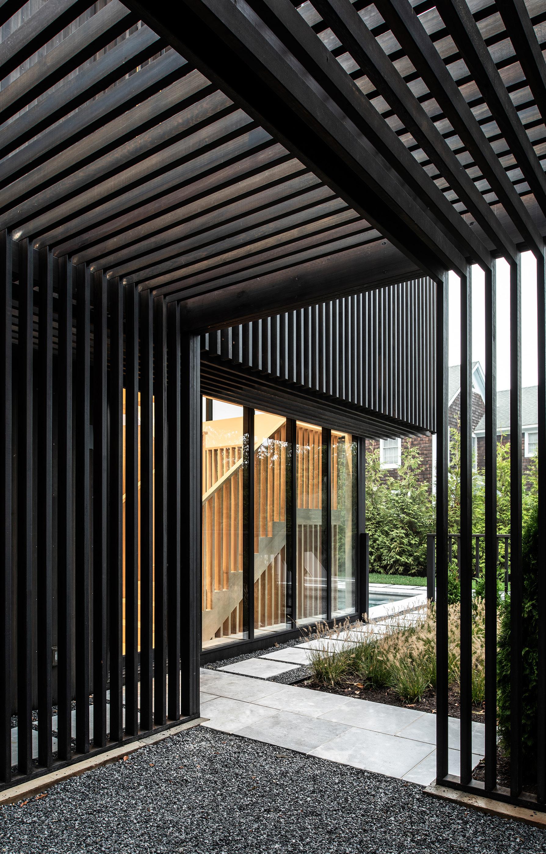
Sponsored Content
ALAN TANSEY ALAN
TANSEY
The Up Studio is a firm that consistently puts people, process, and performance first. Central to the firm’s success is a goal to help clients understand the story of their design and provide them with a feeling of ownership in the design process.
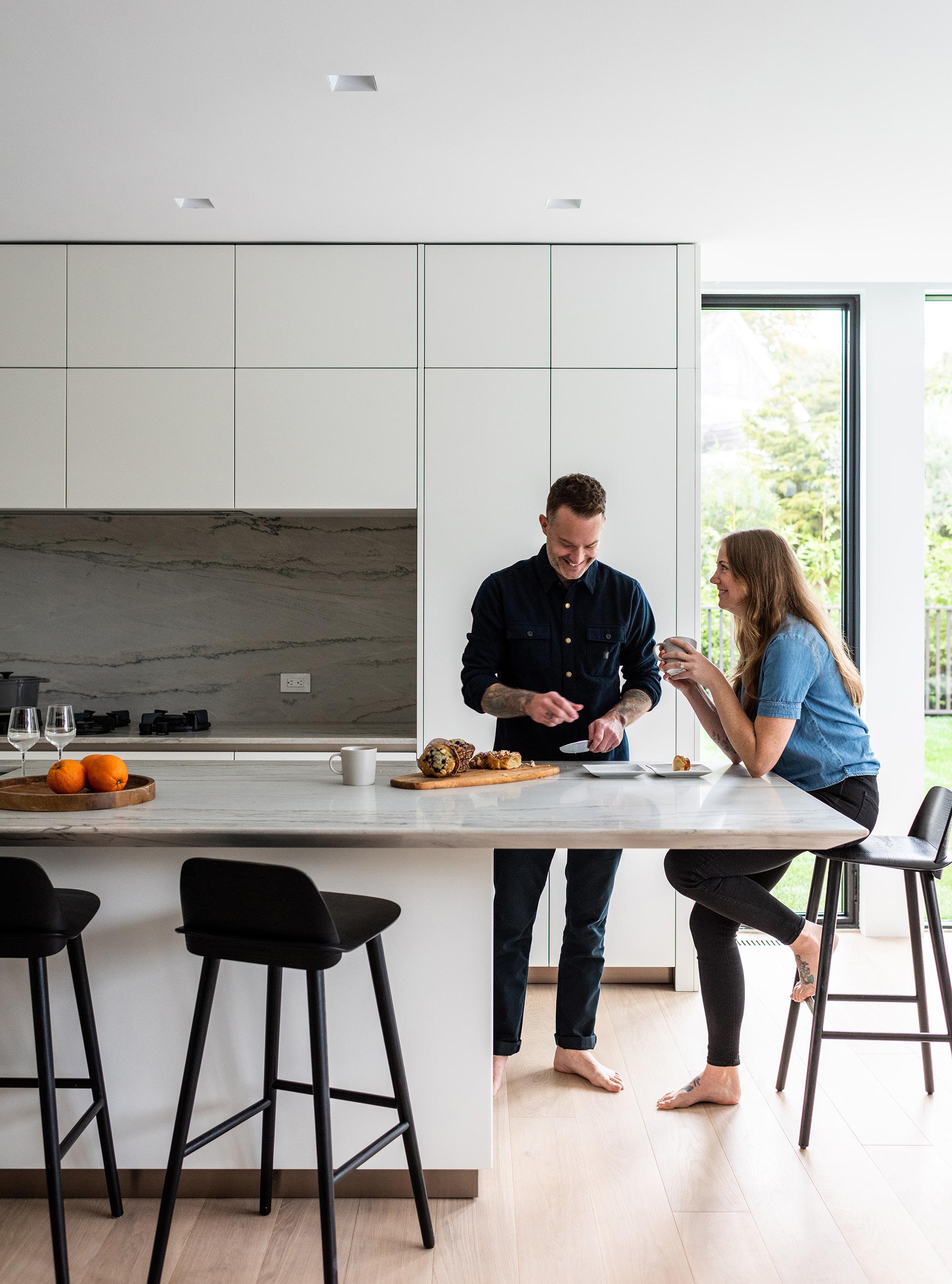
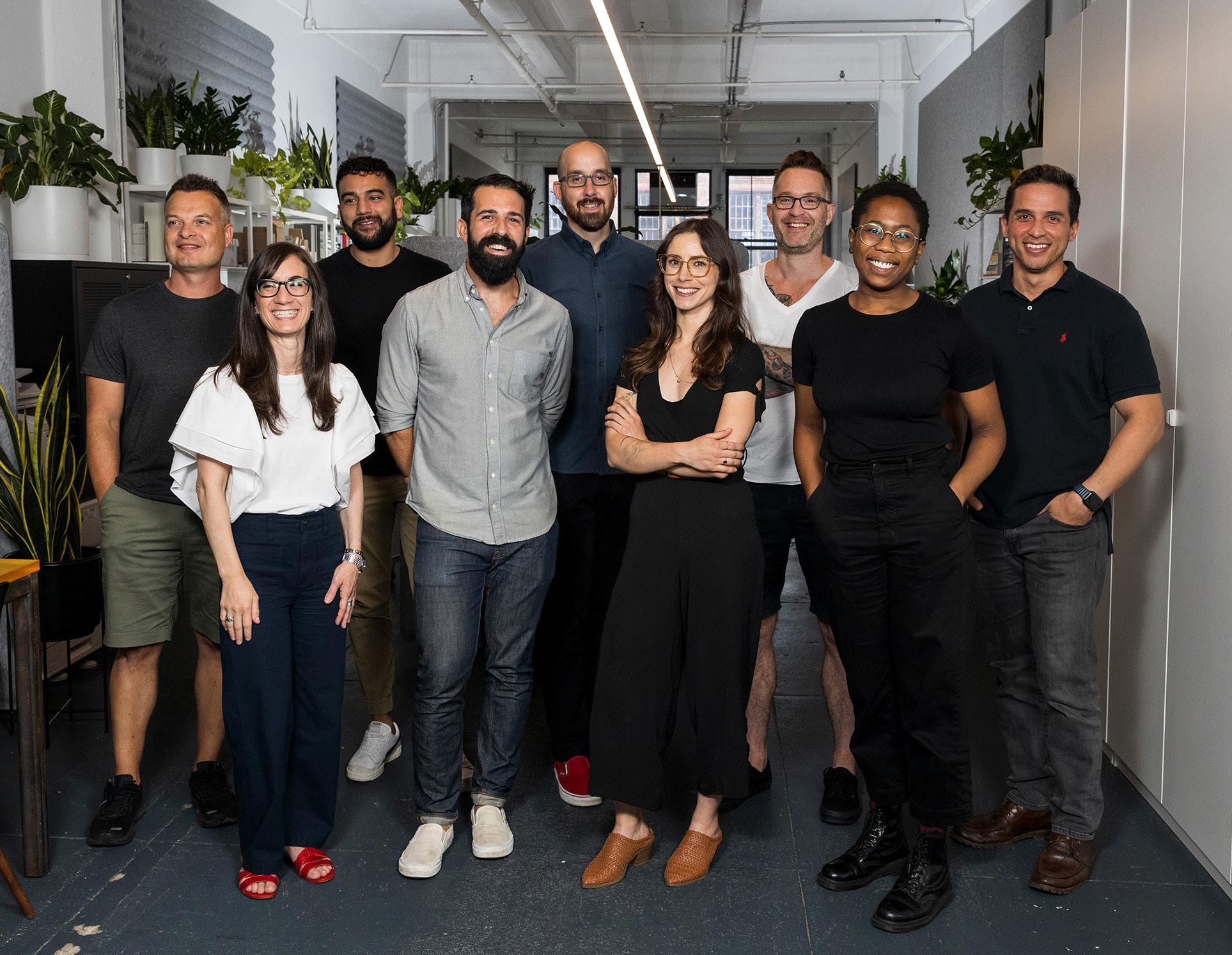
The Up Studio is an award-winning full-service architecture, interior, and brand design studio that aims to enhance people’s lives through their concept-driven work. Their team focuses on customizing projects to meet their clients’ needs, in a way that is site specific, and rooted in a thoughtful design strategy. Each member of The Up Studio believes that design has a story to tell. To tell that story, the team employs a multidisciplinary approach that combines broad ideas, diligent organization, and innovative tools, presented within a coherent narrative.
Graphisoft empowers teams to design great buildings through award-winning software solutions, learning programs, and professional services for the AEC industry.
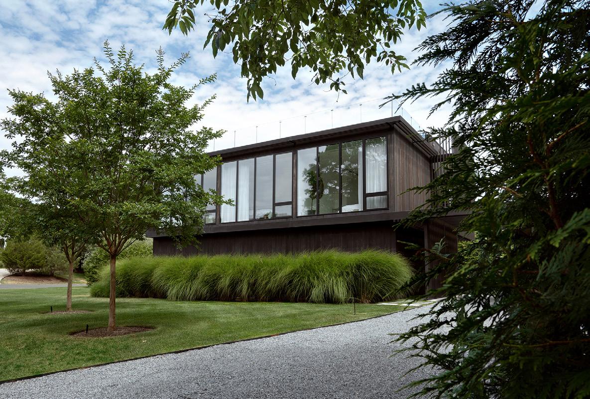
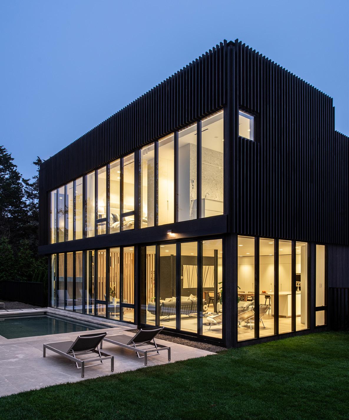

Sponsored Content Take a behind-the-scenes look at The Up Studio today! ALAN TANSEY ALAN TANSEY ©THE UP STUDIO, THEUPSTUDIO.COM, PHOTO: JULIAN BRACERO
CHRISTINA GRIECO
BIRD


FRIENDL
WORLD-CLASS BIRD PROTECTION
It is estimated that up to one billion birds die each year in the U.S. due to glass and building collisions. Bird-Friendly Glass from Glasswerks combats confusing reflections and undesirable bird fatalities by applying our pattern to the primary surface of the glass, allowing birds to avoid invisible threats.


Follows 2x4 Rule
6 Standard Patterns

Ultra-Durable Ceramic Ink


Solar Controlled Low-E


Glasswerks bird-friendly
Prevents Bird Collisions


Eco-Friendly
Etched Glass Patterns
Custom Patterns Available

888.789.7810 | glasswerks@glasswerks.com | glasswerks.com GLASSWERKS’ GROUP OF COMPANIES THINK BIG THINK GLASSWERKS™
LY G L A S S
G uar dian Bi rd 1s t ™
REUSE ADAPTIVE
We live in a society obsessed with the idea of continuous growth. For architects, this pressure results in the expectations that outputs must be newer, taller, and better. These -er’s override many essential values and lessons that make sustainable buildings, places, and cities.
The skill of working with and within existing fabric—be it a constrained city lot, an existing apartment, or even a historically significant site—is a consistent aspect of architectural history that today remains an invaluable tool for designers. This feature section is all about the potentials of adaptive reuse: GOMA’s reimagination of an industrial complex in Mexico shows the potentials for beauty inherent in blending old and
new; a historic school now supports an experimental P20 education model thanks to designs by PLY+; and projects by LOHA and Bruner/Cott showcase two more examples of smart engagement with existing structures. To start, Deborah Burke, of renowned (and renamed) New York–based architecture firm TenBerke, shares an excerpt from her new book Transform, a manifesto “against” preservation but “for” an architecture of transformational change.
Through careful and thoughtful adaptations that respect and maintain our existing architectural assets, maybe we really can reimagine a more responsible and compassionate practice, where less truly is more.
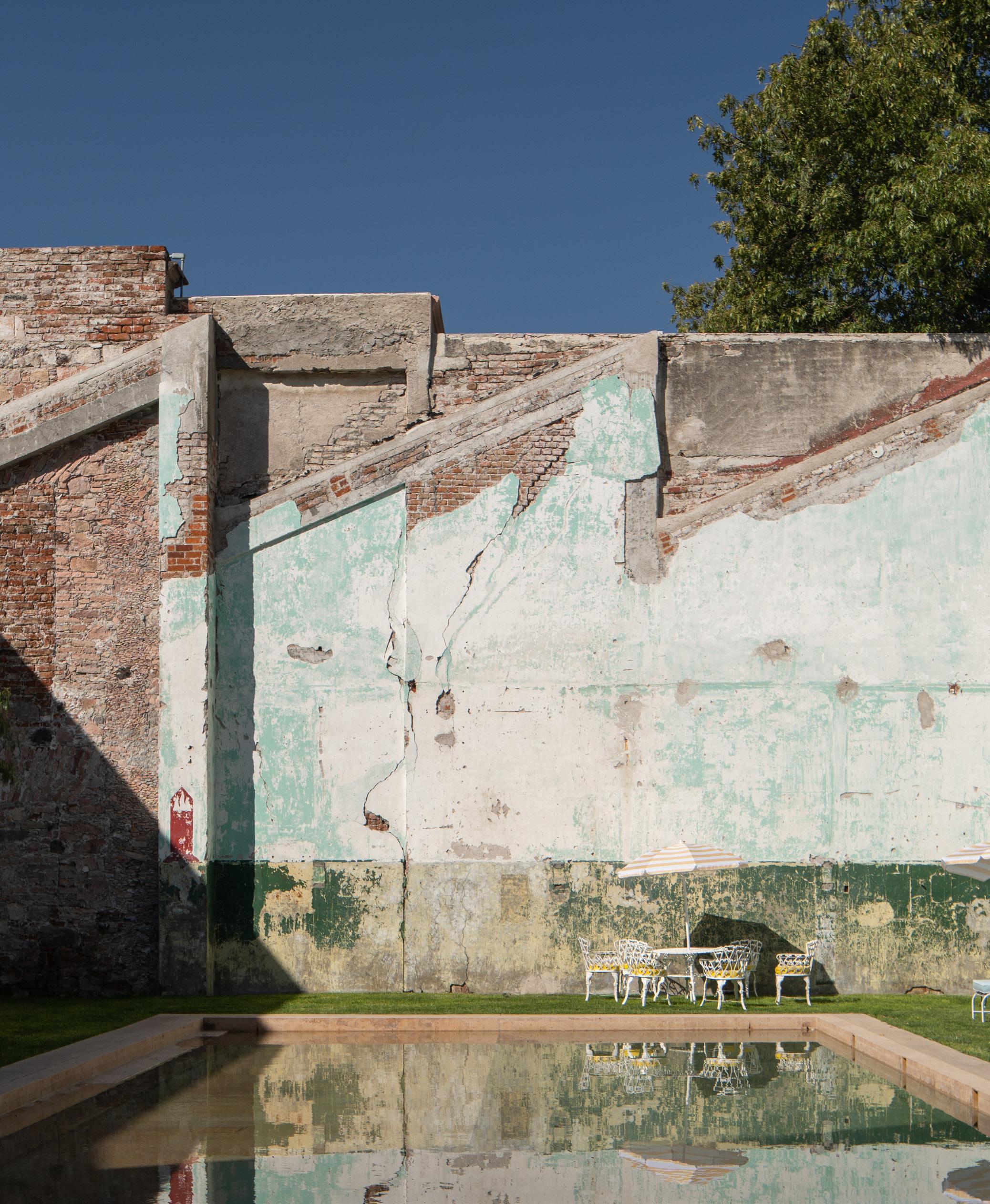
BÉJAR 27 Feature September 2023
CÉSAR
AGAINST PRESERVATION
An architecture of transformational change
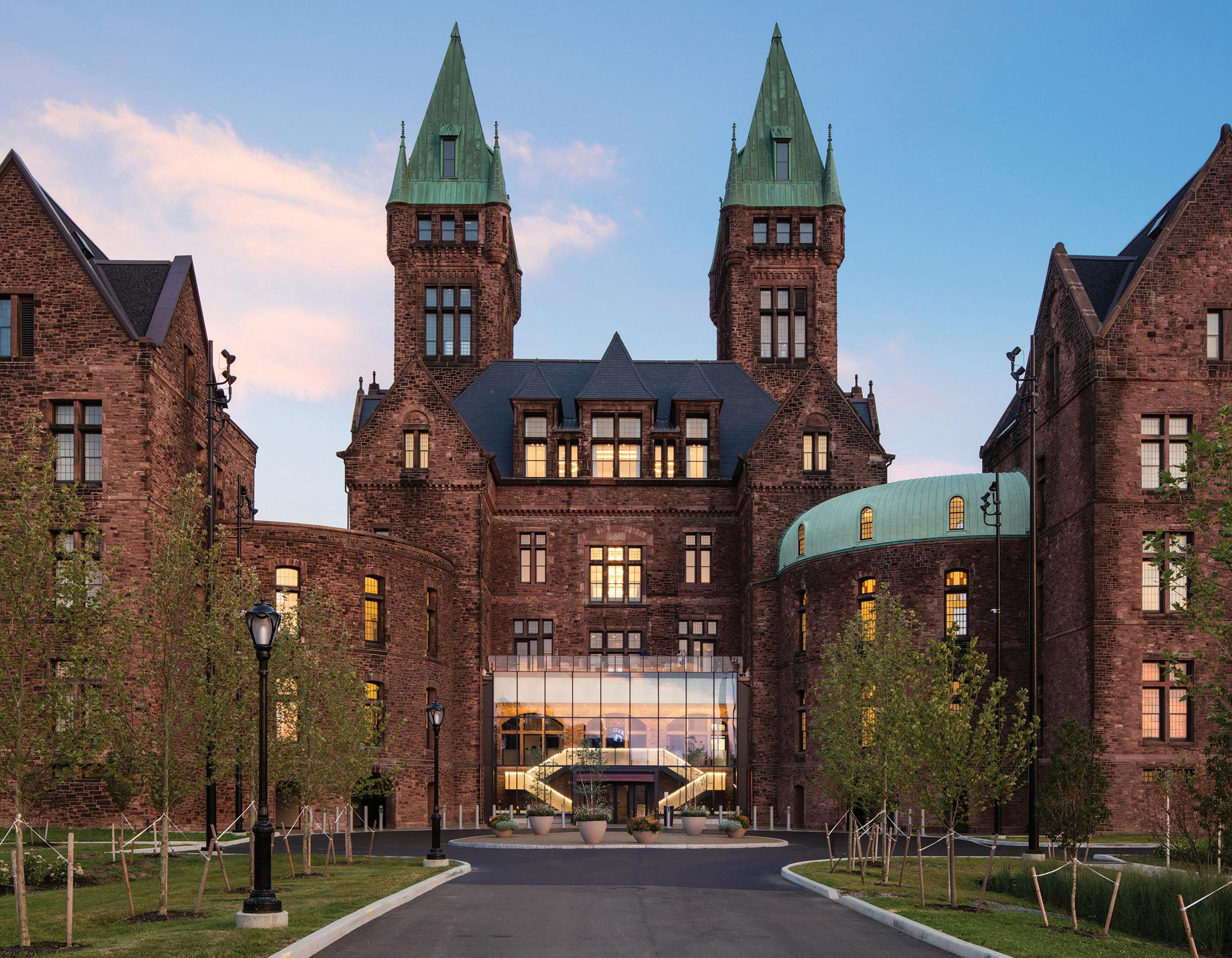
A new essay by Deborah Berke, founder of the architecture firm TenBerke, in Transform: Promising Places, Second Chances, and the Architecture of Transformational Change, written in collaboration with critic and author Thomas de Monchaux and published by Monacelli Press, argues not for preservation, but for regenerative reuse.
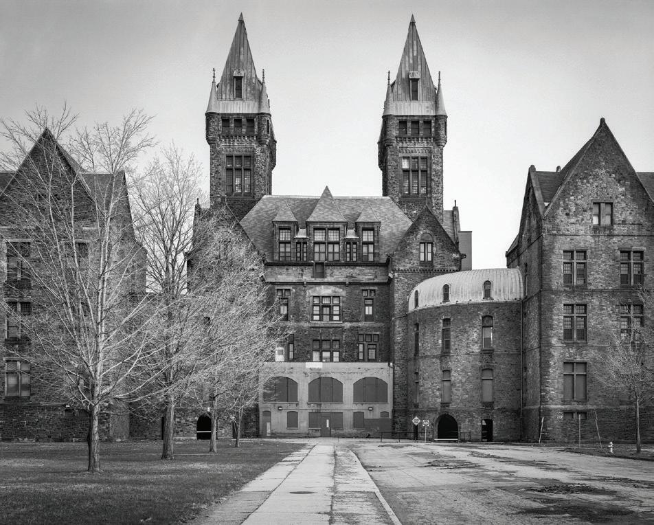
The strategic stitching together of old and new combines two of architecture’s great virtues. On the one hand, there is solidity, continuity, and a sense of place. On the other hand, there is agility, empathy, and a nimble ability to change as quickly as fashion without being fashionable. The space— and time—between old and new is where we live our lives. Opening this space to thinking, making, and being is now more urgent than ever. Transformed and adapted places are inherently pluralistic: visual, material, and spatial diversity in places can resonate supportively with the diverse identities
and dignities of all the people who use those places. An architecture of repurposing, repairing, retrofitting, remaking, and reusing—this is an architecture of purpose and promise, an architecture of the greater good.
Finding and fulfilling the promise in old places intersects with historic preservation, sometimes problematically so. Historic preservation constitutes its own professional practice, itsown philosophy, and its own system of advocacy and strategy. As a practice, historic preservation is often associated with regulatory tools that designate a building as “significant.”
Typically, to achieve significance and protection, a building, structure, or landscape must fall into certain categories: have a design deemed to be meritorious; have been designed by a small handful of historically canonical architects; contribute aesthetically to a larger historic district whose value has been already established; and/or relate to an event or figure of historical significance (e.g., Washington slept here).
In our practice, we think carefully and critically about what is called monumental, significant, and visible, versus what is called everyday, functional, unselfconscious, and vernacular, even rough-and-ready. The monumental and the everyday depend on each other. They both represent aspects of the architectural, cultural, and natural environment that we can rightfully expect to inherit, inhabit, and pass forward. But the first legacy—the merely monumental—is often privileged at the expense of the everyday.
Historic preservation in the United States developed in the mid-20th century in reaction to political abuses of urban planning and urban design that were coincident with the apogee of modernism as a fashionable architectural style. That style’s tendency toward “clean-slate” site planning and elevated freestanding structures was used to provide an intellectual veneer to political acts of demolition of urban fabric.
[Landmarking is] an instinct to protect that which is seen to be threatened, vulnerable, and cast aside. But here too the foregrounding of the landmark can come at the expense of other elements of the built environment that are also essential. In our practice, we cherish the so-called background building: the robust and resilient building block of the streetscape’s critical mass that can—because there is so much of it—withstand a lot of culling. But only so much.
The unorthodox historic preservation scholar, artist, and
©CHRISTOPHER PAYNE/ESTO
28 Feature The Architect’s Newspaper
© CHRISTOPHER PAYNE/ESTO
self-described experimental preservationist Jorge OteroPailos has written that “The word preservation is… problematic. It has come to be associated with a sort of deference to the past over the needs of the present that subjugates contemporary action, normalizes it, confines it to moves legally regulated by the governmental powers that be, and stands in the way of anything new…Experimental preservationists put pressure on this traditional identity of preservation with the governmental protection of cultural objects.” He notes the observation by Laurajane Smith, a scholar of what her Australian culture calls heritage studies, that “the authorized heritage discourse focuses attention on aesthetically pleasing objects, sites, places that current generations must…revere [and use] to forge a sense of common identity based on the past.” In our practice, we are deferent and reverent when appropriate. But we are also strategically irreverent, especially when we work to value the continuities of people’s lived experiences—in addition to what at one historic moment has been designated an aesthetically pleasing object. And though we treasure some legacies from the past, the identities we seek our spaces to nurture are future-focused too. Historic preservation can tend toward the binary. Saved versus lost. Same versus different. The assertion of historic status or pleasing aesthetics can often be instrumentalized, even weaponized, against even mindful and sustainable in-
terventions into the built environment. This can make for brittle and inflexible disputes. And for brittle and inflexible places. I believe in an architecture of transformation that is layered and complex.
Starting from scratch is deeply ingrained in the history and psyche of the United States, and demolition seems often to be the most economically expedient approach to the built environment. So we need terms such as historic preservation and adaptive reuse to describe something we see as a necessary corrective to the typical way of building. But this lexicon is bland, uninspiring, and imprecise.


[P]erhaps we can establish a new lexicon for simultaneous architectural innovation and preservation in the built environment. For historic preservation we might instead say historic conservation—which opens up a wider range of possible interventions that respect the existing object while acknowledging the fact of change. We might even sometime say historic activation—as for when we have fulfilled the latent promise of a place. For adaptive reuse we might instead say creative reuse. Creative means that as an architectural guest, the new intervention can also be usefully ornery, as well as appropriately considerate of its elder.
Around the world, as cities rapidly grow and environmental stresses increase, these questions take on ever more urgency. We must live with more creativity and dig-
nity, even as we must live with more density, into the built environment that we have. We must live newer and better lives in older places. As the world’s highest per-capita energy consumers and carbon emitters, Americans have a special responsibility to rethink how we use and reuse our built environment. Transforming old buildings is fundamental to that responsibility. Transforming historic preservation itself into historic conservation, adaptive reuse into creative reuse, can be part of that practice.
It knows, as we all do, the special value of something that has been repaired and treasured rather than discarded and replaced. It understands that, in its abundance and persistence, time is our collaborator.
The original version of this essay, “Against Preservation,” appears in Transform: Promising Places, Second Chances, and the Architecture of Transformational Change, published by Monacelli Press, released in June 2023. Transform illustrates how the work of TenBerke reveals the signs and signatures of adaptation with intention, to compose a continuity in which the after doesn’t erase the before, and people are able to imprint their own now.
 TenBerke is a New York-based architecture studio united by values. Bound by the promise that architecture must build toward dignity and decency, they believe that the truest measure of good design is the good that it does the world. And that it must be good in these ways: imaginatively, sustainably, delightfully.
Facing page: The Richardson Olmsted Campus is an adaptive reuse of an asylum designed by H. H. Richardson. Today it's an events and education complex housing the Buffalo Architecture Center.
Above: Box Studios is an adaptive reuse project that reimagined a derelict warehouse in Manhattan's Meatpacking District. Today it houses a photogarpher's postproduction studio.
TENBERKE
29 Feature September 2023
TENBERKE
LIGHT TOUCH
Hotel Hércules retains the shape of the original house, designed with the age-old design strategy of the central courtyard. With all rooms of the home opening onto both the internal courtyard and the perimeter grounds, the house was cooled via cross-ventilation in an era before air-conditioning, and still today still allows for abundant sunshine and good views from all the rooms. The landscaped space is a quiet refuge for visitors, planted with olive trees and showcasing intricate detailing in the original stone ornamentation and Ionic columns. These 19th-century flourishes, along with a commanding marble statue of Hercules flanked by lions at the center of the courtyard, are some of the last that remain within the updated concrete complex.
Common areas such as the lobby, dining room, and lounge achieve a refined yet relaxed aesthetic through a careful infusion of greenery and an eclectic selection of vintage furniture sourced from markets throughout Mexico City. United in their deep wood tones, some of the furnishings lean traditional, while many incorporate the ever-popular midcentury modern feel into the mix. This carries through pine-framed doorways into the guest rooms, complete with low-slung headboards and deep armchairs carved from wood. Operable windows ensure abundant fresh courtyard breezes.
Traditional Mexican craft appears in the form of hand-painted tiles as well as thick textile wall hangings. Peppered throughout the private and communal spaces, these sculptural accents are produced by Caralarga, a tenant of the Hércules creative complex that manufactures jewelry, apparel, and home accents using recycled textiles and fibers.
But behind these modern accents and artful details, evidence of the factory’s industrial past is still revealed through the preserved, patchy concrete walls, exposed steel beams, and brick barrel vaults that constitute the structure of the space. Designers take this fragmented history one step further by also placing curated pieces of old equipment throughout the property. But like many arts complexes and residences before, Hércules also takes advantage of the loft-style proportions of the industrial spaces, offering guests generously sized rooms and impressive ceiling heights that nevertheless feel warm, welcoming, and filled with light.
“The greatest challenge was to create a serene oasis within an urban place without imposing too much of our design,” noted GOMA founding principal Carlos González. As is evidenced by the thoughtful restraint throughout the hotel, the firm’s “less is more” approach extends outward to the new, exterior amenity spaces. Here, porosity and greenery play a large role in shifting the factory ambience.
Following a similar treatment in the Hércules beer garden, the architects carefully peeled away portions of roof in the factory’s former fiber separation, or “carding,” room to create the Buenavista social club. By subtracting six teeth from the expansive, sawtooth structure, the designers were able to transform the space into an open-air venue complete with a grass volleyball court, pool, and covered terraces. Able to accommodate up to 700 people, the flexible space has hosted concerts and other large gatherings, including a communal meal for former textile factory workers and their families, who were invited to explore the renovation ahead of the hotel’s opening in June. Bold remnants of the roof structure remain above the green spaces as a reminder of the space’s past life.
While Querétaro may not be your top Mexican design destination, perhaps it should be. It’s home to some of central Mexico’s best-preserved colonial architecture, boasts a long history of craft, and, recently, has been undergoing a revitalization. In an area with such tangible history, it makes sense to embrace the concept of adaptive reuse to help connect the old with a welcome surge of new. In the capital city of Santiago de Querétaro, local architecture firm GOMA has done just that: Within the industrial bones of a historic textile factory that once employed 10 percent of the workers in the state, GOMA has retained the architectural character, as well as the history of labor embedded in the old factory, but updated it to serve a burgeoning new generation of creatives and artisans. The result has opened the city up to new visitors.
Hotel Hércules is a 40-room hospitality project complete with all you’d expect of a new destination: spa, pool, restaurant, and what the designers are calling a “social club.” Programmed into the bones of defunct warehouse, manufacturing, and employee-housing spaces, this revitalization opts for a lighter intervention that both minimizes construction emissions and pays homage to the site’s 175-year history.
Hot on the heels of Mexico’s industrial revolution, Fábrica el Hércules was founded in 1846 and, until it
closed its doors in 2019, was Querétaro’s oldest operating factory. Struggling to compete with textile production overseas, though, the company had been downsizing its 470,000-square-foot operation for a number of years prior. In 2011, an unused wing of the factory was converted into a brewery—Cervecera Hércules—a welcome newcomer to the local scene. This early experiment in transforming the factory space became a place for tastings, informal gatherings, and events, rather than an example of abandonment or vacancy. The success of this first adaptation was quickly recognizable in the additions of an open-air beer garden, dance hall, shops, offices, and creative studios.
Much of this development was steered by current Hércules tenant GOMA. In addition to the execution of the beer garden, community offices, and warehouse storefront, the firm has most recently completed the complex’s largest adaptation yet: To transition Hércules from a locals-only spot to one that invites a wider audience, a new hotel has been inserted into the industrial fabric. GOMA renovated what was originally the factory owner’s on-site residence into a warm, pink courtyard hotel. The goal was to balance the expected refinement of a destination hotel within the more industrial history of local labor. Skillfully, GOMA holds both of these stories in the factory’s rugged shell.
Interventions are similarly light in the outdoor spa, with only the injection of one freestanding bathroom structure between an existing bay of bright, blue-dipped columns. Throughout the surrounding courtyard, sunken hydromassage and hydrotherapy pools cut through the expansive concrete floor plate, which has been enhanced by lush, local plantings. Inside existing manufacturing spaces, GOMA introduces massage cabins and saunas; a “relaxation room” punctuated with more of that preserved, defunct textile machinery; and a vapor chamber clad entirely in tiles glazed a calming blue hue.
Upon reflection on this adaptive reuse process, González noted, “If all you’re focused on is the numbers—profit, units, square footage—everything becomes an obstruction instead of an opportunity.” Rather than razing and erasing the site’s industrial past to achieve its newfound refinement, the design for Hotel Hércules capitalizes on the aesthetic and ultimately sustainable advantages of working within the substantive history and infrastructure of the existing site. This strategy not only permits a unique design that is deeply rooted in place but also illustrates that “new” doesn’t always equate to “good” and that there is inimitable opportunity within the existing built environment.
Sophie Aliece Hollis is an architecture and design writer in New York City.
GOMA practices restraint in the reinvention of a former Mexican textile factory.
1 2 3 30 Feature The Architect’s Newspaper
Above: Site plan of the Hercules complex 1. Casona, 2. Social Club and 3. Spa.
Hotel Hércules repositions a block of defunct industrial employee housing into a luxurious, 40-room guesthouse for the burgeoning Compañía Cervecera Hércules. Centered around an olive grove courtyard, the rooms strike a careful balance between the colonial, industrial, and contemporary design forces at play in this historic site.
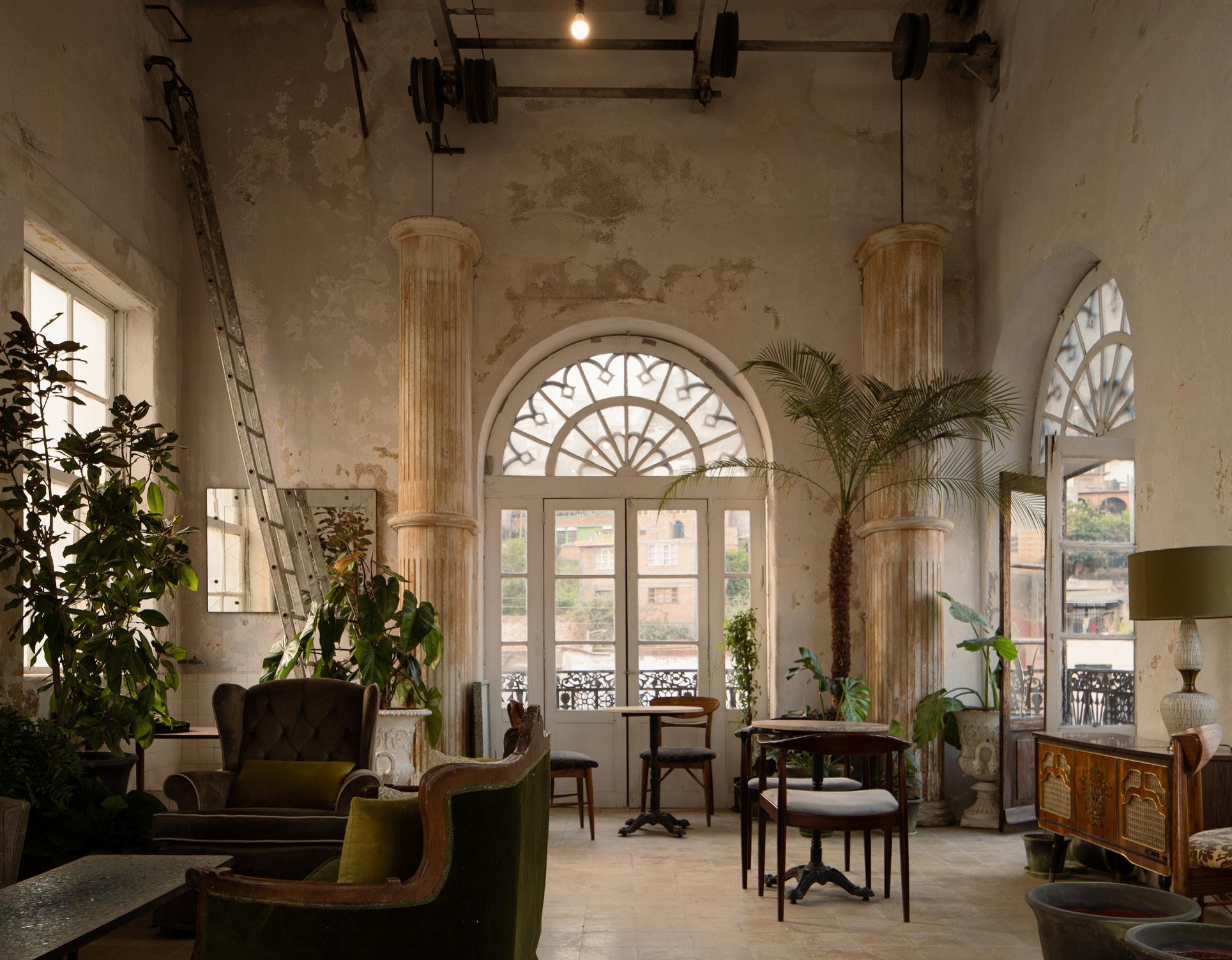
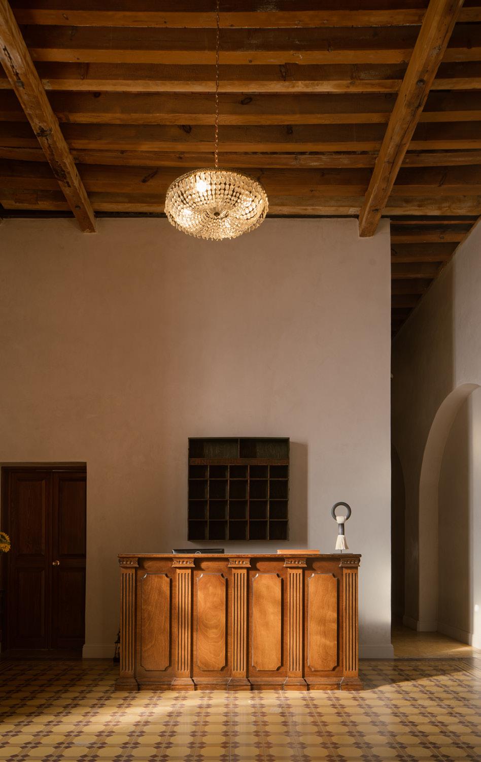
 Casona
CÉSAR BELIO CÉSAR BELIO CÉSAR BELIO 31 Feature September 2023
Social Club
The Buenavista social club is a multipurpose, open-air venue complete with a swimming pool, volleyball court, and ample patio seating. By peeling back sections of an existing industrial sawtooth roof, GOMA created an adaptable greenspace amenity for the Hércules complex.
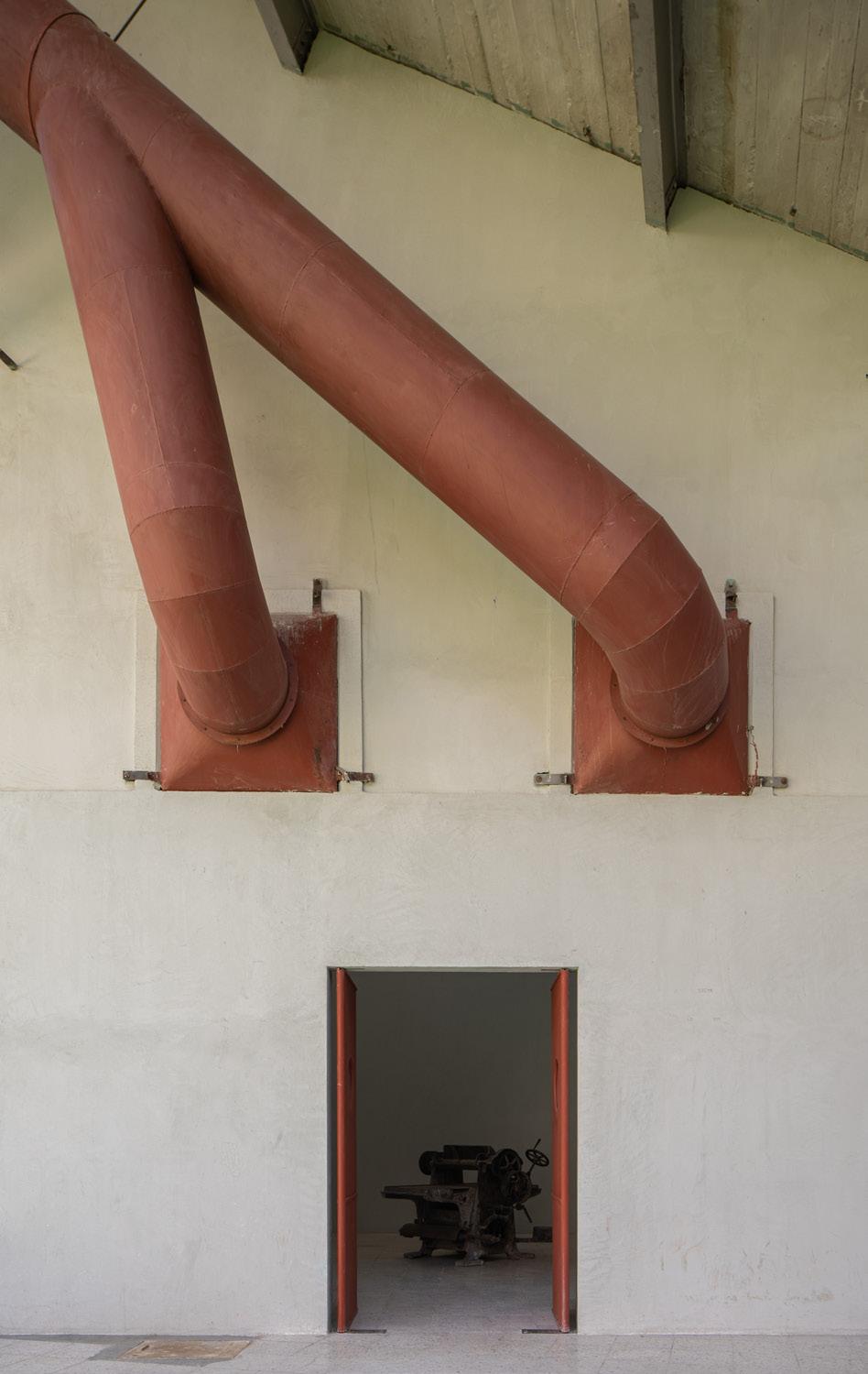

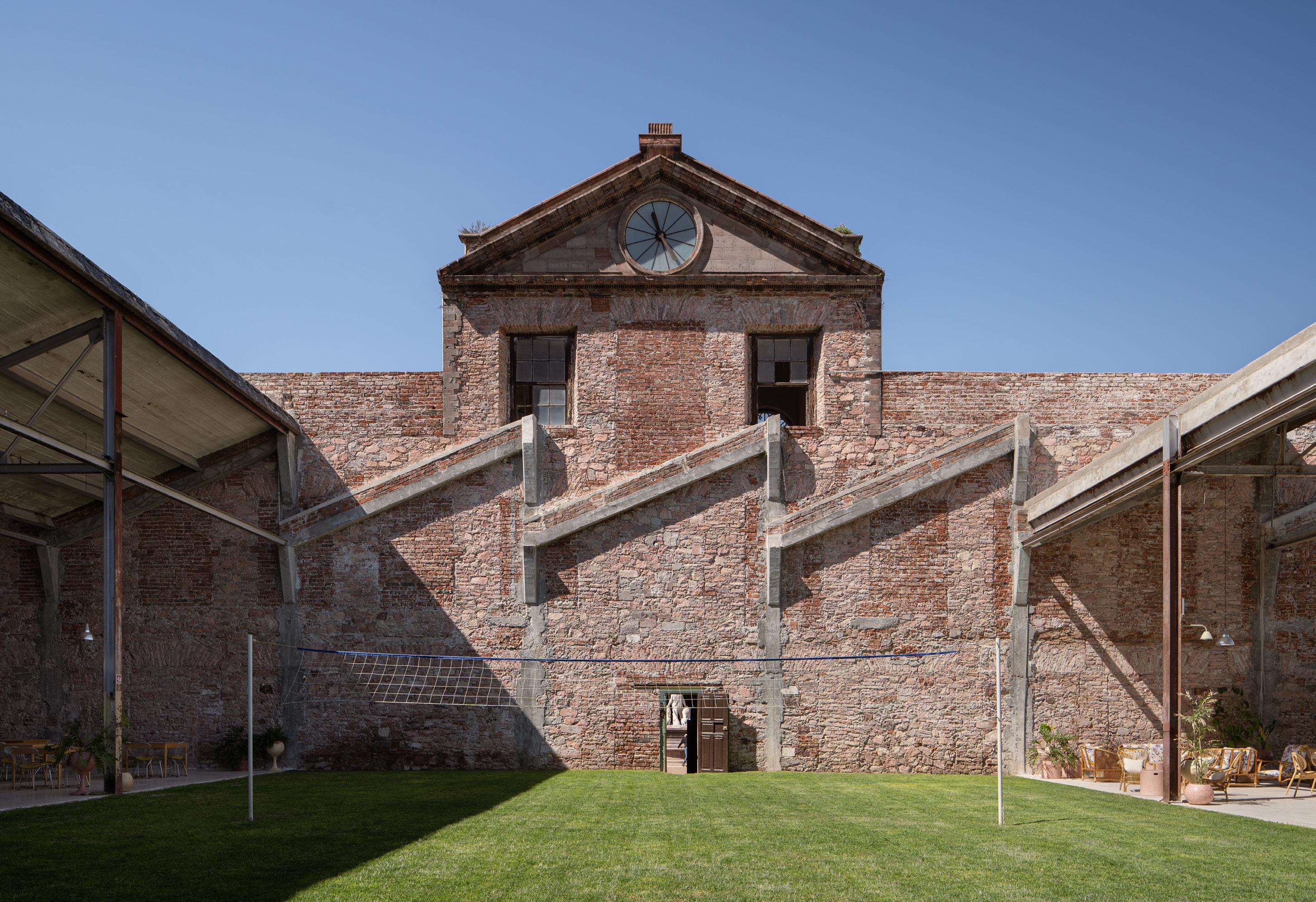
CÉSAR BELIO CÉSAR BELIO CÉSAR BELIO 32 Feature The Architect’s Newspaper
Spa
A light-touch ethos drove the design of the verdant indoor/outdoor spa adjacent to Hotel Hércules. Aside from the sunken hydrotherapy pools and earthen-hued cement bathroom structure, other spa amenities—including massage cabins and a relaxation room, sauna, and vapor chamber—were incorporated into the existing factory shell.
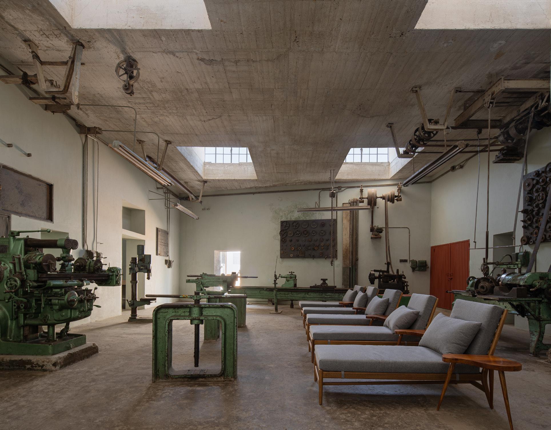
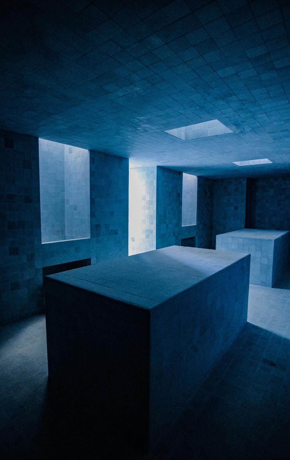
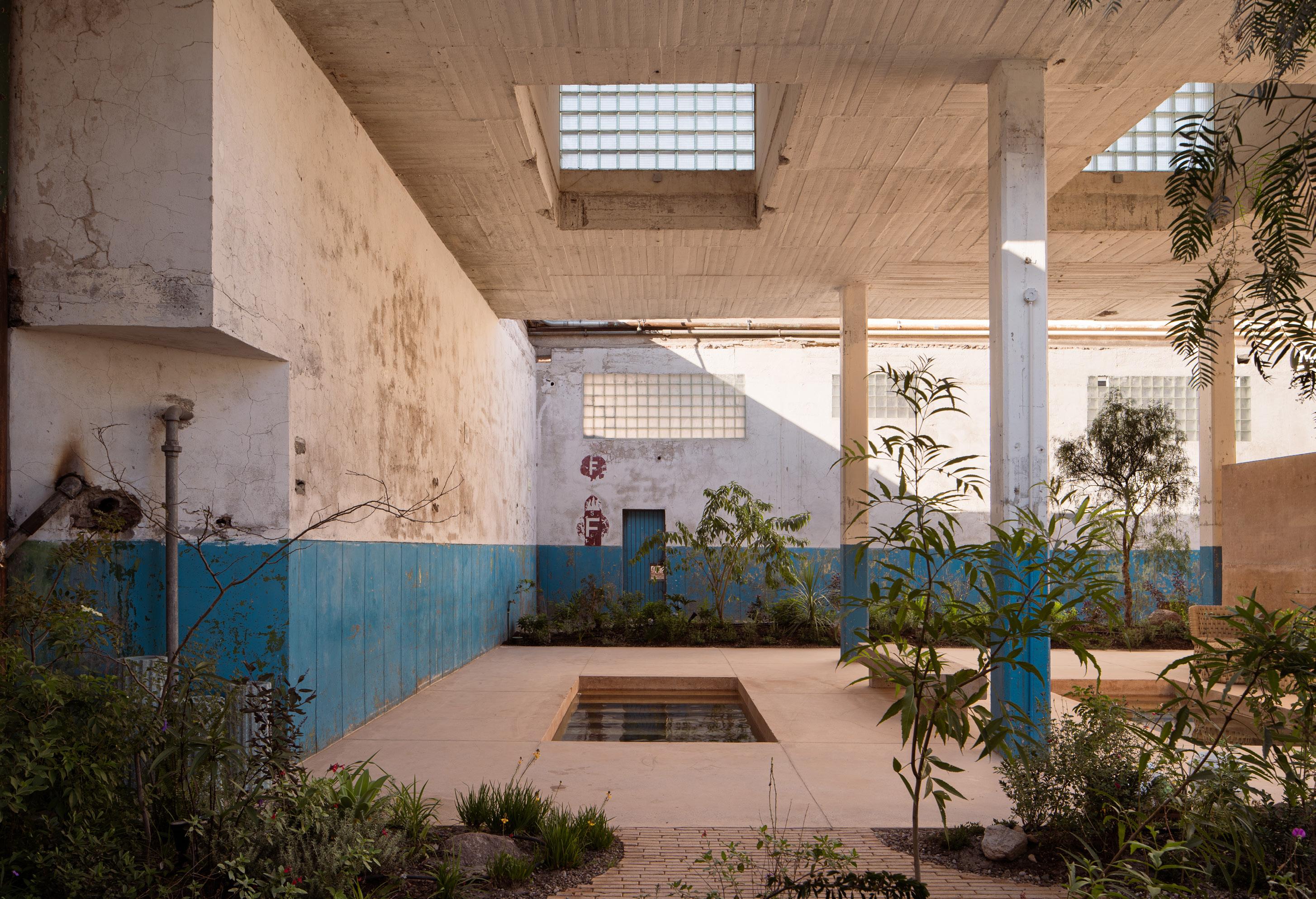
CÉSAR BÉJAR ARTURO OCHOA CÉSAR BÉJAR 33 Feature September 2023
REIMAGINED WITHOUT RESTRAINT
Working on historic buildings often requires compromise. Many state historic preservation offices, landmark committees, and preservation organizations across the country skew conservative, even if they claim to begin with good intentions. The U.S. has seen so much of its historic fabric and natural areas lost to new and overdevelopment, from the much-maligned history of urban renewal schemes in post industrial cities to the suburban sprawl that has led to natural resource fragmentation and degradation. This push and pull, which takes cues from extreme examples like the demolition of Penn Station, often ensnares smallscale, well-intentioned projects in its wake.
The productive work of repurposing existing buildings that springs from this context is often some of the most beautiful, well-considered, and environmentally sensitive design emerging today. That exact push-pull is what Ann Arbor, Michigan–based architects PLY+ found grace
within during the realization of the School at Marygrove, an experimental education project resulting from collaboration between the firm, Detroit Public Schools, and the University of Michigan School of Education. The adaptive reuse project revitalizes the long-abandoned, historic Immaculata building on the 53-acre campus of what was Marygrove College in northwest Detroit into a colorful and experientially ambitious P-20 program. The name might sound familiar: Beyond two renovated buildings, the complex also includes a new-construction Early Childhood Education Center designed by Marlon Blackwell Architects.
For PLY+ principal Jen Maigret, a generative constraint that emerged early in the schematic design phase was the school’s run-of-the-mill corridor. It looked exactly as you would imagine: a long, linoleum-lined hallway lined with metal lockers, animated by the sounds of rebellious slamming, metal bell clanging, and students pushing up against each other in an overcrowded, rushed environment. Maigret and her team originally saw ample opportunity to amend this age-old experience by reconfiguring the entire corridor, introducing sinuous walls sloping at soft angles to create corner nooks for informal gatherings and respite from the throngs at the center. However, when the very stereotypical double-loaded corridor was identified as “historically significant” to the Immaculata building—and therefore untouchable in terms of form—Maigret merely shifted gears.
Focusing less on the architectural form of the corridor and instead on the endless march of lockers, PLY+ reenvisioned the rows as syncopated clusters of “cubbies.” By
losing the metal doors and instead opening the flanks up as recesses for small drawers, exposed coat hangers, and overhead bins, the cubbies not only effectively work as storage, but double as casual seating that naturally clusters small groups of students together in identifiable ways— just like her original goals for a more formally altered corridor. A theme of transparency begins to emerge; it plays well with the firm’s focus on materials and fabrication. The potentials of customized furnishings and novel, place-specific treatments take the project’s adaptive reuse constraints miles further than expected.
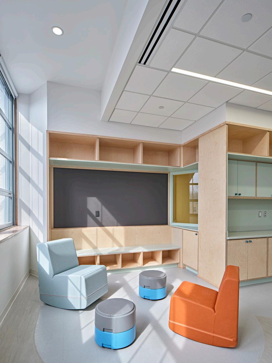
But the historic fabric can also yield unexpected wins. Vintage character and distinct geometries abound in Marygrove’s architecture, notably in what students now call the Media Room, which was formerly a chapel dating from the building’s stint in the 1980s as an all-girls Catholic high school. Located on an upper floor of the building, the room’s arched ceiling and raised pulpit were retained but remixed into an exciting multimedia room for younger students. Filled with flexible, curvilinear custom furnishings by PLY+ painted with pops of pastel color, the space encourages students to learn through interaction and play. Whether exploring technology, from recordings and video equipment, or physically designing their own learning space by moving furniture around like set pieces, children are supported in this space. They can then showcase new ideas or talents by literally putting on a show: The chapel’s old pulpit has transformed into a stage raised just slightly above the main floor, complete with sliding green curtain for theatrical effect.

©JASON KEEN ©JASON KEEN
34 Feature The Architect’s Newspaper
PLY+ transforms a neighborhood landmark into an experimental P20 school in collaboration with the University of Michigan's School of Education.
“The media room differs from the library or reading rooms we have on the lower floors because it’s specifically designed for younger children,” PLY+ founder Craig Borum said. “The media room is focused on the students who can’t yet read at high levels but are ready for alternative or emerging forms of visual media.” The chapel-turned-media room also solves another code-inflected issue with the historic fabric: Fire codes require that young children have their own modes of egress separate from older kids and adults because they are, of course, physically smaller and move slower. “The media room allows us to elevate space for younger students on the upper floors of the school without mixing that means of egress,” Borum explained.
After larger programmatic considerations were agreed upon and codes met, the team invested time in the details, right down to the hardware and colors selected for the experimental school’s fit-out. As part of PLY+’s commitment to wellness and sustainability, all the custom furnishings and selected finishes were natural. Plywood was used extensively for playful, curvilinear furnishings and a preference for hardwood flooring and tiles trumped the use of midcentury linoleum. Light fixtures were also chosen throughout to complement, rather than overwhelm or replace, natural light in all classroom spaces. Previously, the historic building had the classic midcentury treatment of dropped ceilings. What PLY+ found hidden above them were nearly full-height windows. Maximizing natural lighting also meant adding to the project’s beauty so that the added plus of energy efficiency feels inevitable, a happy coincidence that is the result of optimizing embedded design knowledge rather than an “engineered” solution.
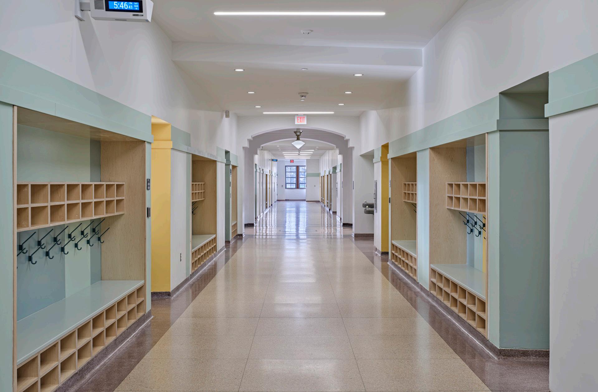
Overall, the partnership between PLY+, the University of Michigan, and the Fitzgerald neighborhood is one that fits the profile of Detroit’s recent successes: After decades of decline, the city is already showing itself to be a model of community-led revitalization that works from the ground up. The Immaculata building has stood on its corner for over a century and has become a “neighborhood anchor,” to quote a local news channel’s coverage of the project. Neighbors are invested in not only preserving this architectural landmark but in ensuring its new use is by and for them—meaning, local residents—and not a ploy for outside investors or a tool of gentrification.
“It’s amazing to see this story of revitalization play out in a city and community with the history and energy of Detroit,” Maigret said. Despite well-intentioned hurdles, the design beautifully mixes old and new. While the more adventurous, formal design concepts first developed by Maigret and Borum were turned down by the landmarks commission, the success of the Marygrove project may begin to rebuild the trust between preservation and development. There is much interest among younger generations in cultural heritage, but not at the expense of experimental design ideas: Historic fabric can and should be seen as a fertile ground for conceptual play, especially as questions of carbon sequestration take center stage in debates over development. PLY+’s beautiful drawings—completed even for aspects of the project that went unrealized, like the gently lilting corridor intervention—are a lively example of architects showcasing their capacity for imagination, whether or not the construction drawings get signed. EC
Facing page, above: The media room reimagines the old chapel
Facing page, below: PLY+ designed built-in storage and flexible furniture

Top: Splashes of color add identity and life to classrooms
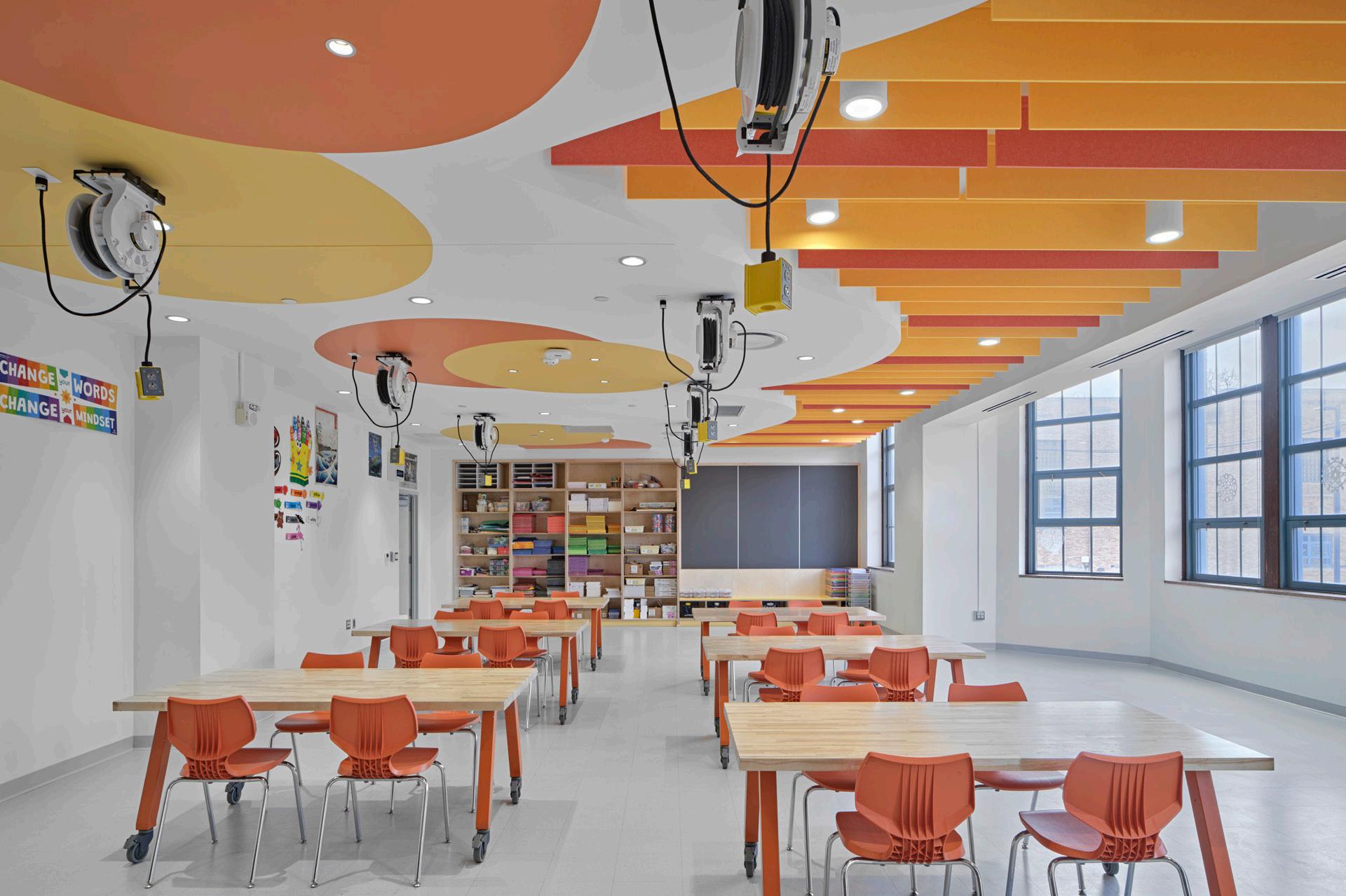
Center: The reimagined, historic corridor
corridor
Above: Original
plan
©JASON KEEN
35 Feature September 2023
©JASON
KEEN COURTESY PLY+
DANCE FACTORY
LOHA transforms a historic orange-packing house into a diaphanous arts center at Chapman University.
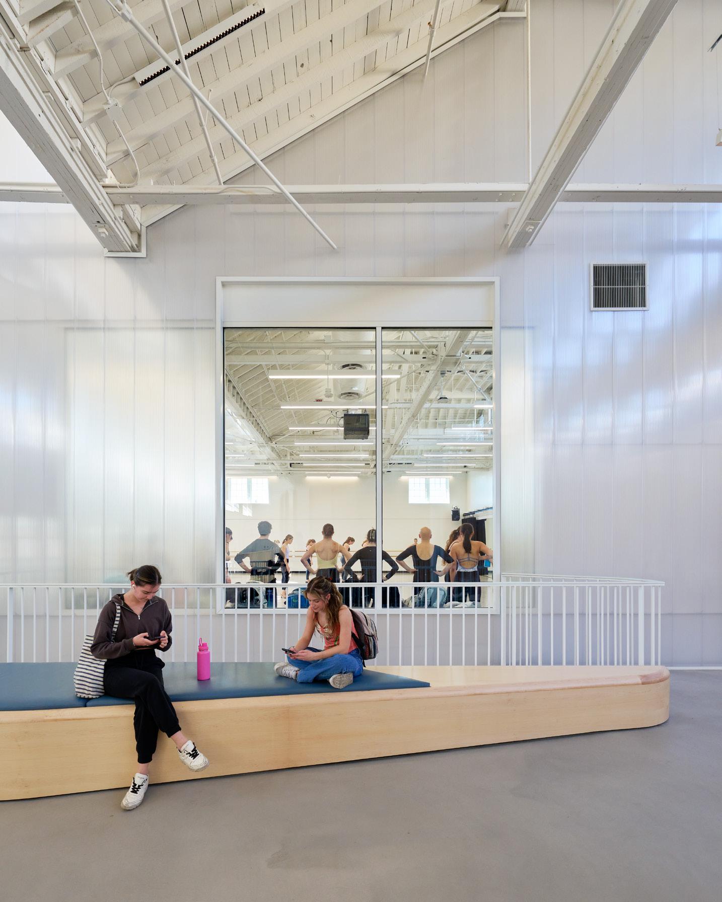
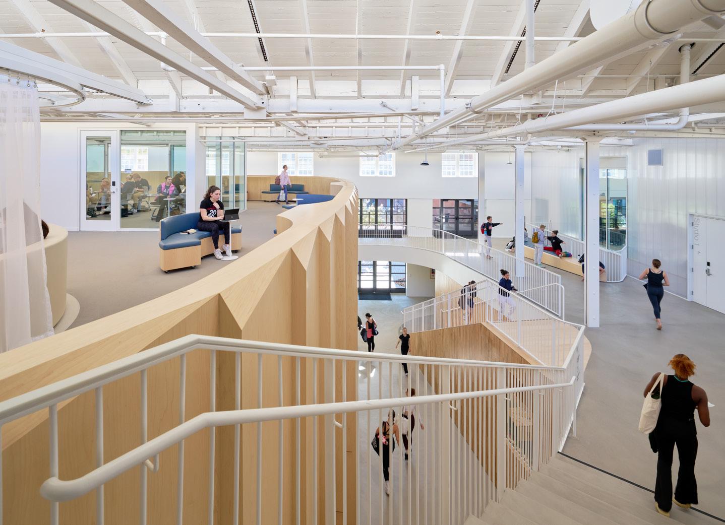
“Dancers drive themselves constantly,” the American modern dancer and choreographer Murray Lewis once explained, “producing a glow that lights not only themselves but audience after audience.” As Murray and other figures in the dance world have testified, “lightness” is one of the essential ingredients of dance: Countless hours of heavy-footed missteps are smoothed out to become so light as to defy gravity.
It is this same sense of lightness—both as a physical and metaphorical quality—that guided Lorcan O’Herlihy when his firm, Lorcan O’Herlihy Architect (LOHA), was commissioned by Chapman University to transform a 100-year-old orange packing house in Orange, California, into the Sandi Simon Center for Dance. Part of a larger campus plan to be unveiled in the coming years, the dance center defines the university’s K/Dance Courtyard, tying together the newest student residence hall with the Department of Dance and encouraging social engagement to spill outside.
To achieve a lightness equal to that of its users, LOHA drew inspiration from the historic structure itself. “We were given a factory with an expansive sawtooth roof originally designed to shine light on oranges during all stages of the packing process,” said O’Herlihy. “We saw that we could provide a space for a new program that was all about fluidity, movement and energy if we brought light all the
way down to the lowest spaces by cutting a large hole in the original floor.” Nearly all 72,000 square feet of the threestory building are naturally lit from above, thus allowing everything, from performance spaces and studios to classrooms, to maintain a constant brightness.
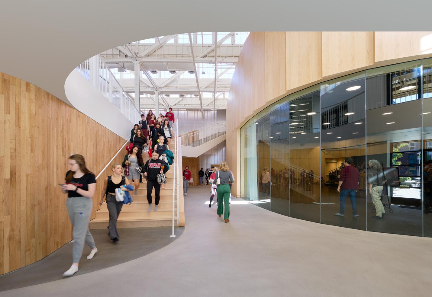
In an effort to repair the historic elements of the space without cluttering the interior with excess supports, a number of structural gymnastics were undertaken with the assistance of engineering firm Structural Focus: New steeltube struts and tensile rods were added to the roof, and steel reinforcements were added to columns to compensate for openings cut into the floor.
The spaces in between the main rooms encourage students to relax and socialize—an opportunity notably missing from the department’s original facilities. “Professional-level dancing requires cooling off every now and then,” O’Herlihy explained, “so we found an opportunity for stress relief by exchanging hallways with open-air expanses large enough to accommodate open-ended furniture.”
Even the materials used throughout convey lightness in every way one might imagine the term. A polycarbonate wall dividing studios from the main atrium is punctuated by large panes of glass that frame performances taking place within. The nearly invisible barrier,
almost screenlike, is obstructed only by crisp, white railings and narrow steel columns that gracefully add to the composition. Complementing this transparency, LOHA also selected maple wood to curve around the main performance studio at the center of the new space. A stepped pattern within the grain is a subtle nod to the sawtooth geometry overhead. Wood is also used in other places to warm the space, with sustainability always front of mind: For example, the original wood flooring was repurposed as cladding for the interior walls on the ground floor.
Running a firm best known for its residential design, O’Herlihy jumped at the opportunity to design a space that could uplift the next generation of dancers. “Cultural projects were my first calling when I first arrived in California from Ireland to pursue architecture,” he said. “This project was close to my heart, as it’s the type that allows me to find my true self as a creative practitioner.” As LOHA embarks next on several cultural projects from its recently opened second office, in Detroit—most notably including Sunflower, a 20,000-square-foot art center in the Old Redford neighborhood—the Sandi Simon Center for Dance serves as a precedent for matching form with function, a space for practicing the lightness of dance seemingly bereft of shadows. SR-R
Above: Internal circulation cuts through various levels of the building's program.
Right, above: Spaces to pause and rest are intentionally included throughout.
Right. below: Strategic skylights bring the sun into even the center of the space.
ERIC STAUDENMAIER
ERIC STAUDENMAIER
36 Feature The Architect’s Newspaper
ERIC STAUDENMAIER
Memorial Drive in Cambridge, Massachusetts, is peppered with modern buildings made by 20th century icons. MIT owns two of the finest examples of campus architecture ever built on the Charles Rivers promenade: Baker House by Alvar Aalto, built in 1949, and I. M. Pei’s Visual Arts Center, from 1962. Three years after Pei’s tower was built, Josep Lluís Sert completed Peabody Terrace, a housing complex for Harvard students. Sert injected hulking concrete masses into the quiet brick town on the Charles River, though their construction was met with mixed reviews. Sert said he wanted to “bring the color and life of the Mediterranean” to Cambridge, but critics say this dream went unrealized. After its opening, one writer with The Boston Globe lamented, “There was not much color in his tall gray slabs.”
Aalto, Pei, Sert: These are tough acts to follow. Nevertheless, the Boston firm Bruner/Cott didn’t shy away from the opportunity to make a bold architectural statement in its latest refurbishment project at Rivermark Towers, a Brutalist residential complex by Steffian Bradley Architects from the 1970s, located near major architectural landmarks by the modern masters.
Formerly known as 808 Memorial Drive, Rivermark Towers offer 300 apartments split between two buildings: A 19story tower housing 211 apartments sits next to a stepped, 10-story building with 89 units. In 1997, three years after rent control in Massachusetts was abolished, the 501(c)3 nonprofit Homeowners Rehab Inc. (HRI) purchased Rivermark Towers to provide affordable housing for low-income renters. Twenty-five years later, Bruner/Cott and NEI General Contracting were brought on by the Cambridge Housing Authority and HRI to refurbish them: Their rehab of the 490,000-square-foot “urban village” was completed in 2022.
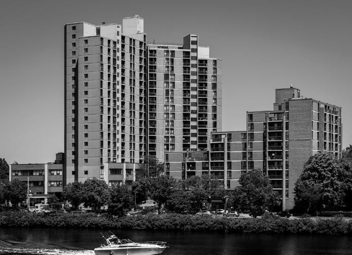
The Bruner/Cott reno at Rivermark arguably realizes Sert’s dream of adding splashes of warm color to the Cambridge skyline. While it delivers much-needed improvements to roofing, insulation, and ADA accessibility upgrades, the most visible new feature at Rivermark Towers is the colorful panels specified by the architects for their energy saving qualities. “The original facade material was textured concrete, which became really quite dirty over time,” Lawrence Cheng, a principal at Bruner/Cott, told AN. “When the client rebranded the building from 808 Memorial Drive to Rivermark Towers, we chose to reclad the buildings in panels with colors that match Cambridge’s many brick buildings.”
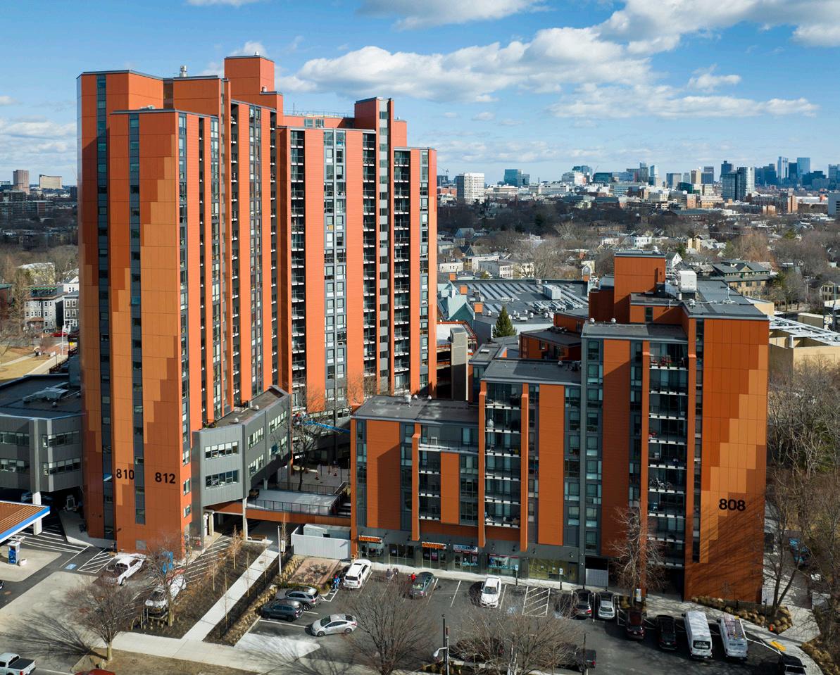

Both Cheng and Jason Jewhurst, a fellow principal at Bruner/Cott, note that they found inspiration in Lacaton & Vassal’s work in France on midcentury social housing. The Pritzker Prize–winning studio is recognized for its pioneering work on retrofits, adding new skins to building exteriors that extend the footprint of apartments or add coveted outdoor space without the hefty price tag of ground-up construction. Its work allows older buildings to find new life, a design approach shared by Bruner/Cott in Cambridge.
“There are so many buildings like Rivermark throughout the U.S.,” Jewhurst told AN. “They either fall into degradation or result in teardowns. This was a really interesting project for us to think about how we can transform a midcentury modern building into a highly sustainable housing complex and how we can encourage the community, which has been there for four generations, to stay there.”
Today, Rivermark Towers provides an addition to Bruner/ Cott’s already impressive portfolio. Since 1973, Bruner/Cott has built an impressive track record of refurbishing midcentury classics: The firm was actually tapped to renovate Sert’s Peabody Terrace as well his Law School building at Boston University. It also successfully refurbished the Smith Campus Center (formerly Holyoke Center), another prominent Sert building on Harvard’s campus. “The difference between Rivermark Towers and our work on Sert’s buildings is that Rivermark isn’t landmarked,” Cheng said. “This is the first time we actually put a new skin on an existing building.”
Looking ahead, Jewhurst sees real potential in applying the lessons learned from Rivermark Towers to similar midcentury buildings in disrepair across the country. “Rivermark was an interesting challenge in the way we think about deep energy retrofits with overcladding,” he said. “The colorful cladding totally changes the experience of the courtyard. When the sun comes up and light touches the exterior, the feeling is remarkable. The cold concrete just didn’t have that same effect,” he continued. “To see people using and enjoying the outdoor space as the original architects intended is really rewarding.” DJR
IN GOOD COMPANY
At Rivermark Towers, Bruner/Cott doesn’t shy away from adding color to Cambridge’s historic, Brutalist shoreline.
Top: View from across the Charles River of the newly reclad Rivermark Towers.
Above: The original 1970s tower design before Bruner/Cott's cladding adaptation.
Left: The Rivermark combines distinct towers clustered around a central courtyard.
RICK MANDELKORN
BRUNER/COTT
37 Feature September 2023
RICK MANDELKORN
Sustainable and soothing by nature



Sustainable materials, acoustical performance, and biophilic design – now you can have it all when you mix and match design and IEQ benefits from the largest ceilings portfolio in the industry. Start with products that are part of our Sustain® and Total Acoustics® portfolios. Then layer on a linear wood-look visual for a comforting touch of nature. Bring the outside in with a complementary combination that’s a natural fit for your space at armstrongceilings.com/sustain

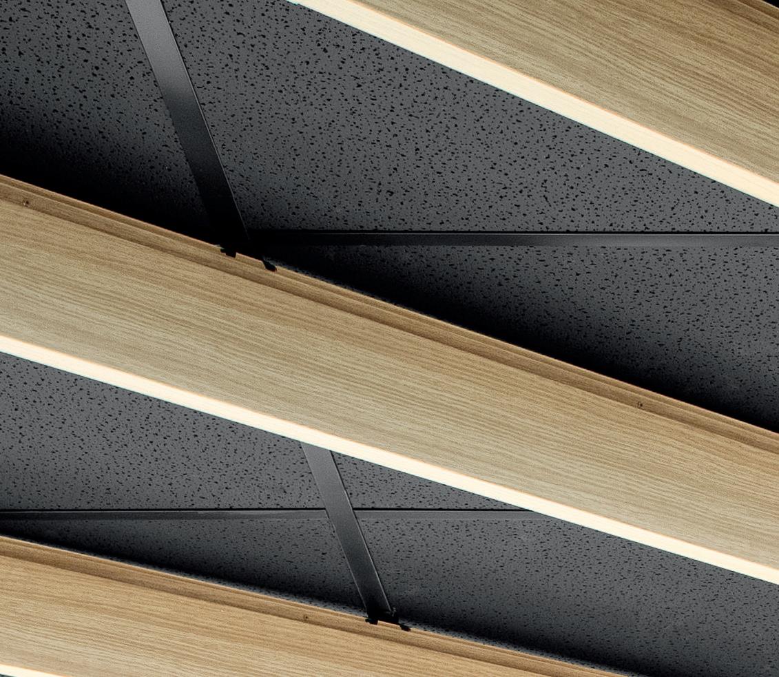




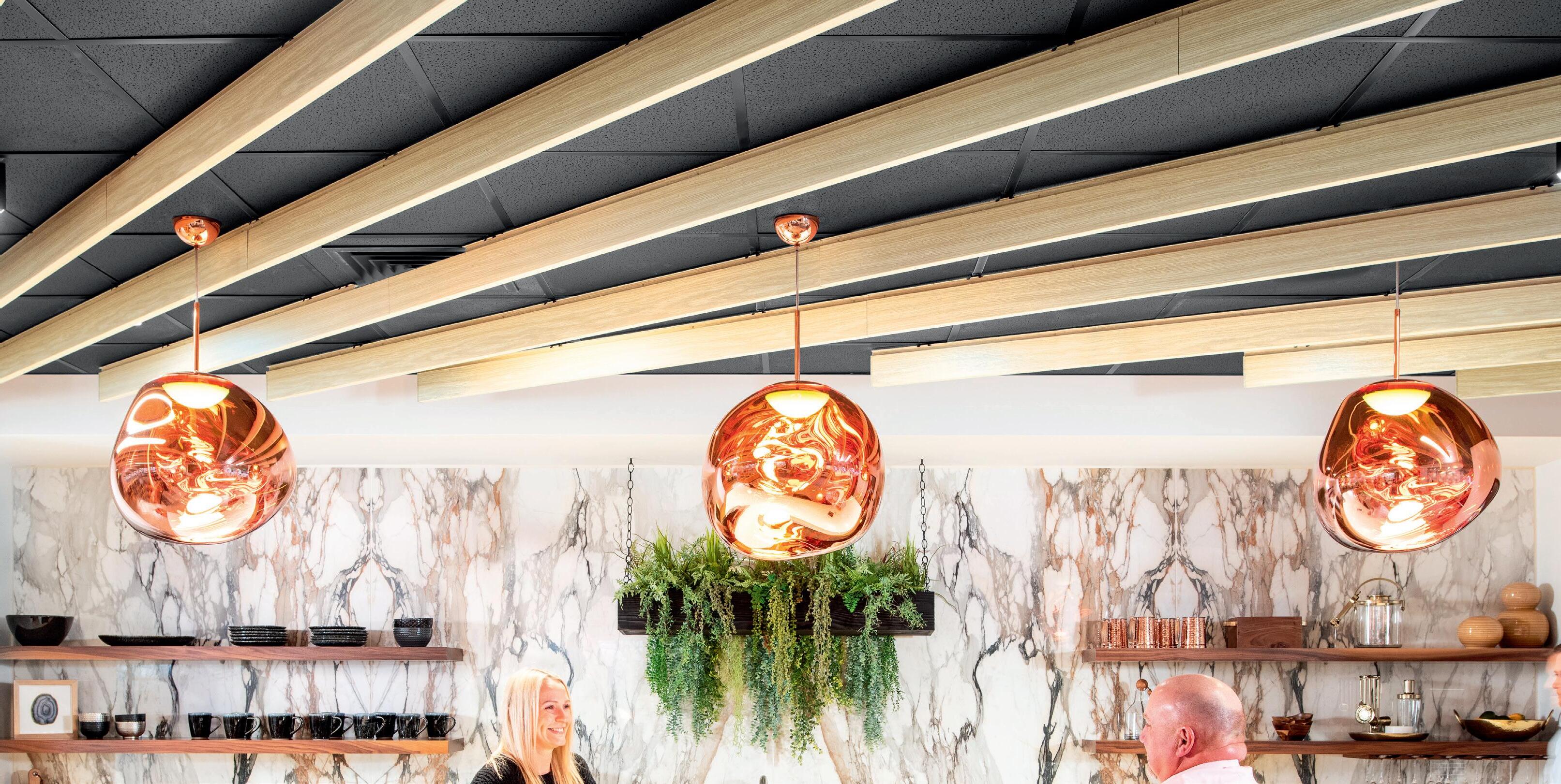 MetalWorks Blades – Classics & Fine Fissured Panels > Red Thread, East Hartford, CT > QA+M Architecture, Farmington, CT

42 Case Study: Decarbonizing Cement 44 Textiles & Acoustics 46 Envelopes (Insulation & Cladding) 48 Q&A: Unpacking LCAs 52 Interior & Exterior Wood 54 Case Study: Parson’s Material Lab 56 Review: How to Build a Low-Carbon Home 59 Resources COURTESY HEMPITECTURE
September 2023
Sustainability
September
2023
The Climate Crisis

Environmental thinking is already history. What can architects do to help?
Depending on your point of view, sustainability was either born yesterday or is the oldest trick in the book. The subject is either endlessly fascinating or the site of cringeworthy greenwashing efforts.
The reality is that even by conservative measures, the environmental movement is at least 50 years old, if you count the United Nations Conference on the Human Environment, held in June 1972 in Stockholm, as an origin point. (By then some scientists had known about the potential for human activity to change our climate for over 60 years, though the term global warming wouldn’t be used until a 1975 paper in Science.) Which means: By building standards, the climate crisis is now old enough to be eligible for historic preservation.
Today, we know all too well that construction and the built environment has been a major contributor to carbon emissions, so the many ways that architects can work to reduce future outflows of greenhouse gases into the atmosphere— from small-scale changes in specification and assemblies to advocating for policy that makes a big difference—are valuable. Given this summer’s extreme heat and environmental weirdness—we’ve seen wildfires in Canada and on Maui and the combination tropical storm/earthquake in Los Angeles—the urgency for this work only increases every year.
Building regulations and conventions lag behind the science. Early awareness about architecture’s role in creating sustainable buildings proliferated in the 1960s, but it took until 1993 for LEED certification to be established. Thirty years later, it remains a widely known standard. Still, building codes vary from city to
city, and some municipalities need to catch up to the latest versions of the International Building Code, to say nothing of loosening their zoning strictures. There are many factors that contribute to the carbon footprint of a building; architects should advocate to minimize the items they have control over. Sometimes this manifests in the form of refusal, by delivering buildings with fewer bits and bobs that will break or—to invoke Mies—by simply doing less. Some advocate for an even stricter paradigm under the rallying cry “No new buildings.”
AN takes a material-forward approach to sustainability in this Focus section. Jonathan Hilburg examines a range of companies seeking to decarbonize cement production, including Prometheus, which uses cyanobacteria to produce bio-cement. An interview with William Beer, a decarbonization consultant, establishes major pitfalls for architects when they look to specify low-carbon materials. Alison Mears and Jonsara Ruth of The Healthy Materials Lab at the Parsons School of Design share their work through five vignettes. And Ellen Peirson reviews How to Build a Low-Carbon Home, an exhibit currently on view at the Design Museum in London that explores how our homes could respond to the climate emergency. Beyond these stories, a wealth of products illustrated by Contributing Products Editor Rita Catinella Orrell showcase forward-thinking offerings across four categories.
AHMER KALAM VIA UNSPLASH
It’s a lot to take in, as so many conventions of contemporary architecture must change. AN ’s Focus section offers a clutch of pages that show how this effort is already in progress. JM 40
and take your next project from render to reality
SOLAR READY ROOFING



Standing seam metal roofs are the best choice for crystalline PV and thin film solar panels because, unlike other materials, metal offers the longest service life. When installing a crystalline system that typically is warranted for 25 years of power generation, a building owner is going to benefit from a roofing substrate that has a greater life expectancy than that of the solar panels. Standing-seam panels also provide a natural platform for attaching crystalline systems without any roof penetrations. Additionally, highly reflective cool roofs and above sheathing ventilation (ASV) help keep rooftop temperatures cool, resulting in better performance from solar panels.

Cincinnati Zoo | Cincinnati, OH Roof Panels: 1” Field-Lok: Dove Grey (incorporated PV Solar Array)
INNOVATE
VISION
YOUR
ATAS International, Inc. Allentown, PA | Mesa, AZ | University Park, IL 610.395.8445 | www.atas.com 1963 • 2023 SCAN FOR MORE INFORMATION ON SOLAR READY ROOFING!
Design Better
“As an architect, you don’t want to compromise your design in order to get what you want. You want to have a product that can meet what you need it to do. And we’ve found that Western Window Systems works very well for us.” James M. Evans, Collaborative Designworks

WesternWindowSystems.com

42 Case Study

Outgrowing Portland Cement production has an emissions problem. Here’s how companies are addressing it. COURTESY PROMETHEUS September 2023
July 2023 was the hottest month ever recorded. Scorching heat, droughts, a disruption of the polar jet stream, and record-high ocean surface temperatures offer just a taste of how climate change is affecting the planet. Yet while the architecture industry is making strides toward shrinking its footprint—firms are doing everything from designing tall timber towers to actively declining commissions for projects like airports— the world is in the midst of a building boom.
That’s a problem if countries want to avoid the worst impacts of climate change, as the 4 billion tons of cement produced every year accounts for 8 percent of total CO2 emissions. That’s over three times as much as the aviation industry produces (2.5 percent) and right behind the U.S. and China, the world leaders in terms of total CO2 produced by entire nations.
Portland cement—the most common type—is
For companies like cement producer Holcim, which joined the Better Climate Challenge in April 2023, that involves a two-step emissionsreduction process. The first is adapting the company’s 13 U.S. cement plants to run entirely on sustainable power by 2030; the second is reducing total greenhouse gas emissions to zero by 2050. Holcim is the first cement manufacturer to partner with the DOE (the other partners are cities, like Philadelphia, and consumerfacing companies, like Kohl’s and 3M).
Holcim has developed a new type of cement that it hopes will lead the sustainability charge. The company reports that producing its ECOPlanet cement creates 30 percent less emissions, even though the result is a material just as strong as Portland cement. It’s able to achieve those reductions by introducing slag and other cement production waste
and coral are built with) in bioreactors using LED lighting that mimics natural daylight. Ambient air from the room is pumped into a tank containing the algae; this supplies the CO2. The algae are then harvested and transferred to a second tank that stimulates calcium carbonate production. This process is complete when all the algae sink to the bottom of the tank, where they’re then collected, dehydrated, and mixed with other natural binding agents. The result is a bio-cement; it’s then ready to be mixed with aggregates to create concrete. When asked whether Prometheus was also seeking to replace the aggregates, Burnett said the company is actively “looking into sustainable replacements for traditional concrete aggregates, including crushed glass, mirror, and shredded rubber” salvaged from construction sites for a true cradle-to-cradle material.
In July 2022, Prometheus Materials closed its Series A funding round, led by European venture capital firm Sofinnova Partners, with $8 million. Funders included industry luminaries like the Microsoft Climate Innovation Fund, SOM, roofing giant GAF, and the Autodesk Foundation. According to Burnett, as Microsoft ramps up construction of data centers around the world, the company wants to use Prometheus’s bio-composite cement to help hit its sustainability targets. The company has also added PAU founder Vishaan Chakrabarti to its board of directors: Burnett said he watched a video on the environmental costs associated with concrete production that featured Chakrabarti and was so inspired that Chakrabarti was subsequently offered the role.
The material, according to Prometheus, outperforms traditional concrete in flex-roll strength by up to four times. It’s 90 percent less thermally conductive, and Prometheus even boasts that its bio-composite concrete is up to 12 times better at absorbing sound, opening up a broad range of applications. Thus far, the bio-composite has received American Society for Testing and Materials C90 (load-bearing concrete masonry units) and C129 (non-load-bearing CMU) certifications. Accordingly, the Series A funding is being used
to develop a line of CMU blocks, permeable pavers, acoustic panels and tiles, and potentially even thermal panels as Prometheus puts out its first “go-to-market” products to establish a foothold in the space.
Prometheus Materials is currently in its Series B funding round, which it expects to close before the end of the year. Then, in the first half of next year, the company plans to use that funding to build out a new precast production facility so it can begin selling products at scale. Rather than attempting to compete with traditional cement and concrete manufacturers, the company wants to license its technology to other companies worldwide and then ship cement mix produced at the factory to licensees as a drop-in product replacement in their own lineups.
The MIT Media Lab is also investigating a similar material, a bacterial bio-cement grown through a similar process around aggregate. This research takes things one step further than Prometheus’s work, prefiguring a world where bacteria has formed a living, embedded web in bricks that can relay pollution measurements or structural health by changing color. While this technology is much more in the realm of theoretical, it’s not hard to imagine a future where even concrete buildings can be built as embodied carbon sinks and relay information without deep technical analysis.
Jonathan Hilburg is an electronics editor at Reviewed who focuses on gaming. Previously, he was The Architect’s Newspaper’s web editor. He lives in Manhattan and is keenly interested in the intersection of art, architecture, and context.
Facing page: Equipment for growing algae in the Prometheus lab.
Below: Finished cement blocks, made with the lab-grown algae.

the binder that, when combined with particulate like sand and gravel, forms concrete. Limestone and silicate clays like feldspar, slag, and shale are sintered together in a kiln to form clinker (small balls of aggregate), which is then ground down further. The majority of emissions from cement production come from this stage, and a reduction of 4 percent in annual emissions yearover-year is required to hit net-zero emissions, according to the International Energy Agency. But in 2022, we didn’t just miss this mark: We increased these CO2 emissions by 1 percent.
With the passage of the Inflation Reduction Act in 2022, $350 million was allocated to the EPA for technical grants, product labeling, and sourcing tools to help manufacturers produce building materials with less embodied carbon and to bring awareness to consumers about these emissions-intensive materials that, ironically, make up most of our built environment. That money will also go toward increasing transparency about the embodied carbon of building materials throughout their life cycle.
The U.S. Department of Energy’s (DOE) Better Climate Challenge is another avenue aimed at helping manufacturers decarbonize. The department offers grants and technical assistance to help partnered companies reduce greenhouse gas emissions by at least 50 percent within 10 years of signing on.
products into its mix. Taking things one step further, Holcim’s ECOPact concrete, which uses ECOPlanet cement and recycled aggregate made from cast-off building material, is already widely available. At the Robert A. M. Stern Architects–designed ELEVEN, a 41-story, 550-foot-tall condo tower in Minneapolis, more than 9,000 cubic yards of EPOPact were used, and Holcim estimates that the switch reduced emissions in the production by 32 percent compared with a typical concrete mix.
There are also companies and research initiatives taking a slightly different approach to decarbonization. Some are looking to grow cement from biological sources and skip the mining, refining, and grinding altogether. The Colorado-based start-up Prometheus Materials began at the University of Colorado Boulder in response to a 2016 building materials grant from the U.S. Department of Defense to use “living materials.” These materials were to be easily grown and able to bind with local, in-situ aggregates, with the goal of protecting high-value assets. Although the brief was more focused on material durability, Prometheus CEO Loren Burnett said the resultant cement replacement also happened to produce zero emissions.
Prometheus is growing cyanobacteria (algae that photosynthesize carbon dioxide into calcium carbonate, the same mechanism shells
43
COURTESY PROMETHEUS September 2023
“There are also companies and research initiatives taking a slightly different approach to decarbonization. Some are looking to grow cement from biological sources and skip the mining, refining and grinding altogether.”
44 Products
Textiles & Acoustics
These new textiles and acoustic surfaces prioritize sustainability. Many products meet or exceed the criteria required to help projects earn LEED, GreenGuard Gold, WELL, and other certifications.
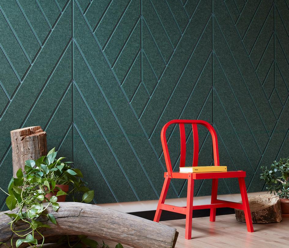


 Rita Catinella Orrell
FeltWorks Blades VarAffix Panels Armstrong armstrongceilings.com
RE/8 Bio-Circular Architectural Mesh Kaynemaile kaynemaile.com
Pindrop Rigid Acoustic Solutions Momentum Tiles momentumtextilesandwalls.com
Silicone Symphony Textiles Designtex designtex.com
Nova Textile Keilhauer keilhauer.com
Soltis Loop Sunmate Serge Ferrari Group sergeferrari.com
ARCHISONIC Cotton Acoustic Absorber Impact Acoustic impactacoustic.com
Dash Tile Kirei kireiusa.com
ALL IMAGES COURTESY THE RESPECTIVE MANUFACTURERS
Wall Scapes Acoustic Collection Turf Design turf.design/products
September 2023
All our products come with a lifetime anti-rust warranty, 15-year adhesion warranty on powder-coated surfaces, 15 year anti-rot warranty on standard wood, and spare parts are always available. This means everything will be looking fresh for years to come.
vestre.com
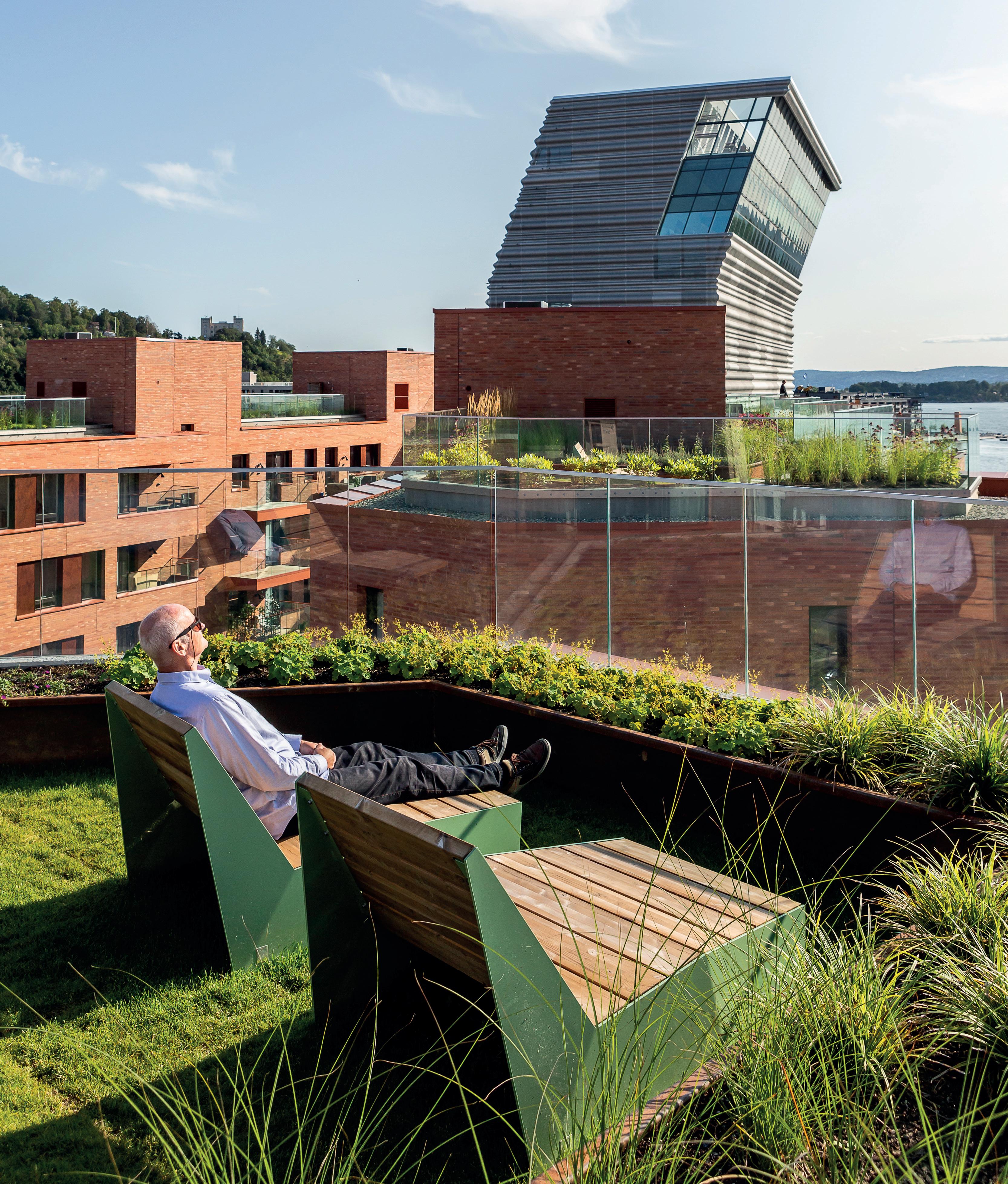 Bloc Designers Lars Tornøe & Atle Tveit
46 Products
Envelopes (Insulation & Cladding)
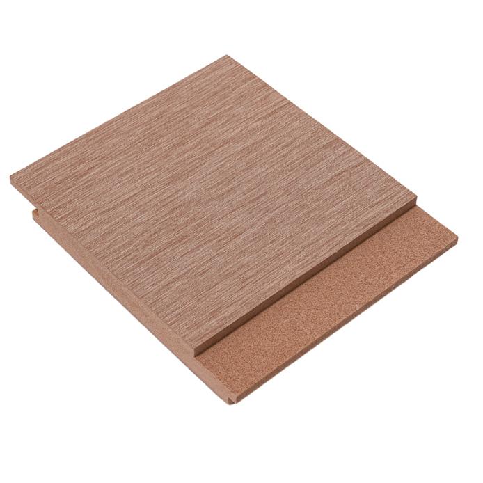
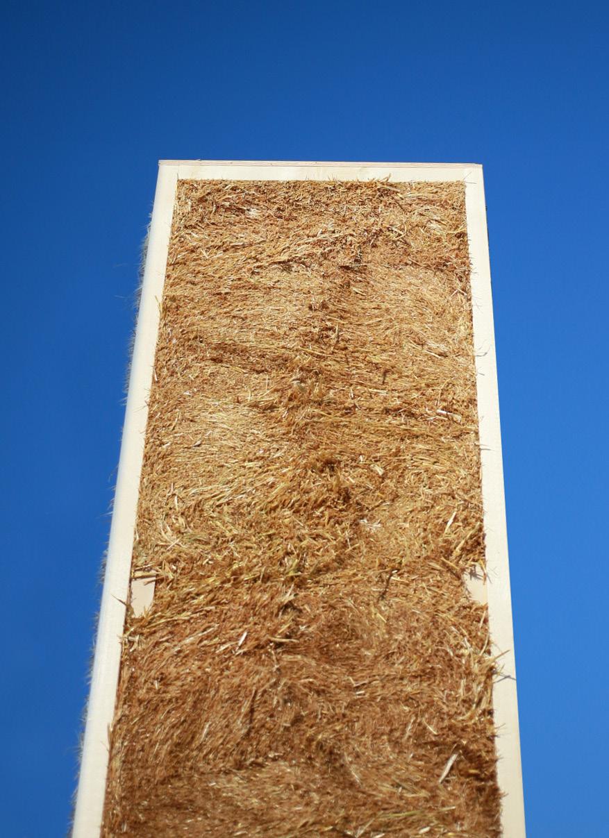
Our roundup of the latest sustainable insulation and cladding products includes innovative products like power-generating roof shingles, carbon-sequestering building panels, upcycled rice hull siding, and hemp-wool insulation, to name just a few. All prioritize natural and recycled materials in their fabrication. RCO


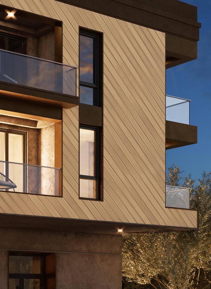
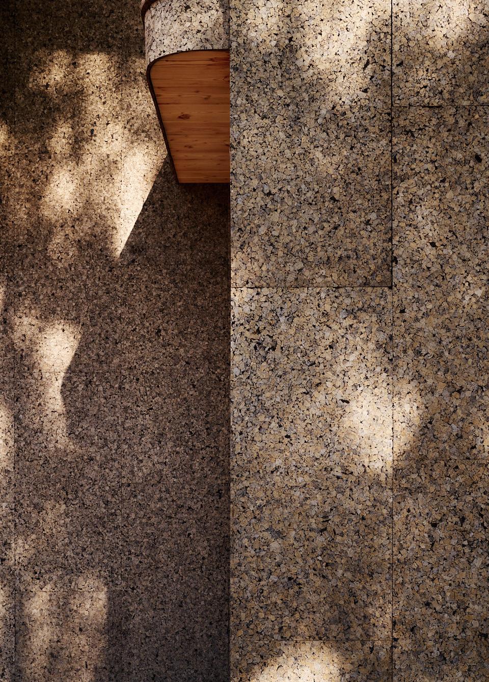

ALL IMAGES COURTESY THE RESPECTIVE MANUFACTURERS
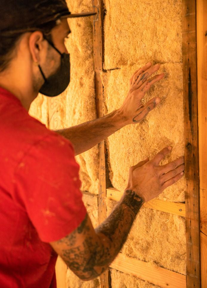 Carbon-Sequestering Building Panels Croft croft.haus
Hempwool Hempitecture hempitecture.com
The Solstice Shingle System CertainTeed certainteed.com
Natural Cork Insulation ThermaCork thermacork.com
Acre Shiplap Siding Modern Mill modern-mill.com Wildwood Composite Cladding Fiberon Composite Cladding fiberoncladding.com
Comfortbatt ROCKWOOL rockwool.com
TimberFill TimberHP timberhp.com
September 2023
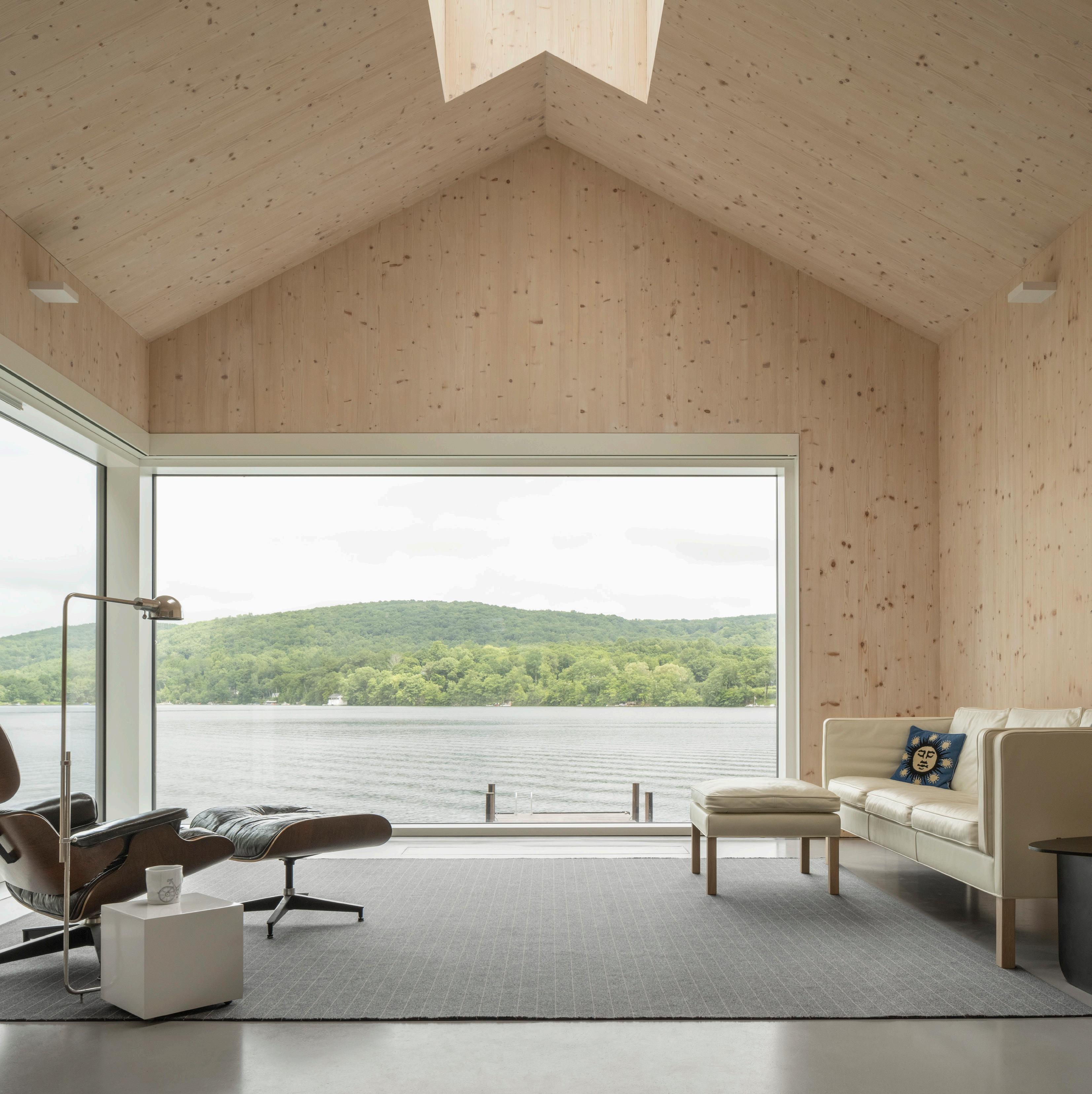
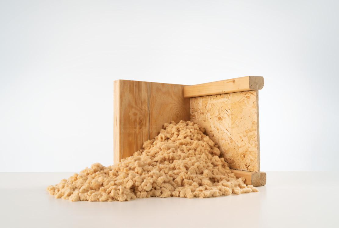
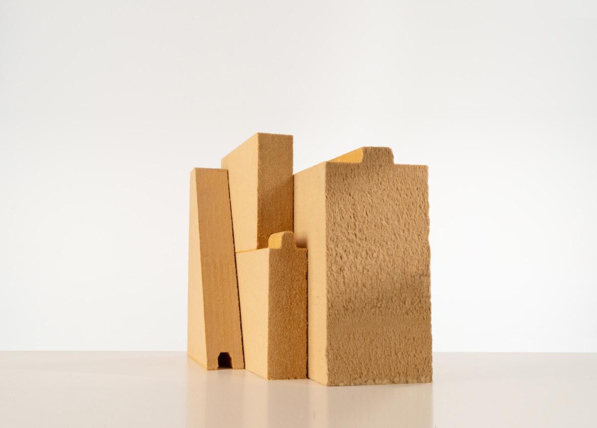
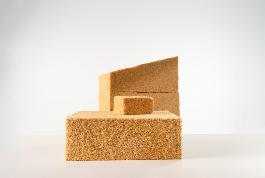
to learn more, visit www.TimberHP.com A Well Insulated Home Can Change the World Introducing TimberHP: Carbon-Storing Wood Fiber Insulation Made in America High Performance Cavity Insulation High Performance Continuous Insulation Dense Pack & Loose Fill Insulation Project Cred: OPAL Architecture / Photo Cred: Trent Bell Photography
Q&A Thinking Through LCAs
customers wouldn’t accept the longer lead time, but they told them that the benefit from this change was a reduction of millions of kilograms of carbon dioxide per year. All of their customers accepted the lead times and still paid their invoices, which were due upon dispatch, not receipt. This meant that there was no cash flow change for the company, and they saved money on shipping costs. This is amazing, because we helped them quantify and reduce emissions, and now they have cash to further invest in the business.
Another example: PurOptima has a furnace to dry solvents on their paint line. (They recommend powder coating instead of anodizing because it makes it easier to refinish components.) We made the (expensive) recommendation to capture the heat that was previously lost and to warm their offices with that heat. They soon signed off on it, and it is now in use.
3, which is essentially your supply chain. Often the biggest footprint isn’t what happens in the company but the materials you purchase. You might invest in solar, but you’re still buying steel from India or Turkey, or you’re buying timber but it’s not FSC-certified that comes from Brazil or Indonesia. We try to home in on scope 3—this is where companies are focusing their attention if they’re ahead of the game.
What should architects be aware of when trying to make environmentally sound sourcing decisions?
There’s one main thing that buyers get wrong. They look at environmental product declarations (EPDs), and 90 percent of those aren’t worth the paper they’re printed on. If an EPD covers multiple categories of products, it’s absolute garbage, and I don’t think these should be allowed.
Greenhouse gas emissions fuel global warming. How can we accurately reduce them?
Measurements are a good place to start, and we currently track them across three distinct scopes: (1) direct emissions; (2) indirect, owned emissions; and (3) all other indirect emissions, upstream and downstream. It’s often not an expertise that companies possess internally, so a consultant can aid in this process.
To learn more, AN ’s executive editor, Jack Murphy, spoke with William Beer, CEO of Tunley Environmental. Trained as an engineer, Beer now leads a team of scientists who work with companies to provide assessments of carbon, biodiversity, toxicology, and resources. They have handled assessments of everything from Botox to the Port of Detroit.

PurOptima, a commercial glass wall partition system specialist for offices in the U.S., is a client of Tunley’s and appears in the following conversation as an illustrative case study. The company, known as Optima in the U.K., where it is headquartered, manufactures its systems using Hydro CIRCAL 75R recycled aluminum, which includes a minimum of 75 percent recycled, postconsumer aluminum scrap. To deal
with the full life cycle of its products, Optima also repurposes build-outs as part of its Reuse and Take Back services, in which products are demounted, disassembled, and readied to be reintroduced into the supply chain for new building. (For now, this service is only available in the U.K.) Internal estimates indicate that there will be significant growth in the use of this service by the end of the decade.
When your company conducts a report and presents it to a client, what action do you see? What changes?
Probably 20 to 30 percent of the time, they don’t care. It’s box ticking, or they’re being forced to go through the motions. Cost is a factor, but for some companies, sustainability is actually becoming part of their business model.
I’ll give you an example. We had a pharmaceutical company as a client. We convinced them to stop overnight shipping their products, which are somewhere between drugs and cosmetics. These items aren’t affected by heat or cold, so they don’t need temperature-controlled transport, and they have an incredibly long life span. The company was worried that
How dependent are these assessments on local conditions, like electricity generation? For example, about 60 percent of the power in the U.S. comes from fossil fuels.
That’s a wonderful question. Let’s pick on South Africa for a moment: If you have an electric car in South Africa and you charge it from the grid, it’s worse than having a diesel engine, because their electricity largely comes from coal. And we see very similar examples to that in India and, to a lesser extent, China.
The challenge in the U.S. is that the grid varies from state to state. What that means from an assessment perspective is we actually have to understand that, and our recommendations need to be based on this reality. If you’re in a state with good renewables, we’re more likely to not recommend things like solar because there are probably initiatives that have the same cost that will get a better return on carbon investment. Compare this to states which are more reliant on coal, where we’d have to account for that when trying to achieve net-zero carbon.
Remember: You don’t want to get too caught up in the energy consumption of your organization, because most of your footprint is in scope
So, my first advice is that if a productspecific EPD isn’t available, don’t buy from the company. This requires no real knowledge to implement. This will tell you two things: One, if they don’t have it, they don’t care about the environment; and two, they’re not investing money into being more sustainable.
I’m also always wary of companies that talk about how many trees they plant and stuff like that, because while it is a lovely team-building exercise, it’s not going to make a difference unless you’ve planted millions of trees.
Architects need to understand what carbon is. Why is CO2 bad? They should know this scientifically and be able to deal with the numbers involved. You architects are a huge part of the problem, but you can be a part of the solution. Part of this means you need to understand, learn, and implement this before you talk publicly about it.
Another big piece of advice for architects is to stop buying low-quality products. If something breaks and needs to be replaced, it means this is going to keep happening over the course of a building’s life cycle. It’s important that architects consider maintenance and design with a maintenance strategy in mind. Where
48
Decarbonization consultant William Beer shares his thoughts about efforts to reduce emissions from the manufacture of building materials.
“Updating the relationship between architects and project management could make a difference in the carbon footprint of a build, like with the mobilization of cranes and other pieces of equipment. When your goal is to reduce the footprint of a build, then a WLC is valuable because it allows you to target the points of greatest carbon return.”
September 2023
COURTESY TUNLEY ENVIRONMENTAL
possible, it’s best to specify products that can be disassembled, repurposed, removed, and recycled easily, whatever the case may be. Unfortunately, sometimes you might have to take what’s perceived to be a higher carbon cost up front to have a lower life cycle cost overall.
An example: The bulk of a smartphone’s environmental footprint comes from its manufacture, not its use. The takeaway for anyone reading this should be: Keep them longer, and when possible, buy secondhand ones. But then if you look at something like a washing machine, you want to buy a better product with a lower operational footprint, because most of its consumption occurs through use, not manufacturing. This means knowing the difference between embodied carbon and a life cycle carbon assessment (LCA), which is sometimes referred to as whole-life carbon assessment (WLC). Always understand that there are different stages of emissions across a product’s life span.
Updating the relationship between architects and project management could make a difference in the carbon footprint of a build, like with the mobilization of cranes and other pieces of equipment. When your goal is to reduce the footprint of a build, then a WLC is valuable because it allows you to target the points of greatest carbon return. Maybe you need to switch to electric vehicles or run them on an alternative biofuel. It’s best to start this early, like before the preparation of construction documents, so there can be meaningful improvement and a chance to correct bad decisions.
What about building materials?
A lot of architects will immediately jump to the conclusion that everything’s got to be made of timber. In many cases, it’s a great material. Wood is good for things that will stay in place for a long time, but if something is being replaced every decade, that changes the
equation, as wood is hard to recycle and often winds up being incinerated. Other materials, like polyethylene terephthalate (PET), can be recycled essentially endlessly. A plastic bottle can become another bottle over and over again, but once it becomes a garment, for example, it is hard and expensive to recycle it, so clothing is often burned.
How do you account for the carbon impacts of shipping building products around the world?
We should always be talking about LCAs, not just embodied carbon. The latter is often referred to as “cradle to gate”—essentially from the ground until when the item is about to leave the manufacturing facility. For an LCA, you go through transport, implementation, maintenance, decommissioning, and disposal. You must account for logistics.
One of my annoyances is when companies hide behind where the “gate” is. For example, let’s pick on raspberries: You could argue the gate is at the farm, or you could argue the gate is at the ferry crossing or the supermarket checkout. I believe there’s some hiding behind where the gate is, so if I see an important food and it has a low carbon footprint, I always ask where the gate is.
We can also pick on timber. It’s a pain to transport because it’s huge: It has a low density compared to its structural strength, so it takes up a lot of space during transit but isn’t very strong. Steel, on the other hand, has the opposite problem. You can’t fill a container solely with steel because you can’t move it as it would exceed the maximum weight. Another reason why aluminum is nice is because it has great packing density per unit strength.
Tell me about your experience working with PurOptima.
PurOptima has designed their business model around sustainability rather than trying to shoehorn it in. Beyond their own operations, we’ve helped them develop their suppliers’ knowledge about sustainability. For example, they’ve invested a lot of resources to be able to utilize Hydro CIRCAL 75R recycled aluminum to manufacture their systems. This
product has a carbon footprint below 2.3 kilograms of CO2 per kilogram of aluminum produced. This is the lowest carbon footprint of any commercially available aluminum.
Let’s put that in perspective. Oatly’s Original Oatmilk Ambient has a carbon footprint of 1 kilogram of CO2 per kilogram of oat milk. So this Hydro aluminum is only about 2.3 times more carbon intensive than oat milk, which we consume readily without consequence. PurOptima previously used Hydro Restore, which uses 6.12 kilograms of CO2 per kilogram of aluminum. Even sustainable aluminum in the U.K. is required to be about 11 kilograms CO2, and some “unsustainable” offerings land at 26 kilograms of CO2 and maybe even higher.
This change wasn’t easy; it took two years of ongoing conversations, and now PurOptima is the only supplier realizing it in the U.K. and the U.S.
Other industries that utilize aluminum are taking similar steps. Mercedes Benz recently announced it is working with Hydro to use recycled aluminum in their vehicles, but even that change will use a minimum 25 percent recycled content and is planned to be in place by 2030.

There’s greenwashing out there about what recycled aluminum means. When melting down a billet of aluminum, the metal swarf and off-cooks are added back into the production line. These are inefficiencies in manufacturing that shouldn’t be called “recycled,” as it’s an unavoidable part of the process. This Hydro CIRCAL 75R product is a minimum 75 percent postconsumer waste—think aluminum cans and engine blocks. And this minimum is based on the worst batch, as opposed to the average, which will be even higher.
The aluminum part makes sense. What about glass production?
We’re supporting PurOptima’s glass manufacturers as well, and they’re pushing hard on that. One of the challenges is that the equipment to manufacture glass is super expensive. But we are doing a lot of work on heat recovery from the production process. Glass is difficult to recycle once it has been toughened, so what PurOptima is doing now to reduce its carbon footprint is it takes back the glass from prior system installations and then designs new systems around this repurposed, existing glass. But it’s tougher than aluminum, and currently there isn’t an easy alternative.
The repurpose offering is also important. The company keeps track of its installs and is able to reconfigure them into new spaces or clients. Glass walls can be demounted and reinstalled or returned to the factory to be refinished. It’s not an easy process, as things need to be taken down carefully, labeled, and inspected. And then it needs to be transported, stored, and transported again. It’s not easy, but it works for clients who are committed to a lower carbon footprint.
Another thing the company is doing is that they are about to begin quoting the carbon footprint of each build-out in addition to the financial cost. This means the company has invested in the systems to be able to calculate this instantly versus somebody sitting there with a calculator at the end of the process. All the systems must talk to one another. We know that this carbon number is being asked for in bids by architects, contractors, and anyone who is serious about lowering the carbon content of their work.
What else should we be aware of?
If you want to know how an organization is treating sustainability, you have to ask yourself two simple questions: Is it in the board meetings? Is it led from the top? If the answers are no, then it isn’t genuine.
49
COURTESY OF PUROPTIMA AND HYDRO September 2023
“Architects need to understand what carbon is. Why is CO2 bad? They should know this scientifically and be able to deal with the numbers involved. You architects are a huge part of the problem, but you can be a part of the solution. Part of this means you need to understand, learn, and implement this before you talk publicly about it.”
Submit your projects today: archpaperawards.com/design23 Submission deadline: October 6, 2023 Enter Now!
At Sherwin-Williams Coil Coatings, color is more than just a coating. Through product innovation, a dedication to our customers’ sustainability goals and to our larger corporate commitments, we can maintain a more vibrant world for generations to come. Together, let’s explore the endless possibilities for how color can change the future.
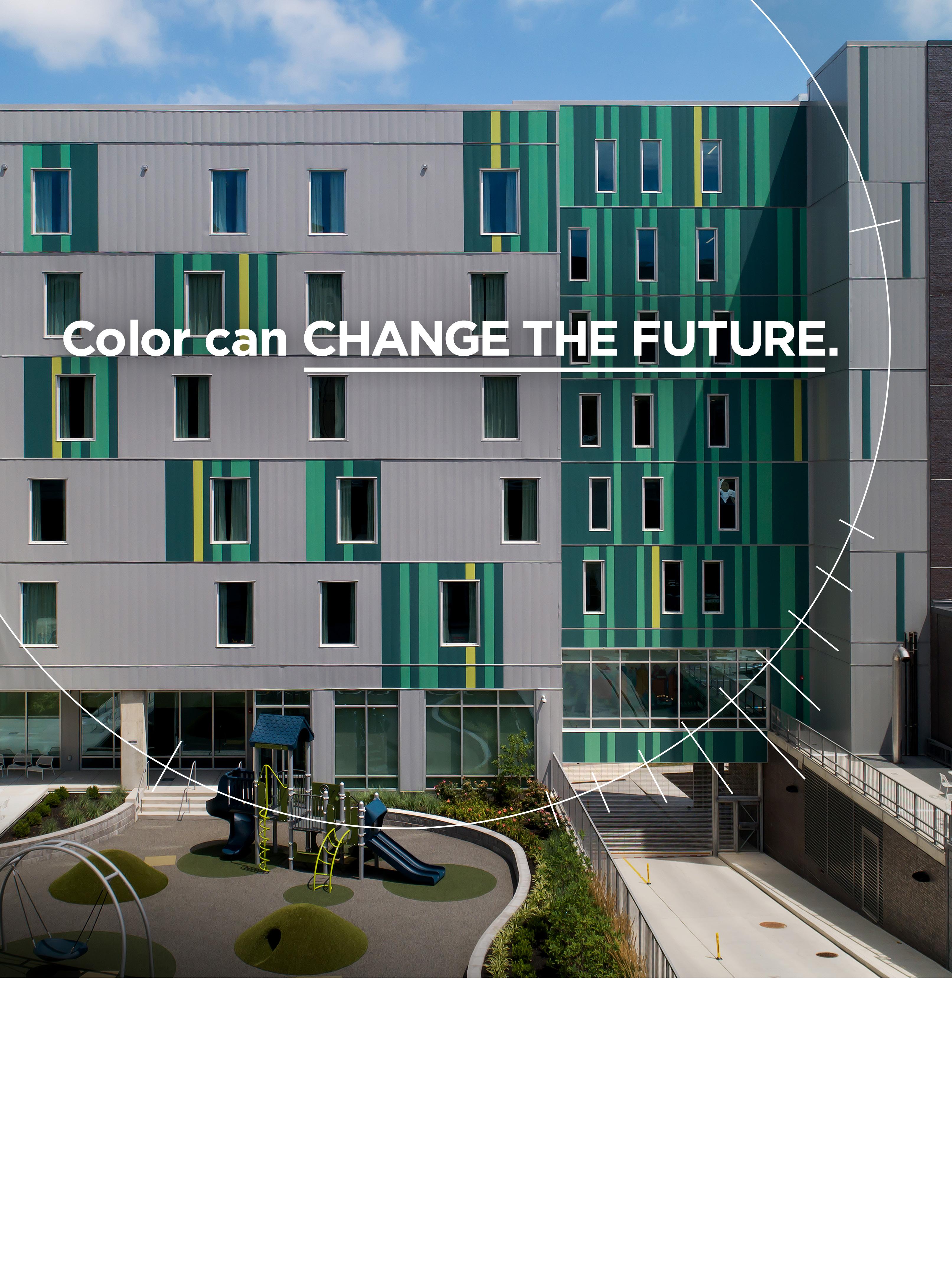
Does your vision include a sustainable advantage? Watch the video to learn how we can help:
coil.sherwin.com/sustainability
Ronald McDonald House Charities | Cincinnati, OH
Products
Lighting & Appliances


The latest lighting fixtures shine in more ways than one. Some are 3D-printed from food waste, while others integrate recycled materials in innovative ways or be recycled at the end of life. This roundup offers some of the most responsible new products on the market. RCO

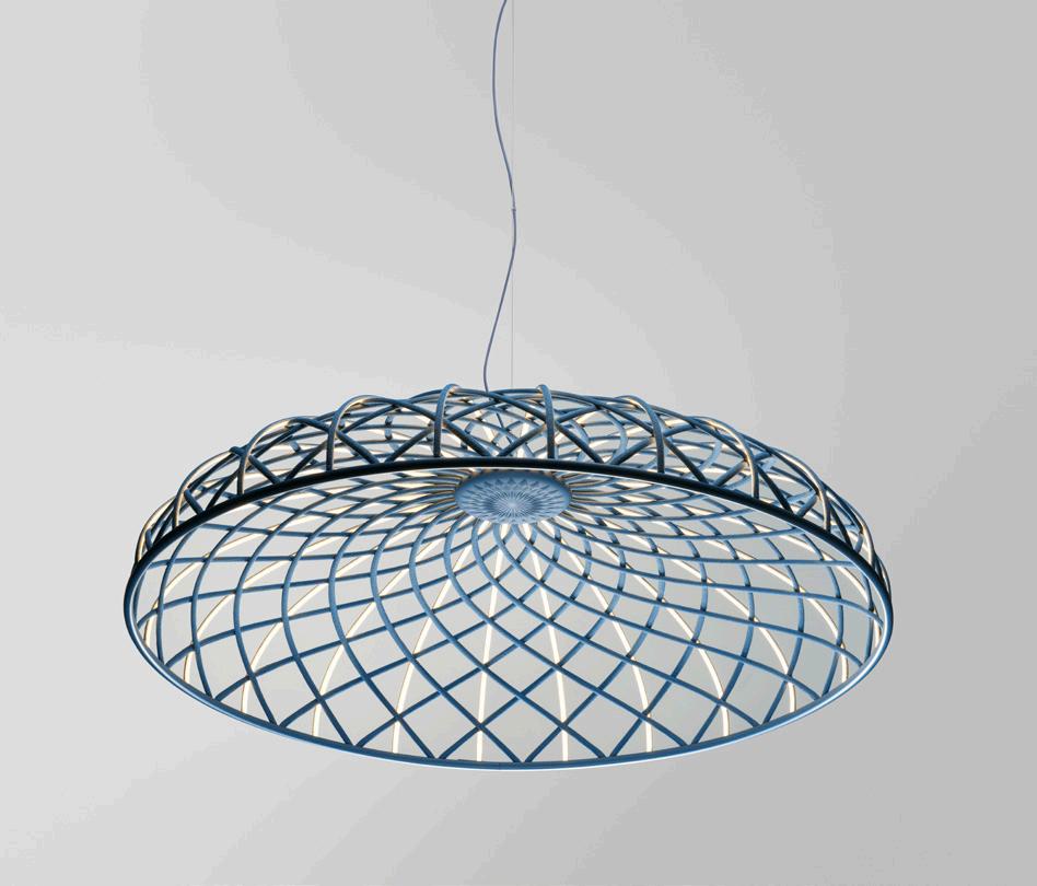
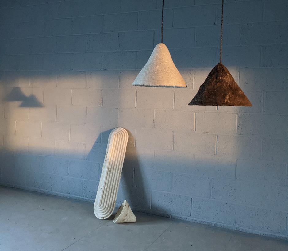


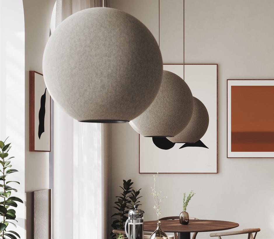
Moon Sound Absorbing Lamp Abstracta abstracta.se Coastal Breeze Collection of 3D Printed Luminaires Signify signify.com/en-us Declare Label Certified Ocean Coil Collection Light Art lightart.com
Light Shades from Algae and Mycelium Ty Smyl Lights tysyml.com Skynest Suspension Flos flos.com Legrand
Plug-in Level 2 Electric Vehicle Charger legrand.us EOS Lighting Series 3D Printed from Food Waste & Wood Dust Model No. model-no.com ALL IMAGES COURTESY THE RESPECTIVE MANUFACTURERS September 2023
Empava IDC12 12” Induction Cooktop Empava empava.com
DS+O
50

52 Products
Interior & Exterior Wood
Wood is a leader in sustainable material trends. Among these new products is a technology that uses sliced instead of sawn wood, allowing for ten times more flooring to be produced from the same amount of lumber. Other innovations include a process that ages new lumber naturally and quickly without the need for paints and stains, a chemical-free modified wood made only using heat and steam. All are created with the goal of further optimizing this beautiful natural material. RCO

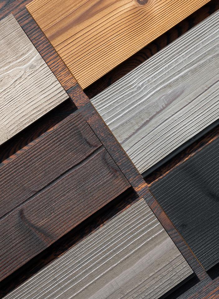
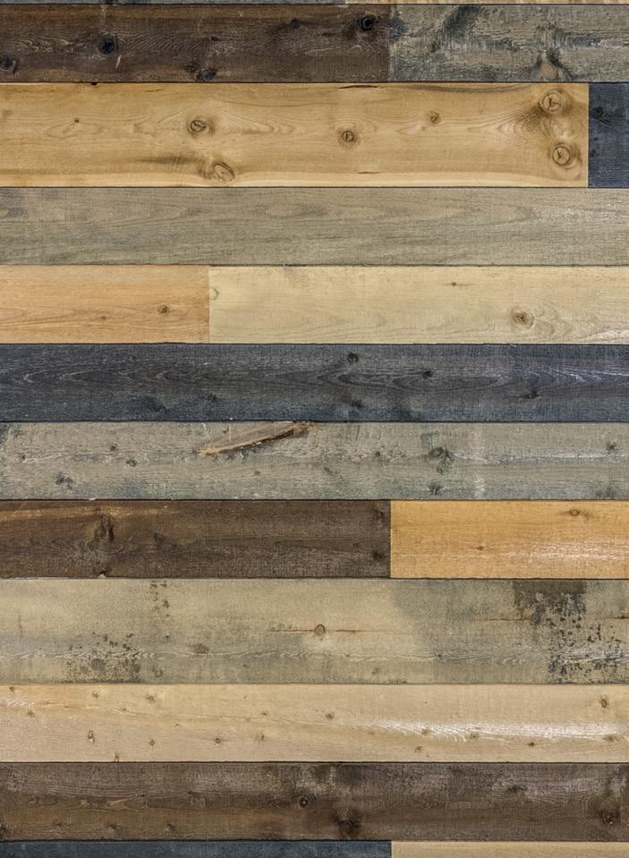 Kebony Clear Cladding Kebony kebony.com
Coeur D’Alene Wood with Xcelerated Process Coeur D’Alene cdawood.com
Colored Slatpanel Wall Panels The Wood Veneer Hub thewoodveneerhub.com
Lunawood ThermoWood Delta Millworks deltamillworks.com
Wood Composite Air Diffuser InviAir inviair.com
The Montane Collection of Kitchens, Closets, and Furnishings Cabbonet cabbonet.com
ALL IMAGES COURTESY THE RESPECTIVE MANUFACTURERS
2023
Commercial Hardwood Collection Bjelin bjelin.com
September

54 Case Study
The Parsons Material Lab Looks Back to Move Forward
Each chapter of Material Health: Design Frontiers interrogates a material of everyday production.
If we imagine a built world created to support both people’s health and all of nature’s ecologies, environments, and living things, then we need to chart a path different from the one Western culture has forged.

Indigenous voices call attention to the importance of learning lessons from ancient cultures that have lived harmoniously with nature for thousands of years. Indigenous ecological knowledge challenges us to nurture , rather than extract , the planet’s abundant resources. Their regenerative practices support healthy places, and therefore healthy communities, for future generations. Within these Indigenous philosophies there is a fundamental understanding that our shared livelihood is all of humanity’s responsibility. Clean water, clean energy, fertile soils, and healthy, affordable homes for everyone are possible only through reconsidering and regenerating our human activities. What if this were the goal of all of today’s decision-makers?
We—Alison Mears and Jonsara Ruth— cofounded Healthy Materials Lab (HML) at Parsons School of Design in New York City to address these intersectional issues related to designing the built world. As women educators, architects, and designers, we pursue our goal to raise the design and construction bar in housing to provide truly sustainable, healthier, and beautiful housing for everyone.
The problems of climate change and human disease are inextricably linked, and based in large part on carbon emissions. Our work has focused on the field of material health, an ecosystem-first approach. Our work at the lab seeks to understanding the toxic life cycles of common building products—from the mining of raw ingredients to their refining, production, and installation processes. We then move forward optimistically, entering into the discourse and research surrounding emerging circular systems of material reuse. In our recent publication Material Health , we consider these and posit critical points of disruption.
HML works to create a truly sustainable architecture, engineering, and construction industry. We demand ingredient transparency and advocate to reduce embodied carbon levels in the building product supply chain. Our work goes beyond individual materials
or bespoke projects, aiming to influence the industry at scale.
To make change possible, we provide resources to architects and designers so that they can put human and environmental health at the center of all design decisions. Our recent book Material Health Design Frontiers is the outcome of a conference we hosted in 2019, which focused on six themes: air, carbon, equity, ecosystem health, circularity, and ultimately design innovation. Thanks to our 19 expert contributors, including a toxicologist, a pediatrician, environmental justice advocates, materials innovators, artists, architects, and designers, the essays describe many positive ways to change the way we live and build.
Forefronting design examples with a description of the issues that need to be addressed, these case studies show that it is indeed possible to shift the way we conceive
of the design process and the way that has become the conventional construction process.
Our work at HML remains firmly rooted in practice. No content remains purely theoretical. A healthy relationship between the natural world and humanity is fundamental to sustaining and supporting human life. It is time to reject the historic and extractive dualities in Western culture between nature, culture, mind, and body, because they isolate us from the essence of what makes us human and disconnect us from all other species. A new innovative path for decision-making is possible. We need positive, radical collaboration at scale, and the built world will evolve into one that is regenerative, just, healthy, and prosperous for many generations to come.
This change is imperative, and the time is NOW.
“In the Time of the Seventh Fire, which is the time that we are in now, we are told that we would have a choice between two paths: One path they said would be well-worn, but it would be scorched, and the other path would not be well-worn, and it would be green. It would be our choice upon which path to embark.”
—Winona Laduke, Water Protector from the White Earth Reservation in northern Minnesota
2023
JONSARA RUTH
September
Air
The opening chapter of Material Health focuses on the air we breathe—a shared resource that knows no borders. Air quality is a key indicator of both human and environmental health, yet these collected studies here show how the two are inextricable. Laura Vandenberg, a biologist and professor at UMass Amherst, focuses on the distinction between toxic and natural chemicals in our environment; Aaron Dorf, director of Snøhetta U.S. discusses the ramifications of the phrase “healthy materials” for practicing architects today; and Ginger Krieg Dosier, architect and founder of Biomason U.S., discusses how material exploration is, and can, disrupt the construction industry.
Carbon
The case studies and products explored in the Carbon chapter of Material Health are visually arresting: they playfully present cutting-edge research in forms that are beautiful and often even engaged with pop culture. Items like a new sneaker designed by Adidas appear; the Futurecraft Loop Shoe is made with recyclable Thermoplastic Polyurethane. Also, a designed experiment titled Air-Ink is presented like a tempting Instagram ad: Different plastic containers resembling paint pens, jars of ink and brush marks contain a silky black liquid. What we read as “paint” through this graphic is actually particulate carbon matter ink, dyed with the particular emissions of 19.6 hours of diesel car pollution.
Equity

Environmental justice has emerged as a powerful movement in architecture and design circles, asserting that without equal access to clean, healthy environments (and buildings) we cannot claim to reach equity and inclusion goals as a practice or as a society. Collected essays in this Equity chapter highlight the work of Dr. Maida Galvez, whose work as an environmental pediatrician challenges traditional labels and offers “prescriptions” for healthier buildings. But equity in quotidian workplace culture is also explored. Samantha Josaphat-Medina reflects on job (in)security in the AEC profession, particularly for marginalized groups, unpacking the feeling of being “stressed behind the desk,” and she’s not alone.
Waste and Circular Economies

“Take-make-waste” is how Kate Daly, who directs the Center for the Circular Economy at Closed Loop Partners, described our current economy and patterns of consumption. And while there are many calls for regenerative, non-extractive systems, these are difficult to realize, or even envision, within the current capitalist system we find ourselves in. Circular economy as a phrase in the AEC industry relates often to material flows and recyclability at the end of a building’s life, emphasizing that the end of a building need not be the end of a material. But even small steps like this are parts of a larger financial, economic shift that Material Health scrutinizes in this chapter.
Ecosystems
“The use of so much plastic was by design. How could we have been so misguided?” asked Franca Trubiano, practicing architect and professor at UPenn. When we think of ecosystems as the concluding chapter of Material Health, it challenges us to think deeper and zoom out. What is a measurement or a certification if the building (be it net-zero or LEED platinum) sits on a foundation of polymers and fossil fuels? Holistic perspectives as well as holistics applications of data and method are necessary if we want to make meaningful change in our built projects, as practitioners like Henning Larsen are advocating for in this section. We can’t just unlearn, we must work toward new systems of practice and understanding.
Material Health: Design Frontiers


Collecting the stories, research and expertise of leaders in the material health field shared at a 2019 symposium, Material Health: Design Frontiers, published in 2022, is an invaluable handbook for architects and designers looking to cultivate a more responsible practice. Centering on indigenous knowledge and strategies for living with and among the natural world, this is a fresh and grounding take on design innovation that goes deeper: an ongoing mission of the Parson’s Healthy Materials Lab’s co-directors Jonsara Ruth and Alison Mears.

55
GKD6 Biomason Biolith precast tiles cure on racks at the Concrete Development and Production Center in Research Triangle Park, North Carolina, U.S.
Julia Lohman, The Oki Naganode sculpture’s colors at Artipelag, Stockholm, 2015, after its chlorophyll content faded.
3XN’s Circle House, the first circular social housing project in the world, is a fully reversible building system made with material passport, post-consumer plastic and cork boards.
Namur, Quebec, 2017. Finished hempcrete wall.
Samantha Josephat-Medina at the Weeksville Heritage Center in Brooklyn.
COURTESY DUCHANVRE COURTESY 3XN NEV SIMPSON COURTESY
JEAN-BAPTISTE BÉRANGER
BIOMASON
September 2023
The Healthy Materials Lab | Lund Humphries | £45.00
56 Review Houses Made of Straw

How to Build a Low-Carbon Home The Design Museum London
Through March 2024
To grind down limestone and heat it with clay, to mine iron ore and power blast furnaces, and to fire kilns—the everyday processes of manufacturing building materials like concrete, steel, and brick—emits huge amounts of carbon dioxide. Yet contemporary construction industries rely heavily on these basic processes. When we talk about embodied carbon in architecture, we mean emissions associated with the extraction, manufacture, transport, assembly, maintenance, replacement, and disposal of all materials that make up a building. These alone account for over 9 percent of global carbon emissions.
The urgency of this may at first feel overwhelming or only surmountable through innovating wholly new ways of building. However, many of the tools we need have existed for millennia: Returning to time-honored processes that center natural materials—such as timber construction, thatching, and stonemasonry—is the key to a low-carbon future.
These concepts are on full display at the Design Museum in London. Curated by Esme Hawes and George Kafka, How to Build a Low-Carbon Home is full of architects and their drawings, tools, scale models, and building materials—but this exhibition is not just for architects. It is an accessible and instructive guide for anyone, showing a new path forward for home-building during the climate emergency. The exhibition is anchored by three London architecture practices that are spearheading the use of natural materials: Material Cultures represents straw; Waugh Thistleton, wood; and Groupwork is stone. The exhibition forms part of a broader research project on low-carbon housing led by Dr. Ruth Lang and the Design Museum’s Future Observatory.
The first material investigation approaches mass timber by starting with the importance of sustainable timber production and forest management. Trees sequester carbon as they grow, but when they die, it is released back into the atmosphere. Building with timber stores this carbon, while planting new trees sequesters more: This is the carbon cycle, and it can facilitate carbon-negative construction. The evolution of engineered timber—layers of raw wood veneers, fibers, or particles bound together—promises to deliver on much of what steel and concrete can. This Waugh Thistleton proves in its work. Fragments of engineered timber plainly show the differences between cross-, dowel-, and glue-laminated timber (CLT, DLT, and glulam), while images of Waugh Thistleton’s mixed-use Dalston Works in London show these methods implemented in the construction of the world’s largest CLT building (10 stories tall). The intimate details of the material are contrasted with its change-making possibilities to show the potential of timber construction for both the self-builder and the large-scale developer.
The next material on view is straw, still suffering from a ruined reputation thanks to three little pigs and a big bad wolf. This display, drawing on the rigorous work of Material Cultures, debunks these myths. Straw here is a broad term that refers to the stalks of cereal plants, but its resurgence as a building material is due to developments that involve combining it with earth, clay, bio-resins, or lime to
© FELIX SPELLER
September 2023
make walls, bricks and insulation. Straw is fast -growing and already a natural by-product of grain production. New architectural processes therefore harness this intrinsically untapped potential. The building components made with it are usually air-dried, making it a low-carbon process by avoiding heat-intensive fossil fuel combustion. The beautiful potential of the material is made more visually clear in this exhibition thanks to photography by Oscar Proktor: A new series showcases the walls of Flat House by Material Culture, constructed from timber cassettes filled with a mulch of hemp, lime, and water.
Finally, the stone-focused display shifts gears in terms of technique: Handheld processes replace the loud, invasive ones we usually envision when considering stone. A wire embedded with diamond beads is displayed next to a film by Joseph Bushell that visually describes how something so small and simple can cut through solid rock. A geological map of the U.K. illustrates the makeup of its bedrock and how this has influenced the vernacular. Surrounded by stone samples, the map then illustrates each stone’s material quality and even color, shifting from the burgundy of St. Bees stone to the ashen gray of Clipsham stone. A compelling argument is also made here for the extraction of stone. Unlike concrete and steel, the raw material is construction-ready upon extraction, requiring no intensive
post-processing. The display concludes with the end of the material’s life cycle: the end of the quarry. Quarries can be remediated back to more healthy, natural states, as with the Centre for Alternative Technology in rural Wales, if not completely redeveloped, like Craigleith Quarry in Edinburgh.
So, how can all of this combine into the home proposed in the exhibition’s title? A propositional model by Webb Yates Engineers shows what such a structure could look like. Made with just the materials on display (wood, straw, and stone), it proves the structural possibilities but also displays their charming qualities. Travertine marble is the primary structure, while Douglas fir is used for timber beams. Straw, represented in the model by grass, provides insulation and roofing.

The display shows exceptional work by architects, but it ends with the insistence that projects and practices like these should not be the exception. The wall text asserts the need “to increase the local supply of these materials and train a new generation of skilled construction workers to build with them.” So, How to Build a Low-Carbon Home reminds that we must consider people, labor, and collaboration in addition to materials when building our low-carbon future.
Facing page: Example by Groupwork of straw acting as roofing material.
Left: Installation view on the Design Museum's mezzanine.

Below, left: Model of a stone framing system.
Below, right: New ideas for old masonry technology.

July/August 2022 57
© FELIX SPELLER
© FELIX SPELLER © FELIX SPELLER
Ellen Peirson is an architectural designer, writer, and editor based in London.


For updates and more information on our Sustainability Program, scan the QR code or visit our website: www.bendheim.com/sustainability
pioneering EPD is a major step forward in our commitment to reducing the environmental impact of Bendheim products in today’s world.
EPD: • Product-Specific Type III EPD • ISO 14025 and EN 15804 • 3rd Party Certified • Contributes up to 1.5 LEED credits Building a Clear Future
….presents the Environmental Product Declaration (EPD) for Lamberts U-profiled Channel Glass. Bendheim
Glass Fort York Visitor Center, Toronto, Ontario, Canada
This
The
BUILDING A CLEAR FUTURE
Channel
59 Resources
Textiles and Acoustics

Armstrong armstrongceilings.com
Designtex designtex.com
Impact Acoustic impactacoustic.com
Kaynemaile Kaynemaile.com
Keilhauer keilhauer.com
Kirei kireiusa.com
Momentum Tiles momentumtextilesandwalls. com
Serge Ferrari Group sergeferrari.com
Turf Design turf.design/products
Envelopes (Insulation & Cladding)
CertainTeed certainteed.com
Croft croft.haus
Fiberon Cladding fiberoncladding.com
Hempitecture hempitecture.com
Modern Mill modern-mill.com
ROCKWOOL rockwool.com

Thermacork thermacork.com
TimberHP timberhp.com
Lighting & Appliances
Abstracta

abstracta.se
Empava empava.com
Flos flos.com
Legrand DS+O legrand.us
Light Art lightart.com
Model No. model-no.com
Signify signify.com/en-us
Ty Smyl Lights tysyml.com
Interior & Exterior Wood Bjelin bjelin.com
Cabbonet cabbonet.com
Coeur D’Alene cdawood.com
Delta Millworks deltamillworks.com
InviAir inviair.com
Kebony kebony.com
The Wood Veneer Hub thewoodveneerhub.com
Technology
Branch Technology branchtechnology.com
Big Time Software bigtime.net
Buildertrend buildertrend.com
BQE bqe.com
Canvas canvas.io
Codesign getcodesign.co
Configura configura.com
Cove.tool cove.tools
CTRL Building ctrlbuilding.com
Cupix cupix.com
Datacolor datacolor.com
Deltek deltek.com
Dextall dextall.com
Enscape enscape3d.com
FivD fivd.io
Geopogo geopogoar.com
Graphisoft graphisoft.com
ImaginIt Technologies imaginit.com
Langan langan.com
Layer App layer.team
Mercato Place mercatoplace.com
Microsol Resources microsolresources.com
Moetsi moetsi.com
Monograph monograph.com
NavVis navvis.com
Nearmap nearmap.com
NVIDIA nvidia.com
OpenAsset openasset.com
Proving Ground apps.provingground.io
SketchPro sketchpro.ai
Sketchup sketchup.com
Snaptrude snaptrude.com
STRUXI struxi.com
SunStyle sunstyle.com
T2D2 t2d2.ai
Vectorworks vectorworks.net
1to1 plans 1to1plans.com
COURTESY MOMENTUM TEXTILES
COURTESY FLOS September 2023
COURTESY HEMPITECTURE

60 OCT 1 - 31, 2023 NYC’s Architecture & Design Month archtober.org Subscribe archpaper.com/subscribe OUTDOOR SPACES • FACADES+ • THE ARCHITECT’S NEWSPAPER • TECH+ • LATE EDITION • CE STRONG AN INTERIOR • TRADING NOTES • OUTDOOR SPACES OUTDOOR SPACES • FACADES+ • THE ARCHITECT’S NEWSPAPER • TECH+ • LATE EDITION • CE STRONG
61 Exhibition Highlights
What Models Make Worlds: Critical Imaginaries of AI

Through December 9
There is Room
Through October 14 (by appointment)
What Models Make Worlds assembles an impressive cast of artists working at the forefront of creative “algorithmic imaginaries,” using them to imagine, reimagine, and critique their world-building abilities. Cocurator Meldia Yesayan said that this exhibition hopes to “rethink how we engage with our communities and imagine a future in which femmeidentifying, BIPOC, and queer creators control our algorithmic worlds.” With AI disrupting so Crafting sculpture, or what artist Carlos Bunga calls “expanded painting,” out of mundane materials isn’t just an aesthetic choice. Materials like cardboard and masking tape combined with high-viz color palettes shaped his childhood as a refugee living in the very real decrepit conditions of government housing. Born into an Angolan family living in Porto, Portugal, Bunga channels these formative spatial experiences into monumental,
many of our systems of production, creativity, and economy, it’s becoming more critical for the “black box” of AI production to open up, and that’s exactly what the work of the 16 represented artists does. Exploring such diverse themes and activities as surveillance, archiving, cultural capital, cartography, and colonialism, the work questions who gets to use, define, and mobilize AI in our world today. EC
Reassembling Spilt Light: An Immersive Installation by Carlos Bunga
Through October 29
This new exhibition surveys the work of Kwong Von Glinow and focuses solely on housing projects on standard lots in Chicago, therefore offering a close reading of the city’s vernacular apartment typologies. Whether new-build apartments or historic structures more than a century old, housing types, from two- to six-flat arrangements, survive despite radically changed living conditions, lifestyles, and trends. There is Room sees optimism in

Eso es la vida/This is life
this persistence and uplifts the very necessary work of home building through this exhibition of half-inch-scaled models (1:24) replete with tiny furniture and the accoutrements of living. The show explores forms of inhabitation (as seen in the grids of images on the walls) and, through the established medium of the model, doubles down on the value of circulation, natural light, and “quality”—as in quality of life. EC
Through November 27
architecture-scaled art forms that museumgoers can walk through, touch, feel, and inhabit. Whether one is navigating columns made of taped-together flatpack boxes or meditating on the unexpected vitality of a boldly painted cargo blanket, the politics of migration come to a head in these built spaces where one can meditate on themes of aid and the real human need for compassion. EC

The exhibition title recalls the advice of activist printmaker Leopoldo Mendez: The role of the maker is to be an agent in such struggles over the everyday: eso es la vida. This sets the tone for a new exhibition curated by Robert J. Kett that highlights the work of Mexican graphic designers. Lettering that has become instantly recognizable is revealed to be deeply rooted in a collaborative national graphic language, spearheaded by foundational designers
like José Guadalupe Posada and the Taller de Gráfica Popular. These histories exist in conversation with contemporary figures like Estudio Herrera, the Red de Reproducción y Distribución, and Carla Valdivia Nakatani. From colorful handmade posters and painted signage techniques to emerging digital media and videomaking, Eso es la vida examines graphic design as a core facet of popular culture today. EC

September 2023 East Midwest
West Southeast
Ford Foundation Gallery 320 East 43rd Street New York, NY 10017 Sarasota Art Museum 1001 South Tamiami Trail Sarasota, FL 34236
Context Reading Room 1564 North Damen Avenue Chicago, IL 60622 Palm Springs Art Museum 101 North Museum Drive Palm Springs, CA 92262 ©
COURTESY RED DE REPRODUCCIÓN Y DISTRIBUCIÓN
RYAN
MAS
DAN KELLEGHAN PHOTOGRAPHY
KIRA XONORIKA
GAMMA
Review
A Manual of Anti-racist Architecture Education

when our discipline becomes “too obsessed with making” within oppressive systems. Here, for everyone who considers themselves a practitioner, the Manual provides several starting points for understanding how world-shaping narratives—which give architecture power and credence and which are in turn shaped by architecture—have historically been made and thus can be collectively “unmade.”
The text concludes with an appendix, “Against the Precarization of Anti-racist Education Labor,” which poses a series of questions on the labor of education. Itself a form of labor, this book offers a reflexive moment of contemplation and an invitation to continue the conversation beyond these pages. Those reading closely may even start to recognize García’s and Frankowski’s own experiences in practice. For instance, their investigations into Pittsburgh’s racial segregation in relation to admissions office erasures of Black neighborhoods by Carnegie Mellon University, where they held visiting professorships, or into Harvard University’s outsize role in profiting off Puerto Rican debt, part of a $41.9 billion endowment compared with the total $450 million budget of García’s alma mater, Universidad de Puerto Rico.

A Manual of Anti-racist Architecture Education challenges us to critically engage with contradictions inherent to architectural practice and education within late capitalist settler colonies through individual practice. The tools WAI offers are both politically potent and deeply optimistic. Throughout, WAI references Eve Tuck and K. Wayne Yang’s essay, “Decolonization Is Not a Metaphor.” García and Frankowski, too, are not speaking in metaphor. There is clarity in their critique of both the historical formations of syllabi and of campuses themselves—allowing us to behold the same systems threading through each scale. For a discipline known for both technical and theoretical prowess in working across scales, this antiracist approach can, and should, be our baseline for practice.

Bz Zhang is an architect and artist based on Tongva land (so-called Los Angeles), where they wonder aloud about representations of violence and the violence of representations by asking questions both using and about disciplinary tools of art and architecture. In their free time, they look for birds and trash in the Los Angeles River.
“Anti-racism is not taught. Anti-racism is practiced,” reads the epigraph of A Manual of Anti-racist Architecture Education. Written by Cruz García and Nathalie Frankowski of WAI Architecture Think Tank, the new publication is a slim edition bound in glittering black cloth that offers architects a set of tools, frameworks, and orientations that support antiracist practice and liberatory futures of “both remembrance and of possibility” in pedagogy and beyond.
WAI Architecture Think Tank is a planetary studio—referring to its international reach, interdisciplinary practice, and political alignment beyond human systems—founded by Puerto Rican architect, artist, curator, educator, author, and theorist Cruz García and French architect, artist, curator, educator, author, and poet Nathalie Frankowski. The studio has excelled in all traditional aspects of practice and research: García and Frankowski have practiced internationally, taught across accredited architecture institutions, and exhibited widely in museums and biennials. Their ideas have been shared in coedited books and in respected peer-reviewed journals. However, this is not their primary stated objective. Rather, WAI as a “think tank” has pushed the boundaries of prescriptive paths for any ambitious studio or practitioner through its emphasis on antiracist and postcolonial critique, public engagement, and collective knowledge production. Consistent with these aims, the Manual (also made freely available in Spanish and English on WAI’s website) is meant to be supportive text in relation to WAI’s own platforms, courses, and interventions as well as more broadly within and beyond architectural institutions.
Continuing this work, the Manual approaches the framework of antiracism praxis in design pedagogy through three distinct vantage points: Before, During, and After architectural education. These are shared using three distinct devices, respectively: an essay, an annotated diagram, and a manifesto. This structure suggests that chapters can be read in sequence, or as a guide for readers to explore within our own unique contexts and scenarios. In deliberately framing its research, writings, and analysis as a “manual,” WAI offers this book as a
companion for students, educators, and spatial practitioners to keep close at hand. And by varying its approaches to each chapter, WAI models the abundantly varied ways we might explore our world with a recursiveness that echoes the rhythms of the decolonial oral and written traditions from which they draw.
In the first chapter, “Before School: On Who Gets to Be an Architect and Anti-Liberation Paywalls,” the Manual unveils systemic barriers to entry, contrasting tuition fees for elite architectural institutions across the United States with median household incomes in their respective cities, as well as endowments compared with the GDPs of entire nations. This chapter builds off the stark simplicity of this material stratification to demonstrate that not only do universities perpetuate exclusion along lines of class and race but they themselves are settler-colonial tools of land occupation, gentrification, and racial oppression.

Meanwhile, “During School: An Anti-racist Architecture Education Spiral” introduces the Anti-racist Spiral as a postcolonial tool that both engages critically with and ultimately decenters Western architecture canons by providing alternate lineages of form, history, and theory. Drawing deeply from radical (from the Latin radix for root) thinkers and practitioners across the world—from Édouard Glissant and Frantz Fanon to Kimberle Crenshaw, Angela Davis, and the Combahee River Collective; from Achille Mbembe to Leanne Betasamosake Simpson to Paul B. Preciado and many others—WAI zeroes in on the Anglo-Saxon roots of the architectural discipline, the violences it has embedded in our built environments, and its ubiquity in contemporary architectural curricula. In directly addressing specific canonical forms, histories, theories, and media, and presenting them alongside an inventory of tangible pedagogical alternatives, WAI provides a play-by-play for radically transforming architectural pedagogy today: One can easily see both studio or seminar professors lifting suggestions from this chapter, one following another.
Finally, “After School: Un-Making Architecture, an Anti-racist Architecture Manifesto” uses the provocation of “un-making” to visualize gaps and omissions that arise
The Architect’s Newspaper
62
COURTESY WAI THINK TANK WAI Think Tank Loudreaders $55
63 Review Paved Paradise
don’t make infill projects physically infeasible, they still often succeed in making them financially infeasible, especially where affordable housing is concerned. The cost of all that parking is baked into higher rents and home prices, more expensive goods and services, and lower wages. How’s that for free?
Paved Paradise deftly captures the extent to which such pseudoscientific parking mandates have deformed the American city. Nowhere is this truer than in Los Angeles, an early and eager adopter of the automobile. Entirely new building typologies emerged in response: Traditional storefronts gave way to strip malls, beloved cottage courts became illegal, and when these were replaced by dingbats, eventually those, too, were phased out. If not painted into surface parking, downtown L.A. lots that once hosted art deco office buildings and movie palaces now host parking podium towers, with garages separating workers from the public realm.
Dedicated advocacy organizations like the Parking Reform Network have emerged to spread the parking reform gospel. Riding the recent wave of YIMBY activism that has remade zoning codes, parking requirements are now on the way out. In 2017, Buffalo, New York, and Hartford, Connecticut, eliminated them altogether. Fast-forward five years, and dozens of U.S. cities have done the same. Last year, California eliminated parking requirements near public transit nodes statewide.
As I write these words, the clock is ticking. Just outside, a parking meter stands guard over my Prius, a blinking-green evil eye warding off pesky parking tickets. This is the third coffee shop I’ve visited today. The first didn’t have any parking, and the second charged $10 for parking, so I spent 15 minutes cruising around Santa Monica looking for a place to write. I have exactly two hours to write before I must vacate my space to make way for the next paying customer.
Until recently, this was exclusively how most thought of parking: superficially, selfishly, and with reluctance. Within local government, on-street-parking management filled out the lowest ranks of the civil service. Off-street-parking management fared little better, tainted by corruption. Among architects, the thankless job of designing lots and garages trickled down to junior staff. A self-respecting academic wouldn’t have been caught dead thinking about such a lowly subject.
That is, until Donald Shoup published The High Cost of Free Parking in 2005. Against a backdrop of apathy and antipathy toward the subject, Shoup dared to give parking the attention it deserves: The trouble with parking isn’t that there’s too little, but that there is far too much of it. The trouble with parking isn’t that it’s “free,” but that its high costs are hidden from drivers. Almost two decades later, Paved Paradise, a new book by Slate writer Henry Grabar, continues the parking revolution, and it’s now poised to go mainstream.
Grabar’s subtitle promises “How parking explains the world,” and it certainly has no trouble explaining how parking broke the American city. Over the course of the 20th century, Americans bought cars en masse, with little notion of where they would put them. The result was a mess: Streets quickly went into cardiac arrest, clogged up by endless rows of double-parked cars and drivers hunting for a spot. Many American drivers eventually gave up and departed for subsidized postwar suburbs, which were built from the ground up to accommodate cars.

In response, planners did two things: First, they undertook a radical program of building public parking, often clearing out historic neighborhoods to do so. Cities from Denver to New Haven mutilated
themselves to compete with the suburbs, providing drivers with convenient and free parking while clearing away everything else. Second, they wrote minimum-parking requirements into zoning, forbidding the construction of any new structure without ample off-street parking. As a result, there are now an estimated eight parking spaces for every vehicle in the U.S.
All of this parking didn’t come cheap: By one measure, building a single spot in a surface lot can cost $20,000; and if it’s in an underground garage, be prepared to fork over as much as $80,000 per space. The result is that if parking mandates

Meanwhile, there was a rather obvious solution to the problem of on-street parking congestion: Price it. Planners could have established prices such that there were always one or two spaces available on every block. Allowing prices to fluctuate based on location and time of day would have ensured that a spot is always available, eliminating the need to double-park or cruise. To make the cost politically palatable, those funds might have been reinvested into local improvements, like street trees and repaved sidewalks.
Of course, it’s easy to write a book picking apart U.S. city planning. What’s refreshing about Paved Paradise is that it captures a revolution that’s already well underway.
Since 2005, Shoup—a professor out of central casting, complete with a long scruffy beard and a stylish tweed wardrobe—has become a kind of cult leader, training a generation of city planners.
Like Shoup before him, Grabar’s prose, sense of humor, and penchant for storytelling help to bring the subject alive—indeed, he may have written the first (and only) parking beach read. For readers new to the issue, the book will have a certain Death and Life of Great American Cities quality, revealing urbanity’s hidden rules and subliminal forces. For the seasoned urbanist, the book is a useful survey of the state of parking, rich with amusing stories and timely data. The text is accompanied by illustrations by Alfred Twu—the de facto artist of the YIMBY movement—playfully depicting the themes of the book.
Achieving the flow writers so desperately covet, I ultimately blew past the two hours of parking I had paid for while writing this review. Returning to my car, I was relieved to see no parking ticket tucked under my windshield wiper. Yes, I had just gotten away with theft. I stole approximately $2.50 from taxpayers. To be sure, I wouldn’t be caught dead stealing a $2.50 candy bar from a gas station or a $2.50 postcard from a bookstore. But what’s the problem? It’s just parking.
September 2023
M. Nolan Gray is the research director for California YIMBY. He is the author of Arbitrary Lines: How Zoning Broke the American City and How to Fix It
O PALSSON/WIKIMEDIA COMMONS/ (CC BY 2.0)
Henry Grabar Penguin Random House $30
October 21 | Palm Springs, California
Albert Frey’s 1931 Aluminaire House and Its Influence on American Modernism by Leo Marmol
In anticipation of the Palm Springs Art Museum’s permanent installation of the Aluminaire House, architect Leo Marmol will explore the impact this structure had on American Modernism design.

View
complete schedule and purchase tickets at modernismweek.com


THE INVISIBLE WALL SYSTEM
The Invisible Wall - occasionally imitated, never equaled. Proven and tested since 1992, with over 60,000 units installed in over 60 countries. Featuring many beautiful innovations that you would only expect from Goldbrecht.

Also Dade County Hurricane Impact rated.
310.988.4455 info@goldbrecht.com goldbrecht.com
The Architect’s Newspaper
COMPANY PAGE Armstrong armstrongceilings.com/sustain 38 ATAS www.atas.com 41 Bendheim bendheim.com 58 Codesign www.getcodesign.co 21 Delta Millworks deltamillworks.com 53 Duravit www.duravit.us 51 Glasswerks glasswerks.com 26 Graphisoft graphisoft.com/us 24 & 25 Hanover Architectural www.hanoverpavers.com Backcover Invisible Structures www.invisiblestructures.com 5 Modular Arts www.modulararts.com 9 Neolith www.neolith.com 2 Pilkington www.pilkington.com/na 3 Thor Kitchens THORKITCHEN.COM 67 TimberHP www.timberhp.com 47 Vestre vestre.com/us/ 45 Vitrosca goldbrecht.com 7 & 64
64 Marketplace
the
Sponsors Media Civic Presenting Sponsors as of August 16, 2023. Rendering courtesy Palm Springs Art Museum
Sahar Coston-Hardy esto.com
Battery Playscape, New York NY BKSK Architects

Presented by:
facadesplus.com Visit our website for the 2023–2024 Facades+ schedule
Image by Midjourney
Architecture 2030 Is Not Enough
In a series of short articles, Edward Mazria, acclaimed founder and CEO of Architecture 2030, has been periodically broadcasting updates on an encouraging trend in the building industry’s effort to reduce carbon emissions.
According to data from the U.S. Energy Information Administration (EIA), from 2005 to 2022 the U.S. building industry, despite adding 62.5 billion square feet to stockpiles, showed a remarkable decrease (28.4 percent) in operational CO2 emissions (those resulting from energy used to heat, cool, and power buildings), resulting in a whopping $1.8 trillion savings for building owners.
This data should strike a blow against arguments questioning the value, viability, and effectiveness of greening power grids and electrifying buildings, particularly in policy debates in states such as New York, where fossil fuel lobbies have waged a misinformation campaign aimed at swaying public opinion against an approved gas ban law. In New York City, real estate interests are also currently flexing political muscle in an attempt to defang one of the nation’s most ambitious programs, Local Law 97, which mandates extensive clean retrofits of the city’s most polluting buildings. The EIA’s data disproves naysayers’ contentions that the greening of power grids and the electrification of buildings are prohibitively expensive and ineffective.
What’s driving these improvements? As late as 2017, Mazria chalked it up to “the architecture and planning community and our colleagues in the building sector,” tracing the turnaround to 2005 and the formation of Architecture 2030. And Mazria wasn’t just blowing his own horn: It’s thought that in recent decades, improved building efficiency alone has staved off the need to build new power plants.
Does
it Matter Who Gets Credit?
Maybe. It’s clear much of the load is carried by improved building efficiency measures (better building systems, envelope design and insulation, widespread adoption of LED lighting, passive design strategies, etc.). Since 2005, Mazria shows, energy intensity (that is, how much energy per square foot a building draws) has dropped precipitously: 39.8 percent for residential buildings and 43.7 percent for commercial buildings.
So are we good? It seems obvious, as Mazria warns, that decoupling growth from emissions in the U.S. does not decouple it from environmental pressures and impacts in general. Most markedly, unquestioning allegiance to spatial expansion weds our work to material extraction and ground coverage over greater areas, driving ecosystem damage not captured by emission calculations alone. The problem, however, is not just overfocusing on emissions. Nor is it the lack of ameliorative, mitigative, and adaptive solutions offered by the building industry. The problem, more fundamentally, is that current economic and political frameworks mostly limit the implementation of reforms to those accommodating capitalist mandates.
Carbon Accounting Is Not Enough
Irrespective of whether past reductions are due to a combination of cleaner power and building electrification or efficiency improvements, building efficiency improvements in the future will deliver a decreasing percentage of returns as electrical energy generation continues to become cheaper and cleaner. This means that embodied carbon will represent an ever-growing percentage of building emissions. (It currently comprises about half.) Mazria is optimistic about the building industry’s potential to reduce these because of the emergence of extensive, ambitious, and, of course, proprietary data-collection and
life-cycle accounting software. However, despite aspirations of scientific management and comprehensiveness, life cycle analysis and similar programs remain, for now, considerably more art than science. They suffer from low participation, lack of standardization, and lack of transparency, as well as “system boundary problems,” which refers to the challenge of gleaning quantitative data from boundlessly complex, interrelated, dynamic systems. One wonders if their greatest impact will be as a delivery mechanism for the U.S.’s $83 billion market for green building products, assemblies, and services, which is expected to double by 2030.
Having emerged as a cottage growth niche itself, carbon accounting remains a mostly unproven mitigation tool. A strategy we know will work, in contrast, and in keeping with a precautionary principle for development, is to slow spatial expansion, build quantitatively less, and spatially contract.
The other problem is that not all building requires spatial expansion. Mazria uses GDP and floor area together to represent “growth.” This makes intuitive sense. Adding floor area requires mobilizing extensive industrial networks, from resource extraction to waste disposal, entailing enormous quantities of energy, material, land, and labor. It’s important to note that EIA data, however, shows GDP and floor area increasingly diverging, the former faster than the latter.
Unquestionably, certain expansion is warranted, not the least of which is the urgent provision of housing in the face of a shortfall of an estimated 6.5 million units. But within wealthy nations, there are obvious reasons for employing strategies of spatial compaction at the urban and architectural scales, including preserving permeability, biodiversity, habitats, and arable land.
The subtle conflation of economic growth and spatial expansion betrays a bias toward additive strategies. Such bias perpetuates externalization of the costs of climate damage, foisting them onto society and future generations. It normalizes the failure to monetize avoiding harm, which is instead diffused and socialized. And it accepts as given the artificial depression of true building costs. It’s true that cohousing and downsizing dwellings might be a big a pill for some Americans to swallow. But in comparison to exclusive reliance on proprietary accreditation systems to incentivize the reduction of embodied carbon, a strategy of minimizing spatial expansion can be counted on to more quickly, effectively, and predictably minimize the addition of embodied carbon to buildings.
Improving Buildings Versus Improving Building
Living in the Sprawl
The problem, however, is that building creates externalized costs not captured in GDP as direct emissions or energy use. In the U.S., floor area has consistently increased faster than population since the postwar period. Homes have nearly doubled in size since the 1970s, while the median household size has diminished, along with average lot sizes. Currently, 90 percent of buildings in the U.S. are single-family homes, composing 60 percent of the country’s total floor area.
These tendencies form the DNA of urban sprawl, loss of agricultural land, and extensive swaths of ill-formed, exurban sprawl, with residents separated within detached buildings tethered together via private transport and reliant on forced air heating and cooling, all the result of cheap, plentiful fossil fuels. The overbuilding of detached single-family houses also may be the primary contributor to increased social isolation and sedentary lifestyle in wealthy countries. Simply put, the building industry’s provision of housing for the country’s population has been largely insufficient, deleterious, wasteful, and alienating.

The most urgent reason for reducing building area, however, is what climate economists term the time value of carbon. Reductions now are more valuable than reductions later, and reductions in the past would have been more valuable than they are now. Atmospheric carbon is a stock, not a flow, problem. That is, while a pivot to lower-carbon materials will reduce the amount of embodied emissions per added square foot of floor area, atmospheric carbon is additive, against which a gradualist approach will only slow the rate.
Present economic and policy frameworks fail to sufficiently support the adaptive, ameliorative, and passive energy design measures architects and planners have recommended for decades. Architecture 2030’s Palette platform is attempting to answer these: However, in practice, 2030’s Palette serves less as an artist’s toolbox than as an attractive hors d’oeuvres platter that (1) municipalities cautiously pluck from, purchased with whatever resources can be pried away from coffers reliant on real estate taxes, and (2) developers avoid, unless incentivized, as they don’t want to ruin their diets.
Under current regimes, each strategy is rated not according to its potential to generate social value but according to metrics of derisking, ESG valuation, and efficiency of marketing expenditure. Without a drastic shift toward radically more democratic control over planning, planning shifts from market chaos to “industrial planning,” which looks a lot like the state acting as a crutch for capital by providing derisking incentives for private financiers to invest in green power development projects and the speculative development of green building industry technology, products, and services.
Creating legislation robust enough to drive investment in public housing, green infrastructure, and a green construction industry that prioritizes people’s needs requires clarity from the architecture profession and, likely, organized action and acts of refusal. It will require the transformation of not merely the built environment but the building design professions. We must undergo a shift from a heroic, form-giving practice to one prioritizing stewardship and repair. What’s needed is a transformation of how we monetize social value. It’s crucial to decouple is the link between profit and planning. We need to recognize the value of doing less and, when needed, of doing nothing.
The Architect’s Newspaper 66
Comment
Martin Weiner is an architectural worker in New York City.
Carbon accounting will only take us so far: The data reveals that architecture's next challenge is to do more with less.
IDUKE/WIKIMEDIA COMMONS/CC BY-SA 2.5
Currently, 90 percent of buildings in the U.S. are single-family homes, composing 60 percent of the country’s total floor area.
DON’T MAKE LUNCH. MAKE THUNDER.

THOR Kitchen: a complete line of full-featured, superbly crafted, stainless steel warriors. Dual fuel, gas and electric options. 4,000–18,000 BTU burners. Infrared broilers. LED panel lights. Continuous cast iron grates. Heavy-duty tilt panel controls. Massive capacities. LightningBoil™ speed. Brilliant blue porcelain oven interiors. And more. The real value in pro-grade performance.

RANGES | OVENS | COOKTOPS | VENTILATION | MICROWAVES | REFRIGERATORS | WINE COOLERS | ICE MAKERS | DISHWASHERS | BBQ GRILLS | PIZZA OVENS
THORKITCHEN.COM MEMBER #COOKLIKEAGOD © Copyright 2023 THOR Kitchen, Inc. | All Rights Reserved. 23TINT01-24-149296-1


Hanover’s Permeable Paving Units allow for stormwater drainage and manage excessive runoff. Minimal openings provide a comfortable walking surface while allowing for water percolation. These pedestrian-friendly ADA compliant paving units are available in Hanover full range of over 3,800 granite-like custom colors, as well as several sizes and textures. www.hanoverpavers.com • 800.426.4242 THE SUSTAINABILITY YOUR PROJECT REQUIRES HANOVER® PERMEABLE PAVERS Link Apartments Linden, Chapel Hill, NC
Park,
IN
West, Syracuse, NY
Switchyard
Bloomington,
Campus
Boston Landing, Boston, MA


 Emily Conklin


 Mason White Director of Master of Urban Design and Post-Professional programs University of Toronto, Daniels Faculty of Architecture, Landscape and Design


 TenBerke is a New York-based architecture studio united by values. Bound by the promise that architecture must build toward dignity and decency, they believe that the truest measure of good design is the good that it does the world. And that it must be good in these ways: imaginatively, sustainably, delightfully.
Facing page: The Richardson Olmsted Campus is an adaptive reuse of an asylum designed by H. H. Richardson. Today it's an events and education complex housing the Buffalo Architecture Center.
Above: Box Studios is an adaptive reuse project that reimagined a derelict warehouse in Manhattan's Meatpacking District. Today it houses a photogarpher's postproduction studio.
TENBERKE


 Casona


 MetalWorks Blades – Classics & Fine Fissured Panels > Red Thread, East Hartford, CT > QA+M Architecture, Farmington, CT


 Rita Catinella Orrell
FeltWorks Blades VarAffix Panels Armstrong armstrongceilings.com
RE/8 Bio-Circular Architectural Mesh Kaynemaile kaynemaile.com
Pindrop Rigid Acoustic Solutions Momentum Tiles momentumtextilesandwalls.com
Silicone Symphony Textiles Designtex designtex.com
Nova Textile Keilhauer keilhauer.com
Soltis Loop Sunmate Serge Ferrari Group sergeferrari.com
ARCHISONIC Cotton Acoustic Absorber Impact Acoustic impactacoustic.com
Dash Tile Kirei kireiusa.com
 Bloc Designers Lars Tornøe & Atle Tveit


 Carbon-Sequestering Building Panels Croft croft.haus
Hempwool Hempitecture hempitecture.com
The Solstice Shingle System CertainTeed certainteed.com
Natural Cork Insulation ThermaCork thermacork.com
Acre Shiplap Siding Modern Mill modern-mill.com Wildwood Composite Cladding Fiberon Composite Cladding fiberoncladding.com
Comfortbatt ROCKWOOL rockwool.com
TimberFill TimberHP timberhp.com


 Kebony Clear Cladding Kebony kebony.com
Coeur D’Alene Wood with Xcelerated Process Coeur D’Alene cdawood.com
Colored Slatpanel Wall Panels The Wood Veneer Hub thewoodveneerhub.com
Lunawood ThermoWood Delta Millworks deltamillworks.com
Wood Composite Air Diffuser InviAir inviair.com
The Montane Collection of Kitchens, Closets, and Furnishings Cabbonet cabbonet.com
