Astute readers might recall the penultimate sentence from my note in the last issue of this magazine: “Each issue of AN Interior is basically a little adventure.” That exploratory vibe is intact here in our latest offering. As you flip through these pages, you might notice that our spreads have had some work done. The publication’s award-winning art direction, which was previously led by Maiarelli Studio, has now been expanded by Studio Loutsis. The results are playful, and there are more colors, typefaces, and collages. The ongoing goal is the savvy sharing of new products, objects, and interiors for our audience of expert eyes. A magazine is a design project just like any other, so along the way there are refinements amid the shifting boundaries of constraints and opportunities.
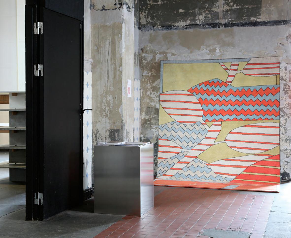
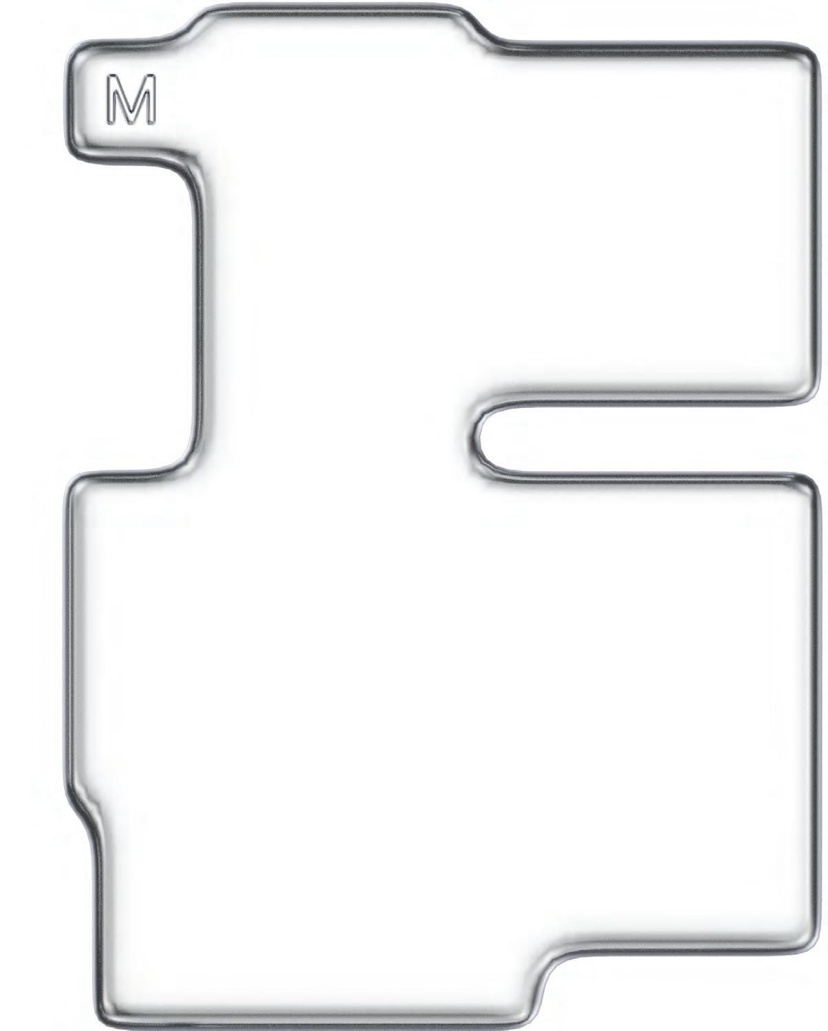
Perhaps the best example of Studio Loutsis’s innovation is its presentation of our annual Top 50 list. How to display this selection, which consists of established firms and new voices? After some sketches, we landed on the idea to shrinkwrap the list. The result, which unfolds starting on page 68, is shiny, metallic, and unexpected, a fitting signature for the creativity of the offices it celebrates.
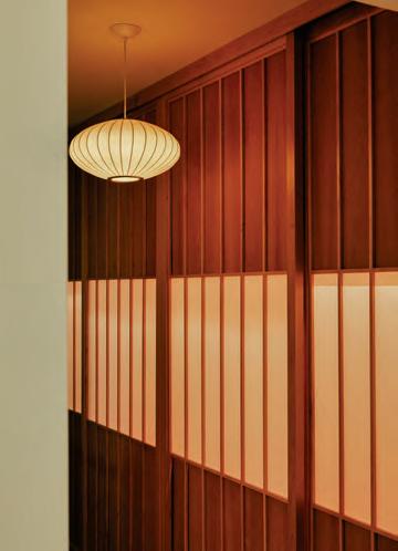
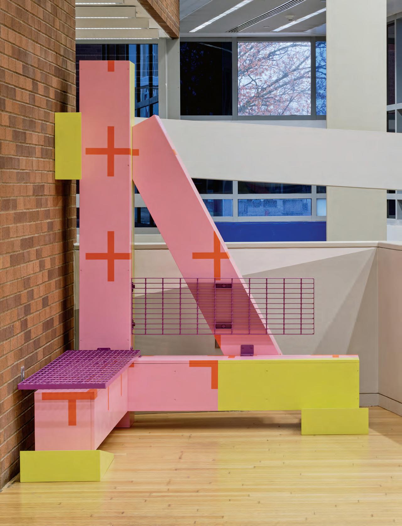
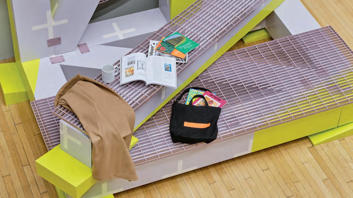
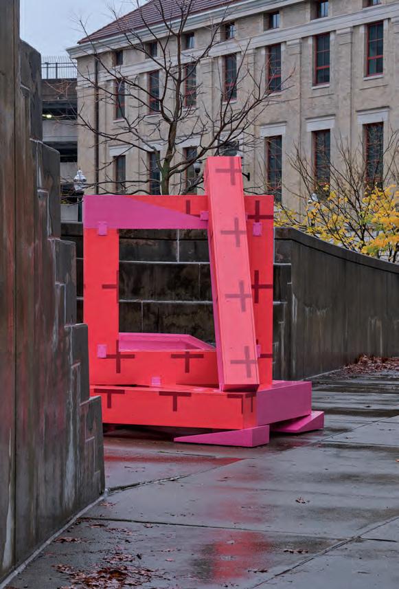
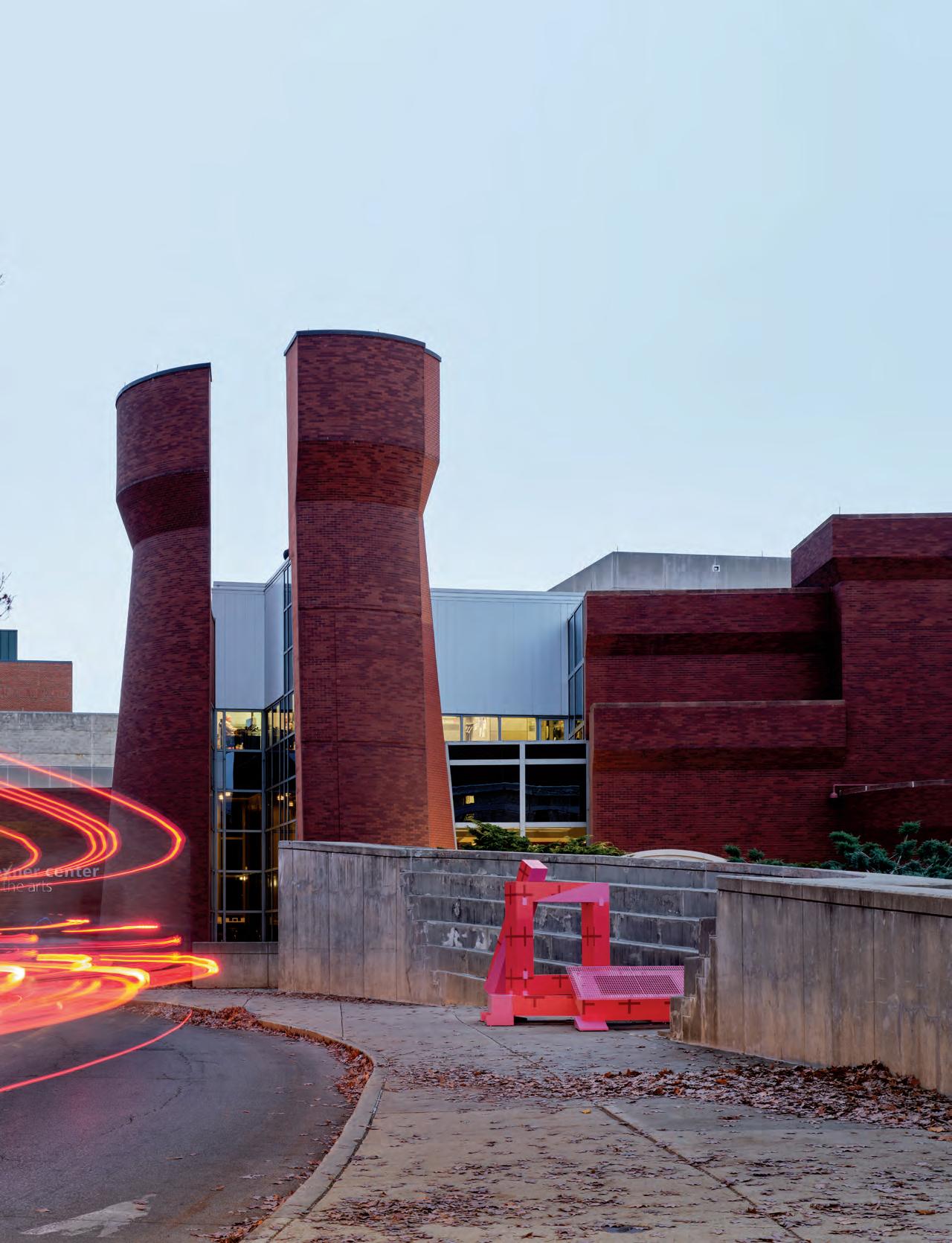
The following renovation-forward features also lean meta-architectural. Witness spaces architects make for themselves or for architectural production and education, like Sam Jacob Studio’s interiors for the Kent School of Architecture. The scale ranges from a small apartment in Madrid reworked by HANGHAR to a pair of buildings designed by the modernist architect Gene Leedy and reimagined by STRANG. The final one is perhaps the most referential, with Outpost Office delivering an installation that responds to the colliding grids of Peter Eisenman’s Wexner Center with fun, strange details like oversize neon shims.
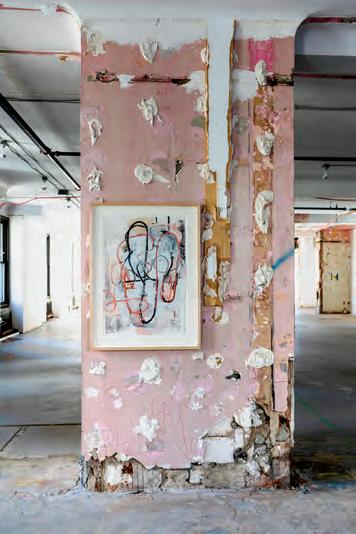
Archmongers’s raw terrace house redo reminded me of Christopher Wool’s SEESTOPRUN, an exhibition of the artist’s work from the past decade that was on view this summer in New York. Installed on the unoccupied 19th floor of 101 Greenwich, just blocks from Ground Zero, the show pleasantly confused artworks with construction mess. (Interestingly, the space previously housed the offices of Studio Libeskind; and, more recently, the space hosted performances of BuildingsI&II, a new play by Richard Maxwell.) SEESTOPRUN spurned the capitalist standards of real estate and art galleries to offer a more materially honest presentation that is less of a perfect image and more of an indexing x-ray. Many architects are taking up a similar mode of inquiry, with encouraging results.
There is still more. Our opening pages are stocked with new furniture, paints, shops, and restaurants, and our Focus section dives deep into the world of tiles, textiles, and surfaces (page 41). We even have criticism! Elizabeth Goodspeed wrote and illustrated a piece about the defanged return of postmodern design (page 38). Arriving at issue 26 means the magazine is fully grown up, conceptually booted from its parents’ health insurance, and forced to survive on its own in the world. If this edition is any indication, I’d like to think we’re doing just fine.
Talk soon,
Jack Murphy Executive Editor
Courtesy Christopher Wool
An installation shot of Christopher Wool’s SEESTOPRUN in New York.
Stone has never felt so inspired.
Introducing our new family of Stone Textures that capture the beauty of natural stone. Inspired by nature, designed for felt, and stunningly unique.
turf.design
Barcelona Wall Scape
CONTRIBUTORS
KATYA BORKOV
Katya Borkov is a writer and multimedia artist based in South Brooklyn. They share their practice as the founder and facilitator of Everything Spills Studio, a hybrid creative hub that offers interdisciplinary incubators and workshops.
JESSE DORRIS
Jesse Dorris is a DJ and freelance journalist whose work has appeared in Aperture, Crack, Dwell, Frieze, TheNewYorker , PINUP , Pitchfork, and many other publications. He lives in Brooklyn.
ELIZABETH FAZZARE
Elizabeth Fazzare is a New York–based editor and journalist who covers architecture, design, culture, and travel. Known for her in-depth features, she is passionate about telling the stories of emerging and underrepresented design talents, reporting on the future of architectural typologies, and uncovering trends that are moving the industry forward. She was previously the senior architecture and design editor at CulturedMagazineand an editor at ArchitecturalDigest.
BRIDGET GOLDBERG
Bridget Goldberg is an architecture writer and communications consultant based in London.
ELIZABETH GOODSPEED
Elizabeth Goodspeed is an independent graphic designer and writer who covers visual culture, design history, and aesthetic trends. She also teaches at the Rhode Island School of Design and serves as the U.S. editor-at-large for It’sNiceThat.
ADRIAN MADLENER
Adrian Madlener is a Brussels-born, New York–based writer. He has contributed to publications including Dezeen, Hypebeast, and Wallpaper . Previously he was a senior editor at TheArchitect’sNewspaper .
ELLEN PEIRSON
Ellen Peirson is an architectural designer, writer, and editor based in London.
DAVID RIFKIND
David Rifkind is a professor in the School of Architecture at the University of Florida. He has written extensively about modern architecture and urban design in Florida, Italy, and Ethiopia.
This issue’s cover features a photo by Luis Díaz Díaz of HANGHAR’s Studiolo project in Madrid. Read Adrian Madlener’s feature about the apartment interior on page 112.
CEO/ CREATIVE DIRECTOR
Diana Darling
EXECUTIVE EDITOR
Jack Murphy
ART DIRECTION
Studio Loutsis
MANAGING EDITOR
Emily Conklin
DESIGN EDITOR
Kelly Pau
WEB EDITOR
Kristine Klein
NEWS EDITOR
Daniel Jonas Roche
ASSOCIATE EDITOR
Paige Davidson
COPY EDITOR
Don Armstrong
PROOFREADER
Joanne Camas
EDITORIAL INTERNS
Soleil Protos
Claudia Yoon
Issue 26 Fall/Winter 2024
AN Interior is published twice a year as part of The Architect’s Newspaper (ISSN 2476-1532), which is published 7 times a year by The Architect’s Newspaper, LLC, 25 Park Place, Floor 2, New York, NY 10007.
Presort-standard postage paid in New York, NY. Postmaster, send address change to: 25 Park Place, Floor 2, New York, NY 10007.
For subscriber service, email subscribe@archpaper.com.
$15.00 a copy, $45.00 one year. Entire contents copyright 2024 by The Architect’s Newspaper, LLC. All rights reserved.
The views of our reviewers and columnists do not necessarily reflect those of the staff or advisers of The Architect’s Newspaper
VICE PRESIDENT OF BRAND PARTNERSHIPS
Dionne Darling
DIRECTOR OF BRAND PARTNERSHIPS
Tara Newton
SALES MANAGER
Heather Peters
AUDIENCE DEVELOPMENT MANAGER
Samuel Granato
VICE PRESIDENT OF EVENTS MARKETING AND PROGRAMMING
Marty Wood
SENIOR PROGRAM ASSOCIATE
Trevor Schillaci
PROGRAM ASSISTANT
Izzy Rosado
EVENTS MARKETING MANAGERS
Andrea Parsons
Charlotte Barnard
BUSINESS OFFICE MANAGER
Katherine Ross
DESIGN MANAGER
Dennis Rose
GRAPHIC DESIGNER
Carissa Tsien
ASSOCIATE MARKETING MANAGER
Sultan Mashriqi
MARKETING ASSOCIATE
Anna Hogan
MEDIA MARKETING ASSISTANT
Mika Rivera
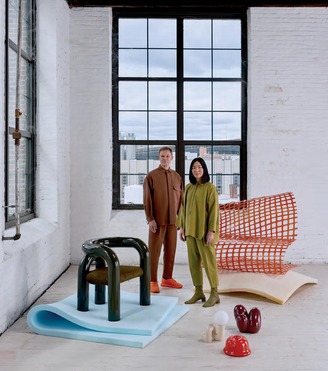
Jumbo
Based in Brooklyn, Jumbo is a design practice founded by Justin Donnelly and Monling Lee. Chubby, curvy, and childlike, the studio’s furniture and objects are guided by an ongoing interest in reductivism and whimsy. At times, the duo takes cues from food: Fortune, put into production by Heller, is a chair inspired by fortune cookies. Other times, industrialism and politics are front of mind, as is the case with the Snow Fence Chair, a reimagining of a flexible polypropylene membrane, commonly found on construction sites, into a static love seat. This piece was inspired by the materials used in outdoor dining spaces during the pandemic. Jumbo researches the science of affect—how physical objects make people feel. —Kelly Pau
Sean Davidson
Designer Profiles
Studio S II
Expect the unexpected. Studio S II, founded by Erica Sellers and Jeremy Silberberg, designs interiors and furniture and curates exhibitions. The through line is subversiveness. For instance, a sconce that mimics the back of someone’s head, long locks and all. Or a chair with two overlapping seats to mimic the vision of a person coming home after a drunk night out. Elsewhere, variation is the only constant, as seen in the studio’s maximal and layered work in Brooklyn: a Greenpoint apartment project to the Scandinavian minimalist interior of a Clinton Hill kitchen. Silberberg and Sellers utilize contradiction and corporeality to explore materials and form. Since its inception in 2020, the studio has quickly grown an audience through often sensual and proudly queer visual languages.
—Kelly Pau
A+A+A
Andrea Chiney, Arianna Deane, and Ashely Kuo founded A+A+A in 2018. The New York–based studio emphasizes inclusivity. It’s evident in the people who make up the firm; in design work like the Tompkinsville Afro-Caribbean and Latin Food & Spice Market on Staten Island; and in the Design Clinic, a consultation service that seeks to help demystify the renovation process by offering a streamlined road map for each project. The studio deals in interiors and architecture as well as mobile and public spaces, installations, and research. A+A+A even designed an architecture studio curriculum, Food Futures, that uses urban acupuncture methodology to examine the relationship between urban spaces and food systems. —Kelly Pau
Isaiah Winters
Obata Noblin Office
ONO, or Obata Noblin Office, approaches everything it does—from its handcrafted models to its designs— with a thoughtful attention to detail. The San Francisco–based architecture firm is led by Tyler Noblin and Max Obata, who cofounded ONO in 2020. Continuity with site history is paramount to the studio’s design process, coupled with incorporating a sense of playfulness whenever possible. Such was the case in the Crane Cove Warehouse, a renovation of a warehouse into a workshop that preserves original industrial materials while introducing bright, contemporary texture. For Pennyroyal, a 1970s ski house in California, the original cedar board and batten facade informed the wood-clad interior. ONO follows a technical and precise method: The goal is not to reinvent the wheel but rather to arrive at something familiar yet fresh. —Kelly Pau
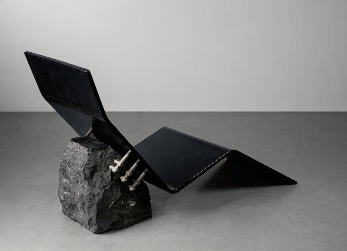
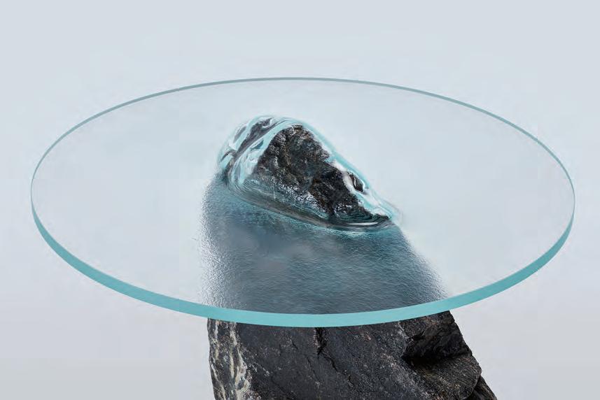
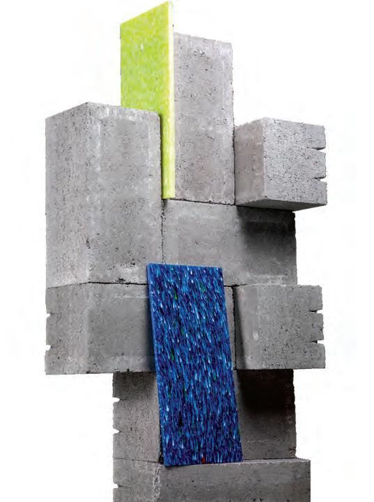
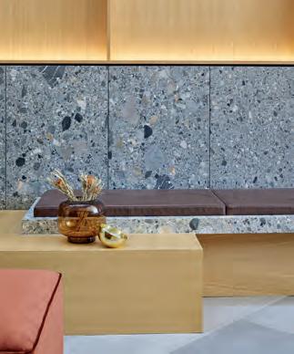
Rocks Rock
Perhaps it’s a growing interest in geology and landscape or just a nifty inclination to use the plentiful, sustainable resources at hand, but the last year has seen an abundance of rock-incorporating designs, the best of which are gathered here.
4
5
6
by Batten and Kamp by Qiaosen Studio onzogranite Fountain
Fearn by Orior
Geodies Collection by Budri × Patricia Uriquiola
Slump Rock Table by Paul Cocksedge
Squiggly and Joyful
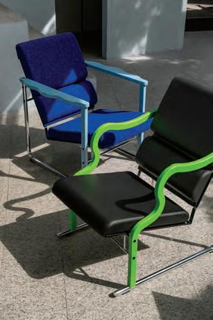
Hem reissues the distinctive Experiment Chair by Finnish designer Yrjö Kukkapuro
In 1982, Yrjö Kukkapuro, already a well-known Finnish designer, underwent a “postmodern explosion.” His Experiment Chair, with its sculptural and colorful armrests, was one output. It embodied the optimism of Finland in the early 1980s and debuted at Salone del Mobile in 1982 before going on sale in 1984. (Production ceased in 1995.) Kukkapuro, 91, considers the Experiment Chair the greatest success of his career. Now Swedish furniture brand Hem has put the chair back into production as the company’s first reissue of an archival piece. The chrome-plated frame can be paired with curvy red, blue, green, or black wooden armrests and three new upholstery options, for a total of 16 possible configurations. Some updates include small ergonomic and material changes that make the item more comfortable, durable, and environmentally responsible. The chair’s release aligns with the publication of The Blue Door , Isa Kukkapuro-Enbom’s biography of her father. “Yrjö has always been ahead of his time,” Petrus Palmér, Hem’s founder, remarked. “We’re beyond excited to bring the Experiment Chair back.” —Jack Murphy
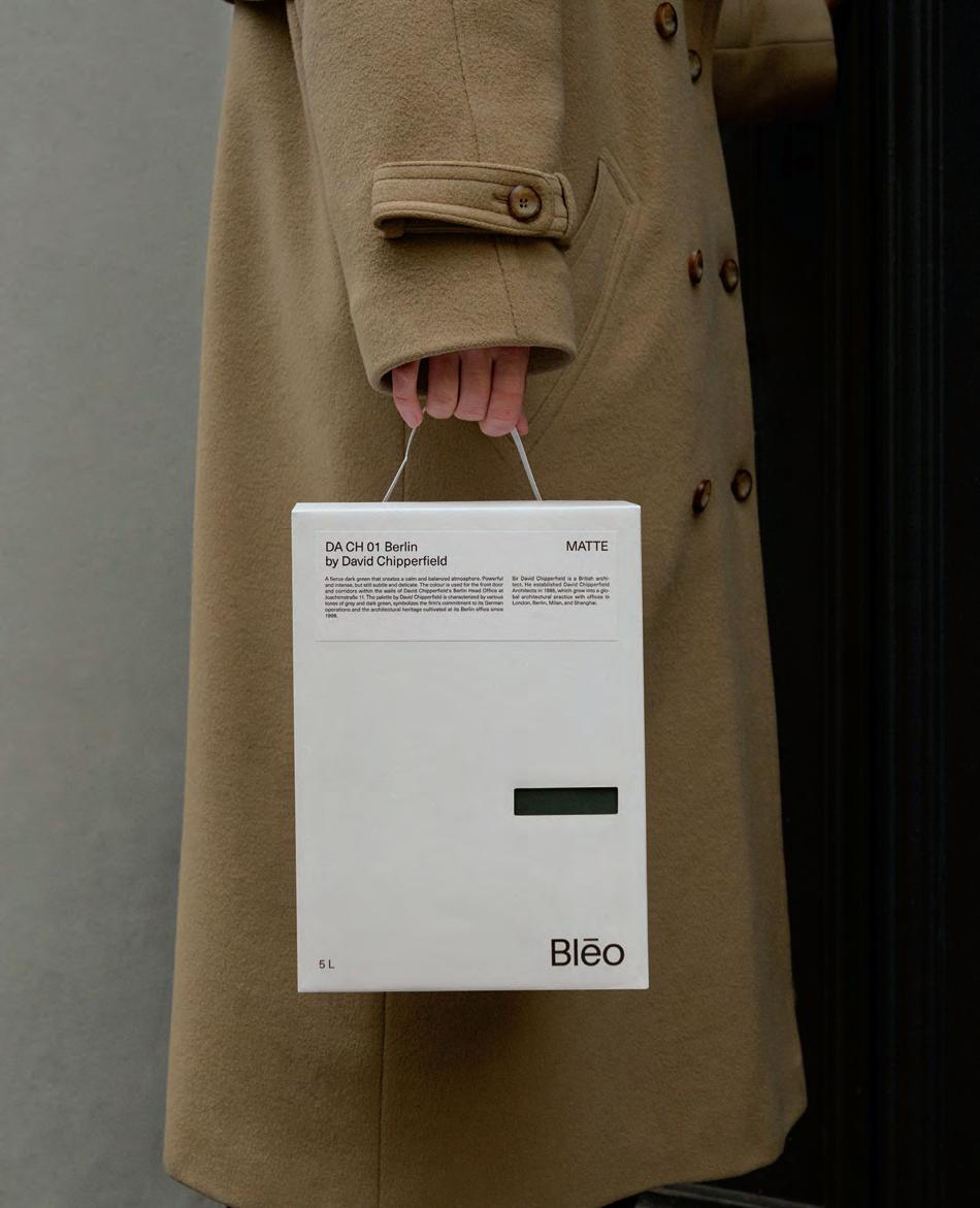
Color Me Happy
New Danish paint company Bleo collaborates with architects, designers, and artists.
Blēo is an Old English word that means color, hue, complexion—and it happens to also be the name of a new innovative paint company from Copenhagen, Denmark. Founder and head of brand/creative Anne Grønskov has pioneered paint through personalized collaboration with artists, designers, and architects.
Since its founding in 2023, Blēo has collaborated with Barber Osgerby, David Chipperfield, Cecilie Bahnsen, and most recently the Josef & Anni Albers Foundation. Grønskov and her team studied Albers’s Interaction of Color and crafted a new 29-color palette influenced by the book.
This fall, Blēo will expand its paint production to North America. One of the first American collaborations will be with Alexander Girard Studio. “Alexander Girard was a legend,” Grønskov said. “Having him and Albers among our color masters is a dream of mine.” —Paige Davidson
Courtesy Blēo
Vinyl Fantasy
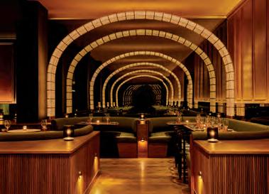
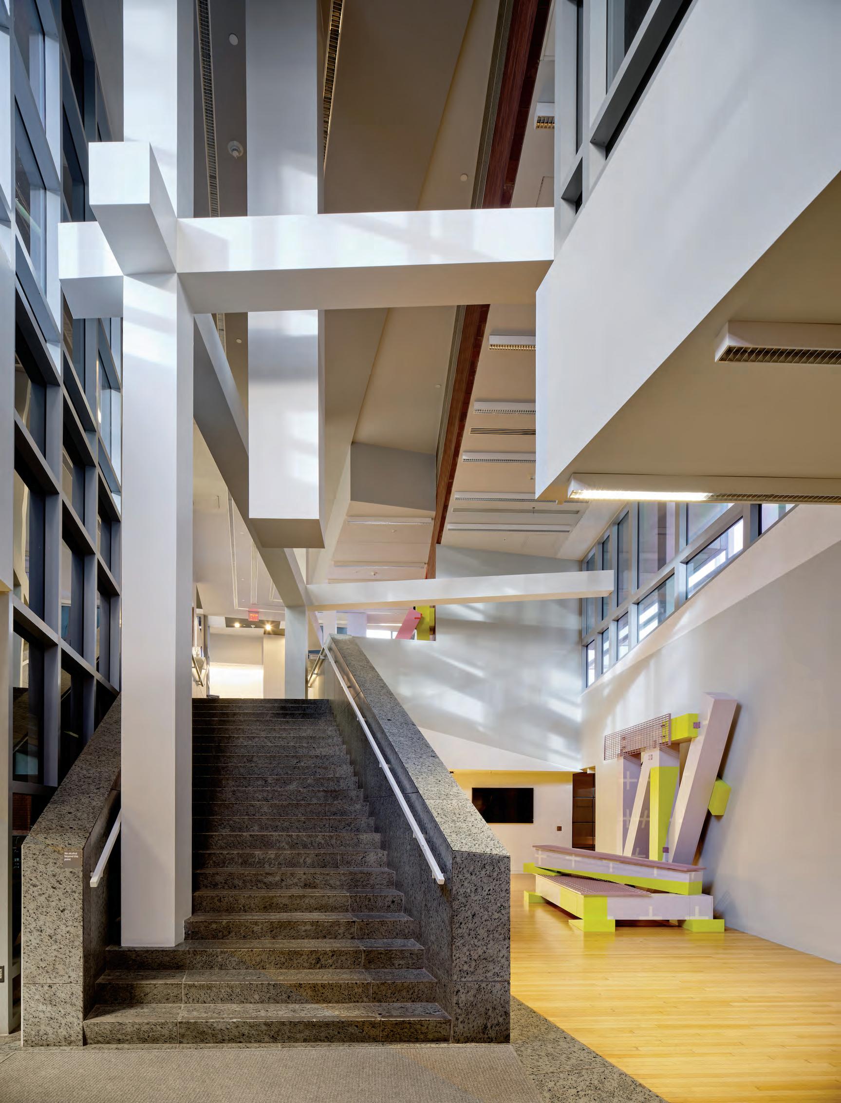
JJ Boooth designs for today’s DJs.
When the designer JJ Boooth was first honing his mixing skills, he did it the way almost every DJ does: endless practice over turntables and a mixer perched atop the classic IKEA Expedit. “It was just a nightmare to play bent over the turntable for hours,” he said. So, he mounted the setup on legs, then recessed the turntables to improve his DJ posture.
A 2015 graduate of ENSA Paris-Belleville, Boooth was no stranger to architectural models, and he felt that transitioning to furniture like his Unit 010 felt like just a larger-scale project.” Now based between Paris and Berlin, he’s mixing standard materials like birch and poplar plywood with new favorites like oak, walnut, and mahogany veneer for modular cabinets for any equipment a DJ might desire.
Next in the queue? A bespoke booth for a club in Paris and a speaker collab with New Fidelity. —Jesse Dorris
Courtesy JJ Boooth
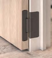
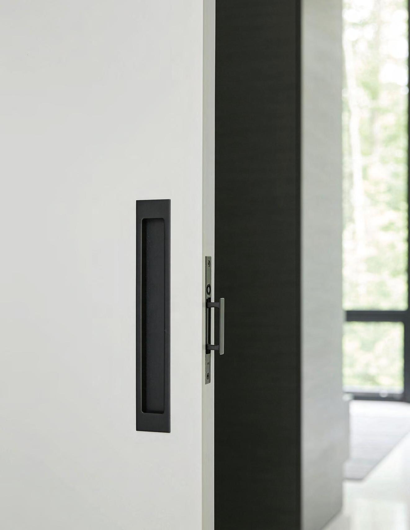
Whether it’s swinging or sliding, small or monumental, Halliday + Baillie offers iconic flush solutions for any door in your project. Delivered in a dozen New Zealand-tested architectural finishes, H+B is dedicated to sustainable sourcing and manufacturing to ensure a lifetime of elegance and performance. The future is flush.
ARCHITECTURAL HARDWARE
Designed + manufactured in New Zealand
There Are Designers Among Us
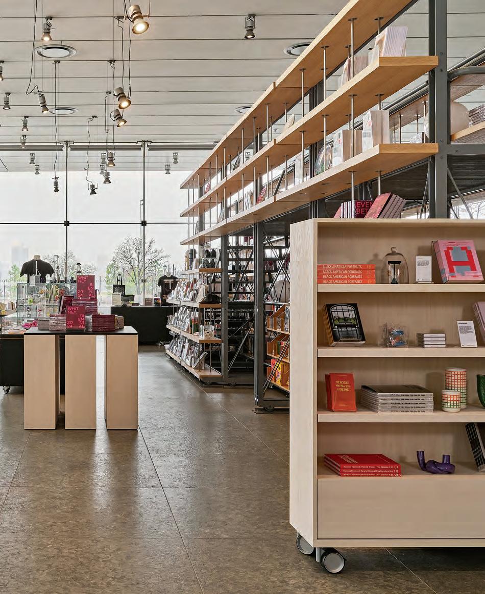
Office of Tangible Space designs a refreshed retail experience at the Whitney.
The Whitney Museum of American Art’s lobby recently welcomed a revamped bookstore by Office of Tangible Space. The Brooklyn-based studio, founded by Michael Yarinsky and Kelley Perumbeti, was tasked with creating a refreshed retail experience for the Whitney shop, which contains everything from artist monographs to postcards to iconic “there are artists among us” merch.
To that end, the studio has delivered a series of shelving units, tables, and chairs that “signal a transformation for the museum,” said the studio founders. All are mounted on wheels for easy reorganization and rendered in a mixture of blond and blackened woods. Elements come together at rounded edges and vary in height from that of a dining table to as tall as seven shelves high. There are also specialized racks for hanging clothing and rotational mechanisms that allow certain shelf units to “close,” akin to shutting a jewelry box.
—Emily Conklin
Claire Esparros
FrameAll Grid is a pre-engineered integrated suspension system for ceilings, surrounds, and soffits. Using hanger wires versus steel studs to deck, you can achieve up to 76% reduction in embodied carbon. Lower your carbon footprint and finish installations 3x faster at armstrongceilings.com/frameall
An Atypical Monograph
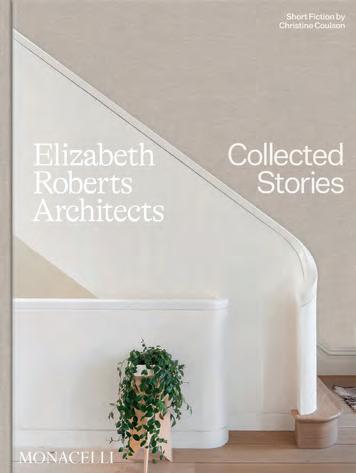
Elizabeth Roberts offers insight into the creation of her first book.
Earlier this fall, Elizabeth Roberts, founding principal of Elizabeth Roberts Architect (ERA) released Collected Stories, published by Monacelli Press. To tell a more accurate story about the lives of her projects, the well-designed volume includes historic photography, sketches, and even short fiction by Christine Coulson. Roberts spoke with AN Interior ’s executive editor, Jack Murphy, about the publication.
Jack Murphy (JM): What did you learn by making this book?
Elizabeth Roberts (ER): Just like an architecture project, making a book is complicated and time consuming! And it takes a village. As with any design challenge, there are lots of pieces and considerations that go into a book—especially a visual book. I learned that it’s deeply satisfying to figure out how to translate the sensibility of my practice into book form.
JM:
How is design a form of storytelling, in your view?
ER:
Forming a story about a structure or a site is how I find my way into the design process—or, as I wrote in the book, it’s how I find the truth of my concept. That story always picks up on some sort of history. It also sets the stage for new stories to be written. When I “finish” a
project, my part of the story is written. But I know what I’ve done is just the starting point for whoever is going to come along and occupy that space.
JM:
What’s the relationship between architecture and interior design for you?
ER:
In my practice, I no longer distinguish between architecture, interior design, and objects. I see them as three interdependent parts of the whole. When I was starting out, I thought I shouldn’t take on interiors work. But I’ve always loved thinking about spaces in their entirety. That’s what really animates how we work at ERA, and it’s what has most enabled my design language to evolve.
William Jess Laird, courtesy Monacelli Press
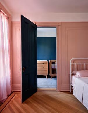
An Old Place, A New Face
adamo-faiden and Chamber Projects bring a taste of Italy to the Argentine capital.
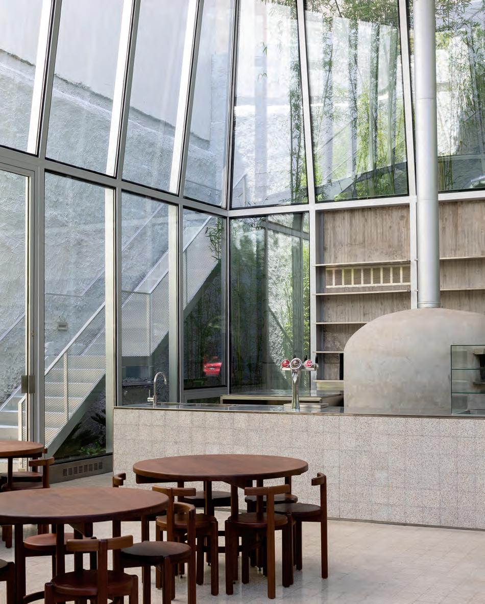
Orno’s third location in Buenos Aires just landed in Palermo. The new pizzeria, designed by adamofaiden and Chamber Projects, is shaped like a frustum, with an aluminum chimney that recalls Le Corbusier’s chapel in Firminy, albeit conceptually. A bespoke stair connects the restaurants’s two floors, and wood furniture throughout is complemented by white tiles, stainless-steel appliances, and exposed concrete. Orno Palermo was built where Esquina del Sol previously stood, a bar that once hosted political meetings and rock shows after Argentina’s dictatorship collapsed in 1983. Esquina del Sol became known to many as a symbol of democracy’s resurgence in Buenos Aires. Orno Palermo sits behind the bar’s old facade, a maneuver that nevertheless preserves the memory of the beloved neighborhood landmark. —Daniel Jonas Roche
Rojas
Simpl e Installation. Stunnin g Results.
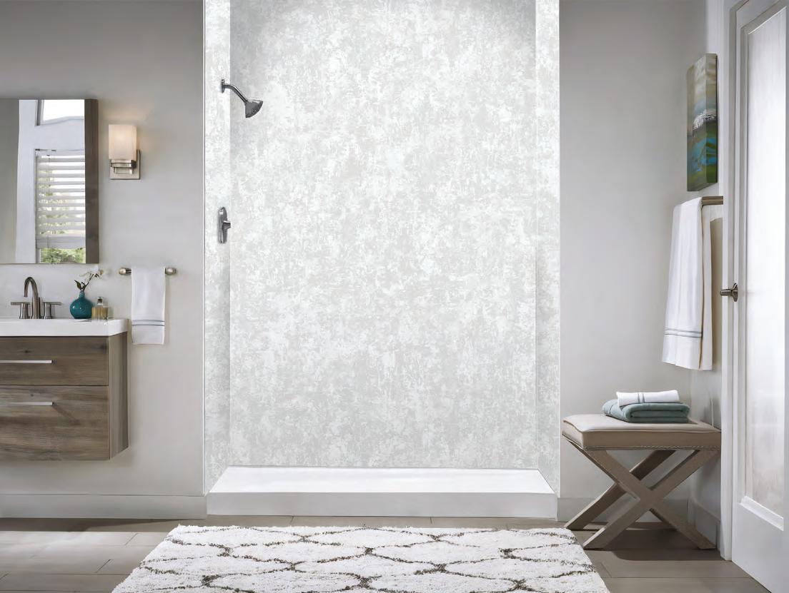
Designed for use in shower / bath enclosures, lobbies, feature walls, and other interior spaces.
Premium properties of MONARC ensure an extremely flat, lightweight, waterproof panel.
Delivers a striking visual appearance inspired by natural elements.
Inspiration drawn from wood, marble, stone and metal variations.
• Waterproof
• Lightweight
• Cost E ective Installation
• High Quality
•Formability
• Low Maintenance
• Fire Rated
• Material Composition
• Flatness & Rigidity
To view the entire collection of 19 finishes or to order samples, please scan the QR code.
For more information about MONARC wall panels, email us at: info.usa@3acomposites.com
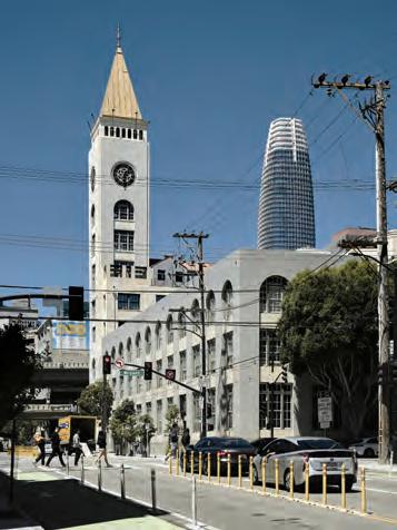
Keeping Time
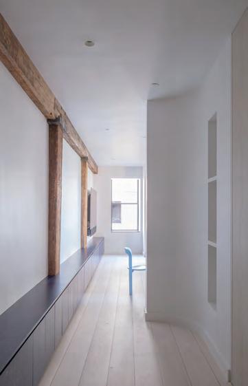
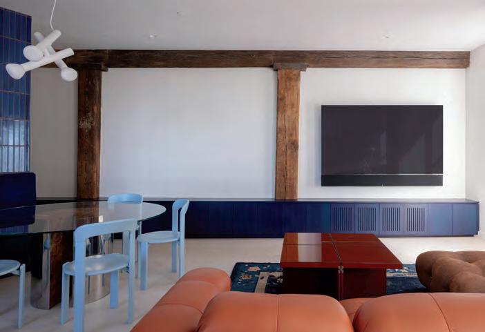
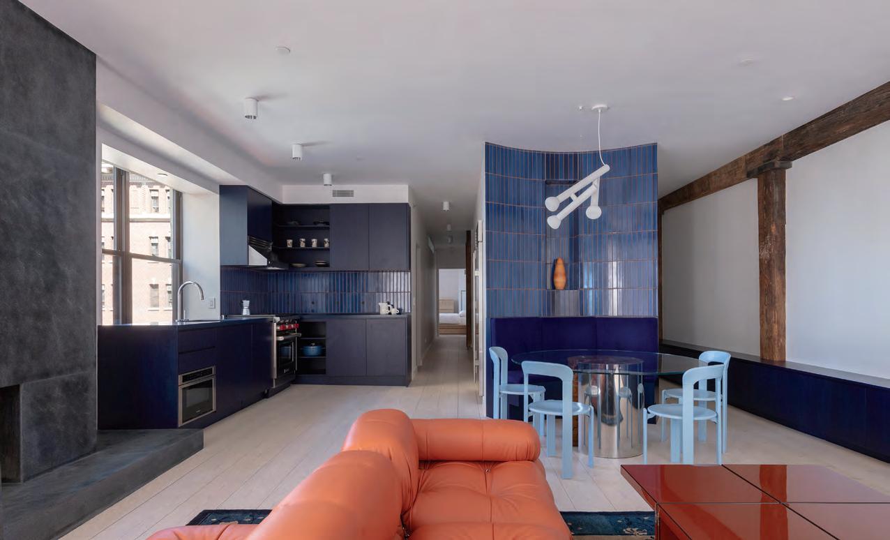
Hesselbrand revitalizes an industrial loft in San Francisco with a European touch.
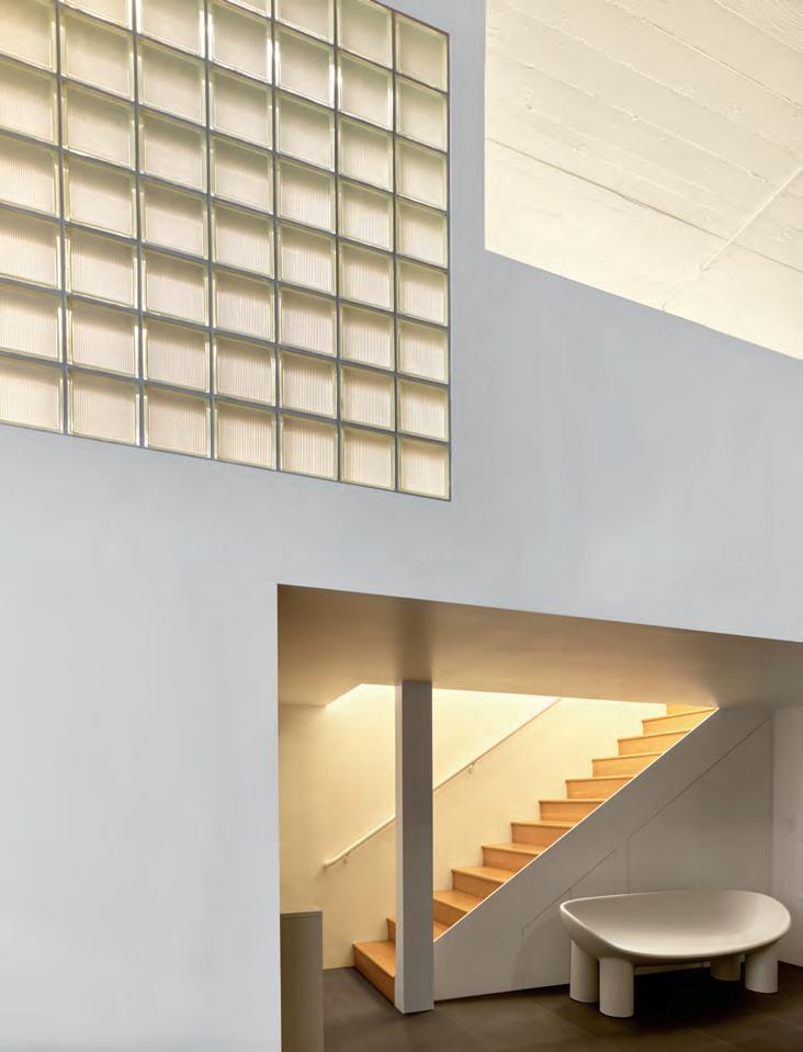
In San Francisco’s beloved Clocktower Building in South Beach, Hesselbrand has inserted a unique loft residence into the landmarked architecture. In the 1990s the structure was converted to live-work lofts by David Baker, but after 30 years the London-based Hesselbrand was invited to put a European spin on one elevated and spacious residence.
Hesselbrand first focused on the problem of natural light. Approaching the project as a work of adaptive reuse, designers recirculated access to and within the apartment by placing living and working spaces around the glazed perimeter. Previously, the industrial use of the building placed circulation on the outside, cutting off interior rooms from the sun.
In a similar vein, the design revolves around an oak core at the center of the loft. Dividing the apartment into five areas, this intervention centralizes services and frees the corners of the home to be open and social, while still offering privacy. —Emily Conklin
FACING PAGE
Oak inserts delineate new spaces for living in the industrial shell.
LEFT
The new design prioritizes social spaces along the glazed perimeter.
BELOW, LEFT
An exterior view of the historic clocktower near downtown.
BELOW, RIGHT
An unexpectedly warm glow welcomes you to the loft’s upper floor.
Three Branches of Practice
OWIU is committed to constant evolution and an expansive definition of architecture.
RIGHT
BELOW
Wood paneling and diffuse lighting define interior spaces at the Duane house.
FACING PAGE
The double-height living area at the Duane house is filled with light and curated furnishings.
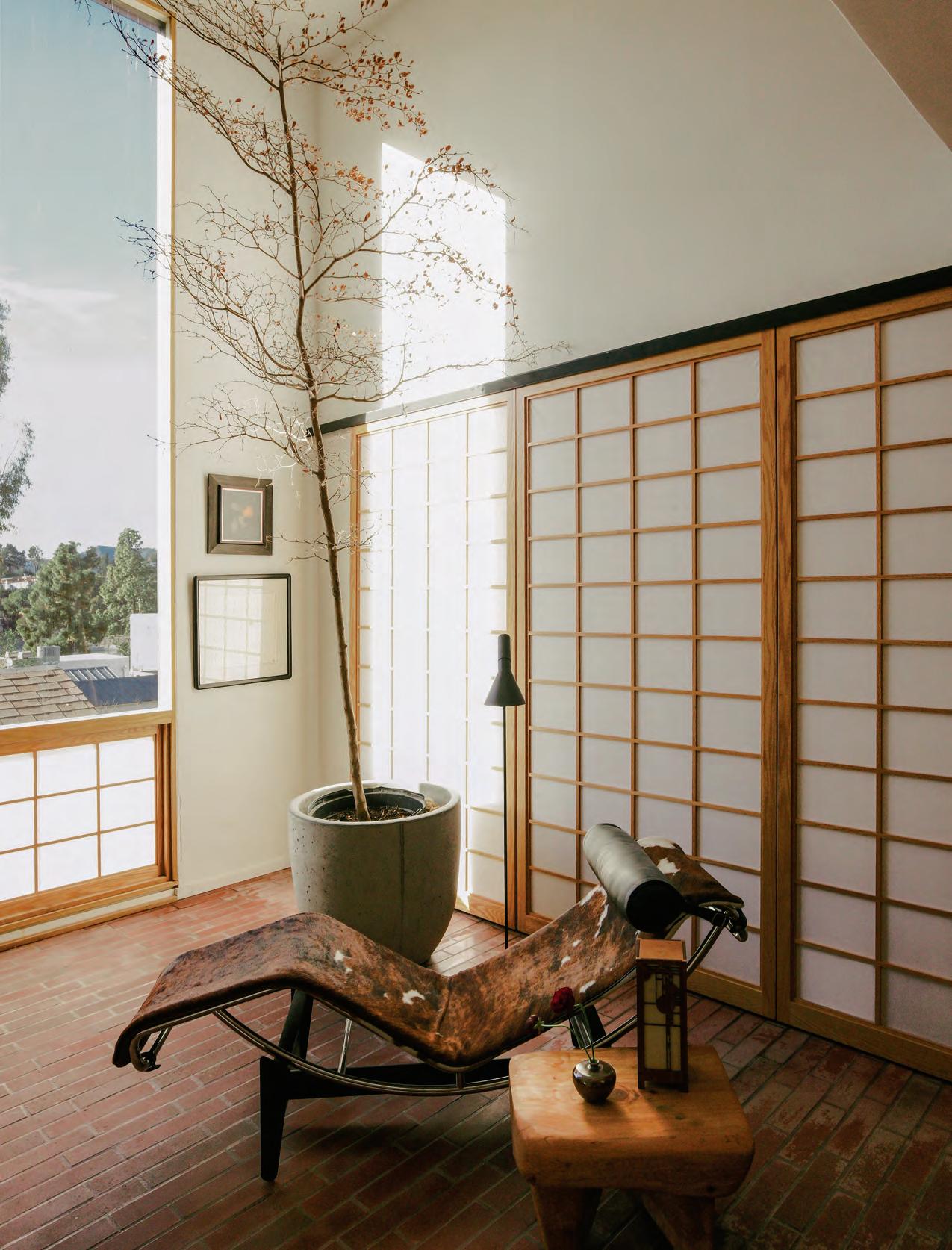
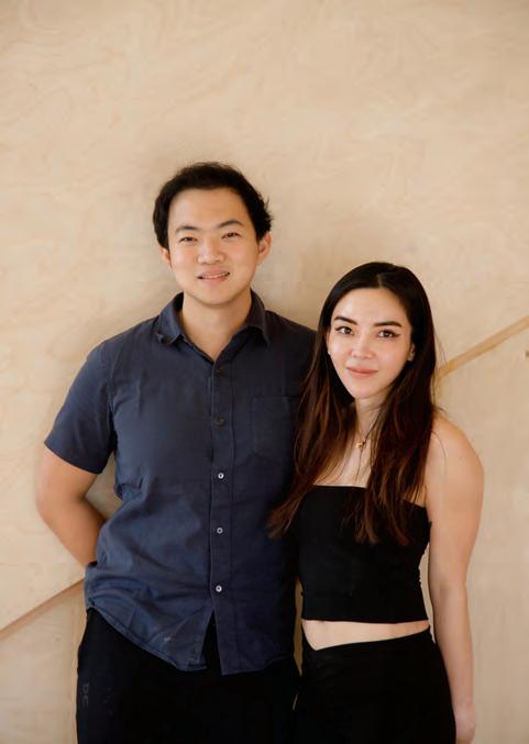
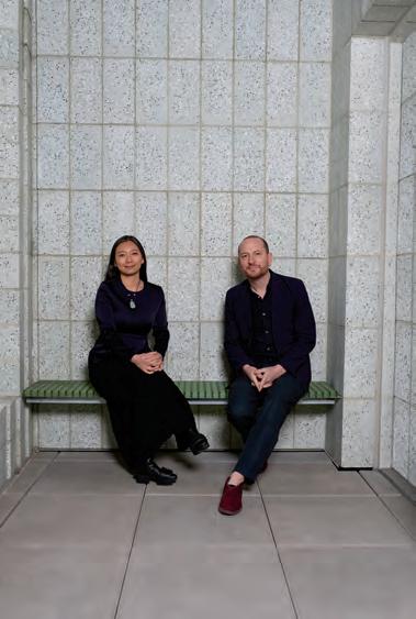
The idiom “the only way is up” is invoked when there’s no other option but to keep going. It’s this sense of reckless abandon and perseverance that led Joel Wong and Amanda Gunawan to leave what they considered their dream jobs at Morphosis and branch off on their own. The name of their firm, OWIU, is an abbreviation of the same phrase, and it’s aptly put. A will to evolve no matter what has led the small California-based firm to embark on two more ventures: a construction firm called Inflexion Builds and a ceramic goods line, OWIU Goods.
Both Gunawan and Wong grew up in Singapore but moved to California to attend the Southern California Institute of Architecture. When they started the studio in 2018, “it was an uphill battle,” Wong said. “We were doing a lot of pro bono projects, a lot of installations.” But the pandemic turned the tides. As people invested more into their homes, they called on OWIU to deliver.
In 2022, the duo was able to start Inflexion Builds—though it had never been a part of the plan. Like all the other aspects of their work, every step in OWIU’s trajectory has been made through a combination of organic happenstance and the cofounders’ willingness to go with it. “We were in a place where we had all these designs and we needed someone to build it, and we were having such a big problem finding a good contractor,” explained Wong. “Screw it! Let’s just create our own entity.”
OWIU’s seven-person build team gives the architects autonomy over the construction process while enabling the bespoke services that so often set architecture firms apart. With Inflexion Builds, the architects can explore materials and specify designs they’ve created exclusively for projects.
OWIU founders Joel Wong and Amanda Gunawan
“Our whole ethos is about thoughtful design and careful craftsmanship,” said Gunawan. “We wanted to have this philosophy on a macro level—building architectural spaces—but also on a micro level, on a product level.” How about a ceramics level? During the pandemic, the cofounders offered employees memberships at a ceramics studio to help with mental wellness. It was such a hit that the studio became flooded with ceramics. Gunawan began sharing photos of the objects online, and offers to purchase came rolling in. Demand for the earthy, minimalist serving ware has now resulted in its own five-person studio.
The three branches work in tandem for each project. The Goods team makes custom plates for restaurants the design team is outfitting, built by the construction company. “They’ve begun to feed off each other,” said Gunawan. “Soon we’ll be able to specify tiles and be able to make and order them ourselves.”
Bespoke elements are at the center of OWIU’s latest project, Duane, the renovation of the cofounders’ own 1962 midcentury quadruplex by Carl Maston. For Unit D, the architects added custom shoji screens to lightly divvy up the open floorplan. “Our work is always this middle ground between preservation and renovation,” shared Gunawan. For Duane, OWIU considered where it’s best to fix and maintain and where it makes sense to add modern elements like the wellness space. Outside, they then inserted (and constructed) a new addition to house a cold plunge and sauna. The neutral-toned interior features midcentury furniture, neutral natural wood, a Japanese garden, paper lanterns, and a genkan, or Japanese-style entryway. It’s Asia-meets-California, a hallmark of OWIU and yet another organic, unintentional combination of the cofounders’ own upbringing.
As if three companies weren’t enough, the OWIU team is also working on a furniture line, born from an assisted living project. Where will they go from there? The only way is up. —Kelly Pau
ABOVE
An in-progress shot of OWIU’s Inflexion Builds contracting work
LEFT
OWIU Goods ceramics are often used in hospitality projects.
BELOW
At the Duane house, wooden accents play off of contemporary furnishings and midcentury lighting designs.
FACING PAGE
Signature gestures reference east Asian influences throughout OWIU’s portfolio.
Avant Basic
A new generation of postmodern design plays into similar ‘70s pastiche, but without the political teeth.
Text & Illustrations by Elizabeth
Goodspeed
You can’t step into a millennial’s apartment today without tripping over a piece of furniture with wiggly lines. From the resurgence of neobaroque furniture to the playful, almost cartoonish typography on product packaging, postmodernism is back, yet again. Once a rebellious movement that sought to undermine the coldness of modernism with irony and eclecticism, postmodernism, or PoMo for short, has mellowed into something a bit more cheerful and accessible, with a focus on visual delight rather than intellectual depth. But there’s a reason this trend is sometimes called “Avant Basic”— it’s avant-garde aesthetics stripped of their edge for the mainstream.
Of course, the new millennium has already seen one rehash of postmodernism: the Memphis Group–inspired aesthetics of the “Indie Sleaze” 2000s. In 2012, mixtapes and graphic tees alike indulged in clashing colors, squiggles, and geometric type faces like Babyteeth (first made famous in a Bob Dylan poster by Milton Glaser, later resur rected on a 2006 album for The Rapture). But as the word sleaze may suggest, this second pass at Memphis Milano brought much of the same cynicism and cheeky bad taste as its pre decessors. While 20th-century postmodernism used irony to question rigidity and dogmatism in modern design, Indie Sleaze PoMo widened its aperture to lambast the prosperity promised by the digital age and consumer-driven culture.
The latest iteration of present-day “post”-postmod ernism (PoPoMo, if you’re in the mood) reflects many of the same aesthetic impulses as its predecessors: bold colors, quirky forms, and a mix of high and low cultural references. The only difference? We ’ve stopped caring about critique. Aesthetic motifs that were once deployed as commentary have evolved into a surface-level celebration of the surreal and irreverent—an indulgent escape in a world that often feels like it’s teetering on the edge. If the greige Scandi minimalism of the past decade was like sending your inner child to a Waldorf school, this is more like giving it 24/7 access to Nickelodeon.
Given this return to unfettered joy, it makes sense that the new postmodernism has a decidedly childlike sense of humor as well. Unlike previous iterations of PoMo, where humor was tonguein-cheek and layered with cerebral meaning, today’s designers embrace a more simplistic, accessible approach to cracking jokes. The goal isn’t to make people feel like they’re in on the joke; you just have to make them laugh. And if making people laugh makes money, the best way to keep a business running in 2024 is to make as many people laugh as possible. Trompe l’oeil in particular has become a favorite punch line for contemporary neo-nostalgic designers. There is, after all, something universally appealing about stuff that looks like
other stuff—you need only look to 3,000-year-old Bronze Age vessels shaped like animals, or pop a rtists like Claus Oldenburg and his oversized sculptures of shuttlecocks and garden spades for p roof. Stores like Think Big (open from 1979 to 1994 in New York) made whimsical outsized design available to everyday consumers, and today’s examples—like Third Drawer Down’s corncob stools, Seungjin Yang’s balloon furniture, and Gohar World’s faux-food candles—carry on the tradition. These instantly recognizable and playfully absurd pieces are easy to style in any home simply because they were never meant to blend in. They pack a big punch with m inimal effort—perfect for a generation of renters who might not be able to paint their walls but still want to make a statement.
Another trend in contemporary postmodernism takes a similarly literal approach like trompe l’oeil’s, distilling objects down to their most essential, impactful forms; they may be abstract, but they're still one-liners.
A good example is The Splat Table by Sophie Colle, which looks exactly how it sounds. The same goes for the Fortune Cookie chair or Squiggle Vessel by Jumbo, the latter of which is inspired by an inchworm, now reduced to a minimalistic pictogram: a monowidth, monochrome squiggle devoid of any distinguishing features beyond its iconic bends.
If trompe l’oeil is literally a worm, this kind of kitsch minimalism represents something more like the idea of a worm. Pieces that play with color and surface form alone, such as Dusen Dusen home goods or the Yinka Ilori x Momentum textile collection, represent the most reduced version of this trend—largescale, immersive color therapy. This trend toward simplified, easily parsed forms has also jumped from the world of objects into graphic design, especially brand packaging. There’s been an unavoidable surge in bold, shapey typography, representing a shift away from the minimal sans serif fonts that defined the CPG wars of the last decade. Frequenters of fashionable gift shops might be familiar with the bright yellow puzzle brand Le Puzz, which, like its first- and second-wave PoMo forebears, uses a typeface reminiscent of our beloved Babyface. This same
block-letter style has also been used by trendy tupperware company Cliik, Venus Williams’s Happy Viking protein powder, and olive oil brand Good Phats. Functionality plays a role here: Just as an Ettore Sotsass’s Ultrafragola Mirror grabs attention even in the background of a Zoom call, blocky logos stand out on small screens without sacrificing detail—crucial in an age where visual impact is king. It’s also a sign of changing consumer attitudes: People no longer equate quality with a sophisticated, uniform aesthetic. (A Chippendale cabinet is likely less valuable than a Memphis Group one now, too.)
That the commercial arts of typography and packaging are now using the same forms once reserved for design-savvy circles is a clear indicator of how ubiquitous and sanitized postmodernism has become. You can snag Memphis-style home goods at Target or Urban Outfitters as easily as you would a pack of socks. And why not? Many of these PoMo items are now around 40 years old, making them ripe for reissue—a far cheaper option for companies than coming up with something new. Meanwhile, the original designers, if they’re still around, can enjoy a well-deserved victory lap. What was once a subversive force has become a staple of the mainstream, repackaged, rebranded, and sold back to us as quirky decor. Instead of critiquing or resisting mass culture, postmodernism has simply become part of it—proof that even the most subversive ideas can be tamed when there’s a buck to be made.
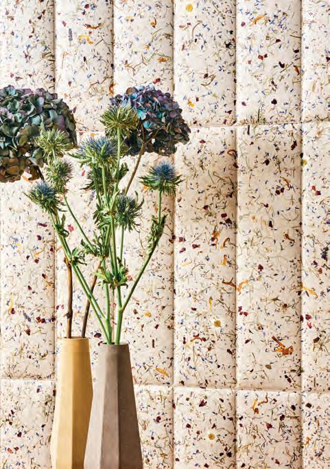
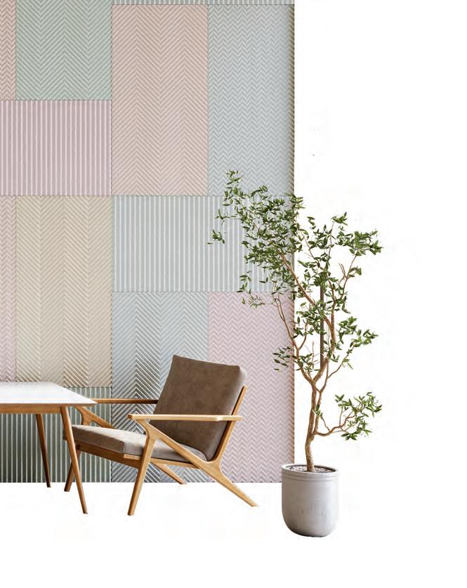
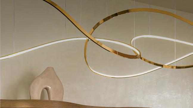
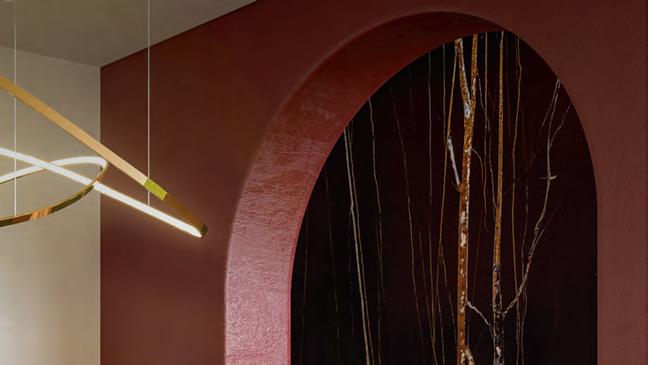
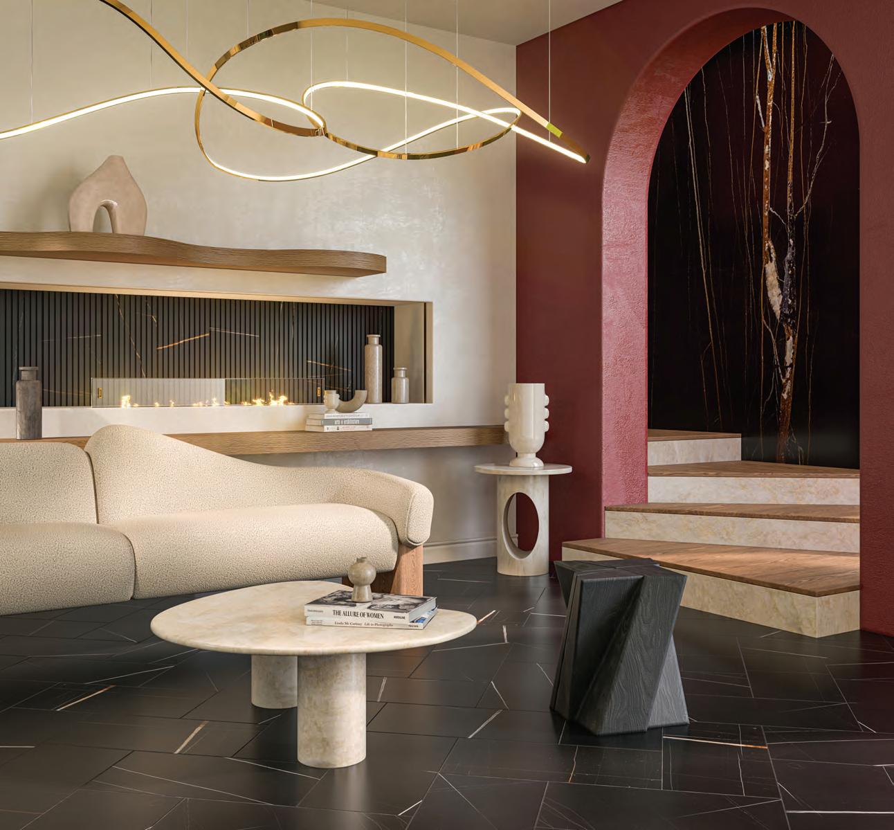
TILES, TEXTILES & SURFACES
These materials define our homes. Experience how textures, patterns, and finishes bring three New York City apartments to the next level.
1 by Jeudan, other images courtesy the manufacturers
Naturally Neutral
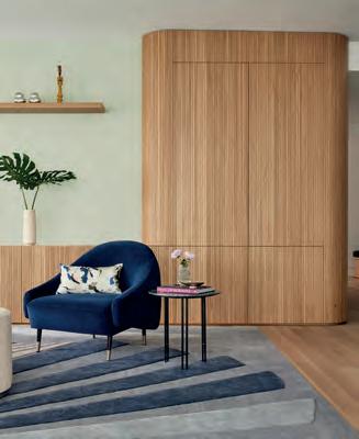
General Assembly crafts a calm oasis with textural complexity on the Upper West Side.
BELOW
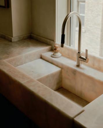
A stone island by BAS Stone is a centerpiece of the kitchen and integrates a custom wooden table furnished with De La Espada chairs.
RIGHT
A Dornbracht fauct completes a custom integrated sink created by BAS Stone.
William Jess Laird
BELOW, RIGHT
Calico Wanderlust Unearth wallpaper adds texture and depth in unexpected places, like the entry to the
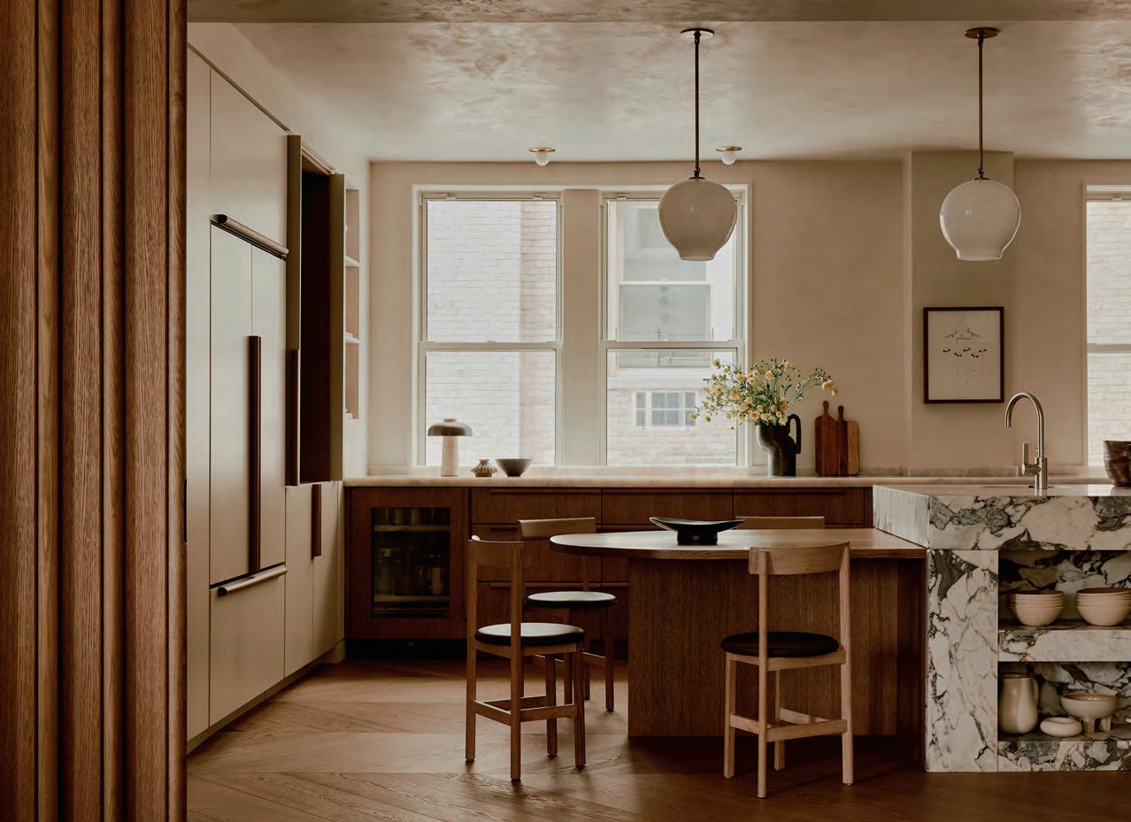
General Assembly’s Upper West Side Residence strikes a harmonic balance between grandeur and simplicity, paying homage to the building’s prewar history through intentional pairings of natural materials. Noting how the family of four uses the space, designers Sarah Zames and Colin Stief opened up the segmented floorplan to create a spacious living area where loved ones gather for annual Super Bowl parties.
Wood details, like a set of sliding doors that demarcate the kitchen, are paired with natural stone elements to create a grounded feeling. Five massive, vibrantly patterned stones are juxtaposed against wooden furnishings; slabs of quartzite and veined marble have become sinks, countertops, and a commanding kitchen island; and a custom-carved table acts as a light counterweight to complement the island’s unique shape.
General Assembly often creates custom pieces to realize its unique visions, which led the firm to open its own retail store for home renovation materials, furniture, and lighting called Assembly Line. The
living room’s modular coffee table was one of the first pieces designed for the space, and reproductions can be found at Assembly Line. The table’s curved edges and rounded shape gesture to the unique sculptural irregularity of natural forms that characterize the firm’s work.
While the open communal space is the apartment’s centerpiece, each private bedroom and guest area is a sanctuary of its own. The designers made use of the primary bedroom’s ample natural light to feature a virker plaster finish on the walls. There’s also a custom floating bed frame, which enhances the open nature of the space’s design.
“We’ve tried to bring in local designers to give a sense of place,” Stief said. Zames pointed out the dining room table from Egg Collective, which sits beneath a light fixture by Lindsey Adelman and holds pieces by Danny Kaplan. Attention to detail down to the dining table’s polished brass accents demonstrates General Assembly’s sophisticated touch when it comes to manufacturing visual harmony across all surfaces. —Katya Borkov
William Jess Laird
RIGHT Interplay between the Oagra rug from Armadillo and Fort Standard’s Planar Side Table, sculpted out of travertine, strikes a balance.
primary bathroom.
Tiles, Textiles & Surfaces
Acoustics
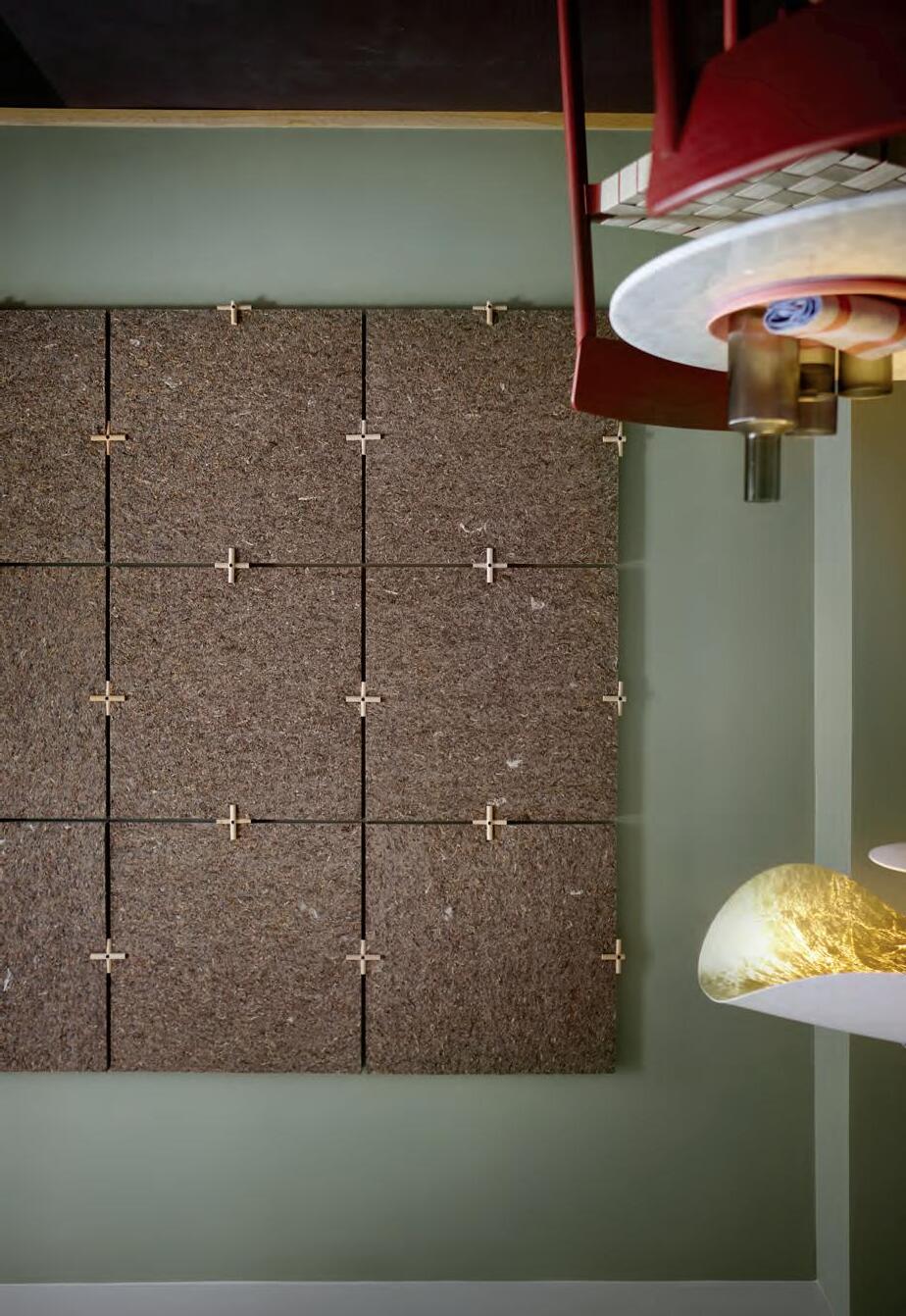
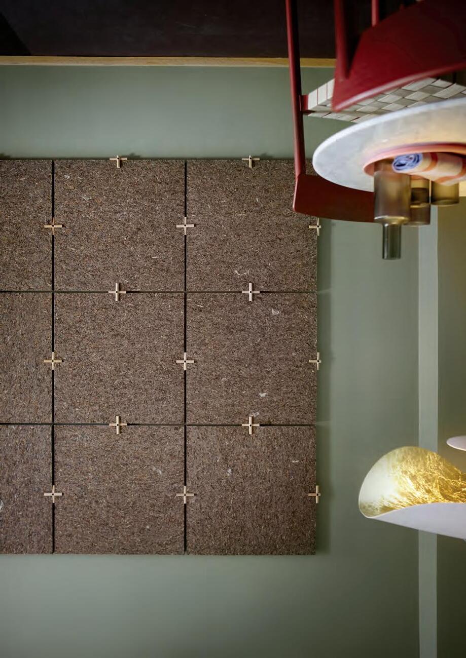
These soundabsorbers play with biophilia in decorative and innovative ways, from incorporating pressed flowers (and their smells) to sculpting organic forms and turning citrus into acoustic pulp.
5 Stone Textures by Turf
6 Hush Stack by 3form Elements
1 BLOOM by Fräsch
2 Acoustic Pulp Bio Colour by BAUX
3 Bloom by Slalom
2 by
Gianluca Bellomo, other images courtesy the manufacturers
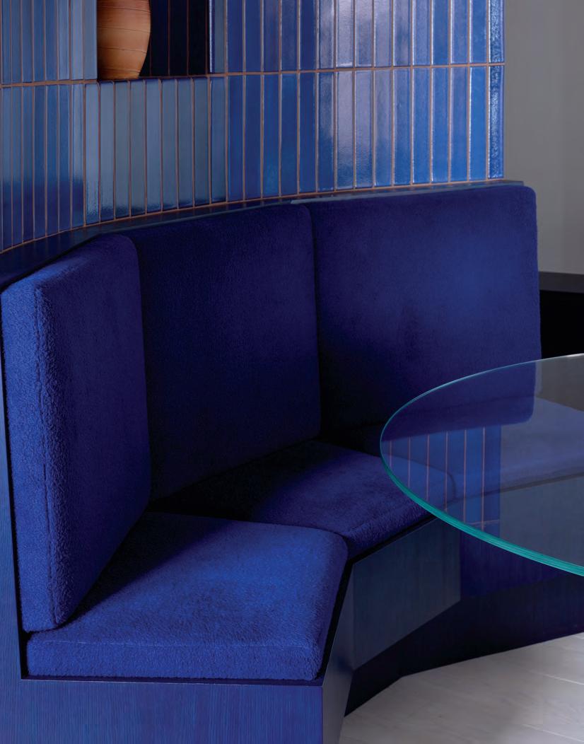
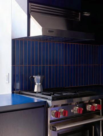
West Village Blues
Inscribing new life into a historic paper factory, O-N delivers on a colorful vision through expert material sourcing and a mastery of form.
ABOVE, LEFT A run of blue millwork lines the entry hall.
ABOVE, RIGHT A statement sofa by B&B Italia BELOW
Two zones of blue tiles by Heath Ceramics boldly define this room.
BELOW
Channeling a vintage modern feel in a repurposed paper factory, Davis Owen and Irene Chung, cofounders of O-N, have thoughtfully tailored a West Village apartment to their clients’ distinct style. Large wooden beams punctuate the wall to the left of the entryway and gesture to the building’s history. One beam is marked with the number 54, perhaps demarcating a former loading dock.
This hall is lined with storage: floor-to-ceiling closets to the right and a length of cabinets to the left that, among other things, house the family’s extensive board game collection. The wall curves to a halt at the living room, indicating how far your street shoes can go.
On the other side of the curve is the star of the show: a rounded blue banquette cradling an onyx geode table, which pays homage to the client’s impressive crystal collection. She described the piece as “a dream come true.” The striking wall features Heath tiles from San Francisco, and the seating’s wooden base is stained with blue linseed oil, a process undertaken with support from expert Thor of Danish brand Linolie & Pigment.
The rest of the crystal collection is displayed across from her luxe, g old-wallpapered closet. “Play is a really big part of our design process,” said Chung. She and Owen recount sharing their clients’ enthusiasm while sourcing vintage furniture and exploring material possibilities to accommodate their unique needs. “They’re pretty big collectors, so we kept [the wall space] pared back to showcase their art,” Owen added.
The kitchen features soapstone countertops and open shelving as b eautiful as they are functional. O-N’s clients love to entertain: The family once ho sted 60 baby shower guests comfortably thanks to the flexible sectional couch, wh ich doubles a makeshift playpen to keep their puppy and baby separated.
—Katya Borkov
Naho Kubota
RIGHT
The banquette is wrapped in Silas fabric by Raf Simons for Kvadrat.
The blue hues continue with the tiled kitchen backsplash and millwork finish.
Tiles, Textiles & Surfaces
at fergusonshowrooms.com.
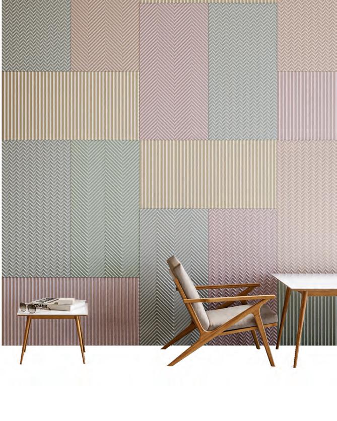
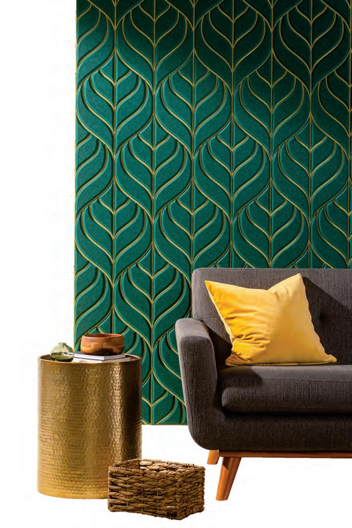
Wallcoverings
Go bold without straying into kitsch—these statement-making wallcoverings are elevated and artful without being overly noisy.
1
2
3
4 Good Dogs Everywhere by Schumacher
5 The Season of the Tree by House of Hackney
Philippe Garcia, other images courtesy the manufacturers
BACKDROP × XAVIER DONNELLY
Emily by Pierre Fray and Emily Jackson
The Green House Wallcovering Collection by Moooi × Arte International
Rugs
Curvilinear, rectilinear, or amorphous: The following rugs play with form to captivate and define a room.
Tiles, Textiles & Surfaces
Rebekka Stange’s Rugs Take Center Stage
Rebekka Stange, headshot by Ottendoerfer
Tiles, Textiles & Surfaces
BELOW, RIGHT
RIGHT
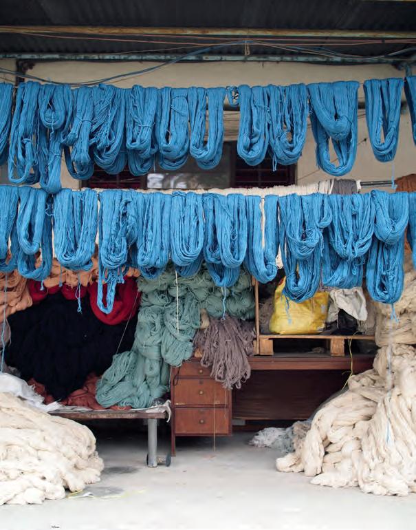
A snapshot of the natural dye process in Nepal
FACING PAGE, BELOW
An installation view at the last 3 Days of Design in Copenhagen
FACING PAGE, ABOVE
Founder Rebekka Stange
As a costume designer, Berlin-based talent Rebekka Stange knows fibers like the back of her hand—she’s created garments for theater and opera productions in France, Germany, the Netherlands, and Switzerland and for films by directors like Francis Lawrence and Roland Emmerich. Her latest venture allows her to explore their relationship to interior space.
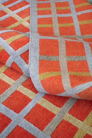
Officially launched in 2022 after a successful presentation during Salone del Mobile the previous fall, Räkki Rugs offers handmade Tibetan loop knotted carpets, designed with Stange’s well-trained eye for hue, material, and detail. Dyed, woven, and finished in collaboration with artisans in Kathmandu, Nepal, that she met during a scouting trip in early 2020, their manufacturing process is meticulous. But, from her studio in Germany, Stange approaches each rug like a work of art.
“I'm very interested in how colors affect us,” said Stange, who recently showed a selection of Räkki Rugs pieces, each with their own personal flair—from a graphic abstraction of nature with pops of deep orange to a geometric color field in muted blue, green, and gray tones—at 3days of design in Copenhagen. Citing artists like Olafur Eliasson and Ellsworth Kelly, her own explorations in photography, and the considerations she makes when designing costumes as inspiration, she
begins every rug design with a small watercolor. The medium is appealing for its “light-reflecting” quality, one that Stange then emulates in the tactile floorcoverings.
“I try to mix different materials to get the [same] effect,” she said, an effort that includes vegetable-dyed Tibetan highland wool, Nepalese nettle for durable grip, and Chinese silk for shimmer. Woven into intricate Tibetan knots or now-rare traditional cross knots—a recent exploration Stange debuted at 3days—to make carpets, her abstract patterns literally shine. For a designer who has focused her career on nailing the details, the handmade nature of these pieces has taught her how to embrace the beauty in irregularity. She noted: “It's a little bit like painting the rug, in the end.”
—Elizabeth Fazzare
A detail of the Hilma textile shows off its gridded colors.
4
5
Opticality by Vanderhurd
Modern Flock by Erica Wakerly
6 Ladder Stripe and Stepped Plaid by Paul Smith for Maharam
Tiles, Textiles & Surfaces
Tiles
Tilemakers continue to innovate on texture and color, incorporating cutoffs—as is the case with Salvatori’s
5
7
8
10
1 -3 Park Avenue by Nemo Tile + Stone
4 Cantera by Zia Tile
XLIGHT Terra by Porcelanosa
Patchwork by Salvatori
Dekton Pietra Edition by Cosentino
Majesty by Marble Systems
Images courtesy
Tiles, Textiles & Surfaces
Believe in Bespoke
Frederick Tang Architecture crafts the Quarry Loft through a sensitive and customized approach.
ABOVE
The living room showcases the Ventaglio Rug by Fede Cheti.
Gentle barrelvaulted ceilings add depth.
LEFT
Phoenix marble from ABC Stone creates a lively backsplash.
ABOVE Walls are wrapped in a green-gray paint from Benjamin Moore.
RIGHT
An assembly of objects sits atop a checkerboard wool rug from Aelfie.
BELOW
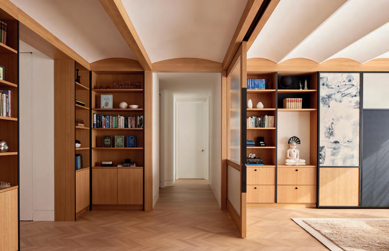
Frederick Tang’s latest project is a testament to form and multifunctionality, creating a serene space that lovingly expresses the personality and heritage of the apartment’s inhabitants. Throughout the Quarry Loft apartment in New York, Tang thoughtfully integrated delicate white oak millwork with decorative wallpaper panels and bold stonework. “The family’s grandfather was an abstract artist, so we were picking a lot of gestural textures on purpose,” said Frederick Tang, principal of the eponymous studio. “You’ll see that in the stone, [and] the fabric panels are very painterly…almost like watercolors.”
The main room features a barrelvaulted ceiling, a series of sliding screens and fabric panels, and recessed doors—a space made to be flexible. “It’s a foyer, a guest room, a library, and an office,” Tang said.
Behind cabinetry, a hidden Murphy bed can be revealed to create a fifth bedroom— perfect for hosting guests during the family’s large reunions. A desk rests behind blue panels that flank a religious altarpiece.
Perseid wallpaper in Twain Blue from Flat Vernacular is a fun detail. Tiles,
The dark blue, green, and pink accents of Phoenix marble from ABC Stone anchor the palette in the kitchen and main room, appearing again as a backsplash in the bar area. This repeated use of materials along with fluted millwork and metal accents brings visual cohesion to a space rich with color and pattern.
As is expected in a historic postwar building, structural columns and asymmetrical risers challenged the designers. The floorplan reveals a laundry room tucked into an alcove and closets built into leftover spaces. The integrated headboard in the bedroom is another detail influenced by the apartment’s unique geometry. But natural forms bring the whole design together. The angled shape of the dark kitchen island, for example, was created to accommodate seating for five. “It’s a sculptural pebble,” said Tang. This artful maze of natural forms fits the family’s vibrant new life into a building that’s been transforming for decades.
—Katya
Borkov
Ringo Studio Rockwell Group Sarah Jacoby Architect SO –IL West of West Woods + Dangaran Worrell Yeung
Michael K Chen Architecture Modellus Novus Morris Adjmi Architects Neri&Hu Design & Research Office Norman Kelley Office of Tangible Space Omar Gandhi Architects Omer Arbel OWIU Peterson Rich Office PRODUCTORA
Home Studios INC Architecture & Design Ivy Studio IwamotoScott Architecture Johnston Marklee & Associates Kwong Von Glinow Leong Leong Marlon Blackwell Architects Michael Hsu Office of Architecture
22RE A+I Aidlin Darling Design ALA Studio Almost Studio Anya Moryoussef Architect Architecture Research Office Atelier Cho Thompson Atelier Zébulon Perron Bestor Architecture Brent Buck Architects
Every year, AN Interior ’s editors assemble our Top 50 List. This grouping recognizes the most outstanding North American architecture and design firms working in interiors. On the following pages, emerging practitioners rub shoulders with established firms, giving readers a sense of the exciting breadth and depth of work shaking up interior architecture today. Our research considered diversity across its many dimensions. The designers, studios, firms, and practices contained here operate in a variety of styles, specialize in a range of typologies, and respond to clients across the continent and planet. Each is motivated by design excellence and understands the holistic importance of creating space through the skillful arrangement of materials, objects, and activities. Interiors are where we live, work, and play, so elevating the quality of these spaces is critical. As always, our Top 50 list identifies those in pursuit of delivering better buildings and better lives for the people who use them.
22RE
Founded in 2021 by principal Dean Levin, 22RE has quickly made a name for itself through lush interior architecture and furniture design, much of which is made in the firm’s in-house
Aidlin Darling Design
Aidlin Darling Design was founded in 1998 with the conviction that architecture can meaningfully impact the human spirit to inspire, educate, and deepen a connection to the earth and to one another.
aidlindarlingdesign.com
A+I
Helmed by Kate Thatcher and founded by Brad Zizmor and Dag Folger, A+I stands for architecture plus information, a name that encompasses the firm’s strategy-led approach in expanding the boundaries of workplace design.
architectureplusinformation.com
ALA Studio
A recognized leader in biophilic design, ALA Studio rethinks and improves traditional healthcare, office, retail, and cultural spaces with an eye toward inclusivity.
alastudio.com
Los Angeles
New York
San Francisco
New York
Elizabeth Carababas, Read McKendree, Richard Barnes courtesy
Aidlin Darling Design, Brooke Holm
Almost Studio
Almost Studio was established in 2018, and its approach considers how a project continually reveals itself. Unknown cultural, social, and spatial potential comes to light as time passes—and this condition of becoming is where the studio found its title, “almost.”
Architecture Research Office
Stephen Cassell, Kim Yao, and Adam Yarinsky lead Architecture Research Office on the basis of inquiry, tackling projects that inspire people, further institutional missions, and advance equity and resilience. aro.net
Atelier Cho Thompson
Working between California and Connecticut, Christina Cho Yoo and Ming Thompson’s studio engages in architecture, interiors, graphics, brand strategy, furniture, and more, all of which are culturally and visually rich. chothompson.com
Anya Moryoussef Architect
In pursuit of deliberate and imaginative design for everyday life, Anya Moryoussef Architect often tweaks typologies for the benefit of its inhabitants’ well-being. amarch.ca
Atelier Zébulon Perron
The studio leverages its knowledge of the hospitality industry to design bars and restaurants, woven with the site’s food and beverage scene yet distinct in its sense of place and experience. zebulonperron.com
Bestor Architecture
Bestor Architecture integrates architecture, infrastructure, and landscape to arrive at a more expansive atmospheric urbanism.
Brent Buck Architects
bestorarchitecture.com
Founded in 2015, this full-service architecture and interiors practice combines architectural rigor with the warmth of craft to create enduring spaces. brentbuckarchitects.com
Charlap Hyman & Herrero
Led by principals Adam Charlap Hyman and Andre Herrero, the firm is recognized for its fantastical, playful vision, executed through research and a keen feel for interaction.
ch-herrero.com
Craig Steely Architecture
Craig Steely’s eponymous practice draws from the two states he works across, always favoring modernism’s clean lines and often playing with unique geometries.
CIVILIAN
Founded in 2018 by Nicko Elliott and Ksenia Kagner, CIVILIAN creates objects and spaces that convey a sense of care and mood, from design-forward residences at Bard College to typographic hardware. civilianprojects.com
craigsteely.com
Yoshihiro Makino, Christopher Sturman, Sean Davidson, Chris Mottalini, Darren Bradley
New
Design, Bitches
Catherine Johnson and Rebecca Rudolph draw from their eccentric background in design, art, and pop culture to inform the optimistic and bright vision of their firm.
designbitches.com
Fogarty Finger
A sense of crisp refinement and a project’s urban environment unite the work of Fogarty Finger, founded in 2003 with an approach that integrates architecture and interiors.
fogartyfinger.com
Esrawe Studio
Led by Hector Esrawe, Esrawe Studio is a multidisciplinary practice designing furniture, interiors, and architectural solutions for hospitality, cultural, and residential projects, with an emphasis on feeling the evolution of design. esrawe.com
Farouki Farouki
Founded by husband-and-wife team Caroline and Sabri Farouki, the architecture and interior design practice has built a warm and tactile body of work throughout the United States, Mexico, and the Caribbean.
faroukifarouki.com
Los Angeles
Mexico City
New Orleans
York; Atlanta; Boston
Frederick Tang Architecture
Frederick Tang Architecture follows an iterative process based on experimentation and curiosity that results in nimble yet optimistic projects.
fredericktang.com
Gabellini Sheppard
Since its founding in 1991, Gabellini Sheppard has distinguished itself through a sculptural finesse of space, light, and materials, executed in projects spanning the world and typologies.
Chicago
Future Firm
Founded by Ann Lui and Craig Reschke in 2015, Future Firm uses design to synthesize the aims and efforts of multiple stakeholders, catalyze transformation for individuals and groups, and create flexible space for diverse needs.
future-firm.org
gabellinisheppard.com
GRT Architects
Led by Tal Schori and RustamMarc Mehta, GRT’s bread and butter remains unique adaptive reuse, but the firm has evolved and expanded its focus to other typologies, all of which are still uniquely composed and sensitively aligned with the existing fabric.
grtarchitects.com
Toronto
gh3*
gh3* works in architecture, urbanism, and landscape, designing pavilions, private houses, and large civic and transit infrastructures with a modernist sense of beauty and clarity. The work is a marriage of the poetic with the programmatic.
gh3.ca
Gieves Anderson, courtesy of the Art Institute of Chicago, BLOK Studio, courtesy gh3*, Jason Schmidt
Home Studios
Known for cult-favorite bars and hotels, Home Studios, led by Oliver Haslegrave, draws from backgrounds in custom fabrication and fine art to design for outsiders, the playful, and the curious.
homestudios.nyc
INC Architecture & Design
INC is an open-source, multidisciplinary architecture and design studio that leverages its tripartite leadership to deliver immersive, emotionally impactful spaces.
IwamotoScott Architecture
Established by Lisa Iwamoto and Craig Scott in 2002, IwamotoScott Architecture revels in the constraints of the everyday to design. Its environments are livable, functional, and attuned to shifting needs.
iwamotoscott.com
Ivy Studio
Self-described as a “one-stop-shop creative firm,” Ivy Studio delivers hyper-personal spaces that often utilize local artisans and builders to create neat, texturally rich environments.
ivystudio.ca
San Francisco
inc.nyc
Johnston Marklee & Associates
Sharon Johnston and Mark Lee founded their practice in 1998, and it has gone on to rigorously approach projects, diverse in scale and type, across 14 countries in North and South America, Europe, and Asia.
johnstonmarklee.com
Leong Leong
Nuanced, detailed, and culturally resonant: Leong Leong’s work integrates aesthetic, social, and ecological concerns for a range of projects, including urban campuses, institutional spaces, retail, and furniture.
leong-leong.com
Kwong Von Glinow
The firm, led by Lap Chi Kwong and Alison Von Glinow, focuses on creating innovative living environments, places for cultural engagement, urban public space, and contemporary workspaces with a forward-looking vision.
kwongvonglinow.com
Los Angeles; Cambridge, Massachusetts
Chicago
New York
Todd Cole, Mikael Olsson, Naho Kubota
Fayetteville, Arkansas
Marlon Blackwell Architects
Marlon Blackwell Architects uses an agile approach that turns economic constraints and limitations into meaningful, honest, and dignified buildings and interiors.
marlonblackwell.com
Michael K Chen Architecture
Austin; Houston
Michael Hsu Office of Architecture
Empathy underscores Michael Hsu’s practice, which strives to build livable, neighborhood-oriented spaces with an emphasis on available materials and simple design palettes.
hsuoffice.com
Recognized for expertise in creating complex urban projects, Michael K Chen Architecture works to produce design that is unexpected, hyperuseful, intelligent, and full of delight.
Modellus Novus
Modellus Novus, Latin for “new model,” challenges the exclusivity of architecture with an inclusive, diverse team to deliver forwardthinking and elegant spaces.
New York; New Orleans
Morris Adjmi Architects
Morris Adjmi Architects strikes a balance between fitting in with local surroundings while looking distinctive enough to make an impact, being engaging to its occupants, and, above all, enduring.
New York
Neri&Hu Design and Research Office
Founded in 2006 by partners Lyndon Neri and Rossana Hu, Neri&Hu designers carefully probe history, site, and programming to deliver challenging and considerate projects, responsive to a global as well as a local perspective.
Norman Kelley
Carrie Norman and Thomas Kelley’s practice focuses on residential architecture, commercial interiors, furniture design, exhibition design, and design criticism, recognizing both the need for place and the unexpected.
Tangible Space
The bicoastal studio, founded by Michael Yarinsky and Kelley Perumbeti, explores design as a conduit for connection and community, which often results in human-centric and playful objects and spaces.
Omar Gandhi Architects
Working on landscapes, residences, products, and largescale works, Omar Gandhi Architects respects the history and environment of each project’s site while evolving traditional forms and conditions.
New York; Shanghai
San Francisco; New York
Toronto; Halifax, Canada
Pedro Pegenaute, Kendall McCaugherty, Claire Esparros, Adrian Ozimek
Omer Arbel
Designers at Omer Arbel see architecture as fluid, moving between sculpture and construction. The studio explores the mechanical, physical, and chemical qualities of materials.
omerarbel.com
OWIU
Founded by Joel Wong and Amanda Gunawan, OWIU is a tripartite firm: an architecture and interior design practice, ceramics studio, and construction company, all sensitive to California’s midcentury legacy.
owiu-design.com
Peterson Rich Office
Miriam Peterson and Nathan Rich established Peterson Rich Office in 2014 with an eye toward culturally and publicly engaged works across different scales, such as the Shepherd Gallery and Arts Center and Galerie Perrotin.
www.petersonrichoffice.com
PRODUCTORA was founded by Abel Perles, Carlos Bedoya, Victor Jaime, and Wonne Ickx, whose works are colorful and precise. Each project is identifiable by clearly legible gestures.
productora-df.com.mx
Ringo Studio
Ringo Studio designs visionary environments rich in articulate nuance, where the customer journey is as strategically considered as the architecture that embodies it.
Rockwell Group
Likely a firm that needs no introduction, Rockwell Group has worked with a theatrical eye across luxury hospitality, cultural projects, and set design for 40 years.
Led by Jing Liu and Florian Idenburg, SO – IL combines local and global perspectives to better engage sitespecific dialogue, such as a museum at the University of California, Davis campus and the multi-unit housing project 450 Warren in Brooklyn.
New York
New York
New York
Riley Snelling, Jason Varney, Ty Cole, Brad Ogbonna
Los Angeles; Portland,Oregon
West of West
Established in 2014 by Jai Kumaran and Clayton Taylor, West of West engages the worlds of design, art, culture, and technology to shape contemporary life and the built environment.
Woods + Dangaran
This midsize office works across the country, integrating architecture, interiors, and furnishings in a quietly luxurious yet warmly modern fashion. woodsdangaran.com
Worrell Yeung
Concise, poetic pragmatism lies at the heart of Max Worrell and Jejon Yeung’s practice, which approaches conceptualization and construction with equal importance.
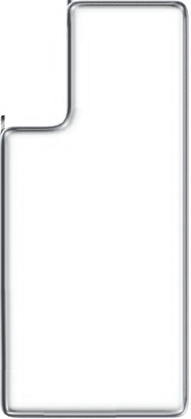
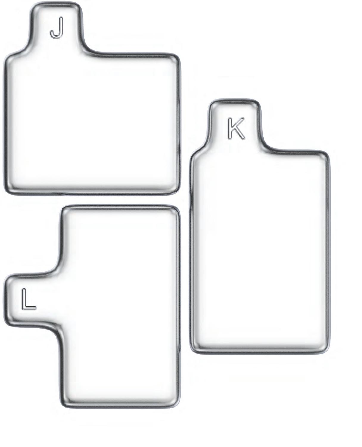
Studio Loutsis designed and produced the graphics for this year’s Top 50 list in-house with the direction to shrinkwrap the content. The arrangements packages the volumetric forms that result from arranging each of the award-winning practices.
worrellyeung.com
In true architectural fashion, these shapes were created in Rhino using Rhino 8’s “ShrinkWrap” command and then rendered by Studio Loutsis’s design team. These graphics feel like more than a flat image: They jump off the page, adding a threedimensional element of surprise to the magazine.
See more work by the Top 50 on our website: aninteriormag.com.
Witness a collection of spaces designed by architects, for architects—and tailored to their unique creative processes.
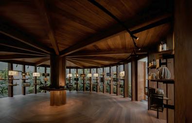
84 Sam Jacob Studio in Canterbury A
92 Archmongers in London B
102 STRANG in Florida C
112 HANGHAR in Madrid D
120 Outpost Office in Ohio E
SPACES A
THE
ARCHI
ARCHI TECTS SPACES OF
PEDA GOGICAL POLY CHROMY
delivers studio space for the Kent School of Architecture that references architectural history.
Text by Ellen Peirson
Photography by Timothy Soar
Sam Jacob Studio
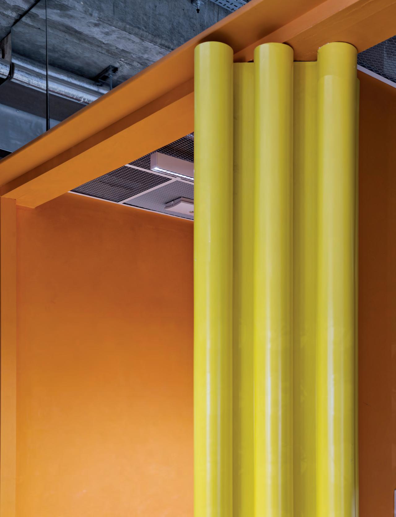
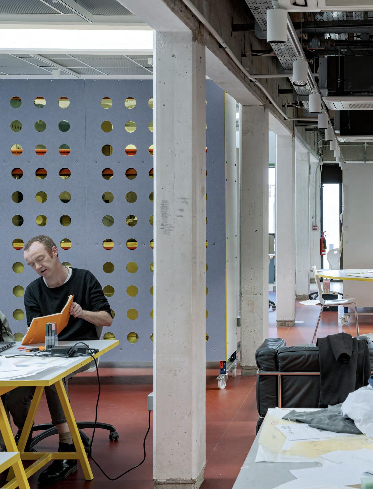
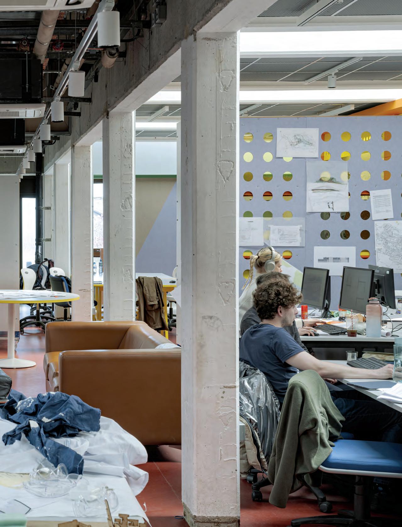
The medieval city of Canterbury is steeped in history, as it sits at the end of an ancient pilgrimage route in the southeast of the U.K. The spires of Canterbury Cathedral tower over the tightly wound streets of the city center, but two miles northeast of the cathedral is the University of Kent. Designed by William Holford in a pared-back Brutalist style, the Kent School of Architecture is now the center of a campus that has sprawled over the years.
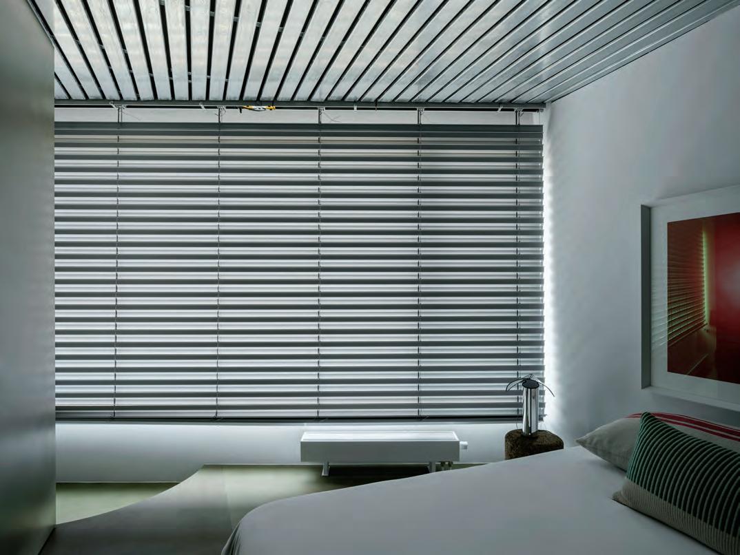
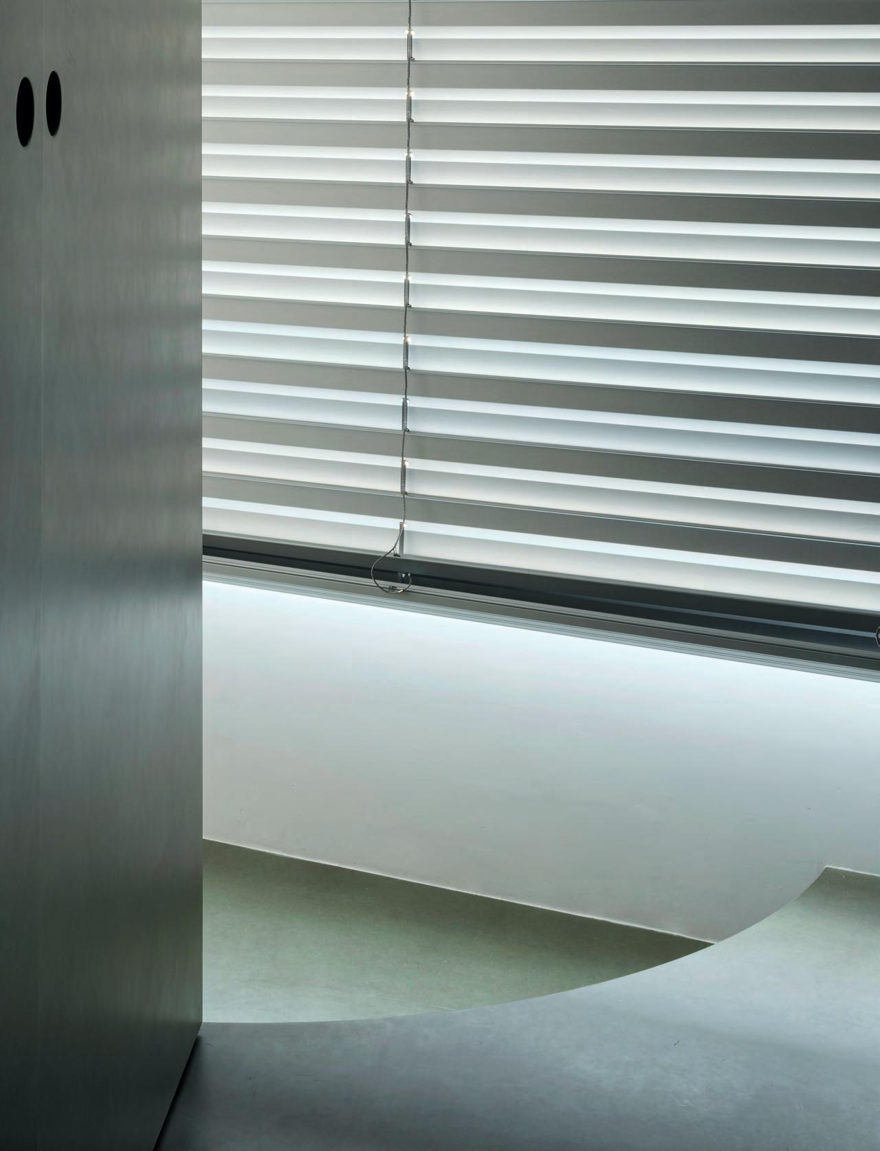
Holford’s Marlowe Building was originaly home to the university’s physics department, but it has hosted the School of Architecture since 2005. The building has recently reanimated the campus with a gradient of colors popping through the windows of the ground-floor studios. These new colors were part of a renovation by Sam Jacob Studio and the result of an open invitation to refit the architecture studio interiors. The simple off-the-shelf blinds strike through the facade of the 1965 William Holford building using Le Corbusier’s 1959 Architectural Polychromy paint system—a selection of 63 colors that the architect saw as inherently architectural and that he curated to be used together. The palette of the brightly colored blinds includes reds, oranges, and yellows on the west facade and then blends into yellows and greens on the south and hues of blue on the east. “It’s to do with where the sun is in the afternoon,” explained Sam Jacob, director of his eponymous London-based practice. “There is a hot side and a cool side.”
Inside, the color palette continues to highlight Sam Jacob Studio’s vibrant insertions against the muted palette of the concrete and brick Marlowe Building.
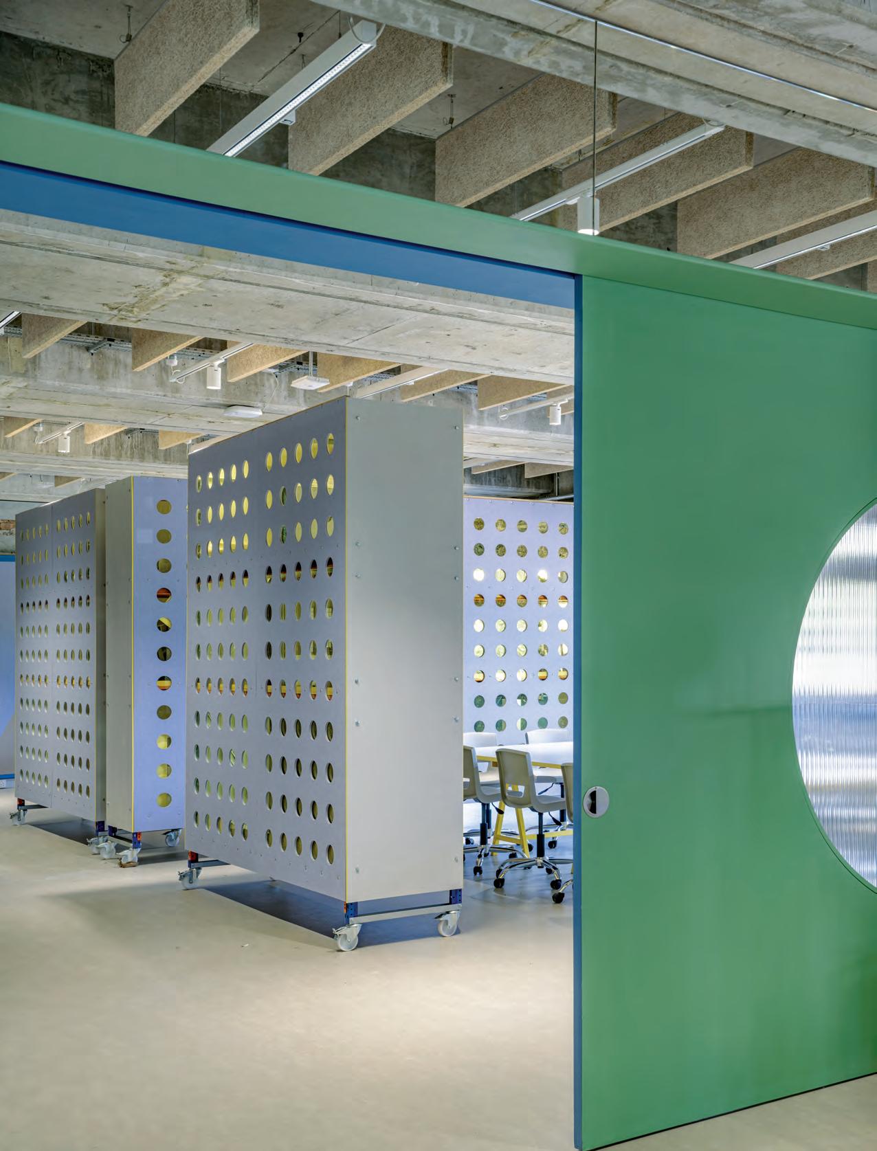
The interior of the Marlowe Building feels solid. The ground floor was designed to hold small cellular offices and labs for physicists, hence its rigid grid of timber windows. Sam Jacob Studio’s first move was to remove these partition walls and suspended ceilings. Now, movable partitions are clad with pin-up boards and yellow-tinted acrylic
FACING PAGE
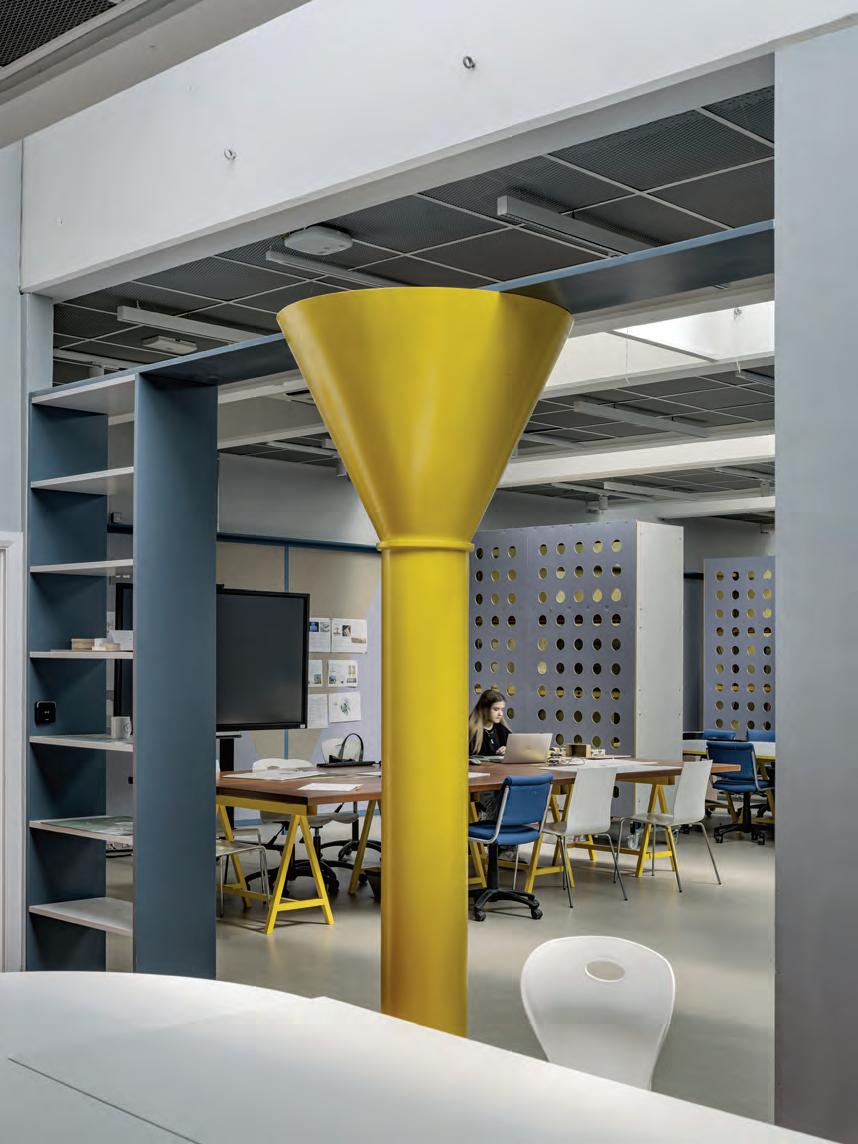
Jacob’s yellow columns make references to architectural history: This one is a nod to the nearby Canterbury Cathedral.
LEFT
An axonometric view of the studio space, with its Corbusian color palette.
sheets. Amid original timber windows and rows of concrete beams in the ceilings, the result is playful: Radiators are painted to match the palette of the blinds, and sustainable woodwool insulation panels provide acoustic comfort.
In the large open spaces that are revealed, just one wall is inserted on the ground floor and a mere two on the second. This creates flexible spaces for students and teachers to use every day, but that can also accommodate organizational changes as the school evolves amid schoolwide uncertainty. This year, management announced that six subjects will be phased out, and while the architecture department is untouched by these axes, it will be merged with the School of Arts in the coming years, necessitating flexibility.
To gently organize new spaces, Sam Jacob Studio employed two devices: different zones of red and light gray Marmoleum flooring and wheelable storage units. “The red zone here is a way of saying, [this is] the circulation strategy,” explained Jacob. But color is also a teaching tool. Three yellow columns (again, Corbusier-selected) reference architectural and art history; the local Canterbury Cathedral; Brâncuși’s Endless Column; and James Stirling’s Olivetti Training Centre. “They are completely nonstructural, but they are a bit spatial,” said Jacob. Another spatial play is a high mirror-backed shelf that makes the concrete grid of the ceiling feel endless.
The rigor and abstracted intellect of these hardworking spaces are designed to inspire the students, encouraging them to read the world around them. But the real charm of this project is in the way students are encouraged to remake the spaces, which gives them agency to them to participate in their environment and instilling this quality in their architectural education.
BELOW
Partitions also become functional: Wheeled storage units readily form more intimate spaces.
FACING PAGE
Sam Jacob Studio quotes a column from James Stirling's Olivetti training center.
Looking down the central circulation axis, a third corridor of sorts connects disparate studio wings.
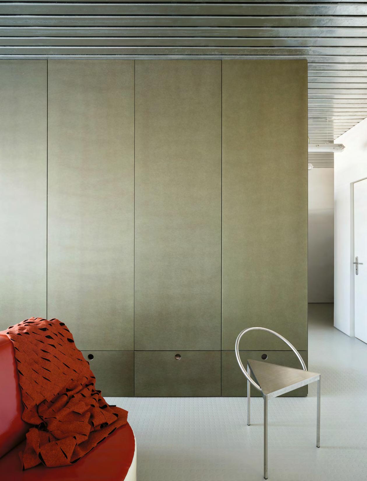
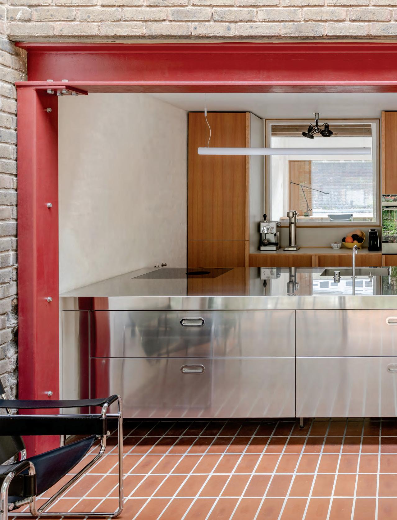
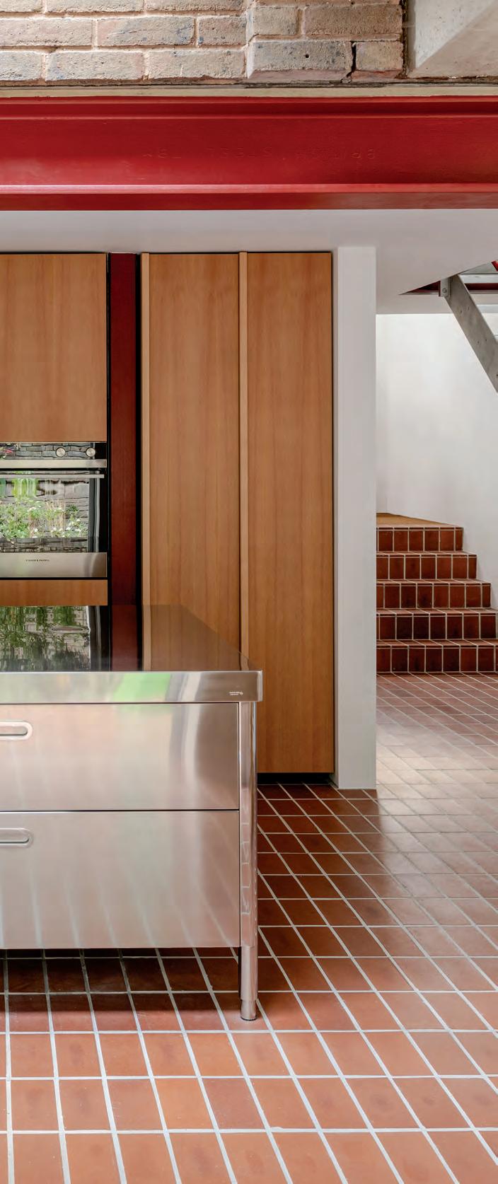
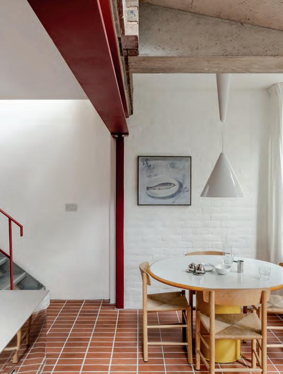
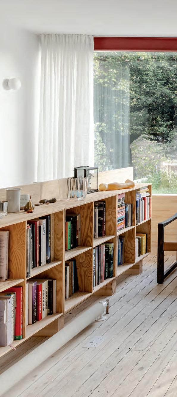
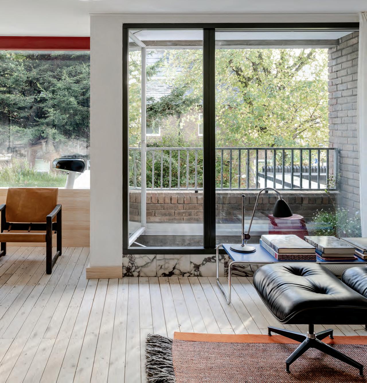
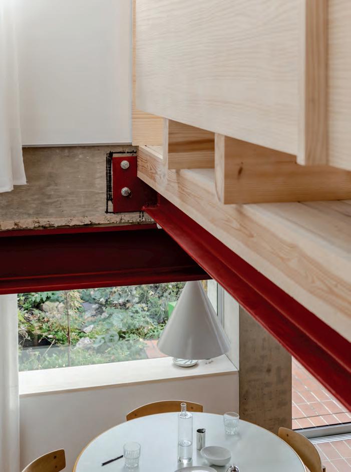
Soft & Sturdy
Archmongers reworks a terrace house into a materially inventive residence for a studio founder.
Text by Photography by Bridget Goldberg French+Tye
Jim Stephenson 96, 99, 100
A bright red steel portal frame welcomes you into the open kitchen.
A casual breakfast nook is set among a robust palette of steel, brick, and concrete.
ABOVE
A section drawing of Elemental House.
RIGHT
The stacking of the new structural elements is left exposed.
FACING PAGE
An office is steps down from the ground floor.
Walking out of Homerton train station in London’s Hackney neighborhood, one is immediately surrounded by blocks of postwar social housing. The East End borough, home to Homerton as well as Hoxton and Shoreditch, has many reputations: For over ten years, it has been a hipster paradise teeming with trendy cafes, galleries, converted studio flats, and glamorous houses, especially near Homerton’s Chatsworth Road. But as recently as the early 2000s, it was one of London’s roughest areas.
A row of nondescript 1970s split-level terrace houses occupies a block among this diverse mix, and one of these houses has been overhauled by local architect Johan Hybschmann for himself, his wife, Anita Freeman, and their son.
Hybschmann runs a small practice called Archmongers that he founded with his university classmate Margaret Bursa in 2013. The two studied together at the Bartlett School of Architecture at University College London and spent a few years apart working at larger firms before teaming up. “The name of our studio is a riff off ‘fishmonger,’ like you’re mongering for architecture,” he said. “We started our practice by doing our own houses quickly. Then we could show them. We were lucky enough to have been able to do
that.” The proof is in the pudding: The U.K.’s design-led realtor Modern House has listed and sold five of their residential retrofits.
Back in 2015, Bursa renovated a similar 1960s terraced structure, akin to a traditional row house, for her family in north London. The duo went on to do several other residential revamps across the city, including a home for Bursa and, before this latest project, a first home for Hybschmann’s family just up the road.
After reviewing the Archmongers portfolio, it’s clear that these homes act as laboratories for the studio. Many—including this one, known as Elemental House—feature quirky details like tiled floors and black rubber gym flooring for stair treads. These sturdy elements stand up to the wear and tear of coming and going in London’s often dark, cloudy, and wet climate, plus busy life with a young boy who loves to play outside in the communal alleyway behind the garden. Their rationale? “We wanted never to feel scared of fully using the house.”
After Hybschmann’s wife toured the derelict and blocky property a few years ago, they both jumped at the opportunity to begin again. “This is our house,” he said. “It’s not for everyone. It’s a testing ground for pushing ideas.” Archmongers stripped out the out-
“We want to show the house’s history but also let things be quite simple and direct in terms of how they are made.”
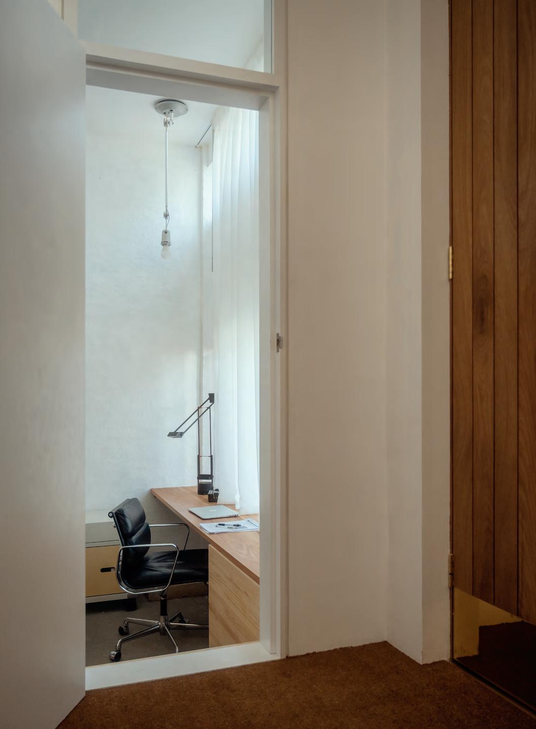
door front steps, creating a more accessible entrance to the foyer. From there, stairs lead down two sections to the kitchen and dining area. A home office doubles as a guest room, and two bedrooms occupy the top level for the couple and their son.
With each project, Hybschmann and Bursa learn and evolve, honing their eye for detail in residential refurbishments. Aspects like longevity, natural materials, and functionality are key to any Archmongers project. The studio iterates with durable materials, especially wood and steel. “I referenced the Louisiana Museum of Modern Art in Denmark, which shares many of the same materials,” Hybschmann said. “The museum buildings are the same as I remember them as a child, and they’ve aged beautifully with use.”
At Elemental House, a galvanized-steel staircase opens up views from the front to the rear garden. The skinny structure was easy to assemble onsite and is “completely indestructible,” according to Hybschmann. A former garage has been swapped for a guest bedroom and home office, allowing natural light to penetrate into the core of the home via a translucent panel doubling as a kitchen backsplash. Upstairs, a living room replaces an existing bedroom. “The design is about making it tough enough to withstand the life that the house needs to take,” he said. “Some people would see it as industrial, but I don’t see it like that.”
The architect then opted for two techniques typical in his native Denmark. For the floors, he sanded down the existing wood floorboards and coated them with lye soap. Then for the walls, he lightly plastered instead of painting, a technique known as
vandskuring. These noninvasive methods are examples of what Archmongers is focusing on now—being pragmatic but also sustainable. “What we’ve tested in this house, and what we want to do more in the future, is to try not to cover up things too much,” he said. While the house’s interiors are the opposite of London’s iconic Victorian homes, they have a history that Hybschmann seeks to highlight. The idea is to let things wear over time. “We want to show the house’s history but also let things be quite simple and direct in terms of how they are made.”
Two hidden things, however, are a mirrored cabinet at the entry concealing coats and shoes and a linen curtain in the upstairs bathroom to hide a stacking washer and dryer. Both of these are almost nonexistent in London homes, even renovated ones, and incorporating them alongside the Danish soap floors and plasterwork are signs that Hybschmann is not English. However, he is quiet about being from Denmark: “It comes with so many design connotations; I don’t want to be pigeonholed as a Danish architect.”
While some features of Elemental House seem rather industrial, including a stainless-steel kitchen island, Hybschmann argues otherwise: “I’d like to think the design is honest and simple. We need to shift our idea of what home looks like. The details can be soft and sturdy, and then it becomes domestic.”
FACING PAGE
Bathroom finishes play with contrasting textures, like an expressive marble versus a tiled grid.
BELOW
Exposed wooden rafters showcase the existing structure.
HOME PLUS OFFICE
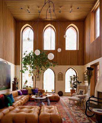
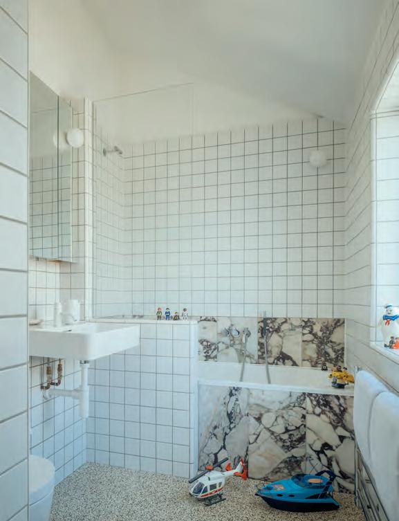
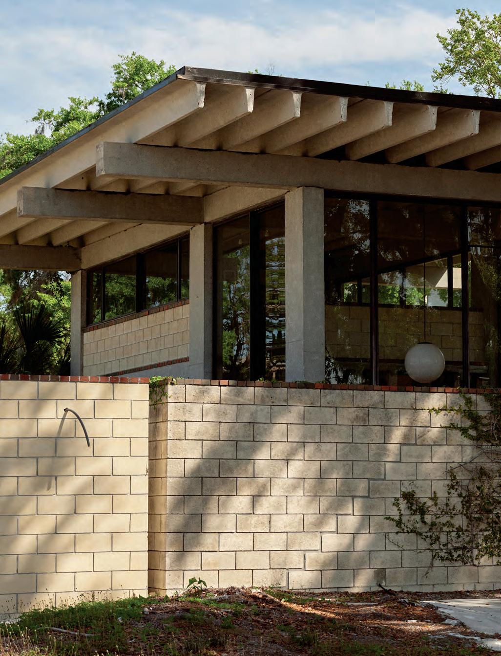
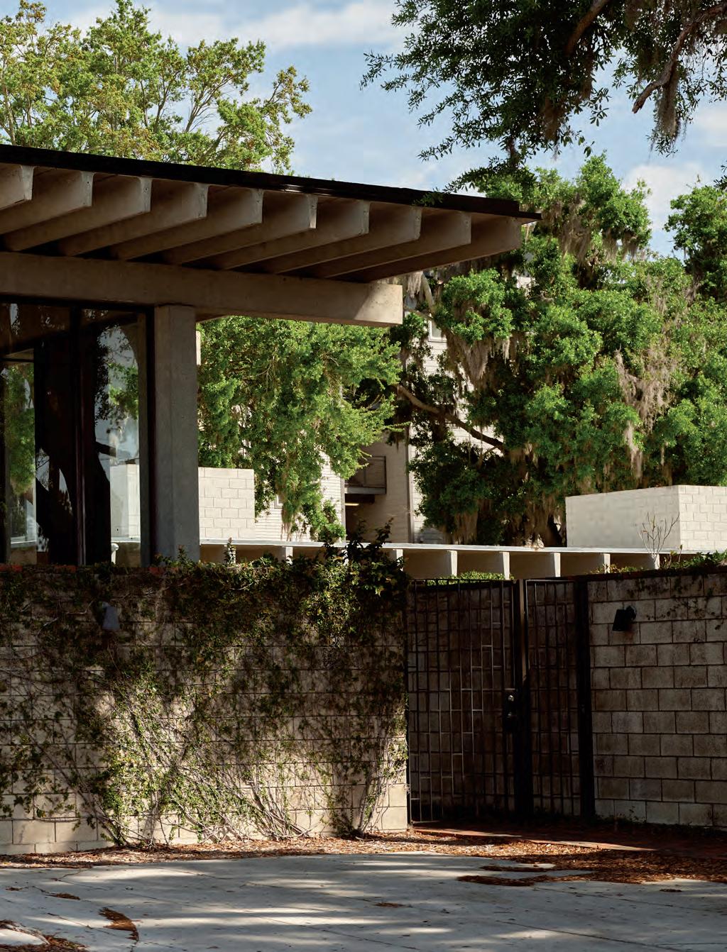
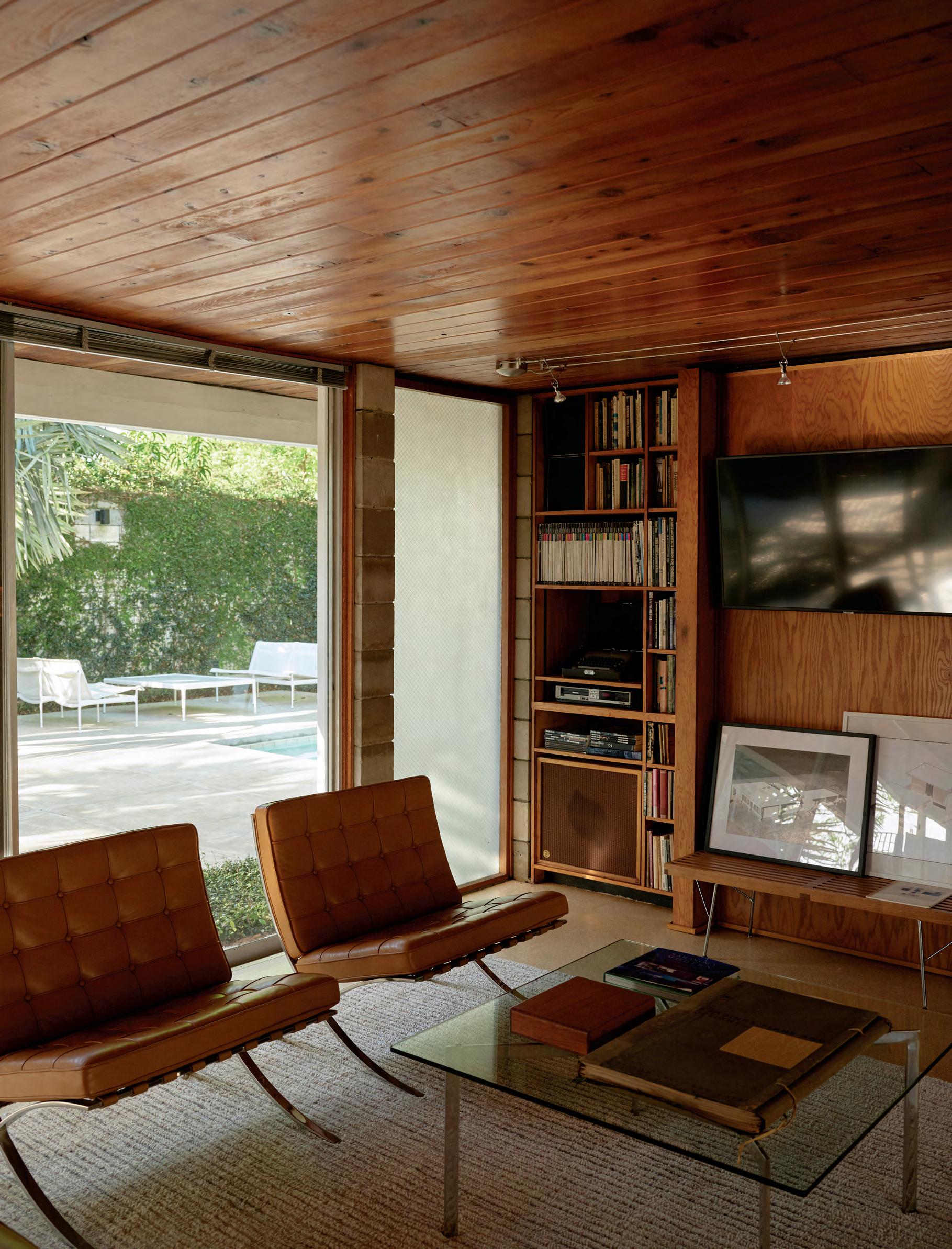
STRANG’s Max Strang reintroduces Gene Leedy, a midcentury Florida modernist.
Text by David Rifkind
Photography by Cody James
FACING PAGE
Wood ceilings and cork floors establish a cozy continuity throughout.
BELOW
The home is outfitted with periodappropriate midcentury furniture in leathery hues.
CMU walls and wood paneling are illuminated by thoughtfully placed windows, which admit the
bright Florida sun.
“I was getting this architecture education without even knowing.”
LEFT
A window enhances seamless visual connections.
ABOVE
The spiral stair connects the office’s two levels.
FACING PAGE
An aerial view of the ground floor shows off its double basketweave brick pattern.
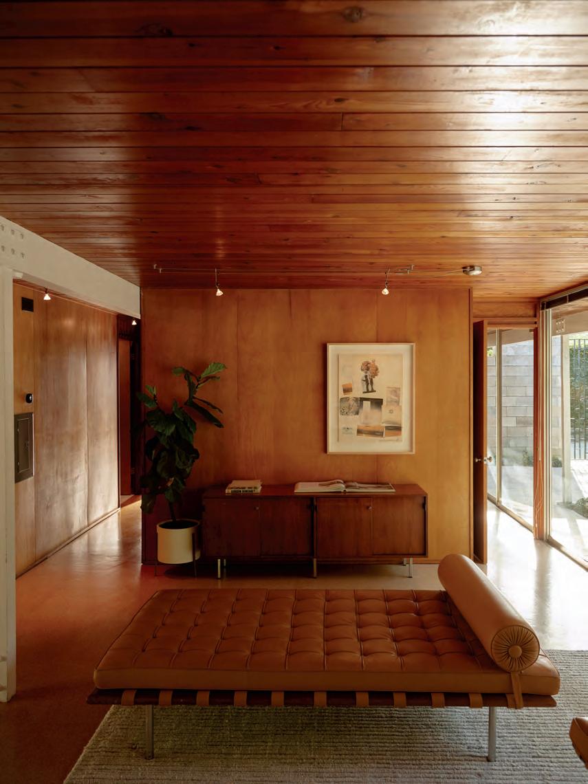
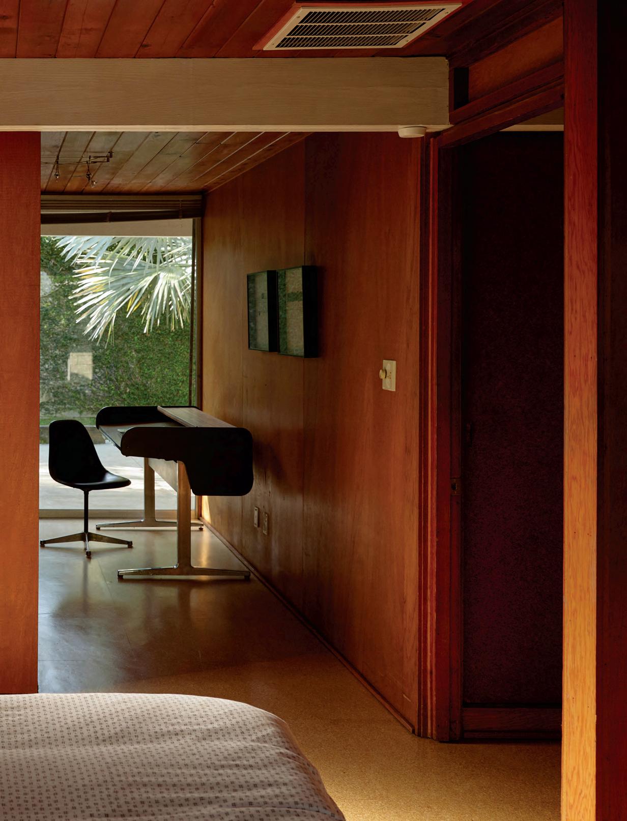
The recent restoration of two important buildings by Gene Leedy has garnered renewed interest in the architect’s influence on Florida modernism. The house Leedy built for himself in 1957, shortly after leaving the office of Ralph Twitchell and Paul Rudolph, brought the tropical cosmopolitanism of the Sarasota School to the central Florida town of Winter Haven, while his nearby office project marked the transition to a formal vocabulary of precast concrete that he would employ in civic, commercial, and residential projects over a 60-year career.
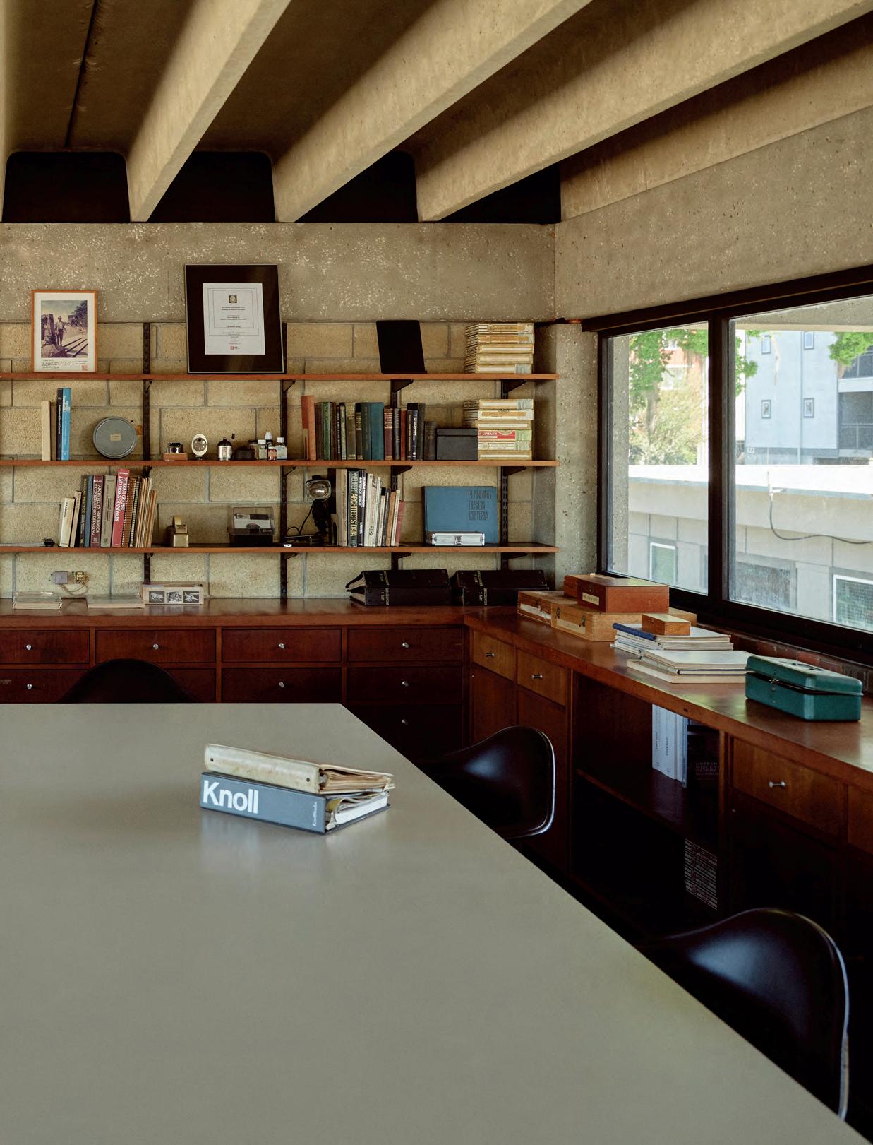
Max Strang, architect and founder of STRANG, grew up in a midcentury Leedy home. Strang would eventually work in Leedy’s office and attend his alma mater, the University of Florida. At STRANG, Max has spent decades grappling with Leedy’s legacy, which emphasized site specificity, structural expression, and a concern for sustainability. Then, when Leedy passed away in 2018, Strang acquired the two properties that had served as his mentor’s home and office for 58 and 62 years, respectively. He promised to restore them faithfully.
Strang knew both buildings well. As a kid he was a frequent guest at the architect’s home. As he recounted to Anne-Marie Russell, “I was getting this architectural education without even knowing.” Both structures had recently sustained damage during Hurricane Irma; the house lost its iconic trellis and part of its signature concrete block garden wall when the storm uprooted a large tree. The office had also suffered from vandalism and had vegetation growing out of its roof. Throughout the restoration process, he asked, “What would Gene do?”
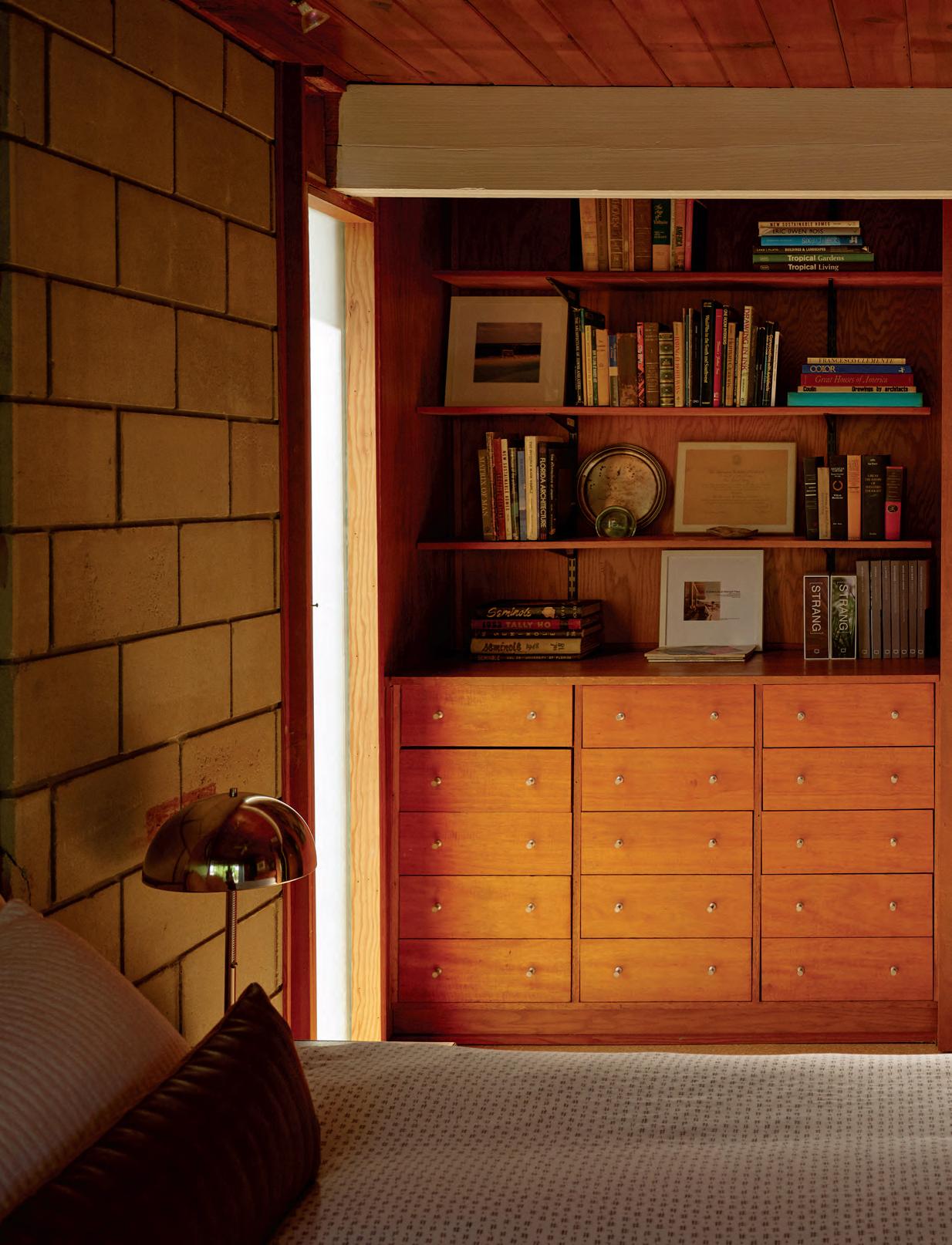
For the house, Strang began by evaluating six decades’ worth of additions and emendations to determine which version of the home to reveal. In the 1980s Leedy had converted the small carport into a two-bedroom wing, which nearly doubled the size of the original 1,100-square-foot structure and better defined the courtyard at the heart of the property. Inside, he restored the clear-finished wood veneer
surfaces of the built-in furnishings, reinstalled cork flooring to match Leedy’s original design, and focused on returning the house to an honest expression of materials and a seamless spatial flow between its indoor and outdoor living spaces.
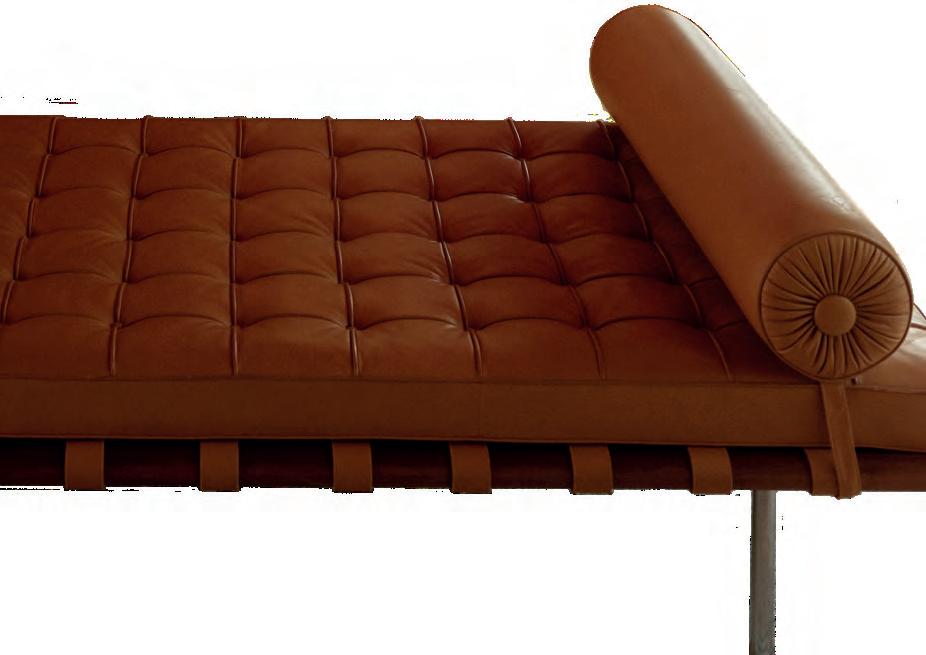
Strang lauds the human scale of the house, whose simplicity and efficiency he likens to that of a boat. At both the house and the 1961 office building Leedy designed for his firm, Strang sifted through an abundance of furniture his mentor had accumulated over the years. “It was like a chair museum,” he recalled. Strang returned the house and office to their original ensemble of Knoll and Herman Miller furnishings and added some pieces (such as Barcelona chairs and a Barcelona couch) that fit the midcentury setting perfectly. Small tributes to Leedy are included throughout the house, like a half-finished bottle of Macallan and a cigar sitting in a glass ashtray.
The house was the first of ten built by Dick Craney, a local developer and construction materials supplier who commissioned Leedy to design prototype houses for up to 70 neighboring lots. Colloquially known as Leedyland, the Craney Spec Houses Historic District was listed on the National Register in 2019. It sits less than three miles east of Leedy’s architectural office, which Strang also restored.
The small office building marked a major inflection point in Leedy’s trajectory as a designer. He embraced a robust vocabulary of precast concrete structural members, including the prestressed “double-tee” elements, which became a signature. Strang uses the office as a remote work outpost for his 45-person firm, and both office and house host company retreats and public tours. Soon, Strang plans to invite artists and scholars in residence under the aegis of Double Tee Arts, a nonprofit he founded to further Leedy’s legacy. “Simply put, this is one of Florida’s best buildings,” said Strang, “and we want to share it.”
The doubletee concrete structure defines the experience of the lofted second floor.
ROOM WITHIN
A
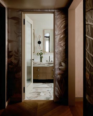
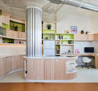
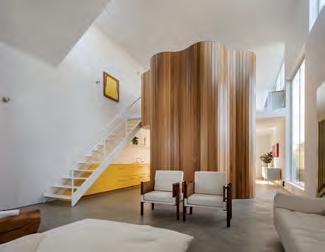
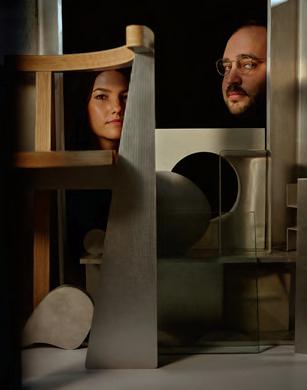
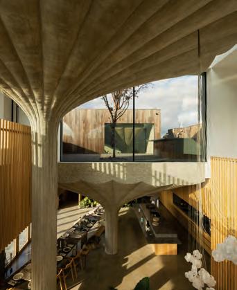
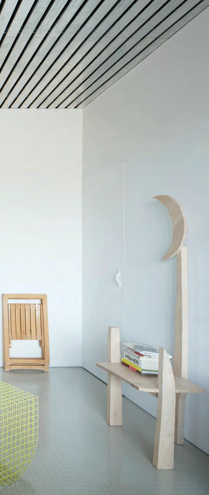
With its speculative Studiolo, Spanish practice HANGHAR explores the potential of nonprescriptive space.
ROOM
Text by Photography by Adrian Madlener Luis Díaz Díaz
BELOW
A curated selection of objects and furnishings activate the introspective Studiolo.
FACING PAGE
Inspiration abounds, including a photo of Lütjens Padmanabhan’s Binningen II.
“Our intention was ... to create a spatial structure that does not convey the use or program assigned to it.”
FACING PAGE
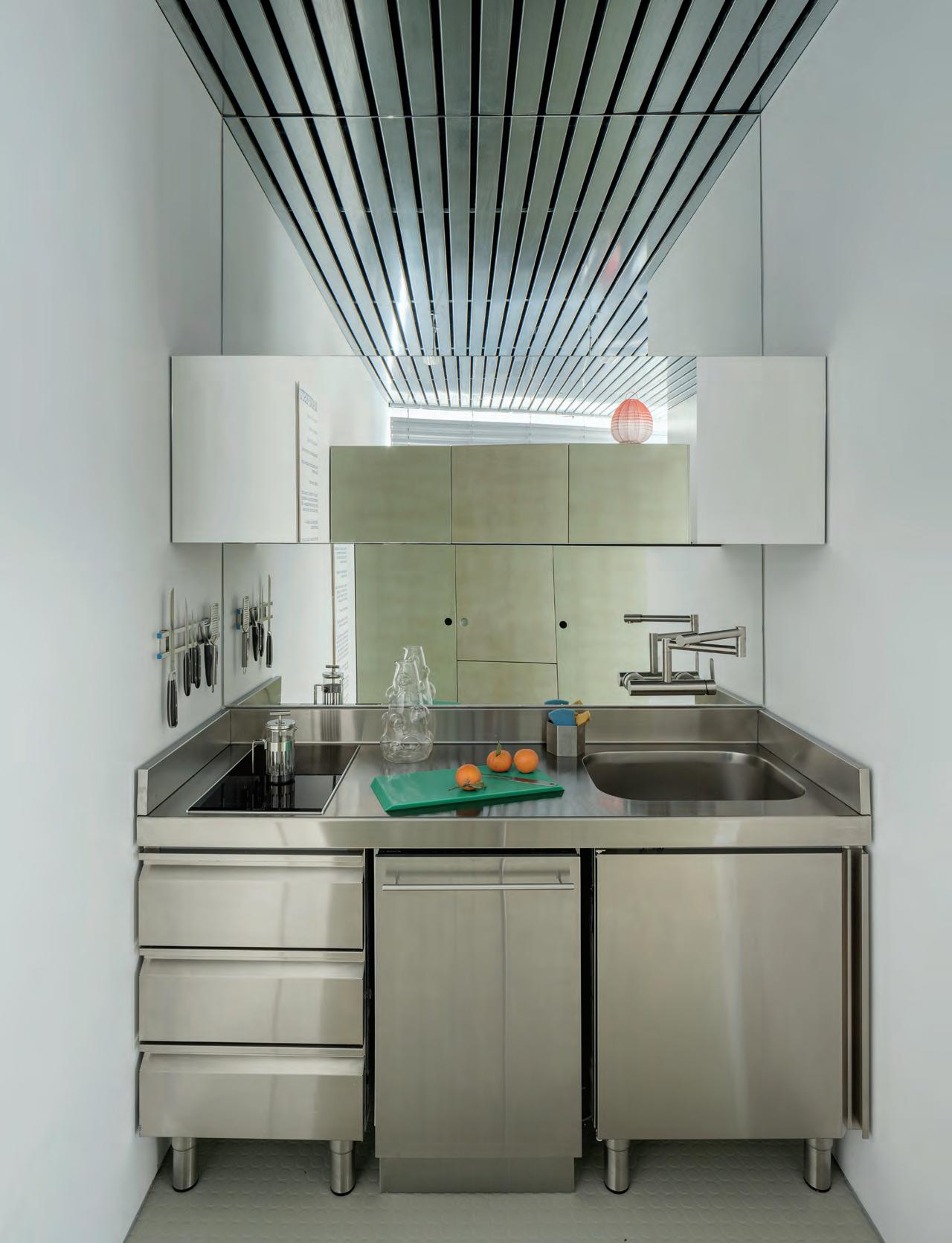
A compact kitchen still delivers on style, pairing stainless-steel with mirrored finishes.
ABOVE Attention to details like color, texture, and reflectivity makes each zone a composed ensemble.
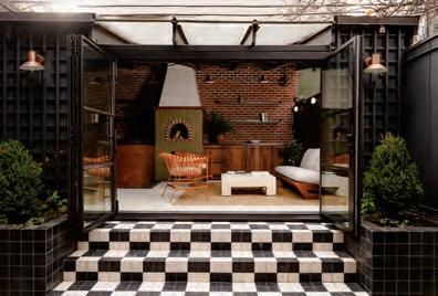
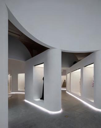
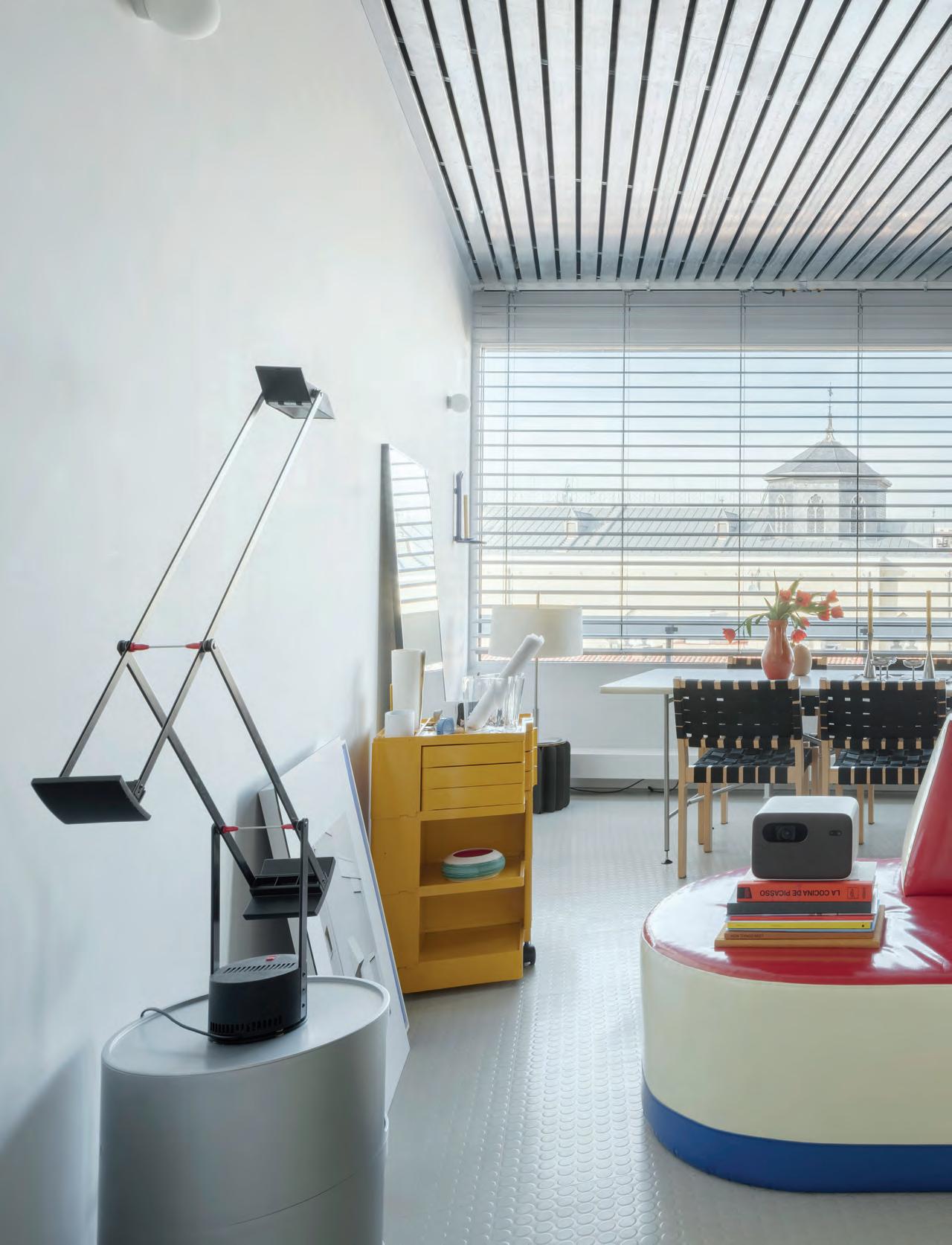
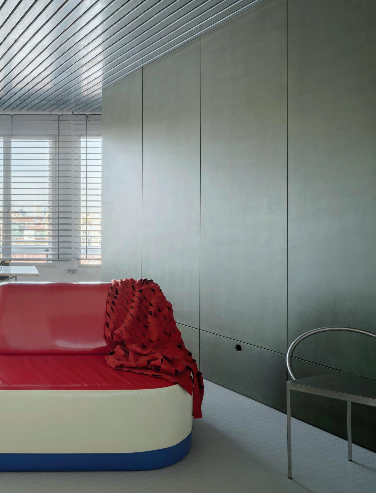
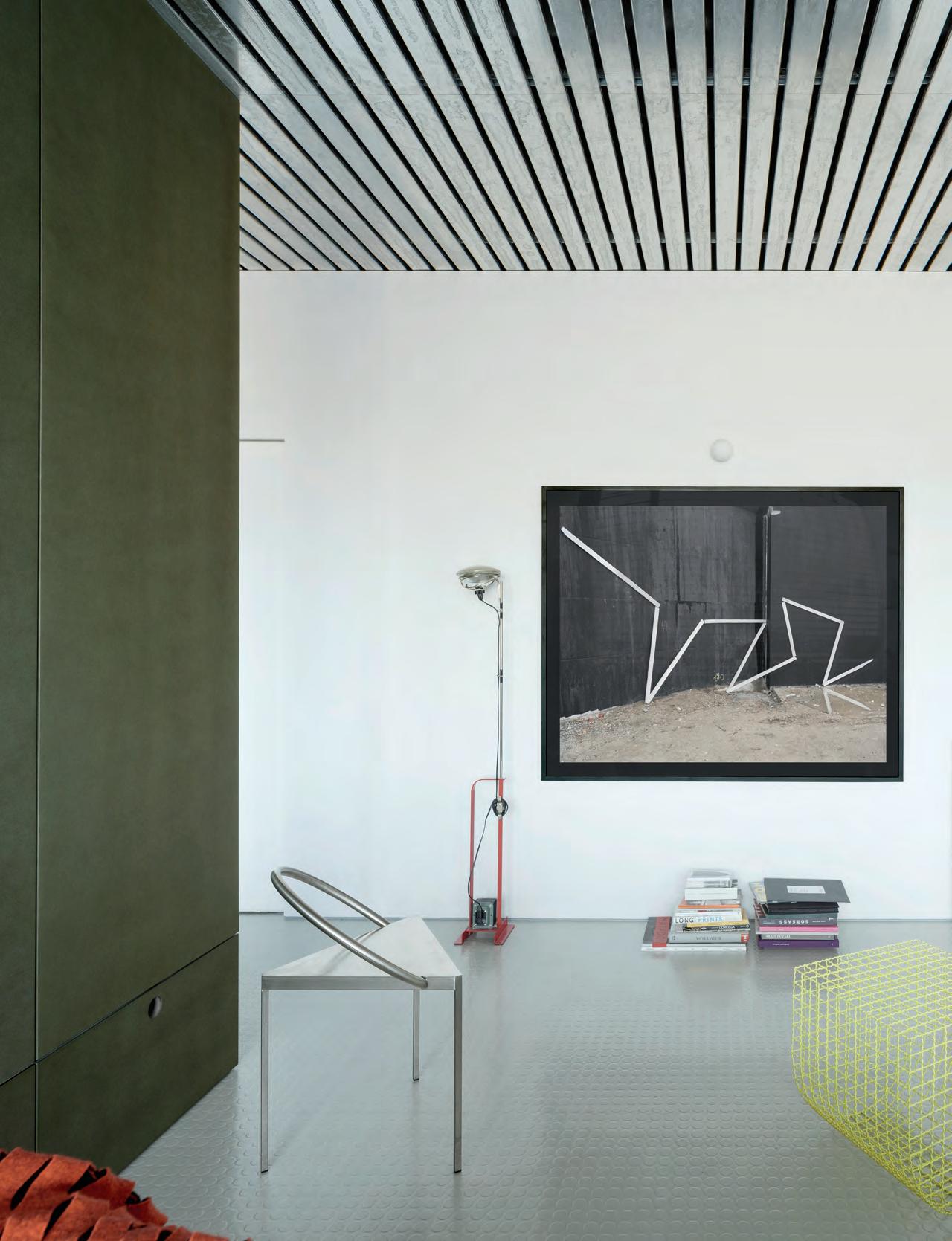
Working to challenge the conventions attributed to increasingly constrained urban residential interiors, Madrid-based speculative architecture practice HANGHAR debuts Studiolo, a room-within-a-room installation with no predetermined purpose.
“Domestic space has been overly commodified in the last century, as real estate has become much more prolific,” said Eduardo Mediero, founder and principal of the Madrid-based practice HANGHAR. “This has severely affected not only how we dwell but also how our homes are designed.” The practice is deliberately intended to exist only for one decade— it will close in 2030—and in this time, it is committed to developing speculative work that tries to subvert market-driven impacts and decommodify residential architecture. It accomplishes this by suggesting different spatial configurations that can accommodate less prescriptive functions.
In creating the form of the recently completed Studiolo project, Mediero and his team reexamined the importance of the “room” as an architectural entity—one that has the potential for open, unconstrained activation. “Our intention was not to assign a specific use to a space and try to make that use as efficient as possible, but rather to create a spatial structure that does not convey the use or program assigned to it,” Mediero explained. “We were interested in how inefficient environments can open up a vast array of possibilities of use.” Drawing inspiration from Renaissance artist Antonello da Messina, and specifically his painting SaintJeromeinHisStudy (1475), HANGHAR introduced a deep-green, cabinetlike room within Mediero’s own central Madrid apartment. This space functions as his own “little studio,” the direct translation of the Italian word from which the project takes its name.
Studiolos were popularized by humanist philosophers during the Renaissance and Enlightenment eras as oft-secluded spaces for unfettered contemplation and ideation. In a bid to establish these enclosed environments as spaces for “retirement and thinking, for dedicated intellectual research,” as the firm’s project description states, they were decorated with more abstracted detail than ornamentation or furnishing that might implicitly suggest a set function, a dining room with tables and chairs and perhaps even paintings of fruit. Messina’s painting illustrates a space with just the essentials: a desk, stool, and shelves to contain manuscripts. Reconstituted at New York’s Metropolitan Museum of Art, Federico da Montefeltro’s 15th-century Palazzo Ducale di Gubbio studiolo is lined with trompe l’oeil inlaid wood panels depicting different allegorical scenes. Incorporated iconography denotes the study of music, geography, alchemy, and ornithology.
Within Mediero’s apartment, the HANGHAR Studiolo is completely decontextualized from its residential surroundings materially. Surfaces are clad in a restrained palette of colored MDF panels, floor and steps are covered in Pirelli rubber (a component more readily found in factories), and the drop ceiling is supported by industrial-grade galvanized steel profiles.
The “aseptic,” minimal, and formally universal architecture can act as a study, a lounge, or even a bedroom. To accommodate an undefined set of potential uses, distinct furnishings from Mediero and his partner’s personal collection are carefully staged right “outside” the room within a room. But Studiolo itself is a piece of furniture as well.
“For me, architecture is definite,” Mediero said. “It’s unmovable, strict, and timeless. It’s the structures within which we live, the backdrop of our lives. Everything else is light, movable, and temporary— the components that suggest purpose and activity.”
Given a recent uptick in international interest in Madrid real estate, most of HANGHAR’s work has centered on residential commissions. But as the conceptual Studiolo project reveals, the firm aims to design these spaces with a far less commodified approach and confront various aspects of that convention: standard layouts and rooms designated solely as bedrooms or living rooms, for example.
Though operating with a for-profit model, HANGHAR answers to the OWN Foundation’s board of trustees, and so its mission is much more focused on developing new typologies through rigorous empirical research, analysis, and eventual provocation. Extending that mission to academia, Mediero teaches and lectures at institutions like the University of Michigan’s Taubman College of Architecture and Urban Planning and Harvard GSD. His work was exhibited at the 16th Venice Architecture Biennale.
FACING PAGE
The texture of the window blinds pairs well with the slatted ceiling.
BELOW A detail of the arcing step built into the raised bed platform.
GRIDS GRATES SHAPES
Color Block No. 2, an installation by Outpost Office, activates the Peter Eisenman–designed Wexner Center.
Text by Kristine Klein
Photography by Leonid Furmansky
A grid of scaffolding and a split brick silo coalesce into Peter Eisenman’s Wexner Center for the Arts. Each seemingly unrelated element comes together to form the iconic building that connects the Ohio State campus to the greater city of Columbus. Functioning as a public gallery (it’s not a museum, as it doesn’t collect art), Wexner plays a very public-facing role for the institution, though it still feels off-limits to many. Running with this idea, local practice
Outpost Office designed ColorBlockNo.2to activate the center’s unusual architecture at the request of Wexner curator Kelly Kivland. The furniture objects are site-specific, but flexibly designed to have a second life at new sites.
The furniture pieces placed around the museum’s campus are collage-like. Boxy columns lean up against one another, while others lie horizontally or stack to double seating capacity. Some pieces were nestled into corners, and others were installed in open venues outdoors.
Each piece was conceived to generate informal gathering. While designed to be functional, much like the building they occupy, they too can be viewed as art objects. It’s the blocky forms and heavy use of color—bright pink, pastel purple, and neon yellow—that make ColorBlockNo.2both stand out and homogenize.
Outpost Office founders Ashley Bigham and Erik Herrmann told ANInteriorthat the locations of the four pieces were informed by the Wexner staff’s favorite spots around the campus. Many are in between places they wish the public noticed more.
“We didn’t want context-specific to mean that it just tries to blend in,” Herrmann said of the installation. “We didn’t want it to match. We wanted it to bring new qualities to its surroundings.”
Each piece is unique in its massing and was fabricated using paint, plywood, powder-coated metal, and vinyl decals. Local fabricator Edgework Creative suggested using Duraply, a sustainable plywood harvested from European poplar. The material is water-resistant and lightweight.
Bigham and Herrmann had ideas on how the pieces would be occupied, but the seating was largely designed to be unprogrammed. The firm is excited to see the unexpected uses the objects play host to—so far, uses as diverse as a puppet theater and a backdrop for protest signs.
One piece sits adjacent to Eisenman’s infamous hanging column.
ABOVE AND BELOW
The same rectilinear forms turn horizontal to form benches balanced on oversize shims.
FACING PAGE
FACING PAGE
The stacked forms and their fluorescent colors activate a roadside amphitheater.
BELOW
The bright addition is an invitation for passersby to visit the museum.
Green Roof by Ari Burling/ Esto Restoration by Serhii Chrucky/ Esto Landscape by Sahar Coston-Hardy/ Esto Portrait by George Etheredge/ Esto Airport by Jeff Goldberg/ Esto Interiors by Robert Granoff/ Esto
Development by Mike Kelley/ Esto Aerials by Alon Koppel/ Esto Museum by Matthew Monteith/ Esto Flagship Store by Anna Morgowicz/ Esto Factory by Christopher Payne/ Esto
Skyscraper by David Sundberg/ Esto
Film by Ben Stechschulte/ Esto Library by Lara Swimmer/ Esto House by Michael Vahrenwald/ Esto University by Albert Vecerka/ Esto
Benjamin Moore benjaminmoore.com de Gournay degournay.com
Design Quarters designquarters.com
Eskayel eskayel.com
Forbo forbo.com/flooring
Giopato & Coombes giopatocoombes.com
Hem hem.com
James Dunlop Textiles jamesdunloptextiles.com
Juniper Design juniperdesign.com
Kvadrat kvadrat.dk
Ladies and Gentlemen ladiesandgentlemenstudio.com Lumens lumens.com
Maharam maharam.com
Muuto muuto.com
Nordic Knots nordicknots.com
Pierre Frey pierrefrey.com
RUEMMLER ruemmler.us
Sarkos sarkos.nyc
PEDAGOGICAL POLYCHROMY 84
Boakes boakesjoinery.com
ECO eco-mep.co.uk
MRL Acoustics mrl-acoustics.co.uk
Shepway shepwayceilings.co.uk
Stonepoint stonepointconstruction.com
Thorlux thorlux.com
SOFT AND STURDY 92 &Tradition andtradition.com
Artemide artemide.com
Astro Lighting astrolighting.com
Bollom bollomdirect.co.uk
Bora bora.com
Cassina cassina.com D-line dline.com
Domus domusgroup.com
Fisher & Paykel fisherpaykel.com
Flos flos.com
Fredericia fredericia.com
Fritz Hansen fritzhansen.com
Gubi gubi.com
Herman Miller hermanmiller.com
Integral BC Solutions integralbcs.co.uk
Kettley’s kettleysfurniture.co.uk
Kingspan kingspan.com
Knoll knoll.com
Thonet thonet.de
VELFAC velfac.co.uk VOLA en.vola.com
ROOM WITHIN A ROOM 112
Artemide artemide.com
Artigo artigo.com
Cinca cinca.pt
CORTIZO cortizo.com
Emilie Holm Atelier emilieholm.dk
Kartell kartell.com
Moooi moooi.com
nanimarquina nanimarquina.com
Tornasol Studio tornasolstudio.com
Vitra vitra.com
Coming Soon: Making Home
Cooper Hewitt
Smithsonian Design Museum
2 East 91st Street
New York, NY 10128
November 2, 2024–August 10, 2025
This November, Cooper Hewitt, Smithsonian Design Museum will open its seventh annual Design Triennial. Making Home centers the theme of domestic life but investigates housing more broadly through its exploration by designers. This showcase is curated by Alexandra Cunningham Cameron, curator of contemporary design and Hintz Secretarial Scholar at Cooper Hewitt; Christina L. De León, associate curator of Latino design at Cooper Hewitt; and Michelle Joan Wilkinson, curator of architecture and design at the Smithsonian’s National Museum of African American History and Culture. The exhibition design is by Johnston Marklee.
The triennial is organized into three parts: “Going Home,” which considers how people shape and are shaped by domestic spaces; “Seeking Home,” which showcases a range of institutional, experimental, and utopian definitions of home; and “Building Home,” which showcases alternatives to single-family construction models, embracing radical models of coliving, land stewardship, and historic preservation.
In total the triennial is composed of 25 new and site-specific installations, with work by the Black Artists + Designers Guild, Designing Justice + Designing Spaces, Liam Lee and Tommy Mishima, Leong Leong, Curry J. Hackett, Aranda\Lasch, and Ronald Rael, among others. An accompanying publication titled MakingHome:Belonging, Memory,andUtopiainthe21stCentury will be copublished with The MIT Press. —Emily Conklin
After Oceanic is a modern hale in Hawaii by Leong Leong in collaboration with a hālau of architects, including Jojo Henderson and Nalani Tukuafu.
Courtesy Cooper Hewitt, Smithsonian Design Museum, After Oceanic and Leong Leong
Meet WASHLET G5A -- TOTO’s latest WASHLET+ smart toilet. It features a compact, modern design, as well as our TORNADO FLUSH® system that uses an efficient 1.2 or 1.0 GPF. Complete with our CEFIONTECT® ion barrier glaze and a larger water spot, the G5A minimizes debris from sticking to ceramic surfaces, keeping your toilet cleaner, longer.
TOTO NYC GALLERY 20 W 22nd Street, New York, NY 10010 TOTOUSA.COM | 917-237-0665 EXT. 3 SCAN CODE FOR INFO