While kitchens and baths have long been the stars of luxury residential projects, this issue of AN Interior takes a more holistic look at what makes the design of these spaces so unique. Tracking trends in explosive color palettes that make a big splash out of small kitchens, Lauren Gallow gives us a tour of three compact yet multichromatic kitchens that become both the social and artistic heart of the home. This section then goes one step further for the bath—in these pages we leave the home altogether to explore the ancient and essential concept of the bathhouse. Jesse Dorris offers a closer look at these places for relaxation, socialization, and above all unique connection, and what defines the resurgence of the trend— and architectural type—today. Each product showcased in these pages was curated by our design editor, Kelly Pau.
●In this Section
44 Fre e the Kitchen
48 Trend: Sculptural Faucets
50 Sinks & Vanities
52 Toilets
54 Millwork
58 Sarah Jacoby Architect in Manhattan
60 Ideas o f Order in Washington Heights
61 02A in Rome
62 Hardware
66 Outdoor Kitchens
68 Outdoor Showers
70 Rockwell Group’s Bathhouse
74 FO OD New York’s Garden Club
76 S chemata’s Komaeyu
Kitchen & Bath
43 AN Interior

Kitchen designs by Berlin-based architect Sam Chermayeff Office come with oven-size microwaves and wheels, challenging both social norms and design standards.
Text by Lev Bratishenko
Free the Kitchen
facing page Chermayeff’s kitchen islands are some of his best-known works, freeing countertops, ranges, and even sinks from the wall.
below Appliances become exaggerated yet functional kitchen creatures in Chermayeff’s designs.

45 AN Interior
IN FOCUS
Oliver Helbig


Hoping for radical social change through objects often disappoints, as it always turns out to matter more who uses them. Nevertheless, some designs become strongly associated with desires for more freedom, flexibility, or fun, and while it would be naive to imagine that they change social relations all by themselves—just by being there—they can help.
Architect Sam Chermayeff’s “free kitchens” reflect this optimism well. His designs are free in that everything from sinks to ranges is liberated from walls. Many elements have caster feet and can be moved, though practicality dictates they stay close to one another like a huddle of penguins. “I mean, l didn’t invent the kitchen island,” Chermayeff joked, though even his most fixed designs, which are islands, take unusual forms. They juxtapose kitchen components in ways that
suggest we have been neglecting even this familiar typology, whose original shock in bringing food preparation out of the closed kitchen and onto a kind of domestic stage has been so normalized that it’s largely forgotten (though whose labor is displayed vs. whose is hidden has not changed as much).
Chermayeff’s kitchens break up into archipelagos that reflect their owners’ desires more than standards of industrial production. His designs speak the language of industry and its materials, evoking an image of mass customization that has been a dream of functionalism for a long time. Walk through the lofts in Meyer-Grohbrügge & Chermayeff’s apartment building on Kurfurstenstrasse in Berlin, and you’ll feel the variations as a personality barometer. The rare apartments in the building that do con-
form to the norm of linear kitchens attached to the walls stand out like a kid with crossed arms in the schoolyard. They don’t want to play the game.
Chermayeff’s free kitchens continue to develop, and recent commissions for kitchens in restrained plans may test the strength of the concept’s attachment to the loft. Everything in a loft is supposed to be free. Ideally, things can always be picked up and moved around as life changes. But in the kitchen, the promise of open loft living crashes into the stubbornly inflexible electric, gas, plumbing, and ventilation conduits that sit in our homes.
So, Chermayeff is also thinking about bathrooms, probably the most rigid interface between the home and urban infrastructure. How free can you be on the toilet? ●
46 Issue 25 Spring/Summer 2024
above , left Rendered in crisp stainless-steel, appliances and islands come together to form beautiful yet functional compositions.
above , right While the forms of Chermayeff’s islands and storage units might be custom, he often incorporates industry-leading appliances from brands like Miele and Kohler.
Oliver Helbig

Poggenpohl Los Angeles 8900 Beverly Blvd. Suite 104 90048 Los Angeles +1 310-289-4901 losangeles@poggenpohl.com losangeles.poggenpohl.com
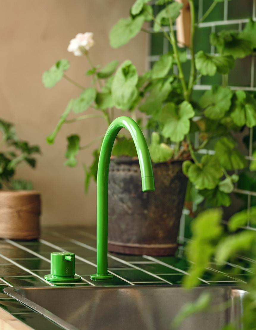
Even functional fixtures can be bold design statements, a point many brands seemed to have agreed on at this year’s KBIS. Weaving together the many new releases at the international trade show, one uniting factor made a splash: sculptural faucets. The forms of spouts and handles offer designers opportunities to get creative with shape, curvature, linearity, and tactility. Some opted for the sleek and angular, composing sharp right angles and minimalist systems. Others went playful, turning handles into fully circular knobs or devising serpentine spouts whose various configurations better suit oversize sinks. As more and more bathrooms and kitchens deliver charismatic, distinct interiors, these products add an eye-catching layer for a more immersive design.


Kohler Components kohler.com

Sculptural Faucets
BARIL Design MARIE barildesign.com

48 Issue 25 Spring/Summer 2024
TREND VOLA 590H en.vola.com
courtesy the product manufacturers
Images
THUMB quadrodesign.it
QuadroDesign


49 AN Interior Newport Brass is widely recognized for its expertise in creating bathroom and kitchen faucets and fixtures known for their exceptional quality. The brand’s collections encompass a broad spectrum of designs, innovations, and finishes, catering to contemporary, transitional, and traditional styles. Inspired Design. Unrivaled Craftsmanship. 2001 CARNEGIE AVENUE SANTA ANA, CA 92705 • 949-417-5207 • WWW.NEWPORTBRASS.COM
Color stole the show at 2024’s KBIS. Concretti’s Bucket Sinks were a particular trade show favorite, blending a vintage style with vibrant concrete. These saturated sinks come alongside material innovation and whimsy, as in the case of Kast’s curving sinks or Clou’s Ecorazzo, made from 100-percent-recycled plastic waste.
Sink & Vanities


1. Concretti, Bucket Sink concrettidesigns.com
2. Ruvati, Canali ruvati.com
3. Kast, Wave collection kastconcretebasins.com
4. Ceramica Cielo, Theo 175 ceramicacielo.us
5. Kohler, Heritage Colors Collection kohler.com
6. Clou, Ecorazzo clou.nl


50 Issue 25 Spring/Summer 2024
PRODUCTS
1 4 3 2 5 6
courtesy the product manufacturers
Images


51 AN Interior Manhattan | Southampton | Red Bank | Philadelphia | Hicksville | Boston NemoTile.com | 48 East 21st Street New York, NY 10010 | 212.505.0009
Leon - A Porcelain Marble Collection & HD Awards Finalist

Since the pandemic, a desire for smarter, more hygienic design has continued to propel interiors, especially in the realm of bathrooms. Manufacturers have risen to the call by building lavatories that are never singularly functional. Instead, 2024’s fixtures emphasize energy saving, self-cleaning technology, anticlog safeguards, and odor and dirt reduction.


1. FGI, Anti-overflow toilet fgi-industries.com
2. Ferguson, American Standard Advanced Clean® 100 SpaLet® ferguson.com
3. Laufen, The Euro durasein.com
4. Bocchi, 1632 Milano wall-hung toilet bocchiusa.com
5. Toto, Neorest totousa.com
6. Duravit, SensoWashR Classic Shower Toilet Seat duravit.us
52 Issue 25 Spring/Summer 2024
PRODUCTS Toilets
2 3 1 4 5 6 Images courtesy the product manufacturers

WX1 2023 TOTO’s new NEOREST WX1 Wall-Hung model blends cutting-edge technology with a sleek space-saving design, offering unparalleled comfort, hygiene, and sustainability for a truly sophisticated bathroom experience. TOTO NYC GALLERY 20 W 22nd Street, New York, NY 10010 TOTOUSA.COM | 917-237-0665 EXT. 3 SCAN CODE FOR INFO
PRODUCTS Millwork
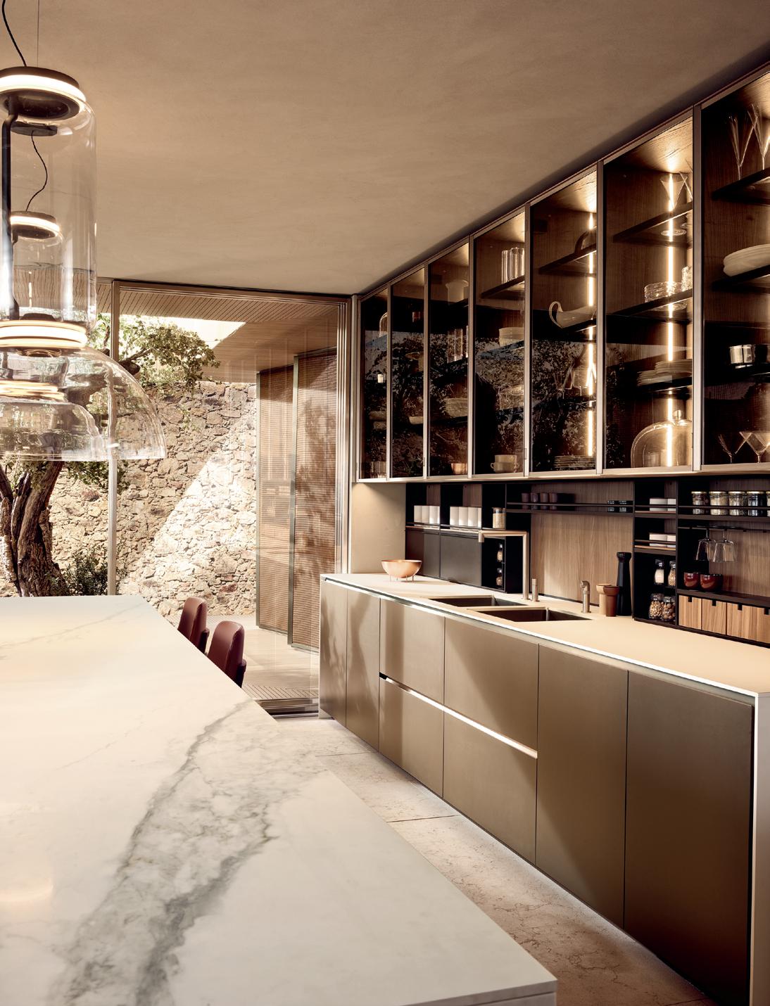
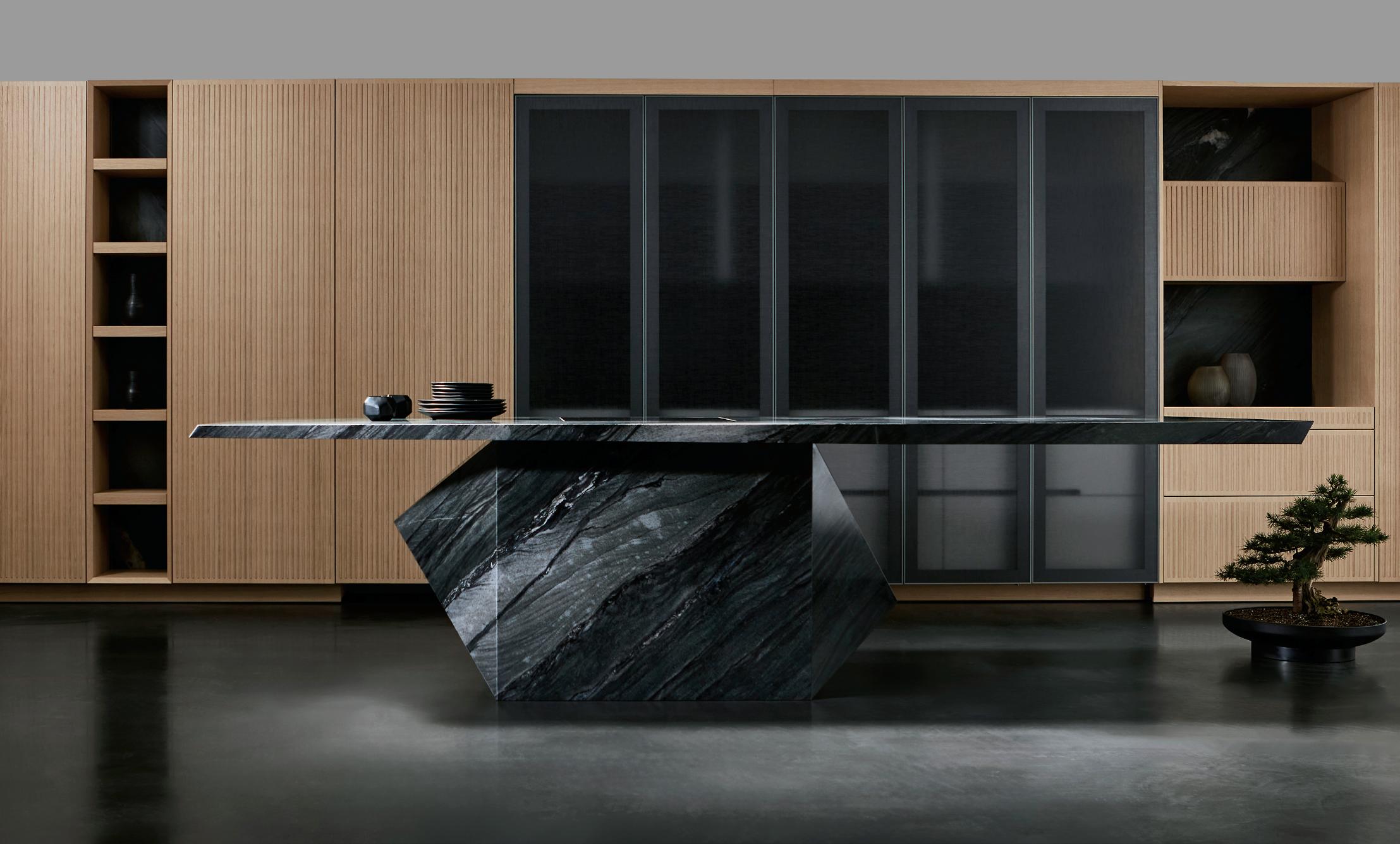
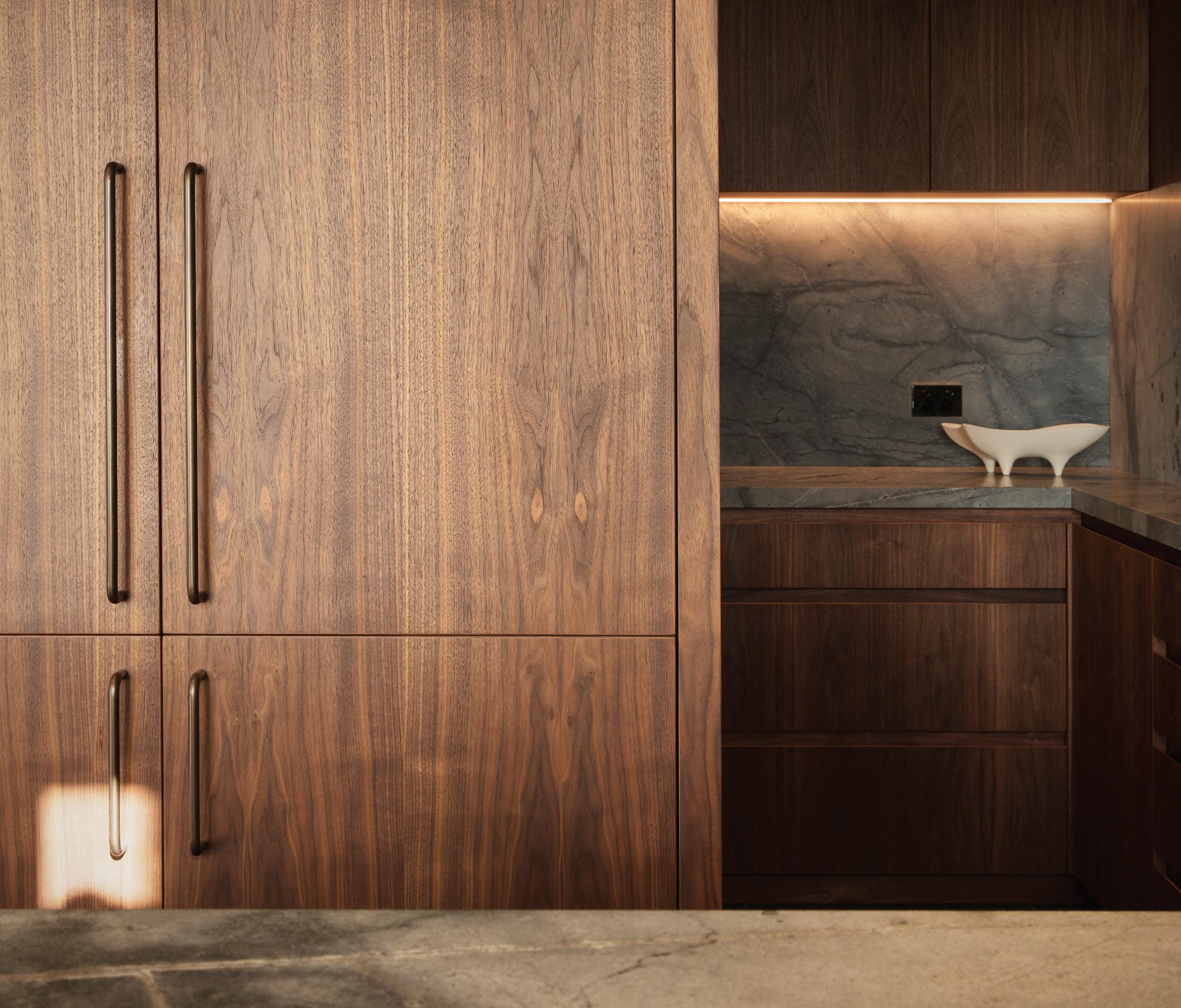
From storage systems to islands, millwork often makes (or breaks) one’s first impression of a kitchen. These systems organize all of a room’s necessities. The following products are a testament to how manufacturers have grown increasingly creative with material application, installation efficiency, texture, and volumes—without sacrificing aesthetics.
1. Vipp, V3 Kitchen vipp.com
2. Molteni&C, Prime Kitchen shopmolteni.it
3. Reform, COLUMN reformcph.com
4. SieMatic, Secret Service siematic.com


54 Issue 25 Spring/Summer 2024
1 3 2 4
Images courtesy the product manufacturers


innovative design ideas that defy gravity eggersmann since 1908 eggersmannusa.com new york | dania beach | naples | houston | dallas | chicago | los angeles | laguna niguel | pittsburgh | scottsdale | sand city | maui | honolulu | los cabos eggersmann Kitchens | Home Living 8921 Beverly Blvd | West Hollywood, CA 90048 | 310.288.0073
6. Poliform, Alea Pro poliform.it
7. eggersman, Depot Murphy Doors + Nami Kitchen Island eggersmanusa.com


56 Issue 25 Spring/Summer 2024 Millwork PRODUCTS 5 7 6
5. Poggenpohl, Poggenpohl kitchen with the contour fronts poggenpohl.com
courtesy the product manufacturers
Images


this page The kitchen is centered around a breakfast
served
facing
counter
by custom stools made by the
artist Pam Lins.
page The primary color palette of the kitchen built-ins continues in a playful mosaic backsplash.
Ty Cole
Sarah Jacoby Architect designs a compact and colorful kitchen for a visual artist with custom, space-saving details and furnishings. Text by Lauren Gallow
Playful and Personal
In Manhattan, Sarah Jacoby Architect combined color with a thoughtful reorganization for an inspired new kitchen composition. The artist’s kitchen pulls from the abstract sensibilities evident in her own paintings and drawings, which incorporate bold swaths of color and brazen geometric shapes. “The kitchen was originally a galley with very little room,”
said Jacoby. “We wanted to keep most of the appliances where they were, while opening it up and bringing in color, light, shape, and playfulness—more of the artist herself.”
Hindered by tight square footage, Jacoby removed a wall to make room for a new peninsula offering additional counter space and a seating area linking the kitchen
and living areas. Primary colors animate the painted custom cabinetry and laminate countertops, and a backsplash of Fireclay tiles in an arrangement codesigned with the artist provide a focal point at the back, making the kitchen feel larger. Stools designed by the artist Pam Lins, a friend of the client, inject a dose of playful personality to cap it off. ●

AN Interior
IN FOCUS
An uptown Manhattan apartment is reimagined by New York–based firm Ideas of Order to become a forever home with contemporary style. Text by Lauren Gallow
Art Deco Update

Located within a 1940s art deco building, this upper Manhattan apartment takes inspiration from the era’s proclivity for shiny surfaces and colored light to help a small kitchen feel more spacious. Designed by local firm Ideas of Order, the kitchen’s facelift was part of a larger renovation, including a new flex room and additional entryway storage. “The clients had been living there for years and decided to invest to make it a home they’ll continue to live in for a long time,” said the architect and firm cofounder Henry Ng.
The kitchen’s aluminum cabinets, backsplash, and paneling beneath the eatin counter offer a subtle reflectivity that amplifies each volume. Concrete countertops ground the space, with polychrome painted millwork providing visual interest: Different color palettes demarcate the kitchen from the other zones of the open-plan apartment. A circular window between the kitchen and the flex room becomes a playful porthole while also drawing in natural light. Overhead cabinetry with sliding panel doors maximizes access in a tight space. “We approached the design with as much attention as we would have a larger space,” said architect and cofounder Jacob Esocoff. “It was an understanding that small scale can be an asset and value in design.” ●

60 Issue 25 Spring/Summer 2024
IN FOCUS
above The kitchen stands apart from the rest of the home through its cool and calming color palette. Blues and purples play well with stainless-steel chromatic accents.
Sean Davidson
right A small punched aperture in the kitchen wall allows for a playful peek into the adjacent room.

IN FOCUS
In Rome, 02A crafts a sunny and bright kitchen in the Italian capital with a contrasting palette of dandelion yellow and seafoam green. Text by Lauren Gallow
At Home in Rome
For this early 20th century home in the Pigneto district of Rome, local firm 02A conceived a tailor-made kitchen reflective of the owners’ joie de vivre. Occupying a space that was formerly the home’s entrance, the new kitchen manages to be both open and separate at the same time. The sink and cooktop are tucked into a U-shaped niche that opens to a dining area containing the oven, refrigerator, and additional counterspace. “The clients envisioned a kitchen that would facilitate both cooking and socializing simultaneously,” said 02A co-owner Marco Rulli, who worked with manager Ilaria Caprioli on the proj-
ect. “Our approach was to craft a kitchen that physically bridges the two functional zones.”
02A’s functional interventions surprise and delight, including a free-floating, triangular yellow hood, a dish drying rack integrated into over-sink shelving, and gabled casework enclosing the refrigerator and shelving. The result is a space that feels playful and inviting—an homage to self-expression. “Our aim was to encapsulate the stories and aspirations of our clients, creating a repository of memories from past homes and a welcoming space where friends can gather,” said Rulli. ●

top Custom peaked fridge cladding adds a funky and personalized touch.
above A funky 3D floor pattern enlivens the kitchen by adding depth to the small space.
61 AN Interior
Paolo Fusco
PRODUCTS Hardware
A design’s cohesion can often be felt through details: the knobs, pulls, drains, and handles. Whether a space is in need of a decorative accent or something seamlessly concealed into the larger design, this guide collates the latest releases whose attention to detail, craft, and performance are meticulous enough for a kitchen or bath.


1. Oatey, Quickdrain bench oatey.com
2.Belwith Keeler, Berkshire belwithkeeler.com
3. Richlieu, Autore Collection richlieu.com
4. Infinity Drain, Adhesion Linear infinitydrain.com
5. Emtek, Habitat Collection emtek.com
6. Armac Martin, Cocktail Collection durasein.com

62 Issue 25 Spring/Summer 2024
1 3 2 4 6 5
Images courtesy the product manufacturers

ARCHITECTURAL HARDWARE
Designed and manufactured in New Zealand


Whether it’s for the kitchen, the bath, or on the rocky coast of New Zealand, Halliday + Baillie has been making architectural hardware that stands up to any harsh environment, and does so beautifully. A commitment to sustainability is matched by the innate Kiwi talent for innovation. The diverse offering of solid brass pull handles, flush pulls, pocket door locksets, door stops, and modern stair rail brackets can enhance any space in your home. Available in a dozen hardy architectural finishes.
63 AN Interior
Available in North America through Bridgeport Worldwide and its dealers : +1-888-846-4319 hallidaybaillie.com
New cooking trends are constantly trying to embrace both tradition and the innovation at the same time: We want both gas stoves and an air fryer. The ovens and ranges collected here adapt to the shifting kitchen landscape by incorporating different methods of cooking, flexibility in their forms, and multi-functionality.


64 Issue 25 Spring/Summer 2024
PRODUCTS Ranges 3 2 1 5 4 1.
2.
3.
and
4.
5.
Images courtesy the product manufacturers
Thor Kitchens, 36 Inch Tilt Panel Professional Gas Range thorkitchen.com
Unox Casa, SuperOven unoxcasa.com
Fotile, 30” Moonshadow Tri-Ring Cooktop
Hood fotileglobal.com
ILVE, Panoramagic 36” Induction Range ilve.com
Fisher & Paykel, Series 11 48" Professional Induction Range fisherpaykel.com


65 AN Interior Available in North America through Bridgeport Worldwide and its dealers : +1-888-846-4319
The ONE Collection, by Piet Boon—offers solutions for every corner of your project. In a wide range of luxury finishes, delivers a total concept. Designed in The Netherlands. Obsessed with details formani.com TOTAL PROJECT ARCHITECTURAL HARDWARE FOR MODERN LIVING SPACES
Falken Reynolds Interiors Photography: Emma Peter
Outdoor Kitchens


66 Issue 25 Spring/Summer 2024
typologies, designers have shown an interest in blurring the boundaries between indoors and outdoors. It makes sense, then, that more architects are extending kitchens beyond the interior realm. Products have answered the call with not only an attention to durability but also an emphasis on striking industrial aesthetics. PRODUCTS
Across
2 1. Dekton x Urban Bonfire, Collab collection urbanbonfire.com 2. Hestan, Outdoor Living Suite hestan.com 3. Oldcastle, Elements Collection durasein.com 4. Abimis, Atria abimis.com 3 1 4 Images courtesy the product manufacturers


Whether your home is near a sandy beach or boasts a secluded backyard pool, an outdoor shower is a fashionable and functional addition that effortlessly adds a luxurious, tropical feeling to your space. These new outdoor bathing products use sleek, minimal silhouettes so they feel like an integral part of your design composition.
Outdoor Showers


1. QuadroDesign FFQT Outdoor Shower quadrodesign.it
2. Outdoor Shower Company, FTA-S40-HC outdoorshowerco.com
3. Fantini, AW / EX Pipe fantini.it
4. Ceadesign, BOLD ceadesign.it
68 Issue 25 Spring/Summer 2024
PRODUCTS
Images courtesy the product manufacturers 1 4 2 3

Lit from above by evocative pyramidal fixtures, each bath within Bathhouse offers a unique gradation of both temperature and privacy.

Rockwell Group with Colberg Architecture debut Bathhouse’s new location in the Flatiron District, offering New Yorkers a taste of tranquility. Text by Jesse Dorris
Manhattan Oasis

In most of the world, people used to bathe together; it was almost unheard of to be wet, nude, and alone. In 21st-century New York City, it’s rare to be alone unless you’re in your bathroom. While the city does have a long history of bathhouses and spas, from the East Village Russian and Turkish Baths on East 10th Street to Korean jjimjilbangs like the much-missed Spa Castle in Queens, most have moved from the no-frills
men’s club vibe toward buzzy takes on tradition. In the 1970s, gay men began populating traditional bathhouses from Harlem on down, turning them into sites of resistance for people tired of being told their bodies, and what they might do with them, are inherently filthy. But recently these spaces have become much more palatable for corporate tastes and takes on wellness and well-being.
Sexy, if not sexualized, self-care is exemplified by Travis Talmadge and Jason Goodman’s Bathhouse concept. And it’s perhaps perfected at their first Manhattan location, for which the pair enlisted Rockwell Group with Colberg Architecture to elevate the idea—or, given its previous life as a parking garage beneath West 22nd Street, take things deeper.
“In New York, going to the spa re -
71 AN Interior
IN FOCUS
Gaut and
Adrian
Emily Andrews


quires a pivot and transition, because you’re in this very hectic environment,” said David Rockwell. After you check in on the groundfloor, a pair of illuminated arches signals your transition: a stairwell, surprisingly dark, descending to a floor offering labyrinthine men’s and women’s locker rooms. This level is also home to a cafe that accommodates both wellness and party vibes with a menu of toasts, juices, and cocktails. “I think those of us who work in cities find ways to embrace vertical circulation,” Rockwell said. “I’ve always been interested in stairs as delivery devices, but also as emotional things.” Here, the emotion is a kind of hushed wonder at what is to come, a not-inappropriate feeling for the moment before you get (mostly) naked with strangers.
An even deeper stairway leads to the heart of the place. Its quarter turns and changes in light do a lot of the lifting. “Working with a limited palette, just a shift in color temperature from slightly blue to very warm
does make you feel like you’ve arrived at a destination,” Rockwell said. At Bathhouse, the destination is a thoughtful progression of six hot and cold pools, some illuminated by inverted pyramids filling the overhead space. On the perimeters, doors lead to ceremonial and infrared saunas, with recessed lighting that emphasizes their long cedar lines. There’s also a banya, whose beautifully simple stove forms a focal point; and an eerie steam room, where strip lights cause the 3D Danish tile to shimmer in the steam plumes, as if you’re sweating it out in a James Turrell installation.
It’s very razzmatazz, in its minimal way—very Rockwell. “The material palette is moody,” he said, “really just travertine, fluted glass, stone, concrete, and patinated metals.” Ancient in spirit yet speaking to the moment, Bathhouse flatters the very New York impulse to look inward and look good doing it, or at least do it in a good-looking space. To be sure, some elements need to
catch up to contemporary NYC. On my Tuesday afternoon visit, the clientele encompassed wide swaths of gender expressions, physiques, ages, and levels of peacockery. Gender-binary bathrooms go back as far as bathhouses themselves and aren’t just an American hang-up, but hopefully before long they’ll seem as backwards as the Reduc-o-matic portable tub.
Soon enough, water may be a luxury in and of itself—not to mention the energy for the heating and cooling of that water. At Bathhouse Flatiron, the heat is provided via Bitcoin mining, which feels both ridiculously contemporary and a bubble as ready to burst as those pumped into the pools themselves. Best not to think about it, perhaps. It makes sense that we’re longing for quiet moments of contemplation, or maybe of avoiding contemplation, to gather strength for the pivots and transitions on the horizon. After a few hours of spectacular rejuvenation, it might feel like no sweat at all. ●
72 Issue 25 Spring/Summer 2024
above , left The dry sauna offers warm lighting and centers on a large bed of heated rock. There is a calming herbaceous scent throughout the room.
above , right The subterranean entrance to the locker rooms sets the mood for your bathing experience.
Adrian Gaut and Emily Andrews
above Each pool offers a distinct sensory and social experience, ranging from icy-cold solo plunges to larger, pleasantly warm oases.
below Treatment rooms are separate from the pool floor, offering quiet retreat for a variety of facial treatments, massages, and scrubs.


FOOD New York beckons visitors to a lush retreat in the jungle with highly textural materials and a chic sensibility at the buzzy Palm Heights Hotel. Text by Jesse Dorris
At the Garden Club

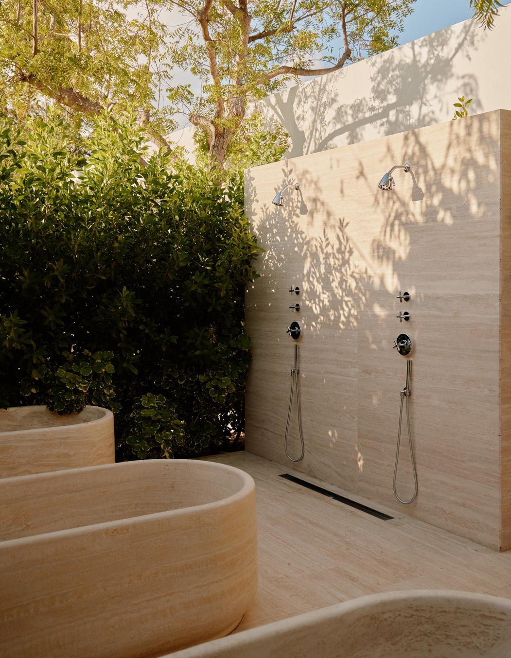
The genius of the traditional bathhouse is its simplicity: just four walls, fire, and water. For the Garden Club of the Palm Heights Hotel on the Cayman Islands, FOOD New York managed to distill things even further, all but eliminating one of those essential elements.
“The brief was very open-ended,” said founding director Dong-Ping Wong, so he took a plane down to check out the site. “You walk out of the plane into this wall of humidity,” he described, “so it was a no-brainer. You’re sweating anyway. Instead
left The spa takes advantage of the tropical climate to create an outdoor bathhouse experience with sculptural fixtures amid lush greenery.
below Outdoor showers and baths allow visitors to feel connected to nature as they unwind after treatments. All facilities are open to the sky.

of fabricating the bathhouse, could you just get outside?”
In effect, that wall of humidity is a bathhouse wall. But in reality, lush hedges do the spatial trick, carving out zones across a 35,000-square-foot spa with a sextet of pools, a hammam, treatment and locker rooms, and more. “Planting became an architectural material,” Wong said. “It had to have a certain level of thickness, because we wanted opacity.”
Stone steps in when absolutely nec-
essary: Yellow travertine clads both ice and steam rooms, its hue meant to be discovered like sun filtering through the greenery. Black marble defines a roofless zone with both hot and cold plunging pools. “The idea was for it to become a sensory- deprivation room,” Wong said. But even here, the sunlight gets in. Connection to the senses is key. “I wanted as little artifice between the thing producing the experience—in this case nature and temperature—and your body experiencing it.” Simple as that. ●
74 Issue 25 Spring/Summer 2024
IN FOCUS
William Jess Laird

Simple
• Designed for use in shower / bath
• Premium properties of MONARC ensure an extremely flat, lightweight, waterproof panel
• Delivers a striking visual appearance inspired by natural elements
• Inspiration drawn from wood, marble, stone and metal variations


75 AN Interior
Calcutta Marble
Installation. Stunning Results.
enclosures, lobbies,
feature walls, and other interior spaces
FIRE & ELECTRICAL RATED LIGHTWEIGHT COMPOSITE MATERIAL LOW MAINTENANCE EASY INSTALLATION WET WALL APPLICATIONS HIGH QUALITY APPEARANCE From the makers of For more information or to order samples, scan QR code with mobile camera or email us: info.usa@3acomposites.com 800.626.3365 | ALUCOBONDUSA.COM / PRODUCT / MONARC

IN FOCUS
The Komaeyu bathhouse by Schemata Architects is a playful take on a ritual tradition in Japan that crafts and intimate sense of community. Text by Jesse Dorris
Bathing Rituals
In 2020, Schemata Architects reimagined a 1985 Japanese sento, or public bathhouse, into a Towada-clad destination complete with DJ booth and cafe. Last year, founder Jo Nagasaka and his team looked back to the history of the sento—and toward the future of a vacant lot nearby—when refreshing an extant bathhouse on the ground floor of a reinforced-concrete building in the Komae suburbs of Tokyo.
Traditionally, sento partition walls separated zones for men and women. Here, one rises some 7 feet high, not quite to the ceiling of the 1,000-square-foot bathhouse, carving out zones for saunas but also a bandai, or reception counter, where everyone
can relax together over a beer. Postwar sento also boasted murals of Mount Fuji, a custom carried into the present via tile patchworks arranged in honor of the murals Nagasaka remembered from the Kyoto bathhouses he used to frequent.
Those tiles, custom made in Tajimi in three shapes and sizes, clad the surfaces of the bathing areas for installations that incorporate the usual grids but also patterns of negative space that give a sense of time passing. Their hue references the greenery of the lot next door, where plants sprout up to feed off the bathhouse culverts. With this humble yet impactful project, Schemata has updated the old sento into a breezy 21st-century hangout. ●

above A playful and modern seafoam green color palette is consistent throughout the bathhouse, creating a fun contrast to neonyellow accessories.
right Schemata used the tile design material to create surprising mosaics like this Mount Fuji rendering at the front bar area.
76 Issue 25 Spring/Summer 2024
Ju Yeon Lee

YOUR LOCAL SHOWROOM: NEW YORK | GREENVALE | SOUTHAMPTON YOUR PROJECT IS OUR PRIORITY Our showrooms are designed to inspire, with bath, kitchen and lighting choices from top brands curated in beautiful, hands-on displays. From product selection to delivery coordination, an industry expert will be there to support your project every step of the way. fergusonshowrooms.com


