PORTFOLIO


Jan de Oudeweg 396 Delft, Netherlands 2628SK
linkedin.com/in/roshko2411 roshko2411@gmail.com
+31-0634187146
Sep 2020 - Nov 2022
Aug 2014 - Dec 2019
Msc Architecture | Technical University
- Graduation with cum laude (GPA 8.8/10)
Bsc Architecture | Monterrey Institute
- Graduation with cum laude (GPA 9.5/10)
Sep 2021 - Nov 2021
Project Leader | Why Factory Studio
- Coordination of around 50 students with
- Development of storyline
- Creation of entire 3d model of Amsterdam
Seeking the position of an architect; bringing two years of experience in the professional field and a Master’s degree in Architecture.
*Currently holding a Dutch EU/EEA Residence Permit
Jan 2020 - Jul 2020
Junior Architect | CEBRA Arkitekter

- Visualization and 3d modeling of projects
- Illustrations for conceptual diagrams using
- Facade design and development
- Preliminary design and conceptualization
Aarhus Vand, Office, Denmark UTSC Instructional Center, University, Nørrebrogade, Housing, Aarhus Verge Park, Masterplan, Abu
Aug 2018 - Jul 2019
Architectural Intern | CEBRA Arkitekter
- Visualization and 3d modeling of projects
- Illustrations for conceptual diagrams
- Model making using wood workshop,
- Preliminary design and conceptualization
Mosevej, Housing, Denmark Schulcampus Struenstrasse, Al Badia, Masterplan, Abu Dhabi Broadview, Housing, Canada Brande, Competition School, Ny Skole Atuarfik, Competition
Oct 2017 - Dec 2017
Architectural Intern | Corcuera Arquitectos
- Documentation of elevation, plan and
- Production of design drawings and visualizations
University of Delft
8.8/10)
Institute of Technology
with 3 other project leaders
Amsterdam using Blender
projects using conceptualization for a variety of projects
Denmark University, Canada
Aarhus Dhabi
Arkitekter
9.5/10) projects
laser cutter, and foam cutter conceptualization for a variety of projects
Competition School, Germany
Dhabi
Denmark Competition School, Greenland
Arquitectos
section drawings
visualizations
ENEA Architecture | National Competition
ENEA Masterplan | National Competition
Food Factory | Workshop
Citizen Park | Regional Competition
Arctic Hotel | International Competition Top
Highest GPA | Bsc Architecture
30° ENEA | ArchDaily
PROYECTA Exhibition | Bsc Architecture
Highest GPA | Panorama TEC
English | Native Rhinoceros Grasshopper
Konkani | Native
Spanish | Professional
Hindi | Literate Danish | Intermediate German | Basic
V-Ray Ladybug
AutoCAD Enscape
Revit Adobe Package
Maya Video
Procreate SketchUp Blender

Type: Msc Thesis Project, Individual
Year: Jan. 2022 - Nov. 2022
Location: Delft, Netherlands
Tutors: Roel van de Pas, Hubert van der Meel, Sabina Tanović
A Living Lab for Flow is a design project that thematically focuses on the notion of flow in the emerging context where creativity and working deep have become the most valuable skill sets in our society. We spend, on average, more than 90% of our time indoors and with that being the case, the psychological and physiological impact of spaces on our well-being are critical aspects that can be explored. Thus, the lab is conceived as a neuro-architecture research centre where research is conducted on how spatial settings can feed and nurture the brain.

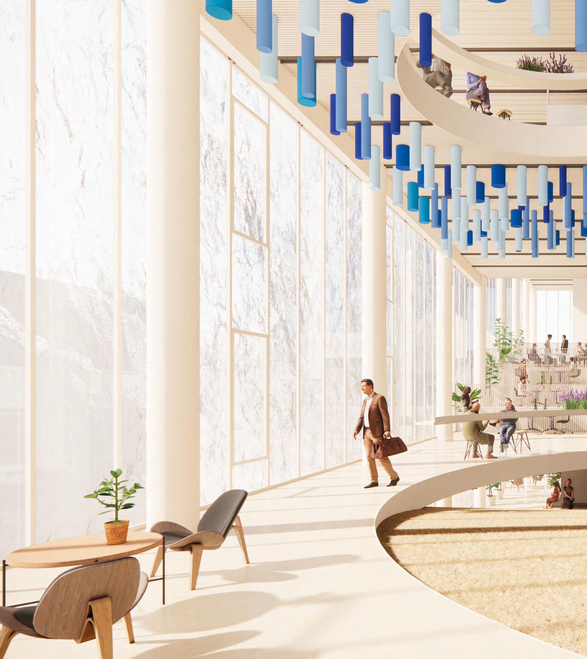
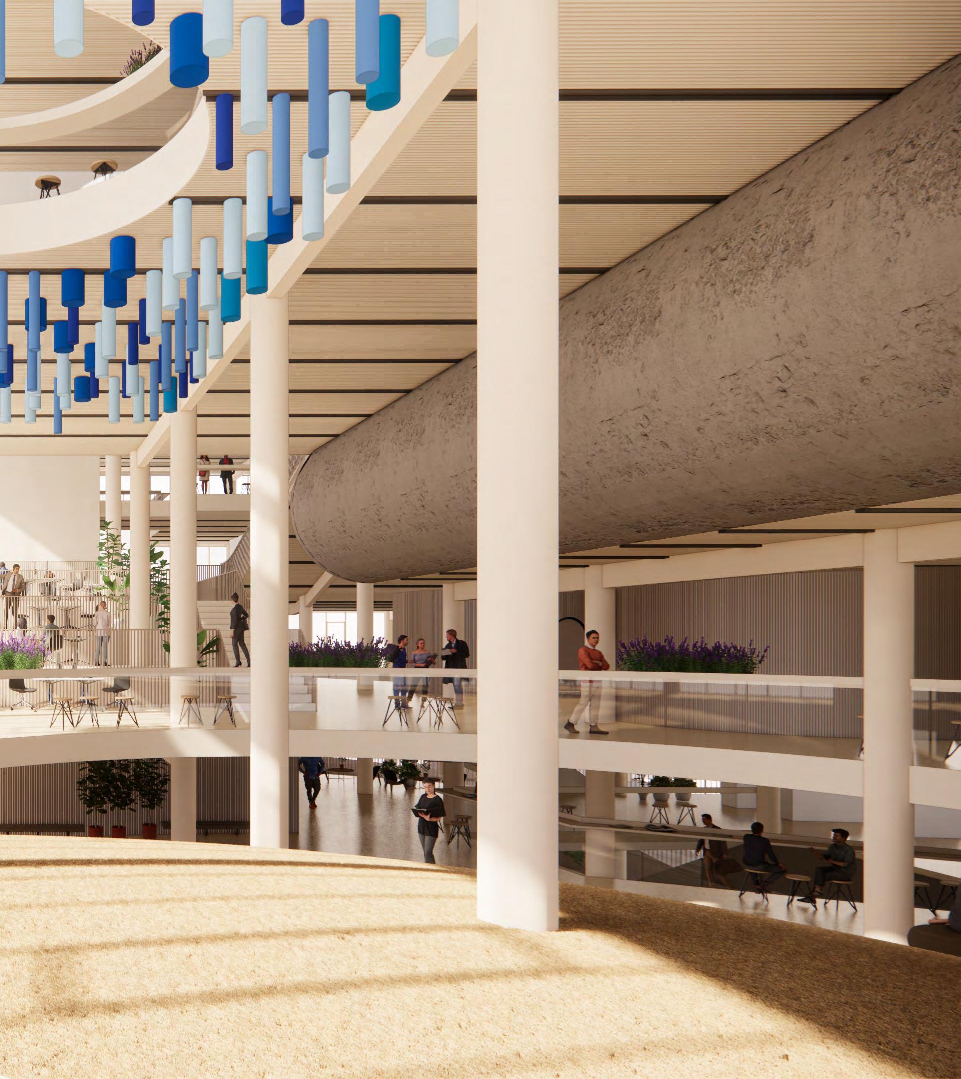 VIEW OF ILLUSIVE HORIZON
The Research Centre is conceived as a simple rectangular extrusion to respect the design intentions of the Bouwkunde and highlight the corner as the existing faculty building does. Through experimental paper cutting and perceptual sketching as a design method, the idea was to focus on the interior and take it from a simple stacked extrusion to the notion of a building as a promenade.
Social Flow
Solitary Flow
Sources
Encounters
Platform
Void
Seclusion
Visual Cues
Views
Variation
Ambiance Activator
With the flow theory being one of the main design drivers in the project, I created a design strategy that mapped the two flow types to the different spatial settings necessary to support them. The diagram is also based on Katja Thorings theory of creative workspace design.
The spatial on and, at the Dewane's theory Machine theory to bring flow into five essential stages
The Chamber
5
Living Lab
4
Staff Offices Command Centre for Lab Server and Storage room
3
Solitary Flow Chamber Meeting Rooms The Neighbourhood
2
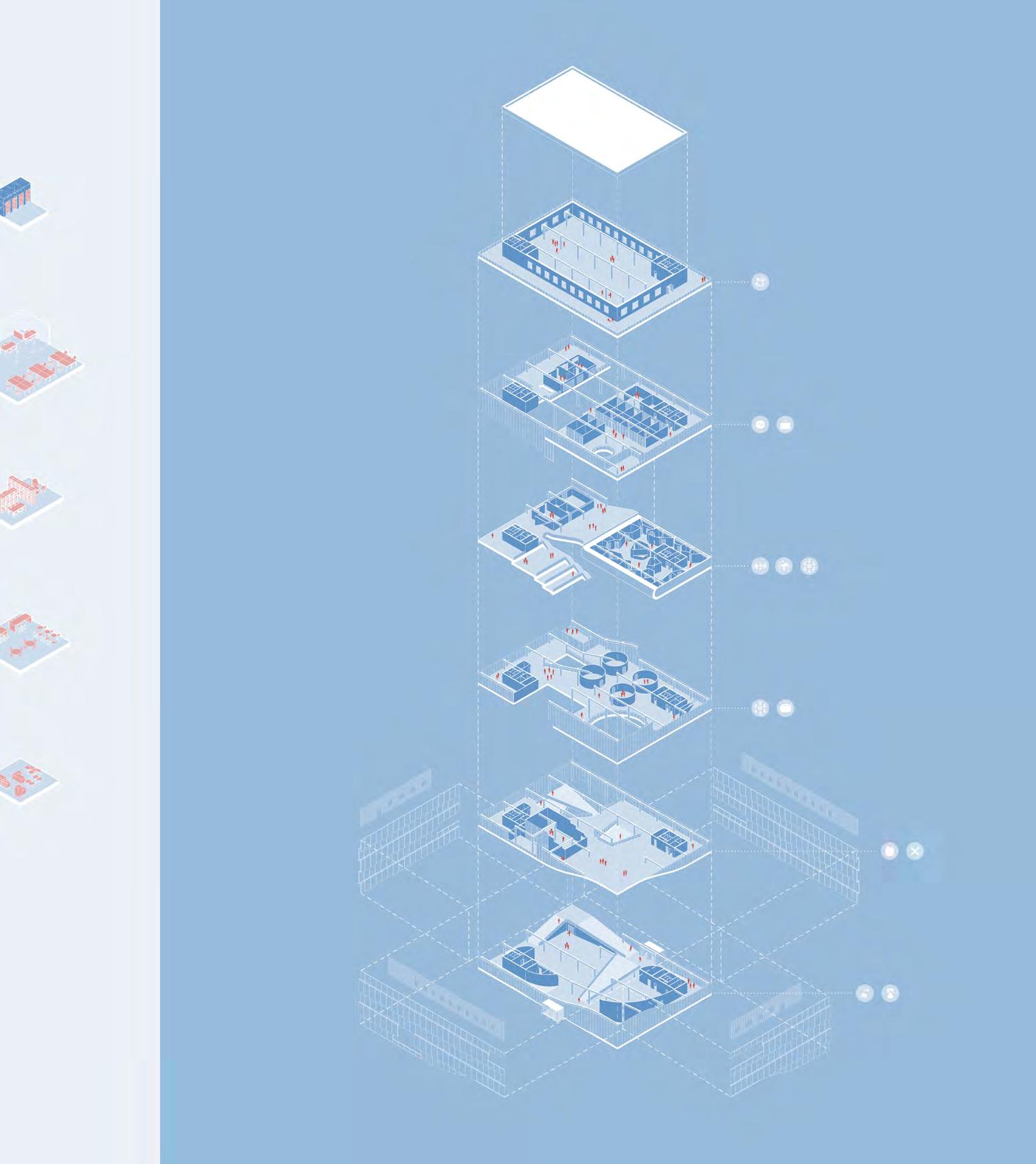
spatial hierarchy is based same time, challenges theory of the Eudaimonic which focuses on how into a workspace. There are stages to bring about flow.
1 G
VR Lab Open work space Library Cafeteria Gallery Lobby
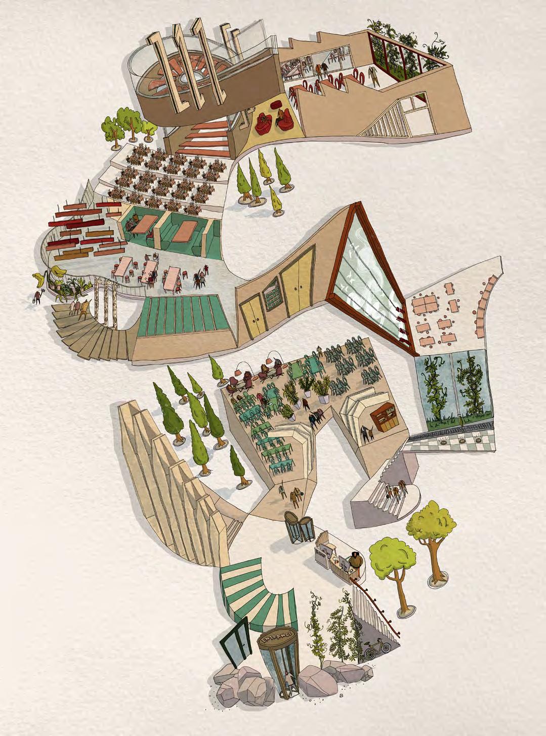
For the drawing on the left, I implemented a methodology of drawing known as experiential sketching. For this, I made use of a value perspective – where the scale of the drawn elements is based on its significance – and a distorted oblique perspective – extrusion of 2D linework in any angle - to create the feeling of depth. By drawing with this child-like understanding of spaces, such a methodology allowed me to capture my experience of the space felt in terms of how constricted or open, how flat or vivid, how stimulating or sedative, how organic or controlled the building felt.

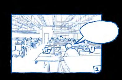
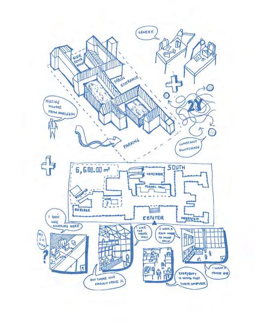
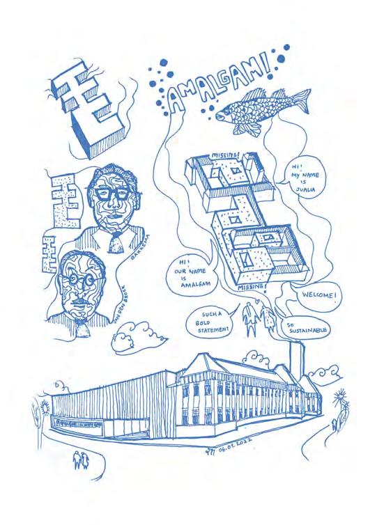
The croquis on the right hand side of the page are all rough sketches made by hand during the early phases of the design process. Sketching has been an activity for me throughout my life which is why I studied the sketching process of an architect during the research phase of my Masters thesis project. I investigated the impact of the choice of tool, digital and analogue, on ideation and design flow experience of an architect with the use of an EEG headset (to capture the brainwaves). If you would like to learn more about my findings, you can check out the link on the title page.
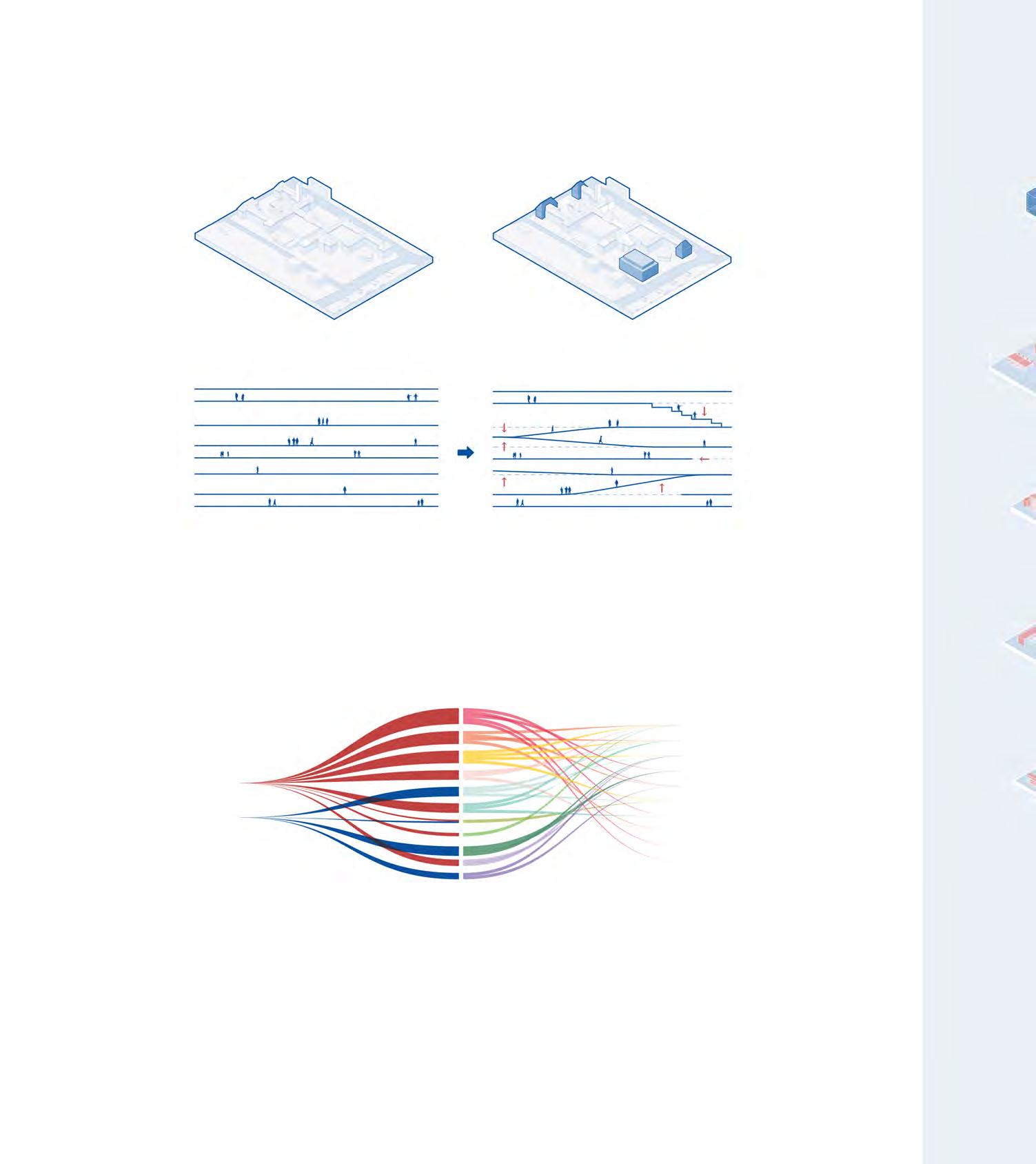
The figure above illustrates the relation of the project with the TU Delft Architecture faculty building and its surrounding context.
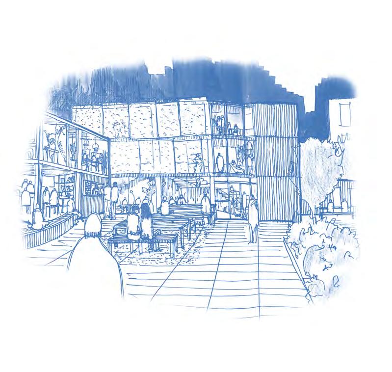
The research centre is conceived as a cube that is carved from the inside out as the interior had a greater priority than the volume itself. It is for this reason as to why the research centre does not take away from the heritage and historic value of the Architecture faculty building.
The plan to the right highlights the open office space environment. Here, research teams can form neighbourhoods and conduct shallow work. It also houses four VR lab spaces where static neuro-architectural research studies on how spaces impact our neuro-physiology is conducted. The platform - staircase like floor slab - is called the Neighbourhood where different research teams can work together during the more creative phases of the research.
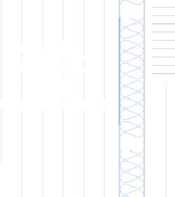
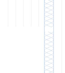
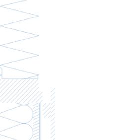
The elevation on the right illustrates how the glass facade changes its transparency as you move up the building. This is because the facade is made of textured cast glass ranging in thickness - with the lowest layer being the thickest and the upper being the thinnest.
The idea behind the facade was to give the building a bit more of a mysterious character by making it go from a semi opaque to a translucent appearance so that people who passed by the building could only see hints of what was going on within the building. It also provided the users of the building to experience a softer diffused light within.


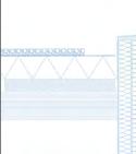















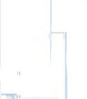
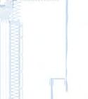
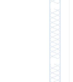
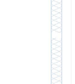




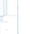









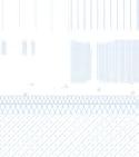
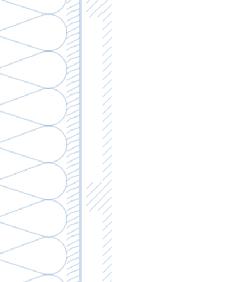
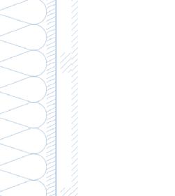
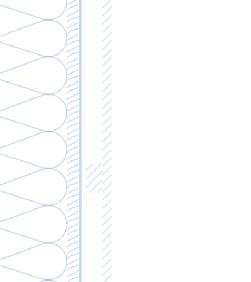
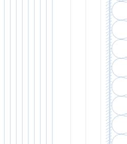
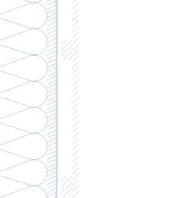
DOWEL LAMINATED TIMBER


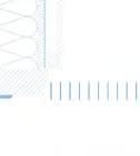
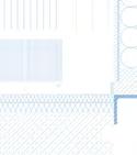










TIMBER COLUMN TO FLOOR













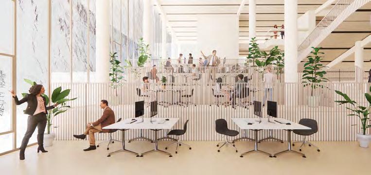
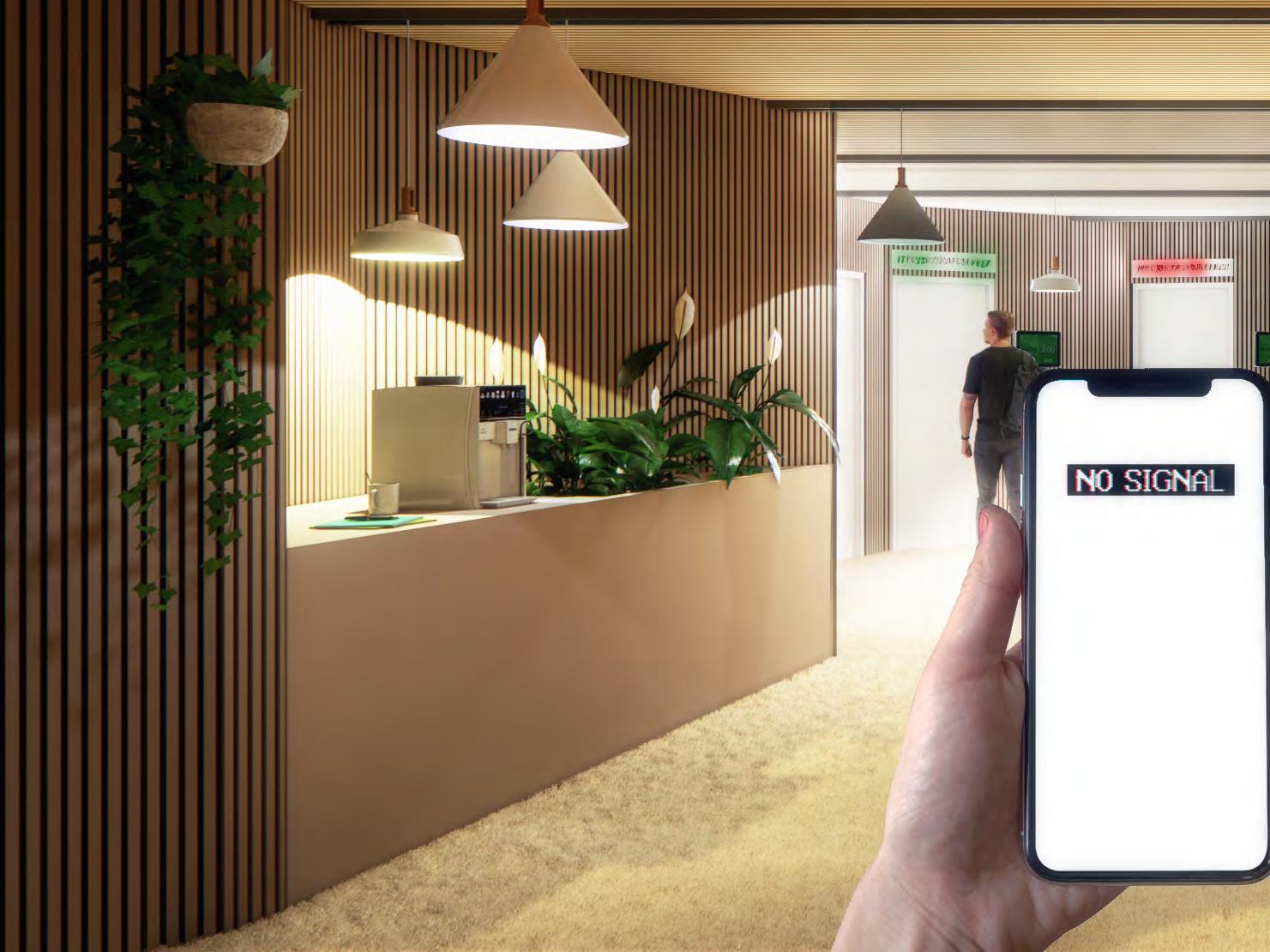
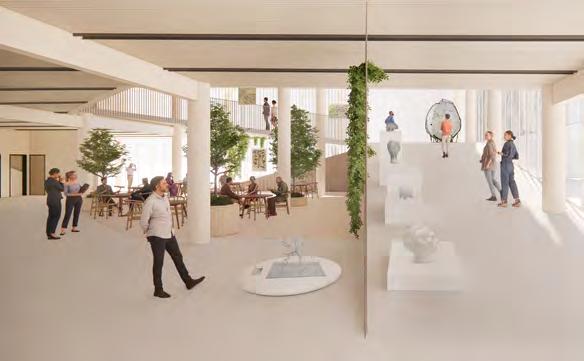
During flow, the brain is functioning at its fullest capacity and is wholeheartedly dedicated to the task at hand. In this space, the mind is acute. It’s not daydreaming or loitering around in its shallower registers, accessing superficial thoughts, gossipy insights, and banal fantasies. No, here, in this space, the brain is "total" and “"perfect."
This is why the solitary flow chamber is designed as a Faraday cage - a technological cold spot in the building where the users can work without too many distractions.
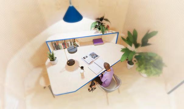
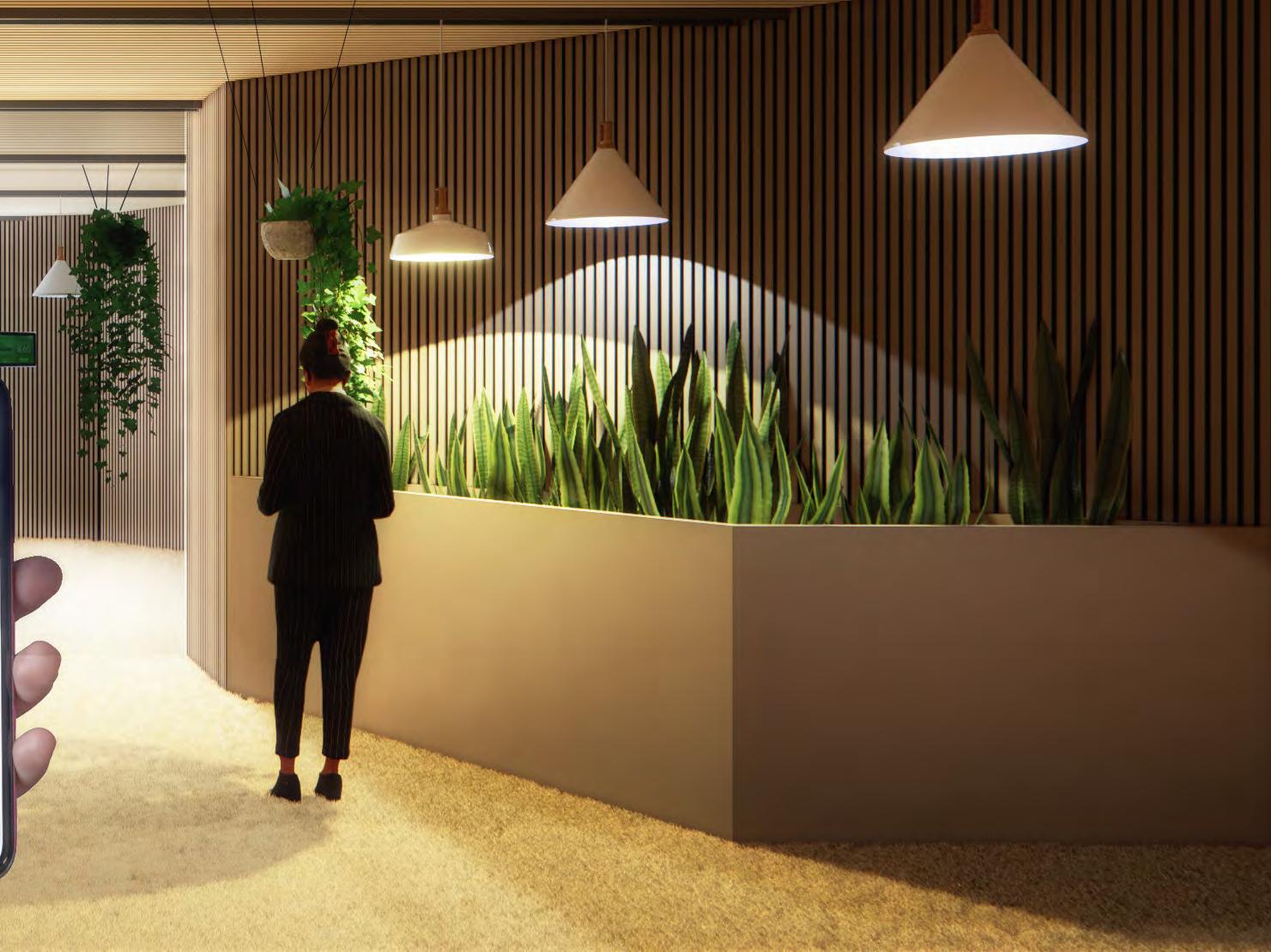
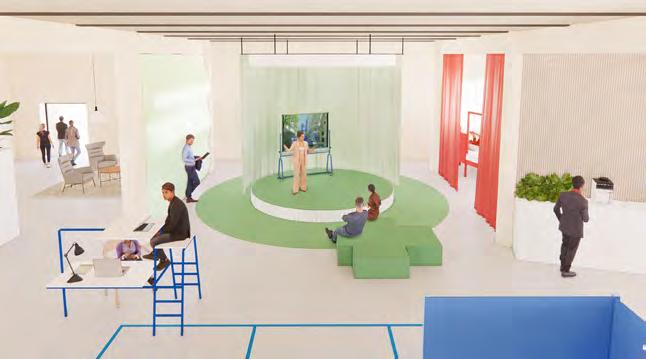
 LEVEL 3 |
VIEW OF THE SOLITARY FLOW CAVE
LEVEL 5 | VIEW OF THE LIVING LAB
Type: Arctic Hotel Competition, Team
Year: Jun. 2021 - Jul 2021
Location: Rovaniemi, Finland
Team: Gabriel Gallo, Diego Castro
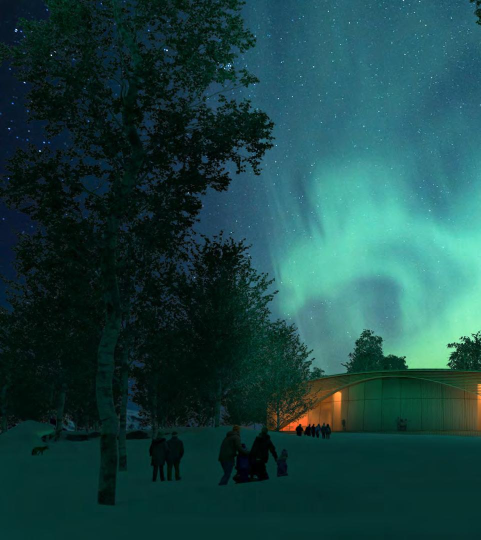
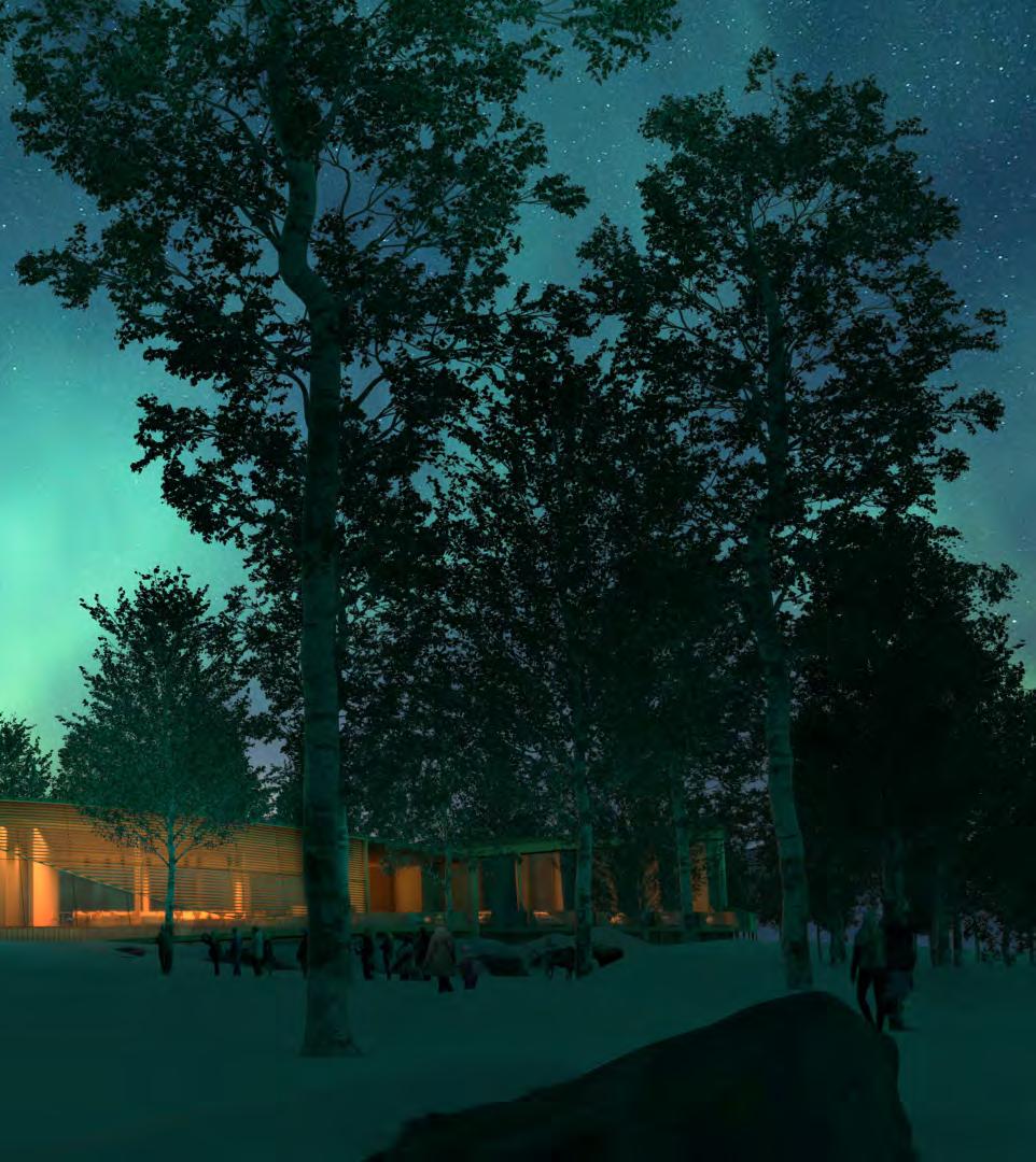
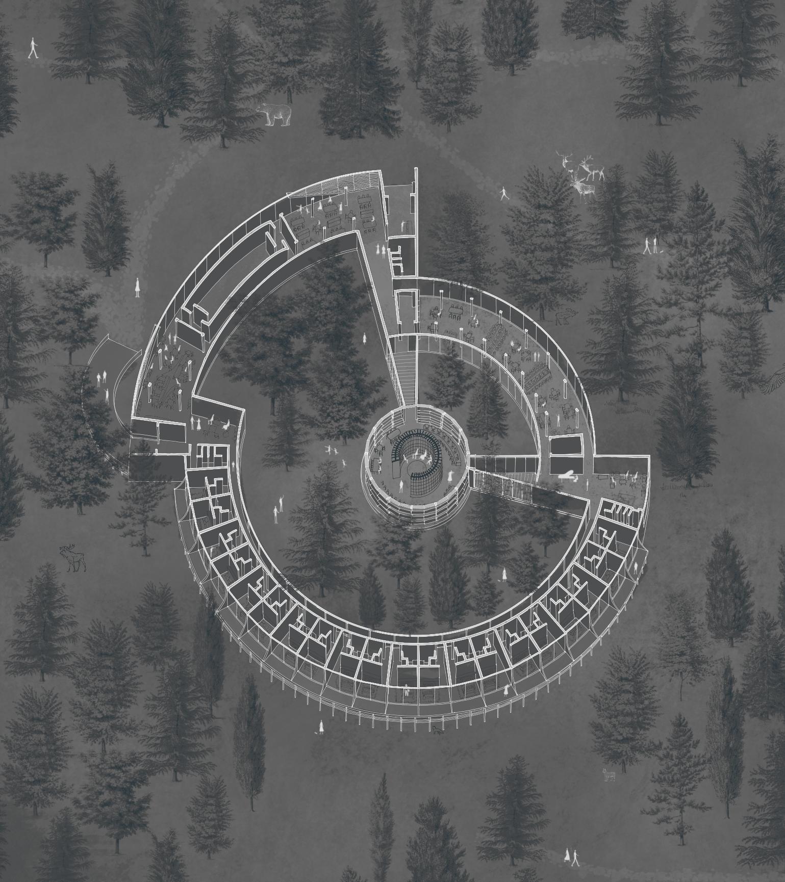
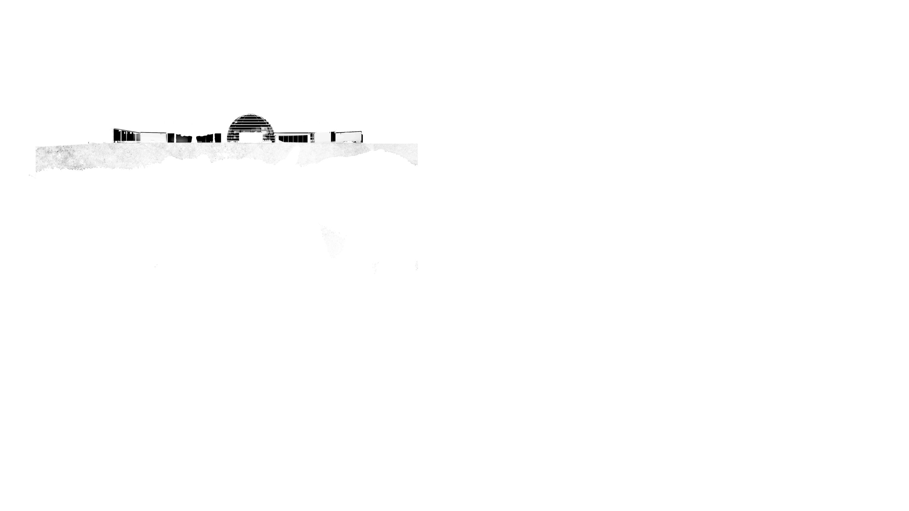
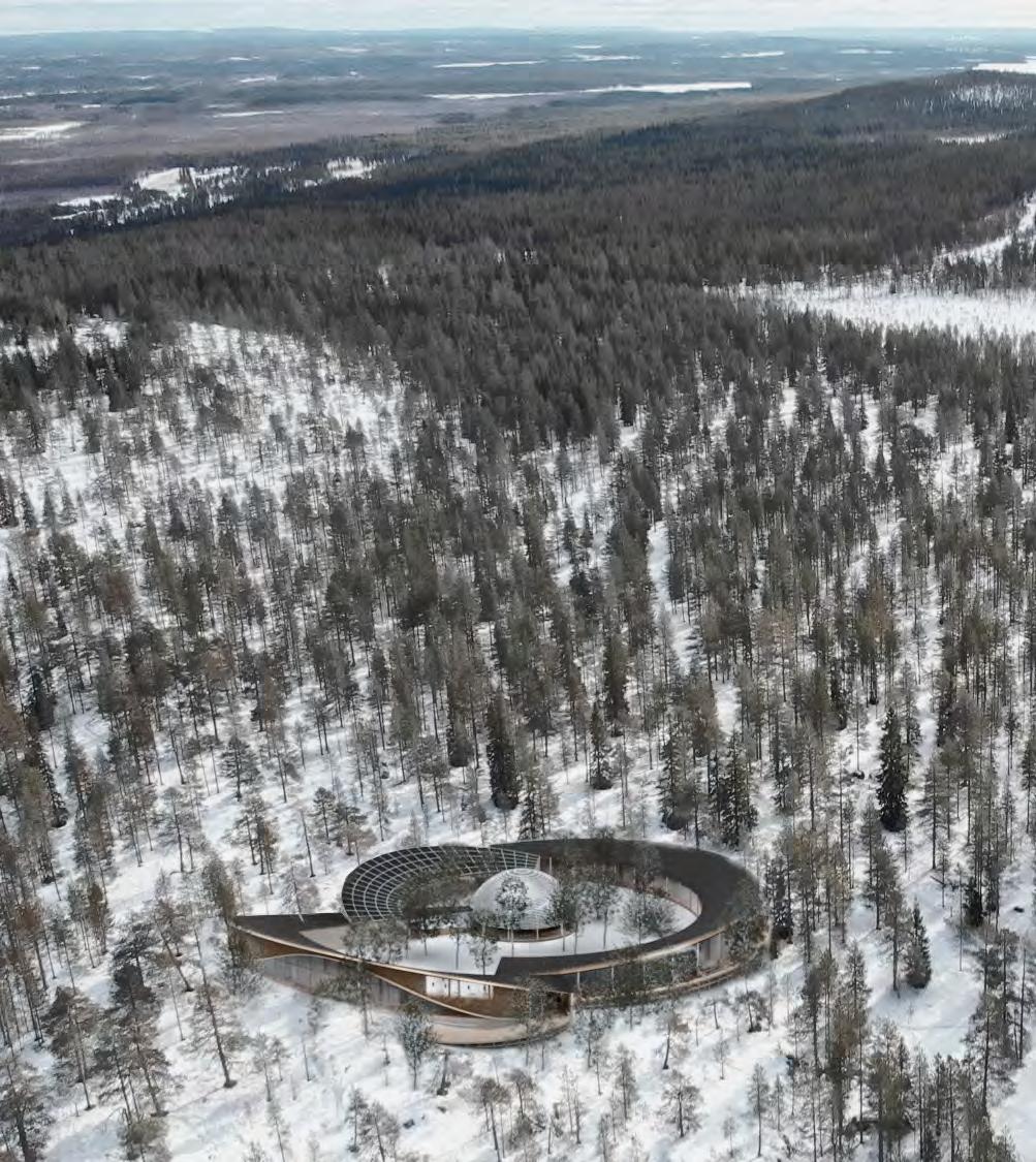
The Lapland Hotel was conceived with the ambition to design a retreat where people can experience the most authentic North, respecting its isolation and magic. The challenge was to create a new hospitality model to protect the remote identity of the land characterized by primitive beauty, inaccessibility, and harmony. On the top of Ounasvaara Hill, overlooking one of the most remote bases ever built, we have designed a hotel that blends with the snow, the forest and the sky. A place where visitors can find shelter from the freezing temperatures of the Arctic Circle, gather around a fire, and enjoy the rarest and most mysterious spectacle of nature: the Aurora Borealis.
Placing a simple volume on site that meets the minimum spatial requirements of the brief.
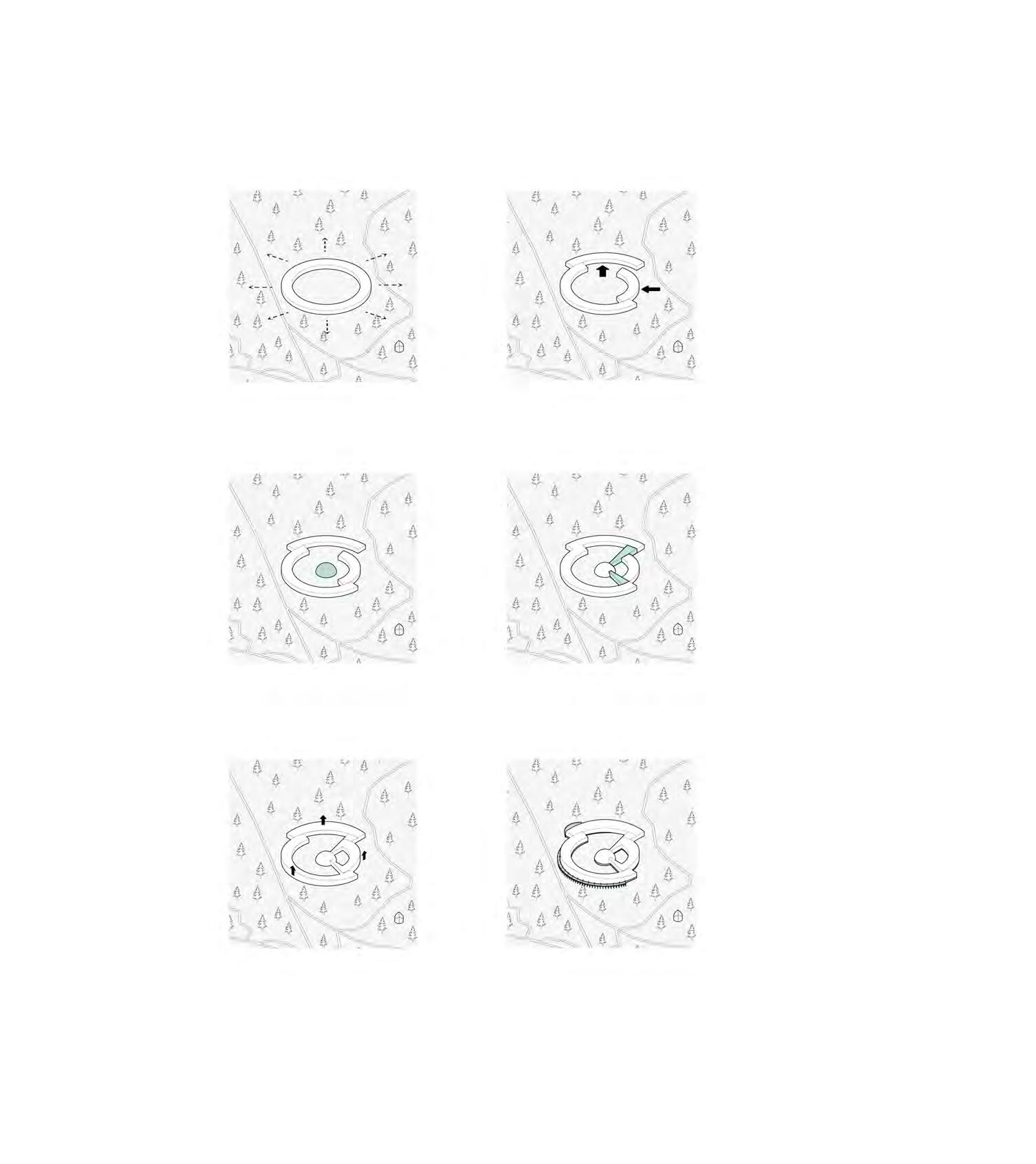
Pushing and pulling in parts of the volume to open up the building and introduce some dynamism.
Placing a semi-sphere glass house (Observatory) in the centre as an addition to the program.
Connecting the volumes to have a fluid circulation throughout the building.
Lifting the roof towards the outer edges to maximise the views to the surrounding landscape.
Adding ramps to access the building, the foundation, and the terraces.

Type: Msc2 Complex Projects (Research & Design) Studio, Team
Year: Apr. 2021 - Jun 2021
Location: Agbogbloshie, Ghana
Team: Léa Alapini, Dominik Stoschek
Tutors: Paul Cornet, Hans Larsson, Negar Sanaan Bensi, Setareh Noorani
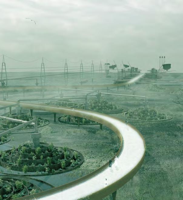
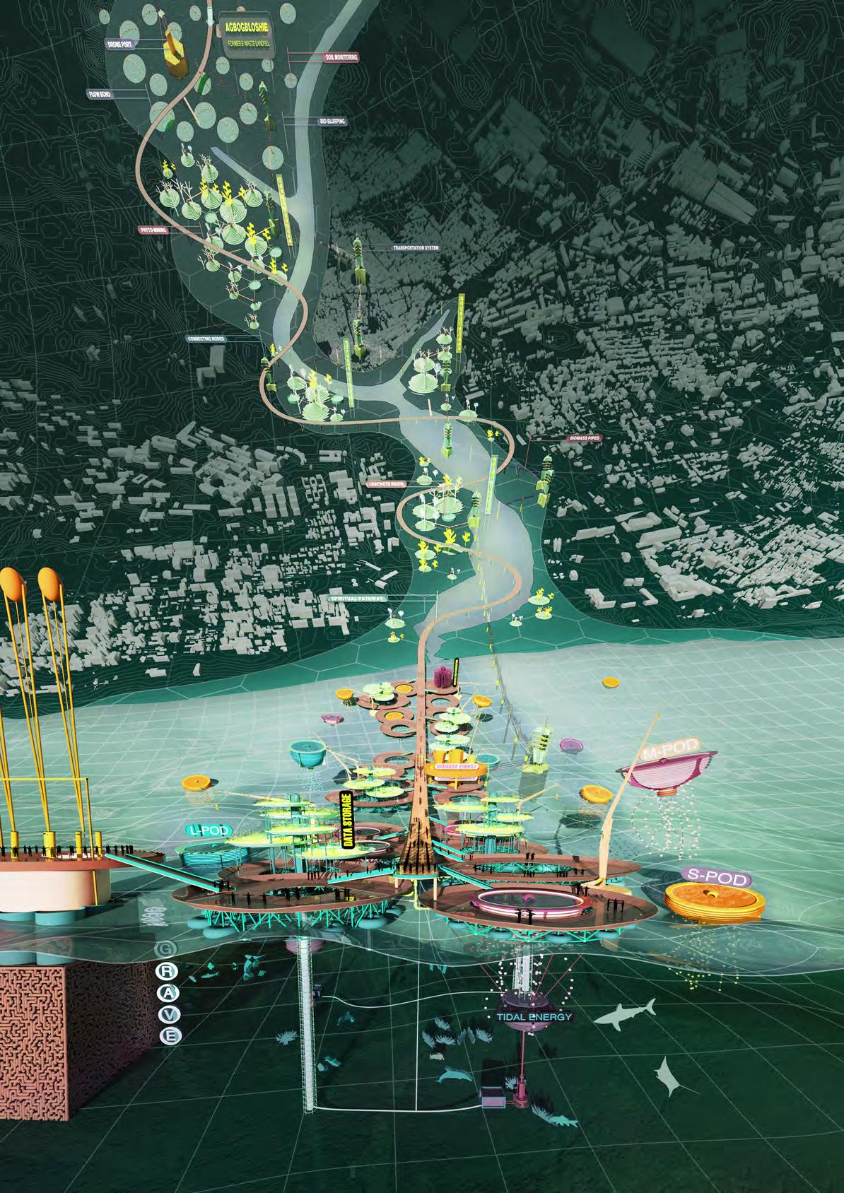
Graceful (DE-) gradation is a design project that operates on planetary cross-roads, oscillating between land and sea, bridging current/post-e-waste processing sites, and internet data cable terminal. It consists of systems being deployed as moving filtering entities in search of toxic/scarce mineral spills. Such actions are ensured by means of bacterial and fungi species. While part of the scenario speculates on multi-species care, the other side of the scenario enacts data selection and erasure of surplus digital content, guaranteeing the user a grave to its cloud, limiting the afterlife of compulsively hoarded data using prevention models.
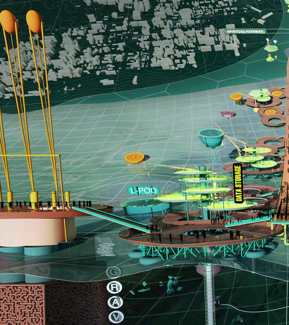
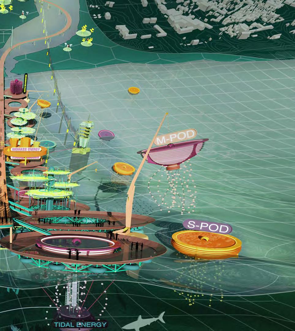 VIEW OF GRACEFUL (DE)-GRADATION SYSTEM
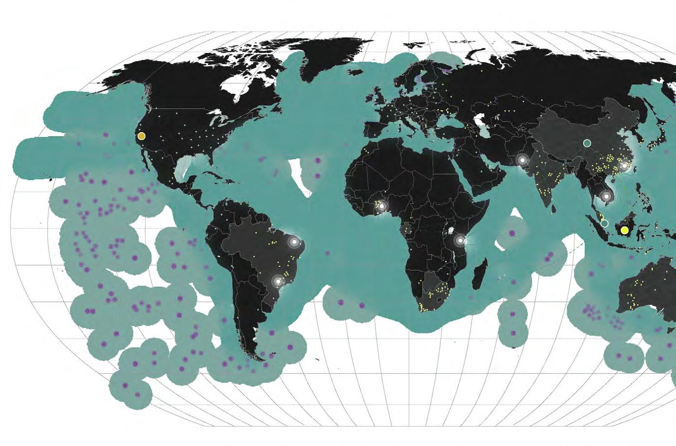
E-waste Dumpsites
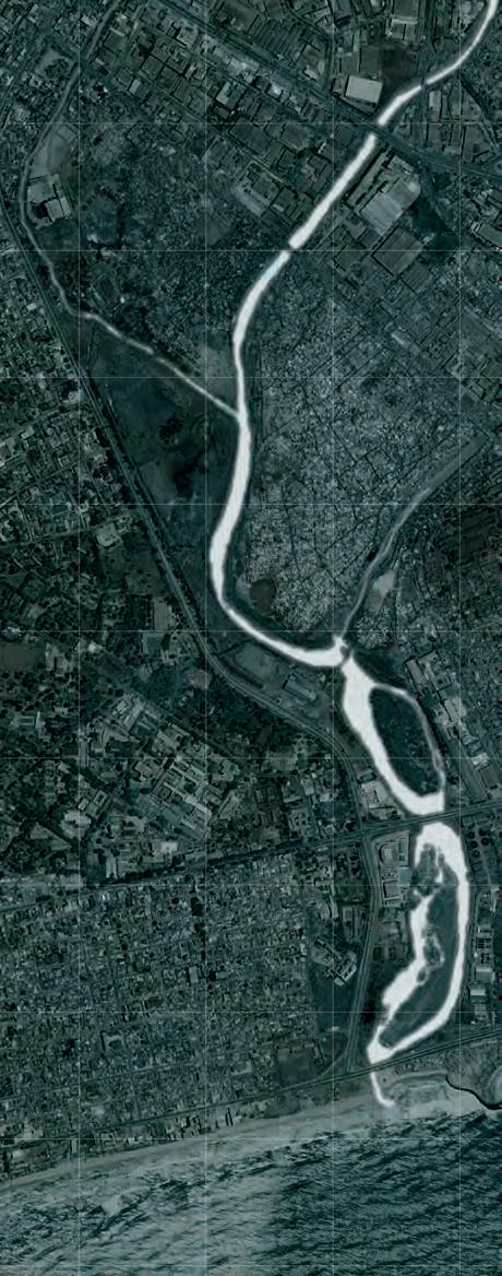
Agbogbloshie, Ghana
Seabed Internet Cables
Transportation of Minerals
As a case study entry point, biometric wearables seemed to be the perfect example for showcasing how e- and d-waste can form an inextricably linked unit that cannot fully be looked at separately. These devices are the biggest data hoarders available on the market due to Google’s acquisition of Fitbit and due to its function to monitor fitness.
The study of the Fitbit was divided into three chapters where each chapter places an emphasis on specific moments in the life-cycle of the wearable. The first is Mining which covers the geopolitical and environmental implications of manufacturing biometric wearables. The second chapter is called Use and focuses on the use of the object itself with an attempt to understand d-waste as a by-product which comes with using a biometric wearable. The last part is called the Afterlife, tracking the trajectory of dand e-waste components allowing us to hint at possible transmutations and to decipher parallels between d- and e-waste after the disposal of the device. The parallels between the two waste streams were found at the cross junction between the e-waste landfills, data centres and seabed cables. Of the seven sites that were identified, Agbogbloshie in Ghana was chosen as the site to implement the design.
 1. Mining
2. Manufacturing
3. Use
As coined by Bethany Nowviskie and Dot Porter, “graceful degradation” designates an attitude that is used in the design approach as a way to address the core notion of the by-product together with its toxic counterparts.
What if every bit truly counts, whether it be a bit of manganese or another scarce earth mineral that is in itself also involved in processing/computing a byte of biometrics data? How can one gracefully treat and address the unforeseen planetary by-product, as a way to prevent one from becoming waste?
The unforeseen waste by-product that allows sensing faculties of fitness or smart tracker, calls for a better understanding of the chemicotechnical afterlife of the object, regarding planetary depletion and resource management on the one hand. Hence, we propose a Graceful (DE-)Gradation system. An afterlife facility for e-and d-waste.
With a less exclusionary sense of waste, it might be possible to see that matter moves in “gradations” and, thereby, to devise “ceremonies of transformation.
- Jane Gabrys, Digital Rubbish, p.155
AERIAL RENDER GRACEFUL (DE)-GRADATION SYSTEM

Type: Nemrut Volcano Eyes Competition, Team
Year: Mar. 2017 - Jul 2017
Location: Nemrut, Turkey
Team: Yevgeniya Semanivaska, Jorge Juarez
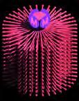
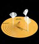
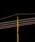
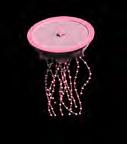
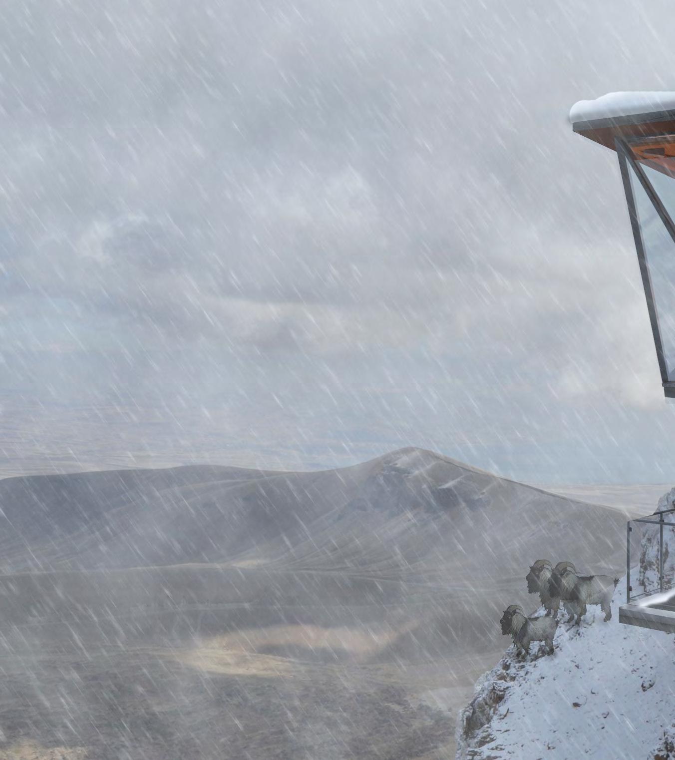
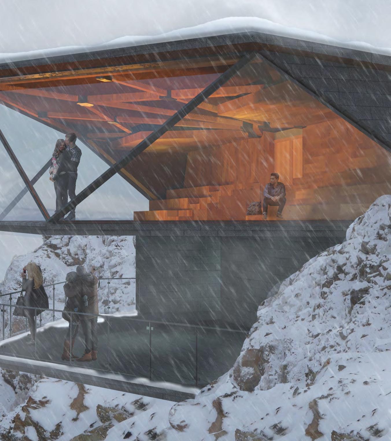
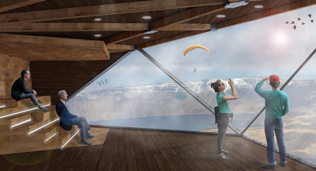
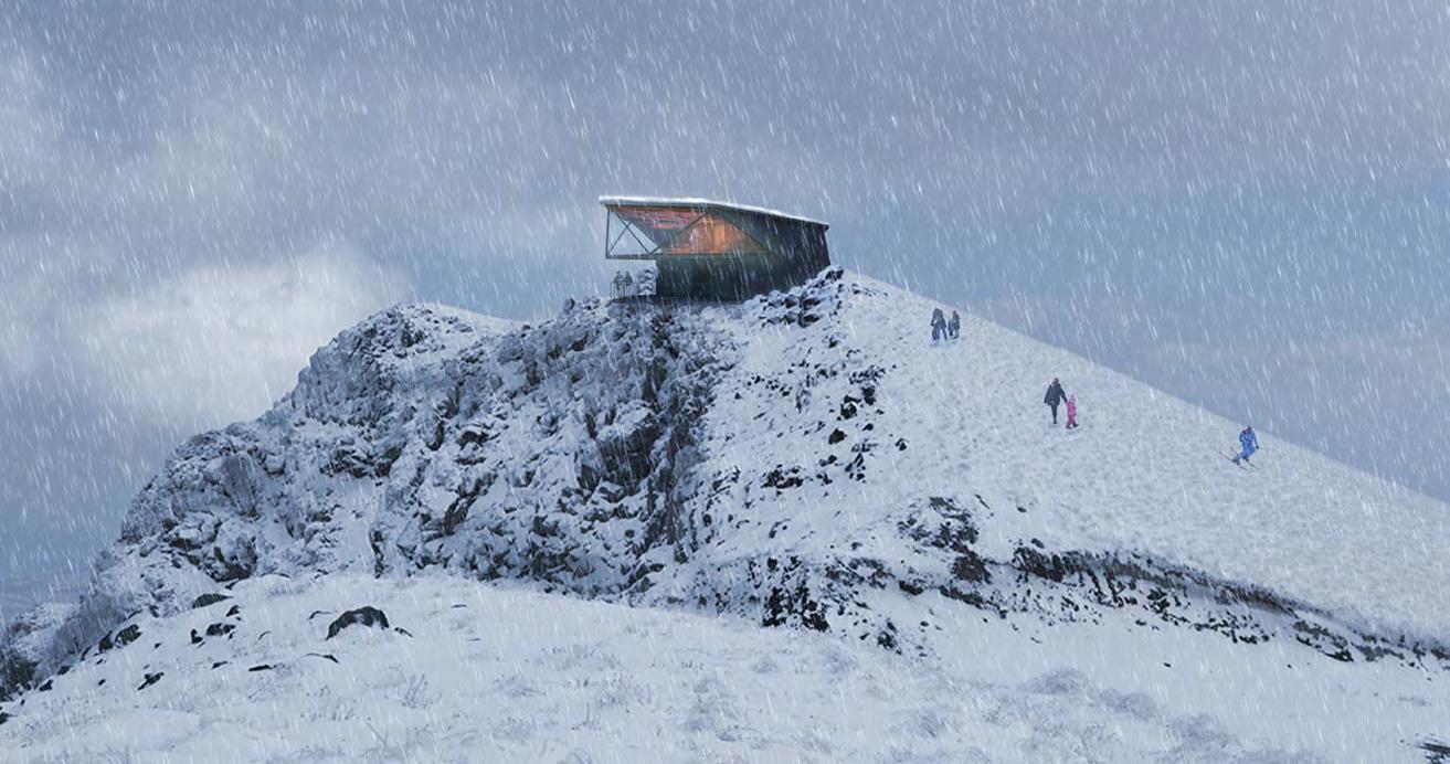
The Nemrut Caldera sits cradled within the Nemrut Volcano in Turkey, formed by the collapse of the volcano into itself creating a large and deep crater. This dramatic formation creates a unique micro-environment, becoming home to plants and animals that thrive in the harsh conditions. Nestled within the caldera is Lake Nemrut, a half-moon crater freshwater lake that further adds to the unique biodiversity of the caldera. The objective of the competition - Nemrut Volcano Eyes - was to design an observatory on one of the peak points of the Nemrut volcano. By interlacing the heritage, culture, and architecture of Turkey, a contemporary Observatory was designed to provide visitors with a 360° view of the caldera below.
Type: Professional Competition
Firm: CEBRA Arkitekter
Year: Dec. 2018 - May 2019
Location: Brande, Denmark
Team: Flemming Svendsen, Daniel Birch, Thomas Maagaard, Eirini Bravou, Simon Smedsmo
Responsibilities: 3D Modelling, Visualizations, Facade Design, Diagrams
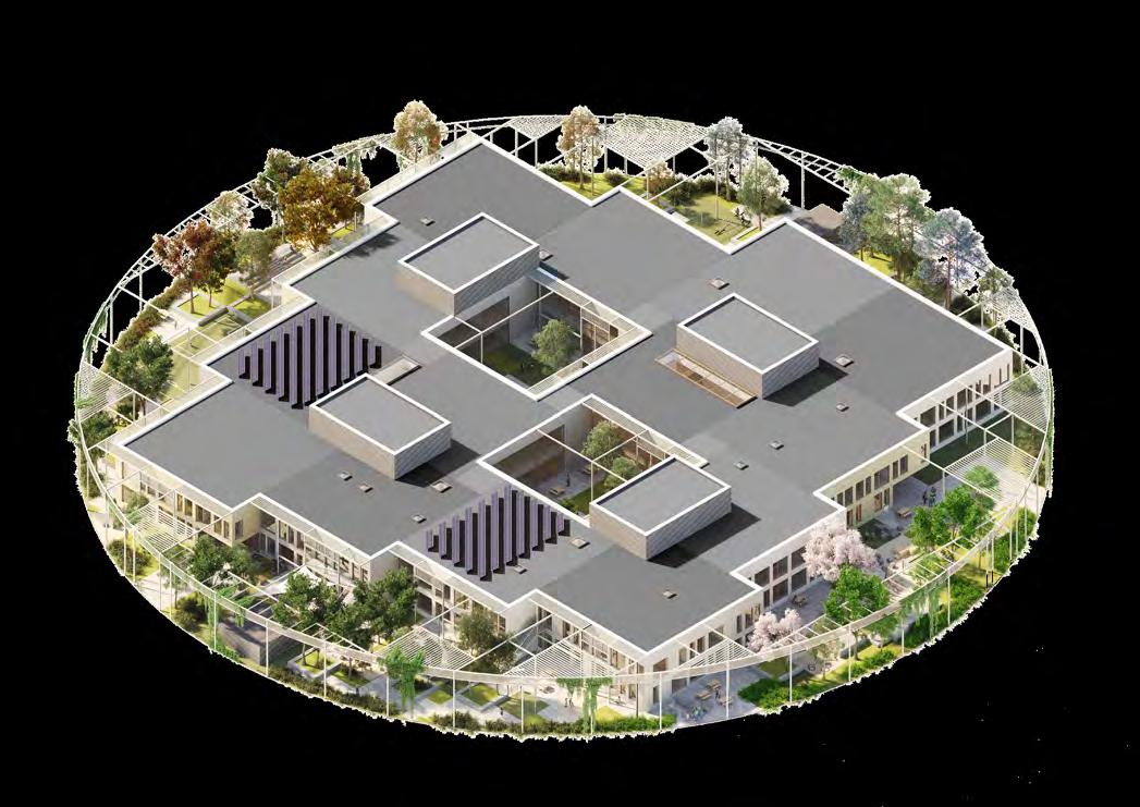
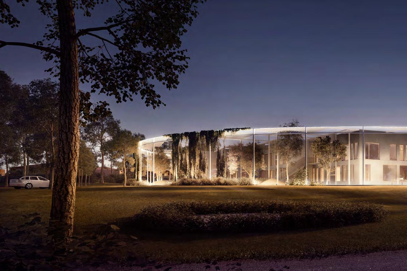
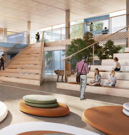
The Hippo-campus school was conceived with the ambition to design a school that responds to future prospects in education by incorporating the WISE program which answers the most prominent questions with regards to education. The primary concept arose out of the question - What do kids respond to the most nowadays? Games and technology. Thus, the video game Minecraft was used as an inspiration in the development of this project.
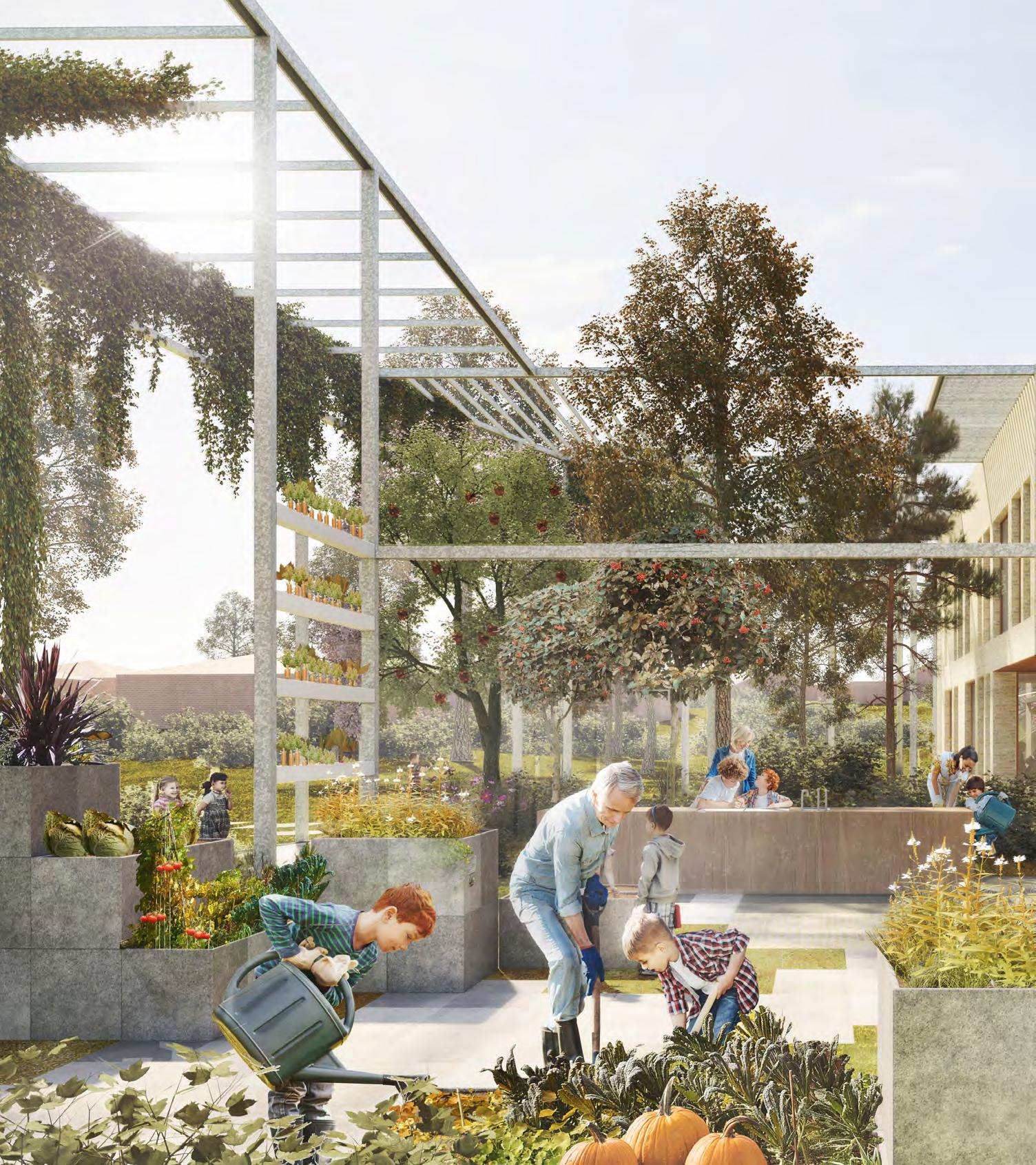
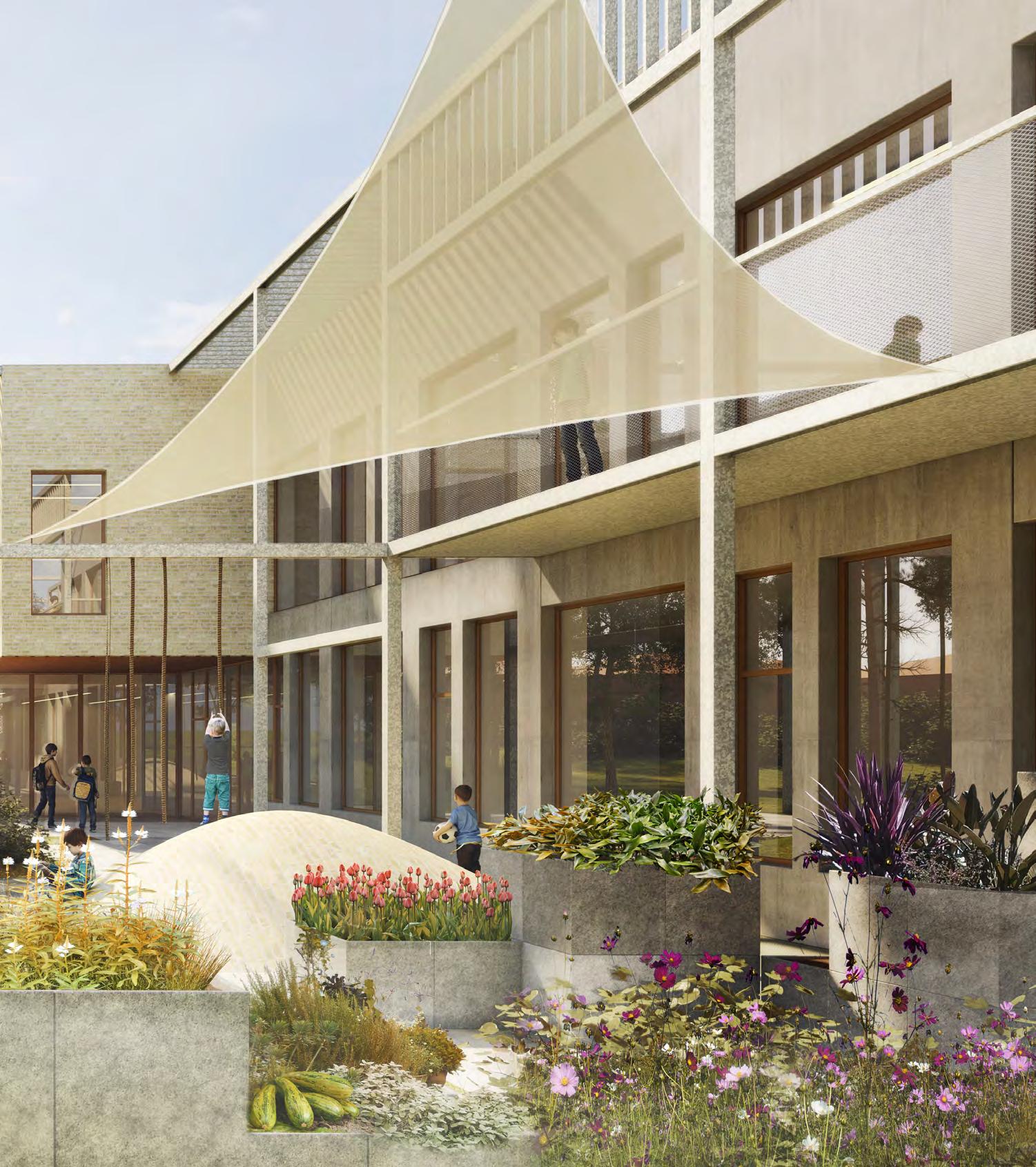
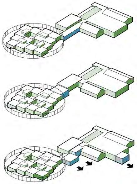
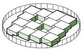
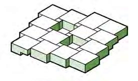
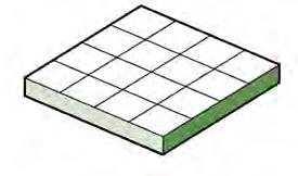
The school was designed as a hybrid atrium typology where the entire program of 2048 m2 was first conceived of as a simple square shaped cuboid distributed over two levels. The form was then divided into 16 individual cuboids that were cut based on an 8 x 8 meter grid system. Through form studies, with the use of a sketch physical model, the displaced cubes aesthetic was deemed as the right way to move forward with the design of the school since it created a dynamic facade and fit well with the concept of the Minecraft game. Form

Future






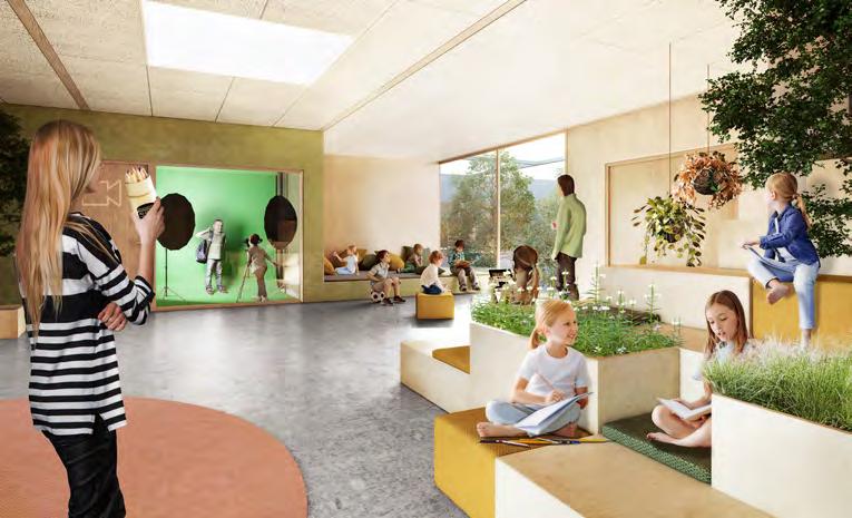
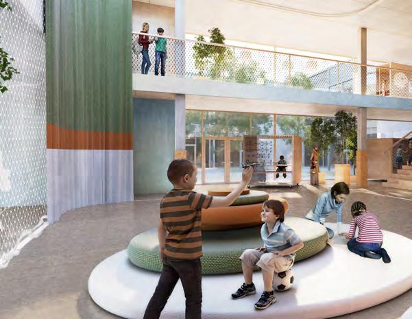
 LEVEL 1 | VIEW OF MEDIA ROOM & HALLWAY
EXTERIOR | VIEW OF SOUTH-EAST TOWARDS PARKING LOT
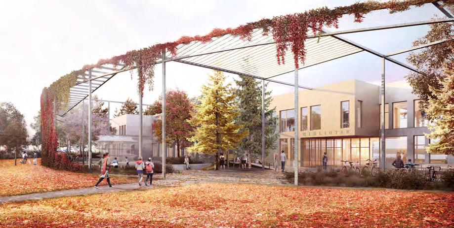
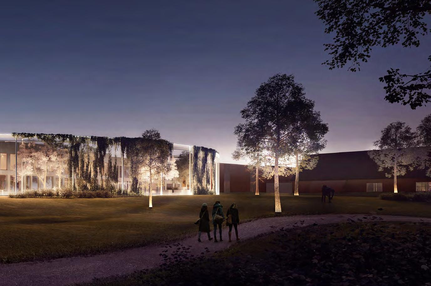 EXTERIOR | VIEW OF LIBRARY MAIN ENTRANCE