

QUICK REFERENCE ••• 1
Click on the Home icon to return to the Table of Contents.
2
. . . . 5
ISSUES & REVISIONS
Date 08/17/23
Description Issue #1

1.1 Introduction
1.2 Guiding Principles
1.3 Organization of the Guidelines
MATERIAL ELEMENTS 11
2.1 Building a Palette ............................
Foundation Palette
Circulation
Clinical Spaces
• Patient Room Med Surg Scheme One
• Patient Room Med Surg Scheme Two .......
• Patient Room Step Down
• Patient Room ICU.
• Patient Room LDRP
• Patient Room Pediatric
• ED Treatment, Exam and Intake
• Radiology
• Operating Suite, PACU and Prep/ Recovery
2.2 Paint Color Application
2.3 Creating Touch Points
• Main Lobby and Main Reception
• Information Desk & Check In
• Family Lounge/ Waiting
• Elevator Lobby & Unit Entry
• Cafe & Dining
• Team Station


To provide a safe and compassionate experience that improves the health and well-being of our community by placing the safety of our patients and support of our employees at the center of all we do.
Inspira Health inspires and empowers healthier communities by creating the highest quality and most desirable patient experience in the region.
INNOVATION
We educate and inspire positive change and healthier long-term outcomes. I C R E A T E I C R E A T E
We strive to employ ingenuity and new standards of care to improve our work every day.
COMPASSION
We treat everyone equally with kindness and respect.
RELIABILITY
We put the safety of our patients, compliance and best practice at the forefront of all we do.
EMPATHY
We listen and genuinely relate to others in order to make them feel seen and appreciated.

ACCESS
We provide a high-quality patient experience to all people.
TEAMWORK
We collaborate and utilize the full breadth of the Inspira network to improve patient experience.
EMPOWERMENT

Creating high-impact moments that will trigger visual cues and brand defining elements will enhance the patient experience immediately creating a sense of having arrived in the right place—a place of quality integrated care.
TOUCH POINTS
» Focal features at entrances to the facility, circulation and departments.
» Reinforce the color and textural palette.
» Opportunities for staff, patients and the public to engage the built environment.
WAYFINDING
» Use of color and materials to create directional opportunities.
» Clear visual signage.
GATHERING ZONES
» Strategically located at entrances to the facility and departments.
» Designed to create open gathering opportunities while maintaining privacy through use of materials and architecture.
» Clear sight-lines back to the reception desk where applicable.
CLINICAL ZONES
» Clear organization of patient zones, equipment and appropriate furnishings to reinforce the brand and enhance patient, family and staff satisfaction.
» Use of clinically appropriate materials for a sophisticated and maintainable appearance.
This document is a guideline for the interior design of facility circulation and departmental areas throughout the Inspira Health Network enterprise. These Iguidelines are intended to be an open system that allows for design freedom, while outlining performance criteria and details necessary to ensure that spaces are functional, durable, “noninstitutional” in feel, and supprotive of the highest level of patient care.
The guidelines are to be used in the design of all capital projects as well as in the continous upkeep of Inspira’s Health’s visible infrastructure, namely of all “front of the house” items such as flooring, ceilings, wall finishes, etc.

This document was created as the framework for all future projects at Inspira Health Network facilities by establishing guidelines as it relates to specific design elements, styles and palettes that will be used to help identify and express the brand identity of the facility. The brand guidelines have been derived from the built environment at the Mullica Hill Campus and are intended to be ised for the following:
1. Provide brand clarity to Inspira Health.
2. Provide design philosophy and criteria to support growth and transformation throughout the facility without compromising design innovation and freedom.
3. Create continuity between public and clinical spaces.
4. Create a matrix of interior finish materials and parameters based on maintenance, cleaning protocols, safety, ergonomics, sustainability, aesthetics and Infection Control criteria, as well as materials successfully installed at Mullica Hill.
5. Elevate the quality and durability of the materials in the built environment with the use of cost effective and responsible materials.
6. Create critical details that are tested and will promote high aesthetics and durability.
Brand Elements enhance all touch points and reinforce quality and care expectations. These elements are supplemented by a deep resource kit which will provide efficient and effective parameters for all facility improvements. They include:
1. Material Elements which provide guidance for capital projects as well as routine or recurring maintenance initiatives. The Touch Points provide guidance for key nodes such as entry decision points, departmental portals and patient and family gathering zones. This section will also provide a framework for color strategies. The guidelines identify criteria for deploying paint accents in a way that provides greater certainty of pleasing aesthetic combinations.
2. Material Matrix section is designed to scale both capital improvement and refinishing efforts to align with base and enhanced finish and material investments where applicable. Each project area can be found in this section.
3. Material Standards include specification and source data for all materials. Links to each manufacturer website can be found here.
4. Detail Components includes standard practices and details for optimal constructibility that reduces damage and improves infection control.


The Foundation Palette is the starting point for every palette. It contains the elements that will be consistent across projects and campuses. Be cognizant to reference the materials matrix and detail components sections for usage in various locations throughout the facility.

This neutral palette is the starting point for all spaces:
» Foundation of Neutral paints for wall and trim. Refer to 2.2 Paint Color System for more detailed information on application.
» Dark wood tone to be used in public waiting areas, reception desks and Team Station fronts. Light wood tone to be used in clinical corridors, patient rooms and clinical support areas.
» LG HiMacs to be the main solid surface unless noted otherwise.
» Wilsonart High Rise with Corian Concrete in BOH areas where wood look laminate is not used.
» Formica Paloma Polar to be used in non-clinical areas with laminate counters in combination with dark wood laminate cabinets
» Decorative glass panels at Family Registration, Waiting areas, Nurse Stations and other focal areas.
» In multi stall Public toilet rooms use Moonstruck for the floors and walls with accent walls of River Marble
» Patient and staff toilet rooms floors and wet walls should be Crossover tile.
» Resilient tile flooring should be in all clinical areas. Alternate flooring of Luxury vinyl tile 5mm can be used only in locations where existing conditions requires this product thickness. Refer to Material standards for specifications.
» Resilient sheet flooring for areas requiring a seamless installation.
» Carpet tile flooring for non-clinical administrative areas and waiting areas where there are minimal concerns about rigorous cleaning.
» Glimmer tile is for all offices
» Uncover tile to be used in Lobby and Waiting areas.
» Kasuri tile is for any Executive Admin areas.


The Foundation Palette is the starting point for every palette. It contains the elements that will be consistent across projects and campuses. Be cognizant to reference the materials matrix and detail components sections for usage in various locations throughout the facility.

The Circulation palette incorporates distinct colors that will help with wayfinding and creating a sense of place in public spaces such as Lobbies, Public Corridors and Elevator Lobbies. Use the foundation of neutrals as your starting point.
» Selection of deep tones to be used to help create interest and wayfinding at focal touchpoints.
» Deploy colors in strategic locations to align with the clincal patient room palette.
» Solid surface textured panels to be used in focal touchpoint locations.
» Stone tile to be used as a focal wall in Waiting areas and Main Lobby.
» Laminam to be used as an accent around elevators at public circulation locations.
» Quartz material for high impact focal locations.
» 3form specialty panels for the front of reception or team station desks.
» Specialty plank carpet tiles to be used in focal waiting areas.
» Terrazzo should be used as the base material for Main Lobbies and entry areas with simple patterning. Decorative Vinyl tile to be used as an alternate when budget does not permit terrazzo.
» Texas Granite to be used as the standard for all public and clinical corridors.





The Foundation Palette is the starting point for every palette. It contains the elements that will be consistent across projects and campuses. Be cognizant to reference the materials matrix and detail components sections for usage in various locations throughout the facility.

The Clinical palette incorporates distinct colors by unit while staying connected to the neutral palette. Flooring alternates between sheet and tile flooring depending on the clinical functions of the space.
» General paint for all walls, unless noted otherwise
» SW6211 on headwall, bump out around corridor touchdown and soffit above footwall.
» SW9038 accent paint on footwall.
» Solid Suface wall protection to wainscot between wood look laminate side panels.
» Artwork (from image library) printed on type II vinyl wallcovering and incorporated above casework at footwall for positive distraction.
» Porcelain tile for walls and floor with decorative glass tile in shower by controls.
» Artwork (from image library) printed on plastic laminate panel and incorporated above casework at footwall for positive distraction.
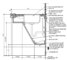
» Solid Surface countertop with integral sink and waterfall edge. Angled sink apron: stainless; ADA angled not full base.
» Solid Suface ledge at footwall connected to sink.
» Provide plastic laminate full height patient wardrobe with plam fascia and adjacent 34” h small storage cabinet with open solid surface shelf on the bottom and solid surface top.
» Casework to have brushed stainless pulls.
» Texas Granite to be used as the standard for all patient rooms with simple patterning to match Inspira Mullica Hill patient rooms.
PAINT- GENERAL, TRIM, CEILING, GENERAL ACCENT AND MAIN ACCENT


RESILIENT TILE FLOORING


The Foundation Palette is the starting point for every palette. It contains the elements that will be consistent across projects and campuses. Be cognizant to reference the materials matrix and detail components sections for usage in various locations throughout the facility.

The Clinical palette incorporates distinct colors by unit while staying connected to the neutral palette. Flooring alternates between sheet and tile flooring depending on the clinical functions of the space.
» General paint for all walls, unless noted otherwise
» SW6211 on headwall, bump out around corridor touchdown and soffit above footwall.
» SW9059 accent paint on footwall.
» Solid Suface wall protection to wainscot between wood look laminate side panels.
» Artwork (from image library) printed on type II vinyl wallcovering and incorporated above casework at footwall for positive distraction.
» Porcelain tile for walls and floor with decorative glass tile in shower by controls.
» Artwork (from image library) printed on plastic laminate panel and incorporated above casework at footwall for positive distraction.
» Solid Surface countertop with integral sink and waterfall edge. Angled sink apron: stainless; ADA angled not full base.
» Solid Suface ledge at footwall connected to sink.
» Provide plastic laminate full height patient wardrobe with plam fascia and adjacent 34” h small storage cabinet with open solid surface shelf on the bottom and solid surface top.
» Casework to have brushed stainless pulls.
» Texas Granite to be used as the standard for all patient rooms with simple patterning to match Inspira Mullica Hill patient rooms.
PAINT- GENERAL, TRIM, CEILING, GENERAL ACCENT AND MAIN ACCENT


RESILIENT TILE FLOORING


The Foundation Palette is the starting point for every palette. It contains the elements that will be consistent across projects and campuses. Be cognizant to reference the materials matrix and detail components sections for usage in various locations throughout the facility.

The Clinical palette incorporates distinct colors by unit while staying connected to the neutral palette. Flooring alternates between sheet and tile flooring depending on the clinical functions of the space.
» General paint for all walls, unless noted otherwise
» SW6211 on headwall, bump out around corridor touchdown and soffit above footwall.
» SW6681 accent paint on footwall.
» Solid Suface wall protection to wainscot between wood look laminate side panels.
» Artwork (from image library) printed on type II vinyl wallcovering and incorporated above casework at footwall for positive distraction.
» Porcelain tile for walls and floor with decorative glass tile in shower by controls.
» Artwork (from image library) printed on plastic laminate panel and incorporated above casework at footwall for positive distraction.
» Solid Surface countertop with integral sink and waterfall edge. Angled sink apron: stainless; ADA angled not full base.
» Solid Suface ledge at footwall connected to sink.
» Provide plastic laminate full height patient wardrobe with plam fascia and adjacent 34” h small storage cabinet with open solid surface shelf on the bottom and solid surface top.
» Casework to have brushed stainless pulls.
» Texas Granite to be used as the standard for all patient rooms with simple patterning to match Inspira Mullica Hill patient rooms.
PAINT- GENERAL, TRIM, CEILING, GENERAL ACCENT AND MAIN ACCENT


PORCELAIN & GLASS


MILLWORK


RESILIENT TILE FLOORING


HEADWALL


The Foundation Palette is the starting point for every palette. It contains the elements that will be consistent across projects and campuses. Be cognizant to reference the materials matrix and detail components sections for usage in various locations throughout the facility.

The Clinical palette incorporates distinct colors by unit while staying connected to the neutral palette. Flooring alternates between sheet and tile flooring depending on the clinical functions of the space.
» General paint for all walls, unless noted otherwise
» SW6211 on window wall and soffit above footwall.
» SW6681 accent paint on footwall.
» Solid Suface wall protection to wainscot between wood look laminate side panels.
» Porcelain tile for walls and floor with decorative glass tile in shower by controls.
» Solid Suface ledge at footwall.
» Provide plastic laminate full height patient wardrobe with plam fascia and adjacent 34” h small storage cabinet with open solid surface shelf on the bottom and solid surface top and full waterfall side.
» Casework to have brushed stainless pulls.
» Resilient sheet flooring with integral base in simple patterning to match Inspira Mullica Hill patient rooms.
PAINT- GENERAL, TRIM, CEILING, GENERAL ACCENT AND MAIN ACCENT


PORCELAIN


MILLWORK


RESILIENT SHEET FLOORING


HEADWALL


The Foundation Palette is the starting point for every palette. It contains the elements that will be consistent across projects and campuses. Be cognizant to reference the materials matrix and detail components sections for usage in various locations throughout the facility.

The Clinical palette incorporates distinct colors by unit while staying connected to the neutral palette. Flooring alternates between sheet and tile flooring depending on the clinical functions of the space.
» General paint for all walls, unless noted otherwise
» SW6263 on window wall.
» SW7643 accent paint on headwall
» Sheet wall protection on headwall and footwall.
» Decorative Resin sliding wall at Bassinet.
» Glass tile at Infant bath and counter.
» Solid Surface countertop with integral sink and waterfall edge. Angled sink apron: stainless; ADA angled not full base.
» Casework to have brushed stainless pulls.
» Millwork Headwall with Nevamar Crema panels and decorative glass with SW6558 Plummy painted beyond.
» Incorporate location in millwork for personal UC refrigerator.
» Sheet vinyl wood look flooring throughout room.
» Large format porcelain tile in Toilet room.
PAINT- GENERAL, TRIM, CEILING, GENERAL ACCENT AND MAIN ACCENT


HEADWALL


RESILIENT SHEET FLOORING`

The Foundation Palette is the starting point for every palette. It contains the elements that will be consistent across projects and campuses. Be cognizant to reference the materials matrix and detail components sections for usage in various locations throughout the facility.

The Clinical palette incorporates distinct colors by unit while staying connected to the neutral palette. Flooring alternates between sheet and tile flooring depending on the clinical functions of the space.
» General paint for all walls, unless noted otherwise
» SW6627 at handwash alcove in Semi- private rooms
» Wolf Gordon at alcoves in Semi-private rooms and at handwash locations in private rooms.
» SW6471 accent paint on footwall, bump out around corridor touchdown, soffit above footwall and toilet room walls inside patient room.
» Solid Suface wall protection to wainscot between wood look laminate side panels.
» Porcelain tile for walls and floor with decorative glass tile in shower by controls.
» Solid Surface countertop with integral sink and waterfall edge. Angled sink apron: stainless; ADA angled not full base.
» Solid Suface ledge at footwall connected to sink.
» Provide plastic laminate full height patient wardrobe with plam fascia and adjacent 34” h small storage cabinet with open solid surface shelf on the bottom and solid surface top.
» Casework to have brushed stainless pulls.
» Resilient sheet flooring with integral base in simple patterning to match Inspira Mullica Hill patient rooms for Isolation rooms.
» Resilient tile with simple patterning to match Inspira Mullica Hill throughout unit.
PAINT & WALLCOVERING - GENERAL, TRIM, CEILING, GENERAL ACCENT AND MAIN ACCENT


RESILIENT TILE FLOORING


RESILIENT SHEET FLOORING


The Foundation Palette is the starting point for every palette. It contains the elements that will be consistent across projects and campuses. Be cognizant to reference the materials matrix and detail components sections for usage in various locations throughout the facility.

The Clinical palette incorporates distinct colors by unit while staying connected to the neutral palette. Flooring alternates between sheet and tile flooring depending on the clinical functions of the space.
» General paint for all walls, unless noted otherwise
» SW6211 on back wall of Acute and Intake bay/ rooms.
» SW6211 on side wall of Observation room.
» SW9059 on back wall of Pediatric Exam. and Vertical treatment bays.
» Wall Protection - See wall protection breakdown in Details sections.
» Porcelain tile for walls and floor in Observation room toilets.
» Solid Surface countertop with integral sink and waterfall edge. Angled sink apron: stainless; ADA angled not full base.
» Solid Suface ledge on footwall.
» Resilient sheet flooring with integral base in Behavioral health rooms.
» Resilient tile with simple patterning to match Inspira Mullica Hill throughout unit.
FIELD AND ACCENT PAINT


MILLWORK


RESILIENT SHEET FLOORING


RESILIENT TILE FLOORING


The Foundation Palette is the starting point for every palette. It contains the elements that will be consistent across projects and campuses. Be cognizant to reference the materials matrix and detail components sections for usage in various locations throughout the facility.

The Clinical palette incorporates distinct colors by unit while staying connected to the neutral palette. Flooring alternates between sheet and tile flooring depending on the clinical functions of the space.
» General paint for all walls, unless noted otherwise
» SW7103 to be the field color in small Rad rooms with SW6211 accent.
» SW6211 to be the field paint in large Rad rooms (CT, MRI, R/F, Nuc Med) with the SW9059 as the accent color.
» Tile floor and wet walls in toilet rooms attached to rad rooms.
» Wall Protection - See wall protection breakdown in Details sections.
» Limit millwork to what is clinically necessary.
» Provide plastic laminate cabinets and solid surface countertops.
» Upper cabinets should have sloped tops.
» Resilient sheet flooring with integral base to be used in a simple 2 color pattern in large Rad rooms (CT, MRI, R/F, Nuc Med).
» Resilient tile to be used in all other clinical spaces including corridors. .
» Consider graphic image backlit panels in the ceiling as a possible enhancement.


The Foundation Palette is the starting point for every palette. It contains the elements that will be consistent across projects and campuses. Be cognizant to reference the materials matrix and detail components sections for usage in various locations throughout the facility.

The Clinical palette incorporates distinct colors by unit while staying connected to the neutral palette. Flooring alternates between sheet and tile flooring depending on the clinical functions of the space.
» General paint for all walls, unless noted otherwise.
» SW6221 Moody Blue to be used as an accent on one wall in Team stations, Procedure rooms, Prep/ Recovery Bays
» Painted walls, epoxy in sterile environments for areas that need to be able to be scrubbed down.
» Wall Protection - See wall protection breakdown in Details sections.
» Solid Surface desks in ORs
» Plastic laminate casework with solid surface tops as necessary to support clinical needs.
» Resilient sheet flooring with integral base in simple patterning and integral base.
» Provide Oval shape under the OR table to indicate the sterile field.


» Use rich saturated colors and deep tones at touch points to support the distinction of zones and departments
» Use mid tone colors to promote wayfinding at key decision points, landmarks, and feature walls
» Use light, mid, and bright tone colors to signify key areas in the patient zones

» Walls: General paint and accent color to be site specific and should be coordinated by Facility. Default color to be SW 7103 Whitetail.
» Trim & Frames: Default color for door frames to be SW 7018 Dovetail
» Ceilings: Default color for ceilings and soffits to be SW 7007 Bright White unless noted otherwise.
» Doors should be selected to match the campus standard of maple. Vinyl clad doors are the preferred selection for patient rooms and similar high abuse doors.
» Team Station: SW 7643 backdrop color with accent color around columns that match patient room footwall that flank either side of the team station millwork.
» Patient Rooms: Patient room accent should match the Team station, corridor Family waiting and Corridor accent per by unit.
» Clinical support accents: Memorable colors for use at Units Entries, Team Stations and other key decision points.
» ED Observation corridors accent - SW 9057
» Ped corridor accent- SW 6627
» ICN Patient room corridors - SW 6500
» Public space accents:
» Lobby & Main connecting corridor - SW 6228
» Second flr Surgical Family Lounge & Waiting - SW 7642
» Servery Accent: SW 7510
» Non-Clinical accent; Offices, Conference rooms, Lounges, Auditorium: SW9135
» Support space accent:
» BOH accent: SW 9153


Touch Points are key areas which require signage to assist visitors and patients navigating the hospital campus. Artwork and other design accents should be applied to assist in public wayfinding and signage placement.

In public circulation, every intersection is a decision point for the visitor. These locations should include the following:
» Defined boundaries to create a sense of place.
» Use of paint colors from Circulation palette to give a floor identity to visitors.
» Design elements that create memorable landmarks. Critical decision points are strengthened by landmarks that help to orient visitors, create a sense of place and enhance wayfinding.
» Terminus points require department signage or additional directional signage to indicate family zones or restricted areA
In patient, staff and family zones it is important to create familiarity of the brand across multiple campuses. The use of design guidelines in conjunction with specific design elements enhance brand identity. The touchpoints outlined in the guidelines are provided to create guidance in establishing this design language across multiple campuses.


Touch Points are key areas which require signage to assist visitors and patients navigating the hospital campus. Artwork and other design accents should be applied to assist in public wayfinding and signage placement.
The design language should stay consistent between all campuses.
Create an accent wall behind desks for visual interest and signage.
Create main check-in and discreet private check-in desk with plastic laminate face and/or solid surface face materials, solid surface transaction top and 4” base.
Create discreet registration bays with divider walls. All exposed corners to be captured with stainless steel corner or end guards. End of wall of bay to include decorative glass or resin fin for increased staff visibility to check-in que while maintaining patient acoustical privacy.
Provide Terrazzo look Solid Vinyl Tile flooring with simple patterning.
Provide wood look ceiling tile to create landmark design element.
Provide decorative LED pendants, downlights and linear direct and indirect lightning. Graze focal wall and signage with LED lighting.

Provide decorative stacked stone as a design element within the space to add visual interest.
Consider quartz transaction top and face material.
Use of terrazzo flooring based on project size, scope and location.


Touch Points are key areas which require signage to assist visitors and patients navigating the hospital campus. Artwork and other design accents should be applied to assist in public wayfinding and signage placement.
The design language should stay consistent between all campuses.
Create an accent wall behind desks for visual interest and signage.
Create main check-in and discreet private check-in desk with plastic laminate face and/or solid surface face materials, solid surface transaction top and 4” base.
Create discreet registration bays with divider walls. All exposed corners to be captured with stainless steel corner or end guards.
End of wall of bay to include decorative glass or resin fin for increased staff visibility to check-in que while maintaining patient acoustical privacy.
Provide Solid Vinyl Tile flooring with simple patterning.
Provide wood look ceiling tile to create landmark design element.
Provide decorative LED pendants, downlights and linear direct and indirect lightning. Graze focal wall and signage with LED lighting.

Consider quartz transaction top and face material.
Use of terrazzo flooring based on project size, scope and location.


Touch Points are key areas which require signage to assist visitors and patients navigating the hospital campus. Artwork and other design accents should be applied to assist in public wayfinding and signage placement.

Provide accent wall with paint or high impact wallcovering.
Carpet tile flooring unless Solid Vinyl Tile is required by department.
LED downlights and linear light fixtures.
Social groupings
Heads down focus area with counter and stools
Recliner zone for quiet rest
Bariatric options
Convenient charging
Decorative Dividers
Consider refreshment zone (coffee, filtered water, etc.).
Consider decorative pendant lighting for visual interest.


Touch Points are key areas which require signage to assist visitors and patients navigating the hospital campus. Artwork and other design accents should be applied to assist in public wayfinding and signage placement.
The design language should stay consistent through all units.
Paint focal walls and touchpoints one of the selected accent paint colors per floor.
Create stone look porcelain wall paneling, per standard, with metal trim dividers and outside corners. Outside corners should continue to floor. See Detail Components section for addtitional information.
Carpet Tile in seating zones.
Solid Vinyl Tile flooring with simple patterning at elevator lobby.
All public corridors to have ballet style handrail.
Linear LED lights
All directories and signage centered between elevator cabs in clear line of sight.

of terrazzo flooring based on project size, scope and location.


Touch Points are key areas which require signage to assist visitors and patients navigating the hospital campus. Artwork and other design accents should be applied to assist in public wayfinding and signage placement.

Create an tile accent wall behind the food lines for visual interest.
Food service line should incorporate plastic laminate for the face of the counters and solid surface countertops.
Provide porcelain tile flooring on the public side of servery and in dining area.
LED downlights and linear light fixtures.
Social group dining with community bar height tables.
Stand alone table and chairs and banquettes for seating flexibility.
Bariatric options and ADA accessible options are required.
Decorative Dividers, stacked stone and laminate wood planks for visual interest.
Consider decorative pendant lighting and light coves for visual interest
quartz countertops


Touch Points are key areas which require signage to assist visitors and patients navigating the hospital campus. Artwork and other design accents should be applied to assist in public wayfinding and signage placement.
Solid surface transaction height counter and resin decorative accents at face of Team station and solid surface/plastic laminate desk body with colored cork tack surface between countertop and transaction top.
Select paint for backdrop wall from accent paint deep tones to create a landmark design element.
Solid Vinyl Tile flooring with simple patterning to designate staff zone
Drywall soffit painted an neutral accent to help define the Team station.
LED lighting, downlights at soffit over desk.
All outside corners and exposed plastic laminate to receive metal trim.
Incorporate toetick at public side of desk. Scribing of solid surface to floor is discouraged due to potential water seepage from mops.

glass for staff charting area


Touch Points are key areas which require signage to assist visitors and patients navigating the hospital campus. Artwork and other design accents should be applied to assist in public wayfinding and signage placement.
Use applied Gordon metal trim for mid-wall paint transitions.
When possible, PPE and de-centralized clinical storage cabinets should be provided along corridor. Plastic laminate with discreet tab type pull to be used. An alternate version with some counters at PPE storage can be considered.
All walls to receive handrail, sheet wall protection and low bumper rail.
Solid Vinyl Tile floor with simple pattern. Avoid patterns that align with millwork desks and items that might cause installation sequence issues. Use pattern to highlight substations.
Use artwork at key intersections and/or terminus points to create visual interest and to assist with wayfinding.
Each patient room to receive digital signage panel.

Use neutral paint from Foundations Palette on one side of corridor to create depth and visual interest.
De-centralized charting stations provided dependent on unit type. Consider decorative lensed fixture to create a focal accent light.


Touch Points are key areas which require signage to assist visitors and patients navigating the hospital campus. Artwork and other design accents should be applied to assist in public wayfinding and signage placement.
Headwall to receive plastic laminate wall protection side panels to organize medical gases and outlets in ICU rooms. All outside edges captured by aluminum trim.
Artwork (from image library) printed on plastic laminate panel and incorporated above casework at footwall for positive distraction.
Accent paint on footwall, select from selected patient room scheme light accents.
Secondary standard accent paint on footwall.
Wood-look plastic laminate casework with solid surface wrap and ledge. Integrated storage cabinet and storage shelf in base cabinetry.
Casework to have brushed stainless pulls.
Sheet wall protection on all walls in color to match adjacent general wall color. Solid Suface wall protection to wainscot between wood look laminate side panels.

Solid Surface countertop with integral sink and waterfall edge. Angled sink apron: stainless; ADA angled not full base.
Painted GWB soffit above sink/counter zone.
TV and Patient Care Monitor centered on patient bed.
Refer to Section 5: Detail Components for additional information.


Touch Points are key areas which require signage to assist visitors and patients navigating the hospital campus. Artwork and other design accents should be applied to assist in public wayfinding and signage placement.

Large format porcelain tile on all walls
Large format porcelain tile floors in rooms with showers. Shower pans to be SSP or poured epoxy. Existing shower pans should be coated in epoxy. Two drains should be placed to account for proper drainage. Coordinate with MEP.
Accent tile in shower zone or behind sink. Select from Options.
Arrange soap and paper towel dispensers so as not to obstruct the mirror and sink.
Solid surface countertop and apron with undermount sink
ENHANCEMENTS:
Backlit mirror with downlights in ceiling.
Consider linear drain for more optimal drainage and aesthetics.
Consider a sliding door for maneuverability.
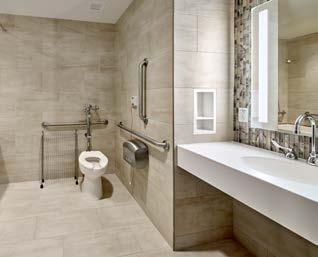
Large format porcelain tile on all walls, floor to ceiling. In Staff and Single Public restrooms, tile only on wet and wide walls
Accent tile on walls. Select from Options.
Arrange soap and paper towel dispensers so as not to obstruct the mirror and sink.
Linear LED at sink / mirror zone, supplement with with downlights in ceiling as necessary.
Solid surface countertop and apron with undermount sink.
Staff toilet rooms to have wall hung sink.


» Develop a palette based on the material matrix and Inspira Health’s approved scheme options.
» Use clinically appropriate and durable materials for all surfaces.
» Be cognizant of accessories and equipment locations in coordination with wall protection.
QUICK REFERENCE •••
Click on the room name to view the material matrix for each room type

LOBBY
WELCOME DESK
REGISTRATION/INTAKE
PUBLIC CORRIDOR
ELEVATOR LOBBY
SERVICE ELEVATOR CABS
PUBLIC ELEVATOR CABS
CAFE & DINING
PUBLIC RESTROOM
GATHERING ZONES
GIFT SHOPS
1. Incorporate branding elements, art, and focal and accent light to create memorable experience.
2. Place appropriate quantity of trash and recycling containers. Consider locations for best access by visitors.
3. Plan for marketing signage opportunities, consider incorporation of educational communication (ie. TV's etc).
4. Place adequate walk off mats, review with EVS.
5. Position welcome desk in prominent position to foster hospitable encounter without sacrificing security functions.
6. Provide appropriate seating for patient and families.
7. Provide for wheelchair storage accessible to valet and reception staff.
8. Maximize natural light and exterior veiws; consider positive distractions and opportunities for engagement.
9. Consider indirect and pendant LED lighting
*Enhanced material options and design consideration notations to be evaluated on a project basis with prior discussion and review with Inspira leadership.
1. Consider use of soffits to draw attention to desk position and to accommodate donor and approved signage.
2. Consider direct and indirect light sources.
3. Consider patterned glass, custom graphic printed glass, or resins as decorative panel treatment.
4. Counters and transaction tops to be quartz; solid surface may be considered.
*Enhanced material options and design consideration notations to be evaluated on a project basis with prior discussion and review with Inspira leadership.
1. Donor signage, branded signage to be organized and located on design elevations for review by client team.
2. HIPPA privacy required for desk functions.
3. Desk and privacy panels to be solid surface, plastic laminate and decorative glass or resin panels.
• Accent solid surface materials permitted
• Recessed toe kick
• Provide ADA height worksurface at public side
6. Consider decorative glass or resin accent as space divider between bays.
7. Terrazzo or porcelain tile if part of lobby renovation or new construction, SVT or LVT may be used for renovated zones; carpet may be used in office zones; seating areas.
*Enhanced material options and design consideration notations to be evaluated on a project basis with prior discussion and review with Inspira leadership.
base enhanced
base enhanced
base enhanced
base enhanced
base enhanced
1. Incorporate branding elements, art, and focal and accent light to create memorable experience.
2. Plan for donor and marketing signage opportunities, consider architectural features and focal lighting at portals.
3. Wall protection to serve multi-purpose, functional, decorative and patient-oriented (handrails) uses.
4. Elimate raised thresholds and transitions between corridors and rooms.
5. Consider floor patterning to reinforce decision points and provide camouflage.
6. Consider transitioning from terrazzo floor to SVT or LVT as appropriate.
*Enhanced material options and design consideration notations to be evaluated on a project basis with prior discussion and review with Inspira leadership.
1. Wayfinding signage to be organized and located on design elevations for review by client team.
2. Incorporate branding elements, art, and focal and accent light to create memorable experience.
3. In renovation, review condition of elevator doors, frames, call buttons and lanterns. Replace if necessary.
4. Consider benches when space permits.
5. Place appropriate quantity of trash and recycling containers. Consider locations for best access by visitors.
*Enhanced material options and design consideration notations to be evaluated on a project basis with prior discussion and review with Inspira leadership.
1. Provide heavy duty wall protection and rails.
*Enhanced material options and design consideration notations to be evaluated on a project basis with prior discussion and review with Inspira leadership.
1. Consider heavy duty wall protection and rails where passenger and patient transport share the same elevator.
2. Consider caution sign message about respecting patient privacy.
3. Consider indirect lighting and down lights.
4. Consider patterned decorative glass.
*Enhanced material options and design consideration notations to be evaluated on a project basis with prior discussion and review with Inspira leadership.
1. When working with an outside vendor, review proposed branding compliance elements; standard construction details:
• Plastic laminate with 3mm edge band. All exposed outside corners captured with metal trim.
• Solid surface or quartz horizontal surfaces as required by function.
3. Ceiling over services and cooking lines to be washable tile.
4. Locate wall protection in consideration of equipment and client usage.
5. Consider specialty lighting over countertops or dining elements.
6. Consider decorative screening.
*Enhanced material options and design consideration notations to be evaluated on a project basis with prior discussion and review with Inspira leadership.
1. Large format porcelain wall tile with dark grout and metal corner and trim pieces.
2. Solid surface countertop and apron.
3. Porcelain or solid surface undermount sink.
4. Accent tile on sink wall.
5. Coordinate all accessories with EVS, and then document on elevations for sign-off.
6. Floor/wall mounted partitions in a multiple fixture room. Consider phenolic, stainless steel, or acrovyn partitions.
7. Install backlit, individual surface mounted mirrors.
8. No bed pan holders in patient toilet rooms.
9. All renovated toilet fixtures to be at new accessible heights, where applicable.
*Enhanced material options and design consideration notations to be evaluated on a project basis with prior discussion and review with Inspira leadership.
1. Consider wheelchair clearance in seating zones and storage.
2. Consider various lighting types including general, ambient and accent lighting.
3. Consider decorative glass panels to create discreet waiting zones that provide patients and families personal space.
4. Consider refreshments station including coffee and water dispensers.
5. Window shades to have 5% openness factor.
6. Consider artwork locations in the design.
7. Consider self-directed education and/or entertainment options
8. Maximize daylight and external views
9. Provide adequate bariatric seating and hip chairs as needed
10. Consider carpet tile in seating zones.
*Enhanced material options and design consideration notations to be evaluated on a project basis with prior discussion and review with Inspira leadership.
*Enhanced material options and design consideration notations to be evaluated on a project basis with prior discussion and review with Inspira leadership.
QUICK REFERENCE •••
Click on the room name to view the material matrix for each room type
CATH LAB
CONTROL ROOM
CYSTIC ENDO
DIAGNOSTIC IMAGING
EXAM ROOM
LABORATORY
PHARMACY
PHYSICAL THERAPY
PREP HOLD RECOVERY OBSERVATION
MRI
RADIATION THERAPY ROOM
RESTRICTED CORRIDOR
SCRUB AREA
SURGICAL ROOM
TRAUMA ROOM
TREATMENT ROOM
UNRESTRICTED CORRIDOR
PHLEBOTOMY
INFUSION
PROCEDURE ROOM
WOUND & HYPERBARIC
1. Ceiling to be gypsum wallboard or gasketed clean room tile or lay-in tile (Armstrong Ultima or equal).
2. Counters, side, and backsplash to be solid surface material; refer to detail components.
3. Cabinets to be plastic laminate. Consider undercabinet lights.
*Enhanced material options and design consideration notations to be evaluated on a project basis with prior discussion and review with Inspira leadership.
CONSIDERATIONS
*Enhanced material options and design consideration notations to be evaluated on a project basis with prior discussion and review with Inspira leadership.
DESIGN CONSIDERATIONS
1. Ceiling to be gypsum wallboard, gasketed clean room tile or lay-in tile (Armstrong Ultima or equal).
*Enhanced material options and design consideration notations to be evaluated on a project basis with prior discussion and review with Inspira leadership.
1. Consider backlit imagery panels in ceiling for positive patient distraction.
*Enhanced material options and design consideration notations to be evaluated on a project basis with prior discussion and review with Inspira leadership.
1. Continuous door hinge for privacy in lieu of curtain.
2. Consider dual roller with blackout shade for areas where patients may be undressing etc.
3. Coordinate and elevate device mounting heights.
4. Consider rub rail or wall protection at seating and other areas where wall damage may occur.
5. Incorporate trash can into cabinets, see detail components section.
*Enhanced material options and design consideration notations to be evaluated on a project basis with prior discussion and review with Inspira leadership.
1. Counters, side, and backsplash to be 1" or 3/4" phenolic slab. Coordinate with vendor if not part of millwork package.
2. Provide adequate light level for worksurfaces
3. Refer to FGI for each room type ceiling requirements.
*Enhanced material options and design consideration notations to be evaluated on a project basis with prior discussion and review with Inspira leadership.
1. Refer to FGI for each room type ceiling requirements.
*Enhanced material options and design consideration notations to be evaluated on a project basis with prior discussion and review with Inspira leadership.
1. Cubicle curtain required for privacy (sizes will vary)
2. Consider blackout shade for areas where patients may be undressing (ie. Lymph) etc.
*Enhanced material options and design consideration notations to be evaluated on a project basis with prior discussion and review with Inspira leadership. 94 base
1. Headwall to incorporate finishes as outlined in Touchpoints section.
2. Consider dual roller with blackout shade for areas where patients may be undressing or sleeping etc.
3. All walls to receive plastic sheet wall protection.
4. Cubicle curtain required for privacy at bays.
*Enhanced material options and design consideration notations to be evaluated on a project basis with prior discussion and review with Inspira leadership.
*Enhanced material options and design consideration notations to be evaluated on a project basis with prior discussion and review with Inspira leadership.
1. Consider backlit imagery panels in ceiling for positive patient distraction.
2. Provide dimmable lighting source.
3. P-3, SR-5(A), RB-1, accent P-5
*Enhanced material options and design consideration notations to be evaluated on a project basis with prior discussion and review with Inspira leadership.
CORRIDOR
*Enhanced material options and design consideration notations to be evaluated on a project basis with prior discussion and review with Inspira leadership.
1. Provide sheet wall protection to 40" AFF.
2. Ceiling to be lay-in tile. No tegular.
3. Wall paint to be epoxy.
*Enhanced material options and design consideration notations to be evaluated on a project basis with prior discussion and review with Inspira leadership.
*Enhanced material options and design consideration notations to be evaluated on a project basis with prior discussion and review with Inspira leadership.
1. Ceiling to be gypsum wallboard, or gasketed clean room tile.
as required for privacy (sizes will vary).
*Enhanced material options and design consideration notations to be evaluated on a project basis with prior discussion and review with Inspira leadership.
1. Continuous hinge on door for privacy.
2. Consider dual roller with blackout shade for patient privacy.
3. Create defined charting and equipment zones.
4. Provide rub rail or wall protection at guest chair location.
*Enhanced material options and design consideration notations to be evaluated on a project basis with prior discussion and review with Inspira leadership.
DESIGN CONSIDERATIONS
1. Consider gypsum wallboard soffits to enhance wayfinding at department portals and decision points.
2. Consider floor pattern to enhance visual appeal and wayfinding.
*Enhanced material options and design consideration notations to be evaluated on a project basis with prior discussion and review with Inspira leadership. 94
1. Cubicle curtain as required for privacy (sizes will vary).
*Enhanced material options and design consideration notations to be evaluated on a project basis with prior discussion and review with Inspira leadership.
1. Consider wood look or other specialty ceiling.
2. Cubicle curtain as required for privacy (sizes will vary).
*Enhanced material options and design consideration notations to be evaluated on a project basis with prior discussion and review with Inspira leadership.
*Enhanced material options and design consideration notations to be evaluated on a project basis with prior discussion and review with Inspira leadership.
1. Create defined charting and equipment zones.
2. Coordinate and elevate device mounting heights.
*Enhanced material options and design consideration notations to be evaluated on a project basis with prior discussion and review with Inspira leadership.
QUICK REFERENCE •••
Click on the room name to view the material matrix for each room type
PATIENT ROOM
PATIENT ROOM - CRITICAL CARE
PATIENT ROOM - ISOLATION
PATIENT ROOM - LDR & POST PARTUM
PATIENT TOILET ROOM
PATIENT TOILET ROOM WITH SHOWER
CONSULT
FAMILY RESTROOM
FAMILY WAITING
PATIENT ROOM - NICU
NURSERY
TEAM STATION
PATIENT CORRIDOR
MEDICATION ROOM
NOURISHMENT
PATIENT CHANGING & LOCKER
SOILED UTILITY
STORAGE
BIOHAZARD
CLEAN SUPPLY & LINEN
CLEAN WORK
DIALYSIS
4. Footwall to receive specialty wallcovering accent in botanical motif. base
1. Headwalls and footwalls to be given special consideration; HW to have plam panels to define med gas outlet locations.
2. Dual roller window shade with black-out.
3. Consider handrail along path from bed to toilet room.
*Enhanced material options and design consideration notations to be evaluated on a project basis with prior discussion and review with Inspira leadership.
PATIENT ROOM CRITICAL CARE
DESIGN CONSIDERATIONS
1. Headwalls and footwalls to be stick-built and use materials as indicated in 2.11
2. Dual roller window shade with black-out.
3. Consider handrail along path from bed to toilet room
4. Footwall to receive specialty wallcovering accent in botanical motif.
*Enhanced material options and design consideration notations to be evaluated on a project basis with prior discussion and review with Inspira leadership.
ISOLATION ROOM
DESIGN CONSIDERATIONS
1. Ceiling to be lay-in acoustic tile (1 lb per sf) or gypsum wallboard.
2. Headwalls and footwalls to be stick-built and use materials as indicated in Touchpoints Section 2.11.
3. Dual roller window shade with black-out.
4. All lighting fixture to be sealed and gasketed, avoid wall sconce that creates a shelf affect
5. Footwall to receive specialty wallcovering accent in botanical motif.
*Enhanced material options and design consideration notations to be evaluated on a project basis with prior discussion and review with Inspira leadership.
base enhanced base enhanced
1. Headwalls to be stick-built and use materials as indicated in 2.11
2. Cubicle curtain as required for privacy (sizes will vary)
3. Window shade 1% openness or double shade with black out feature and runners
4. Consider handrail along path from bed to toilet
*Enhanced material options and design consideration notations to be evaluated on a project basis with prior discussion and review with Inspira leadership.
DESIGN CONSIDERATIONS
1. Schluter Dilex cove base trim where floor and wall meet.
2. Minimize grout by using large format tile; use dark color epoxy grout.
3. Coordinate and elevate all accessories.
4. Undermount sink in solid surface millwork counter.
5. Tile on all walls to 7'-0" or 7'-2" AFF. Coordinate with tile size to avoid small cut tiles.
6. All exposed edges of tile are to be protected with metal trim
7. Provide accent tile on sink wall.
8. Backlit mirror with downlights.
9. Include coat hook at both typical and ADA heights
*Enhanced material options and design consideration notations to be evaluated on a project basis with prior discussion and review with Inspira leadership.
1. Ceiling to be Denshield or equal with semi-gloss paint.
2. Minimize grout by using large format tile; use dark color epoxy grout.
3. Consider solid surface panels in enclosed renovation showers in lieu of tile.
4. Coordinate and elevate all accessories.
5. Consider linear drain to minimize water migration.
5. Tile on all walls to 7'-0" or 7'-2" AFF. Coordinate with tile size to avoid small cut tiles.
7. All exposed edges of tile are to be protected with metal trim.
8. Schluter Dilex cove base trim where floor and wall meet.
7. Accent tile on sink wall.
8. Backlit mirror with downlights.
9. Curbless showers should utilize 2" mosaic tile on floor w/ dark epoxy grout. In renovation, shower pans to be epoxy coated.
10. Curbed shower to receive pre-fabricated solid surface pan.
10. Include coat hook at both typical and ADA heights.
*Enhanced material options and design consideration notations to be evaluated on a project basis with prior discussion and review with Inspira leadership.
DESIGN CONSIDERATIONS
1. Consider painted accent paint.
*Enhanced material options and design consideration notations to be evaluated on a project basis with prior discussion and review with Inspira leadership.
4. Include coat hook at both typical and ADA heights base enhanced base enhanced
1. All exposed edges of tile are be protected with metal trim.
2. Provide individual, backlit ADA compliant mirror(s) and downlights
3. Coordinate and elevate all accessories.
*Enhanced material options and design consideration notations to be evaluated on a project basis with prior discussion and review with Inspira leadership.
1. Consider a variety of light types including indirect and specialty.
2. Consider a variety of seating types: tandem, individual, lounge, bariatric, recliner, hip chair and several wheelchair positions.
3. Consider refreshment station, with built in trash cabinet, sink and countertop for coffee and/or water dispenser.
4. Consider educational and/or entertainment opportunities (TV's etc).
5. Provide sufficient USB ports in wall for charging electronic devices.
6. Use decorative glass or resin to create physical division while maintaining sight lines.
*Enhanced material options and design consideration notations to be evaluated on a project basis with prior discussion and review with Inspira leadership.
1. Provide Armstrong Calla acoustical ceiling tile or equal per FGI.
2. Headwalls to be stick-built and use materials as indicated in Touchpoints Section 2.11.
3. Dual roller window shade with black-out.
4. Consider acoustic wall treatment that is cleanable.
5. Consider a cushion backed flooring to improve acoustics.
*Enhanced material options and design consideration notations to be evaluated on a project basis with prior discussion and review with Inspira leadership.
DESIGN CONSIDERATIONS
4. Consider acoustic wall treatment that is cleanable. enhanced
1. Consider providing Armstrong Calla acoustical ceiling tile or equal to improve acoustics.
2. Headwalls to be stick-built and use materials as indicated in Touchpoints Section 2.11.
3. Dual roller window shade with black-out.
5. Consider a cushion backed flooring to improve acoustics.
*Enhanced material options and design consideration notations to be evaluated on a project basis with prior discussion and review with Inspira leadership.
6. Consider specialty wall covering behind desk (nature image) base
1. Signage to be organized and located on design elevations for review by client team
2. Desk to be solid surface countertops and transaction tops with plastic laminate face.
• Avoid horizontal reveals, minimal vertical reveals permitted
• Accent solid surface materials permitted
• Recessed toe kick
• Consider storage and equipment in the desk design
• All outside plastic laminate edges to be captured with metal trim
3. Consider glass enclosed team work room or decorative glass as part of the station for more private workspace.
4. Consider opportunities to store and charge mobile carts within the nurse station footprint
*Enhanced material options and design consideration notations to be evaluated on a project basis with prior discussion and review with Inspira leadership. base
5. Consider a greeter or unit administrator workstation location that is approachable with good sight lines to unit entry.
DESIGN
1. Coordinate digital patient room sign locations.
2. All walls without casework to receive handrail, crash rail and plastic sheet to top of handrail. See Detail Components Section 5.
*Enhanced material options and design consideration notations to be evaluated on a project basis with prior discussion and review with Inspira leadership.
CORRIDOR
DESIGN CONSIDERATIONS
1. Coordinate equipment placement
2. Consider vision panel in door.
*Enhanced material options and design consideration notations to be evaluated on a project basis with prior discussion and review with Inspira leadership.
DESIGN CONSIDERATIONS
1. Coordinate equipment placement.
2. Consider trash receptacle location.
*Enhanced material options and design consideration notations to be evaluated on a project basis with prior discussion and review with Inspira leadership.
base enhanced
DESIGN CONSIDERATIONS
1. Consider trash receptacle location, bench and linen hamper locations as required by program.
2. Consider plastic sheet protection in areas with carts.
*Enhanced material options and design consideration notations to be evaluated on a project basis with prior discussion and review with Inspira leadership.
1. Provide 15/16" clean ceiling grid with sealed lighting fixtures
2. Provide plastic sheet wall protection to 40" AFF.
*Enhanced material options and design consideration notations to be evaluated on a project basis with prior discussion and review with Inspira leadership.
base enhanced
base enhanced
base enhanced
1. Consider wire mold with power outlets for equipment charging above all protection
2. Coordinate quantity and location of plastic sheet wall protection based on type of storage.
*Enhanced material options and design consideration notations to be evaluated on a project basis with prior discussion and review with Inspira leadership. 94
DESIGN CONSIDERATIONS
1. Plastic sheet wall protection to 40" AFF.
*Enhanced material options and design consideration notations to be evaluated on a project basis with prior discussion and review with Inspira leadership.
*Enhanced material options and design consideration notations to be evaluated on a project basis with prior discussion and review with Inspira leadership.
*Enhanced material options and design consideration notations to be evaluated on a project basis with prior discussion and review with Inspira leadership.
base enhanced
1. Headwalls and footwalls to be stick-built and use materials as indicated in Touchpoints Section 2.11. Consider phenolic at Dialysis boxes.
2. Window with dual roller for black-out shade.
*Enhanced material options and design consideration notations to be evaluated on a project basis with prior discussion and review with Inspira leadership.
QUICK REFERENCE •••
Click on the room name to view the material matrix for each room type
CLASSROOM
CONFERENCE ROOM
CORRIDOR
OFFICE
ON CALL
READING ROOM
RECEPTION
STAFF LOCKER ROOM
STAFF LOUNGE
STAFF TOILET
DESIGN CONSIDERATIONS
1. Consider flexible table and chair arrangement; as well as nesting and stacking options.
2. Consider markerboard surface, projection surface and technology integration.
3. Consider refreshment station at built-in or credenza location.
4. If projection is required, consider dual shades with black out and side runners.
5. Consider additional power outlets in floor near tables.
6. Consider lectern for technology interface, coordinate with IT team.
*Enhanced material options and design consideration notations to be evaluated on a project basis with prior discussion and review with Inspira leadership.
1. Consider flexible table and chair arrangement; as well as nesting and stacking options.
2. Consider markerboard surface, projection surface and technology integration.
3. Consider refreshment station at built-in or credenza location.
4. If projection is required, consider dual shades with black out and side runners.
5. Consider additional power outlets in floor at table zone.
6. Consider lectern for technology interface, coordinate with IT team
7. Consider specialty wood base.
8. Consider franed art.
*Enhanced material options and design consideration notations to be evaluated on a project basis with prior discussion and review with Inspira leadership.
1. Consider architectural features and specialty lighting to frame key entry portals
2. Consider floor pattern to provide visual interest
3. Anticipate art locations
4. Consider color as visual cue
5. Consider wall protection applied as architectural feature
6. Consider specialty base.
*Enhanced material options and design consideration notations to be evaluated on a project basis with prior discussion and review with Inspira leadership.
1. Consider one wall for accent, art placement.
*Enhanced material options and design consideration notations to be evaluated on a project basis with prior discussion and review with Inspira leadership.
1. Consider additional sound attenuation at walls.
2. Provide dual roller shade with blackout.
3. Provide dimmable light source.
*Enhanced material options and design consideration notations to be evaluated on a project basis with prior discussion and review with Inspira leadership.
1. Dual lighting controls may be required; consider 1% dimming control.
2. Mid-tone paints may be desirable to reduce glare and contrast.
3. Provide dual roller shade with blackout. Runner may be required.
4. Consider low output table lamp or sconce at each reading station.
*Enhanced material options and design consideration notations to be evaluated on a project basis with prior discussion and review with Inspira leadership.
1. Consider desired first impression including a focal point and architectural features.
2. Consider soffits to enhance wayfinding.
3. Consider placement of branding and potential donor recognition. Ensure signage is lit with wall washers.
4. Anticipate art locations.
5. Carefully consider millwork to reduce visual and physical clutter.
6. Consider seating group that includes bariatric seating and several wheelchair positions.
7. Provide accessible reception counter surface.
8. Consider specialty wood base.
*Enhanced material options and design consideration notations to be evaluated on a project basis with prior discussion and review with Inspira leadership.
base enhanced
1. Coordinate location of moveable furniture with wall protection as required.
2. Plan for trash receptacle location.
3. Promote access to natural light and external views.
4. Consider artwork.
5. Consider clock placement.
*Enhanced material options and design consideration notations to be evaluated on a project basis with prior discussion and review with Inspira leadership.
DESIGN CONSIDERATIONS
1. Coordinate appliance clearances as well as ADA locations for microwave.
2. Promote access to natural light and external views.
3. Anticipate art locations.
4. Consider markerboard, tackable surface and clock placement
5. Plan for trash and recycling locations
6. Consider lounge seating where appropriate.
7. Consider an separate work counter with computers for staff.
*Enhanced material options and design consideration notations to be evaluated on a project basis with prior discussion and review with Inspira leadership.
DESIGN CONSIDERATIONS
1. Sinks to be wall mount porcelain.
2. Provide coat hook at both typical and ADA mounting heights.
3. All exposed edges of tile to be protected with metal trim.
4. Coordinate all accessory placement and mounting heights in elevation.
5. All walls to receive large format porcelain tile.
*Enhanced material options and design consideration notations to be evaluated on a project basis with prior discussion and review with Inspira leadership.
QUICK REFERENCE •••
Click on the room name to view the material matrix for each room type
IT/TELE DATA
EVS CLOSET
MECHANICAL & ELECTRICAL
STERILE PROCESSING
SUPPORT SERVICES
KITCHEN
1. Provide continuous wall blocking to maximize flexibility
2. Consider dark floor color as cleaning may be infrequent
3. Provide fire retardant plywood panel for wall
4. Ceiling should be exposed.
5. Floor tile should be static dissipative
*Enhanced material options and design consideration notations to be evaluated on a project basis with prior discussion and review with Inspira leadership.
*Enhanced material options and design consideration notations to be evaluated on a project basis with prior discussion and review with Inspira leadership.
1. Consider dark floor color as cleaning may be infrequent.
2. Ceiling should be exposed.
3. Consider sealed concrete floor finish.
*Enhanced material options and design consideration notations to be evaluated on a project basis with prior discussion and review with Inspira leadership.
base enhanced
1. All walls to receive plastic sheet wall protection to 40" AFF with epoxy paint above.
2. Ceilings to be Armstrong Ceramaguard lay-in acoustic ceiling tile or approved equal. FLOORING
*Enhanced material options and design consideration notations to be evaluated on a project basis with prior discussion and review with Inspira leadership.
DESIGN CONSIDERATIONS
1. Wall protection should be provided based on the function of the space and level of abuse.
*Enhanced material options and design consideration notations to be evaluated on a project basis with prior discussion and review with Inspira leadership.
1. Provide Armstrong Ceramaguard acoustical lay-in ceiling tile or approved equal.
2. Provide plastic FRP sheet wall protection where required by code. Coordinate locations with code required stainless steel wall panels. base enhanced
3. Consider safety floor with 6" integral cove base or epoxy per code.
*Enhanced material options and design consideration notations to be evaluated on a project basis with prior discussion and review with Inspira leadership.


4.1 Ceilings


4.1 Ceilings
ACOUSTICAL CEILING TILE
As manufactured by: Armstrong Ceilings
ITEM 1:
» Style: Optima Square Tegular 3256
» Color: White
» Size: 48” x 48”
» Edge Detail: Square Tegular
» Grid: Suprafine 9/16” XL Exposed Tee
» Hyperlink
ITEM 2:
» Style: Optima Square Tegular 3355
» Color: White
» Size: 24” x 24”
» Edge Detail: Square Tegular
» Grid: 9/16” Interlude
» Hyperlink
ITEM 3:
» Style: Dune Square 1772
» Color: White
» Size: 24” x 24”
» Edge Detail: Square Lay-In
» Grid: Prelude 15/16”
» Hyperlink
ITEM 4:
» Style: Optima Health Zone 3314
» Color: White
» Edge Detail: Square Lay-In
» Grid: Prelude 15/16” and Clean Room 15/16” Gasketed
» Hyperlink
4.1 Ceilings


4.1 Ceilings
As manufactured by: Armstrong Ceilings
SPECIALTY CEILINGS
As manufactured by: Armstrong Ceilings
ITEM 1:
» Style: Optima Tegular #3262
» Size: 24” x 96”
» Color: White
» Grid: 9/16” Suprafine XL Exposed Tee
» Hyperlink
ITEM 2:
» Style: Lyra High Cac Lay-in #8732PB
» Size: 24” x 24”
» Color: White
» Grid: 15/16” Prelude
» Hyperlink
ITEM 3:
» Style: Metalworks Linear - Classics
» Size: 8” x 96”
» Color: Effects Walnut 5493 with M2 Microperforations
» Grid: Suspended System
» Hyperlink
Walls


As manufactured by: Sherwin Williams
Select manufacturer based on facility preference.
ITEM 1:
» Color: SW 7103 Whitetail
» Hyperlink
ITEM 2:
» Color: SW 7007 Bright White
» Hyperlink
ITEM 3:
» Color: SW 6211 Rainwashed
» Hyperlink
ITEM 4:
» Color: SW 7643 Pussywillow
» Hyperlink
NOTE:
» Eggshell finish on all walls.
» Semi-gloss finish on all trim.
» Epoxy paint as required by matrices and/or program requirements.
Walls


As manufactured by: Sherwin Williams
Select manufacturer based on facility preference.
ITEM 1:
» Color: SW 9059 Silken Peacock
» Hyperlink
ITEM 2:
» Color: SW 6221 Moody Blue
» Hyperlink
ITEM 3:
» Color: SW 6681 Butter Up
» Hyperlink
ITEM 4:
» Color: SW 6263 Exclusive Plum
» Hyperlink
NOTE:
» Eggshell finish on all walls.
» Semi-gloss finish on all trim.
» Epoxy paint as required by matrices and/or program requirements.
4.2 Walls


As manufactured by: Sherwin Williams
Select manufacturer based on facility preference.
ITEM 1:
» Color: SW 9038 Cucuzza Verde
» Hyperlink
ITEM 2:
» Color: SW 7510 Chateau Brown
» Hyperlink
ITEM 3:
» Color: SW 6558 Plummy
» Hyperlink
ITEM 4:
» Color: SW 9135 Whirlpool
» Hyperlink
NOTE:
» Eggshell finish on all walls.
» Semi-gloss finish on all trim.
» Epoxy paint as required by matrices and/or program requirements.
4.2 Walls

1 2

3

4

As manufactured by: Sherwin Williams
Select manufacturer based on facility preference.
ITEM 1:
» Color: SW 6228 Refuge
» Hyperlink
ITEM 2:
» Color: SW 7642 Pavestone
» Hyperlink
ITEM 3:
» Color: SW 6627 Emberglow
» Hyperlink
ITEM 4:
» Color: SW 6471 Hazel
» Hyperlink
NOTE:
» Eggshell finish on all walls.
» Semi-gloss finish on all trim.
» Epoxy paint as required by matrices and/or program requirements.
Walls 4


As manufactured by: Sherwin Williams
Select manufacturer based on facility preference.
ITEM 1:
» Color: SW 6500 Open Seas
» Hyperlink
ITEM 2:
» Color: SW 7018 Dovetail
» Hyperlink
ITEM 3:
» Color: SW 9057 Aquitaine
» Hyperlink
NOTE:
» Eggshell finish on all walls.
» Semi-gloss finish on all trim.
» Epoxy paint as required by matrices and/or program requirements.
WALL COATING
As manufactured by: MDC
ITEM 4:
» Style: LiquaPearl
» Color: LP1228/4767
» Type: Medium
» Installation: Spray on Chapel Ceiling
» Hyperlink
4.2 Walls
FLOOR PAINT
As manufactured by: Benjamin Moore
ITEM 1:
» Style: Insl-x Sure Step Acrylic Anti-slip Coating
» Color: Light Gray
» Sheen: Flat
» For use on treads and risers in egress stairs
» Hyperlink
Walls



4.2 Walls
CERAMIC TILE
As manufactured by Royal Mosa
ITEM 1:
» Color: Bright White #34510
» Size: 6” x 12”
» Finish: Matte Gloss
» Grout: Laticrete 89 Smoke Grey
» Hyperlink
PORCELAIN TILE
As manufactured by: Daltile
As manufactured by: Garden State Tile
ITEM 1:
» Style: River Marble Polished
» Color: Smoky River RM94
» Size: 12” x 24”
» Grout: Laticrete 78 Sterling Silver
» Hyperlink
ITEM 2:
» Style: Sands
» Color: Ivory Sands
» Size: 12” x 24”
» Grout: Laticrete 90 Light Pewter
» Hyperlink
ITEM 3:
» Style: Sands
» Color: Ivory Sands
» Size: 2” x 2” mosaic
» Grout: Laticrete 90 Light Pewter
» Hyperlink
4.2 Walls


4.2 Walls
PORCELAIN TILE
As manufactured by: Crossville
ITEM 1:
» Style: Moonstruck
» Color: Juno AV301 Honed
» Size: 18”x36” and 12”x24”
» Grout: Laticrete 78 Sterling Silver
» Hyperlink
ITEM 2:
» Style: Oxide Laminam
» Color: Moro
» Size: 1m x 3m
» Grout: Laticrete 59 Espresso
» Hyperlink
ITEM 3:
» Style: Oxide Laminam
» Color: Bianco
» Size: 1m x 3m
» Grout: Laticrete 17 Marble Beige
» Hyperlink
ITEM 4:
» Style: Cross Colors Mingle
» Color: Gray Mingle
» Size: 8” x 8”
» Grout: Laticrete Epoxy 60 Dusty Grey
» Hyperlink


4.2 Walls
DECORATIVE STONE VENEER
As manufactured by: Realstone Systems
ITEM 1:
» Style: Shadowstone
» Color: Silver Alabaster
» Size: 6” x 24” Panel
» Hyperlink


4.2 Walls
GLASS TILE
As manufactured by: Tilebar
As manufactured by: Daltile
As manufactured by: Lunada Bay Tile
ITEM 1:
» Style: Matchstix
» Color: Rainstorm
» Size: 10.75” x 10.5” mosaic sheet
» Grout:
» Hyperlink
ITEM 2:
» Style: Serenade
» Color: Surf Rock F192
» Size: 13-23/32” x 12-5/16” Moasic Sheet
» Grout: Laticrete 90 Light Pewter
» Hyperlink
ITEM 3:
» Style: Clio
» Color: Luna CL13
» Size: 11-3/4” x 11-3/4” Mosaic Sheet
» Grout: Laticrete 89 Smoke Grey
» Hyperlink
ITEM 4:
» Style: Tomei Falling Water Blend
» Color: Glass Act Silk Finish
» Grout: Laticrete 90 Light Pewter
» Hyperlink
3 4.2 Walls

1 2


4


4.2 Walls
As manufactured by: Maharam
ITEM 1:
» Style: Illude
» Color: 020 Jib
» Type: Type II
» Location: Emergency Waiting
» Hyperlink
ITEM 2:
» Style: Illude
» Color: 013 Cement
» Type: Type II
» Location: MCH/ Surgery and ICU Waiting
» Hyperlink
ITEM 3:
» Style: Illude
» Color: 023 Frost
» Type: Type II
» Location: Administration
» Hyperlink
ITEM 4:
» Style: Cascade
» Color: 004 Liquid
» Type: Type II
» Location: MCH
» Hyperlink
Walls
1

2


4.2 Walls
As manufactured by: MDC
As manufactured by: WolfGordon
As manufactured by: Eykon
As manufactured by: Carnegie
ITEM 1:
» Style: Natural Linens - Colton
» Color: Oyster
» Type: Linen
» Location: Chapel
» Hyperlink
ITEM 2:
» Style: Bamboo
» Color: Pumpkin
» Type: Type II
» Location: Pediatric Emergency Department
» Hyperlink
ITEM 3:
» Style: Ravelle
» Color: Sky High A162-384
» Type: Type II
» Location: Maternal Child Health
» Hyperlink
ITEM 4:
» Style: Diverge 8082
» Color: 11
» Type: Type II
» Location: Dining
» Hyperlink
4.2 Walls


4.2 Walls
As manufactured by: Koroseal
FABRIC WRAPPED PANEL
As manufactured by: Carnegie Xorel
ITEM 1:
» Style: Tac-Wall
» Color: 06 Harbor
» Hyperlink ITEM 2:
» Style: Kaleidoscope
» Color: 3
» Backing: X-Protect Wall
» Location: Patient Suites
» Hyperlink
4.2 Walls


4.2 Walls
As manufactured by: Forms + Surfaces
As manufactured by: Skyline Design
ITEM 1:
» Type: ViviGraphix Gradiance
» Style: Switchgrass
» Finish: Standard
» Color: White
» Hyperlink
ITEM 2:
» Style: Organics
» Pattern: Fern
» Glass: Clear Tempered Safety Glass
» Hyperlink
4.2 Walls




4.2 Walls
DECORATIVE WALL PANELS
As manufactured by: Forms + Surfaces
As manufactured by: Porcelanosa
ITEM 1:
» Style: Fused Nickel Bronze
» Finish: Linen
» Hyperlink
ITEM 2:
» Style: Fused Nickel Bronze
» Finish: Seastone
» Hyperlink
ITEM 3:
» Style: AC4 Natural 1L
» Color: Michigan Brown
» Hyperlink


CORNER GUARDS
As manufactured by: C/S Acrovyn
CRASH RAILS
As manufactured by: C/S Acrovyn
ITEM 1:
» Style: CO-8 / CO-8M / SCO-8 Corner Gaurds and End Gaurds
» Color: Stainless Steel, #4 Satin Finish
» Size: 3.5” Wing
» Hyperlink
HANDRAILS
As manufactured by: C/S Acrovyn
ITEM 2:
» Style: SCR-48MN
» Size: 6” H
» Color: Mission White 933
» Hyperlink
ITEM 3:
» Style: ECR-60S
» Size: 6” H
» Color: Stainless Steel, Non-Exposed Fasteners
» Hyperlink
ITEM 3:
» Style: HRWS-6C
» Color: #052 - Natural Beech
» Hyperlink


4.3 Wall Protection
PLASTIC WALL PROTECTION
As manufactured by: Construction Specialties
As manufactured by: Altro
ITEM 1:
» Color: 933 Mission White
» Texture: Suede
» Thickness: 0.060
» Hyperlink
ITEM 2:
» Style: Whiterock
» Color: Standard White 3/4
» Thickness: 2.5 mm
» Hyperlink
ITEM 3:
» Style: Whiterock
» Color: Oyster
» Thickness: 2.5 mm
» Hyperlink
ITEM 3:
» Style: Whiterock
» Color: Fawn
» Thickness: 2.5 mm
» Hyperlink
4.3 Wall Protection

4.3 Wall Protection
PLASTIC WALL PROTECTION
As manufactured by: Panolam Surface Systems
ITEM 1:
» Style: RFP Panel
» Color: White
» Hyperlink
ITEM 2:
» Style: 947-CM025 Final Forms 1
» Color: Clear Anodized
» Size: 1/4” x 1/4”
» Taped, Spackled, and Sanded onto Drywall
» Hyperlink


RUBBER WALL BASE
As manufactured by: Johnsonite
ITEM 1:
» Style: Baseworks Thermoset
» Color: Pebble
» Size: 4” H
» Hyperlink
SOLID SURFACE WALL BASE
As manufactured by: LG Hi-Macs
ITEM 2:
» Style: Pause
» Size:
» Refer to Detail Components 5.2 Wall Base for profile
INTEGRAL RUBBER BASE
As manufactured by: Flexco
ITEM 3:
» Style: Health Design
» Color: 037 Dark Beige
» Size: 6” H
» Hyperlink
EPOXY BASE
As manufactured by: Stonhard
ITEM 4:
» Style: Stontec TRF
» Color: Glacier Peak
» Size: 6” H


4.4 Base
TERRAZZO BASE
As manufactured by: Terroxy
ITEM 1:
» Style: TM #16-371
» Color:
» Size: 4” H
EPOXY BASE
As manufactured by: Stonhard
ITEM 2:
» Style: Stontec TRF
» Color: Glacier Peak
» Size: 6” H
» Hyperlink
4.5 Flooring


As manufactured by: Texas Granite
ITEM 1:
» Color: Mission White
» Size: 12” x 12” Tiles
» Thickness: 1/8”
» Hyperlink
ITEM 2:
» Color: Bowling Green
» Size: 12” x 12” Tiles
» Thickness: 1/8”
» Hyperlink
ITEM 3:
» Color: Soft Brown
» Size: 12” x 12” Tiles
» Thickness: 1/8”
» Hyperlink
ITEM 4:
» Color: Almond Shell
» Size: 12” x 12” Tiles
» Thickness: 1/8”
» Hyperlink
4.5 Flooring


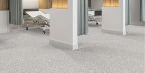

As manufactured by: Patcraft
ITEM 1:
» Style: Terrazzo Admix
» Color: Sundial 00130
» Size: 36” x 36”
» Hyperlink
ITEM 2:
» Style: Terrazzo Admix
» Color: Dove Shell 00720
» Size: 36” x 36”
» Hyperlink
ITEM 3:
» Style: Terrazzo Admix
» Color: Scallop 00520
» Size: 36” x 36”
» Hyperlink
ITEM 4:
» Style: Terrazzo Admix
» Color: Fawn 00147
» Size: 36” x 36”
» Hyperlink
4.5 Flooring


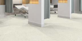

As manufactured by: Patcraft
SHEET VINYL
As manufactured by: Shaw Contract
ITEM 1:
» Style: Terrazzo Admix
» Color: White Coral 00100
» Size: 36” x 36”
» Hyperlink
ITEM 2:
» Style: Terrazzo Admix
» Color: Dove Shell 00720
» Size: 36” x 36”
» Hyperlink
ITEM 3:
» Style: Naturelife 002V
» Color: Stained Walnut 09572
» Size: 6’ x 75’ L, .087in Thick
» Hyperlink
4.5 Flooring




LUXURY VINYL TILE
As manufactured by: Shaw Contract
ITEM 1:
» Style: Compound 4077V
» Color: Threshold 77515
» Size: 24” x 24”, 5.0mm
» Hyperlink
ITEM 2:
» Style: Compound 4077V
» Color: Onset 77525
» Size: 24” x 24”, 5.0mm
» Hyperlink
ITEM 3:
» Style: Compound 4077V
» Color: Foundation 77530
» Size: 24” x 24”, 5.0mm
» Hyperlink
ITEM 4:
» Style: Compound 4077V
» Color: Origin 77114
» Size: 24” x 24”, 5.0mm
» Hyperlink NOTE:
» This product is to only be used in lieu of the Texas Granite Solid Vinyl tile when the existing conditions require a 5.0mm thickness.
4.5 Flooring


4.5 Flooring
As manufactured by: Tarkett
ITEM 1:
» Style: iQ Eminent
» Color: Dusty White 0906
» Size: 2 x 23m Roll
» Hyperlink
ITEM 2:
» Style: iQ Eminent
» Color: Dusty Sand
» Size: 2 x 23m Roll
» Hyperlink
ITEM 3:
» Style: iQ Eminent
» Color: Dusty Blue
» Size: 2 x 23m Roll
» Hyperlink
ITEM 4:
» Style: iQ Eminent
» Color: Dusty Grey
» Size: 2 x 23m Roll
» Hyperlink
4.5 Flooring


TERRAZZO
As manufactured by: Terroxy Epoxy
ITEM 1:
» Style: Epoxy Terrazzo
» Color: TM#16-371
» Size: Monolithic
» Hyperlink
ITEM 2:
» Style: Epoxy Terrazzo
» Color: TM#16-377
» Size: Monolithic
» Hyperlink
ITEM 3:
» Style: Epoxy Terrazzo
» Color: TM#16-582
» Size: Monolithic
» Hyperlink
ITEM 4:
» Style: Epoxy Terrazzo
» Color: TM#16-580
» Size: Monolithic
» Hyperlink
4.5 Flooring


TERRAZZO
As manufactured by:
Terroxy Epoxy
ITEM 1:
» Style: Epoxy Terrazzo
» Color: TM#16-581
» Size: Monolithic
» Hyperlink
PORCELAIN TILE
As manufactured by:
Garden State Tile
ITEM 2:
» Style: Sands
» Color: Ivory Sands
» Size: 12” x 24”
» Grout: Laticrete 90 Light Pewter
» Hyperlink
ITEM 3:
» Style: Sands
» Color: Ivory Sands
» Size: 2” x 2” mosaic
» Grout: Laticrete 90 Light Pewter
» Hyperlink
4.5 Flooring


4.5 Flooring
CARPET TILE
As manufactured by: Shaw
ITEM 1:
» Style: Glimmer Tile 59329
» Color: Gloss 27761
» Size: 24” x 24”
» Layout: Ashlar
» Hyperlink
ITEM 2:
» Style: Uncover 5T150
» Color: Tarnished Alum 50761
» Size: 18” x 36”
» Hyperlink
ITEM 3:
» Style: Fault
» Color: Carraca Silver 20100
» Size: 12’ W Broadloom
» Hyperlink
ITEM 4:
» Style: Kasuri Tile 5T046
» Color: Galvanized 92515
» Size: 24” x 24”
» Hyperlink
4.5 Flooring


4.5 Flooring
ENTRANCE MAT
As manufactured by: Shaw
ITEM 1:
» Style: Welcome II Tile 5T031
» Color: Sterling 31557
» Size: 24” x 24”
» Installation: Quarter Turn with Ecoworx Backing
» Hyperlink
ITEM 2:
» Style: Pedigrid SA G8
» Serrated Aluminum Insert
» Depth: 1-11/16”
» Level Base with Drain Pan
» Hyperlink
4.6 Millwork


4.6 Millwork
As manufactured by: Wilsonart
As manufactured by: Nevamar
ITEM 1:
» Color: Walnut Heights 1965K
» Finish: SoftGrain 12
» Hyperlink
ITEM 2:
» Color: High Rise 4996
» Finish: Matte
» Hyperlink
ITEM 3:
» Style: Satin Brushed Lite Bronze 6261
» Finish: 419
» Hyperlink
ITEM 4:
» Style: Clear Maple WM8340-T
» Finish: Textured with ARP
» Hyperlink
Millwork


4.6 Millwork
As manufactured by: Nevamar
As manufactured by: Formica
ITEM 1:
» Style: Crema WZ0049T
» Finish: Textured with ARP
» Location: VIP Rooms
» Hyperlink
ITEM 2:
» Style: Paloma Polar 6698-58
» Finish: Matte
» Hyperlink
ITEM 3:
» Style: Plex Bronzetoned M6486
» Finish: Decometal
» Location: VIP Rooms
» Hyperlink
ITEM 4:
As manufactured by: Dooge Veneers
» Hyperlink WOOD VENEER
» Style: Rustic Walnut, Flat Cut
» Finish: Clear Lacquer
4.6 Millwork


4.6 Millwork
As manufactured by: LG Hi-Macs
As manufactured by: Corian
ITEM 1:
» Color: Pause R0009
» Hyperlink
ITEM 2:
» Color: Concrete
» Hyperlink
ITEM 3:
» Color: Deep Mink
» Hyperlink
ITEM 4:
» Color: White Jasmine
» Hyperlink
4.6 Millwork


4.6 Millwork
As manufactured by: Caesarstone US
ITEM 1:
» Color: Frosty Carrina 5141
» Finish: Polished
» Thickness: 20 mm
» Hyperlink
ITEM 2:
» Color: Nougat 6600
» Finish: Polished
» Thickness: 30 mm
» Hyperlink
As manufactured by: Stone Source
ITEM 3:
» Color: Woodlands 6338
» Finish: Polished
» Thickness: 20 mm
» Hyperlink
ITEM 4:
» Color: Calacatta Tucci Marble
» Finish: Honed
» Hyperlink



PRIVACY CURTAIN
As manufactured by: Momentum Textiles
SHOWER CURTAIN
As manufactured by:
InPro Architectural Products
ITEM 1:
» Pattern: Streamers
» Color: Seabreeze
» Width: 74”
» Hyperlink
ITEM 2:
» Pattern: Clickeze Super Bio Stat
» Color: White
» Style: Style 2 Full Coverage
» Hyperlink
4.8 Shading


As manufactured by: WT Shades
ITEM 1:
» Style: H200 Solomount bracket with front fascia in Silver 20
» Shadecloth: Ecofabrix 253, Color: 12 White/Sand
» 3% Openness
» Hyperlink
ITEM 2:
» Style: H200 Solomount bracket with front fascia in Silver 20
» Shadecloth: Ecofabrix 772 Blackout, Color: 10 White
» 0% Openness
» Hyperlink
ITEM 1 1:
» Image Source: iStock
» Image #: 1175028487
» Image Code: SWC-1A
» Hyperlink
ITEM 1 2:
» Image Source: iStock
» Image #: 1145663494
» Image Code: SWC-1BA/B
» Hyperlink
ITEM 1 3:
» Image Source: iStock
» Image #: 829735568
» Image Code: SWC-1CA/B
» Hyperlink
ITEM 1 4:
» Image Source: iStock
» Image #: 1395803117
» Image Code: SWC-1F
» Hyperlink




1.5

ITEM 1 .5:
» Image Source: iStock
» Image #: 487300354
» Image Code: SWC-1H
» Hyperlink
ITEM 2 1:
» Image Source: iStock
» Image #: 637585282
» Image Code: SWC-2A/2B
» Hyperlink
ITEM 2 2:
» Image Source: iStock
» Image #: 1318326439
» Image Code: SWC-2D
» Hyperlink
ITEM 2 3:
» Image Source: iStock
» Image #: 507174370
» Image Code: SWC-2E
» Hyperlink
ITEM 2 4:
» Image Source: iStock
» Image #:
» Image Code: SWC
» Hyperlink


2.5

ITEM 2 .5:
» Image Source: iStock
» Image #: 577349894
» Image Code: SWC-2F
» Hyperlink
ITEM 3 1:
» Image Source: iStock
» Image #: 1219470679
» Image Code: SWC-3A
» Hyperlink
ITEM 3 .2:
» Image Source: iStock
» Image #:
» Image Code: SWC
» Hyperlink
ITEM 3 3:
» Image Source: iStock
» Image #: 1075275204
» Image Code: SWC-3J
» Hyperlink
ITEM 3 4:
» Image Source: iStock
» Image #: 1125009189
» Image Code: SWC-3F
» Hyperlink


3.5

ITEM 3 .5:
» Image Source: iStock
» Image #: 1169284564
» Image Code: SWC-3B
» Hyperlink
4.9 Image Library
ITEM 3 5:
» Image Source: iStock
» Image #: 1164205817
» Image Code: SWC-3H
» Hyperlink
ITEM 3 .7:
» Image Source: iStock
» Image #: 972344084
» Image Code: SWC-3C
» Hyperlink
3.5

3.7

3.8

ITEM 3 .8:
» Image Source: iStock
» Image #: 1486985657
» Image Code: SWC-3G
» Hyperlink
ITEM 4 1:
» Image Source: iStock
» Image #: 1175028487
» Image Code: SWC-4A
» Hyperlink
ITEM 4 .2:
» Image Source: iStock
» Image #: 1145663494
» Image Code: SWC-4F
» Hyperlink
ITEM 4 3:
» Image Source: iStock
» Image #: 485927972
» Image Code: SWC-4D
» Hyperlink
ITEM 4 4:
» Image Source: iStock
» Image #: 829735568
» Image Code: SWC-1CA/B
» Hyperlink


4.9 Imagery


ITEM 4 7:
» Image Source: iStock
» Image #: 529404288
» Image Code: SWC-4B
» Hyperlink
ITEM 4 5:
» Image Source: iStock
» Image #: 1638788401
» Image Code: SWC-4E
» Hyperlink
ITEM 4 .6:
» Image Source: iStock
» Image #: 1251656996
» Image Code: SWC
» Hyperlink

ITEM 4 8:
» Image Source: iStock
» Image #: 479184967
» Image Code: SWC-4C
» Hyperlink Material Standards
ITEM 5 1:
» Image Source: iStock
» Image #: 1337120405
» Image Code: SWC-5A
» Hyperlink
ITEM 5 .2:
» Image Source: iStock
» Image #: 1388016241
» Image Code: SWC-5F
» Hyperlink
ITEM 5 3:
» Image Source: iStock
» Image #: 1588035003
» Image Code: SWC-5G
» Hyperlink


5.4

ITEM 5 4:
» Image Source: iStock
» Image #: 147917024
» Image Code: SWC-5B
» Hyperlink
5.6

ITEM 5 6:
» Image Source: iStock
» Image #: 477660546
» Image Code: SWC-
» Hyperlink
5.5

ITEM 5 5:
» Image Source: iStock
» Image #: 511132929
» Image Code: SWC-5C
» Hyperlink
5.7

ITEM 5 7:
» Image Source: iStock
» Image #: 1256437483
» Image Code: SWC-5D
» Hyperlink Material Standards


1. Confirm wall substrate and coordinate with manufacturer’s specific installation instructions.
2. Wall protection selection to be appropriate to functional program and budget.
3. All corner guards shall be full height.
4. The maximum tolerance distance from ceiling and/or scheduled base to bottom of and/or top of corner guard is 1/8”.
5. Stainless steel corner guards to be direct applied with adhesive.
6. All seams and top of wall protection to be caulked to wall with color match caulk unless otherwise directed by the specific campus.
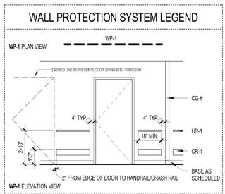

WP-1 LOCATIONS:
» Inpatient Unit Clinical Corridors
WP-2 LOCATIONS:
» Headwalls: ED Intake, ED Acute Rm, Typical Pediatric Exam, ED Observation Rm, ICN, Nursery
» Corridors: ED, Radiology, Observation, Lab, Prep/ Recovery, Procedure

WP-3 LOCATIONS:
» WP-3A
» Alcoves: Equipment, WC, stretcher and holding bays.
» ED Observation back wall
» Rehab headwalls
» Prep/Recovery side walls
» BOH: Maintenance, Receiving, Central Storage
» WP-3B
» OR Equipment alcoves
» Clean core
» PACU side walls
» BOH: Soiled Linen, Trash, Biohazard, Soiled workroom, EVS, Equipment Storage.
» WP-3C
» OB Assesment and Patient room footwalls.
» WP-3D
» ED Exam side walls, Pediatric, Acute, Intake headwalls.
» LDRP walls except headwall and accent wall.
» Corridor handwash alcoves
» ICU Footwalls

PWP SPEC:
» PWP-1: Acrovyn Mission White
» PWP-2: Altro Standard White
» PWP-3: Altro Oyster
» PWP-4: Altro Fawn
» PWP-5: Panolam FRP White
» WP-3E
» Decontamination and Scope Processing
» WP-3F
» ED Acute Secure
» BH ED Health Rooms.
» WP-3G
» OR’s and C- Section Rooms
» WP-3H
» LDRP team station crash cart alcoves.
» WP-3K
» BH ED Health Rooms back wall
» WP-3L
» Kitchen ans Dish room


WP-4 LOCATIONS:
» BOH Main Service Corridor and Service Elevator Vestibules.
WP-5 LOCATIONS:
» Headwalls: Inpatient rooms, OB Assessment rooms, ICU and ISO.

WP-6 LOCATIONS:
» Sterile Corridors
» Clean Cores
» Headwalls: PACU and Prep/ Recovery
5.1 Wall Protection
1. 4” rubber base is typical, 6” integral base is typical where required. Solid surface base should only be used in public spaces.
2. Wood look floor should be used only in conjunction with non wood-look millwork.
3. Wood look sheet vinyl is not to be coved up wall. Use coordinating solid/texture vinyl or do not use in rooms where cove base is required.
4. All floor transitions to be smooth and even. Where possible, flash patch floors to achieve a transition without noticeable elevation change.
5. Floor patterns should not align to millwork and other out of sequence architectural elements to avoid coordination issues with alignment.
6. All materials should be installed flush to wall surface. If a flush transition cannot be achieved, clear or color match caulk should d be used to close any gaps.
7. All exposed tile edges to be captured by Schluter metal transition. Use cove base (Dilex) in toilet and shower rooms. Protect exposed edges with Jolly profile and outside corners (with tile on both sides) should utilize Quadec.

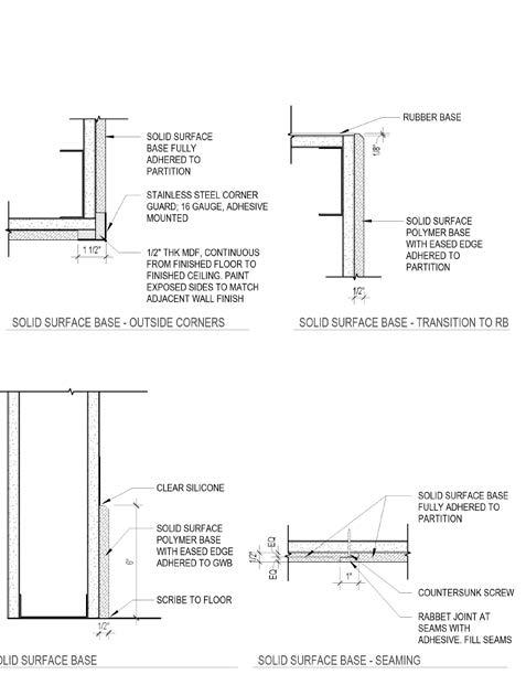

1. Specify Acrovyn plastic, wood or equal doors. When budget allows, Acrovyn (or equal) doors shall be specified and continuously hinged at high use areas.
2. Coordinate closer locations and necessary blocking.
3. All wood doors shall receive a kick plate. Coordinate size with room function and abuse level.
4. Sliding doors should be considered for patient toilet rooms to give more clear access.
1. All millwork must be premium grade MDF substrate and comply with the AWS (Architectural Woodwork Standard).
2. Plastic laminate with 3mm edge band to be used on MDF substrate for doors and drawer fronts.
3. Phenolic product may be used in lieu of laminate construction in high abuse areas, cabinet doors, drawers and body with approval. Phenolic construction methods must be coordinated.
4. Base substrate toe kicks and return end panels to be MDF or marine grade plywood at all locations.
5. Specify concealed, frameless, self closing hinges and soft close drawer glides.
6. Solid surface top with Moisture resistant MDF substrate shall be used in all patient care areas unless specifically directed otherwise by the facility.
7. All exposed/outside corners on a countertop to have a 1/2” radius.
8. All clinical millwork to receive tab type door/drawer pull, Amerock 2000852 or equal. Millwork for patient or public use should have door/drawer pull, Amerock BP29111G10 or equal. Patient wardrobes to have 24” bar type pull, Amerock BP19019CSG9 or equal.
9. Trash and Linen cabinets shall have a continuous floor and wall base extended into the cabinet.
10. All upper cabinets to have a white plastic laminate fascia above.
11. All outside edges to be captured with aluminum trim to minimize exposure to damage.
12. At all sink locations with a solid surface countertop, provide a drip edge as shown in the details.
REGISTRATION DESK:


CLINICAL TEAM STATION:


5.4 Millwork


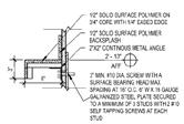

5.4 Millwork

5.4 Millwork


5.4 Millwork


